My Account
My Slides
Search by Category
Pricing
Templates
View All Templates
Download Template Slides
✦ AI Search
Feedback
Login
Logout
Get Started
Browse all Slides
Browse all Slides
Create a FREE Account
Instant access to 1,000+ real slides from top companies like McKinsey, BCG, Goldman Sachs, Google and many more!
First Name
Last Name
Email
Password
I agree to all
Terms & Privacy Policy
Thank you! Your submission has been received!
Oops! Something went wrong while submitting the form.
Have an account?
Sign in
Saved Slides
Total No. of slides saved
0
↻ Refresh
✖ Clear all
Column charts showing NPL ratios, loan loss provisions, and Stage 2 loans for top UK banks.
Risk Assessment and Management
Financial Services
Analyzes NPL ratios and provisions of major UK banks, highlighting risk management strategies and trends.
UK, banks, NPL, risk, management
false
Risk Assessment and Management
Financial Services
Multiple Chart
Deloitte
Add to my slides
Remove from favorites
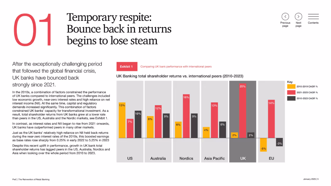
Split layout with large numeral “01”, narrative text block, and vertical bar chart comparing shareholder returns across regions; color-coded CAGR segments.
Financial Performance
Financial Services
This slide reviews the performance of UK banks vs. international peers from 2010–2023. While UK banks rebounded post-2021, they still trail in overall shareholder returns. Strong recent returns have been driven by rising interest rates, but momentum may be weakening.
UK banks, shareholder returns, international comparison, financial recovery, interest rates, CAGR, performance trends, banking sector
false
Financial Performance
Financial Services
Mixed Chart
PwC/Strategy&
Add to my slides
Remove from favorites
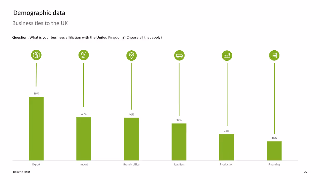
Bar chart displaying business affiliations with the UK, with vertical bars representing different affiliations.
Market Analysis and Trends
Professional Services
Shows the extent of business ties companies have with the UK, such as exports, imports, and branch offices.
UK, business ties, exports, imports, affiliations
false
Market Analysis and Trends
Professional Services
Single Chart
Deloitte
Add to my slides
Remove from favorites
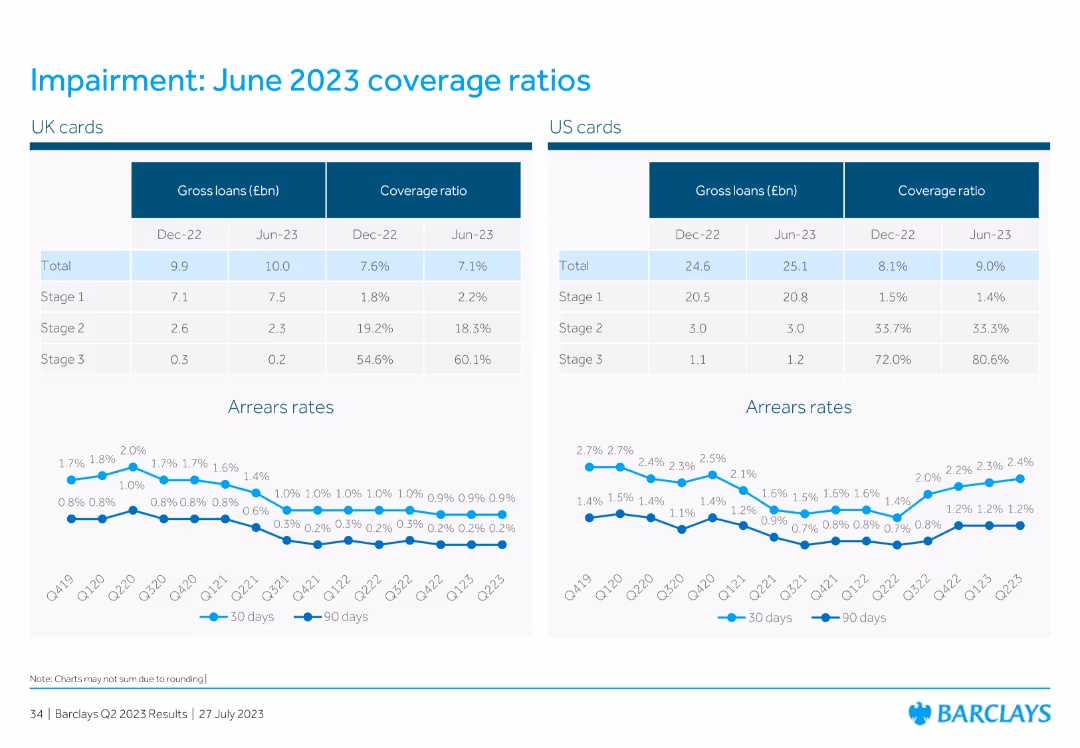
This slide displays two tables comparing UK and US cards for gross loans and coverage ratios for Dec 2022 and Jun 2023. Below the tables, there are two line charts showing arrears rates for 30 days and 90 days for both regions.
Financial Performance
Financial Services
The slide compares the coverage ratios and gross loans of UK and US cards for Dec 2022 and Jun 2023. It includes line charts to show the arrears rates over several quarters, providing insight into the financial health of these assets.
UK cards, US cards, gross loans, coverage ratio, arrears rates
false
Financial Performance
Financial Services
Multiple Chart
Barclays
Add to my slides
Remove from favorites
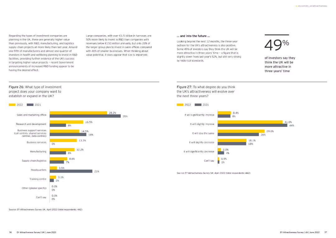
Displays a bar chart showing the leading city destinations of UK investment projects, excluding London, for 2020 and 2021.
Market Analysis and Trends
Financial Services
This slide highlights the top cities in the UK, excluding London, that attracted investment projects in 2020 and 2021, showing the comparative data.
UK cities, investment projects, 2020-21, bar chart
false
Market Analysis and Trends
Financial Services
Multiple Chart
EY
Add to my slides
Remove from favorites
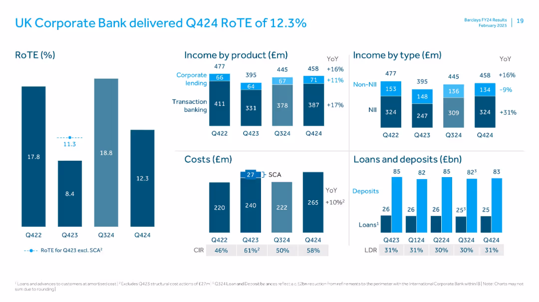
Mixed layout: bar charts for RoTE and income; waterfall and cost analysis; loans/deposits side-by-side bar comparison
Financial Performance
Financial Services
Focuses on UK Corporate Bank's Q424 financial performance. Showcases stable RoTE with YoY income growth led by transaction banking. Loan-deposit ratio and CIR analysis accompany commentary on cost trends and income types.
UK Corporate Bank, RoTE, transaction banking, loans, deposits, CIR, costs, Q424
false
Financial Performance
Financial Services
Multiple Chart
Barclays
Add to my slides
Remove from favorites
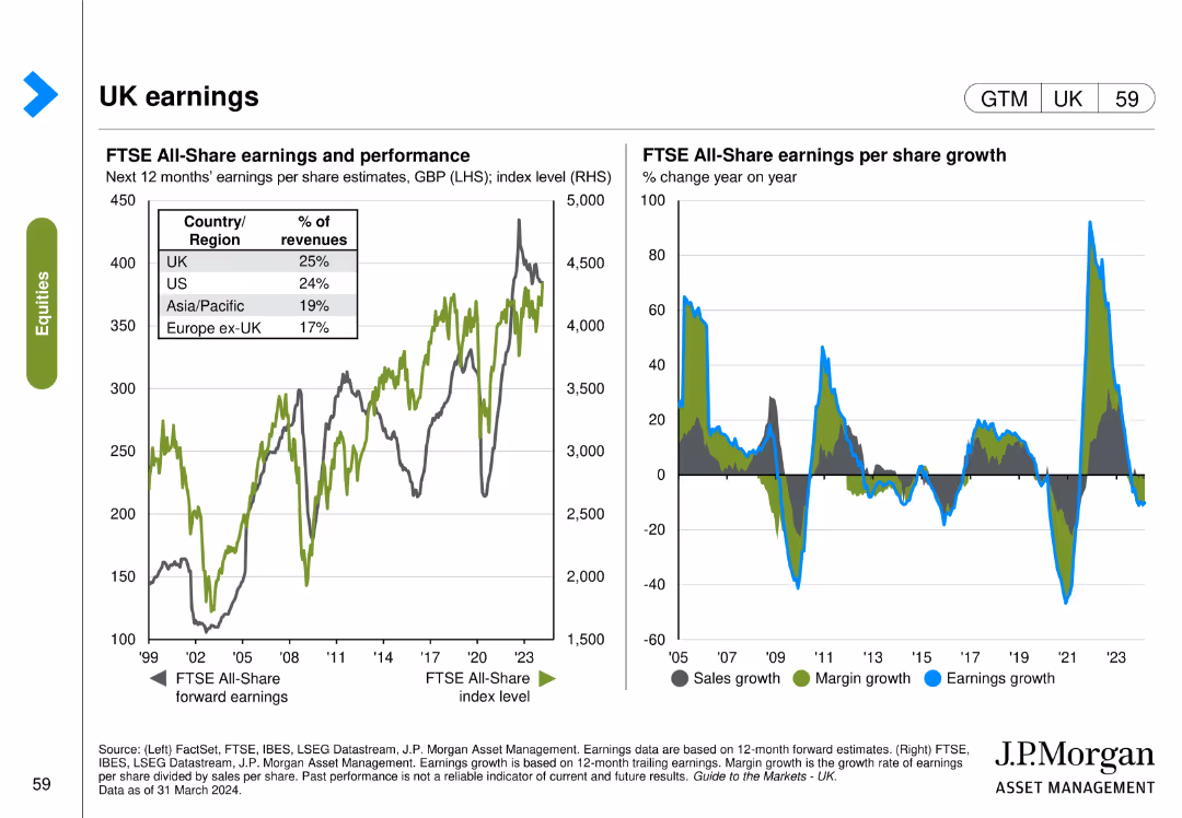
This slide contains two line charts. The first chart shows the FTSE All-Share earnings and performance over time. The second chart depicts the FTSE All-Share earnings per share growth year on year.
Financial Performance
Financial Services
The slide analyzes the FTSE All-Share earnings performance and growth, providing insights into the financial performance and trends within the UK market.
UK, earnings, FTSE, All-Share, performance, growth, financial, analysis
false
Financial Performance
Financial Services
Multiple Chart
JP Morgan
Add to my slides
Remove from favorites
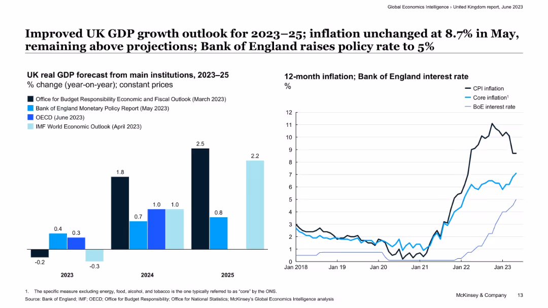
Two-panel layout with bar chart (left) of GDP forecasts and line chart (right) of CPI, core inflation, and BoE interest rate.
Strategic Planning
Financial Services
The slide outlines improved GDP growth forecasts for the UK over the 2023–2025 period, along with persistent inflation pressures. It shows the Bank of England’s policy rate hike to manage inflation, while core inflation trends remain elevated, suggesting monetary tightening is expected to continue.
UK economy, GDP growth, inflation, interest rate, monetary policy, Bank of England, CPI, economic forecast
false
Strategic Planning
Financial Services
Multiple Chart
McKinsey
Add to my slides
Remove from favorites
The slide includes three line charts depicting UK y/y real GDP (2017-27F), UK unemployment and employment (2018-23), and UK y/y headline CPI (2004-25F). The charts are detailed, with future projections and supporting explanations in the text.
Market Analysis and Trends
Financial Services
This slide analyzes the UK economic outlook for 2024, highlighting constraints on growth due to household income, housing activity, and capital expenditures despite easing inflation. It provides insights into GDP, employment, and inflation trends.
UK economy, GDP, unemployment, CPI, growth constraints
false
Market Analysis and Trends
Financial Services
Multiple Chart
EY
Add to my slides
Remove from favorites
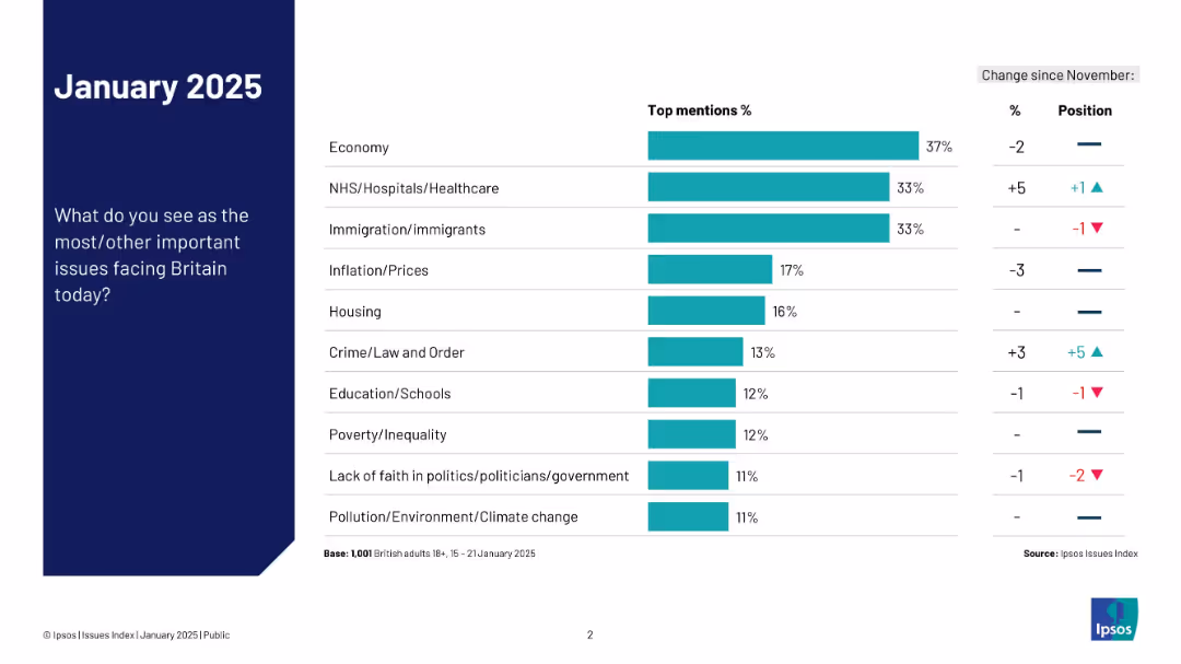
Left-aligned title and question; right side features a horizontal bar chart ranking top national concerns
Market Analysis and Trends
Government & Public Sector
The slide ranks the most pressing issues in Britain as of January 2025, with economy, NHS, and immigration topping the list. It includes change indicators from November and position shifts.
UK, economy, NHS, immigration, top issues, public opinion, priorities, Ipsos, change, survey
false
Market Analysis and Trends
Government & Public Sector
Mixed Chart
IPSOS
Add to my slides
Remove from favorites
The slide features a large pie chart with centered text, multiple bullet points, and two high-resolution images. The layout is dense with a blend of text and visuals.
Industry Overview
Industrial & Manufacturing
The slide presents the economic benefits of the Tempest programme, emphasizing the development of critical skills and investment in R&D within the UK. It serves as a detailed informational piece to stakeholders about the programme's broader impacts on the economy.
UK economy, R&D, critical skills, Tempest programme, STEM careers, Catapult networks, high-skilled jobs, technology integrators, innovation culture
false
Industry Overview
Industrial & Manufacturing
Text Only
PwC/Strategy&
Add to my slides
Remove from favorites
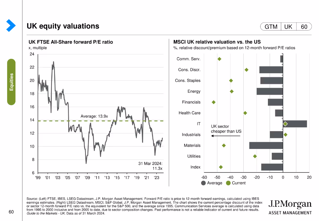
This slide includes two column charts. The first chart shows the UK FTSE All-Share forward P/E ratio over time. The second chart compares MSCI UK relative valuation vs. the US across different sectors.
Investment Analysis
Financial Services
The slide provides an analysis of the UK FTSE All-Share forward P/E ratio and its relative valuation compared to the US, aiding in investment decisions.
UK, equity, valuations, FTSE, MSCI, P/E ratio, US, comparison
false
Investment Analysis
Financial Services
Multiple Chart
JP Morgan
Add to my slides
Remove from favorites
Tabular format with icons, topics, and bullet-point summaries under a consistent column layout; uses white, red, black, and grey color blocks to distinguish topic categories.
Regulatory and Compliance
Government & Public Sector
This slide outlines several cooperative agreements between the UK and EU across sectors like fishing, farming, carbon trading, and defense. It emphasizes reduced red tape, reciprocal access, and restoration of quotas to pre-Brexit norms.
UK-EU agreement, regulatory cooperation, red tape, sectoral deals, fishing, farming, defense, steel, mobility scheme, SPS standards
false
Regulatory and Compliance
Government & Public Sector
Table
PwC/Strategy&
Add to my slides
Remove from favorites
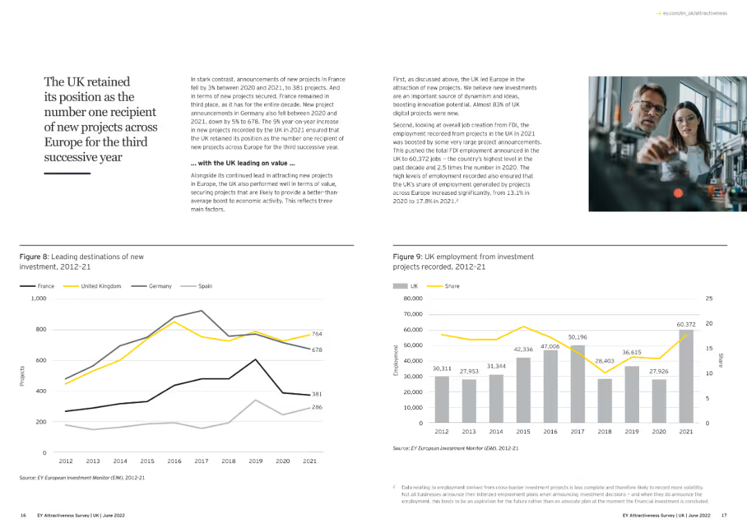
Text and line chart showing the UK's leading position in new investment projects in Europe.
Market Analysis and Trends
Financial Services
The slide highlights the UK's continued leadership in attracting new FDI projects across Europe for the third successive year, emphasizing the economic benefits and job creation resulting from these investments.
UK, FDI, Leadership, New Projects, Economic Benefits
false
Market Analysis and Trends
Financial Services
Multiple Chart
EY
Add to my slides
Remove from favorites
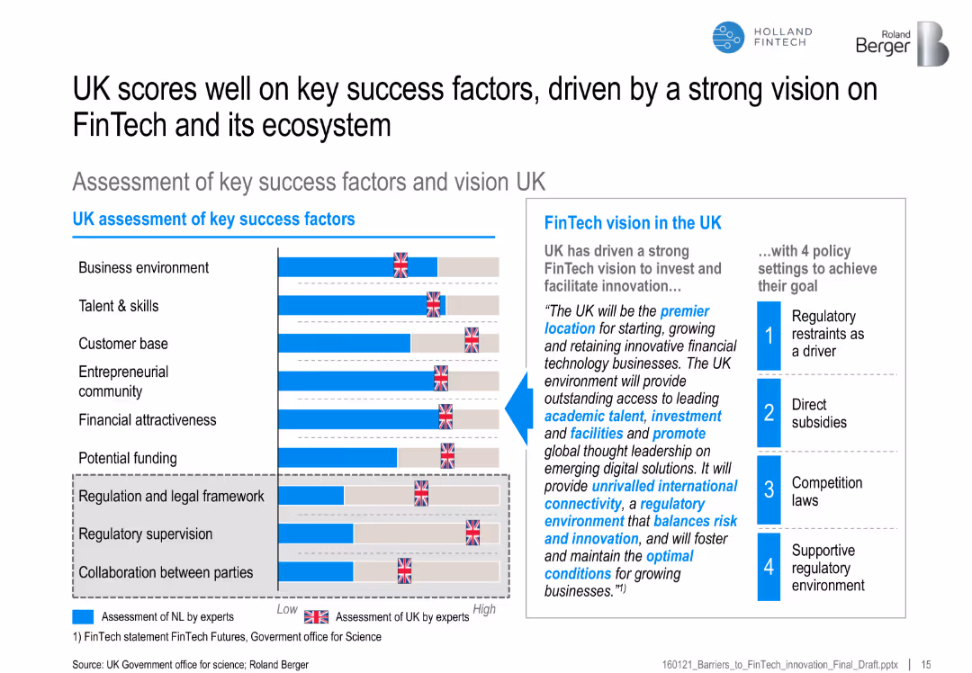
Bar chart of UK vs. benchmark on FinTech success factors, with a vision statement and four supporting policy actions
Strategic Planning
Financial Services
Highlights the UK’s strong performance across FinTech-enabling factors, backed by a clear vision and regulatory framework, promoting its position as a FinTech hub.
UK FinTech, ecosystem, regulatory vision, success factors, funding, policy, entrepreneurship, talent
false
Strategic Planning
Financial Services
Mixed Chart
Roland Berger
Add to my slides
Remove from favorites
The slide contains two column charts. The left chart shows the contribution to UK real GDP growth by different sectors. The right chart displays UK Purchasing Managers' Indices (PMI) over time. The charts are detailed and use various colors to distinguish data categories.
Market Analysis and Trends
Financial Services
The slide analyzes the UK's GDP growth and business activity through sector contributions and PMI trends, essential for economic analysis and business strategy.
UK GDP, business surveys, PMI, sector growth, economic analysis
false
Market Analysis and Trends
Financial Services
Multiple Chart
JP Morgan
Add to my slides
Remove from favorites
The slide features a title, two column charts for GDP projections, and a combined line and column chart for inflation and interest rates.
Financial Performance
Financial Services
This slide presents forecasts for UK's GDP growth and inflation rates, alongside historical Bank of England interest rates, useful for financial analysis.
UK, GDP, inflation, forecast, Bank of England, interest rate, economic, analysis, projections
false
Financial Performance
Financial Services
Multiple Chart
McKinsey
Add to my slides
Remove from favorites
The slide features two main visual elements: a bar graph on the left side comparing UK real GDP forecasts, and a line graph on the right side displaying 12-month inflation and Bank of England interest rates. The design is moderately dense with textual annotations and a legend explaining the data sources.
Market Analysis and Trends
Financial Services
This slide presents a forecast of the UK's real GDP growth and inflation trends, showing expectations from major institutions and actual economic performance. The inflation graph shows a recent peak and the interest rates set by the Bank of England. It is likely used to communicate economic forecasts to inform financial planning or policy-making decisions.
UK GDP, Inflation, Forecast, Economic Growth, Interest Rates, Monetary Policy, Financial Outlook, Comparative Analysis
false
Market Analysis and Trends
Financial Services
Multiple Chart
McKinsey
Add to my slides
Remove from favorites
The slide contains two charts: a line chart on the left showing UK GDP from Q4 2019 to Q4 2023, and another line chart on the right displaying 12-month inflation and Bank of England interest rate trends.
Market Analysis and Trends
Financial Services
The slide provides an analysis of the UK's economic performance, noting a 0.3% GDP decline in Q4 2023, steady CPI at 4% in January, and the Bank of England's policy rate at 5.25%. It is used to assess economic health and monetary policy impact.
UK GDP, inflation, interest rate, Bank of England, economic performance
false
Market Analysis and Trends
Financial Services
Multiple Chart
McKinsey
Add to my slides
Remove from favorites
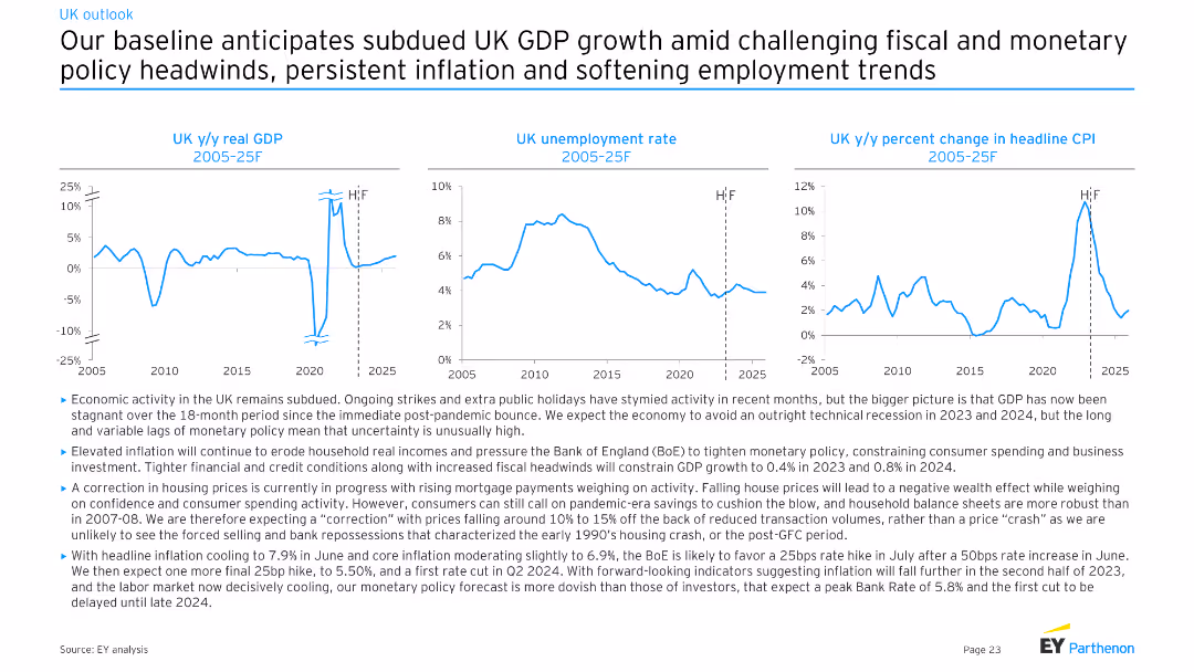
Three line charts depicting UK y/y real GDP, UK unemployment rate, and UK y/y percent change in headline CPI from 2005-25F. Moderate complexity with clear visual representations for economic trends analysis.
Market Analysis and Trends
Financial Services
The slide provides an economic forecast for the UK, projecting subdued GDP growth, persistent inflation, and softening employment trends. It discusses the effects of fiscal and monetary policies, as well as ongoing strikes and public holidays on economic activity.
UK, GDP, unemployment, CPI, forecast
false
Market Analysis and Trends
Financial Services
Multiple Chart
EY
Add to my slides
Remove from favorites
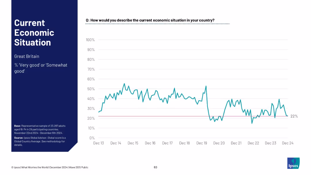
Timeline chart for Great Britain; shows fluctuation and recent dip; pink baseline at 22%.
Market Analysis and Trends
Financial Services
Great Britain’s economic sentiment is at 22%, showing considerable variability since 2013. The chart indicates a recent dip, reinforcing a low economic outlook.
UK, Great Britain, Ipsos, sentiment analysis, timeline, economic perception, 2024 low, public opinion, volatility
false
Market Analysis and Trends
Financial Services
Mixed Chart
IPSOS
Add to my slides
Remove from favorites
This slide includes two column charts. The left chart shows UK mortgage rates over time for different loan-to-value ratios. The right chart presents UK housing market trends, including house prices and sales to stock ratio. The charts are clear with detailed annotations.
Market Analysis and Trends
Financial Services
This slide examines the UK housing market by analyzing mortgage rates, house prices, and market trends, useful for real estate market analysis and financial planning.
UK housing market, mortgage rates, house prices, sales to stock ratio, real estate
false
Market Analysis and Trends
Financial Services
Multiple Chart
JP Morgan
Add to my slides
Remove from favorites
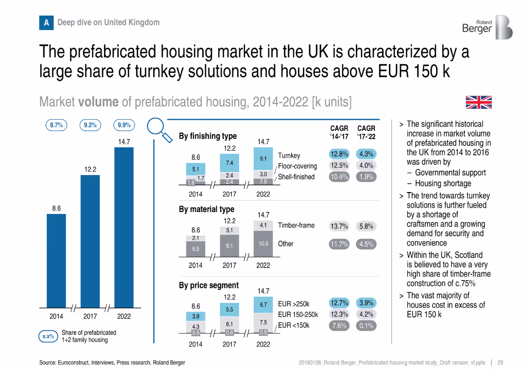
Vertical bars with detailed breakdowns by finishing type, material, and price; flag and notes on right
Customer and Market Segmentation
Real Estate & Construction
A deep dive into the UK market shows a strong preference for turnkey solutions and higher-value homes. Government support and housing shortages have driven growth. Timber-frame construction and higher price segments dominate.
UK housing, turnkey, timber-frame, pricing, prefabricated, market growth, segmentation
false
Customer and Market Segmentation
Real Estate & Construction
Multiple Chart
Roland Berger
Add to my slides
Remove from favorites
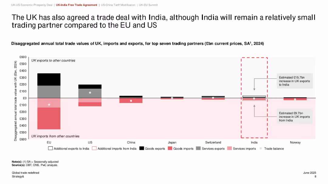
Bar chart comparing trade value with seven major countries; India trade section highlighted; use of black/red/gray with dotted annotation boxes
Strategic Planning
Government & Public Sector
The slide outlines the UK's trade relationships with major countries, emphasizing a new trade deal with India. Though India remains a small trade partner compared to the EU and US, the deal is expected to add £15.7bn in UK exports and £9.7bn in imports. The chart helps position India's role within the UK's overall trade strategy.
UK-India trade, exports, imports, trade agreement, economic relations, top partners, global strategy
false
Strategic Planning
Government & Public Sector
Single Chart
PwC/Strategy&
Add to my slides
Remove from favorites
Line chart comparing UK core goods versus services prices from 1988 to the present. Two lines, one for services (orange) and one for core goods (blue), show different growth trajectories with a clear upward trend for services.
Market Analysis and Trends
Financial Services
Demonstrates the differential inflation trends for goods and services in the UK, suggesting globalization's influence on price levels. This may inform investment strategies and economic policies.
UK, inflation, core goods, services prices, globalization, economic trends, market analysis, line chart, index level, J.P. Morgan.
false
Market Analysis and Trends
Financial Services
Single Chart
JP Morgan
Add to my slides
Remove from favorites
This slide features two line charts illustrating UK CPI inflation rates over several years, comparing the traditional core inflation with core excluding COVID-impacted sectors. The orange dashed line represents the traditional core, while the blue line shows the core excluding COVID-impacted sectors.
Market Analysis and Trends
Financial Services
This slide dissects the recent rise in UK inflation by differentiating between traditional core inflation and core inflation excluding sectors impacted by COVID-19. It can be used to discuss the nuances of inflation measurement and the pandemic's specific effects on economic indicators.
UK, Inflation, CPI, COVID-19 Impact, Economic Analysis, Sector Comparison, Line Chart
false
Market Analysis and Trends
Financial Services
Single Chart
JP Morgan
Add to my slides
Remove from favorites
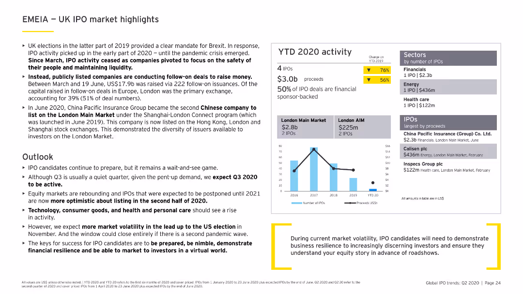
Features column charts, data tables, and bullet points. The slide is moderately dense with a clear layout, focusing on the UK's IPO market activities and highlights.
Market Analysis and Trends
Financial Services
Discusses the impact of Brexit and COVID-19 on the UK IPO market, including sector performance, major IPOs, and future market expectations for the latter half of 2020.
UK, IPO, Brexit, COVID-19, market highlights
false
Market Analysis and Trends
Financial Services
Multiple Chart
EY
Add to my slides
Remove from favorites
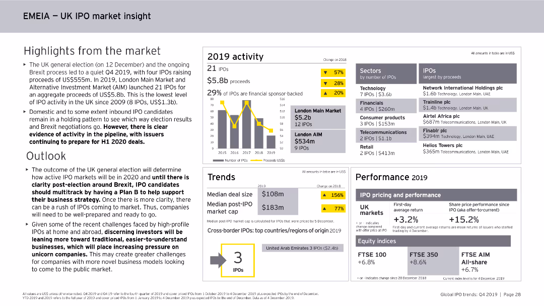
This slide features column charts, numerical data points, and textual highlights. It focuses on the UK IPO market within the EMEIA region, covering activity levels, sectors, and performance metrics for 2019.
Market Analysis and Trends
Financial Services
The slide summarizes the UK IPO market within the EMEIA region for 2019, noting the number of IPOs, proceeds, sector activity, performance metrics, and the outlook for 2020.
UK, IPO, EMEIA, Market Analysis, Financial Services, Trends, Activity, Sectors, 2019
false
Market Analysis and Trends
Financial Services
Mixed Chart
EY
Add to my slides
Remove from favorites
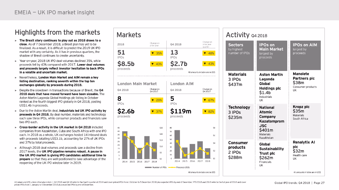
This slide includes multiple sections: highlights from the market, markets, and activity. It uses column charts and data tables to present IPO data and market performance in the UK. The layout is detailed, offering a clear and structured overview of the market insights.
Market Analysis and Trends
Financial Services
Provides insights into the UK IPO market in 2018, including market highlights, performance data, and activity details. Useful for market analysis and strategic planning in the financial sector.
UK, IPO, market insight, performance, trends
false
Market Analysis and Trends
Financial Services
Multiple Chart
EY
Add to my slides
Remove from favorites
The slide features two column charts. The left chart shows the UK unemployment rate and wage growth over time. The right chart presents labor force participation rates for the US, Eurozone, and UK. The data is well-segmented and color-coded.
Market Analysis and Trends
Financial Services
This slide provides insights into the UK labor market, focusing on unemployment, wage growth, and labor force participation rates, essential for labor market analysis.
UK labor market, unemployment, wage growth, labor force participation, economic trends
false
Market Analysis and Trends
Financial Services
Multiple Chart
JP Morgan
Add to my slides
Remove from favorites
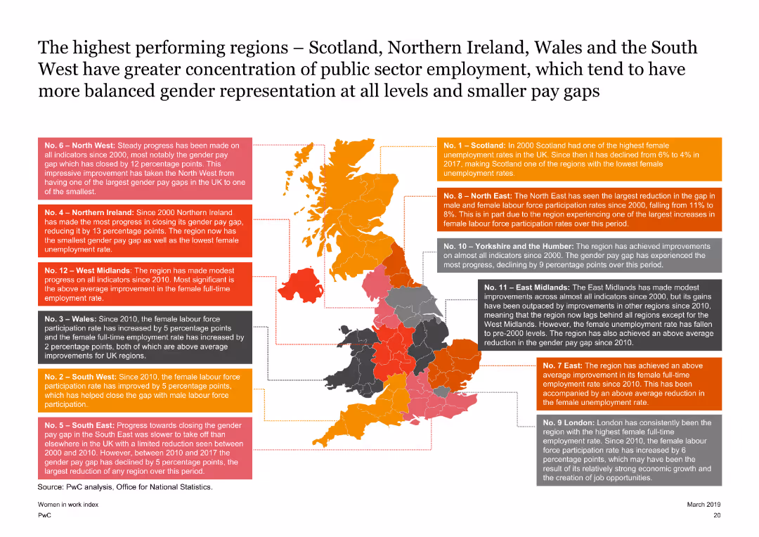
Features a map of the UK with highlighted regions and text boxes explaining the performance of each region on the Women in Work Index. The slide is detailed with a clear visual representation of regional data.
Market Analysis and Trends
Government & Public Sector
Highlights the top-performing regions in the UK on the Women in Work Index, such as Scotland and Northern Ireland, discussing their progress in female labor force participation and gender pay gap reduction since 2000.
UK map, regional performance, gender pay gap, female labor force participation
false
Market Analysis and Trends
Government & Public Sector
Graphic
PwC/Strategy&
Add to my slides
Remove from favorites
Features a map of the UK with key points listed about market growth, emphasizing the UK's strengths such as regulatory environment and London as a financial centre.
Market Analysis and Trends
Financial Services
The slide argues for the strategic timing of expanding financial operations in the UK, emphasizing national economic resilience, strong regulatory frameworks, and London’s role as a global financial hub, supporting a strategic business decision for market expansion.
UK Market, Growth, Strategy, Financial Hub
false
Market Analysis and Trends
Financial Services
Graphic
Barclays
Add to my slides
Remove from favorites
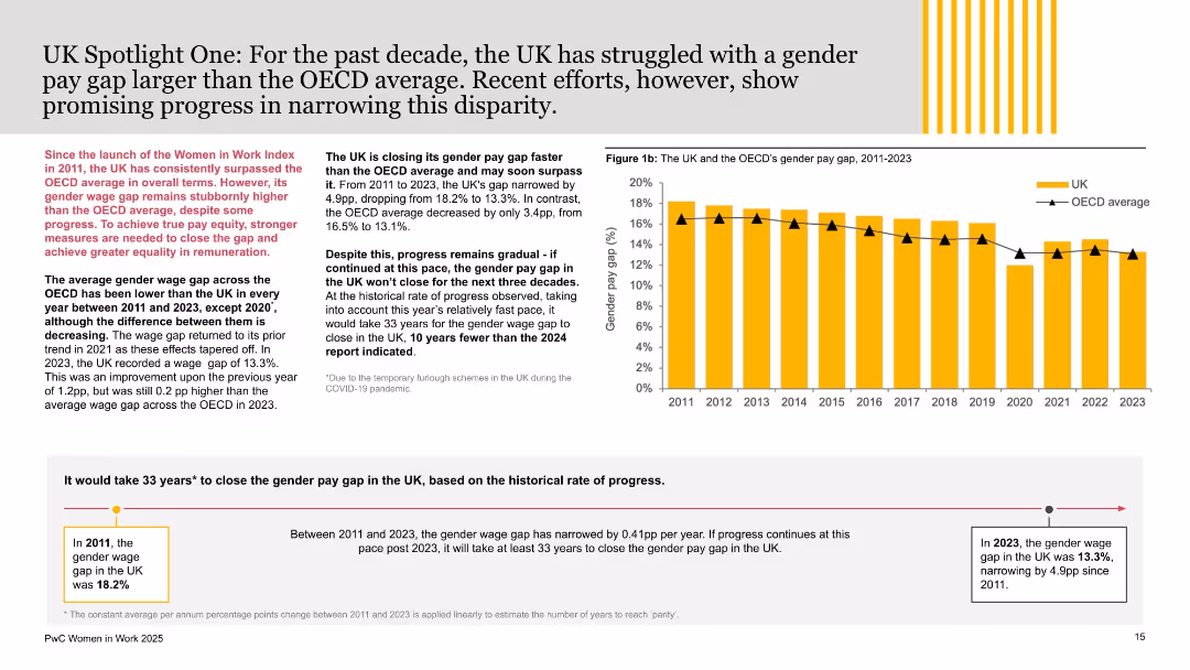
Mix of bar chart and annotated analysis; UK and OECD gender pay gap from 2011 to 2023 charted with narrative on progress and future projections.
Regulatory and Compliance
Government & Public Sector
This slide focuses on the UK’s gender pay gap, showing a reduction from 18.2% in 2011 to 13.3% in 2023. Despite progress, the UK still lags behind the OECD average. The projection estimates it would take 33 more years to reach parity if trends persist.
UK pay gap, gender disparity, OECD comparison, remuneration equity, wage trends, PwC report, policy, gender equality, parity forecast, employment
false
Regulatory and Compliance
Government & Public Sector
Mixed Chart
PwC/Strategy&
Add to my slides
Remove from favorites
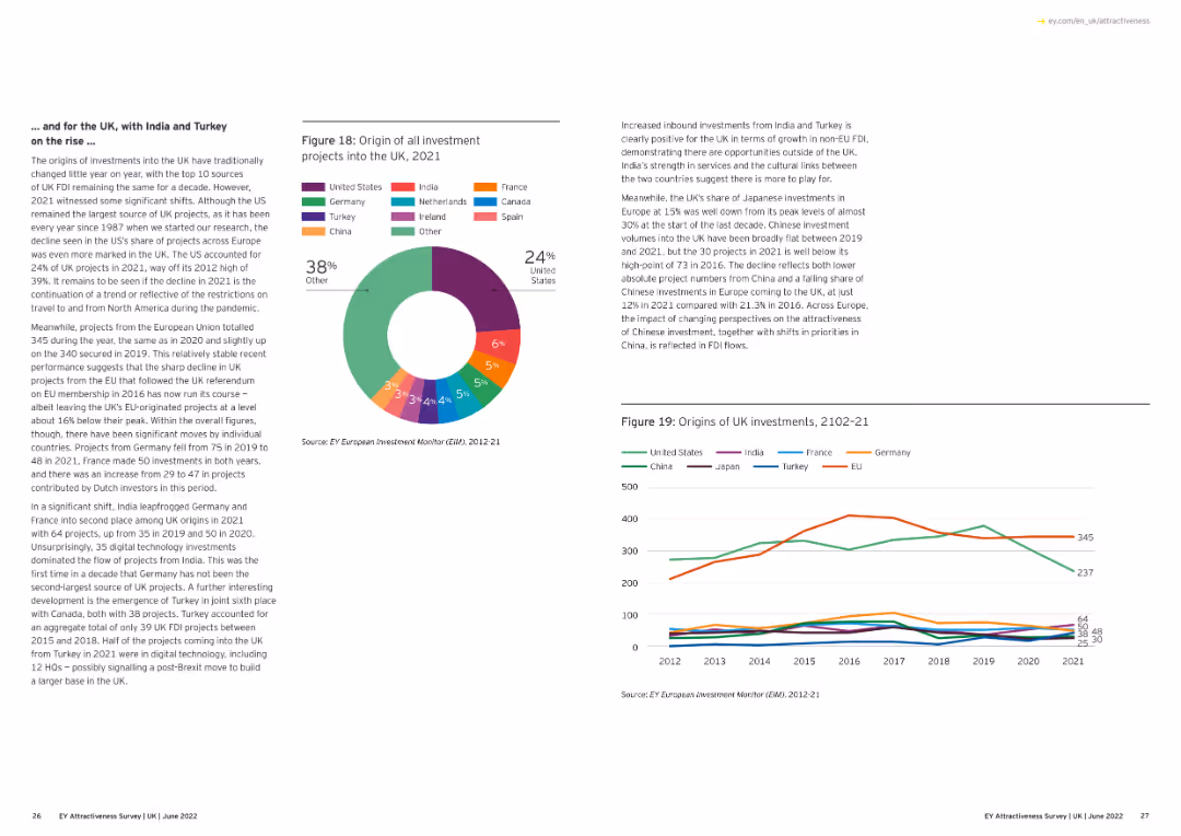
The slide shows a line chart detailing UK projects by activity from 2012 to 2021, with lines for different types of activities like business services, sales.
Market Analysis and Trends
Financial Services
This slide provides an overview of the distribution of UK projects by activity over the past decade, highlighting changes in business focus and investment.
UK projects, activity, business services, 2012-21
false
Market Analysis and Trends
Financial Services
Multiple Chart
EY
Add to my slides
Remove from favorites
Features a bar chart comparing the regional and devolved administration destinations of UK projects in 2020 and 2021.
Market Analysis and Trends
Financial Services
This slide presents data on the distribution of UK investment projects across various regions and devolved administrations, showing year-on-year changes.
UK projects, regions, devolved administration, 2020-21
false
Market Analysis and Trends
Financial Services
Multiple Chart
EY
Add to my slides
Remove from favorites
The slide features a line chart comparing expected reductions in UK government spending. It includes commentary and implications for corporates.
Regulatory and Compliance
Government & Public Sector
This slide examines the potential contraction in UK public services spending due to government tax cuts. It discusses the impacts on businesses and household finances.
UK, public spending, government policy, financial analysis, regulatory impact
false
Regulatory and Compliance
Government & Public Sector
Mixed Chart
Accenture
Add to my slides
Remove from favorites
Includes line graphs and trend analysis with annotations. Visual focus on historical and forecasted data with a red highlight on recent trends.
Risk Assessment and Management
Energy & Utilities
Focuses on the economic ramifications of the Ukraine conflict, analyzing inflation, commodity prices, and potential slowdowns in green investments.
Ukraine conflict, inflation, commodity prices, economic impact, green investment
false
Risk Assessment and Management
Energy & Utilities
Multiple Chart
Bain
Add to my slides
Remove from favorites
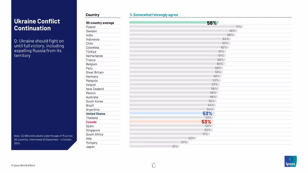
Same structure as other Ipsos slides; bar chart showing support across countries for Ukraine to fight until full territorial victory.
Strategic Planning
Government & Public Sector
This slide displays international support for Ukraine continuing its military campaign until achieving full territorial control. A 30-country average is compared with individual country results, indicating varied levels of support.
Ukraine, conflict, territorial integrity, Russia, global support, public opinion, international alignment, Ipsos, war continuation, military goals
false
Strategic Planning
Government & Public Sector
Mixed Chart
IPSOS
Add to my slides
Remove from favorites
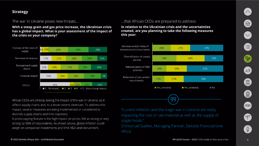
The slide features two column charts assessing the impact of the Ukrainian crisis on companies and the measures planned in response. The charts use various colors to denote the levels of impact and response. Text explanations are provided at the bottom.
Risk Assessment and Management
Energy & Utilities
This slide evaluates the impact of the war in Ukraine on companies, focusing on supply costs, revenue decrease, and supply chain disorganization. It also outlines measures African CEOs plan to take, including investment delays and diversification of sources.
Ukraine crisis, impact, supply chain, response, measures
false
Risk Assessment and Management
Energy & Utilities
Multiple Chart
Deloitte
Add to my slides
Remove from favorites
This slide includes two main visual elements: a column chart detailing the share of total exports to Ukraine, Russia, and Belarus from 2015-2021, and a column chart depicting trade in goods from January to April in billion ISK at constant exchange rates from 2018-2022. Both charts use distinct colors to represent different commodities and metrics.
Market Analysis and Trends
Financial Services
Analyzes the direct effects of the Ukraine conflict on Iceland's exports, particularly focusing on commodities like seafood and aluminum. It indicates minimal impact on the overall trade, supported by high production prices, and provides a yearly and monthly breakdown of trade volumes and values in the context of geopolitical tensions.
Ukraine, exports, trade, seafood, aluminum, geopolitical impact
false
Market Analysis and Trends
Financial Services
Multiple Chart
Deutsche Bank
Add to my slides
Remove from favorites
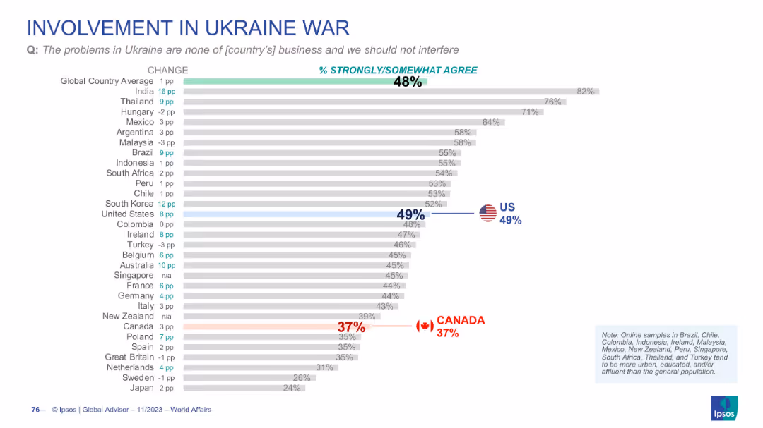
Bar chart ranking countries by agreement with the idea that Ukraine is not their country’s business. US and Canada marked; layout consistent.
Strategic Planning
Government & Public Sector
This slide measures sentiment that the Ukraine conflict is none of the country’s business. Global agreement is 48%, with 49% in the US and only 37% in Canada. It suggests public division over foreign policy involvement.
Ukraine, foreign policy, public opinion, global affairs, Ipsos
false
Strategic Planning
Government & Public Sector
Single Chart
IPSOS
Add to my slides
Remove from favorites
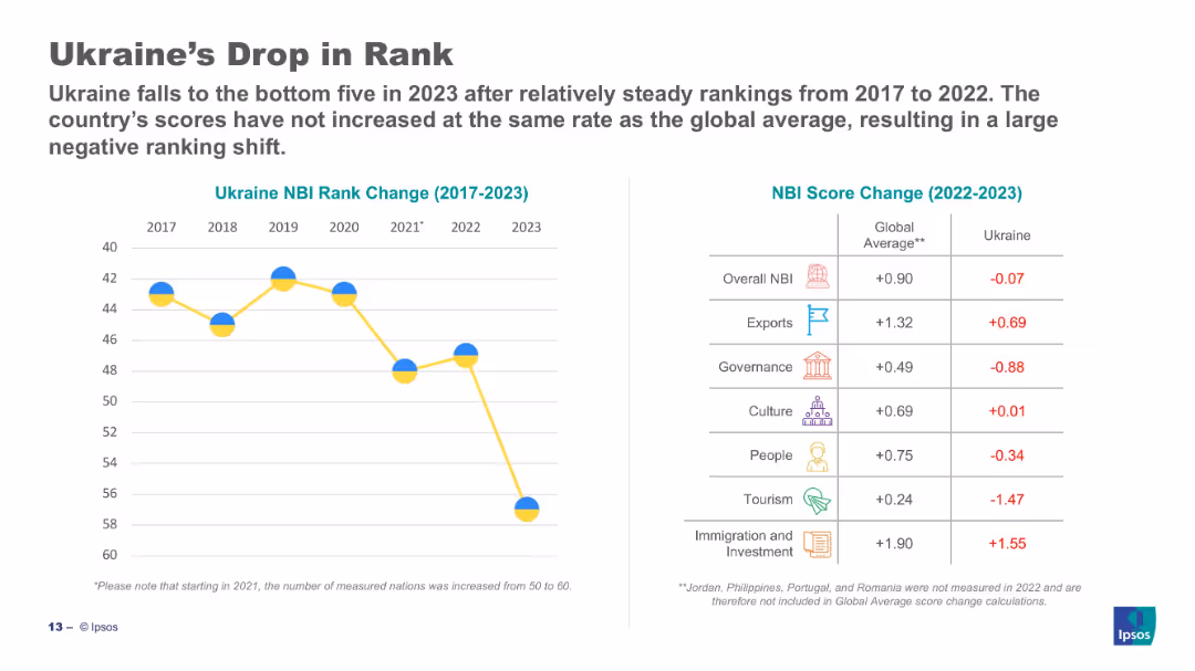
Split slide: line chart (left) shows drop in Ukraine's NBI rank (2017–2023); table (right) compares score changes.
Strategic Planning
Government & Public Sector
Ukraine has dropped into the bottom five of the NBI in 2023. The left chart shows a sharp decline post-2021. The right table compares Ukraine's 2023 scores to global averages, with Ukraine underperforming in most categories, especially tourism and governance.
Ukraine, NBI, decline, governance, score change, comparison, Ipsos, ranking, 2023
false
Strategic Planning
Government & Public Sector
Mixed Chart
IPSOS
Add to my slides
Remove from favorites
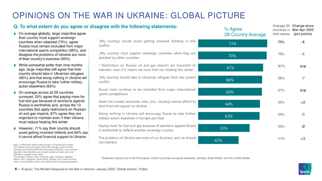
Two-column layout: left side has bullet points, right side features a horizontal bar chart comparing % agreement across statements.
Market Analysis and Trends
Government & Public Sector
This slide summarizes global public opinion on key issues surrounding the war in Ukraine. It shows levels of agreement with various statements about support for Ukraine, military involvement, refugee intake, and economic sanctions. Data represents 28-country averages.
Ukraine, public opinion, sanctions, refugees, military, Ipsos, global, support, agreement, comparison
false
Market Analysis and Trends
Government & Public Sector
Mixed Chart
IPSOS
Add to my slides
Remove from favorites
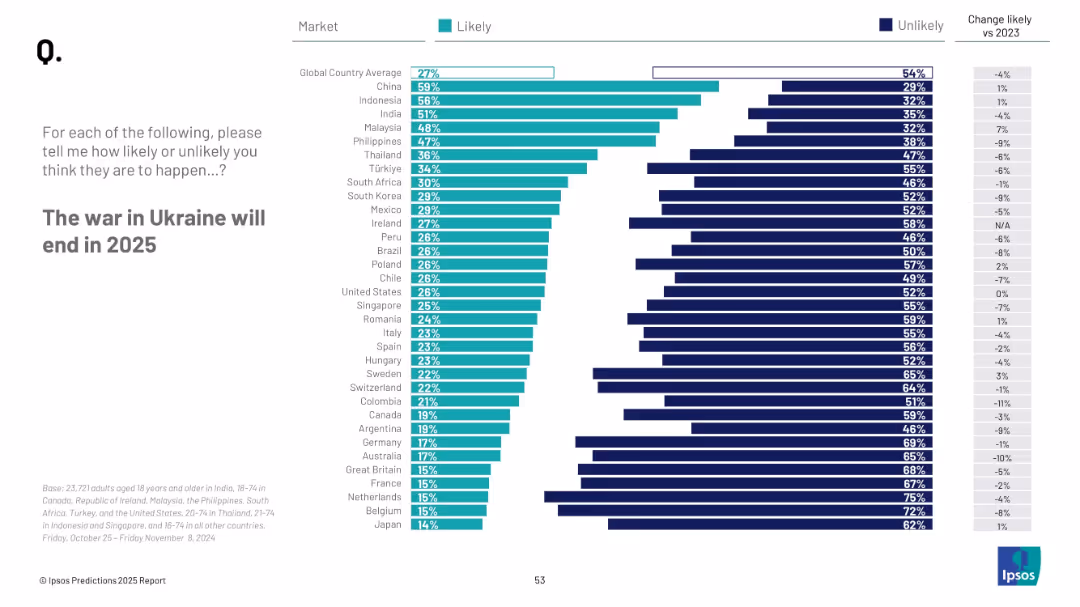
Bar chart showing countries' perceived likelihood; vertical list of countries with teal and navy bars; clean white background
Strategic Planning
Government & Public Sector
This slide depicts survey responses about the expected end of the Ukraine war in 2025. The results are sorted by percentage of people per country who consider it likely, with trends vs. 2023 included for comparison.
Ukraine war, 2025 prediction, global views, peace, likelihood, international sentiment, Ipsos, geopolitics
false
Strategic Planning
Government & Public Sector
Mixed Chart
IPSOS
Add to my slides
Remove from favorites
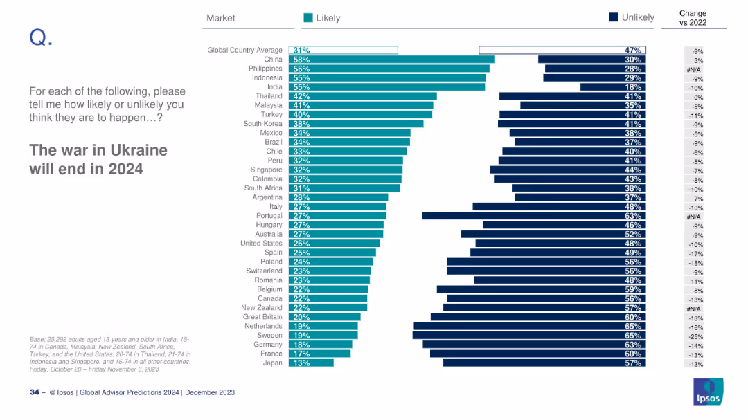
Bar chart showing global likelihood ratings by country; right side displays change from 2022.
Strategic Planning
Government & Public Sector
This slide presents the perceived likelihood of the Ukraine war ending in 2024. China and the Philippines express the most optimism, while Japan and France are among the least optimistic. The slide includes year-over-year shifts in public sentiment.
Ukraine war, geopolitics, global opinion, 2024 prediction, survey, conflict resolution
false
Strategic Planning
Government & Public Sector
Mixed Chart
IPSOS
Add to my slides
Remove from favorites
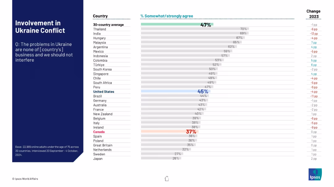
Horizontal bar chart ranking agreement that Ukraine is not their country’s concern. Sidebar on the left with title and survey question.
Risk Assessment and Management
Government & Public Sector
This slide assesses the level of agreement among different populations that their country should not interfere in the Ukraine conflict. Data reveals contrasting degrees of neutrality or disengagement sentiment among surveyed nations.
Ukraine war, international involvement, neutrality, Ipsos, public sentiment, foreign policy, disengagement, global conflict, survey data
false
Risk Assessment and Management
Government & Public Sector
Mixed Chart
IPSOS
Add to my slides
Remove from favorites
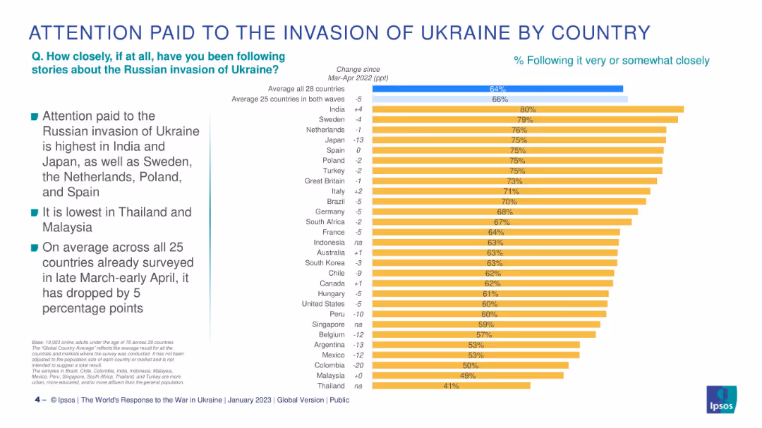
Bar chart of 28 countries, ranked by % following Ukraine war, with change vs Mar-Apr 2022.
Market Analysis and Trends
Government & Public Sector
This slide breaks down how attentively people in different countries follow the Ukraine conflict, showing the highest attention in India and Japan and the largest drop in Colombia and Argentina.
Ukraine war, public attention, international survey, Ipsos, by country, geopolitical awareness, year-on-year change, global concerns
false
Market Analysis and Trends
Government & Public Sector
Mixed Chart
IPSOS
Add to my slides
Remove from favorites
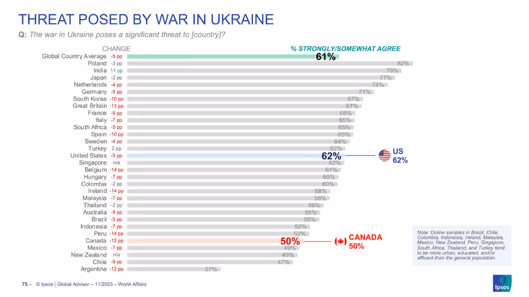
Bar chart with % agreement by country; change indicators in red/blue; US and Canada flagged. Clean, neutral color palette.
Risk Assessment and Management
Government & Public Sector
Depicts global perceptions of the war in Ukraine as a threat to one’s own country. 61% globally agree, 62% in the US, but only 50% in Canada. The slide suggests waning concern, especially in some Western countries.
Ukraine war, threat perception, geopolitical conflict, Canada, US
false
Risk Assessment and Management
Government & Public Sector
Single Chart
IPSOS
Add to my slides
Remove from favorites
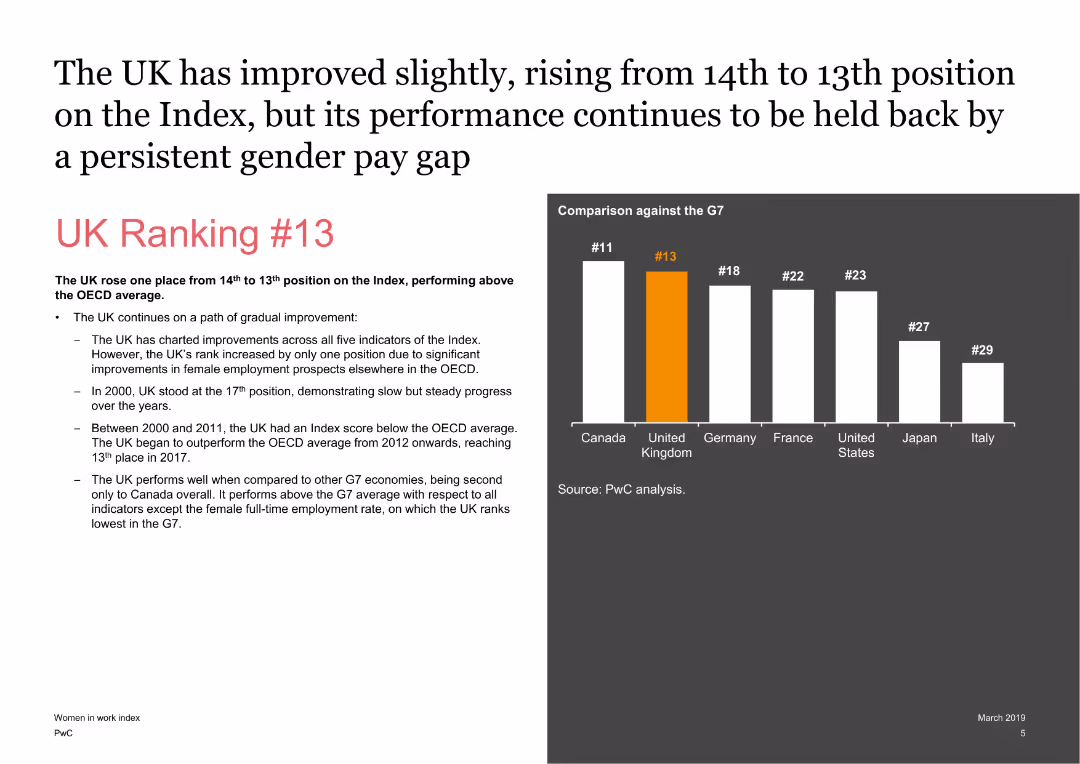
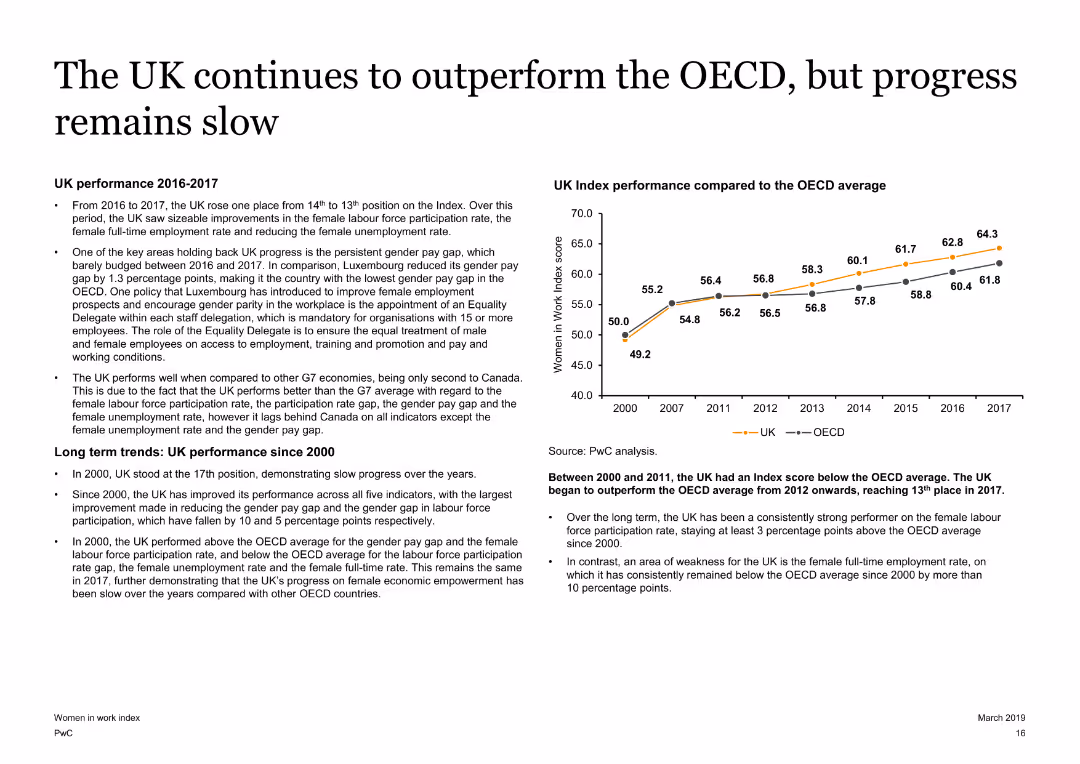
The slide features a mix of text and a column chart comparing the UK’s ranking with other G7 countries. The text highlights key points about the UK's position in the index and its performance over time.
Market Analysis and Trends
Financial Services
It discusses the UK’s improvement in the ranking on the Women in Work Index, highlighting the UK's performance compared to other G7 countries and factors influencing its ranking.
UK, Ranking, G7, Performance, Index, Analysis
false
Market Analysis and Trends
Financial Services
Mixed Chart
PwC/Strategy&
Add to my slides
Remove from favorites
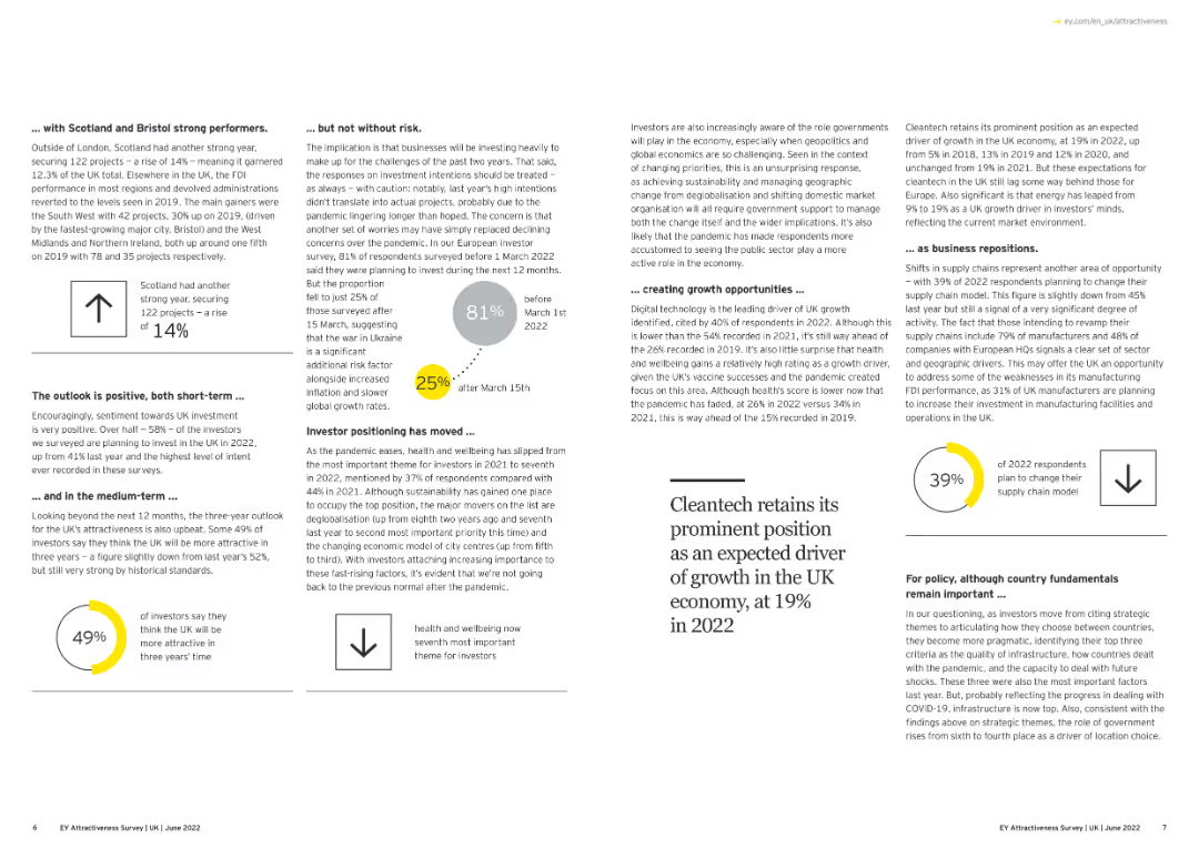
A combination of text and simple visual elements summarizing investment trends in specific UK regions.
Market Analysis and Trends
Financial Services
The slide outlines the performance of different UK regions in attracting FDI, noting the strength of Scotland and Bristol, the cautious investor sentiment, emerging growth opportunities, and the shifting investor focus towards sustainability and health and wellbeing.
UK Regions, FDI, Investment Trends, Regional Performance
false
Market Analysis and Trends
Financial Services
Multiple Chart
EY
Add to my slides
Remove from favorites
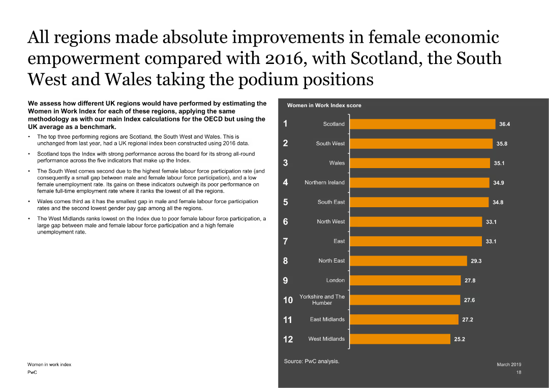
Features a text on the left with a column chart on the right showing Women in Work Index scores for different UK regions. The slide is visually balanced with clear regional comparisons.
Market Analysis and Trends
Government & Public Sector
Assesses the performance of different UK regions on the Women in Work Index, highlighting the top-performing regions like Scotland, the South West, and Wales, and discussing the factors contributing to their scores.
UK regions, Women in Work Index, economic empowerment, regional analysis
false
Market Analysis and Trends
Government & Public Sector
Mixed Chart
PwC/Strategy&
Add to my slides
Remove from favorites
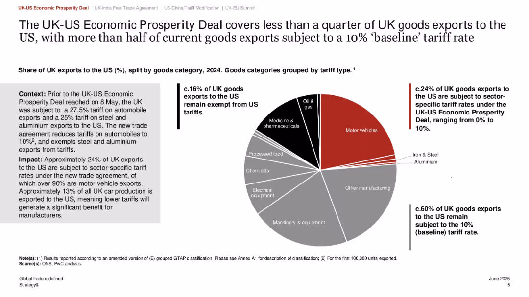
Left-aligned text summary with bold headings; large central pie chart on right; three major callouts; minimal clutter; black/red/gray palette
Regulatory and Compliance
Government & Public Sector
The slide explains the impact of the UK-US Economic Prosperity Deal on UK exports. It shows that less than 25% of UK goods exports are covered under reduced tariffs, with over 60% still facing a 10% tariff. The deal primarily benefits motor vehicle exporters and reduces tariffs from over 25% to 10%, supporting UK manufacturers heavily reliant on US markets.
UK-US trade deal, tariffs, motor vehicles, economic impact, exports, regulatory change, UK manufacturers
false
Regulatory and Compliance
Government & Public Sector
Mixed Chart
PwC/Strategy&
Add to my slides
Remove from favorites
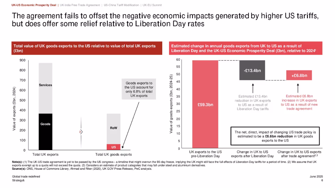
Dual bar charts: left shows export distribution, right shows economic impact; central column explains estimated changes in exports; clear numeric callouts
Regulatory and Compliance
Government & Public Sector
This slide quantifies the impact of the UK-US trade agreement, showing a net loss of £6.6bn in UK exports to the US even after accounting for gains from the new deal. It also emphasizes that UK goods exports to the US make up only 6.8% of total exports, highlighting limited trade dependency.
UK-US trade, export value, tariff policy, economic impact, Liberation Day, trade deficit, goods exports
false
Regulatory and Compliance
Government & Public Sector
Multiple Chart
PwC/Strategy&
Add to my slides
Remove from favorites
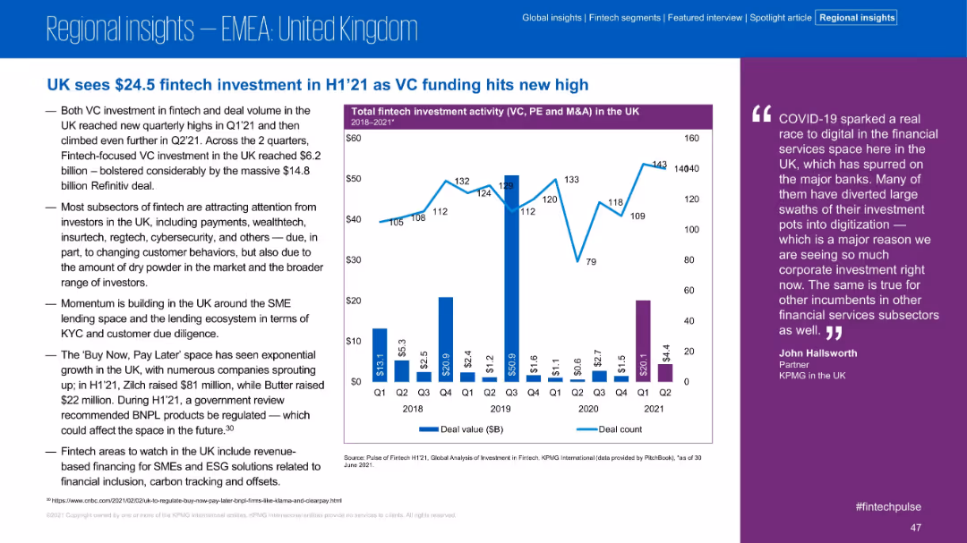
Left-aligned bullet points with right-side chart and quote; purple-accented chart shows total fintech investment in the UK from 2018 to 2021. Clean, professional layout.
Market Analysis and Trends
Financial Services
The slide highlights the UK's record fintech investment of $24.5B in H1 2021. VC activity and deal volume hit new highs due to large deals, especially the $14.8B Refinitiv transaction. Commentary includes insights on subsectors like insurtech and BNPL.
UK, VC, Fintech, H1 2021, BNPL, Insurtech, Refinitiv, Investment Volume, Trends
false
Market Analysis and Trends
Financial Services
Mixed Chart
KPMG
Add to my slides
Remove from favorites
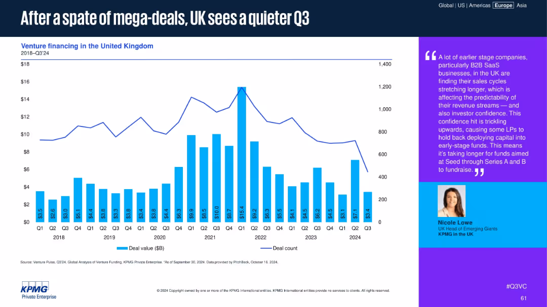
Bar chart overlaid with a line graph showing venture financing deal value and count in the UK from 2018 to Q3 2024. Commentary on the right side with expert quote and photo.
Market Analysis and Trends
Financial Services
UK venture financing shows a notable Q3 slowdown after previous mega-deals, especially among early-stage B2B SaaS firms. The commentary highlights LP hesitancy and longer fundraising cycles amid uncertain revenue predictability.
UK, venture financing, SaaS, deal volume, early-stage, LP confidence, Q3 slowdown, fundraising, seed funds, Series A
false
Market Analysis and Trends
Financial Services
Mixed Chart
KPMG
Add to my slides
Remove from favorites
A slide with text on the left and a line chart on the right. The line chart compares the UK Index performance with the OECD average from 2000 to 2017. The slide has a moderate amount of text and visual elements.
Market Analysis and Trends
Government & Public Sector
Analyzes the UK's performance on the Women in Work Index, showing improvements over time and comparing it with the OECD average. Highlights key factors affecting progress, such as the gender pay gap and female labor force participation rates.
UK, Women in Work Index, OECD, gender pay gap, labor force participation
false
Market Analysis and Trends
Government & Public Sector
Mixed Chart
PwC/Strategy&
Add to my slides
Remove from favorites
A global map highlights the firm's presence in the ultra-high net worth segment. The slide contains numerical data points and a concise list of services offered, presented with a balanced use of space and a clear font.
Market Analysis and Trends
Financial Services
Showcasing the firm as a leader in the ultra-high net worth sector, this slide communicates the extensive global reach, services offered, and the substantial assets under supervision.
ultra-high net worth, global, wealth management, assets
false
Market Analysis and Trends
Financial Services
Graphic
Goldman Sachs
Add to my slides
Remove from favorites
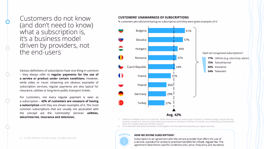
The slide features a column chart showing the percentage of customers in various countries who are unaware of having subscriptions. Accompanying text explains the concept of subscriptions.
Customer and Market Segmentation
Consumer Goods
The slide reveals that a significant percentage of customers are unaware of having subscriptions, with utilities and telecommunications being the most commonly unrecognized subscriptions.
unawareness, subscriptions, customer, survey, utilities
false
Customer and Market Segmentation
Consumer Goods
Mixed Chart
Deloitte
Add to my slides
Remove from favorites
Slide with number 2, a large column chart comparing the percentage of unbanked adults in various countries, with text annotations for additional context.
Market Analysis and Trends
Financial Services
Highlighting financial inclusion issues, this slide compares the proportion of adults without bank accounts in SEA countries to the global average. It focuses on Vietnam, Philippines, and Indonesia, signaling market challenges and opportunities in financial services.
unbanked, SEA, financial inclusion, Vietnam, Philippines, Indonesia, adult population
false
Market Analysis and Trends
Financial Services
Single Chart
Bain
Add to my slides
Remove from favorites
The design is simple and clear, employing icons and bullet points to outline uncertainties associated with emerging software development trends. The use of colors distinguishes different areas of concern, with a good balance of text and visuals for a non-cluttered presentation of complex information.
Risk Assessment and Management
Technology & Software
This slide articulates the challenges and uncertainties faced by the next wave of software development technologies, including low-code platforms and AI-based testing. It's geared towards an audience looking for insights into potential obstacles in adopting these technologies on a larger scale.
Uncertainties, Software Development, Scale, Low-Code, AI, Risk Management
false
Risk Assessment and Management
Technology & Software
Header Horizontal
McKinsey
Add to my slides
Remove from favorites
The slide has bullet points in a two-column layout with icons, set against a subtle red patterned background. A man seems to be typing or reading, suggesting thought or analysis.
Strategic Planning
Professional Services
Outlines strategies for businesses to manage uncertainties, such as identifying industry forces, embracing alternative futures, and resource allocation for adaptation.
uncertainties, strategies, industry forces, alternative futures, resource allocation
false
Strategic Planning
Professional Services
Header Vertical
Bain
Add to my slides
Remove from favorites
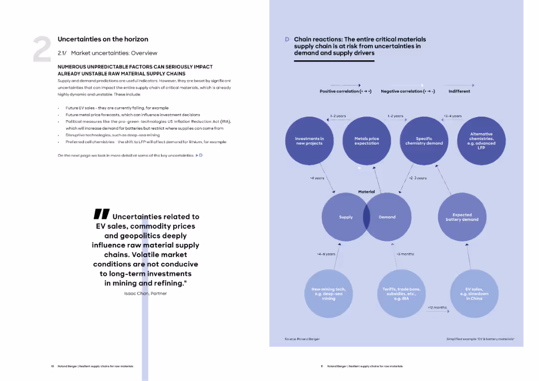
Split layout with left text summarizing uncertainty factors, right side with a bubble map showing interlinked supply chain risks and their timeframes.
Regulatory and Compliance
Energy & Utilities
The slide outlines key uncertainties affecting raw material supply chains such as EV sales, geopolitical shifts, and mining technology. It shows how different variables interrelate and impact supply and demand across different time horizons.
uncertainties, supply chain, EV sales, mining, raw materials, policy risk, supply demand
false
Regulatory and Compliance
Energy & Utilities
Boxed
Roland Berger
Add to my slides
Remove from favorites
An image of storm clouds with three text boxes indicating different areas of uncertainty. There is also a global image and a photo of classical architecture.
Risk Assessment and Management
Industrial & Manufacturing
This slide lists various sources of uncertainty that may affect business planning and strategy, including geopolitical, macroeconomic, and regulatory challenges.
Uncertainty, Geopolitical Risk, Macroeconomics, Regulatory Challenges, Business Strategy, Risk Management, Global Impact
false
Risk Assessment and Management
Industrial & Manufacturing
Mixed Chart
JP Morgan
Add to my slides
Remove from favorites
This slide is moderately complex, featuring four colored content blocks with descriptive icons, explaining a four-step methodology. Each block is labeled with steps 1 through 4.
Strategic Planning
Professional Services
This slide presents a four-step methodology for economic analysis by Deloitte Access Economics focusing on macroeconomic forecasting and regression analyses related to work in New Zealand and Australia. It serves as a summary of the analytical approach, detailing each step's focus from uncertainty scenarios to final outlooks.
Uncertainty, Macroeconomic, Forecasting, Regression, New Zealand, Australia, Economic Analysis, Scenario Planning
false
Strategic Planning
Professional Services
Pillar
Deloitte
Add to my slides
Remove from favorites
The slide contains a central diagram labeled "Navigating a world of uncertainty," with five connected themes: Pricing strategy, Labor, Supply, Cost of capital, and ESG and sustainability. Each theme has additional relevant factors listed around the diagram.
Strategic Planning
Financial Services
The slide describes how to transform economic uncertainty into opportunities by focusing on five key themes: pricing strategy, labor, supply, cost of capital, and ESG and sustainability, with detailed sub-themes related to each main area.
uncertainty, opportunity, strategy, ESG, sustainability, pricing
false
Strategic Planning
Financial Services
Diagram
EY
Add to my slides
Remove from favorites
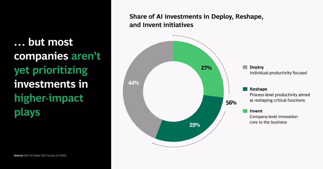
Similar donut chart to previous slide but showing global averages; left panel inverts the headline to highlight underperformance.
Operational Efficiency
Artificial Intelligence
Indicates that most companies still invest heavily in basic deployment rather than higher-impact innovation, revealing a gap in strategic prioritization.
underinvestment, AI deploy, reshape, innovation, donut chart, gap, strategic focus, transformation
false
Operational Efficiency
Artificial Intelligence
Single Chart
BCG
Add to my slides
Remove from favorites
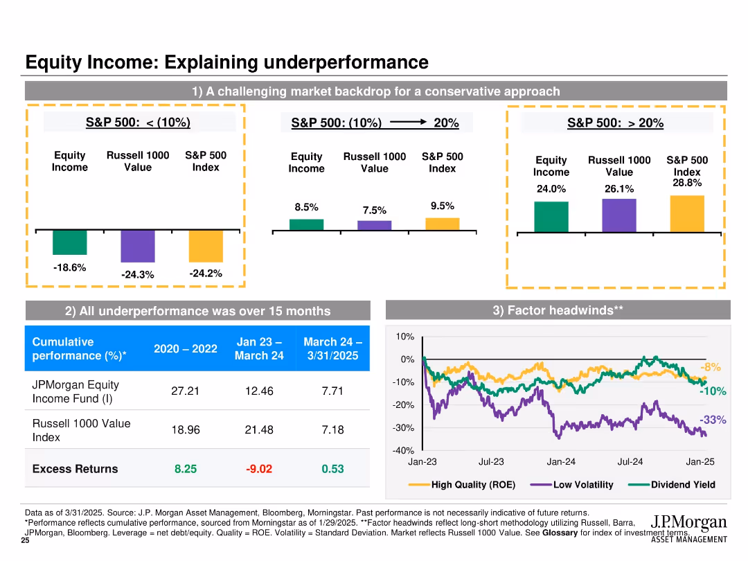
Multi-panel layout with bar charts and a line chart; panels compare performance across different S&P 500 return periods, show cumulative returns, and factor headwinds.
Performance Metrics and KPIs
Financial Services
This slide analyzes reasons for underperformance of the JPMorgan Equity Income Fund, attributing it to challenging market conditions, concentrated underperformance during a short period, and negative impacts from market factors like ROE and volatility.
underperformance, S&P 500, equity income, returns, factors, ROE, volatility, Russell 1000, analysis, headwinds
false
Performance Metrics and KPIs
Financial Services
Multiple Chart
JP Morgan
Add to my slides
Remove from favorites
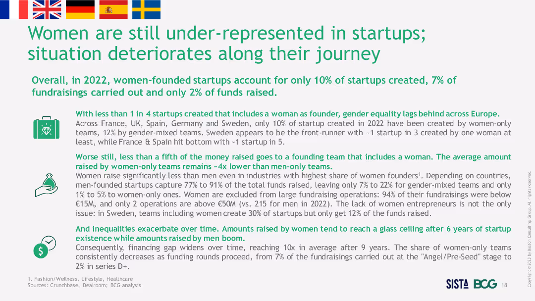
Text-heavy slide with several bullet points discussing statistics and trends about women-founded startups. Includes flags of different countries and icons representing various themes.
Strategic Planning
Professional Services
The slide discusses the under-representation of women in startups across Europe in 2022, providing statistics on startup creation and fundraising, and emphasizing the challenges and disparities faced by women entrepreneurs.
Under-representation, Startups, Europe, Women, Trends
false
Strategic Planning
Professional Services
Header Vertical
BCG
Add to my slides
Remove from favorites
The slide contains several horizontal bar graphs displaying percentage ratings of different underwriting solutions. Color gradients from purple to pink are used.
Operational Efficiency
Financial Services
This slide evaluates various underwriting solutions used today in organizations to improve process efficiency.
underwriting, automation, efficiency, bar graph, solutions
false
Operational Efficiency
Financial Services
Single Chart
Accenture
Add to my slides
Remove from favorites
Slide presents a column chart comparing challenges within underwriting function by account size, using various colors to denote different account ranges.
Strategic Planning
Financial Services
The slide outlines the top challenges faced by underwriters in achieving business objectives with specific focus on different account sizes, highlighting issues like ineffective systems and lack of information.
underwriting, challenges, business objectives, account sizes, systems, information
false
Strategic Planning
Financial Services
Mixed Chart
Accenture
Add to my slides
Remove from favorites
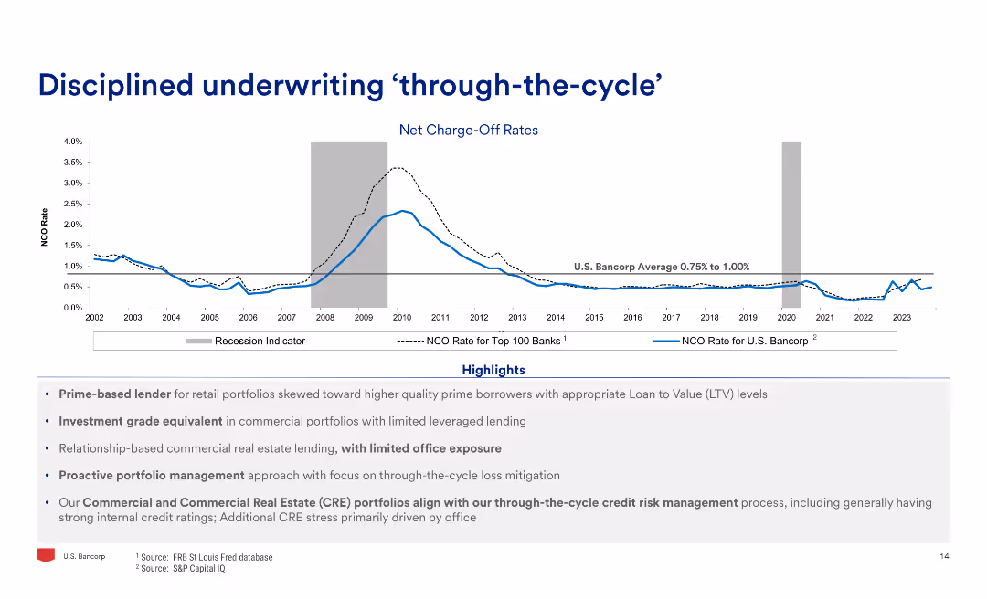
The slide features a line chart of net charge-off rates over time, highlighting recession periods, and text detailing the highlights of disciplined underwriting practices.
Risk Assessment and Management
Financial Services
The slide emphasizes the disciplined underwriting practices through economic cycles, showing historical net charge-off rates and highlighting key lending and risk management practices.
Underwriting, Cycle, Charge-Off, Rates, Discipline, Risk
false
Risk Assessment and Management
Financial Services
Mixed Chart
Barclays
Add to my slides
Remove from favorites
Slide includes bar charts indicating the importance of different areas to improve underwriting quality, using percentages and color differentiation.
Strategic Planning
Financial Services
Prioritizes areas for improving the quality of underwriting in an organization, such as data quality and underwriter training.
underwriting improvement, data quality, underwriter training, risk pricing tools
false
Strategic Planning
Financial Services
Mixed Chart
Accenture
Add to my slides
Remove from favorites
Contains a series of bar charts displaying the impact of various factors on insurance underwriting over the next three years, differentiated by color for clarity.
Strategic Planning
Financial Services
Evaluates future factors affecting insurance underwriting, such as customer demands and new technologies, emphasizing their expected impact over the coming years.
underwriting, insurance, future impact, customer demands, new technologies
false
Strategic Planning
Financial Services
Mixed Chart
Accenture
Add to my slides
Remove from favorites
Features bar charts analyzing top factors with increased impact on underwriting by line of business, with color-coded significance levels.
Strategic Planning
Financial Services
Discusses significant factors that will influence underwriting processes in different insurance lines, highlighting the emphasis on new technologies and growth pressure.
underwriting, insurance lines, technologies, growth pressure, strategic impact
false
Strategic Planning
Financial Services
Mixed Chart
Accenture
Add to my slides
Remove from favorites
Slide contains multiple bar charts showing importance of various factors for investment in underwriting capabilities. Colors differentiate the significance of factors such as improving quality and reducing expenses.
Investment Analysis
Financial Services
This slide discusses key factors influencing company investment decisions in underwriting capabilities, including improving underwriting quality and business ease for customers.
underwriting, investment, quality, expenses, business ease, customers
false
Investment Analysis
Financial Services
Single Chart
Accenture
Add to my slides
Remove from favorites
The slide features column charts showing gross notional exposure and textual explanations. It details loan underwriting commitments by geography and segment.
Financial Performance
Financial Services
This slide illustrates the investment bank's loan underwriting commitments, detailing exposure across various regions and sectors, used for evaluating underwriting risks and commitments.
Underwriting, Loans, Commitments, Exposure, Geography
false
Financial Performance
Financial Services
Multiple Chart
UBS
Add to my slides
Remove from favorites
The slide presents multiple vertical column charts analyzing the impact of offshoring and pricing authority on underwriters. The charts are organized by line of business, with color coding for impact levels and percentage labels for clarity.
Risk Assessment and Management
Financial Services
Focuses on the nuanced impacts of offshoring and changes in pricing authority within underwriting. It provides a sector-specific look into how these factors affect various lines of business, useful for strategic planning and operational adjustments in financial services.
underwriting, offshoring, pricing, financial services, business lines, impact
false
Risk Assessment and Management
Financial Services
Multiple Chart
Accenture
Add to my slides
Remove from favorites
Contains column charts showing trends in underwriting results, investment income, and pre-tax results.
Financial Performance
Financial Services
Illustrates Lloyd's financial focus on underwriting profit, detailing historical performance metrics and the impact of various global events on financial outcomes.
Underwriting, Profit, Trends, Financial, Performance
false
Financial Performance
Financial Services
Single Chart
PwC/Strategy&
Add to my slides
Remove from favorites
Slide presents a bar chart assessing the quality of underwriting processes across various criteria like strategy and tools, with varying shades indicating quality levels.
Operational Efficiency
Financial Services
Reviews the current quality of underwriting processes within a company, showing areas of strength and those needing improvement across various functions.
underwriting quality, assessment, process improvement, strategic quality, tool effectiveness
false
Operational Efficiency
Financial Services
Mixed Chart
Accenture
Add to my slides
Remove from favorites
This slide displays multiple column charts segmented by underwriter type and account size, analyzing the impact of new organizational models and rating platforms. Each segment is color-coded based on impact level, with clear labels for each category, making it easy to distinguish between different sections.
Risk Assessment and Management
Financial Services
This slide offers a detailed breakdown of the impact of new processes and underwriting platforms across different segments of the industry, including personal and commercial lines. It is valuable for understanding specific impacts in diverse operational scales and could guide tailored strategic adjustments.
underwriting, segmentation, impact analysis, personal lines, commercial lines, processes
false
Risk Assessment and Management
Financial Services
Multiple Chart
Accenture
Add to my slides
Remove from favorites
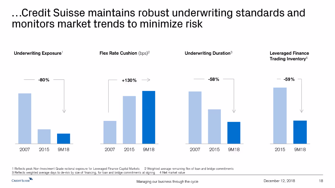
The slide includes comparative bar charts showing underwriting exposure, flex rate cushion, underwriting duration, and trading inventory.
Risk Assessment and Management
Financial Services
The slide explains how Credit Suisse upholds strong underwriting standards and adapts to market trends to reduce risk, supported by relevant data.
underwriting standards, market trends, risk minimization, Credit Suisse, exposure, flex rate, duration, inventory
false
Risk Assessment and Management
Financial Services
Multiple Chart
Credit Suisse
Add to my slides
Remove from favorites
Slide lists key topics from open-ended survey questions, divided into 'most excited about' and 'most concerned about' with associated icons.
Market Analysis and Trends
Financial Services
Summarizes main points of interest and concern among underwriters about the future of their industry, particularly focusing on AI and technology.
underwriting, technology, AI, excitement, concerns, future, industry insights
false
Market Analysis and Trends
Financial Services
Boxed
Accenture
Add to my slides
Remove from favorites
The slide features multiple horizontal bar charts detailing the impact of various factors on underwriters over the past 5-10 years. Each bar represents a different impact level (from negative to positive) with corresponding percentages. The bars are color-coded and labeled, providing clear visual differentiation.
Risk Assessment and Management
Financial Services
This slide analyzes the various factors impacting underwriters in the financial industry, highlighting areas such as new platforms, automation, and offshoring. It shows significant positive impacts from new technological tools and some negative effects from offshoring, useful for assessing operational and strategic changes in underwriting practices.
underwriting, technology, automation, offshoring, impact, financial services, risk management
false
Risk Assessment and Management
Financial Services
Mixed Chart
Accenture
Add to my slides
Remove from favorites
Displays a series of bar charts showing the superior rating trend of underwriting processes from 2008, 2013, to 2021.
Operational Efficiency
Financial Services
Highlights trends in the quality of underwriting processes over time, analyzing changes in rating across various underwriting aspects.
underwriting trends, quality rating, historical comparison, process evaluation
false
Operational Efficiency
Financial Services
Mixed Chart
Accenture
Add to my slides
Remove from favorites
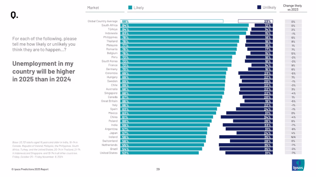
Horizontal bar chart with turquoise (likely) and navy (unlikely) values. Includes country-specific data, global average, and a column indicating change from 2023. Minimalist layout with clean fonts and white background.
Performance Metrics and KPIs
Government & Public Sector
This slide shows the percentage of people in different countries who believe unemployment will increase in 2025. South Africa, Türkiye, and Indonesia top the list. It also includes comparisons to 2023 figures, indicating changes in sentiment.
unemployment, 2025, public opinion, likelihood, Ipsos, labor market
false
Performance Metrics and KPIs
Government & Public Sector
Mixed Chart
IPSOS
Add to my slides
Remove from favorites
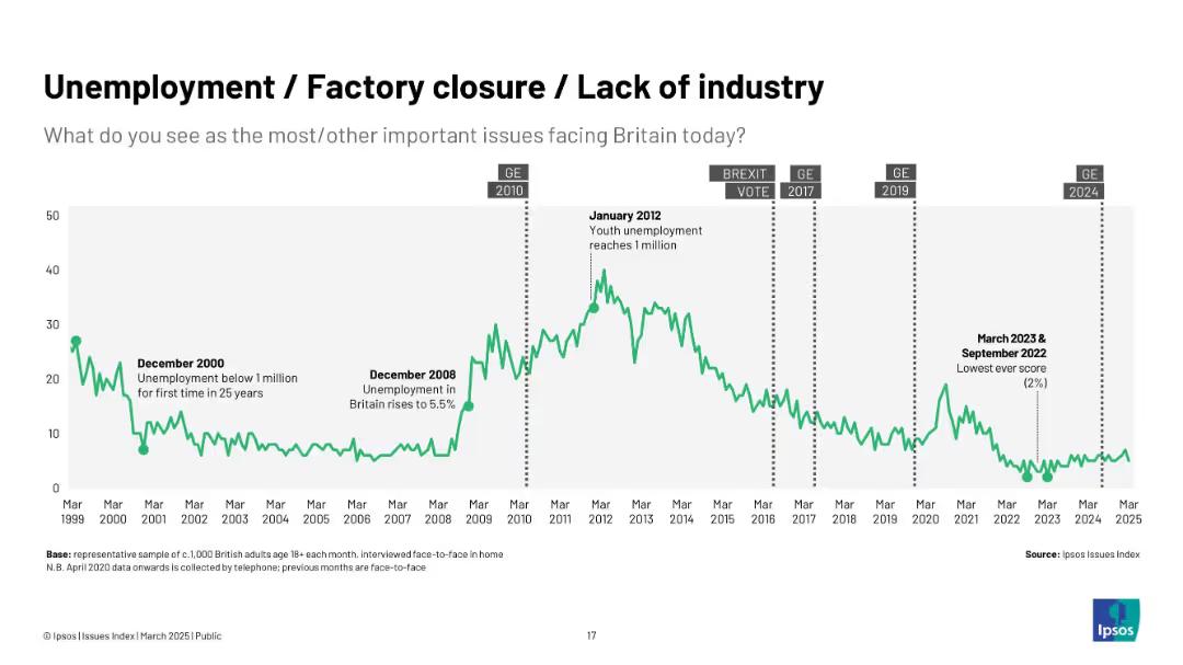
Green line graph showing trend from 1999–2025; annotated with unemployment milestones and elections.
Market Analysis and Trends
Industrial & Manufacturing
The chart displays trends in public concern about unemployment and industry, peaking around economic crises like in 2008 and 2012, and falling to record lows post-2022.
unemployment, factory closure, industry, jobs, economy, Ipsos, recession, economic concern, joblessness
false
Market Analysis and Trends
Industrial & Manufacturing
Single Chart
IPSOS
Add to my slides
Remove from favorites
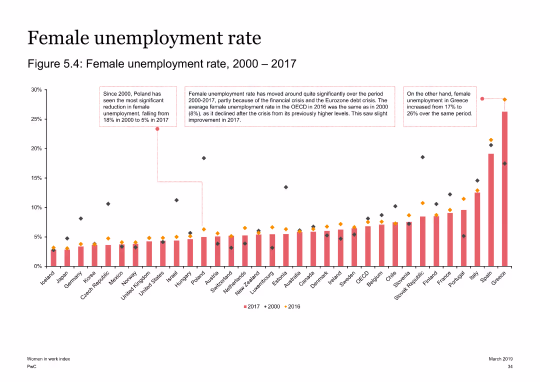
The slide displays a column chart showing the female unemployment rates from 2000 to 2017 across various countries. Three text boxes highlight key changes for Poland, Greece, and OECD averages.
Risk Assessment and Management
Government & Public Sector
The slide examines changes in female unemployment rates from 2000 to 2017, highlighting notable trends in Poland, Greece, and OECD averages. It provides insights into how economic crises have influenced these rates.
Unemployment, female, OECD, Poland, Greece, economic crisis, trends
false
Risk Assessment and Management
Government & Public Sector
Single Chart
PwC/Strategy&
Add to my slides
Remove from favorites
Line graph from 1999–2025, major events like Dec 2008 crisis and Jan 2012 unemployment peak noted; green line on white background.
Performance Metrics and KPIs
Industrial & Manufacturing
Displays public concern over employment and industry issues, showing high concern post-2008 crisis and steep declines by 2023.
unemployment, industry, job loss, UK economy, factory closures, Ipsos, trends
false
Performance Metrics and KPIs
Industrial & Manufacturing
Single Chart
IPSOS
Add to my slides
Remove from favorites
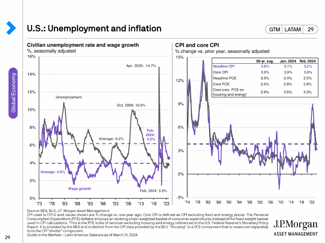
The slide features two line charts: one showing civilian unemployment rate and wage growth, and another displaying CPI and core CPI changes over time.
Market Analysis and Trends
Financial Services
This slide provides a detailed analysis of unemployment and inflation rates in the U.S., illustrating trends in wage growth and consumer price indices.
unemployment, inflation, wage growth, CPI, core CPI, economic trends
false
Market Analysis and Trends
Financial Services
Multiple Chart
JP Morgan
Add to my slides
Remove from favorites
This slide is divided into two main sections, each featuring bar graphs. The left section shows the total claims value and the number of jobs furloughed in the UK with vertical bars growing darker and taller from April to August. The right section compares the monthly number of unemployed people in the US with two trend lines showing temporary and permanent job losses. The design is clear, with data points labeled and a consistent color scheme that distinguishes between different data types, making it easy to track trends and changes over time.
Market Analysis and Trends
Financial Services
This comparative slide visually represents unemployment trends in the UK and the US, showcasing the effectiveness of furlough programs and the progression of job losses, respectively. It's used to analyze the economic impact of COVID-19 on job markets and the effectiveness of government interventions. The comparison between temporary and permanent job losses provides insights into the depth of the employment crisis and potential long-term impacts, crucial for stakeholders planning recovery strategies or assessing the economic climate.
unemployment, job loss, COVID-19, economic impact, government intervention, furlough programs, US, UK
false
Market Analysis and Trends
Financial Services
Multiple Chart
BCG
Add to my slides
Remove from favorites
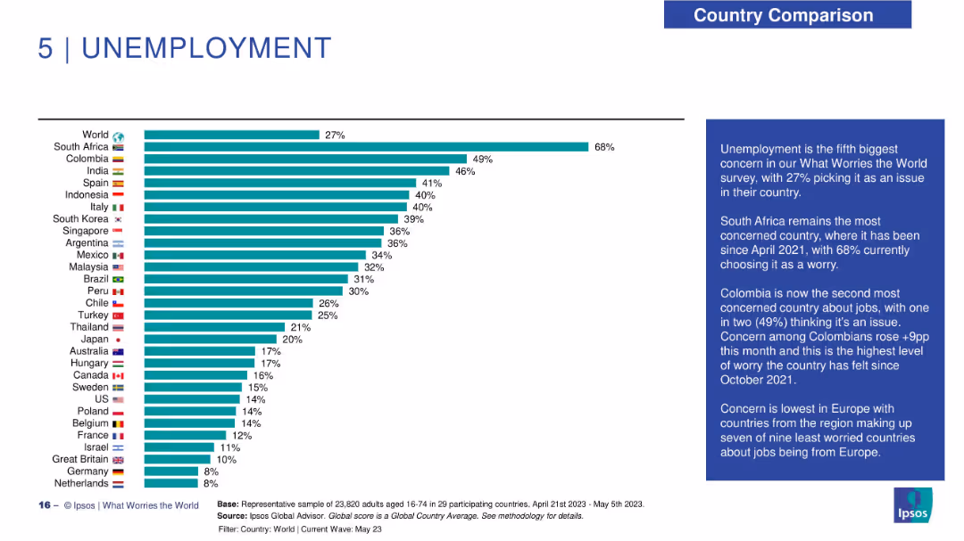
Horizontal bar chart showing unemployment concern by country; summary box on the right provides insights.
Market Analysis and Trends
Government & Public Sector
The slide reports global concern about unemployment, with South Africa (68%), Colombia (49%), and India (46%) leading. The global average is also 27%. European countries generally show lower concern. Commentary notes Colombia’s sharp 9-point rise in concern compared to the previous month.
unemployment, jobs, concern levels, Ipsos, Colombia, South Africa, global worry, economy, public opinion
false
Market Analysis and Trends
Government & Public Sector
Mixed Chart
IPSOS
Add to my slides
Remove from favorites
Bar chart of countries with highest concern over unemployment, includes trend comparison to last month and last year.
Performance Metrics and KPIs
Financial Services
The slide reveals 27% globally worry about unemployment. South Africa tops at 65%. It offers insight into short-term and long-term shifts, with notable concern increases in Singapore and Argentina.
unemployment, labor market, joblessness, global survey, economic trends
false
Performance Metrics and KPIs
Financial Services
Single Chart
IPSOS
Add to my slides
Remove from favorites
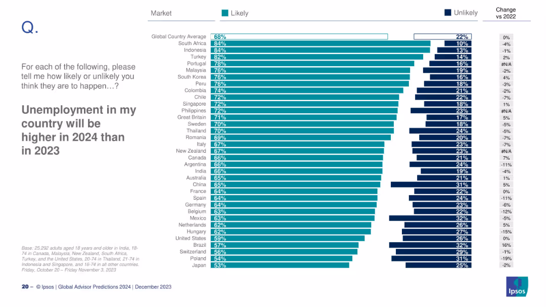
Ranked bar chart by country showing likelihood of rising unemployment
Risk Assessment and Management
Professional Services
The slide analyzes how likely people in different countries believe unemployment will rise in 2024. It shows global and country-level averages, plus comparisons with 2022 data for trend analysis.
unemployment, labor market, risk, economic sentiment, global survey
false
Risk Assessment and Management
Professional Services
Mixed Chart
IPSOS
Add to my slides
Remove from favorites
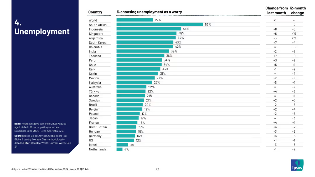
Bar chart ranked by country, showing % of people concerned with unemployment; includes monthly and yearly changes.
Market Analysis and Trends
Government & Public Sector
This slide visualizes unemployment as a global concern, ranked by country. South Africa leads with 66%, followed by Argentina and Colombia. It tracks month-over-month and 12-month shifts, showing evolving public sentiment on job insecurity.
unemployment, public concern, global trends, Ipsos, labor market, sentiment, survey, economic stress, job loss, perception
false
Market Analysis and Trends
Government & Public Sector
Single Chart
IPSOS
Add to my slides
Remove from favorites
Line chart showing DM unemployment rate from 1971 to 2021 with a notable spike and grey shading indicating recent uncertainty. The design is clean with a single blue line and minimal text annotations.
Market Analysis and Trends
Financial Services
Analyzes unemployment trends over five decades, highlighting uncertainties due to recent global events. Useful for economic forecasting and labor market analysis.
Unemployment rate, DM, economic analysis, labor market trends, historical data, pandemic impact, line chart, J.P. Morgan.
false
Market Analysis and Trends
Financial Services
Single Chart
JP Morgan
Add to my slides
Remove from favorites
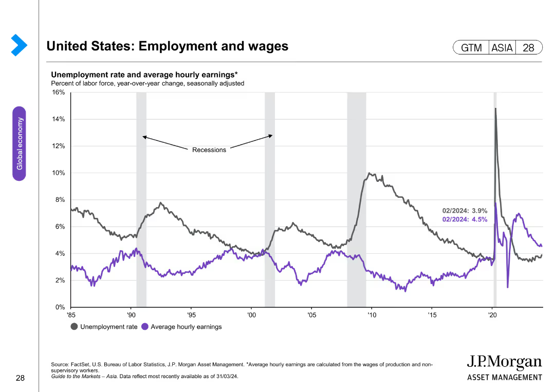
The slide includes a line chart comparing unemployment rates and average hourly earnings over time. The layout is simple and clear.
Market Analysis and Trends
Financial Services
This slide tracks the unemployment rate and average hourly earnings, showing correlations and trends over time, especially during recession periods.
unemployment rate, hourly earnings, recession trends, labor market, economic indicators
false
Market Analysis and Trends
Financial Services
Single Chart
JP Morgan
Add to my slides
Remove from favorites
Two line graphs track unemployment rates and retail sales growth over time across different regions. The design uses contrasting colors to distinguish between the data series, making it easy to interpret.
Market Analysis and Trends
Financial Services
Analyzes trends in unemployment rates and retail sales growth, providing insights into economic health and consumer behavior. Useful for economic forecasting and strategic planning in various sectors.
Unemployment, Retail Sales, Economic Indicators, Consumer Behavior, Trends
false
Market Analysis and Trends
Financial Services
Multiple Chart
Deutsche Bank
Add to my slides
Remove from favorites
This slide presents a line chart showing unemployment rates from 2000 to 2030 under four scenarios: early adoption, mid adoption, late adoption, and baseline. The chart is annotated with assumptions about re-employment rates and historical context for comparison.
Risk Assessment and Management
Industrial & Manufacturing
Analyzing projected unemployment trends under different automation adoption scenarios, this slide helps in understanding the temporal dynamics of job market disruptions and recoveries. It provides a statistical foundation for discussing policy measures and planning in anticipation of economic shifts caused by automation.
unemployment, trends, automation, policy, scenarios
false
Risk Assessment and Management
Industrial & Manufacturing
Single Chart
McKinsey
Add to my slides
Remove from favorites
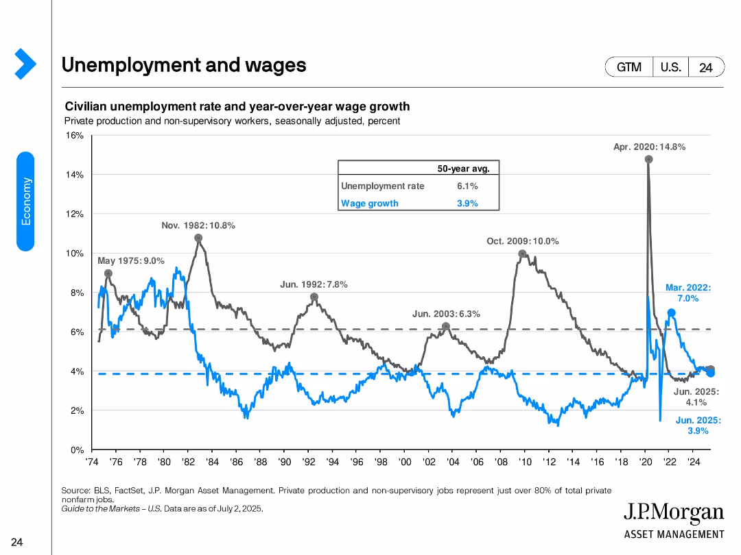
Dual-axis line chart tracking unemployment rate and wage growth since 1974. Historical peaks and the 50-year average are annotated. The chart ends in June 2025, showing recent trends stabilizing.
Performance Metrics and KPIs
Financial Services
This slide contrasts the historical and recent dynamics of unemployment and wage growth. It highlights key peaks like the 2020 COVID spike and notes June 2025 values: 4.1% unemployment and 3.9% wage growth, near long-term averages.
unemployment, wage growth, labor market, historical trends, 2025, recession indicators, labor cost
false
Performance Metrics and KPIs
Financial Services
Single Chart
JP Morgan
Add to my slides
Remove from favorites
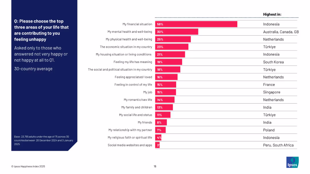
Horizontal bar chart showing top unhappiness drivers; right-aligned column notes countries with highest percentages per factor; matches layout of previous slide.
Customer and Market Segmentation
Professional Services
This slide outlines the main causes of unhappiness according to survey respondents. Financial concerns top the list, followed by mental and physical health issues. The chart helps contextualize the emotional impact of personal and societal factors by country, with Indonesia and Türkiye prominent in several categories.
unhappiness, financial situation, mental health, Ipsos, emotional drivers, global comparison, 2025, dissatisfaction
false
Customer and Market Segmentation
Professional Services
Mixed Chart
IPSOS
Add to my slides
Remove from favorites
Previous
Next
You don't have any favorites yet.
Please wait loading your favorites slides...
Create a FREE account to continue browsing
Receive Instant Access to 1,000+ slides from companies like McKinsey, Google, and Goldman Sachs
First Name
Last Name
Email
Password
I agree to all
Terms & Privacy Policy
Thank you! Your submission has been received!
Oops! Something went wrong while submitting the form.
Have an account?
Sign in
Upgrade to PRO to Save slides
Advanced Search and Filters
Access to 15,000+ slides
Access to Category Pages
Save/Bookmark Slides
PowerPoint Template Library
Pick a Plan
MONTHLY
$12/month
Billed every month, Cancel anytime.
YEARLY
$9/year
Billed $108 annually, Cancel anytime.
Checkout for $12/month
Checkout for $108/yr
Secured by Stripe | AES-256 bit encryption