My Account
My Slides
Search by Category
Pricing
Templates
View All Templates
Download Template Slides
✦ AI Search
Feedback
Login
Logout
Get Started
Browse all Slides
Browse all Slides
Create a FREE Account
Instant access to 1,000+ real slides from top companies like McKinsey, BCG, Goldman Sachs, Google and many more!
First Name
Last Name
Email
Password
I agree to all
Terms & Privacy Policy
Thank you! Your submission has been received!
Oops! Something went wrong while submitting the form.
Have an account?
Sign in
Saved Slides
Total No. of slides saved
0
↻ Refresh
✖ Clear all
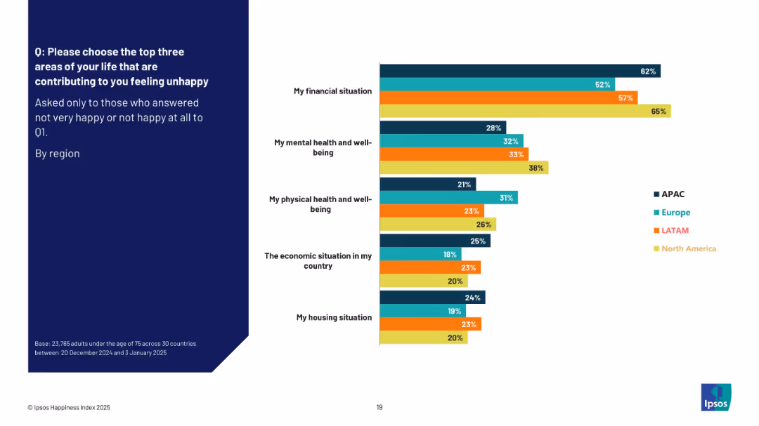
Similar split layout as 18941. Left side has question text, right side presents a horizontal bar chart showing top factors for unhappiness by region.
Market Analysis and Trends
Professional Services
This slide displays insights from respondents who reported feeling unhappy, identifying the most influential areas contributing to this state. Financial situation is the top concern globally, followed by mental and physical well-being. Regional breakdowns highlight differences in how these areas affect overall unhappiness.
unhappiness, mental health, financial situation, regional data, survey insights, public opinion, well-being
false
Market Analysis and Trends
Professional Services
Mixed Chart
IPSOS
Add to my slides
Remove from favorites
A map highlights the distribution of unicorns across ASEAN, complemented by icons representing industry sectors. The layout is organized, with data points and percentages providing a clear visual summary.
Investment Analysis
Technology & Software
Examines the growth of unicorn companies in the ASEAN region, emphasizing the tripling number in 2021 and the industries they represent. This slide might be used to discuss investment potential and the impact of such companies on local economies and talent needs.
unicorns, ASEAN, growth, industries, investment
false
Investment Analysis
Technology & Software
Boxed
Kearney
Add to my slides
Remove from favorites
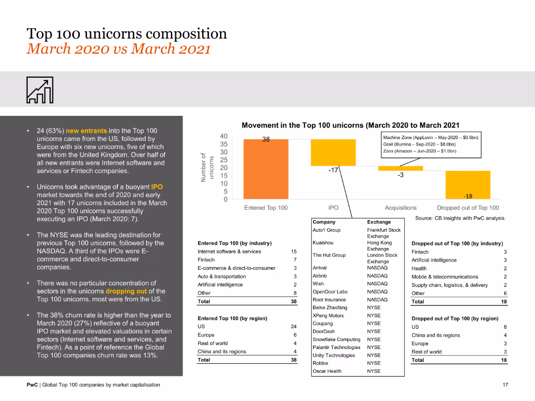
Features a column chart and data lists comparing the composition of the top 100 unicorns over a year. The design is moderately detailed with focus on changes in composition.
Market Analysis and Trends
Financial Services
This slide analyzes the composition of the top 100 unicorns from March 2020 to March 2021, noting new entrants, exits, and changes in valuation and sector distribution.
unicorns, composition, market changes, new entrants, exits, valuation, sector distribution
false
Market Analysis and Trends
Financial Services
Mixed Chart
PwC/Strategy&
Add to my slides
Remove from favorites
Slide with vertical bar chart, icons for E-commerce, Lending, SME Services, Payment, Ed-tech, Health-tech, and Ride and Delivery. Predictive statements about unicorn companies. Text annotations with insights on expected growth.
Market Analysis and Trends
Technology & Software
Forecasts the emergence of unicorns in sectors such as E-commerce, Lending, SME Services, due to digital habits spilling over from personal to business use. Predicts integration between lending and e-commerce catalyzing growth and the advent of one unicorn from B2B e-commerce.
Unicorns, E-commerce, Lending, SME, B2B, Forecast, Growth, Digital Integration, Consumer Behavior, Future Trends
false
Market Analysis and Trends
Technology & Software
Header Horizontal
Kearney
Add to my slides
Remove from favorites
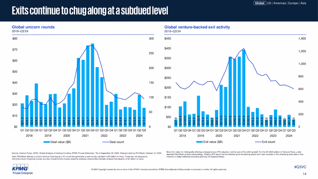
Two bar-line combo charts: one on unicorn rounds, the other on global exit activity; time-series layout; vertical blue bars and line for counts; standard KPMG chart design.
Risk Assessment and Management
Financial Services
This slide highlights the subdued levels of both unicorn financing rounds and exit activity from 2022–2024. Deal count and values have both decreased sharply since their 2021 peaks, reflecting investor caution and market cool-down in IPOs and M&A exits.
unicorns, exits, IPO, M&A, deal activity, venture exits, exit value, Q3 2024, unicorn rounds, global VC
false
Risk Assessment and Management
Financial Services
Multiple Chart
KPMG
Add to my slides
Remove from favorites
Bar graphs comparing the number of unicorns in the United States, Greater China, and the rest of the world, with boxing gloves.
Competitive Landscape
Media & Entertainment
Highlights the competitive growth of unicorns in China compared to the US and globally, suggesting a shift in the global power balance.
Unicorns, Global, Power Balance, China, United States, Competition
false
Competitive Landscape
Media & Entertainment
Multiple Chart
PwC/Strategy&
Add to my slides
Remove from favorites
Features a column chart with data annotations displaying investments in unicorns across sectors, accompanied by textual analysis. The design is straightforward with clear data presentation.
Investment Analysis
Technology & Software
Examines investment trends in Southeast Asia's unicorn companies, focusing on their collective move towards profitability and the influence of private funding.
unicorns, investment, SEA, profitability
false
Investment Analysis
Technology & Software
Mixed Chart
Bain
Add to my slides
Remove from favorites
Slide with column charts showing the time to reach a $1 billion valuation over different years, accompanied by a quote on startup sustainability
Market Analysis and Trends
Financial Services
Highlights the decreasing time to become a unicorn in the tech sector over the years, with a focus on the increased pace of startup life cycles
unicorns, startups, valuation, growth, burn rates
false
Market Analysis and Trends
Financial Services
Single Chart
McKinsey
Add to my slides
Remove from favorites
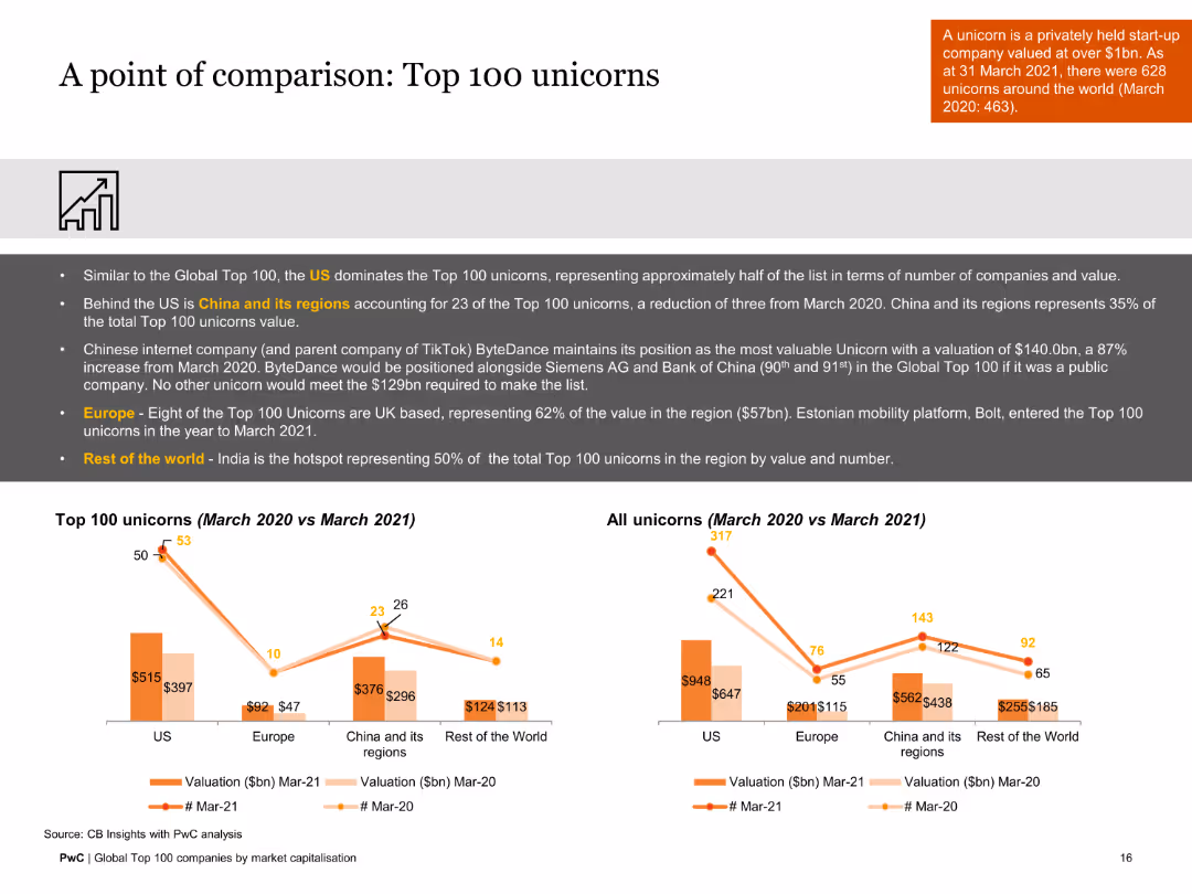
This slide includes a column chart and a comparative table showing data on the top 100 unicorns. The design is moderately complex with comparative visual elements.
Market Analysis and Trends
Financial Services
The slide compares the top 100 unicorns from March 2020 to March 2021, highlighting key changes in valuations and number of companies across different regions.
unicorns, valuation, comparative analysis, 2020-2021, regional data, financial trends
false
Market Analysis and Trends
Financial Services
Multiple Chart
PwC/Strategy&
Add to my slides
Remove from favorites
The slide presents a color-coded organizational chart for Unilever, highlighting different business groups such as Nutrition, Personal Care, and others within a simplified corporate structure.
Organizational Structure and Change
Consumer Goods
This slide outlines Unilever's new organizational structure effective July 1, 2022, emphasizing a more category-focused approach.
Unilever, organizational structure, corporate strategy, business groups, restructuring
false
Organizational Structure and Change
Consumer Goods
Diagram
Deutsche Bank
Add to my slides
Remove from favorites
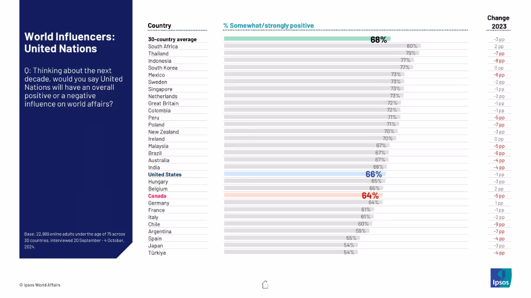
Similar bar chart as previous slides; evaluates public opinion on whether the UN will have a positive impact in global affairs in the coming decade.
Strategic Planning
Government & Public Sector
The slide reflects global confidence in the United Nations’ future influence, comparing sentiment across 30 countries and highlighting changes in approval from the prior year. The UN is benchmarked against the average.
United Nations, global governance, public trust, influence perception, strategic role, world affairs, Ipsos
false
Strategic Planning
Government & Public Sector
Mixed Chart
IPSOS
Add to my slides
Remove from favorites
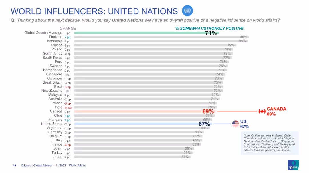
Horizontal bar graph showing international views on the UN’s influence
Market Analysis and Trends
Government & Public Sector
Depicts positive perception of the United Nations across countries. Canada (69%) and the U.S. (67%) both fall slightly below the global average (71%). Change from previous year is indicated for each country.
United Nations, public opinion, global sentiment, Canada, US, Ipsos, UN influence, future impact, world affairs, trends
false
Market Analysis and Trends
Government & Public Sector
Single Chart
IPSOS
Add to my slides
Remove from favorites
The slide contains two column charts. The first chart shows corporate cash as a percentage of current assets by sector. The second chart shows research & development and capital expenditure by sector.
Financial Performance
Financial Services
This slide details cash and capital expenditure in the United States by sector, focusing on corporate cash holdings and investment in research & development. It is used for financial performance analysis and strategic planning.
United States, cash, capital expenditure, sector, research & development, financial performance
false
Financial Performance
Financial Services
Multiple Chart
JP Morgan
Add to my slides
Remove from favorites
The slide features two column charts. The first chart shows S&P 500 year-over-year operating EPS growth, broken into revenues, profit margins, and share count changes. The second chart shows S&P 500 profit margins over time.
Financial Performance
Financial Services
The slide explores sources of earnings growth and profit margins for the S&P 500, detailing contributions from revenue, profit margins, and share count changes. It is used for financial performance analysis.
United States, earnings growth, profit margins, S&P 500, EPS, financial performance
false
Financial Performance
Financial Services
Multiple Chart
JP Morgan
Add to my slides
Remove from favorites
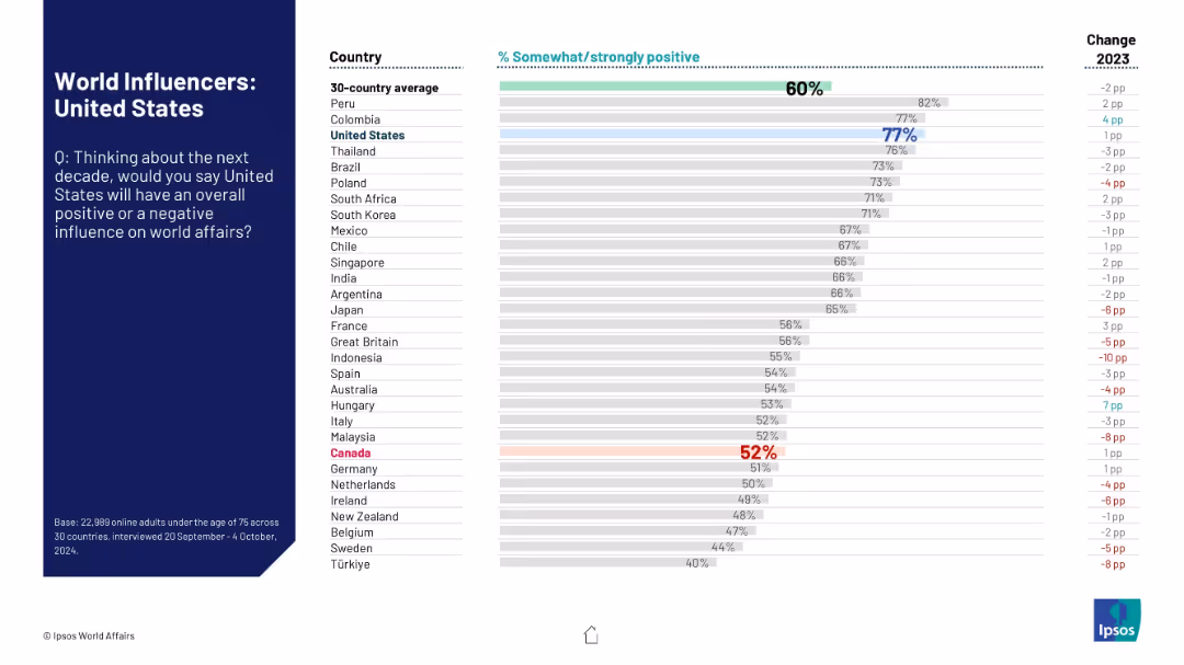
Standard Ipsos layout with question on the left and sentiment-based ranking chart on the right.
Market Analysis and Trends
Government & Public Sector
This slide captures global opinions on the United States' projected influence on global affairs. It displays country-by-country approval percentages and highlights changes from the prior year.
United States, global influence, perception, international opinion, bar graph, Ipsos, geopolitical standing, trend analysis, 2024
false
Market Analysis and Trends
Government & Public Sector
Mixed Chart
IPSOS
Add to my slides
Remove from favorites
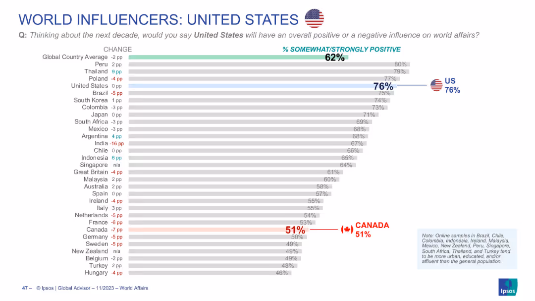
Horizontal bar chart showing global opinion on U.S. influence; Canada’s rating (51%) is highlighted
Market Analysis and Trends
Government & Public Sector
Presents global opinions on whether the U.S. will have a positive influence in the next decade. The U.S. scores 76% globally, but Canada shows a much lower 51% approval, marking a notable international divergence.
United States, global influence, perception, opinion, Canada comparison, bar chart, Ipsos, positive rating, diplomacy, trends
false
Market Analysis and Trends
Government & Public Sector
Single Chart
IPSOS
Add to my slides
Remove from favorites
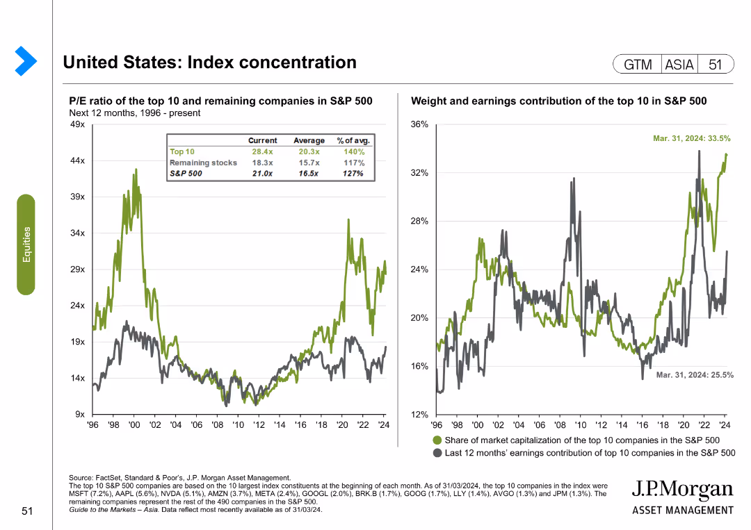
The slide features two line charts. The first chart shows the P/E ratio of the top 10 and remaining companies in the S&P 500 from 1996 to the present. The second chart shows the weight and earnings contribution of the top 10 in the S&P 500.
Market Analysis and Trends
Financial Services
The slide analyzes index concentration in the United States, focusing on the P/E ratio and earnings contribution of the top 10 companies in the S&P 500. It is used for market analysis and investment decision-making.
United States, index concentration, S&P 500, P/E ratio, earnings contribution, market analysis
false
Market Analysis and Trends
Financial Services
Multiple Chart
JP Morgan
Add to my slides
Remove from favorites
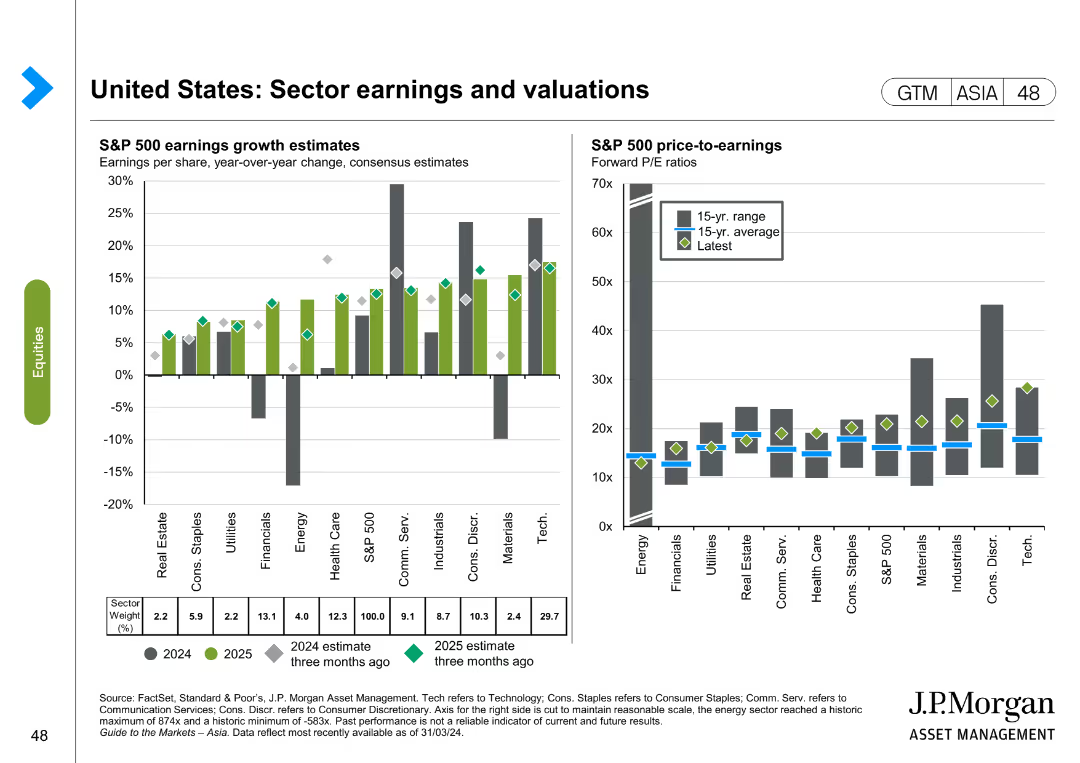
The slide contains two column charts. The first chart shows S&P 500 earnings growth estimates by sector for 2024 and 2025. The second chart shows S&P 500 price-to-earnings ratios by sector. Color coding is used to differentiate data points.
Financial Performance
Financial Services
This slide discusses sector earnings and valuations in the United States, providing earnings growth estimates and price-to-earnings ratios for various sectors. It is used for financial performance analysis and investment planning.
United States, sector earnings, valuations, S&P 500, price-to-earnings, financial performance, investment
false
Financial Performance
Financial Services
Multiple Chart
JP Morgan
Add to my slides
Remove from favorites
Mirrors slides 18836 and 18837. Uses blue-striped visuals. Gaps calculated for the US.
Risk Assessment and Management
Government & Public Sector
United States data showing public concern vs. perceived preparedness for several threat categories. Cybersecurity and disinformation show the highest concern-preparedness gaps. Highlights areas for governmental improvement.
United States, security gap, cyber threats, disinformation, public trust, risk readiness
false
Risk Assessment and Management
Government & Public Sector
Mixed Chart
IPSOS
Add to my slides
Remove from favorites
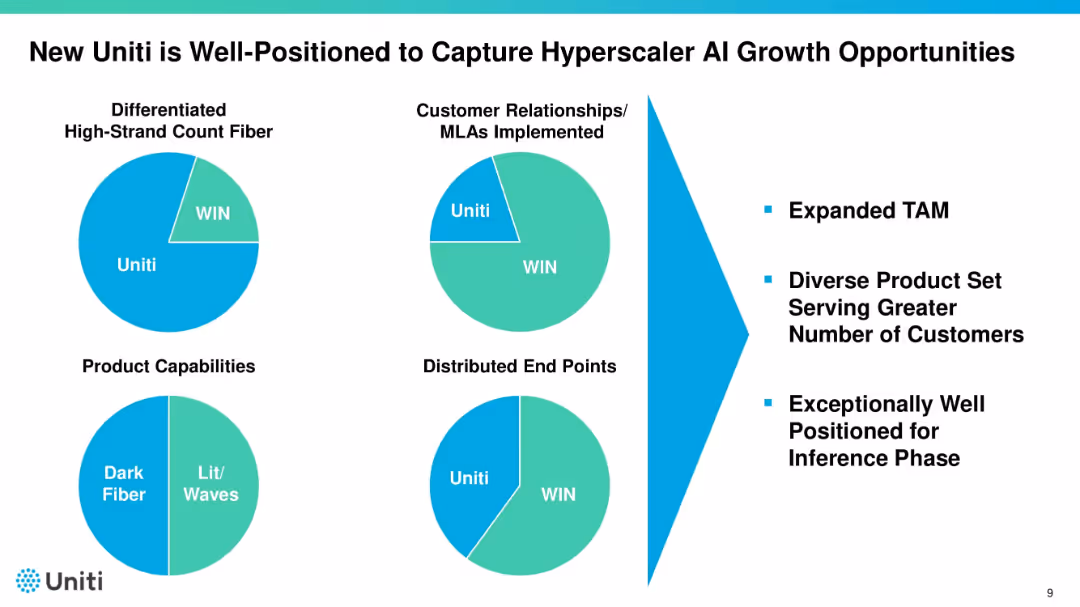
Four pie charts illustrating Uniti vs. WIN across different categories. Right side lists benefits such as expanded TAM and customer diversity. Uses bold black titles and teal highlights.
Sales and Business Development
Telecommunications
Highlights Uniti’s competitive advantages over WIN in fiber, relationships, product capabilities, and endpoints. Uses pie charts to show comparative share. Emphasizes positioning to benefit from AI-driven infrastructure growth.
Uniti, AI growth, fiber, market position, customer base
false
Sales and Business Development
Telecommunications
Mixed Chart
Goldman Sachs
Add to my slides
Remove from favorites
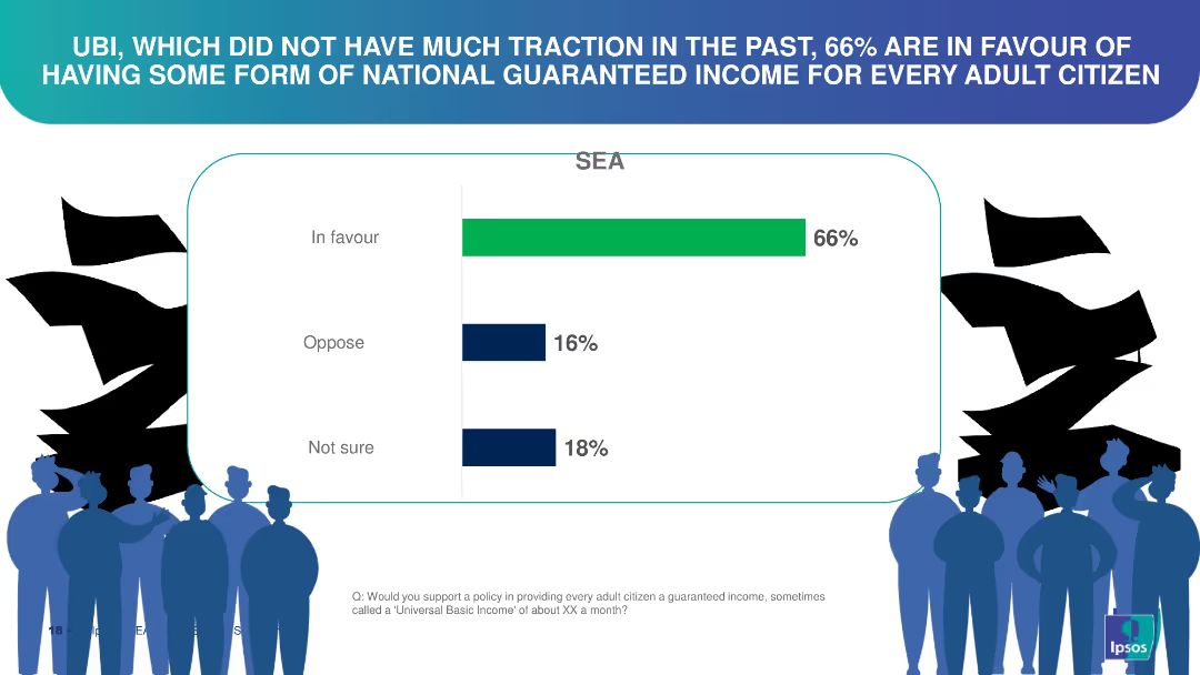
This slide features a vertical bar chart illustrating support levels for Universal Basic Income (UBI) among the surveyed population. The chart is simple, with three distinct bars showing "In favour," "Oppose," and "Not sure" categories.
Market Analysis and Trends
Financial Services
The slide shows that 66% are in favor of UBI, 16% oppose it, and 18% are unsure. It highlights the growing support for UBI, which can be utilized to discuss policy changes, economic reforms, and public sentiment towards income security.
universal basic income, survey results, public opinion, income security, economic reform
false
Market Analysis and Trends
Financial Services
Single Chart
IPSOS
Add to my slides
Remove from favorites
The slide is text-heavy with a large title and several subsections, including key initiatives and actions, alongside country examples. It outlines the role of universities in generating ICT talent and ensuring they possess the necessary skills. There's central text with green color highlights featuring key points. The layout is informative and arranged in lists and text blocks with distinct headers.
Strategic Planning
Education & Training
The slide outlines key initiatives and actions for universities to address the ICT talent gap. It suggests increasing investment in education, enhancing accessibility to ICT majors, and ensuring diversity. The slide also provides international examples of how these initiatives are implemented, framing the role of universities as crucial in producing job market-ready graduates.
Universities, ICT Talent, Strategic Planning, Key Initiatives, Investment, Accessibility, Diversity, Education Policy, Skill Development, Global Examples
false
Strategic Planning
Education & Training
Header Vertical
Kearney
Add to my slides
Remove from favorites
The slide contains two column charts. The left chart shows the top countries for universities with QT research programs, and the right chart shows the number of universities offering QT master’s degrees per country.
Human Resources and Talent Management
Education & Training
This slide provides data on the growth of quantum technology education, indicating a significant increase in the number of universities offering QT master's degrees. It highlights the leading countries in QT research and education.
Universities, QT, Master's Degrees, Research, Education
false
Human Resources and Talent Management
Education & Training
Multiple Chart
McKinsey
Add to my slides
Remove from favorites
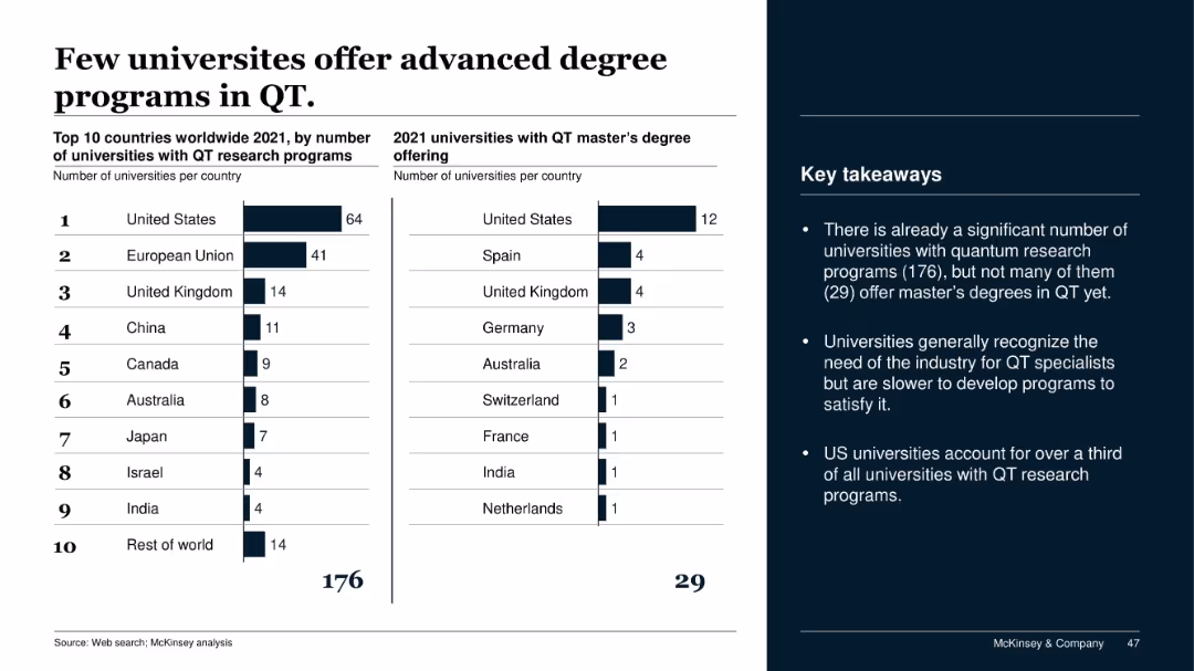
Dual-column bar chart showing universities with QT research and QT master’s programs; summary points included.
Human Resources and Talent Management
Education & Training
This slide reveals a gap in advanced quantum education, with many universities conducting research but few offering QT master’s programs. The US leads both in research and degree offerings, but overall, master’s availability is limited.
universities, QT programs, master's degrees, quantum research, talent pipeline, education gaps
false
Human Resources and Talent Management
Education & Training
Mixed Chart
McKinsey
Add to my slides
Remove from favorites
The slide features a bar chart with statistics on universities, spinouts, and active spinouts. It also includes textual information and navigation.
Industry Overview
Education & Training
This slide presents the number of companies spun out by universities in Edinburgh, along with the number of spinouts that remain active, highlighting the university's impact on local businesses.
universities, spinouts, Edinburgh, education, data presentation, sector impact, research innovation, equity funding, technology sector, pharmaceuticals
false
Industry Overview
Education & Training
Mixed Chart
Barclays
Add to my slides
Remove from favorites
Visually vibrant slide with icons representing each of the UN Sustainable Development Goals, accompanied by descriptive texts highlighting their importance and goals.
Market Analysis and Trends
Government & Public Sector
Provides an overview of the UN Sustainable Development Goals, highlighting their scope and the global consensus on values aimed at achieving a sustainable future for all.
UN, SDGs, global, development, goals, sustainability, future, consensus, values, society
false
Market Analysis and Trends
Government & Public Sector
Table
Roland Berger
Add to my slides
Remove from favorites
Includes bullet points on unsecured debt, a column chart comparing benchmark and preferred stock issuance against maturities, and another chart depicting liability management actions. The text details expectations and actions regarding unsecured debt management.
Financial Performance
Financial Services
Analyzes the firm's unsecured debt strategy, detailing the benchmark issuance, the mix of funding sources, and planned liability management actions. It provides insight into the expectations for the fiscal year regarding unsecured debt and the strategic issuance of benchmark debt.
unsecured debt, benchmark issuance, funding strategy, liability management, column chart
false
Financial Performance
Financial Services
Mixed Chart
Goldman Sachs
Add to my slides
Remove from favorites
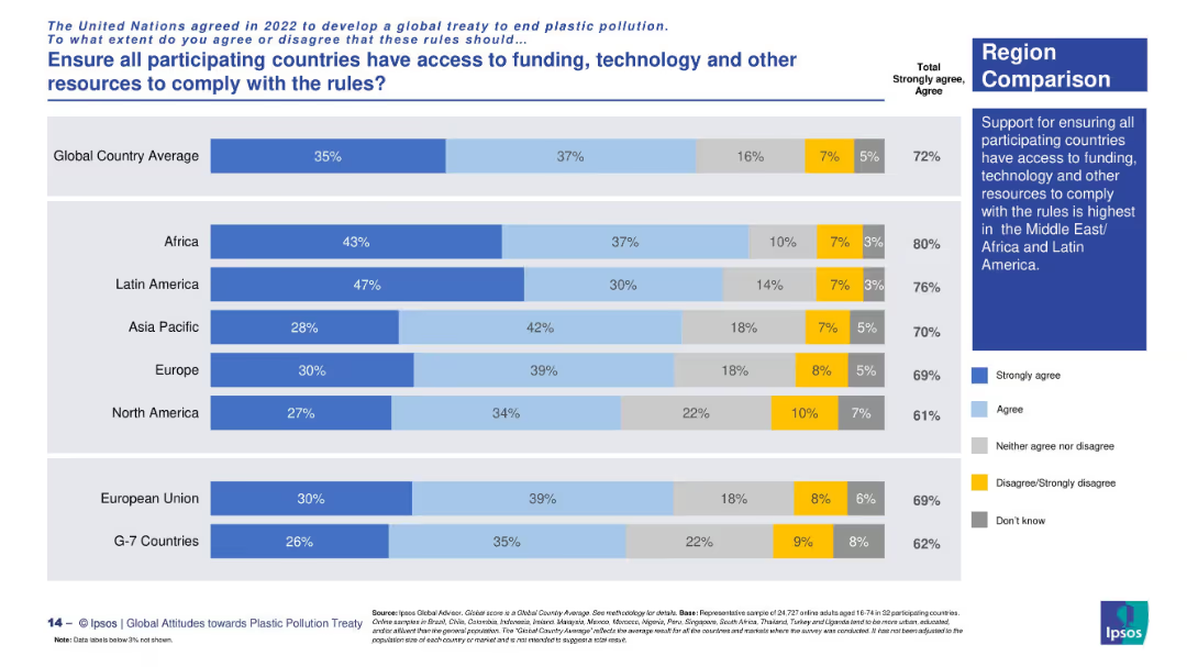
Horizontal bar chart with region-based comparison. Uses five-color segmented bars to represent opinion distribution across global regions. A text box on the right summarizes key insight.
Regulatory and Compliance
Government & Public Sector
This slide shows regional public opinion on ensuring equitable access to funding, technology, and other resources to help countries comply with UN plastic pollution treaty rules. Africa and Latin America show the strongest support.
UN treaty, plastic pollution, regional support, funding access, technology equity, Africa, Latin America, compliance support
false
Regulatory and Compliance
Government & Public Sector
Mixed Chart
IPSOS
Add to my slides
Remove from favorites
Dark green background with white text, a comparative chart with illustrations of different appliances and electronics stored unused, and their associated material weights.
Regulatory and Compliance
Consumer Goods
The slide discusses the amount of unused or broken appliances and electronics stored in households, highlighting the potential for resource recovery and recycling.
Unused appliances, resource recovery, recycling, household survey, sustainability
false
Regulatory and Compliance
Consumer Goods
Single Chart
Oliver Wyman
Add to my slides
Remove from favorites
This slide uses a simple design with images and text to announce upcoming reports on industrial automation by Harris Williams and L.E.K., including process industry automation, discrete (factory) automation, and warehouse automation.
Strategic Planning
Industrial & Manufacturing
The slide informs about upcoming reports from Harris Williams and L.E.K. on industrial automation, focusing on process industry automation, discrete (factory) automation, and warehouse automation.
Upcoming Reports, Industrial Automation, Process Automation, Discrete Automation, Warehouse Automation, Harris Williams, L.E.K.
false
Strategic Planning
Industrial & Manufacturing
Diagram
LEK
Add to my slides
Remove from favorites
The slide uses a simple layout with images to indicate upcoming detailed reports on different subsectors of industrial automation, including process industry, discrete, and warehouse automation.
Market Analysis and Trends
Industrial & Manufacturing
The slide provides a preview of forthcoming reports on industrial automation subsectors, scheduled for release in summer, fall, and winter 2021.
upcoming reports, industrial automation, subsectors, process industry, discrete automation, warehouse automation
false
Market Analysis and Trends
Industrial & Manufacturing
Diagram
LEK
Add to my slides
Remove from favorites
This slide presents a column chart comparing upcountry costs in different Australian states and Canada, with additional notes on utilization and cost factors.
Operational Efficiency
Agriculture & Food Production
The slide examines upcountry costs in Australia and Canada, showing that costs are similar despite lower utilization in Australia, and discussing the implications for operational efficiency.
Upcountry costs, Australia, Canada, cost comparison, utilization, agriculture, food production, operational efficiency
false
Operational Efficiency
Agriculture & Food Production
Mixed Chart
LEK
Add to my slides
Remove from favorites
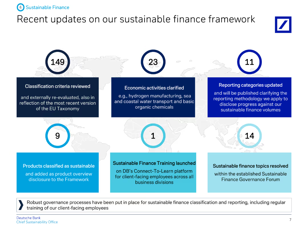
The slide contains text and numbered points summarizing recent updates to the sustainable finance framework, including criteria reviews and economic activity clarifications.
Regulatory and Compliance
Financial Services
Highlights Deutsche Bank's recent updates to their sustainable finance framework, including classification criteria, economic activities, and reporting category updates.
Updates, sustainable, finance, framework, criteria, economic, activities, reporting, banking, ESG
false
Regulatory and Compliance
Financial Services
Graphic
Deutsche Bank
Add to my slides
Remove from favorites
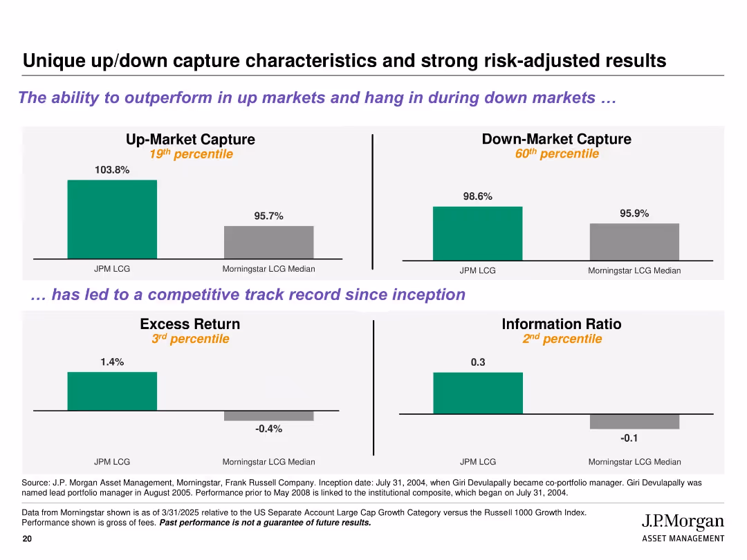
Four quadrant-style bar charts with percentile ranks and color-coded results; includes titles and subheadings in purple for emphasis
Performance Metrics and KPIs
Financial Services
Illustrates the strategy's ability to outperform in up markets and remain resilient in down markets. Key metrics shown include Up/Down Market Capture, Excess Return, and Information Ratio, benchmarked against Morningstar LCG median, with percentile ranks indicating strong risk-adjusted returns.
up-market capture, down-market capture, excess return, risk-adjusted, percentile, J.P. Morgan, performance, Morningstar
false
Performance Metrics and KPIs
Financial Services
Multiple Chart
JP Morgan
Add to my slides
Remove from favorites
The slide features logos of example companies next to their respective technology impact descriptions. A clean and professional design, with balanced text and imagery.
Client Case Studies
Transportation & Logistics
Provides examples of companies in various industries that have created significant impact through the adoption and implementation of mobility technologies.
UPS, BMW, Deutsche Telekom, E.ON, innovation, case studies, fuel savings, safety improvements
false
Client Case Studies
Transportation & Logistics
Header Vertical
McKinsey
Add to my slides
Remove from favorites
Slide with four separate graphs (bar, line, bar, line) corresponding to four key drivers of upskilling. The layout is structured with each graph and its explanation in quadrants.
Market Analysis and Trends
Financial Services
Addresses the factors contributing to the need for upskilling in the workforce, such as job automation, talent availability, mobility of skilled labor, and aging talent.
Upskilling, Automation, Talent Scarcity, Workforce Mobility, Aging Population
false
Market Analysis and Trends
Financial Services
Multiple Chart
PwC/Strategy&
Add to my slides
Remove from favorites
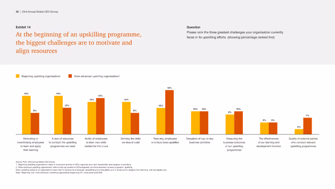
This slide includes a column chart comparing challenges faced by beginning and advanced upskilling organizations, with bars representing different challenges and their severity.
Human Resources and Talent Management
Professional Services
The slide discusses the primary challenges in initiating upskilling programs, including motivating employees, resource limitations, and aligning efforts.
Upskilling challenges, motivation, resource alignment, employee engagement, program initiation
false
Human Resources and Talent Management
Professional Services
Single Chart
PwC/Strategy&
Add to my slides
Remove from favorites
The slide includes a column chart comparing challenges in upskilling initiatives, with different colors representing the beginning and advanced stages of such programs.
Organizational Structure and Change
Professional Services
Discusses the initial challenges organizations face when starting upskilling programs, such as motivation, resource allocation, and employee retention.
Upskilling Challenges, Resource Allocation, Employee Retention, Skill Development
false
Organizational Structure and Change
Professional Services
Single Chart
PwC/Strategy&
Add to my slides
Remove from favorites
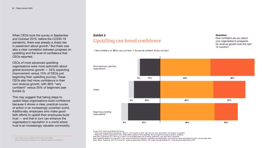
Displays a column chart showing the confidence levels of CEOs about revenue growth related to upskilling initiatives, with different colors indicating levels of confidence.
Human Resources and Talent Management
Professional Services
This slide discusses the positive impact of upskilling on CEOs' confidence in revenue growth, presenting survey data on confidence levels among more advanced and beginning upskilling organizations.
upskilling, confidence, revenue growth, CEOs, survey
false
Human Resources and Talent Management
Professional Services
Mixed Chart
PwC/Strategy&
Add to my slides
Remove from favorites
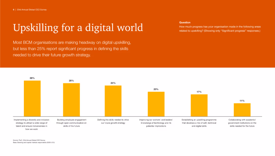
The slide has an orange background with a large white title. Below, a column chart with yellow bars displays progress in various areas related to digital upskilling.
Human Resources and Talent Management
Technology & Software
This slide highlights the progress made by BCM organizations in digital upskilling, with a focus on skills needed for future growth strategy and employee engagement.
Upskilling, digital, skills, BCM, growth, strategy, employee engagement, technology, progress
false
Human Resources and Talent Management
Technology & Software
Mixed Chart
PwC/Strategy&
Add to my slides
Remove from favorites
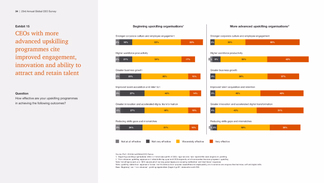
The slide presents two side-by-side column charts comparing the effectiveness of upskilling programs in beginning and advanced organizations, with a focus on various outcomes.
Human Resources and Talent Management
Professional Services
The slide highlights that advanced upskilling programs lead to better engagement, innovation, and talent retention, compared to beginning programs.
Upskilling effectiveness, engagement, innovation, talent retention, program comparison
false
Human Resources and Talent Management
Professional Services
Multiple Chart
PwC/Strategy&
Add to my slides
Remove from favorites
This slide presents a bar chart comparison of the outcomes of upskilling programs between organizations at different stages of program implementation, with a clear text description.
Human Resources and Talent Management
Professional Services
Compares the perceived effectiveness of upskilling programs between organizations at varying levels of program maturity, focusing on engagement, productivity, and innovation.
Upskilling Effectiveness, Talent Management, Workforce Productivity, Innovation, Engagement
false
Human Resources and Talent Management
Professional Services
Multiple Chart
PwC/Strategy&
Add to my slides
Remove from favorites
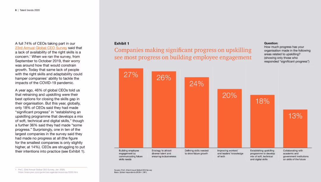
Features a column chart illustrating the correlation between progress in upskilling and improvements in employee engagement, with different percentages for various engagement strategies.
Human Resources and Talent Management
Professional Services
This slide highlights the relationship between significant progress in upskilling programs and the corresponding improvements in employee engagement, showing data from a CEO survey.
upskilling, employee engagement, progress, CEOs, survey
false
Human Resources and Talent Management
Professional Services
Mixed Chart
PwC/Strategy&
Add to my slides
Remove from favorites
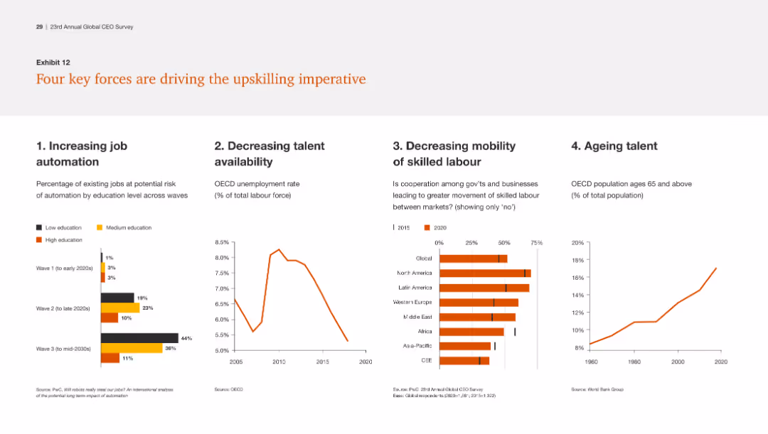
The slide includes four separate charts: a bar chart, a line chart, a column chart, and an area chart, illustrating trends in job automation, talent availability, labor mobility, and aging talent.
Human Resources and Talent Management
Professional Services
The slide identifies four major forces impacting the need for upskilling: job automation, declining talent availability, reduced labor mobility, and an aging workforce.
Upskilling, job automation, talent availability, labor mobility, aging workforce
false
Human Resources and Talent Management
Professional Services
Multiple Chart
PwC/Strategy&
Add to my slides
Remove from favorites
This slide features a column chart comparing the effectiveness of beginning and advanced upskilling organizations across various metrics. The chart uses three color codes for differentiation. The left side contains a text block summarizing key findings.
Human Resources and Talent Management
Professional Services
The slide compares the effectiveness of upskilling programs in achieving outcomes such as corporate culture improvement, workforce productivity, and innovation. It highlights how advanced programs yield greater gains.
Upskilling, productivity, corporate culture, innovation, skills gap, retention, business growth, digital transformation
false
Human Resources and Talent Management
Professional Services
Mixed Chart
PwC/Strategy&
Add to my slides
Remove from favorites
Illustrates a learning pathway from a current role (machine operator) to a future role (autonomous production maintenance team lead), with a flowchart and lists of skills and requirements.
Human Resources and Talent Management
Industrial & Manufacturing
Details a strategic approach to upskilling for resilience, showcasing a transition from traditional roles to more advanced, technology-driven roles within manufacturing operations.
upskilling, resiliency, role transition, skills development, technology integration, manufacturing operations, Accenture Research
false
Human Resources and Talent Management
Industrial & Manufacturing
Diagram
Accenture
Add to my slides
Remove from favorites
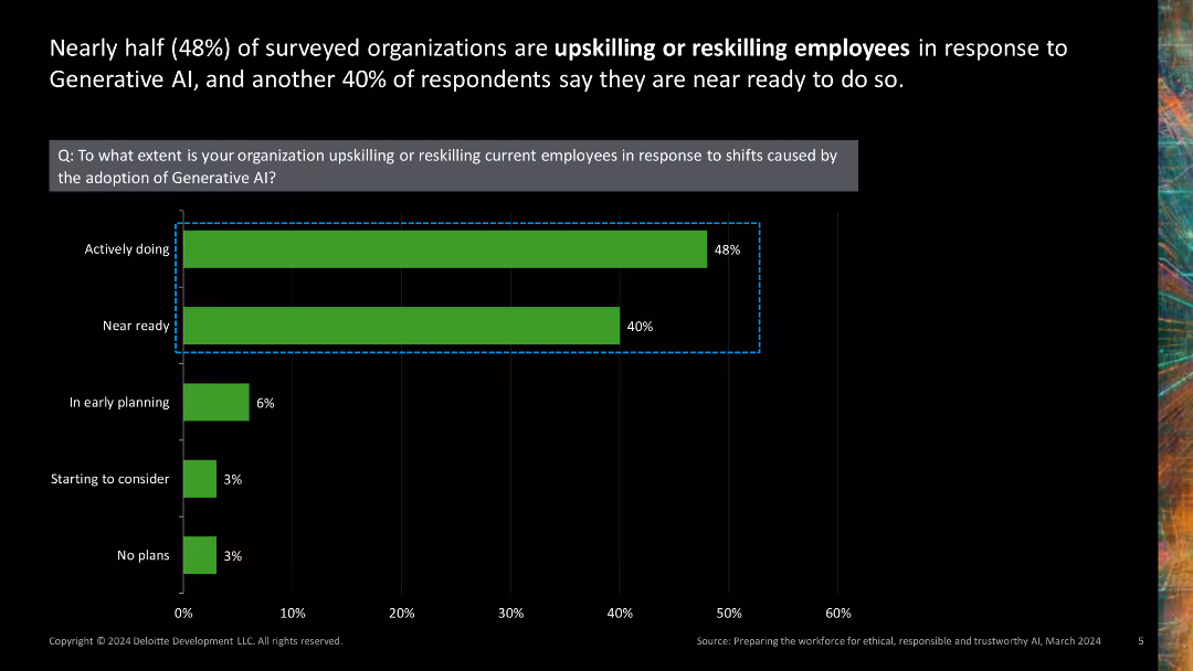
Single column chart showing the extent of organizations upskilling or reskilling employees for AI adoption.
Human Resources and Talent Management
Technology & Software
Displays survey results on the extent to which organizations are preparing their workforce for generative AI by upskilling or reskilling employees.
upskilling, reskilling, AI adoption, workforce preparation, human resources
false
Human Resources and Talent Management
Technology & Software
Single Chart
Deloitte
Add to my slides
Remove from favorites
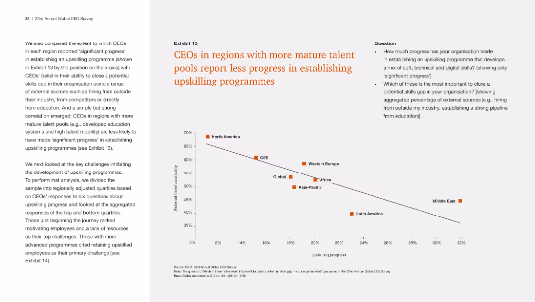
The slide features a scatter plot with a diagonal trend, labeled "Exhibit 13". There's a legend at the top marking different regions with color-coded squares. The x-axis shows upskilling progress percentage and the y-axis shows CEO's belief in upskilling.
Market Analysis and Trends
Professional Services
The slide presents a correlation between the maturity of talent pools in various regions and the progress in establishing upskilling programs, suggesting regions with more mature talent are less likely to have made significant progress in this area.
upskilling, talent pools, regional comparison, CEO beliefs, progress
false
Market Analysis and Trends
Professional Services
Mixed Chart
PwC/Strategy&
Add to my slides
Remove from favorites
The slide contains a scatter plot showing the correlation between talent pool maturity and progress in upskilling programs across different regions.
Human Resources and Talent Management
Professional Services
The slide reveals that regions with more developed talent pools see less progress in upskilling initiatives, indicating a potential complacency or other barriers.
Upskilling, talent pools, regional comparison, scatter plot, progress
false
Human Resources and Talent Management
Professional Services
Mixed Chart
PwC/Strategy&
Add to my slides
Remove from favorites
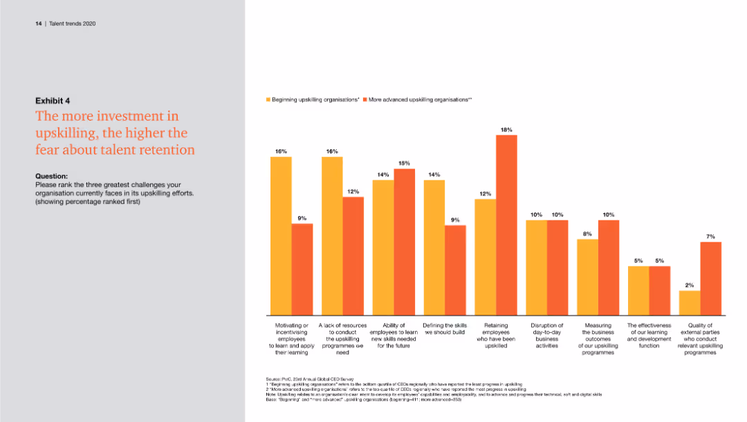
This slide includes a column chart showing the greatest challenges organizations face in upskilling efforts. The chart uses two colors to compare beginning and advanced upskilling organizations.
Human Resources and Talent Management
Professional Services
The slide highlights the top challenges in upskilling, such as employee motivation, resources for programs, and retaining upskilled employees, suggesting that higher investment raises retention concerns.
Upskilling, talent retention, challenges, motivation, resources, employee learning
false
Human Resources and Talent Management
Professional Services
Single Chart
PwC/Strategy&
Add to my slides
Remove from favorites
The slide includes a column chart showing the percentage of upstream emissions by geographic source for various countries. It is visually straightforward.
Market Analysis and Trends
Environmental Services & Sustainability
This slide analyzes the geographic source of upstream emissions across different countries, emphasizing the impact of local versus global suppliers.
Upstream emissions, geographic source, country, analysis, environmental impact, sustainability, emissions percentage, data visualization, local suppliers
false
Market Analysis and Trends
Environmental Services & Sustainability
Mixed Chart
Accenture
Add to my slides
Remove from favorites
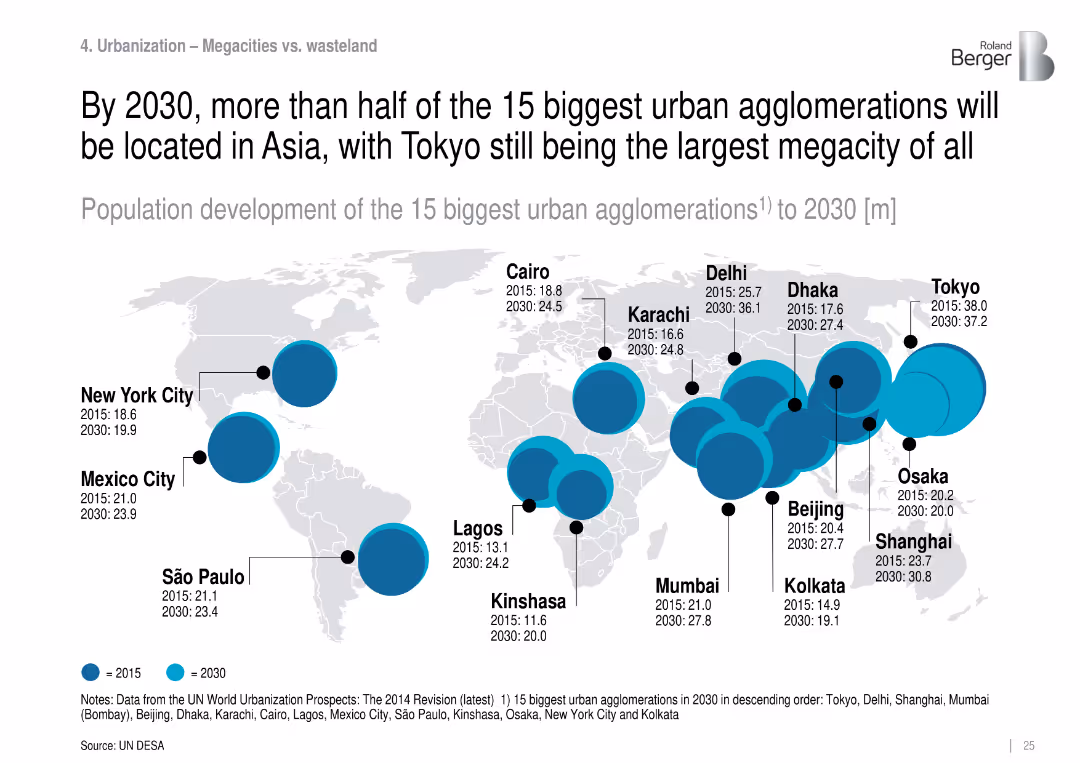
World map with bubble sizes showing population growth of the 15 largest urban centers from 2015 to 2030.
Strategic Planning
Government & Public Sector
Identifies and projects the largest urban agglomerations globally, noting that by 2030, most will be in Asia. Tokyo remains the largest, while cities like Delhi, Shanghai, and Mumbai grow rapidly.
urban agglomerations, megacities, population density, Asia, city planning, urban growth
false
Strategic Planning
Government & Public Sector
Mixed Chart
Roland Berger
Add to my slides
Remove from favorites
Features three distinct icons representing urban dynamics, mobility evolution, and customer preferences, each accompanied by a brief descriptor, arranged horizontally across the slide.
Strategic Planning
Transportation & Logistics
Discusses the major forces shaping future transportation ridership including urban dynamics, mobility options, and shifting customer expectations. Ideal for strategic planning in urban transport and mobility sectors.
urban dynamics, mobility, customer preferences, transportation, future trends
false
Strategic Planning
Transportation & Logistics
Pillar
BCG
Add to my slides
Remove from favorites
The slide features a column chart displaying the percentage growth of urban agglomerations with the highest population growth from 2015-35. The chart differentiates between African and Asian cities. Below the chart are annotations and additional notes regarding urbanization trends in Africa.
Market Analysis and Trends
Technology & Software
This slide analyzes the fastest-growing cities in terms of population, comparing urban agglomerations in Africa and Asia. It highlights the impact of rapid urbanization on consumption expenditure in Africa, suggesting significant opportunities for economic growth in these regions.
urban growth, population, Africa, Asia, urbanization
false
Market Analysis and Trends
Technology & Software
Mixed Chart
LEK
Add to my slides
Remove from favorites
The slide shows a balanced layout with text on the left and related hexagonal icons on the right. It details investment approaches like "Equity," "Debt," and "Tax Credit Equity," with impacts such as "Sustainable Transport" and "Communities."
Investment Analysis
Government & Public Sector
This slide is about Goldman Sachs' Urban Investment Group and its commitment to creating commercial opportunities within communities. It is useful for presentations related to urban development, community engagement, and investment impacts on education and sustainable transport.
urban investment, Goldman Sachs, community, sustainability, finance
false
Investment Analysis
Government & Public Sector
Table
Goldman Sachs
Add to my slides
Remove from favorites
This slide includes a map of the United States, figures about investments, and text describing the Urban Investment Group's strategies. It has a clear and organized layout, with the information effectively segmented.
Industry Overview
Government & Public Sector
The slide offers an overview of the Urban Investment Group's strategies and impact, including a 19-year investment history and specific funded projects. It is appropriate for presentations on strategic investments in underserved areas, showcasing the group's pioneering role in social impact.
urban investment, strategic planning, social impact, Goldman Sachs
false
Industry Overview
Government & Public Sector
Table
Goldman Sachs
Add to my slides
Remove from favorites
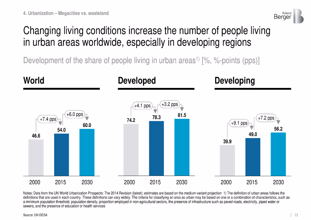
Grouped bar charts for urbanization rates (2000, 2015, 2030) by world, developed, and developing regions.
Market Analysis and Trends
Government & Public Sector
Tracks urbanization growth globally, with the fastest increases in developing regions. The share of people living in urban areas is projected to rise significantly by 2030, driven by economic and living condition changes.
urbanization, city growth, population shift, infrastructure, urban living, developing countries
false
Market Analysis and Trends
Government & Public Sector
Single Chart
Roland Berger
Add to my slides
Remove from favorites
Contains multiple bar charts and lists, comparing urban and rural populations across various income categories, using shades of blue and gray.
Market Analysis and Trends
Environmental Services & Sustainability
Analyzes the impact of urbanization on global population distribution, emphasizing the need for Earth Observation data in urban planning and disaster risk management.
urbanization, Earth Observation, population, global, disaster risk, data analysis, planning
false
Market Analysis and Trends
Environmental Services & Sustainability
Mixed Chart
PwC/Strategy&
Add to my slides
Remove from favorites
Contains column charts showing the percentage of population in urban areas from 2020 to 2050 across continents, with color distinctions and clear labeling.
Market Analysis and Trends
Government & Public Sector
Predicts significant urban population increases by 2050, emphasizing urban planning needs.
urbanization, population growth, planning, 2050, global
false
Market Analysis and Trends
Government & Public Sector
Multiple Chart
Roland Berger
Add to my slides
Remove from favorites
Features multiple small column charts detailing urbanization percentages in various countries by 2050, arranged by region.
Market Analysis and Trends
Government & Public Sector
Compares urbanization rates to highlight regional development and planning challenges.
urbanization, regional comparison, 2050, development
false
Market Analysis and Trends
Government & Public Sector
Multiple Chart
Roland Berger
Add to my slides
Remove from favorites
Contains a variety of graphical elements including bar charts showing economic impact over time, diagrams outlining applications of urban monitoring, and key points in text format. The layout is designed for clarity and focus on data-driven insights.
Strategic Planning
Environmental Services & Sustainability
This slide provides an overview of the economic and strategic benefits of urban monitoring using Copernicus services. It discusses revenue opportunities for service providers and benefits for end users, highlighting the application in urban planning and risk management.
urban monitoring, Copernicus, economic impact, strategic benefits, data services
false
Strategic Planning
Environmental Services & Sustainability
Mixed Chart
PwC/Strategy&
Add to my slides
Remove from favorites
This slide combines text and images, including a small bar chart, bullet points, and a large green-themed graphic layout. The visual elements support the content, emphasizing the environmental focus.
Risk Assessment and Management
Environmental Services & Sustainability
Discussing the strategic and environmental impacts of urban monitoring via Copernicus, this slide emphasizes the identification and management of environmental issues like urban sprawl and pollution. It presents urban monitoring as a crucial tool for sustainable urban planning and policy development.
urban monitoring, environmental impact, Copernicus, sustainability, urban sprawl
false
Risk Assessment and Management
Environmental Services & Sustainability
Linear Flow
PwC/Strategy&
Add to my slides
Remove from favorites
This slide uses a scatter plot to compare various global cities on scales of density and city structure, categorizing them as monocentric or polycentric.
Risk Assessment and Management
Transportation & Logistics
Analyzes how the urban structure and density of different cities influence their vulnerability to transportation-related threats.
urban planning, transportation, city, density, threat level, global, analysis, risk management
false
Risk Assessment and Management
Transportation & Logistics
Mixed Chart
BCG
Add to my slides
Remove from favorites
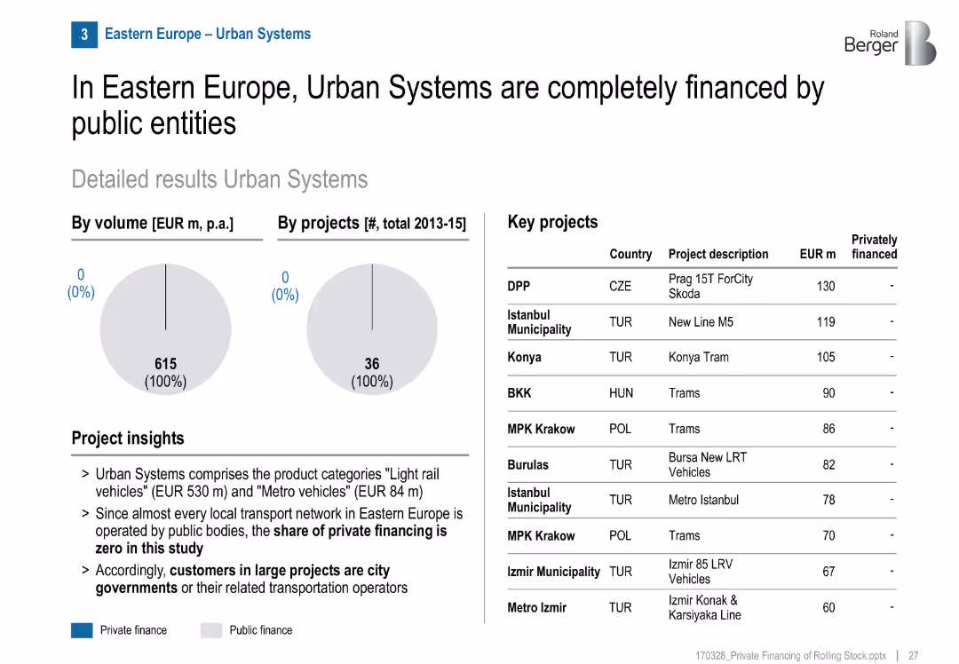
Two pie charts (volume and project count) showing 100% public finance; table listing key projects; project insights in bullet format; clean and structured layout.
Investment Analysis
Transportation & Logistics
The slide shows that from 2013–2015, all urban rail systems in Eastern Europe were publicly financed, with no private investment. Major urban transit projects are listed by cost.
urban systems, public finance, Eastern Europe, rail transport, light rail, metro, investment, municipalities, infrastructure
false
Investment Analysis
Transportation & Logistics
Mixed Chart
Roland Berger
Add to my slides
Remove from favorites
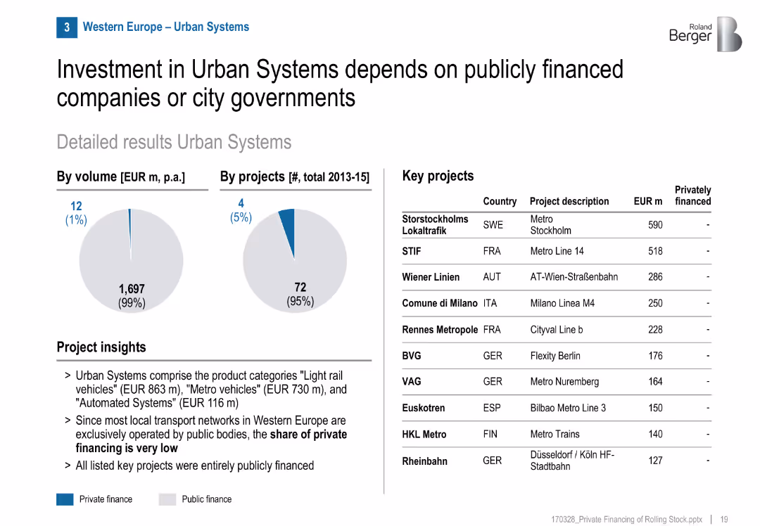
Minimal private finance (pie charts), project table, mostly public projects, layout mirrors previous slides
Market Analysis and Trends
Transportation & Logistics
Urban transport systems like metros and trams in Western Europe are almost entirely publicly financed, with minimal private involvement. Key projects are funded by municipalities or public entities.
urban transport, metro, trams, public sector, city governments, public finance, Western Europe
false
Market Analysis and Trends
Transportation & Logistics
Mixed Chart
Roland Berger
Add to my slides
Remove from favorites
Features line chart, column chart, and images. Moderate layout density with cityscape background.
Market Analysis and Trends
Financial Services
Outlines BBVA's presence in the USA, including GDP growth, loans and deposits, and market trends.
USA, BBVA, GDP, banking, growth
false
Market Analysis and Trends
Financial Services
Multiple Chart
Morgan Stanley
Add to my slides
Remove from favorites
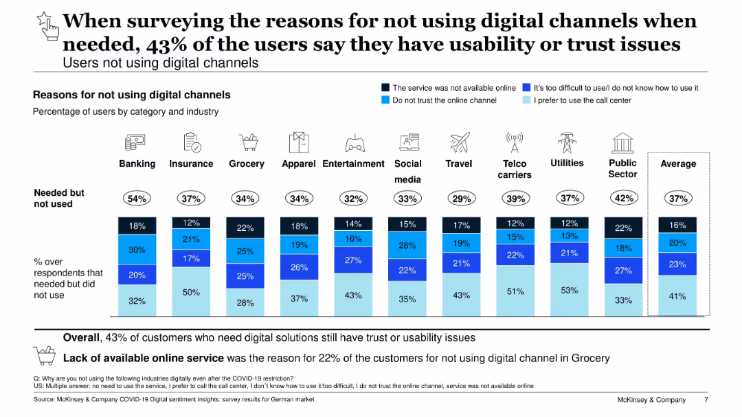
Vertical stacked bar chart showing reasons users didn’t use digital services by industry. Highlights usability and trust concerns.
Customer and Market Segmentation
Technology & Software
Analyzes reasons customers avoided digital channels across various industries. Common reasons include lack of service availability, usability issues, and lack of trust. Suggests improvement opportunities in digital UX and support.
usability, trust, digital barriers, customer behavior, COVID-19
false
Customer and Market Segmentation
Technology & Software
Single Chart
McKinsey
Add to my slides
Remove from favorites
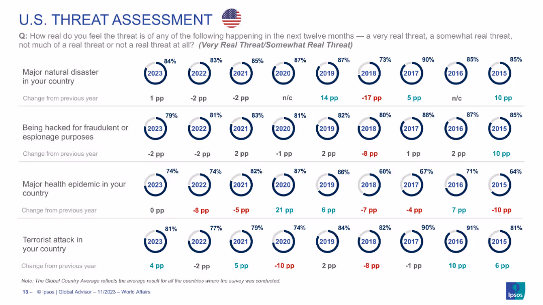
Circular indicators tracking U.S. public perception on four threats from 2015–2023, using consistent layout.
Risk Assessment and Management
Government & Public Sector
U.S. data showing high levels of concern for natural disasters (84%) and hacking (79%) in 2023. Epidemic concern remains steady. Long-term perception trends are visualized year-over-year, indicating overall concern has remained consistently high across most categories.
USA, cybersecurity, epidemic, natural disaster, risk perception, national survey, Ipsos
false
Risk Assessment and Management
Government & Public Sector
Single Chart
IPSOS
Add to my slides
Remove from favorites
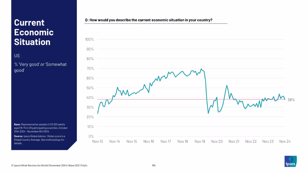
U.S.-focused layout, with typical structure. Graph shows economic sentiment fluctuations ending at 38%
Market Analysis and Trends
Government & Public Sector
The U.S. economy sentiment stands at 38%. A sharp dip around 2020 is followed by partial and uneven recovery. The slide summarizes public opinion on the nation's economic health.
USA, economic sentiment, recession impact, Ipsos data, public view, recovery trends, economic pulse
false
Market Analysis and Trends
Government & Public Sector
Single Chart
IPSOS
Add to my slides
Remove from favorites
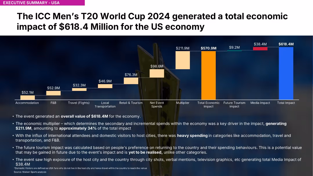
Similar chart structure to 18667 but covering entire USA; highlights $618.4M impact
Investment Analysis
Media & Entertainment
Highlights USA's $618.4M contribution to economic impact. Strong spending in F&B, accommodation, and tourism. Media exposure generated $38.4M.
USA, ICC, T20, economic value, spending, travel, Nielsen, event impact, media exposure, multiplier
false
Investment Analysis
Media & Entertainment
Mixed Chart
Nielsen
Add to my slides
Remove from favorites
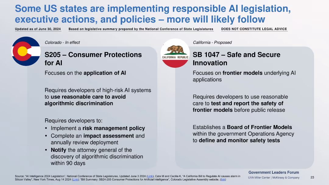
Two-column comparison of enacted (Colorado) and proposed (California) AI laws, each with regulatory focus and developer requirements.
Regulatory and Compliance
Government & Public Sector
Focuses on U.S. state-level AI laws. Colorado mandates discrimination risk controls in AI applications; California proposes safety testing and oversight for frontier models.
US AI law, frontier models, algorithmic bias, risk policy, S205, SB1047
false
Regulatory and Compliance
Government & Public Sector
Pillar
McKinsey
Add to my slides
Remove from favorites
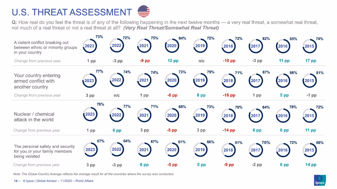
Continuation of U.S. threat data across four more categories; same visual style and layout as prior slides.
Risk Assessment and Management
Government & Public Sector
Explores U.S. threat perception regarding ethnic conflict, military conflict, nuclear/chemical attack, and personal safety. Shows general stability in concern, with slight increases in 2023. Presents longitudinal perspective on threat awareness in American society.
USA, terrorism, nuclear attack, personal security, public opinion, ethnic conflict, geopolitical tension
false
Risk Assessment and Management
Government & Public Sector
Single Chart
IPSOS
Add to my slides
Remove from favorites
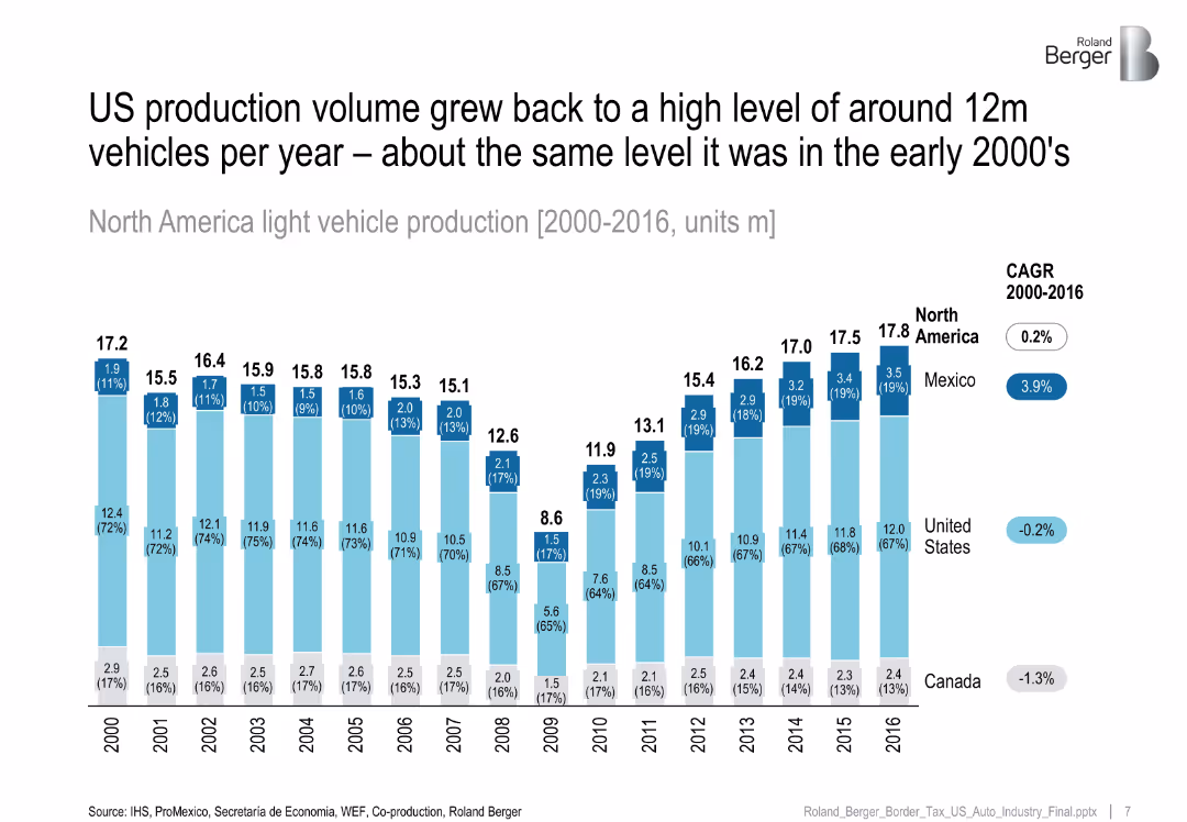
Stacked column chart by country (US, Mexico, Canada) from 2000–2016, CAGR values on right.
Financial Performance
Industrial & Manufacturing
Shows that North American light vehicle production returned to early 2000s levels by 2016, with Mexico seeing positive growth while US and Canada showed stagnation or decline.
US auto industry, vehicle production, Mexico growth, North America, CAGR
false
Financial Performance
Industrial & Manufacturing
Single Chart
Roland Berger
Add to my slides
Remove from favorites
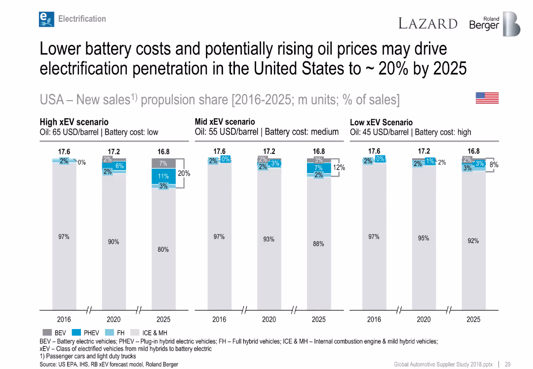
Bar charts by year and scenario, showing propulsion share forecasts.
Strategic Planning
Industrial & Manufacturing
Forecasts xEV market share in the US through 2025 across high, mid, and low xEV scenarios, based on oil and battery cost assumptions.
USA, xEV adoption, BEV, PHEV, oil price, battery cost, forecast
false
Strategic Planning
Industrial & Manufacturing
Single Chart
Roland Berger
Add to my slides
Remove from favorites
This slide features a column chart displaying U.S. applications for business formation and a bar chart showing growth in business establishments by industry.
Market Analysis and Trends
Financial Services
The slide provides insights into the trends in U.S. business formation applications and growth in business establishments across various private industries.
U.S. business formation, applications, growth, private industry, recession, data analysis
false
Market Analysis and Trends
Financial Services
Multiple Chart
JP Morgan
Add to my slides
Remove from favorites
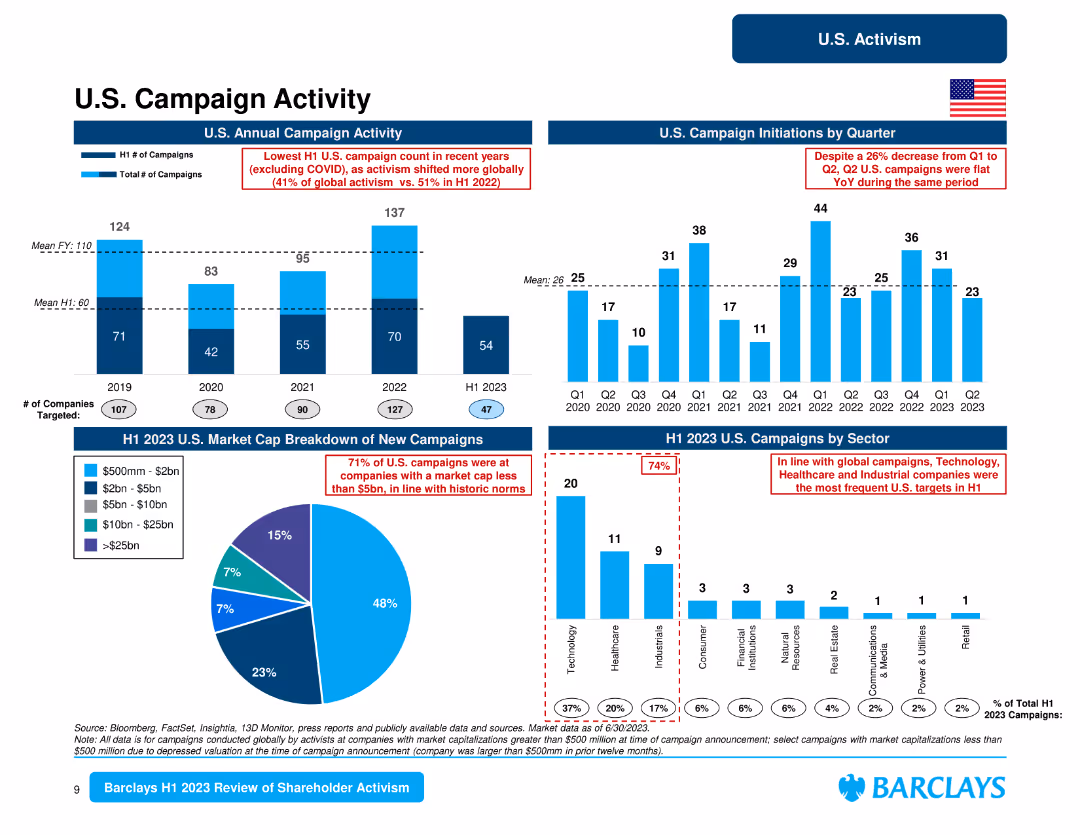
This slide includes multiple column charts depicting U.S. campaign activity by year, market cap, and sector, along with a pie chart for market cap breakdown.
Market Analysis and Trends
Financial Services
The slide outlines U.S. campaign activity trends, highlighting the number of campaigns by year, quarterly initiations, and sectors targeted, with a focus on market cap distribution.
U.S. campaigns, annual activity, quarterly initiations, market cap, sector breakdown, activism trends, financial services
false
Market Analysis and Trends
Financial Services
Multiple Chart
Barclays
Add to my slides
Remove from favorites
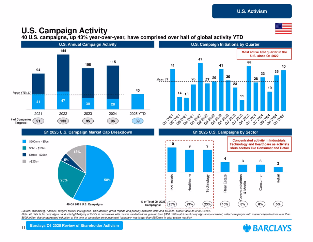
Multi-panel layout: bar charts for U.S. campaign activity annually and quarterly; pie chart of market cap breakdown; sector bar chart.
Market Analysis and Trends
Financial Services
Focuses on U.S.-specific activist trends in Q1 2025. Reports 40 campaigns YTD (43% YoY growth), with Industrials, Healthcare, and Technology as dominant sectors. Majority of targets are sub-$5bn firms. Signals rising U.S. market focus and campaign intensity.
U.S. campaigns, market cap, shareholder activism, 2025 trends, sector analysis, Barclays
false
Market Analysis and Trends
Financial Services
Multiple Chart
Barclays
Add to my slides
Remove from favorites
Includes column charts showing quarterly data on loan loss rates and reserve builds alongside delinquency rates, underpinned by a detailed analysis of the credit card sector.
Risk Assessment and Management
Financial Services
Analyzes trends in credit card delinquencies and reserve strategies in the US, offering insights into risk management and market conditions.
US Cards, delinquencies, loan loss, market trends, reserve build, credit management, financial risk, Barclays
false
Risk Assessment and Management
Financial Services
Multiple Chart
Barclays
Add to my slides
Remove from favorites
This slide contains multiple pie charts displaying data regarding Barclays US Consumer Bank's performance in the US cards market. The layout is structured, with clear sections for each topic such as '20+ years of expertise in US cards' and 'US Cards Market'. The color scheme is predominantly blue and white, with textual information complementing the charts.
Industry Overview
Financial Services
This slide provides an overview of Barclays US Consumer Bank's current status in the US card market, detailing years of expertise, market position, and customer base. It emphasizes their core strengths like deep partnership card expertise and strong risk management.
US cards, market share, customer accounts, core strengths, FICO score
false
Industry Overview
Financial Services
Multiple Chart
Barclays
Add to my slides
Remove from favorites
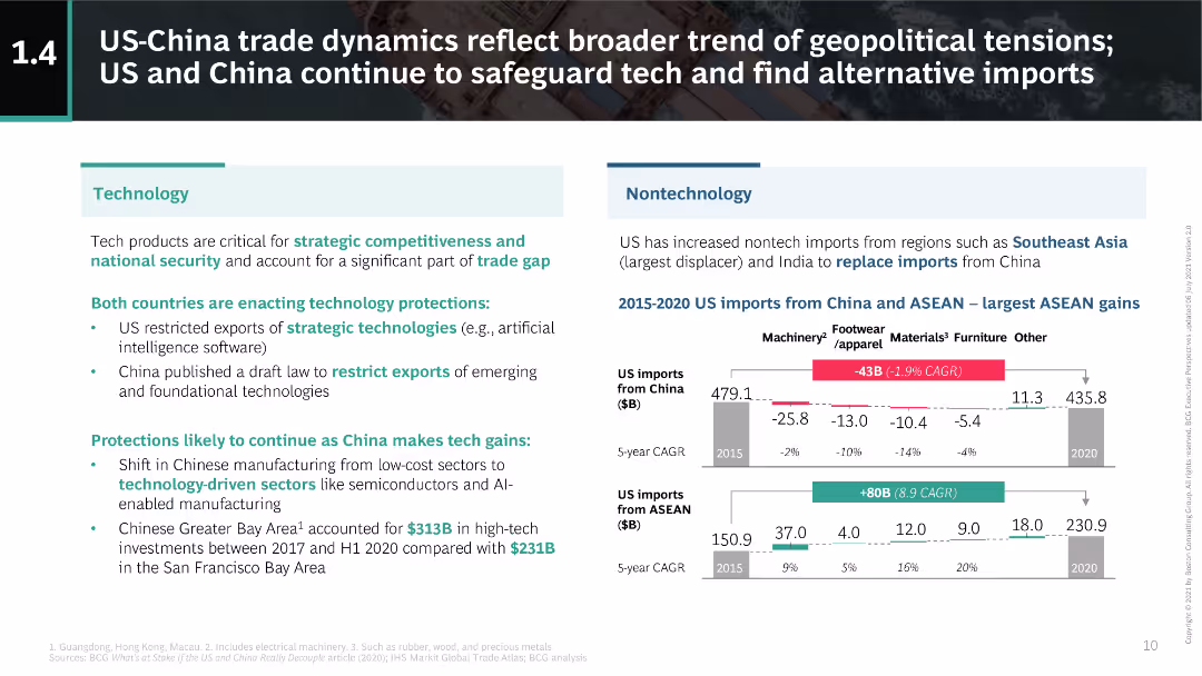
This slide is divided into two main sections: technology and nontechnology impacts. It uses text and simple charts to compare import changes from China and ASEAN.
Market Analysis and Trends
Technology & Software
The slide discusses the geopolitical tensions between the US and China, focusing on technology protection measures and shifts in nontech imports to ASEAN and India.
US-China, trade, technology, ASEAN, geopolitical
false
Market Analysis and Trends
Technology & Software
Multiple Chart
BCG
Add to my slides
Remove from favorites
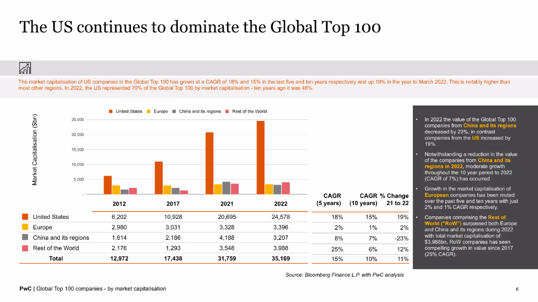
The slide presents bar charts and text, illustrating the market capitalization dominance of US companies in the Global Top 100 compared to other regions.
Market Analysis and Trends
Financial Services
The slide details the market dominance of US companies in the Global Top 100, showing significant growth in market capitalization over the past decade.
US companies, global top 100, market capitalization, dominance, regions, growth
false
Market Analysis and Trends
Financial Services
Mixed Chart
PwC/Strategy&
Add to my slides
Remove from favorites
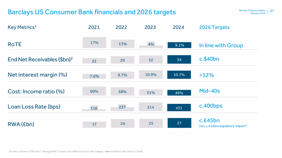
Key metrics table (2021–2024), color-coded with emphasis on 2024 and 2026 targets; blue and white minimalist layout
Financial Performance
Financial Services
The slide reviews US Consumer Bank metrics like RoTE, net receivables, net interest margin, cost-income ratio, loan loss rate, and RWA. 2026 targets aim for margin >12%, lower cost ratios, and manageable loan loss rates. Consistent growth in net receivables and RWA is shown.
US Consumer Bank, receivables, net interest margin, RoTE, loan loss, RWA
false
Financial Performance
Financial Services
Single Chart
Barclays
Add to my slides
Remove from favorites
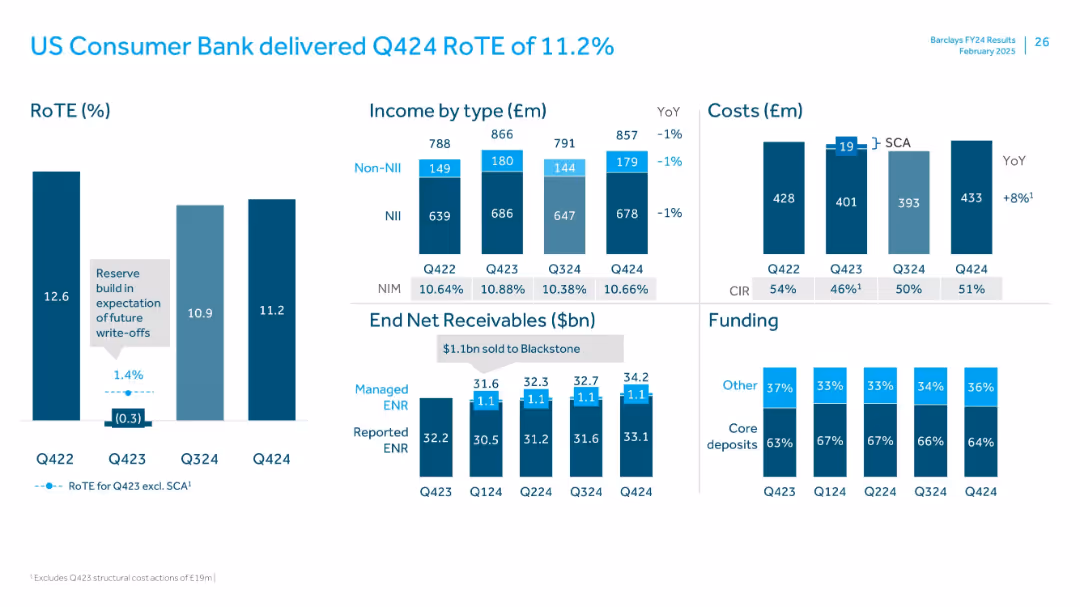
Multi-panel slide with bar charts for RoTE, income type, costs, receivables, and funding. Uses blue shades for categories, with gray annotations and YoY metrics. Compact, data-dense format.
Financial Performance
Financial Services
The slide shows consistent US Consumer Bank performance with RoTE at 11.2% for Q4 2024. Income, costs, receivables, and funding sources are compared across quarters. Managed ENR remained steady, and core deposits dominated funding.
US Consumer Bank, RoTE, income, costs, ENR, funding, Q4 2024, deposits
false
Financial Performance
Financial Services
Multiple Chart
Barclays
Add to my slides
Remove from favorites
The slide features bar charts showing US consumer behavior in terms of price sensitivity (sticker shock) and substitutability (trading down) from March 2022 to February 2023. Commentary on the right explains observed trends.
Market Analysis and Trends
Consumer Goods
The slide analyzes US consumer behavior under inflationary pressures, showing reduced price sensitivity and trading down trends since early 2023. It suggests that consumers are still cautious about prices despite slight easing of headline inflation.
US consumer behavior, price sensitivity, inflation, trends, trading down
false
Market Analysis and Trends
Consumer Goods
Multiple Chart
Accenture
Add to my slides
Remove from favorites
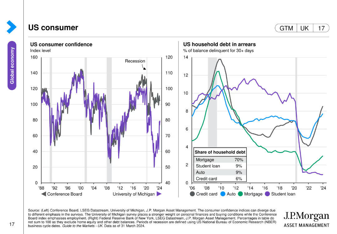
The slide includes a line chart on US consumer confidence from 1988 to 2024 and another line chart showing US household debt in arrears by category.
Market Analysis and Trends
Financial Services
This slide examines US consumer confidence and household debt, illustrating trends over time with data on mortgage, student loan, auto, and credit card debt, offering insights into the economic behavior of US consumers.
US consumer, confidence, debt, arrears, economic trends
false
Market Analysis and Trends
Financial Services
Multiple Chart
JP Morgan
Add to my slides
Remove from favorites
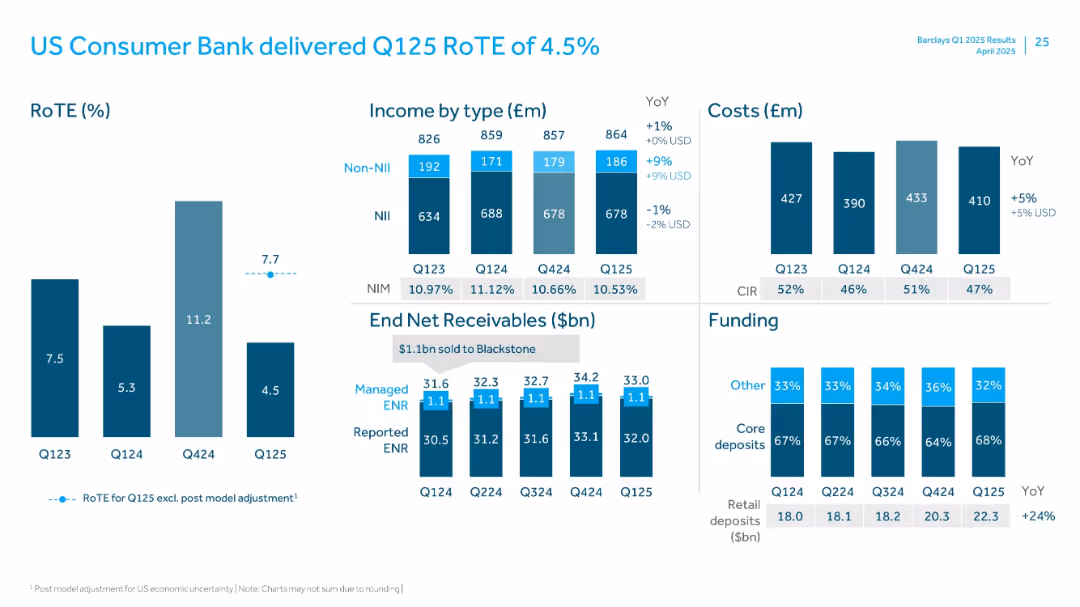
Visuals include RoTE bars, income breakdown, cost bars, ENR trend, and deposit funding mix.
Financial Performance
Financial Services
Analyzes performance of US Consumer Bank with a low RoTE of 4.5%. Contains income and cost breakdowns, net receivables trend, and funding mix. Retail deposits up 24% YoY. Includes post-model adjustment commentary.
US Consumer, RoTE, ENR, Retail Deposits, Income, NIM, Non-NII, Q125
false
Financial Performance
Financial Services
Multiple Chart
Barclays
Add to my slides
Remove from favorites
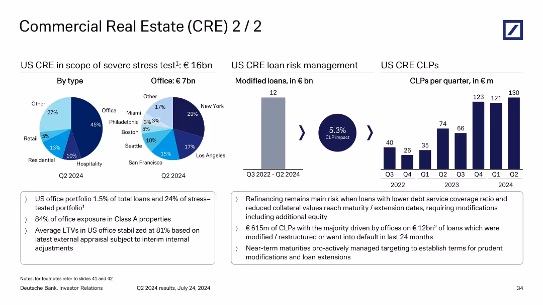
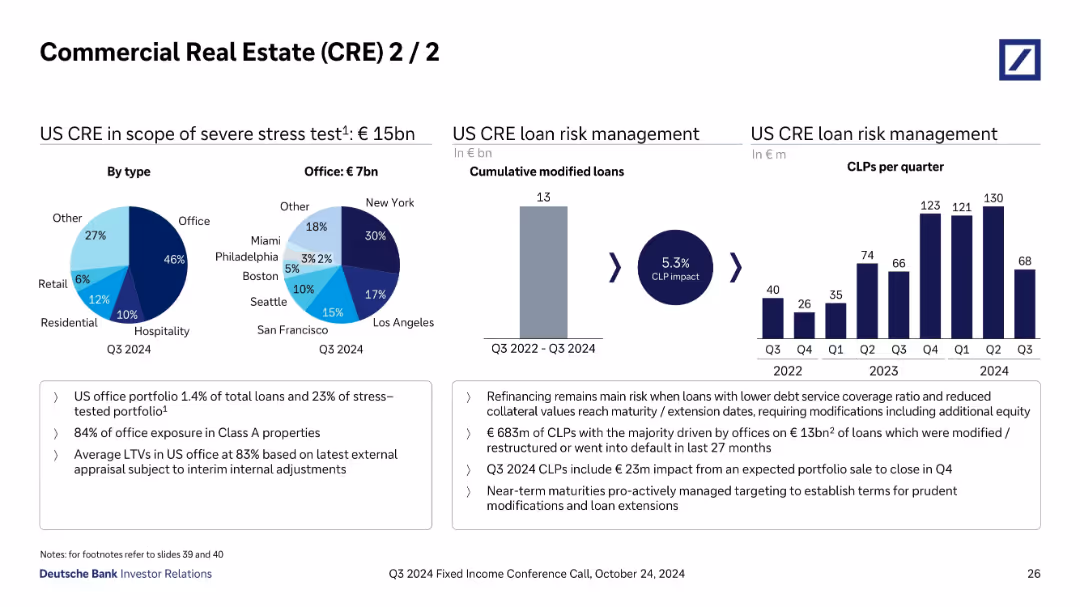
Multi-section layout with pie charts, bar chart, and supporting bullet points; visually divides analysis by loan type, office risk, and CLP trends.
Risk Assessment and Management
Financial Services
This slide delves deeper into US CRE loan risks, particularly the €16bn under stress testing, of which €7bn are office-related. It tracks €615m of CLPs linked to €12bn of restructured or defaulted office loans. A chart shows rising CLPs per quarter, emphasizing risk from refinancing and lower collateral values.
US CRE, CLP impact, refinancing risk, loan modification, office exposure
false
Risk Assessment and Management
Financial Services
Multiple Chart
Deutsche Bank
Add to my slides
Remove from favorites
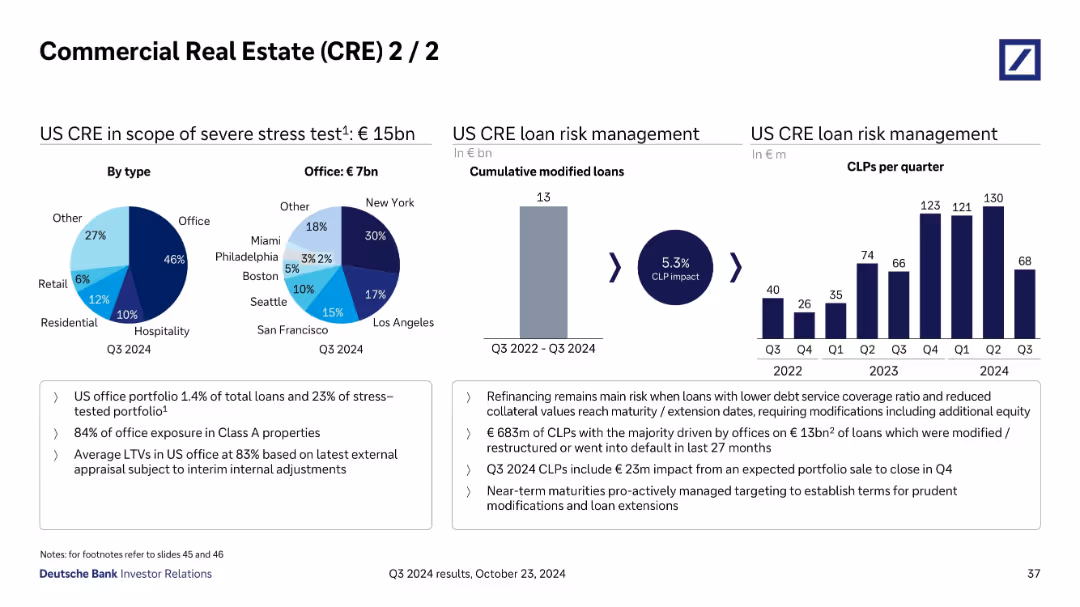
Left section includes two pie charts, middle has a vertical bar chart, right features bar chart of CLPs per quarter and bullet point notes at bottom.
Risk Assessment and Management
Financial Services
Focuses on €15bn in US CRE stress-tested loans with detailed breakdown by type and geography. Discusses risk management, CLPs of €683m from modified/restructured loans, and emphasizes risks from low debt service coverage and portfolio maturities.
US CRE, CLPs, Risk Management, Office Loans, Stress Testing, Loan Types
false
Risk Assessment and Management
Financial Services
Multiple Chart
Deutsche Bank
Add to my slides
Remove from favorites
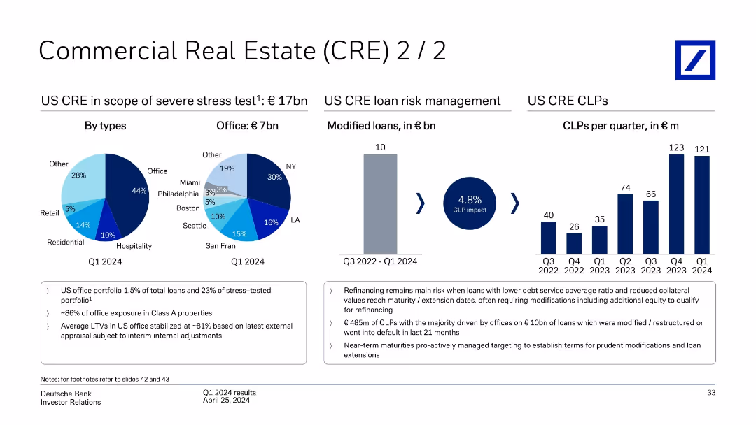
Series of pie and bar charts visualizing US CRE stress test exposure, modified loans, and CLPs over time; supported by key risk notes.
Risk Assessment and Management
Financial Services
Focuses on €17bn US CRE exposure under stress testing, dominated by office loans (44%). Regional breakdown of office loans and trend of cumulative loan loss provisions (CLPs) from Q3 2022–Q1 2024 are shown. Emphasis is placed on refinancing risk, Class A property exposure, and modification efforts.
US CRE, loan loss provisions, refinancing, CLP impact, Class A office, Deutsche Bank
false
Risk Assessment and Management
Financial Services
Multiple Chart
Deutsche Bank
Add to my slides
Remove from favorites
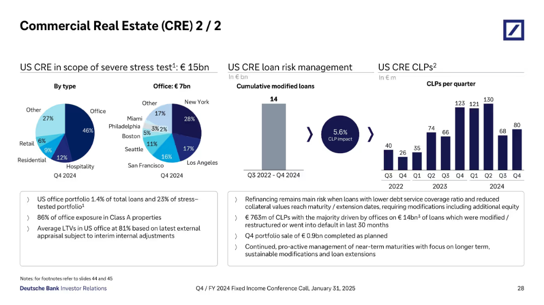
Left section shows pie charts for US CRE by type and office distribution; middle shows bar chart of cumulative modified loans; right shows quarterly CLPs bar chart.
Risk Assessment and Management
Financial Services
Focuses on US CRE stress exposure (€15bn), especially US office loans (€7bn) with significant risk in cities like NYC and LA. Emphasizes loan modifications and €763m CLPs driven by refinancing risk and office default trends.
US CRE, loan modifications, CLP, stress test, office, refinancing, defaults
false
Risk Assessment and Management
Financial Services
Multiple Chart
Deutsche Bank
Add to my slides
Remove from favorites
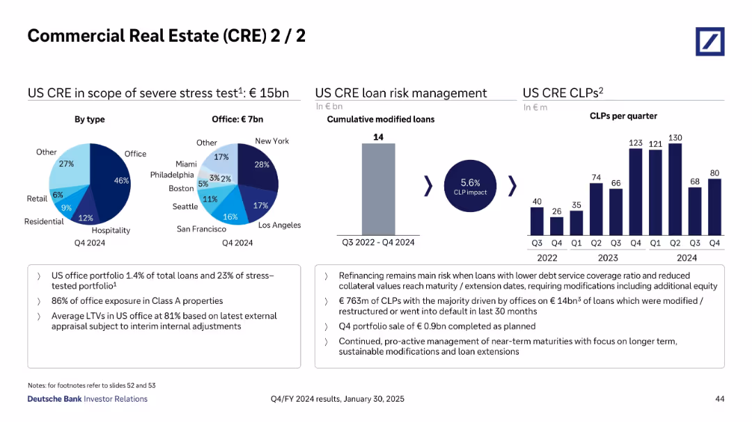
Pie charts and bar charts showing breakdown of US CRE by property type and location; risk metrics on the right
Investment Analysis
Financial Services
Deep dive into €15bn US CRE stress-tested loans, focusing on offices, especially in major US cities. Highlights a 5.6% CLP impact over time and shows historical quarterly CLPs. Risk is mainly from refinancing and low coverage ratios; risk mitigation strategies are actively pursued.
US CRE, office loans, CLPs, refinancing risk, stress test, risk exposure
false
Investment Analysis
Financial Services
Multiple Chart
Deutsche Bank
Add to my slides
Remove from favorites
Multiple pie charts and bar graphs showing US CRE exposure and CLPs per quarter; callouts highlight risk management strategies.
Risk Assessment and Management
Financial Services
Continuation of CRE risk analysis, focusing on €15bn US portfolio. Emphasizes refinancing risk and mitigation through portfolio sales and modifications. Shows CLP evolution over time, peaking in Q1/Q2 2024. Notably, New York leads in exposure with high concentration in office properties.
US CRE, refinancing, CLPs, stress test, office risk, Deutsche Bank, Q3 2024
false
Risk Assessment and Management
Financial Services
Multiple Chart
Deutsche Bank
Add to my slides
Remove from favorites
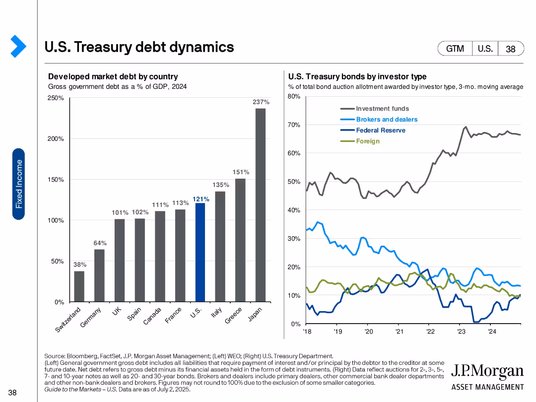
Two-panel visual: bar chart (left) of developed market debt as % of GDP and line chart (right) of bond allocations by investor type.
Market Analysis and Trends
Financial Services
The slide illustrates government debt levels across developed countries and the distribution of U.S. Treasury bond holdings by investor type. It shows the U.S. has high debt levels and investment funds dominate Treasury purchases.
U.S. debt, Treasury holdings, investor types, global debt, GDP ratio, fixed income, bond market, financial markets, government borrowing
false
Market Analysis and Trends
Financial Services
Multiple Chart
JP Morgan
Add to my slides
Remove from favorites
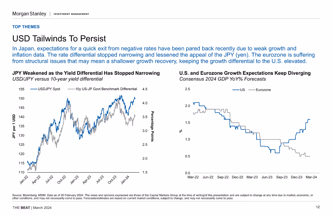
Line chart of USD/JPY spot rate vs. yield differential and a line chart comparing US and Eurozone GDP growth expectations, showing divergence in growth expectations.
Market Analysis and Trends
Financial Services
The slide discusses the persistent tailwinds for USD due to yield differentials and structural issues in the Eurozone, impacting growth recovery and exchange rates.
USD, JPY, Yield Differential, GDP, Growth Expectations, Eurozone, Market Analysis
false
Market Analysis and Trends
Financial Services
Multiple Chart
Morgan Stanley
Add to my slides
Remove from favorites
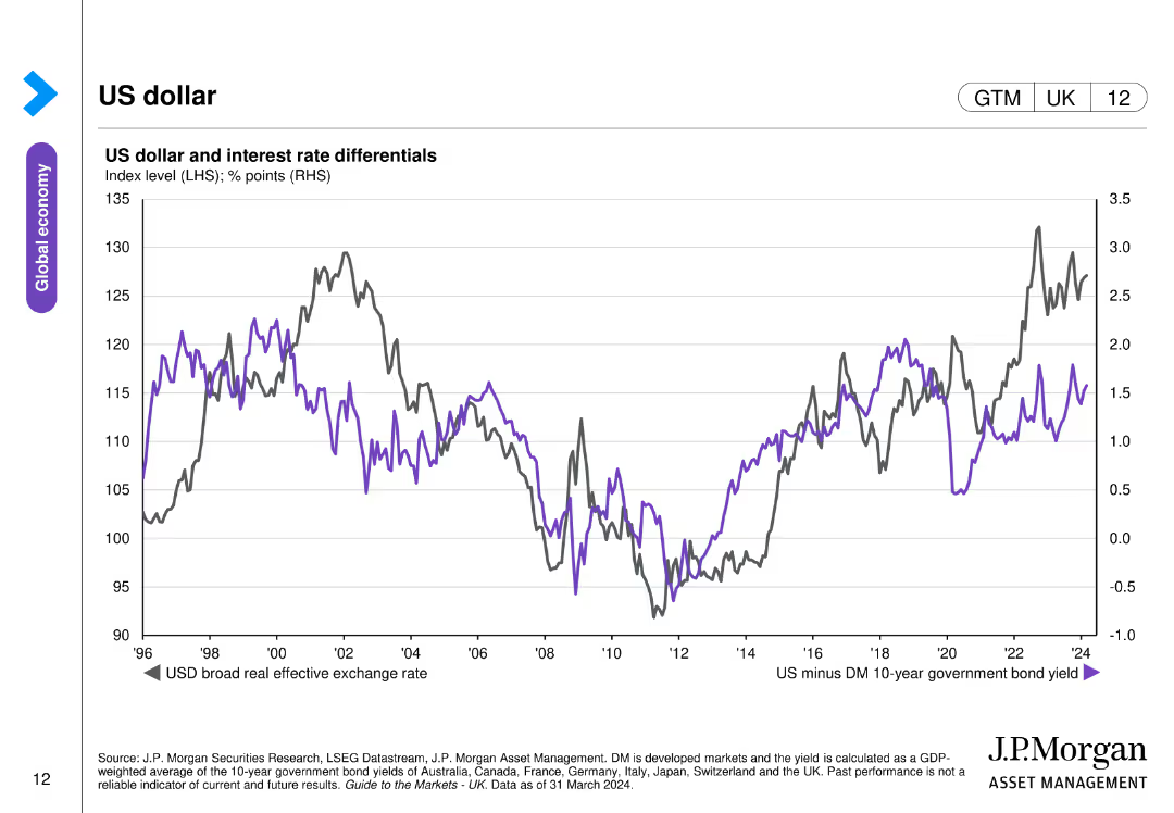
The slide contains a line chart depicting the US dollar's broad real effective exchange rate and interest rate differentials between the US and developed markets.
Investment Analysis
Financial Services
The slide analyzes the performance of the US dollar and its relationship with interest rate differentials, relevant for currency and investment strategies.
US dollar, exchange rate, interest rates, currency performance, investment
false
Investment Analysis
Financial Services
Single Chart
JP Morgan
Add to my slides
Remove from favorites
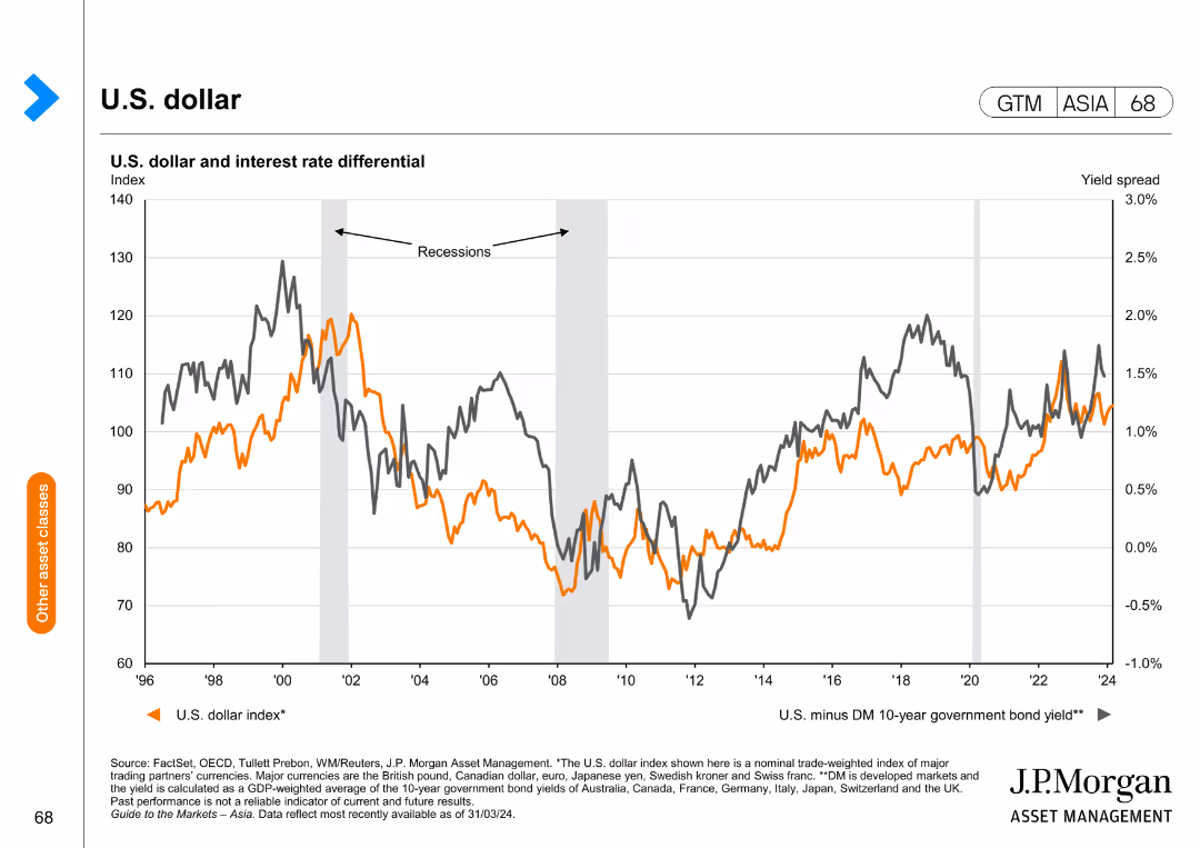
This slide includes a line chart depicting the U.S. dollar index and the interest rate differential over time.
Market Analysis and Trends
Financial Services
The slide analyzes the U.S. dollar index in relation to interest rate differentials, providing insights into currency trends and economic impacts.
U.S. dollar, interest rates, currency trends, economic analysis, financial insights
false
Market Analysis and Trends
Financial Services
Single Chart
JP Morgan
Add to my slides
Remove from favorites
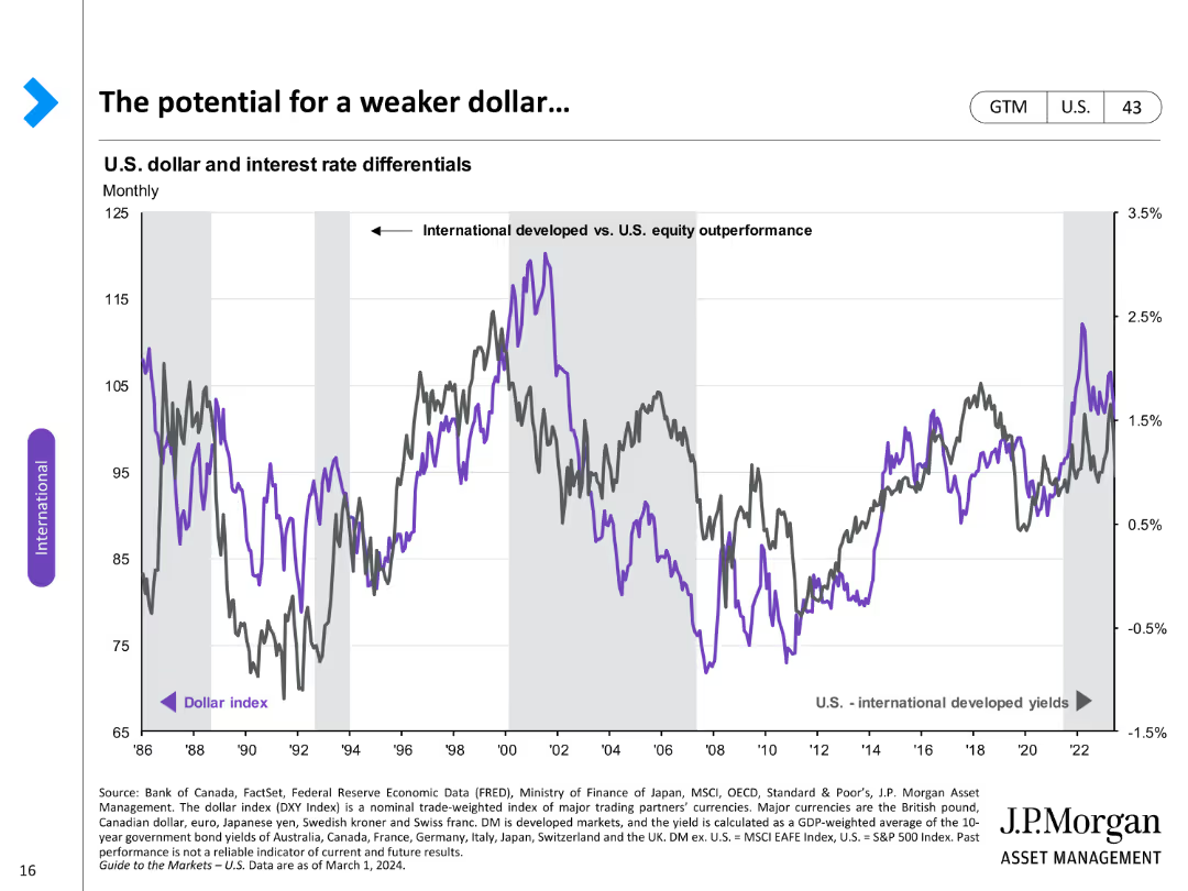
A line chart comparing the U.S. dollar index with international developed yields over time, highlighting differential trends.
Market Analysis and Trends
Financial Services
Discusses potential weakening of the U.S. dollar in relation to international yields, focusing on market trends.
U.S. dollar, international yields, market trends, differential, weakening, analysis, index, potential
false
Market Analysis and Trends
Financial Services
Single Chart
JP Morgan
Add to my slides
Remove from favorites
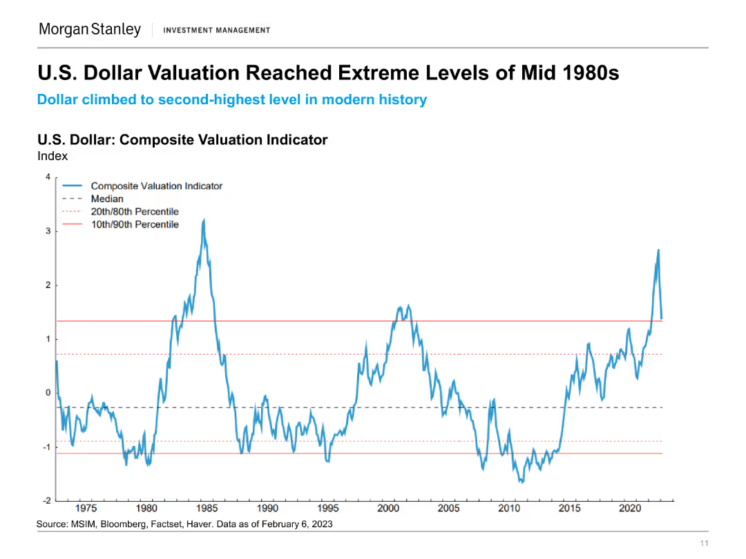
The slide includes a line chart showing the U.S. Dollar Composite Valuation Indicator from 1975 to 2023, with various percentiles marked. The chart highlights the extreme valuation levels.
Financial Performance
Financial Services
This slide illustrates the historical valuation levels of the U.S. dollar, comparing current valuations to historical extremes and noting significant changes.
U.S. Dollar, Valuation Indicator, Historical Analysis, Financial Performance, Currency Valuation, Economic History, Dollar Trends, Market Analysis
false
Financial Performance
Financial Services
Single Chart
Morgan Stanley
Add to my slides
Remove from favorites
Three line charts showing US GDP growth, unemployment rate, and y/y CPI inflation from 2005-2026F, with projections.
Market Analysis and Trends
Financial Services
Predicts cooler US economic dynamics in 2024, including slower GDP growth, a rise in unemployment, and cooling inflation.
US economy, GDP, unemployment, CPI, forecast, line chart, economic dynamics, inflation, private sector, Fed rate cuts
false
Market Analysis and Trends
Financial Services
Multiple Chart
EY
Add to my slides
Remove from favorites
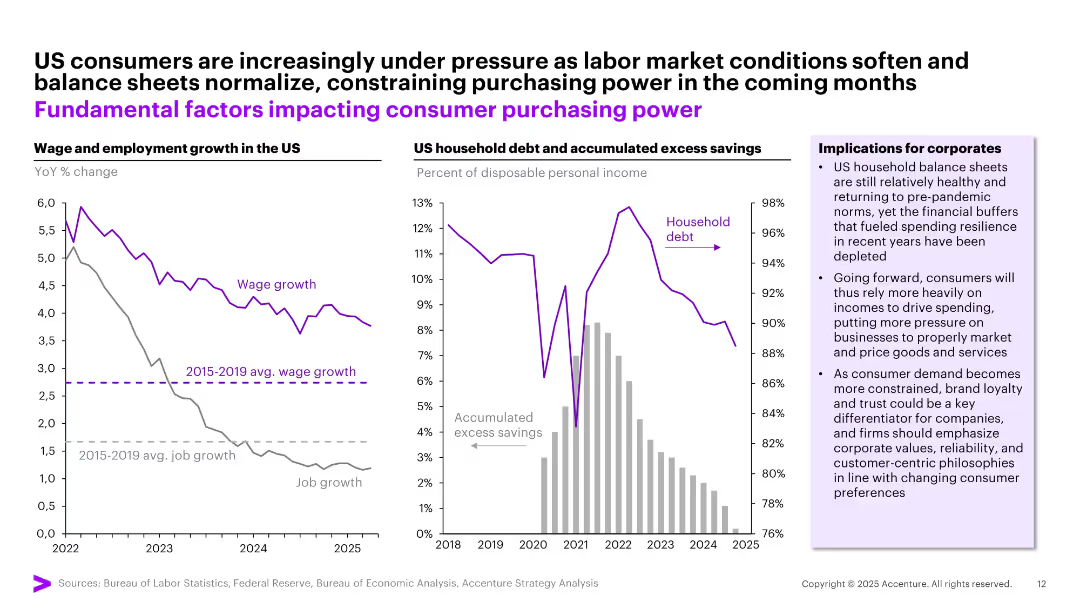
Dual-panel layout: Left—line chart showing declining wage/job growth. Right—bar and line graph showing rising debt and falling savings.
Strategic Planning
Financial Services
Illustrates weakening US consumer financial resilience due to falling wage growth, job slowdown, rising household debt, and declining savings. Suggests implications for corporate strategy in pricing, marketing, and customer retention.
US economy, household debt, wage growth, savings, corporate strategy
false
Strategic Planning
Financial Services
Multiple Chart
Accenture
Add to my slides
Remove from favorites
Previous
Next
You don't have any favorites yet.
Please wait loading your favorites slides...
Create a FREE account to continue browsing
Receive Instant Access to 1,000+ slides from companies like McKinsey, Google, and Goldman Sachs
First Name
Last Name
Email
Password
I agree to all
Terms & Privacy Policy
Thank you! Your submission has been received!
Oops! Something went wrong while submitting the form.
Have an account?
Sign in
Upgrade to PRO to Save slides
Advanced Search and Filters
Access to 15,000+ slides
Access to Category Pages
Save/Bookmark Slides
PowerPoint Template Library
Pick a Plan
MONTHLY
$12/month
Billed every month, Cancel anytime.
YEARLY
$9/year
Billed $108 annually, Cancel anytime.
Checkout for $12/month
Checkout for $108/yr
Secured by Stripe | AES-256 bit encryption