My Account
My Slides
Search by Category
Pricing
Templates
View All Templates
Download Template Slides
✦ AI Search
Feedback
Login
Logout
Get Started
Browse all Slides
Browse all Slides
Create a FREE Account
Instant access to 1,000+ real slides from top companies like McKinsey, BCG, Goldman Sachs, Google and many more!
First Name
Last Name
Email
Password
I agree to all
Terms & Privacy Policy
Thank you! Your submission has been received!
Oops! Something went wrong while submitting the form.
Have an account?
Sign in
Saved Slides
Total No. of slides saved
0
↻ Refresh
✖ Clear all
This slide presents a line chart showing the distribution of labor share by sector in the US from 1840 to 2010, highlighting three sectors: manufacturing, agriculture, and the rest of the economy.
Industry Overview
Industrial & Manufacturing
The slide analyzes labor distribution changes over time in the US economy, focusing on manufacturing, agriculture, and other sectors. Useful for discussing shifts in industrial labor demands.
US economy, labor distribution, manufacturing, agriculture, historical analysis, line chart, economic sectors
false
Industry Overview
Industrial & Manufacturing
Single Chart
McKinsey
Add to my slides
Remove from favorites
This slide features a line chart tracking the optimism about the U.S. economy over time, accompanied by a textual analysis that provides detailed optimism levels by economic sector. The color contrasts and annotations enhance readability.
Market Analysis and Trends
Professional Services
This slide tracks changes in U.S. economic optimism over time, correlating these trends with various industry sectors. It highlights the shifts in sentiment during significant events, such as economic downturns or recoveries, providing a temporal analysis of industry-specific optimism which could guide strategic decisions.
U.S. Economy, Optimism, Economic Sectors, Trends, Strategic Planning
false
Market Analysis and Trends
Professional Services
Mixed Chart
Deloitte
Add to my slides
Remove from favorites
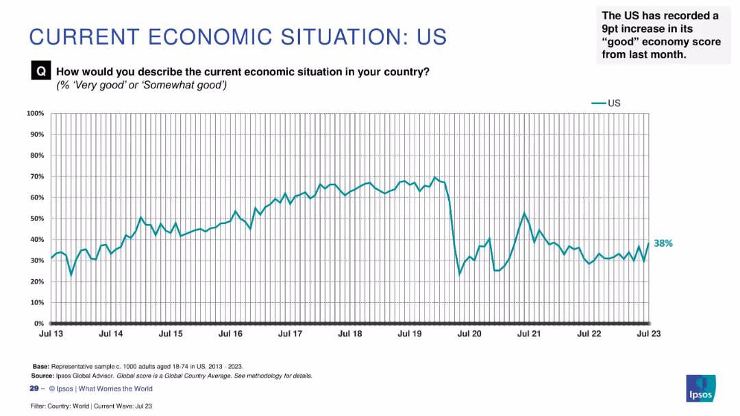
Line chart tracking sentiment from 2013–2023 with a recent increase to 38% highlighted as a 9-point monthly gain.
Market Analysis and Trends
Financial Services
Economic optimism in the US has risen by 9 percentage points to 38%, indicating a notable improvement in public sentiment. The chart shows historical trends and fluctuations in perception.
US economy, public sentiment, recent rise, Ipsos, economic perception, monthly change, economic trends, survey analysis
false
Market Analysis and Trends
Financial Services
Single Chart
IPSOS
Add to my slides
Remove from favorites
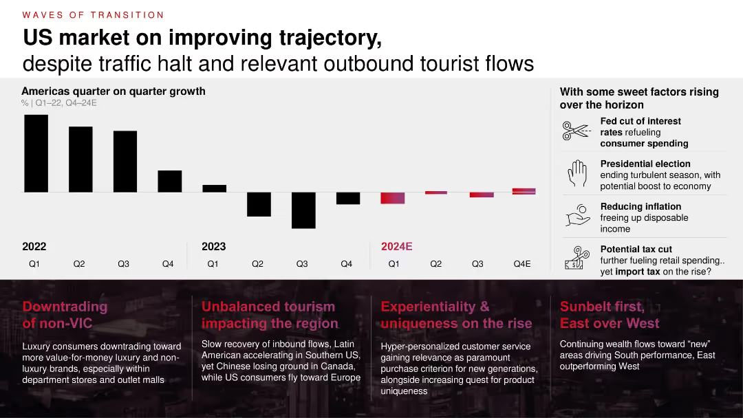
Bar chart showing quarterly growth (2022–2024E) with trend indicators and annotated callouts; text boxes summarizing regional and consumer trends; icons highlight future growth levers.
Market Analysis and Trends
Consumer Goods
This slide outlines US market trends showing an improving trajectory post-2022, despite downturns in tourism and retail traffic. It highlights supportive factors such as potential interest rate cuts, tax changes, and consumer behavior shifts.
US economy, retail trends, tourism, inflation, interest rates, tax cuts, luxury, outlet, consumer behavior
false
Market Analysis and Trends
Consumer Goods
Mixed Chart
Bain
Add to my slides
Remove from favorites
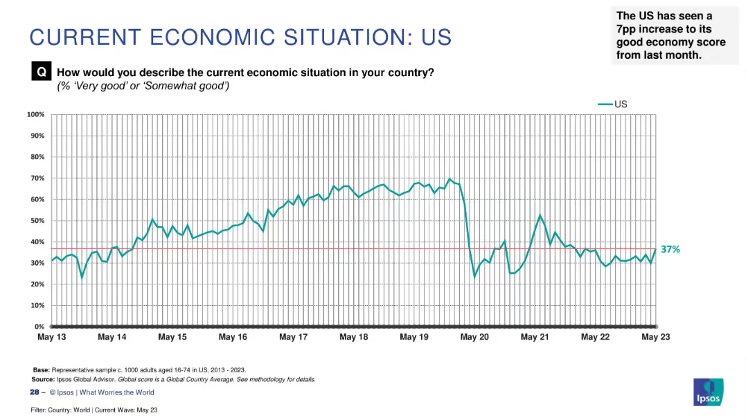
Line graph on white background charting US economic sentiment from May 2013 to May 2023, with annotation.
Market Analysis and Trends
Government & Public Sector
The slide presents long-term survey data on how US citizens perceive their national economy. Sentiment peaked between 2015–2019, declined in 2020, and recovered slightly to 37% by May 2023. It notes a 7 percentage point rise from the prior month.
US economy, trend, perception, Ipsos, 2023, sentiment, increase, historical data, survey
false
Market Analysis and Trends
Government & Public Sector
Single Chart
IPSOS
Add to my slides
Remove from favorites
Features column charts comparing the purchase intent for used cars pre-COVID-19 and during subsequent months.
Market Analysis and Trends
Transportation & Logistics
Examines the resilience of used car markets in the US and Asia compared to weaker performance in Germany and France.
used cars, market analysis, US, Asia, Europe
false
Market Analysis and Trends
Transportation & Logistics
Multiple Chart
McKinsey
Add to my slides
Remove from favorites
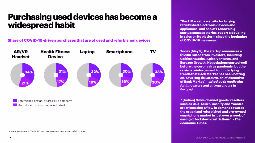
The slide features pie charts showing the share of COVID-19-driven purchases that are used and refurbished devices across various product categories.
Market Analysis and Trends
Retail & E-commerce
The slide examines the trend of purchasing used and refurbished devices due to COVID-19, with statistics on various electronic categories and consumer habits.
used devices, refurbished devices, COVID-19, consumer trends, electronics
false
Market Analysis and Trends
Retail & E-commerce
Multiple Chart
Accenture
Add to my slides
Remove from favorites
The slide features multiple column charts displaying the reasons for buying and not buying a used EV, as well as the factors that would incentivize the purchase of a used EV. It includes regional data (APAC, EMEA, North America).
Market Analysis and Trends
Transportation & Logistics
This slide explores the factors influencing EV owners' decisions to purchase or avoid used EVs, emphasizing the importance of battery state of health (SoH) as a key barrier. It provides regional insights and lists key motivators for purchasing used EVs.
used EVs, battery SoH, purchase decisions, reasons, incentives, regional data
false
Market Analysis and Trends
Transportation & Logistics
Multiple Chart
PwC/Strategy&
Add to my slides
Remove from favorites
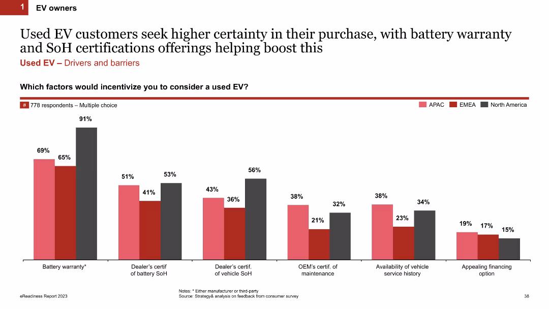
The slide includes a column chart showing factors that would incentivize customers to consider a used EV, with regional breakdowns (APAC, EMEA, North America). Key factors include battery warranty, dealer certifications, and vehicle service history.
Product and Service Analysis
Transportation & Logistics
The slide highlights the key factors that would encourage customers to buy used EVs, such as battery warranty and certifications of battery state of health (SoH). It provides regional insights into customer preferences and concerns.
used EVs, incentives, battery warranty, certifications, SoH, regional data
false
Product and Service Analysis
Transportation & Logistics
Single Chart
PwC/Strategy&
Add to my slides
Remove from favorites
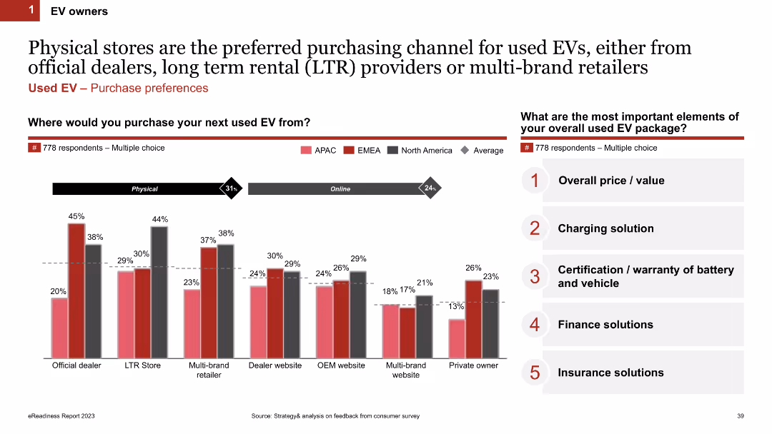
The slide features column charts showing where customers prefer to purchase used EVs (official dealers, LTR stores, multi-brand retailers) and the most important elements of the used EV package (price, charging solution, warranty).
Market Analysis and Trends
Transportation & Logistics
This slide examines the preferred purchasing channels for used EVs and the key elements that customers consider important in a used EV package. It includes regional preferences and highlights factors like price and warranty.
used EVs, purchasing channels, physical stores, preferred elements, price, warranty
false
Market Analysis and Trends
Transportation & Logistics
Mixed Chart
PwC/Strategy&
Add to my slides
Remove from favorites
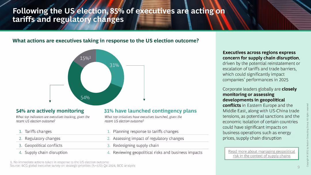
Donut chart shows 54% monitoring and 31% launching contingency plans. Supporting list of tracked and planned actions. Right text panel outlines concerns about supply chain and geopolitical instability.
Risk Assessment and Management
Professional Services
Majority of executives are reacting to the US election by monitoring and planning responses to tariffs, regulations, and geopolitical conflict. Highlights increased concern over supply chain risks and regional instability.
US election, contingency planning, tariffs, regulatory change, supply chain, monitoring, risk management
false
Risk Assessment and Management
Professional Services
Mixed Chart
BCG
Add to my slides
Remove from favorites
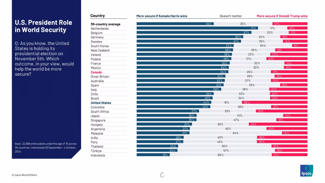
Horizontal bar chart showing comparative views across countries about who would make the world more secure: Kamala Harris or Donald Trump. Left side contains question prompt.
Strategic Planning
Government & Public Sector
This slide compares global sentiment on which U.S. presidential candidate—Kamala Harris or Donald Trump—would make the world more secure. It includes three response categories: Harris, Trump, or “Doesn't matter.”
U.S. election, world security, Kamala Harris, Donald Trump, public sentiment, Ipsos, global opinion, 2024 election, international views, comparative
false
Strategic Planning
Government & Public Sector
Mixed Chart
IPSOS
Add to my slides
Remove from favorites
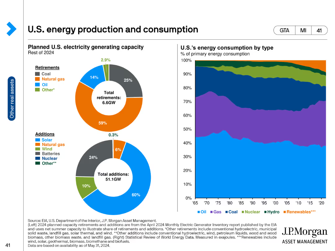
The slide features two circular charts on the left showing the planned U.S. electricity generating capacity for the rest of 2024, divided into retirements and additions. On the right, a stacked area chart depicts the U.S. energy consumption by type from 1965 to 2024. The circular charts use color coding for different energy sources, while the area chart uses layers for each energy type.
Market Analysis and Trends
Energy & Utilities
This slide provides an overview of the U.S. energy landscape, detailing planned electricity generating capacity changes in 2024 and historical energy consumption patterns. It is useful for understanding the evolution of energy sources and predicting future trends in energy consumption.
U.S. energy, electricity capacity, energy consumption, renewable energy, fossil fuels, energy trends, energy planning
false
Market Analysis and Trends
Energy & Utilities
Multiple Chart
JP Morgan
Add to my slides
Remove from favorites
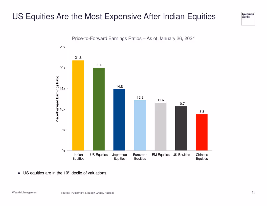
The slide features a column chart comparing the price-to-forward earnings ratios of different equities as of January 26, 2024. US equities are highlighted as the second most expensive.
Market Analysis and Trends
Financial Services
This slide presents a comparison of price-to-forward earnings ratios, indicating that US equities are highly valued, second only to Indian equities.
US equities, Indian equities, price-to-earnings ratio, market analysis, valuation
false
Market Analysis and Trends
Financial Services
Single Chart
Goldman Sachs
Add to my slides
Remove from favorites
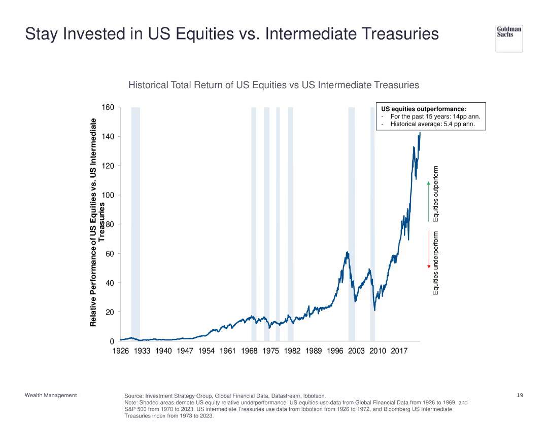
The slide displays a line chart showing the historical total return of US equities versus US intermediate treasuries from 1926 to 2023. Annotations highlight periods of outperformance and underperformance.
Investment Analysis
Financial Services
This slide compares the total return of US equities to US intermediate treasuries, indicating the significant outperformance of equities over the long term.
US equities, intermediate treasuries, historical return, investment, performance comparison
false
Investment Analysis
Financial Services
Single Chart
Goldman Sachs
Add to my slides
Remove from favorites
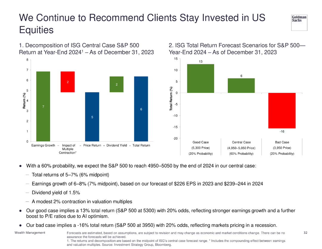
Two column charts: one showing the decomposition of ISG central case S&P 500 return for year-end 2024, another showing total return forecast scenarios.
Investment Analysis
Financial Services
Recommends staying invested in US equities with a 60% probability of reaching 4950-5050 by end of 2024, discussing various return scenarios and factors influencing S&P 500 performance.
US equities, investment, forecast, S&P 500, returns
false
Investment Analysis
Financial Services
Multiple Chart
Goldman Sachs
Add to my slides
Remove from favorites
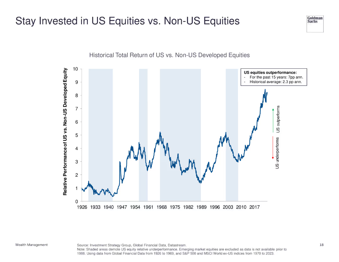
The slide features a line chart comparing the historical total return of US equities vs. non-US developed equities from 1926 to 2023. It shows periods of underperformance and outperformance with annotations for key trends.
Investment Analysis
Financial Services
This slide demonstrates the relative performance of US equities compared to non-US developed equities, emphasizing US equities' historical outperformance.
US equities, non-US equities, historical return, investment, performance comparison
false
Investment Analysis
Financial Services
Single Chart
Goldman Sachs
Add to my slides
Remove from favorites
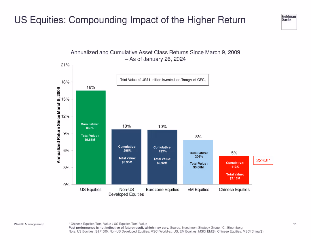
The slide shows a column chart comparing the annualized and cumulative returns of various equity markets since 2009, with US equities highlighted.
Financial Performance
Financial Services
The slide illustrates the superior performance of US equities compared to other markets, showing both annualized and cumulative returns to emphasize the compounding impact of higher returns.
US Equities, Returns, Performance, Market, Comparison
false
Financial Performance
Financial Services
Single Chart
Goldman Sachs
Add to my slides
Remove from favorites
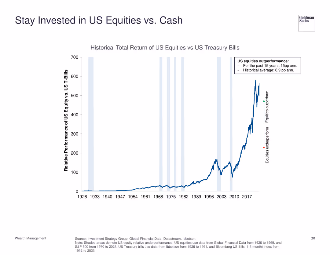
The slide contains a line chart illustrating the historical total return of US equities versus US treasury bills from 1926 to 2023. Key performance highlights are annotated.
Investment Analysis
Financial Services
This slide shows the performance comparison between US equities and US treasury bills, emphasizing the strong outperformance of equities.
US equities, treasury bills, historical return, investment, performance comparison
false
Investment Analysis
Financial Services
Single Chart
Goldman Sachs
Add to my slides
Remove from favorites
Comprises two bar charts assessing the importance of geopolitical and macro factors in the US equity market. Each chart uses green, red, and teal colors to indicate investor sentiments.
Investment Analysis
Financial Services
Evaluates the key factors that investors consider critical for the US equity market, including interest rate policies and geopolitical risks, and how these perceptions influence market optimism.
US equity market, interest rates, geopolitical risks, investor sentiment
false
Investment Analysis
Financial Services
Multiple Chart
BCG
Add to my slides
Remove from favorites
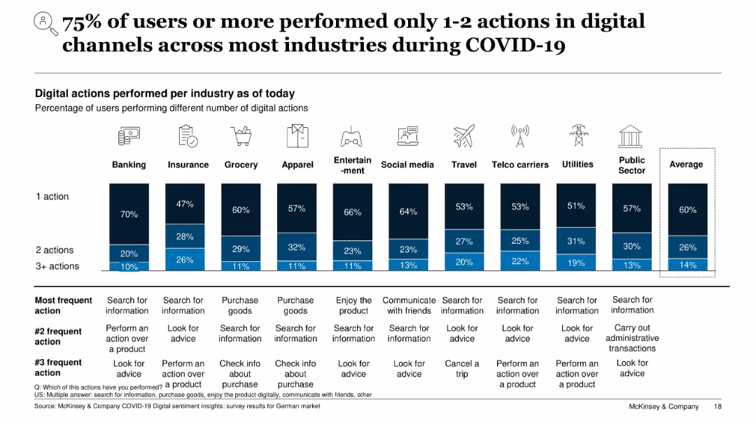
Stacked bar chart by industry showing users by number of digital actions (1, 2, 3+); table below lists top actions
Performance Metrics and KPIs
Technology & Software
This slide analyzes digital user engagement by counting actions performed across industries. Most users engaged in only 1–2 actions, such as searching for information or purchasing. Fewer users performed more complex tasks. The table outlines the most common digital behaviors per sector.
user actions, digital usage, engagement, customer behavior, COVID-19, online activity, performance metrics
false
Performance Metrics and KPIs
Technology & Software
Single Chart
McKinsey
Add to my slides
Remove from favorites
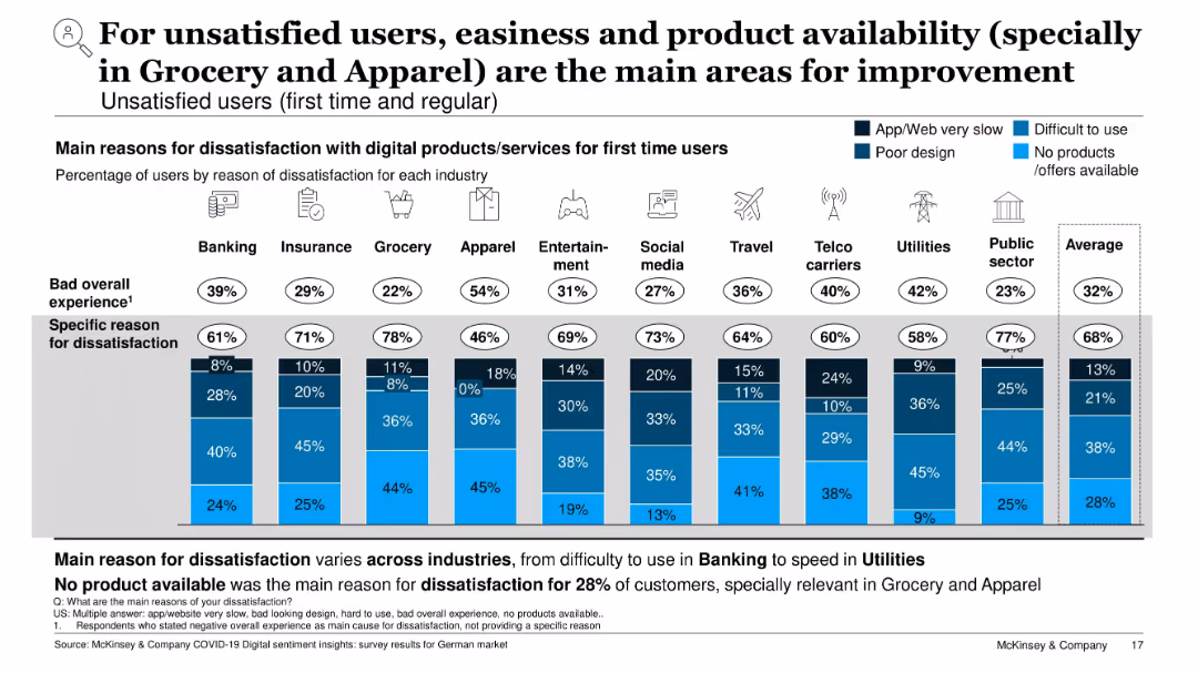
Stacked bar chart by industry; shows specific dissatisfaction reasons (slow, hard to use, poor design, product availability)
Performance Metrics and KPIs
Technology & Software
This slide identifies why users are dissatisfied with digital services. Top issues include difficulty of use and lack of available products or offers, especially in Grocery and Apparel. Each industry’s chart shows what aspects need improvement, providing guidance for digital product optimization.
user dissatisfaction, product availability, UX issues, service improvement, digital challenges, KPIs, grocery, apparel
false
Performance Metrics and KPIs
Technology & Software
Single Chart
McKinsey
Add to my slides
Remove from favorites
Contains a bar chart displaying the percentage of monthly active users in various demographic segments for food delivery and transport. Uses a color-coded key for segment types, contrasting dark and light shades.
Customer and Market Segmentation
Technology & Software
Analyzes user segmentation in the food delivery and transport services by demographic, revealing usage patterns and preferences across affluent, young, mainstream, and budget users.
user segmentation, demographics, food delivery, transport services, digital natives, monthly active users
false
Customer and Market Segmentation
Technology & Software
Multiple Chart
Bain
Add to my slides
Remove from favorites
A large pie chart on the left and a bar graph on the right against a purple background with descriptive text boxes.
Strategic Planning
Telecommunications
Examines how the nbn™ network aligns with user values, indicating a significant agreement on its positive impact on their lives.
user values, nbn network, life impact, agreement percentage, life goals, value alignment, network benefits, survey data
false
Strategic Planning
Telecommunications
Multiple Chart
Accenture
Add to my slides
Remove from favorites
The slide features three line charts representing the US, Euro area, and UK with input and output PPI trends from 2017 to 2024.
Financial Performance
Financial Services
The slide explains how companies in the US, Euro area, and UK are passing input costs to consumers, highlighting margin erosion trends.
US, Euro area, UK, input PPI, output PPI, margin erosion, financial performance, cost pass-through
false
Financial Performance
Financial Services
Multiple Chart
Accenture
Add to my slides
Remove from favorites
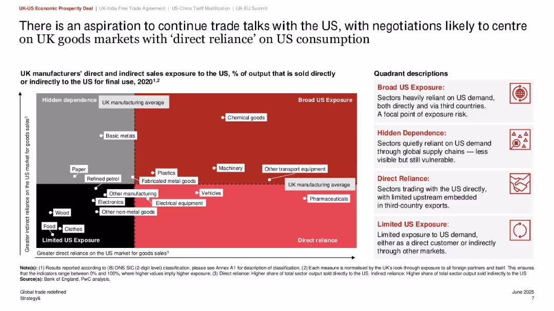
Scatter plot quadrant graph showing direct vs. indirect exposure to US market; color-coded quadrants with callouts; right-side text explaining quadrant meanings
Risk Assessment and Management
Government & Public Sector
This slide categorizes UK manufacturing sectors based on their exposure to the US market, using a matrix of direct and indirect reliance. Sectors such as chemical goods and transport equipment fall in the “Broad US Exposure” quadrant. It aids in identifying vulnerable sectors for targeted negotiations in future trade talks.
US exposure, UK manufacturing, export risk, sector analysis, trade dependency, quadrant matrix, policy planning
false
Risk Assessment and Management
Government & Public Sector
Mixed Chart
PwC/Strategy&
Add to my slides
Remove from favorites
The slide features two column charts. The left chart shows the composition of the US federal deficit over time. The right chart displays the US federal debt as a percentage of GDP. The charts are moderately dense with detailed annotations and forecast lines.
Market Analysis and Trends
Financial Services
This slide provides an overview of the US federal deficit and debt trends, highlighting forecasted changes. It is useful for analyzing fiscal policy and economic health.
US federal deficit, federal debt, GDP, fiscal policy, economic trends
false
Market Analysis and Trends
Financial Services
Multiple Chart
JP Morgan
Add to my slides
Remove from favorites
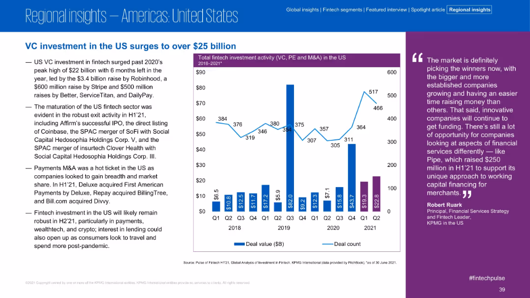
Text-heavy left section lists major deals and exits; right side features a bar-line combo chart for quarterly US investment activity 2018–2021
Market Analysis and Trends
Financial Services
The US fintech sector surpassed $25B in VC investment in H1 2021, led by major raises (Robinhood, Stripe, Better) and significant exit activity (Coinbase, SoFi). The chart reveals strong Q1 and Q2 2021 deal values, signaling continued momentum and investor confidence.
US fintech, Robinhood, VC investment, IPO, SPACs, Stripe, market activity, Q1 Q2 2021
false
Market Analysis and Trends
Financial Services
Mixed Chart
KPMG
Add to my slides
Remove from favorites
Slide includes icons and bullet points depicting funding sources and infrastructure projects under the Indonesian Universal Service Obligation (USO). Annotations explain funding mechanisms and geographic focus areas, with a sidebar detailing specific government-led projects.
Regulatory and Compliance
Telecommunications
Explains the role of the Indonesian USF in funding telecommunications infrastructure in remote and underdeveloped areas. Describes ongoing projects and financial strategies, emphasizing the government's commitment to enhancing nationwide connectivity.
USF, network coverage, remote areas, funding, infrastructure, government projects
false
Regulatory and Compliance
Telecommunications
Linear Flow
BCG
Add to my slides
Remove from favorites
The slide features a column chart showing contributions to US real GDP growth by various components and a line chart of US Purchasing Managers’ Indices (PMI) for manufacturing and services sectors.
Market Analysis and Trends
Financial Services
This slide analyzes US GDP growth contributions and PMI trends, providing a comprehensive view of the country's economic performance and business activity.
US GDP, business surveys, economic performance, PMI, growth components
false
Market Analysis and Trends
Financial Services
Multiple Chart
JP Morgan
Add to my slides
Remove from favorites
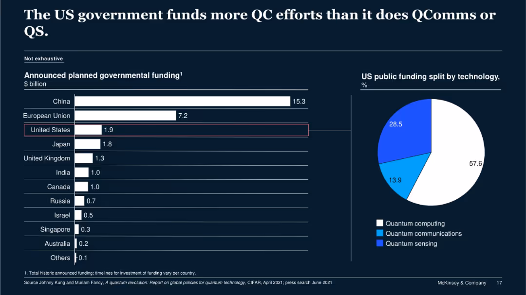
Bar chart comparing national QC funding; pie chart showing US funding split by technology type (QC, QComms, QS).
Regulatory and Compliance
Government & Public Sector
The slide outlines the US government’s $1.9B funding plan for QC, with most of the allocation (57.6%) going to quantum computing, followed by quantum sensing and communications. It contrasts this with other nations' investments for contextual benchmarking.
US government, quantum computing, QComms, funding, public investment
false
Regulatory and Compliance
Government & Public Sector
Multiple Chart
McKinsey
Add to my slides
Remove from favorites
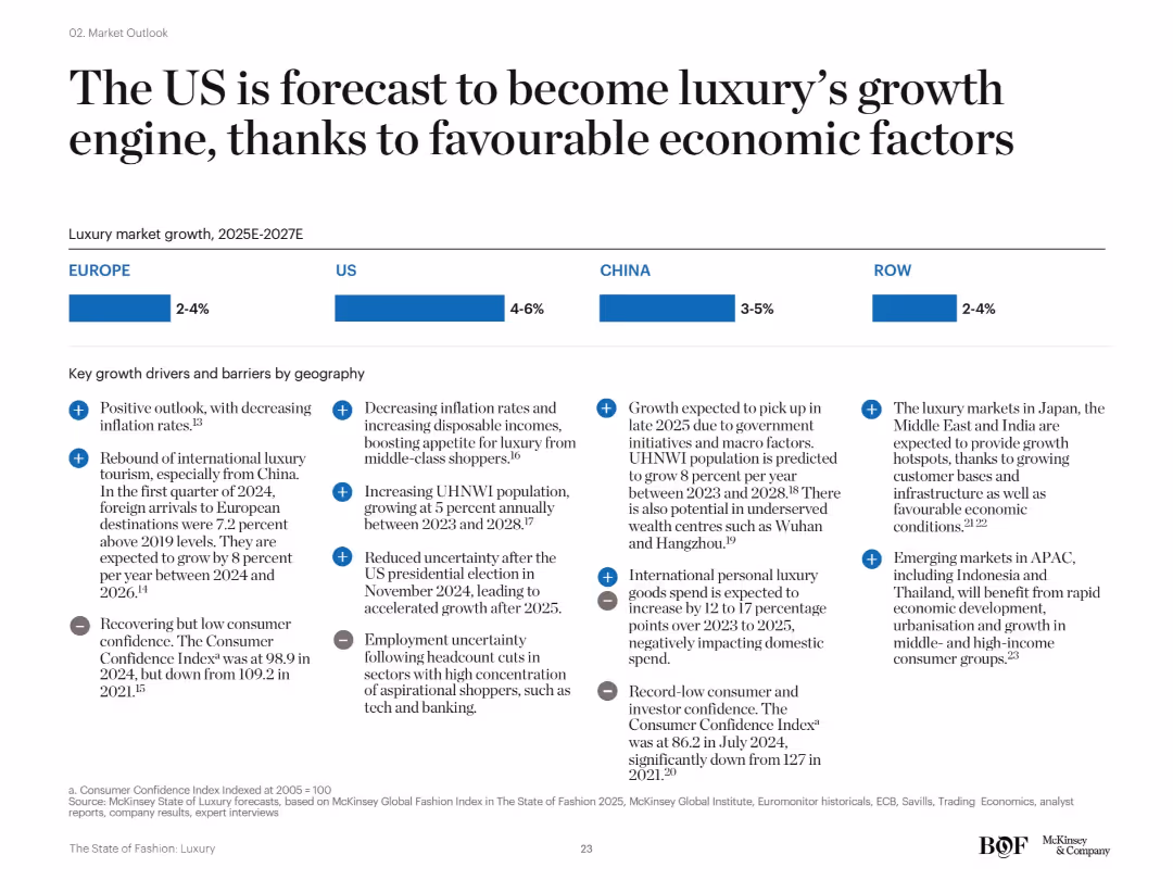
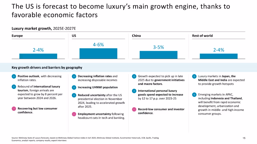
Simple layout with region-wise bar segments (Europe, US, China, RoW) and bullet points listing economic and demographic growth factors and risks by region.
Strategic Planning
Consumer Goods
This slide positions the US as the key growth driver for the luxury sector between 2025–2027, aided by macroeconomic stability, lower inflation, and growing UHNW populations. Other regions are expected to show mixed or limited recovery due to consumer confidence and geopolitical risks.
US growth, macro factors, consumer confidence, luxury drivers, forecast, global regions
false
Strategic Planning
Consumer Goods
Mixed Chart
McKinsey
Add to my slides
Remove from favorites
Featuring a detailed line chart with multiple data series, the slide visually represents the perceived maturity of I&D efforts across different stages, highlighted by color coding and distinct markers.
Strategic Planning
Professional Services
Discusses the perception of I&D initiative maturity by US respondents, noting a gap in achieving targets.
US, I&D, line chart, progress evaluation, maturity stages, diversity targets, gap analysis
false
Strategic Planning
Professional Services
Single Chart
Accenture
Add to my slides
Remove from favorites
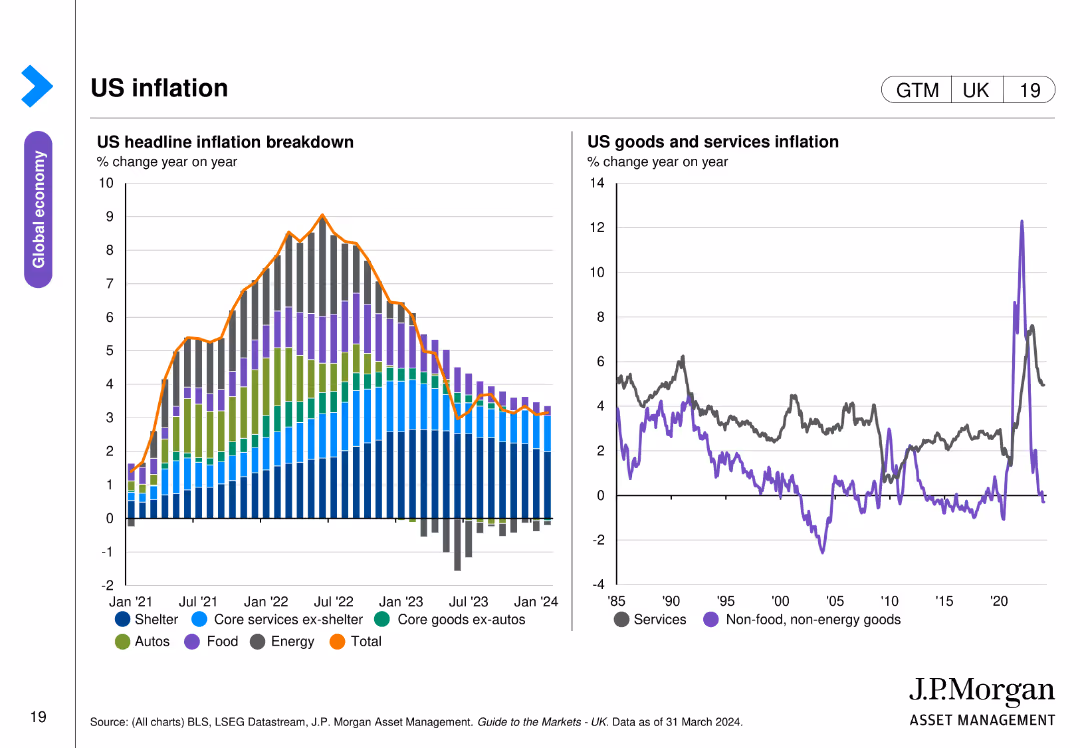
The slide features two line charts: one detailing the breakdown of US headline inflation from January 2021 to March 2024, and the other showing US goods and services inflation year on year since 1985.
Market Analysis and Trends
Financial Services
This slide provides an in-depth look at US inflation, breaking down headline inflation by components and comparing goods and services inflation trends over nearly four decades, highlighting key inflation drivers and trends.
US inflation, headline inflation, goods, services, trends
false
Market Analysis and Trends
Financial Services
Multiple Chart
JP Morgan
Add to my slides
Remove from favorites
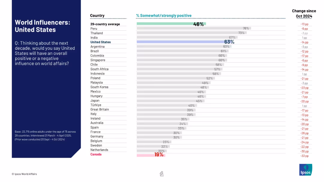
Horizontal bar chart showing positive influence perception of the U.S. by country. Right side shows change vs Oct 2024.
Market Analysis and Trends
Government & Public Sector
This slide highlights global perceptions of the United States’ influence on world affairs over the next decade. It ranks countries by the % of respondents viewing the U.S. influence as positive, and notes changes since October 2024.
U.S. influence, international relations, Ipsos, global perception, country comparison, bar chart, survey data, world affairs, trends
false
Market Analysis and Trends
Government & Public Sector
Mixed Chart
IPSOS
Add to my slides
Remove from favorites
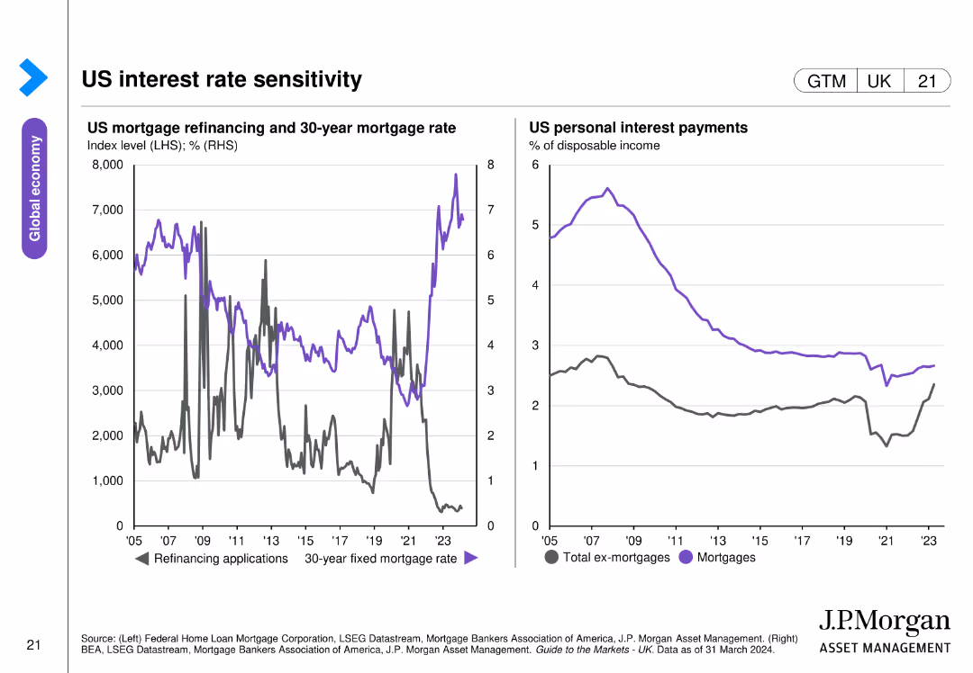
The slide includes two line charts: one showing US mortgage refinancing applications and 30-year mortgage rates from 2005 to 2023, and the other depicting US personal interest payments as a percentage of disposable income.
Market Analysis and Trends
Financial Services
This slide explores the sensitivity of US interest rates, presenting data on mortgage refinancing applications, 30-year mortgage rates, and personal interest payments relative to disposable income, highlighting interest rate impacts on consumers.
US interest rates, mortgage, refinancing, personal interest payments
false
Market Analysis and Trends
Financial Services
Multiple Chart
JP Morgan
Add to my slides
Remove from favorites
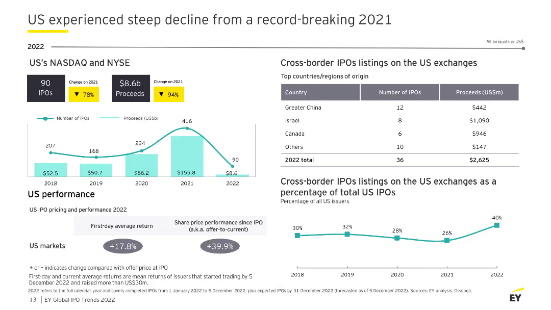
This slide presents data on the US IPO market's steep decline in 2022 with column charts and percentage changes. It includes cross-border IPO data and performance metrics.
Market Analysis and Trends
Financial Services
The slide highlights a significant decline in US IPOs from a record-breaking 2021, with detailed data on IPO performance, cross-border listings, and share price performance since IPO.
US IPO, decline, cross-border, performance, 2022
false
Market Analysis and Trends
Financial Services
Multiple Chart
EY
Add to my slides
Remove from favorites
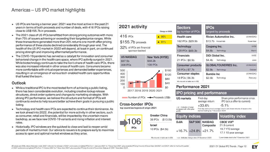
Features multiple column charts, bullet points, and highlighted statistics. Color-coded elements distinguish between different datasets.
Market Analysis and Trends
Financial Services
Provides detailed information on the US IPO market in 2021, including sector performance, market outlook, and cross-border IPO activity.
US IPO, financial services, 2021 activity, market analysis, trends, sectors, performance, cross-border IPOs, outlook, health care
false
Market Analysis and Trends
Financial Services
Mixed Chart
EY
Add to my slides
Remove from favorites
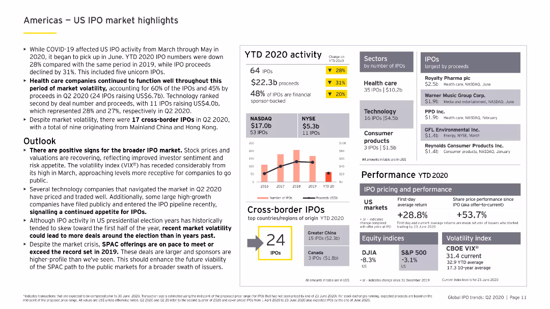
Includes column charts and bar charts showing YTD 2020 IPO activity in the US, sector analysis, and cross-border IPO data, with a focus on health care and technology.
Market Analysis and Trends
Financial Services
Reviews the US IPO market's performance in 2020, focusing on trends and insights from the health care and technology sectors, along with cross-border IPO activities.
US IPO, health care, technology, cross-border, YTD 2020
false
Market Analysis and Trends
Financial Services
Mixed Chart
EY
Add to my slides
Remove from favorites
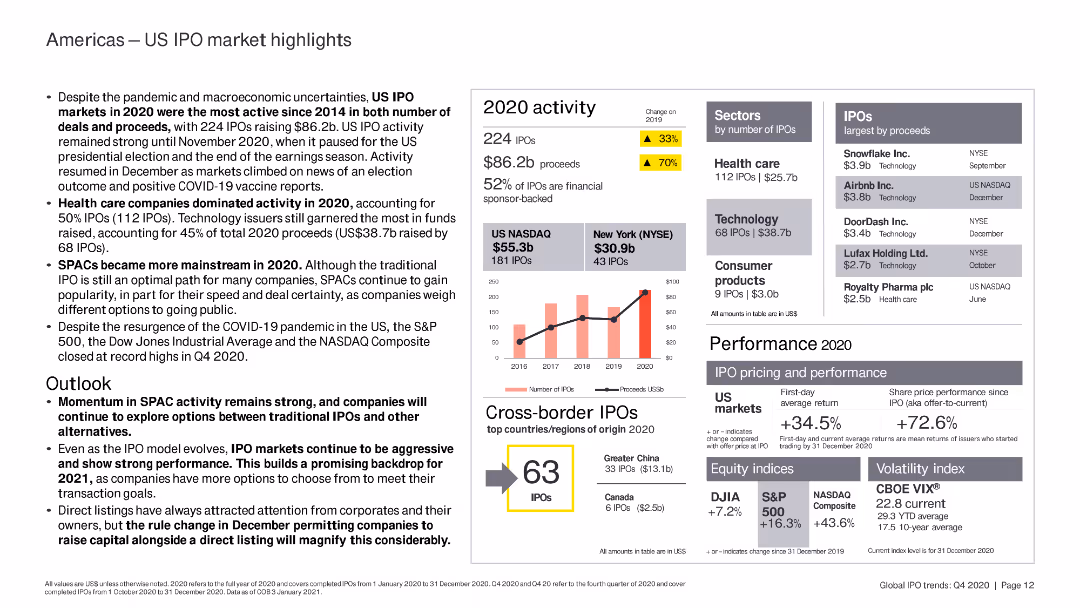
The slide includes column charts and bar charts highlighting US IPO market performance, key sectors, and top IPOs by proceeds in 2020.
Market Analysis and Trends
Financial Services
The slide analyzes the US IPO market in 2020, highlighting the dominance of healthcare and technology sectors, the rise of SPACs, and overall market performance despite the pandemic.
US IPO, healthcare, technology, SPAC, market
false
Market Analysis and Trends
Financial Services
Mixed Chart
EY
Add to my slides
Remove from favorites
The slide includes a column chart tracking the number of IPOs and proceeds from 2019 to 2023 and a table summarizing cross-border IPO listings on US exchanges.
Market Analysis and Trends
Financial Services
This slide discusses the growth in the US IPO market, highlighting increased listings, proceeds, and improved after-market performance. It also covers cross-border deals and their contribution to the market.
US IPO market, cross-border deals, market growth, financial performance, IPO trends
false
Market Analysis and Trends
Financial Services
Multiple Chart
EY
Add to my slides
Remove from favorites
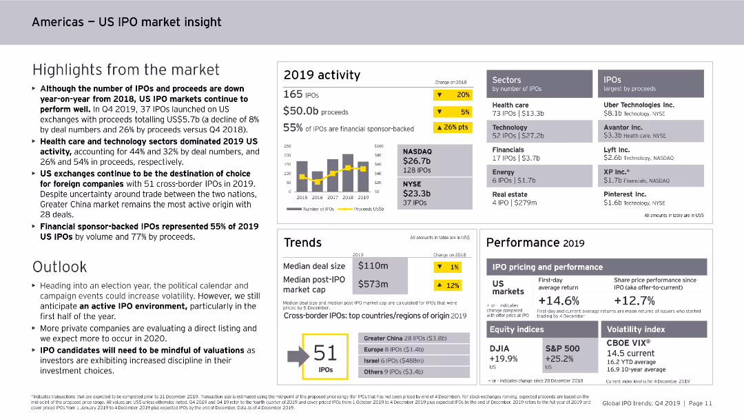
Includes column charts, data tables, and bullet points. The slide is moderately dense with detailed information on the US IPO market's performance and trends.
Market Analysis and Trends
Financial Services
Provides an overview of the US IPO market in 2019, highlighting key sectors, financial performance, trends in cross-border IPOs, and projections for the future market outlook.
US, IPO, market insight, 2019, trends
false
Market Analysis and Trends
Financial Services
Mixed Chart
EY
Add to my slides
Remove from favorites
A column chart is used to show the steep decline in IPOs and proceeds from 2021 to 2022, accompanied by tables of US cross-border IPOs.
Financial Performance
Financial Services
The slide details the performance of US IPOs, including pricing, performance, and the number of IPOs by country of origin.
US IPOs, performance, cross-border, proceeds, pricing
false
Financial Performance
Financial Services
Mixed Chart
EY
Add to my slides
Remove from favorites
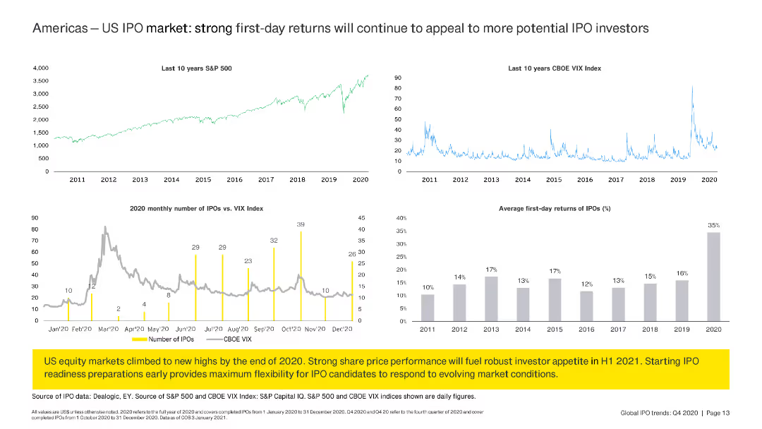
The slide features line charts and column charts summarizing US IPO market trends, S&P 500 performance, and first-day returns for IPOs.
Market Analysis and Trends
Financial Services
The slide reviews US IPO market trends, comparing S&P 500 and VIX Index performance with monthly IPO numbers and average first-day returns, suggesting strong future prospects.
US IPO, trends, S&P 500, VIX, returns
false
Market Analysis and Trends
Financial Services
Multiple Chart
EY
Add to my slides
Remove from favorites
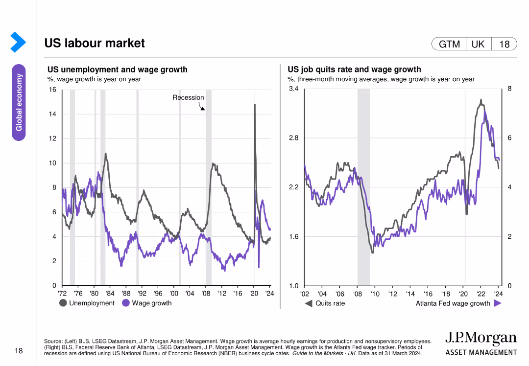
The slide contains two line charts: one showing US unemployment and wage growth from 1972 to 2024, and the other depicting the US job quits rate and wage growth over time.
Market Analysis and Trends
Financial Services
This slide analyzes the US labor market, showing trends in unemployment, wage growth, and job quit rates, providing a comprehensive view of labor dynamics and wage trends over several decades.
US labor market, unemployment, wage growth, trends
false
Market Analysis and Trends
Financial Services
Multiple Chart
JP Morgan
Add to my slides
Remove from favorites
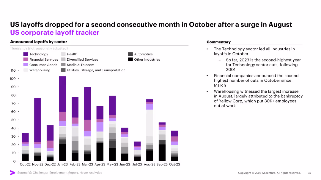
The slide features a column chart tracking announced layoffs by sector (Technology, Health, Financial Services, etc.) in the US from October 2022 to October 2023. Commentary on the right.
Market Analysis and Trends
Financial Services
The slide shows a drop in US layoffs for the second consecutive month in October, with technology leading the layoffs in October.
US, layoffs, corporate, tracker, technology, financial services, health, automotive, column chart
false
Market Analysis and Trends
Financial Services
Mixed Chart
Accenture
Add to my slides
Remove from favorites
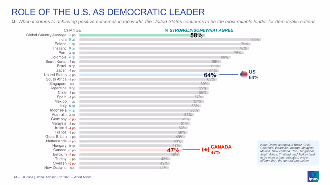
Chart measuring global trust in the US as a democratic leader; US and Canada marked; title and bars are bold and clear.
Strategic Planning
Government & Public Sector
Survey on whether the US is still seen as a reliable democratic leader. 58% globally agree, with 64% in the US and only 47% in Canada. Indicates skepticism about US leadership among some allies and globally.
US leadership, democracy, global opinion, trust, Canada, Ipsos
false
Strategic Planning
Government & Public Sector
Single Chart
IPSOS
Add to my slides
Remove from favorites
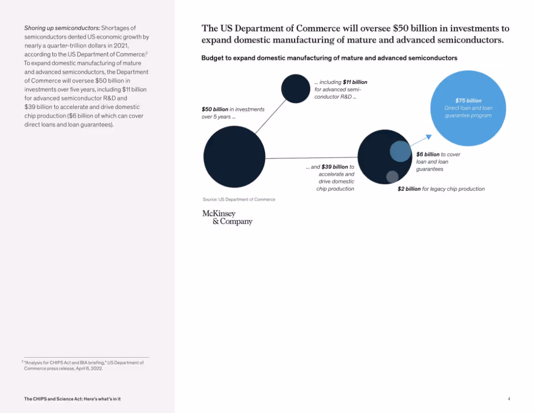
Circular infographic showing funding breakdowns for R&D, production, and loan guarantees; paired with summary text
Strategic Planning
Government & Public Sector
This slide details a $50 billion investment plan managed by the U.S. Department of Commerce to enhance domestic semiconductor manufacturing. The visual shows allocation to advanced R&D, domestic chip production, and legacy chip production, emphasizing long-term strategic growth.
U.S. manufacturing, CHIPS funding, semiconductor strategy, federal investment, R&D funding, economic development
false
Strategic Planning
Government & Public Sector
Mixed Chart
McKinsey
Add to my slides
Remove from favorites
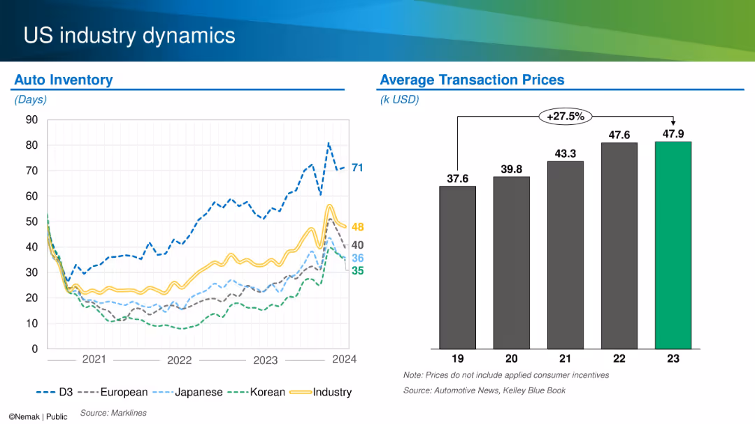
Dual chart layout showing auto inventory levels by origin and average transaction prices from 2019–2023.
Operational Efficiency
Industrial & Manufacturing
This slide compares US auto inventory levels across manufacturers (domestic, Japanese, Korean, European) and tracks average transaction prices over time. It notes a 27.5% increase in prices since 2019 and shows varying inventory recovery patterns by region and brand.
US market, auto inventory, pricing, transaction cost, OEM trends
false
Operational Efficiency
Industrial & Manufacturing
Multiple Chart
Barclays
Add to my slides
Remove from favorites
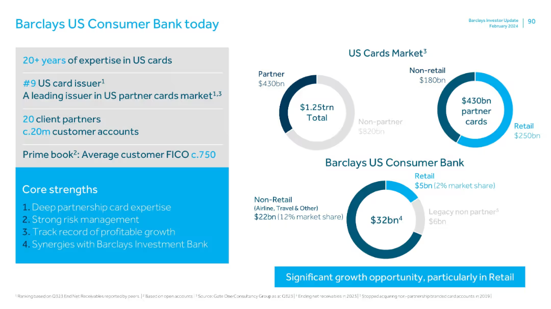
Left side shows history and customer data; right uses donut charts for market share in US cards; branding at bottom.
Industry Overview
Financial Services
Details Barclays' position in the US cards market with 20+ years of expertise, 20 million accounts, and $32bn in assets. Highlights leadership in partner cards and outlines significant growth potential, especially in retail.
US market, cards, FICO, retail, consumer, Barclays, growth opportunity
false
Industry Overview
Financial Services
Mixed Chart
Barclays
Add to my slides
Remove from favorites
Column bar chart with regional growth forecasts and supporting bullet points
Strategic Planning
Consumer Goods
The slide forecasts the US as the primary growth driver for luxury between 2025–2027, citing lower inflation, political stability, and increased wealth, while noting regional barriers.
US market, economic drivers, forecast, inflation, UHNWIs, macro factors, regional barriers
false
Strategic Planning
Consumer Goods
Mixed Chart
McKinsey
Add to my slides
Remove from favorites
Column charts for industry performance and backlogs of work, with a line graph for selected industries' PMI output/activity
Market Analysis and Trends
Financial Services
The slide details the performance of various industries in the US, focusing on output, backlogs of work, and industry performance.
US outlook, industry performance, PMI, backlogs, trends
false
Market Analysis and Trends
Financial Services
Multiple Chart
Accenture
Add to my slides
Remove from favorites
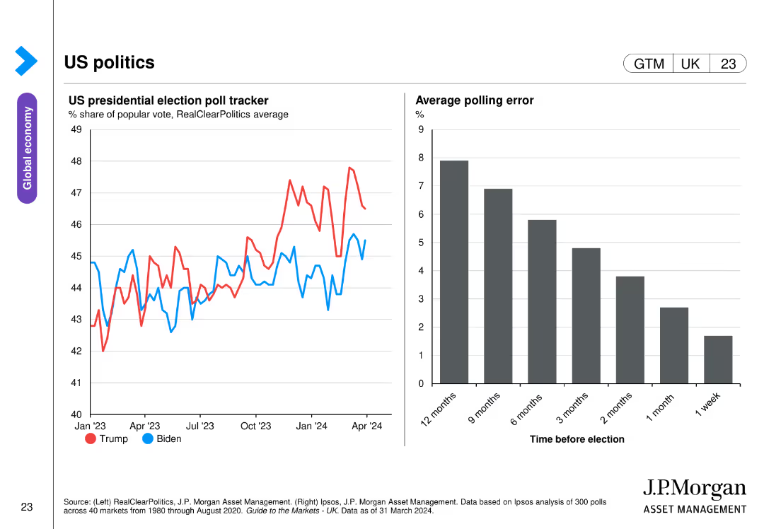
The slide includes two charts: one line chart tracking the US presidential election poll tracker from January 2023 to April 2024, and a bar chart showing the average polling error over different timeframes before the election.
Market Analysis and Trends
Government & Public Sector
This slide analyzes US presidential election polling data, showing trends in voter support for Trump and Biden from January 2023 to April 2024, along with a bar chart illustrating the average polling error at various points before the election.
US politics, presidential election, polling, trends, errors
false
Market Analysis and Trends
Government & Public Sector
Multiple Chart
JP Morgan
Add to my slides
Remove from favorites
Line chart showing 10-year Treasury yield and fed funds rate. Another chart shows the breakdown of nominal yield into breakeven and real yield.
Market Analysis and Trends
Financial Services
Analyzes U.S. real yields by breaking down Treasury yields and comparing them with the fed funds rate, providing insights into real vs. nominal returns.
U.S., real yields, Treasury, nominal, breakeven
false
Market Analysis and Trends
Financial Services
Multiple Chart
JP Morgan
Add to my slides
Remove from favorites
A bar graph displays the percentage of investors' expectations regarding the timing of an economic recession in the US. Colored bars represent different time periods, and percentages are listed atop each bar.
Market Analysis and Trends
Financial Services
The slide presents survey results of investors' beliefs about the timing of the next US recession, with the majority expecting it within the year.
US recession, investor expectations, economic analysis, survey results, 2023 outlook
false
Market Analysis and Trends
Financial Services
Single Chart
BCG
Add to my slides
Remove from favorites
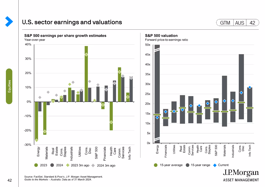
The slide presents two charts: a column chart on S&P 500 earnings per share growth estimates, and a line chart on S&P 500 valuation forward price-to-earnings ratio.
Financial Performance
Financial Services
Reviews sector earnings and valuations in the U.S. market, focusing on S&P 500 growth estimates and P/E ratios, useful for financial performance analysis.
U.S., sector earnings, valuations, S&P 500, growth estimates
false
Financial Performance
Financial Services
Multiple Chart
JP Morgan
Add to my slides
Remove from favorites
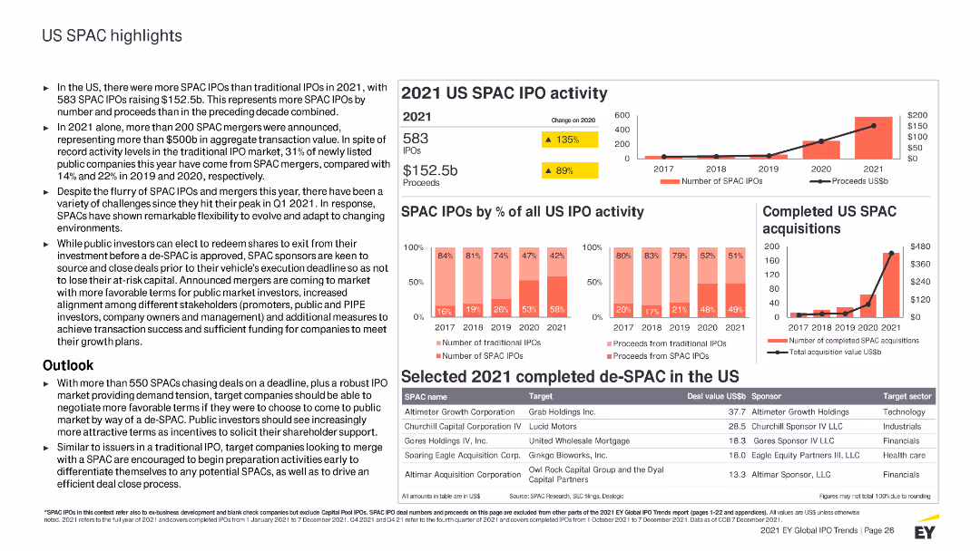
Contains column charts, tables, and detailed text sections with highlighted statistics. Uses red and yellow colors to differentiate SPAC IPO activities and data.
Market Analysis and Trends
Financial Services
Highlights US SPAC IPO activities for 2021, including key statistics, trends, sector performances, and an outlook on the SPAC market and its future.
US, SPAC, IPO, 2021 activity, market highlights, trends, sectors, performance, acquisitions, outlook
false
Market Analysis and Trends
Financial Services
Multiple Chart
EY
Add to my slides
Remove from favorites
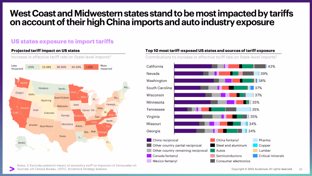
Choropleth map showing state-level tariff exposure, paired with a bar chart listing top 10 exposed states and their sources of exposure.
Strategic Planning
Government & Public Sector
This slide details how different US states are exposed to import tariffs, with West Coast and Midwestern states being the most vulnerable. It attributes this to high China import volumes and auto industry dependence, visualized through a heat map and stacked bar chart.
US states, import tariffs, exposure, auto industry, China trade, regional impact
false
Strategic Planning
Government & Public Sector
Multiple Chart
Accenture
Add to my slides
Remove from favorites
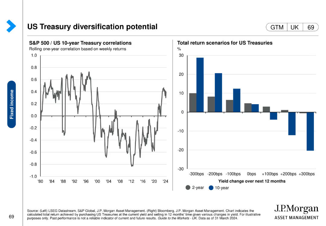
Contains a line chart on the left showing S&P 500/US 10-year Treasury correlations over time and a column chart on the right displaying total return scenarios for US Treasuries.
Investment Analysis
Financial Services
This slide analyzes the correlation between S&P 500 and US 10-year Treasury bonds, highlighting the potential diversification benefits. It includes return scenarios for different yield changes.
US Treasuries, diversification, correlations, return scenarios, S&P 500
false
Investment Analysis
Financial Services
Multiple Chart
JP Morgan
Add to my slides
Remove from favorites
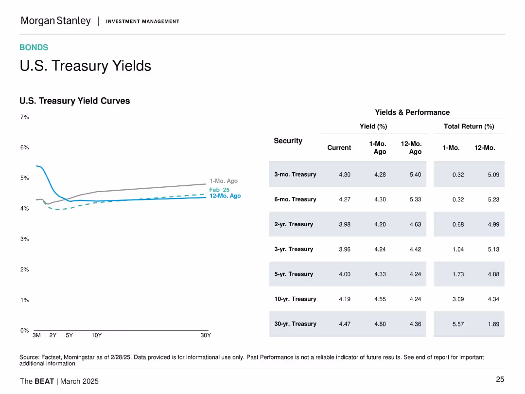
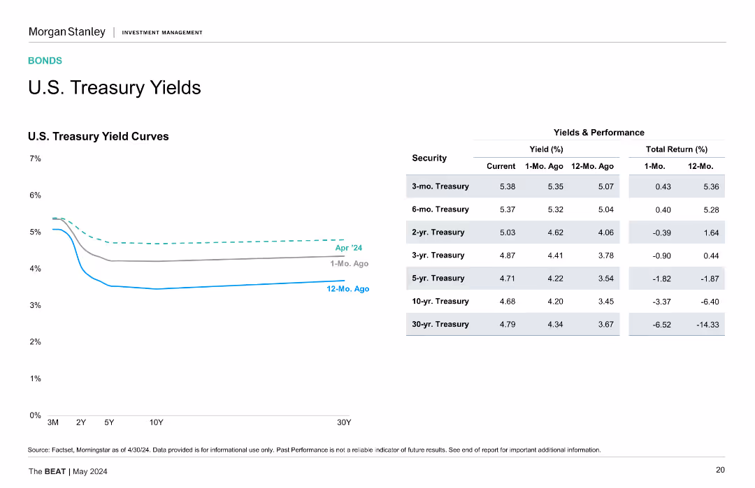
Left: U.S. Treasury yield curve over 3 time points. Right: Yield and return table for various tenors. Minimalist design with small color coding.
Financial Performance
Financial Services
This slide provides a snapshot of the U.S. Treasury yield curve and recent performance by tenor. It highlights recent downward shifts in yields and strong 12-month total returns, particularly for longer-dated securities, reflecting changing market sentiment.
U.S. Treasuries, yield curve, total return, short-term vs long-term, interest rate trend, bond performance, investment returns
false
Financial Performance
Financial Services
Mixed Chart
Morgan Stanley
Add to my slides
Remove from favorites
Left line chart showing yield curves; right table detailing yields and total returns for various maturities.
Financial Performance
Financial Services
Shows the current, 1-month, and 12-month U.S. Treasury yield curves and provides detailed yield and return data for bonds ranging from 3-month to 30-year.
U.S. Treasury, yield curve, fixed income, returns, bond maturities, 2025, performance, rates
false
Financial Performance
Financial Services
Mixed Chart
Morgan Stanley
Add to my slides
Remove from favorites
The slide shows a line chart of U.S. Treasury yield curves over different maturities and a table of current, 1-month ago, and 12-month ago yields.
Market Analysis and Trends
Financial Services
Displays the U.S. Treasury yield curves and performance of various treasury securities with their current and historical yields.
U.S. Treasury, Yield Curves, Bond Performance, Interest Rates, Financial Analysis
false
Market Analysis and Trends
Financial Services
Mixed Chart
Morgan Stanley
Add to my slides
Remove from favorites
A line chart displays U.S. Treasury yield curves for different periods, accompanied by a table with yield and performance data for various securities.
Investment Analysis
Financial Services
Slide features U.S. Treasury yield curves over time, providing insights into market expectations of future interest rates and economic health. The data is essential for financial market analysis and investment decisions.
U.S. Treasury, Yield Curves, Interest Rates, Market Analysis, Investment, Economy
false
Investment Analysis
Financial Services
Mixed Chart
Morgan Stanley
Add to my slides
Remove from favorites
Graphs depicting U.S. Treasury yield curves with a comparative view of 1-month ago and 12-month ago yields.
Investment Analysis
Financial Services
This slide offers insight into the U.S. Treasury market by showcasing yield curves and comparing past and present data points.
U.S. Treasury, yield curves, market insight, comparison, financial
false
Investment Analysis
Financial Services
Mixed Chart
Morgan Stanley
Add to my slides
Remove from favorites
The slide shows a line chart depicting U.S. Treasury yield curves for different time periods, alongside a table comparing yields and performance of various Treasury securities.
Financial Performance
Financial Services
The slide provides an analysis of U.S. Treasury yields, comparing current, 1-month ago, and 12-month ago data. Useful for assessing bond market trends.
U.S. Treasury, yields, bonds, performance, securities
false
Financial Performance
Financial Services
Mixed Chart
Morgan Stanley
Add to my slides
Remove from favorites
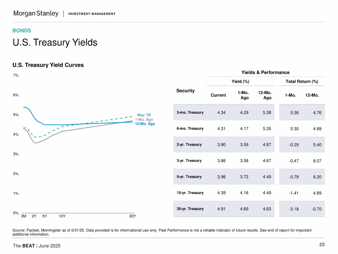
Contains a line chart on the left showing the U.S. Treasury yield curves for April 2024, one month ago, and twelve months ago, and a table on the right comparing yields and total returns for various Treasury securities over the same periods.
Market Analysis and Trends
Financial Services
The slide analyzes the changes in U.S. Treasury yields over the past year, providing insights into yield curves and total returns for different Treasury maturities.
U.S. Treasury, Yields, Yield Curve, Total Return, Financial Analysis, Treasury Securities
false
Market Analysis and Trends
Financial Services
Mixed Chart
Morgan Stanley
Add to my slides
Remove from favorites
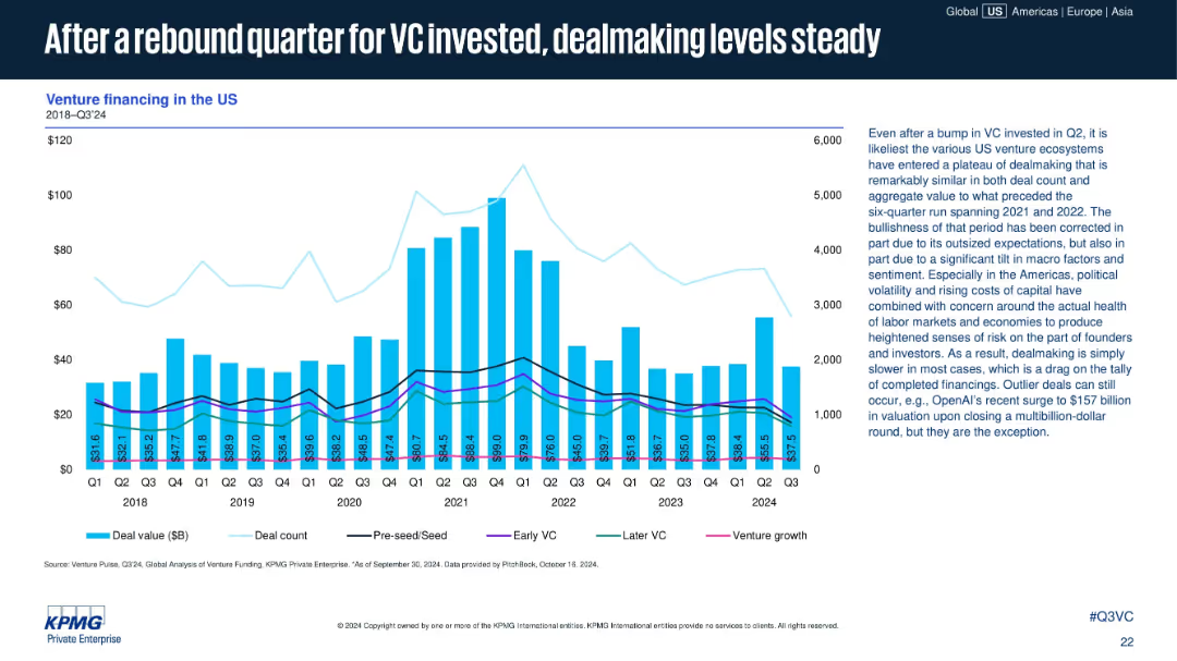
Bar-line chart showing U.S. VC financing by quarter (value and count); additional trendlines for financing type (seed to venture growth); detailed commentary on right.
Financial Performance
Technology & Software
This slide focuses on U.S. venture financing trends up to Q3 2024. After a bump in Q2, Q3 dealmaking appears steady, though overall deal count remains below historic highs. Text notes that macroeconomic factors and cautious sentiment have moderated growth across deal stages.
US venture capital, deal count, VC investment, seed to growth, financing types, macro trends, Q3 2024, startup deals, OpenAI example
false
Financial Performance
Technology & Software
Mixed Chart
KPMG
Add to my slides
Remove from favorites
A slide with two separate column charts depicting trends in US venture investment and nontraditional investor deal activity. These charts have a clear visual distinction between the years and include trend lines for comparison.
Investment Analysis
Financial Services
The slide provides insight into the normalization of U.S. venture investments and activities of nontraditional investors, illustrating the changing landscape of venture capital. It's used for examining investment patterns and forecasting future investment climates, particularly useful for financial analysts and investors.
US Venture Investment, Nontraditional Investors, Deal Activity, Capital, Market Trends
false
Investment Analysis
Financial Services
Multiple Chart
JP Morgan
Add to my slides
Remove from favorites
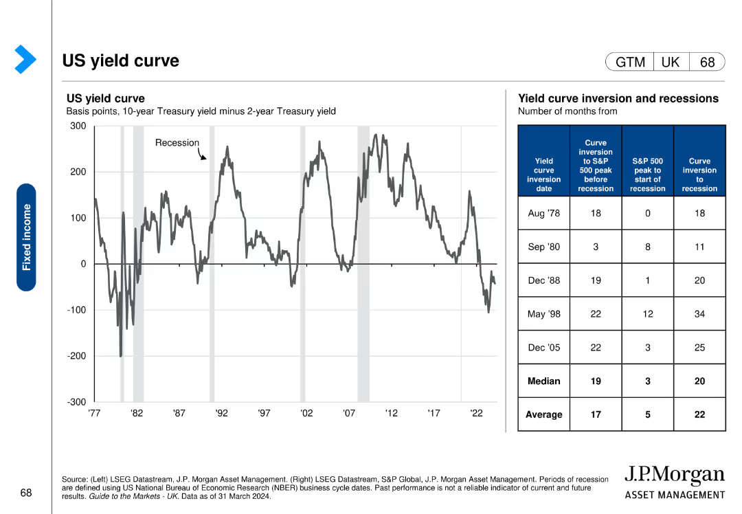
This slide includes a line chart showing the US yield curve over time and a table detailing yield curve inversion dates and subsequent economic events.
Risk Assessment and Management
Financial Services
The slide analyzes the US yield curve and its inversions, providing insights into economic risks and the timing of recessions, useful for risk management.
US, yield curve, inversion, recessions, economic events, risk assessment, management
false
Risk Assessment and Management
Financial Services
Mixed Chart
JP Morgan
Add to my slides
Remove from favorites
The slide includes two charts. The left scatter plot shows allowed returns versus inflation, and the right column chart shows household utility spending trends.
Financial Performance
Energy & Utilities
It compares utility allowed return on equity against CPI changes and analyzes household utility spending as a percentage of personal consumption.
utility, profitability, consumption, returns, inflation, spending, equity, CPI, household
false
Financial Performance
Energy & Utilities
Multiple Chart
JP Morgan
Add to my slides
Remove from favorites
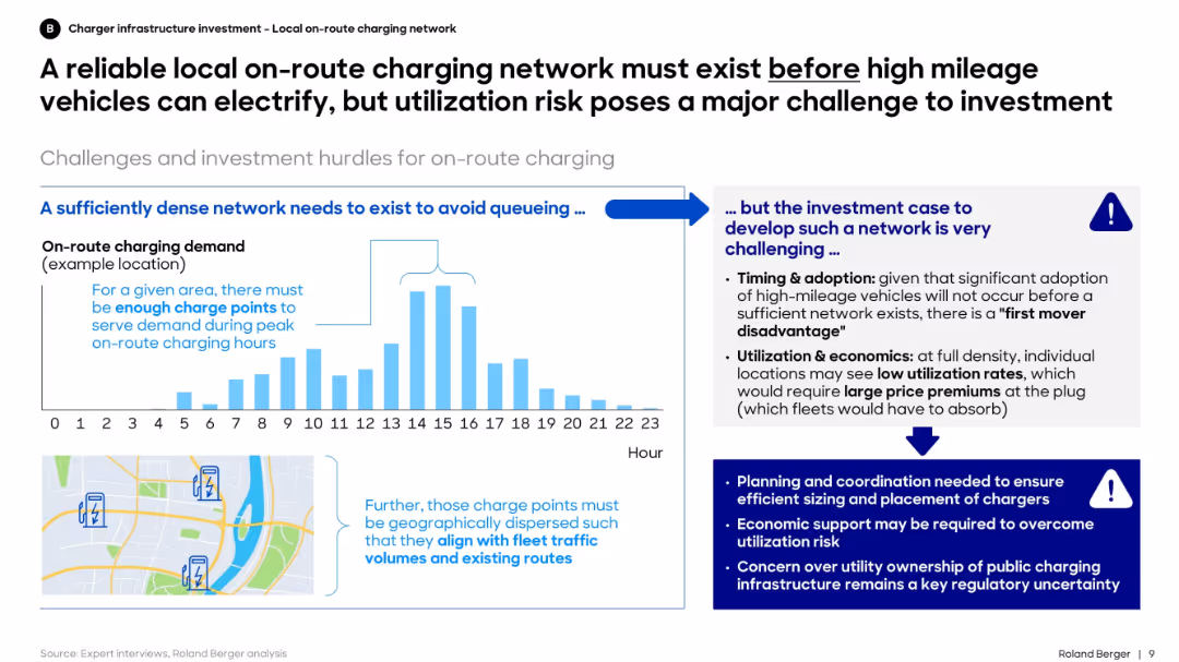
Left side shows charging demand over time and map-based charger siting need. Right section discusses investment hurdles and risks.
Regulatory and Compliance
Transportation & Logistics
The slide highlights that investment in local on-route charging must precede widespread electrification of high-mileage fleets. However, it stresses the challenge of ensuring high utilization rates to justify this upfront investment.
utilization, charging network, investment, electrification, high-mileage, planning, fleet, infrastructure
false
Regulatory and Compliance
Transportation & Logistics
Mixed Chart
Roland Berger
Add to my slides
Remove from favorites
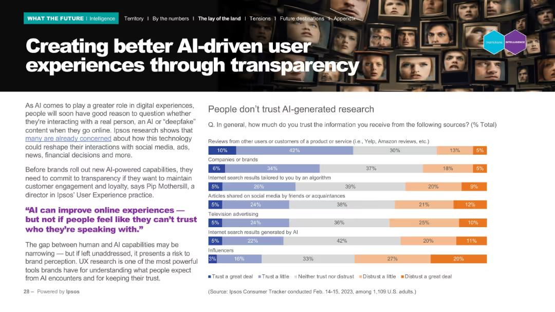
Left-aligned explanatory text with a quote and right-aligned bar chart on trust in information sources. Background features faces on digital monitors.
Technology and Digital Transformation
Technology & Software
The slide discusses how transparency is essential for trust in AI-driven user experiences. It shows low trust in AI-generated sources and emphasizes that brands must prioritize transparency to preserve user engagement.
UX, AI, transparency, trust, digital experience
false
Technology and Digital Transformation
Technology & Software
Mixed Chart
IPSOS
Add to my slides
Remove from favorites
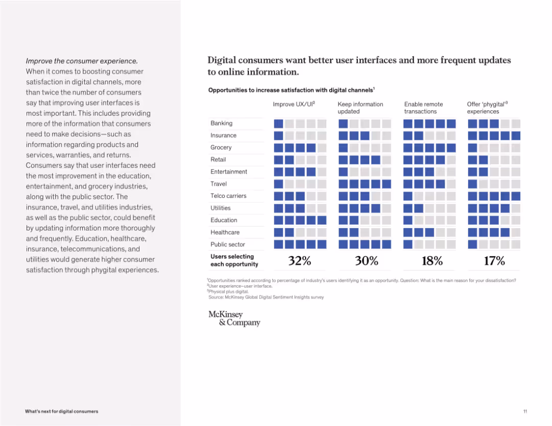
Grid-style matrix visual with industries and improvement areas like UI, info updates, remote access, and phygital. Blue highlights indicate user priorities.
Customer and Market Segmentation
Technology & Software
The slide presents opportunities for enhancing digital satisfaction. Improving user experience (UX/UI) and updating information are top needs across multiple sectors, especially education, entertainment, and public services.
UX/UI, digital satisfaction, consumer feedback, phygital, remote, updates, user needs, digital channels
false
Customer and Market Segmentation
Technology & Software
Mixed Chart
McKinsey
Add to my slides
Remove from favorites
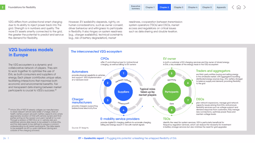
Dual circular diagrams representing stakeholders in the V2G ecosystem. Text blocks on both sides for context.
Organizational Structure and Change
Energy & Utilities
Describes the collaborative network and roles within the V2G ecosystem in Europe, including automakers, CPOs, aggregators, and grid operators. Emphasizes the value of interoperability, data sharing, and flexible energy use.
V2G, business model, EV, stakeholders, grid, charging, Europe, coordination, flexibility, roles
false
Organizational Structure and Change
Energy & Utilities
Header Horizontal
EY
Add to my slides
Remove from favorites
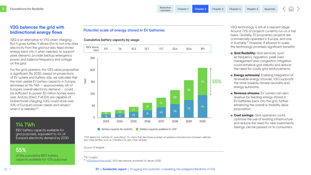
Bar chart on battery capacity use to right, detailed explanatory text to left, with green and blue design elements.
Technology and Digital Transformation
Energy & Utilities
Explains how Vehicle-to-Grid (V2G) technology enables energy storage and grid balancing via EV batteries. Highlights future capacity projections, benefits like grid support, energy autonomy, revenue, and cost efficiency.
V2G, EV batteries, bidirectional flow, energy storage, grid support, capacity, Europe, 2030, autonomy, savings
false
Technology and Digital Transformation
Energy & Utilities
Mixed Chart
EY
Add to my slides
Remove from favorites
Timeline and bar chart showing the increase in V2V equipped vehicle models from 2017 to 2020, with a significant rise in models and geographical expansion.
Product and Service Analysis
Transportation & Logistics
Examines the growth of vehicle-to-vehicle (V2V) technology in the automotive market, highlighting the increase in models and the expansion into new regions.
V2V technology, commercialization, automotive, 2020
false
Product and Service Analysis
Transportation & Logistics
Graphic
Roland Berger
Add to my slides
Remove from favorites
Table showing vacancy rates by division pre- and post-COVID. Text highlights the most affected areas. Dense with critical details.
Human Resources and Talent Management
Government & Public Sector
Examination of vacancy rates within NH DHHS divisions, pointing to transactional constraints and critical needs post-COVID.
Vacancies, Division, DHHS, COVID-19, Transactional Constraints
false
Human Resources and Talent Management
Government & Public Sector
Table
Alvarez & Marsal
Add to my slides
Remove from favorites
Column chart showing the Eligibility Function Vacancy Rate from FY18 to FY21, and a table with the Finance & Program Quality and Integrity vacancy rates pre- and post-COVID. Text boxes for findings.
Market Analysis and Trends
Government & Public Sector
Discusses current vacancy rates in DEHS eligibility functions and the impact of vacancies on DHHS's ability to fulfill its transactional needs. Presents data for Office of Finance and Program Quality.
vacancy rates, DEHS, DHHS, finance, program integrity, transactional needs, COVID-19 impact, operational challenges
false
Market Analysis and Trends
Government & Public Sector
Mixed Chart
Alvarez & Marsal
Add to my slides
Remove from favorites
The slide shows two charts. The left chart illustrates U.S. vacancy rates by property type from 1Q00 to 1Q24. The right chart depicts net operating income (NOI) growth by property type over different periods (1yr, 3yr, 5yr, 10yr).
Market Analysis and Trends
Real Estate & Construction
The slide compares vacancy rates and NOI growth across different property types in the U.S. real estate market. It helps in understanding occupancy trends and income performance for various property segments.
vacancy rates, NOI growth, property types, real estate market, income performance, trends
false
Market Analysis and Trends
Real Estate & Construction
Multiple Chart
JP Morgan
Add to my slides
Remove from favorites
This slide features a line chart showing the impact of vacant home tax on investment property decisions. It uses lines for no impact (purple) and no longer buy (orange), highlighting changes over time.
Market Analysis and Trends
Real Estate & Construction
The slide examines survey data on the impact of vacant home tax on investment property purchasing decisions, indicating how tax policies influence buyer behavior.
vacant home tax, investment decision, survey, tax impact, buyer behavior
false
Market Analysis and Trends
Real Estate & Construction
Single Chart
IPSOS
Add to my slides
Remove from favorites
The slide features a bar chart showing the potential impact of the vacant home tax with categories: won’t impact at all, sell my investment property, and have tenants rent from me.
Regulatory and Compliance
Real Estate & Construction
This slide evaluates how a vacant home tax would impact investment property decisions, showing different responses from investors.
vacant home tax, property sale, investment, regulatory impact, bar chart, investor response
false
Regulatory and Compliance
Real Estate & Construction
Single Chart
IPSOS
Add to my slides
Remove from favorites
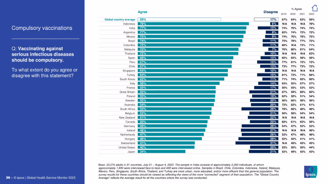
Split layout; left side has a blue panel with white text, right side displays a horizontal bar chart showing country-level agreement/disagreement percentages and year-on-year trends from 2018–2023.
Market Analysis and Trends
Healthcare & Pharmaceuticals
This slide presents global survey data on public opinion regarding mandatory vaccination against serious infectious diseases. It shows a country-wise breakdown of agreement levels and compares results across years (2018–2023), highlighting trends and public health sentiment.
vaccination, compulsory, public opinion, global health, trend, agreement, infectious diseases, Ipsos, survey, healthcare
false
Market Analysis and Trends
Healthcare & Pharmaceuticals
Mixed Chart
IPSOS
Add to my slides
Remove from favorites
Dual-pane layout showing fatality rates by age group on the left, and vaccination impact scenarios on the right using bar charts. Text box below outlines assumptions.
Strategic Planning
Healthcare & Pharmaceuticals
This slide highlights the benefit of prioritizing high-risk populations for COVID-19 vaccination. It shows how vaccinating older age groups can substantially reduce infection fatality rates (IFRs), even with limited vaccine coverage and efficacy. The scenarios are based on realistic assumptions about herd immunity and demographics.
vaccination, fatality rate, COVID-19, high-risk, age group, population
false
Strategic Planning
Healthcare & Pharmaceuticals
Mixed Chart
McKinsey
Add to my slides
Remove from favorites
The slide features column charts and text blocks. The left side shows employee support for vaccination policies by region, and the right side presents global vaccination intent.
Risk Assessment and Management
Professional Services
Explores employee preferences for mandatory vaccinations for safe return to work, including regional differences and overall support levels.
vaccination, safe return, survey, regional differences, employee preferences
false
Risk Assessment and Management
Professional Services
Multiple Chart
EY
Add to my slides
Remove from favorites
Ranked horizontal bar chart of countries showing % agreement and disagreement; includes trend data from 2018–2022.
Regulatory and Compliance
Healthcare & Pharmaceuticals
This slide presents global survey results on whether vaccination against infectious diseases should be mandatory. Country-wise agreement levels vary, with Indonesia and India showing high agreement and Japan the lowest.
vaccinations, compulsory, global opinion, infectious diseases, regulation, Ipsos, country comparison, trends
false
Regulatory and Compliance
Healthcare & Pharmaceuticals
Mixed Chart
IPSOS
Add to my slides
Remove from favorites
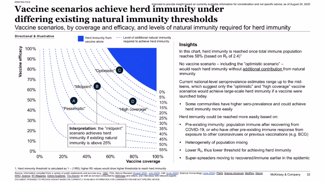
Chart plotting vaccine efficacy vs. coverage, overlaid with contour lines representing natural immunity needed; insights listed on the side.
Strategic Planning
Healthcare & Pharmaceuticals
Presents a sensitivity analysis showing how much natural immunity is required to achieve herd immunity under different vaccine efficacy and coverage combinations. Only optimistic scenarios succeed without needing substantial pre-existing immunity.
vaccine coverage, herd immunity, natural immunity, modeling, thresholds
false
Strategic Planning
Healthcare & Pharmaceuticals
Mixed Chart
McKinsey
Add to my slides
Remove from favorites
Contains a gradient bar chart showing vaccine candidates in various development phases with a specific focus on Phase III.
Regulatory and Compliance
Healthcare & Pharmaceuticals
Highlights leading COVID-19 vaccine candidates, their current trial phases, and projected timelines for emergency use authorizations.
vaccine, COVID-19, trials, phases, candidates
false
Regulatory and Compliance
Healthcare & Pharmaceuticals
Mixed Chart
BCG
Add to my slides
Remove from favorites
Includes a timeline with phases of vaccine development and potential acceleration due to COVID-19. Marked with different stages and approval milestones.
Regulatory and Compliance
Healthcare & Pharmaceuticals
Describes the expedited development timeline for COVID-19 vaccines, highlighting phases and regulatory steps for early access.
vaccine, development, timeline, COVID-19
false
Regulatory and Compliance
Healthcare & Pharmaceuticals
Linear Flow
BCG
Add to my slides
Remove from favorites
Table format showing countries and their vaccination priority status for different groups such as healthcare workers and elderly, marked with green check icons.
Strategic Planning
Healthcare & Pharmaceuticals
Lists countries and their strategies for prioritizing vaccine distribution among key demographic groups, indicating official guidelines and advisory recommendations.
vaccine distribution, priorities, countries, healthcare workers, elderly
false
Strategic Planning
Healthcare & Pharmaceuticals
Table
BCG
Add to my slides
Remove from favorites
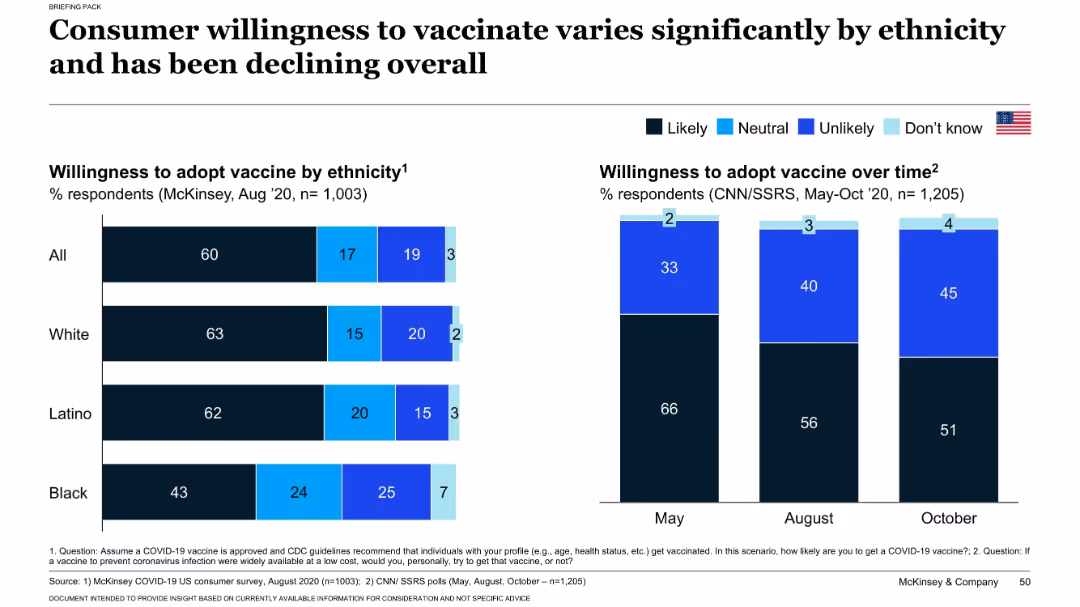
Split chart layout: left side shows willingness by ethnicity; right side shows willingness trend from May to Oct 2020.
Customer and Market Segmentation
Healthcare & Pharmaceuticals
This slide explores how willingness to receive a COVID-19 vaccine varies across ethnic groups and over time. It shows a decline in vaccine acceptance from May to October 2020 and highlights differences in likelihood to vaccinate among Black, Latino, and White populations. Insights support targeted communication strategies.
vaccine hesitancy, ethnicity, public opinion, COVID-19, trends, adoption
false
Customer and Market Segmentation
Healthcare & Pharmaceuticals
Multiple Chart
McKinsey
Add to my slides
Remove from favorites
Utilizes bar charts to display projected vaccine production capacities by various manufacturers, highlighting planned figures for end-2020 and end-2021.
Regulatory and Compliance
Healthcare & Pharmaceuticals
Evaluates the global vaccine production capabilities and strategies, with emphasis on scaling up to meet anticipated demand.
vaccine, manufacturing, scale-up, capacity
false
Regulatory and Compliance
Healthcare & Pharmaceuticals
Mixed Chart
BCG
Add to my slides
Remove from favorites
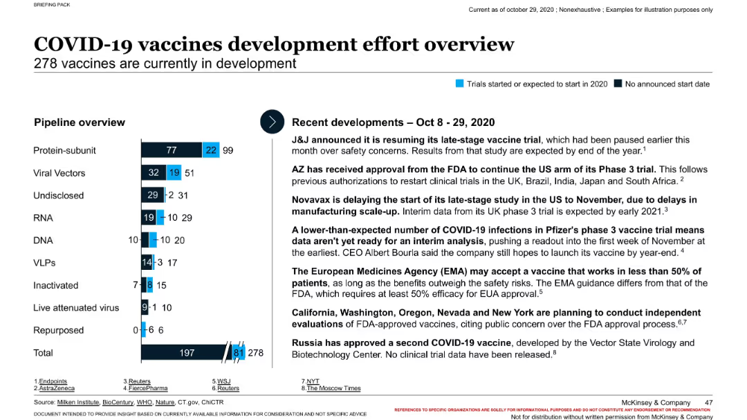
Bar chart showing vaccine pipeline by type and stage; right panel outlines recent developments from Oct 2020.
Strategic Planning
Healthcare & Pharmaceuticals
The slide provides a snapshot of global COVID-19 vaccine development, with 278 candidates in the pipeline. It categorizes vaccines by type and clinical phase and summarizes notable updates from developers such as J&J, AZ, and Pfizer. It reflects ongoing progress and regulatory engagement during a critical phase of pandemic response.
vaccine pipeline, clinical trials, COVID-19, development, public health
false
Strategic Planning
Healthcare & Pharmaceuticals
Mixed Chart
McKinsey
Add to my slides
Remove from favorites
Features bar and column charts comparing vaccine trial candidates against other diseases and various vaccine technologies.
Regulatory and Compliance
Healthcare & Pharmaceuticals
Reviews the global response to COVID-19 through vaccine development efforts, comparing it to other diseases and detailing technological approaches.
vaccine, R&D, COVID-19, technology, trials
false
Regulatory and Compliance
Healthcare & Pharmaceuticals
Mixed Chart
BCG
Add to my slides
Remove from favorites
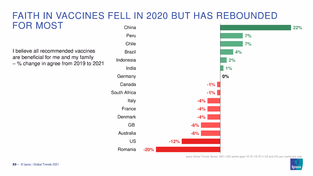
A bar chart displaying changes in faith in vaccines across various countries from 2019 to 2021. Green bars indicate positive change, red negative.
Market Analysis and Trends
Healthcare & Pharmaceuticals
The slide shows the percentage change in belief in the benefits of vaccines for various countries, highlighting changes between 2019 and 2021.
Vaccines, Belief, Change, 2019-2021, Countries
false
Market Analysis and Trends
Healthcare & Pharmaceuticals
Single Chart
IPSOS
Add to my slides
Remove from favorites
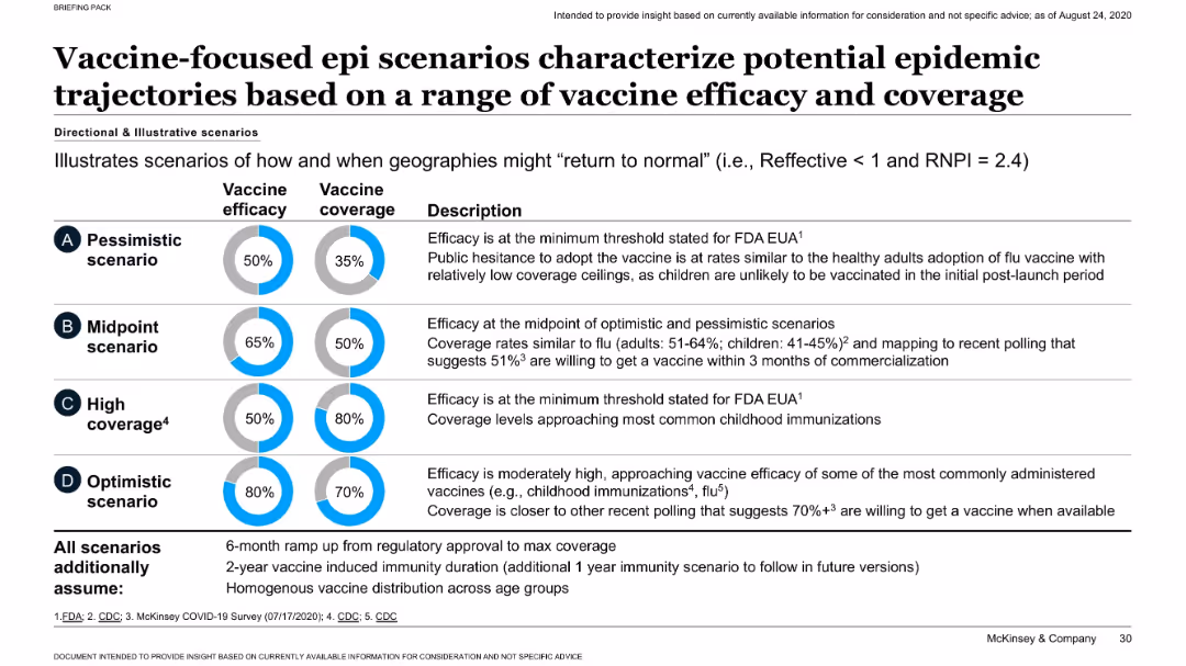
Matrix of four scenarios (A–D) with visual indicators of vaccine efficacy and coverage; accompanied by descriptive text.
Strategic Planning
Healthcare & Pharmaceuticals
Illustrates four vaccine rollout scenarios ranging from pessimistic to optimistic, based on varying levels of efficacy and population coverage. Assumptions include 6-month ramp-up and 2-year immunity. Highlights implications for controlling the pandemic.
vaccine scenarios, efficacy, coverage, epidemic control, modeling
false
Strategic Planning
Healthcare & Pharmaceuticals
Mixed Chart
McKinsey
Add to my slides
Remove from favorites
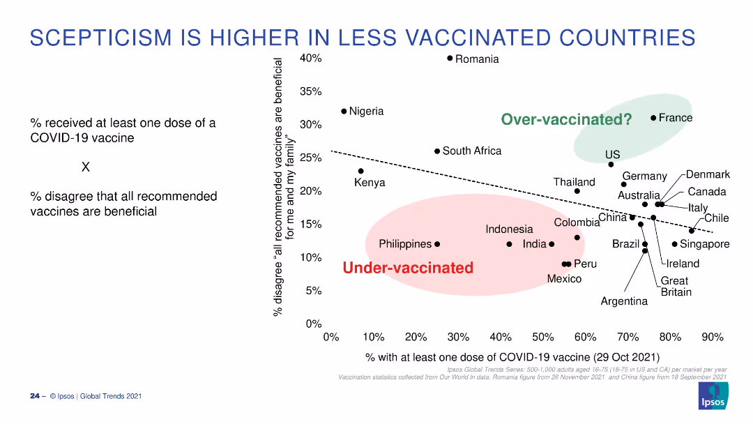
A scatter plot showing the correlation between vaccination rates and vaccine scepticism, with countries categorized as over or under-vaccinated.
Market Analysis and Trends
Healthcare & Pharmaceuticals
This slide illustrates the relationship between the percentage of the population vaccinated and the percentage who disagree that vaccines are beneficial.
Vaccines, Scepticism, Correlation, Vaccination, Over-vaccinated
false
Market Analysis and Trends
Healthcare & Pharmaceuticals
Single Chart
IPSOS
Add to my slides
Remove from favorites
Features bar graphs contrasting vaccine and treatment trials, accompanied by quotes, on a clinical color scheme.
Regulatory and Compliance
Healthcare & Pharmaceuticals
Highlights the rapid pace of vaccine and treatment development, with data points and quotes from health officials.
vaccines, treatments, clinical trials, COVID-19, healthcare, development pace
false
Regulatory and Compliance
Healthcare & Pharmaceuticals
Multiple Chart
BCG
Add to my slides
Remove from favorites
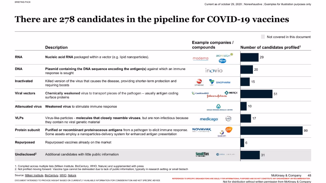
Tabular format listing vaccine types, descriptions, examples of companies, and number of profiled candidates. Clean, structured.
Product and Service Analysis
Healthcare & Pharmaceuticals
This slide classifies and explains the types of vaccines in development for COVID-19. It provides descriptions for each category (e.g., RNA, DNA, VLPs) and shows the number of candidates per category. Company logos accompany each type, giving a visual sense of who is working on what. Undisclosed candidates are also noted.
vaccine types, candidates, RNA, protein subunit, companies, COVID-19
false
Product and Service Analysis
Healthcare & Pharmaceuticals
Mixed Chart
McKinsey
Add to my slides
Remove from favorites
Text descriptions with bullet points and key figures, including a green sidebar for key success factors, alongside graphical elements emphasizing statistics.
Risk Assessment and Management
Healthcare & Pharmaceuticals
Discusses potential obstacles to COVID-19 vaccine uptake and outlines strategies to enhance vaccination rates, such as improving transparency and communication.
vaccine uptake, barriers, strategies, communication, transparency
false
Risk Assessment and Management
Healthcare & Pharmaceuticals
Header Horizontal
BCG
Add to my slides
Remove from favorites
Features column charts indicating the vaccine wastage rates at various healthcare centers before and after adopting solar power.
Regulatory and Compliance
Healthcare & Pharmaceuticals
Explores the reduction in vaccine wastage through improved power supplies via solar energy adoption, showing significant decreases in wastage rates post-implementation in Nigerian healthcare facilities.
vaccine wastage, solar power, healthcare centers, Nigeria, power supply, energy solutions
false
Regulatory and Compliance
Healthcare & Pharmaceuticals
Single Chart
BCG
Add to my slides
Remove from favorites
Previous
Next
You don't have any favorites yet.
Please wait loading your favorites slides...
Create a FREE account to continue browsing
Receive Instant Access to 1,000+ slides from companies like McKinsey, Google, and Goldman Sachs
First Name
Last Name
Email
Password
I agree to all
Terms & Privacy Policy
Thank you! Your submission has been received!
Oops! Something went wrong while submitting the form.
Have an account?
Sign in
Upgrade to PRO to Save slides
Advanced Search and Filters
Access to 15,000+ slides
Access to Category Pages
Save/Bookmark Slides
PowerPoint Template Library
Pick a Plan
MONTHLY
$12/month
Billed every month, Cancel anytime.
YEARLY
$9/year
Billed $108 annually, Cancel anytime.
Checkout for $12/month
Checkout for $108/yr
Secured by Stripe | AES-256 bit encryption