My Account
My Slides
Search by Category
Pricing
Templates
View All Templates
Download Template Slides
✦ AI Search
Feedback
Login
Logout
Get Started
Browse all Slides
Browse all Slides
Create a FREE Account
Instant access to 1,000+ real slides from top companies like McKinsey, BCG, Goldman Sachs, Google and many more!
First Name
Last Name
Email
Password
I agree to all
Terms & Privacy Policy
Thank you! Your submission has been received!
Oops! Something went wrong while submitting the form.
Have an account?
Sign in
Saved Slides
Total No. of slides saved
0
↻ Refresh
✖ Clear all
Contains a pie chart detailing reasons for vaccine wastage, and a column chart showing the impact of unreliable power on vaccine preservation in Nigerian healthcare centers.
Regulatory and Compliance
Healthcare & Pharmaceuticals
Focuses on the critical issues of vaccine wastage linked to inadequate power supply in Nigeria, advocating for solar energy solutions to ensure vaccine preservation and enhance immunization rates.
vaccine wastage, unreliable power, healthcare, Nigeria, solar power, immunization, public health
false
Regulatory and Compliance
Healthcare & Pharmaceuticals
Mixed Chart
BCG
Add to my slides
Remove from favorites
This slide features a column chart comparing the current NTM P/E ratios vs. 10-Year High, Low, and Average for various indices such as S&P 500, Russell 2000, MSCI World, etc. The chart includes data points for high, current, and low P/E ratios.
Financial Performance
Financial Services
The slide provides a valuation analysis by comparing current NTM P/E ratios with historical highs, lows, and averages for different market indices.
Valuation analysis, NTM P/E, indices, S&P 500, Russell 2000
false
Financial Performance
Financial Services
Mixed Chart
Morgan Stanley
Add to my slides
Remove from favorites
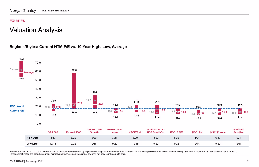
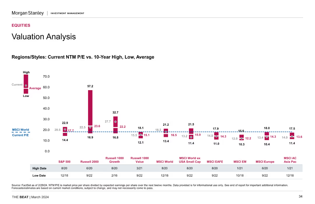
The slide shows a column chart comparing current NTM P/E ratios with 10-year high, low, and average values for different regions/styles.
Investment Analysis
Financial Services
The slide provides a valuation analysis, comparing current NTM P/E ratios with historical values across different regions and styles, highlighting investment potential.
Valuation Analysis, NTM P/E Ratios, Historical Values, Investment Potential
false
Investment Analysis
Financial Services
Mixed Chart
Morgan Stanley
Add to my slides
Remove from favorites
The slide presents a column chart comparing current NTM P/E ratios to 10-year high, low, and average for various regions/styles and another chart for S&P 500 sectors.
Market Analysis and Trends
Financial Services
The slide provides a valuation analysis, comparing price-to-earnings ratios across regions and sectors. Useful for market valuation assessments.
valuation analysis, NTM P/E, regions, styles, S&P 500, sectors, market valuation
false
Market Analysis and Trends
Financial Services
Single Chart
Morgan Stanley
Add to my slides
Remove from favorites
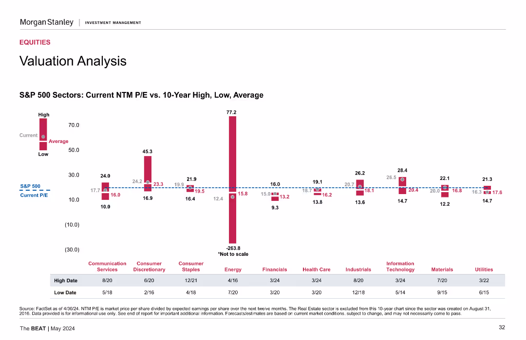
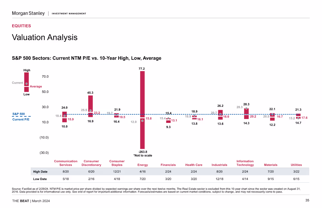
This slide presents a column chart showing the current NTM P/E ratios vs. 10-Year High, Low, and Average for S&P 500 sectors such as Communication Services, Consumer Discretionary, Energy, etc. The chart includes data points for high, current, and low P/E ratios.
Financial Performance
Financial Services
The slide offers a detailed valuation analysis of S&P 500 sectors, comparing current NTM P/E ratios with historical highs, lows, and averages.
Valuation analysis, NTM P/E, S&P 500, sectors, historical data
false
Financial Performance
Financial Services
Mixed Chart
Morgan Stanley
Add to my slides
Remove from favorites
This slide presents column chart and a table comparing current P/E ratios with historical highs, lows, and averages, using a clear color scheme to denote values.
Investment Analysis
Financial Services
Evaluates market valuation by comparing current price-to-earnings ratios with historical data, aiding investors in identifying potential overvalued or undervalued market segments.
valuation analysis, P/E ratio, bar graphs, heat map, historical comparison, market valuation
false
Investment Analysis
Financial Services
Single Chart
Morgan Stanley
Add to my slides
Remove from favorites
The slide includes a column chart comparing current NTM P/E ratios to 10-year high, low, and average for various S&P 500 sectors, highlighting notable variations.
Market Analysis and Trends
Financial Services
The slide offers a detailed valuation analysis of S&P 500 sectors, focusing on price-to-earnings ratios. Useful for sector-specific investment decisions.
valuation analysis, S&P 500, NTM P/E, sectors, market valuation, financial analysis
false
Market Analysis and Trends
Financial Services
Mixed Chart
Morgan Stanley
Add to my slides
Remove from favorites
Slide is laid out in two columns, featuring a mix of text and round diagrams in red and white colors. Descriptions of PwC's audit and valuation approaches are provided alongside key audit matters.
Financial Performance
Professional Services
Discusses PwC's valuation practices during audits, highlighting the importance of accurate valuations in financial reporting and decision-making. It's intended for professionals involved in finance and accounting, particularly in understanding audit complexities.
valuation, audit, financial reporting, PwC, practices
false
Financial Performance
Professional Services
Multiple Chart
PwC/Strategy&
Add to my slides
Remove from favorites
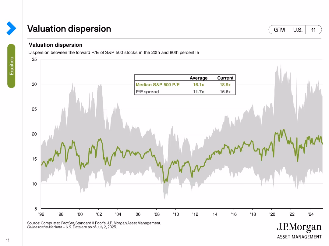
Area chart showing the P/E spread between the 20th and 80th percentile S&P 500 stocks with overlaid median P/E.
Risk Assessment and Management
Financial Services
This slide highlights valuation dispersion within the S&P 500, emphasizing how wide the spread is between high- and low-valued stocks. The current P/E spread (16.6x) is above the historical average, indicating elevated disparity in investor valuations. Median P/E has also risen to 18.9x.
valuation dispersion, S&P 500, P/E spread, percentile, median valuation, equity risk, market breadth, investor sentiment
false
Risk Assessment and Management
Financial Services
Single Chart
JP Morgan
Add to my slides
Remove from favorites
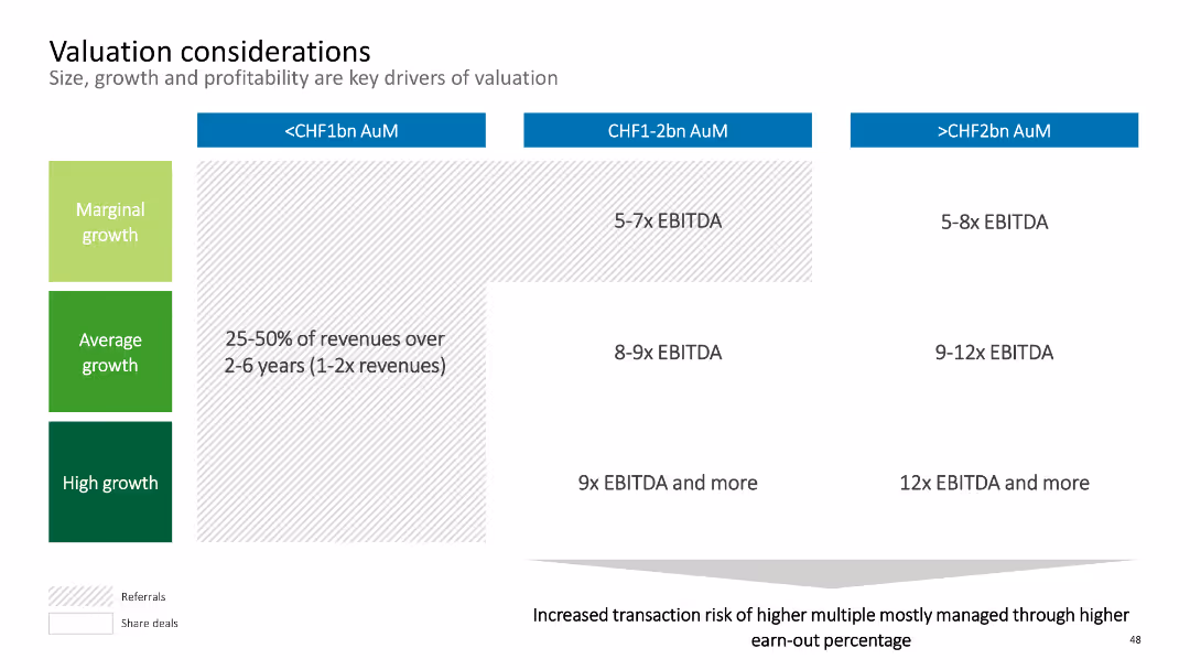
The slide contains a matrix chart with three columns representing AuM ranges and three rows representing growth levels. Each cell indicates EBITDA multiples. The layout is simple with colored sections for clarity.
Corporate Finance and Valuation
Financial Services
This slide discusses valuation considerations, focusing on size, growth, and profitability as key drivers. It provides EBITDA multiples based on AuM and growth levels. Suitable for analyzing company valuation for mergers and acquisitions.
Valuation, EBITDA, AuM, Growth, Financials
false
Corporate Finance and Valuation
Financial Services
Table
Deloitte
Add to my slides
Remove from favorites
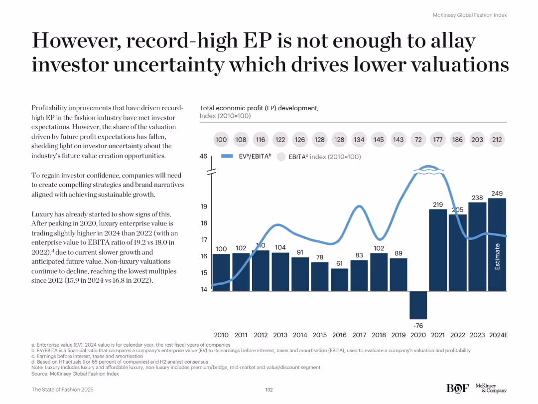
Dual-axis line and bar chart shows EP vs. EBITA index. Text discusses investor sentiment and valuation pressures.
Investment Analysis
Retail & E-commerce
Despite strong EP performance, the fashion industry faces declining valuations due to investor concerns about future growth. The chart compares EP trends with EBITA ratios, revealing a drop in valuation multiples since 2020.
Valuation, investor sentiment, EBITA, economic profit, fashion finance, capital markets, growth outlook, luxury, profitability, EV/EBITA
false
Investment Analysis
Retail & E-commerce
Mixed Chart
McKinsey
Add to my slides
Remove from favorites
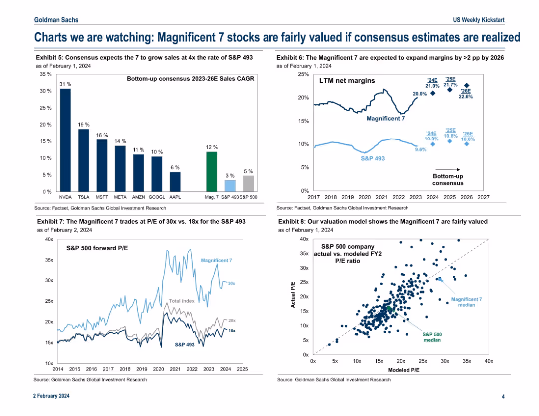
Four-panel chart layout showing growth estimates, valuation metrics, and modeled P/E ratios for the Mag 7 vs. the rest of the S&P 500.
Investment Analysis
Technology & Software
This slide justifies the current valuations of the Magnificent 7 by comparing their projected sales growth and margin expansion to the broader market. It concludes they are fairly valued given consensus estimates. P/E comparisons and a modeled valuation chart reinforce the analytical viewpoint.
valuation, Magnificent 7, sales growth, P/E ratio, consensus, margin expansion, fair value
false
Investment Analysis
Technology & Software
Multiple Chart
Goldman Sachs
Add to my slides
Remove from favorites
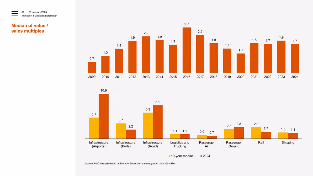
Dual bar chart layout with top section showing annual median values (2009–2024), and bottom comparing 2024 vs 10-year medians across infrastructure and transport sectors.
Investment Analysis
Transportation & Logistics
The slide analyzes historical and current value/sales multiples in transport and logistics sectors, with 2024 showing peaks in airport and road infrastructure. It highlights sector-level variations in valuation trends over time, emphasizing notable outliers and medians.
valuation, multiples, infrastructure, logistics, trucking, air, rail, shipping, median, PwC
false
Investment Analysis
Transportation & Logistics
Multiple Chart
PwC/Strategy&
Add to my slides
Remove from favorites
Column charts showing current NTM P/E vs. 10-year high, low, and average for various indices and sectors.
Investment Analysis
Financial Services
Evaluates valuation metrics, comparing current price-to-earnings ratios with historical data for different indices and sectors.
Valuation, NTM P/E, Indices, Historical Data, Investment Analysis
false
Investment Analysis
Financial Services
Mixed Chart
Morgan Stanley
Add to my slides
Remove from favorites
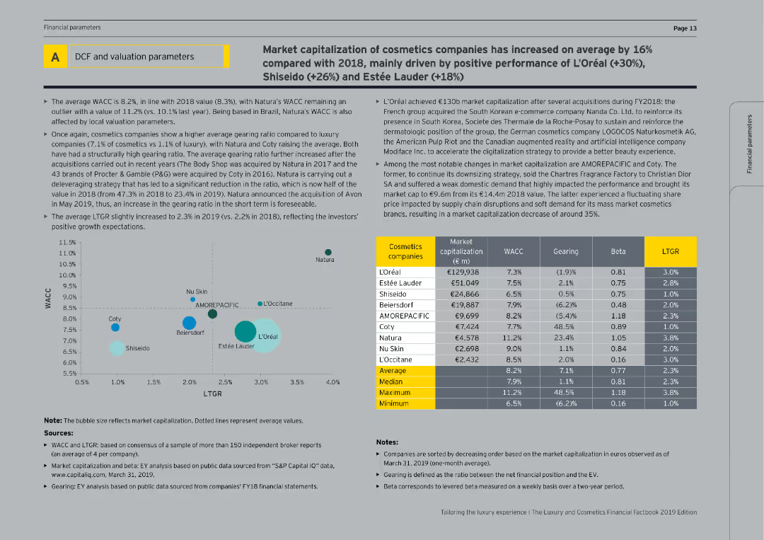
This slide includes tables and bubble charts showing the market capitalization, WACC, gearing, beta, and LTGR of cosmetics companies.
Financial Performance
Consumer Goods
The slide provides financial data on cosmetics companies, analyzing market capitalization, cost of capital, and gearing ratios, with a focus on recent performance and growth expectations.
Valuation parameters, cosmetics companies, financial metrics, market capitalization, WACC
false
Financial Performance
Consumer Goods
Mixed Chart
EY
Add to my slides
Remove from favorites
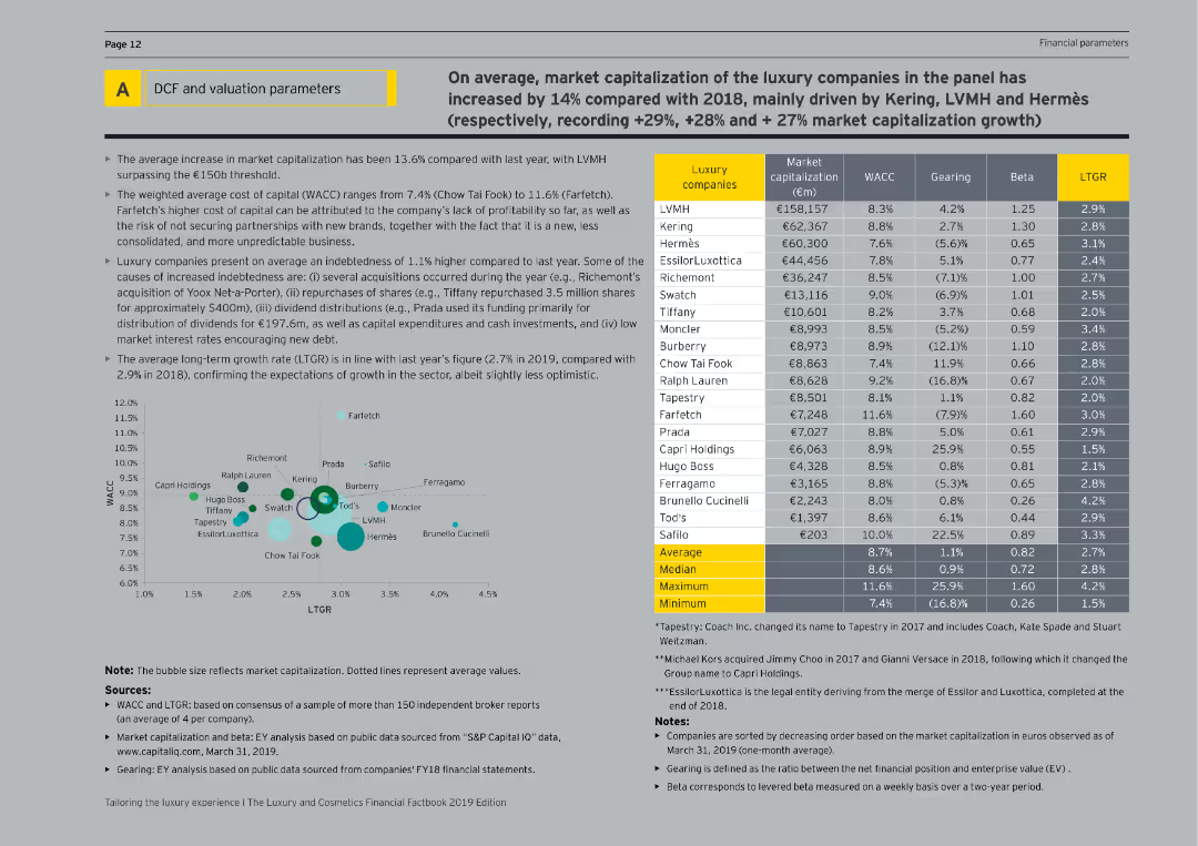
This slide features tables and bubble charts showing the market capitalization, WACC, gearing, beta, and LTGR of luxury companies.
Financial Performance
Consumer Goods
The slide presents detailed financial parameters of luxury companies, including market capitalization, cost of capital, and gearing ratios, with comparisons and growth expectations.
Valuation parameters, luxury companies, financial metrics, market capitalization, WACC
false
Financial Performance
Consumer Goods
Mixed Chart
EY
Add to my slides
Remove from favorites
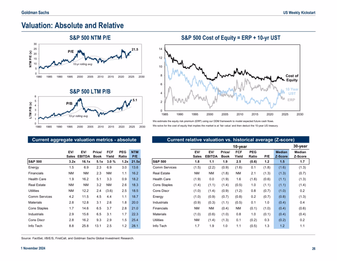
Split into top graphs and lower tables. Top shows S&P 500 valuation metrics (P/E, P/B) over time. Bottom has tables comparing sector metrics and Z-scores across 10- and 30-year horizons.
Financial Performance
Financial Services
This slide presents both absolute and relative valuation metrics for the S&P 500 and sectors. It compares metrics like EV/EBITDA and P/E ratios, highlighting sector dispersion and relative over/undervaluation via Z-scores.
valuation, P/E, P/B, sectors, Z-score, EV/EBITDA, financial ratios, S&P 500
false
Financial Performance
Financial Services
Multiple Chart
Goldman Sachs
Add to my slides
Remove from favorites
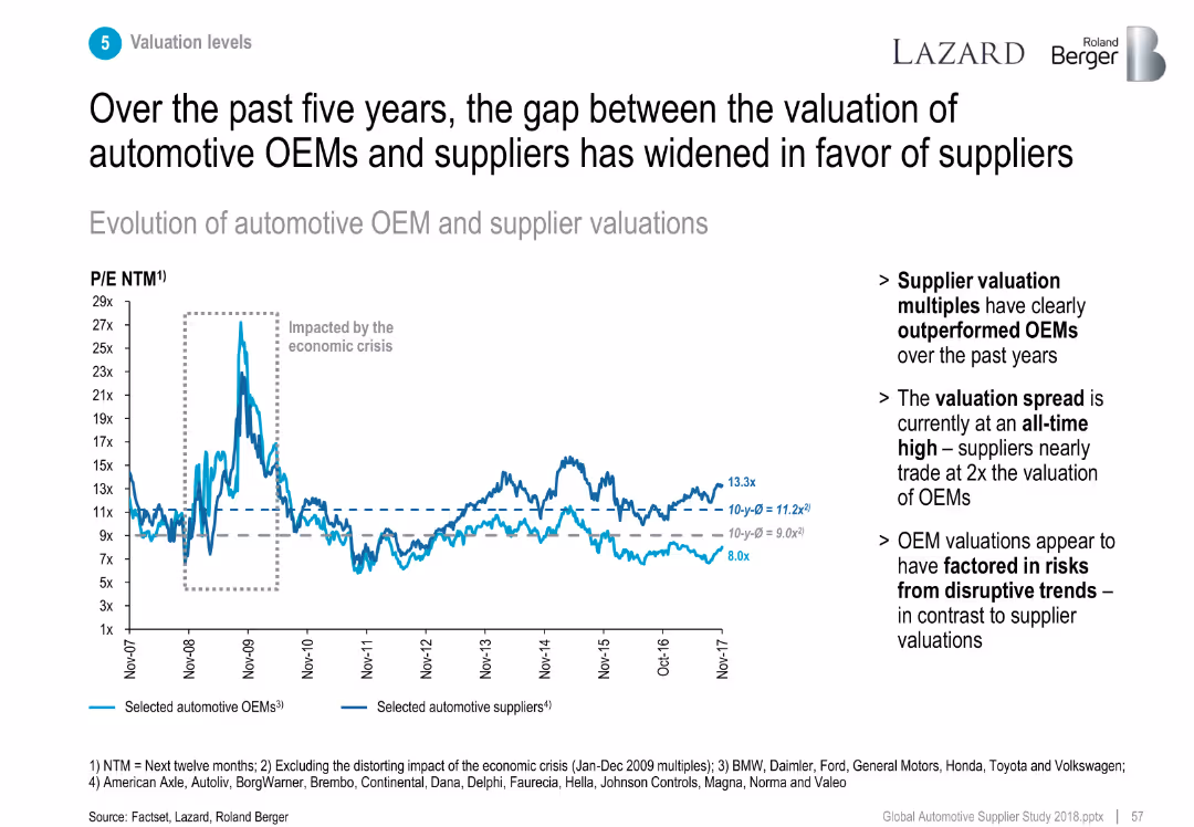
Line chart tracking P/E ratios of OEMs vs. suppliers (2007–2017).
Investment Analysis
Industrial & Manufacturing
Shows that supplier P/E ratios have consistently outperformed OEMs, especially post-economic crisis, reflecting investor confidence in suppliers.
valuation, P/E ratio, OEM vs supplier, investment trend, multiples
false
Investment Analysis
Industrial & Manufacturing
Mixed Chart
Roland Berger
Add to my slides
Remove from favorites
Multi-chart layout including line graphs and data tables. Shows S&P 500 valuation metrics (P/E, P/B), cost of equity, and sector-level valuation comparisons. Clean and data-dense with side-by-side segmentation.
Financial Performance
Financial Services
This slide provides an overview of absolute and relative valuation metrics for the S&P 500 and its sectors. It compares historical trends in P/E and P/B ratios and evaluates the cost of equity using ERP and Treasury yields. Sector-specific data is organized into clear tables and visuals.
valuation, P/E ratio, P/B ratio, cost of equity, ERP, sector metrics
false
Financial Performance
Financial Services
Multiple Chart
Goldman Sachs
Add to my slides
Remove from favorites
This slide presents a column chart comparing the current P/E ratios to 10-year highs, lows, and averages for various regions and styles. The color coding distinguishes between the metrics, and the layout is clear with labeled axes and an accompanying legend.
Investment Analysis
Financial Services
Focused on investors and financial analysts, this slide offers a valuation analysis using price-to-earnings ratios. It contrasts current figures with historical data across different regions and styles, serving as a basis for assessing market valuation and aiding in the development of investment strategies.
Valuation, P/E Ratio, Regions, Investment Analysis, Stocks
false
Investment Analysis
Financial Services
Single Chart
Morgan Stanley
Add to my slides
Remove from favorites
Features column chart of 'Current NTM P/E vs. 10-Year High, Low, Average' for different sectors. The slide employs stark color contrast to emphasize differences in valuation, and the data is well-structured for ease of analysis.
Investment Analysis
Financial Services
The slide is a deep dive into sector-specific valuation for sectors within the S&P 500, providing essential insights for investors or financial strategists. It enables comparisons with historical valuation trends, facilitating informed decisions in stock selection and portfolio balancing.
Valuation, P/E Ratio, S&P 500, Sector Analysis, Trends
false
Investment Analysis
Financial Services
Single Chart
Morgan Stanley
Add to my slides
Remove from favorites
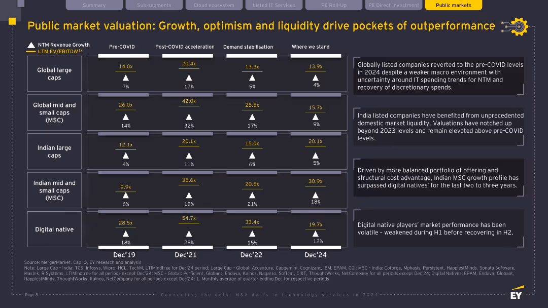
Table with valuation metrics (EV/EBITDA and revenue growth), historical comparisons across five company types; contextual text on the right side explains trends.
Financial Performance
Financial Services
The slide tracks valuation trends across global and Indian large/mid caps and digital-native firms from pre-COVID to 2024. It shows valuation multipliers stabilizing post-COVID acceleration and notes India’s strong domestic liquidity and structural advantages in mid and small caps. Digital natives show volatility but recovery. The slide contextualizes how market maturity and investor confidence shape current valuations.
Valuation, public markets, digital native, small caps, growth, liquidity, EV/EBITDA
false
Financial Performance
Financial Services
Table
EY
Add to my slides
Remove from favorites
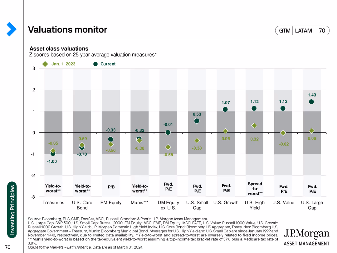
The slide features a dot plot showing asset class valuations based on Z-scores, comparing current values against historical averages.
Financial Performance
Financial Services
The slide tracks asset class valuations with Z-scores, helping investors understand current market conditions relative to historical benchmarks.
valuations, asset classes, Z-scores, financial performance, market conditions, historical averages, investment analysis, market trends
false
Financial Performance
Financial Services
Single Chart
JP Morgan
Add to my slides
Remove from favorites
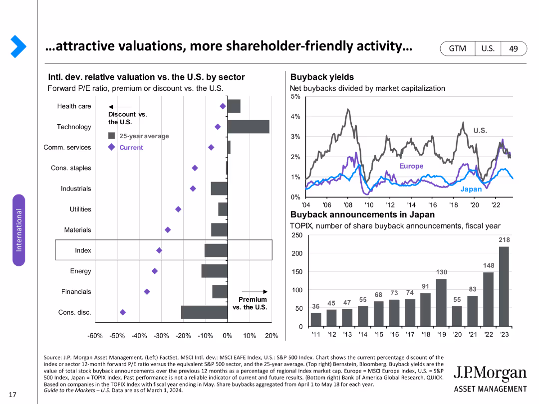
Two charts: a column chart showing relative valuation by sector and a line chart of buyback yields and announcements.
Investment Analysis
Financial Services
Analyzes relative valuations and buyback activity across different sectors, emphasizing shareholder value.
Valuations, buybacks, sectors, shareholder value, analysis, yields, announcements, activity, relative
false
Investment Analysis
Financial Services
Multiple Chart
JP Morgan
Add to my slides
Remove from favorites
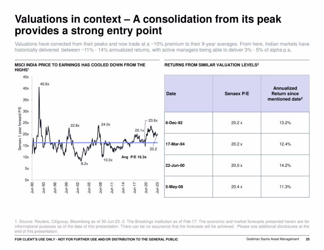
Split layout: left side features a historical P/E line graph, right side shows a table comparing Sensex P/E and returns at past valuation levels. Clean, data-centric design with minimal color use.
Investment Analysis
Financial Services
The slide highlights that Indian equity valuations have corrected and now present a favorable entry point. It shows the MSCI India Price to Earnings ratio historically and compares similar valuation levels to long-term annualized returns, supporting the case for future upside.
valuations, India, Sensex, P/E ratio, annual returns, investment, entry point, MSCI, equity markets, historical data
false
Investment Analysis
Financial Services
Mixed Chart
Goldman Sachs
Add to my slides
Remove from favorites
The slide features a line chart on the left comparing Value vs. Growth relative valuations from 1997 to present and a column chart on the right showing Value vs. Growth in different interest rate environments.
Market Analysis and Trends
Financial Services
This slide analyzes the relative valuations of U.S. Value and Growth stocks over time and their performance in different interest rate environments, highlighting key data points.
valuations, interest rates, growth, value, stocks
false
Market Analysis and Trends
Financial Services
Multiple Chart
JP Morgan
Add to my slides
Remove from favorites
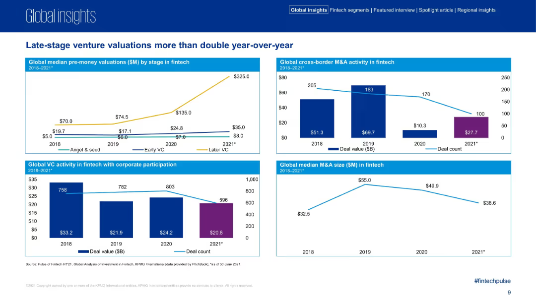
Four mini chart sections comparing pre-money valuations, M&A activity, VC corporate participation, and median M&A sizes.
Investment Analysis
Financial Services
The slide captures dramatic growth in later-stage fintech valuations in 2021 and a comparative drop in deal counts. It includes breakdowns by funding stage, cross-border M&A activity, and M&A deal sizes, signaling shifts in fintech investment behavior.
valuations, M&A, venture capital, fintech, corporate participation, investment activity
false
Investment Analysis
Financial Services
Multiple Chart
KPMG
Add to my slides
Remove from favorites
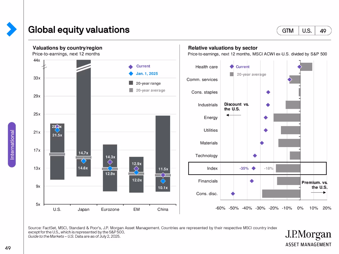
Two bar charts: Left—PE ratios by country; Right—relative sector valuations vs. U.S.; includes averages and 20-year ranges.
Investment Analysis
Financial Services
Examines global equity valuation levels through P/E ratios by region and sector. Highlights valuation discounts and premiums versus U.S. benchmarks, revealing investment opportunities and historical valuation context.
valuations, P/E ratio, sector discounts, premiums, global equities, investment comparison, valuation range
false
Investment Analysis
Financial Services
Multiple Chart
JP Morgan
Add to my slides
Remove from favorites
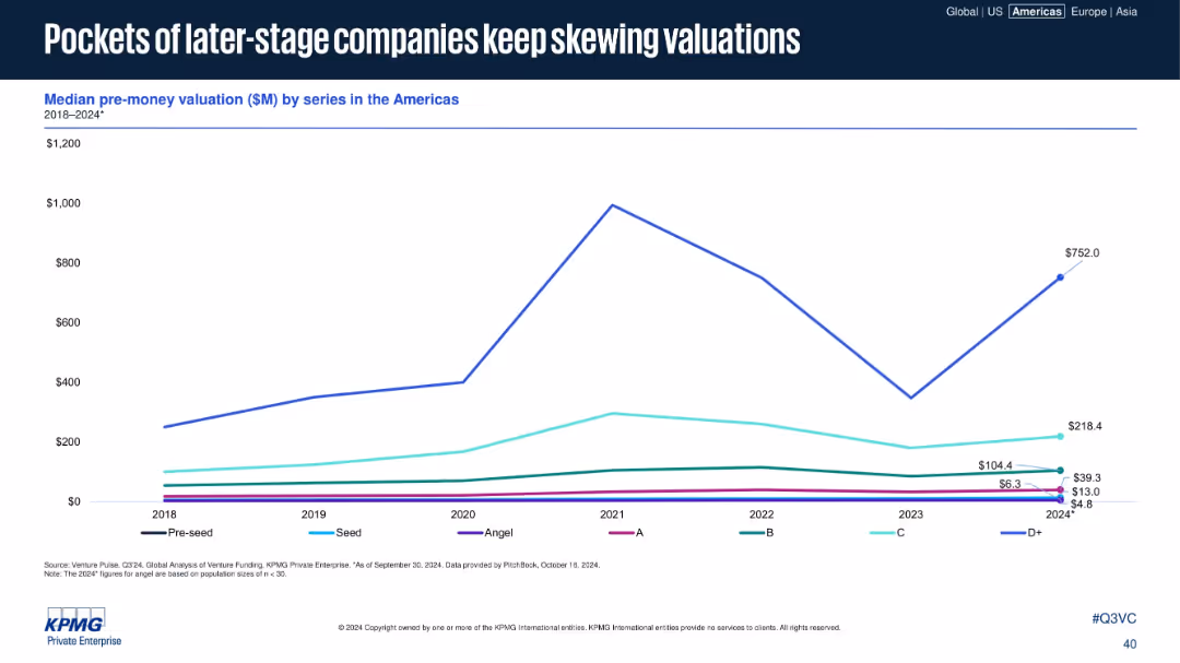
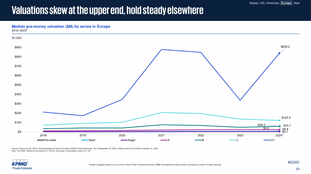
Line graph of median pre-money valuations by funding series from 2018–2024.
Investment Analysis
Financial Services
The slide depicts the median pre-money valuations across various VC funding stages, with later-stage D+ companies significantly impacting valuation trends. Despite lower early-stage valuations, a few high-value deals skew overall metrics.
valuations, pre-money, D+ rounds, VC, skewed metrics, startup funding, stage comparison, Americas
false
Investment Analysis
Financial Services
Single Chart
KPMG
Add to my slides
Remove from favorites
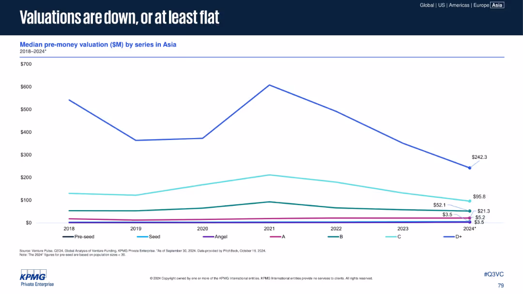
Line chart of median pre-money valuation ($M) by series (2018–2024). Each series is a different color, y-axis scaled to $700M.
Performance Metrics and KPIs
Financial Services
Details falling or flatlining pre-money valuations across VC stages in Asia. D+ valuations see the most substantial drop, while early rounds remain relatively flat. Signifies tightening investor confidence and capital conservation.
Valuations, Pre-money, Series A-D+, Angel, Asia, VC Funding, 2024
false
Performance Metrics and KPIs
Financial Services
Single Chart
KPMG
Add to my slides
Remove from favorites
This slide has multiple line graphs titled "Indexed valuation based on pooled return, global buyout-backed holdings". It compares the valuations of different sectors against major indices from Q4 2019 to Q3 2022, with colored lines indicating each sector.
Market Analysis and Trends
Financial Services
Discusses the divergence in valuations between private and public entities over time, shedding light on strategic considerations for valuation and investment approaches within these sectors.
Valuations, Private Companies, Public Companies, Investment, Indexed Valuation, Sectors
false
Market Analysis and Trends
Financial Services
Single Chart
Bain
Add to my slides
Remove from favorites
Line chart showing pre-money valuations by series (2018–2024)
Investment Analysis
Financial Services
This slide illustrates the median pre-money valuation by series. While early-stage valuations remain stable, Series D+ shows volatility and a sharp recovery in 2024, indicating skewed capital allocation to late-stage deals.
valuations, Series D+, pre-money, investor sentiment, funding landscape
false
Investment Analysis
Financial Services
Single Chart
KPMG
Add to my slides
Remove from favorites
Scatter plot showing the relationship between the Shiller CAPE and subsequent calendar-year total return since 1945.
Investment Analysis
Financial Services
Examines how the Shiller CAPE has historically explained only 6% of the variation in equity returns in the subsequent year, questioning its reliability as a timing signal.
valuations, Shiller CAPE, equity returns, timing signal
false
Investment Analysis
Financial Services
Mixed Chart
Goldman Sachs
Add to my slides
Remove from favorites
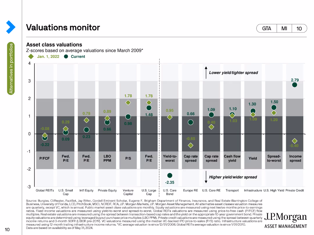
The slide includes a bar chart comparing asset class valuations using Z-scores based on average valuations since March 2009. The chart uses green and grey tones to depict current and past valuations across various asset categories.
Risk Assessment and Management
Financial Services
This slide monitors asset class valuations through Z-scores, comparing current values with historical averages since March 2009. It helps assess the relative attractiveness or risk of different asset classes.
Valuations, Z-scores, Asset Classes, Historical Average, Risk
false
Risk Assessment and Management
Financial Services
Single Chart
JP Morgan
Add to my slides
Remove from favorites
A slide with multiple line charts depicting median pre-money valuation trends across different funding series. Each line represents a funding series, with distinct colors for differentiation and clear axis labels.
Investment Analysis
Financial Services
Discussing the divergent trends in company valuations across various stages of funding, this slide is essential for investors and financial analysts to understand valuation dynamics and their implications on investment and fundraising strategies.
Valuation Trends, Investment Stages, Funding Series, Financial Analysis, Market Dynamics
false
Investment Analysis
Financial Services
Mixed Chart
JP Morgan
Add to my slides
Remove from favorites
A column chart at the bottom showing the percentage of companies focusing on various employee well-being initiatives. Text explains the broader value agenda embraced by leapfroggers.
Strategic Planning
Professional Services
The slide discusses how leapfroggers extend their innovations across departments, focusing on employee well-being and collaborative work environments.
Value Agenda, Employee Well-being, Innovation, Training, Collaboration
false
Strategic Planning
Professional Services
Mixed Chart
Accenture
Add to my slides
Remove from favorites
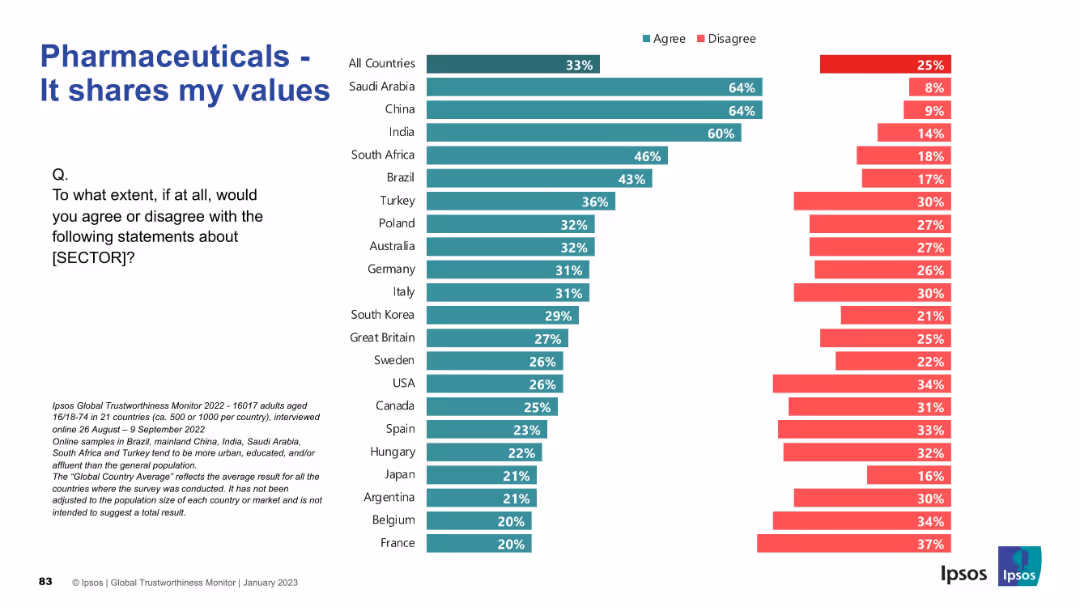
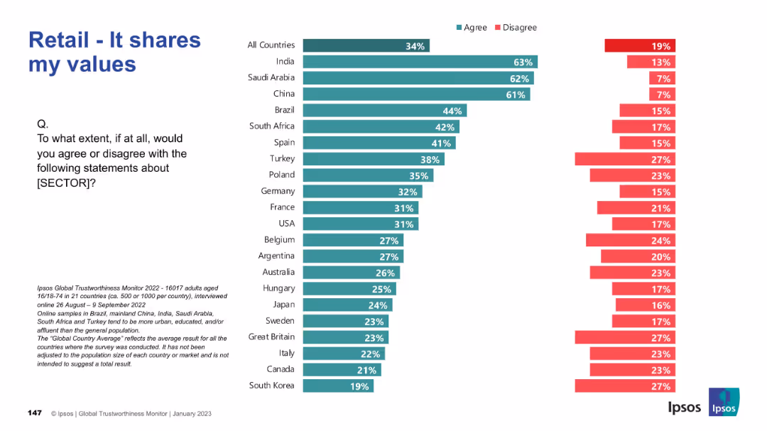
Horizontal bar chart by country. Teal (agree) values are low globally. Standardized layout with question and source text on left.
Market Analysis and Trends
Healthcare & Pharmaceuticals
The slide analyzes value alignment between the public and the pharmaceutical industry. Globally, agreement is low, with few countries above 40%. Only Saudi Arabia, China, and India show high congruence in values, while France and Belgium show the least.
value alignment, public trust, pharma, sentiment, healthcare, Ipsos data, personal values, ethics, perception, agreement
false
Market Analysis and Trends
Healthcare & Pharmaceuticals
Mixed Chart
IPSOS
Add to my slides
Remove from favorites
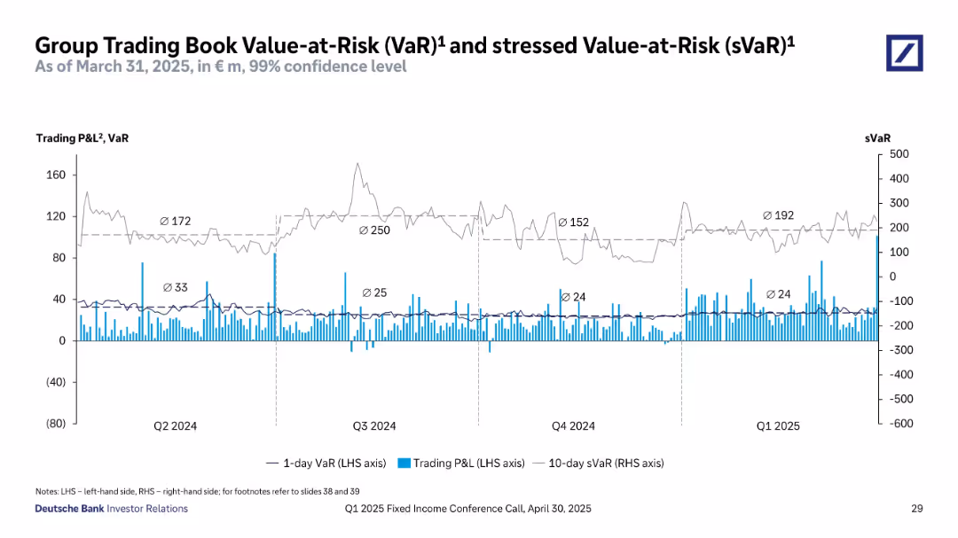
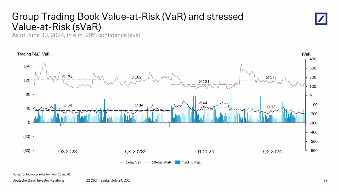
Time series graph showing 1-day VaR, 10-day sVaR, and trading P&L.
Risk Assessment and Management
Financial Services
Depicts Deutsche Bank's trading risk exposure over time using Value-at-Risk metrics. The chart includes 1-day VaR, 10-day stressed VaR, and daily trading profit and loss, tracked from Q2 2024 to Q1 2025. Shows volatility in sVaR and stability in VaR, helping assess market risk sensitivity and backtesting effectiveness in trading operations.
value-at-risk, VaR, sVaR, trading risk, Deutsche Bank, Q1 2025, financial exposure, P&L, market sensitivity, stress testing
false
Risk Assessment and Management
Financial Services
Single Chart
Deutsche Bank
Add to my slides
Remove from favorites
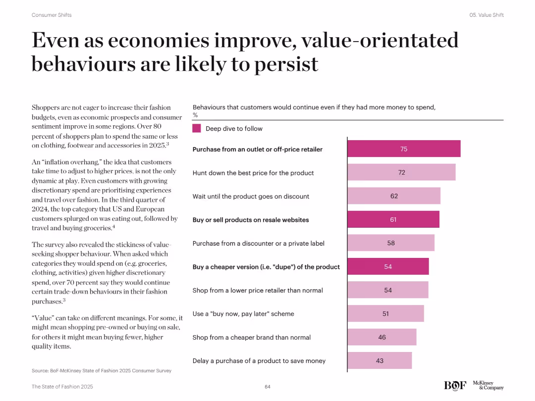
Right bar chart listing top 10 consumer trade-down behaviors with % deep dive follow. Left text discusses post-inflation and value-persistence behaviors. Dark pink bars indicate strong consumer intent.
Pricing Strategies
Retail & E-commerce
Despite improved economic outlook, shoppers are expected to maintain cost-conscious behaviors. Lists key actions such as buying from off-price retailers, waiting for discounts, and choosing cheaper versions. Highlights over 80% plan to spend the same or less on fashion in 2025.
value behavior, discount shopping, price sensitivity, trade-down, economic resilience
false
Pricing Strategies
Retail & E-commerce
Mixed Chart
McKinsey
Add to my slides
Remove from favorites
Diagram slide with icons representing the four key segments of the value chain in agriculture, accompanied by brief descriptions.
Strategic Planning
Agriculture & Food Production
Describes the agriculture value chain's four key segments, suggesting varied investment opportunities across each segment.
value chain, agriculture, investment opportunities, segmentation, input providers, services
false
Strategic Planning
Agriculture & Food Production
Table
EY
Add to my slides
Remove from favorites
The slide has a purple-themed color scheme with two main visual elements. On the left, there's a hexagonal flow chart with text labels like "Identify Consumer Demand". On the right, a radial graph shows various business impacts in shades of purple indicating different impact levels.
Strategic Planning
Technology & Software
The slide emphasizes the importance of an end-to-end approach to business planning and intelligent manufacturing. It maps interventions across the value chain and their degree of impact, serving as a strategic planning tool for assessing business processes and performance frontiers.
Value Chain, Business Planning, Manufacturing, Strategic Planning, End-to-End, Performance, Intelligent Manufacturing, Impact Levels, Fullfillment Capabilities, Optimization
false
Strategic Planning
Technology & Software
Single Chart
Accenture
Add to my slides
Remove from favorites
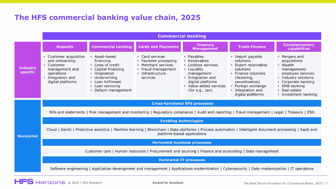
Multi-section diagram with vertical industry-specific layers and horizontal enablers, processes, and IT layers.
Product and Service Analysis
Financial Services
This visual breaks down the commercial banking value chain into functional domains (e.g., deposits, lending), cross-functional processes, and enabling technologies, providing a comprehensive structure of service components.
Value chain, commercial banking, fintech, process automation, GenAI, treasury, lending
false
Product and Service Analysis
Financial Services
Table
Accenture
Add to my slides
Remove from favorites
Presents a detailed flow diagram breaking down the crop market value chain into four main buckets with accompanying descriptions.
Operational Efficiency
Agriculture & Food Production
The slide breaks down the crop market value chain into detailed segments, showing input, produce, transform, and consume stages.
value chain, crop market, segmentation, inputs, produce, transform, consume
false
Operational Efficiency
Agriculture & Food Production
Table
EY
Add to my slides
Remove from favorites
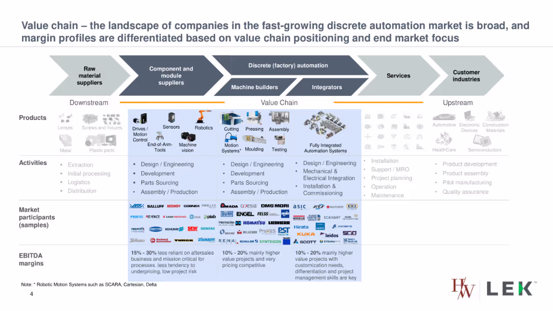
The slide presents a detailed value chain diagram for the discrete automation market, illustrating different products, activities, market participants, and EBITDA margins.
Competitive Landscape
Industrial & Manufacturing
The slide analyzes the value chain of the discrete automation market, highlighting the diversity of companies involved and the variation in margin profiles based on their positioning and focus.
value chain, discrete automation, market participants, products, activities, EBITDA margins
false
Competitive Landscape
Industrial & Manufacturing
Table
LEK
Add to my slides
Remove from favorites
Presents a horizontal value chain diagram illustrating the stages from input companies to consumers, incorporating icons for each stage. The design is linear and straightforward.
Customer and Market Segmentation
Agriculture & Food Production
Describes the food industry value chain in Belgium, aiming to assess sustainability practices. It mentions a survey covering various stakeholders from farming to retail, focusing on sustainable business practices.
value chain, food industry, sustainability, Belgium
false
Customer and Market Segmentation
Agriculture & Food Production
Diagram
Deloitte
Add to my slides
Remove from favorites
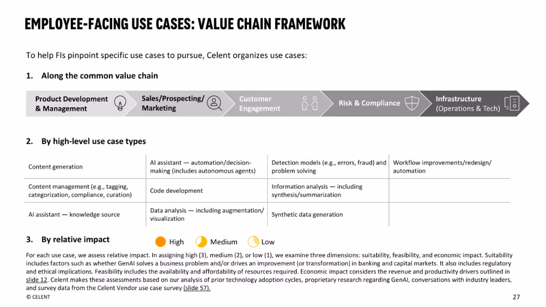
White background with a gray horizontal flow diagram (value chain) on top. Three-part breakdown: common value chain, high-level use case types, and impact scoring key (High/Medium/Low).
Operational Efficiency
Financial Services
Introduces a framework for evaluating employee-facing GenAI use cases across the value chain (product development to infrastructure). Categorizes use case types and explains assessment based on suitability, feasibility, and impact. This structure guides institutions in selecting impactful, practical GenAI implementations.
value chain, impact, GenAI, employee-facing, framework, productivity, automation
false
Operational Efficiency
Financial Services
Framework
Oliver Wyman
Add to my slides
Remove from favorites
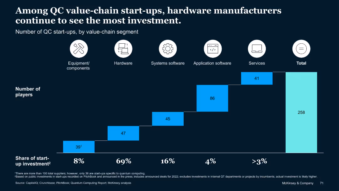
Stacked bar chart with icons above each segment; horizontal layout emphasizing value-chain categories with associated number of players.
Investment Analysis
Artificial Intelligence
Breaks down QC start-ups by value-chain segments (hardware, software, services). Shows that most investment is directed toward hardware, highlighting disparity across other segments.
Value chain, investment, quantum hardware, start-ups, segmentation
false
Investment Analysis
Artificial Intelligence
Single Chart
McKinsey
Add to my slides
Remove from favorites
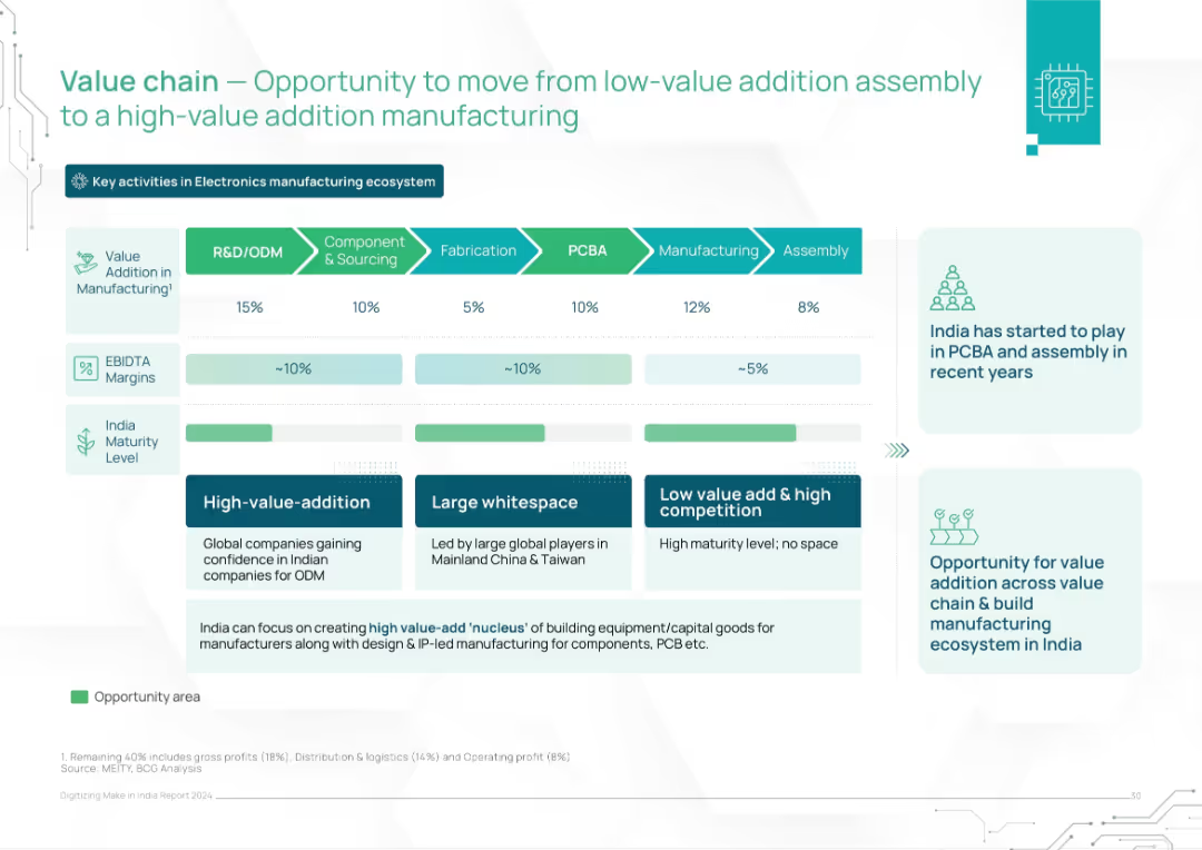
Horizontal value chain layout across 6 stages, with value addition, EBITDA, and maturity level indicators. Includes strategic suggestions.
Operational Efficiency
Consumer Goods
The slide analyzes the electronics manufacturing value chain and highlights India's positioning and whitespace. It promotes a shift from low-margin assembly to high-value activities like R&D and PCBA, suggesting targeted capacity building.
value chain, manufacturing, PCBA, India, electronics, value addition, margins, strategy, ODM
false
Operational Efficiency
Consumer Goods
Mixed Chart
BCG
Add to my slides
Remove from favorites
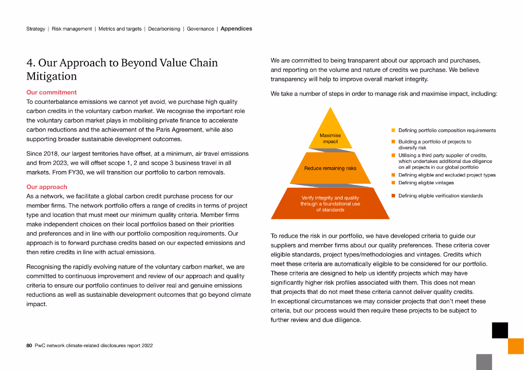
The slide features a pyramid diagram and text, detailing strategies for beyond value chain mitigation, including carbon credits and quality standards.
Strategic Planning
Energy & Utilities
The slide describes the approach to mitigating emissions beyond the value chain, focusing on carbon credits, risk management, and quality assurance standards.
value chain, mitigation, carbon credits, quality standards, emissions, risk management
false
Strategic Planning
Energy & Utilities
Framework
PwC/Strategy&
Add to my slides
Remove from favorites
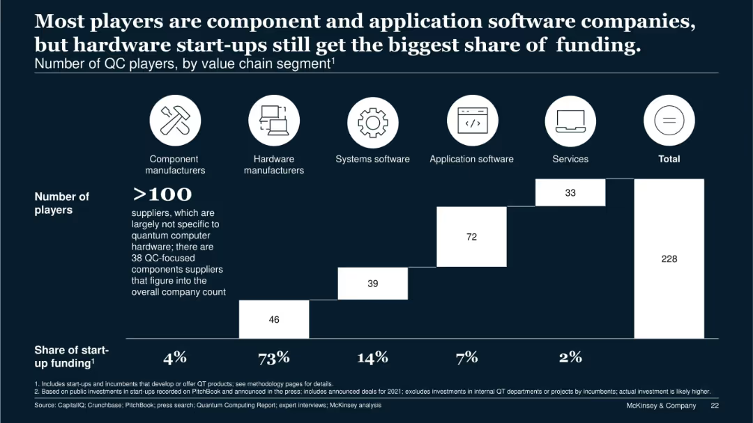
Stacked bar chart segmented by company type; icons for categories above the chart; funding share noted below.
Competitive Landscape
Technology & Software
This slide segments 228 quantum computing companies by value chain role. Although hardware manufacturers represent only a fraction of players, they receive 73% of total startup funding. It illustrates market imbalance and the dominant capital flow toward hardware.
value chain, QC players, startup funding, hardware, components, services
false
Competitive Landscape
Technology & Software
Single Chart
McKinsey
Add to my slides
Remove from favorites
The slide includes a step-by-step process diagram showing different phases of service delivery from needs definition to client support.
Operational Efficiency
Professional Services
The slide outlines the entire value chain process for service delivery, emphasizing quality assurance and client support.
Value Chain, Service Delivery, Process, Quality Assurance, Client Support
false
Operational Efficiency
Professional Services
Linear Flow
IPSOS
Add to my slides
Remove from favorites
The slide shows a world map and text describing a shift from globalized to localized and decarbonized value chains. It includes icons and lines connecting different regions, indicating shifts in operational strategies.
Operational Efficiency
Industrial & Manufacturing
Discusses the evolution from globalized to localized value chains, emphasizing the need for flexibility and decarbonization in operations to mitigate future disruptions and improve resiliency.
value chains, globalization, localization, decarbonization, operational flexibility, future disruptions, resiliency, Accenture Research
false
Operational Efficiency
Industrial & Manufacturing
Graphic
Accenture
Add to my slides
Remove from favorites
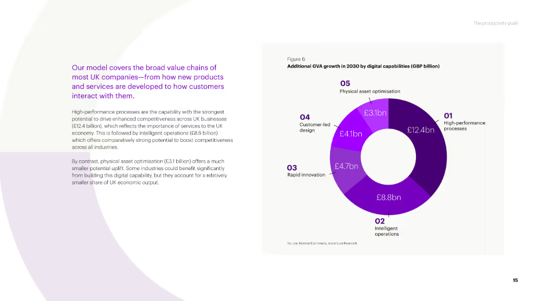
A donut chart showing additional GVA growth in 2030 by digital capabilities (high-performance processes, intelligent operations, rapid innovation, customer-led design, physical asset optimisation) for UK companies.
Market Analysis and Trends
Technology & Software
This slide details the potential GVA growth from digital capabilities in the UK, highlighting which processes and innovations will drive the most value across various industries.
value chains, GVA growth, digital capabilities, UK companies, high-performance processes
false
Market Analysis and Trends
Technology & Software
Mixed Chart
Accenture
Add to my slides
Remove from favorites
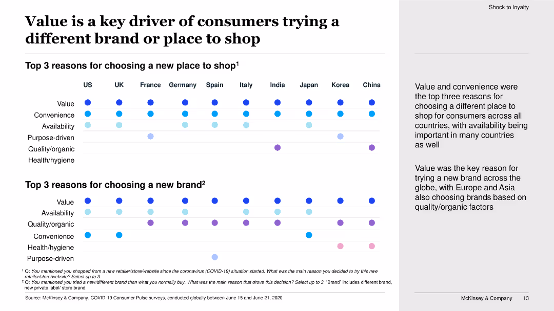
This slide features dot plots showing the top three reasons for choosing a new place to shop and a new brand in various countries.
Market Analysis and Trends
Retail & E-commerce
The slide explores the key reasons consumers choose different brands or places to shop, with value and convenience being primary factors across multiple countries.
value, convenience, new brand, new place to shop, consumer choice, dot plots, survey, shopping behavior
false
Market Analysis and Trends
Retail & E-commerce
Boxed
McKinsey
Add to my slides
Remove from favorites
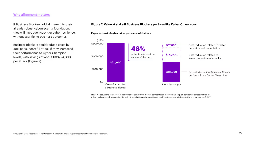
A bar chart comparing the cost of cyber attacks if Business Blockers performed like Cyber Champions. Purple bars represent cost savings and reduction potential.
Strategic Planning
Professional Services
The slide outlines potential cost savings for organizations if they improve their cyber resilience to the level of Cyber Champions, highlighting significant reductions in attack costs.
value, cost savings, cyber resilience, performance, comparison
false
Strategic Planning
Professional Services
Multiple Chart
Accenture
Add to my slides
Remove from favorites
The slide is split into two columns and one row with a dominant red color scheme. It features multiple boxes with rounded corners, each containing icons and brief texts describing different elements such as 'Our environment,' 'Why,' 'What,' 'How,' 'Services & impact.' There is also a use of pie charts.
Industry Overview
Professional Services
This slide details PwC's value creation through its business model and practices. It discusses the company's environmental considerations, purpose, vision, transformation process, and the impact of services in areas like assurance, tax, and advisory. It is suitable for explaining PwC's strategic approach and its relevance to stakeholders.
value creation, business model, services, impact, strategy
false
Industry Overview
Professional Services
Linear Flow
PwC/Strategy&
Add to my slides
Remove from favorites
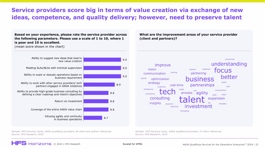
Two-part layout: bar chart with rating on value-related attributes and a word cloud on areas of improvement. Talent stands out in feedback.
Organizational Structure and Change
Artificial Intelligence
This slide illustrates clients’ positive evaluation of AADA providers for innovation and operational flexibility. However, the word cloud indicates talent retention as a key concern, suggesting focus areas for improvement.
value creation, innovation, consulting, AADA, client feedback, talent retention, SLAs, agility
false
Organizational Structure and Change
Artificial Intelligence
Mixed Chart
KPMG
Add to my slides
Remove from favorites
The slide includes three pie charts comparing operating profit distribution between investments, employees, shareholders, and taxes for 2017, 2021, and 2025.
Strategic Planning
Professional Services
It shows the distribution of value creation between stakeholders for the years 2017, 2021, and projected for 2025, highlighting changes over time.
value creation, stakeholders, profit, Ipsos, planning
false
Strategic Planning
Professional Services
Multiple Chart
IPSOS
Add to my slides
Remove from favorites
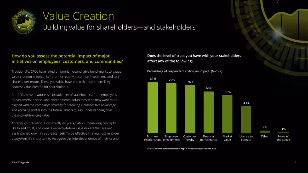
The slide features a mix of text and a vertical column chart. The left side has detailed paragraphs discussing value creation, while the right side presents a chart showing the impact of trust on various factors.
Strategic Planning
Professional Services
This slide addresses the impact of major initiatives on various stakeholders and the importance of trust in influencing business relationships, employee engagement, and financial performance.
value creation, trust, stakeholders, impact, initiatives, business relationships, employee engagement, financial performance
false
Strategic Planning
Professional Services
Mixed Chart
Deloitte
Add to my slides
Remove from favorites
A mix of text and process diagrams illustrating the Value Engineering Team (VET) concept and its practical applications.
Strategic Planning
Professional Services
Describes the VET concept, detailing structured processes for implementing value engineering decisions efficiently.
Value Engineering Team, VET, strategic planning, process, implementation, efficiency, procurement, structured sessions, concept
false
Strategic Planning
Professional Services
Linear Flow
Kearney
Add to my slides
Remove from favorites
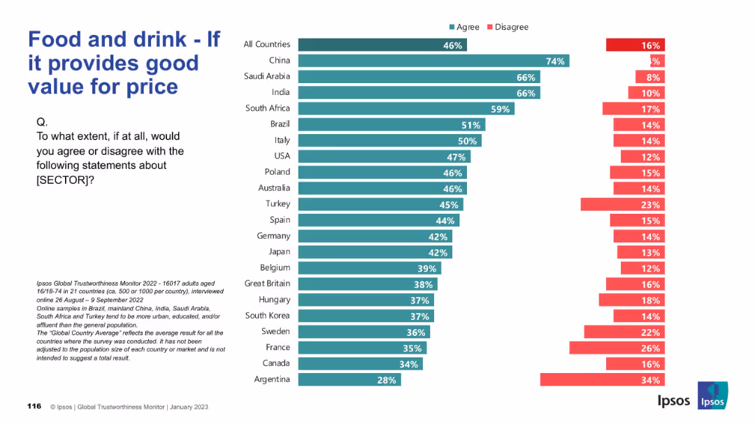
Bar chart split by countries showing agreement/disagreement on whether the sector delivers good value.
Pricing Strategies
Consumer Goods
This chart presents public opinion on whether the food and drink sector offers good value for money. China, Saudi Arabia, and India lead in agreement, indicating strong consumer satisfaction in pricing.
value for price, pricing, consumer satisfaction, Ipsos, food and drink, international survey, affordability, global opinions
false
Pricing Strategies
Consumer Goods
Mixed Chart
IPSOS
Add to my slides
Remove from favorites
The slide features several bar charts comparing leaders and others in value generation across dimensions like cost, resilience, ESG, and growth.
Operational Efficiency
Financial Services
It highlights how leaders generate value through cost reduction, resilience, ESG, and growth. It is used for showing value dimensions and their impact.
Value generation, cost reduction, resilience, ESG, growth, procurement, financial impact
false
Operational Efficiency
Financial Services
Mixed Chart
Kearney
Add to my slides
Remove from favorites
The slide features several bar charts comparing leaders and others in value generation across dimensions like cost, resilience, ESG, and growth.
Operational Efficiency
Financial Services
It highlights how leaders generate value through cost reduction, resilience, ESG, and growth. It is used for showing value dimensions and their impact.
Value generation, cost reduction, resilience, ESG, growth, procurement, financial impact
false
Operational Efficiency
Financial Services
Single Chart
Kearney
Add to my slides
Remove from favorites
A column chart comparing the approximate values lost by users during incidents such as hacking, fraud, or scams in 2023 and 2022.
Risk Assessment and Management
Financial Services
This slide displays the reported financial losses during incidents involving hacking or fraud on crypto trading platforms, comparing 2023 and 2022.
Value, loss, incident, hacking, fraud, 2023, 2022
false
Risk Assessment and Management
Financial Services
Mixed Chart
IPSOS
Add to my slides
Remove from favorites
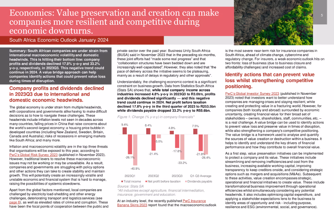
Bar charts depicting changes in company financials, including total income, net profit before taxation, and dividends payable.
Risk Assessment and Management
Financial Services
Discusses how value preservation and creation can help South African companies navigate economic challenges and remain competitive.
Value Preservation, Economic Downturns, Resilience, Competitiveness, Financial Performance
false
Risk Assessment and Management
Financial Services
Mixed Chart
PwC/Strategy&
Add to my slides
Remove from favorites
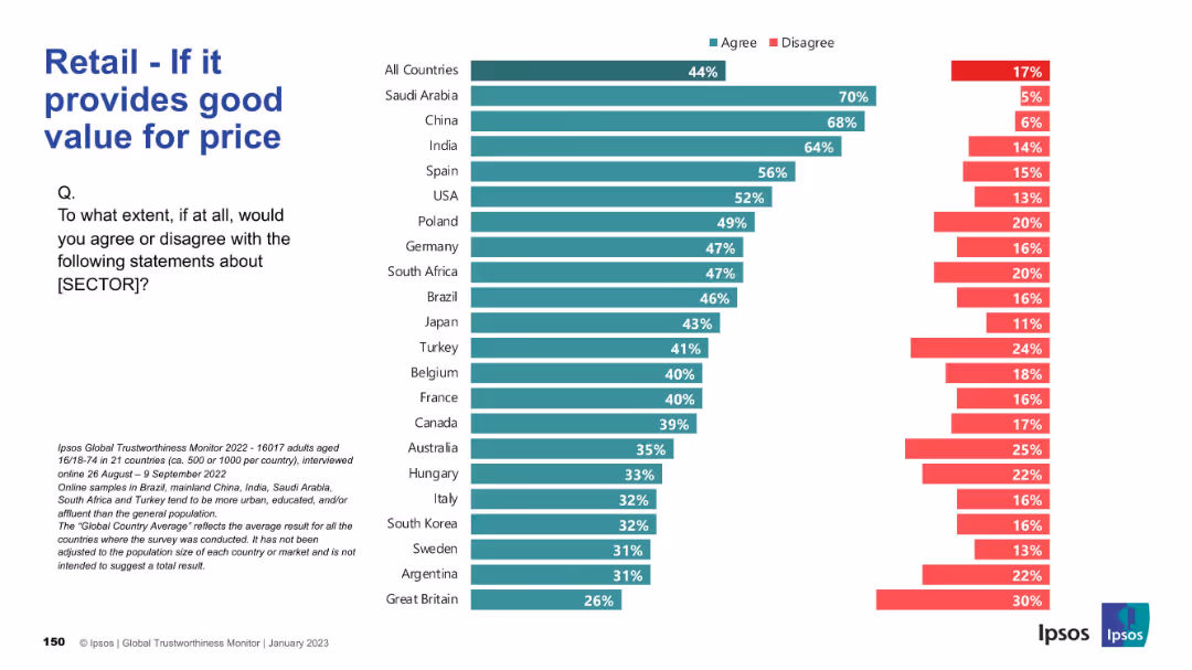
Horizontal bar chart; agreement levels on price/value alignment; same visual theme.
Pricing Strategies
Retail & E-commerce
This slide assesses how well the retail sector is seen to deliver value for money. Saudi Arabia, China, and India top the list; UK ranks lowest.
value, pricing, affordability, retail perception, customer opinion
false
Pricing Strategies
Retail & E-commerce
Mixed Chart
IPSOS
Add to my slides
Remove from favorites
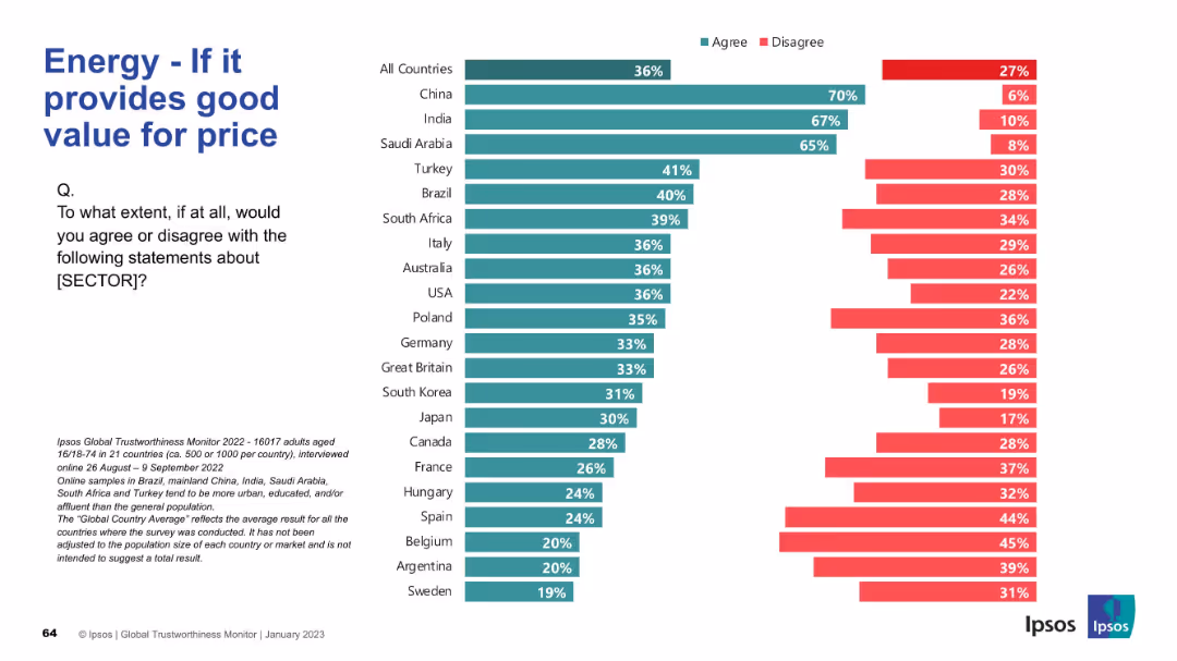
Final bar chart in the series; evaluates perceived value-for-money
Market Analysis and Trends
Energy & Utilities
This slide examines whether people believe the energy sector offers good value for money. China, India, and Saudi Arabia are again the highest in agreement. Western and South American countries generally exhibit skepticism about value.
value, pricing, perception, affordability, energy sector, trust, survey, Ipsos
false
Market Analysis and Trends
Energy & Utilities
Mixed Chart
IPSOS
Add to my slides
Remove from favorites
Triangular diagram depicting 30 elements of value that elevate products and services beyond commodity status, categorized into social, emotional, and functional.
Product and Service Analysis
Professional Services
Outlines a framework for understanding the various elements that add value to products and services, useful in developing marketing and product development strategies.
Value, Product Analysis, Services
false
Product and Service Analysis
Professional Services
Framework
Bain
Add to my slides
Remove from favorites
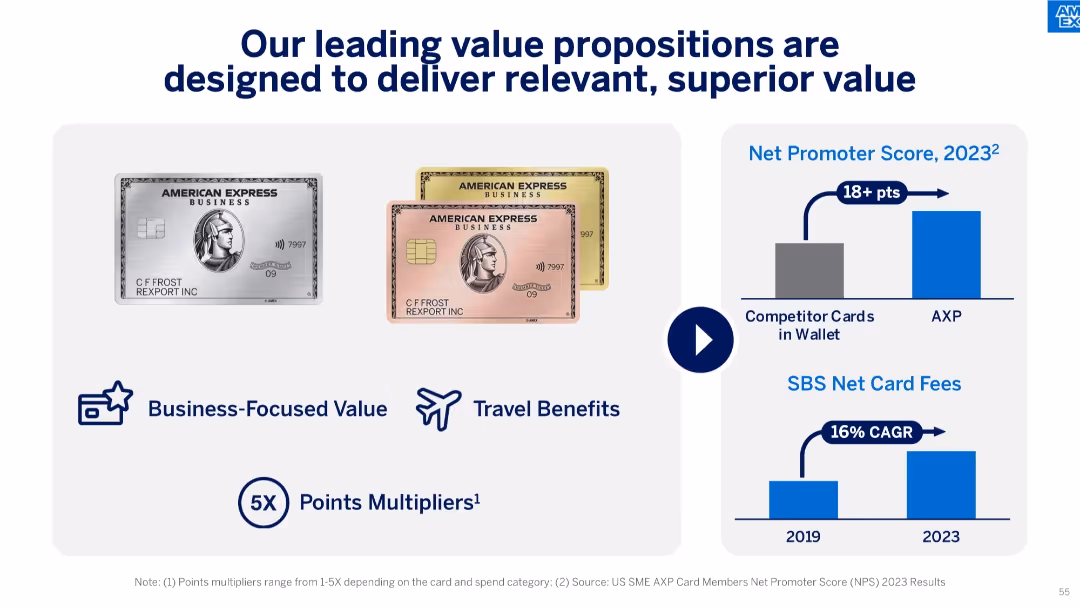
Visual of Amex Business cards, benefit icons, and two graphs showing Net Promoter Score and SBS Net Card Fee CAGR from 2019 to 2023.
Product and Service Analysis
Financial Services
The slide emphasizes Amex's customer value proposition with business-focused features, strong Net Promoter Scores, and a 16% CAGR in SBS Net Card Fees, suggesting strong customer satisfaction and profitability.
value proposition, Amex cards, NPS, net card fees, customer satisfaction, travel benefits, rewards, B2B focus
false
Product and Service Analysis
Financial Services
Mixed Chart
McKinsey
Add to my slides
Remove from favorites
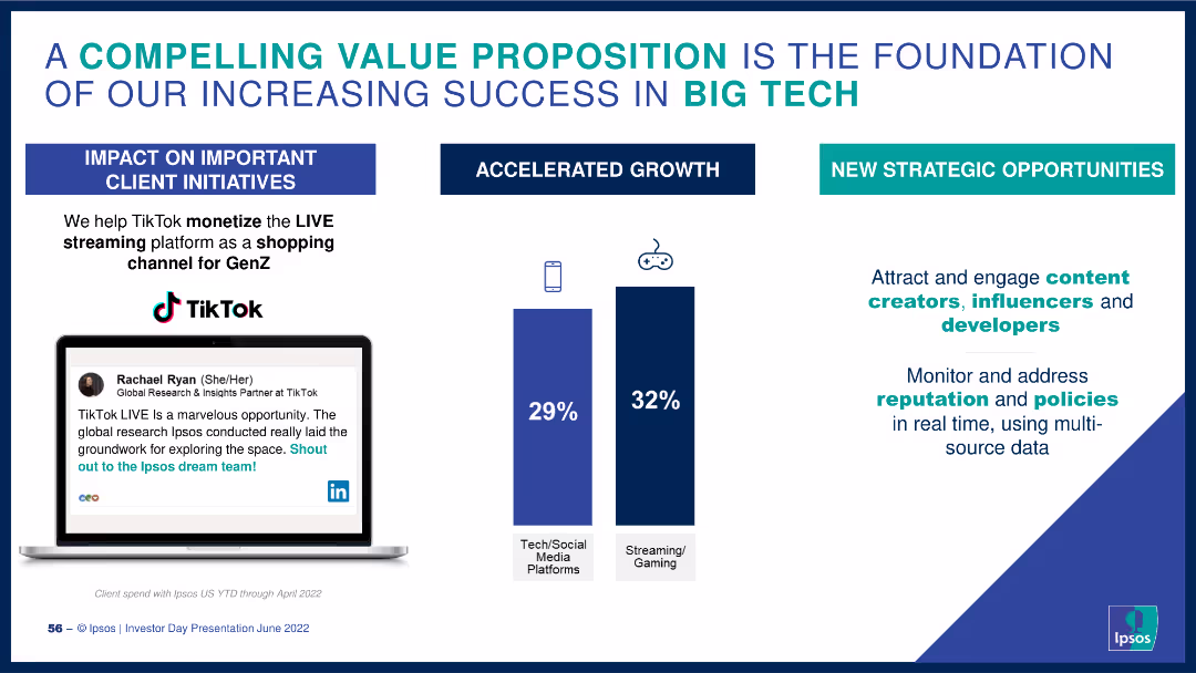
The slide includes a quote from a TikTok partner, bar charts showing growth percentages in tech/social media and streaming/gaming, and key strategic points.
Client Case Studies
Technology & Software
It showcases Ipsos's value proposition, highlighting successful client initiatives with TikTok and growth in tech and gaming sectors, along with strategic opportunities.
value proposition, client success, TikTok, Ipsos, growth
false
Client Case Studies
Technology & Software
Mixed Chart
IPSOS
Add to my slides
Remove from favorites
The slide includes three column charts for different customer segments with supporting icons and bullet points highlighting banking features and strategies.
Market Analysis and Trends
Financial Services
Analyzes the bank's value proposition tailored to different customer segments, focusing on account types and associated services designed to meet varying financial needs.
value proposition, customer segments, banking, financial health, low-cost, full-service, relationship banking, checking accounts, market strategy
false
Market Analysis and Trends
Financial Services
Multiple Chart
JP Morgan
Add to my slides
Remove from favorites
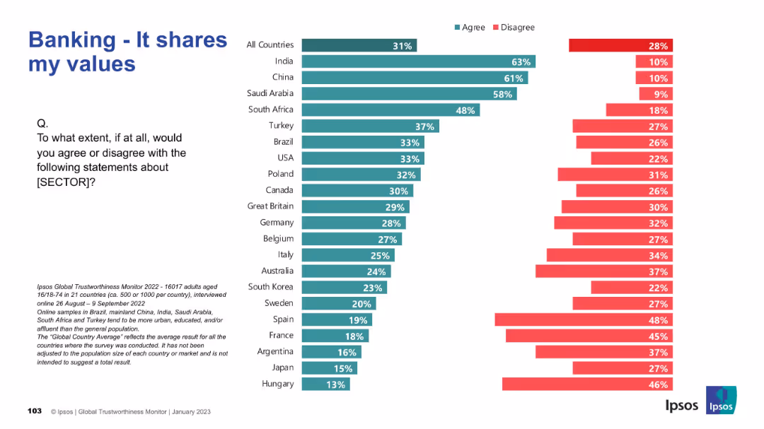
Horizontal bar chart showing level of agreement across countries. Follows same visual format.
Customer and Market Segmentation
Financial Services
Analyzes how well people feel the banking sector aligns with their personal values. Emerging markets show stronger alignment perceptions than Western countries. This has implications for market trust and engagement.
values alignment, banking, global sentiment, public opinion, Ipsos, segmentation
false
Customer and Market Segmentation
Financial Services
Mixed Chart
IPSOS
Add to my slides
Remove from favorites
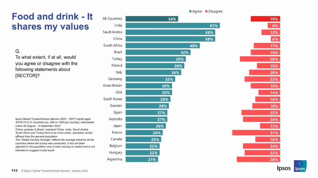
Horizontal bar chart showing public agreement/disagreement on value alignment with the food and drink sector.
Market Analysis and Trends
Consumer Goods
This slide assesses whether consumers feel that the food and drink sector shares their personal values. The data is displayed by country, with highest alignment seen in India and Saudi Arabia.
values alignment, consumer beliefs, global trust, Ipsos survey, food industry, agreement, perception, country data, chart
false
Market Analysis and Trends
Consumer Goods
Mixed Chart
IPSOS
Add to my slides
Remove from favorites
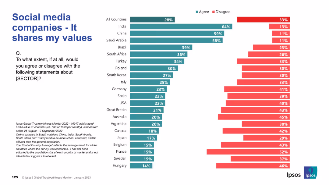
Horizontal bar chart showing alignment of social media companies with personal values by country; design is consistent with earlier slides.
Market Analysis and Trends
Technology & Software
This slide assesses whether individuals feel that social media companies share their personal values. Strong alignment is seen in India, China, and Saudi Arabia, while countries like France, Belgium, and Hungary report the lowest agreement, reflecting cultural and ideological disconnects.
values alignment, cultural trust, user perception, social media, Ipsos, agree, disagree
false
Market Analysis and Trends
Technology & Software
Mixed Chart
IPSOS
Add to my slides
Remove from favorites
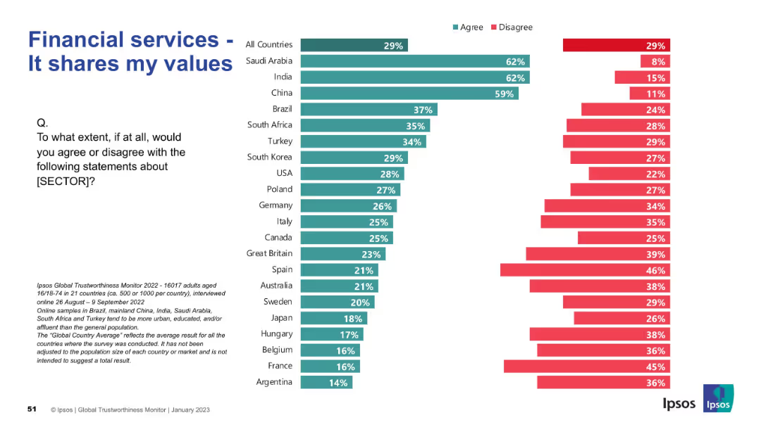
Visual layout consistent with others; stacked bar chart across countries
Customer and Market Segmentation
Financial Services
This slide evaluates alignment of financial services with personal values. High agreement in Saudi Arabia, India, and China contrasts with low agreement in Western countries. Public sentiment varies significantly by region.
values, alignment, customer perception, trust, Ipsos, segmentation, public opinion, financial services
false
Customer and Market Segmentation
Financial Services
Mixed Chart
IPSOS
Add to my slides
Remove from favorites
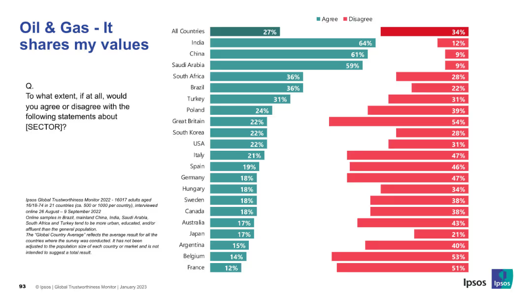
Standard Ipsos visualization with “Agree” and “Disagree” bars by country; values perception theme; survey metadata at bottom.
Market Analysis and Trends
Energy & Utilities
This slide addresses alignment of values between the public and oil & gas sector. Strongest alignment is seen in India, China, and Saudi Arabia, while most Western nations report weak alignment, reflecting cultural and ethical disconnects.
Values Alignment, Oil & Gas, Ipsos, Cultural Fit, Public Opinion, Global Comparison, Sector Trust, Personal Values, Survey Insights
false
Market Analysis and Trends
Energy & Utilities
Mixed Chart
IPSOS
Add to my slides
Remove from favorites
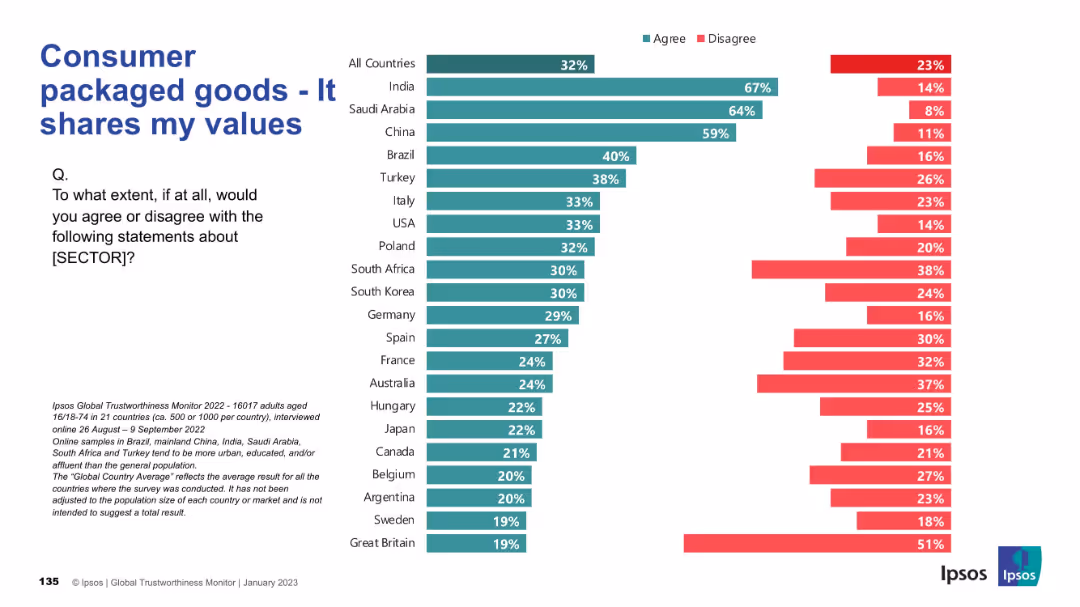
Country-level comparison of public agreement/disagreement with whether the CPG sector aligns with their personal values.
Market Analysis and Trends
Consumer Goods
The chart highlights agreement rates across countries regarding whether individuals feel the CPG sector shares their values, with notable differences in sentiment.
values, alignment, perception, cultural relevance, consumer trust, CPG, Ipsos, global attitudes, agreement
false
Market Analysis and Trends
Consumer Goods
Mixed Chart
IPSOS
Add to my slides
Remove from favorites
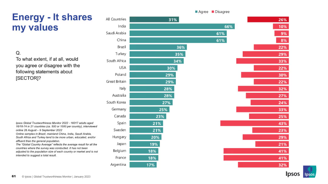
Consistent bar chart format; question focuses on alignment with personal values
Market Analysis and Trends
Energy & Utilities
This slide addresses whether people feel the energy sector aligns with their personal values. High scores in India, Saudi Arabia, and China indicate stronger alignment in these countries. Western countries generally express lower agreement.
values alignment, public perception, ethics, energy sector, Ipsos, international survey, agreement
false
Market Analysis and Trends
Energy & Utilities
Mixed Chart
IPSOS
Add to my slides
Remove from favorites
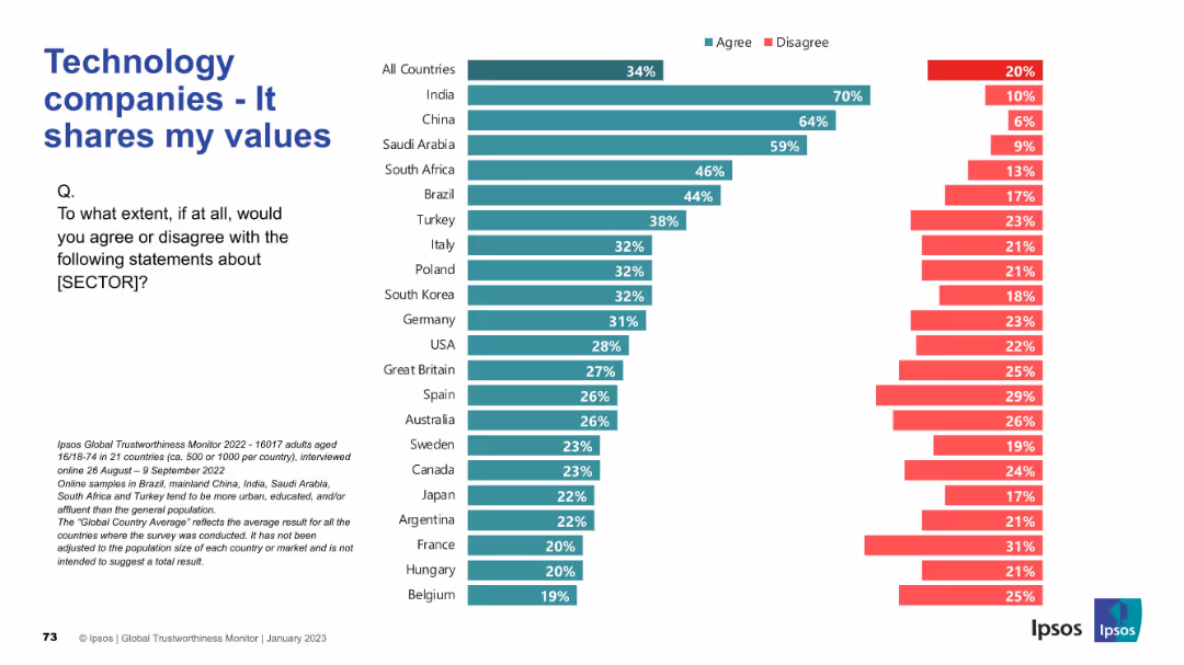
Traditional Ipsos slide design; left-aligned title/question, right-aligned bar chart.
Customer and Market Segmentation
Technology & Software
This slide evaluates how aligned technology companies are with the personal values of individuals in different countries, as measured by survey responses.
values alignment, tech companies, Ipsos, trust, ethics, customer perception, cultural fit, survey, sentiment, agreement
false
Customer and Market Segmentation
Technology & Software
Mixed Chart
IPSOS
Add to my slides
Remove from favorites
Bar chart with descending agreement levels per country; agreement/disagreement shown visually.
Market Analysis and Trends
Retail & E-commerce
Reflects whether consumers feel retail companies align with their personal values. Agreement is low globally, with only a few countries exceeding 40%.
values, alignment, trust, opinion, retail sector, Ipsos, global
false
Market Analysis and Trends
Retail & E-commerce
Mixed Chart
IPSOS
Add to my slides
Remove from favorites
Bar chart showing levels of agreement and disagreement per country
Customer and Market Segmentation
Government & Public Sector
This slide reflects how closely people feel their governments align with their personal values. India scores highest, while disagreement is strong in Argentina and others.
values, alignment, trust, perception, government, survey, Ipsos, agreement, citizen values
false
Customer and Market Segmentation
Government & Public Sector
Mixed Chart
IPSOS
Add to my slides
Remove from favorites
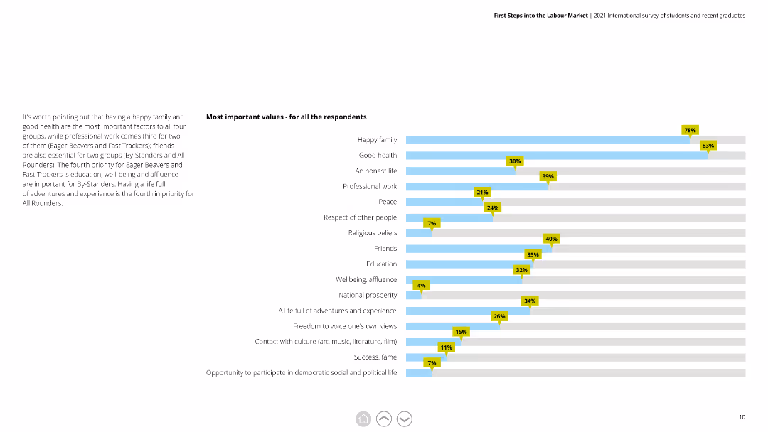
The slide features a horizontal bar chart with multiple categories representing different values. Each bar indicates the importance percentage of the respective value among the respondents. The chart has blue bars with yellow percentage markers.
Market Analysis and Trends
Education & Training
The slide displays the most important values for all respondents, highlighting factors like family, health, and professional work. It helps understand what young graduates prioritize in life, useful for tailoring educational and training programs.
values, bar chart, priorities, respondents, family, health, education, importance, graduates
false
Market Analysis and Trends
Education & Training
Mixed Chart
Deloitte
Add to my slides
Remove from favorites
Column chart depicting years of dividend increases and a line graph comparing total shareholder return to market indices.
Strategic Planning
Energy & Utilities
Highlights the company's shareholder value proposition, emphasizing low-risk business model and steady growth.
value, shareholder, growth, risk, dividends
false
Strategic Planning
Energy & Utilities
Multiple Chart
Barclays
Add to my slides
Remove from favorites
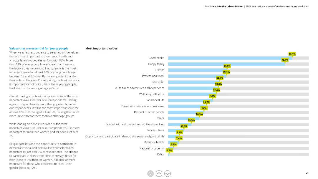
A horizontal bar chart (bar chart) ranking most important values among respondents, such as good health and a happy family.
Market Analysis and Trends
Professional Services
Provides insight into the top values prioritized by respondents, indicating a focus on health, family, and professional work.
Values, Importance, Health, Family, Professional Work, Respondents
false
Market Analysis and Trends
Professional Services
Mixed Chart
Deloitte
Add to my slides
Remove from favorites
Displays comparative line charts and bar charts for value vs. growth valuations and returns across different interest rate environments.
Market Analysis and Trends
Financial Services
The slide compares value and growth stock performance in varying interest rate conditions, suggesting support for value stocks in higher rate environments.
value stocks, growth stocks, interest rates, market analysis, valuations
false
Market Analysis and Trends
Financial Services
Multiple Chart
JP Morgan
Add to my slides
Remove from favorites
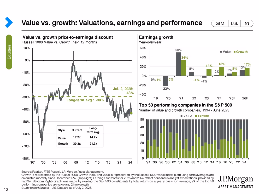
Three-part slide with valuation discount line chart, earnings growth bar chart, and value vs. growth performance bar chart of top 50 stocks.
Market Analysis and Trends
Financial Services
The slide compares valuation, earnings, and performance between value and growth stocks. As of July 2, 2025, value stocks trade at a -43% discount to growth, deeper than the long-term average. Earnings forecasts show stronger near-term growth for value stocks. Historical top-performing stock count also favors growth.
value stocks, growth stocks, valuation discount, earnings, performance, S&P 500, style investing, market segmentation
false
Market Analysis and Trends
Financial Services
Multiple Chart
JP Morgan
Add to my slides
Remove from favorites
The slide features a circular diagram labeled "Goldman Sachs FINANCIAL CLOUD" with circular arrows linking concepts like "Drive scale advantages" and "Internal developers access the same APIs as clients", along with explanatory text.
Operational Efficiency
Financial Services
This slide illustrates the strategy of Goldman Sachs to create value by leveraging technology platforms and APIs to drive scale advantages and provide uniform services to both internal developers and clients, thereby optimizing operations and revenue.
value, technology, platform, APIs, efficiency
false
Operational Efficiency
Financial Services
Linear Flow
Goldman Sachs
Add to my slides
Remove from favorites
This slide presents a combined graph and textual information. On the left, a column chart shows 'GS Group Vanilla and Preferred Stock Issuance vs. Maturities' over several years. On the right, a pie chart details '1Q20 GS Group Vanilla Issuance by Currency'. Additionally, there are bullet points summarizing key funding details.
Financial Performance
Financial Services
Offers a look into the company's funding strategy through various debt instruments and preferred stocks, useful for investors or financial analysts interested in funding diversification and debt maturity profiles.
vanilla funding, preferred stock, issuance, debt maturities, bar chart, pie chart, currency distribution, investment analysis, financial diversification, funding strategy
false
Financial Performance
Financial Services
Multiple Chart
Goldman Sachs
Add to my slides
Remove from favorites
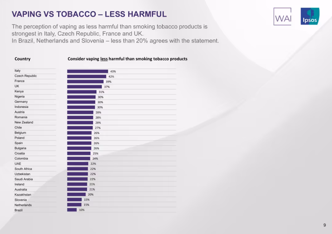
Ranked bar chart by country showing percentage who believe vaping is less harmful than smoking. Purple bars with white background.
Market Analysis and Trends
Healthcare & Pharmaceuticals
The slide shows countries where the belief that vaping is less harmful than smoking is most prevalent. Italy leads with 43%, followed by Czech Republic and France. The lowest perceptions are found in Brazil and Slovenia.
vaping less harmful, perception, smoking, comparative risk, countries, public opinion, Ipsos, ranking
false
Market Analysis and Trends
Healthcare & Pharmaceuticals
Single Chart
IPSOS
Add to my slides
Remove from favorites
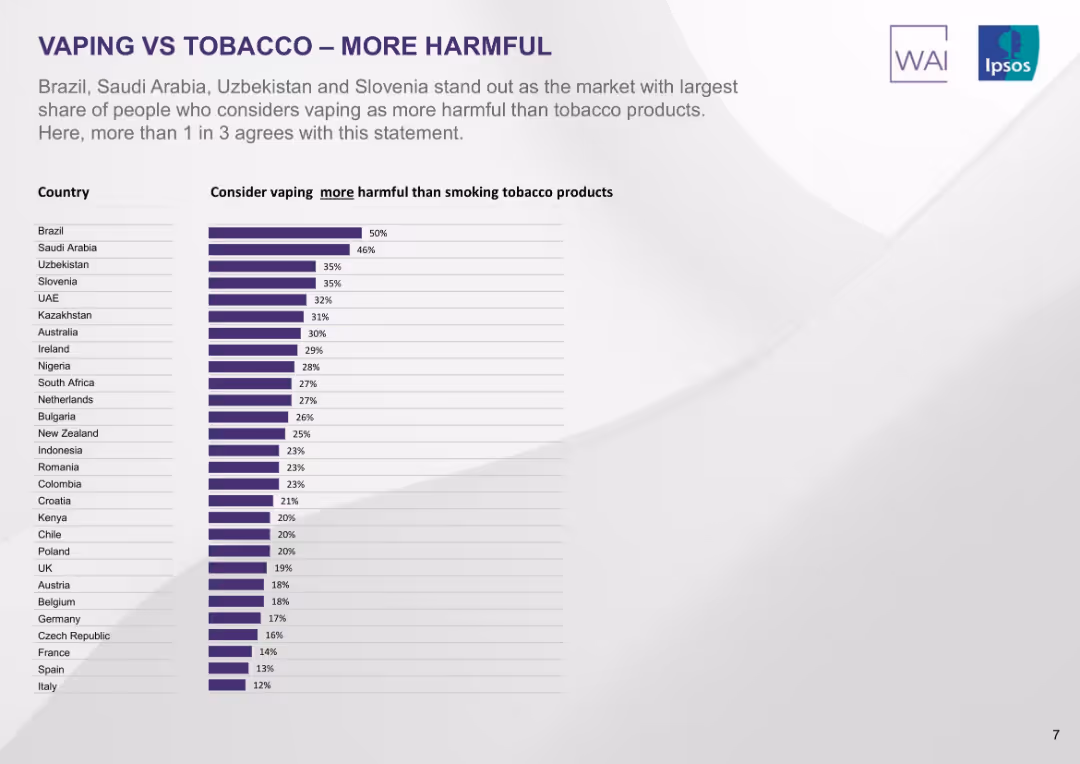
Vertical bar chart listing countries by percentage who view vaping as more harmful than smoking. Purple bars on minimalist background.
Market Analysis and Trends
Healthcare & Pharmaceuticals
This slide isolates the portion of people who view vaping as more harmful than smoking. Brazil leads at 50%, with Saudi Arabia, Uzbekistan, and Slovenia close behind. In many countries, fewer than 30% hold this view.
vaping more harmful, perception, smoking, country comparison, Ipsos, risk views, public opinion, ranked list
false
Market Analysis and Trends
Healthcare & Pharmaceuticals
Single Chart
IPSOS
Add to my slides
Remove from favorites
Large centered pie chart with two contrasting segments in purple shades; minimal text and clean background.
Market Analysis and Trends
Healthcare & Pharmaceuticals
This slide shows that 74% of global tobacco smokers believe vaping is at least as harmful as smoking, with only 26% seeing it as less harmful. It highlights the skepticism of smokers regarding vaping's health impact.
vaping, smoking, health perception, pie chart, global smokers, harm comparison, Ipsos, survey
false
Market Analysis and Trends
Healthcare & Pharmaceuticals
Single Chart
IPSOS
Add to my slides
Remove from favorites
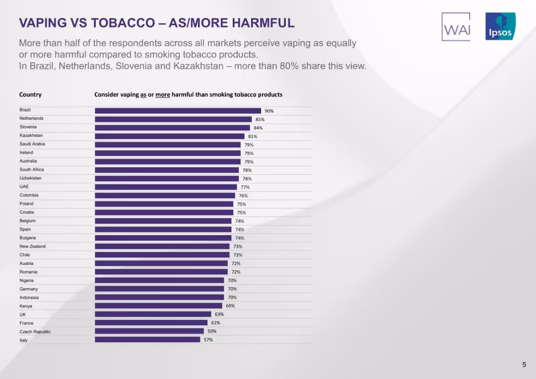
Vertical bar chart ranking countries by share of people considering vaping equally or more harmful than smoking. Purple-toned bars on light background.
Market Analysis and Trends
Healthcare & Pharmaceuticals
The slide shows over half of respondents in most countries perceive vaping as equally or more harmful than smoking, with Brazil, Netherlands, Slovenia, and Kazakhstan showing the highest agreement (>80%).
vaping, tobacco, health perception, survey, global attitudes, harm comparison, Ipsos, ranked countries
false
Market Analysis and Trends
Healthcare & Pharmaceuticals
Single Chart
IPSOS
Add to my slides
Remove from favorites
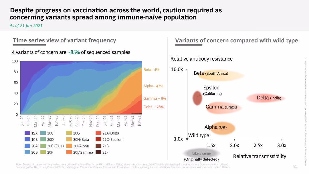
Time series graph of variant frequency and a bubble chart comparing variants' resistance and transmissibility.
Risk Assessment and Management
Healthcare & Pharmaceuticals
Shows the prevalence of COVID-19 variants over time and compares their resistance and transmissibility, urging caution despite vaccination progress.
variants, frequency, resistance, transmissibility
false
Risk Assessment and Management
Healthcare & Pharmaceuticals
Multiple Chart
BCG
Add to my slides
Remove from favorites
Line and bar graph combination showing daily VaR, stressed VaR, and trading P&L trends over four quarters.
Risk Assessment and Management
Financial Services
This slide illustrates the variability in Deutsche Bank’s trading book VaR and stressed VaR metrics. It highlights average VaR levels across recent quarters and compares them with actual daily trading performance. The bank uses these metrics to gauge market volatility and stress conditions for regulatory and internal risk purposes.
VaR, sVaR, market risk, trading P&L, risk management
false
Risk Assessment and Management
Financial Services
Single Chart
Deutsche Bank
Add to my slides
Remove from favorites
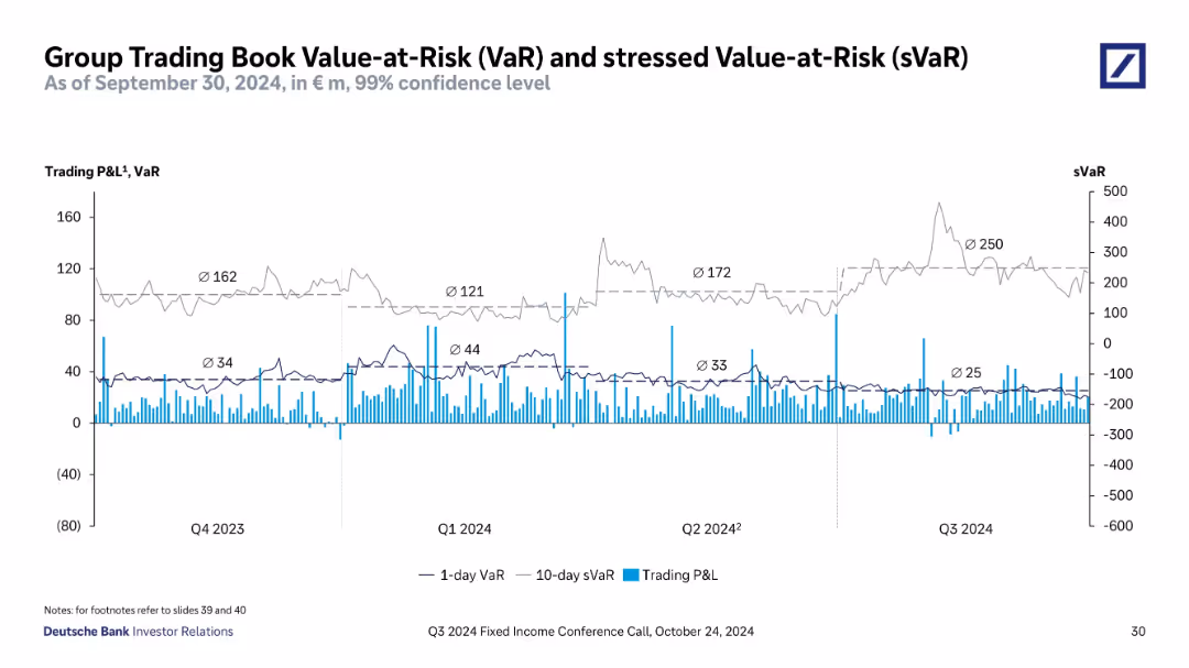
Time series line chart with dual axes for sVaR and P&L; dotted trend lines and color-coded series; clean black-and-blue theme
Risk Assessment and Management
Financial Services
Tracks Deutsche Bank's Value-at-Risk and stressed VaR over several quarters through Q3 2024. Also displays daily P&L, highlighting average risk exposure and trading volatility, providing insights into market sensitivity.
VaR, sVaR, P&L, risk management, trading book, Q3 2024, Deutsche Bank, volatility, stress testing, financial risk
false
Risk Assessment and Management
Financial Services
Single Chart
Deutsche Bank
Add to my slides
Remove from favorites
Line graphs showing trends in VaR and sVaR for regulatory scopes, detailed with average values per quarter.
Risk Assessment and Management
Financial Services
Analyzes the trading and regulatory risk profiles of the bank using VaR and sVaR metrics over multiple quarters, aimed at risk managers and financial analysts.
VaR, sVaR, risk assessment, Q3 2023
false
Risk Assessment and Management
Financial Services
Multiple Chart
Deutsche Bank
Add to my slides
Remove from favorites
Two line graphs tracking VaR and sVaR over multiple quarters, with clear markings for each data point.
Risk Assessment and Management
Financial Services
Offers a historical and current overview of VaR and sVaR metrics for Deutsche Bank's trading and regulatory books.
VaR, sVaR, risk management, trading risk, financial metrics
false
Risk Assessment and Management
Financial Services
Multiple Chart
Deutsche Bank
Add to my slides
Remove from favorites
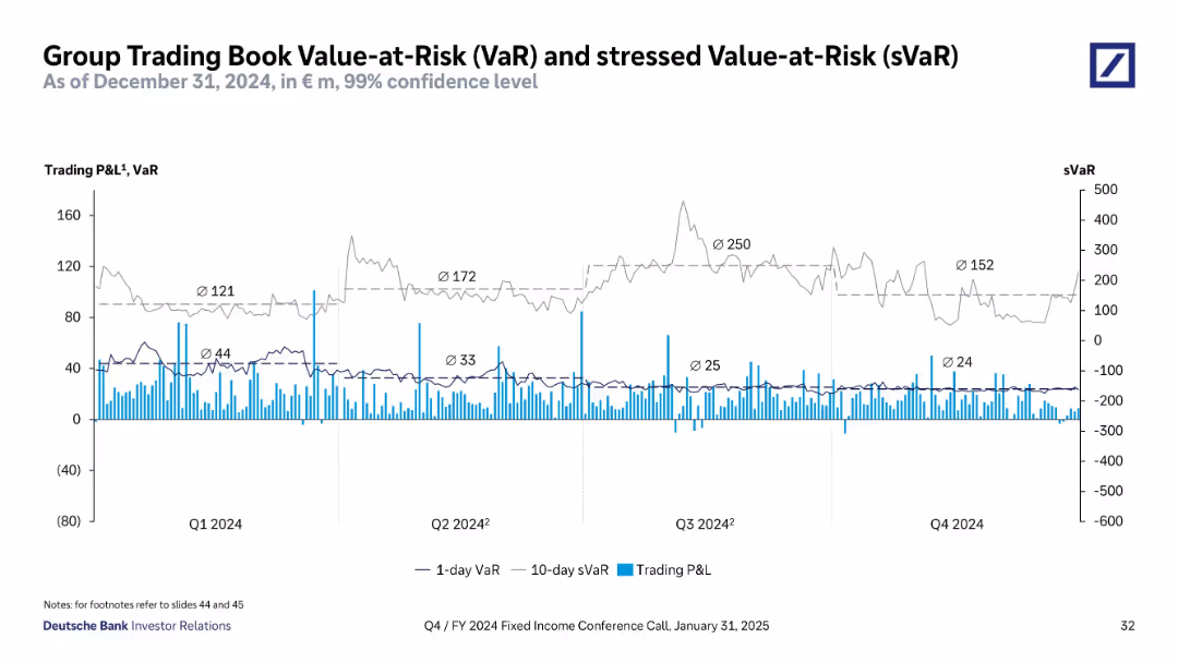
Time series line and bar chart showing 1-day VaR, 10-day stressed VaR (sVaR), and daily P&L over 2024.
Risk Assessment and Management
Financial Services
Visualizes Deutsche Bank’s trading risk profile with 1-day VaR and 10-day sVaR trends, alongside daily trading P&L. Shows quarterly average risk metrics, highlighting volatility and peak values (e.g., Q3 sVaR = 250).
VaR, sVaR, risk, trading, P&L, volatility, confidence interval, exposure
false
Risk Assessment and Management
Financial Services
Single Chart
Deutsche Bank
Add to my slides
Remove from favorites
Line chart showing trading P&L and VaR across quarters, with sVaR values indicated.
Risk Assessment and Management
Financial Services
Analyzes the trading book's value-at-risk and stressed value-at-risk over different quarters, showing the financial risk exposure.
VaR, sVaR, trading book, risk, financial exposure, quarters, value-at-risk
false
Risk Assessment and Management
Financial Services
Single Chart
Deutsche Bank
Add to my slides
Remove from favorites
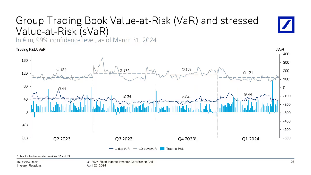
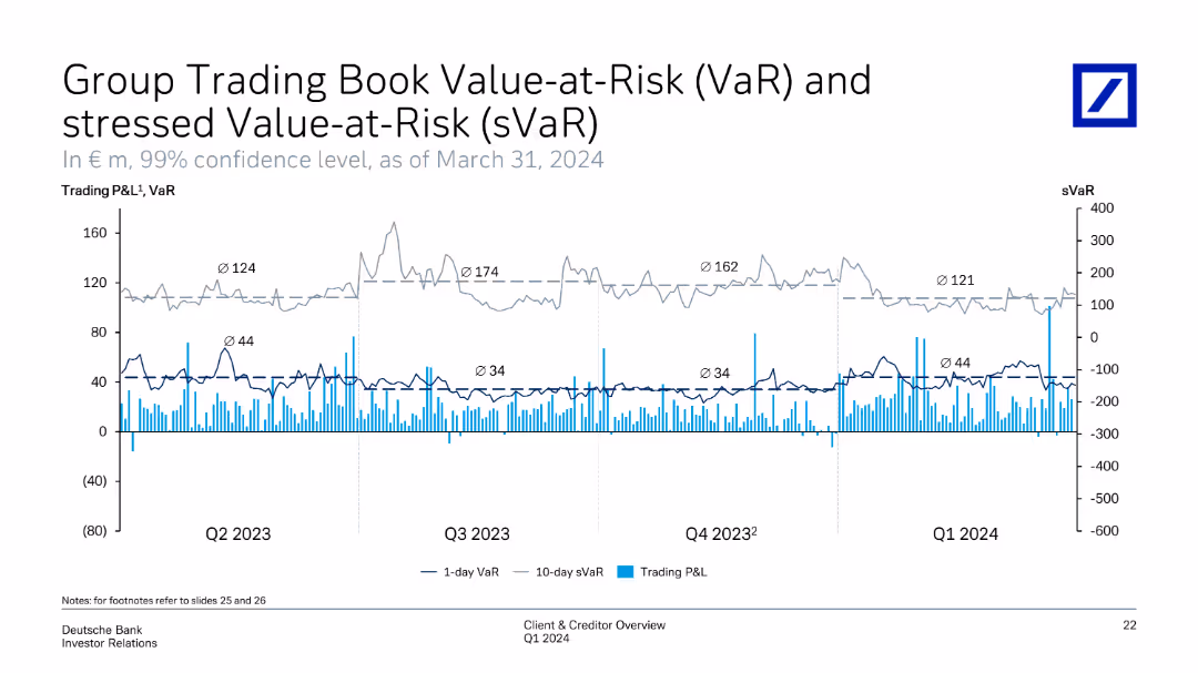
Shows line charts representing Trading P&L, 1-day VaR, and 10-day sVaR over Q2 2023 to Q1 2024. It visualizes the variations in risk levels and corresponding trading performance.
Risk Assessment and Management
Financial Services
Illustrates the trading book's value-at-risk and stressed value-at-risk over time, highlighting risk management in trading activities. It tracks changes in VaR and sVaR, correlating with trading P&L to evaluate risk exposure and control mechanisms.
VaR, sVaR, trading book, risk management, P&L
false
Risk Assessment and Management
Financial Services
Single Chart
Deutsche Bank
Add to my slides
Remove from favorites
Previous
Next
You don't have any favorites yet.
Please wait loading your favorites slides...
Create a FREE account to continue browsing
Receive Instant Access to 1,000+ slides from companies like McKinsey, Google, and Goldman Sachs
First Name
Last Name
Email
Password
I agree to all
Terms & Privacy Policy
Thank you! Your submission has been received!
Oops! Something went wrong while submitting the form.
Have an account?
Sign in
Upgrade to PRO to Save slides
Advanced Search and Filters
Access to 15,000+ slides
Access to Category Pages
Save/Bookmark Slides
PowerPoint Template Library
Pick a Plan
MONTHLY
$12/month
Billed every month, Cancel anytime.
YEARLY
$9/year
Billed $108 annually, Cancel anytime.
Checkout for $12/month
Checkout for $108/yr
Secured by Stripe | AES-256 bit encryption