My Account
My Slides
Search by Category
Pricing
Templates
View All Templates
Download Template Slides
✦ AI Search
Feedback
Login
Logout
Get Started
Browse all Slides
Browse all Slides
Create a FREE Account
Instant access to 1,000+ real slides from top companies like McKinsey, BCG, Goldman Sachs, Google and many more!
First Name
Last Name
Email
Password
I agree to all
Terms & Privacy Policy
Thank you! Your submission has been received!
Oops! Something went wrong while submitting the form.
Have an account?
Sign in
Saved Slides
Total No. of slides saved
0
↻ Refresh
✖ Clear all
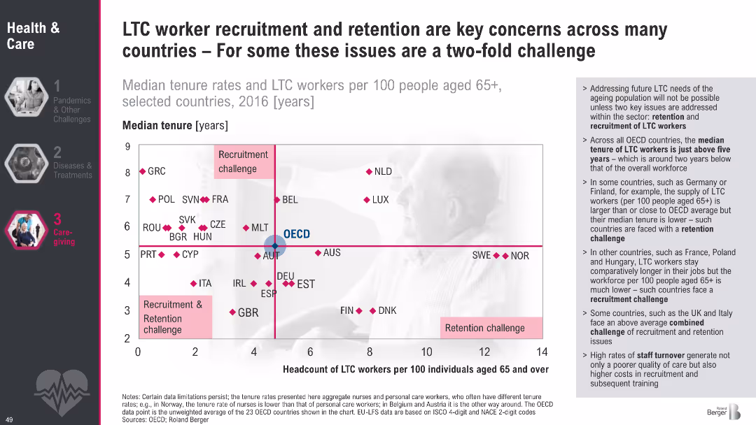
Scatter plot quadrant chart with median tenure on Y-axis and headcount of LTC workers on X-axis; quadrant labels for types of challenges; supporting bullet text on the right; dark theme on left menu
Human Resources and Talent Management
Healthcare & Pharmaceuticals
This slide analyzes long-term care (LTC) worker availability across countries using median tenure and headcount per 100 elderly. It categorizes countries by whether they face recruitment, retention, or both challenges. The OECD average is used as a benchmark. Commentary on workforce trends and high turnover is provided on the right.
LTC, recruitment, retention, tenure, aging, workforce, OECD, healthcare, staffing, elder care
false
Human Resources and Talent Management
Healthcare & Pharmaceuticals
Mixed Chart
Roland Berger
Add to my slides
Remove from favorites
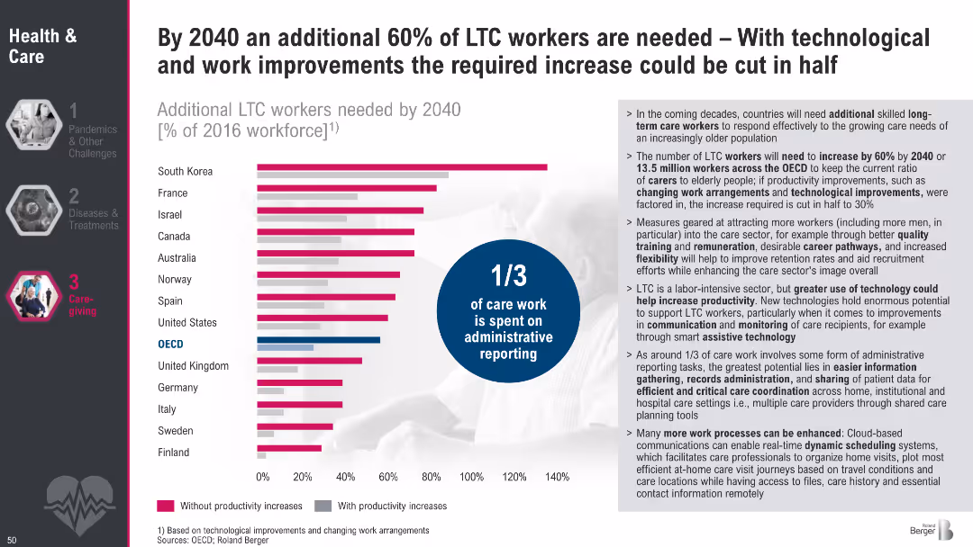
Horizontal bar chart comparing LTC workforce needs by country with and without productivity improvements; infographic circle notes 1/3 of care work is administrative; explanatory text to the right
Strategic Planning
Healthcare & Pharmaceuticals
This slide presents projected increases in demand for LTC workers by 2040, with and without productivity gains. It emphasizes how improving processes and leveraging technology could halve workforce needs. The text explains contributing factors and areas where tech could boost efficiency.
LTC, workforce, projections, productivity, administrative burden, eldercare, 2040, care work, staffing needs
false
Strategic Planning
Healthcare & Pharmaceuticals
Mixed Chart
Roland Berger
Add to my slides
Remove from favorites
Venn diagram showing the overlap of content consumption across LTV, OTT, and movie studios, with consumer quotes on their viewing preferences.
Customer and Market Segmentation
Media & Entertainment
This slide presents the seamless transition of consumers between LTV and OTT platforms, supported by a Venn diagram and consumer quotes.
LTV, OTT, transition, consumers, preferences
false
Customer and Market Segmentation
Media & Entertainment
Mixed Chart
BCG
Add to my slides
Remove from favorites
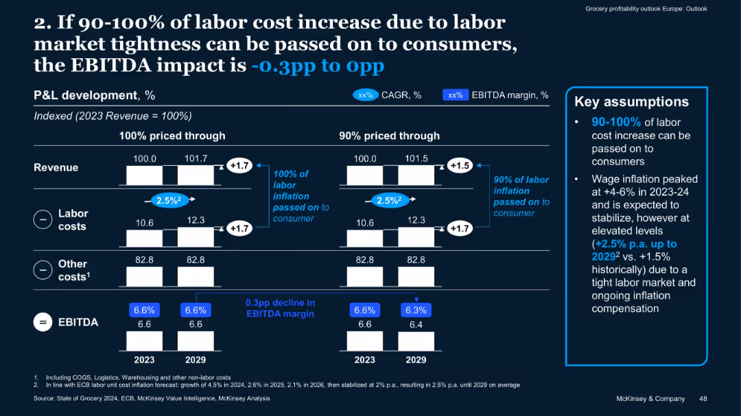
Similar format to 15538; bar charts for two pricing scenarios with labor cost inflation assumptions
Risk Assessment and Management
Retail & E-commerce
Labor cost inflation (assumed at +2.5% p.a. through 2029) may reduce EBITDA by up to 0.3pp if not fully passed on to consumers. The slide outlines two pricing scenarios and ties labor costs to margin outcomes.
Labor Cost, Inflation, EBITDA, Pricing, Retail Economics, Workforce Cost
false
Risk Assessment and Management
Retail & E-commerce
Mixed Chart
McKinsey
Add to my slides
Remove from favorites
Contains multiple column charts comparing labor market parameters (vacancy development, unemployment rate, hourly labor wage growth) across Germany, USA, and China. Includes a line chart showing key supplier performance indicators globally.
Operational Efficiency
Transportation & Logistics
Examines the impact of high inflation and labor shortages on labor costs in the automotive industry. Analyzes different labor market parameters and how they contribute to the overall structural challenges faced by suppliers.
Labor Costs, Inflation, Automotive, Workforce, Performance
false
Operational Efficiency
Transportation & Logistics
Multiple Chart
Roland Berger
Add to my slides
Remove from favorites
Matrix chart showing the dynamics of occupations due to automation, with job losses and gains across various sectors like transport, healthcare, and construction.
Market Analysis and Trends
Technology & Software
This slide analyzes the structural changes in the labor market due to automation, robotics, and AI. It presents a matrix of job dynamics, highlighting which sectors are likely to experience job losses or gains, and emphasizes the transformative impact of technology on employment.
Labor Market, Automation, Robotics, Job Dynamics
false
Market Analysis and Trends
Technology & Software
Table
Roland Berger
Add to my slides
Remove from favorites
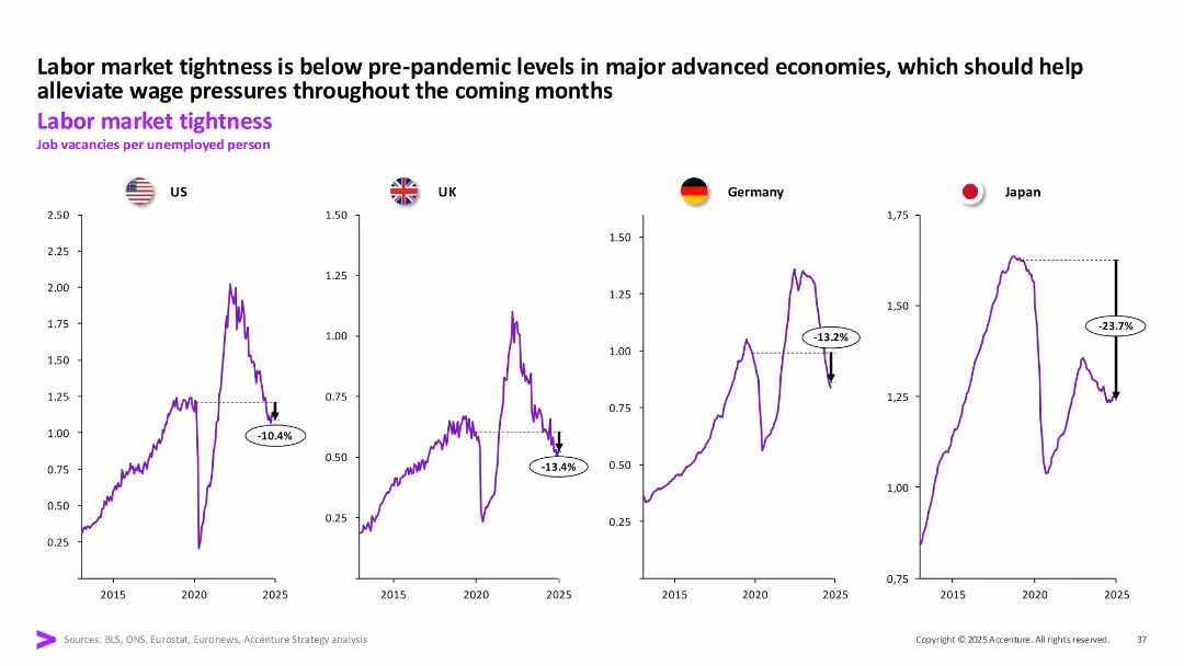
Four line charts (US, UK, Germany, Japan) showing job vacancies per unemployed person over time; each chart includes recent % decline annotations.
Human Resources and Talent Management
Professional Services
Labor market tightness in major economies is below pre-pandemic levels. Japan shows the sharpest decline in job vacancies per unemployed person, indicating easing pressure on wage inflation.
Labor Market, Job Vacancies, Wage Pressure, Unemployment, US, UK, Germany, Japan
false
Human Resources and Talent Management
Professional Services
Multiple Chart
Accenture
Add to my slides
Remove from favorites
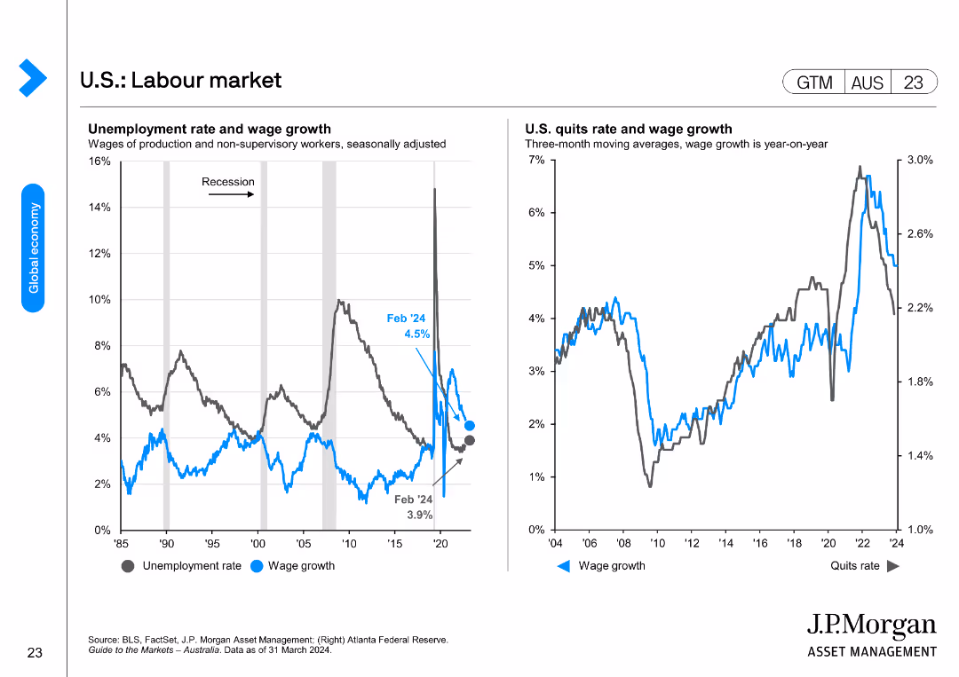
The slide contains two line charts. The left chart shows the U.S. unemployment rate and wage growth from 1985 to 2024. The right chart depicts the U.S. quits rate and wage growth year-on-year from 2004 to 2024.
Market Analysis and Trends
Financial Services
This slide analyzes the U.S. labor market by examining unemployment, wage growth, and quits rate, providing insights into employment trends and economic conditions.
Labor Market, Unemployment, Wage Growth, U.S., Trends
false
Market Analysis and Trends
Financial Services
Multiple Chart
JP Morgan
Add to my slides
Remove from favorites
Two line charts showing U.S. unemployment rate vs. Atlanta Fed wage growth and EU unemployment vs. compensation growth.
Market Analysis and Trends
Financial Services
This slide evaluates the labor market trends in the U.S. and EU, highlighting signs of normalization in the U.S. and decline in EU wages compared to the U.S.
Labor Markets, Unemployment, Wage Growth, U.S., EU, Comparison
false
Market Analysis and Trends
Financial Services
Multiple Chart
Morgan Stanley
Add to my slides
Remove from favorites
Column charts comparing the average annual growth rates of labor productivity and average wages from 2010 to 2019 for France, Germany, Switzerland, and the US.
Technology and Digital Transformation
Technology & Software
This slide compares the decoupling of labor productivity growth and average wage growth across different countries. It highlights the impact of technological change on labor markets, showing that increased productivity does not always translate to higher wages.
Labor Productivity, Wages, Decoupling
false
Technology and Digital Transformation
Technology & Software
Multiple Chart
Roland Berger
Add to my slides
Remove from favorites
Column and dot graphs showing the density of highly skilled workers and total labor force in various countries.
Strategic Planning
Professional Services
Analyzes the labor market potential by assessing the density of skilled workers and their distribution across multiple countries.
Labor market, skilled workers, workforce density, strategic planning
false
Strategic Planning
Professional Services
Single Chart
Accenture
Add to my slides
Remove from favorites
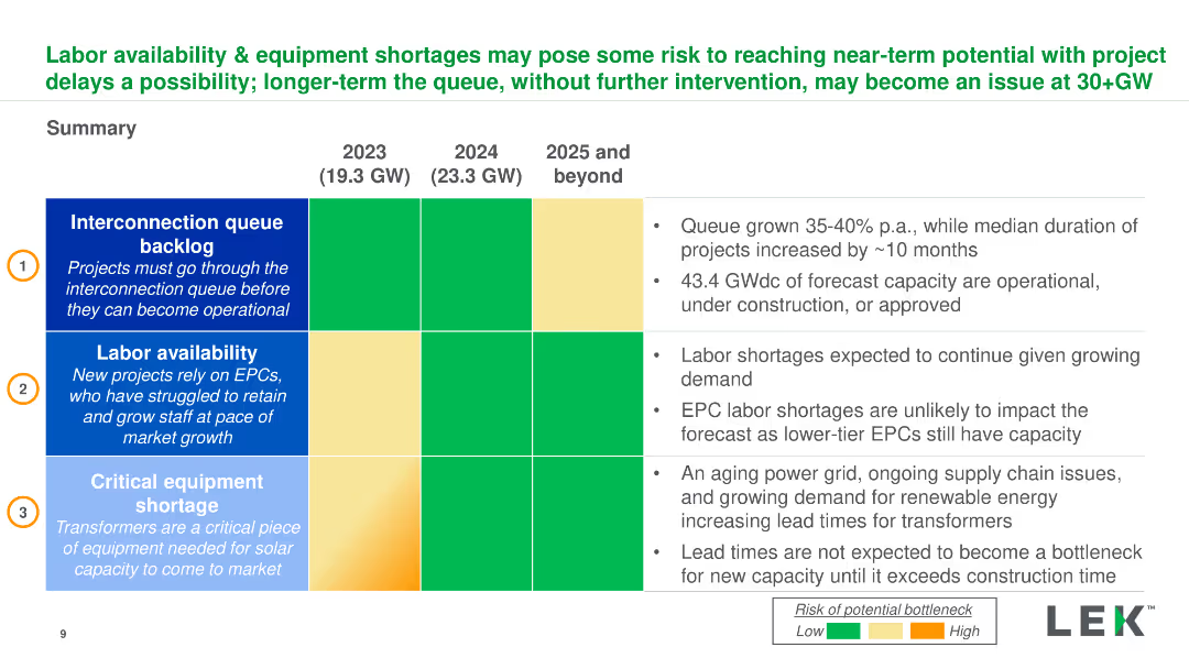
Summary table and bullet points detailing interconnection queues, labor availability, and equipment shortages for 2023-2025. Dense with key insights.
Risk Assessment and Management
Energy & Utilities
Overview of risks to solar project timelines due to labor shortages, interconnection queues, and equipment delays, and their potential impact on capacity.
Labor, Equipment, Solar Projects, Interconnection, Risk Management
false
Risk Assessment and Management
Energy & Utilities
Table
LEK
Add to my slides
Remove from favorites
The slide features a column chart showing various land management practices to improve carbon sequestration. It includes detailed descriptions of actions like cropland carbon sequestration and savanna fire management.
Regulatory and Compliance
Agriculture & Food Production
This slide discusses improved land management practices in agriculture to enhance carbon sequestration. It covers actions such as cropland carbon sequestration, degraded farmland restoration, and improved pasture management.
Land management, Carbon sequestration, Agriculture, Pasture, Savanna
false
Regulatory and Compliance
Agriculture & Food Production
Mixed Chart
EY
Add to my slides
Remove from favorites
The slide presents a column chart depicting land use changes and their impact on carbon sequestration. It includes sections on reforestation and developing integrated shelterbelts, with examples of initiatives.
Regulatory and Compliance
Agriculture & Food Production
This slide focuses on land use changes in agriculture to enhance carbon sequestration. It discusses reforestation of marginal land and developing integrated shelterbelts, providing examples of specific projects and their benefits.
Land use, Reforestation, Carbon sequestration, Agriculture, Shelterbelts
false
Regulatory and Compliance
Agriculture & Food Production
Mixed Chart
EY
Add to my slides
Remove from favorites
The slide is divided into two columns, each with an image at the top and text below. Includes a trend assessment with a bar chart for impact on industry and time of adoption.
Technology and Digital Transformation
Retail & E-commerce
Explains the importance of last mile solutions in retail, focusing on delivery efficiency and customer satisfaction.
Last Mile, Delivery, Customer Satisfaction, Retail, Logistics, Real-time Notifications, Delivery Times, Eco-friendly, Customer Experience
false
Technology and Digital Transformation
Retail & E-commerce
Multiple Chart
Deloitte
Add to my slides
Remove from favorites
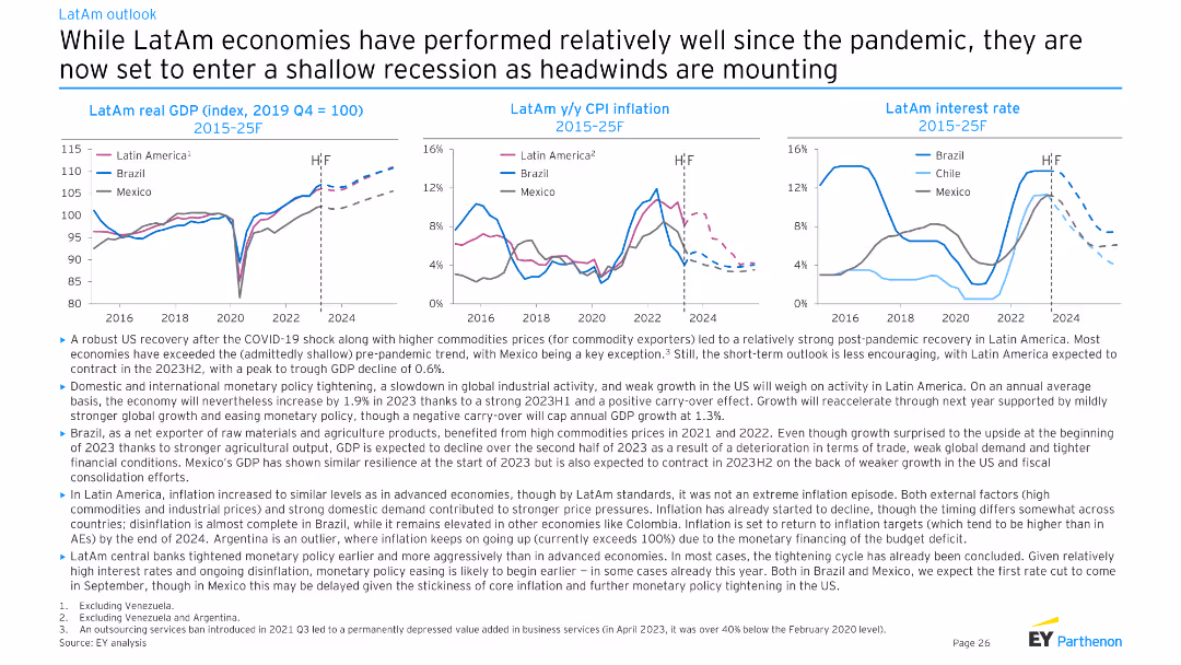
Three line charts depicting LatAm real GDP (index), y/y CPI inflation, and interest rate trends for Brazil, Chile, and Mexico from 2015-25F. Moderate complexity, well-suited for presenting regional economic trends.
Market Analysis and Trends
Financial Services
This slide provides an economic outlook for Latin American countries, highlighting post-pandemic recovery, commodity prices, and the anticipated shallow recession. It discusses GDP growth, inflation, and interest rate trends in Brazil, Chile, and Mexico.
LatAm, GDP, CPI, interest rate, recession
false
Market Analysis and Trends
Financial Services
Multiple Chart
EY
Add to my slides
Remove from favorites
Contains three charts: a line chart of LatAm y/y real GDP (2019 Q4 = 100) from 2015-2025F, a column chart of 2024F y/y real GDP, and a line chart of LatAm employment.
Market Analysis and Trends
Financial Services
Examines Latin America's economic performance in 2023 and provides forecasts for 2024, highlighting GDP, employment trends, and economic challenges.
Latin America, GDP, Employment, 2024, Trends
false
Market Analysis and Trends
Financial Services
Multiple Chart
EY
Add to my slides
Remove from favorites
This slide has three main charts: a bar chart showing the year-over-year change in real GDP, a line chart tracking inflation rates, and another line chart depicting real policy rates by country (Brazil, Peru, Colombia, Mexico, Chile).
Market Analysis and Trends
Financial Services
The slide provides an overview of economic performance in Latin America, highlighting growth, inflation trends, and policy rates by country.
Latin America, GDP, inflation, policy rates, economic growth
false
Market Analysis and Trends
Financial Services
Multiple Chart
JP Morgan
Add to my slides
Remove from favorites
Contains a regional breakdown of banking operations in Latin America with performance highlights, using icons and a table format to detail country-specific operations.
Financial Performance
Financial Services
Reviews the profitability of banking operations across Latin America, highlighting key markets and strategic positions in retail and wholesale banking sectors.
Latin America, banking, profitability, operations, strategy
false
Financial Performance
Financial Services
Table
Barclays
Add to my slides
Remove from favorites
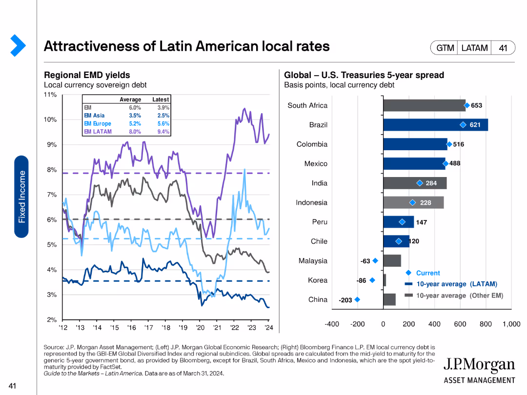
This slide features line charts showing regional EMD yields and a column chart comparing global U.S. Treasuries 5-year spread across various countries.
Market Analysis and Trends
Financial Services
The slide evaluates the attractiveness of Latin American local rates by comparing EMD yields and U.S. Treasury spreads across different countries, highlighting investment opportunities and risks.
Latin America, local rates, EMD yields, U.S. Treasuries, investment opportunities, investment risks, economic analysis
false
Market Analysis and Trends
Financial Services
Multiple Chart
JP Morgan
Add to my slides
Remove from favorites
The slide contains two charts: a bar chart showing the price-to-earnings ratios for various Latin American countries and a line chart depicting earnings per share (EPS) trends. The charts use multiple colors for different countries and time periods.
Market Analysis and Trends
Financial Services
It compares valuations and earnings across Latin American countries, providing insights into market performance and potential investment opportunities in these regions.
Latin America, valuations, earnings, price-to-earnings, EPS
false
Market Analysis and Trends
Financial Services
Multiple Chart
JP Morgan
Add to my slides
Remove from favorites
Slide features two column charts with annotations and icons indicative of legal categories. The color scheme is red and gray with legal symbols.
Regulatory and Compliance
Government & Public Sector
Analyzes the state of general law matters, including the volume of family law cases, federal law applications, and opportunities for improvement.
Law, legal statistics, federal cases, family law, migration matters, court applications, case triaging, judicial expertise
false
Regulatory and Compliance
Government & Public Sector
Multiple Chart
PwC/Strategy&
Add to my slides
Remove from favorites
A hierarchical diagram with four levels of leadership maturity: Foundational, Integrated, Scalable, and Systemic Leadership. Each level is described with key characteristics and a percentage indicating prevalence.
Market Analysis and Trends
Professional Services
The slide explains the different levels of leadership maturity, from basic foundational leadership to advanced systemic leadership. It describes the characteristics and prevalence of each level within organizations.
Leadership Maturity, Hierarchical, Foundational, Integrated, Scalable, Systemic
false
Market Analysis and Trends
Professional Services
Framework
Deloitte
Add to my slides
Remove from favorites
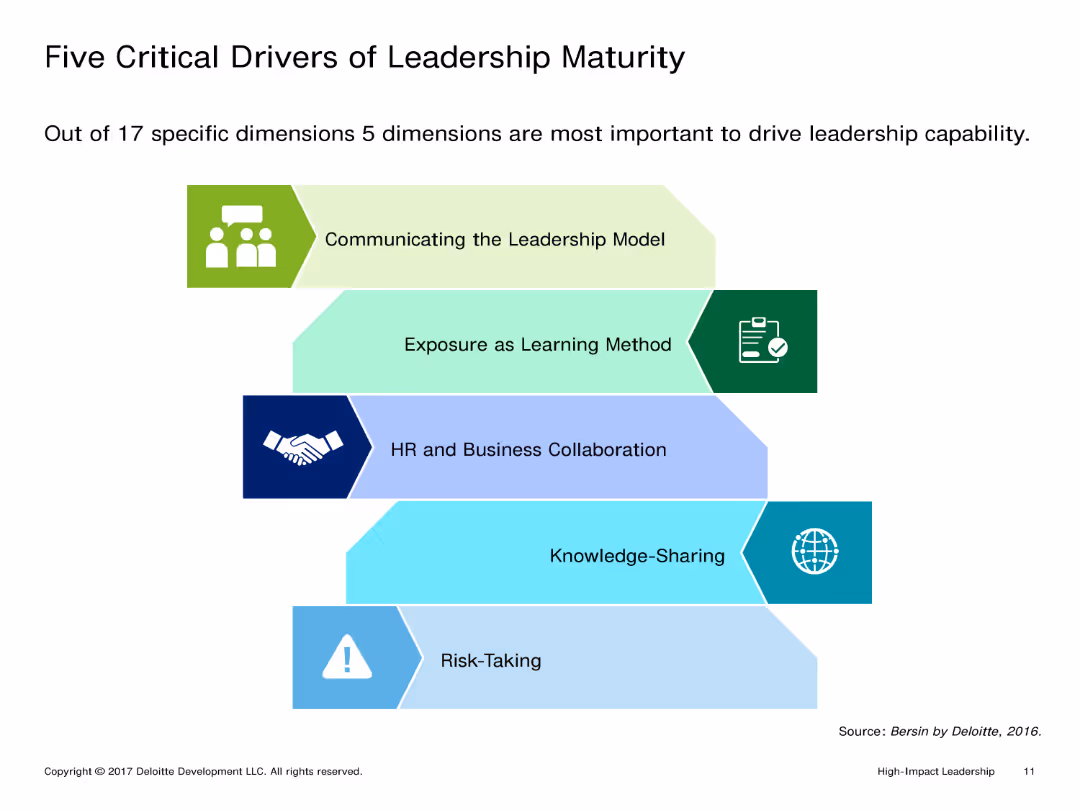
Single-column layout with text at the top and a diagram illustrating five critical drivers of leadership maturity below. Text is concise.
Market Analysis and Trends
Professional Services
Identifies and explains five key dimensions crucial for driving leadership capability: communicating the leadership model, exposure as a learning method, HR collaboration, knowledge-sharing, and risk-taking.
Leadership maturity, Critical drivers, Communication, Learning exposure, HR collaboration, Knowledge-sharing, Risk-taking
false
Market Analysis and Trends
Professional Services
Vertical Flow
Deloitte
Add to my slides
Remove from favorites
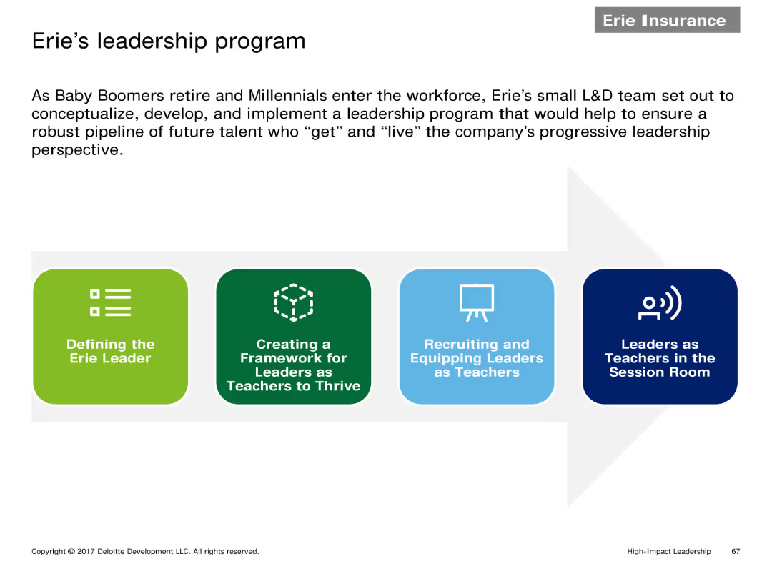
A horizontal flowchart with four stages: Defining the Erie Leader, Creating a Framework for Leaders, Recruiting and Equipping Leaders, Leaders as Teachers.
Human Resources and Talent Management
Financial Services
Describes the steps of Erie's leadership program aimed at developing future leaders within the organization by focusing on defining, creating frameworks, and equipping leaders.
Leadership program, flowchart, future leaders, Erie, framework
false
Human Resources and Talent Management
Financial Services
Linear Flow
Deloitte
Add to my slides
Remove from favorites
Bar graphs and statistics, blue theme with white text, section titled and numbered in the corner.
Strategic Planning
Healthcare & Pharmaceuticals
Outlines the impact of bioengineering on business and society, with statistical evidence.
Leadership, Bioengineering, Business Impact, Statistics
false
Strategic Planning
Healthcare & Pharmaceuticals
Header Horizontal
McKinsey
Add to my slides
Remove from favorites
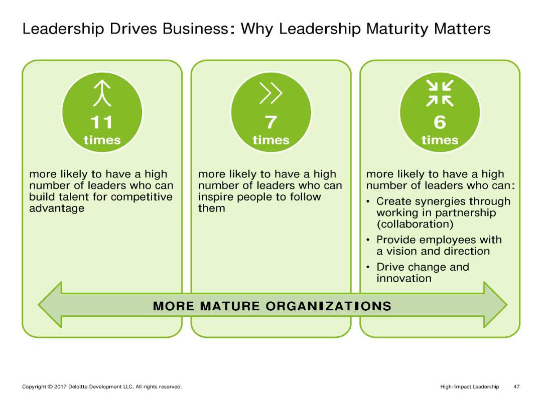
This slide includes three vertical columns with icons and text explaining the importance of leadership maturity. Each column is dedicated to a different aspect: building talent, inspiring followers, and driving innovation.
Market Analysis and Trends
Professional Services
The slide emphasizes the significant impact of leadership maturity on business success. It highlights how mature leaders are more likely to build competitive talent, inspire their teams, and drive innovation within their organizations.
Leadership, Business Success, Talent, Inspiration, Innovation
false
Market Analysis and Trends
Professional Services
Pillar
Deloitte
Add to my slides
Remove from favorites
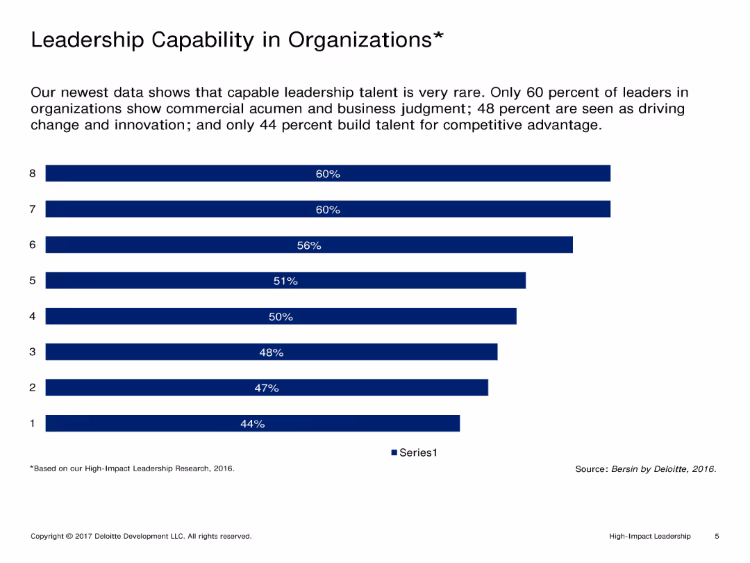
Single-column layout with text at the top and a column chart showing percentages of leadership capabilities below. Text is minimal.
Market Analysis and Trends
Professional Services
Analyzes leadership capabilities in organizations, highlighting areas such as commercial acumen, business judgment, innovation, and competitive advantage.
Leadership, Capability, Organizations, Commercial acumen, Business judgment, Innovation, Competitive advantage
false
Market Analysis and Trends
Professional Services
Single Chart
Deloitte
Add to my slides
Remove from favorites
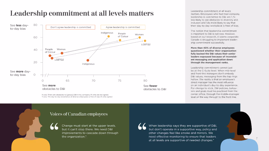
This slide features a scatter plot showing the correlation between perceived leadership commitment and daily bias. It includes quotes and uses distinct color coding for clarity.
Human Resources and Talent Management
Government & Public Sector
The slide discusses the importance of leadership commitment to reducing day-to-day bias and obstacles in diversity and inclusion, supported by employee quotes and a scatter plot analysis.
Leadership, Commitment, Bias, Diversity, Inclusion, Day-to-Day, Employee Quotes, Correlation, Analysis
false
Human Resources and Talent Management
Government & Public Sector
Mixed Chart
BCG
Add to my slides
Remove from favorites
A radar chart comparing various aspects like employee training, customer experience, and data sovereignty between leaders and laggards. The layout is balanced with text on one side and chart on the other.
Strategic Planning
Professional Services
This slide discusses how leaders create value by focusing on areas such as employee training and data sovereignty. The radar chart highlights differences between leaders and laggards.
Leadership, Employee Training, Data Sovereignty, Customer Experience, Innovation
false
Strategic Planning
Professional Services
Mixed Chart
Accenture
Add to my slides
Remove from favorites
A text-focused layout with two pie charts demonstrating contract mix and business win rates.
Investment Analysis
Financial Services
The slide showcases the company’s industry leadership with key highlights, financial data, and contract distribution, asserting its position and financial stability to stakeholders.
Leadership, Financial Stability, Contract Distribution, Revenue
false
Investment Analysis
Financial Services
Multiple Chart
Booz Allen Hamilton
Add to my slides
Remove from favorites
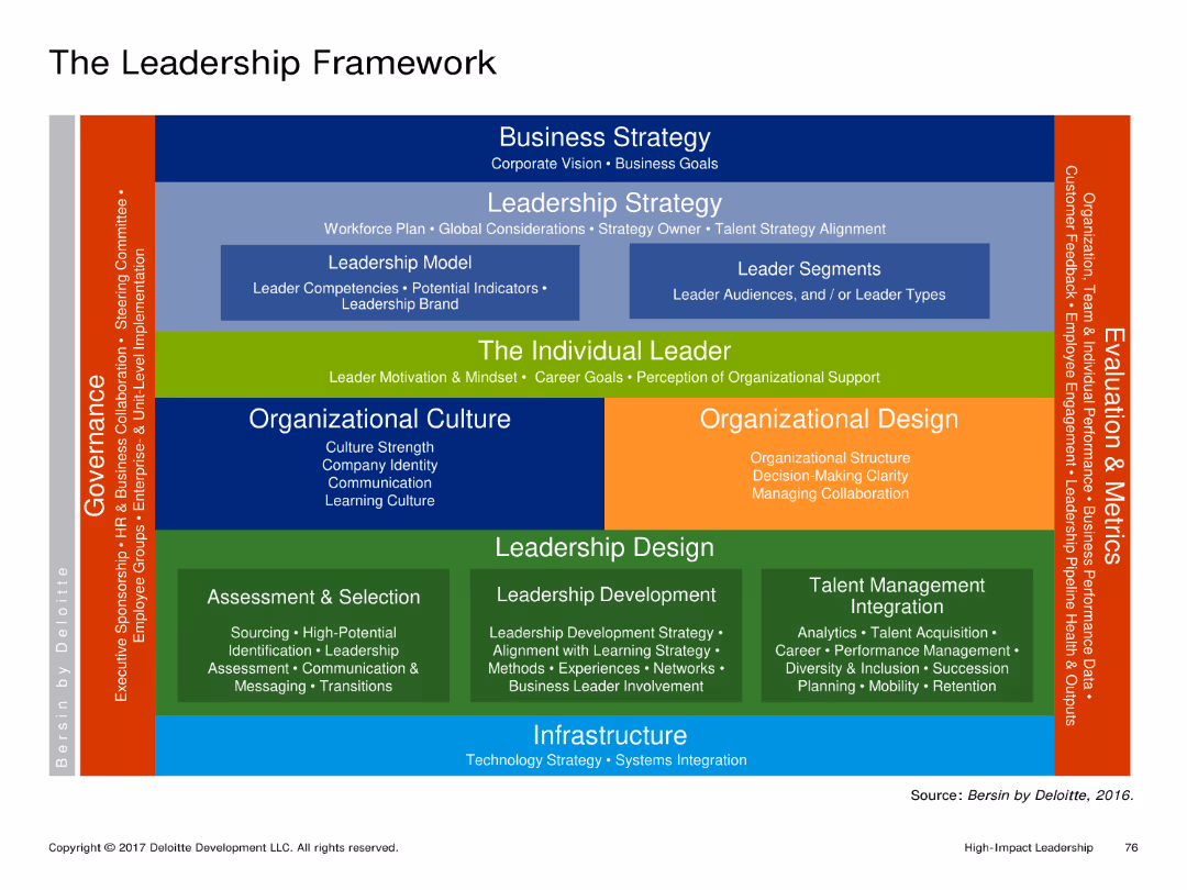
A complex diagram depicting various aspects of leadership including Business Strategy, Leadership Strategy, The Individual Leader, Organizational Culture, and more. The diagram is color-coded and detailed with multiple sections and labels.
Organizational Structure and Change
Professional Services
The slide explains the components of a leadership framework by Deloitte, detailing areas like Business Strategy, Leadership Strategy, and Organizational Culture. It serves as a comprehensive guide for understanding leadership in an organizational context.
Leadership, Framework, Organizational, Strategy, Culture
false
Organizational Structure and Change
Professional Services
Framework
Deloitte
Add to my slides
Remove from favorites
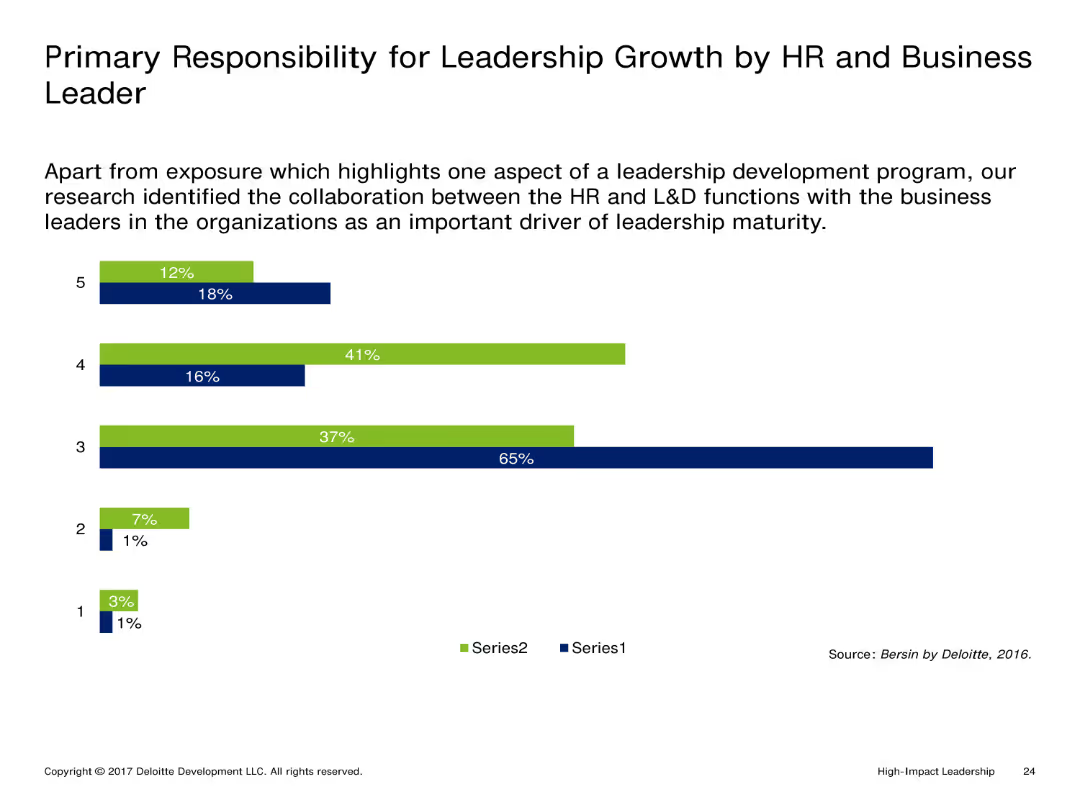
This slide features a vertical column chart with two series of data, each series represented by different colors (blue and green). The columns indicate the percentage responsibility of HR and business leaders in leadership growth.
Market Analysis and Trends
Professional Services
The slide compares the responsibility for leadership growth between HR and business leaders. The chart highlights the significant collaboration between these functions as a crucial factor for leadership maturity.
Leadership, Growth, HR, Business Leaders, Collaboration
false
Market Analysis and Trends
Professional Services
Single Chart
Deloitte
Add to my slides
Remove from favorites
Three-panel design illustrating phases of stabilization, sustainable growth, and future leadership aspirations with icons.
Strategic Planning
Financial Services
This slide outlines the bank's strategic roadmap post-2019, focusing on past achievements and future goals aimed at establishing industry leadership, highlighting key phases in strategy implementation.
Leadership, Growth, Strategy, Aspirations, Roadmap, Industry, Future
false
Strategic Planning
Financial Services
Linear Flow
Deutsche Bank
Add to my slides
Remove from favorites
The slide features a list of sectors with rank, three bar graphs representing sub-sectors for 2017-19 and 2020-22 averages, and a pie chart indicating a 20% gap in the global IB industry wallet.
Market Analysis and Trends
Financial Services
Demonstrates sector leadership and growth in priority sub-sectors, highlighting opportunities where there are gaps.
Leadership, Growth, Sub-Sectors, Market Share, Wallet, Energy, Fintech, Retail
false
Market Analysis and Trends
Financial Services
Multiple Chart
JP Morgan
Add to my slides
Remove from favorites
This slide features bar charts comparing today's critical leadership roles with projections for the next 2-4 years. The design is straightforward with clear labels for easier comprehension.
Human Resources and Talent Management
Professional Services
This slide discusses the evolving roles of leaders in a boundaryless business world, focusing on harnessing disruption, resilience, and engagement across geographies. It shows current and future trends in leadership focus areas, particularly highlighting the increased need for innovation and adaptability in the coming years.
Leadership, Innovation, Resilience, Future, Roles
false
Human Resources and Talent Management
Professional Services
Multiple Chart
Deloitte
Add to my slides
Remove from favorites
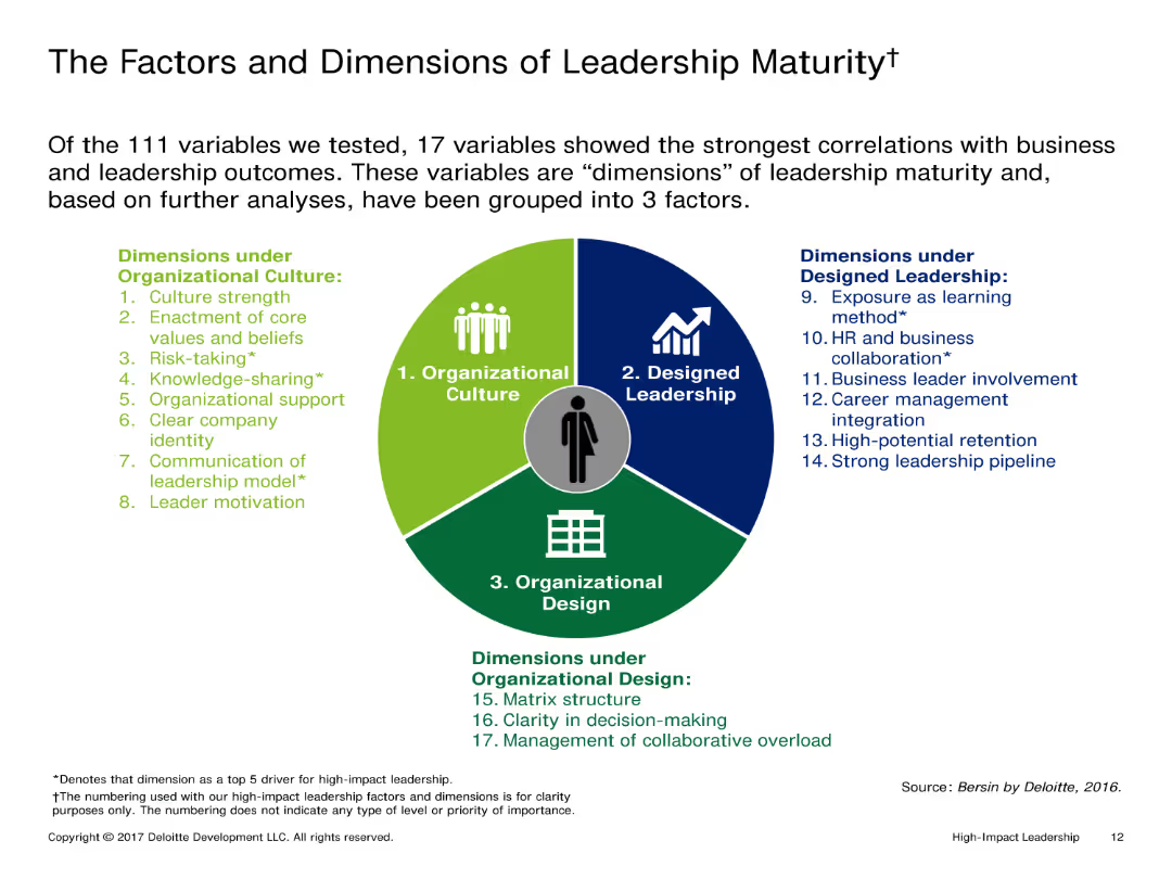
This slide features a circular diagram divided into three segments, each representing different factors of leadership maturity. The diagram is colorful, with icons and text annotations explaining each segment.
Market Analysis and Trends
Professional Services
The slide outlines 17 variables of leadership maturity, grouped into three main factors: Organizational Culture, Designed Leadership, and Organizational Design. It emphasizes the correlation between these variables and leadership outcomes.
Leadership, Maturity, Organizational Culture, Design, Development
false
Market Analysis and Trends
Professional Services
Diagram
Deloitte
Add to my slides
Remove from favorites
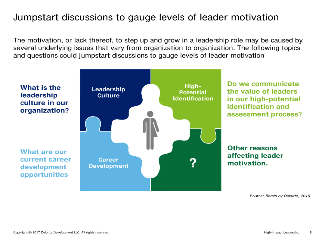
The slide uses a puzzle piece layout, with each piece representing different aspects of leader motivation. There is a mix of text and icons, with a person icon in the center linking the components together.
Market Analysis and Trends
Professional Services
It discusses various factors affecting leader motivation, including leadership culture, career development opportunities, and the value communicated to leaders in high-potential identification and assessment processes.
Leadership, Motivation, Career Development, Culture, Assessment
false
Market Analysis and Trends
Professional Services
Diagram
Deloitte
Add to my slides
Remove from favorites
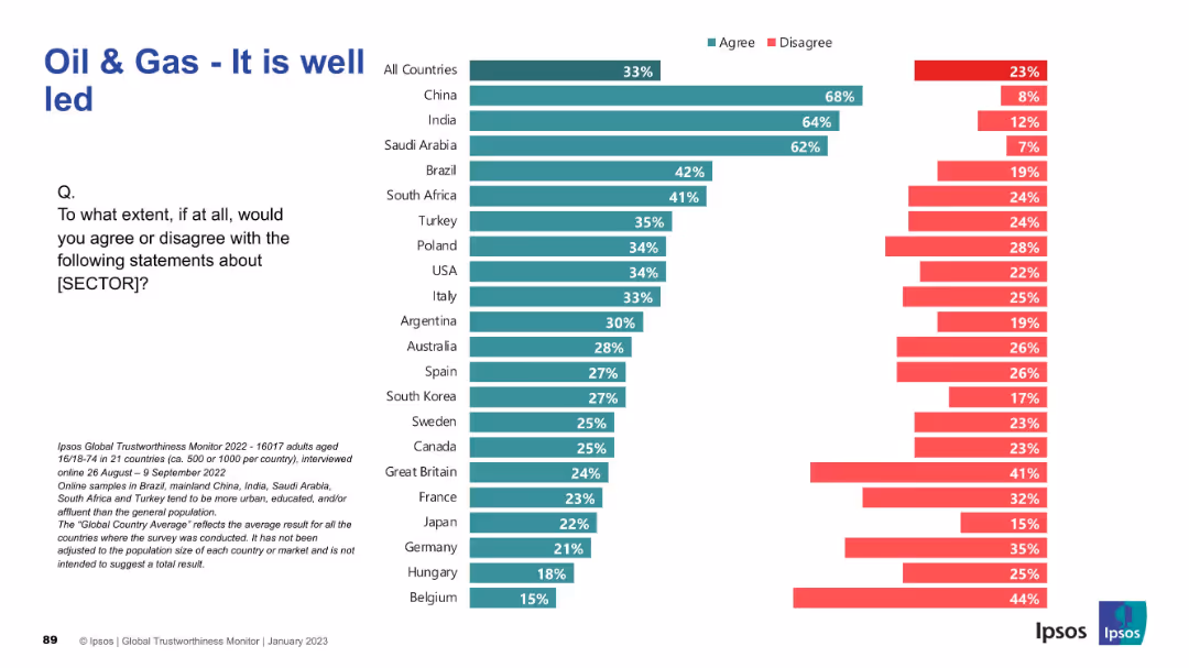
Similar layout with bar chart split by country. Green and red bars for agree/disagree; title on top left; Ipsos source and methodology noted.
Market Analysis and Trends
Energy & Utilities
This slide evaluates perceptions of leadership in the oil & gas sector. Leadership credibility is rated highest in China, India, and Saudi Arabia, while European countries show lower levels of agreement and higher disagreement.
Leadership, Oil & Gas, Ipsos, Trustworthiness, Global Opinion, Energy Sector, Management, Governance, Public Views, Country Trends
false
Market Analysis and Trends
Energy & Utilities
Mixed Chart
IPSOS
Add to my slides
Remove from favorites
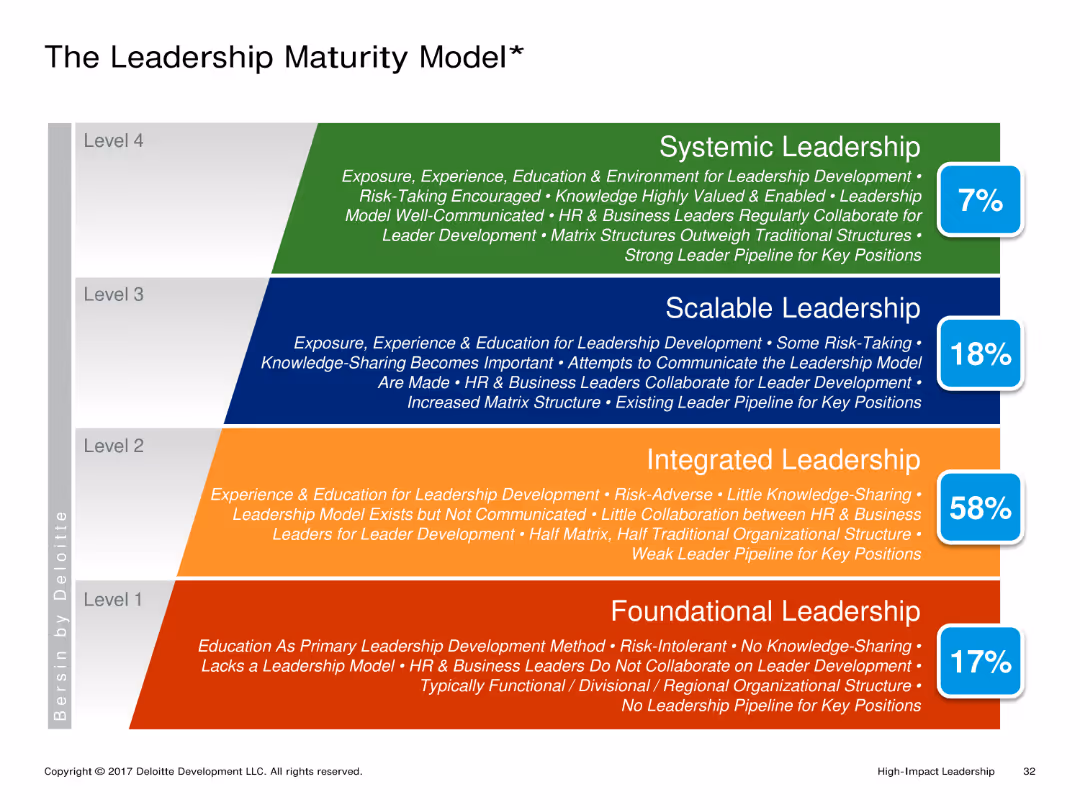
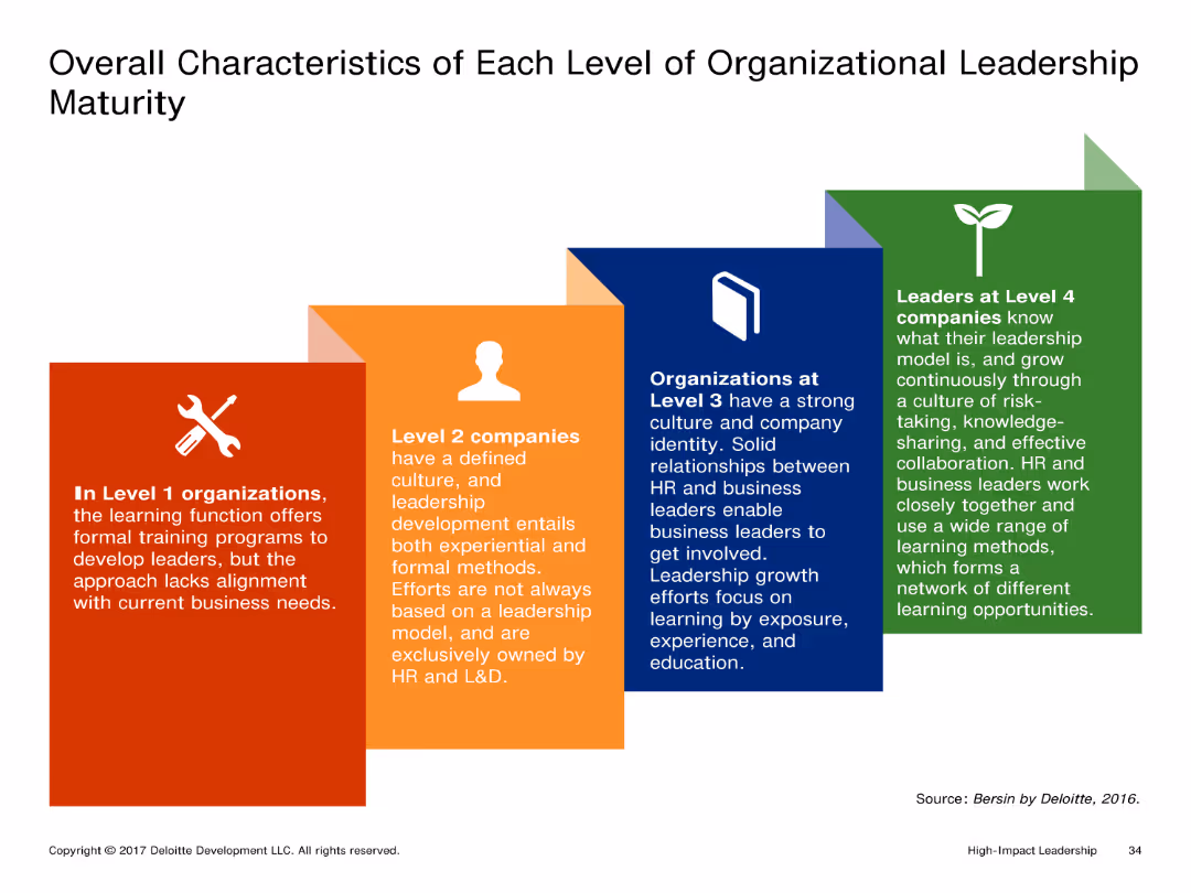
The slide shows a visual representation of different levels of organizational leadership maturity with distinct boxes for each level. Each box contains detailed text describing the characteristics of that level.
Market Analysis and Trends
Professional Services
It outlines the characteristics of organizations at different levels of leadership maturity, from Level 1 to Level 4. Each level's description highlights the leadership development approach and involvement of HR and business leaders.
Leadership, Organizational Maturity, Levels, Characteristics, Development
false
Market Analysis and Trends
Professional Services
Pillar
Deloitte
Add to my slides
Remove from favorites
Featuring bold color blocks and clear statistical highlights, the slide offers a snapshot of economic indicators. The layout is segmented to draw attention to key metrics like unemployment rates, GDP growth, and inflation, all of which are crucial for assessing real estate investment risks.
Risk Assessment and Management
Real Estate & Construction
The slide is designed to prompt real estate portfolio reassessments by leadership teams, given current economic challenges. It offers a concise, high-level view of economic data that could influence strategic decisions in portfolio management, emphasizing the need for adaptability in uncertain times.
Leadership, Real Estate, Economic Indicators, Portfolio Management, Adaptability
false
Risk Assessment and Management
Real Estate & Construction
Boxed
EY
Add to my slides
Remove from favorites
Utilizes text blocks and simple line drawings to depict leadership approaches, integrating visual and textual information with color highlights for separation.
Operational Efficiency
Professional Services
Integrates head, heart, and hands in leadership, outlining strategies for business management and planning during crises with real-world leadership actions from a mining company example.
Leadership, Strategy, Crisis management, Empowerment, Communication
false
Operational Efficiency
Professional Services
Header Vertical
BCG
Add to my slides
Remove from favorites
Features four circular icons representing different actions (CEO and board engagement, employee and stakeholder engagement, performance measures, and cultural integration), each with a brief descriptor.
Organizational Structure and Change
Professional Services
This slide outlines four critical actions to successfully integrate sustainability into a company’s core strategy, emphasizing the roles of leadership, employee engagement, performance metrics, and cultural adaptation to embed sustainability deeply within organizational practices.
Leadership, Sustainability, Engagement, Performance Metrics, Organizational Culture
false
Organizational Structure and Change
Professional Services
Pillar
McKinsey
Add to my slides
Remove from favorites
Includes a large pie chart with statistical data and a list of three strategic actions for CEOs with associated icons.
Human Resources and Talent Management
Professional Services
This slide emphasizes the importance of leadership in the successful integration of SDGs into business strategy, presenting statistical evidence and actionable recommendations for CEOs to foster a sustainability-focused culture at all organizational levels.
Leadership, Sustainability, SDGs, Strategic Recommendations, Business Strategy
false
Human Resources and Talent Management
Professional Services
Mixed Chart
McKinsey
Add to my slides
Remove from favorites
Contains three overlapping circles, each representing a different aspect of engaging with Web3 (Explore, Partner, Upskill), set against a dark background.
Strategic Planning
Technology & Software
Offers guidance for business leaders on how to begin engaging with Web3, suggesting a reevaluation of business models and partnerships, and highlighting the importance of upskilling the workforce in Web3 technologies.
Leadership, Web3, Business Strategy, Partnerships, Training
false
Strategic Planning
Technology & Software
Diagram
McKinsey
Add to my slides
Remove from favorites
This slide uses a combination of icons and text to highlight common themes and strengths of leading companies, such as innovation, niche market leadership, diversification, global solutions, and software-enabled products. It includes statistical data such as growth rates and workforce impacts.
Competitive Landscape
Industrial & Manufacturing
The slide identifies key traits of successful companies in various segments, emphasizing innovation, niche leadership, diversification, global solutions, and the importance of software-enabled and connected products.
Leading Companies, Common Themes, Innovation, Market Leadership, Diversification, Global Solutions, Software-Enabled Products
false
Competitive Landscape
Industrial & Manufacturing
Table
LEK
Add to my slides
Remove from favorites
A vertical list of five leading practices with corresponding icons: Networking is learning, Leverage the boss, Obtain a sponsor, Create a pilot program, Give leaders freedom.
Human Resources and Talent Management
Financial Services
Outlines key lessons and leading practices for effective leadership and organizational development, emphasizing networking, leveraging support, and creating pilot programs.
Leading practices, lessons learned, leadership, networking, pilot program
false
Human Resources and Talent Management
Financial Services
Vertical Flow
Deloitte
Add to my slides
Remove from favorites
A column chart depicting IT budget allocation before and after a strategic flip to innovation. Text explains the factors contributing to becoming a leapfrogger.
Market Analysis and Trends
Technology & Software
The slide explains the characteristics and budgetary strategies of leapfroggers, emphasizing the shift from operational expenses to innovation-focused spending.
Leapfrogger, IT Budget, Innovation, Operations, Savings
false
Market Analysis and Trends
Technology & Software
Mixed Chart
Accenture
Add to my slides
Remove from favorites
The slide contains a column chart showing learning loss in different countries, and a column chart comparing NAEP test scores for Mathematics and Reading from 2019 to 2023.
Strategic Planning
Education & Training
This slide analyzes the learning gaps caused by COVID-19, presenting data on learning loss across countries and trends in US NAEP test scores for Math and Reading.
Learning, Gap, COVID-19, Test Scores, Education, Analysis, Trends, Data, Recovery, Impact
false
Strategic Planning
Education & Training
Multiple Chart
LEK
Add to my slides
Remove from favorites
Three sets of column charts compare the percentage of lease breaks and expiries by Weighted Average Lease Expiry (WALE) and Weighted Average Lease Break (WALB) across different years. The charts are color-coded by segment, comparing the overall portfolio with light industrial/logistics and office segments. Annotations provide additional insights into the risk management process.
Risk Assessment and Management
Real Estate & Construction
Highlights the risk mitigation strategies applied to lease breaks and expirations within a real estate portfolio, emphasizing proactive management and future planning.
Lease Management, Risk Mitigation, Real Estate Portfolio, Strategic Planning, WALE, WALB, Proactive Measures
false
Risk Assessment and Management
Real Estate & Construction
Multiple Chart
Morgan Stanley
Add to my slides
Remove from favorites
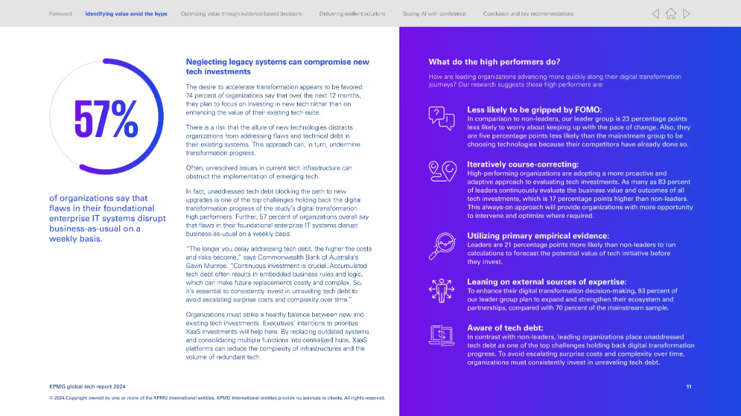
Two-column layout; left side presents text and a circular percentage visualization; right side uses an icon-text list with gradient background.
Operational Efficiency
Technology & Software
Emphasizes the risks of not addressing legacy IT systems, which disrupt operations. Explains that 57% report foundational IT flaws affect weekly operations. Right column identifies strategies high performers use—proactive evaluation, empirical data use, tech debt awareness.
Legacy systems, tech debt, operational disruption, proactive tech investment, digital transformation strategy, empirical evaluation, high performers
false
Operational Efficiency
Technology & Software
Mixed Chart
KPMG
Add to my slides
Remove from favorites
This slide contains a complex, color-coded map showing Deutsche Bank's global operations and their division into regions with a focus on corporate structure.
Organizational Structure and Change
Financial Services
Overview of Deutsche Bank’s global legal entity structure, highlighting significant branches and subsidiaries across different regions.
Legal, structure, global, branches, corporate, Deutsche Bank, map, entities, organization
false
Organizational Structure and Change
Financial Services
Table
Deutsche Bank
Add to my slides
Remove from favorites
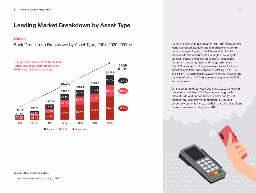
The slide features a column chart detailing the bank gross loan breakdown by asset type from 2008 to 2020, with accompanying text on trends and growth rates.
Market Analysis and Trends
Financial Services
This slide presents a detailed analysis of the Turkish lending market by asset type, showing the growth trends in retail, SME, and corporate loans over time.
Lending Market, Asset Type, Turkey, Retail Loans, SME Loans
false
Market Analysis and Trends
Financial Services
Mixed Chart
PwC/Strategy&
Add to my slides
Remove from favorites
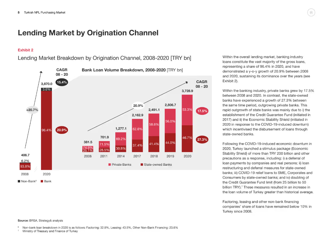
This slide includes a column chart breaking down the lending market by origination channel from 2008 to 2020, with an accompanying explanation of trends and growth rates.
Market Analysis and Trends
Financial Services
The slide analyzes the breakdown of the Turkish lending market by origination channel, highlighting the growth of private and state-owned banks and overall market dynamics.
Lending Market, Origination Channel, Turkey, Private Banks, State-owned Banks
false
Market Analysis and Trends
Financial Services
Multiple Chart
PwC/Strategy&
Add to my slides
Remove from favorites
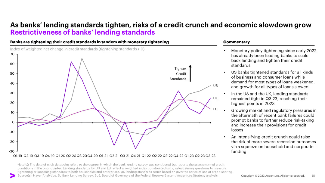
A line chart tracks changes in credit standards for US, UK, and EU banks, with a commentary section on the right. The y-axis shows net changes, and the x-axis displays quarters/years.
Risk Assessment and Management
Financial Services
The slide outlines the tightening of banks' lending standards in response to monetary policy, highlighting the impact on business and consumer loans and potential for a credit crunch.
Lending standards, credit, monetary policy, banks, credit crunch
false
Risk Assessment and Management
Financial Services
Mixed Chart
Accenture
Add to my slides
Remove from favorites
Includes column charts showing loan and deposit developments over several quarters, with FX adjustments noted. The layout is simple and focused on trends.
Financial Performance
Financial Services
Analyzes stable lending trends and increasing deposit volumes in Q4 2023 across various bank divisions, reflecting on strategic responses to regulatory changes and market conditions. It also discusses the balance of loan and deposit flows, providing insights into the bank's operational stability and growth in the financial sector.
Lending, Deposits, Financial Stability, Market Trends, Operational Strategy
false
Financial Performance
Financial Services
Multiple Chart
Deutsche Bank
Add to my slides
Remove from favorites
Features multiple column charts and statistics.
Financial Performance
Financial Services
Reviews lending, deposits, and money market fund trends with a focus on firm stability and client trust, indicated by EOP balances and net migration rates.
Lending, Deposits, Money Market, Stability, Trust
false
Financial Performance
Financial Services
Multiple Chart
JP Morgan
Add to my slides
Remove from favorites
This slide is data-driven, containing three separate graphs: two bar graphs and one pie chart. It has a clear, concise layout with annotations and a side panel with textual information about Kredivo's services.
Customer and Market Segmentation
Financial Services
The slide presents growth metrics for a lending company, Kredivo, focusing on the expansion in non-tier 1 cities. It highlights the increase in loan disbursement, user activation, and transaction frequency.
Lending, Growth, Non-Tier 1 Cities, Kredivo, Loan Disbursement, User Activation, Transaction Frequency
false
Customer and Market Segmentation
Financial Services
Multiple Chart
Kearney
Add to my slides
Remove from favorites
The slide includes a line graph and column charts about funded loans and net interest income, with supplemental textual descriptions. The slide design effectively balances detailed data and explanatory text.
Financial Performance
Financial Services
Provides an overview of progress in lending across the franchise, detailing growth in funded loans, net interest income, and lending strategies for different client segments.
Lending, Net Interest Income, Funded Loans, Franchise Growth, PWM, GS Select, Institutional Financing, Client Strategy
false
Financial Performance
Financial Services
Multiple Chart
Goldman Sachs
Add to my slides
Remove from favorites
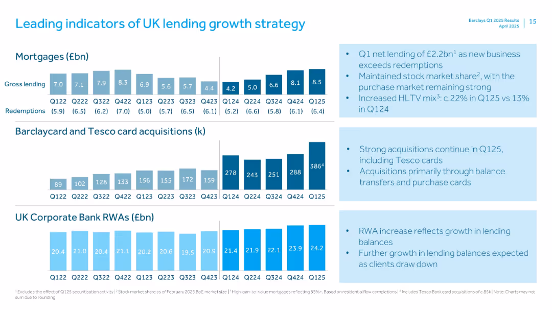
Three rows of small bar charts for mortgages, card acquisitions, and RWA, alongside bulleted insights.
Strategic Planning
Financial Services
Highlights key metrics driving Barclays' UK lending strategy, including mortgage gross lending, Barclaycard & Tesco card acquisitions, and Corporate Bank RWA. Notes continued market strength and higher loan-to-value mortgages.
Lending, Strategy, Mortgages, RWAs, Tesco, Cards, HLTV, Growth, UK Market
false
Strategic Planning
Financial Services
Multiple Chart
Barclays
Add to my slides
Remove from favorites
Depicts Lenovo's evolution with a central graphic highlighting core modernization areas and financial milestones, complemented by a clear layout with purple and white design elements.
Market Analysis and Trends
Technology & Software
This slide reflects on Lenovo's transformation through continuous innovation in technology and processes. It illustrates Lenovo's journey from a hardware-centric company to an intelligent solutions provider, highlighting strategic areas such as supply chain and IT transformation.
Lenovo, core modernization, enterprise reinvestment, market penetration, intelligent solutions, ERP overhaul, IT model redesign, supply chain, finance transformation
false
Market Analysis and Trends
Technology & Software
Diagram
Accenture
Add to my slides
Remove from favorites
Includes pie charts and column charts detailing the composition and changes in Level 3 assets and liabilities.
Risk Assessment and Management
Financial Services
Analyzes the Level 3 assets and liabilities as of March 31, 2023, noting the changes and reasons behind these valuations.
Level 3 assets, financial risk, liabilities, asset management
false
Risk Assessment and Management
Financial Services
Multiple Chart
Deutsche Bank
Add to my slides
Remove from favorites
Uses pie charts and column charts in blue tones. Visualizes complex financial data about asset levels and movements.
Risk Assessment and Management
Financial Services
Details the uncertainty in asset valuation and changes in level 3 assets and liabilities, with focus on risk management.
Level 3 assets, liabilities, financial risk, valuation, asset management, financial reporting
false
Risk Assessment and Management
Financial Services
Multiple Chart
Deutsche Bank
Add to my slides
Remove from favorites
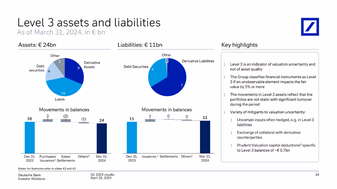
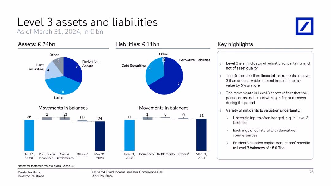
This slide includes pie charts and bar charts showing Deutsche Bank's Level 3 assets and liabilities, movements in balances, and key highlights as of March 31, 2024.
Financial Performance
Financial Services
The slide provides an overview of Deutsche Bank's Level 3 assets and liabilities as of March 31, 2024, detailing movements in balances and key highlights of the valuation and uncertainty of these assets.
Level 3 assets, liabilities, movements, balances, valuation, uncertainty, Deutsche Bank, March 31, 2024
false
Financial Performance
Financial Services
Multiple Chart
Deutsche Bank
Add to my slides
Remove from favorites
This slide utilizes pie charts and column charts to illustrate the distribution and movement of Level 3 assets and liabilities, including details on types of assets and liabilities and their changes over time. Includes key highlight points on regulatory implications and valuation uncertainties.
Regulatory and Compliance
Financial Services
Details the complexity of Level 3 assets and liabilities, key for understanding the risks associated with valuation uncertainties. Important for compliance and regulatory reporting, aiding in financial risk management and strategic planning within financial institutions.
Level 3 assets, liabilities, valuation uncertainty, regulatory compliance, financial institutions, risk management
false
Regulatory and Compliance
Financial Services
Multiple Chart
Deutsche Bank
Add to my slides
Remove from favorites
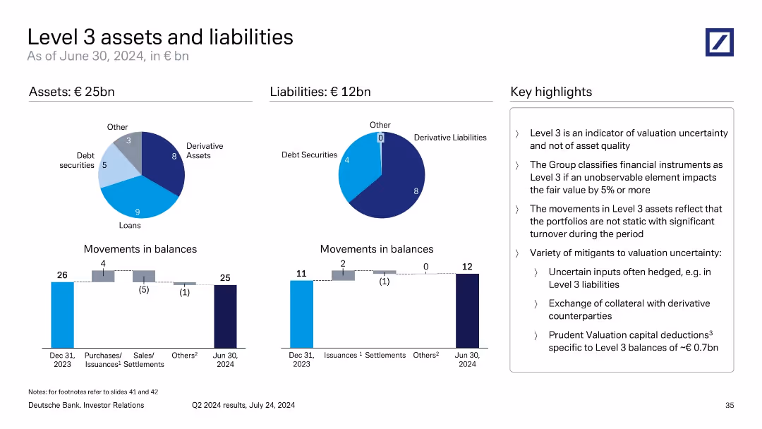
Two pie charts showing asset/liability composition; bar charts showing movements in balances; key points on classification and valuation uncertainty.
Regulatory and Compliance
Financial Services
Shows Deutsche Bank’s Level 3 financial instruments as of March 31, 2024, with €24bn in assets and €11bn in liabilities. Visuals classify asset types (loans, derivatives) and illustrate quarterly changes. Highlights focus on valuation uncertainty, turnover, and mitigating practices.
Level 3 assets, valuation uncertainty, derivative liabilities, Q1 2024, balance movement, Deutsche Bank
false
Regulatory and Compliance
Financial Services
Multiple Chart
Deutsche Bank
Add to my slides
Remove from favorites
Features pie charts for assets and liabilities, bar charts for movement in balances over time, and a bulleted key highlights section.
Regulatory and Compliance
Financial Services
Summarizes Level 3 assets (€26bn) and liabilities (€13bn), categorizing by type (loans, derivatives, debt securities). Emphasizes valuation uncertainty and hedging strategies, and outlines balance movement from 2023 to Q3 2024.
Level 3, Assets, Liabilities, Valuation, Derivatives, Loans
false
Regulatory and Compliance
Financial Services
Multiple Chart
Deutsche Bank
Add to my slides
Remove from favorites
Pie charts for assets and liabilities distribution, bar charts for movements in balances, with key highlights on the right.
Financial Performance
Financial Services
Provides an overview of Level 3 assets and liabilities, including movements in balances and valuation uncertainty mitigation.
Level 3, assets, liabilities, balances, valuation, uncertainty, financial instruments
false
Financial Performance
Financial Services
Multiple Chart
Deutsche Bank
Add to my slides
Remove from favorites
Two donut charts for asset/liability composition; two bar charts for balance movements; right-aligned text summary.
Financial Performance
Financial Services
The slide explains €25bn in Level 3 assets and €12bn in liabilities, categorized into loans, derivatives, and debt securities. It emphasizes valuation uncertainty rather than quality and outlines mitigants like collateral exchange and hedging. Movements in balances suggest active portfolio management despite uncertainty.
Level 3, valuation risk, asset uncertainty, derivatives, loan balances
false
Financial Performance
Financial Services
Multiple Chart
Deutsche Bank
Add to my slides
Remove from favorites
Two pie charts and two bar charts show breakdown and changes in Level 3 assets and liabilities; key messages on valuation risk
Regulatory and Compliance
Financial Services
Level 3 exposures amount to €26bn in assets and €13bn in liabilities. Loans and derivatives form the bulk. Bar charts depict balance changes. Discussion focuses on valuation uncertainty, classification criteria, and risk mitigation strategies such as collateral exchanges and hedging practices.
Level 3, valuation risk, derivatives, regulatory, asset-liability
false
Regulatory and Compliance
Financial Services
Multiple Chart
Deutsche Bank
Add to my slides
Remove from favorites
Pie charts for assets and liabilities; bar charts for movements; boxed key highlights on the right; circular and vertical bar visuals
Regulatory and Compliance
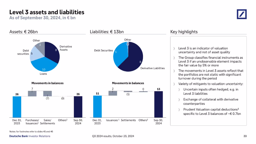
Financial Services
Shows Deutsche Bank’s Level 3 assets and liabilities as of September 30, 2024, emphasizing valuation uncertainty. Includes breakdowns by asset class and tracks changes in balances, along with commentary on mitigating valuation risks.
Level 3, valuation uncertainty, derivative assets, financial reporting, liabilities, Deutsche Bank, balance sheet, asset classification
false
Regulatory and Compliance
Financial Services
Multiple Chart
Deutsche Bank
Add to my slides
Remove from favorites
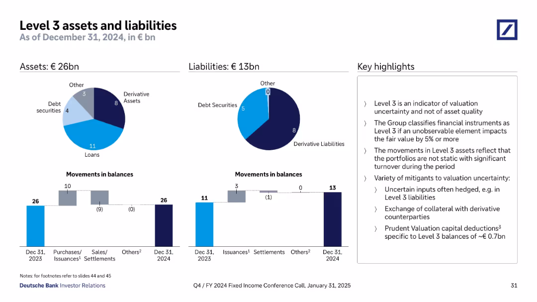
Two pie charts show Q4 2024 Level 3 assets (€26bn) and liabilities (€13bn) by type; bar charts below show movements during the year; key points listed on the right.
Financial Performance
Financial Services
Summarizes Level 3 instruments representing high valuation uncertainty. Explains composition, changes over the year, and risk mitigants such as hedging and collateral. Notes prudent valuation capital deductions of ~€0.7bn.
Level 3, valuation uncertainty, derivatives, assets, liabilities, fair value
false
Financial Performance
Financial Services
Multiple Chart
Deutsche Bank
Add to my slides
Remove from favorites
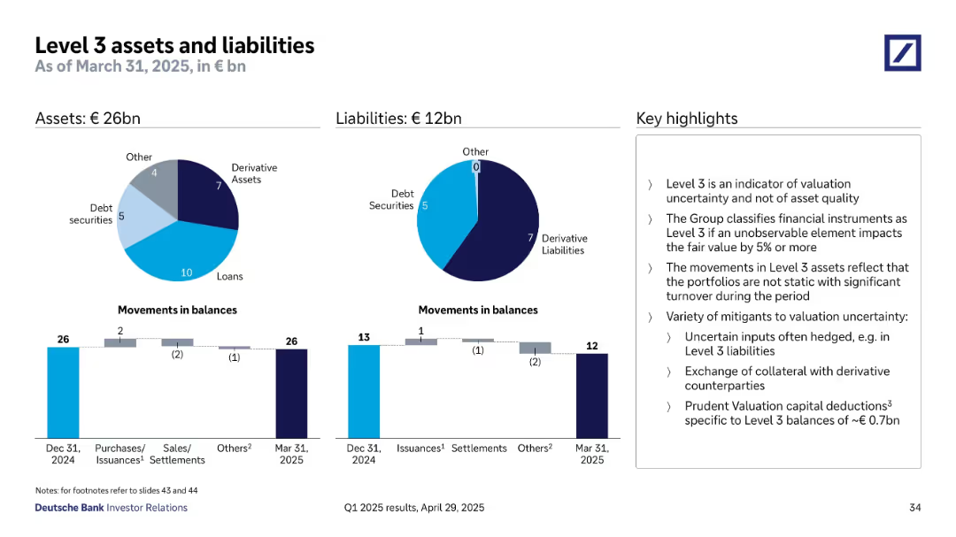
Two pie charts showing asset and liability composition, supported by bar charts for balance movements. Sidebar highlights key interpretations.
Regulatory and Compliance
Financial Services
This slide discusses Level 3 assets (€26bn) and liabilities (€12bn) as of March 31, 2025, indicating valuation uncertainty rather than asset quality. It details changes in balances due to purchases, settlements, and issuance, while noting the mitigants used to manage valuation risk, such as collateral exchange and prudent valuation deductions.
Level 3, valuation, derivative, balance movement, fair value, compliance
false
Regulatory and Compliance
Financial Services
Multiple Chart
Deutsche Bank
Add to my slides
Remove from favorites
Composed of column chart tracking the leverage ratio across quarters with explanations for changes due to FX effects, capital adjustments, and exposure variations.
Regulatory and Compliance
Financial Services
Explores the slight decrease in the leverage ratio of Q4 2023, discussing factors such as trading activities and liquidity reserves. It details the implications for financial strategies and regulatory compliance, highlighting proactive measures to maintain a robust leverage framework.
Leverage Ratio, Financial Strategy, Regulatory Compliance, Trading Activities, Liquidity Management
false
Regulatory and Compliance
Financial Services
Mixed Chart
Deutsche Bank
Add to my slides
Remove from favorites
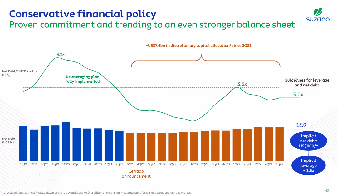
Timeline chart with leverage ratio trend (line graph) and stacked net debt bars by quarter; key events like Cerrado project announcement annotated.
Risk Assessment and Management
Consumer Goods
This slide illustrates Suzano’s financial discipline, highlighting a deleveraging trajectory, net debt levels, and commitment to a conservative financial policy. It contextualizes capital allocations against leverage management.
Leverage, Net Debt, Financial Policy, Risk, Timeline
false
Risk Assessment and Management
Consumer Goods
Single Chart
Goldman Sachs
Add to my slides
Remove from favorites
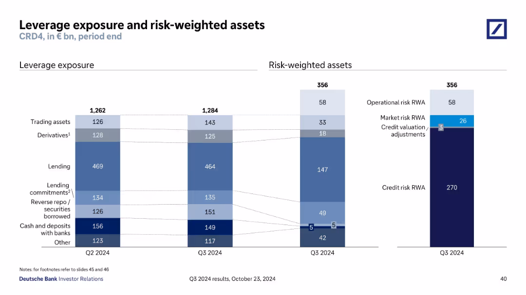
Side-by-side bar charts: left for leverage exposure by asset class, right for risk-weighted assets with detailed breakdowns.
Risk Assessment and Management
Financial Services
Displays Q3 2024 data for €1,284bn in leverage exposure and €356bn in risk-weighted assets. Breaks down exposure across trading, lending, repo, cash, and others; risk-weighted assets include credit, market, and operational risk.
Leverage, Risk-Weighted Assets, Credit Risk, Exposure, Q3 2024
false
Risk Assessment and Management
Financial Services
Multiple Chart
Deutsche Bank
Add to my slides
Remove from favorites
Column charts and detailed textual information, utilizing shades of blue to illustrate financial data points.
Risk Assessment and Management
Financial Services
Provides insights into leverage and risk-weighted assets, essential for risk management and regulatory compliance.
Leverage, risk-weighted assets, financial risk, compliance, banking, operational risk, market risk
false
Risk Assessment and Management
Financial Services
Multiple Chart
Deutsche Bank
Add to my slides
Remove from favorites
The slide includes two line graphs titled "Average EBITDA purchase price multiple for leveraged buyout transactions" for the US and Europe from 2000 to 2022. The data points are highlighted in red, indicating specific values of 11.9x for the US and 10.7x for Europe, contrasting against a gray background.
Financial Performance
Financial Services
Examines leveraged buyout purchase price multiples, suggesting robust competition and asset quality in the US and European markets, valuable for assessing investment purchase strategies and market entry considerations.
Leveraged Buyout, EBITDA, Multiples, US, Europe, Investment Strategy, Asset Quality
false
Financial Performance
Financial Services
Single Chart
Bain
Add to my slides
Remove from favorites
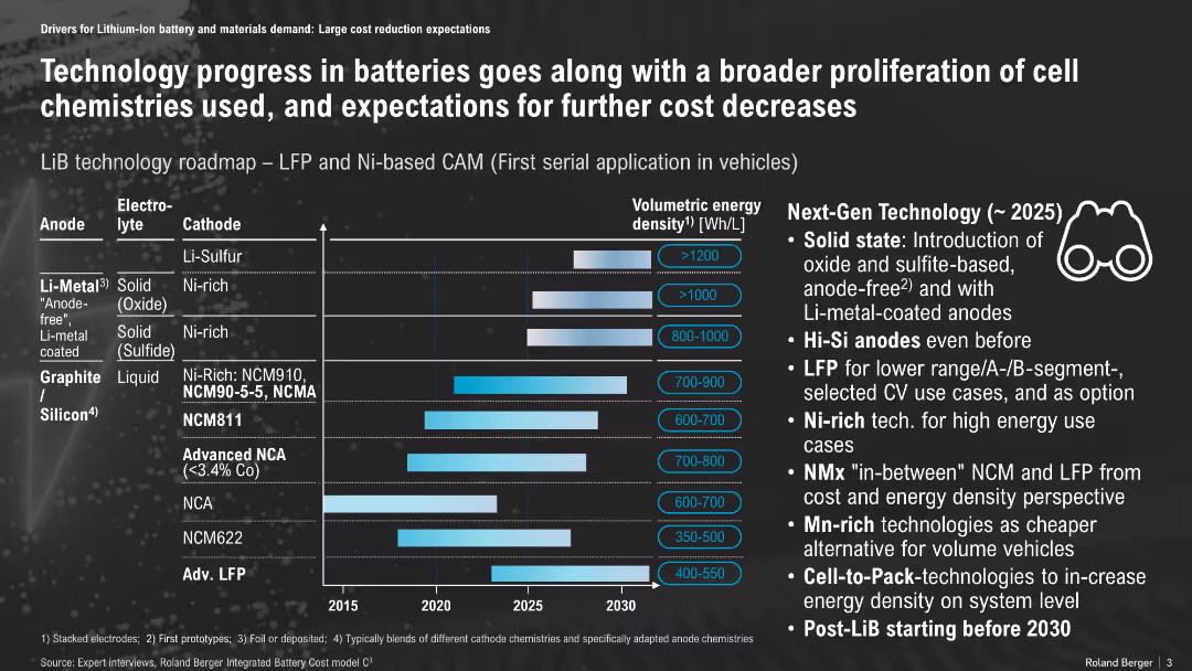
Horizontal timeline with bar chart, matrix of anode/electrolyte/cathode types and energy density projections; icons and callouts on the right
Technology and Digital Transformation
Energy & Utilities
The slide presents a roadmap of lithium-ion battery technologies, showing progress in energy density from different material combinations and their expected commercialization timeline. It emphasizes upcoming advancements like solid-state batteries, Hi-Si anodes, and LFP for specific vehicle segments.
Li-ion, battery roadmap, solid-state, energy density, LFP, NCM, anode, cathode, vehicle, cost reduction
false
Technology and Digital Transformation
Energy & Utilities
Mixed Chart
Roland Berger
Add to my slides
Remove from favorites
Dark blue background with a large vertical column chart detailing the global demand for Li-ion battery cells from 2015 to 2040, split into three sectors: mobility, energy storage systems, and consumer electronics.
Market Analysis and Trends
Energy & Utilities
The slide analyzes the growing demand for Li-ion batteries, emphasizing the impact of electric vehicles on this increase. It highlights key insights about market growth expectations and sector contributions.
Li-ion, electric vehicles, market growth, energy storage, consumer electronics
false
Market Analysis and Trends
Energy & Utilities
Mixed Chart
McKinsey
Add to my slides
Remove from favorites
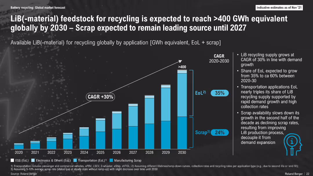
Stacked bar chart with CAGR trajectory, breakdown by application types (ESS, Electronics, Transportation, Scrap); dark theme, annotated with notes on trends
Market Analysis and Trends
Energy & Utilities
This slide forecasts LiB-material feedstock for recycling to exceed 400 GWh by 2030, driven by growing End-of-Life volumes and early scrap. Scrap remains dominant until 2027 before EoL overtakes it, indicating changes in battery production maturity and recycling dynamics.
LiB Recycling, GWh Feedstock, Scrap, End-of-Life, CAGR, Battery Materials, 2030, Market Growth
false
Market Analysis and Trends
Energy & Utilities
Mixed Chart
Roland Berger
Add to my slides
Remove from favorites
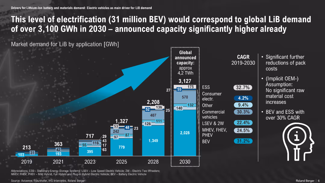
Bar chart showing LiB demand growth by application; forecast to 2030
Market Analysis and Trends
Energy & Utilities
Projected lithium-ion battery demand by application suggests a 3,100 GWh requirement by 2030 driven by BEV growth. The supply capacity is expected to exceed this, with BEV and ESS leading CAGR over 30%.
LiB demand, energy storage, BEV, GWh forecast, CAGR, application mix
false
Market Analysis and Trends
Energy & Utilities
Mixed Chart
Roland Berger
Add to my slides
Remove from favorites
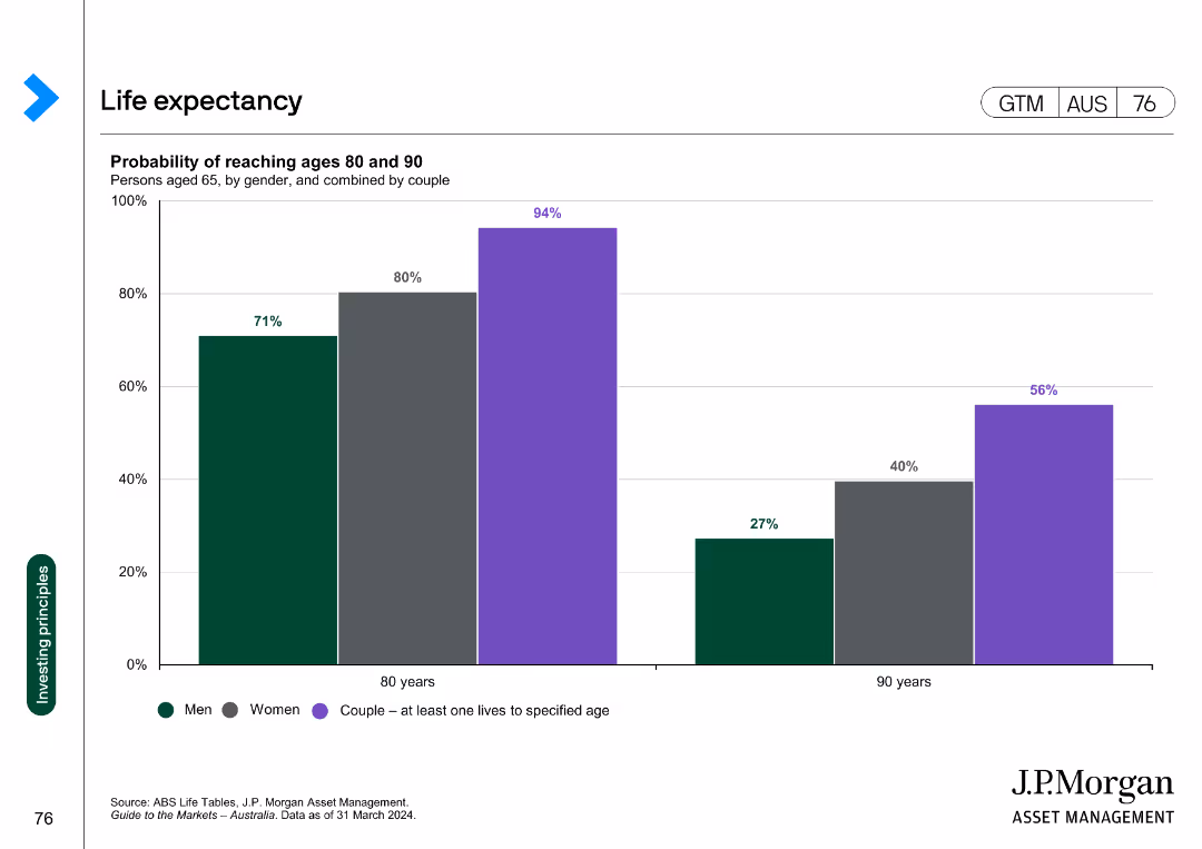
A column chart displaying the probability of men, women, and couples reaching ages 80 and 90. The bars represent the percentages for each group, with different colors for each category.
Market Analysis and Trends
Financial Services
The slide shows the probability of men, women, and couples reaching the ages of 80 and 90. It is used to illustrate longevity statistics relevant to financial planning.
Life expectancy, longevity, financial planning, retirement, demographics
false
Market Analysis and Trends
Financial Services
Single Chart
JP Morgan
Add to my slides
Remove from favorites
Slide showcases a client lifecycle on a gentle curve graph, with text boxes and icons for different stages and a data section detailing financial services.
Investment Analysis
Financial Services
Outlines the firm's coverage and solutions throughout the client's growth phases, providing financial insights.
Lifecycle, IB Coverage, Solutions, Growth, M&A, Private Equity, IPO, Strategic Growth
false
Investment Analysis
Financial Services
Table
JP Morgan
Add to my slides
Remove from favorites
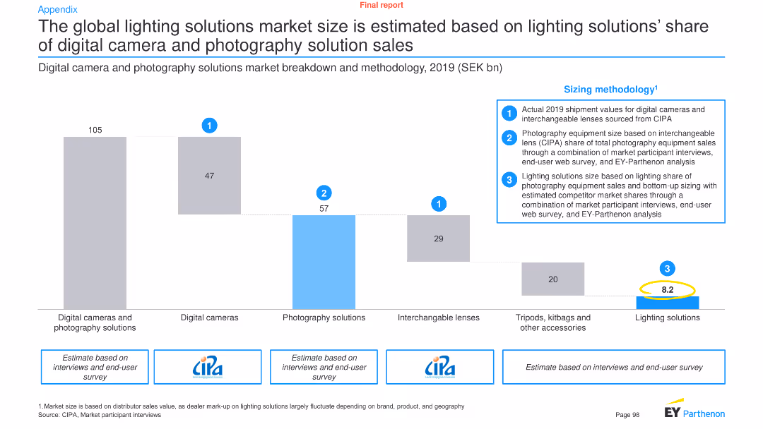
This slide features a column chart and text to illustrate the market size of lighting solutions in relation to digital cameras and photography solutions, along with sizing methodology.
Market Analysis and Trends
Technology & Software
It estimates the global market size of lighting solutions based on their share of digital camera and photography solution sales, providing a detailed breakdown and methodology.
Lighting solutions, market size, digital cameras, photography, global market, sizing methodology, technology, analysis, trends
false
Market Analysis and Trends
Technology & Software
Mixed Chart
EY
Add to my slides
Remove from favorites
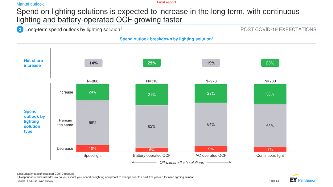
This slide features a column chart showing the net share increase in spend outlook by different lighting solutions: speedlight, battery-operated OCF, AC-operated OCF, and continuous light.
Market Analysis and Trends
Industrial & Manufacturing
The slide projects an increase in spending on lighting solutions, particularly battery-operated and continuous lighting, over the long term. It provides a breakdown of expected changes in spending across various lighting technologies.
Lighting solutions, spend outlook, long-term trends, battery-operated OCF, continuous light, speedlight, AC-operated OCF, market forecast
false
Market Analysis and Trends
Industrial & Manufacturing
Single Chart
EY
Add to my slides
Remove from favorites
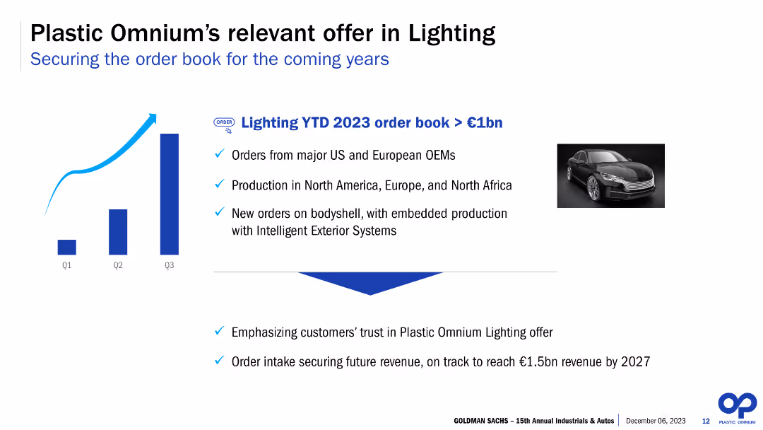
The slide combines a column chart with an upward trend for three quarters, an accompanying high-quality image of a car, and bullet points outlining key facts about the company's offer in lighting. The visual focus is balanced between the chart and the image, with both elements prominently displayed against a clean white background. The text is concise, using bold fonts for emphasis.
Product and Service Analysis
Industrial & Manufacturing
This slide highlights the company's significant order book in lighting, emphasizing orders from major automotive OEMs and production across regions. It discusses new orders and projects future revenue targets. This visual and textual combination effectively conveys the company's capabilities in lighting and its market relevance, likely aimed at investors or partners.
Lighting, Order Book, OEMs, Production, Growth, Revenue Targets, Column Chart, Automotive, Market Relevance, Forecast
false
Product and Service Analysis
Industrial & Manufacturing
Mixed Chart
Goldman Sachs
Add to my slides
Remove from favorites
The slide includes a column chart showing the year-to-date order book for 2023, along with bullet points detailing major orders, production locations, and new orders on bodyshells with embedded production. It also features an image of a car.
Product and Service Analysis
Industrial & Manufacturing
The slide outlines Plastic Omnium’s offerings in the lighting sector, showcasing significant orders from major OEMs, production spread across regions, and new orders with embedded production capabilities. It emphasizes the strategic importance and customer trust in their lighting solutions.
Lighting, order book, OEMs, production, bodyshells, embedded production, customer trust, strategic importance, Plastic Omnium, year-to-date
false
Product and Service Analysis
Industrial & Manufacturing
Mixed Chart
Goldman Sachs
Add to my slides
Remove from favorites
Contains bar charts showing the likelihood of quitting by gender, income, generation, and caregiving responsibilities.
Market Analysis and Trends
Professional Services
Discusses the likelihood of employees quitting based on factors like gender, income, generation, and caregiving responsibilities, highlighting differences in flexibility needs.
Likelihood to quit, Gender, Income, Generation, Caregiving responsibilities
false
Market Analysis and Trends
Professional Services
Multiple Chart
EY
Add to my slides
Remove from favorites
The slide includes a donut chart and text, analyzing the likelihood of Canadians facing unexpected expenses due to COVID-19.
Risk Assessment and Management
Financial Services
It assesses the chances of Canadians encountering unexpected expenses over $5,000, with pandemic-related insights.
Likelihood, Unexpected Expenses, COVID-19, Canadians, $5,000, Donut Chart, Financial, Risk, Assessment, Analysis
false
Risk Assessment and Management
Financial Services
Mixed Chart
IPSOS
Add to my slides
Remove from favorites
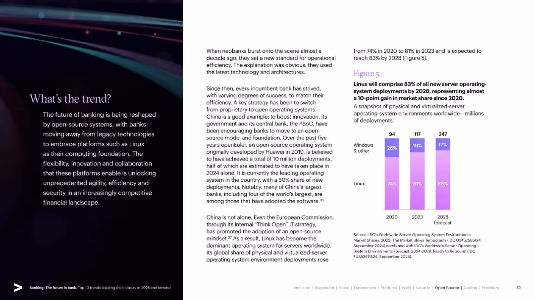
Split design with stylized visuals and trend text on left; bar chart on right showing growth of Linux server deployments.
Technology and Digital Transformation
Technology & Software
Explores the adoption of open-source platforms, particularly Linux, in banking IT systems. Highlights operational efficiency and future server OS dominance projected by 2028.
Linux, Open Source, Banking IT, Efficiency, Server Deployment, Digital Core, Technology Shift
false
Technology and Digital Transformation
Technology & Software
Mixed Chart
Accenture
Add to my slides
Remove from favorites
The slide contains a dual-section layout with text-based principles on the left and key liquidity metrics on the right in rectangular callouts. The design is straightforward and focused on clarity of information.
Risk Assessment and Management
Financial Services
Discussing principles of liquidity management, the slide highlights the firm's strategies to maintain a robust liquidity position. Appropriate for briefings on financial risk management, illustrating conservative liquidity principles and current liquidity metrics.
Liquidity Management, Financial Risk, Principles, Metrics, Conservative Approach
false
Risk Assessment and Management
Financial Services
Header Horizontal
Goldman Sachs
Add to my slides
Remove from favorites
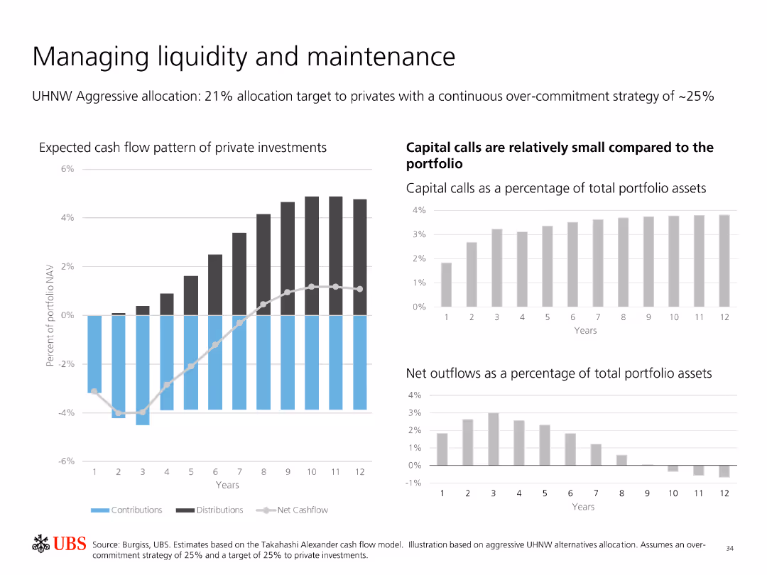
Contains multiple bar charts showing expected cash flow patterns of private investments, capital calls, and net outflows as a percentage of total portfolio assets.
Financial Performance
Financial Services
Analyzes liquidity management and maintenance in private investments, highlighting expected cash flows, capital calls, and net outflows relative to portfolio assets.
Liquidity Management, Private Investments, Cash Flow, Capital Calls, Net Outflows, Portfolio, Strategy, Analysis, Maintenance
false
Financial Performance
Financial Services
Multiple Chart
UBS
Add to my slides
Remove from favorites
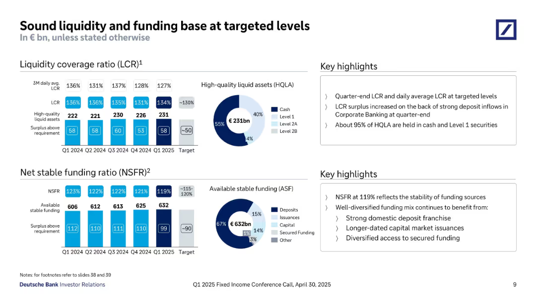
Two major sections with bar charts (LCR & NSFR), donut charts (liquidity and funding composition), and textual highlights on the right.
Risk Assessment and Management
Financial Services
The slide outlines Deutsche Bank’s liquidity and funding ratios in Q1 2025. LCR stands at 127%, NSFR at 119%, both within target ranges. It emphasizes stable high-quality liquid assets and strong deposit-based funding structure.
Liquidity, LCR, NSFR, Funding, Stability, HQLA, Surplus, Risk Management, Targeted Levels, Q1 2025
false
Risk Assessment and Management
Financial Services
Multiple Chart
Deutsche Bank
Add to my slides
Remove from favorites
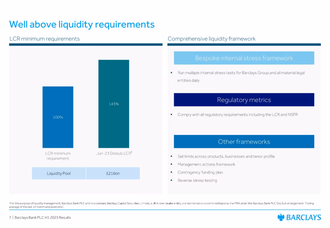
Two-bar comparison chart (LCR min vs. Barclays) and bullet list of liquidity frameworks
Risk Assessment and Management
Financial Services
Highlights Barclays' liquidity coverage ratio of 143% against a 100% requirement, supported by a £216bn liquidity pool. Also outlines the bank's internal and regulatory frameworks to manage liquidity risks.
Liquidity, LCR, Stress Testing, Barclays, Risk Management, Financial Compliance, Resilience
false
Risk Assessment and Management
Financial Services
Mixed Chart
Barclays
Add to my slides
Remove from favorites
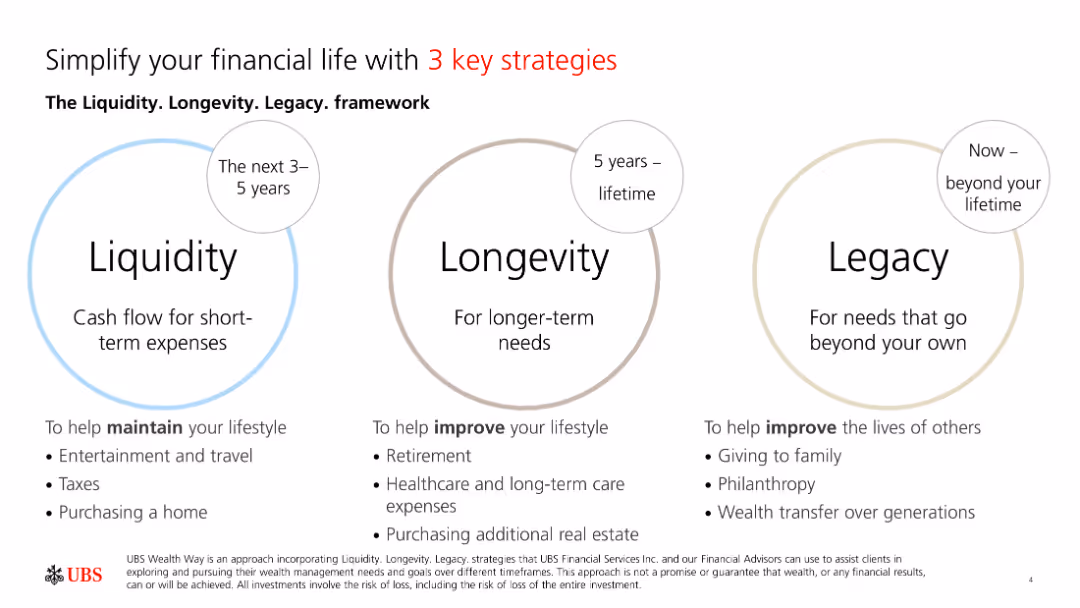
The slide contains three circular diagrams labeled Liquidity, Longevity, and Legacy, each representing different financial strategies over timeframes.
Strategic Planning
Financial Services
The slide introduces the Liquidity, Longevity, and Legacy framework, highlighting strategies for maintaining lifestyle, long-term needs, and beyond lifetime.
Liquidity, Longevity, Legacy, Strategies, Finance
false
Strategic Planning
Financial Services
Framework
UBS
Add to my slides
Remove from favorites
Bar chart of liquidity coverage ratio trends and a donut chart of liquidity pool composition, emphasizing high-quality liquid assets and securities.
Financial Performance
Financial Services
Presentation of liquidity coverage ratio and the composition of UBS's liquidity pool, highlighting high-quality liquid assets.
Liquidity, coverage, assets, securities, cash
false
Financial Performance
Financial Services
Multiple Chart
UBS
Add to my slides
Remove from favorites
This slide features a vertical column chart illustrating the drawn SNB liquidity facilities over various dates. On the left, there is text highlighting key liquidity ratios (LCR and NSFR) and repayment details.
Financial Performance
Financial Services
The slide presents UBS's management of liquidity and funding, highlighting key ratios like LCR and NSFR, and showing the repayment of SNB facilities over time. It is used to show financial stability and management effectiveness.
Liquidity, funding, SNB facilities, LCR, NSFR
false
Financial Performance
Financial Services
Mixed Chart
UBS
Add to my slides
Remove from favorites
Features column charts and pie charts on bank's funding and liquidity status, depicting diverse deposit bases and liquidity ratios with target comparisons.
Investment Analysis
Financial Services
Evaluates the bank's liquidity management and funding diversity, critical for understanding its capacity to meet financial obligations and investment needs.
Liquidity, funding, ratios, financial health
false
Investment Analysis
Financial Services
Multiple Chart
Deutsche Bank
Add to my slides
Remove from favorites
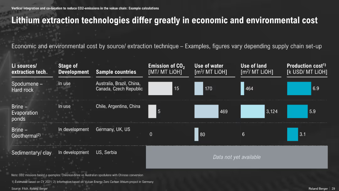
Table format comparing lithium extraction methods; includes emissions, water use, land use, and cost across extraction types
Technology and Digital Transformation
Environmental Services & Sustainability
The slide compares four lithium extraction technologies, highlighting trade-offs in CO₂ emissions, land and water use, and costs. Geothermal brine shows strong environmental and economic performance, while evaporation ponds are most resource-intensive.
Lithium Extraction, Environmental Cost, Geothermal, Hard Rock, Brine, CO₂, Water Use, Land Use
false
Technology and Digital Transformation
Environmental Services & Sustainability
Single Chart
Roland Berger
Add to my slides
Remove from favorites
Previous
Next
You don't have any favorites yet.
Please wait loading your favorites slides...
Create a FREE account to continue browsing
Receive Instant Access to 1,000+ slides from companies like McKinsey, Google, and Goldman Sachs
First Name
Last Name
Email
Password
I agree to all
Terms & Privacy Policy
Thank you! Your submission has been received!
Oops! Something went wrong while submitting the form.
Have an account?
Sign in
Upgrade to PRO to Save slides
Advanced Search and Filters
Access to 15,000+ slides
Access to Category Pages
Save/Bookmark Slides
PowerPoint Template Library
Pick a Plan
MONTHLY
$12/month
Billed every month, Cancel anytime.
YEARLY
$9/year
Billed $108 annually, Cancel anytime.
Checkout for $12/month
Checkout for $108/yr
Secured by Stripe | AES-256 bit encryption