My Account
My Slides
Search by Category
Pricing
Templates
View All Templates
Download Template Slides
✦ AI Search
Feedback
Login
Logout
Get Started
Browse all Slides
Browse all Slides
Create a FREE Account
Instant access to 1,000+ real slides from top companies like McKinsey, BCG, Goldman Sachs, Google and many more!
First Name
Last Name
Email
Password
I agree to all
Terms & Privacy Policy
Thank you! Your submission has been received!
Oops! Something went wrong while submitting the form.
Have an account?
Sign in
Saved Slides
Total No. of slides saved
0
↻ Refresh
✖ Clear all
Slide features a series of column charts comparing revenue streams across different banking divisions between Q3 2022 and Q3 2023, annotated for clarity.
Financial Performance
Financial Services
Discusses the revenue distribution and growth within the bank's various divisions over the last year, emphasizing on diversified revenue sources and strategic initiatives driving growth.
Revenue, Growth, Banking Divisions, Q3 2023, Financial Strategies, Diversification
false
Financial Performance
Financial Services
Mixed Chart
Deutsche Bank
Add to my slides
Remove from favorites
This slide includes a detailed table of financial metrics and a line chart illustrating contract value and free cash flow over several years.
Financial Performance
Financial Services
It provides a comprehensive summary of financial performance, including revenue, growth rates, margins, EBITDA, and free cash flow trends.
Revenue, Growth, EBITDA, Free Cash Flow, Contract Value, Financial Metrics
false
Financial Performance
Financial Services
Multiple Chart
Gartner
Add to my slides
Remove from favorites
Three bar graphs showing revenue changes for AmeriHealth, NH Healthy Families, and Well Sense over different fiscal years. Dense layout with tables.
Financial Performance
Healthcare & Pharmaceuticals
Analysis of revenue changes across health plans, highlighting the impact of performance incentives on health plan revenues and profit opportunities.
Revenue, Health Plan, Performance, Incentives, Fiscal Year
false
Financial Performance
Healthcare & Pharmaceuticals
Multiple Chart
Alvarez & Marsal
Add to my slides
Remove from favorites
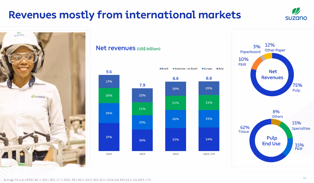
Split layout with left-side image of worker and right-side with stacked bar and donut charts; bold blue titles and clean grid layout on white background.
Financial Performance
Consumer Goods
This slide illustrates Suzano’s revenue distribution by geography and product. It highlights a strong international presence, with 75% of revenue coming from pulp. Regional revenue contributions are broken down with bar charts by year.
Revenue, International Markets, Pulp, Net Sales, Segments
false
Financial Performance
Consumer Goods
Multiple Chart
Goldman Sachs
Add to my slides
Remove from favorites
Bar charts showing revenue growth rates for luxury brands during various economic conditions from 1994 to 2017.
Financial Performance
Consumer Goods
Examines revenue growth polarization among luxury brands across different periods, highlighting how external economic conditions like crises impact financial performance.
Revenue, Luxury Brands, Economy
false
Financial Performance
Consumer Goods
Multiple Chart
Bain
Add to my slides
Remove from favorites
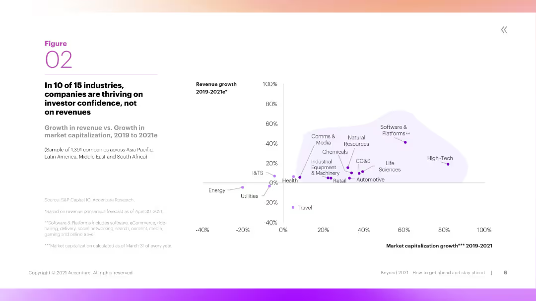
The slide includes a scatter plot showing the relationship between revenue growth and market capitalization growth across different industries. It uses a clear legend and color coding to distinguish between industries.
Market Analysis and Trends
Financial Services
The slide examines the relationship between revenue growth and market capitalization growth in 10 out of 15 industries, showing that many companies are thriving on investor confidence rather than revenue growth.
Revenue, Market Capitalization, Industries, Growth, Confidence
false
Market Analysis and Trends
Financial Services
Mixed Chart
Accenture
Add to my slides
Remove from favorites
The slide features a dark background with six column charts in contrasting colors comparing Q1 2020 and Q1 2021 figures. A cyan highlight indicates improvements or targets met.
Financial Performance
Financial Services
This slide presents financial data comparisons year-on-year to assess company performance. It's designed to inform stakeholders about fiscal health and forecast alignment with annual financial guidance.
Revenue, NPAT, Earnings, Profit, ROIC
false
Financial Performance
Financial Services
Multiple Chart
Goldman Sachs
Add to my slides
Remove from favorites
This slide features three main metrics: revenue, total installed base, and future revenue projections. It includes pie charts for product lines, geographies, and revenue models with purple color themes.
Financial Performance
Healthcare & Pharmaceuticals
Details the financial metrics and projections for the Molecular Diagnostics Business Unit, including product line distribution, geographical reach, and projected revenue from new product launches.
Revenue, Projections, Product, Geography, Healthcare
false
Financial Performance
Healthcare & Pharmaceuticals
Multiple Chart
JP Morgan
Add to my slides
Remove from favorites
The slide features a prominent logo at the top right, a title, two circle diagrams on the left, and a vertical column chart showing revenue trends from 2016/17 to 2020/21.
Financial Performance
Government & Public Sector
This slide presents annual revenue data from 2016/17 to 2020/21 alongside priority areas for structural reforms. It's useful for discussing financial strategies and policy impacts within the government sector.
Revenue, Reforms, Forecast, Government, Policy
false
Financial Performance
Government & Public Sector
Single Chart
PwC/Strategy&
Add to my slides
Remove from favorites
Slide features two column charts depicting revenue growth and market resiliency.
Market Analysis and Trends
Financial Services
Shows Equifax's revenue resilience and growth levers during economic fluctuations, emphasizing its strength in diverse market conditions.
Revenue, Resilience, Growth, Economy, Market
false
Market Analysis and Trends
Financial Services
Multiple Chart
Barclays
Add to my slides
Remove from favorites
Contains a column chart for total revenue distribution and a block diagram for the service portfolio, divided into new service business and core service business.
Operational Efficiency
Industrial & Manufacturing
Highlights the distribution of industrial company revenue from services and product segments, and outlines various service portfolio components for business efficiency.
Revenue, Service Portfolio, Industrial, Efficiency, Distribution
false
Operational Efficiency
Industrial & Manufacturing
Mixed Chart
Accenture
Add to my slides
Remove from favorites
This slide features a large, central pie chart comparing tax and non-tax revenue in billions, with a thermometer chart on the right showing growth over the previous year.
Financial Performance
Government & Public Sector
The slide presents Namibia's total revenue for the fiscal year 2018/19, breaking down tax and non-tax sources. It highlights an increase in total revenue from the previous year, emphasizing government income sources.
Revenue, Tax, Non-Tax, Growth, Comparison
false
Financial Performance
Government & Public Sector
Multiple Chart
PwC/Strategy&
Add to my slides
Remove from favorites
Includes a large pie chart that breaks down tax and non-tax revenue sources, illustrated with colors and labeled segments. A smaller triangle graph breaks down the components of non-tax revenue.
Regulatory and Compliance
Government & Public Sector
This slide provides a breakdown of tax versus non-tax revenue for the fiscal year, detailing the proportions and specific amounts from various sources such as fines, fees, and entrepreneurial activities. This aids in understanding the structure and diversity of government revenue sources.
Revenue, Tax, Non-tax, Fiscal policy, Government finance
false
Regulatory and Compliance
Government & Public Sector
Mixed Chart
PwC/Strategy&
Add to my slides
Remove from favorites
This slide has a column chart showing revenue from 2017 to 2021, a table for market leadership, and various text annotations. The layout is balanced between visual data and descriptive information.
Financial Performance
Financial Services
Highlights J.P.Morgan's revenue growth and leadership positions in the Treasury Services sector, despite challenges such as price compression.
Revenue, Treasury Services, Market Share, Leadership, Growth, Financial Services, J.P.Morgan
false
Financial Performance
Financial Services
Mixed Chart
JP Morgan
Add to my slides
Remove from favorites
Multiple tables and a column chart showing divisional revenues and key financial metrics such as net interest margin and CET1 ratio. Lists key highlights in bullet points.
Financial Performance
Financial Services
Overview of financial highlights for Q1 2023, focusing on revenue growth, cost management, and risk, providing a snapshot of the bank's financial health.
Revenue, costs, provisions, financial health
false
Financial Performance
Financial Services
Mixed Chart
Deutsche Bank
Add to my slides
Remove from favorites
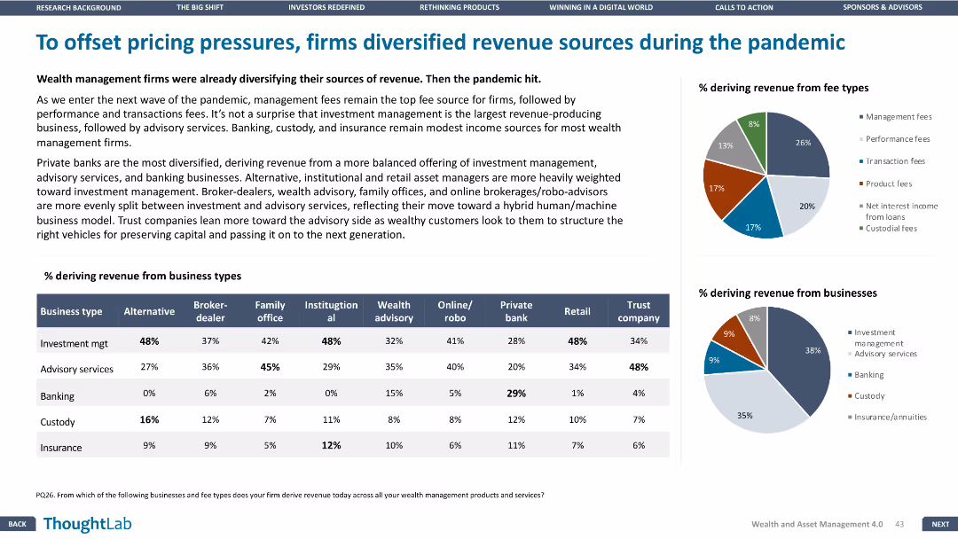
This slide has a column chart, pie charts, and a table. The layout is dense with multiple visual elements and minimal white space.
Strategic Planning
Financial Services
The slide discusses how wealth management firms diversified their revenue sources during the pandemic, with data showing the percentage of revenue from different business types and fee types.
Revenue, diversification, pandemic, wealth management, business types, fee types
false
Strategic Planning
Financial Services
Multiple Chart
Deloitte
Add to my slides
Remove from favorites
This slide features a column chart comparing total revenue and expenditure over three fiscal years, highlighting budget surpluses or deficits.
Regulatory and Compliance
Government & Public Sector
Compares governmental revenue versus expenditure over recent years to assess financial health and operational efficiency.
Revenue, expenditure, budget deficit, fiscal years, comparison
false
Regulatory and Compliance
Government & Public Sector
Multiple Chart
PwC/Strategy&
Add to my slides
Remove from favorites
A column chart representing annual revenue from FY 2019 to FY 2022, with future projections. The design is simple and uses shades of blue.
Financial Performance
Financial Services
Analysis of Deutsche Bank's revenue growth over four years, highlighting exceeded expectations and future revenue goals.
Revenue, performance, growth, Deutsche Bank, financial, projections, analysis, FY
false
Financial Performance
Financial Services
Mixed Chart
Deutsche Bank
Add to my slides
Remove from favorites
Features a projection column chart from 2022 to 2025 with strategic growth measures listed beside it. The slide uses a simple, clean design with blue and white tones.
Investment Analysis
Financial Services
Projects future revenue targets for Deutsche Bank, detailing strategic initiatives across various divisions to drive growth.
Revenue, projections, Deutsche Bank, strategy, growth, 2025, financial targets, divisions
false
Investment Analysis
Financial Services
Mixed Chart
Deutsche Bank
Add to my slides
Remove from favorites
Column chart showing revenue changes from 3Q23 to 4Q23 with breakdowns of various business segments and total revenue impacts.
Financial Performance
Financial Services
Details UBS's total revenues for 4Q23, showing a 3% decrease compared to the previous quarter, with contributing segment breakdowns.
Revenues, Financial Performance, UBS, 4Q23, Analysis
false
Financial Performance
Financial Services
Mixed Chart
UBS
Add to my slides
Remove from favorites
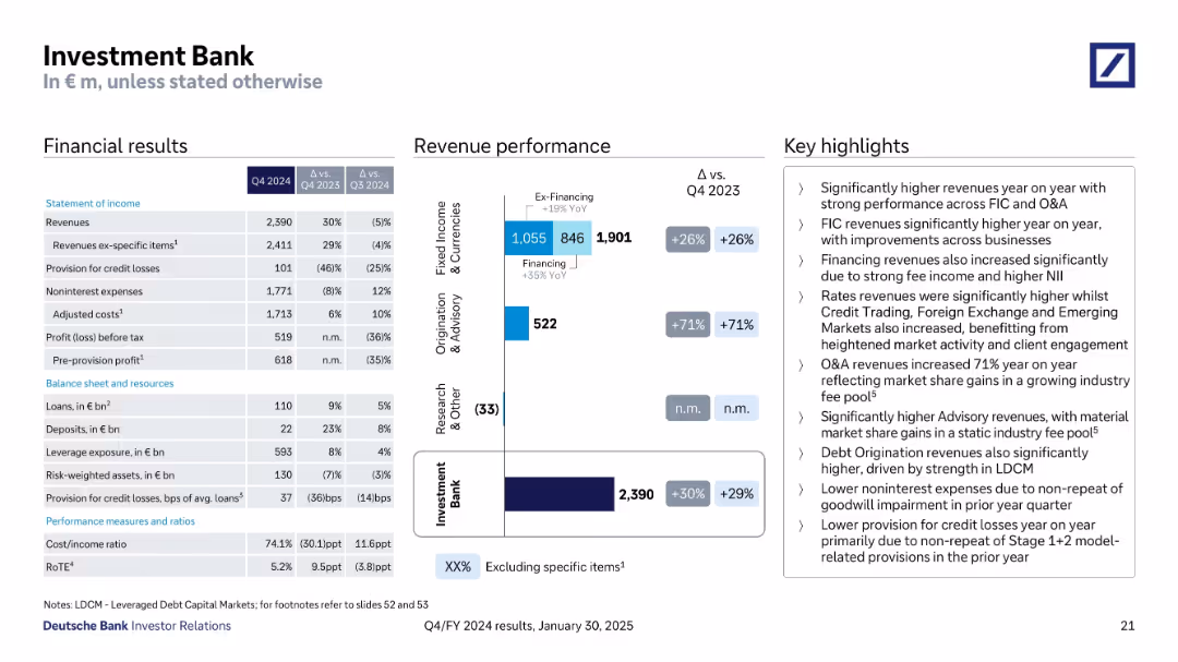
Three-column layout with financial results, bar charts for revenue performance, and bullet-point highlights
Financial Performance
Financial Services
This slide presents Q4 2024 financial results of the Investment Bank division, showing 30% YoY revenue growth, a breakdown of revenue components, and key highlights such as strong performance in Fixed Income & Currencies and Origination & Advisory. Noninterest expenses declined and provisions for credit losses dropped due to prior-year provisions not repeating.
Revenues, Profit, Credit Losses, Financing, FIC, O&A, Costs, YoY Growth
false
Financial Performance
Financial Services
Mixed Chart
Deutsche Bank
Add to my slides
Remove from favorites
Column chart presenting revenues, color-coded for different sectors, and easy-to-read layout.
Financial Performance
Financial Services
Details the net revenues of global banking and markets, showcasing the increased wallet share and returns over years.
Revenues, banking, growth
false
Financial Performance
Financial Services
Single Chart
Goldman Sachs
Add to my slides
Remove from favorites
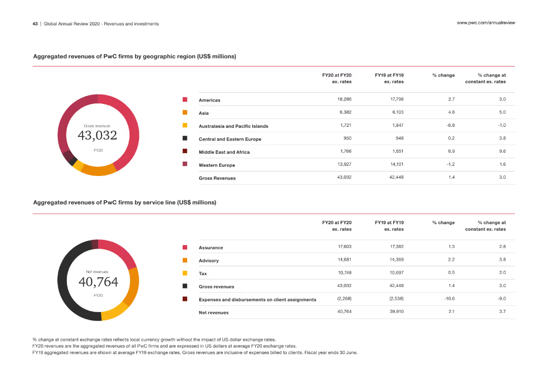
This slide features two tables displaying PwC's revenue by geographic region and service line, accompanied by column charts for visual representation. The tables include revenue figures, percentage changes, and constant exchange rate changes.
Financial Performance
Professional Services
The slide presents a detailed financial performance overview of PwC, showing revenue distribution across regions and service lines, with emphasis on year-over-year changes and growth rates.
Revenues, geographic distribution, service lines, financial performance, growth rates
false
Financial Performance
Professional Services
Multiple Chart
PwC/Strategy&
Add to my slides
Remove from favorites
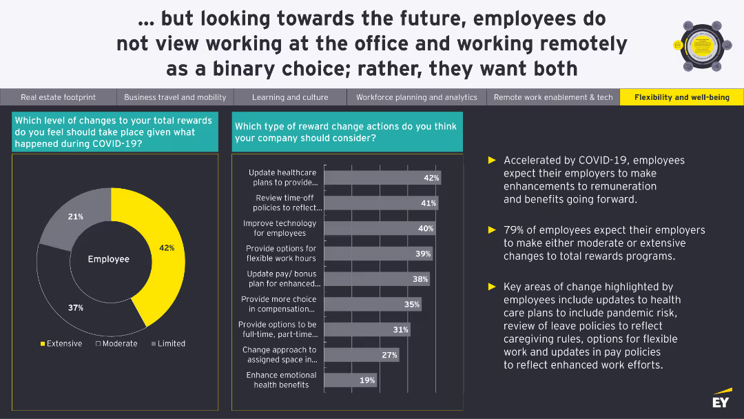
A pie chart shows the level of changes needed in total rewards. A bar chart details specific reward change actions employees think companies should consider.
Human Resources and Talent Management
Financial Services
The slide discusses the expected changes in total rewards and benefits due to COVID-19, with a focus on healthcare plans, leave policies, and flexible work options.
Rewards, Benefits, Compensation, COVID-19, Employee Expectations
false
Human Resources and Talent Management
Financial Services
Multiple Chart
EY
Add to my slides
Remove from favorites
A diagram showing a multi-phase approach to transition and transformation, featuring elements like experience, well-being, physical vs. digital, data and technology.
Strategic Planning
Professional Services
This slide outlines a comprehensive strategy for transitioning and transforming business operations, focusing on employee experience, digital transformation, and safety measures.
Rewards, Benefits, Compensation, COVID-19, Employee Expectations
false
Strategic Planning
Professional Services
Linear Flow
EY
Add to my slides
Remove from favorites
It contains a bar graph and a pie chart depicting the market size for ride-hailing and food delivery services, with a focus on tier 2 and tier 3 cities.
Market Analysis and Trends
Transportation & Logistics
Exploring the market size and potential for ride-hailing and food delivery services in tier 2 and tier 3 cities, this slide suggests that market growth may be limited due to lower importance of convenience in these areas, relative to tier 1 cities. It could be used for strategic decisions in market penetration and service offerings based on regional convenience factors.
Ride-Hailing, Food Delivery, Market Size, Growth Limitations, Convenience, Tier Cities
false
Market Analysis and Trends
Transportation & Logistics
Mixed Chart
Kearney
Add to my slides
Remove from favorites
Left side: Line chart titled 'Commute volume adjustment, indexed to January 2020' for 6 countries over months, with a legend for types of transport. Right side: Three column charts, titled 'Consumer sentiment about using Ride Hailing during COVID-19', with percentage values.
Market Analysis and Trends
Technology & Software
Analyzes the recovery of intra-city travel and ride-hailing services post-pandemic, showing consumer sentiment and commute volume adjustments. Useful for transport industry players and policymakers assessing the impact of COVID-19 on urban mobility and ride-hailing services.
Ride-hailing, COVID-19, Consumer sentiment, Commute volume, Market recovery
false
Market Analysis and Trends
Technology & Software
Multiple Chart
Bain
Add to my slides
Remove from favorites
Column charts, pie chart, and various metrics displayed; text on the left
Regulatory and Compliance
Professional Services
Discusses the impact of EY Ripples initiatives in Italy, showcasing volunteer activities and their outcomes
Ripples, volunteers, Italy, impact, initiatives
false
Regulatory and Compliance
Professional Services
Multiple Chart
EY
Add to my slides
Remove from favorites
This slide contains a pie chart detailing portfolio by industry and a line graph illustrating net charge-off performance, accompanied by text boxes.
Risk Assessment and Management
Financial Services
The slide presents a portfolio summary, market commentary, and performance metrics for commercial and industrial (C&I) lending, discussing risk management and credit performance.
Risk Discipline, C&I Lending, Portfolio, Market Commentary, Performance, Credit Quality
false
Risk Assessment and Management
Financial Services
Multiple Chart
JP Morgan
Add to my slides
Remove from favorites
Circular flow diagram detailing risk management strategy components, supplemented by a list of key elements in risk management.
Risk Assessment and Management
Financial Services
Highlights the company's approach to risk management, illustrating the cycle of continuous improvement in culture, oversight, and processes. Ideal for presentations on corporate governance and risk mitigation strategies.
Risk Management, Corporate Governance, Oversight, Continuous Improvement, Culture, Structural, Cyber Risk, Reputational Risk, Process, Controls
false
Risk Assessment and Management
Financial Services
Linear Flow
Goldman Sachs
Add to my slides
Remove from favorites
This slide contains a pie chart on the left, two column charts in the middle, and a text box on the right with bullet points discussing the disciplined risk process and diverse loan portfolio. The visuals are accompanied by descriptions and data points.
Risk Assessment and Management
Financial Services
Highlights the company's disciplined risk management strategy and diverse loan portfolio, contributing to strong credit quality. The data visualizations compare the firm's loan loss rate and variance against peers, illustrating financial stability and risk control.
Risk Management, Credit Quality, Loan Portfolio, Financial Stability, Peer Comparison
false
Risk Assessment and Management
Financial Services
Multiple Chart
Goldman Sachs
Add to my slides
Remove from favorites
This slide contains bar charts showing strategic responses to human risk management, labeled with current and future percentages. The design uses a simple, clean layout to focus on the data.
Human Resources and Talent Management
Professional Services
This slide explores organizational strategies for managing human risks, such as implementing data analytics and frequent scenario planning. It compares current and projected future strategies, highlighting shifts in strategic focus and identifying major barriers like rate of change and leadership commitment.
Risk Management, Data Analytics, Planning, Future, Strategy
false
Human Resources and Talent Management
Professional Services
Multiple Chart
Deloitte
Add to my slides
Remove from favorites
Slide includes two pie charts showing cash flow sources and revenue composition from customers, along with a timeline comparing guidance versus actual EPS.
Risk Assessment and Management
Energy & Utilities
Assesses the low-risk profile of Enbridge's business model, focusing on financial stability and predictable returns, beneficial for risk management and financial planning.
Risk Management, Financial Stability, Predictable Returns, Business Model
false
Risk Assessment and Management
Energy & Utilities
Multiple Chart
Barclays
Add to my slides
Remove from favorites
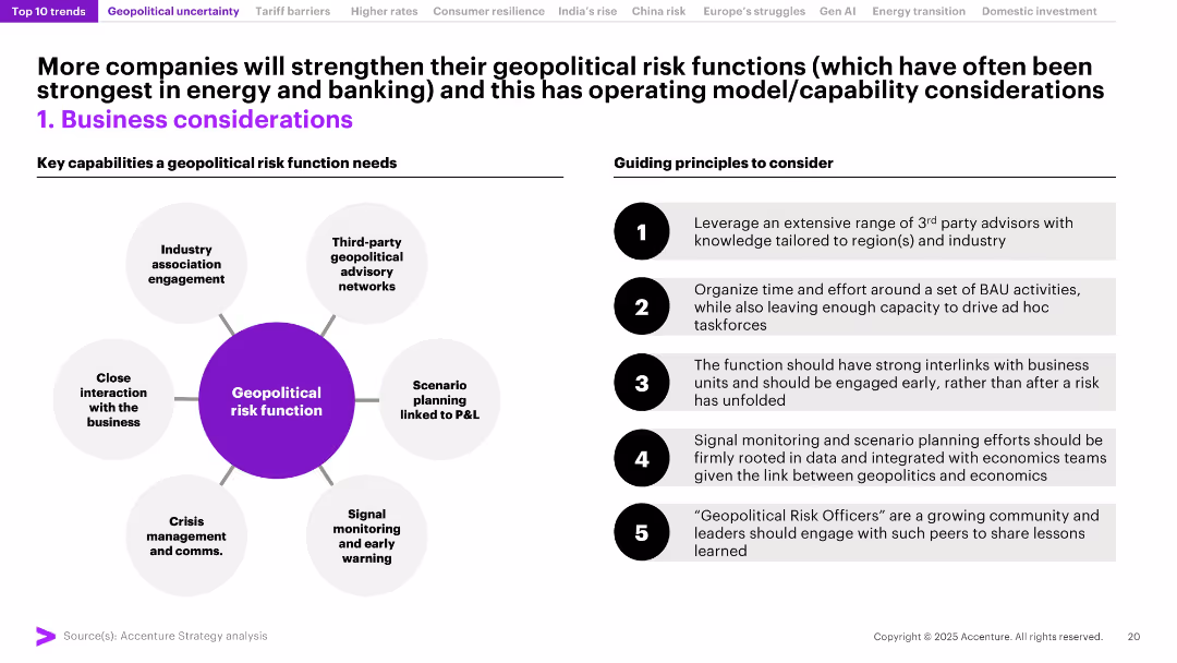
Split into two columns: left shows a circular diagram of risk function capabilities; right lists guiding principles in numbered blocks. Clean, process-oriented layout.
Risk Assessment and Management
Professional Services
The slide outlines the structure and best practices for building robust geopolitical risk functions in organizations. Emphasizes proactive scenario planning, crisis communication, and business integration, particularly relevant for banking and energy sectors.
Risk Management, Geopolitics, Scenario Planning, P&L, Crisis Comms, Business Strategy, Functions, Advisory Networks
false
Risk Assessment and Management
Professional Services
Header Horizontal
Accenture
Add to my slides
Remove from favorites
Column charts with timeline, risk management metrics.
Risk Assessment and Management
Financial Services
Illustrates risk management strategies and outcomes over time with reference to global events.
Risk Management, Global Events, Strategies, Outcomes, Timeline
false
Risk Assessment and Management
Financial Services
Multiple Chart
Barclays
Add to my slides
Remove from favorites
This slide includes checklists, a circular flow diagram in the center with three labeled points, and a bar chart listing types of risks on the right. It is visually balanced with elements well-distributed across the slide.
Risk Assessment and Management
Financial Services
The slide outlines the risk management framework, emphasizing the firm's approach through a culture of risk management, process and structural oversight, and continuous improvement. A list details various types of risks such as market, credit, and operational risks. Suitable for a presentation on corporate governance or risk management strategies.
Risk Management, Governance, Framework, Corporate, Oversight, Improvement, Analysis
false
Risk Assessment and Management
Financial Services
Linear Flow
Goldman Sachs
Add to my slides
Remove from favorites
Shows dense data in tables to compare the company's risk performance metrics with industry peers, along with key portfolio indicators over time.
Risk Assessment and Management
Financial Services
Details the company’s prudent risk management approach while achieving business growth, showcasing industry comparisons and portfolio risk indicators.
Risk Management, Industry Comparison, Portfolio Indicators, Business Growth
false
Risk Assessment and Management
Financial Services
Table
JP Morgan
Add to my slides
Remove from favorites
Multiple boxes and arrows illustrating liquidity coverage ratio, net stable funding ratio, regulatory minimums, stress testing, governance, and contingency planning.
Risk Assessment and Management
Financial Services
Explains UBS's risk management framework, including regulatory requirements, liquidity and funding strategies, and stress testing.
Risk Management, Liquidity, Funding, UBS, Governance
false
Risk Assessment and Management
Financial Services
Framework
UBS
Add to my slides
Remove from favorites
The slide features a two-tiered column chart showing average loans by client segment over three years, with text sections highlighting strategies.
Risk Assessment and Management
Financial Services
It analyzes loan performance segmented by client type, showcasing risk management and business growth strategies in financial services.
Risk Management, Loan Performance, Client Segments, Business Growth, Strategy, Financial Services
false
Risk Assessment and Management
Financial Services
Mixed Chart
JP Morgan
Add to my slides
Remove from favorites
Contains three line graphs depicting the NPL ratio, coverage ratio, and cost of risk over three years, complemented by text boxes explaining the risk framework and management goal.
Risk Assessment and Management
Financial Services
Highlights BBVA's risk management metrics and strategies, providing a snapshot of financial health and risk preparedness. Used for discussions on risk mitigation and financial prudence.
Risk Management, NPL Ratio, Coverage Ratio, Cost of Risk, Financial Health, Prudence, Strategy
false
Risk Assessment and Management
Financial Services
Mixed Chart
Morgan Stanley
Add to my slides
Remove from favorites
Featuring icons representing five risk areas, the slide is laid out to facilitate easy comparison and risk assessment, using a blue and black theme.
Risk Assessment and Management
Professional Services
Focused on risk management, this slide outlines the primary areas of risk to consider during new technology implementation, from business to legal considerations. It's instrumental for leadership and management audiences in formulating a comprehensive risk assessment and mitigation strategy.
Risk Management, Technology, Business, Legal, Society, Operational, Compliance, Strategy
false
Risk Assessment and Management
Professional Services
Pillar
McKinsey
Add to my slides
Remove from favorites
Slide with title and subtitle, utilizes a puzzle graphic as a metaphor for critical components of disciplined underwriting. Also, features two column charts showing approval rates and card NCO rates based on deposit relationships.
Risk Assessment and Management
Financial Services
This slide could be used to illustrate the advantages of deepened banking relationships in risk management. It uses underwriting as a case study to show how customer data from non-card relationships can inform better risk decisions, with graphical data supporting the claims.
Risk Management, Underwriting, Banking Relationships, Data Utilization, Customer Data, Deposit Relationships, Approval Rates, Financial Services, Card NCO Rates, Chase
false
Risk Assessment and Management
Financial Services
Mixed Chart
JP Morgan
Add to my slides
Remove from favorites
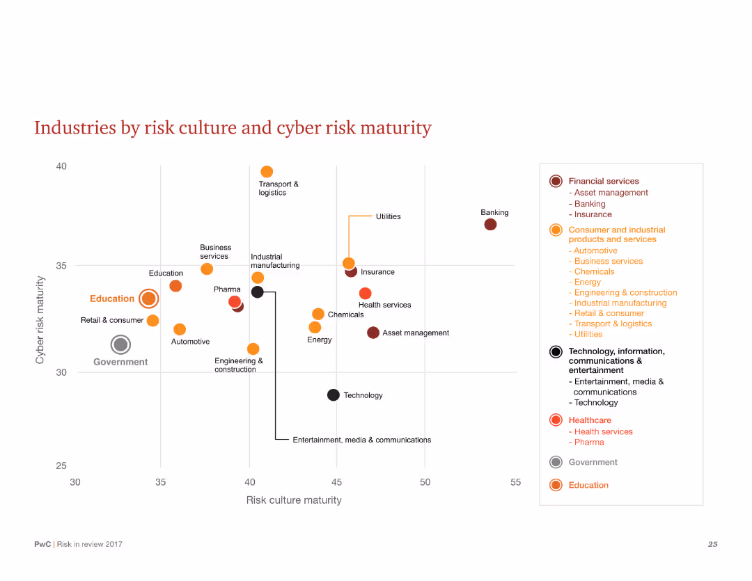
A scatter plot showing industries by their risk culture and cyber risk maturity, with different industry sectors marked on the chart.
Market Analysis and Trends
Financial Services
Visualizes the relationship between risk culture and cyber risk maturity across various industries. Highlights sectors like financial services and education in terms of their maturity levels.
Risk culture, cyber risk, maturity, scatter plot, industries, sectors, financial services, education, chart
false
Market Analysis and Trends
Financial Services
Single Chart
PwC/Strategy&
Add to my slides
Remove from favorites
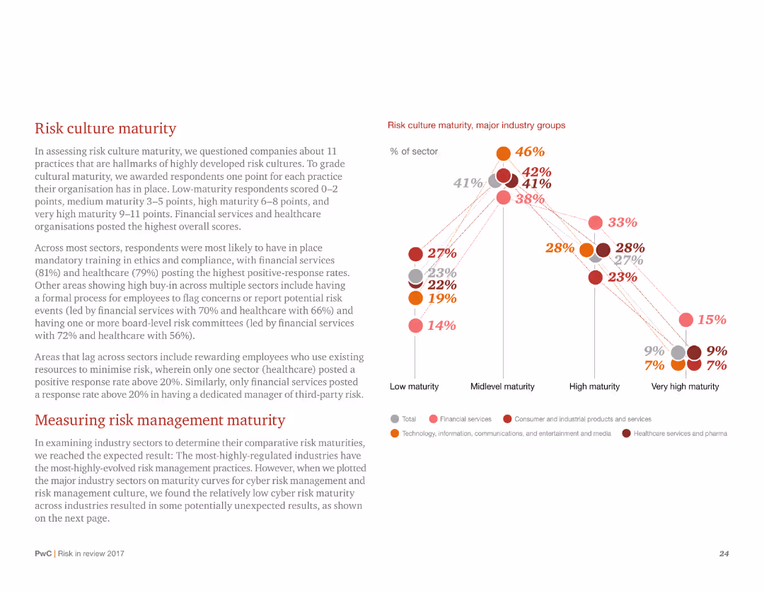
A combined column chart and line chart depicting risk culture maturity across major industry groups, with detailed narrative text.
Risk Assessment and Management
Healthcare & Pharmaceuticals
Examines the maturity of risk culture across different industry sectors, highlighting those with mandatory training and strong compliance measures. Includes measurement of risk management maturity.
Risk culture, maturity, industry groups, healthcare, compliance, risk management, training, sectors, maturity measurement
false
Risk Assessment and Management
Healthcare & Pharmaceuticals
Mixed Chart
PwC/Strategy&
Add to my slides
Remove from favorites
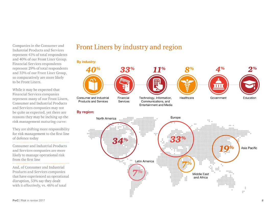
This slide displays a combination of circular icons and a world map with percentages, categorizing 'Front Liners' by industry and region. It has a structured layout with clear visual hierarchy and minimal text.
Risk Assessment and Management
Consumer Goods
It categorizes survey respondents as 'Front Liners' across various industries and regions, indicating higher risk management maturity. The slide shows the distribution of Front Liners, with detailed percentages for each industry and geographical region.
Risk management, Front Liners, industry distribution, regional analysis, survey
false
Risk Assessment and Management
Consumer Goods
Mixed Chart
PwC/Strategy&
Add to my slides
Remove from favorites
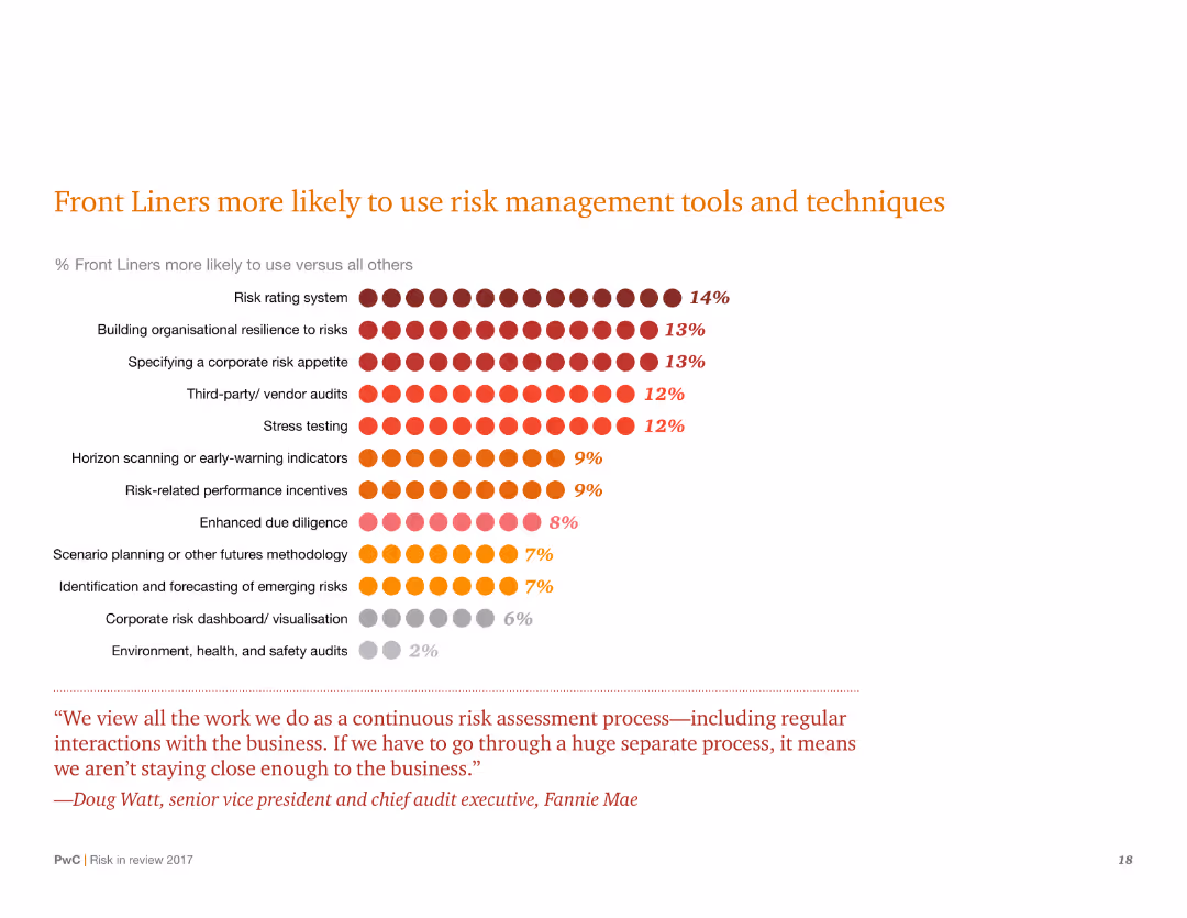
A chart slide with a dot matrix representing the percentage of Front Liners using various risk management tools. There is also a quote at the bottom.
Risk Assessment and Management
Financial Services
Highlights the percentage of Front Liners using different risk management tools. Emphasizes building organizational resilience and risk rating systems among other techniques.
Risk management, Front Liners, resilience, tools, techniques, percentages, chart, risk rating, organizational
false
Risk Assessment and Management
Financial Services
Mixed Chart
PwC/Strategy&
Add to my slides
Remove from favorites
A slide with a dark blue theme containing two column charts showing the evolution of market and credit RWAs from 2015 to 2019, along with bullet points outlining the company's risk management culture, processes, and oversight.
Risk Assessment and Management
Financial Services
It communicates Goldman Sachs' approach to risk management, detailing changes in risk-weighted assets and the infrastructure supporting risk management processes, valuable for presentations on corporate risk policies or compliance training.
Risk management, RWAs, market, credit, Goldman Sachs
false
Risk Assessment and Management
Financial Services
Multiple Chart
Goldman Sachs
Add to my slides
Remove from favorites
The slide features a pie chart, a bullet point summary section, and market commentary. It is well-organized, with color-coded sections to distinguish different types of content.
Risk Assessment and Management
Financial Services
This slide focuses on credit quality and risk management within the commercial and industrial loan portfolio. It provides a breakdown by industry and comments on market conditions, with attention to supply chain and inflation effects, indicating a thorough approach to maintaining risk discipline in a fluctuating market.
Risk management, credit quality, industry breakdown, market commentary
false
Risk Assessment and Management
Financial Services
Multiple Chart
JP Morgan
Add to my slides
Remove from favorites
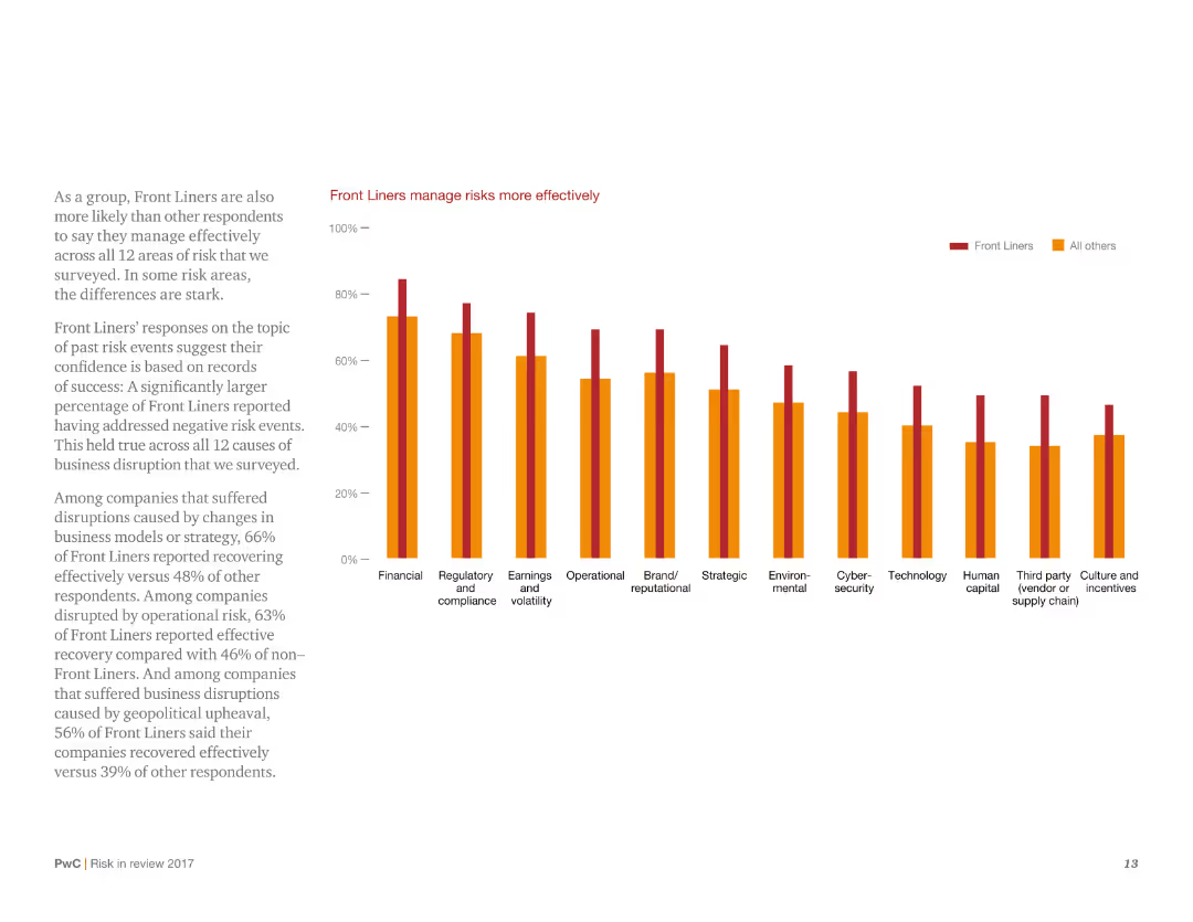
This slide presents a column chart showing the effectiveness of Front Liners in managing risks across multiple categories. It uses a simple design with minimal text, focusing on the comparison of Front Liners versus other respondents.
Risk Assessment and Management
Consumer Goods
It highlights that Front Liners are more effective in managing risks compared to other respondents, with higher percentages across various risk categories. The slide underscores the success rate of Front Liners in addressing negative risk events.
Risk management, effectiveness, Front Liners, survey, comparison
false
Risk Assessment and Management
Consumer Goods
Mixed Chart
PwC/Strategy&
Add to my slides
Remove from favorites
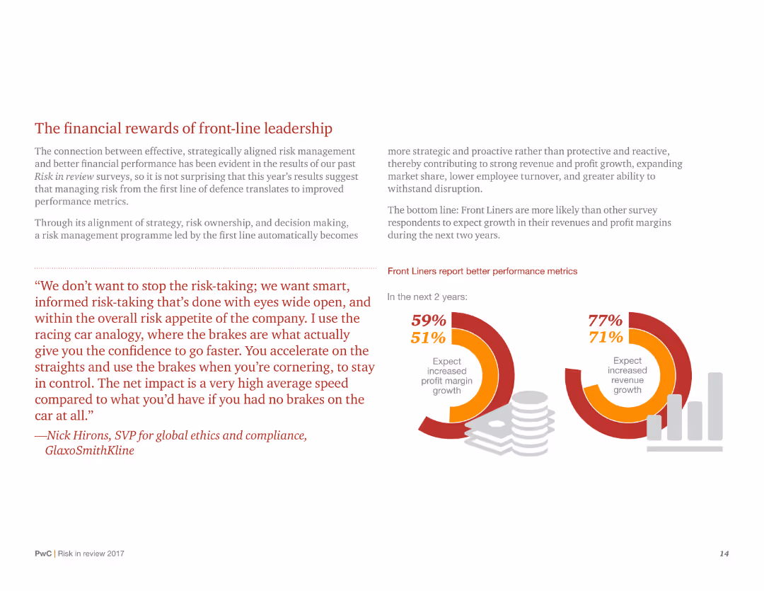
The slide includes column charts and a prominent quote, illustrating the financial benefits of front-line leadership in risk management. The design is clean with clear visual elements supporting the main message.
Financial Performance
Consumer Goods
This slide discusses the financial advantages of effective risk management led by Front Liners, showing higher expected growth in profit margins and revenue. It uses supporting statistics and a quote to reinforce the message.
Risk management, financial performance, Front Liners, profit growth, survey
false
Financial Performance
Consumer Goods
Multiple Chart
PwC/Strategy&
Add to my slides
Remove from favorites
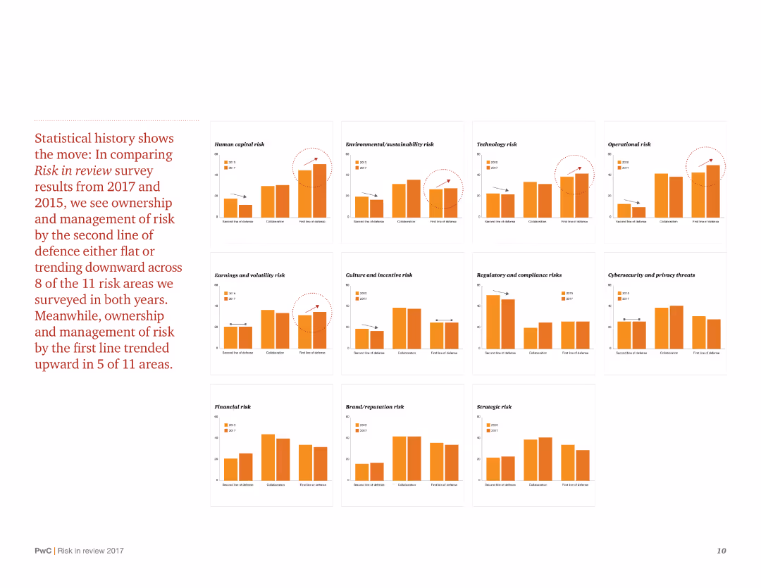
The slide contains multiple column charts comparing risk management trends between 2017 and 2015. It uses a grid layout with clear labels and minimal text to explain each chart.
Risk Assessment and Management
Consumer Goods
The slide compares historical data on risk management across various categories, highlighting trends and changes over time. It shows whether the management of different types of risks has improved, remained stable, or declined.
Risk management, historical data, trends, survey comparison, 2017 vs 2015
false
Risk Assessment and Management
Consumer Goods
Multiple Chart
PwC/Strategy&
Add to my slides
Remove from favorites
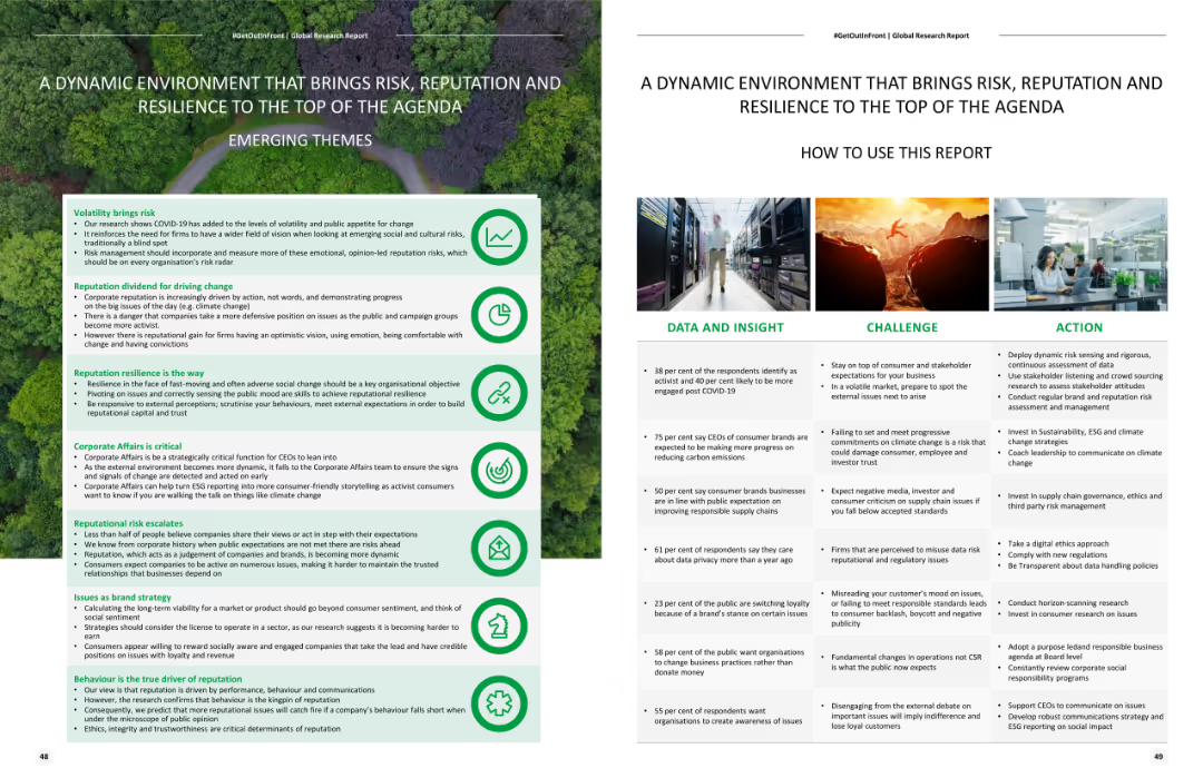
Includes a list of emerging themes and a structured layout with bullet points detailing data insights, challenges, and actions related to risk and reputation.
Strategic Planning
Professional Services
Discusses the importance of risk, reputation, and resilience in the current environment, providing insights and actions for managing these factors effectively.
Risk management, reputation, resilience, strategic planning, emerging themes
false
Strategic Planning
Professional Services
Header Horizontal
Deloitte
Add to my slides
Remove from favorites
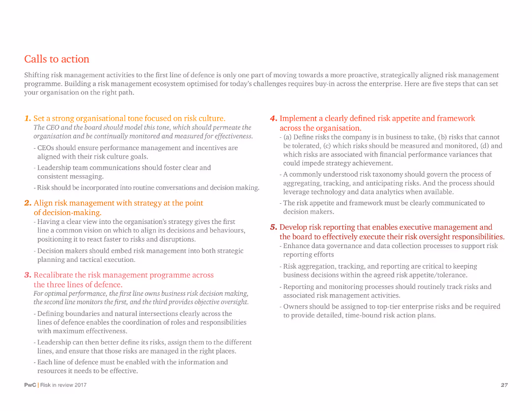
A text-heavy slide with numbered points outlining strategic actions for risk management, with a focus on organizational tone and risk culture.
Strategic Planning
Professional Services
Provides a detailed action plan for improving risk management, including setting organizational tone, aligning risk with strategy, and developing risk reporting.
Risk management, strategic planning, organizational tone, risk culture, action plan, reporting, alignment
false
Strategic Planning
Professional Services
Vertical Flow
PwC/Strategy&
Add to my slides
Remove from favorites
Column charts illustrating investment categories over years and a graphical representation of risk management capabilities.
Risk Assessment and Management
Financial Services
This slide highlights advanced risk management capabilities and delivery approach, with strategic investments and technology platforms.
Risk management, technology platform, investment categories, strategic investments, delivery approach
false
Risk Assessment and Management
Financial Services
Multiple Chart
Credit Suisse
Add to my slides
Remove from favorites
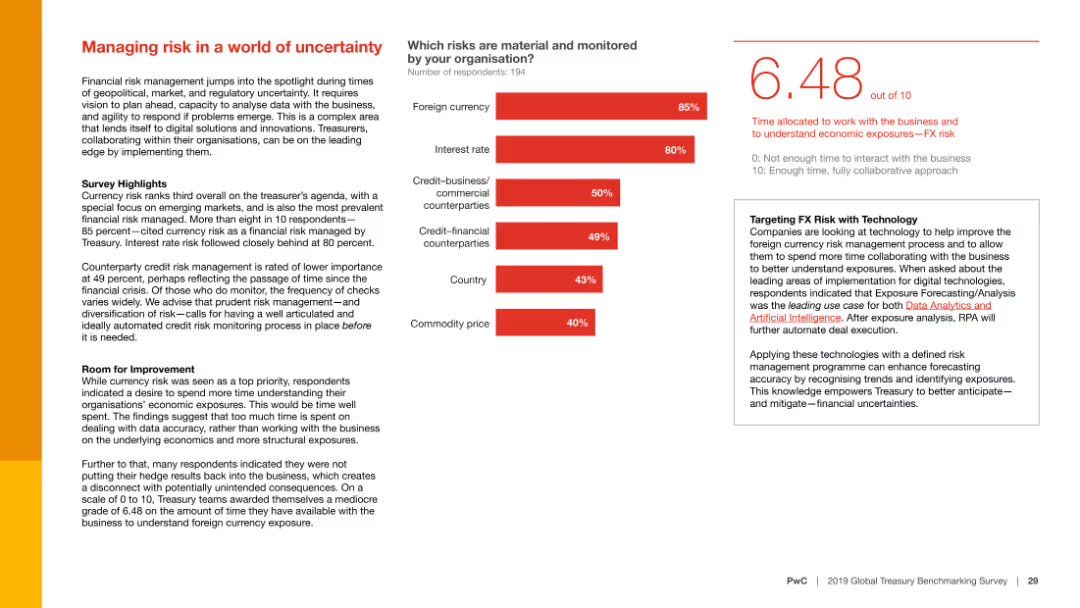
The slide features a column chart showing the material risks monitored by organizations and text discussing survey highlights, room for improvement, and targeting FX risk with technology.
Risk Assessment and Management
Financial Services
This slide focuses on the importance of managing financial risks, particularly currency risk, in uncertain times, and discusses the use of technology to improve foreign currency risk management.
Risk management, uncertainty, currency risk, financial services, survey highlights, room for improvement, technology, FX risk, financial risks, market trends
false
Risk Assessment and Management
Financial Services
Mixed Chart
PwC/Strategy&
Add to my slides
Remove from favorites
The slide features a comprehensive risk profiling chart. It uses a grid layout to categorize aging debt into different risk groups. The right side contains column charts representing past due amounts and accounts past due in various colors.
Risk Assessment and Management
Energy & Utilities
The slide provides a detailed analysis of aging debt risk profiling for utility customers, categorizing them into five aging groups with associated risk levels and past due amounts.
Risk, Aging Debt, Profiling, Utility, Groups
false
Risk Assessment and Management
Energy & Utilities
Multiple Chart
EY
Add to my slides
Remove from favorites
The slide includes a column chart and text blocks. It shows the breakdown of risk-weighted assets (RWA) by different risk categories and their changes over time.
Risk Assessment and Management
Financial Services
This slide outlines the distribution of risk-weighted assets, detailing changes due to market volatility and new business activities, useful for risk management and regulatory reporting.
Risk, Assets, Weighted, RWA, Volatility
false
Risk Assessment and Management
Financial Services
Mixed Chart
UBS
Add to my slides
Remove from favorites
This slide includes text explanations and numbered points outlining the roles of the Chief Risk Office, Chief Sustainability Office, and Data and Technology.
Risk Assessment and Management
Financial Services
It describes Deutsche Bank's approach to integrating ESG into risk management, advancing sustainable finance, and leveraging data and technology to scale ESG business responsibly.
Risk, control, policies, ESG, sustainability, technology, risk management, integration, banking, success
false
Risk Assessment and Management
Financial Services
Header Vertical
Deutsche Bank
Add to my slides
Remove from favorites
The slide includes a pie chart detailing a breakdown by property type and a line chart showing the net charge-off rate over time, comparing commercial banking to peer average. It also features text sections with bullet points.
Risk Assessment and Management
Financial Services
Analysis of credit risk management, with focus on performance, asset class strength, and exposure.
Risk, credit, performance, exposure, CRE, asset, lending, quality, portfolio, discipline
false
Risk Assessment and Management
Financial Services
Multiple Chart
JP Morgan
Add to my slides
Remove from favorites
A pie chart illustrating the proportion of users who recall receiving risk information from crypto trading platforms in 2023, compared to 2022.
Risk Assessment and Management
Financial Services
This slide shows the percentage of users who remember receiving risk information before purchasing crypto assets, comparing 2023 with 2022.
Risk, information, crypto, trading, platforms, 2023, 2022
false
Risk Assessment and Management
Financial Services
Mixed Chart
IPSOS
Add to my slides
Remove from favorites
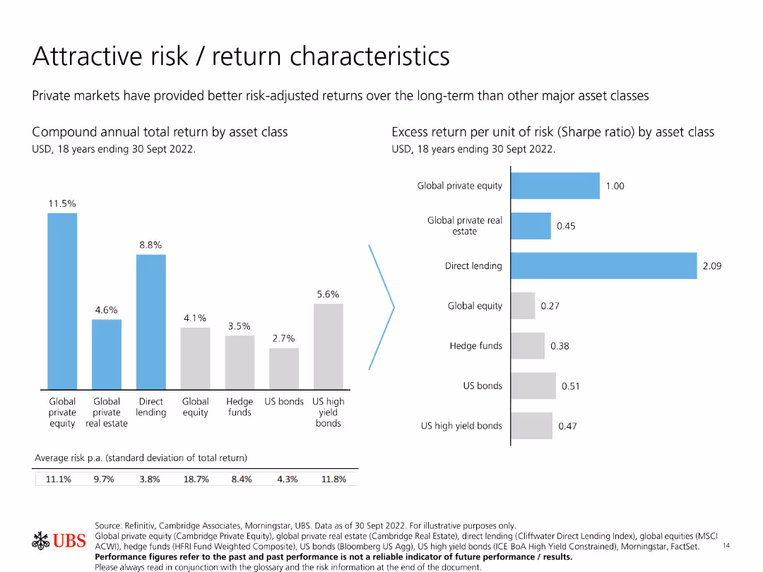
Features two bar charts: one showing compound annual total return by asset class, and another showing excess return per unit of risk (Sharpe ratio) by asset class.
Investment Analysis
Financial Services
Compares the risk and return characteristics of various asset classes, emphasizing how private markets provide better long-term risk-adjusted returns.
Risk, return, private markets, Sharpe ratio, asset classes
false
Investment Analysis
Financial Services
Multiple Chart
UBS
Add to my slides
Remove from favorites
Slide displays two line charts tracking the Value-at-Risk for DB Group's trading and regulatory books. Annotations and quarterly averages are shown. Colors are primarily blue and white.
Risk Assessment and Management
Financial Services
Analysis of DB Group's trading and regulatory risk over quarterly periods, illustrating changes and risk management effectiveness.
Risk, trading, regulatory, finance, analysis, value-at-risk, quarterly, management, DB Group
false
Risk Assessment and Management
Financial Services
Multiple Chart
Deutsche Bank
Add to my slides
Remove from favorites
Three column charts showing decline in SP risk-weighted assets, value-at-risk, and trading inventory over time.
Risk Assessment and Management
Financial Services
The slide presents data on the decline in SP’s risk-weighted assets, value-at-risk, and trading inventory, indicating improved risk management.
Risk-weighted assets, value-at-risk, trading inventory, risk management, capital velocity
false
Risk Assessment and Management
Financial Services
Multiple Chart
Credit Suisse
Add to my slides
Remove from favorites
The slide features a vertical column chart illustrating the progress towards a 15% return on CET1 capital by 2026.
Financial Performance
Financial Services
This slide describes the target of achieving a 15% RoCET1, outlining steps and expected financial outcomes.
RoCET1, CET1 capital, financial targets, cost savings, capital returns
false
Financial Performance
Financial Services
Mixed Chart
UBS
Add to my slides
Remove from favorites
The slide features line charts and tables displaying RoCET1, cost/income ratio trends, and key financial figures. It uses a mix of graphical and textual data presentation.
Financial Performance
Financial Services
It reviews the company's performance in terms of RoCET1 and cost/income ratios, showing progress toward meeting full-year targets and key financial metrics.
RoCET1, cost/income ratio, financial performance, targets, metrics
false
Financial Performance
Financial Services
Multiple Chart
UBS
Add to my slides
Remove from favorites
The slide has a column chart with multiple stages indicated for different financial factors affecting RoCET1, alongside key levers for achieving the target.
Financial Performance
Financial Services
This slide outlines the steps and key financial levers required to achieve a 15% return on common equity tier 1 capital by 2026, detailing cost efficiencies and optimizations.
RoCET1, financial levers, cost efficiencies, optimization
false
Financial Performance
Financial Services
Mixed Chart
UBS
Add to my slides
Remove from favorites
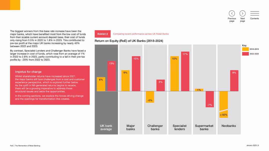
Vertical bar chart comparing RoE across bank types and periods; left panel has explanatory narrative; red-yellow color code indicates performance by time range.
Performance Metrics and KPIs
Financial Services
The slide compares RoE across various UK bank types, showing that major and specialist lenders improved returns since 2022, while challenger and supermarket banks faced declining profitability. It highlights structural differences in cost of funds and customer models.
RoE, UK banks, profitability, major banks, challenger banks, structural challenges, performance comparison, 2018–2024
false
Performance Metrics and KPIs
Financial Services
Mixed Chart
PwC/Strategy&
Add to my slides
Remove from favorites
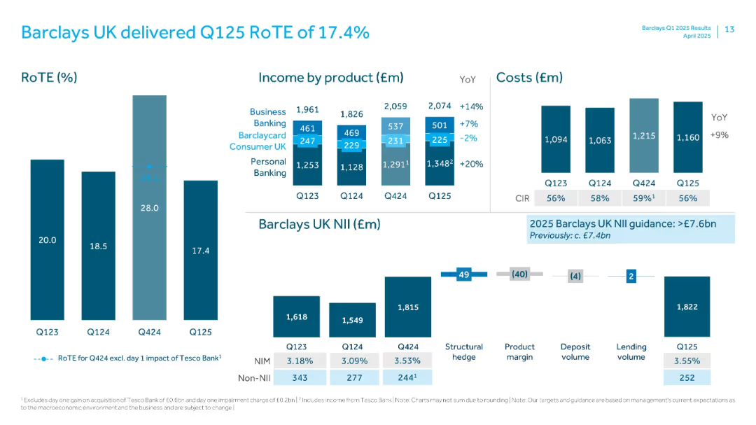
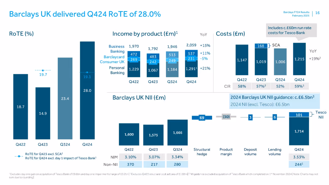
Multi-chart slide with bar graphs and side labels showing RoTE, income by product, cost trends, and NII.
Financial Performance
Financial Services
Highlights Q125 financial performance for Barclays UK, including RoTE of 17.4%, income breakdown by banking segments, cost analysis, and net interest income trends. It shows performance improvements across most metrics with year-over-year comparisons.
RoTE, Barclays UK, NII, Income, Costs, Q125, Financials, CIR, Personal Banking, Business Banking
false
Financial Performance
Financial Services
Multiple Chart
Barclays
Add to my slides
Remove from favorites
Left: vertical RoTE bar chart; Center: stacked bars for income by product; Right: cost bars; bottom: NII breakdown waterfall
Financial Performance
Financial Services
Reports Barclays UK’s return on tangible equity for Q424, dissecting revenue by product and costs, with insights into Tesco Bank's financial integration. Structural hedge and product margin effects on NII are also highlighted.
RoTE, Barclays UK, NII, Tesco, income breakdown, cost analysis, structural hedge, Q424
false
Financial Performance
Financial Services
Multiple Chart
Barclays
Add to my slides
Remove from favorites
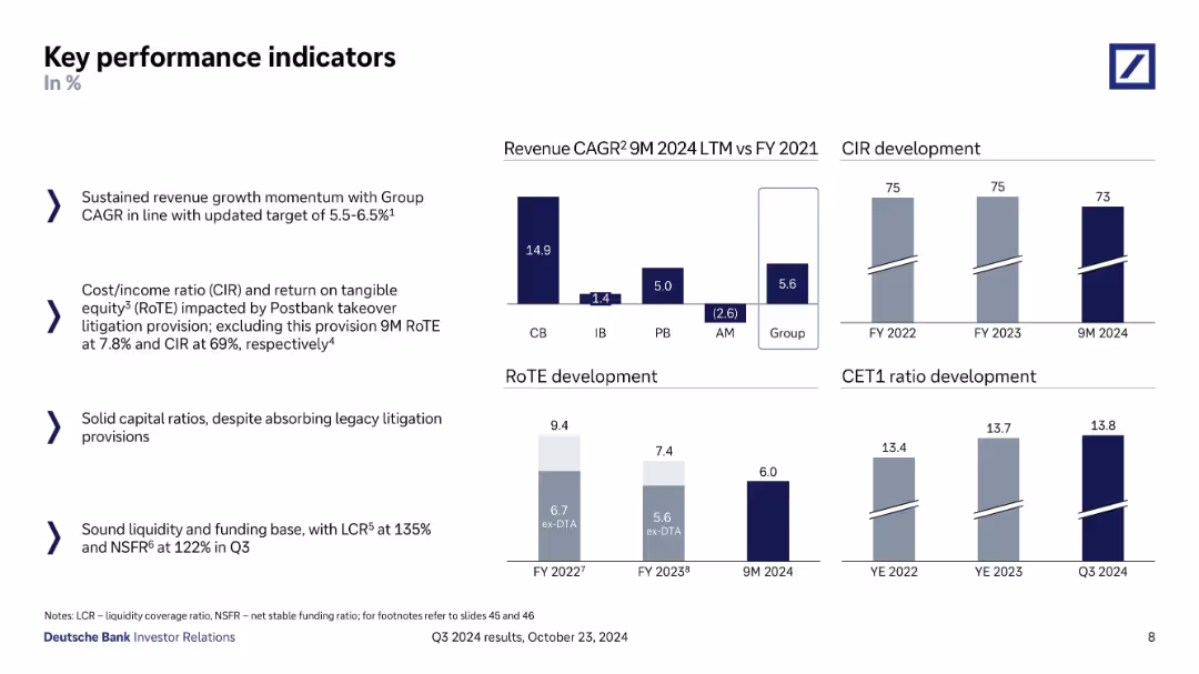
Multi-column layout; left side has bullet points; right side includes bar and column charts for KPIs.
Performance Metrics and KPIs
Financial Services
Presents Deutsche Bank’s performance indicators such as revenue CAGR, CIR, RoTE, CET1 ratio, and liquidity/funding ratios. Visuals show development over time with context about litigation provisions and capital strength.
RoTE, CET1 ratio, CIR, revenue CAGR, liquidity, litigation provision
false
Performance Metrics and KPIs
Financial Services
Multiple Chart
Deutsche Bank
Add to my slides
Remove from favorites
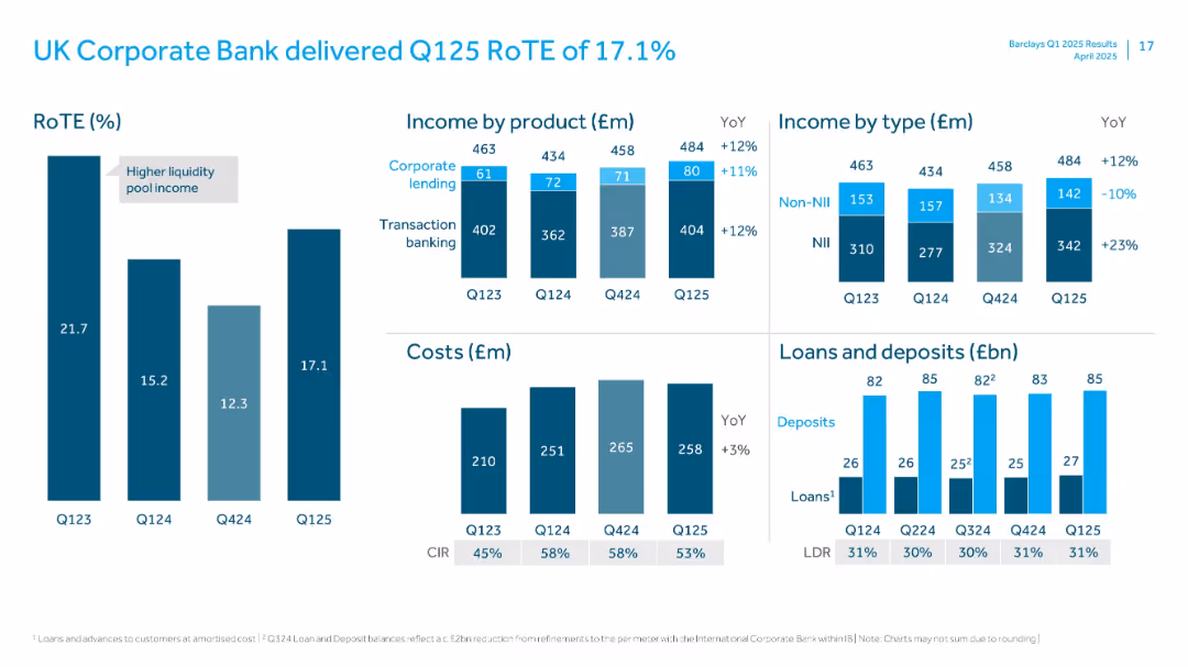
Grids of bar charts showing RoTE, income breakdown, cost structure, and loan/deposit values with LDR.
Financial Performance
Financial Services
Reviews performance of UK Corporate Bank, with RoTE of 17.1%. Includes income by product and type, cost evolution, and loans/deposits metrics. Notes YoY growth in income and marginal increase in cost base.
RoTE, Corporate Bank, Transaction Banking, Lending, Income, LDR, Deposits, NII, Q125
false
Financial Performance
Financial Services
Multiple Chart
Barclays
Add to my slides
Remove from favorites
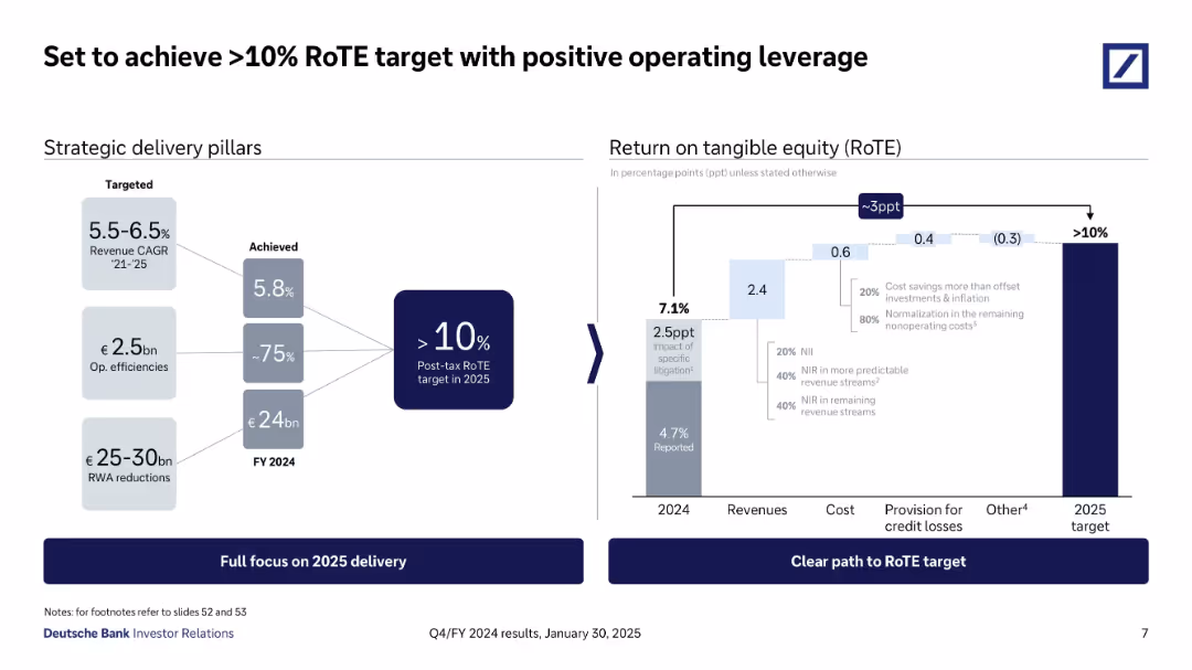
Left panel lists strategic delivery metrics; right chart visualizes bridge to >10% RoTE target by 2025, showing contributions from revenues, costs, and provisions.
Financial Performance
Financial Services
Shows Deutsche Bank’s strategic path to exceed 10% Return on Tangible Equity by 2025. Key drivers include 5.8% revenue CAGR, €2.5bn in cost efficiencies, and ~€24bn RWA reductions. Breakdown of RoTE improvement elements is provided.
RoTE, Deutsche Bank, return on equity, strategy, revenue, costs, FY25 target
false
Financial Performance
Financial Services
Mixed Chart
Deutsche Bank
Add to my slides
Remove from favorites
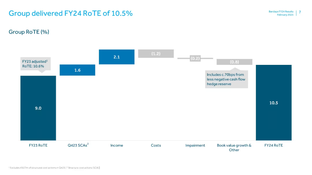
Waterfall chart illustrating components of return on tangible equity. Minimalist layout with teal and gray tones.
Financial Performance
Financial Services
Displays Barclays’ FY24 Return on Tangible Equity (RoTE), explaining the change from FY23’s 9.0% to FY24’s 10.5% through breakdowns of SCAs, income, costs, impairments, and other adjustments.
RoTE, FY24, Barclays, Return, Income, Costs, Performance, Hedge, Equity
false
Financial Performance
Financial Services
Single Chart
Barclays
Add to my slides
Remove from favorites
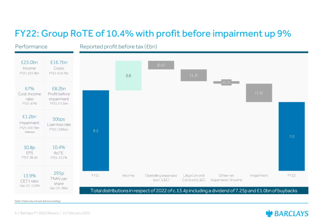
Bar chart + waterfall chart showing profit flow; left column of key performance metrics
Financial Performance
Financial Services
Summarizes Barclays’ FY22 performance with key metrics like income, costs, impairment, and RoTE. A waterfall chart outlines profit drivers and detractors from FY21 to FY22, providing transparency in financial movements.
RoTE, Profit, FY22, Barclays, Impairment, Earnings, EPS, Cost Ratio, Loan Loss
false
Financial Performance
Financial Services
Single Chart
Barclays
Add to my slides
Remove from favorites
The slide includes a complex column chart displaying the impact of various factors on statutory return on tangible equity (RoTE) projections from 2023 to 2026.
Financial Performance
Financial Services
This detailed slide projects the statutory RoTE increasing to above 12% by 2026, breaking down the contributions by income, costs, impairments, and other factors. It provides a comprehensive financial outlook, essential for stakeholders interested in the fiscal strategies and health of the organization.
RoTE, Projections, Financial Strategy, Growth
false
Financial Performance
Financial Services
Single Chart
Barclays
Add to my slides
Remove from favorites
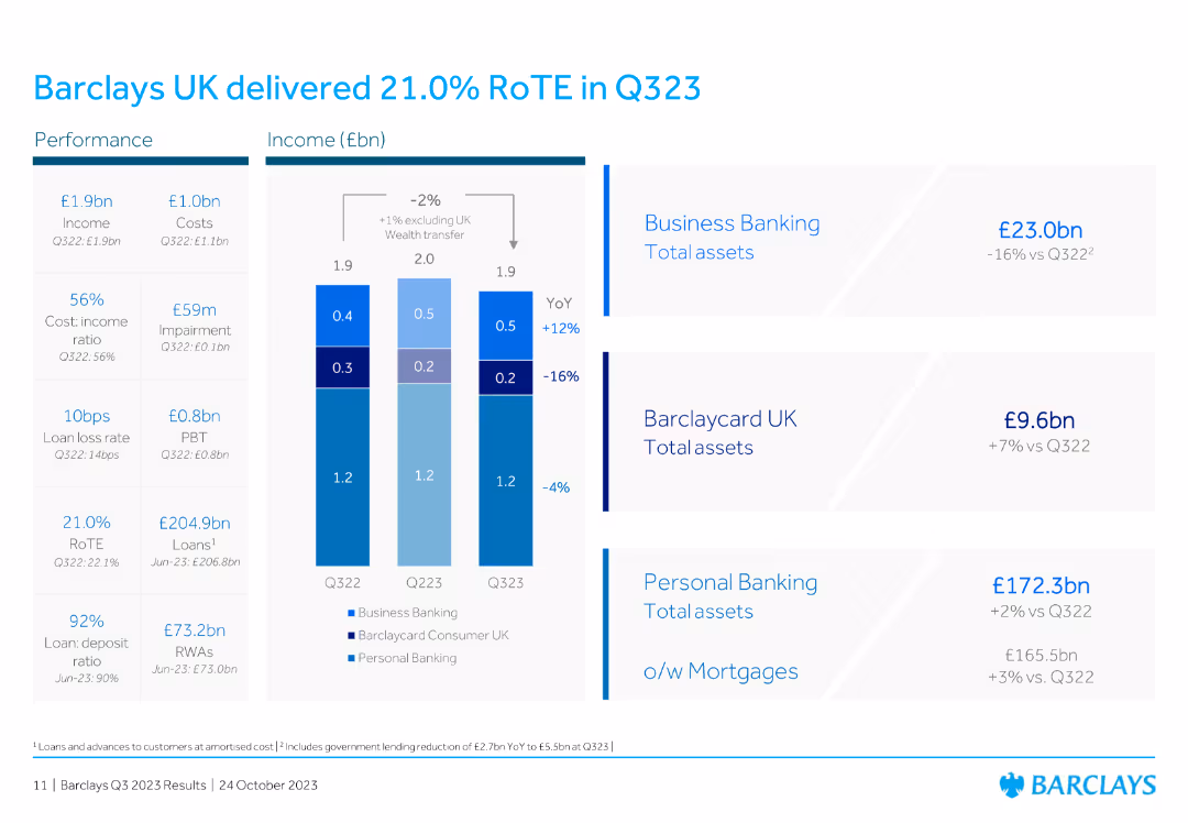
The slide features a column chart showing income (£bn) and financial performance metrics for Barclays UK from Q322 to Q323. It includes performance indicators for business banking, Barclaycard UK, and personal banking.
Financial Performance
Financial Services
The slide highlights Barclays UK's financial performance for Q323, reporting a RoTE of 21.0%. It includes metrics for income, costs, impairment, and performance indicators for business banking, Barclaycard UK, and personal banking.
RoTE, Q323, Barclays UK, performance, metrics
false
Financial Performance
Financial Services
Mixed Chart
Barclays
Add to my slides
Remove from favorites
Featuring a series of column charts, the slide depicts the return on tangible equity over the years and distribution amounts.
Financial Performance
Financial Services
Highlights the growth in return on tangible equity over recent years and the increased capital distributions to shareholders.
RoTE, distributions, growth, equity, shareholders
false
Financial Performance
Financial Services
Multiple Chart
Barclays
Add to my slides
Remove from favorites
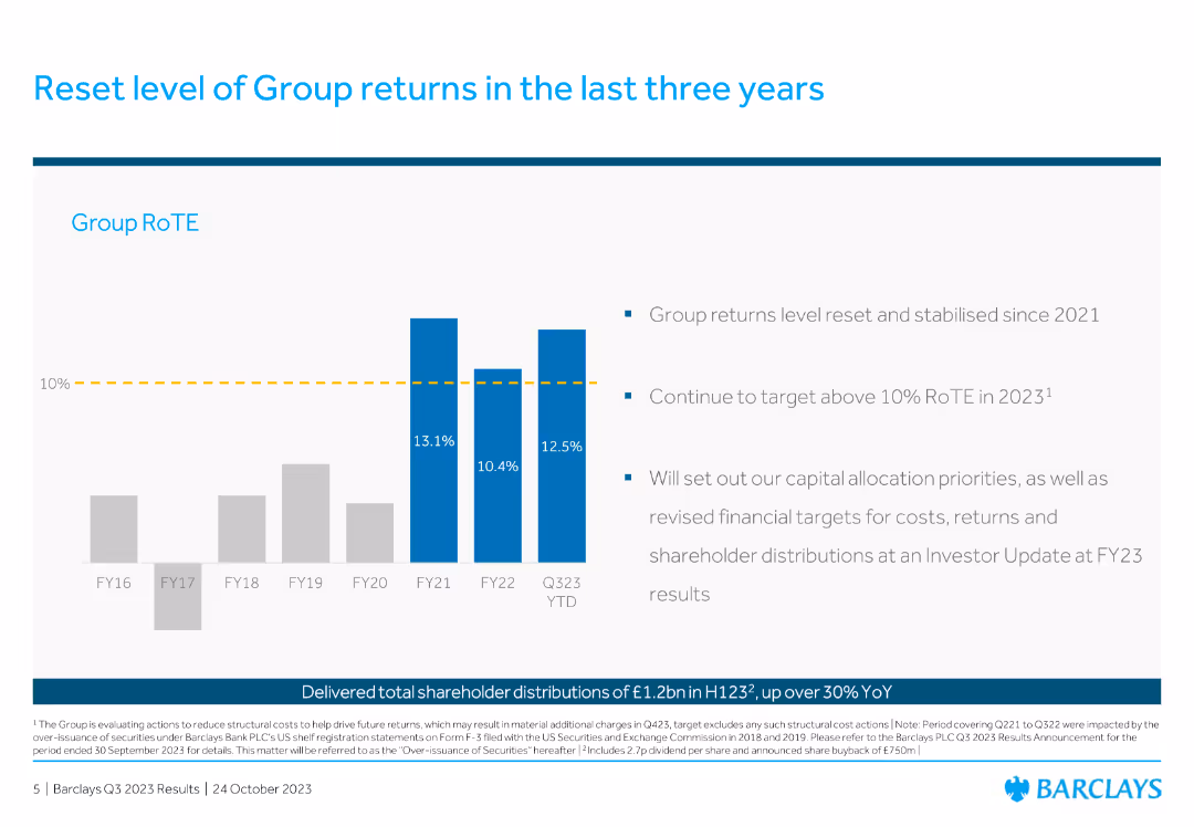
The slide features a column chart showing the Group RoTE over the past years with a future target marked and bullet points outlining the strategic focus.
Financial Performance
Financial Services
This slide discusses the historical and target Return on Tangible Equity (RoTE) for the Group, highlighting past performance and future strategic goals to stabilize and improve financial returns.
RoTE, group returns, financial performance, strategy
false
Financial Performance
Financial Services
Mixed Chart
Barclays
Add to my slides
Remove from favorites
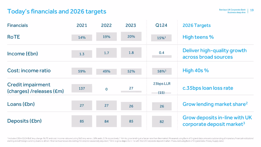
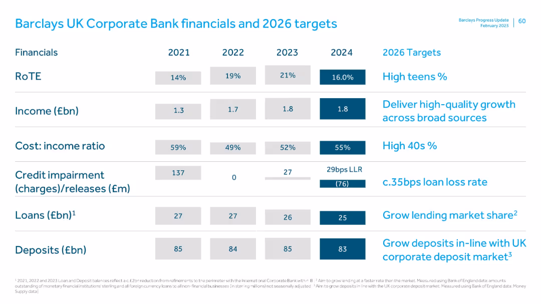
Tabular layout with financial metrics from 2021 to Q1 2024 and target metrics for 2026. Clean layout, white background, blue highlight accents.
Financial Performance
Financial Services
Presents Barclays UK Corporate Bank's key financial figures including RoTE, income, cost-income ratio, impairments, loans, and deposits from 2021–Q1 2024 alongside 2026 performance targets, aiming for sustained growth and efficiency.
RoTE, income, cost-income ratio, targets, Barclays, Q1 2024, loans, deposits, impairments, 2026 goals
false
Financial Performance
Financial Services
Single Chart
Barclays
Add to my slides
Remove from favorites
Tabular format with financial metrics (2021–2024), right column listing 2026 targets; clean white background with blue highlights
Financial Performance
Financial Services
The slide presents Barclays UK Corporate Bank’s financial performance from 2021 to 2024 and sets targets for 2026. Metrics include RoTE, income, cost-income ratio, credit impairments, loans, and deposits. It emphasizes goals like high teen RoTE, reduced cost-income ratio, and market-aligned growth.
RoTE, income, cost-income, loan growth, credit impairment, targets, UK Corporate Bank
false
Financial Performance
Financial Services
Single Chart
Barclays
Add to my slides
Remove from favorites
This slide uses column charts to depict Barclays' financial performance from 2021 to 2023, with metrics like RoTE, Income, and Loan Loss Rate. It's visually structured with a clear progression from left to right, using a simple and professional color palette of grey and blue tones.
Financial Performance
Financial Services
This slide presents a detailed financial overview of Barclays from 2021 to 2023, showing key performance metrics such as RoTE, net receivables, and income growth. It provides insights into the financial health and operational efficiency of the bank over the years.
RoTE, income, net receivables, financial performance, metrics
false
Financial Performance
Financial Services
Multiple Chart
Barclays
Add to my slides
Remove from favorites
Contains column charts comparing statutory RoTE across different bank divisions over several years.
Financial Performance
Financial Services
Demonstrates how different bank divisions contribute to overall growth and performance, emphasizing improvements and future targets.
RoTE, performance, divisions, growth, targets
false
Financial Performance
Financial Services
Multiple Chart
Barclays
Add to my slides
Remove from favorites
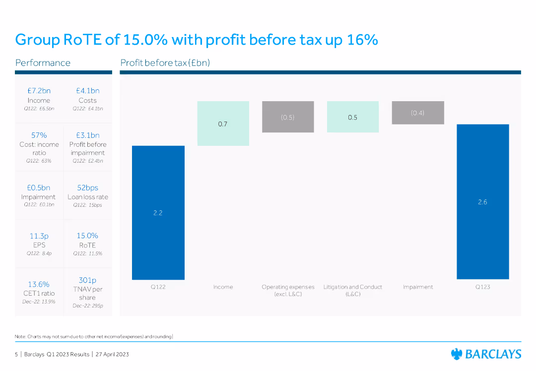
This slide includes a column chart showing profit before tax and other financial metrics like income, operating expenses, litigation, conduct costs, and impairment for Q122 and Q123, highlighting changes and growth rates.
Financial Performance
Financial Services
The slide displays financial performance metrics for Barclays Group, showing a 15% RoTE and profit before tax increase, with detailed breakdowns of income, expenses, and impairments for Q122 and Q123.
RoTE, profit before tax, financial metrics, income, expenses
false
Financial Performance
Financial Services
Mixed Chart
Barclays
Add to my slides
Remove from favorites
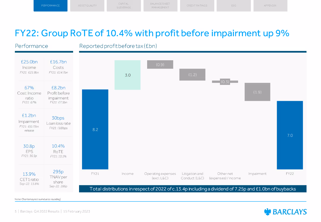
The slide features a column chart showing profit before tax, with key financial metrics listed alongside. The design is straightforward with blue tones.
Financial Performance
Financial Services
The slide provides an overview of Barclays' FY22 financial performance, highlighting a 10.4% RoTE and a 9% increase in profit before impairment.
RoTE, profit, financial performance, Barclays, FY22
false
Financial Performance
Financial Services
Mixed Chart
Barclays
Add to my slides
Remove from favorites
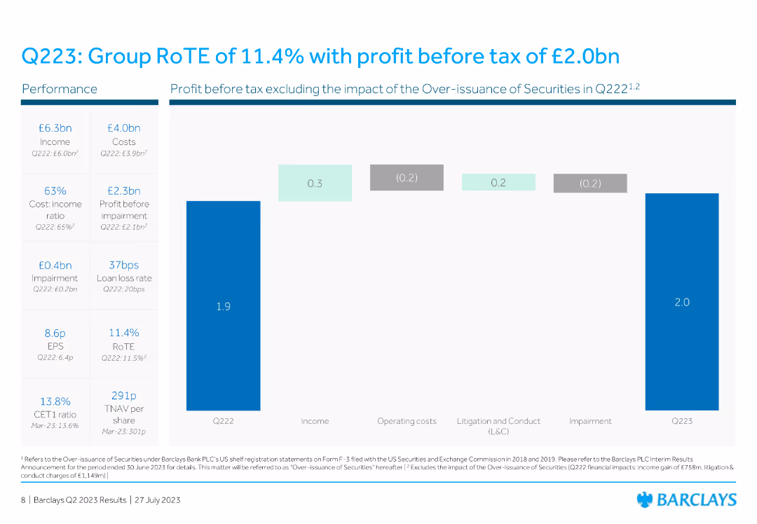
This slide has a column chart detailing profit before tax, including elements like income, costs, and impairment impacts over time.
Financial Performance
Financial Services
The slide highlights the Group RoTE and profit before tax, excluding specific impacts, and provides performance metrics for Q223.
RoTE, profit, tax, performance, financial, metrics, column chart, vertical bar, Q223, income
false
Financial Performance
Financial Services
Mixed Chart
Barclays
Add to my slides
Remove from favorites
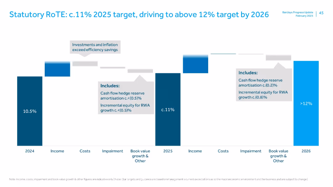
Waterfall chart showing RoTE progression from 2024 (10.5%) to 2026 (>12%), with breakdowns by income, cost, impairment, equity growth.
Financial Performance
Financial Services
Illustrates how Barclays plans to achieve and exceed RoTE targets through income gains and efficiency, despite inflation and investments. Highlights key adjustments (e.g., cash flow hedge reserve, RWA equity).
RoTE, profitability, return on equity, financial targets, cost impact
false
Financial Performance
Financial Services
Single Chart
Barclays
Add to my slides
Remove from favorites
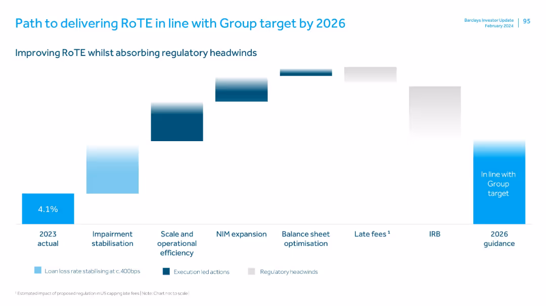
Waterfall chart format with stages marked below, each bar showing incremental impact; uses colors to differentiate action types.
Strategic Planning
Financial Services
Outlines Barclays’ roadmap for improving RoTE to meet Group targets by 2026. Includes execution strategies like impairment stabilization, operational efficiency, NIM expansion, and offsetting regulatory headwinds such as IRB changes and capped late fees.
RoTE, regulatory impact, operational efficiency, NIM, impairment, late fees, IRB, roadmap
false
Strategic Planning
Financial Services
Single Chart
Barclays
Add to my slides
Remove from favorites
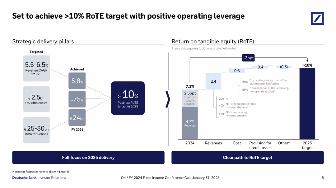
Two-part layout: strategic goals on the left, and a stacked bar chart for RoTE breakdown on the right. Uses arrows and gradients to show contributions of cost, provision, and revenue to RoTE.
Performance Metrics and KPIs
Financial Services
Deutsche Bank outlines its strategy to achieve >10% Return on Tangible Equity by 2025 through revenue growth, operational efficiencies, and risk-weighted asset reductions. The slide details how these elements cumulatively impact RoTE, with specific gains and offsets labeled clearly in the bar chart.
RoTE, return on equity, operating leverage, strategy, efficiencies, KPIs, 2025 target
false
Performance Metrics and KPIs
Financial Services
Mixed Chart
Deutsche Bank
Add to my slides
Remove from favorites
This slide features a series of column charts and pathway graphics detailing the strategy to align RoTE with the group target by 2026. The colors used are shades of blue and grey, signifying different aspects like 'loan loss rate stabilization' and 'late fees'. The design is clear with each section distinctly marked for focus.
Strategic Planning
Financial Services
Outlines Barclays' strategic actions towards achieving a RoTE in line with the group target by 2026, highlighting areas such as scale and operational efficiency, and balance sheet optimization.
RoTE, strategic plan, operational efficiency, balance sheet, 2026
false
Strategic Planning
Financial Services
Single Chart
Barclays
Add to my slides
Remove from favorites
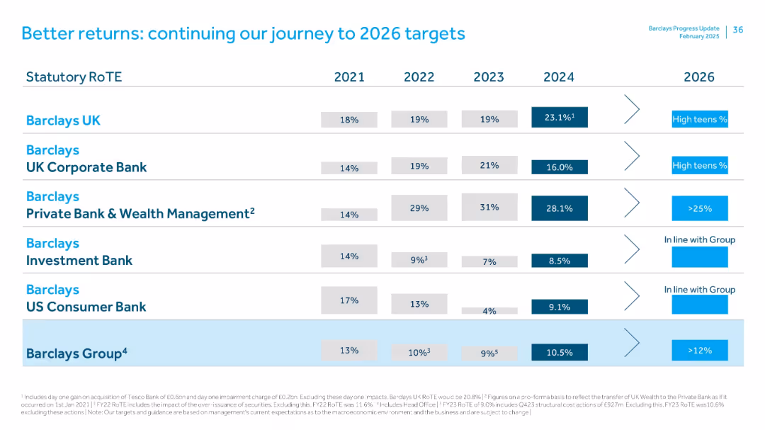
Table comparing RoTE by Barclays divisions from 2021–2024 with 2026 targets. Uses horizontal alignment with industry-specific goals and strategy callouts.
Strategic Planning
Financial Services
Lays out RoTE performance and 2026 targets across Barclays’ divisions. Barclays UK shows strong 2024 gains (23.1%), while Investment Bank and US Consumer Bank show modest improvements. Group target RoTE is >12% by 2026.
RoTE, targets, strategy, Barclays UK, investment bank, 2026 outlook
false
Strategic Planning
Financial Services
Single Chart
Barclays
Add to my slides
Remove from favorites
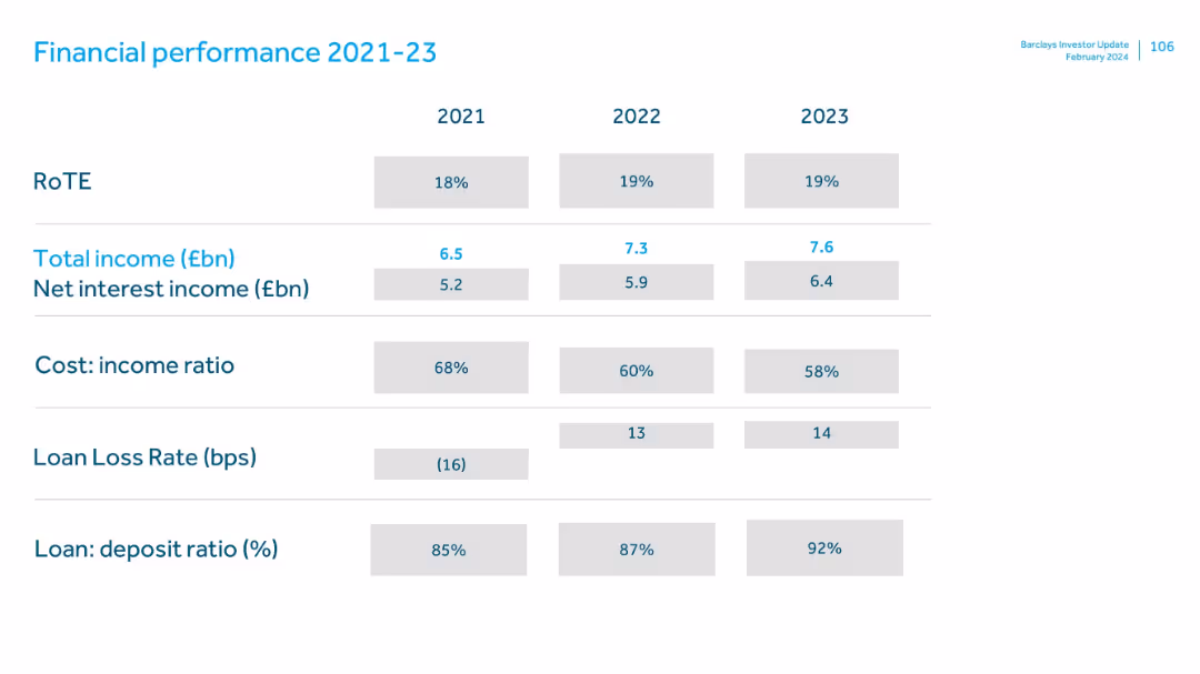
Grid layout with grey and blue text boxes; metrics shown in columns by year for 2021–2023.
Financial Performance
Financial Services
Displays Barclays UK's key financial metrics over three years, including RoTE, income, cost ratios, loan loss rate, and deposit ratios. It shows steady income growth and operational efficiency improvements.
RoTE, total income, cost ratio, loan loss, deposits, trends, Barclays
false
Financial Performance
Financial Services
Single Chart
Barclays
Add to my slides
Remove from favorites
The slide presents a scatter plot and column chart showing the variation in Australian road freight costs with distance, with annotations highlighting key findings.
Market Analysis and Trends
Transportation & Logistics
The slide analyzes the variation in road freight costs across different distances and regions in Australia, noting that costs decrease with distance but are highest in South Australia and Victoria.
Road freight costs, Australia, distance, cost variation, transportation, logistics, scatter plot, market analysis, freight efficiency
false
Market Analysis and Trends
Transportation & Logistics
Multiple Chart
LEK
Add to my slides
Remove from favorites
The slide features a column chart comparing road freight costs to port across various regions, with contextual annotations on factors influencing costs.
Operational Efficiency
Transportation & Logistics
The slide provides a comparative analysis of road freight costs in Australia and international competitors, highlighting the efficiency and cost advantages of Australia's road freight network.
Road freight, Australia, cost comparison, transportation, logistics, modal share, efficiency, freight network, operational efficiency
false
Operational Efficiency
Transportation & Logistics
Mixed Chart
LEK
Add to my slides
Remove from favorites
The slide includes three sections comparing road transport, coastal shipping, and domestic port costs, with bullet points summarizing key findings for each.
Market Analysis and Trends
Transportation & Logistics
It compares the costs of road freight, coastal shipping, and port services in Australia, highlighting road freight as a supply chain priority.
Road freight, coastal shipping, port, costs, benchmarking, transport, supply chain, Australia, comparators
false
Market Analysis and Trends
Transportation & Logistics
Pillar
LEK
Add to my slides
Remove from favorites
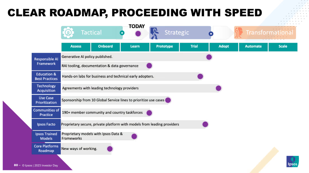
The slide displays a timeline divided into Tactical, Strategic, and Transformational phases, with milestones listed for each phase. It uses a horizontal timeline layout with colored segments and icons.
Strategic Planning
Technology & Software
The slide presents a clear roadmap for strategic initiatives, detailing phases from tactical to transformational steps, and highlights milestones such as AI policy, technology acquisition, and community practices.
Roadmap, strategy, tactical, strategic, transformational, milestones, AI, technology, acquisition, community
false
Strategic Planning
Technology & Software
Table
IPSOS
Add to my slides
Remove from favorites
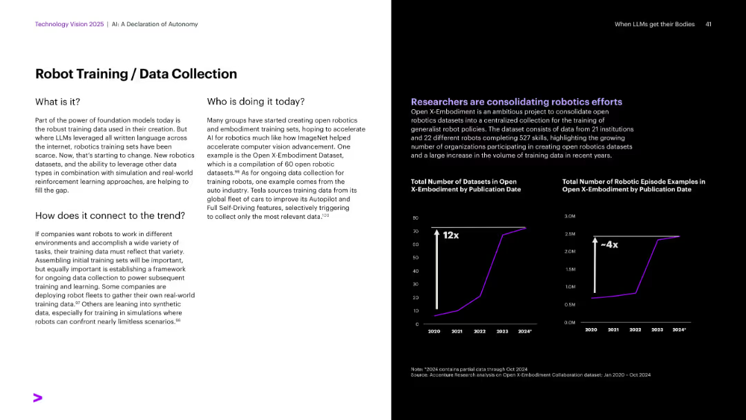
Layout similar to others: text left, black background right with dual line charts (datasets and examples growth).
Operational Efficiency
Artificial Intelligence
The slide discusses the importance of robust training datasets for foundation models in robotics. It features Open X-Embodiment, a dataset consolidating robotic data. Growth in dataset volume and episode examples is visualized, showing major recent scaling of data collection and robotics research efforts.
Robotics training, datasets, Open X-Embodiment, simulation, Tesla
false
Operational Efficiency
Artificial Intelligence
Multiple Chart
Accenture
Add to my slides
Remove from favorites
The slide contains a picture of a robot in a store setting and text describing retail robotics. Below the text are trend assessment bars labeled "Watch" with impact on industry and time of mainstream adoption.
Technology and Digital Transformation
Retail & E-commerce
Explains the role of robotics in automating store operations, refilling shelves, and managing inventory, projecting that such technologies will be realized by 2040. It discusses the expected benefits and potential applications in improving retail and food service industries' workflows.
Robotics, Retail, Automation, AI, Technology
false
Technology and Digital Transformation
Retail & E-commerce
Mixed Chart
Deloitte
Add to my slides
Remove from favorites
Column chart showing the projected impact of robot deployment on GDP for China, US, EU, Japan, and South Korea under low, base, and high scenarios for 2030.
Technology and Digital Transformation
Technology & Software
The slide projects the economic impact of increased robot deployment on GDP for several regions under different scenarios. It discusses the potential gains from the "robot dividend" and how higher robot stock levels could lead to significant economic growth by 2030.
Robots, GDP, Economic Impact, 2030
false
Technology and Digital Transformation
Technology & Software
Mixed Chart
Roland Berger
Add to my slides
Remove from favorites
With moderate visual complexity, the slide uses two pie charts to present perceptions of gender role modeling in international assignments. The design is clean and professional, employing a red and grey color scheme to draw attention to the gender comparison data.
Human Resources and Talent Management
Professional Services
Discussing the shortage of female role models with international assignment experience, the slide highlights this gap's impact on wider talent and global mobility programs. It urges organizations to showcase positive experiences of successful female assignees to drive awareness and inspire women.
Role models, Gender gap, Leadership development, Talent retention
false
Human Resources and Talent Management
Professional Services
Multiple Chart
PwC/Strategy&
Add to my slides
Remove from favorites
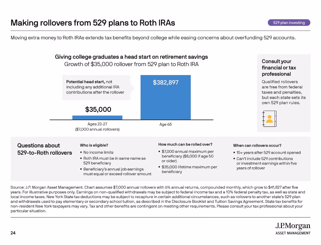
Bar chart showing long-term IRA growth; callout and Q&A section about rules and eligibility.
Investment Analysis
Financial Services
The slide explains how rolling over unused 529 plan funds into Roth IRAs can provide long-term retirement benefits. It includes rules about timing, eligibility, and contribution limits, and illustrates how a $35,000 rollover can grow significantly. Encourages consultation with tax professionals.
Roth IRA, 529 rollover, retirement, tax benefits, investment growth
false
Investment Analysis
Financial Services
Mixed Chart
JP Morgan
Add to my slides
Remove from favorites
Previous
Next
You don't have any favorites yet.
Please wait loading your favorites slides...
Create a FREE account to continue browsing
Receive Instant Access to 1,000+ slides from companies like McKinsey, Google, and Goldman Sachs
First Name
Last Name
Email
Password
I agree to all
Terms & Privacy Policy
Thank you! Your submission has been received!
Oops! Something went wrong while submitting the form.
Have an account?
Sign in
Upgrade to PRO to Save slides
Advanced Search and Filters
Access to 15,000+ slides
Access to Category Pages
Save/Bookmark Slides
PowerPoint Template Library
Pick a Plan
MONTHLY
$12/month
Billed every month, Cancel anytime.
YEARLY
$9/year
Billed $108 annually, Cancel anytime.
Checkout for $12/month
Checkout for $108/yr
Secured by Stripe | AES-256 bit encryption