My Account
My Slides
Search by Category
Pricing
Templates
View All Templates
Download Template Slides
✦ AI Search
Feedback
Login
Logout
Get Started
Browse all Slides
Browse all Slides
Create a FREE Account
Instant access to 1,000+ real slides from top companies like McKinsey, BCG, Goldman Sachs, Google and many more!
First Name
Last Name
Email
Password
I agree to all
Terms & Privacy Policy
Thank you! Your submission has been received!
Oops! Something went wrong while submitting the form.
Have an account?
Sign in
Saved Slides
Total No. of slides saved
0
↻ Refresh
✖ Clear all
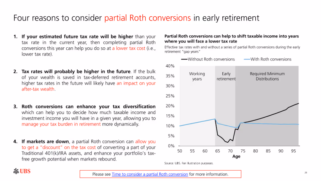
A slide with bullet points and a graph explaining reasons to consider partial Roth conversions in early retirement. The graph compares tax rates with and without conversions.
Financial Performance
Financial Services
The slide discusses the benefits of partial Roth conversions for tax management in retirement, supported by a graph illustrating the impact on tax rates.
Roth conversion, tax planning, retirement strategy, financial management, tax diversification
false
Financial Performance
Financial Services
Mixed Chart
UBS
Add to my slides
Remove from favorites
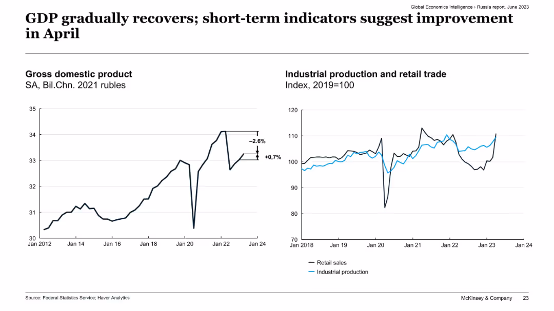
Side-by-side charts: GDP trend (left) and indexed industrial production vs. retail trade (right), Russia.
Market Analysis and Trends
Government & Public Sector
The slide shows a slight recovery in Russia's GDP and industrial output, following prior contractions. Retail sales and industrial production indicators show signs of improvement as of April, suggesting short-term economic stabilization despite previous volatility.
Russia economy, GDP recovery, industrial production, retail trade, short-term indicators, April improvement, economic stabilization
false
Market Analysis and Trends
Government & Public Sector
Multiple Chart
McKinsey
Add to my slides
Remove from favorites
The slide has two graphs side by side. On the left, a line graph depicts the GDP with a time axis from 2012 to Q1 2023, with annotations for specific points. On the right, a dual line graph shows industrial production and retail trade indices from 2018 to June 2023.
Market Analysis and Trends
Financial Services
This slide presents economic data for Russia, showing GDP trends and industrial production over time, suggesting insights into economic recovery and market conditions.
Russia, GDP, Economic Recovery, Industrial Production, Retail Trade, Market Analysis, Q1 2023, Data Trends
false
Market Analysis and Trends
Financial Services
Multiple Chart
McKinsey
Add to my slides
Remove from favorites
A column chart showing net Russian risk exposure for 4Q21 and 1Q22, with a 56% reduction. Text outlines the risk and compliance-led risk reduction actions, including trade finance limits and collateralized exposure.
Risk Assessment and Management
Financial Services
Describes the response to the Russia/Ukraine crisis, showing a significant reduction in Russian risk exposure and outlining the risk reduction actions taken by the risk and compliance teams, including cross-division support and daily focus meetings.
Russia, Ukraine, risk reduction, compliance, exposure, trade finance
false
Risk Assessment and Management
Financial Services
Mixed Chart
Credit Suisse
Add to my slides
Remove from favorites
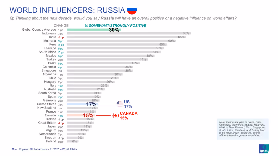
Ranked horizontal bar chart with positivity percentages for Russia, showing global and national differences; visual emphasis on US and Canada.
Market Analysis and Trends
Government & Public Sector
Global opinion on Russia's influence is low, averaging 30% positive. Indonesia shows the highest positivity (68%), while the US and Canada are below average, at 17% and 15% respectively.
Russia, global perception, soft power, country rankings, opinion poll, Ipsos, influence rating
false
Market Analysis and Trends
Government & Public Sector
Single Chart
IPSOS
Add to my slides
Remove from favorites
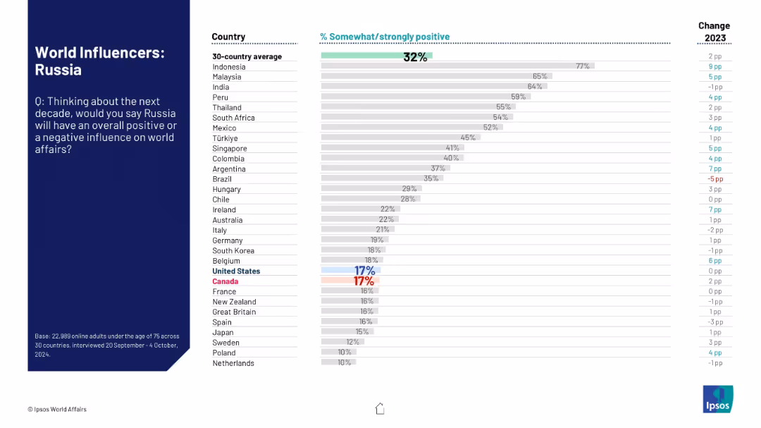
Standard design with bar chart on right and introductory context on left side.
Market Analysis and Trends
Government & Public Sector
This slide shows that Russia has the lowest perceived positive influence on global affairs among surveyed countries. Despite small upticks in some nations, overall global opinion remains highly negative.
Russia, global sentiment, geopolitical perception, Ipsos, international opinion, public influence, country ratings, trend change, 2024
false
Market Analysis and Trends
Government & Public Sector
Mixed Chart
IPSOS
Add to my slides
Remove from favorites
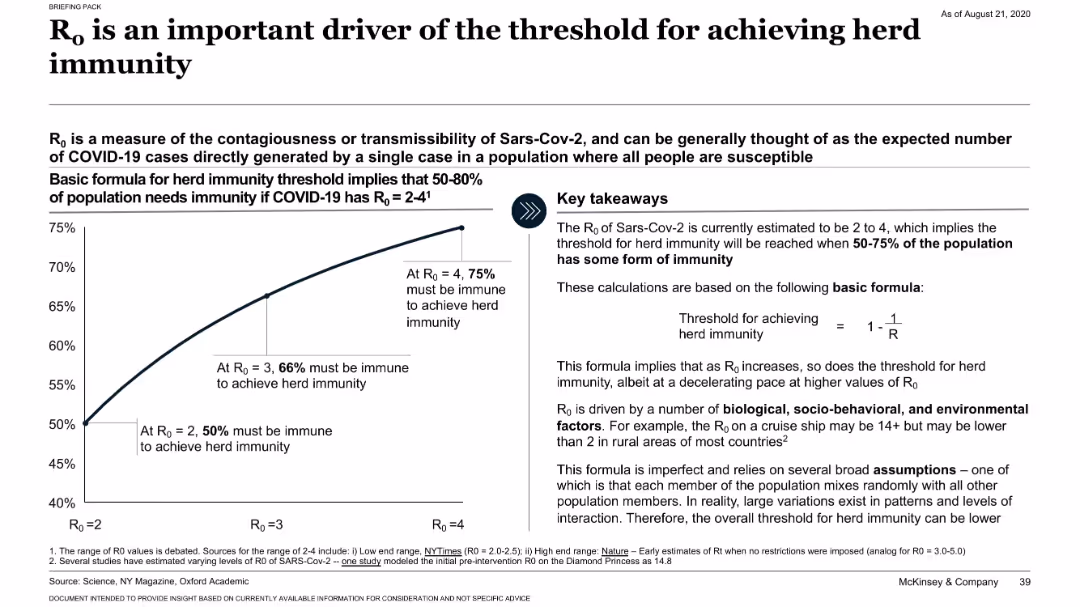
Split layout with a left-side chart showing immunity thresholds by R₀ value, and a right-side text box with key takeaways and formula. Minimalistic, clinical.
Risk Assessment and Management
Healthcare & Pharmaceuticals
The slide explains how the basic reproduction number (R₀) influences the threshold required for herd immunity, using a simple mathematical formula. It visualizes that with an R₀ of 2 to 4, between 50% to 75% of a population must be immune. It discusses variability due to biological, behavioral, and environmental factors.
R₀, herd immunity, COVID-19, transmission, infection rate, public health
false
Risk Assessment and Management
Healthcare & Pharmaceuticals
Mixed Chart
McKinsey
Add to my slides
Remove from favorites
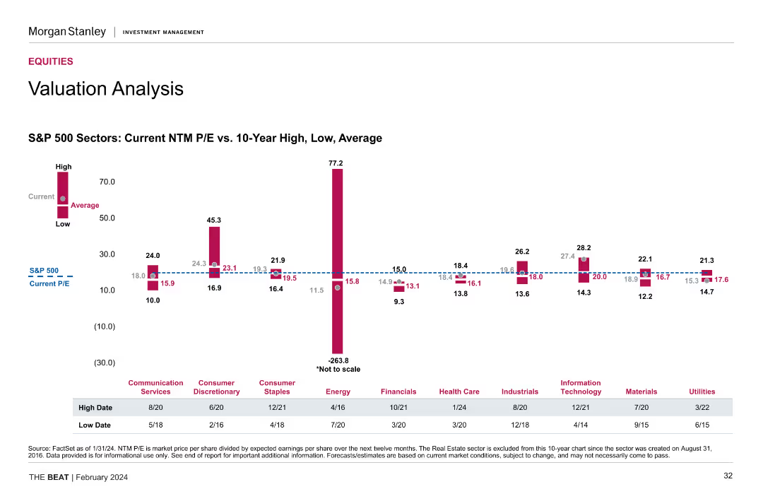
A column chart compares current NTM P/E ratios with 10-year high, low, and average values for various S&P 500 sectors.
Investment Analysis
Financial Services
This slide provides a detailed valuation analysis of S&P 500 sectors, showing current and historical NTM P/E ratios, essential for sector-based investment strategies.
S&P 500 Sectors, NTM P/E Ratios, Valuation Analysis, Historical Data
false
Investment Analysis
Financial Services
Mixed Chart
Morgan Stanley
Add to my slides
Remove from favorites
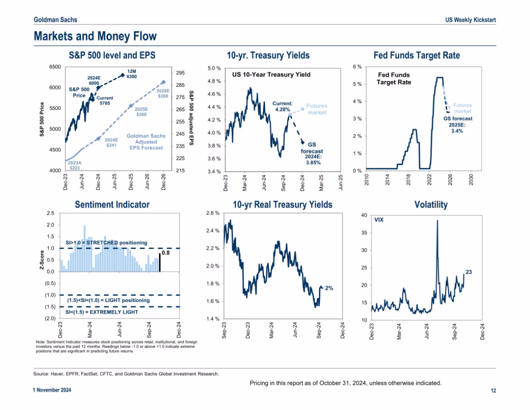
Six-panel grid format showing various indicators including EPS projections, treasury yields, fund rates, sentiment, and volatility; consistent visual style and annotated data points
Market Analysis and Trends
Financial Services
This slide captures key financial market indicators as of late 2024, including EPS forecasts, treasury yields, the Fed funds rate, investor sentiment, and volatility. It provides a snapshot of macro-financial conditions to assess capital flows and investment climate.
S&P 500, EPS forecast, treasury yields, Fed rate, sentiment, volatility, financial conditions
false
Market Analysis and Trends
Financial Services
Multiple Chart
Goldman Sachs
Add to my slides
Remove from favorites
Slide contains several vertical column charts, comparing different financial metrics such as Earnings Growth, P/E ratio, ROE, and Dividend Yield of the S&P 500.
Financial Performance
Financial Services
This slide is designed for financial professionals assessing short-term investment performance, with detailed comparison across key financial metrics of the S&P 500 index.
S&P 500, Financial Analysis, ROE, P/E Ratio, Dividend Yield, Earnings Growth, 1-Month Return, Column Chart
false
Financial Performance
Financial Services
Multiple Chart
Morgan Stanley
Add to my slides
Remove from favorites
This slide contains two sets of column charts comparing the 1-month, YTD, and 1-year returns of the S&P 500 and MSCI World index sectors. Colors blue, red, and purple are used to differentiate the time frames, with labels for each sector at the base.
Financial Performance
Financial Services
Evaluates the performance returns of various sectors within the S&P 500 and MSCI World indices over multiple time frames, useful for sector-specific investment strategy development.
S&P 500, MSCI World, sector returns, performance analysis, investment strategy, time frame comparison, index analysis
false
Financial Performance
Financial Services
Multiple Chart
Morgan Stanley
Add to my slides
Remove from favorites
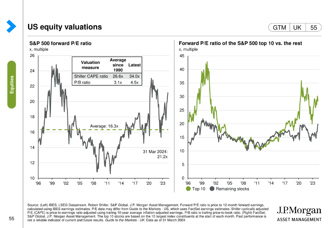
The slide features two visual elements: the left chart shows S&P 500 forward P/E ratio measures, and the right chart compares the forward P/E ratio of the S&P 500 top 10 stocks with the rest.
Market Analysis and Trends
Financial Services
The slide evaluates US equity valuations by comparing different P/E ratio measures and analyzing the forward P/E ratios of the top 10 S&P 500 stocks vs. the rest.
S&P 500, P/E ratio, top 10 stocks, equity valuations, market analysis, trends
false
Market Analysis and Trends
Financial Services
Multiple Chart
JP Morgan
Add to my slides
Remove from favorites
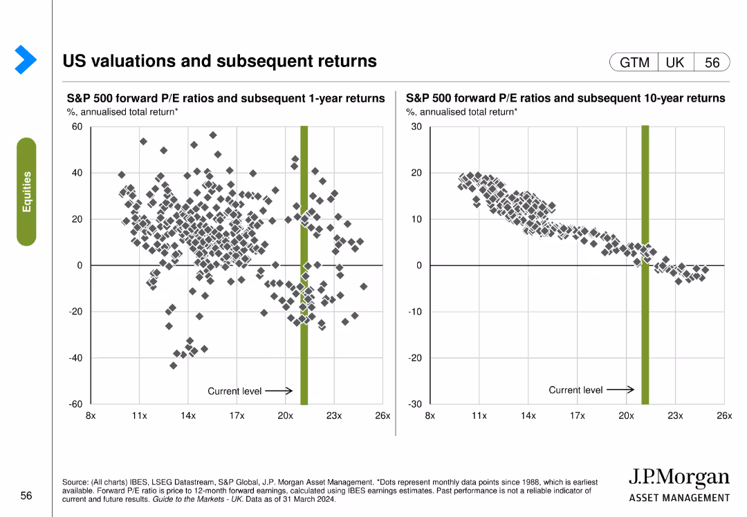
The slide contains two scatter plots: the left plot shows S&P 500 forward P/E ratios vs. subsequent 1-year returns, and the right plot shows forward P/E ratios vs. subsequent 10-year returns.
Investment Analysis
Financial Services
The slide analyzes the relationship between S&P 500 forward P/E ratios and subsequent returns over 1-year and 10-year periods, providing insights for investment strategies.
S&P 500, P/E ratios, returns, investment analysis, 1-year, 10-year, subsequent returns
false
Investment Analysis
Financial Services
Multiple Chart
JP Morgan
Add to my slides
Remove from favorites
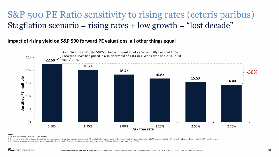
Column chart depicting the sensitivity of S&P 500 PE ratios to rising interest rates.
Risk Assessment and Management
Financial Services
This slide presents the impact of rising yields on S&P 500 forward PE valuations, illustrating a potential "lost decade."
S&P 500, PE ratio, rising rates, stagflation, risk assessment, financial analysis
false
Risk Assessment and Management
Financial Services
Single Chart
Deloitte
Add to my slides
Remove from favorites
A line chart comparing the S&P 500 Quality Index to the S&P 500. The chart is superimposed on recession period markers. The background is white, with the 'Equities' category highlighted in green.
Financial Performance
Financial Services
This slide examines the performance of high-quality stocks during recession periods, likely intended for financial analysts and investors focusing on long-term investment strategies and the resilience of quality stocks in turbulent times.
S&P 500, Quality, Performance, Recession, Equities, Analysis, Investment
false
Financial Performance
Financial Services
Single Chart
JP Morgan
Add to my slides
Remove from favorites
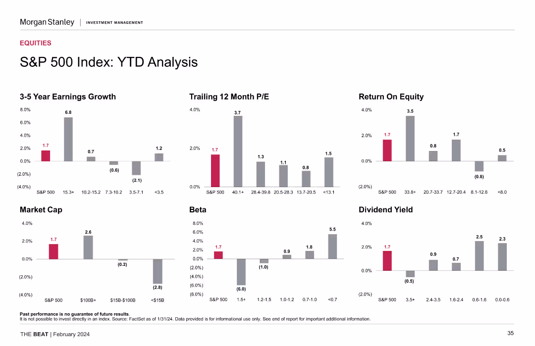
Slide showcases a set of vertical column charts depicting the year-to-date financial analysis of the S&P 500, focused on metrics like Earnings Growth and Market Cap.
Investment Analysis
Financial Services
Intended for financial analysts, this slide offers a comprehensive year-to-date analysis of the S&P 500 index's performance, highlighting crucial investment insights.
S&P 500, YTD Analysis, Financial Metrics, Earnings Growth, Market Cap, Beta, Dividend Yield, Column Chart
false
Investment Analysis
Financial Services
Multiple Chart
Morgan Stanley
Add to my slides
Remove from favorites
Slide features column charts showing 3-5 year earnings growth, trailing 12-month P/E, and dividend yield, among others, for the S&P 500 index. The design includes a clear depiction of YTD data with highlights in red, contrasting with the gray for other data points.
Investment Analysis
Financial Services
Presents a year-to-date analysis of the S&P 500 index across various financial metrics, essential for understanding market trends and investment decisions.
S&P 500, YTD analysis, earnings growth, P/E ratio, dividend yield, financial statistics, market trend analysis, investment insights
false
Investment Analysis
Financial Services
Multiple Chart
Morgan Stanley
Add to my slides
Remove from favorites
The slide presents six column charts showcasing the year-to-date (YTD) performance of the S&P 500 index in terms of earnings growth, P/E ratio, ROE, market cap, beta, and dividend yield.
Performance Metrics and KPIs
Financial Services
This slide offers a YTD performance analysis of the S&P 500 index, highlighting key financial metrics such as earnings growth, P/E ratio, and ROE for the current year.
S&P 500, YTD analysis, earnings growth, P/E ratio, financial metrics
false
Performance Metrics and KPIs
Financial Services
Multiple Chart
Morgan Stanley
Add to my slides
Remove from favorites
Similar layout to the 1-Month Return Analysis slide, with six vertical column charts depicting YTD performance across 3-5 year earnings growth, trailing 12 month P/E, return on equity, market cap, beta, and dividend yield.
Financial Performance
Financial Services
Provides year-to-date analysis of the S&P 500 index using the same financial metrics as the 1-month return analysis. Useful for tracking performance trends over a longer period within the same year.
S&P 500, YTD, earnings growth, P/E ratio, return on equity, market cap, beta, dividend yield
false
Financial Performance
Financial Services
Multiple Chart
Morgan Stanley
Add to my slides
Remove from favorites
Multiple column charts showing year-to-date (YTD) performance metrics for the S&P 500 Index, including earnings growth, P/E, ROE, market cap, beta, and dividend yield.
Financial Performance
Financial Services
This slide offers a YTD analysis of the S&P 500 Index, presenting various performance metrics to give a clear picture of financial performance over the year.
S&P 500, YTD, performance, metrics, analysis
false
Financial Performance
Financial Services
Multiple Chart
Morgan Stanley
Add to my slides
Remove from favorites
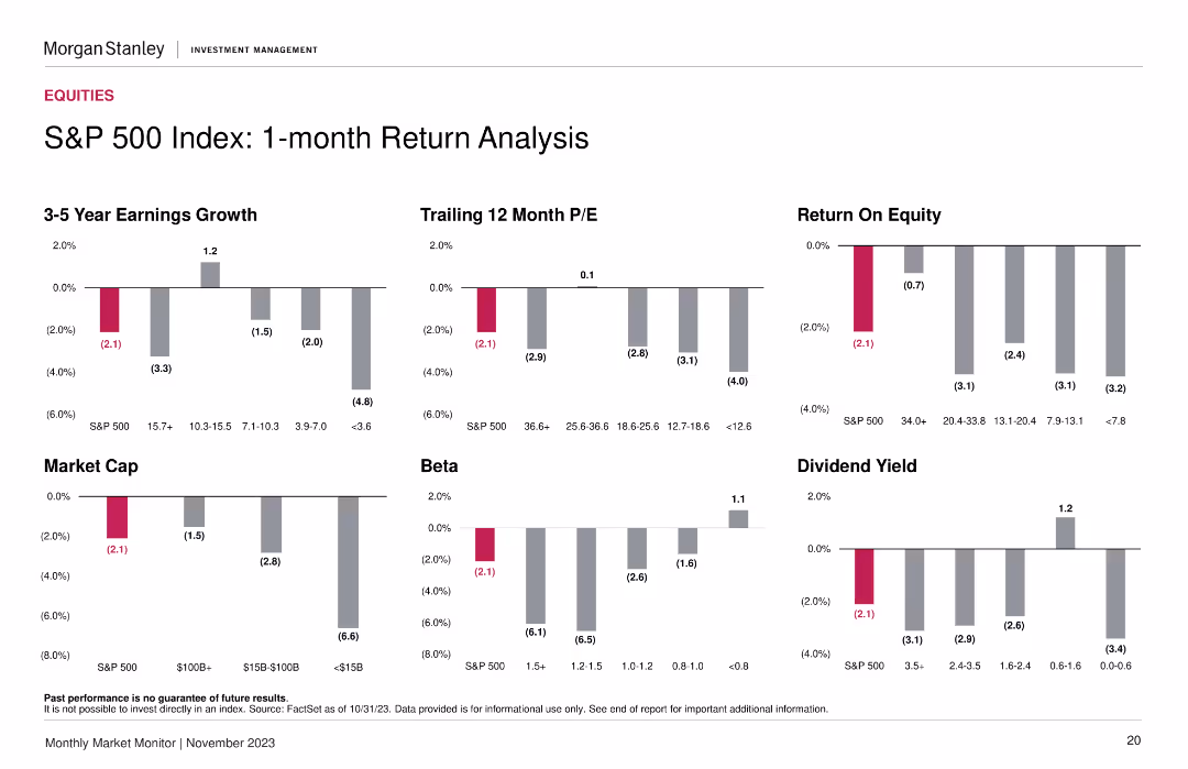
Contains six column charts showing 3-5 year earnings growth, trailing 12 month P/E, return on equity, market cap, beta, and dividend yield for S&P 500. Bars are vertical with varying data points in each category.
Financial Performance
Financial Services
Analyzes the one-month return of the S&P 500 index through various financial metrics. Useful for understanding recent performance trends in the index and comparing it with different financial indicators.
S&P 500, earnings growth, P/E ratio, return on equity, market cap, beta, dividend yield
false
Financial Performance
Financial Services
Multiple Chart
Morgan Stanley
Add to my slides
Remove from favorites
Contains six sets of column charts representing 3-5 year earnings growth, trailing 12-month P/E, market cap, and other financial metrics by different market cap categories. The bars use shades of gray with significant figures highlighted in pink.
Financial Performance
Financial Services
Analyzes the 1-month performance of the S&P 500 index across various financial metrics, critical for investors' short-term market assessment.
S&P 500, earnings growth, market capitalization, financial metrics, performance analysis, investment, market cap segments
false
Financial Performance
Financial Services
Multiple Chart
Morgan Stanley
Add to my slides
Remove from favorites
The slide shows bar and column charts for S&P 500 EPS growth and profit margins, with clear segmentations and color coding.
Financial Performance
Financial Services
It projects positive earnings growth for the S&P 500 in the upcoming year, breaking down the factors contributing to this outlook.
S&P 500, earnings growth, profit margins, financial projections, EPS
false
Financial Performance
Financial Services
Multiple Chart
JP Morgan
Add to my slides
Remove from favorites
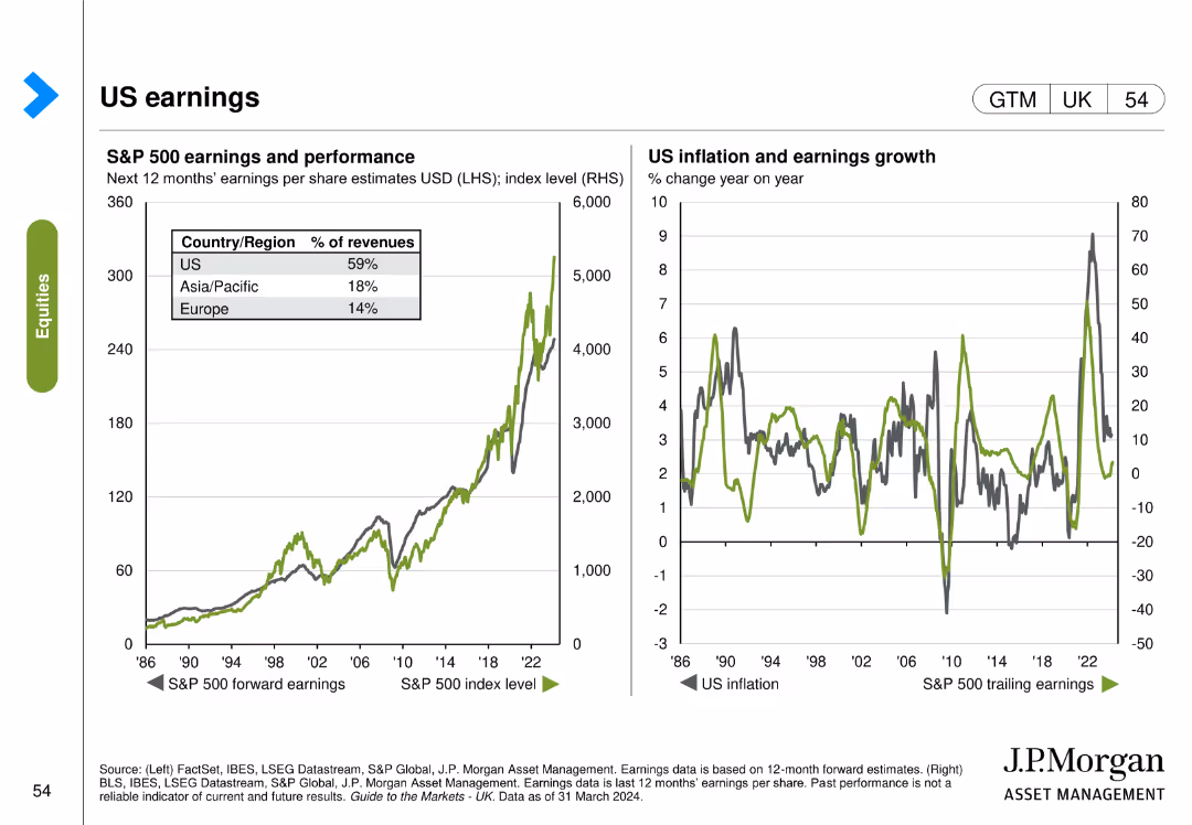
The slide includes two visual elements: the left chart shows S&P 500 earnings and performance, and the right chart shows US inflation and earnings growth over time.
Financial Performance
Financial Services
The slide analyzes US earnings by tracking the S&P 500 earnings performance and correlating it with inflation and earnings growth trends.
S&P 500, earnings, performance, inflation, growth, US economy, financial performance
false
Financial Performance
Financial Services
Multiple Chart
JP Morgan
Add to my slides
Remove from favorites
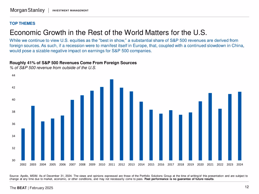
Vertical bar chart (2002–2024) showing % of S&P 500 revenue from outside the U.S.
Market Analysis and Trends
Financial Services
The slide emphasizes the global exposure of U.S. equities, noting that about 41% of S&P 500 revenues come from foreign markets. It warns that economic slowdowns abroad, especially in Europe and China, could negatively impact earnings. The long-term chart visualizes the steady foreign contribution to revenue, underscoring global interdependence.
S&P 500, foreign revenue, globalization, earnings impact, Europe, China, economic exposure, U.S. equities
false
Market Analysis and Trends
Financial Services
Single Chart
Morgan Stanley
Add to my slides
Remove from favorites
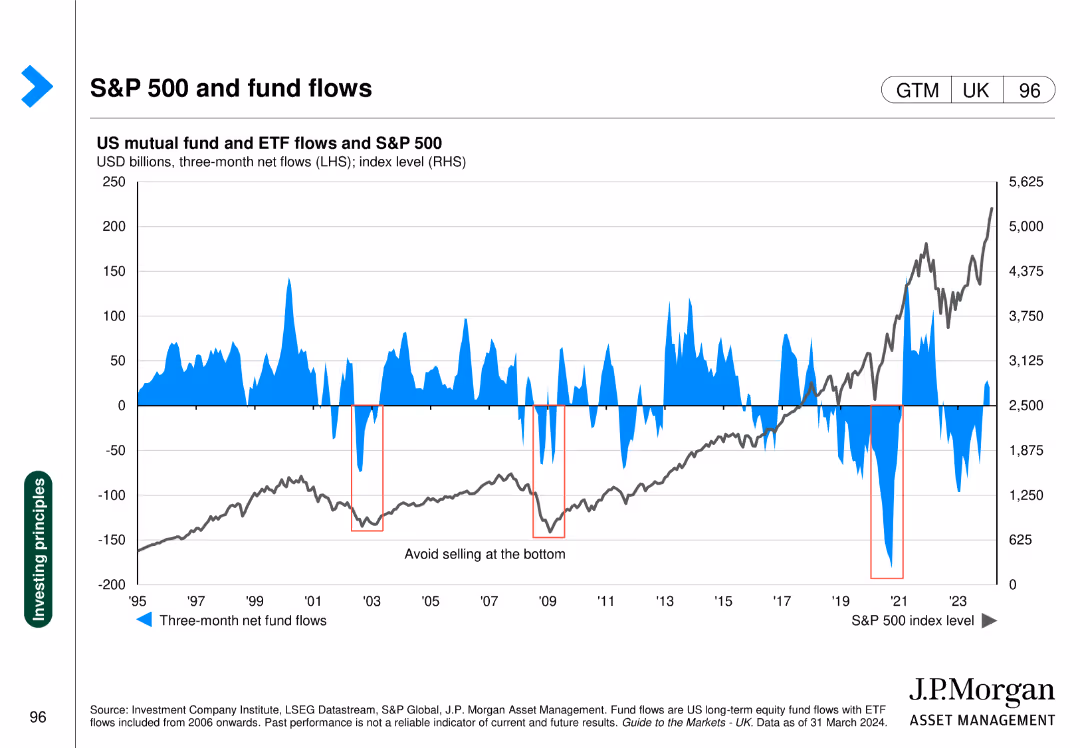
The slide includes a line chart of the S&P 500 index and a bar chart of US mutual fund and ETF flows, showing correlations between fund flows and market performance.
Market Analysis and Trends
Financial Services
This slide analyzes the relationship between US mutual fund/ETF flows and the S&P 500 index, indicating investor behavior trends and market impacts.
S&P 500, fund flows, mutual funds, ETFs, market trends
false
Market Analysis and Trends
Financial Services
Single Chart
JP Morgan
Add to my slides
Remove from favorites
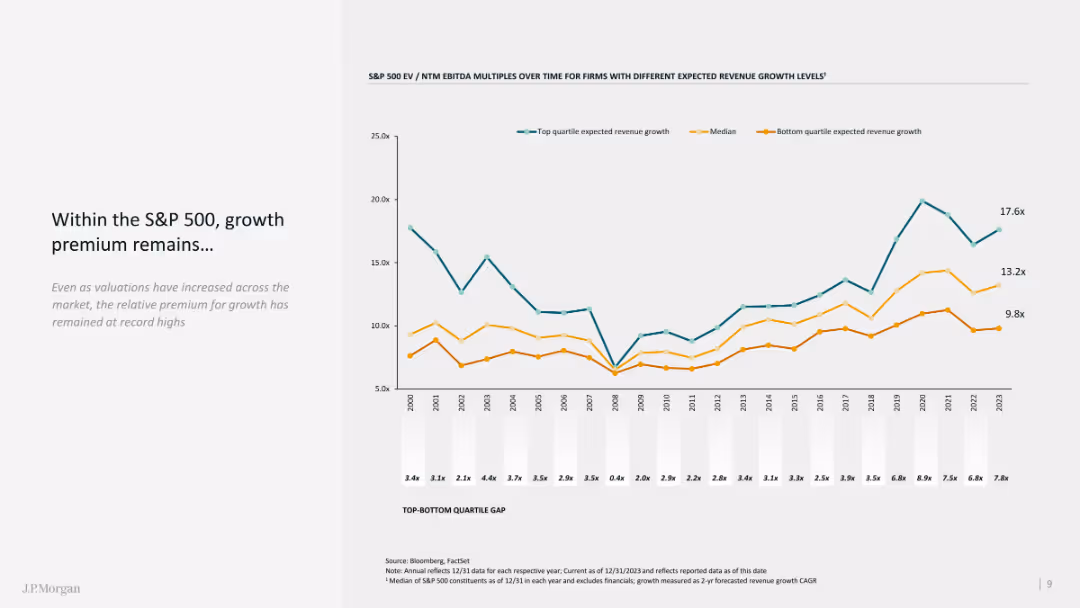
The slide features a line chart showing growth premiums within the S&P 500 over time, with comparative quartiles.
Market Analysis and Trends
Financial Services
The slide analyzes the growth premium in the S&P 500, emphasizing historical data and current valuation metrics.
S&P 500, growth premium, line chart, comparative analysis, historical data
false
Market Analysis and Trends
Financial Services
Mixed Chart
JP Morgan
Add to my slides
Remove from favorites
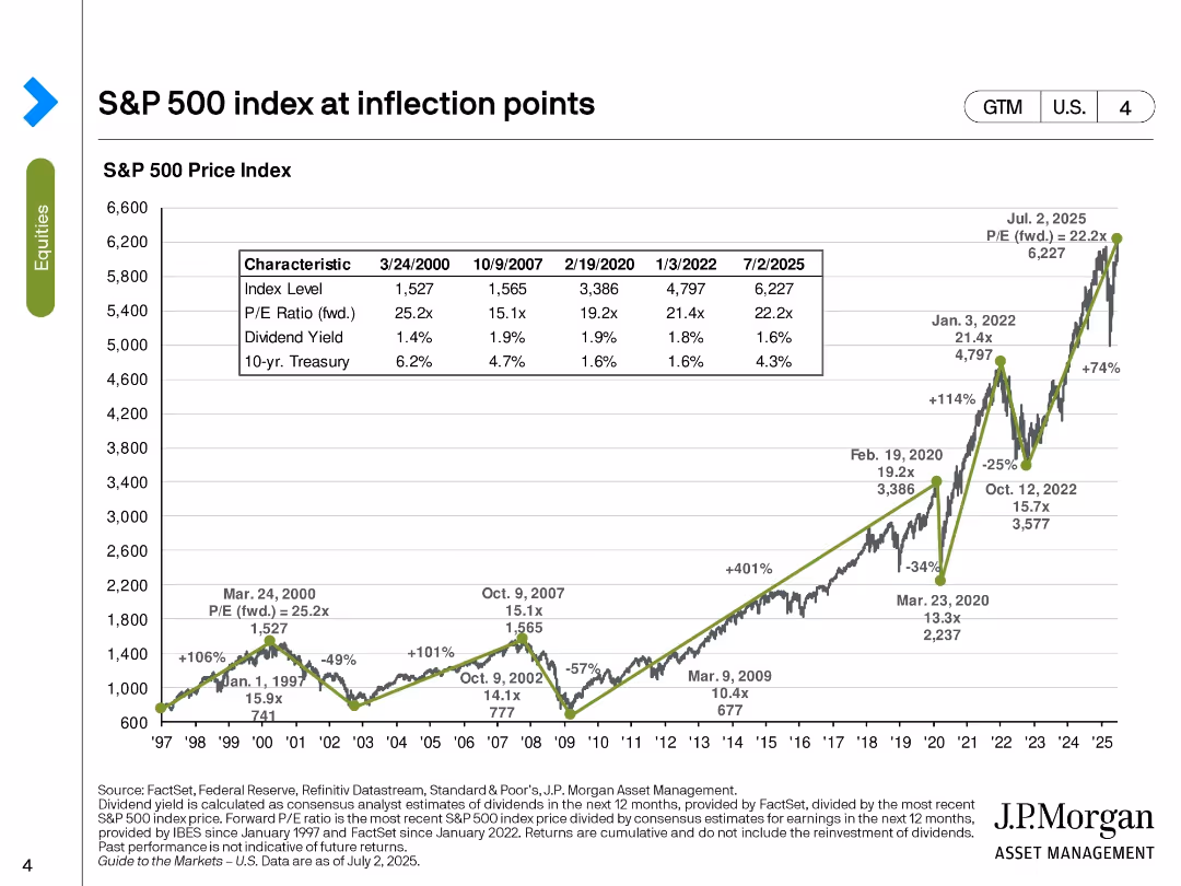
Line chart of S&P 500 index over time with annotations on major economic events; inset table compares metrics at key dates.
Market Analysis and Trends
Financial Services
This slide charts the historical trajectory of the S&P 500 from 1997 to 2025, marking significant market inflection points. It provides insights into valuation ratios, dividend yields, and interest rates at these points, helping to interpret market trends and investor behavior.
S&P 500, inflection points, market trends, valuation, dividend yield, interest rates, economic cycles, equity index
false
Market Analysis and Trends
Financial Services
Single Chart
JP Morgan
Add to my slides
Remove from favorites
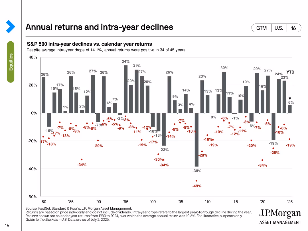
Vertical bar chart of calendar year returns with red dots showing intra-year drawdowns for each year from 1980 to 2025.
Risk Assessment and Management
Financial Services
This slide visualizes the volatility of annual S&P 500 returns by overlaying intra-year declines. Despite average intra-year drops of 14.1%, positive returns occurred in 34 of 45 years. The chart reinforces the notion that temporary declines do not always derail full-year performance.
S&P 500, intra-year decline, calendar return, volatility, drawdown, annual performance, investment risk, market resilience
false
Risk Assessment and Management
Financial Services
Single Chart
JP Morgan
Add to my slides
Remove from favorites
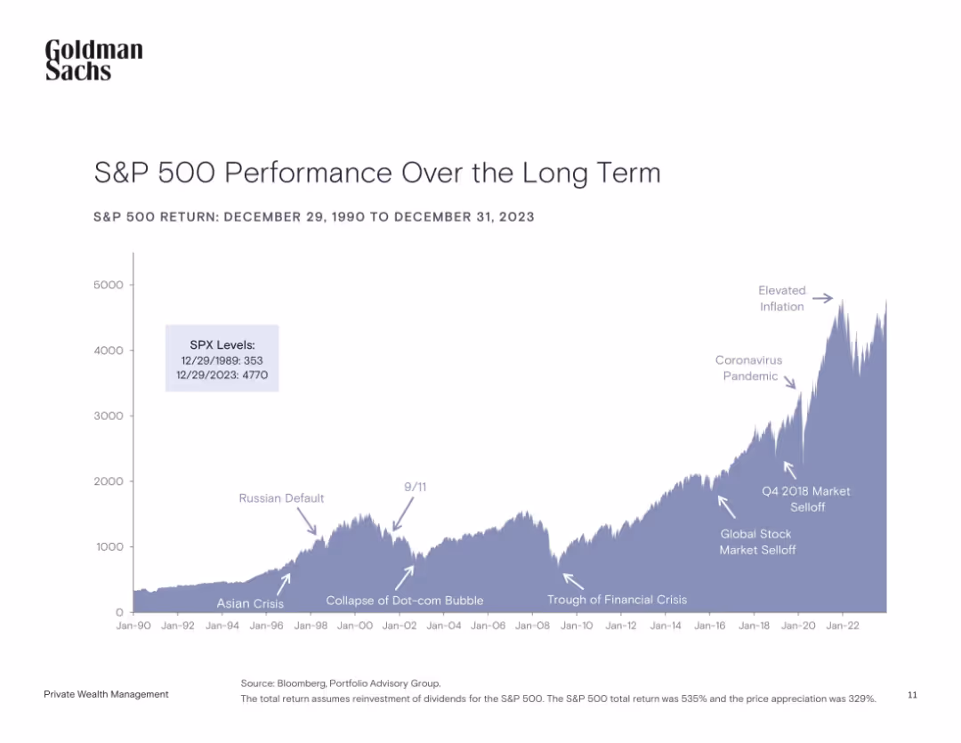
Area chart with key historical events annotated, covering S&P 500 levels from 1990 to 2023.
Market Analysis and Trends
Financial Services
The chart illustrates the S&P 500’s growth over three decades, highlighting significant global events (e.g., 9/11, COVID-19) and their impact on the market. The data emphasizes long-term growth despite volatility.
S&P 500, long-term growth, stock market, financial crises, historical events, volatility, investment, returns
false
Market Analysis and Trends
Financial Services
Single Chart
Goldman Sachs
Add to my slides
Remove from favorites
Features two large pie charts, highlights and summarizing significant changes in company longevity within the index.
Market Analysis and Trends
Financial Services
Summarizes the longevity and changes in the composition of S&P 500 companies over time, useful for discussions on market dynamics and corporate sustainability.
S&P 500, longevity, market trends, corporate, changes
false
Market Analysis and Trends
Financial Services
Multiple Chart
McKinsey
Add to my slides
Remove from favorites
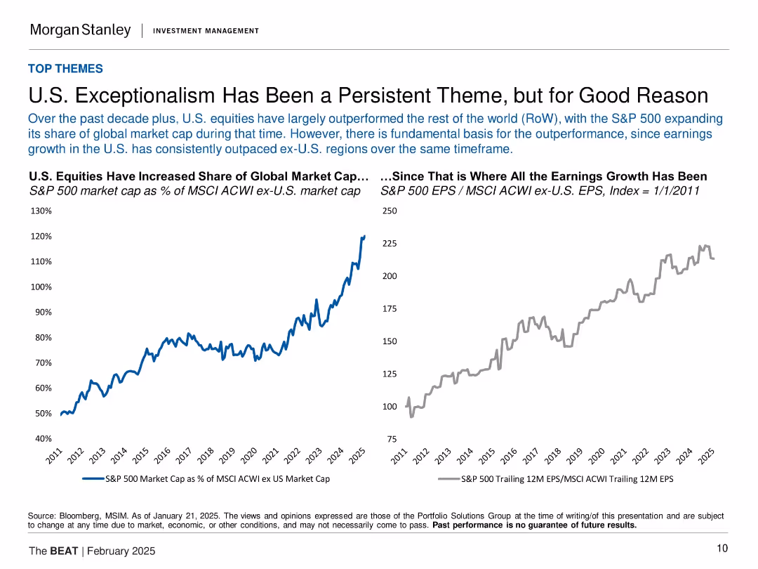
Dual-line chart showing S&P 500 market cap vs. earnings relative to MSCI ACWI ex-U.S. from 2011–2025.
Strategic Planning
Financial Services
The slide demonstrates that U.S. equities, especially the S&P 500, have significantly outperformed international markets over the past decade. It links this trend to superior earnings growth, with two charts showing market cap share and earnings growth indices. The argument is that U.S. exceptionalism has a structural basis rather than being cyclical or sentiment-driven.
S&P 500, market cap, earnings growth, U.S. equities, global equities, MSCI, exceptionalism, investment strategy
false
Strategic Planning
Financial Services
Multiple Chart
Morgan Stanley
Add to my slides
Remove from favorites
The slide includes two line charts: one comparing the S&P 500 price index vs. earnings through Q3 2023, and another showing bull and bear markets over the post-WWII period.
Investment Analysis
Financial Services
This slide analyzes the S&P 500's performance relative to earnings and highlights the historical trends of bull and bear markets.
S&P 500, price index, earnings, bull market, bear market, historical trends
false
Investment Analysis
Financial Services
Multiple Chart
Goldman Sachs
Add to my slides
Remove from favorites
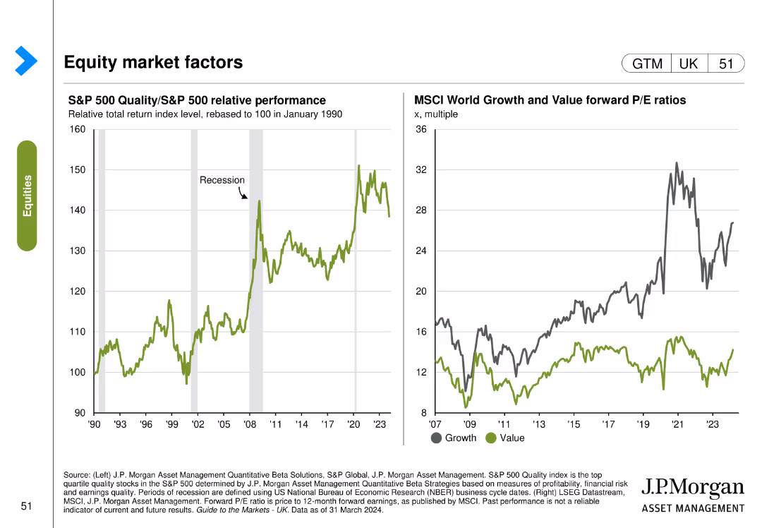
The slide features two line charts: the left chart shows the relative performance of the S&P 500 Quality index compared to the S&P 500, and the right chart shows forward P/E ratios of growth and value.
Market Analysis and Trends
Financial Services
The slide analyzes equity market factors by comparing the performance of quality stocks to the overall market and examining forward P/E ratios of growth and value stocks.
S&P 500, quality index, market factors, performance, growth, value, P/E ratios
false
Market Analysis and Trends
Financial Services
Multiple Chart
JP Morgan
Add to my slides
Remove from favorites
The slide contains six column charts detailing the S&P 500 index's 1-month returns in areas such as earnings growth, P/E ratio, ROE, market cap, beta, and dividend yield.
Performance Metrics and KPIs
Financial Services
This slide provides a 1-month return analysis of the S&P 500 index, breaking down performance in various financial metrics such as earnings growth, P/E ratio, and dividend yield.
S&P 500, return analysis, earnings growth, P/E ratio, financial metrics
false
Performance Metrics and KPIs
Financial Services
Multiple Chart
Morgan Stanley
Add to my slides
Remove from favorites
This slide contains several column charts displaying various metrics like earnings growth, P/E ratios, ROE, market cap, beta, and dividend yield for the S&P 500 index.
Market Analysis and Trends
Financial Services
The slide presents a detailed analysis of the S&P 500 index's one-month return, highlighting different financial metrics and their performance over the specified period.
S&P 500, return analysis, earnings growth, P/E, ROE
false
Market Analysis and Trends
Financial Services
Multiple Chart
Morgan Stanley
Add to my slides
Remove from favorites
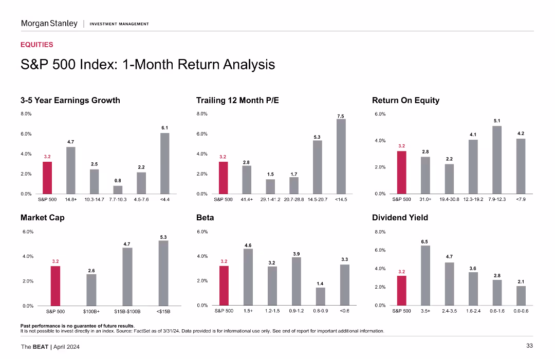
The slide presents multiple column charts analyzing the S&P 500 Index's 1-month return across various metrics including earnings growth, P/E ratio, return on equity, market cap, beta, and dividend yield. The charts use distinct colors for clarity.
Financial Performance
Financial Services
The slide provides a detailed analysis of the S&P 500 Index's 1-month return, comparing metrics like earnings growth, P/E ratio, return on equity, market cap, beta, and dividend yield, useful for financial performance assessment.
S&P 500, return analysis, financial metrics, earnings growth, market cap, P/E ratio, beta, dividend yield, return on equity
false
Financial Performance
Financial Services
Multiple Chart
Morgan Stanley
Add to my slides
Remove from favorites
Multiple column charts showing various financial metrics for the S&P 500 Index, including earnings growth, P/E, ROE, market cap, beta, and dividend yield.
Financial Performance
Financial Services
The slide provides a detailed return analysis of the S&P 500 Index over one month, covering multiple financial metrics to offer a comprehensive financial performance review.
S&P 500, return, analysis, metrics, performance
false
Financial Performance
Financial Services
Multiple Chart
Morgan Stanley
Add to my slides
Remove from favorites
This slide features multiple vertical bar (column) charts showing the S&P 500 sectors' current P/E ratios against 10-year highs, lows, and averages, with annotations for specific dates and a descriptive legend below. The layout is information-dense with a mix of vibrant colors for differentiation.
Financial Performance
Financial Services
The slide presents a comparative valuation analysis of S&P 500 sectors using current and historical P/E ratios, useful for financial analysts and investors.
S&P 500, valuation, P/E ratio, financial analysis, equity markets, historical comparison, investment, sector analysis
false
Financial Performance
Financial Services
Single Chart
Morgan Stanley
Add to my slides
Remove from favorites
Line chart comparing the P/E ratios of FANGMANT stocks and the rest of the S&P 500, and a column chart showing changes in P/E ratios resulting in flat S&P 500 P/E ratio.
Financial Performance
Financial Services
Analyzes how most S&P 500 companies are trading at less demanding valuations, focusing on the disparity between FANGMANT stocks and other S&P 500 companies.
S&P 500, valuations, P/E ratio, FANGMANT stocks
false
Financial Performance
Financial Services
Multiple Chart
Goldman Sachs
Add to my slides
Remove from favorites
This slide contains a scatter plot comparing S&P 500 valuations to interest rates and a column chart showing the market cap share of top S&P 500 firms.
Investment Analysis
Financial Services
The slide analyzes the high valuations of equity markets driven by a few ultra-mega-cap firms, represented as the "Magnificent 7." It discusses the impact of these firms on the S&P 500 and the overall market dynamics. This slide can be used for investment strategy discussions and market valuation analysis.
S&P 500, valuations, market cap, Magnificent 7, equities
false
Investment Analysis
Financial Services
Multiple Chart
JP Morgan
Add to my slides
Remove from favorites
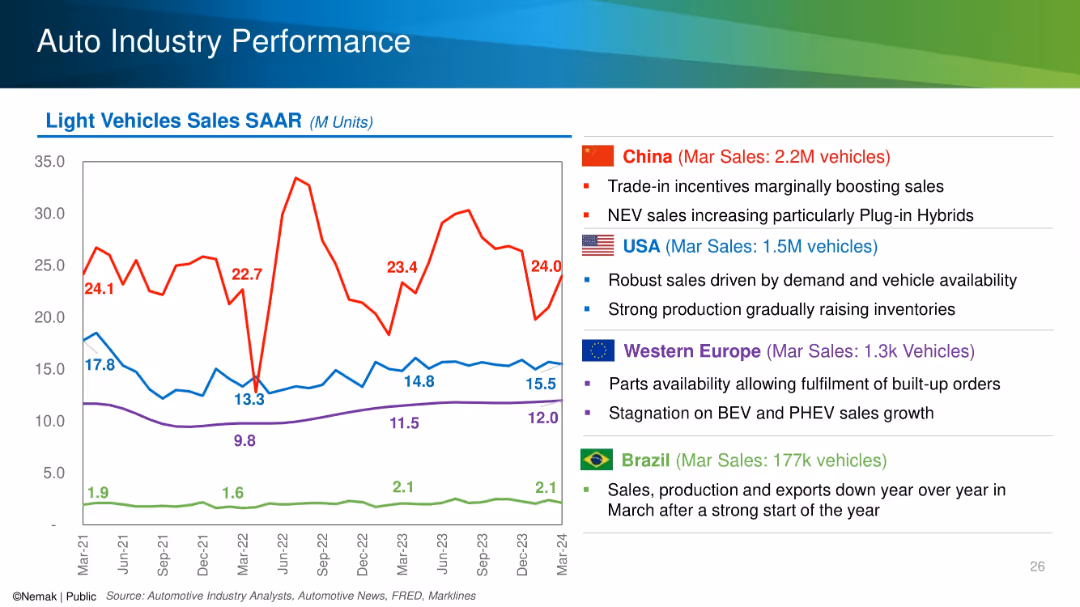
Line chart with SAAR trends for China, USA, Europe, and Brazil alongside country-specific bullet points.
Performance Metrics and KPIs
Industrial & Manufacturing
The slide tracks seasonally adjusted annual rates (SAAR) of light vehicle sales for major global markets and highlights key drivers and challenges in each region, such as incentives in China and stagnation in Europe. March 2024 sales figures are emphasized.
SAAR, auto sales, regional performance, NEV, incentives, inventory
false
Performance Metrics and KPIs
Industrial & Manufacturing
Mixed Chart
Barclays
Add to my slides
Remove from favorites
Contains a column chart that compares SACU receipts over three fiscal years, with each year represented by a column colored in orange.
Regulatory and Compliance
Government & Public Sector
Analyzes the SACU receipts from previous, current, and projected fiscal years, providing insights into economic trends and regional financial contributions. This information is crucial for assessing economic health and regional cooperation within the Southern African Customs Union.
SACU, Receipts, Budget, Forecasting, Economic analysis
false
Regulatory and Compliance
Government & Public Sector
Single Chart
PwC/Strategy&
Add to my slides
Remove from favorites
Features a series of column charts representing SACU receipts over four fiscal years, showcasing trends and fluctuations in revenue.
Financial Performance
Government & Public Sector
This slide tracks the Southern African Customs Union (SACU) receipts from 2017 to 2020, providing insights into regional economic collaboration and financial trends affecting Namibia's budgetary considerations.
SACU, Revenue, Trends, Economic, Customs
false
Financial Performance
Government & Public Sector
Single Chart
PwC/Strategy&
Add to my slides
Remove from favorites
Features two column charts. The first chart depicts SACU receipts over four fiscal years. The second shows indirect tax comparisons excluding SACU receipts for three fiscal years.
Financial Performance
Government & Public Sector
Analyzing SACU receipts and indirect tax contributions in Namibia, this slide aids in understanding the impact of regional agreements and indirect taxes on the national budget.
SACU, indirect tax, Namibia, fiscal year, regional agreements, national budget, tax contributions
false
Financial Performance
Government & Public Sector
Multiple Chart
PwC/Strategy&
Add to my slides
Remove from favorites
Displays three orange vertical bars representing SACU receipts over three fiscal years, with values labeled clearly atop each bar.
Regulatory and Compliance
Government & Public Sector
The slide shows past, estimated, and projected SACU receipts, helping in financial assessment and future budgeting within the government sector.
SACU, receipts, financial review, projection, government, budgeting, past, estimate, fiscal, finance
false
Regulatory and Compliance
Government & Public Sector
Single Chart
PwC/Strategy&
Add to my slides
Remove from favorites
This slide shows a column chart and a line graph on SACU revenue over time. It illustrates actual revenues and their percentage of total revenue, highlighted with a dotted line.
Regulatory and Compliance
Government & Public Sector
Focuses on the Southern African Customs Union (SACU) revenue streams, analyzing past performance and future projections.
SACU, revenue analysis, projections, fiscal planning, customs
false
Regulatory and Compliance
Government & Public Sector
Single Chart
PwC/Strategy&
Add to my slides
Remove from favorites
This slide features a column chart comparing SACU receipts over three fiscal years. The columns are color-coded in orange, and the monetary values and fiscal years are clearly labeled above each column.
Financial Performance
Government & Public Sector
This slide shows the trends in SACU receipts over recent years, useful for discussions in economic or budgetary presentations focused on regional economic contributions within the Southern African Customs Union.
SACU, revenue trends, economic contributions, fiscal analysis
false
Financial Performance
Government & Public Sector
Single Chart
PwC/Strategy&
Add to my slides
Remove from favorites
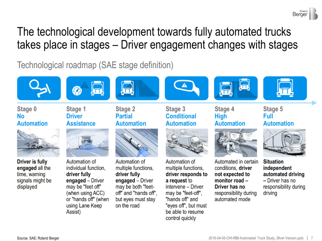
A horizontal infographic outlines six SAE automation stages, with illustrations and explanatory text below each stage.
Technology and Digital Transformation
Transportation & Logistics
The slide explains the SAE stages of truck automation, from no automation to full autonomy. It describes changes in driver engagement across each automation level.
SAE automation, driver assistance, truck technology, partial automation, full automation, roadmap, transport future
false
Technology and Digital Transformation
Transportation & Logistics
Linear Flow
Roland Berger
Add to my slides
Remove from favorites
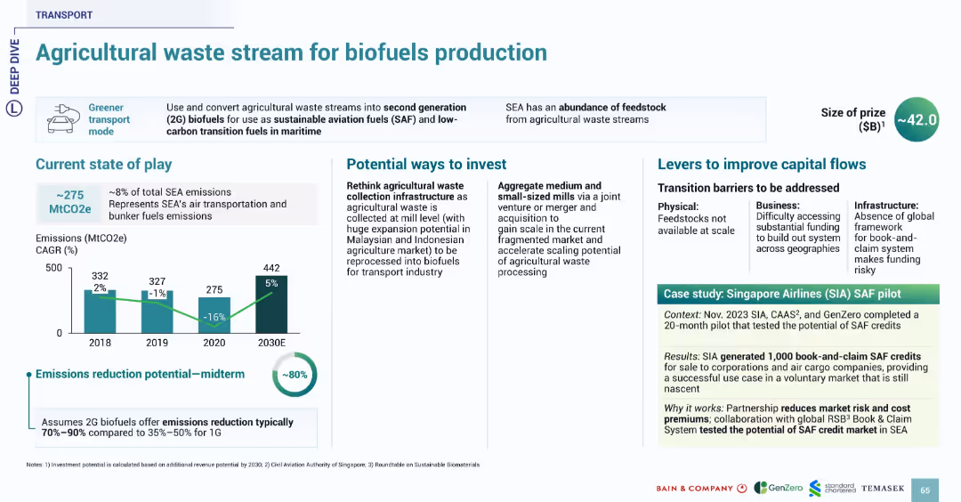
Structure consistent with transport series slides. Bar chart, investment ideas, barriers, and real-world example in green highlight box.
Investment Analysis
Transportation & Logistics
This slide discusses converting agricultural waste into second-generation biofuels (SAF) to reduce emissions from air transport and marine fuels. Emissions reduction potential is up to 80%. Investment areas include improved waste collection infrastructure and scaling small mills. The Singapore Airlines SAF pilot demonstrates market viability through book-and-claim SAF credits generation.
SAF, biofuels, agricultural waste, emissions, Singapore Airlines, SEA, transportation
false
Investment Analysis
Transportation & Logistics
Multiple Chart
Bain
Add to my slides
Remove from favorites
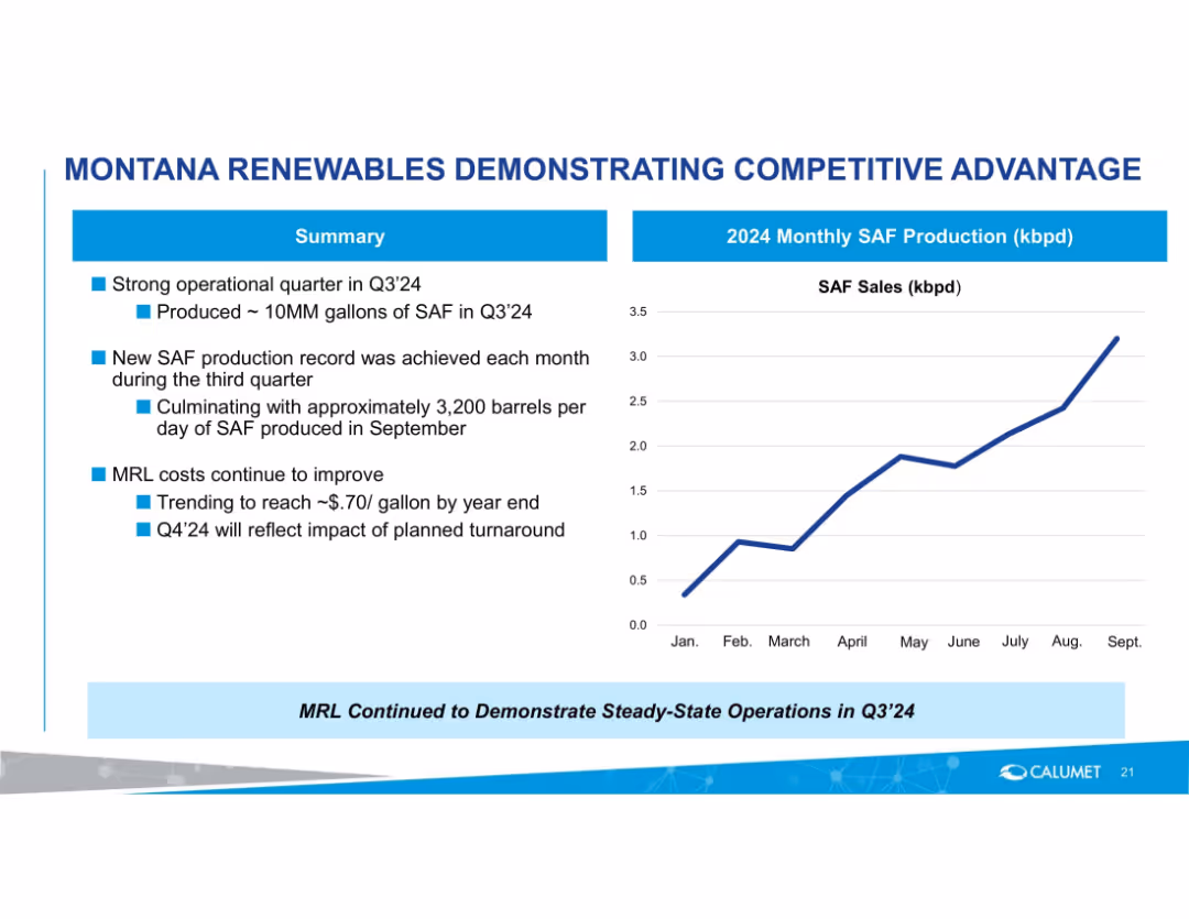
Left side summary bullets with a right side line chart showing monthly SAF production trend in 2024.
Performance Metrics and KPIs
Energy & Utilities
Reports strong Q3'24 production of SAF with monthly growth, culminating at 3,200 barrels/day in September. Notes ongoing cost improvements and anticipated impact of turnaround in Q4'24.
SAF, sustainable aviation fuel, production growth, Q3'24, cost improvement, operations, monthly metrics
false
Performance Metrics and KPIs
Energy & Utilities
Mixed Chart
Goldman Sachs
Add to my slides
Remove from favorites
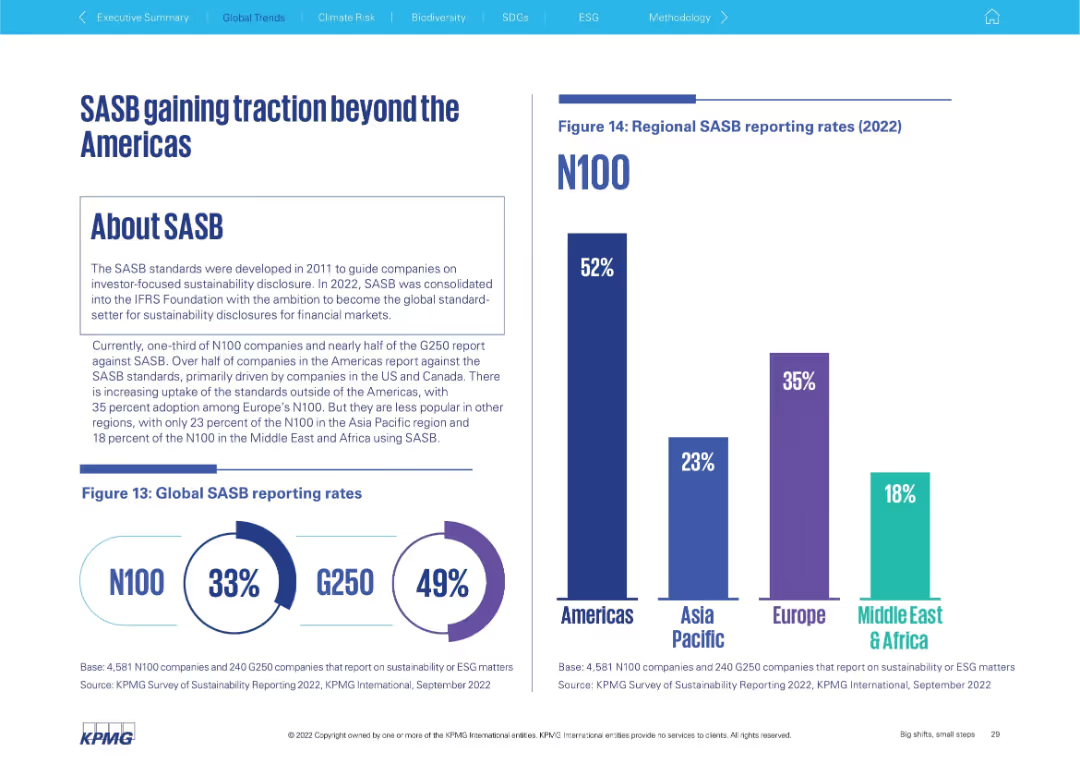
Left side explains SASB framework; right shows global and regional adoption bar charts
Regulatory and Compliance
Professional Services
Discusses adoption of the SASB framework for sustainability disclosure. It shows that the Americas lead (52%), followed by Europe (35%), with lower uptake in Asia Pacific (23%) and Middle East & Africa (18%). Global rates for N100 and G250 are also included.
SASB, sustainability disclosure, ESG standards, global adoption, Americas, G250, N100
false
Regulatory and Compliance
Professional Services
Multiple Chart
KPMG
Add to my slides
Remove from favorites
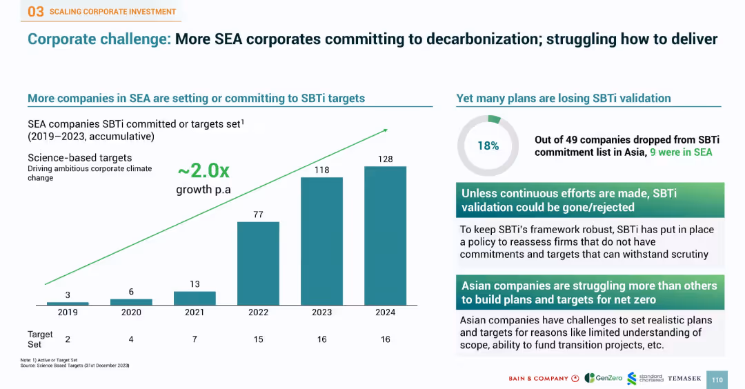
Bar chart of SBTi commitments over years and pie chart of validation loss. Right side provides insights into corporate struggles and requirements for target credibility.
Performance Metrics and KPIs
Industrial & Manufacturing
Reviews the increase in SEA companies committing to SBTi targets, with commitments doubling annually. Notes 18% failure rate in maintaining validation. Points to challenges such as plan credibility, funding gaps, and target scope issues. Underscores the need for continuous efforts to meet stringent validation frameworks and credibility in climate goal setting.
SBTi, SEA corporates, decarbonization, validation, climate targets, science-based targets, KPI, commitment, emissions
false
Performance Metrics and KPIs
Industrial & Manufacturing
Multiple Chart
Bain
Add to my slides
Remove from favorites
Features a diagram depicting the transition from the current state to the future state of an organization through SCT, using labels and connecting arrows.
Strategic Planning
Professional Services
Describes the objective of Strategic Cost Transformation, which aims to align the business model, operating, and capital model for enhanced organizational performance and efficiency.
SCT, Business Model, Operational Efficiency, Alignment, Future State
false
Strategic Planning
Professional Services
Framework
Deloitte
Add to my slides
Remove from favorites
Contains a descriptive block on the left about Palsgaard's focus, a complex table in the center with checkboxes marking the strategic direction in relation to specific SDGs, and the SDG logos for 'Responsible Consumption' and 'Climate Action'.
Strategic Planning
Environmental Services & Sustainability
This slide details Palsgaard’s strategic focus on SDG 12 and 13, highlighting initiatives like responsible resource use and CO2 emissions reduction. The central table checks align Palsgaard’s operations with these SDGs, pointing out their commitment to innovation in sustainability and the impact on operational costs and global CO2 management.
SDG 12, SDG 13, Sustainability, CO2 Reduction, Resource Management
false
Strategic Planning
Environmental Services & Sustainability
Table
McKinsey
Add to my slides
Remove from favorites
A pie chart shows the proportion of SDG-aligned investments against other investments, with associated text blocks. A color-coded list describes contributions to SDG goals.
Regulatory and Compliance
Government & Public Sector
Communicates the company's commitment to sustainability through SDG-aligned investments. It highlights the yearly investment averages and the main areas of contribution, suitable for reports on corporate responsibility and sustainability initiatives.
SDG Goals, Investments, Sustainability, Corporate Responsibility, Innovation
false
Regulatory and Compliance
Government & Public Sector
Table
Goldman Sachs
Add to my slides
Remove from favorites
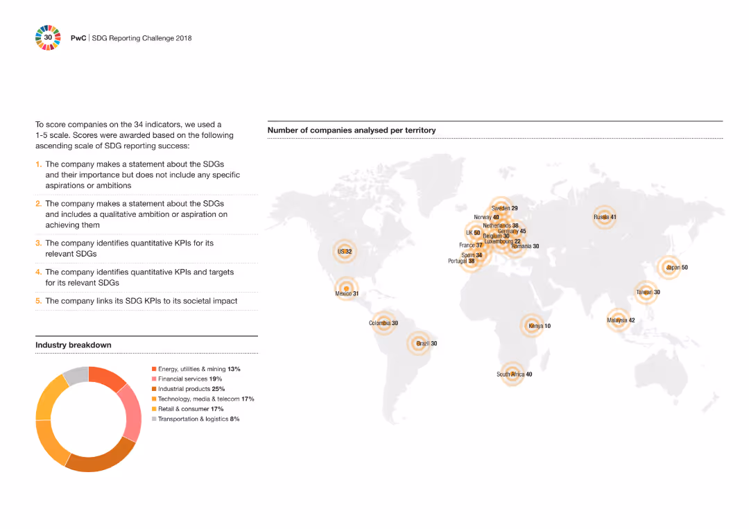
The slide includes a world map showing the number of companies analyzed per territory and a donut chart with industry breakdown. Text details the scoring criteria for SDG indicators.
Performance Metrics and KPIs
Professional Services
The slide describes the scoring methodology for companies on SDG indicators using a 1-5 scale. It includes a geographic and industry breakdown of the companies analyzed, showing a global perspective on SDG reporting practices.
SDG indicators, scoring, global analysis, companies, professional services, industry breakdown, donut chart, map
false
Performance Metrics and KPIs
Professional Services
Mixed Chart
PwC/Strategy&
Add to my slides
Remove from favorites
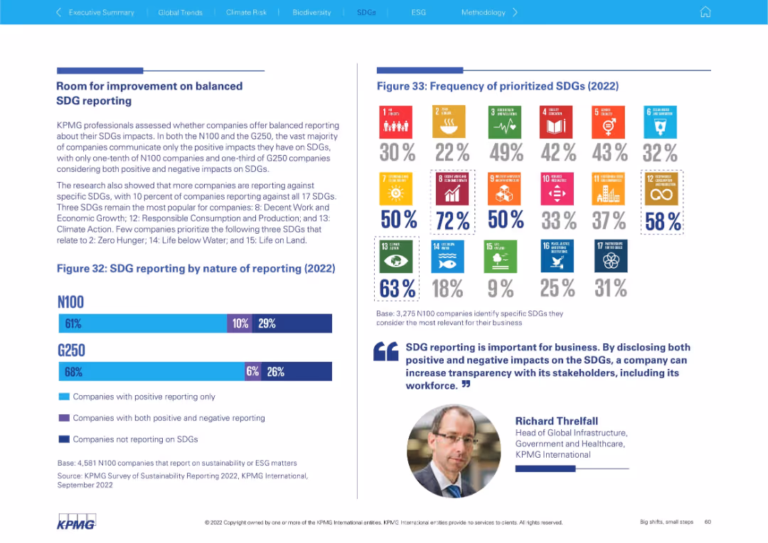
Left-aligned paragraph explanation with bar chart below showing nature of SDG reporting, and a colorful SDG icon grid on the right depicting frequency of prioritization.
Performance Metrics and KPIs
Professional Services
This slide examines the balance in SDG reporting, noting most companies report only positive impacts. It shows which SDGs are most commonly prioritized and provides figures for how many companies disclose both positive and negative impacts.
SDG prioritization, reporting balance, impact disclosure, G250, N100, sustainability metrics, ESG, SDG icons, transparency
false
Performance Metrics and KPIs
Professional Services
Mixed Chart
KPMG
Add to my slides
Remove from favorites
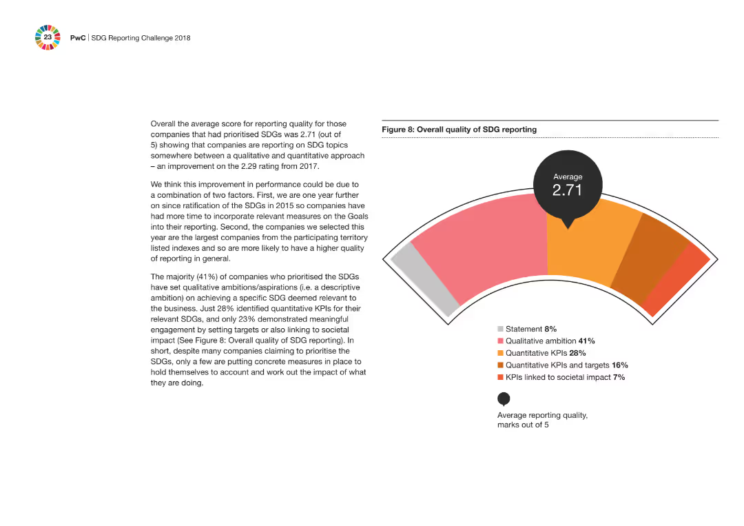
This slide contains a gauge chart displaying an average score of 2.71 for SDG reporting quality, with a breakdown of qualitative and quantitative measures.
Regulatory and Compliance
Professional Services
It discusses the average score for reporting quality of companies prioritizing SDGs, highlighting improvements from the previous year and the importance of setting qualitative and quantitative KPIs.
SDG reporting, quality score, qualitative, quantitative, professional services, gauge chart, improvements, compliance
false
Regulatory and Compliance
Professional Services
Mixed Chart
PwC/Strategy&
Add to my slides
Remove from favorites
The slide includes a circular flow diagram, bullet points detailing initiatives, and a textbox with key product highlights. It's designed with a clean look using red and grey colors.
Operational Efficiency
Environmental Services & Sustainability
Highlights initiatives contributing to the Sustainable Development Goals (SDG) and showcases new products that align with the company's sustainability portfolio.
SDG, initiatives, industrial process efficiency, energy efficiency, digitalization, innovation, AW609, AW169, integrated sensors, sustainability portfolio
false
Operational Efficiency
Environmental Services & Sustainability
Header Horizontal
Goldman Sachs
Add to my slides
Remove from favorites
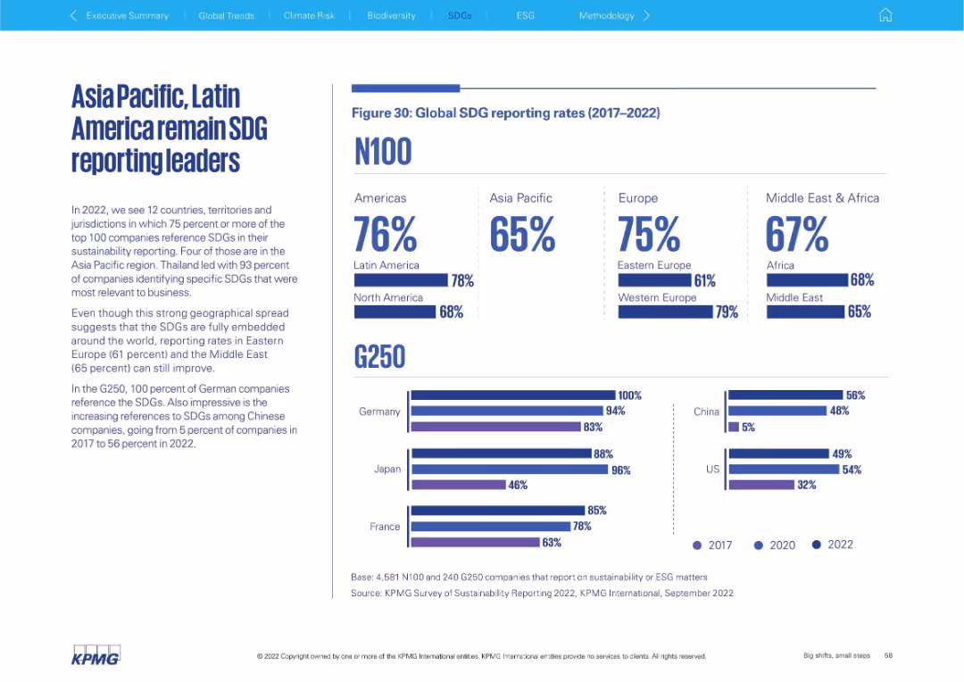
Two-column layout with text on the left and a data-rich infographic on the right, including bar graphs and percentage stats comparing global SDG reporting by region and country.
Strategic Planning
Professional Services
This slide presents SDG reporting rates globally (2017–2022), highlighting regional leaders and laggards. It compares N100 and G250 companies by region and includes national-level insights, notably Germany’s 100% G250 reporting rate and China’s rapid growth.
SDG, sustainability, G250, N100, regional comparison, ESG, Latin America, Asia Pacific, Europe, corporate reporting
false
Strategic Planning
Professional Services
Multiple Chart
KPMG
Add to my slides
Remove from favorites
The slide includes a bar chart comparing the roles of various corporate leaders in driving SDG initiatives, prominently highlighting the role of CEOs with a backdrop of subtle blue tones.
Market Analysis and Trends
Professional Services
This slide presents survey data on the driving forces behind SDG implementation in companies, emphasizing the significant role of CEOs compared to other leadership roles like CSR managers and sustainability project managers.
SDGs, CEO, leadership, corporate governance
false
Market Analysis and Trends
Professional Services
Single Chart
McKinsey
Add to my slides
Remove from favorites
Contains a series of bar charts that represent the percentage of the largest Danish companies engaging with various SDGs, with color-coding corresponding to different SDG goals.
Market Analysis and Trends
Environmental Services & Sustainability
This slide reviews the SDG engagement of top Danish companies, showing high involvement in goals related to industry, innovation, and climate action, as reported in their annual sustainability reports.
SDGs, Danish companies, sustainability reporting, corporate engagement
false
Market Analysis and Trends
Environmental Services & Sustainability
Single Chart
McKinsey
Add to my slides
Remove from favorites
Features three numbered steps with corresponding icons, describing the process of operationalizing SDG initiatives, including templates, timelines, and tracking methods.
Strategic Planning
Professional Services
Offering a strategic blueprint, this slide outlines essential steps to operationalize and measure the impact of SDG initiatives, aiming to enhance clarity and accountability in sustainability efforts within corporate strategies.
SDGs, Strategic Planning, Operationalization, Impact Measurement, Accountability
false
Strategic Planning
Professional Services
Pillar
McKinsey
Add to my slides
Remove from favorites
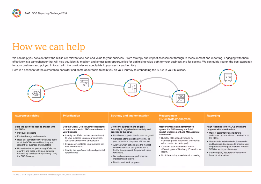
A sequence of five circular icons connected by arrows, each representing a different phase: Awareness raising, Prioritisation, Strategy and implementation, Measurement, Reporting.
Strategic Planning
Professional Services
The slide outlines the approach for embedding SDGs in businesses, highlighting steps from awareness raising to reporting with corresponding actions and tools.
SDGs, Strategy, Implementation, Reporting, Measurement, Tools, Awareness, Business, Value, Specialists
false
Strategic Planning
Professional Services
Mixed Chart
PwC/Strategy&
Add to my slides
Remove from favorites
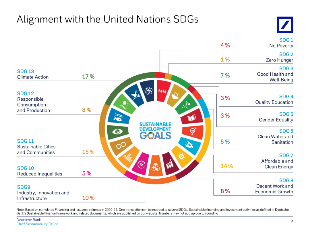
This slide uses a circular diagram to align Deutsche Bank's initiatives with various UN Sustainable Development Goals (SDGs).
Regulatory and Compliance
Financial Services
Highlights Deutsche Bank's contributions to specific UN SDGs, detailing percentages for each goal, showcasing commitment to ESG.
SDGs, UN, alignment, sustainability, ESG
false
Regulatory and Compliance
Financial Services
Single Chart
Deutsche Bank
Add to my slides
Remove from favorites
The circular diagram is split into four quadrants with icons, blue and gray color themes, and focused text blocks.
Strategic Planning
Environmental Services & Sustainability
Details how SDGs can enhance business strategies in four key areas: organizational performance, growth, risk management, and return on capital.
SDGs, business growth, risk management, sustainability, return on capital
false
Strategic Planning
Environmental Services & Sustainability
Framework
McKinsey
Add to my slides
Remove from favorites
Compares potential business opportunities arising from the UN Sustainable Development Goals globally and specifically for Denmark. Uses maps and icons to visualize areas such as new market opportunities and job creation, highlighting both global and national impacts.
Strategic Planning
Government & Public Sector
Analyzes how the UN Sustainable Development Goals can generate significant business opportunities by 2030, both globally and in Denmark. The slide details the potential for new jobs and market growth, providing a strategic perspective for businesses looking to align with global sustainability efforts and capitalize on emerging trends in responsible business practices.
SDGs, business opportunities, global markets, Denmark
false
Strategic Planning
Government & Public Sector
Table
McKinsey
Add to my slides
Remove from favorites
Circular diagram with twelve segments, each labeled with different strategic focuses, comprehensive design.
Strategic Planning
Government & Public Sector
Describes twelve primary areas where companies can derive business value from SDGs, including partnerships and operational improvements.
SDGs, business strategy, partnerships, operational improvements
false
Strategic Planning
Government & Public Sector
Diagram
McKinsey
Add to my slides
Remove from favorites
This slide displays the 17 Sustainable Development Goals (SDGs) set by the UN, each represented by an icon and a brief description. The slide provides a comprehensive overview of these goals, which include ending poverty, ensuring education for all, and combating climate change, among others.
Regulatory and Compliance
Government & Public Sector
Provides an overview of the United Nations' Sustainable Development Goals, highlighting their role as a global framework for addressing key challenges like poverty, education, and climate change. The slide serves as a valuable educational tool for discussing global priorities and the collaborative efforts needed to achieve sustainable development across various sectors.
SDGs, global challenges, sustainability, education, poverty
false
Regulatory and Compliance
Government & Public Sector
Table
McKinsey
Add to my slides
Remove from favorites
Presents a series of infographics and icons summarizing global progress on various SDGs, such as poverty reduction, health improvements, and educational advancements, with a focus on statistical changes.
Strategic Planning
Government & Public Sector
This slide summarizes global achievements and ongoing challenges in achieving the Sustainable Development Goals, highlighting significant progress in areas like health and poverty, alongside areas needing more effort like sanitation and renewable energy access.
SDGs, global progress, challenges, health, education
false
Strategic Planning
Government & Public Sector
Table
McKinsey
Add to my slides
Remove from favorites
Column chart illustrating the percentage of companies across various industries that mention the SDGs in their reports. Visual includes icons representing different industries on the right side of the chart.
Regulatory and Compliance
Financial Services
The slide details the percentage of companies in various industries that mention the SDGs in their reporting, highlighting that most sectors are engaging with these sustainability goals.
SDGs, industries, reporting, sustainability, companies
false
Regulatory and Compliance
Financial Services
Mixed Chart
PwC/Strategy&
Add to my slides
Remove from favorites
Matrix layout with checkmarks showing SDG relevance across various industries.
Strategic Planning
Government & Public Sector
Provides a matrix mapping SDGs to industry relevance, highlighting key areas for business impact.
SDGs, industry relevance, strategic planning, business impact
false
Strategic Planning
Government & Public Sector
Table
McKinsey
Add to my slides
Remove from favorites
Features a bar chart detailing the incremental value of the 12 largest SDG-related business opportunities by 2030, highlighting sectors like mobility, healthcare, and energy efficiency.
Market Analysis and Trends
Environmental Services & Sustainability
The slide illustrates potential market sizes and savings from SDG-related business opportunities, projecting significant growth in areas like mobility systems and new healthcare solutions by 2030.
SDGs, market opportunities, business growth, sustainability
false
Market Analysis and Trends
Environmental Services & Sustainability
Single Chart
McKinsey
Add to my slides
Remove from favorites
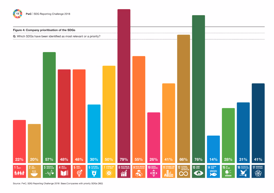
A multi-colored column chart showing the prioritization of various SDGs by companies. Each SDG is represented by a distinct color and percentage, providing a visual representation of company focus areas.
Strategic Planning
Financial Services
This slide highlights which Sustainable Development Goals (SDGs) are prioritized by companies, showing the most relevant and high-priority goals through a colorful visual representation.
SDGs, prioritization, companies, strategic, goals
false
Strategic Planning
Financial Services
Single Chart
PwC/Strategy&
Add to my slides
Remove from favorites
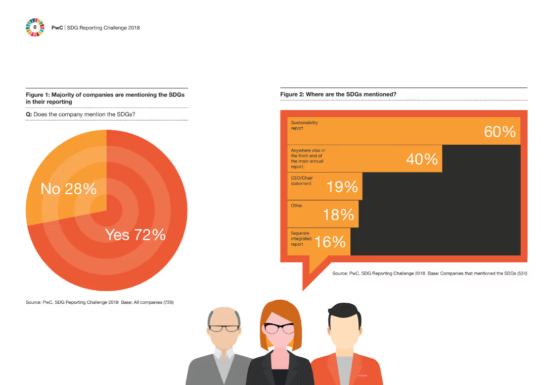
Two column charts presenting data on the extent of SDG mention in company reporting and where they are mentioned. Simple visual layout with one column chart on each side of the slide.
Regulatory and Compliance
Financial Services
This slide shows that the majority of companies mention the Sustainable Development Goals (SDGs) in their reporting, detailing where within the reports these mentions are most frequently found.
SDGs, reporting, companies, compliance, sustainability
false
Regulatory and Compliance
Financial Services
Multiple Chart
PwC/Strategy&
Add to my slides
Remove from favorites
Circular diagram split into four quadrants with icons, focused on strategic business values from SDGs.
Strategic Planning
Government & Public Sector
Highlights four strategic directions from SDGs for business value: growth, risk, return on investment, and organizational performance.
SDGs, strategic directions, business value, growth, risk management
false
Strategic Planning
Government & Public Sector
Framework
McKinsey
Add to my slides
Remove from favorites
Diagram with three main sections: Inspire, Engage, Impact, with supporting icons and text.
Strategic Planning
Environmental Services & Sustainability
Offers a structured guide to inspire and engage executives in SDG strategy implementation, measuring impact via surveys.
SDGs, strategic implementation, executive engagement, guide, impact measurement
false
Strategic Planning
Environmental Services & Sustainability
Pillar
McKinsey
Add to my slides
Remove from favorites
Text-heavy with bullet points, iconography for emphasis, blue and gray color scheme.
Organizational Structure and Change
Professional Services
Discusses the challenges and strategies for successfully implementing SDG-focused plans in businesses.
SDGs, strategic planning, business challenges, organizational change
false
Organizational Structure and Change
Professional Services
Table
McKinsey
Add to my slides
Remove from favorites
This slide features a bar chart showing the relevance of various SDGs among Danish executives, coupled with a key takeaway box emphasizing SDG 12, 8, 13, 9, and 3 as most relevant to businesses.
Market Analysis and Trends
Professional Services
The slide displays survey results from Danish executives highlighting the perceived relevance of SDGs to their businesses, emphasizing SDGs related to responsible production, economic growth, and climate action as most pertinent.
SDGs, survey, Danish executives, business relevance
false
Market Analysis and Trends
Professional Services
Single Chart
McKinsey
Add to my slides
Remove from favorites
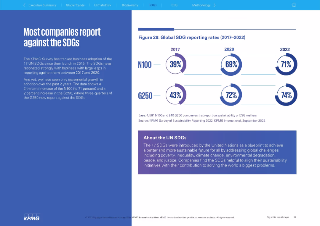
Left: narrative explanation; Right: circular infographic showing SDG reporting rates (2017–2022) for N100 and G250. Bottom panel explains SDGs.
Regulatory and Compliance
Environmental Services & Sustainability
The slide shows a high and gradually increasing rate of corporate reporting against the UN Sustainable Development Goals (SDGs). It explains the relevance of SDGs and highlights that three-quarters of G250 companies now report against them.
SDGs, sustainability goals, reporting, UN, ESG, corporate responsibility
false
Regulatory and Compliance
Environmental Services & Sustainability
Mixed Chart
KPMG
Add to my slides
Remove from favorites
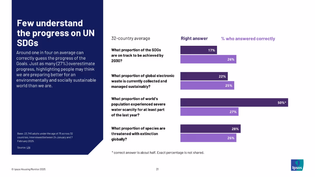
Bar chart comparing actual correct answers to % of people answering correctly across four sustainability-related questions
Regulatory and Compliance
Education & Training
This slide highlights a global gap in awareness regarding progress on UN Sustainable Development Goals. Less than a quarter of people correctly identify real metrics on SDGs, electronic waste, water scarcity, and species extinction.
SDGs, sustainability, awareness, public knowledge, Ipsos, education, UN goals, global average, environmental metrics
false
Regulatory and Compliance
Education & Training
Mixed Chart
IPSOS
Add to my slides
Remove from favorites
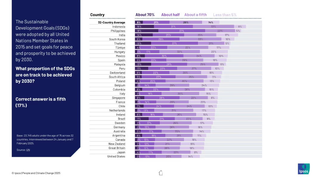
Stacked bar chart using shades of purple to show estimates across countries. Left panel provides correct answer (17%) for reference.
Industry Overview
Government & Public Sector
The chart shows how people estimate progress toward UN Sustainable Development Goals by 2030. Many overestimate; few select the accurate proportion (about one-fifth).
SDGs, sustainable development, UN goals, public awareness, global perception, Ipsos, progress tracking, purple chart, development targets, 2030 goals
false
Industry Overview
Government & Public Sector
Mixed Chart
IPSOS
Add to my slides
Remove from favorites
This slide features a complex table correlating SDG goals with business metrics like new markets, sustainable operations, and risk management, indicating areas of high and low potential for value creation with color shading.
Strategic Planning
Professional Services
Discusses how businesses perceive the potential for value creation through responsible consumption and production, decent work, and partnerships, according to SDGs, focusing on sectors with significant operational and strategic impacts.
SDGs, value creation, business strategy, operational efficiency
false
Strategic Planning
Professional Services
Table
McKinsey
Add to my slides
Remove from favorites
The slide is text-centric with a table format highlighting stages of the software development life cycle (SDLC) and corresponding technologies. Each technology is paired with a real-world company example, and the layout is direct with a clear delineation of information, utilizing minimal design elements for clarity.
Technology and Digital Transformation
Technology & Software
Highlighting successful industry applications of next-gen software development tools, this slide gives examples of companies like Decathlon and Atlassian leveraging technologies such as infrastructure-as-code and AI-based reviews. It serves as a practical insight into how these tools are applied in business contexts.
SDLC, Case Studies, Software Development, Infrastructure-as-Code, AI, Atlassian, Decathlon
false
Technology and Digital Transformation
Technology & Software
Header Vertical
McKinsey
Add to my slides
Remove from favorites
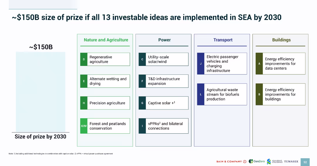
Grid-style layout categorizing 13 priority ideas by sector: Nature & Agriculture, Power, Transport, Buildings; left side shows potential value.
Strategic Planning
Environmental Services & Sustainability
The slide estimates a ~$150B opportunity if 13 prioritized green investments are implemented across SEA by 2030. It categorizes each idea under sectors like agriculture and power, listing initiatives such as solar, biofuels, and energy-efficient buildings. A visual grid aids clarity and sector association.
SEA 2030 strategy, investment opportunity, decarbonization, priority ideas, emissions reduction, value projection
false
Strategic Planning
Environmental Services & Sustainability
Mixed Chart
Bain
Add to my slides
Remove from favorites
Includes text descriptions with accompanying icons related to survey insights on hospital priorities in SEA.
Market Analysis and Trends
Healthcare & Pharmaceuticals
Provides an overview of an annual survey conducted by L.E.K. to understand hospital priorities in the SEA region, highlighting key decision areas.
SEA region, hospital priorities, survey, healthcare, MedTech
false
Market Analysis and Trends
Healthcare & Pharmaceuticals
Diagram
LEK
Add to my slides
Remove from favorites
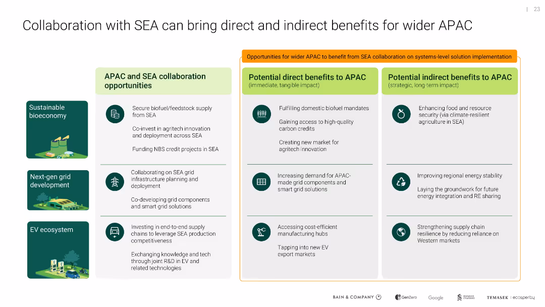
Three-column layout with icons; left shows collaboration areas, middle shows direct benefits, right lists indirect benefits
Sales and Business Development
Environmental Services & Sustainability
Outlines mutual benefits of SEA-APAC collaboration in bioeconomy, energy, and EV infrastructure, with both immediate market and long-term stability impacts for the broader region.
SEA, APAC, collaboration, energy grid, EV, bioeconomy, benefits
false
Sales and Business Development
Environmental Services & Sustainability
Table
Bain
Add to my slides
Remove from favorites
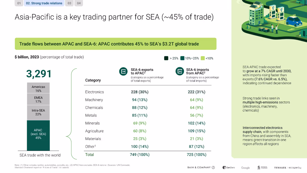
Split layout with left-side chart and right-side analysis; includes data table, bar graph, and callout highlights
Market Analysis and Trends
Transportation & Logistics
This slide emphasizes APAC’s dominant share (45%) in SEA’s global trade, highlighting electronics, machinery, and chemicals. It notes strong trade growth (7% CAGR) and interdependence in electronics supply chains between regions.
SEA, APAC, trade, electronics, CAGR, interdependence, supply chain
false
Market Analysis and Trends
Transportation & Logistics
Mixed Chart
Bain
Add to my slides
Remove from favorites
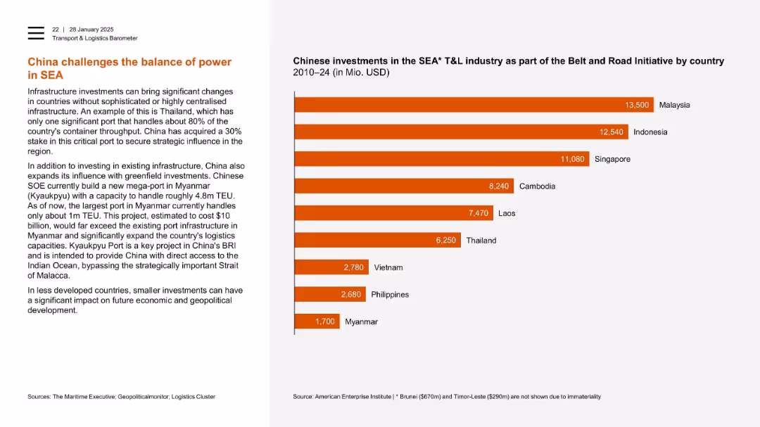
Left-aligned text with horizontal bar chart on right ranking investments by country.
Strategic Planning
Transportation & Logistics
China’s influence in Southeast Asia’s logistics is illustrated through investments in strategic ports. A chart ranks Malaysia, Indonesia, and Singapore as top recipients. Myanmar’s Kyaukpyu port is a key future asset, underscoring China’s regional ambitions.
SEA, Chinese investment, ports, Myanmar, Kyaukpyu, Thailand, infrastructure, geopolitical influence
false
Strategic Planning
Transportation & Logistics
Mixed Chart
PwC/Strategy&
Add to my slides
Remove from favorites
The slide presents a clear and structured column chart showcasing the trend of SEA-based dry powder funds over five years. The design is minimal with a distinct separation of sections and prominent titles.
Investment Analysis
Financial Services
This slide analyzes the growth of SEA-based dry powder funds from 2016 to 2020, indicating a positive trend and setting the stage for continued deal activity in 2021 and beyond. The $14B dry powder in the region signifies a strong investment landscape.
SEA, Dry Powder, Funds, Investment, Growth
false
Investment Analysis
Financial Services
Single Chart
Bain
Add to my slides
Remove from favorites
Column charts comparing GDP growth and inflation rates.
Market Analysis and Trends
Technology & Software
Compares SEA's economic resilience to other regions, useful in evaluating regional economic stability and investment potential.
SEA, GDP growth, inflation rates, economic stability, comparative analysis
false
Market Analysis and Trends
Technology & Software
Multiple Chart
Bain
Add to my slides
Remove from favorites
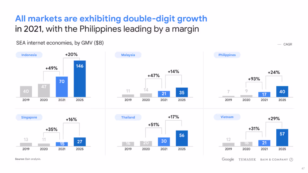
The slide has a title at the top, six paired bars (column charts) with projections for 2021, 2030 high case, and 2030 base case. Below each pair is the name of a Southeast Asian country. On the right side are bulleted points with projections for each country’s internet economy growth. The slide is clean, with a white background and blue elements.
Market Analysis and Trends
Technology & Software
This slide provides a comparison of the projected internet economy GMV in various Southeast Asian countries for 2030. It serves as an analytical tool for understanding the potential economic scale and growth in different SEA markets, making it useful for strategic planning and investment decisions targeting these regions' internet economies.
SEA, GMV, 2030, Internet Economy, Growth Projections, Indonesia, Malaysia, Philippines, Singapore, Thailand, Vietnam
false
Market Analysis and Trends
Technology & Software
Multiple Chart
Bain
Add to my slides
Remove from favorites
This slide displays column charts for internet economy sizes by country with projected growth. Colored bars represent different years.
Financial Performance
Financial Services
The slide shows historical and projected growth in Gross Merchandise Volume (GMV) for Southeast Asian internet economies. It highlights the Philippines' significant lead in growth, indicating a potential focus area for market investment and expansion strategies.
SEA, GMV, Growth, Internet, Economy
false
Financial Performance
Financial Services
Multiple Chart
Bain
Add to my slides
Remove from favorites
Slide with a stacked column chart showing the growth of the SEA Internet economy GMV from 2015, projecting significant growth by 2025, categorized by sectors like e-Commerce and Online Travel.
Financial Performance
Technology & Software
Presents the growth trajectory of the SEA Internet economy, highlighting resilience and future potential in various digital sectors, important for investment and economic forecasts.
SEA, Internet economy, GMV, growth, e-Commerce, Online Travel, forecast, resilience
false
Financial Performance
Technology & Software
Single Chart
Bain
Add to my slides
Remove from favorites
Slide features colored blocks diagramming key strategies for SEA's Net Zero journey, including energy transition and nature valuation, with supportive icons.
Strategic Planning
Environmental Services & Sustainability
Outlines strategic initiatives for achieving Net Zero in SEA, focusing on energy, agriculture, and waste management, useful for environmental strategists and policy makers.
SEA, Net Zero, strategy, energy transition, nature valuation, waste management, diagram, strategic planning, icons
false
Strategic Planning
Environmental Services & Sustainability
Pillar
Bain
Add to my slides
Remove from favorites
Showcases multiple corporate profiles detailing their sustainability commitments and strategies with visual aids like logos and icons.
Market Analysis and Trends
Environmental Services & Sustainability
Details the sustainability strategies and commitments of leading SEA companies in their journey to Net Zero, targeting corporate strategists and sustainability advocates.
SEA, Net Zero, sustainability, corporate strategies, case studies, visual aids, profiles, commitments, corporate
false
Market Analysis and Trends
Environmental Services & Sustainability
Table
Bain
Add to my slides
Remove from favorites
Includes column charts and bar graphs detailing the growth and segmentation of SEA’s carbon market, highlighted with annotations for clarity.
Market Analysis and Trends
Environmental Services & Sustainability
Analyzes the growth trends of the voluntary carbon market in SEA, emphasizing forestry credits and future projections, useful for investors and policy makers in environmental sectors.
SEA, carbon market, growth, voluntary, forestry credits, projections, column charts, bar graphs, annotations, investment
false
Market Analysis and Trends
Environmental Services & Sustainability
Multiple Chart
Bain
Add to my slides
Remove from favorites
Slide presents multiple bar graphs. Color-coded elements distinguish different data sets and regions. Clear, structured layout with annotations.
Market Analysis and Trends
Environmental Services & Sustainability
This slide analyzes South East Asia's climate commitments compared to global benchmarks using graphs showing emissions changes, carbon pricing, and corporate climate ambitions. Aimed at environmental policy analysts.
SEA, climate, emissions, carbon pricing, NDC, corporate ambitions, global comparison, bar graphs, column charts, map
false
Market Analysis and Trends
Environmental Services & Sustainability
Multiple Chart
Bain
Add to my slides
Remove from favorites
This slide has a column chart illustrating the deal values for SEA, with a distinction between unicorn and other deals, as well as the number of deals annually and for half-years. It features a clear title and key points in a side text block.
Market Analysis and Trends
Financial Services
Analyzes the deal landscape in Southeast Asia, noting a significant increase in deal values and the influx of global capital. It comments on the positive outlook due to tech company activities, enhancing investor confidence in the region.
SEA, deal value, unicorn, global capital, investment confidence
false
Market Analysis and Trends
Financial Services
Single Chart
Bain
Add to my slides
Remove from favorites
Previous
Next
You don't have any favorites yet.
Please wait loading your favorites slides...
Create a FREE account to continue browsing
Receive Instant Access to 1,000+ slides from companies like McKinsey, Google, and Goldman Sachs
First Name
Last Name
Email
Password
I agree to all
Terms & Privacy Policy
Thank you! Your submission has been received!
Oops! Something went wrong while submitting the form.
Have an account?
Sign in
Upgrade to PRO to Save slides
Advanced Search and Filters
Access to 15,000+ slides
Access to Category Pages
Save/Bookmark Slides
PowerPoint Template Library
Pick a Plan
MONTHLY
$12/month
Billed every month, Cancel anytime.
YEARLY
$9/year
Billed $108 annually, Cancel anytime.
Checkout for $12/month
Checkout for $108/yr
Secured by Stripe | AES-256 bit encryption