My Account
My Slides
Search by Category
Pricing
Templates
View All Templates
Download Template Slides
✦ AI Search
Feedback
Login
Logout
Get Started
Browse all Slides
Browse all Slides
Create a FREE Account
Instant access to 1,000+ real slides from top companies like McKinsey, BCG, Goldman Sachs, Google and many more!
First Name
Last Name
Email
Password
I agree to all
Terms & Privacy Policy
Thank you! Your submission has been received!
Oops! Something went wrong while submitting the form.
Have an account?
Sign in
Saved Slides
Total No. of slides saved
0
↻ Refresh
✖ Clear all
Contains column charts showcasing France's strengths and weaknesses in workforce qualification and cost compared to other European countries.
Operational Efficiency
Professional Services
Analyzes how France stands in terms of workforce qualifications and cost efficiency, aiding companies in strategic workforce planning.
Workforce Qualification, Cost Efficiency, European Comparison, Strategic Planning
false
Operational Efficiency
Professional Services
Single Chart
Bain
Add to my slides
Remove from favorites
Includes a column chart depicting workforce trends over recent years, accompanied by quotes from sector leaders.
Human Resources and Talent Management
Professional Services
Discusses the stability and growth projections of workforces across industries, aiding HR planning and workforce development strategies.
Workforce Stability, Sector Growth, Temporary Workers, HR Planning
false
Human Resources and Talent Management
Professional Services
Mixed Chart
Bain
Add to my slides
Remove from favorites
Features a stacked column chart displaying changes in employment requirements by industry from 2011 to 2030.
Operational Efficiency
Industrial & Manufacturing
Illustrates fluctuations in workforce needs over two decades, highlighting industry responses to technological and market changes.
Workforce Trends, 2030, Industry Changes, Employment Fluctuations, Technological Impact, Market Response, Operational Efficiency
false
Operational Efficiency
Industrial & Manufacturing
Single Chart
BCG
Add to my slides
Remove from favorites
Filled with pie charts and graphs, depicts salary expectations and job satisfaction levels across various sectors.
Human Resources and Talent Management
Professional Services
Discusses evolving workforce expectations regarding pay, crucial for financial planning and HR strategies in businesses.
Workforce Trends, Pay Dynamics, Salary Expectations, Job Satisfaction, HR Strategy
false
Human Resources and Talent Management
Professional Services
Multiple Chart
PwC/Strategy&
Add to my slides
Remove from favorites
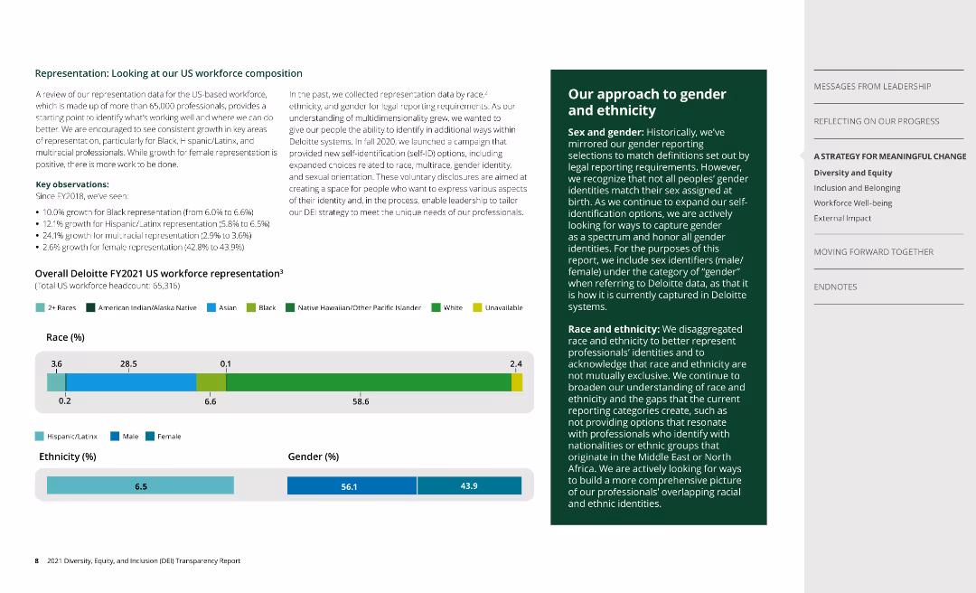
This slide includes bar charts depicting the racial, ethnic, and gender composition of the US workforce, with additional text explaining key observations and the company's approach to gender and ethnicity.
Human Resources and Talent Management
Professional Services
The slide analyzes the representation of various demographics within the US workforce, detailing racial, ethnic, and gender distribution, and outlines the company's efforts to broaden understanding and inclusivity through expanded self-ID options.
Workforce composition, diversity, gender, ethnicity, representation
false
Human Resources and Talent Management
Professional Services
Multiple Chart
Deloitte
Add to my slides
Remove from favorites
Contains tables, bar graphs, and a flowchart to discuss dynamic workforce adjustments, visually representing demand versus supply of staff functions over time with color-coded bars.
Human Resources and Talent Management
Professional Services
Analyzes workforce management strategies, managing capacity gaps, and adjusting capacity through measures like vacations, furloughs, or automation, with emphasis on proactive management.
Workforce management, Staff planning, Surplus management, Automation
false
Human Resources and Talent Management
Professional Services
Header Vertical
BCG
Add to my slides
Remove from favorites
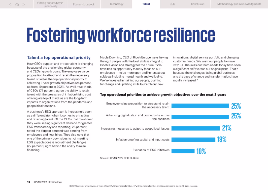
Bold headline, narrative text, CEO quote, and horizontal bar chart of operational priorities
Human Resources and Talent Management
Professional Services
Highlights talent attraction and retention as top CEO priorities. Charts show workforce-related goals (25%) and advancing digitalization (25%) are equally emphasized. Also touches on inflation, ESG, and geopolitics as relevant focus areas.
Workforce resilience, talent strategy, ESG, inflation, CEO priorities
false
Human Resources and Talent Management
Professional Services
Mixed Chart
KPMG
Add to my slides
Remove from favorites
An organizational chart with categories like 'Retail sales-people' and 'Food and beverage service workers', alongside icons representing different workplace activities.
Strategic Planning
Technology & Software
Maps out the automation potential in various job roles, focusing on activities that can be automated and the capabilities required for each, such as social and cognitive skills.
Workforce, Automation, Job Roles, Capabilities, Skills
false
Strategic Planning
Technology & Software
Table
McKinsey
Add to my slides
Remove from favorites
This slide displays a purple bar chart comparing the share of tasks that can be reinvented by technology across various industries. The layout is split into two columns, with the left showing the percentage of tasks and the right depicting the share of worked hours in 2021.
Strategic Planning
Professional Services
It analyzes the potential for technology-driven job reinvention across industries, presenting augmentation and automation prospects. This slide could be used to discuss workforce transformation trends and the impact of technology on employment across different sectors.
Workforce, Automation, Technology, Job Reinvention, Industry Comparison, Augmentation, Employment Trends, 2021, US Workers, Technology Impact
false
Strategic Planning
Professional Services
Single Chart
Accenture
Add to my slides
Remove from favorites
The slide includes bar charts and lists. Charts compare the top drivers for optimizing the workforce ecosystem, types of workers used by organizations, and key outcomes from implementing these strategies. The colors differentiate data between Ukraine and Global.
Human Resources and Talent Management
Professional Services
This slide analyzes the drivers and outcomes of optimizing the workforce ecosystem. It compares traditional employment structures to more flexible, skill-based arrangements, discussing the prevalence of freelancers, contractors, and outsourced teams, especially contrasting usage rates in Ukraine versus globally. It also discusses the resultant business outcomes like increased retention.
Workforce, Ecosystem, Flexibility, Skills, Global
false
Human Resources and Talent Management
Professional Services
Mixed Chart
Deloitte
Add to my slides
Remove from favorites
Includes a bar graph comparing employment roles in "FIGURE 4", bulleted text, and detailed analysis on the right side concerning work roles in the US.
Market Analysis and Trends
Technology & Software
The slide examines the redistribution of work roles in the United States from 2017 to 2028, highlighting the major increase in workers required in 'Empathy and Support' roles over the next 10 years.
Workforce, Empathy, Support, USA, Redistribution
false
Market Analysis and Trends
Technology & Software
Mixed Chart
Accenture
Add to my slides
Remove from favorites
The slide contains several data blocks with statistics on employer and workforce sentiments regarding returning to work post-pandemic. It includes bar charts and text descriptions to explain the trends.
Market Analysis and Trends
Professional Services
The slide examines trends in workforce and employer sentiments about returning to work after the pandemic. It highlights key statistics, such as the percentage of CEOs expecting remote work to continue and workers' preferences for remote work. This data is critical for planning future workplace strategies and policies.
Workforce, Employer Sentiment, Remote Work, Trends, Statistics
false
Market Analysis and Trends
Professional Services
Mixed Chart
Deloitte
Add to my slides
Remove from favorites
This slide features a series of column charts comparing challenges faced by German and Global organizations in preparing their workforce for Industry 4.0. The graphs illustrate disparities in skillset mismatches, attraction and retention of skilled talent, and the lack of necessary training programs.
Human Resources and Talent Management
Education & Training
Analyzes challenges in workforce development for Industry 4.0, showing German executives' perspectives versus global trends in skill mismatches, talent attraction, retention, and training initiatives.
Workforce, Industry 4.0, Talent, Training, Skills, Germany, Global, Challenges
false
Human Resources and Talent Management
Education & Training
Multiple Chart
Deloitte
Add to my slides
Remove from favorites
The slide presents three columns of bullet points with corresponding icons and a pie chart representing geographic distribution of employees. Each column has a different green header highlighting workforce, daily operations, and operational excellence, with a mix of bar charts and infographics.
Operational Efficiency
Financial Services
This slide outlines the IT landscape of Northern Trust, emphasizing the global workforce, daily operations like payments processed and security events, and the achievements in operational excellence including reliability and management of hardware and software. Designed to provide a snapshot of the company's technological capabilities and operational metrics.
Workforce, Payments, Security, Reliability, Management
false
Operational Efficiency
Financial Services
Mixed Chart
Morgan Stanley
Add to my slides
Remove from favorites
Circular layout representing a continuous process cycle.
Technology and Digital Transformation
Professional Services
Highlights Deloitte's approach to addressing workforce challenges with a three-part process: imagine, compose, activate.
Workforce, Solutions, Imagine, Compose, Activate
false
Technology and Digital Transformation
Professional Services
Diagram
Deloitte
Add to my slides
Remove from favorites
Contains a central text block with three surrounding icons representing Work, Workforce, and Workplace. Each icon is connected with a line to the central text, suggesting a relationship between the three dimensions.
Strategic Planning
Professional Services
Slide explores the deeply integrated dimensions of workforce transformation, addressing the work, workforce, and workplace. Useful for discussions on the integration of these elements in strategic business planning.
Workforce, Transformation, Strategy, Integration
false
Strategic Planning
Professional Services
Diagram
Deloitte
Add to my slides
Remove from favorites
Slide contains two sections: one with a green semi-transparent overlay with text, and another with icons representing various types of workers spiraling towards the word 'DISRUPTED'.
Market Analysis and Trends
Professional Services
Illustrates the transformation and disruption in the workforce with traditional employee roles compared to new forms of work like freelancers and robots. Useful for analyzing the evolving talent landscape.
Workforce, Transformation, Talent, Disruption
false
Market Analysis and Trends
Professional Services
Pillar
Deloitte
Add to my slides
Remove from favorites
A map highlighting Central American countries with icons indicating their roles in the semiconductor production value chain, such as assembly and test or manufacturing equipment.
Human Resources and Talent Management
Education & Training
The slide identifies Central American countries with skilled workforces capable of participating in the semiconductor production value chain, emphasizing roles in assembly, testing, and manufacturing.
Workforce, semiconductor, Central America, skills, map
false
Human Resources and Talent Management
Education & Training
Graphic
Deloitte
Add to my slides
Remove from favorites
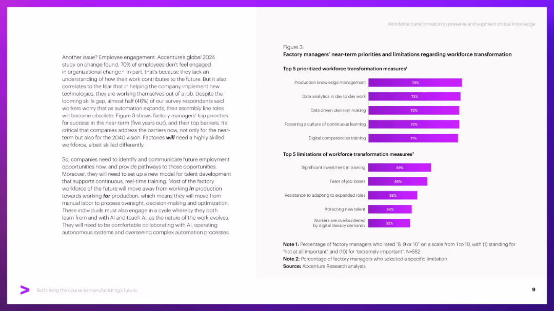
Two bar charts on the right, paragraph text on the left. Purple bars indicate percentages.
Human Resources and Talent Management
Industrial & Manufacturing
Discusses workforce transformation needs including skills training, data literacy, and knowledge management. Highlights barriers like cost, job fears, and adaptation resistance through factory manager survey results.
Workforce, transformation, upskilling, barriers, training, AI adaptation
false
Human Resources and Talent Management
Industrial & Manufacturing
Mixed Chart
Accenture
Add to my slides
Remove from favorites
The slide features a column chart showing the estimated change in working-age population from 2024 to 2033 by region, and a bar chart comparing average hourly wages by country for 2023.
Market Analysis and Trends
Financial Services
This slide analyzes changes in the working-age population and compares average hourly wages across countries, providing insights into labor market trends and economic productivity.
Working Age Population, Wages, Labor Market, Economic Productivity, Demographics
false
Market Analysis and Trends
Financial Services
Multiple Chart
JP Morgan
Add to my slides
Remove from favorites
The slide features bar charts detailing different levers in working capital management with activity levels and trends.
Financial Performance
Financial Services
Highlights levers in working capital management, such as inventory optimization and accounts receivable, showing trends for 2019.
Working Capital, Inventory, Accounts Receivable, Trends
false
Financial Performance
Financial Services
Single Chart
Roland Berger
Add to my slides
Remove from favorites
The slide has a title at the top, text in the middle, and a column chart at the bottom depicting changes in working situations or hours due to the pandemic.
Operational Efficiency
Professional Services
Provides data on changes in working situations due to the pandemic, with 43% reporting changes. Details include working from home, decrease/increase in hours, and furlough.
Working Situation, Pandemic, Survey, Work, Data
false
Operational Efficiency
Professional Services
Mixed Chart
IPSOS
Add to my slides
Remove from favorites
A pipeline diagram illustrating a working capital improvement approach with phases: Quick scan, Diagnostic, Design, and Implementation, accompanied by lists of specific actions and outcomes.
Operational Efficiency
Financial Services
The slide explains PwC's approach to improving working capital, detailing steps and examples in accounts receivable, inventory, and accounts payable.
Working capital, Quick scan, Diagnostic, Design, Implementation, Accounts receivable, Inventory, Accounts payable, Outcomes, Efficiency
false
Operational Efficiency
Financial Services
Header Vertical
PwC/Strategy&
Add to my slides
Remove from favorites
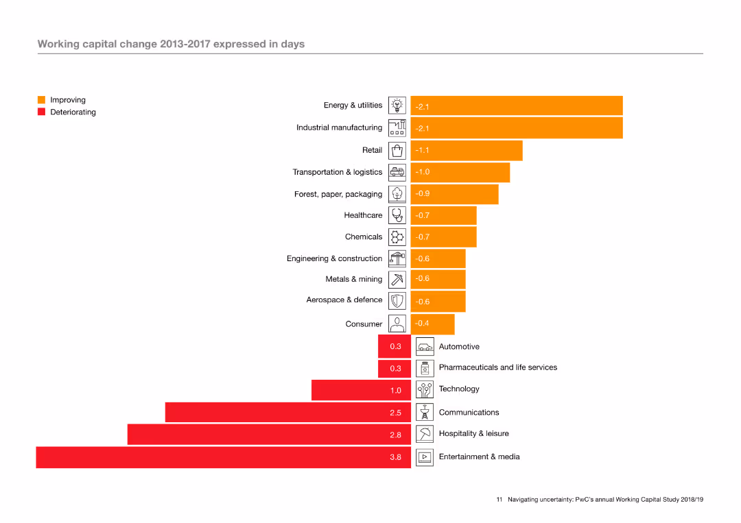
The slide features a column chart with horizontal bars indicating working capital change in various industries from 2013 to 2017. The bars are color-coded to show improving and deteriorating metrics. Icons representing different industries are aligned on the left of the chart.
Operational Efficiency
Industrial & Manufacturing
The slide analyzes working capital changes across different industries over a five-year period, using a column chart to illustrate which industries have seen improvements or deteriorations. The analysis highlights trends in operational efficiency within these sectors.
Working capital, operational efficiency, industry trends, improvement, deterioration, column chart
false
Operational Efficiency
Industrial & Manufacturing
Single Chart
PwC/Strategy&
Add to my slides
Remove from favorites
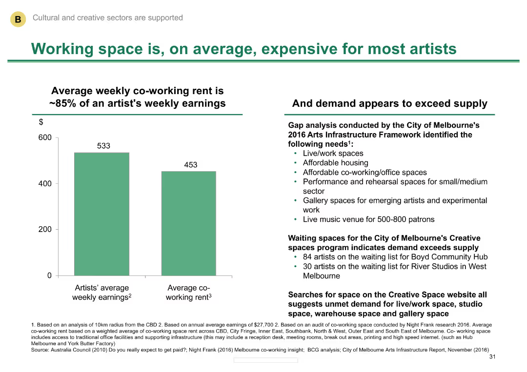
Column chart comparing average weekly earnings of artists with co-working rent
Market Analysis and Trends
Media & Entertainment
Illustrates the high cost of working space for artists in Melbourne and the demand exceeding supply.
Working space, cost, artists, Melbourne, demand
false
Market Analysis and Trends
Media & Entertainment
Mixed Chart
BCG
Add to my slides
Remove from favorites
The slide features a left panel with text about autonomy at work and a right panel with a horizontal bar chart depicting regional differences in providing autonomy to employees.
Human Resources and Talent Management
Professional Services
The slide discusses the importance of workplace autonomy, highlighting survey data on regional disparities in how much freedom employees are given to control their work and make decisions.
Workplace autonomy, employee freedom, regional disparities, survey data, control
false
Human Resources and Talent Management
Professional Services
Mixed Chart
PwC/Strategy&
Add to my slides
Remove from favorites
The slide includes various charts and graphs depicting changes in workplace dynamics, such as remote work percentages and engagement metrics.
Organizational Structure and Change
Professional Services
It discusses changes in the strategic procurement team's working environment, engagement, retention, diversity, and gender balance.
Workplace dynamics, remote work, engagement, retention, diversity, gender balance, procurement
false
Organizational Structure and Change
Professional Services
Multiple Chart
Kearney
Add to my slides
Remove from favorites
Balanced layout with visuals and bullet points detailing the workshop experience.
Technology and Digital Transformation
Professional Services
This slide is an invitation to Deloitte's lab experience, offering insights into future work trends and strategic workforce planning.
Workshop, Future of Work, Trends, Planning, Strategy
false
Technology and Digital Transformation
Professional Services
Header Horizontal
Deloitte
Add to my slides
Remove from favorites
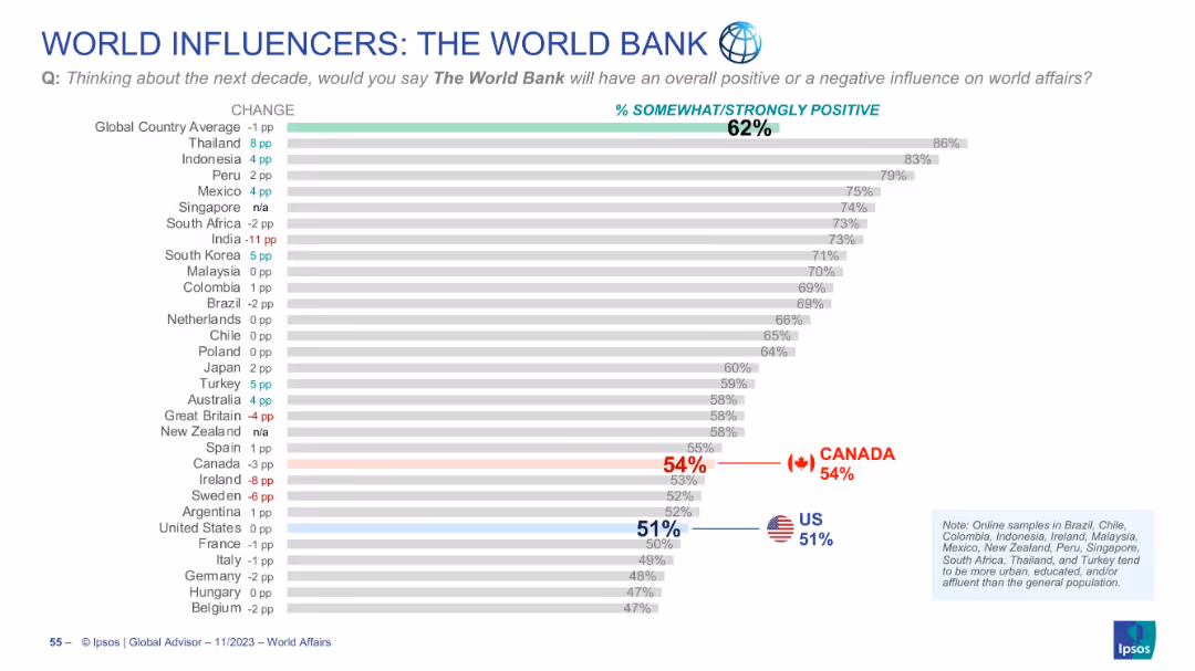
Horizontal bar graph showing opinions on The World Bank’s future global influence
Market Analysis and Trends
Government & Public Sector
Displays perceptions of The World Bank’s role in future global affairs. Canada scores 54%, slightly above the U.S. (51%), both under the global average of 62%. Trends vs last year are noted.
World Bank, global influence, development finance, Ipsos, perception, Canada, US, public opinion, world affairs, bar chart
false
Market Analysis and Trends
Government & Public Sector
Single Chart
IPSOS
Add to my slides
Remove from favorites
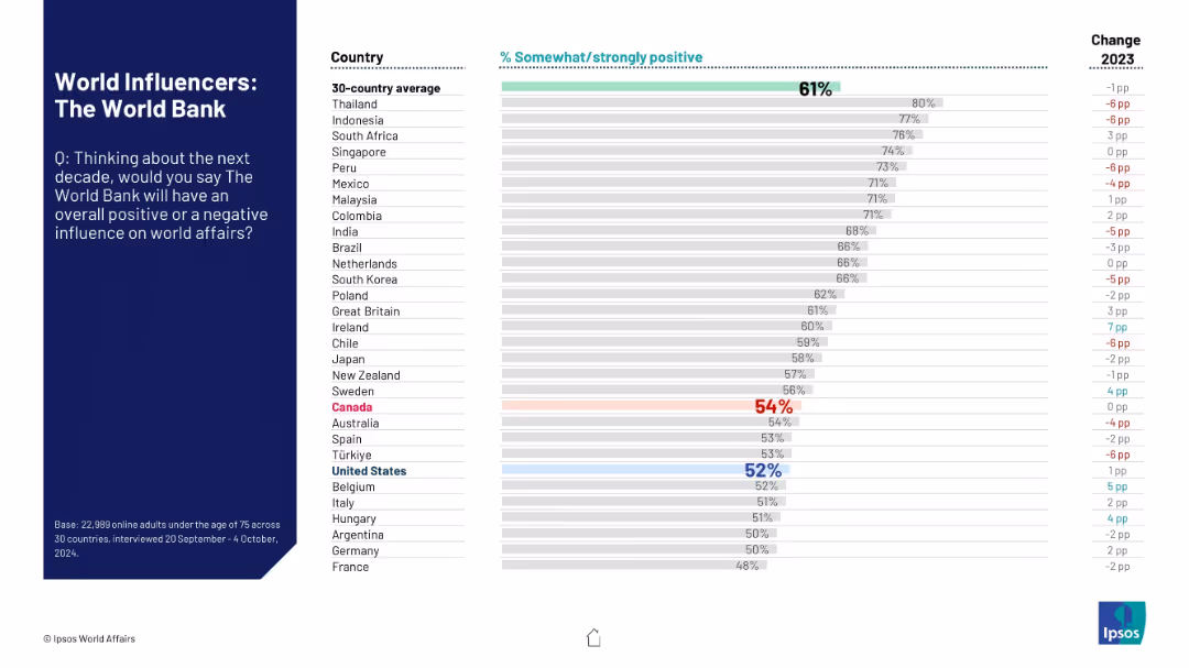
Consistent design with left panel for context and question; right side shows bar chart of public sentiment by country.
Market Analysis and Trends
Financial Services
The slide presents perceptions of the World Bank’s influence over the coming decade. Each country's positive sentiment is listed alongside change from the previous year, showing declining confidence in many regions.
World Bank, global perception, development finance, influence, Ipsos, sentiment analysis, country ranking, positive rating, 2024, trend
false
Market Analysis and Trends
Financial Services
Mixed Chart
IPSOS
Add to my slides
Remove from favorites
A comparative bar chart showing top concerns among Millennials and Gen Z before and after the pandemic, with categories like climate change and health care.
Market Analysis and Trends
Professional Services
This slide compares the primary concerns of Millennials and Gen Z before and after the pandemic, focusing on issues like climate change and health care.
World challenges, pandemic, Millennials, Gen Z, concerns, climate change, health care, comparison, global issues
false
Market Analysis and Trends
Professional Services
Multiple Chart
Deloitte
Add to my slides
Remove from favorites
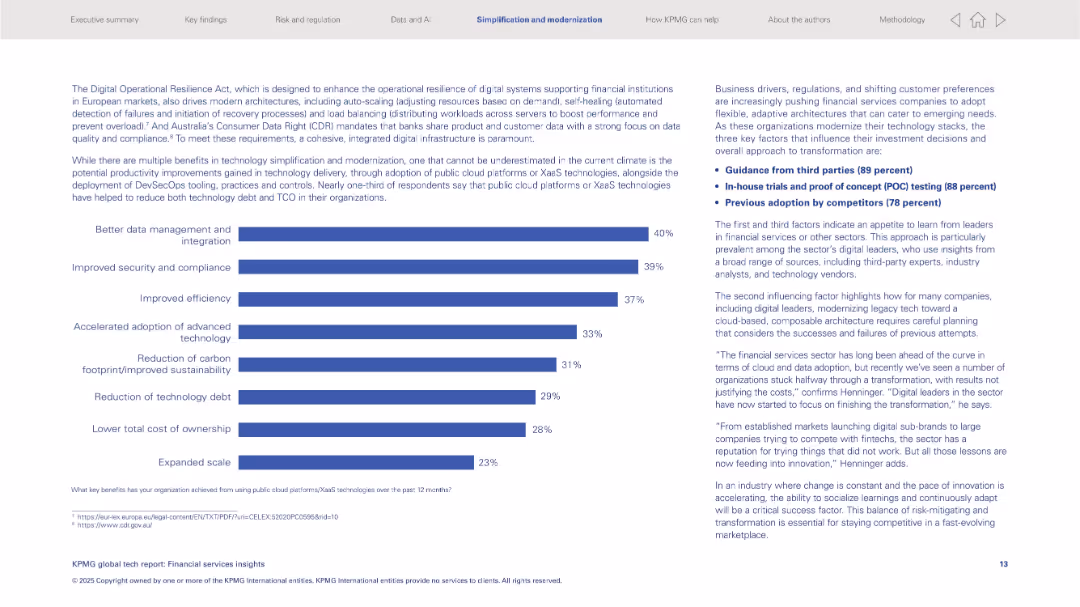
Left: horizontal bar graph listing tech benefits; right: text insights and key influencing factors.
Operational Efficiency
Financial Services
Discusses benefits from public cloud/XaaS like better data integration and security. Key transformation drivers include third-party guidance, in-house testing, and competitor adoption. Also addresses modernization of legacy tech stacks.
XaaS, cloud platforms, modernization, security, integration, third-party advice, financial sector
false
Operational Efficiency
Financial Services
Mixed Chart
KPMG
Add to my slides
Remove from favorites
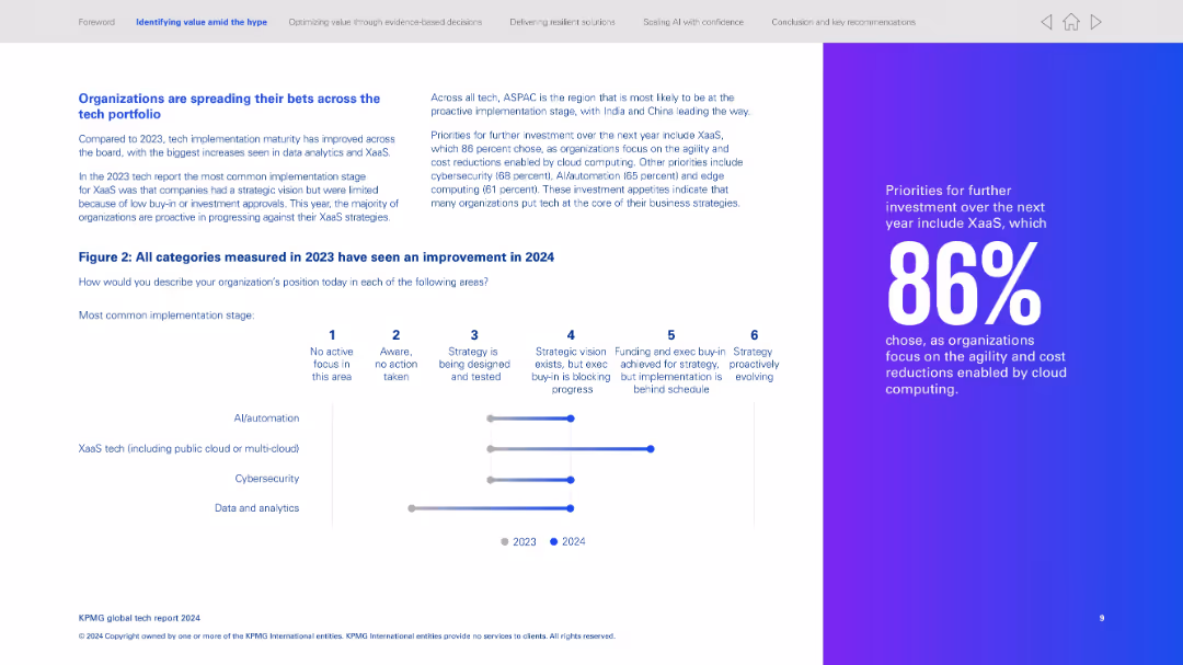
Left side explains improvement across tech categories; right side features a vertical progress bar chart. Far right has a bold statistic highlight.
Technology and Digital Transformation
Technology & Software
Organizations are maturing across tech categories, especially XaaS and data/analytics. Chart shows progress from 2023 to 2024 in four key tech areas. Notes ASPAC is leading in proactive implementation. Calls out 86% prioritizing XaaS for agility and cost savings.
XaaS, cloud, strategy evolution, tech maturity, AI, cybersecurity
false
Technology and Digital Transformation
Technology & Software
Mixed Chart
KPMG
Add to my slides
Remove from favorites
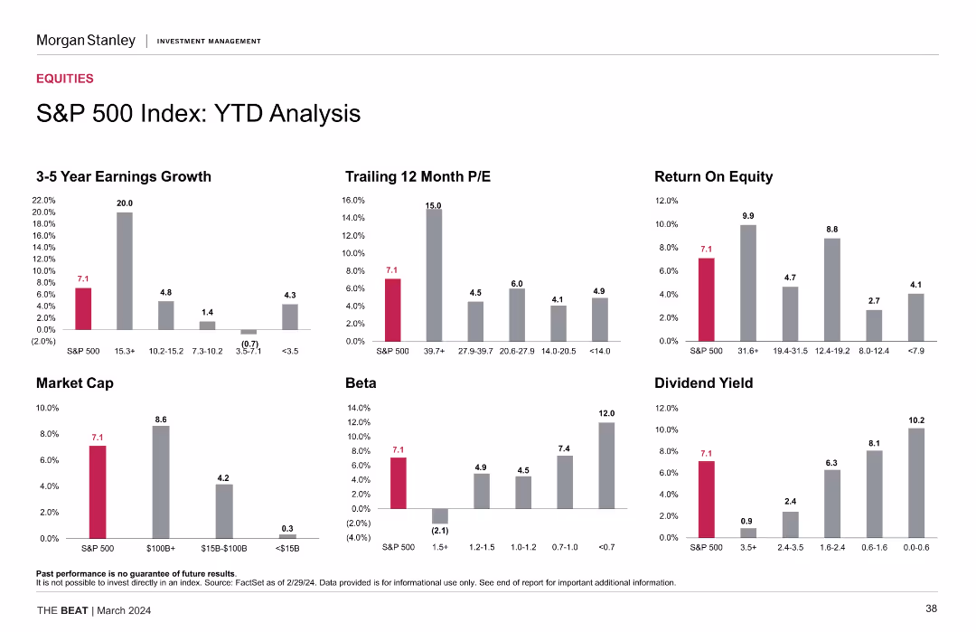
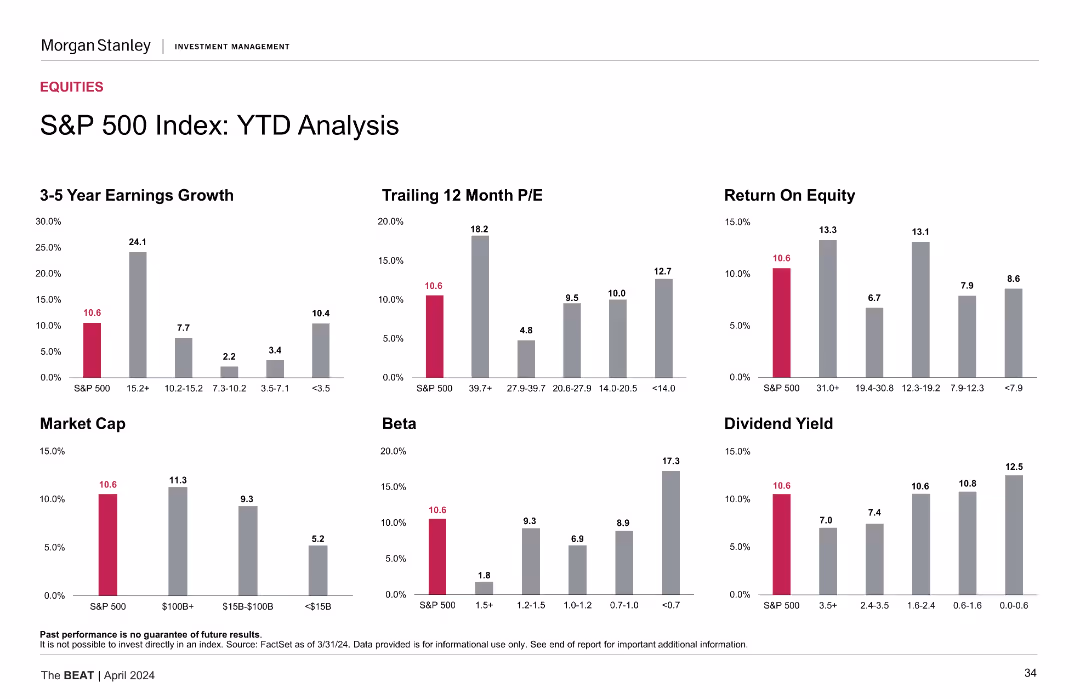
The slide includes multiple column charts that analyze the S&P 500 Index's year-to-date (YTD) performance. Metrics such as earnings growth, trailing 12-month P/E, return on equity, market cap, beta, and dividend yield are displayed in distinct colors.
Financial Performance
Financial Services
This slide details the YTD performance of the S&P 500 Index, presenting various financial metrics such as earnings growth, P/E ratio, return on equity, market cap, beta, and dividend yield to provide a comprehensive performance overview.
YTD analysis, S&P 500, financial metrics, earnings growth, market cap, P/E ratio, beta, dividend yield, return on equity
false
Financial Performance
Financial Services
Multiple Chart
Morgan Stanley
Add to my slides
Remove from favorites
Similar to the previous slide, this one also has multiple column charts but focuses on year-to-date (YTD) performance for the same metrics.
Market Analysis and Trends
Financial Services
The slide provides a year-to-date performance analysis of the S&P 500 index, including earnings growth, P/E ratios, ROE, market cap, beta, and dividend yield metrics.
YTD analysis, financial metrics, S&P 500, performance
false
Market Analysis and Trends
Financial Services
Multiple Chart
Morgan Stanley
Add to my slides
Remove from favorites
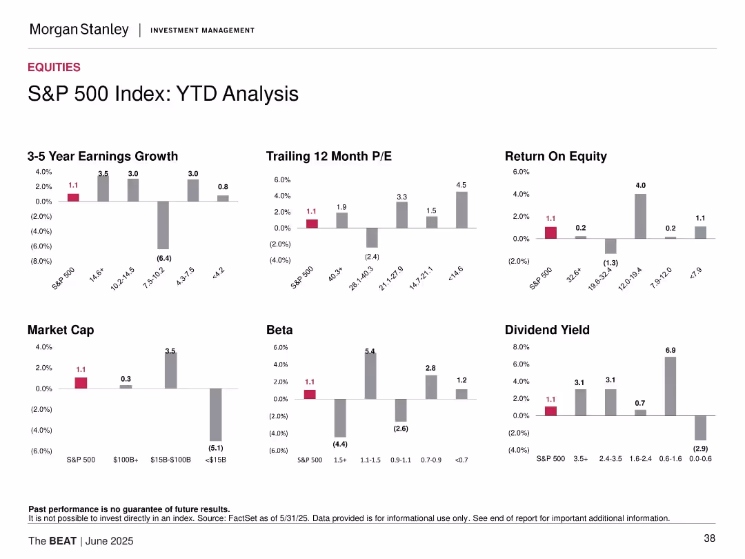
Similar grid to the previous slide but focuses on YTD data; includes earnings growth, ROE, and dividend yield trends.
Performance Metrics and KPIs
Financial Services
The slide examines year-to-date (YTD) performance across various factors, highlighting trends in earnings growth, valuation, and return on equity. It reveals weaker overall metrics compared to the 1-month analysis, with negative returns in several cohorts such as small cap and high beta stocks.
YTD performance, return analysis, ROE, valuation, beta groups, earnings trend, sector underperformance
false
Performance Metrics and KPIs
Financial Services
Multiple Chart
Morgan Stanley
Add to my slides
Remove from favorites
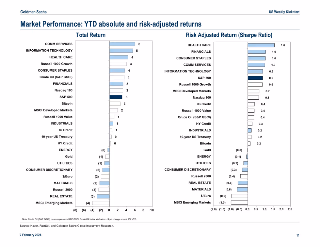
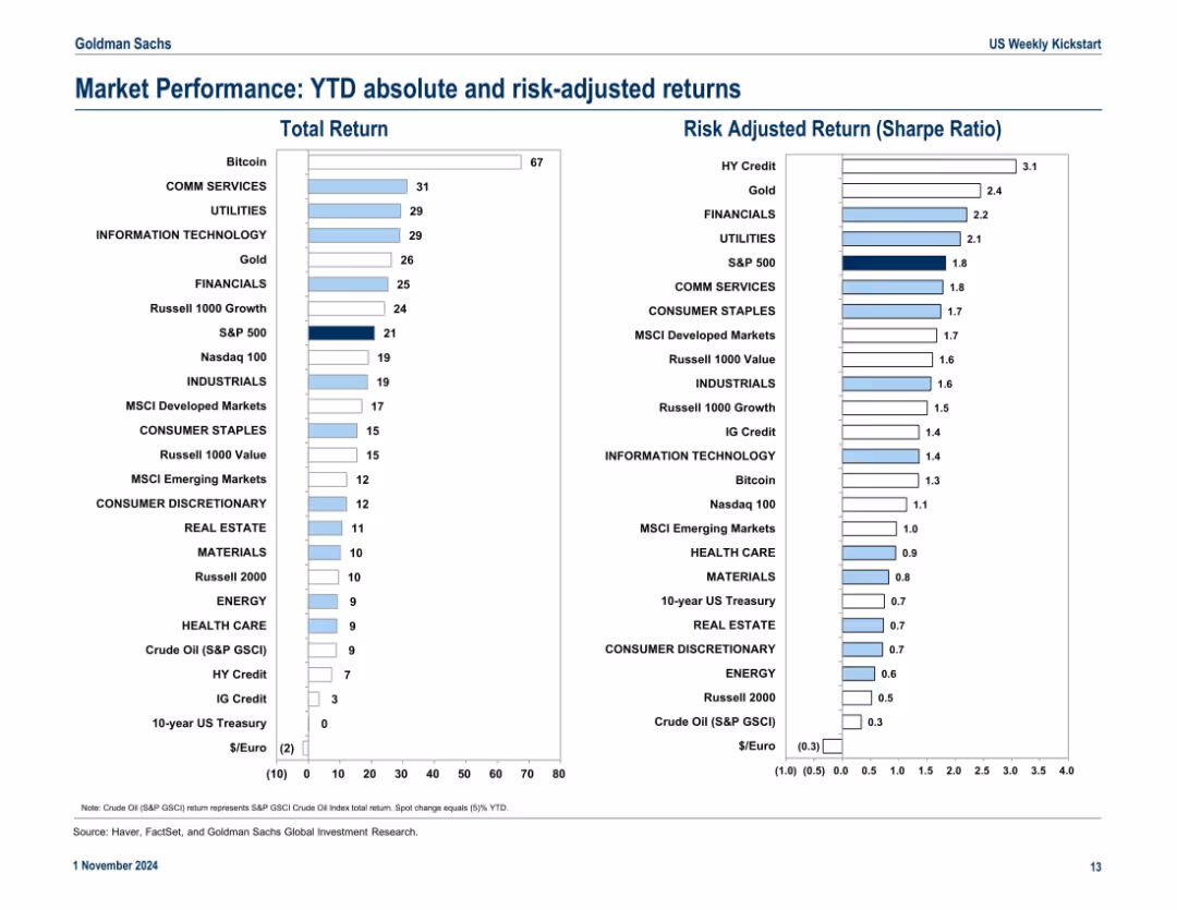
Split dual-column layout with horizontal bar charts showing Total Return (left) and Risk-Adjusted Return (Sharpe Ratio, right). Each bar represents a market sector or asset class. Color is used for emphasis, and returns are plotted numerically on the horizontal axis.
Financial Performance
Financial Services
This slide compares year-to-date absolute returns and Sharpe Ratios for various asset classes and sectors. Communication Services and Information Technology lead in total returns, while Health Care shows the highest Sharpe Ratio. MSCI Emerging Markets underperform in both metrics. The slide highlights which investments offer better return-to-risk tradeoffs.
YTD returns, Sharpe Ratio, market sectors, asset performance, volatility, risk-adjusted return, MSCI, S&P 500, Crude Oil, Bitcoin
false
Financial Performance
Financial Services
Multiple Chart
Goldman Sachs
Add to my slides
Remove from favorites
Dual bar chart layout comparing total and risk-adjusted returns for various assets and sectors; simple, color-coded format
Performance Metrics and KPIs
Financial Services
The slide ranks year-to-date (YTD) total and Sharpe ratio (risk-adjusted) returns across major sectors and asset classes. Bitcoin and Communication Services lead in total returns, while HY Credit and Gold top risk-adjusted performance.
YTD returns, Sharpe ratio, sector performance, asset classes, risk-adjusted return, Bitcoin
false
Performance Metrics and KPIs
Financial Services
Multiple Chart
Goldman Sachs
Add to my slides
Remove from favorites
Features two line charts: 'AAA Muni-to-Treasury Yield Ratios' and 'Credit Quality Spreads vs. AAA'. Both charts include timelines from 2014 to 2024, color differentiation for clarity, and a data table for current and historical metrics in a clean and organized manner.
Market Analysis and Trends
Financial Services
This slide offers an update on the municipal bond market, focusing on yield ratios and credit quality spreads. Aimed at investors or analysts, it provides a clear visual representation of the market's condition, comparing municipal bonds to treasury yields and assessing credit quality differences, crucial for strategic financial planning or market forecasting.
Yield Ratios, Credit Spreads, Municipal Bonds, Treasury, AAA
false
Market Analysis and Trends
Financial Services
Multiple Chart
Morgan Stanley
Add to my slides
Remove from favorites
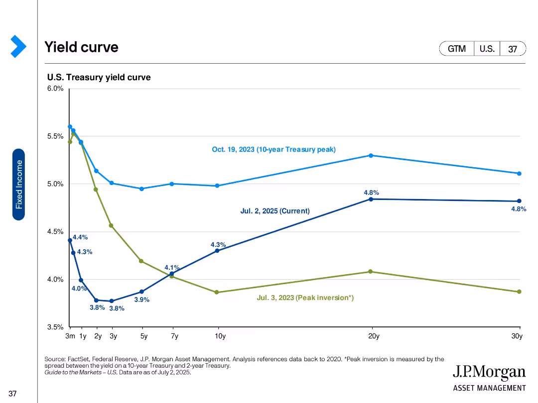
Line chart comparing U.S. Treasury yield curves across three dates with labeled peaks and inversions.
Market Analysis and Trends
Financial Services
This slide compares U.S. Treasury yield curves at three points: July 2, 2025, October 19, 2023 (10-year peak), and July 3, 2023 (peak inversion). It highlights changes in short- and long-term interest rates, showing trends in fixed income expectations.
Yield curve, Treasury rates, interest rates, peak inversion, bond market, fixed income, economic outlook, J.P. Morgan, U.S. yields, duration
false
Market Analysis and Trends
Financial Services
Single Chart
JP Morgan
Add to my slides
Remove from favorites
The slide features two sections; the left side has a scatter plot titled 'Yield/Duration' with various investment types plotted. The right side shows a column chart titled '10-Year Correlation with U.S. Treasuries' indicating correlation values. The design is professional, with a color scheme of purple and blue, and the graphs are clearly labeled.
Risk Assessment and Management
Financial Services
The left graph compares the yield to duration of various loans and securities. The right bar chart displays the 10-year correlation of different investment types with U.S. Treasuries, providing insight into interest rate risk and investment strategy.
Yield, Duration, Rate Risk, Credit Exposure, Correlation, U.S. Treasuries, Investment, Floating-Rate Loan, High-Yield Corp, EM Sovereign
false
Risk Assessment and Management
Financial Services
Multiple Chart
Morgan Stanley
Add to my slides
Remove from favorites
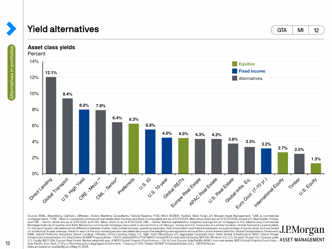
The slide displays a column chart of asset class yields in percentage terms. Different colors represent equities, fixed income, and alternatives, with the highest yields shown for direct lending and global transport.
Investment Analysis
Financial Services
This slide compares asset class yields, highlighting the percentage yields for different investment types such as equities, fixed income, and alternatives, with a focus on the highest yielding options available as of the current date.
Yields, Asset Classes, Equities, Fixed Income, Alternatives
false
Investment Analysis
Financial Services
Single Chart
JP Morgan
Add to my slides
Remove from favorites
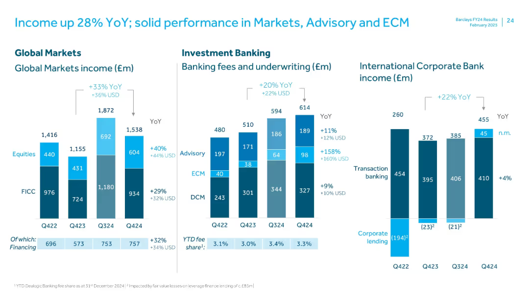
Three-panel bar chart layout with segmented color-coded bars; includes YoY comparisons, labeled categories (Global Markets, Investment Banking, Corporate Bank), and numeric callouts; clean white background with blue accents.
Financial Performance
Financial Services
The slide presents income performance for Q4 2024, showing YoY growth across Global Markets (+33%), Investment Banking (+20%), and International Corporate Bank (+22%). Equities, FICC, and fees are broken out, highlighting strong Equities and Advisory growth.
YoY growth, equities, FICC, advisory, ECM, corporate bank, income, Q4 2024
false
Financial Performance
Financial Services
Multiple Chart
Barclays
Add to my slides
Remove from favorites
This slide has a colorful and dynamic layout with pie charts, icons, and significant percentages displayed, highlighting year-over-year growth in YouTube watch time, with a particular emphasis on mobile device usage.
Market Analysis and Trends
Technology & Software
The slide details the three main factors contributing to the increase in YouTube watch time: non-English content, local language searches, and mobile-first content. It showcases the impact of these forces with the aid of visual data representations.
YouTube, growth, mobile, local language, watch time
false
Market Analysis and Trends
Technology & Software
Linear Flow
BCG
Add to my slides
Remove from favorites
The slide includes pie charts showing the development of self-confidence, presentation skills, and business networking skills among participants.
Strategic Planning
Education & Training
The slide describes the Your Future program, focusing on supporting young people in transitioning from school to work through training and coaching.
Your Future, self-confidence, training, coaching
false
Strategic Planning
Education & Training
Multiple Chart
EY
Add to my slides
Remove from favorites
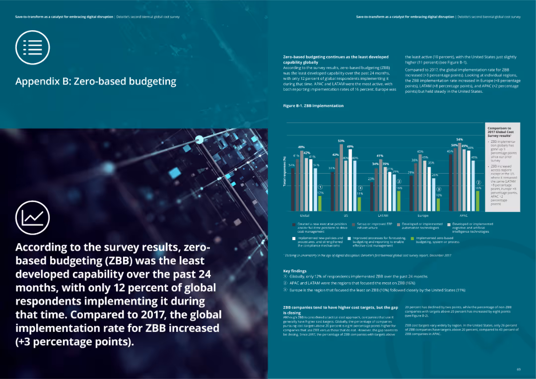
The slide includes a column chart showing ZBB implementation rates globally and by region, with key findings and insights related to ZBB practices.
Strategic Planning
Financial Services
Overview of Zero-based budgeting (ZBB) implementation and key findings from the survey. Highlights the least developed capability globally and its growth.
ZBB, budgeting, financial planning, implementation, insights
false
Strategic Planning
Financial Services
Mixed Chart
Deloitte
Add to my slides
Remove from favorites
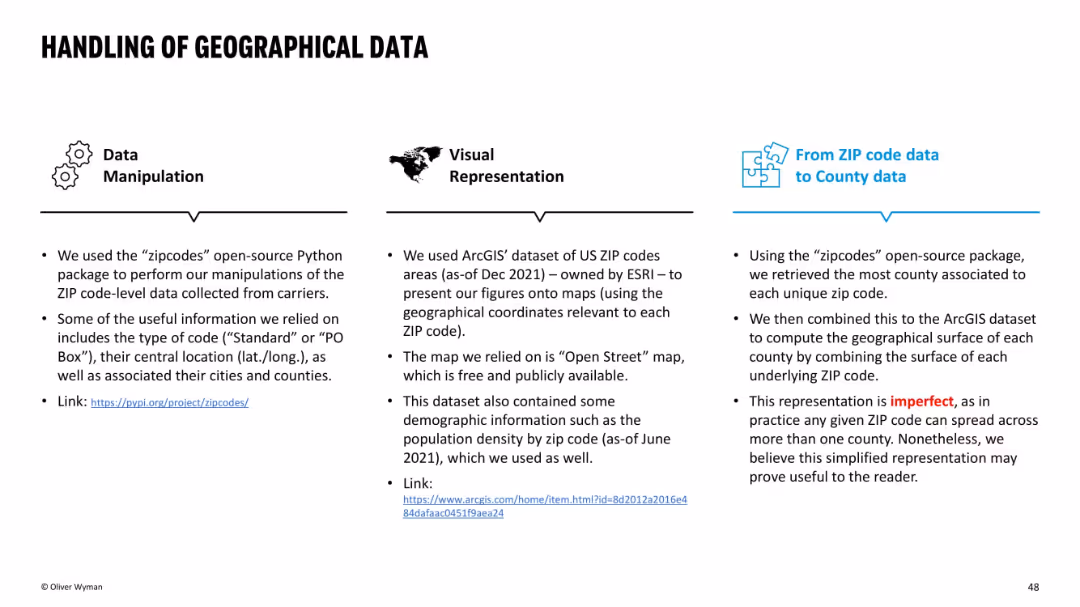
Three-column layout with icons atop each section: Data Manipulation, Visual Representation, and ZIP-to-County mapping. Mostly textual with clean blue and black design.
Regulatory and Compliance
Environmental Services & Sustainability
This slide explains the methodology used to convert ZIP-level insurance data to county-level insights using open-source tools and ESRI datasets. It acknowledges imperfections in geographic mapping due to ZIP codes spanning multiple counties, yet supports the simplified structure as useful for analysis.
ZIP code, county, data handling, mapping, ArcGIS, open-source, methodology, insurance, limitations
false
Regulatory and Compliance
Environmental Services & Sustainability
Pillar
Oliver Wyman
Add to my slides
Remove from favorites
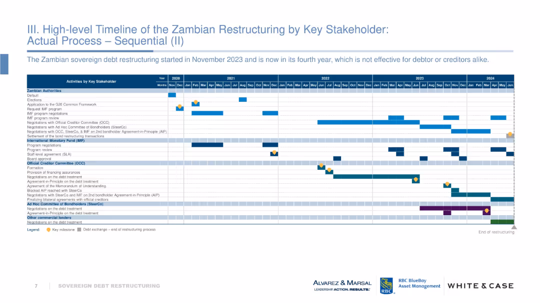
Gantt-style timeline tracking actions by Zambian authorities, IMF, OCC, bondholders, etc., from 2020–2024. Includes milestones and activity bars.
Regulatory and Compliance
Government & Public Sector
Outlines the chronological sequence of Zambia’s sovereign debt restructuring process. Highlights prolonged negotiations and inefficiencies. Visual tracks progress across multiple stakeholders. Notes the lack of effective resolution four years into the process.
Zambia, debt restructuring, IMF, OCC, timeline, sovereign debt, negotiation delays
false
Regulatory and Compliance
Government & Public Sector
Table
Alvarez & Marsal
Add to my slides
Remove from favorites
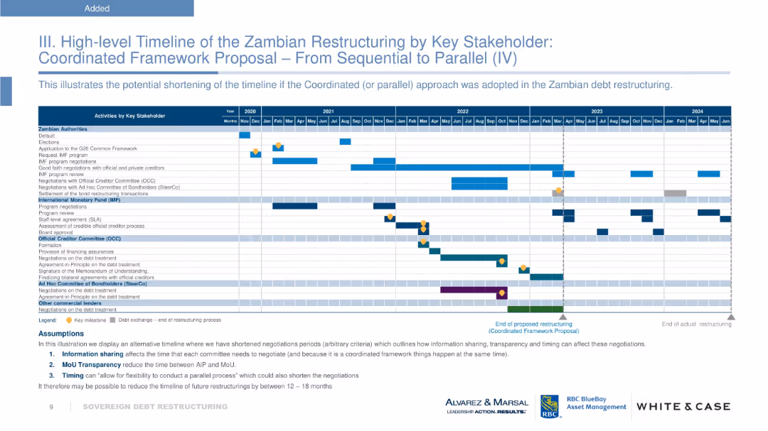
Gantt chart layout with horizontal bars, milestones, and color coding per stakeholder. Uses a calendar grid from 2020 to 2024. Bottom section includes a legend and bullet-pointed assumptions. Corporate branding along the bottom.
Strategic Planning
Financial Services
The slide provides a high-level timeline showing the restructuring process of Zambia's sovereign debt under a coordinated framework. It compares sequential vs. parallel negotiation phases involving multiple stakeholders like IMF, bondholders, and official creditors. The aim is to demonstrate potential time savings of 12–18 months.
Zambia, sovereign debt, restructuring, IMF, bondholders, coordinated framework, timeline, milestones, assumptions
false
Strategic Planning
Financial Services
Table
Alvarez & Marsal
Add to my slides
Remove from favorites
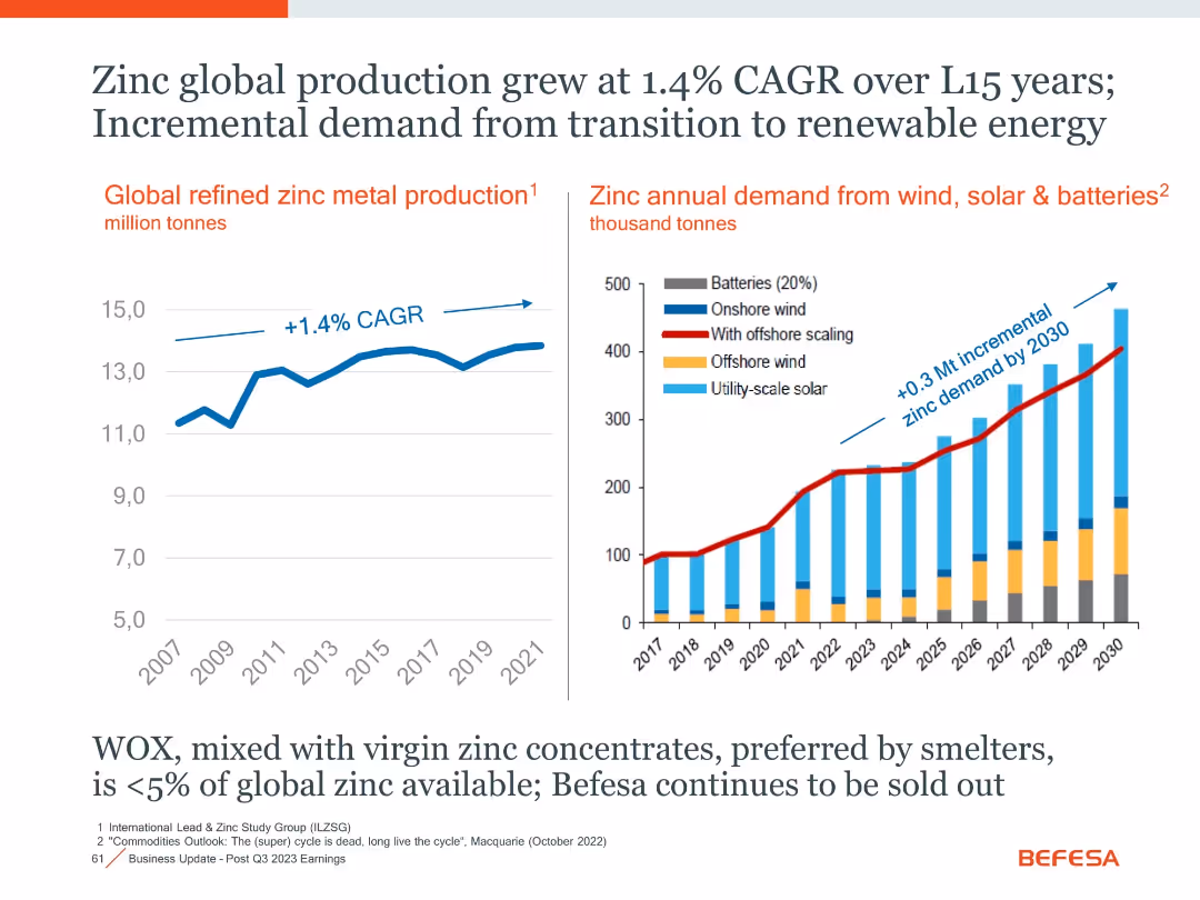
Two-panel layout with line and stacked bar charts, annotated CAGR and projections
Market Analysis and Trends
Industrial & Manufacturing
The slide presents historical and projected data on zinc production and its growing demand, especially from renewable energy sectors like wind, solar, and batteries.
Zinc, Renewable Energy, CAGR, Demand Growth, Batteries, Solar, Wind
false
Market Analysis and Trends
Industrial & Manufacturing
Multiple Chart
Goldman Sachs
Add to my slides
Remove from favorites
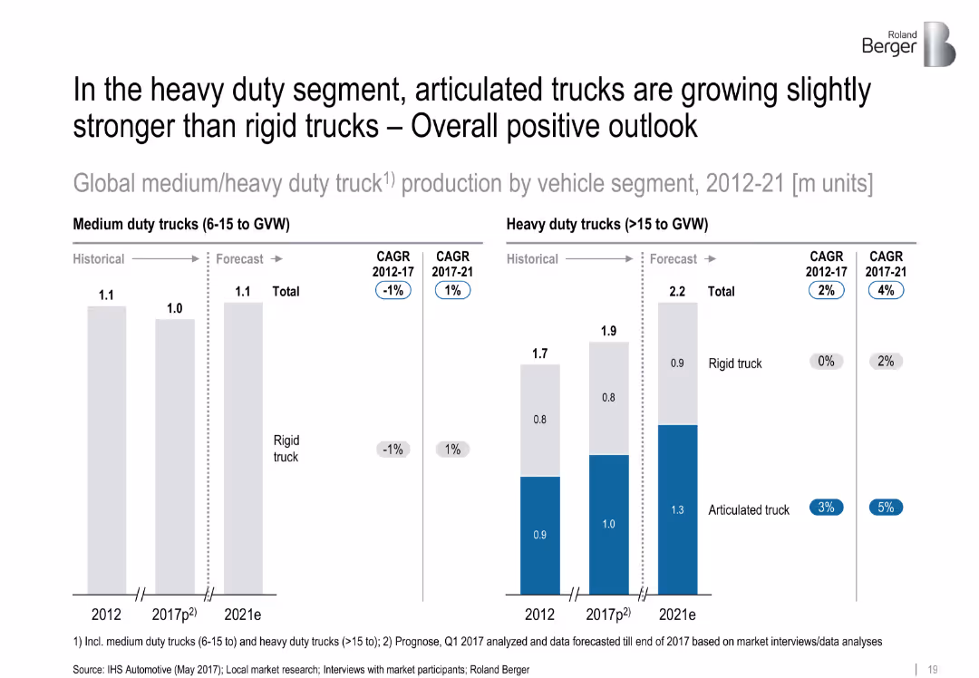
Side-by-side bar charts split by truck type and time period. Forecast period clearly indicated with CAGR metrics.
Product and Service Analysis
Transportation & Logistics
The chart compares growth trends in medium and heavy-duty truck production, emphasizing the rising preference for articulated trucks over rigid trucks in the forecast period (2017–2021).
['articulated trucks', 'rigid trucks', 'segment analysis', 'heavy duty', 'vehicle production', 'CAGR', 'forecast']
false
Product and Service Analysis
Transportation & Logistics
Multiple Chart
Roland Berger
Add to my slides
Remove from favorites
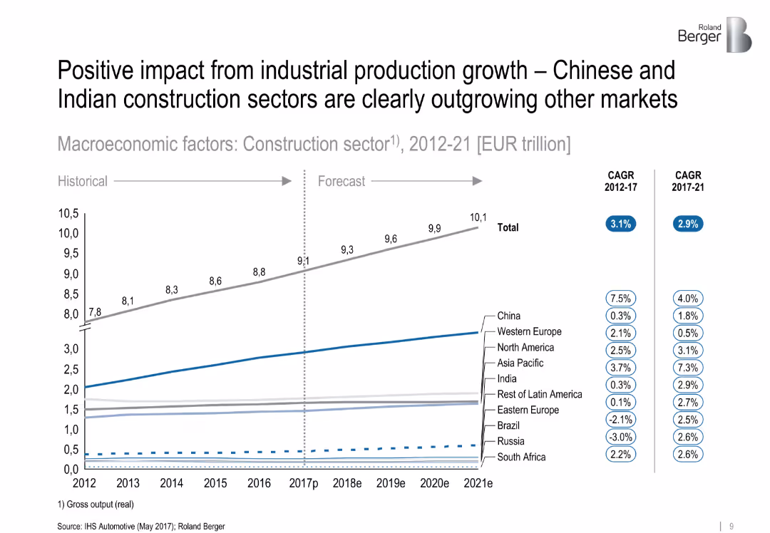
Line chart showing historical and forecasted construction sector output by region (2012–2021), with CAGR figures in side legends. Clean layout with subtle color coding and segmentation by region.
Market Analysis and Trends
Industrial & Manufacturing
The slide presents growth projections for the global construction sector, highlighting that China and India are significantly outpacing other regions. It includes CAGR data from 2012–2017 and forecasts for 2017–2021, showing clear segmentation by geographic region.
['construction', 'industrial production', 'growth forecast', 'China', 'India', 'CAGR', 'regional comparison', 'market trend']
false
Market Analysis and Trends
Industrial & Manufacturing
Single Chart
Roland Berger
Add to my slides
Remove from favorites
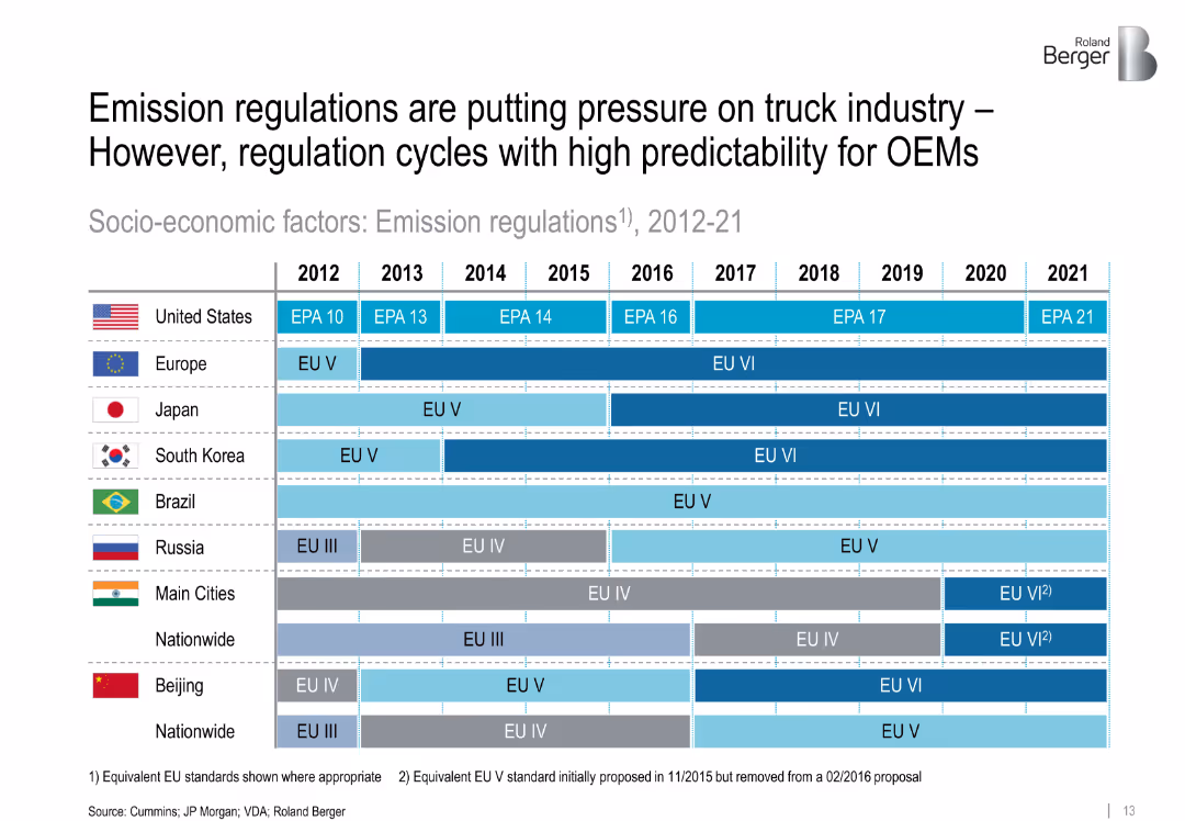
Gantt-style timeline comparing emission regulation timelines across multiple countries from 2012–2021. Color-coded by standard level.
Regulatory and Compliance
Transportation & Logistics
This slide details emission regulations in key global regions from 2012–2021. It shows how stricter environmental standards impact OEMs, emphasizing regulatory predictability and geographic differences in policy rollouts.
['emissions', 'regulations', 'trucking', 'compliance', 'OEM', 'regional standards', 'environment', 'EU', 'EPA']
false
Regulatory and Compliance
Transportation & Logistics
Table
Roland Berger
Add to my slides
Remove from favorites
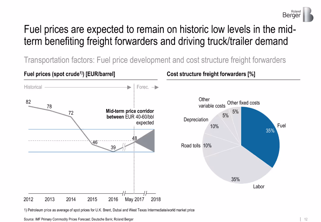
Split chart: left shows historical oil prices with a forecast corridor; right shows pie chart of freight forwarder cost structure. Minimalist style with strong visual cues.
Operational Efficiency
Energy & Utilities
The slide forecasts oil prices staying between €40–60/bbl, benefitting freight forwarders. It also shows a cost breakdown, where fuel and labor make up the majority of expenses, driving demand for efficient freight solutions.
['fuel prices', 'freight forwarding', 'cost structure', 'oil forecast', 'energy costs', 'logistics', 'operational cost']
false
Operational Efficiency
Energy & Utilities
Multiple Chart
Roland Berger
Add to my slides
Remove from favorites
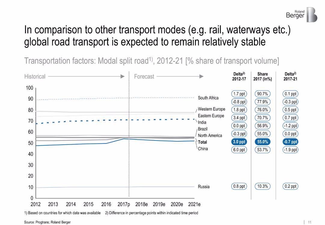
Line chart showing percentage share of transport volume via road from 2012–2021, comparing regions. Horizontal layout with data labels and shift indicators.
Market Analysis and Trends
Transportation & Logistics
The chart illustrates the share of road transport compared to other modes like rail or waterways. While total road usage remains stable globally, regional differences are shown, particularly China's increase and India's steady share.
['modal split', 'road transport', 'market share', 'China', 'India', 'logistics', 'transport modes', 'CAGR']
false
Market Analysis and Trends
Transportation & Logistics
Single Chart
Roland Berger
Add to my slides
Remove from favorites
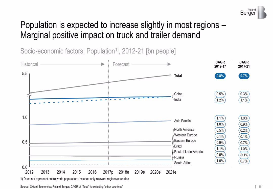
Line chart displaying population growth trends by region from 2012–2021, with CAGR metrics. Organized by country/region, clean layout.
Market Analysis and Trends
Government & Public Sector
The slide projects population growth across various regions, noting modest increases. The implication is a marginal positive effect on logistics and truck/trailer demand due to expanding consumer bases.
['population', 'demographics', 'growth trend', 'logistics impact', 'market drivers', 'regional analysis', 'forecast']
false
Market Analysis and Trends
Government & Public Sector
Single Chart
Roland Berger
Add to my slides
Remove from favorites
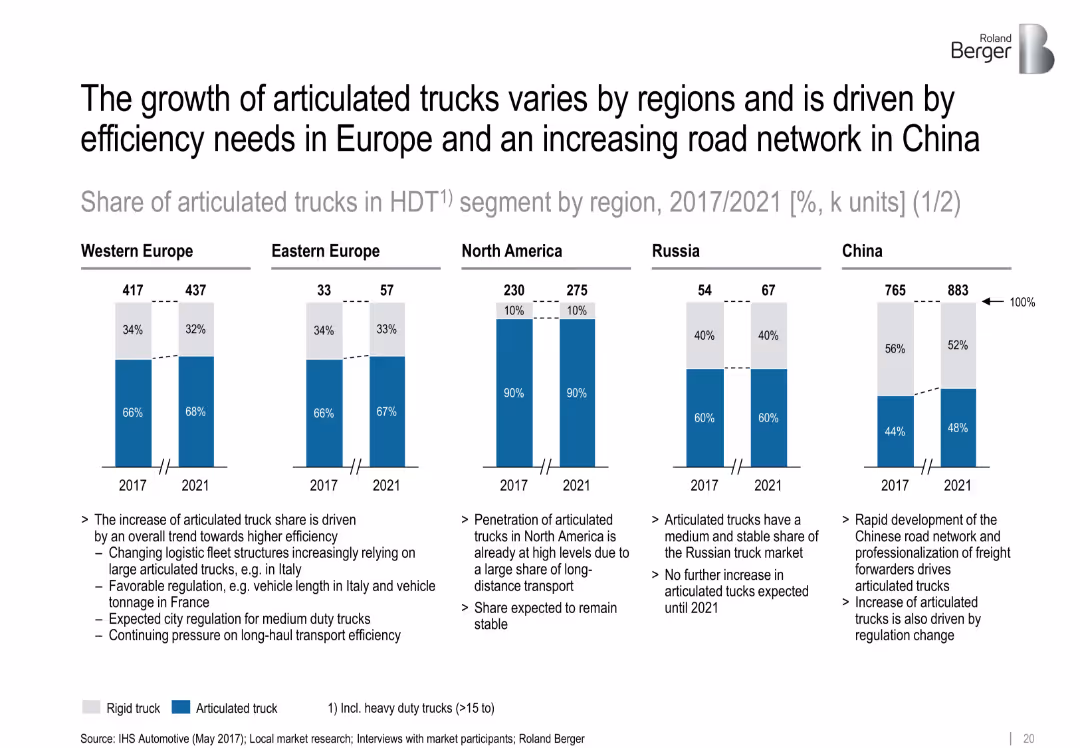
Five regional bar charts with split percentages for articulated vs rigid trucks in 2017 and 2021. Supporting notes below each graph.
Customer and Market Segmentation
Transportation & Logistics
This slide examines the regional differences in articulated truck share, highlighting Europe's efficiency-driven growth and China’s network-driven increase. North America remains stable with high penetration.
['regional trends', 'articulated trucks', 'segmentation', 'logistics', 'fleet efficiency', 'market share', 'forecast']
false
Customer and Market Segmentation
Transportation & Logistics
Mixed Chart
Roland Berger
Add to my slides
Remove from favorites
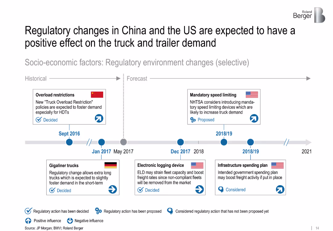
Timeline with icons indicating regulatory events and their impact on demand. Visual coding for positive/negative effects and decision status.
Strategic Planning
Transportation & Logistics
This timeline outlines selected regulatory changes between 2016 and 2021 in China, the US, and Germany. These include overload restrictions, speed limiting proposals, and infrastructure plans that influence heavy truck and trailer demand.
['regulations', 'truck demand', 'policy', 'China', 'US', 'timeline', 'logistics', 'forecast', 'strategic planning']
false
Strategic Planning
Transportation & Logistics
Uncategorized
Roland Berger
Add to my slides
Remove from favorites
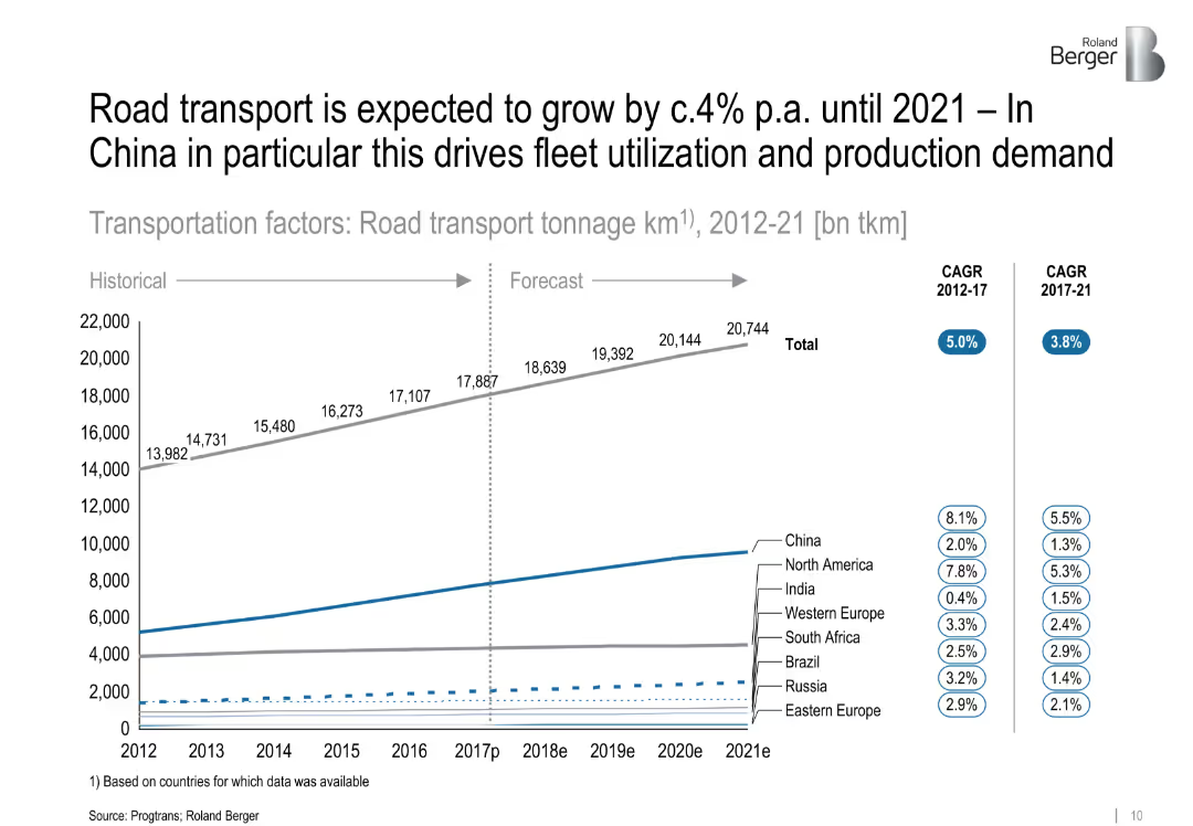
Line graph depicting road transport tonnage from 2012 to 2021 by region, with CAGR stats on the side. Clear separation between historical and forecast data.
Market Analysis and Trends
Transportation & Logistics
This slide analyzes road transport volume (in billion ton-km), indicating a steady global increase with China leading in growth. It links increased road transport to greater demand for fleets and vehicle production.
['road transport', 'fleet utilization', 'China', 'market growth', 'CAGR', 'logistics', 'forecast', 'tonnage']
false
Market Analysis and Trends
Transportation & Logistics
Single Chart
Roland Berger
Add to my slides
Remove from favorites
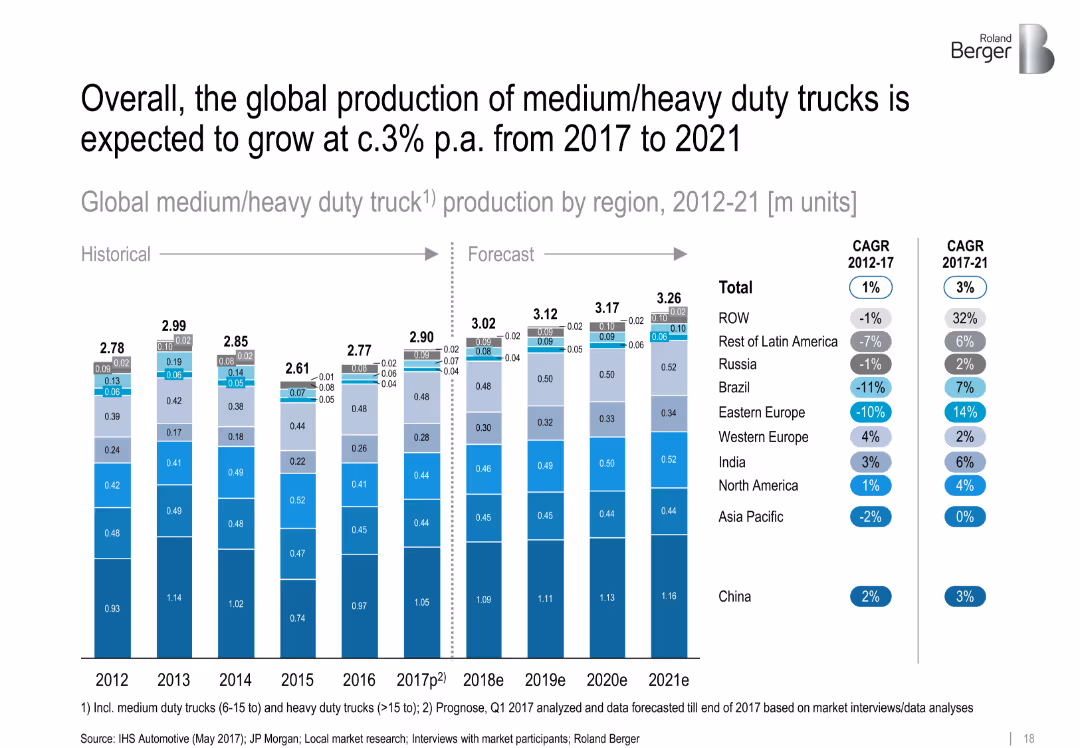
Stacked bar chart comparing truck production by region (2012–2021) with CAGR data. Segments color-coded and neatly aligned.
Financial Performance
Transportation & Logistics
This slide presents the volume and forecast of global medium/heavy duty truck production. Regional breakdowns show China as the leader, while emerging markets see modest growth. Includes CAGR data for historic and forecast periods.
['truck production', 'heavy duty', 'regional growth', 'CAGR', 'China', 'forecast', 'manufacturing', 'automotive']
false
Financial Performance
Transportation & Logistics
Single Chart
Roland Berger
Add to my slides
Remove from favorites
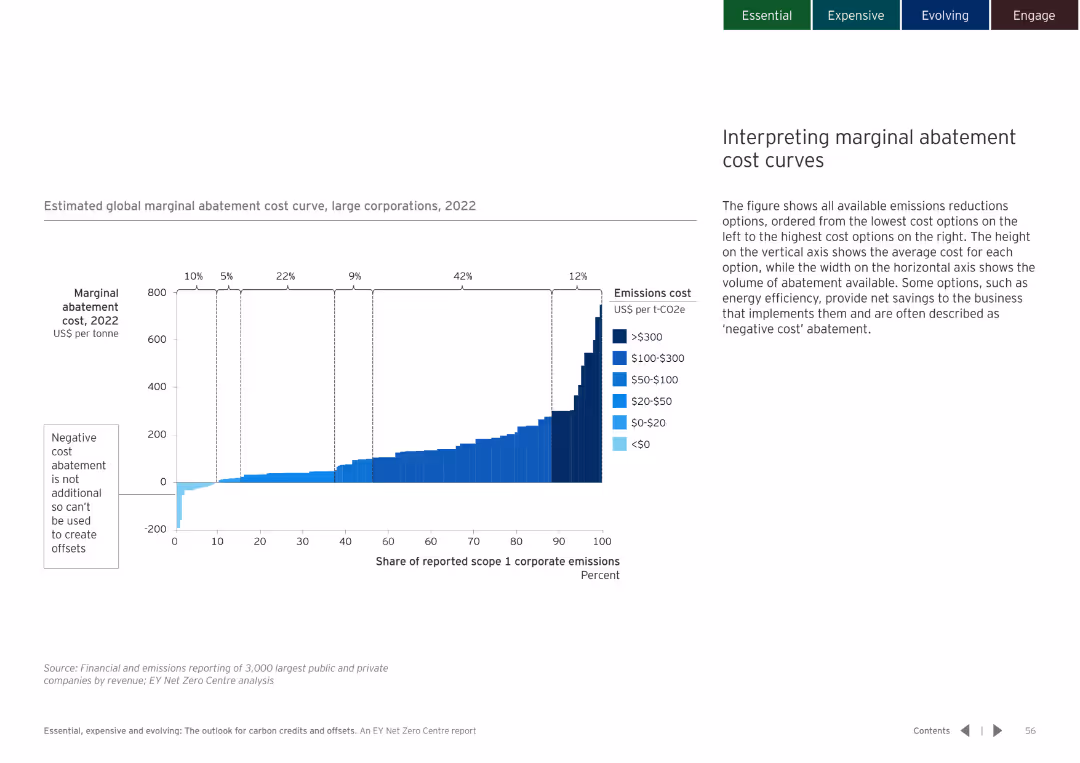
White background with a bar chart showing the marginal abatement cost curve. Clear labeling and color coding for different cost ranges.
Financial Performance
Environmental Services & Sustainability
Explains the interpretation of marginal abatement cost curves and the implications for emissions reduction strategies.
abatement cost curves, emissions reduction, cost interpretation
false
Financial Performance
Environmental Services & Sustainability
Mixed Chart
EY
Add to my slides
Remove from favorites
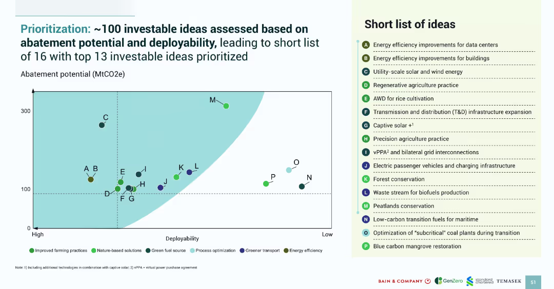
Scatterplot showing 16 ideas by potential and deployability; legend on the right lists the top 13 ideas with category color codes.
Strategic Planning
Environmental Services & Sustainability
This slide displays the prioritization of 100 green investment ideas, highlighting the top 13 based on abatement potential and deployability. The scatterplot visually identifies top opportunities, such as regenerative agriculture and solar/wind, with category-based color groupings.
abatement potential, deployability, prioritization, green ideas, SEA investments, climate strategy
false
Strategic Planning
Environmental Services & Sustainability
Mixed Chart
Bain
Add to my slides
Remove from favorites
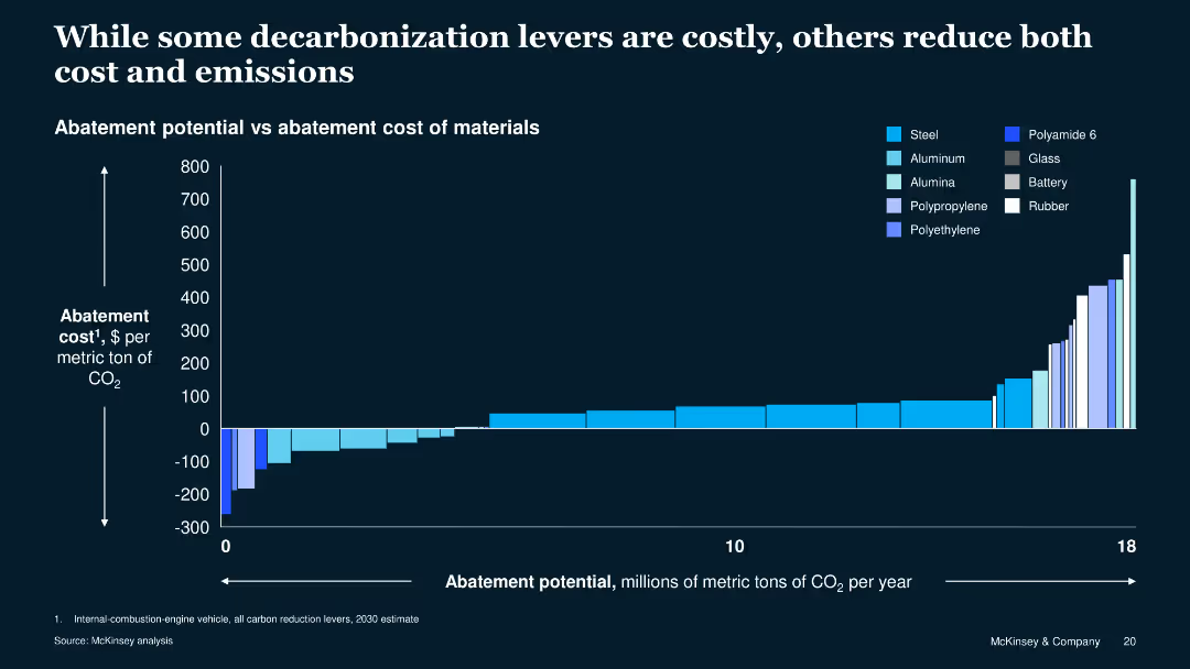
The slide includes a column chart showing abatement potential versus cost for various materials. The chart uses different shades of blue to represent different materials.
Operational Efficiency
Energy & Utilities
This slide compares the cost and potential CO2 reduction of various materials used in manufacturing, illustrating that some options can reduce both costs and emissions.
abatement, cost, emissions, materials, comparison, manufacturing, energy, efficiency, sustainability, decarbonization
false
Operational Efficiency
Energy & Utilities
Single Chart
McKinsey
Add to my slides
Remove from favorites
The slide shows a dual-axis line chart tracking accelerator attendance and equity investment over time, with text descriptions on accelerator impacts.
Market Analysis and Trends
Technology & Software
It discusses the role and impact of accelerators in Edinburgh, showing trends in equity investment and accelerator attendance from 2011 to 2020, with a focus on local technology growth.
accelerators, investment, Edinburgh, technology, growth, equity, government role, startup support, local ecosystem, economic development
false
Market Analysis and Trends
Technology & Software
Mixed Chart
Barclays
Add to my slides
Remove from favorites
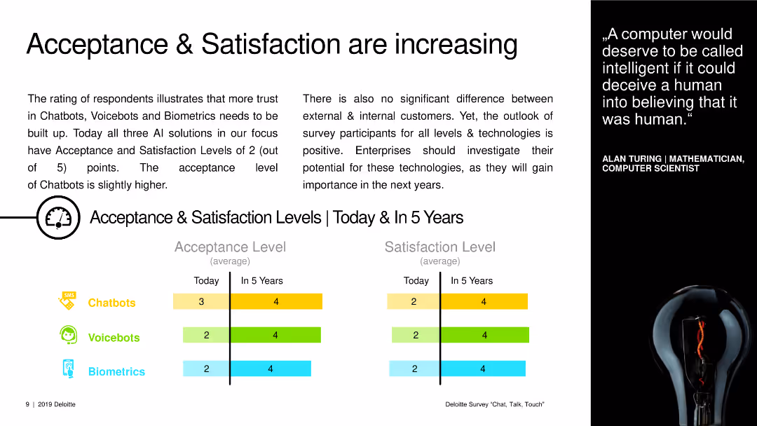
A text slide with charts showing current and future acceptance and satisfaction levels for chatbots, voicebots, and biometrics.
Market Analysis and Trends
Technology & Software
The slide presents data on current and projected acceptance and satisfaction levels for various AI technologies over the next five years.
acceptance levels, satisfaction levels, AI technologies, chatbots, voicebots, biometrics, future trends
false
Market Analysis and Trends
Technology & Software
Multiple Chart
Deloitte
Add to my slides
Remove from favorites
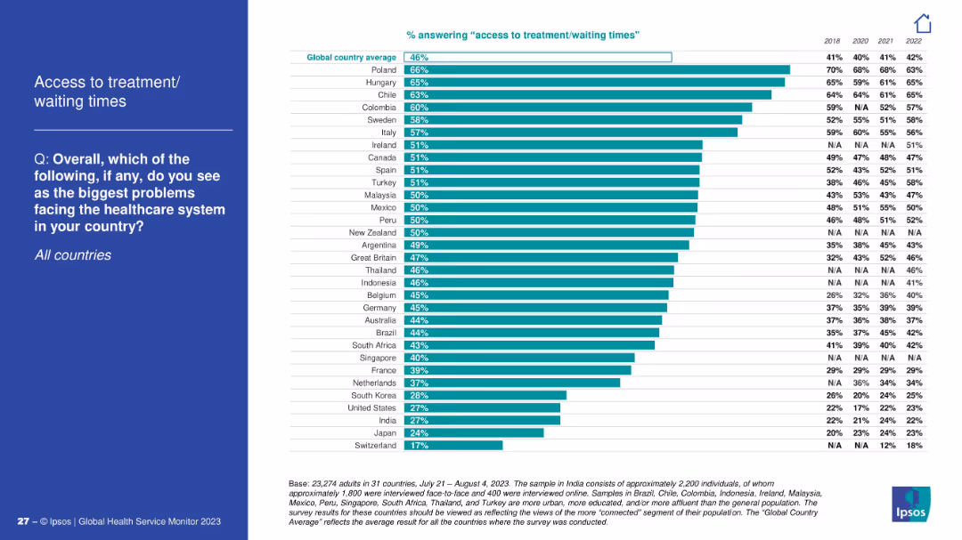
Vertical bar chart by country; left panel contains the title and question.
Performance Metrics and KPIs
Healthcare & Pharmaceuticals
This slide compares perceived issues with access to treatment and wait times across countries. Poland, Hungary, and Chile report the highest concern. Yearly comparison data is shown from 2018 to 2022.
access to care, wait times, global healthcare
false
Performance Metrics and KPIs
Healthcare & Pharmaceuticals
Mixed Chart
IPSOS
Add to my slides
Remove from favorites
Includes a donut chart and a gauge chart detailing managerial accountability in performance. The visual elements are color-coded to represent different levels of agreement or disagreement among respondents.
Human Resources and Talent Management
Professional Services
Discusses the accountability of managers for both their performance and their team’s, valuable for leadership training and development workshops.
accountability, management, performance
false
Human Resources and Talent Management
Professional Services
Multiple Chart
PwC/Strategy&
Add to my slides
Remove from favorites
A pie chart showing an 80% reduction in time spent on payables and expenses, with icons representing benefits such as cost savings and improved control.
Technology and Digital Transformation
Financial Services
Highlights the benefits of automating accounts payable within finance, notably in time savings and enhanced spend visibility and control.
accounts payable, automation, finance, time savings, cost savings, spend visibility, control, digital transformation
false
Technology and Digital Transformation
Financial Services
Mixed Chart
Deloitte
Add to my slides
Remove from favorites
Features column charts detailing the financial aspects of an acquisition, including breakdowns of loans, deposits, and expected impacts on financial metrics.
Mergers and Acquisitions
Financial Services
Details the acquisition of Tesco Bank's retail banking division, focusing on the financial benefits, expected impacts, and integration strategies.
acquisition, Tesco Bank, financial impact, retail banking, integration, Barclays, deposits, loans
false
Mergers and Acquisitions
Financial Services
Multiple Chart
Barclays
Add to my slides
Remove from favorites
Details acquisition impacts with financial metrics and future growth opportunities.
Mergers and Acquisitions
Financial Services
Explains the strategic benefits of Tesco Bank acquisition for growth and market presence.
acquisition, Tesco Bank, growth, strategy, market presence
false
Mergers and Acquisitions
Financial Services
Linear Flow
Barclays
Add to my slides
Remove from favorites
The slide features a large logo of Xperiti, a text description on the left, and a Venn diagram on the right showing the integration of traditional research firms, tech-enabled expert networks, and traditional expert networks.
Mergers and Acquisitions
Technology & Software
The slide describes the acquisition of Xperiti, highlighting its digital platform for AI-driven professional recruitment and its integration into Ipsos' market research capabilities.
acquisition, Xperiti, tech-enabled, market research, AI
false
Mergers and Acquisitions
Technology & Software
Framework
IPSOS
Add to my slides
Remove from favorites
The slide features four product images of Horlicks and Boost brands with circular charts above them depicting market share and profitability. There is also a large text box on the left displaying financial metrics.
Market Analysis and Trends
Consumer Goods
This slide highlights the acquisition of Horlicks and Boost, emphasizing their market positions and financial significance within the functional nutrition sector.
acquisition, nutrition, market share, profitability, functional nutrition
false
Market Analysis and Trends
Consumer Goods
Multiple Chart
Deutsche Bank
Add to my slides
Remove from favorites
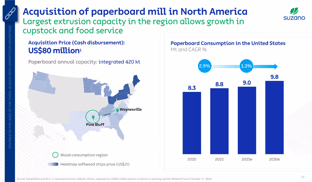
Mixed layout with map and bar chart. Shows location and details of new mill plus projected paperboard consumption in the U.S. Uses corporate blue branding and minimal text for clarity.
Mergers and Acquisitions
Industrial & Manufacturing
Announces acquisition of a paperboard mill with high extrusion capacity to target food service markets. Supports growth in U.S. paperboard demand with estimated increase from 8.3 Mt (2020) to 9.8 Mt (2030e).
acquisition, paperboard, Suzano, North America, capacity, Pine Bluff
false
Mergers and Acquisitions
Industrial & Manufacturing
Multiple Chart
Goldman Sachs
Add to my slides
Remove from favorites
Text explaining the acquisition's impact on payment capabilities, graphs displaying revenue and growth projections, and logos of payment services. An image of the Newline™ service by Fifth Third.
Investment Analysis
Financial Services
Discusses the impact of the Rize acquisition on enhancing embedded payment capabilities and growth projections. Used for investor communications and showcasing digital transformation in payments.
acquisition, payments, digital transformation, fintech, growth projection, technology
false
Investment Analysis
Financial Services
Mixed Chart
Morgan Stanley
Add to my slides
Remove from favorites
Features comparative pie charts showing revenue breakdowns, efficiently comparing data pre- and post-acquisition.
Mergers and Acquisitions
Financial Services
Analyzes the geographical revenue impact of Faurecia's acquisition of Clarion, highlighting the strategic benefits and increased market presence in Asia, particularly with Japanese OEMs.
acquisition, revenue, market presence, Asia, automotive, OEMs
false
Mergers and Acquisitions
Financial Services
Multiple Chart
Deutsche Bank
Add to my slides
Remove from favorites
The slide features a stacked column chart showing the use of proceeds for M&A, refinancing, and other purposes from 2006 to 2018.
Investment Analysis
Financial Services
The slide highlights the use of leveraged finance proceeds in M&A activities in 2018 and the strong outlook for M&A in 2019, supported by data.
acquisitions, M&A, leveraged finance, proceeds, 2018, 2019, outlook, refinancing, investment analysis
false
Investment Analysis
Financial Services
Mixed Chart
Credit Suisse
Add to my slides
Remove from favorites
The slide includes a column chart with blue and red columns for assets, deposits, and loans, a map of branch footprints, and two company logos. The layout is balanced between text and visuals.
Financial Performance
Financial Services
This slide presents financial data highlighting the growth due to acquisitions, emphasizing market position and customer base expansion. It's used to communicate business growth and performance metrics.
acquisitions, customer base, financial data, growth, market position
false
Financial Performance
Financial Services
Multiple Chart
Goldman Sachs
Add to my slides
Remove from favorites
Slide with multiple 3D column charts showing capital deployment over fiscal years and the number of acquisitions.
Mergers and Acquisitions
Technology & Software
Analyzes Accenture’s strategic investments in acquisitions, highlighting the capital deployed and the increased number of acquisitions to enhance capabilities.
acquisitions, investments, skills, capital deployment, strategic growth, Accenture, capabilities, fiscal year, enhancement
false
Mergers and Acquisitions
Technology & Software
Mixed Chart
Accenture
Add to my slides
Remove from favorites
Slide is a straightforward table layout listing acronyms used in the presentation. Each row has the acronym and its full meaning.
Market Analysis and Trends
Education & Training
Serves as a reference material providing definitions for various acronyms related to green economy and investments used throughout the presentation, facilitating better understanding for the audience.
acronyms, glossary, green economy
false
Market Analysis and Trends
Education & Training
Text Only
Bain
Add to my slides
Remove from favorites
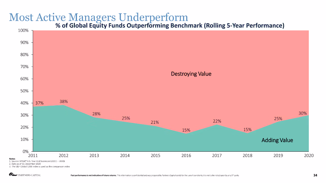
Area chart showing the percentage of global equity funds outperforming the benchmark over a rolling 5-year period.
Human Resources and Talent Management
Financial Services
The slide shows that most active managers underperform relative to benchmarks, highlighting the difficulty in adding value.
active managers, underperformance, equity funds, benchmark, performance metrics
false
Human Resources and Talent Management
Financial Services
Single Chart
Deloitte
Add to my slides
Remove from favorites
Features a table showing Australia’s market presence in manufacturing active materials and electrolytes with a detailed list of planned production activities.
Operational Efficiency
Industrial & Manufacturing
Evaluates Australia's current and upcoming activities in the production of active materials for batteries, including investments and market shares in global context.
active materials, electrolytes, manufacturing, Australia, market analysis
false
Operational Efficiency
Industrial & Manufacturing
Table
Accenture
Add to my slides
Remove from favorites
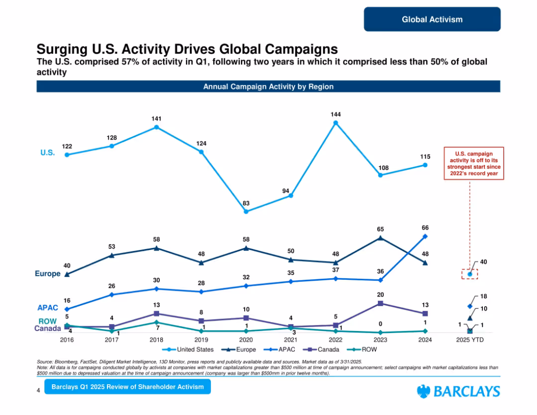
Line chart showing regional campaign trends (U.S., Europe, APAC, Canada, ROW); callouts highlight surges in U.S. activity.
Market Analysis and Trends
Financial Services
Tracks regional activist campaign activity from 2016 through Q1 2025. U.S. drives over 50% of activity in Q1 2025, rebounding strongly after lower share in previous years. Europe and APAC show moderate activity. Emphasizes growing U.S. influence.
activism by region, U.S. activism, campaign surge, Barclays, Q1 2025, regional trends
false
Market Analysis and Trends
Financial Services
Single Chart
Barclays
Add to my slides
Remove from favorites
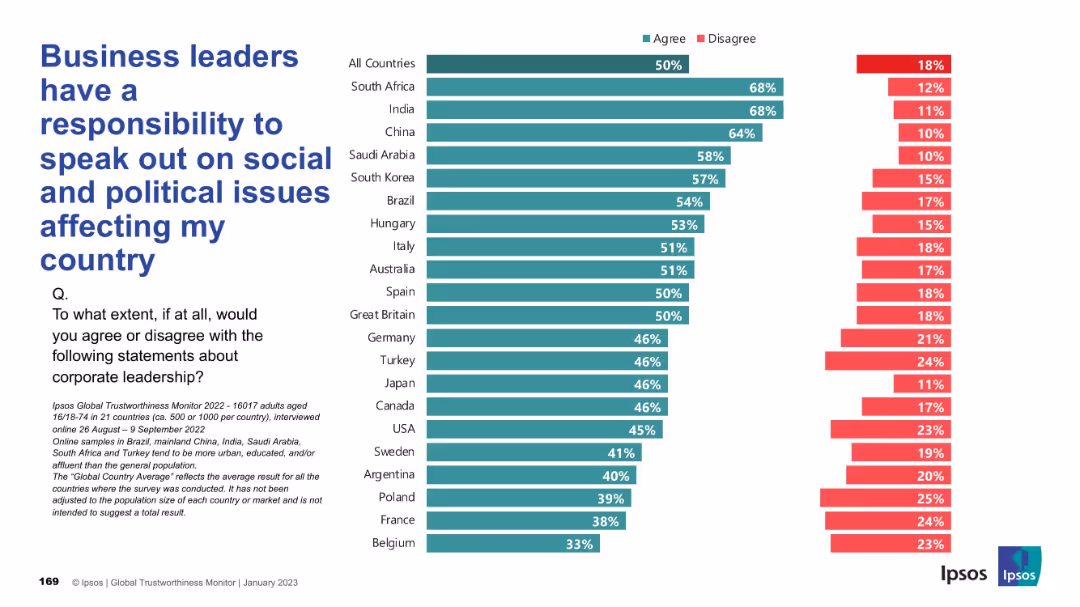
Layout follows the same bar chart format; responses shown per country; design includes clear labels, Ipsos branding, and legible typography.
Regulatory and Compliance
Professional Services
The chart shows varying global opinions on whether corporate leaders should engage in socio-political discourse. Strongest agreement comes from South Africa and India; Belgium and France are least supportive of such involvement.
activism, business role, social responsibility, politics, corporate speech, stakeholder engagement, Ipsos
false
Regulatory and Compliance
Professional Services
Mixed Chart
IPSOS
Add to my slides
Remove from favorites
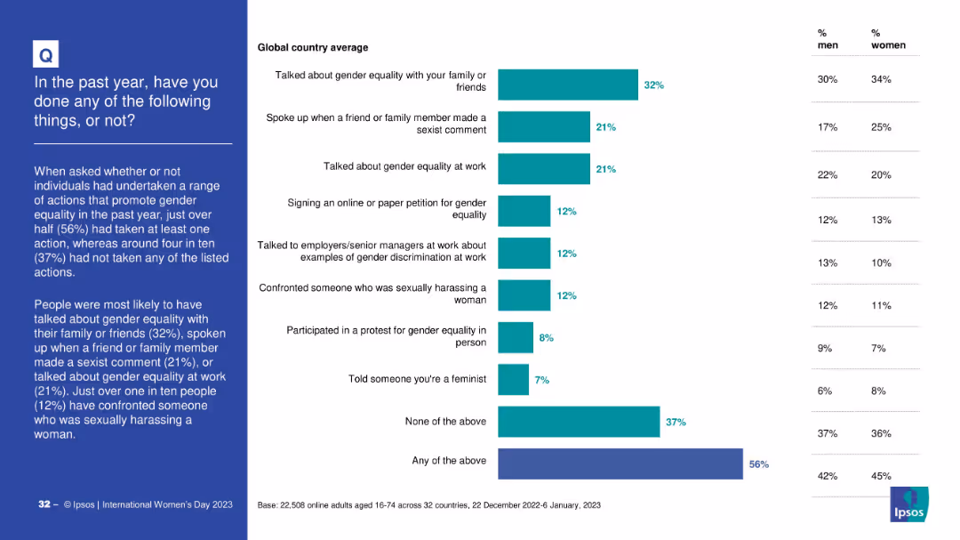
Bar chart listing actions taken to support gender equality, such as speaking up or confronting harassment. Includes gender-specific participation rates.
Strategic Planning
Government & Public Sector
This slide summarizes global participation in actions supporting gender equality. 56% took at least one action, with common actions including discussing equality with others and addressing sexist comments.
activism, gender rights, behavior analysis, participation, public engagement, awareness
false
Strategic Planning
Government & Public Sector
Mixed Chart
IPSOS
Add to my slides
Remove from favorites
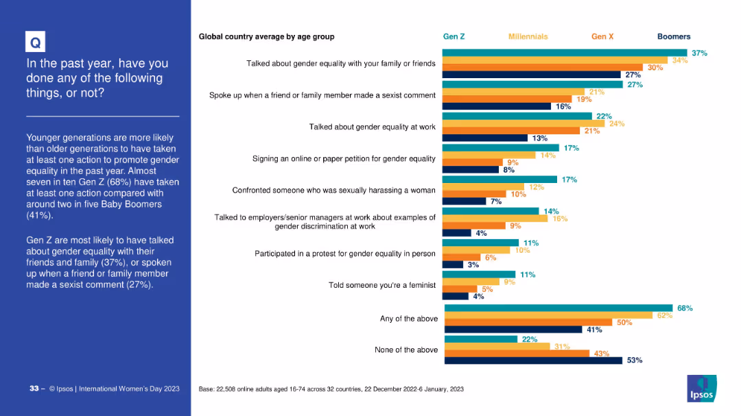
Stacked bar chart by generation showing participation in different actions. Categories include discussing gender equality, confronting harassment, or joining protests.
Strategic Planning
Government & Public Sector
This slide shows generational trends in actions supporting gender equality. Gen Z leads across most categories, especially in discussions and confronting sexism. Boomers report the lowest participation.
activism, generational divide, equality actions, civic behavior, public awareness
false
Strategic Planning
Government & Public Sector
Mixed Chart
IPSOS
Add to my slides
Remove from favorites
The slide features two column charts. The first chart shows the relationship between activism and strategic reviews over time. The second chart presents the global M&A quarterly announced volumes for 2023.
Strategic Planning
Financial Services
The slide discusses the link between activist campaigns and strategic reviews, and how this affects M&A activity. It suggests that increased activism will drive strategic actions.
activism, strategic reviews, M&A, financial services, 2023 trends
false
Strategic Planning
Financial Services
Multiple Chart
JP Morgan
Add to my slides
Remove from favorites
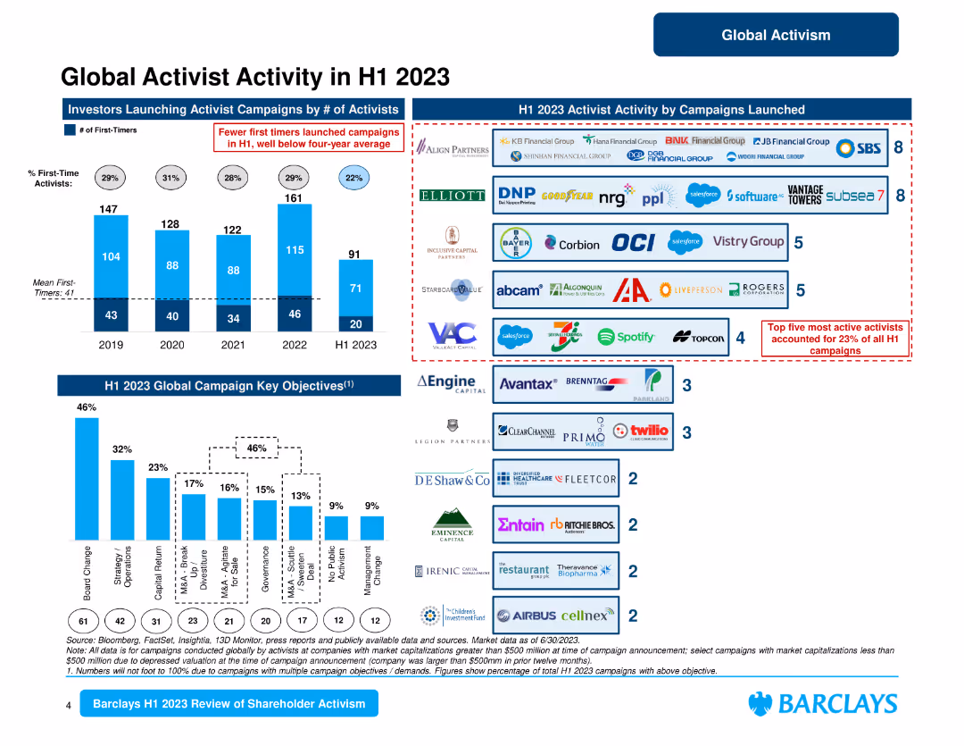
This slide contains several column charts and logos of companies involved in activist campaigns. It visually depicts the number of campaigns, key objectives, and prominent activists.
Competitive Landscape
Financial Services
Provides detailed insights into global activist activities in the first half of 2023, highlighting key objectives, campaign launches, and the most active activists.
activist activity, H1 2023, campaigns, key objectives, global
false
Competitive Landscape
Financial Services
Multiple Chart
Barclays
Add to my slides
Remove from favorites
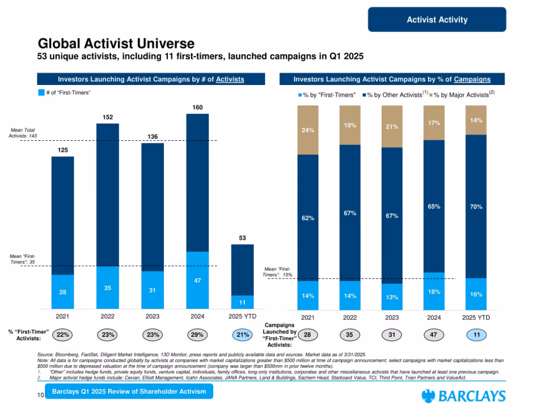
Two vertical charts: number of activists (incl. first-timers) and percentage of campaigns by type of activist.
Market Analysis and Trends
Financial Services
Highlights breadth of activist investors in Q1 2025, with 53 total and 11 first-time participants. Tracks campaign share by major, other, and new activists. Emphasizes growth in major activist influence and slight decline in first-timer share.
activist investors, first-timers, campaign origin, major activists, Barclays, Q1 2025
false
Market Analysis and Trends
Financial Services
Multiple Chart
Barclays
Add to my slides
Remove from favorites
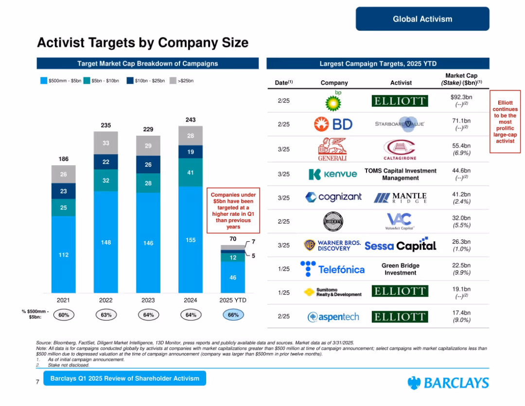
Left: stacked bar chart showing market cap breakdown (2019–2025); Right: list of largest YTD 2025 campaign targets.
Market Analysis and Trends
Financial Services
Analyzes activist campaign targets by market cap, showing increased focus on companies under $5bn in Q1 2025 (66%). Lists largest campaign targets including BP and BD. Elliott highlighted as a key repeat activist. Offers a view into activist targeting preferences.
activist targets, company size, market cap, Elliott, campaign trends, Barclays, Q1 2025
false
Market Analysis and Trends
Financial Services
Mixed Chart
Barclays
Add to my slides
Remove from favorites
Column chart showing the decline in certain activities such as calling/messaging family, engaging with news, and drinking alcohol from May to December 2020.
Market Analysis and Trends
Healthcare & Pharmaceuticals
Highlights the decline in specific activities during the COVID-19 pandemic, comparing data between May 2020 and December 2020.
activity decline, COVID-19, family messaging, news engagement, alcohol consumption
false
Market Analysis and Trends
Healthcare & Pharmaceuticals
Single Chart
IPSOS
Add to my slides
Remove from favorites
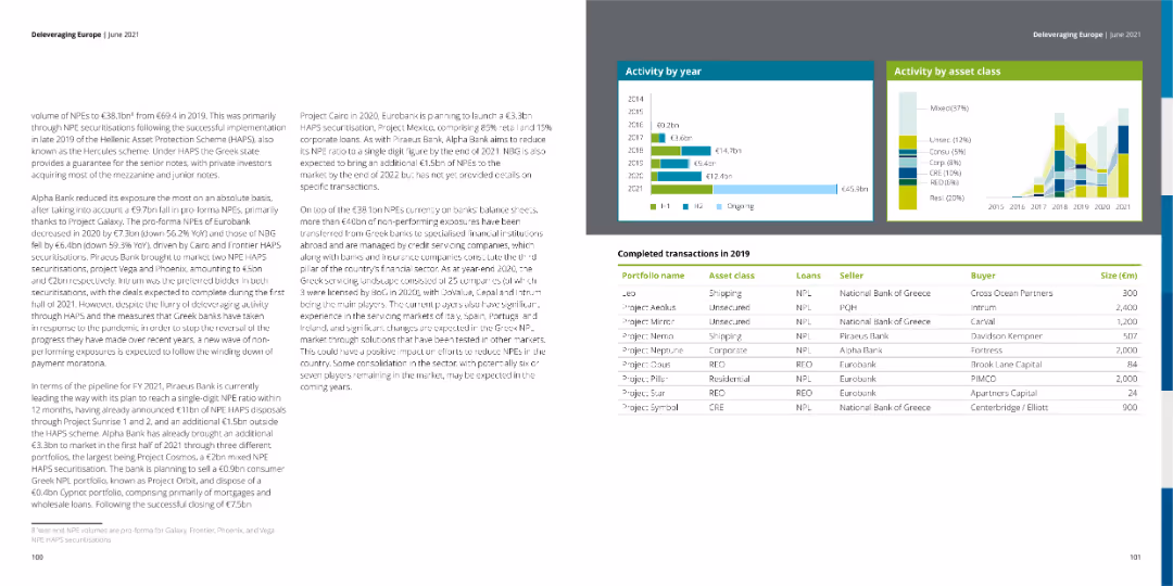
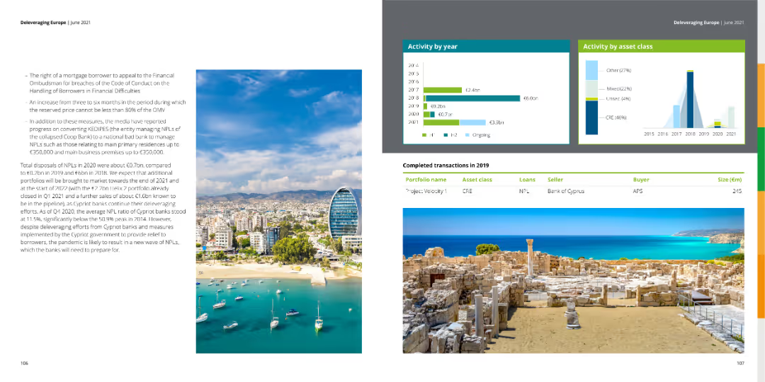
The slide displays tables of completed transactions for 2019, along with bar charts showing activity by year and asset class. The left side contains a dense text block summarizing NPL volumes and actions taken by banks.
Market Analysis and Trends
Financial Services
The slide summarizes the financial activities by year and asset class, including completed transactions in 2019, highlighting trends and strategic moves by various banks.
activity, transactions, asset class, trends, NPL
false
Market Analysis and Trends
Financial Services
Multiple Chart
Deloitte
Add to my slides
Remove from favorites
The slide presents tables of completed transactions for 2019, along with bar charts showing activity by year and asset class. The left side contains a dense text block discussing NPL volumes and bank actions.
Market Analysis and Trends
Financial Services
The slide offers a detailed overview of financial activities by year and asset class, including completed transactions in 2019, with insights into trends and strategic bank actions.
activity, transactions, asset class, trends, NPL
false
Market Analysis and Trends
Financial Services
Multiple Chart
Deloitte
Add to my slides
Remove from favorites
This slide includes a column chart comparing the expected changes in the proportion of acute beds over the next five years by country and hospital type.
Strategic Planning
Healthcare & Pharmaceuticals
This slide predicts an increase in the demand for acute beds in hospitals over the next five years, with detailed analysis by country and hospital type.
acute beds, demand surge, hospital planning, future trends, regional analysis
false
Strategic Planning
Healthcare & Pharmaceuticals
Multiple Chart
LEK
Add to my slides
Remove from favorites
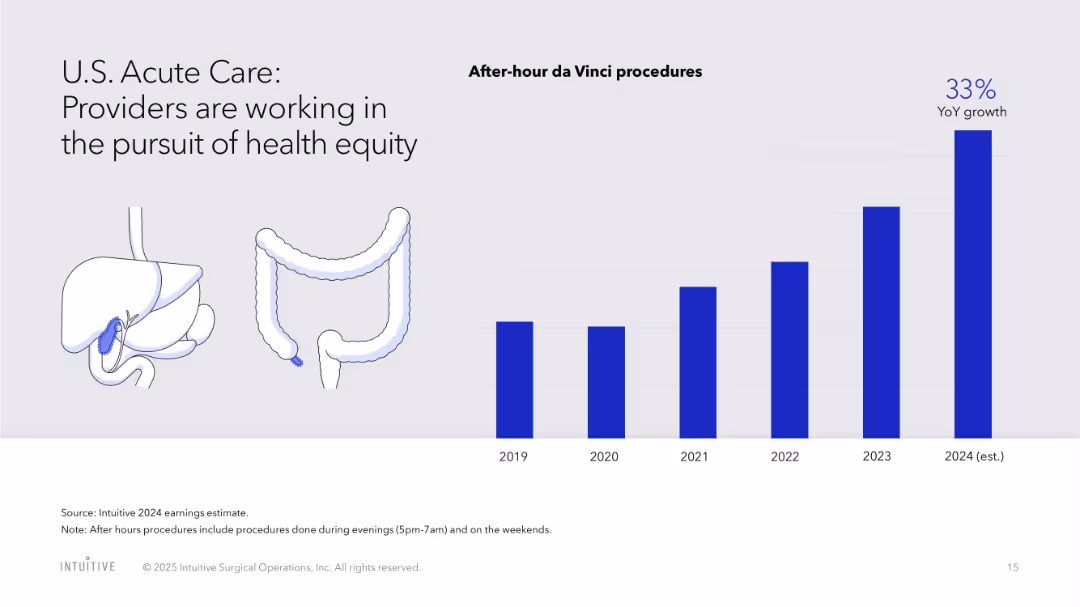
Bar chart for after-hour procedures and illustrative visuals of human anatomy
Human Resources and Talent Management
Healthcare & Pharmaceuticals
Emphasizes the expansion of after-hour da Vinci procedures to enhance healthcare equity, alongside visuals of organs typically treated.
acute care, health equity, after-hours surgery, access, da Vinci, growth, healthcare disparity
false
Human Resources and Talent Management
Healthcare & Pharmaceuticals
Single Chart
JP Morgan
Add to my slides
Remove from favorites
This slide displays a column chart showing global visibility into ad content placement across different regions with corresponding percentages. Text on the right.
Market Analysis and Trends
Professional Services
The slide shows the percentage of visibility into ad content placement globally, broken down by region (APAC, EMEA, North America, LATAM) and different levels of visibility.
ad placement, visibility, global analysis, column chart, advertising
false
Market Analysis and Trends
Professional Services
Mixed Chart
Nielsen
Add to my slides
Remove from favorites
A column chart showing changes in total ad-supported television reach for different user categories between January 2021 and January 2022.
Market Analysis and Trends
Media & Entertainment
The slide shows a decline in the potential weekly reach of ad-supported TV, with significant growth in SVOD only users, highlighting a shift in viewing patterns.
ad-supported TV, reach, SVOD, users, decline
false
Market Analysis and Trends
Media & Entertainment
Mixed Chart
Nielsen
Add to my slides
Remove from favorites
A visual comparative layout with five segments, each with an icon, color-coded and containing bullet points, with arrows pointing towards the center.
Risk Assessment and Management
Financial Services
Highlights the need for adaptability in finance, considering competition, regulatory, cyber, tech, and ESG factors for strategic and risk planning.
adaptability, finance, competition, regulatory, cyber, technology, ESG, strategic planning
false
Risk Assessment and Management
Financial Services
Pillar
JP Morgan
Add to my slides
Remove from favorites
A graphic scale compares traits of a 'Stable Organisation' and an 'Adaptable Organisation' with colored circles denoting each trait's presence in an organization. There are icons representing different organizational qualities.
Strategic Planning
Professional Services
Compares behavioral traits between stable and adaptable organizations to prompt discussions on strategic planning and organizational adaptability within professional services.
adaptability, stable, organisation, strategic, planning, traits
false
Strategic Planning
Professional Services
Single Chart
Deloitte
Add to my slides
Remove from favorites
The slide contains textual content and three distinct sections labeled 'X-Ray', 'MRI', and 'Brainscan', each with a unique graphic: a chart, a circular diagram, and a network graph. Colors are used for differentiation and emphasis.
Technology and Digital Transformation
Professional Services
Explores the use of various analytical tools to assess organizational health, which can be applied in healthcare or technology sectors for discussions on adaptability and organizational diagnostics.
adaptable, health, analysis, organizational, X-Ray, MRI, Brainscan
false
Technology and Digital Transformation
Professional Services
Pillar
Deloitte
Add to my slides
Remove from favorites
Previous
Next
You don't have any favorites yet.
Please wait loading your favorites slides...
Create a FREE account to continue browsing
Receive Instant Access to 1,000+ slides from companies like McKinsey, Google, and Goldman Sachs
First Name
Last Name
Email
Password
I agree to all
Terms & Privacy Policy
Thank you! Your submission has been received!
Oops! Something went wrong while submitting the form.
Have an account?
Sign in
Upgrade to PRO to Save slides
Advanced Search and Filters
Access to 15,000+ slides
Access to Category Pages
Save/Bookmark Slides
PowerPoint Template Library
Pick a Plan
MONTHLY
$12/month
Billed every month, Cancel anytime.
YEARLY
$9/year
Billed $108 annually, Cancel anytime.
Checkout for $12/month
Checkout for $108/yr
Secured by Stripe | AES-256 bit encryption