My Account
My Slides
Search by Category
Pricing
Templates
View All Templates
Download Template Slides
✦ AI Search
Feedback
Login
Logout
Get Started
Browse all Slides
Browse all Slides
Create a FREE Account
Instant access to 1,000+ real slides from top companies like McKinsey, BCG, Goldman Sachs, Google and many more!
First Name
Last Name
Email
Password
I agree to all
Terms & Privacy Policy
Thank you! Your submission has been received!
Oops! Something went wrong while submitting the form.
Have an account?
Sign in
Saved Slides
Total No. of slides saved
0
↻ Refresh
✖ Clear all
Table comparing carbon neutrality targets for major oil and gas companies in Europe, indicating targets for Scope 1, 2, and 3 emissions for 2030, 2040, and 2050.
Strategic Planning
Energy & Utilities
The slide details carbon neutrality targets set by major European oil and gas companies, focusing on different scopes and timelines to achieve net zero emissions.
carbon neutrality, Scope 3, O&G, net zero, Europe
false
Strategic Planning
Energy & Utilities
Single Chart
Kearney
Add to my slides
Remove from favorites
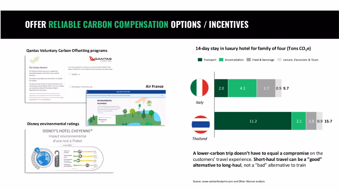
Four-part layout with screenshots of airline and hotel initiatives and bar chart comparing vacation CO2 footprints
Operational Efficiency
Hospitality & Tourism
This slide showcases carbon offset programs by airlines and hospitality providers and compares carbon footprints of short-term travel by country to emphasize low-carbon options.
carbon offset, tourism, hotel footprint, airline programs, travel sustainability
false
Operational Efficiency
Hospitality & Tourism
Mixed Chart
Oliver Wyman
Add to my slides
Remove from favorites
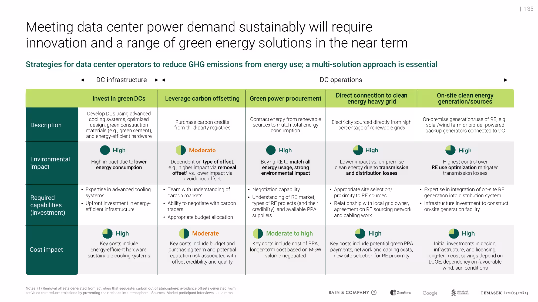
Matrix table format categorizing five decarbonization strategies; green-themed visuals
Operational Efficiency
Technology & Software
Proposes a multi-solution strategy for reducing emissions from data center energy use. Outlines five approaches including investing in green DCs, carbon offsetting, renewable procurement, grid connection, and on-site generation. Each is evaluated by environmental impact, required investment, and cost impact.
carbon offsetting, green power, infrastructure, emissions, PUE, RE sources, sustainability, DC operations
false
Operational Efficiency
Technology & Software
Mixed Chart
Bain
Add to my slides
Remove from favorites
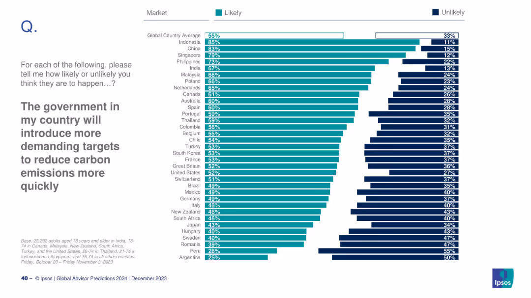
Country-based likelihood chart showing where citizens expect stricter carbon policy.
Regulatory and Compliance
Environmental Services & Sustainability
This slide explores public expectations for stricter carbon emission regulations. Countries like Indonesia and China show high confidence in future policy shifts. The global average is 55%, indicating moderate overall optimism.
carbon policy, climate action, regulations, Ipsos, government response, emissions
false
Regulatory and Compliance
Environmental Services & Sustainability
Mixed Chart
IPSOS
Add to my slides
Remove from favorites
The slide features a line chart showing the carbon price in USD per ton over time (1990-2020) for various countries, with a legend on the left side listing the different carbon taxes and ETS initiatives tracked.
Regulatory and Compliance
Energy & Utilities
This slide shows the historical carbon price trends in Nordic countries and other regions, highlighting Sweden as having the highest carbon tax. It provides comparative data for different carbon pricing mechanisms over time.
carbon price, Nordic countries, Sweden, ETS, tax
false
Regulatory and Compliance
Energy & Utilities
Single Chart
Kearney
Add to my slides
Remove from favorites
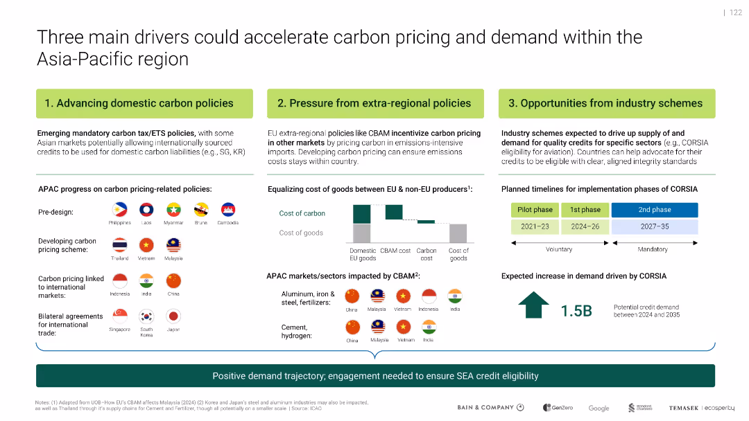
Horizontal layout showing 3 drivers: domestic policy, extra-regional pressure, industry schemes; charts illustrate timelines and CBAM cost shifts.
Regulatory and Compliance
Government & Public Sector
Identifies three forces driving SEA carbon credit demand: local policy reforms, CBAM pressure from EU, and sector initiatives like CORSIA. Illustrates APAC market readiness and implementation timelines through flags and schematics.
carbon pricing, CBAM, CORSIA, Asia-Pacific, ETS, compliance
false
Regulatory and Compliance
Government & Public Sector
Mixed Chart
Bain
Add to my slides
Remove from favorites
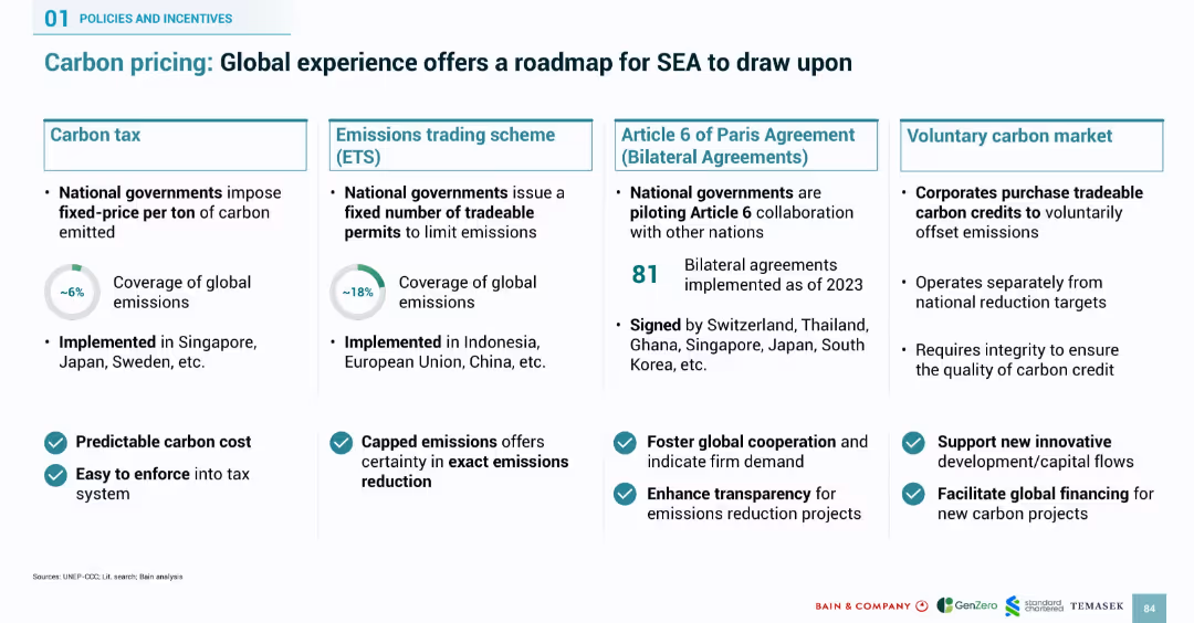
Four-column layout covering carbon tax, emissions trading, Article 6 bilateral agreements, and voluntary carbon markets. Uses icons and checkmarks for benefits.
Regulatory and Compliance
Environmental Services & Sustainability
Outlines four global carbon pricing models that SEA can adopt: carbon tax, emissions trading, bilateral agreements, and voluntary markets. Includes global adoption stats, benefits such as transparency and enforceability, and lists of countries that have implemented them. The slide serves as a strategic framework for SEA carbon policy design.
carbon pricing, ETS, carbon tax, bilateral agreements, voluntary market, emissions, SEA, regulation, global roadmap
false
Regulatory and Compliance
Environmental Services & Sustainability
Mixed Chart
Bain
Add to my slides
Remove from favorites
World map with carbon prices, various regions colored to indicate different carbon prices. Table below the map shows operational and scheduled ETS details.
Regulatory and Compliance
Energy & Utilities
The slide explains the adoption of carbon pricing in OECD countries, highlighting different carbon prices and summarizing operational and scheduled ETS emissions data.
carbon pricing, ETS, emissions, OECD, regulatory
false
Regulatory and Compliance
Energy & Utilities
Graphic
Kearney
Add to my slides
Remove from favorites
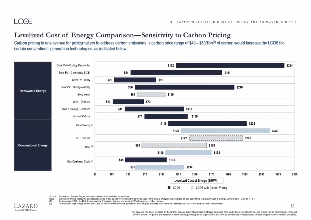
Same layout as previous LCOE slides, with an overlay showing impact of $40–$60/ton carbon pricing on conventional energy LCOEs.
Regulatory and Compliance
Energy & Utilities
Highlights how carbon pricing can raise the LCOE of fossil fuel-based energy sources, making renewables more favorable by comparison in policy-driven environments.
carbon pricing, LCOE, emissions, policy, fossil fuel, cost, sensitivity, regulation
false
Regulatory and Compliance
Energy & Utilities
Single Chart
Roland Berger
Add to my slides
Remove from favorites
Features a line chart showing global change in CO2 emissions generated by the power sector under different scenarios. Includes numbered points summarizing three carbon pricing scenarios and their impacts on emissions and tax revenues.
Strategic Planning
Energy & Utilities
Highlights three carbon pricing scenarios, comparing impacts on CO2 emissions and tax revenues, indicating significant reduction potential in emissions and variation in government tax revenues depending on the scenario.
carbon pricing, emissions, energy transition, tax revenues, scenarios
false
Strategic Planning
Energy & Utilities
Mixed Chart
EY
Add to my slides
Remove from favorites
This slide has two charts: a stacked bar chart showing global emissions covered by carbon pricing initiatives and a line chart showing emission trading system prices over time.
Regulatory and Compliance
Environmental Services & Sustainability
The slide provides data on the effectiveness of carbon pricing in reducing global emissions and compares the prices of emission trading systems across different regions.
carbon pricing, emissions, sustainability, regulatory compliance, emission trading system, global impact, J.P. Morgan, environmental policy, carbon tax, climate change
false
Regulatory and Compliance
Environmental Services & Sustainability
Multiple Chart
JP Morgan
Add to my slides
Remove from favorites
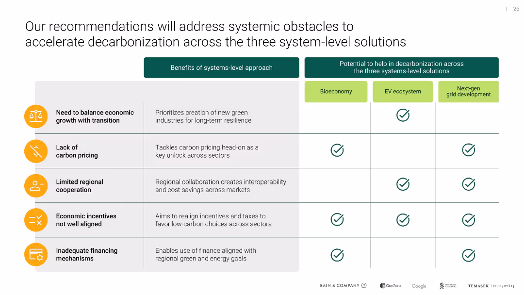
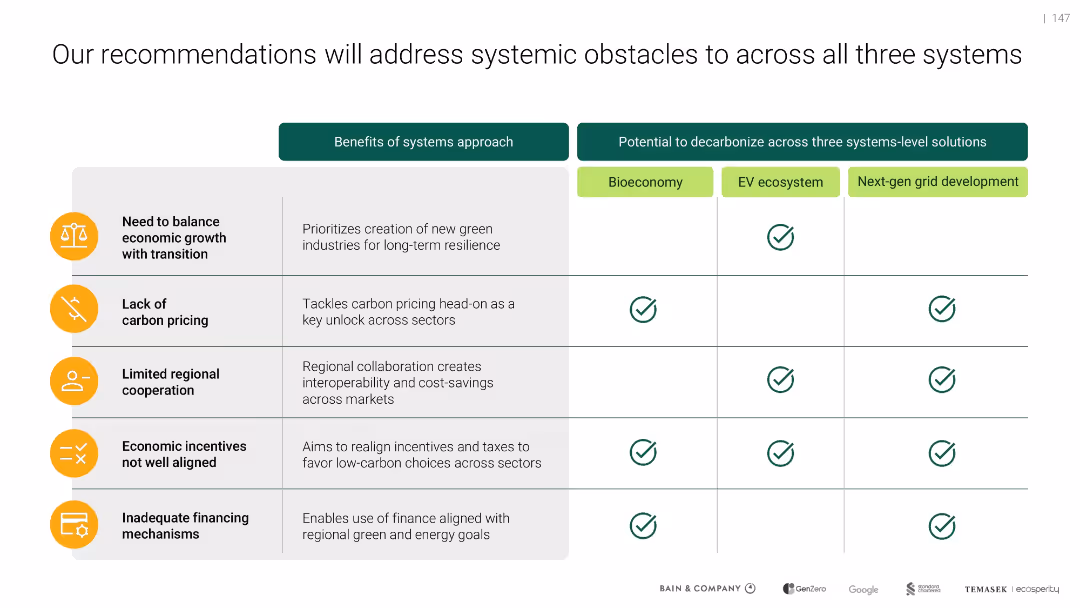
Matrix table format with icons and checkmarks; three top-level system solutions across the top and five systemic issues listed on the left
Technology and Digital Transformation
Environmental Services & Sustainability
Highlights five key barriers (like financing, pricing, incentives) and their impacts across three green transition strategies—bioeconomy, EV ecosystem, and next-gen grid—showing how a system-level approach helps overcome these obstacles.
carbon pricing, energy transition, systemic issues, EV, bioeconomy, grid
false
Technology and Digital Transformation
Environmental Services & Sustainability
Table
Bain
Add to my slides
Remove from favorites
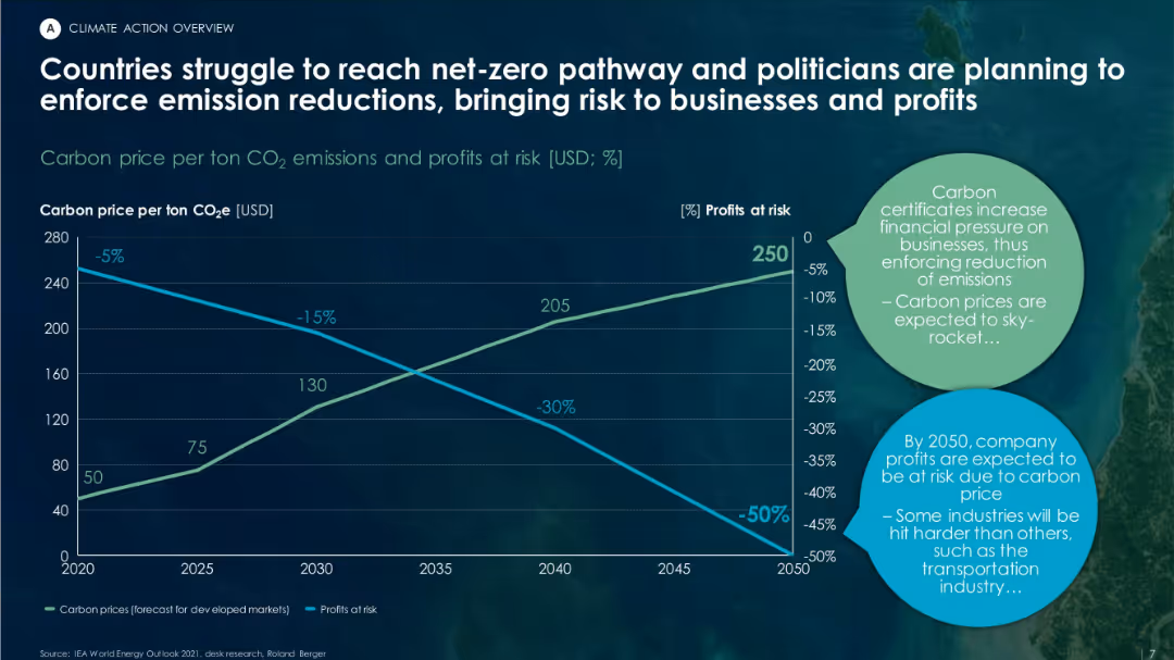
Dual-axis line graph showing increasing carbon prices and declining profit margins over time. Features circular text bubbles summarizing business impacts.
Risk Assessment and Management
Environmental Services & Sustainability
This slide projects the increasing financial burden of carbon pricing and regulatory pressure on companies through 2050. It forecasts higher carbon prices and decreasing profits, particularly for carbon-intensive industries like transportation.
carbon pricing, net-zero, emissions, regulatory risk, business impact, CO₂ cost
false
Risk Assessment and Management
Environmental Services & Sustainability
Mixed Chart
Roland Berger
Add to my slides
Remove from favorites
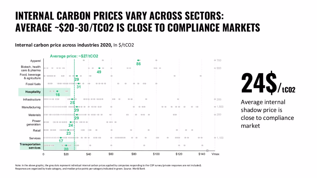
Dot plot with vertical green line showing average carbon price; multiple industries listed on the y-axis
Pricing Strategies
Environmental Services & Sustainability
The slide visualizes the variation of internal carbon prices used by industries. It highlights a convergence toward ~$27/tCO2, close to compliance market rates, with wide variance between sectors.
carbon pricing, shadow price, industry comparison, sustainability, emissions cost
false
Pricing Strategies
Environmental Services & Sustainability
Single Chart
Oliver Wyman
Add to my slides
Remove from favorites
Two-column benefit and impact matrix with checkmarks and icons
Regulatory and Compliance
Environmental Services & Sustainability
Summarizes how systemic barriers like lack of carbon pricing, regional cooperation, and misaligned incentives can be addressed through a systems approach. Emphasizes the role of cross-sector decarbonization strategies such as bioeconomy, EV ecosystems, and grid modernization.
carbon pricing, systemic barriers, decarbonization, EV, grid, bioeconomy, incentives, policy alignment
false
Regulatory and Compliance
Environmental Services & Sustainability
Table
Bain
Add to my slides
Remove from favorites
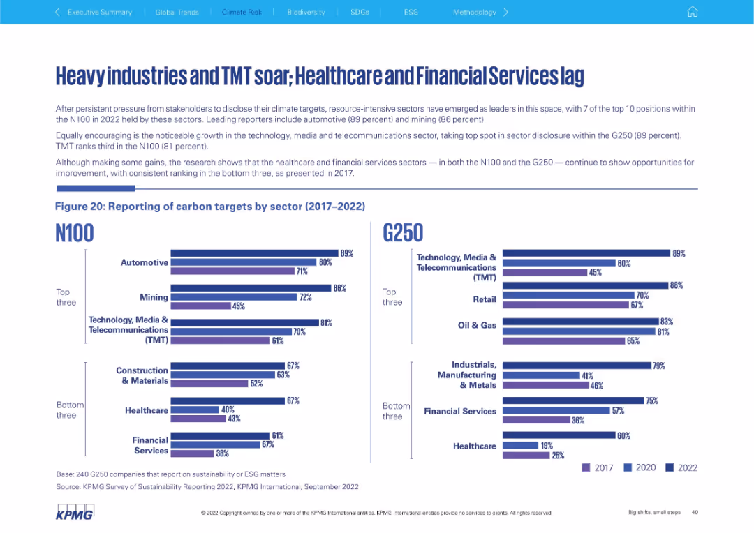
Left: text and bar chart for N100 sector reporting; Right: G250 sector reporting chart. Emphasis on top/bottom 3 sectors in both groups. Clear visual comparison.
Performance Metrics and KPIs
Environmental Services & Sustainability
The slide contrasts carbon target reporting by industry, showing strong adoption in sectors like Automotive, Mining, and TMT, while Healthcare and Financial Services continue to trail. Both N100 and G250 datasets show similar trends, emphasizing resource-intensive sectors' leadership.
carbon reporting, TMT, automotive, healthcare, mining, sectors, N100
false
Performance Metrics and KPIs
Environmental Services & Sustainability
Mixed Chart
KPMG
Add to my slides
Remove from favorites
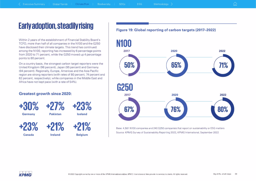
Left: narrative and country growth highlights; Right: circular progress indicators for N100 and G250 (2017, 2020, 2022) showing global carbon target reporting. Balanced layout.
Regulatory and Compliance
Environmental Services & Sustainability
This slide illustrates the global increase in carbon target reporting among companies since the establishment of the TCFD. It highlights strong country-level growth and identifies the UK, Japan, and Germany as leading reporters, with notable gains in Pakistan and Iceland.
carbon targets, TCFD, climate, Germany, Pakistan, reporting, adoption
false
Regulatory and Compliance
Environmental Services & Sustainability
Mixed Chart
KPMG
Add to my slides
Remove from favorites
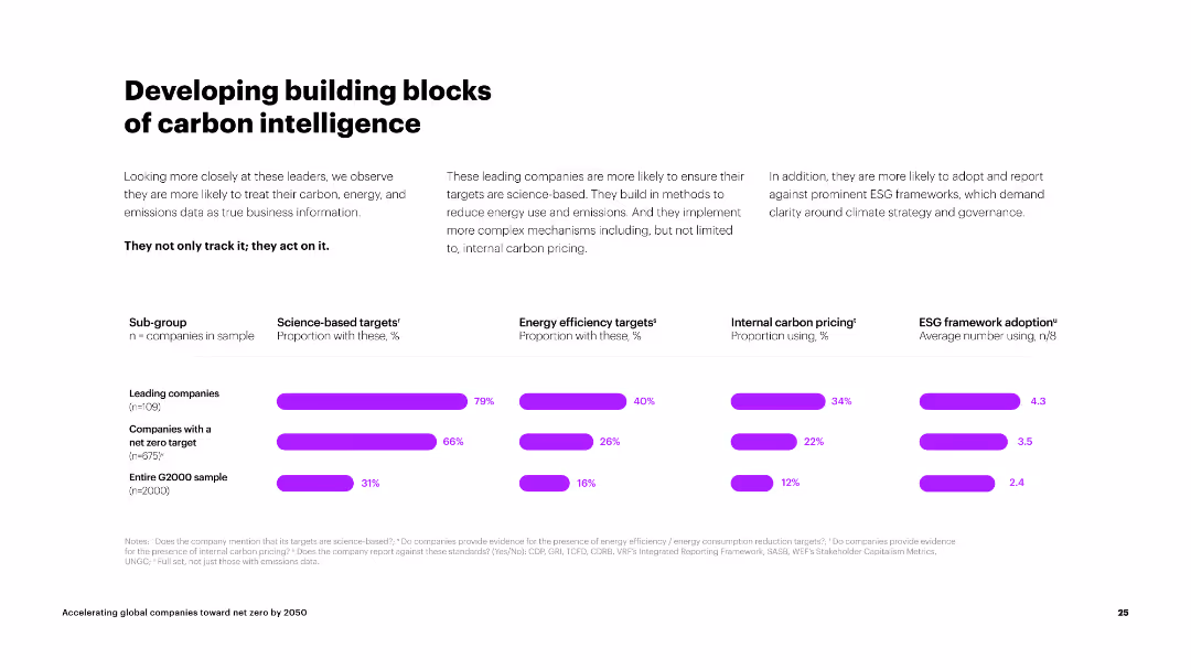
The slide is divided into three sections, each with an icon and text block. The background is white with purple accents, creating a clean and organized look.
Strategic Planning
Energy & Utilities
The slide outlines steps for companies at different stages of carbon intelligence: setting targets, prioritizing investments, and placing bold bets. It provides guidance for companies at various stages of their journey.
carbon targets, investments, energy efficiency, milestones, carbon pricing
false
Strategic Planning
Energy & Utilities
Multiple Chart
Accenture
Add to my slides
Remove from favorites
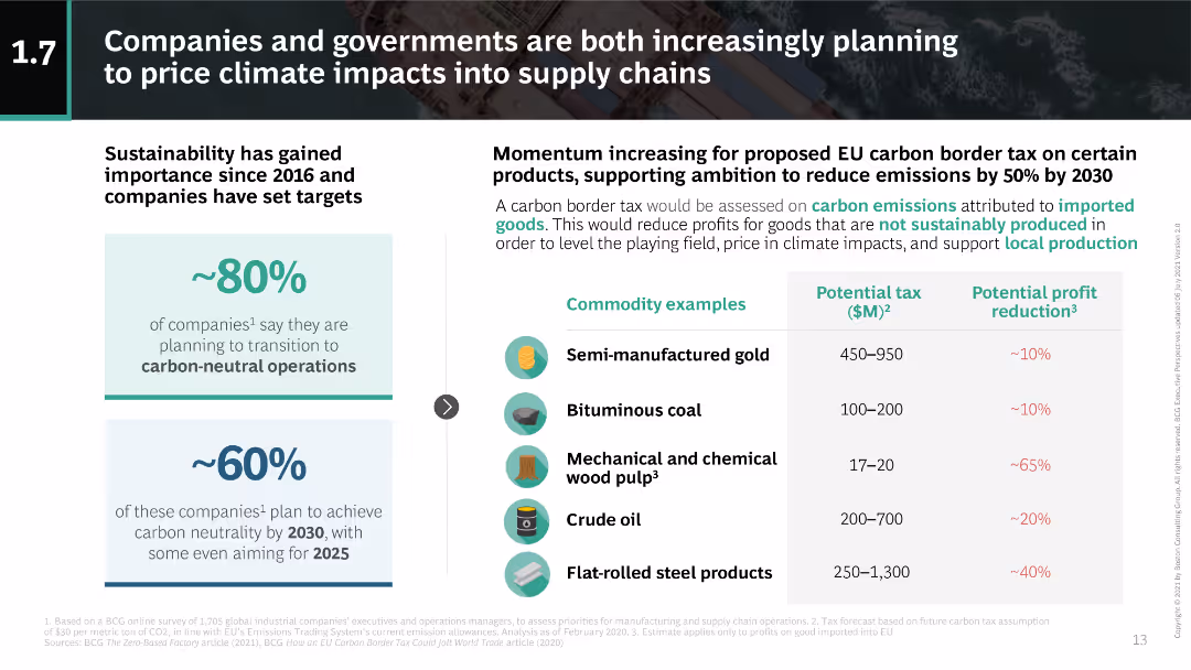
The slide uses a combination of text and a table to discuss the proposed EU carbon border tax. Icons and figures highlight the potential tax impacts on various commodities.
Regulatory and Compliance
Environmental Services & Sustainability
The slide explains the EU carbon border tax proposal, its expected impact on commodity prices, and how companies plan to achieve carbon neutrality by 2030.
carbon tax, EU, sustainability, commodities, carbon neutrality
false
Regulatory and Compliance
Environmental Services & Sustainability
Header Horizontal
BCG
Add to my slides
Remove from favorites
The slide includes icons and tables. The design is modern, with a clean layout and clear segmentation of sections. Labeled clearly with concise text explanations.
Market Analysis and Trends
Environmental Services & Sustainability
This slide presents a detailed analysis of the investment potential and economic viability of nature-based solutions and carbon credit trading, emphasizing the role of forest conservation in achieving net zero carbon emissions. It highlights different stages of capital investment and potential returns.
carbon trading, net zero, forest conservation, investment, economic viability
false
Market Analysis and Trends
Environmental Services & Sustainability
Header Vertical
Bain
Add to my slides
Remove from favorites
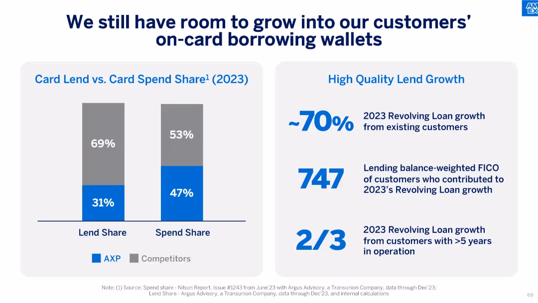
Split design with bar graphs on the left and text metrics on the right, clean and data-heavy layout.
Strategic Planning
Financial Services
This slide shows that while AXP has a high spend share (47%), its lend share (31%) is lower than competitors. It highlights the potential for growth in lending from existing customers and those with long-term accounts and strong FICO scores.
card lending, spend share, FICO, customer growth, revolving loans, strategic planning, credit, lending opportunity
false
Strategic Planning
Financial Services
Mixed Chart
McKinsey
Add to my slides
Remove from favorites
This slide shows column charts with incremental changes and text boxes with bullet points. Visual hierarchy is used to guide the viewer through the content.
Risk Assessment and Management
Financial Services
Analyzes improvements in card marketing productivity and acquisition gains. Likely to be used in risk management and strategic investment discussions.
card marketing, productivity, acquisition gains, risk management
false
Risk Assessment and Management
Financial Services
Multiple Chart
JP Morgan
Add to my slides
Remove from favorites
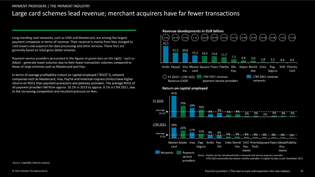
The slide features a column chart comparing revenue developments of major card schemes and payment service providers, and another showing return on capital employed (ROCE) for these entities. Text discusses revenue and profitability trends.
Financial Performance
Financial Services
This slide compares the revenue and profitability of large card schemes like Visa and Mastercard with payment service providers such as PayPal. It highlights differences in transaction volumes and return on capital employed (ROCE).
card schemes, revenue, payment service providers, ROCE, trends
false
Financial Performance
Financial Services
Multiple Chart
Deloitte
Add to my slides
Remove from favorites
Similar format to previous, stacked bar chart showing card spend growth, 2017–2023.
Performance Metrics and KPIs
Financial Services
Demonstrates AXP's increased share in billed card business across its top 5 international countries, significantly outperforming the estimated industry CAGR of 8%, especially in 2023 with 18% growth.
card spend, share gain, billed business, international markets, CAGR, KPIs, performance tracking, industry benchmark
false
Performance Metrics and KPIs
Financial Services
Single Chart
McKinsey
Add to my slides
Remove from favorites
Donut chart showing various career aspirations among young people, with detailed text on the left explaining the importance of different career paths.
Human Resources and Talent Management
Education & Training
This slide presents the career aspirations of young people, showing a preference for expertise over managerial roles and the value of varied experiences.
career aspirations, expertise, managerial roles, horizontal development, young professionals
false
Human Resources and Talent Management
Education & Training
Mixed Chart
Deloitte
Add to my slides
Remove from favorites
This slide is designed with a circular diagram at the center, surrounded by text blocks, icons, and a title, all unified by a consistent blue color palette.
Human Resources and Talent Management
Technology & Software
It stresses the importance of investing in employees’ career growth, suitable for discussions on HR development strategies and managerial training.
career growth, HR, investment, training, enablement, employees, performance management
false
Human Resources and Talent Management
Technology & Software
Diagram
Kearney
Add to my slides
Remove from favorites
Horizontal bar chart with two categories per country (teachers/schools vs parents); dark purple vs light purple bars; countries listed vertically.
Human Resources and Talent Management
Education & Training
This slide reveals public opinion on who should guide students in career choices. Most countries favor teachers/schools over parents for career guidance.
career guidance, teachers, schools, parents, responsibility, education, survey, Ipsos, global, workforce
false
Human Resources and Talent Management
Education & Training
Mixed Chart
IPSOS
Add to my slides
Remove from favorites
Light background with teal and black text. It includes a column chart on job satisfaction and career progression, and a column chart on work motivation, with icons.
Human Resources and Talent Management
Healthcare & Pharmaceuticals
Examines declining career optimism among women, lower job satisfaction, and motivation, with detailed statistics on career progression and work motivation.
career optimism, job satisfaction, motivation, women
false
Human Resources and Talent Management
Healthcare & Pharmaceuticals
Multiple Chart
Deloitte
Add to my slides
Remove from favorites
Features two donut charts and a gauge chart. Each donut chart is segmented with various responses about employee awareness of career paths, colored distinctly for clarity. The gauge chart highlights a percentage.
Human Resources and Talent Management
Professional Services
Analyzes the level of employee awareness regarding career progression within the company, illustrated through clear visual charts. Suitable for internal reviews or strategic HR planning.
career paths, employee awareness, HR, charts
false
Human Resources and Talent Management
Professional Services
Multiple Chart
PwC/Strategy&
Add to my slides
Remove from favorites
Slide includes heatmap comparing preferences among managers in different countries.
Market Analysis and Trends
Professional Services
Analyzes managerial career preferences across various countries, highlighting shifts in career goals.
career progression, management, global trends, preferences, comparative analysis
false
Market Analysis and Trends
Professional Services
Table
BCG
Add to my slides
Remove from favorites
Clean horizontal bar chart with countries listed; global average marked; left panel highlights context and gender breakdown.
Risk Assessment and Management
Government & Public Sector
The slide displays survey responses from people who fear taking action on gender equality might harm their career. The global average is 8%, with India at 18%. The data is segmented by gender and region.
career risk, equality, fear, gender impact, Ipsos, public opinion, professional consequences
false
Risk Assessment and Management
Government & Public Sector
Mixed Chart
IPSOS
Add to my slides
Remove from favorites
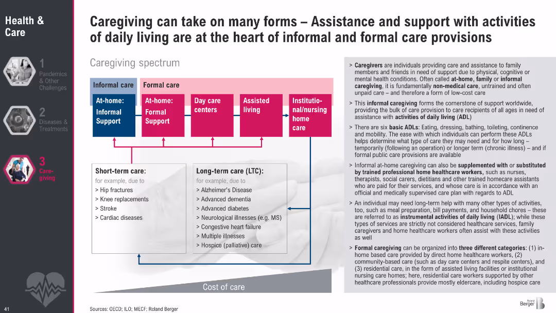
Diagram of caregiving spectrum from informal to formal care with color-coded boxes; side text explains caregiving types, ADLs, and care roles.
Human Resources and Talent Management
Healthcare & Pharmaceuticals
This slide outlines the caregiving spectrum, showing informal vs. formal care types and short-term vs. long-term needs. It also defines the roles of caregivers and the activities they support, emphasizing the importance of both unpaid and professional care structures in supporting daily living.
caregiving, informal care, formal care, ADLs, long-term care, support systems, care spectrum, eldercare
false
Human Resources and Talent Management
Healthcare & Pharmaceuticals
Diagram
Roland Berger
Add to my slides
Remove from favorites
This slide features a flowchart with color-coded sections indicating different stages of a family law case process, accompanied by icons and a timeline.
Strategic Planning
Government & Public Sector
The slide outlines a future case management system for family law, suggesting improvements in process flow, aiming to expedite resolution and reduce litigation costs.
case management, family law, process improvement, timeline, flowchart, mediation, adjudication
false
Strategic Planning
Government & Public Sector
Diagram
PwC/Strategy&
Add to my slides
Remove from favorites
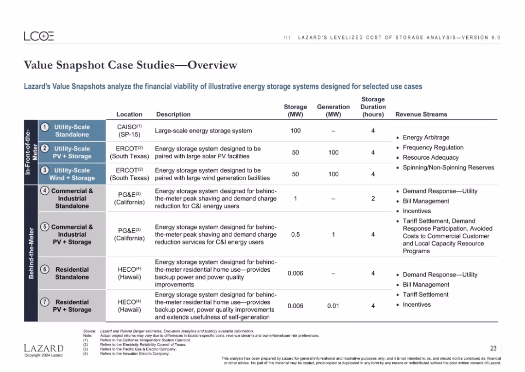
Tabular layout listing 7 case studies categorized by location, configuration, and revenue stream.
Client Case Studies
Energy & Utilities
Summarizes 7 case studies of standalone and hybrid energy storage systems across use cases (utility-scale, commercial, residential). Details include location, generation/storage capacity, and expected revenue sources like arbitrage, incentives, and demand response.
case studies, energy storage, PV, wind, residential, utility-scale, C&I, duration
false
Client Case Studies
Energy & Utilities
Table
Roland Berger
Add to my slides
Remove from favorites
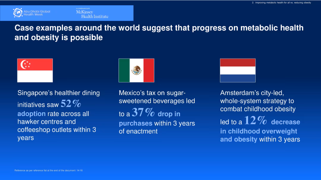
Horizontal layout with flags and country-specific outcomes. Dark blue background with white and blue text.
Client Case Studies
Healthcare & Pharmaceuticals
Shares global case studies from Singapore, Mexico, and Amsterdam demonstrating successful interventions in improving metabolic health and reducing obesity. Shows measurable results within a three-year timeframe.
case studies, obesity, public health, interventions, global examples
false
Client Case Studies
Healthcare & Pharmaceuticals
Pillar
McKinsey
Add to my slides
Remove from favorites
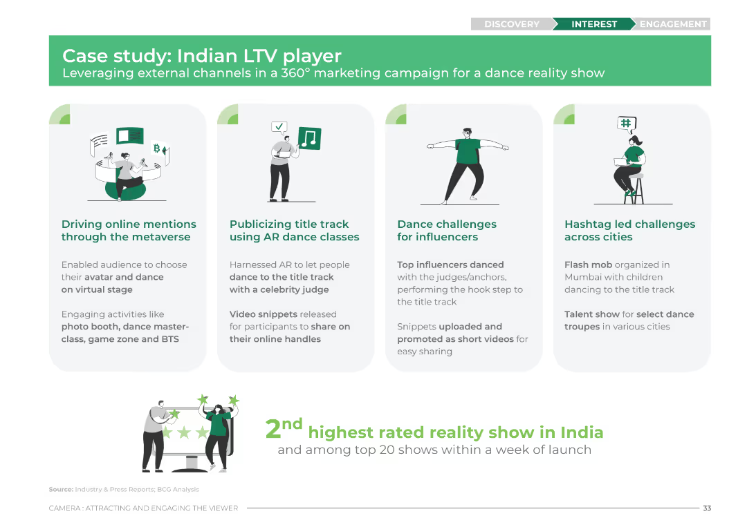
The slide features four columns with icons and brief descriptions for each aspect of the marketing campaign. The design uses green and white colors with icons representing the metaverse, AR dance classes, dance challenges, and hashtag challenges.
Client Case Studies
Media & Entertainment
This slide outlines a case study of an Indian LTV player's marketing campaign. It details the use of metaverse, AR dance classes, influencer dance challenges, and hashtag challenges to drive engagement and mentions the show's high rating and popularity.
case study, LTV, marketing campaign, metaverse, AR dance, influencers, hashtag challenges, engagement
false
Client Case Studies
Media & Entertainment
Pillar
BCG
Add to my slides
Remove from favorites
The slide includes a line chart showing the price of Suriname '26 bonds over time. The layout is clear with a focus on the case study.
Financial Performance
Financial Services
The slide presents a case study on Suriname's debt restructuring, detailing the process, the role of creditor committees, and the positive outcome on bond prices.
case study, Suriname, debt restructuring, bonds, financial performance
false
Financial Performance
Financial Services
Mixed Chart
Morgan Stanley
Add to my slides
Remove from favorites
Three sections with photos and text describing the case examples in the context of cloud and edge computing's impact on different industries.
Technology and Digital Transformation
Technology & Software
Examines specific cases of companies like AT&T, Tesla, and Walmart, showcasing how they are utilizing cloud and edge computing.
case study, cloud computing, edge computing, industry applications, business impact
false
Technology and Digital Transformation
Technology & Software
Header Vertical
McKinsey
Add to my slides
Remove from favorites
A two-part slide with one side outlining a client scenario in bullet points, and the other side titled "Elevate your experience" with a list of operational benefits. A faded background image depicts a person using a mobile phone.
Client Case Studies
Transportation & Logistics
Provides a case study on improving rush hour efficiency with contactless payments, suitable for discussing transportation management and customer experience optimization.
case study, contactless payments, transportation, customer experience, operational benefits
false
Client Case Studies
Transportation & Logistics
Boxed
JP Morgan
Add to my slides
Remove from favorites
The slide features bullet points describing a case study of a global retailer. There are two small visual charts on the right: a colorful bar chart and a heat map.
Market Analysis and Trends
Consumer Goods
The slide outlines a case study for a global retailer, including course details, data sources, and an overview of the two-part case study involving sales analysis and recommendations.
case study, global retailer, data analytics, Tableau, sales variance
false
Market Analysis and Trends
Consumer Goods
Mixed Chart
EY
Add to my slides
Remove from favorites
Various charts including a column chart for integration cost timing and a breakdown of cost categories, presented in a clear, visual format.
Mergers and Acquisitions
Professional Services
Provides a case study on the integration costs of a successful merger, detailing the cost breakdown and timing of expenses.
case study, integration, merger, costs, financial breakdown, cost timing, professional services
false
Mergers and Acquisitions
Professional Services
Multiple Chart
Deloitte
Add to my slides
Remove from favorites
This slide features a title, column charts with annotations on case transfers between FCoA and FCC, and a side note about the increase in transfer times. It uses a straightforward design with contrasting colors for differentiation.
Regulatory and Compliance
Government & Public Sector
The slide discusses the transfer of matters between FCoA and FCC, noting an increase in the number and age of transferred cases, and includes specific figures on the transfer duration and counts for a recent year.
case transfers, FCoA, FCC, legal system efficiency, transfer time growth, case management
false
Regulatory and Compliance
Government & Public Sector
Mixed Chart
PwC/Strategy&
Add to my slides
Remove from favorites
Features a column chart tracking the appeal caseload over multiple years. The slide is data-dense, with a significant amount of textual information supporting the graphical elements.
Operational Efficiency
Government & Public Sector
It details the Appeal Division's caseload over several years, showing filed, finalized, and pending appeals, which provides insights into the trends and workload of the division.
caseload, appeals, finalization, trend analysis, workload
false
Operational Efficiency
Government & Public Sector
Mixed Chart
PwC/Strategy&
Add to my slides
Remove from favorites
This slide features a central column chart surrounded by explanatory text and smaller charts, highlighting the caseload distribution in two courts with a focus on family law. The layout is organized and color-coded for clarity.
Operational Efficiency
Government & Public Sector
It showcases the total number of court cases handled by two courts, emphasizing the distribution and percentage of family law cases, useful for workload analysis and operational insights.
caseload, courts, distribution, family law, analysis
false
Operational Efficiency
Government & Public Sector
Single Chart
PwC/Strategy&
Add to my slides
Remove from favorites
The slide features bar charts displaying sources and uses of funds from 2022 to 2025, including projected free cash flow and additional financial debt.
Strategic Planning
Financial Services
It outlines Ipsos's cash allocation plan from 2022 to 2025, detailing funding sources and financial strategies, including debt and investment allocations.
cash allocation, financial planning, Ipsos, funding
false
Strategic Planning
Financial Services
Multiple Chart
IPSOS
Add to my slides
Remove from favorites
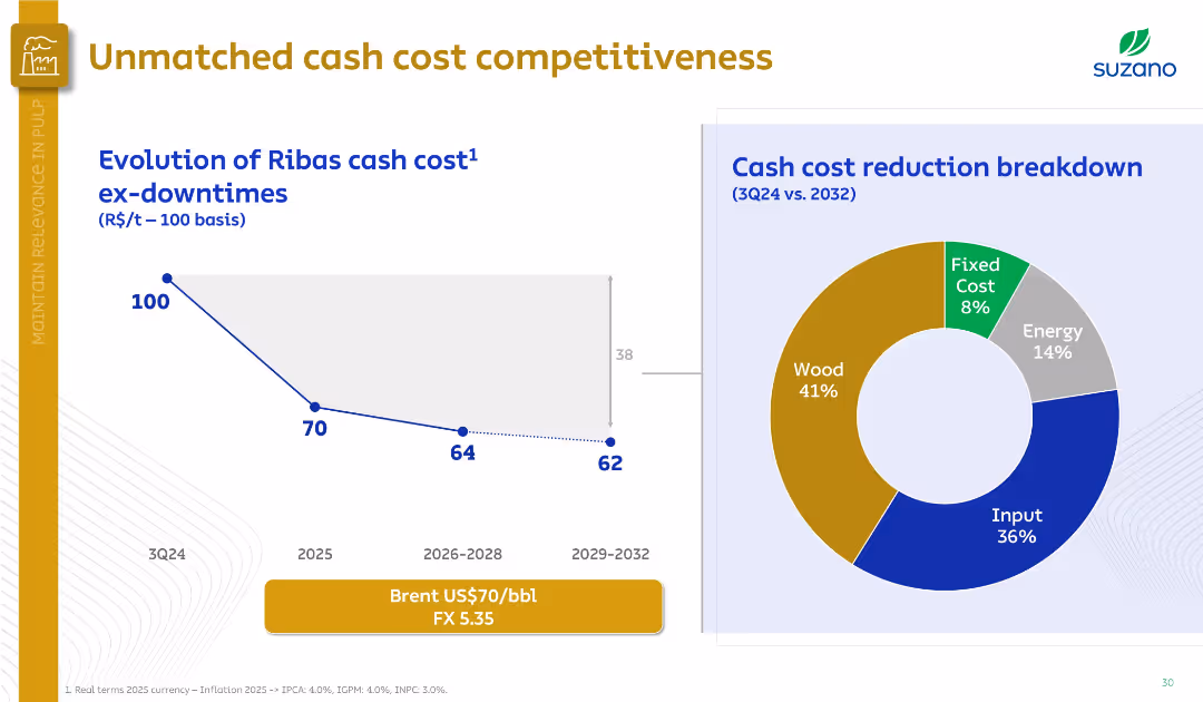
Left side features a downward cost trend graph; right side has a doughnut chart on cost breakdown. Professional, minimalistic design.
Financial Performance
Industrial & Manufacturing
The slide illustrates a projected reduction in Ribas mill cash costs, from 100 in 3Q24 to 62 by 2029–2032. A cost breakdown pie chart highlights wood (41%) and input (36%) as major contributors.
cash cost, Ribas mill, Suzano, wood, input, energy, cost breakdown, competitiveness
false
Financial Performance
Industrial & Manufacturing
Multiple Chart
Goldman Sachs
Add to my slides
Remove from favorites
This slide displays a stacked column chart for global Cash Equities revenue and two line graphs for share of Cash Equities volumes in the U.S., EMEA, and APAC.
Financial Performance
Financial Services
Reviews the revenue and market volume trends in Cash Equities from 2014 to 2018, showcasing growth and focus areas.
cash equities, revenue, growth, market trends
false
Financial Performance
Financial Services
Multiple Chart
JP Morgan
Add to my slides
Remove from favorites
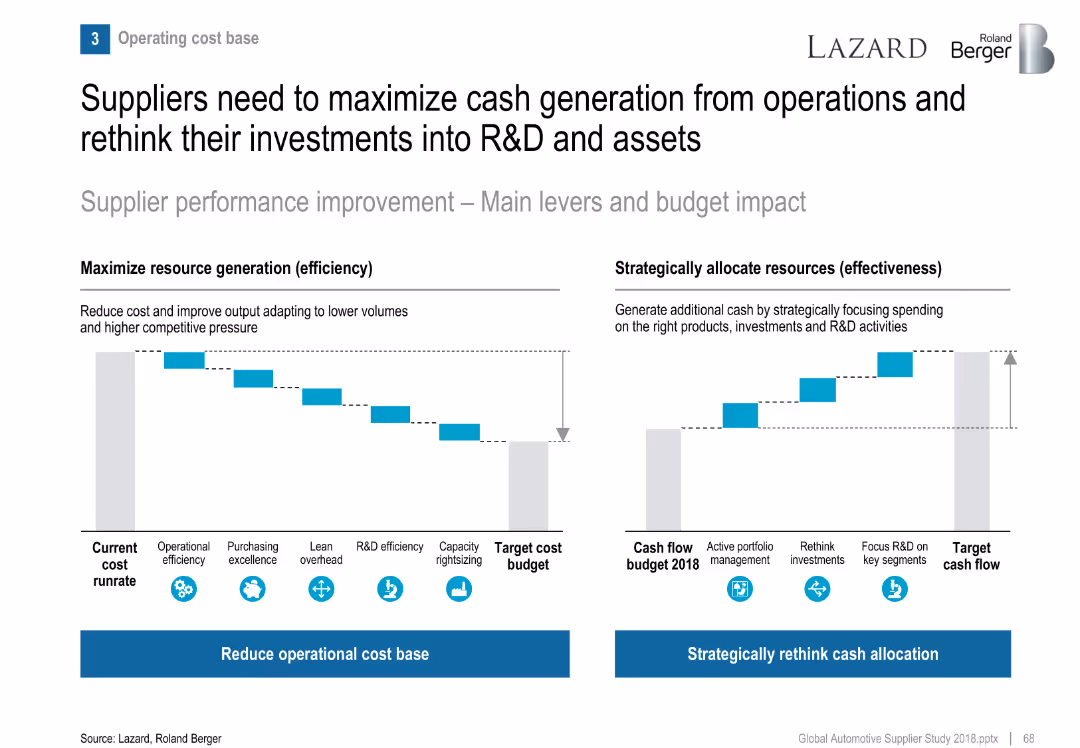
Two waterfall-style bar visuals: cost reduction levers and cash flow reallocation strategies.
Operational Efficiency
Industrial & Manufacturing
Recommends suppliers focus both on reducing operational cost base and reallocating cash to R&D and strategic segments to remain competitive.
cash flow, cost reduction, efficiency, R&D investment, supplier strategy
false
Operational Efficiency
Industrial & Manufacturing
Multiple Chart
Roland Berger
Add to my slides
Remove from favorites
Central diagram focused on free cash flow surrounded by four quadrants detailing business growth, support for dividends, debt leverage, and share repurchases.
Strategic Planning
Consumer Goods
Details strategic financial planning regarding the utilization of cash flow to support dividends, business growth, and other fiscal responsibilities.
cash flow, dividends, debt leverage, strategic planning, share repurchase
false
Strategic Planning
Consumer Goods
Framework
Barclays
Add to my slides
Remove from favorites
Includes a table and a pie chart along with a timeline, presented in a straightforward, easy-to-read format.
Financial Performance
Financial Services
Projects future cash flows, dividend payments, and investment allocations over the upcoming years.
cash flow, dividends, investment, financial forecasting, future projections
false
Financial Performance
Financial Services
Mixed Chart
Deutsche Bank
Add to my slides
Remove from favorites
This slide presents a series of column charts in shades of gray and green, outlining the projected free cash flow and uses for Permian Resources.
Financial Performance
Energy & Utilities
Outlines the financial projections for Permian Resources in 2023, focusing on free cash flow, dividend payments, and strategic financial planning amidst market volatility.
cash flow, financial planning, Permian Resources, 2023, dividends
false
Financial Performance
Energy & Utilities
Multiple Chart
Barclays
Add to my slides
Remove from favorites
A slide with two column charts depicting 'Total Revenues' and 'Adjusted EBITDA' over a six-year period. Blue bars are used to show growth over time, with key figures and annotations providing additional information.
Financial Performance
Financial Services
Discusses the company's strong cash flow generation, using historical data to highlight financial robustness and operational consistency. This slide serves as a basis for discussions on financial strategy and investor relations.
cash flow, financial strategy, operational consistency, investor relations
false
Financial Performance
Financial Services
Multiple Chart
Goldman Sachs
Add to my slides
Remove from favorites
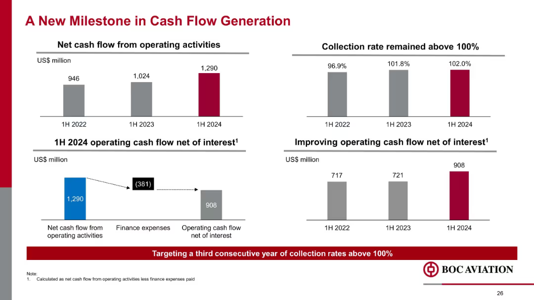
Four mini-charts with bold numbers; horizontal and vertical bar graphs; text boxes highlight improvements
Financial Performance
Financial Services
Demonstrates improved net cash flow from operations, reaching US$1.29B in 1H 2024. Collection rates surpassed 100%, and cash flow net of interest rose to US$908M, reinforcing operational strength and capital efficiency.
cash flow, interest, operating activities, collection rate, finance expense, aviation, liquidity, 2024 performance
false
Financial Performance
Financial Services
Multiple Chart
Goldman Sachs
Add to my slides
Remove from favorites
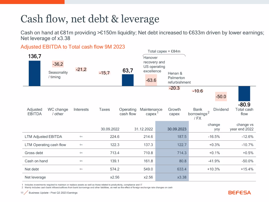
Waterfall chart with financial metrics and a table comparing key indicators over time
Financial Performance
Industrial & Manufacturing
Illustrates cash flow changes and leverage metrics. Shows adjusted EBITDA to total cash flow with detailed breakdowns. Net debt increased to €633m due to lower earnings and capex, leading to 3.38x leverage.
cash flow, net debt, leverage, EBITDA, capex, liquidity
false
Financial Performance
Industrial & Manufacturing
Mixed Chart
Goldman Sachs
Add to my slides
Remove from favorites
Waterfall chart from EBITDA to total cash flow, financial summary table at bottom with YoY changes.
Financial Performance
Industrial & Manufacturing
Shows cash flow decline to -€80.9m in 9M 2023, driven by capex, taxes, dividends, and seasonality. Net debt increased to €633m, and leverage ratio rose to x3.38. Positive cash flow from operations was not enough to offset outflows.
cash flow, net debt, leverage, capex, EBITDA, working capital
false
Financial Performance
Industrial & Manufacturing
Mixed Chart
Goldman Sachs
Add to my slides
Remove from favorites
Two sets of column charts dominate the slide. The left chart, in a dark to light blue gradient, represents 'OPERATING CASH FLOW AFTER INVESTMENTS' across five quarters. The right chart shows 'CASH FLOW OF INVESTMENTS' in the same period, categorized by associated companies and plot investments. The images in the lower right corner give a glimpse into a well-lit office space and a wooden interior, possibly a café or communal area within a business premise, hinting at the corporate setting.
Financial Performance
Financial Services
Highlights a strong cash flow performance, presenting data suitable for discussions in financial strategy meetings or investor briefings on company health.
cash flow, operating cash flow, investment, financial strategy, financial health, quarterly figures, corporate finance, financial services
false
Financial Performance
Financial Services
Multiple Chart
Goldman Sachs
Add to my slides
Remove from favorites
The slide displays a combination of a column chart and a dotted line graph indicating the evolution of Free Cash Flow (FCF) and Segment Operating Income (SOI) over several years. The dotted line represents the percentage change in volumes, whereas the bars represent actual financial figures in euros. It features past data and a projection for 2023. The Michelin logo is present.
Financial Performance
Financial Services
Highlighting the historical performance and future projections of free cash flow and segment operating income against volume changes, this slide visualizes the company's financial resilience and efficiency over time. It is likely used in investor presentations or financial reviews to demonstrate past performance and future expectations.
cash flow, operating income, financials, volumes, Michelin, performance, history, projections, efficiency, resilience
false
Financial Performance
Financial Services
Single Chart
Morgan Stanley
Add to my slides
Remove from favorites
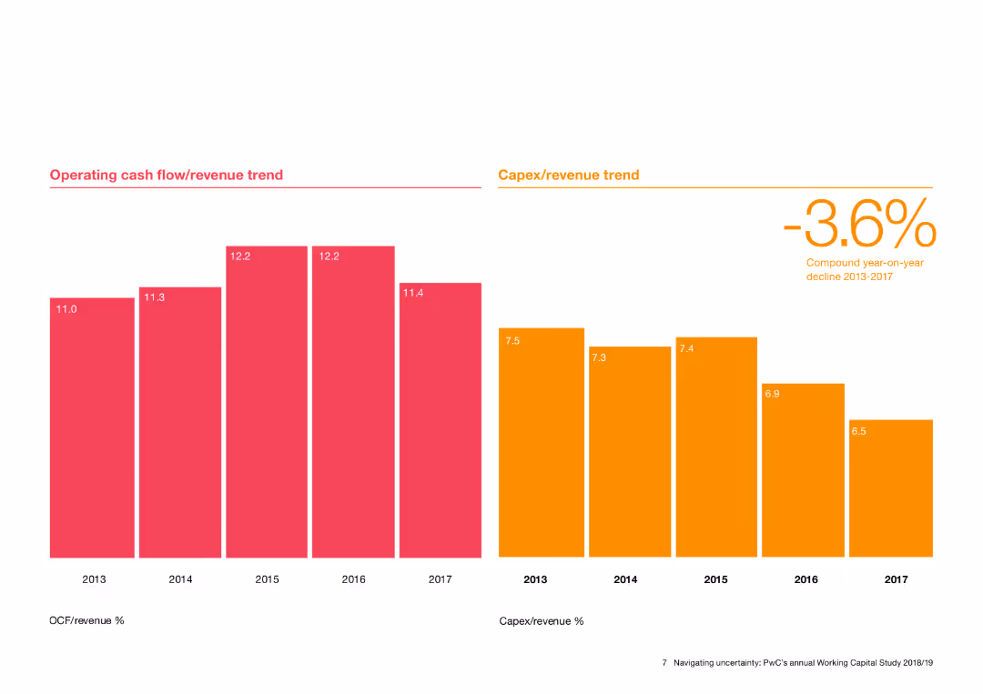
Features column charts showing operating cash flow/revenue and Capex/revenue trends from 2013 to 2017.
Financial Performance
Financial Services
Tracks the trends in operating cash flow and capital expenditure as a percentage of revenue over time, highlighting financial performance and investment levels.
cash flow, revenue trend, Capex, financial performance, investment
false
Financial Performance
Financial Services
Multiple Chart
PwC/Strategy&
Add to my slides
Remove from favorites
Contains a comparative bar graph of cash as a percentage of the annual budget for various states, showing legislative and actual cash reserves, complemented by a summary of cash flow sources and budget sizes.
Regulatory and Compliance
Government & Public Sector
Examines the cash limit requirements for NCDOT compared to other states, discussing the challenges in meeting these limits and the implications for fiscal planning, especially regarding the lack of segregated reserve funds.
cash limits, fiscal planning, NCDOT, state comparison, budget management
false
Regulatory and Compliance
Government & Public Sector
Single Chart
McKinsey
Add to my slides
Remove from favorites
This slide has a white and blue color theme with a bubble chart categorizing various cash-related initiatives by their typical EBIT impact and time to cash release. The chart uses different shades to distinguish between receivables, inventory, payables, and cross-cutting measures, with annotations for certain initiatives.
Financial Performance
Financial Services
The slide prioritizes cash-related initiatives based on their EBIT impact and time to cash release. It visually categorizes these initiatives into groups like "immediate cash opportunities" or "structural changes," providing a strategic overview for financial planning and cash flow management.
cash management, EBIT impact, financial planning, cash flow, strategic prioritization
false
Financial Performance
Financial Services
Single Chart
McKinsey
Add to my slides
Remove from favorites
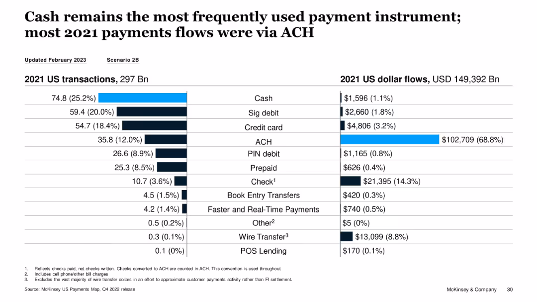
Split bar and table visualization of 2021 transaction volume vs. USD flows by instrument
Performance Metrics and KPIs
Financial Services
The slide highlights that while cash was the most used payment method by volume in 2021, ACH dominated in dollar flows, accounting for 68.8% of total value. This illustrates a divergence between transaction count and transaction value across instruments.
cash usage, ACH, transaction volume, dollar flows, payment instruments, 2021 data
false
Performance Metrics and KPIs
Financial Services
Single Chart
McKinsey
Add to my slides
Remove from favorites
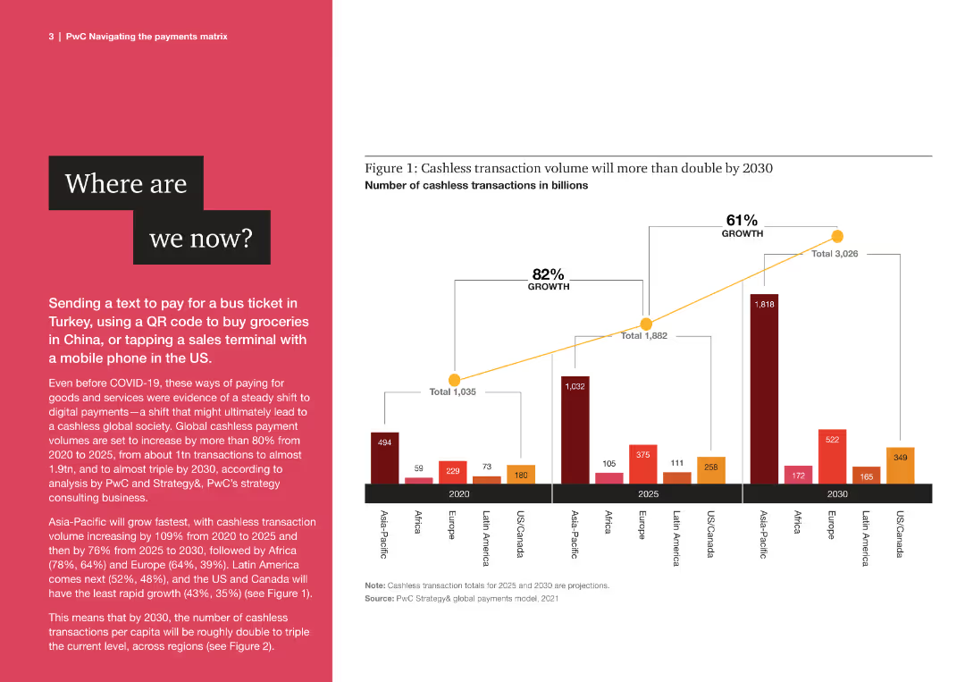
The slide features a column chart with multiple bars representing cashless transaction volumes from 2020 to 2030 across regions.
Market Analysis and Trends
Financial Services
The slide discusses the growth of cashless transactions globally, highlighting projected increases in various regions by 2030.
cashless, transactions, global, growth, projections, financial, trends, 2020, 2030, regions
false
Market Analysis and Trends
Financial Services
Mixed Chart
PwC/Strategy&
Add to my slides
Remove from favorites
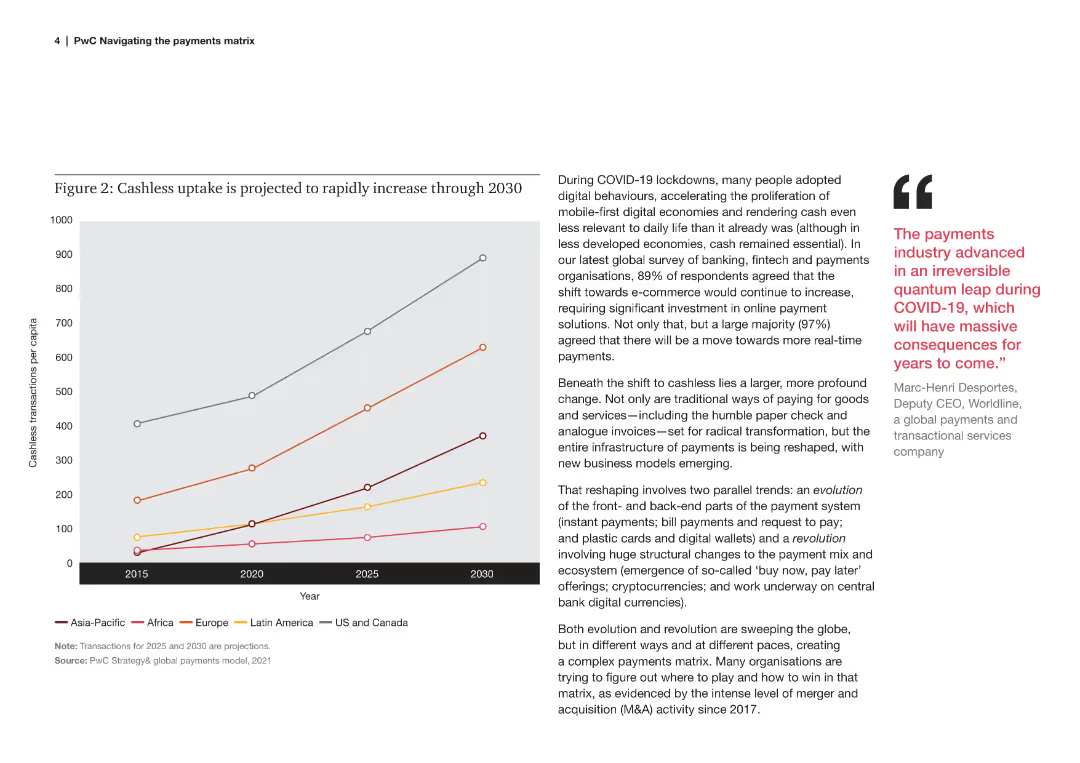
A line chart showing the projected increase in cashless transactions per capita across different regions from 2015 to 2030.
Market Analysis and Trends
Financial Services
This slide explains the projected increase in cashless transactions per capita globally, driven by digital behaviors post-COVID.
cashless, uptake, projection, regions, per capita, 2015, 2030, digital behaviors, COVID
false
Market Analysis and Trends
Financial Services
Mixed Chart
PwC/Strategy&
Add to my slides
Remove from favorites
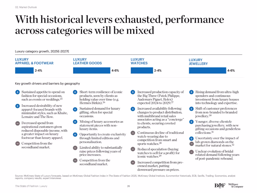
Four-segment layout comparing apparel & footwear, leather goods, watches, and jewellery. Each includes forecasted growth rates and key regional drivers and barriers in bullet format.
Strategic Planning
Consumer Goods
This slide emphasizes diverging performance among luxury categories from 2025–2027. While jewellery and leather goods are expected to grow 4–6%, apparel and watches will see only moderate growth. Key factors include secondhand market pressures, economic shifts, and consumer behavior changes.
category performance, growth forecast, secondhand competition, McKinsey, jewellery, apparel
false
Strategic Planning
Consumer Goods
Mixed Chart
McKinsey
Add to my slides
Remove from favorites
Includes text boxes and icons emphasizing the strategic benefits of cell manufacturing in Australia.
Market Analysis and Trends
Energy & Utilities
Advocates for prioritizing cell manufacturing in Australia due to its strategic importance to the battery value chain.
cell manufacturing, strategic importance, Australia, battery industry
false
Market Analysis and Trends
Energy & Utilities
Pillar
Accenture
Add to my slides
Remove from favorites
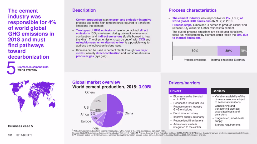
The slide features a detailed case study on the use of biomass in the cement industry, covering the description, process characteristics, global market overview, and drivers/barriers. It includes a pie chart showing world cement production by region for 2018.
Client Case Studies
Industrial & Manufacturing
This slide provides an in-depth analysis of the use of biomass in the cement industry, detailing the process steps, market potential, and the benefits and challenges of integrating biomass to reduce greenhouse gas emissions and improve sustainability.
cement industry, biomass, case study, process description, market overview, drivers, barriers, decarbonization
false
Client Case Studies
Industrial & Manufacturing
Multiple Chart
Kearney
Add to my slides
Remove from favorites
The slide features a column chart comparing domestic supply chain costs and freight costs for cement supply. The columns are divided into categories such as port, depot, rail, and road.
Operational Efficiency
Industrial & Manufacturing
The slide provides a breakdown of cement supply chain costs, showing that freight constitutes 55% of costs. It highlights different transportation methods and their respective cost percentages.
cement, supply chain, costs, transportation, freight, rail, road, port, depot
false
Operational Efficiency
Industrial & Manufacturing
Single Chart
LEK
Add to my slides
Remove from favorites
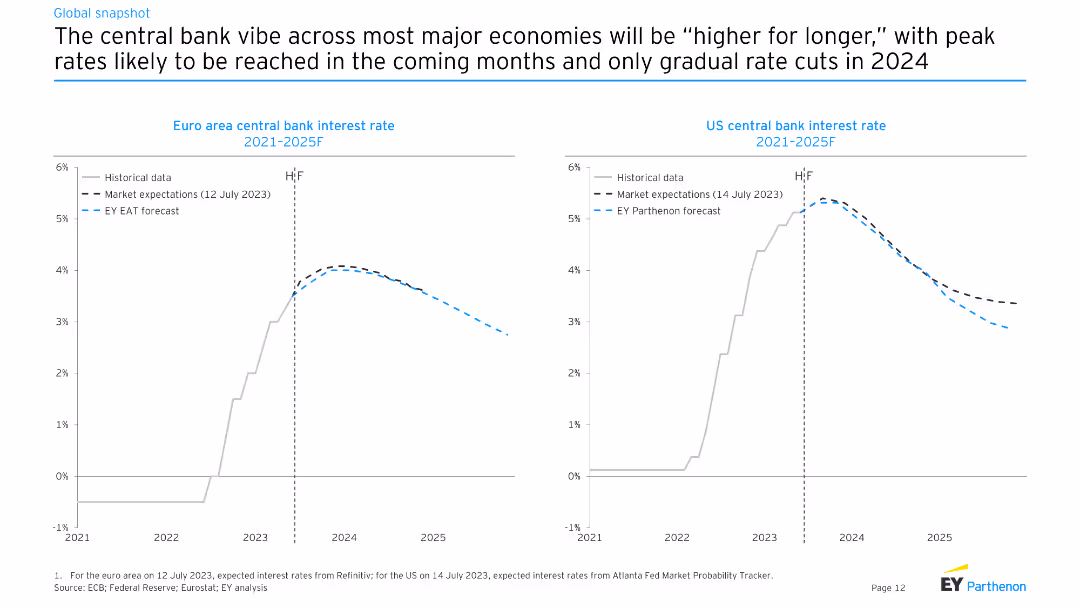
The slide features line charts comparing historical and expected future central bank interest rates for the Euro area and the US from 2021 to 2025F. Different lines represent historical data, market expectations, and EY Parthenon forecasts.
Market Analysis and Trends
Financial Services
The slide discusses the likelihood of higher central bank interest rates for longer periods in major economies, with projections showing gradual rate cuts starting in 2024.
central bank, interest rates, Euro area, US, forecasts
false
Market Analysis and Trends
Financial Services
Multiple Chart
EY
Add to my slides
Remove from favorites
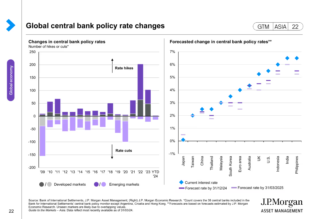
The slide contains two column charts. The left chart shows changes in central bank policy rates for developed and emerging markets. The right chart forecasts changes in central bank policy rates, with separate markers for current and forecasted rates.
Market Analysis and Trends
Financial Services
The slide analyzes changes and forecasts in global central bank policy rates, providing insights into monetary policy trends. It is useful for understanding economic strategies and planning.
central bank, policy rates, economic strategy, financial analysis, developed markets, emerging markets, monetary policy
false
Market Analysis and Trends
Financial Services
Multiple Chart
JP Morgan
Add to my slides
Remove from favorites
Line chart showing central bank key policy rates for various countries. Another chart shows expected policy rate changes over the next year.
Market Analysis and Trends
Financial Services
Tracks central bank policy rates globally, showing historical trends and expectations for future policy changes.
central bank, policy rates, key rates, changes, expectations
false
Market Analysis and Trends
Financial Services
Multiple Chart
JP Morgan
Add to my slides
Remove from favorites
The slide features a scatter plot with lines indicating inflation targets, current inflation, and inflation six months ago for various countries. Different markers are used to differentiate between the data points.
Regulatory and Compliance
Financial Services
The slide compares inflation targets and actual inflation rates across different countries, highlighting changes over time. It is used for regulatory analysis and understanding central bank policies.
central banks, inflation targets, regulatory compliance, economic analysis, country comparison, financial policies, inflation rates
false
Regulatory and Compliance
Financial Services
Single Chart
JP Morgan
Add to my slides
Remove from favorites
The slide has a white background with a line chart depicting inflation expectations and a text block summarizing economic trends.
Market Analysis and Trends
Financial Services
This slide discusses the stability of inflation expectations and central bank confidence, supported by a line chart showing real implied inflationary expectations for five- and ten-year TIPS.
central banks, inflation, market confidence, economic trends, financial services, analysis, stability, TIPS, expectations, overview
false
Market Analysis and Trends
Financial Services
Mixed Chart
McKinsey
Add to my slides
Remove from favorites
Line chart comparing central bank interest rates across major economies (USA, Eurozone, UK, India, etc.) over time, with text commentary.
Regulatory and Compliance
Financial Services
This slide outlines the recent interest rate decisions by central banks, highlighting increases by the ECB and Bank of England, while the Fed held steady. It provides context on manufacturing trends, unemployment, and global geopolitical factors affecting economic outlooks and exchange rate stability.
central banks, interest rates, ECB, Fed, monetary policy, inflation, regulation, macroeconomics, global risk, exchange rates
false
Regulatory and Compliance
Financial Services
Mixed Chart
McKinsey
Add to my slides
Remove from favorites
Line charts illustrating central bank rates and long-term interest rates from 2006-2024 across different countries.
Regulatory and Compliance
Financial Services
It discusses central bank policies and interest rate trends, indicating cautious easing measures to ensure sustained lower inflation.
central banks, policy, interest rates, inflation, trend, line chart, economic policy, long-term, forecast, 2006-2024
false
Regulatory and Compliance
Financial Services
Multiple Chart
EY
Add to my slides
Remove from favorites
Features a column chart showing centralized vs. decentralized decision support areas.
Financial Performance
Professional Services
Emphasizes the strategic value of centralizing decision support functions within GBS frameworks.
centralization, decision support, GBS, strategy, value
false
Financial Performance
Professional Services
Single Chart
Deloitte
Add to my slides
Remove from favorites
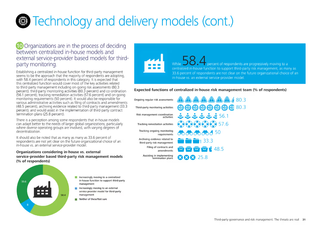
Pie chart showing organizational decisions on centralized in-house vs. external service-provider models for third-party management, with detailed expected functions.
Technology and Digital Transformation
Technology & Software
Discusses organizational preferences for centralized in-house vs. external models for third-party risk management and their expected functions, based on survey results.
centralized, in-house, external, third-party, management, pie chart
false
Technology and Digital Transformation
Technology & Software
Mixed Chart
Deloitte
Add to my slides
Remove from favorites
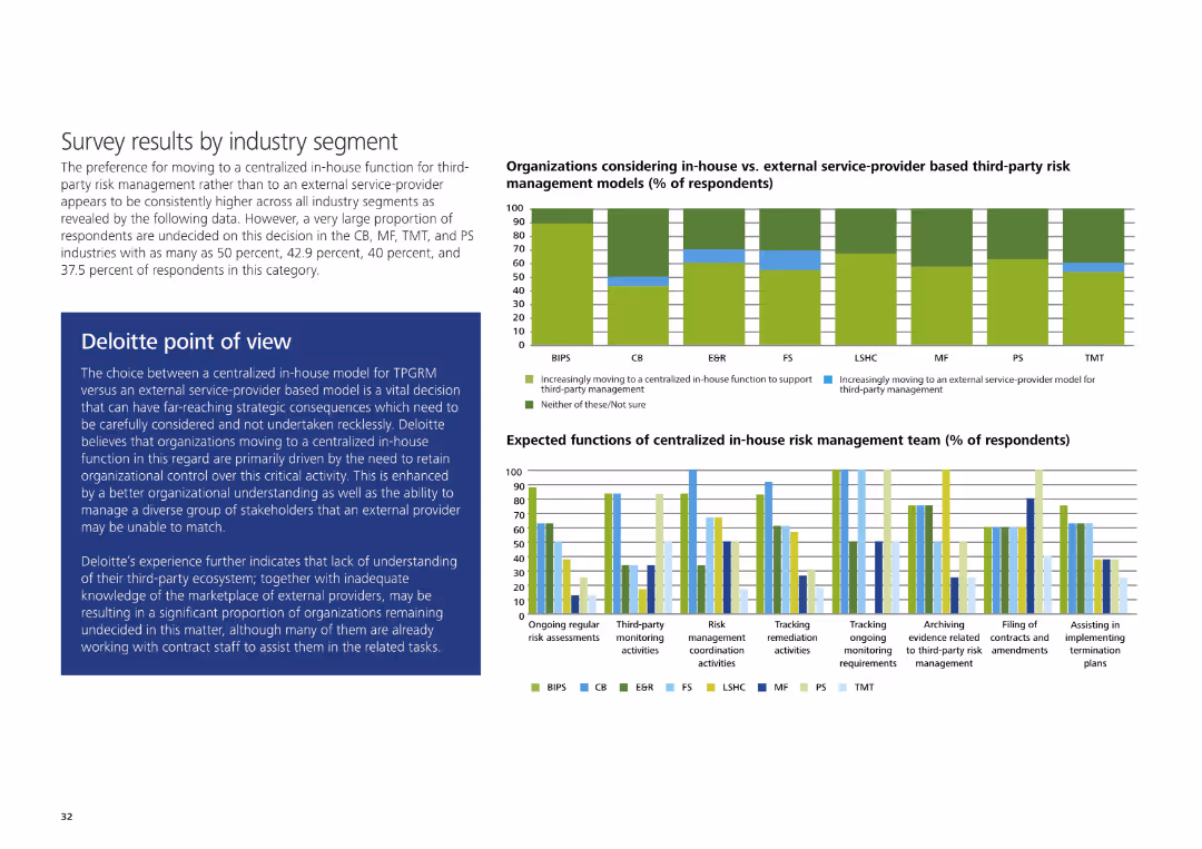
Column charts depicting preferences for centralized in-house functions and expected functions of in-house risk management teams, with Deloitte's point of view.
Technology and Digital Transformation
Technology & Software
Presents survey results on preferences for centralized in-house functions and expected functions of in-house risk management teams, segmented by industry.
centralized, in-house, third-party, risk management, industry segment, column chart
false
Technology and Digital Transformation
Technology & Software
Multiple Chart
Deloitte
Add to my slides
Remove from favorites
Diagram integrates circular and connective elements to discuss the relevance of certified second-hand goods for luxury brands and retailers.
Strategic Planning
Retail & E-commerce
Explores the strategic relevance of certified second-hand goods in the luxury market, focusing on brand and retail perspectives.
certified second-hand, luxury market, brand strategy, retail innovation, market trends
false
Strategic Planning
Retail & E-commerce
Vertical Flow
BCG
Add to my slides
Remove from favorites
Split design with text on left and stacked bar chart on right comparing challengers vs incumbents over years
Financial Performance
Consumer Goods
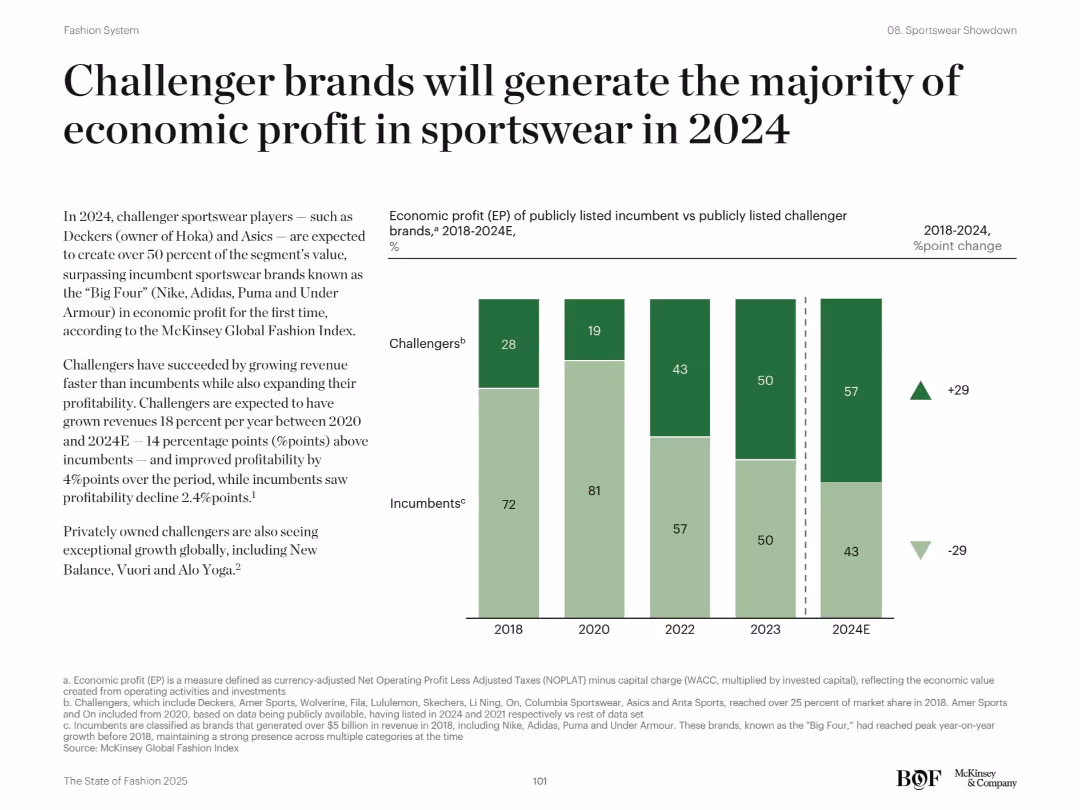
This slide reveals how challenger sportswear brands like Deckers and Asics are surpassing incumbents like Nike and Adidas in economic profit. The chart compares EP share between 2018–2024E, showing a clear shift toward challengers. The analysis explains challengers’ faster revenue growth and stronger profitability, while incumbents show decline.
challenger brands, sportswear, profit, incumbents, EP, growth, 2024, Nike, Asics
false
Financial Performance
Consumer Goods
Mixed Chart
McKinsey
Add to my slides
Remove from favorites
Column charts on this slide rank the most challenging aspects of the HCP engagement process based on a survey.
Risk Assessment and Management
Healthcare & Pharmaceuticals
Analyzes the challenges faced in the HCP engagement process, helping to identify areas needing improvement and focus.
challenges, HCP engagement, survey analysis, process improvement, risk management
false
Risk Assessment and Management
Healthcare & Pharmaceuticals
Single Chart
Deloitte
Add to my slides
Remove from favorites
Slide includes heatmap categorizing primary challenges and skill deficits in scaling digital projects across various business functions in the automotive sector.
Operational Efficiency
Transportation & Logistics
Outlines the major alignment and skill challenges automotive executives face when scaling digital proofs of concept, emphasizing areas needing improvement for successful implementation.
challenges, automotive, digital transformation, skills deficit, alignment issues
false
Operational Efficiency
Transportation & Logistics
Table
Accenture
Add to my slides
Remove from favorites
Left side features a pyramid chart, right side has percentage bubbles and text
Technology and Digital Transformation
Technology & Software
Challenges and use cases of generative AI in software engineering, focusing on code generation
challenges, code generation, software engineering
false
Technology and Digital Transformation
Technology & Software
Multiple Chart
Gartner
Add to my slides
Remove from favorites
Features a bar chart listing top challenges faced by underwriters, including outdated systems, lack of information, and poor organization, with percentage impacts.
Risk Assessment and Management
Financial Services
Highlights the main challenges faced by insurance underwriters, such as inefficient systems and insufficient data, critical for assessing operational and risk management issues.
challenges, insurance, underwriters, risk management, inefficient systems, data accessibility, training needs
false
Risk Assessment and Management
Financial Services
Mixed Chart
Accenture
Add to my slides
Remove from favorites
Includes multiple column charts comparing top challenges faced by underwriters in different lines of business, with focus on systems inefficiencies and training needs.
Risk Assessment and Management
Financial Services
Comparative analysis of top operational and risk management challenges across different insurance lines, emphasizing inefficiencies and the need for better training.
challenges, operational risks, insurance, comparison, systems inefficiency, training, personal lines, commercial lines, specialty lines
false
Risk Assessment and Management
Financial Services
Mixed Chart
Accenture
Add to my slides
Remove from favorites
A comparative slide with a bar chart showing the percentage of respondents identifying specific challenges in service capabilities, processes, funding, and practices across different service categories.
Operational Efficiency
Professional Services
This slide highlights the pivoting challenges faced by different service categories, focusing on service capabilities, investment focus, and management practices.
challenges, service capabilities, funding, management practices, processes
false
Operational Efficiency
Professional Services
Mixed Chart
Accenture
Add to my slides
Remove from favorites
With a split layout, the left side text emphasizes the pace of change, while the right side showcases a lighthouse graphic representing sensing capabilities.
Market Analysis and Trends
Professional Services
Emphasizes the importance of rapid demand-sensing capabilities in different sectors, attributing the necessity to fast-paced changes and consumer behavior.
change pace, consumer behavior, demand-sensing, sectors, analytics, data
false
Market Analysis and Trends
Professional Services
Header Horizontal
BCG
Add to my slides
Remove from favorites
The slide contains a graph showing normal to disrupted patterns and a juxtaposed image of falling blocks.
Financial Performance
Professional Services
Discusses the challenges companies face during disruptive changes and emphasizes the negative impacts on work quality and productivity.
change, disruption, challenges, impact, quality
false
Financial Performance
Professional Services
Single Chart
Bain
Add to my slides
Remove from favorites
The slide features a circular diagram showing "Macro Forces," "Shifts," and "Signals" with arrows indicating change and response/inspiration actions.
Strategic Planning
Professional Services
The slide explains how change happens at various levels, using macro forces, shifts, and signals, and how Ipsos uses this framework to monitor trends over time.
change, macro forces, shifts, signals, Ipsos
false
Strategic Planning
Professional Services
Diagram
IPSOS
Add to my slides
Remove from favorites
Two-column layout; left side has large text title, right side has a vertical bar chart and six boxes with key points.
Organizational Structure and Change
Professional Services
Focuses on the importance of managing change in organizations and lists factors like engaging staff and leveraging technology.
change, management, success, factors, leverage
false
Organizational Structure and Change
Professional Services
Multiple Chart
Kearney
Add to my slides
Remove from favorites
Various radar charts, streamlined design with clear, distinctive icons and color coding for different industries.
Customer and Market Segmentation
Telecommunications
Analyzes channel investment plans across different industries and regions, focusing on digital and automated options.
channel investment, industry analysis, region, digital
false
Customer and Market Segmentation
Telecommunications
Multiple Chart
Deloitte
Add to my slides
Remove from favorites
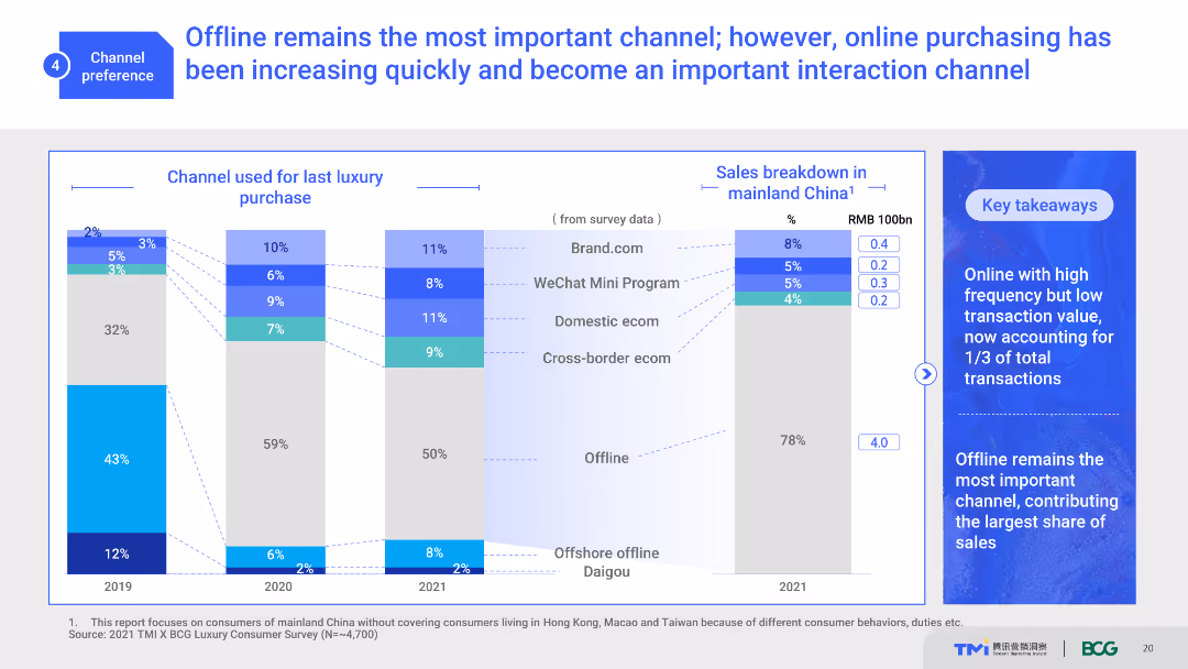
The slide uses a combination of stacked bar charts and text boxes to illustrate the importance of offline and online channels for luxury purchases. It shows channel usage trends from 2019 to 2021 and a sales breakdown in mainland China. The visual complexity is moderate with clear data presentation.
Market Analysis and Trends
Retail & E-commerce
This slide highlights the shifting consumer preferences between offline and online channels for luxury purchases. It shows historical trends and current channel usage, emphasizing the growing importance of online interactions.
channel preference, offline, online, luxury purchases, consumer behavior
false
Market Analysis and Trends
Retail & E-commerce
Multiple Chart
BCG
Add to my slides
Remove from favorites
The slide features a bar chart displaying the percentage usage of various channels (OOH, Social Media, TV, Interactive/Online, VOD, etc.) by entrants and winners. Bars are vertically oriented and categorized by type of channel.
Strategic Planning
Media & Entertainment
This slide emphasizes the importance of selecting the right channels for marketing, showing the percentage usage of different channels by winners and entrants to illustrate strategic channel selection.
channel selection, marketing, bar chart, strategic planning, media usage
false
Strategic Planning
Media & Entertainment
Mixed Chart
IPSOS
Add to my slides
Remove from favorites
The slide includes a line chart illustrating the relationship between the number of channels used and effectiveness. Data points show award scores for varying numbers of channels used by entrants, finalists, and winners.
Market Analysis and Trends
Media & Entertainment
This slide examines the trend that using more channels leads to more effective marketing work, supported by data from Effie awards entries over several years.
channels, effectiveness, line chart, marketing, Effie awards
false
Market Analysis and Trends
Media & Entertainment
Single Chart
IPSOS
Add to my slides
Remove from favorites
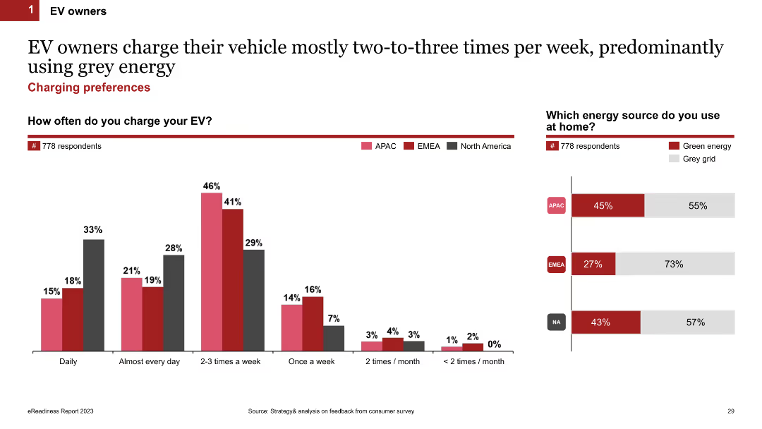
Column chart showing how often EV owners charge their vehicles (daily, weekly, etc.) and the type of energy source used at home (green energy or grey grid). The slide uses color-coded bars for different regions.
Market Analysis and Trends
Transportation & Logistics
This slide examines how frequently EV owners charge their vehicles and the types of energy sources they use at home, comparing green energy and grey grid usage across different regions.
charging frequency, energy sources, home charging, EV owners, regional comparison
false
Market Analysis and Trends
Transportation & Logistics
Multiple Chart
PwC/Strategy&
Add to my slides
Remove from favorites
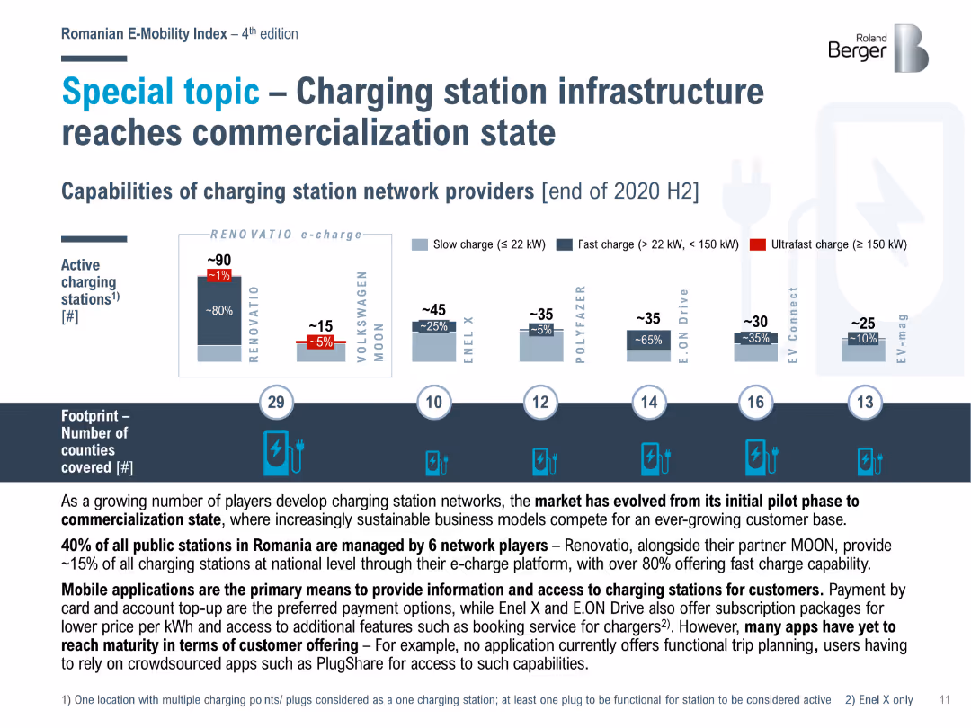
Bar chart showing the capabilities of charging station network providers in Romania at the end of 2020 H2, including the number of slow, fast, and ultrafast charging stations.
Market Analysis and Trends
Energy & Utilities
Analyzes the commercialization of charging station infrastructure in Romania, with details on the capabilities of different network providers and the spread across counties.
charging infrastructure, commercialization, Romania, network providers
false
Market Analysis and Trends
Energy & Utilities
Mixed Chart
Roland Berger
Add to my slides
Remove from favorites
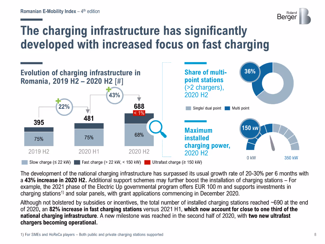
Bar chart showing the evolution of charging infrastructure in Romania from 2019 H2 to 2020 H2, highlighting the increase in fast and ultrafast charging stations.
Market Analysis and Trends
Energy & Utilities
Analyzes the significant development of charging infrastructure in Romania, with a notable increase in fast and ultrafast charging stations and support from government programs.
charging infrastructure, fast charging, Romania, development
false
Market Analysis and Trends
Energy & Utilities
Multiple Chart
Roland Berger
Add to my slides
Remove from favorites
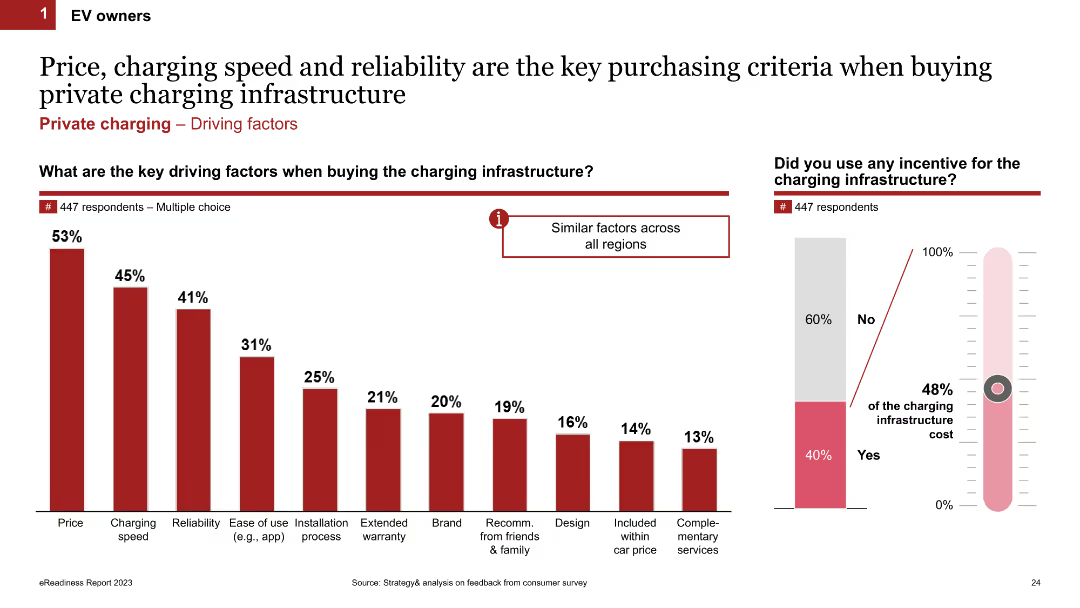
Column chart showing the key driving factors when buying charging infrastructure. It lists factors like price, charging speed, reliability, and ease of use. The slide includes multiple charts, such as a thermometer chart showing incentives used.
Market Analysis and Trends
Transportation & Logistics
This slide outlines the main factors influencing the purchase of charging infrastructure for EV owners. It highlights price, charging speed, reliability, and other factors like ease of use and installation process.
charging infrastructure, purchase criteria, key factors, incentives, EV owners
false
Market Analysis and Trends
Transportation & Logistics
Multiple Chart
PwC/Strategy&
Add to my slides
Remove from favorites
Column chart and stacked bar charts showing where EV owners primarily charge their vehicles (at home, office, street) across APAC, EMEA, and North America. The slide uses icons and percentages to display data.
Market Analysis and Trends
Transportation & Logistics
This slide details the primary charging locations for EV owners, highlighting regional preferences for charging at home, at the office, or on the street.
charging preferences, primary location, EV owners, regional differences, home charging
false
Market Analysis and Trends
Transportation & Logistics
Multiple Chart
PwC/Strategy&
Add to my slides
Remove from favorites
Column chart and multiple bar charts showing the loyalty of EV owners to charging providers based on location convenience, price, and power. It includes tariff usage and reasons for choosing different providers.
Customer and Market Segmentation
Transportation & Logistics
This slide analyzes the loyalty of EV owners to their charging providers, emphasizing factors such as location convenience, pricing tariffs, and power speed. It also discusses reasons for switching providers and typical tariff usage.
charging provider loyalty, location convenience, tariff usage, EV owners, provider comparison
false
Customer and Market Segmentation
Transportation & Logistics
Multiple Chart
PwC/Strategy&
Add to my slides
Remove from favorites
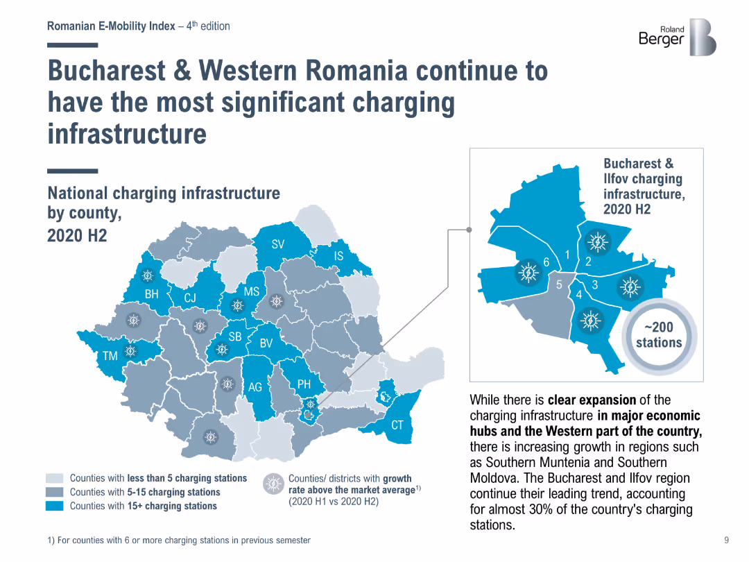
Map showing the distribution of charging stations across Romanian counties in 2020 H2, emphasizing the concentration in Bucharest and Western Romania.
Market Analysis and Trends
Energy & Utilities
Highlights the regional distribution of charging infrastructure in Romania, with Bucharest and Western Romania having the highest number of charging stations.
charging stations, Bucharest, Romania, infrastructure
false
Market Analysis and Trends
Energy & Utilities
Graphic
Roland Berger
Add to my slides
Remove from favorites
Previous
Next
You don't have any favorites yet.
Please wait loading your favorites slides...
Create a FREE account to continue browsing
Receive Instant Access to 1,000+ slides from companies like McKinsey, Google, and Goldman Sachs
First Name
Last Name
Email
Password
I agree to all
Terms & Privacy Policy
Thank you! Your submission has been received!
Oops! Something went wrong while submitting the form.
Have an account?
Sign in
Upgrade to PRO to Save slides
Advanced Search and Filters
Access to 15,000+ slides
Access to Category Pages
Save/Bookmark Slides
PowerPoint Template Library
Pick a Plan
MONTHLY
$12/month
Billed every month, Cancel anytime.
YEARLY
$9/year
Billed $108 annually, Cancel anytime.
Checkout for $12/month
Checkout for $108/yr
Secured by Stripe | AES-256 bit encryption