Create a FREE Account
Instant access to 1,000+ real slides from top companies like McKinsey, BCG, Goldman Sachs, Google and many more!
First Name
Last Name
Email
Password
I agree to all
Terms & Privacy Policy
Thank you! Your submission has been received!
Oops! Something went wrong while submitting the form.
Have an account?
Sign in
Library
Templates
Courses
Pricing
My Account
My Slides
My Templates
✦ AI
AI Prompt Library
AI Search
Sign in
Start Here
Logout
My Saved Slides
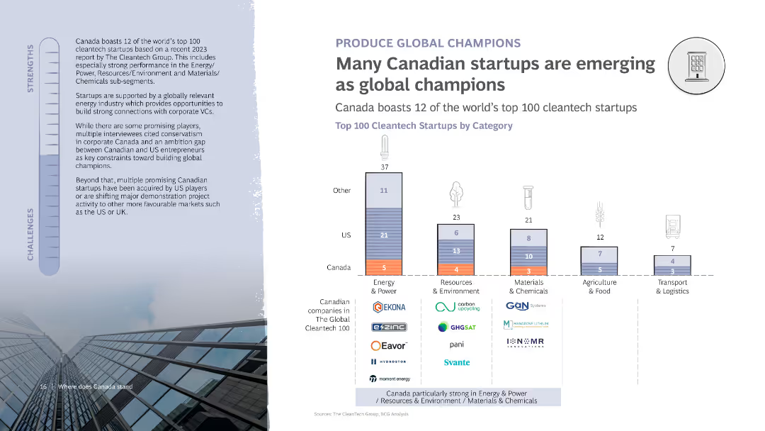
The slide includes a column chart showing the top 100 cleantech startups by category, with a breakdown of companies from Canada and the US. It features text discussing the strengths and challenges of Canadian startups in becoming global champions.
Competitive Landscape
Technology & Software
Discusses the emergence of Canadian startups as global leaders in cleantech, with specific examples from various categories. Highlights strengths and challenges in achieving global recognition and success.
Startups, Cleantech, Canada, Global champions, Chart
Mixed Chart
BCG
Saved
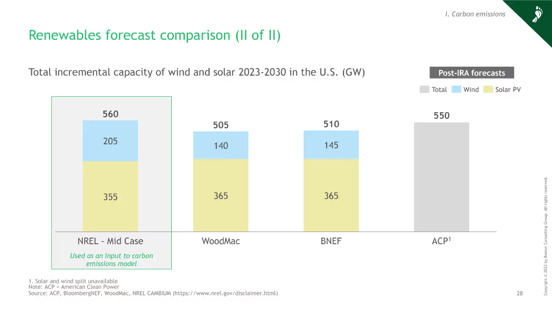
Column chart showing total incremental capacity of wind and solar in the U.S. from 2023 to 2030 by different sources. Divided into total, wind, and solar PV components.
Market Analysis and Trends
Energy & Utilities
This slide presents the forecasted incremental capacity of wind and solar in the U.S. from 2023 to 2030. It compares projections from different sources for informed decision-making.
renewables, forecast, wind, solar, capacity, U.S., incremental, 2030, trends
Single Chart
BCG
Saved
A column graph with annotations displays the shift in venture deal mix by investment round, highlighting the movement away from early-stage funding.
Investment Analysis
Technology & Software
This slide analyzes changes in the investment round mix within the technology sector, pointing out a significant shift from early-stage Angel and Seed funding towards later-stage investments. It discusses the volatility and the strategic adjustments in venture capital allocations in response to market conditions and the startup ecosystem's evolution.
funding shift, Angel funding, Seed funding, investment rounds, venture capital
Single Chart
Oliver Wyman
Saved
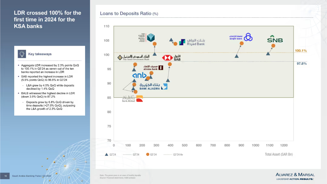
Left column outlines findings; right is a scatter plot comparing total assets vs. loan-to-deposit ratio for banks, with performance markers.
Risk Assessment and Management
Financial Services
Details Q3’24 increase in Loan-to-Deposit Ratio (LDR), crossing 100%. Visual comparison of banks’ asset sizes and LDR positions shows liquidity strength or risk exposure.
LDR, liquidity risk, total assets, Q3’24, KSA banks, deposit ratio, financial stress, risk indicators, balance sheet
Mixed Chart
Alvarez & Marsal
Saved
Features column charts and statistics on community engagement, volunteer hours, and the impact of community hubs on quality of life.
Operational Efficiency
Government & Public Sector
Assesses the impact of community hubs on participant engagement and quality of life improvements, detailing volunteer contributions and personal benefits.
Community hubs, engagement, quality of life, volunteer hours, personal benefits
Multiple Chart
Deloitte
Saved
Highly data-centric slide with graphs, charts, and bullet points presenting various leading indicators for economic recovery.
Performance Metrics and KPIs
Technology & Software
Provides a detailed dashboard of leading indicators related to COVID-19's economic impact in China, valuable for analysts and strategists.
COVID-19, economic indicators, China, Hubei, recovery tracking, consumer confidence, economic restart
Multiple Chart
McKinsey
Saved
Comprises a large pie chart detailing loan compositions across various sectors, color-coded for clarity. Key highlights provide insights into risk management and sector allocation.
Risk Assessment and Management
Financial Services
Provides an overview of the loan distribution by sector, highlighting the diversity and risk associated with different segments. It offers insights into risk management practices and strategic loan portfolio diversification within a financial institution.
loans, risk management, financial, diversification, sectors
Mixed Chart
Deutsche Bank
Saved
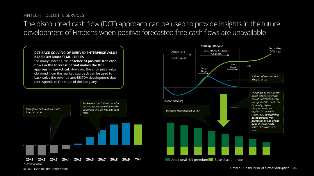
The slide contains a column chart and a line graph illustrating the DCF approach for fintechs, along with a lifecycle diagram of startups. The visual elements are dense and detailed, aimed at technical audiences. Complexity is advanced.
Financial Performance
Financial Services
Discusses the DCF approach to valuing fintechs in the absence of positive cash flows. The slide includes charts and diagrams to explain how enterprise value is derived using market multiples and discount rates. Useful for financial analysis.
DCF, valuation, fintech, enterprise value, cash flow, discount rates
Multiple Chart
Deloitte
Saved
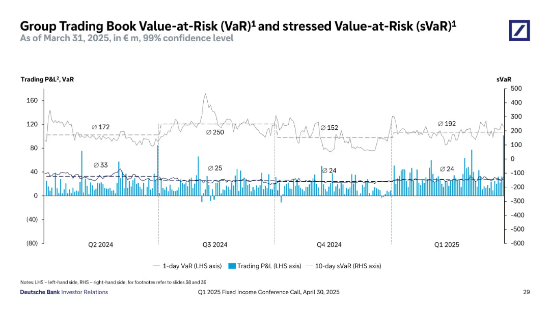
Time series graph showing 1-day VaR, 10-day sVaR, and trading P&L.
Risk Assessment and Management
Financial Services
Depicts Deutsche Bank's trading risk exposure over time using Value-at-Risk metrics. The chart includes 1-day VaR, 10-day stressed VaR, and daily trading profit and loss, tracked from Q2 2024 to Q1 2025. Shows volatility in sVaR and stability in VaR, helping assess market risk sensitivity and backtesting effectiveness in trading operations.
value-at-risk, VaR, sVaR, trading risk, Deutsche Bank, Q1 2025, financial exposure, P&L, market sensitivity, stress testing
Single Chart
Deutsche Bank
Saved
Ranked list with icon indicators and trend arrows; text-heavy layout with bullets and numbering; dark blue background
Regulatory and Compliance
Government & Public Sector
The slide ranks key enablers of increased German investment, including talent regulation, innovation procurement, and competitive energy pricing, based on CxO survey data.
Investment factors, Germany, talent, innovation, energy, ranking, CxO, 2025
Header Vertical
McKinsey
Saved
The slide is divided into two sections, each featuring bar charts. One section shows the number of employees, and the other shows annual sales revenue percentages. This layout allows for quick comparisons between different size categories.
Market Analysis and Trends
Professional Services
This slide continues the demographic breakdown of the survey participants, focusing on the number of employees and sales revenue. It provides insights into the scale of companies involved in the survey, which can be critical for understanding the economic impact of their views and decisions.
Employees, Sales Revenue, Demographics, Survey, Company Size
Multiple Chart
Deloitte
Saved
A text section on the left and two pie charts on the right represent the global market size and IBKR's international customer distribution.
Market Analysis and Trends
Financial Services
The slide communicates Interactive Brokers' global reach in terms of customer distribution and market potential, using pie charts to showcase demographic and financial data.
Global Market, Interactive Brokers, Customer Distribution, Pie Charts, Addressable Market, Demographics, Financial Assets, International
Multiple Chart
Goldman Sachs
Saved
This slide presents a detailed table showing industry trends, impacts on factory automation products, and their overall impacts. It includes column charts depicting benefits of IT & OT convergence, cost reduction through XaaS, and market forecasts for AI in manufacturing, smart machines, IoT connected machines, and cobots.
Technology and Digital Transformation
Industrial & Manufacturing
The slide discusses trends in automation aimed at creating intelligent factories with improved flexibility, quality, security, and productivity. It highlights the convergence of IT and OT, XaaS, intelligent manufacturing, and new technology in manufacturing.
Automation, Intelligent Factories, IT & OT Convergence, XaaS, AI, Smart Machines, IoT, Cobots, Technology
Multiple Chart
LEK
Saved
Slide includes two bar charts and a column chart, and detailed text explanations.
Technology and Digital Transformation
Technology & Software
Discusses methodology for assessing application diversity and interoperability in enterprise applications.
Enterprise, application, diversity, interoperability, methodology
Multiple Chart
Accenture
Saved
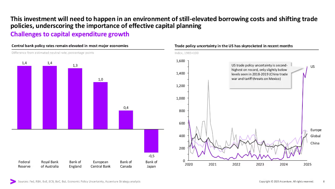
Two-part layout: bar chart of interest rates on left and line graph on right showing trade policy uncertainty. Use of purple for main metrics and annotation callouts.
Risk Assessment and Management
Financial Services
Highlights challenges to capex, including elevated central bank rates and increased trade policy uncertainty (especially in the US). Shows both monetary and geopolitical risks impacting capital planning.
capex, policy rates, risk, trade policy, investment, borrowing costs
Multiple Chart
Accenture
Saved
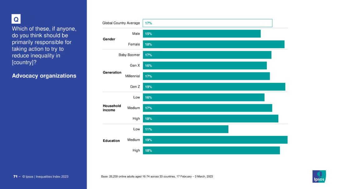
Bar chart by demographics (gender, generation, income, education); blue question box on left and bars on right.
Market Analysis and Trends
Government & Public Sector
The slide breaks down public support for advocacy organizations by demographic segments, showing slightly more support from younger generations and educated individuals.
advocacy, inequality, demographic trends, education, income, public opinion
Mixed Chart
IPSOS
Saved
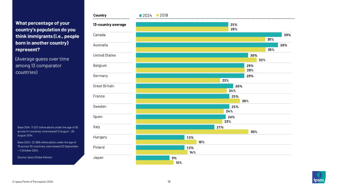
Dual bar chart (2024 vs 2018) showing perception trends in 13 countries; green and yellow bars distinguish years.
Market Analysis and Trends
Government & Public Sector
This trend slide compares changes over time in public perception of immigrant populations across 13 countries from 2018 to 2024. It shows whether the average guess has risen or fallen, revealing persistent overestimation in most cases.
trend analysis, immigration perception, longitudinal data, public opinion trends, overestimation, Ipsos data, perception change
Mixed Chart
IPSOS
Saved
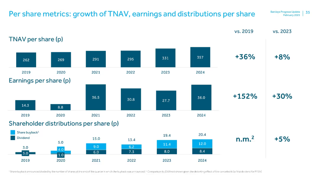
Three-panel stacked bar chart covering TNAV, earnings, and shareholder distributions per share from 2019–2024, with % change vs 2019 and 2023 shown on the right.
Financial Performance
Financial Services
The slide tracks 5-year per-share metrics. TNAV rose 36% vs. 2019; EPS grew 152%, and distributions also increased. A focus on long-term value creation through sustained earnings and return to shareholders.
TNAV, earnings per share, shareholder value, dividend, buyback, 5-year trend
Multiple Chart
Barclays
Saved
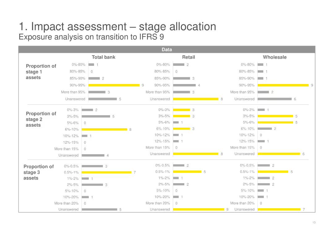
This slide includes three sets of horizontal bar charts showing the proportion of stage 1, 2, and 3 assets for Total bank, Retail, and Wholesale categories. The slide uses yellow and gray colors to differentiate data segments.
Risk Assessment and Management
Financial Services
The slide analyzes the exposure on transition to IFRS 9, detailing the proportions of stage 1, 2, and 3 assets across Total bank, Retail, and Wholesale categories, highlighting the potential impact and risks involved.
IFRS 9, stage allocation, risk assessment, transition, financial services, exposure analysis
Multiple Chart
EY
Saved
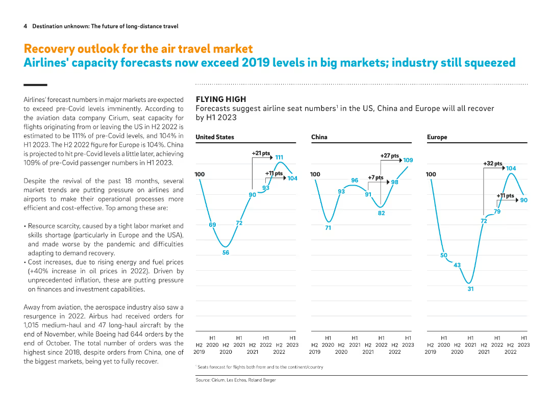
Full-slide with three line graphs on seat capacity forecasts and accompanying explanation of airline and aerospace trends. Emphasizes post-Covid recovery in the US, China, and Europe.
Strategic Planning
Transportation & Logistics
Forecasts suggest airline seat capacities will exceed 2019 levels by H1 2023. The slide also highlights industry pressures such as resource scarcity, labor shortages, and rising fuel costs. Aerospace orders have rebounded, especially in the US and Europe.
Airline capacity, post-Covid recovery, seat forecast, labor shortages, fuel prices, aerospace orders, air travel market
Multiple Chart
Roland Berger
Saved
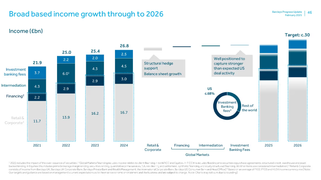
Multi-segment vertical bar chart showing income streams by type (Retail & Corporate, Global Markets, etc.) from 2021–2026.
Financial Performance
Financial Services
Projects Barclays' group income growth toward a ~£30bn target by 2026. Breaks down sources including retail, corporate, and investment banking. Highlights contributions from the U.S. and notes structural supports like hedge and balance sheet growth.
income growth, investment banking, financing, structural hedge, US exposure
Multiple Chart
Barclays
Saved
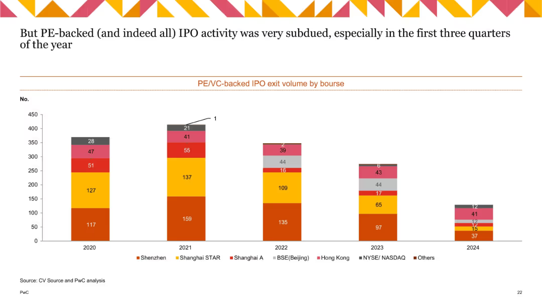
Stacked bar chart showing IPO exit volumes by bourse (2020–2024), categorized by regions like Shenzhen, Hong Kong, NASDAQ, etc.
Mergers and Acquisitions
Financial Services
This slide presents the volume of IPO exits by stock exchange for PE/VC-backed companies. It shows a broad decline over time, particularly notable in 2023–2024, with Shenzhen and Shanghai STAR remaining relatively strong. The subdued IPO activity suggests ongoing market caution and valuation concerns.
IPO exits, PE-backed IPO, VC-backed IPO, bourse, Shenzhen, Hong Kong, NASDAQ, trend
Single Chart
PwC/Strategy&
Saved
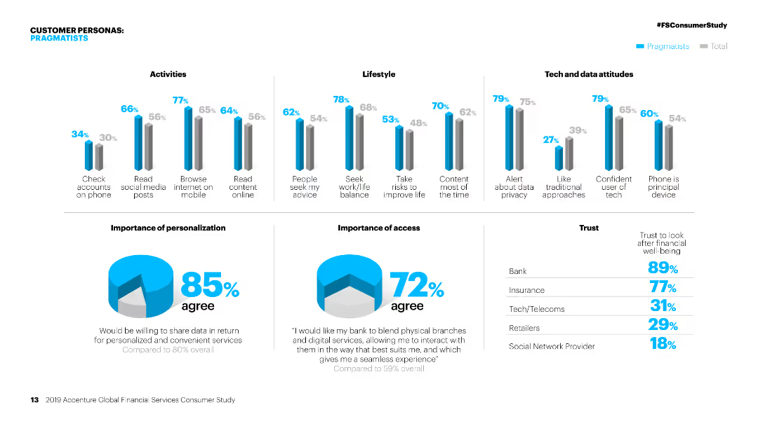
Column charts showing activities, lifestyle, and tech attitudes of 'Pragmatists' compared to the total. Pie charts on personalization and access.
Customer and Market Segmentation
Financial Services
Detailed segmentation of 'Pragmatists' in financial services, focusing on their activities, lifestyle, attitudes towards tech, and personalization preferences.
Personas, financial services, segmentation, pragmatists, activities, lifestyle, tech attitudes, personalization, market study, access
Multiple Chart
Accenture
Saved
Slide with three column and icons related to "Ecosystem co-innovation", "Transition support", and "Regional collaboration". Includes detailed actions for regions and sectors to improve sustainability efforts.
Strategic Planning
Environmental Services & Sustainability
Expands on previous discussions about enhancing SEA's green economy at an ecosystem level, outlining specific collaborative actions and support mechanisms necessary for environmental sustainability.
ecosystem, SEA, sustainability, collaboration, innovation
Pillar
Bain
Saved
The slide features a column chart showing contributions to US real GDP growth by various components and a line chart of US Purchasing Managers’ Indices (PMI) for manufacturing and services sectors.
Market Analysis and Trends
Financial Services
This slide analyzes US GDP growth contributions and PMI trends, providing a comprehensive view of the country's economic performance and business activity.
US GDP, business surveys, economic performance, PMI, growth components
Multiple Chart
JP Morgan
Saved
Previous
Next
If nothing, comes up, please save your slides first
Create a FREE account to continue browsing
Receive Instant Access to 1,000+ slides from companies like McKinsey, Google, and Goldman Sachs
First Name
Last Name
Email
Password
I agree to all
Terms & Privacy Policy
Thank you! Your submission has been received!
Oops! Something went wrong while submitting the form.
Have an account?
Sign in
Column Chart
Heatmap
Chevron
Org Chart
Infographic
Callouts
Timeline
List
Graphic
Picture
Process Flow
Diagram
Paragraph
Map
Table
Framework
Subtitle
Takeaway Box
Icon
Other Chart
Radar Chart
Waterfall Chart
Mekko Chart
Pie Chart
Scatter Plot
Line Chart
Bar chart
Bullet points