Create a FREE Account
Instant access to 1,000+ real slides from top companies like McKinsey, BCG, Goldman Sachs, Google and many more!
First Name
Last Name
Email
Password
I agree to all
Terms & Privacy Policy
Thank you! Your submission has been received!
Oops! Something went wrong while submitting the form.
Have an account?
Sign in
Library
Templates
Courses
Pricing
My Account
My Slides
My Templates
✦ AI
AI Prompt Library
AI Search
Sign in
Start Here
Logout
My Saved Slides
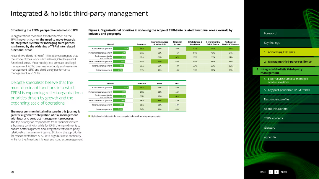
The slide features a column chart showing data distribution and statistics about third-party risk management practices.
Risk Assessment and Management
Professional Services
This slide presents data on third-party risk management practices and their distribution across various parameters.
third-party, risk management, data distribution, statistics
Multiple Chart
Deloitte
Saved
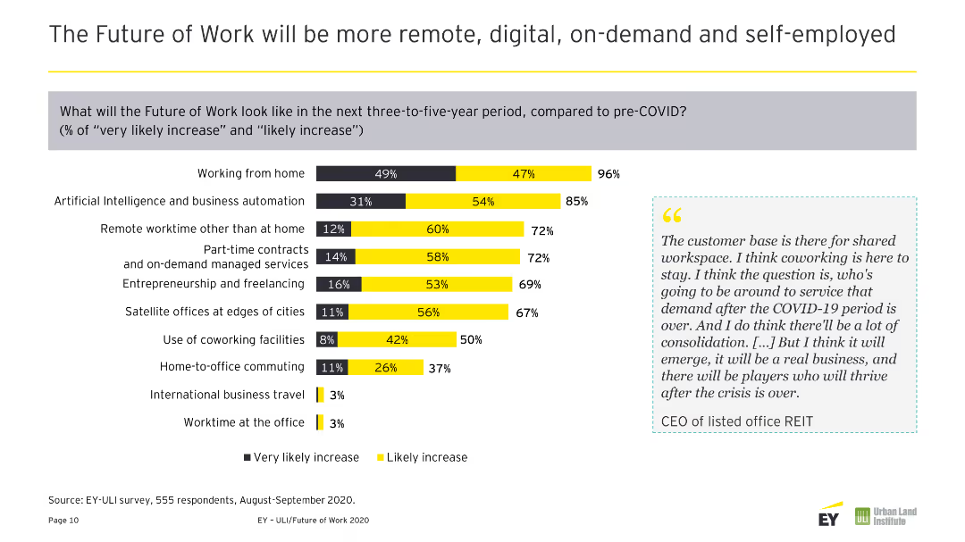
A column chart showing the likely increase in various work trends post-COVID-19, such as remote working, AI, and business automation.
Market Analysis and Trends
Technology & Software
The slide discusses anticipated work trends over the next three to five years, including remote work, AI, and increased reliance on digital tools and on-demand services.
Future Trends, Remote Work, AI, Digital Tools, On-Demand Services
Mixed Chart
EY
Saved
The slide features a semi-circular gauge chart in gradient colors from red to green, indicating scores from "DETRACTOR" to "PROMOTER". A black pointer indicates a score of 8.7, labeled "Promoter".
Regulatory and Compliance
Professional Services
This slide presents a visual metric for assessing compliance with employment legislation, likely used for internal review or external audits. The score of 8.7 suggests a high level of compliance.
compliance, employment, legislation, gauge chart, promoter, detractor, score, regulatory, audit, review
Single Chart
PwC/Strategy&
Saved
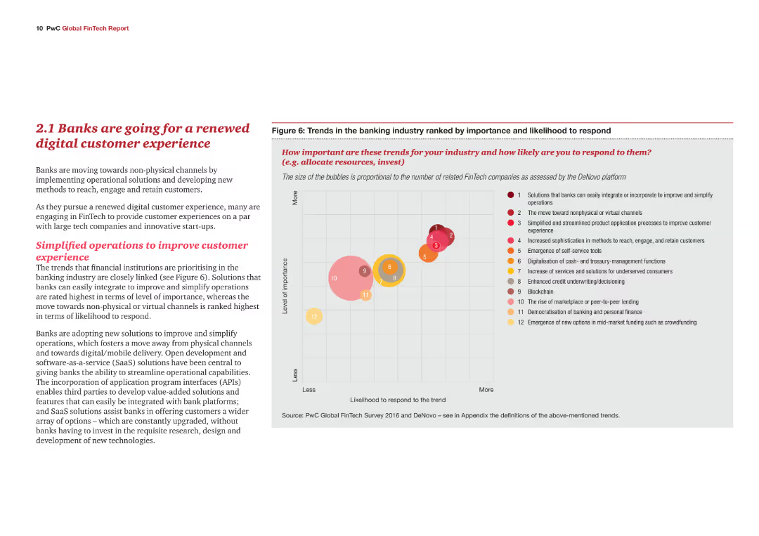
A content slide with text explaining the trends in the banking industry towards digital customer experiences. Includes a bubble chart ranking various trends in terms of importance and likelihood to respond.
Market Analysis and Trends
Financial Services
This slide highlights the shift in the banking industry towards enhancing digital customer experiences. It identifies key trends and their importance, supported by a bubble chart that ranks these trends based on their perceived significance and likelihood of adoption.
Banking, digital customer experience, trends, importance, likelihood to respond, bubble chart
Mixed Chart
PwC/Strategy&
Saved
The slide has a column chart showing the number of deals and deal value in the internet sector in Singapore from 2016 to H1 2020, with a title and legends for the chart elements.
Investment Analysis
Technology & Software
Analyzes the investment landscape in Singapore's internet sector, depicting deal flow and capital investment trends, useful for investors and analysts monitoring the digital economy's health.
Investment, Internet, Singapore, Trends, Capital
Single Chart
Bain
Saved
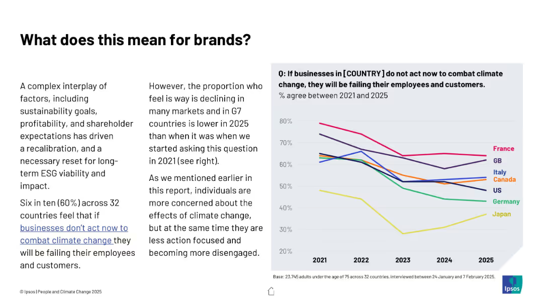
Text and line graph combination; left features contextual explanation, right shows trend lines for multiple countries from 2021 to 2025
Strategic Planning
Professional Services
The slide explores declining belief in corporate responsibility to combat climate change across G7 nations. A downward trend suggests companies may face lower public pressure, despite ongoing environmental challenges.
ESG, brands, climate responsibility, trends, business impact, public opinion, Ipsos, G7, consumer expectations
Mixed Chart
IPSOS
Saved
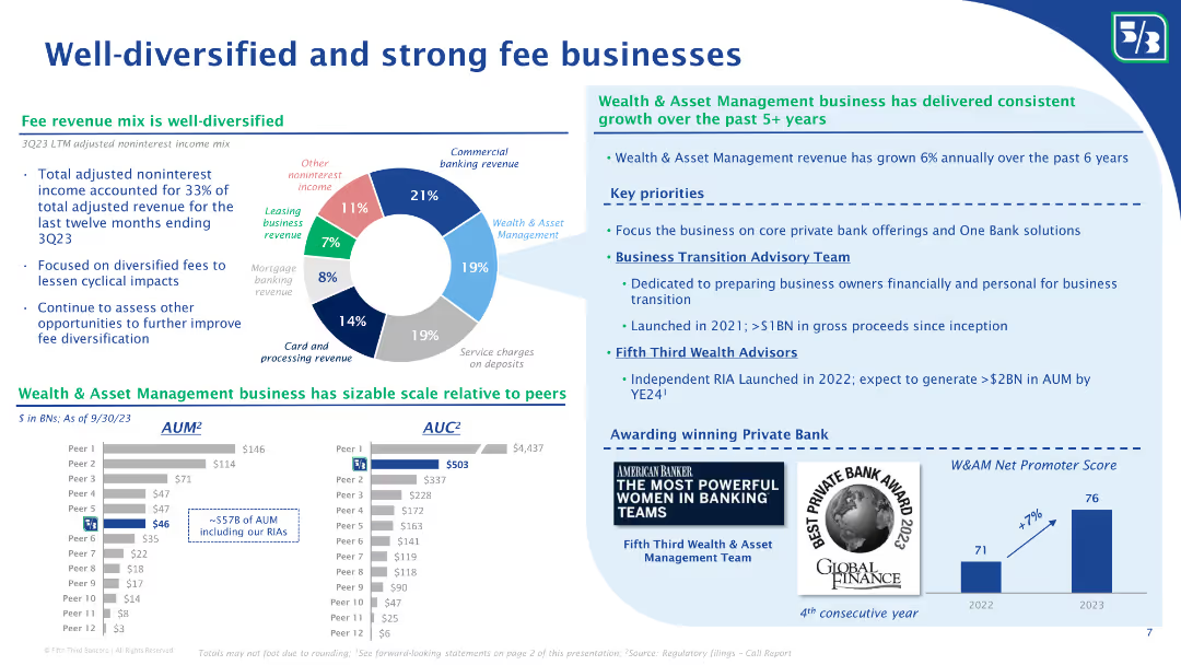
The slide features a pie chart showing the mix of noninterest income, and column charts comparing AUM and AUC with peers. Bullet points discuss the growth of the wealth and asset management business and key priorities for future growth.
Financial Performance
Financial Services
The slide highlights Fifth Third Bank’s diversified fee revenue streams, with a detailed breakdown of noninterest income sources. It showcases their wealth and asset management business growth, comparing AUM and AUC with peers, and outlines key priorities for future growth and client advisory services.
Fee businesses, noninterest income, diversified revenue, AUM, AUC, wealth management, asset management, revenue growth, client advisory, Fifth Third Bank
Multiple Chart
Goldman Sachs
Saved
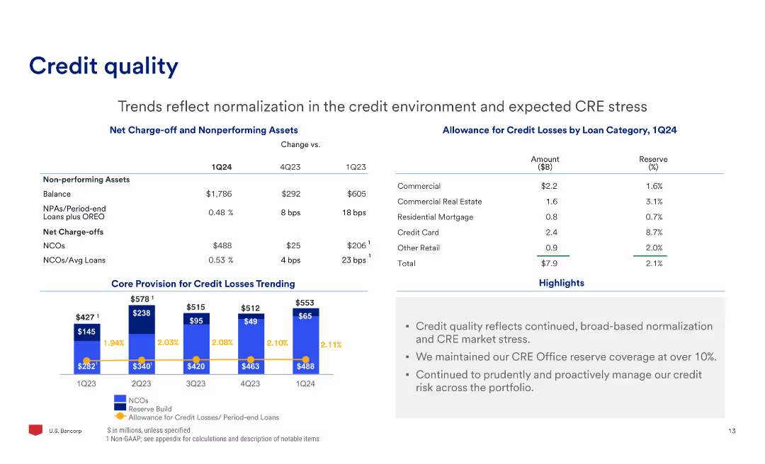
The slide contains a table with data on non-performing assets and allowance for credit losses, column charts showing net charge-offs and core provision for credit losses trending, and text.
Risk Assessment and Management
Financial Services
The slide reviews trends in credit quality, focusing on the normalization in the credit environment and expected CRE stress, with data on charge-offs and credit loss allowances.
Credit, Quality, Risk, Assets, Allowance, Losses
Mixed Chart
Barclays
Saved
Utilizes a column chart to illustrate potential revenue growth with text boxes outlining possible future developments and challenges.
Market Analysis and Trends
Financial Services
Evaluates a revenue opportunity for J.P.Morgan, with projections and an assessment of influencing factors.
Revenue Growth, Financial Services, Projections, J.P.Morgan, Market Opportunities
Mixed Chart
JP Morgan
Saved
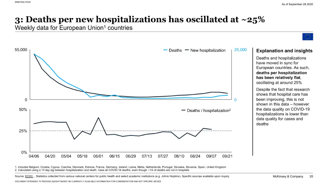
Line chart with two axes: one for death counts, another for hospitalizations; additional chart shows death/hospitalization ratio.
Performance Metrics and KPIs
Healthcare & Pharmaceuticals
Tracks weekly deaths and hospitalizations across EU countries, highlighting that death per hospitalization has remained stable around 25%. Notes limitations in hospitalization data quality and implications for evaluating treatment outcomes.
hospitalization, mortality, EU, COVID-19, health systems, McKinsey
Mixed Chart
McKinsey
Saved
This slide features a medium-term target ROE walk for 2018 with blue column charts displaying the initial value and the end value, and floating bars representing the contributing factors. There's a legend and annotations for clarity. The layout is straightforward with a clear focus on the central graph.
Financial Performance
Financial Services
The slide presents Return on Equity (ROE) changes from 2018 actuals to medium-term targets, highlighting the impacts of net growth, higher capital, and other factors. The data suggests the company's financial strategy and projections, valuable in financial analysis or investor presentations.
ROE, financial analysis, projections, capital, growth, medium-term, actuals, impact, strategy
Single Chart
JP Morgan
Saved
Contains a two-column layout with a column chart for dividends per year on the left and a block of text with figures on share buybacks on the right.
Financial Performance
Financial Services
Displays dividend payments from 2020 to 2023 and details on share buyback in 2023, emphasizing shareholder value creation through dividends and share buybacks.
dividends, shareholder value, buyback, financials, growth
Mixed Chart
IPSOS
Saved
The slide contains a large percentage graphic and horizontal bar charts showing the fee payment status for selling mutual funds during the pandemic. Clean white background.
Market Analysis and Trends
Financial Services
This slide discusses the payment of fees by Canadian investors for selling mutual funds during the pandemic, indicating that most did not pay a fee, while some had to pay or had fees waived.
mutual funds, fee payment, pandemic, Canadian investors, investment fees
Mixed Chart
IPSOS
Saved
Four sections each with an icon and text: Native tokens, Value transfer, Transaction fees, Token allocation. Icons represent crypto tokens, Bitcoin, coins, magnifier.
Industry Overview
Financial Services
Explains different aspects of digital assets on a blockchain, like native tokens, value transfer, transaction fees, and token allocation. Used in discussions on blockchain technology basics.
Blockchain, Crypto, Tokens, Bitcoin, Transaction, Fees, Allocation, Digital Assets
Pillar
McKinsey
Saved
Image of a man working on a laptop. Column chart showing the extent of implementation of automation or advanced analytics in risk management.
Technology and Digital Transformation
Technology & Software
This slide addresses the implementation of AI and advanced analytics in risk management, highlighting the current adoption rates and potential risks associated with these technologies. It discusses the importance of integrating AI to enhance business innovation and operational excellence.
AI, risk management, advanced analytics, automation, technology
Multiple Chart
EY
Saved
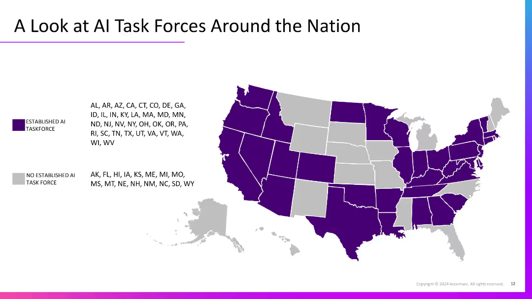
U.S. map with states shaded purple or grey to show presence/absence of AI task forces. States are listed by category with a legend for color-coding.
Regulatory and Compliance
Government & Public Sector
This slide shows the national landscape of established AI task forces by state. Most states have formed AI task forces, indicating growing regulatory attention and government-level strategic planning for artificial intelligence initiatives across the U.S.
AI regulation, public policy, task force, U.S. map, government
Graphic
Accenture
Saved
Features growth curves and financial data represented through line graphs and comparative data points.
Financial Performance
Financial Services
The slide reviews a decade of growth in asset management at JPMorgan, focusing on client assets, revenue, and pre-tax income.
Asset management, growth, financial performance, revenue, client assets, investment returns
Multiple Chart
JP Morgan
Saved
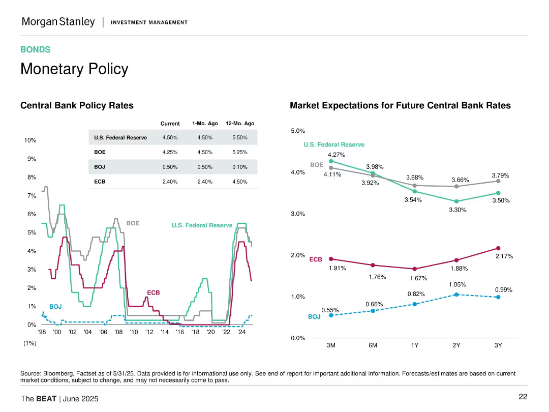
Split layout with historical policy rates line chart on left and projected rate expectations line chart on right.
Strategic Planning
Financial Services
This slide compares central bank policy rates historically (Fed, BOE, ECB, BOJ) and projects future rate expectations over different timeframes (3M to 3Y).
interest rates, central banks, BOE, ECB, BOJ, Fed, rate forecast, monetary policy, future projections, trends
Multiple Chart
Morgan Stanley
Saved
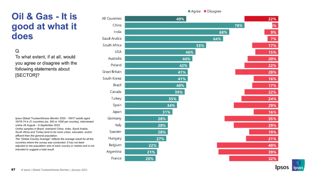
Horizontal bar chart for multiple countries with title and question on left. Sector changed to "Oil & Gas"; maintains same color-coded structure.
Market Analysis and Trends
Energy & Utilities
This slide evaluates how competent people think the oil and gas sector is at its core functions. China, India, and Saudi Arabia again show highest agreement, while European countries like France and Belgium are the most skeptical. This differs slightly from pharmaceutical sentiment.
oil & gas, performance, sector perception, Ipsos, energy industry, global opinion, agreement levels, international comparison, competence
Mixed Chart
IPSOS
Saved
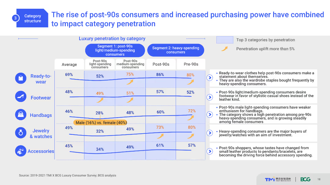
This slide includes a comparative layout with column charts and a table. It shows luxury category penetration by different consumer segments, highlighting the impact of post-90s consumers. The design is moderately complex with clear distinctions between segments and categories.
Market Analysis and Trends
Consumer Goods
This slide analyzes the influence of post-90s consumers on luxury market penetration across different categories. It compares segment-specific data, highlighting purchasing trends and the significant impact of younger consumers.
post-90s consumers, luxury market, category penetration, trends, consumer segments
Mixed Chart
BCG
Saved
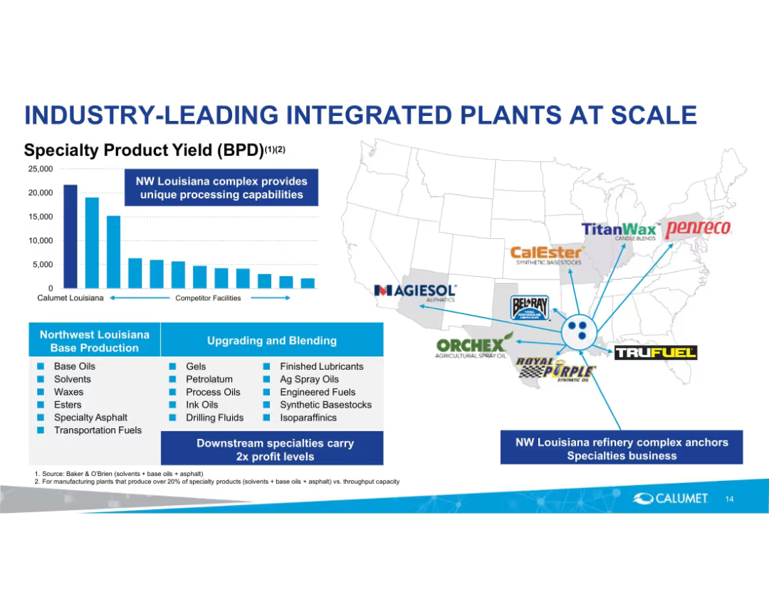
Chart on the left comparing product yield, map on right with brand logos. Bottom section lists products and blending capabilities.
Operational Efficiency
Energy & Utilities
Highlights Calumet’s competitive edge in specialty product yield from NW Louisiana plant. Shows geographic integration with brand logos and details upstream/downstream capabilities, reinforcing scale and specialization.
integrated plants, Calumet, specialty products, processing, Louisiana, operational scale
Mixed Chart
Goldman Sachs
Saved
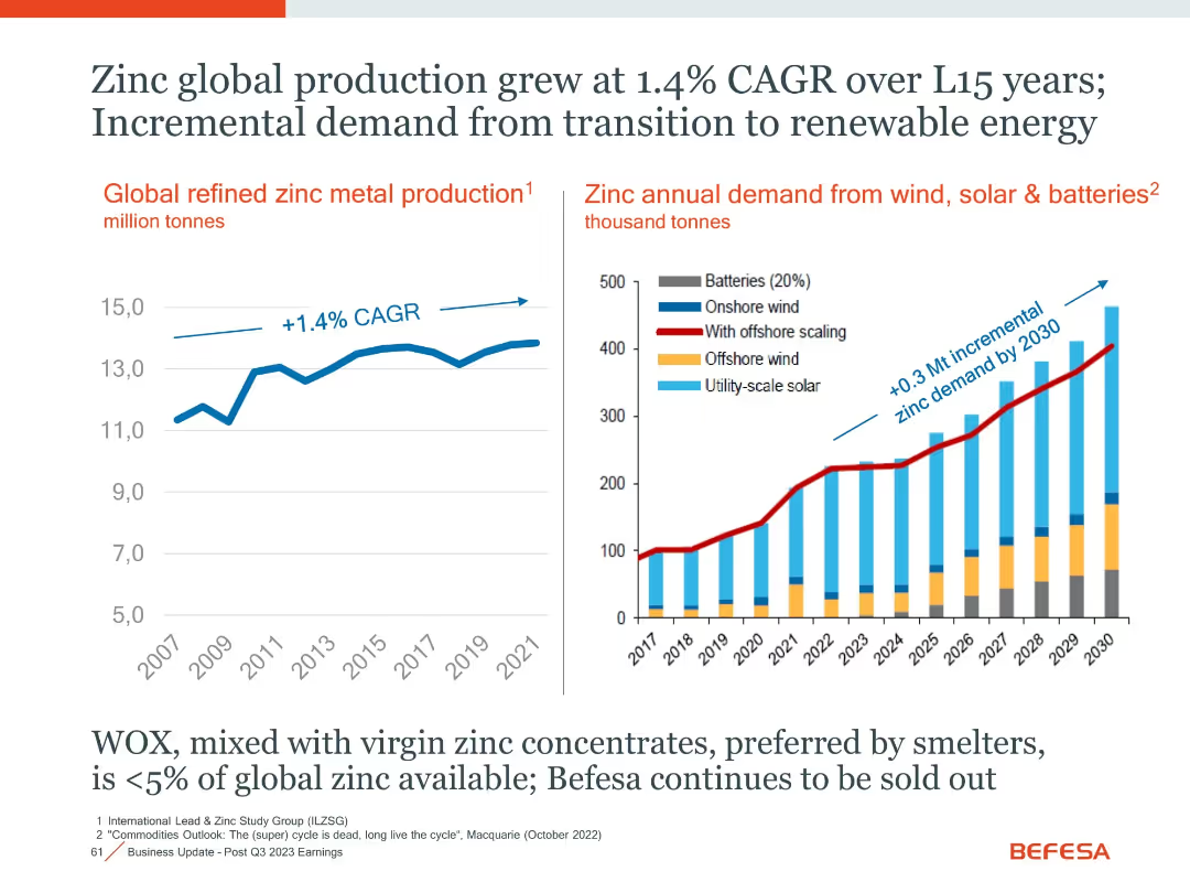
Two-panel layout with line and stacked bar charts, annotated CAGR and projections
Market Analysis and Trends
Industrial & Manufacturing
The slide presents historical and projected data on zinc production and its growing demand, especially from renewable energy sectors like wind, solar, and batteries.
Zinc, Renewable Energy, CAGR, Demand Growth, Batteries, Solar, Wind
Multiple Chart
Goldman Sachs
Saved
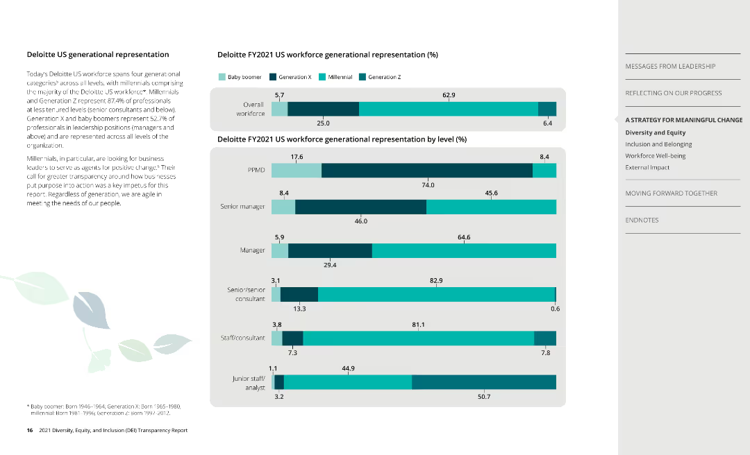
Column charts display generational representation across overall workforce and by job level at Deloitte.
Human Resources and Talent Management
Professional Services
Highlights generational diversity at Deloitte, breaking down representation across different age groups.
generation, workforce, diversity, Deloitte
Multiple Chart
Deloitte
Saved
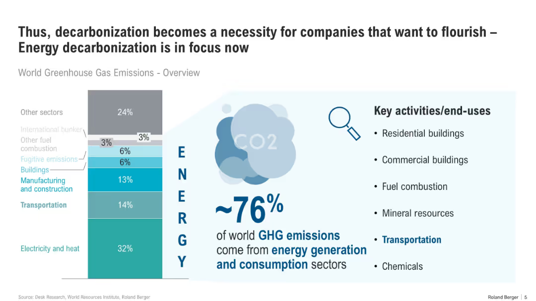
Vertical bar chart centered, split into sectors by emission contribution, with supporting bullet points and infographic elements on the right.
Technology and Digital Transformation
Energy & Utilities
The slide emphasizes that ~76% of global GHG emissions originate from energy generation and use. It highlights key energy-consuming sectors and stresses the need for corporate decarbonization to meet sustainability goals.
decarbonization, GHG emissions, energy, buildings, transportation, commercial, CO2, consumption, sector overview
Mixed Chart
Roland Berger
Saved
Column charts showing invested assets and transaction-based income growth across business segments
Market Analysis and Trends
Financial Services
Displays growth in invested assets and transaction-based income, showing client momentum
franchise, client, momentum, growth
Multiple Chart
UBS
Saved
Previous
Next
If nothing, comes up, please save your slides first
Create a FREE account to continue browsing
Receive Instant Access to 1,000+ slides from companies like McKinsey, Google, and Goldman Sachs
First Name
Last Name
Email
Password
I agree to all
Terms & Privacy Policy
Thank you! Your submission has been received!
Oops! Something went wrong while submitting the form.
Have an account?
Sign in
Column Chart
Heatmap
Chevron
Org Chart
Infographic
Callouts
Timeline
List
Graphic
Picture
Process Flow
Diagram
Paragraph
Map
Table
Framework
Subtitle
Takeaway Box
Icon
Other Chart
Radar Chart
Waterfall Chart
Mekko Chart
Pie Chart
Scatter Plot
Line Chart
Bar chart
Bullet points