Create a FREE Account
Instant access to 1,000+ real slides from top companies like McKinsey, BCG, Goldman Sachs, Google and many more!
First Name
Last Name
Email
Password
I agree to all
Terms & Privacy Policy
Thank you! Your submission has been received!
Oops! Something went wrong while submitting the form.
Have an account?
Sign in
Library
Templates
Courses
Pricing
My Account
My Slides
My Templates
✦ AI
AI Prompt Library
AI Search
Sign in
Start Here
Logout
My Saved Slides
This slide features horizontal bar charts comparing percentages of agreement and disagreement on various social statements. A table highlights the highest and lowest agreement countries.
Market Analysis and Trends
Government & Public Sector
The slide discusses the belief in "live and let live" across different countries, illustrating tensions and divisions. It also shows where agreement is highest and lowest for these beliefs.
agreement, social beliefs, live and let live, tensions, divisions, countries, percentage, bar chart, highest, lowest
Mixed Chart
IPSOS
Saved
The slide displays a column chart depicting semi-annual EBITDA over multiple years. It includes a large blue circle highlighting a recent increase, with a clear and simple layout focusing on financial performance.
Financial Performance
Financial Services
This slide presents the EBITDA growth over the years, highlighting strong earnings growth, particularly in the most recent period. It's designed to communicate financial health and performance trends to stakeholders.
EBITDA, growth, financial performance, mining, earnings, profitability
Single Chart
Morgan Stanley
Saved
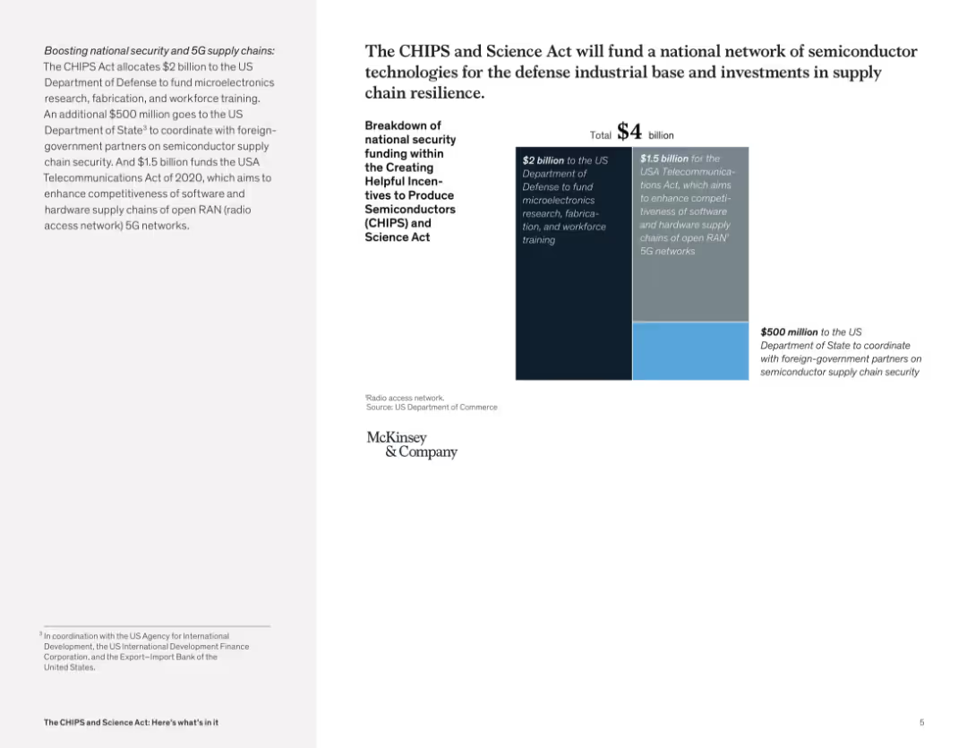
Two-column layout with text on the left and a bar graph with segmented funding blocks on the right; minimal design, McKinsey branding.
Strategic Planning
Government & Public Sector
This slide presents a $4 billion allocation from the CHIPS and Science Act, breaking it down into three components: $2B for microelectronics research and training, $1.5B for software and hardware 5G networks, and $500M for international coordination on semiconductor security.
CHIPS Act, semiconductor, funding, microelectronics, 5G, supply chain, security, US Department of Defense, workforce training, telecommunications
Mixed Chart
McKinsey
Saved
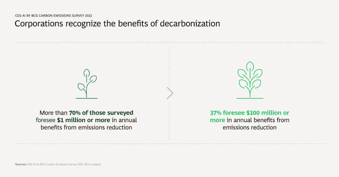
Two comparative infographic elements showing survey results: one indicating the percentage of companies seeing $1 million+ in annual benefits, and the other showing those seeing $100 million+ in benefits from emission reductions.
Strategic Planning
Environmental Services & Sustainability
Highlights the financial benefits corporations expect from decarbonization efforts, showcasing significant monetary advantages at different scales. Supports the argument for strategic investment in emission reduction initiatives.
decarbonization, financial benefits, emission reduction, survey, strategic planning
Boxed
BCG
Saved
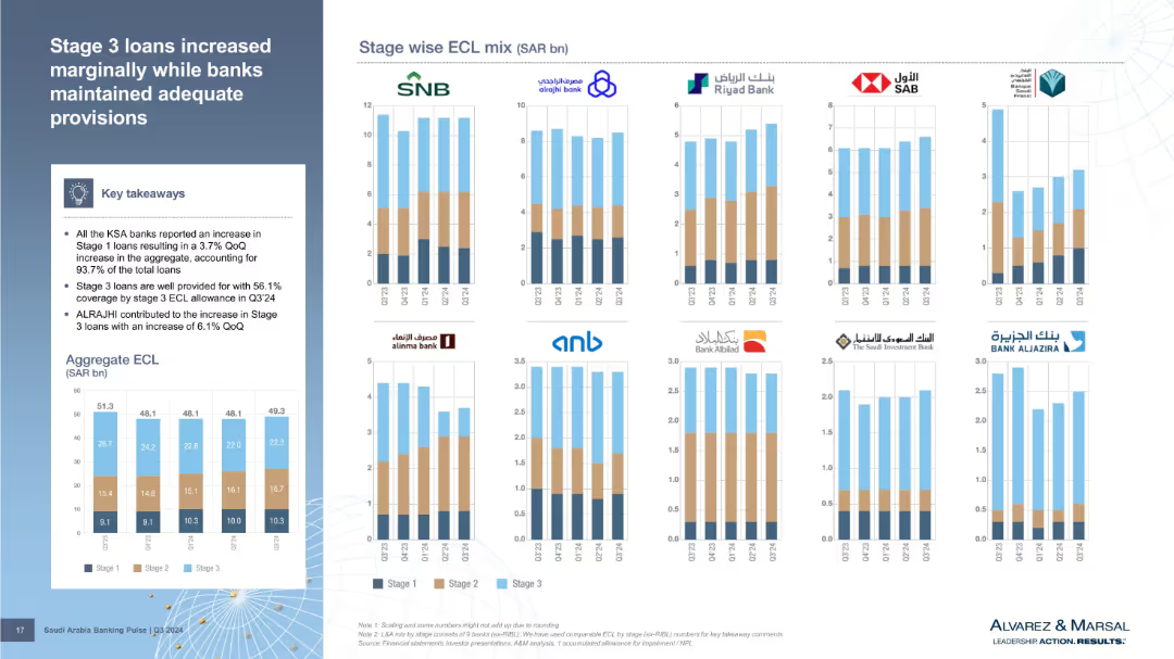
Bar charts per bank showing stage-wise ECL mix, plus an aggregate ECL bar chart. The slide uses three distinct colors to show Stage 1–3 loans. Summary box on the left includes main insights.
Risk Assessment and Management
Financial Services
Analyzes Expected Credit Loss (ECL) distribution by loan stage. Stage 1 loans grew across all banks while Stage 3 loans are well provisioned. ALRAJHI contributed significantly to Stage 3 loan increases. The visual format highlights bank-wise and stage-wise credit quality metrics.
ECL, stage 3 loans, provisions, credit quality, ALRAJHI, loan stages
Multiple Chart
Alvarez & Marsal
Saved
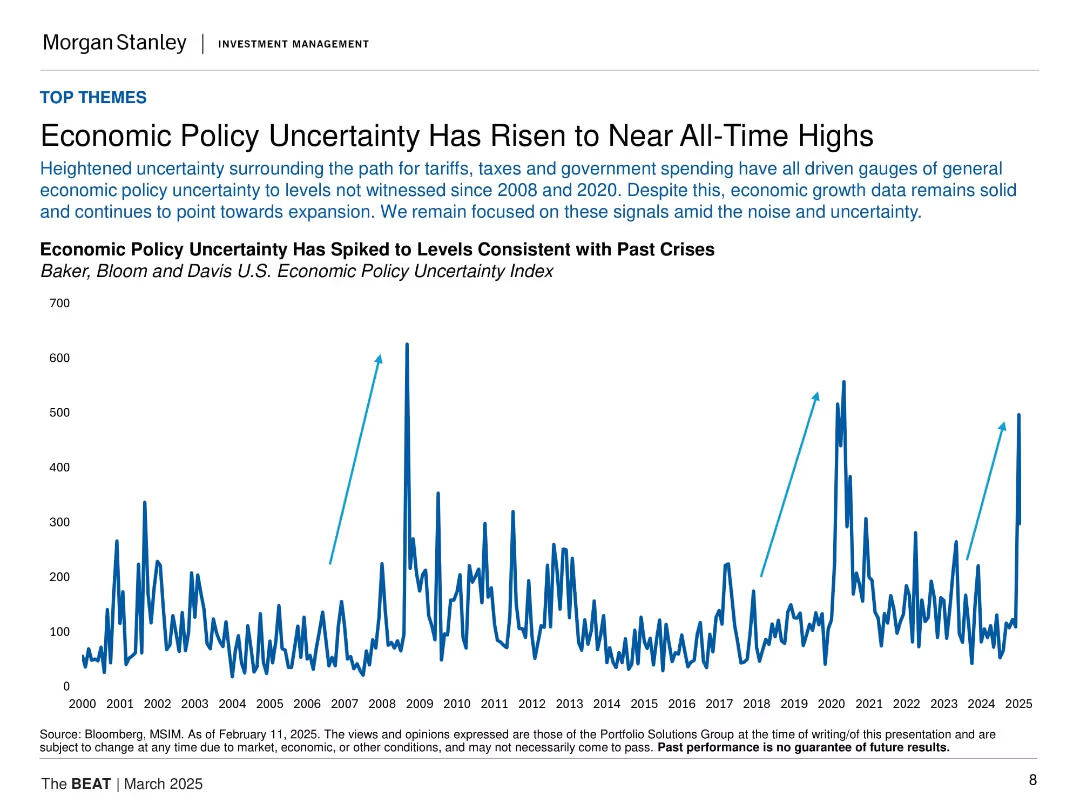
Large central line graph of policy uncertainty index from 2000 to 2025 with three arrows marking crisis peaks. Simple layout.
Risk Assessment and Management
Financial Services
Emphasizes heightened economic policy uncertainty linked to tariffs, taxes, and spending. The index has spiked to levels seen in past crises (2008, 2020), yet economic growth appears resilient.
policy uncertainty, economic risk, tariffs, government spending, market signals, historical spikes
Single Chart
Morgan Stanley
Saved
Features a column chart with various percentages of disagreement on productivity impact by different sectors.
Market Analysis and Trends
Professional Services
Analyzes employee views on the impact of new ways of working on productivity, focusing on those who disagree with mixed on-site and remote work.
New ways of working, Productivity, Employee views, Mixed work, Sectors
Multiple Chart
EY
Saved
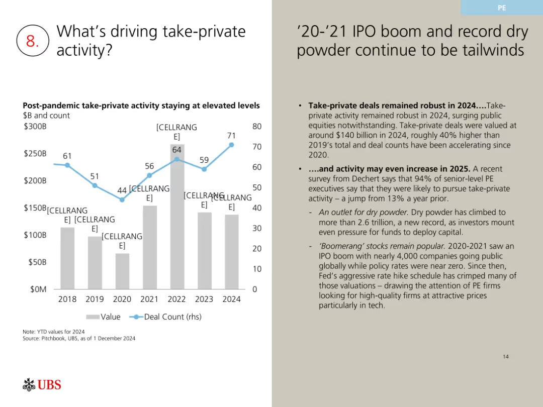
Left-aligned chart with blue line and gray bars; right-hand side has bulleted analysis text on a beige background.
Market Analysis and Trends
Financial Services
The slide examines why take-private deals remain strong post-pandemic. Key drivers include ample dry powder, tech valuations, and interest from PE firms. The 2020-2024 chart shows increasing deal counts and value, signaling robust ongoing interest and possibly more in 2025.
take-private, PE, dry powder, IPO boom, 2024 deals, valuations, M&A
Mixed Chart
UBS
Saved
The slide has a clean and modern look, featuring a bar chart alongside a text section. The chart displays the percentage of risk teams using various technologies like "Data mesh technology," "Robotic process automation," and "Generative AI." It contrasts the adoption rates between top technology users and others, providing a clear visualization of technology uptake in risk management.
Technology and Digital Transformation
Technology & Software
This slide encourages investment in emerging technologies by showing the adoption rates among risk teams. It highlights the disparity in technology usage, advocating for increased investment to bridge this gap. The data serves to underscore the importance of staying current with technological advances to enhance risk management efficiency and overall business resilience.
emerging technology, investment, risk management, data mesh, automation, AI, column chart, adoption rates
Mixed Chart
Accenture
Saved
Slide presents various funding methods with corresponding icons and bullet points explaining the suitability of each method for enhancing school connectivity in well-developed regions. A text box details concerns and justifications for each funding strategy.
Strategic Planning
Education & Training
Analyzes potential funding strategies for achieving full school connectivity in developed regions of Indonesia. Discusses the advantages and concerns associated with each method, including government subsidies and private investment models.
funding methods, school connectivity, government subsidy, private investment, developed regions
Table
BCG
Saved
The slide features two donut charts displaying the percentage of people using VPNs to access crypto trading platforms inside and outside of Canada. The layout is moderately complex.
Technology and Digital Transformation
Financial Services
This slide shows the use of VPNs by Canadians to access crypto trading platforms, with a notable difference between inside and outside Canada. It aims to understand the prevalence of VPN usage in crypto trading.
VPN, crypto trading, access, usage, Canadians
Multiple Chart
IPSOS
Saved
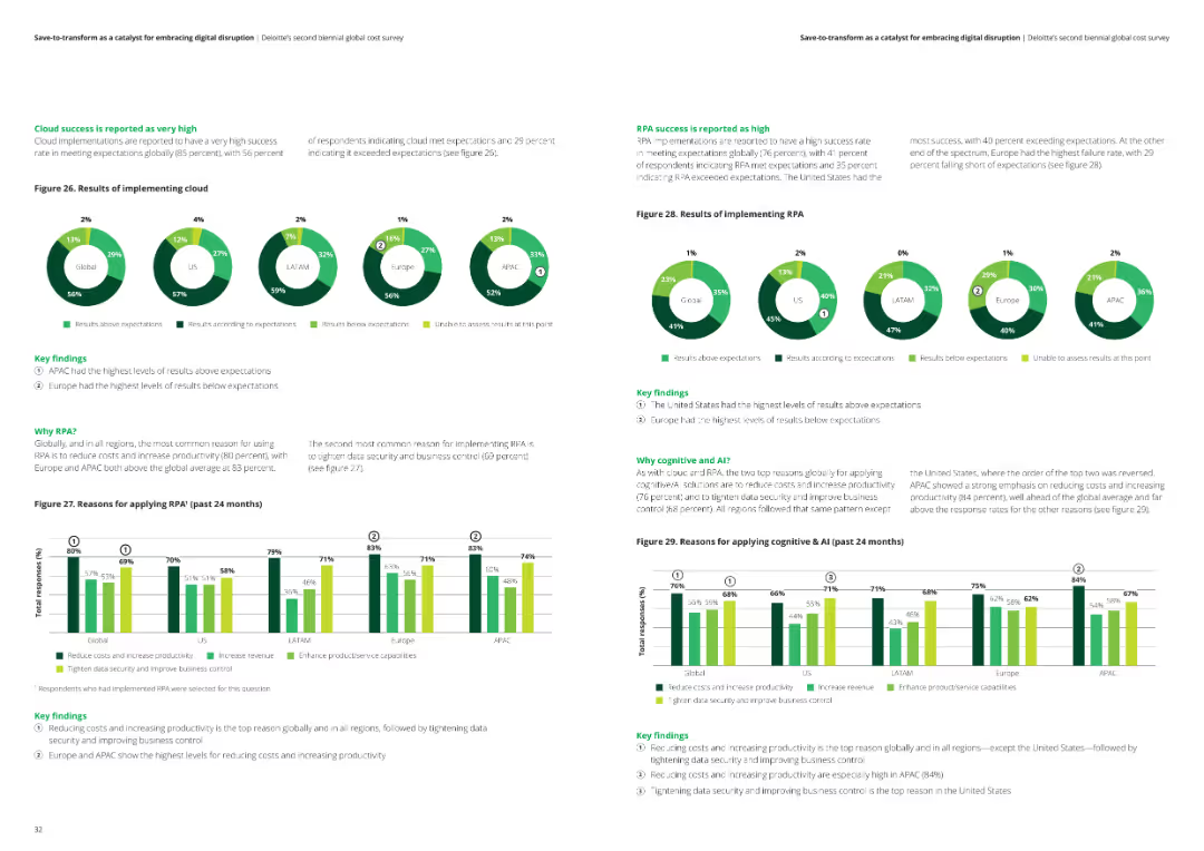
The slide includes two sets of pie charts and column charts showing the success of cloud and RPA implementations across various regions. Key findings are detailed in text boxes.
Technology and Digital Transformation
Financial Services
The slide reports on the success rates of cloud and RPA implementations, reasons for adopting these technologies, and their impact on reducing costs and increasing productivity.
Cloud success, RPA implementation, technology impact, analysis, financial services
Multiple Chart
Deloitte
Saved
The slide shows two charts. The left chart presents the percentage of rented occupied housing units from 1Q00 to 1Q24. The right chart depicts investor market share by property type for the 50 most populous U.S. metro areas from 1Q00 to 1Q24.
Market Analysis and Trends
Real Estate & Construction
The slide analyzes trends in rented occupied housing units and investor market share across different property types in major U.S. metro areas, offering insights into the residential real estate market's dynamics and investment patterns.
residential real estate, rented housing, investor market share, property types, market trends
Multiple Chart
JP Morgan
Saved
Column chart showing the demand projection for various API-related roles over the next 12 months, including Software Developer, DevOps Engineer, and API Engineer, with a breakdown of current roles and future plans.
Human Resources and Talent Management
Technology & Software
The slide analyzes the demand for different API-related roles in software development, indicating which roles are likely to see increased hiring and which ones will remain stable or decrease.
API roles, demand, software development, projections
Single Chart
Gartner
Saved
This slide features a vertical bar chart comparing spreads (in basis points) for various financial instruments, including Aggregate, MBS, ABS, CMBS, Corporate, Preferred, Floating-Rate Loans, Emerging Markets, and High Yield, over multiple dates.
Risk Assessment and Management
Financial Services
Provides a detailed analysis of spread changes across various financial instruments, highlighting maximum and minimum spreads over the past years and current levels relative to historical medians.
Spreads, Basis Points, Financial Instruments, Risk Management, MBS, ABS, CMBS, Corporate, Preferred, Floating-Rate Loans
Mixed Chart
Morgan Stanley
Saved
A table with yields, returns, maturities, and correlations of various bond types, alongside a bar chart of return impact from interest rate changes.
Financial Performance
Financial Services
Evaluates the performance of different bonds and potential returns under changing interest rate scenarios.
Bond returns, yields, performance, interest rates, U.S. Treasuries, correlation, impact, analysis, strong
Mixed Chart
JP Morgan
Saved
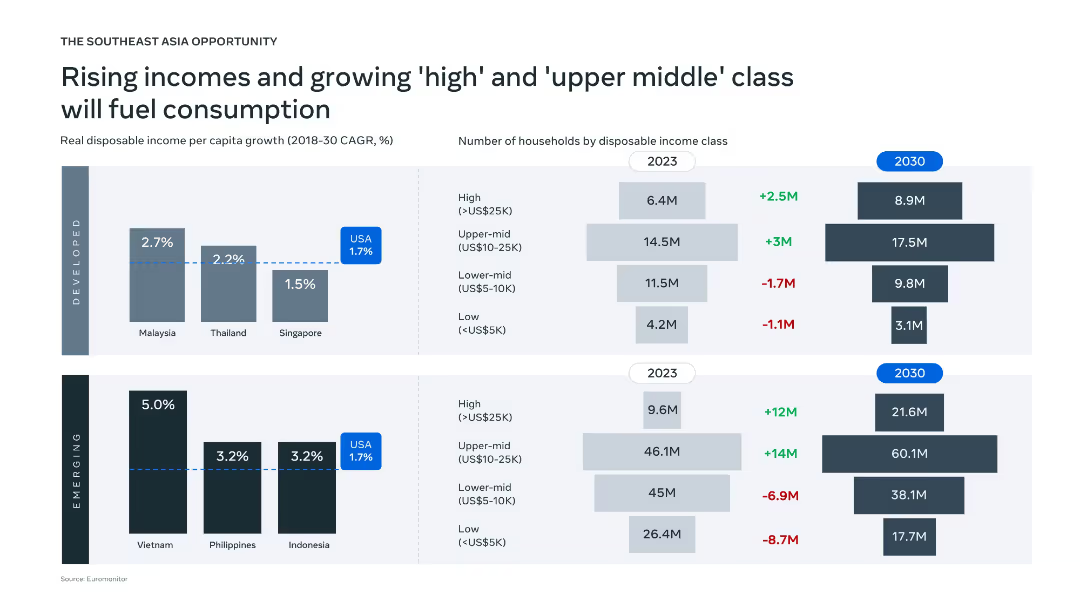
Split into "Developed" and "Emerging" sections with bar graphs and horizontal bar charts, using blue and grey color coding.
Market Analysis and Trends
Consumer Goods
The slide illustrates projected growth in real disposable income per capita in Southeast Asia from 2018–2030 and changes in household income classes between 2023 and 2030. Emerging markets like Vietnam show the highest income growth potential.
income growth, household income, Southeast Asia, consumption, projections, income class, disposable income, developed vs. emerging, CAGR, household segmentation
Multiple Chart
Bain
Saved
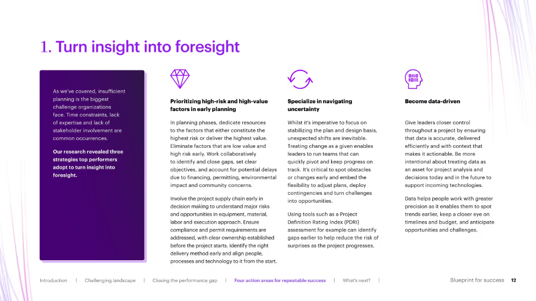
Three-column layout with icons and bold section titles, explaining strategies like data-driven planning and early risk identification.
Strategic Planning
Real Estate & Construction
Elaborates on the first action area from the previous slide: turning insight into foresight. It breaks down how organizations can improve planning through prioritizing risks, navigating uncertainty, and becoming data-driven.
foresight, early planning, risk mitigation, data-driven, uncertainty
Pillar
Accenture
Saved
The slide is divided into two main sections, each with a heading and bulleted points, complemented by iconography. The left side emphasizes customer experience while the right focuses on business and developer tools. The design is straightforward with a good balance of text and imagery.
Operational Efficiency
Financial Services
This slide discusses the implementation of secure and convenient payment options to enhance customer experience and business operations. It's used to promote efficient in-app payment solutions and developer-friendly tools for creating secure payment environments.
payment methods, cart abandonment, in-app experience, business value, developer tools, security solutions, transaction flow, automation
Boxed
JP Morgan
Saved
Features a bar chart comparing preferences for different vehicle engines between two study years. The chart is color-coded and provides percentages for each engine type, including gasoline, hybrid, and electric.
Market Analysis and Trends
Transportation & Logistics
Analyzes consumer preference shifts from traditional gasoline vehicles to electric and hybrid models, reflecting changing market dynamics and environmental concerns in the automotive industry.
consumer behavior, market shift, electric vehicles, hybrid vehicles, gasoline, automotive industry, environmental impact, technology adoption
Single Chart
Deloitte
Saved
A content slide with text on the left and a column chart on the right. The chart identifies skill sets with the most challenges in attracting and maintaining talent.
Human Resources and Talent Management
Financial Services
This slide addresses the need for new talent in risk management, highlighting the most in-demand skills and the challenges in attracting and retaining professionals.
talent, skills, attraction, retention, risk management
Mixed Chart
EY
Saved
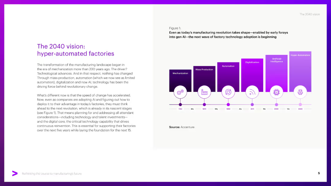
Split layout: left side has title and paragraph text, right side has a timeline graphic with colored blocks indicating tech evolution.
Strategic Planning
Industrial & Manufacturing
Describes the evolution of manufacturing from mechanization to hyper-automation, emphasizing the role of AI and digital technologies. Urges firms to prepare for upcoming shifts by investing in tech, talent, and digital core infrastructure.
Hyper-automation, AI, factories, automation timeline, digitalization
Mixed Chart
Accenture
Saved
Contains a prioritization matrix with bubbles representing market potential, plotted against uncertainty and cost evolution from 2025 to 2035.
Strategic Planning
Energy & Utilities
Predicts the economic timeline for hydrogen applications in transport and industry, focusing on domestic and export markets.
hydrogen, breakeven, ammonia, FCEV, export, domestic, market
Mixed Chart
McKinsey
Saved
This slide features comparative bar charts and a pie chart. There are two sections: one compares the online spend of HVUs vs. non-HVUs across various verticals, and the other shows the demographic and geographic composition of HVUs. Additionally, there are two column charts depicting changes in spend percentage.
Market Analysis and Trends
Technology & Software
The slide presents data on high-value users' (HVUs) online spending habits in Thailand compared to non-HVUs, indicating that HVUs spend significantly more. Demographic and geographic distributions of HVUs are detailed. Changes in spend over the past 12 months and intentions to increase spend are quantified through column charts, highlighting the growing trend in digital consumer behavior.
HVU, Thailand, Spending Habits, Demographics, E-commerce, Transport, Gaming, Growth, Consumer Behavior, Digital Economy
Multiple Chart
Bain
Saved
A clear title is followed by a column chart comparing traditional commerce and e-commerce carbon footprints, with a scenario for optimized e-commerce. Text to the right provides strategies for footprint reduction. The blue color scheme is consistent and visually appealing.
Operational Efficiency
Technology & Software
This slide offers a comparison of carbon footprints between traditional and digital commerce and suggests that optimized e-commerce can significantly reduce carbon emissions. It serves to guide strategies for operational efficiency in reducing carbon footprints within the digital economy.
carbon footprint, e-commerce, optimization, traditional commerce, reduction strategies, digital channels
Multiple Chart
Bain
Saved
Previous
Next
If nothing, comes up, please save your slides first
Create a FREE account to continue browsing
Receive Instant Access to 1,000+ slides from companies like McKinsey, Google, and Goldman Sachs
First Name
Last Name
Email
Password
I agree to all
Terms & Privacy Policy
Thank you! Your submission has been received!
Oops! Something went wrong while submitting the form.
Have an account?
Sign in
Column Chart
Heatmap
Chevron
Org Chart
Infographic
Callouts
Timeline
List
Graphic
Picture
Process Flow
Diagram
Paragraph
Map
Table
Framework
Subtitle
Takeaway Box
Icon
Other Chart
Radar Chart
Waterfall Chart
Mekko Chart
Pie Chart
Scatter Plot
Line Chart
Bar chart
Bullet points