Create a FREE Account
Instant access to 1,000+ real slides from top companies like McKinsey, BCG, Goldman Sachs, Google and many more!
First Name
Last Name
Email
Password
I agree to all
Terms & Privacy Policy
Thank you! Your submission has been received!
Oops! Something went wrong while submitting the form.
Have an account?
Sign in
Library
Templates
Courses
Pricing
My Account
My Slides
My Templates
✦ AI
AI Prompt Library
AI Search
Sign in
Start Here
Logout
My Saved Slides
The slide includes two main sections: one on the left with text and bullet points, and one on the right with three column charts showing percentages of boards' responses to various ESG-related actions.
Operational Efficiency
Environmental Services & Sustainability
It explains the different behaviors of highly resilient boards compared to less resilient ones, focusing on their actions and perceptions towards ESG issues, including climate change and governance.
resilience, behavior, climate change, governance, ESG
Multiple Chart
EY
Saved
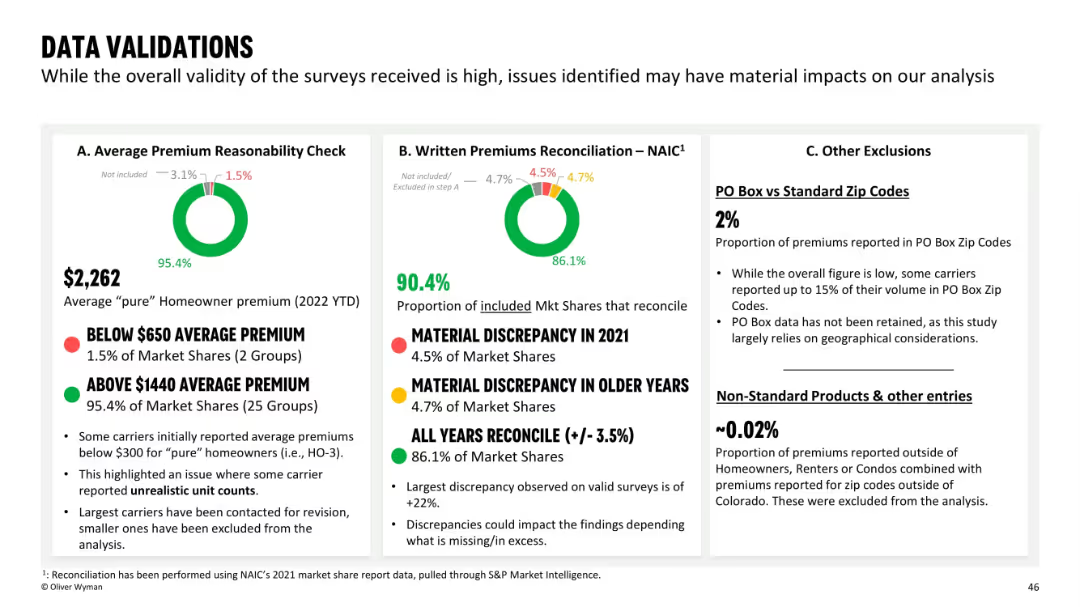
Slide is divided into three labeled sections (A–C) with circular data visuals, percentage figures, and explanations. Clear separation of content with red/green/yellow traffic light indicators.
Regulatory and Compliance
Financial Services
This slide assesses the validity of insurance data used in the analysis, focusing on average premium reasonableness, written premium reconciliation, and exclusions like PO boxes. The slide highlights a few discrepancies but confirms high overall validity of data collected from insurers. Key issues like outliers and unrealistic unit counts are addressed.
data validation, premiums, reconciliation, insurance, survey quality, PO box, exclusions, market share
Multiple Chart
Oliver Wyman
Saved
This slide shows a combination of text, a pie chart, and a column chart. The pie chart represents the split of new and long-term podcast listeners, while the column chart shows frequency and number of podcasts listened to.
Market Analysis and Trends
Media & Entertainment
The slide discusses the growth in podcast listenership and spending. It shows that half of daily podcast listeners started in the past two years and that they now spend significant time listening to podcasts, indicating a growing market.
Podcast growth, listener engagement, spending trends, Nielsen study, podcast market, new listeners, long-term listeners, daily listening habits, podcast revenue
Multiple Chart
Nielsen
Saved
This slide presents a column chart comparing unlinked metro rides annually. Annotations and year markers provide a clear depiction of trends and significant data points.
Risk Assessment and Management
Transportation & Logistics
Offers a decade-long review of rail ridership, illustrating trends and discussing the factors influencing these patterns.
metro rides, annual trends, ridership data, transportation analysis
Single Chart
BCG
Saved
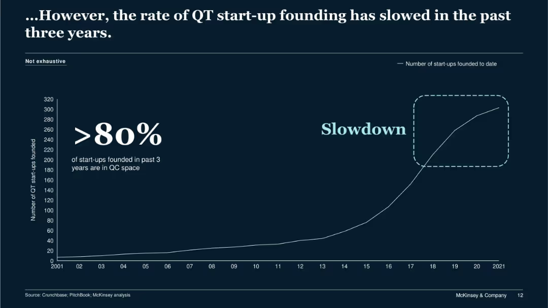
Line graph showing cumulative QT startup founding over time; dark background with large highlighted text and a marked slowdown region.
Market Analysis and Trends
Technology & Software
The slide highlights a slowdown in the formation of QT startups over the last three years despite prior growth. Over 80% of the new startups were in the quantum computing (QC) space. The chart suggests maturing market conditions and possibly barriers to new entrants.
startup slowdown, QT, QC, market trend, startup founding, saturation
Single Chart
McKinsey
Saved
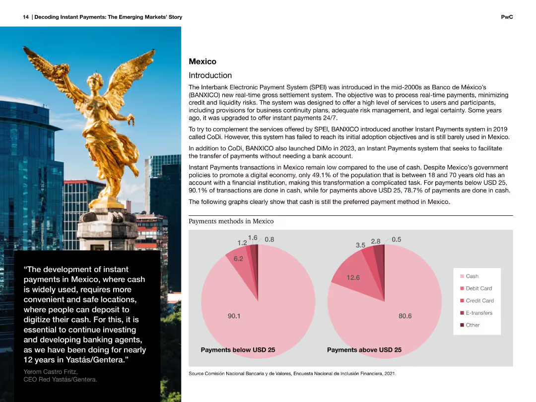
Image of a statue with accompanying text about Mexico's payment methods and pie charts showing payment methods below and above USD 25.
Market Analysis and Trends
Financial Services
Discusses Mexico's payment methods, focusing on the high reliance on cash for transactions below and above USD 25, and the introduction of instant payments systems.
Mexico, payments, cash, methods, instant, systems, transactions, financial, services
Multiple Chart
PwC/Strategy&
Saved
Includes multiple column charts assessing the effectiveness of various health safety measures in encouraging the use of public and shared transport modes.
Market Analysis and Trends
Transportation & Logistics
Evaluates the effectiveness of health safety measures on public and shared transport usage.
health safety, transportation, measures, effectiveness
Single Chart
McKinsey
Saved
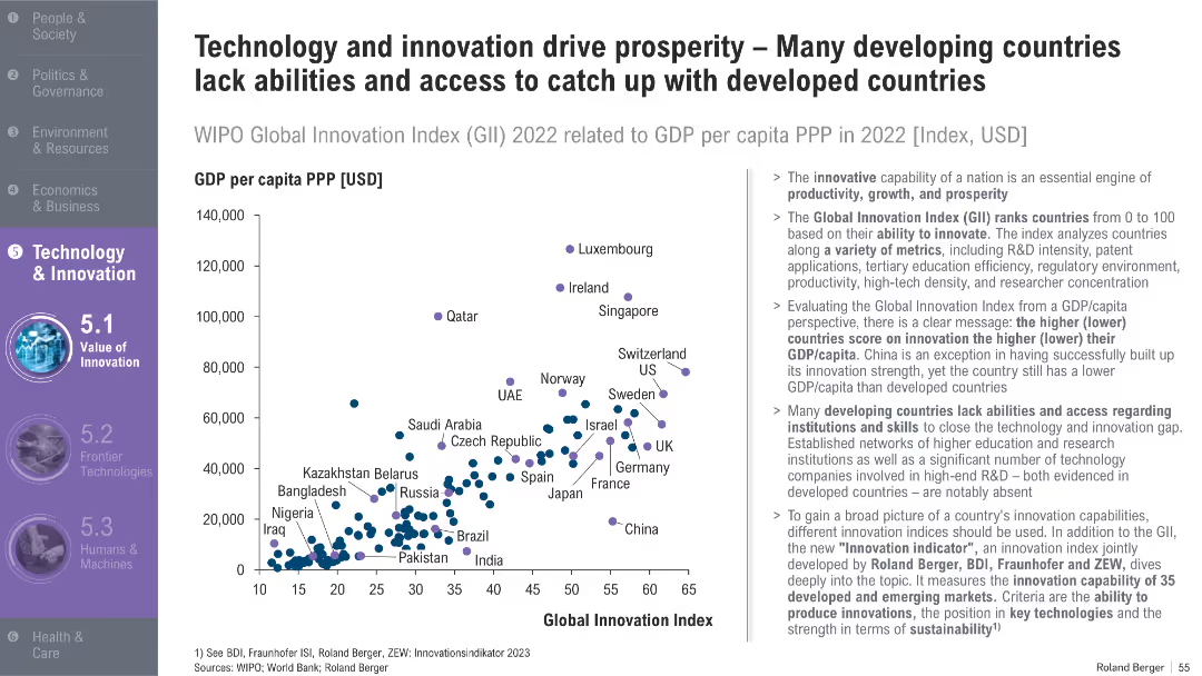
Scatterplot comparing GDP per capita vs. Global Innovation Index; developed and developing countries marked; explanatory text to the right
Market Analysis and Trends
Technology & Software
This slide explores the correlation between innovation and GDP per capita, identifying how many developing countries lag due to limited access to R&D infrastructure and education. It also introduces a new innovation index.
innovation, GDP per capita, R&D, Global Innovation Index, developing countries, productivity, skills, tech access
Mixed Chart
Roland Berger
Saved
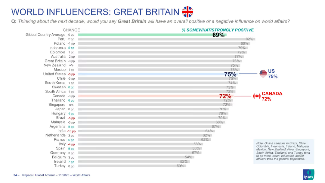
Horizontal bar chart showing international perceptions of the UK’s global influence
Market Analysis and Trends
Government & Public Sector
Surveys global sentiment toward Great Britain’s influence. The global average is 69%. Canada rates it 72%, U.S. at 75%. Results show small shifts in opinion across countries.
Great Britain, UK, global sentiment, Canada opinion, US opinion, Ipsos, bar chart, soft power, international views
Single Chart
IPSOS
Saved
Includes a detailed diagram categorizing H2 production technologies by primary source and conversion technology, along with associated hydrogen categories.
Technology and Digital Transformation
Energy & Utilities
Outlines different hydrogen production technologies, categorized into thermochemical, electrolysis, microbial, and photolytic methods, and their respective applications.
Hydrogen, conversion technologies, thermochemical, electrolysis, production methods
Diagram
Kearney
Saved
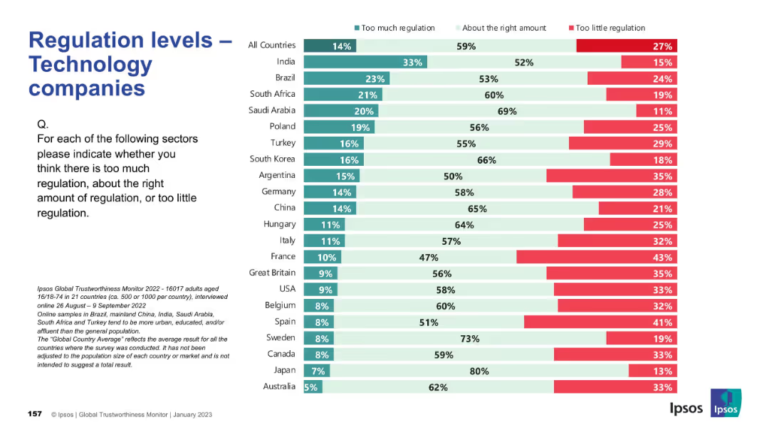
Consistent layout; country ranking by views; colors indicate opinions on regulation sufficiency.
Regulatory and Compliance
Technology & Software
This slide captures opinions on whether technology companies are properly regulated. The majority believe regulation levels are appropriate, but countries like Argentina and France indicate concerns about underregulation, while India and Brazil lean toward thinking there’s too much.
tech industry, regulation, public opinion, Ipsos, governance, compliance, digital policy, international, oversight, perception
Mixed Chart
IPSOS
Saved
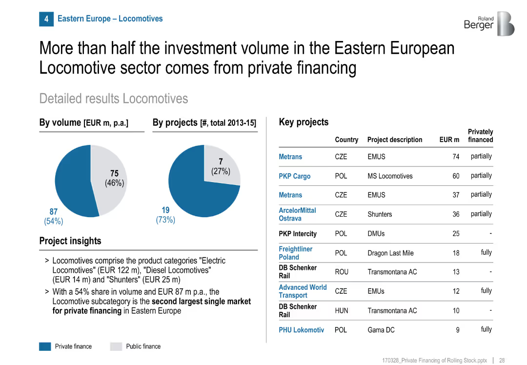
Pie charts show a 54% private finance share by volume, 27% by project count. Table with key projects and financing breakdown. Bullet-point insights on market subtypes.
Investment Analysis
Transportation & Logistics
Locomotives are the second-largest subcategory for private investment in Eastern Europe. Despite fewer private projects, they make up over half the investment volume.
locomotives, private finance, Eastern Europe, freight, investment, public-private mix, EMUs, shunters, MS locomotives
Mixed Chart
Roland Berger
Saved
Visual comparison using bar charts to show the cost disparities between generators, solar mini-grids, and grid electricity, alongside another chart depicting the proportion of market fires caused by generators, emphasizing economic and safety impacts.
Regulatory and Compliance
Industrial & Manufacturing
Highlighting the economic and safety challenges posed by generator use in Nigeria, this slide compares their high costs to other energy sources and their significant role in market fires, advocating for safer and more economical alternatives like solar energy.
generators, costs, fires, market safety, energy sources, Nigeria, economic impact, safety
Multiple Chart
BCG
Saved
The slide contains pie charts and a table detailing plans for automation in HCP engagement by company size and the types of software solutions preferred.
Strategic Planning
Healthcare & Pharmaceuticals
This slide discusses future automation plans within companies for HCP engagement, focusing on the scale of the companies and their software preferences.
automation, company size, software solutions, HCP engagement, strategic planning
Multiple Chart
Deloitte
Saved
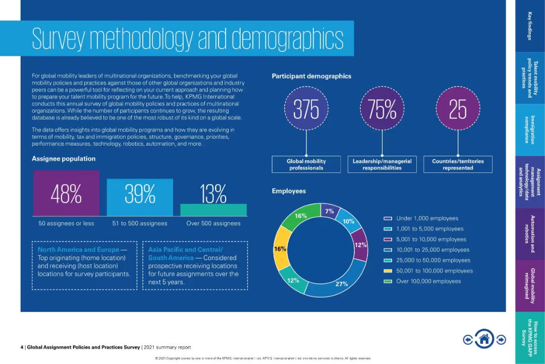
Highly visual layout with pie and bar charts displaying participant demographics, assignee populations, and employee distribution. Dark background with vibrant accents.
Human Resources and Talent Management
Professional Services
This slide presents demographic and methodology details of a global mobility survey. It covers participant roles, regional assignments, company size, and global coverage. Visuals include charts for employee size distribution and assignee population segmentation.
global mobility, HR survey, demographics, assignment trends, international assignees, workforce, survey participants, employee size
Multiple Chart
KPMG
Saved
This slide features column charts and forecasts showcasing growth in the digital economy, with a focus on e-commerce, online travel, and media. It is color-coded in blue tones and uses arrows for growth trajectory, accompanied by CAGR percentages. The information is clearly structured and presented in a professional layout.
Market Analysis and Trends
Technology & Software
The slide details the substantial growth of the digital economy in 2022 with projections for 2025, emphasizing the burgeoning e-commerce sector. It provides a snapshot of market potential and is likely aimed at investors or stakeholders considering digital economy ventures.
digital economy, e-commerce, online travel, media, CAGR, market growth, 2022 projections, 2025 forecast
Multiple Chart
Bain
Saved
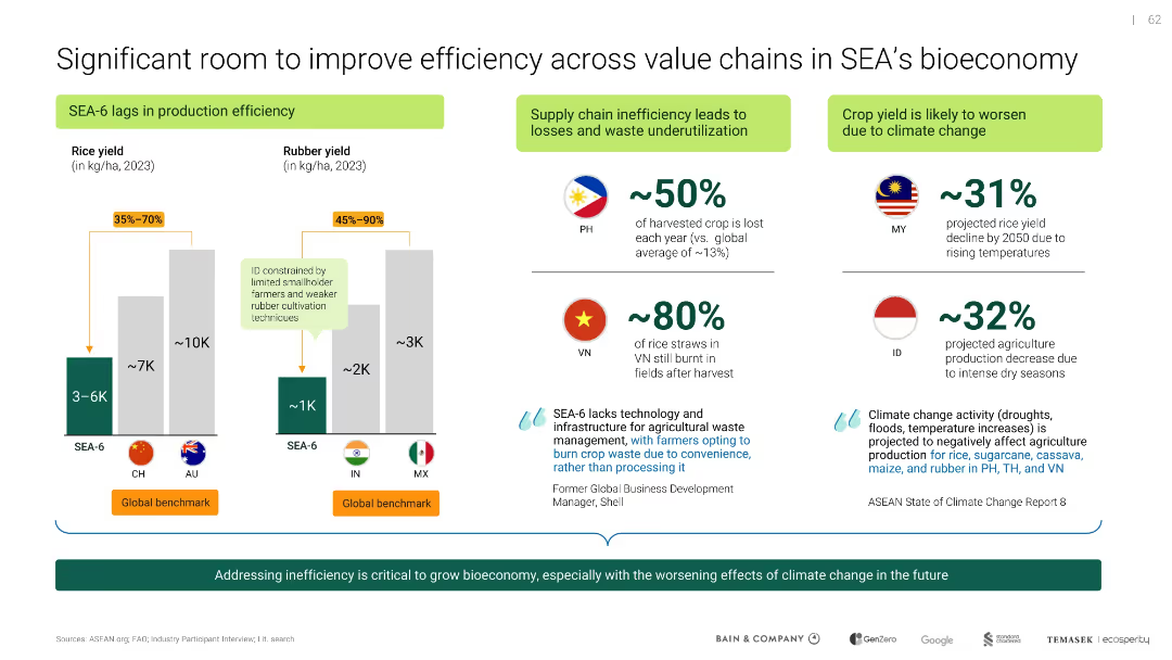
Combination of bar charts and icon-text blocks; segmented by inefficiency sources and climate threats
Operational Efficiency
Agriculture & Food Production
Illustrates production inefficiencies in SEA's rice and rubber sectors, with contributing factors like supply chain losses and climate change. Emphasizes the need for technology and waste management improvements.
inefficiency, value chain, rice yield, rubber yield, climate change, agriculture, SEA
Mixed Chart
Bain
Saved
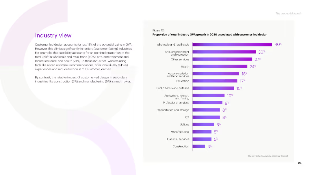
A bar chart showing the proportion of total industry GVA growth in 2030 associated with customer-led design across various industries, with percentages indicated for each industry.
Market Analysis and Trends
Technology & Software
The slide analyzes the role of customer-led design in driving industry GVA growth by 2030, emphasizing its impact on sectors like wholesale and retail trade, arts and entertainment, and health.
industry GVA, customer-led design, growth, wholesale and retail trade, arts and entertainment, health
Mixed Chart
Accenture
Saved
Two line charts are presented: one showing government debt as a percentage of GDP and the other illustrating government interest payments as a percentage of GDP for the US, Eurozone, and UK.
Risk Assessment and Management
Government & Public Sector
The slide examines government debt levels and interest payment trends, useful for assessing fiscal sustainability and debt risk in major economies.
Government debt, interest payments, fiscal sustainability, GDP, risk management
Multiple Chart
JP Morgan
Saved
Visualizes a before and after process flow for consumer goods operations, using purple and white color themes with circles and arrows connecting different stages.
Operational Efficiency
Technology & Software
Highlights the transformation in consumer goods operations due to AI implementation, focusing on efficiency and customer engagement enhancements.
consumer goods, AI integration, process transformation, efficiency, customer engagement, workflow optimization, automation, technology impact, operational improvement
Diagram
Accenture
Saved
The slide features text with four icons representing different healthcare practitioners and their preferred engagement methods with pharma companies.
Strategic Planning
Healthcare & Pharmaceuticals
The slide emphasizes that engagement strategies with healthcare professionals (HCPs) need to be tailored to their specific practice areas, highlighting varied preferences.
engagement, HCPs, strategies, pharma, preferences
Pillar
Accenture
Saved
Horizontal bar chart with country-wise comparison of importance of language proficiency; 2-color segmentation
Customer and Market Segmentation
Government & Public Sector
This slide evaluates public opinion on whether speaking the national language is essential to being a true citizen. Over 85% of respondents globally agree, with highest importance in countries like Indonesia and France, and relatively lower importance in India and the U.S.
language, citizenship, integration, communication, national identity, Ipsos, survey analysis, belonging
Mixed Chart
IPSOS
Saved
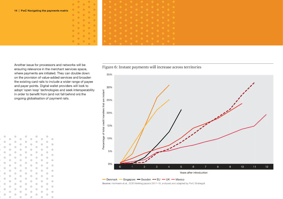
A line chart showing the increase in the percentage of total credit transfers that are instant across several countries over time.
Technology and Digital Transformation
Financial Services
The slide discusses the growth of instant payment systems in different countries, emphasizing the trend towards faster payment methods.
instant payments, credit transfers, countries, growth, trend, faster payments, systems
Mixed Chart
PwC/Strategy&
Saved
A line chart presents EPEX spot prices for selected countries (France, Germany, DK1, NO2, SE3), showing prices over 1,000 hours per year. The graph highlights the price peaks for wind and solar in 2030.
Market Analysis and Trends
Energy & Utilities
The slide discusses the opportunistic selling of P2P electricity in the spot market, noting that prices exceed the levelized cost of energy (LCOE) less than 1% of the time.
P2P, electricity, spot market, EPEX, LCOE, prices, wind, solar, energy, storage
Mixed Chart
Kearney
Saved
Slide shows multiple bar charts comparing "Commerce laggards" and "Commerce leaders" across various aspects of commerce.
Technology and Digital Transformation
Retail & E-commerce
Slide presents comparative data on multi-channel selling, purchase processes, and customer feedback among commerce leaders and laggards.
commerce, multi-channel, customer feedback, purchase process, bar chart
Multiple Chart
BCG
Saved
Previous
Next
If nothing, comes up, please save your slides first
Create a FREE account to continue browsing
Receive Instant Access to 1,000+ slides from companies like McKinsey, Google, and Goldman Sachs
First Name
Last Name
Email
Password
I agree to all
Terms & Privacy Policy
Thank you! Your submission has been received!
Oops! Something went wrong while submitting the form.
Have an account?
Sign in
Column Chart
Heatmap
Chevron
Org Chart
Infographic
Callouts
Timeline
List
Graphic
Picture
Process Flow
Diagram
Paragraph
Map
Table
Framework
Subtitle
Takeaway Box
Icon
Other Chart
Radar Chart
Waterfall Chart
Mekko Chart
Pie Chart
Scatter Plot
Line Chart
Bar chart
Bullet points