Create a FREE Account
Instant access to 1,000+ real slides from top companies like McKinsey, BCG, Goldman Sachs, Google and many more!
First Name
Last Name
Email
Password
I agree to all
Terms & Privacy Policy
Thank you! Your submission has been received!
Oops! Something went wrong while submitting the form.
Have an account?
Sign in
Library
Templates
Courses
Pricing
My Account
My Slides
My Templates
✦ AI
AI Prompt Library
AI Search
Sign in
Start Here
Logout
My Saved Slides
Light background with yellow title banner, text-heavy content, and a column chart comparing IPO returns vs. offer prices by market cap.
Financial Performance
Financial Services
The slide analyzes how large-cap IPOs have trailed smaller deals in returns within a volatile environment. It includes a column chart showing weighted average IPO returns vs. offer prices by market cap for 2022 and 2023.
IPO returns, large-cap, market volatility, 2023, financial analysis
Multiple Chart
EY
Saved
Slide with a prominent bar graph detailing the annual operating expenditure, accompanied by key expense categories. The visual elements are designed for easy comparison.
Financial Performance
Government & Public Sector
Discusses the Appeal Division's operational expenditures, with a focus on the costs associated with appeals scheduling and travel, providing a financial overview of the division's resource allocation.
expenditure, operational costs, financial overview, travel costs
Mixed Chart
PwC/Strategy&
Saved
An informative slide summarizes key investment opportunities in the crop industry, featuring four key themes illustrated with circular icons and brief descriptions. The design is clean and corporate, with a mix of graphics and text.
Industry Overview
Agriculture & Food Production
Aimed at investors, this slide summarizes the attractive characteristics of the crop market, emphasizing the long-term fundamentals, market downturns, technological innovations, and M&A opportunities. It serves as an agenda slide, highlighting key themes that will be discussed in detail throughout the presentation.
Crop Industry, Investment, Opportunities, Value Chain, Themes, Fundamentals, Technology, M&A
Pillar
EY
Saved
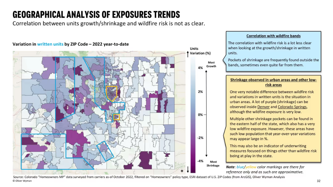
Color-coded ZIP map of Colorado showing growth/shrinkage in insurance units written; blue/yellow bands used as references for wildfire zones.
Strategic Planning
Financial Services
This slide reveals geographical patterns of insurance exposure changes in 2022. Unlike premium maps, there’s no strong correlation with wildfire risk zones. Pockets of decline appear even in low-risk or urban areas, suggesting additional underwriting considerations.
exposure trends, insurance shrinkage, wildfire zones, ZIP variation
Mixed Chart
Oliver Wyman
Saved
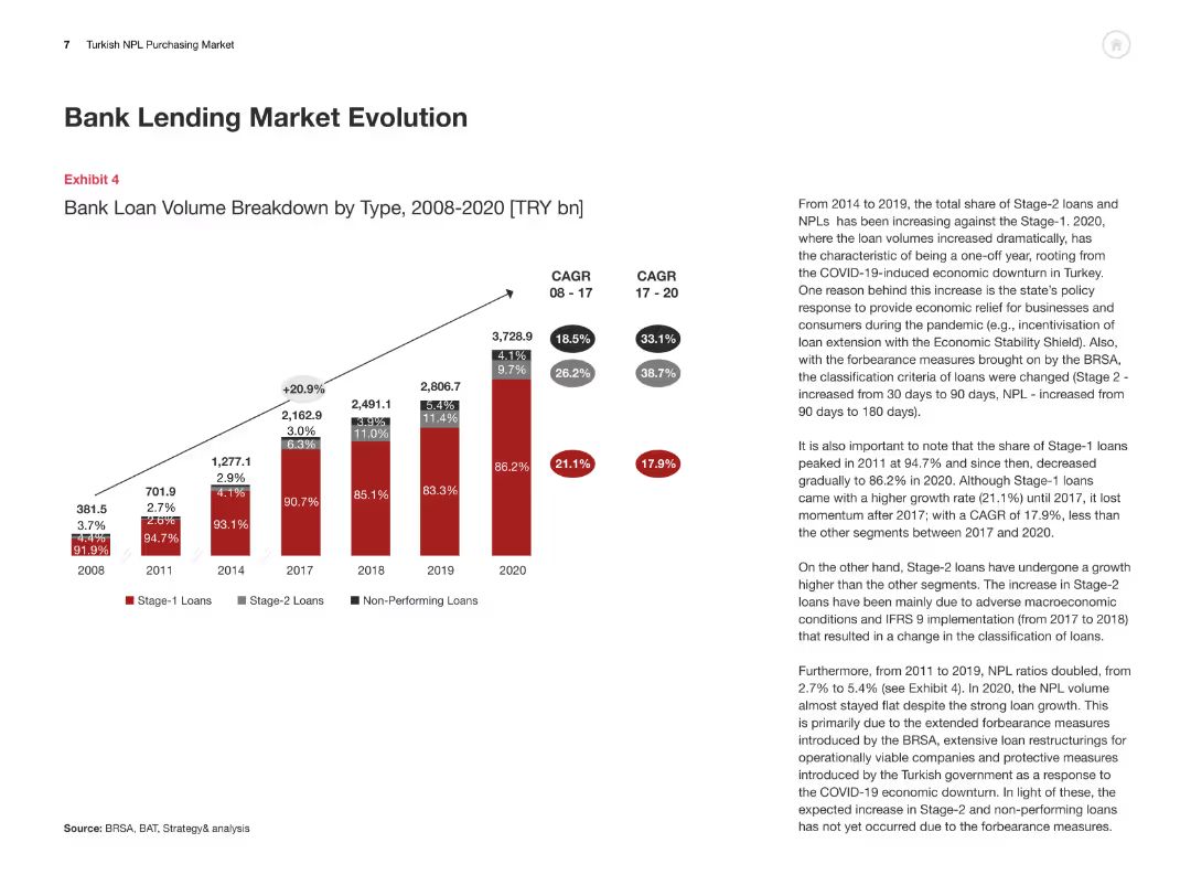
The slide includes a column chart showing the evolution of bank loan volumes by type from 2008 to 2020, with detailed textual analysis of the data trends and implications.
Market Analysis and Trends
Financial Services
This slide provides a comprehensive overview of the Turkish bank lending market evolution, highlighting the changes in loan volumes and types over a period of time.
Bank Lending, Market Evolution, Turkey, Loan Volumes, Data Trends
Mixed Chart
PwC/Strategy&
Saved
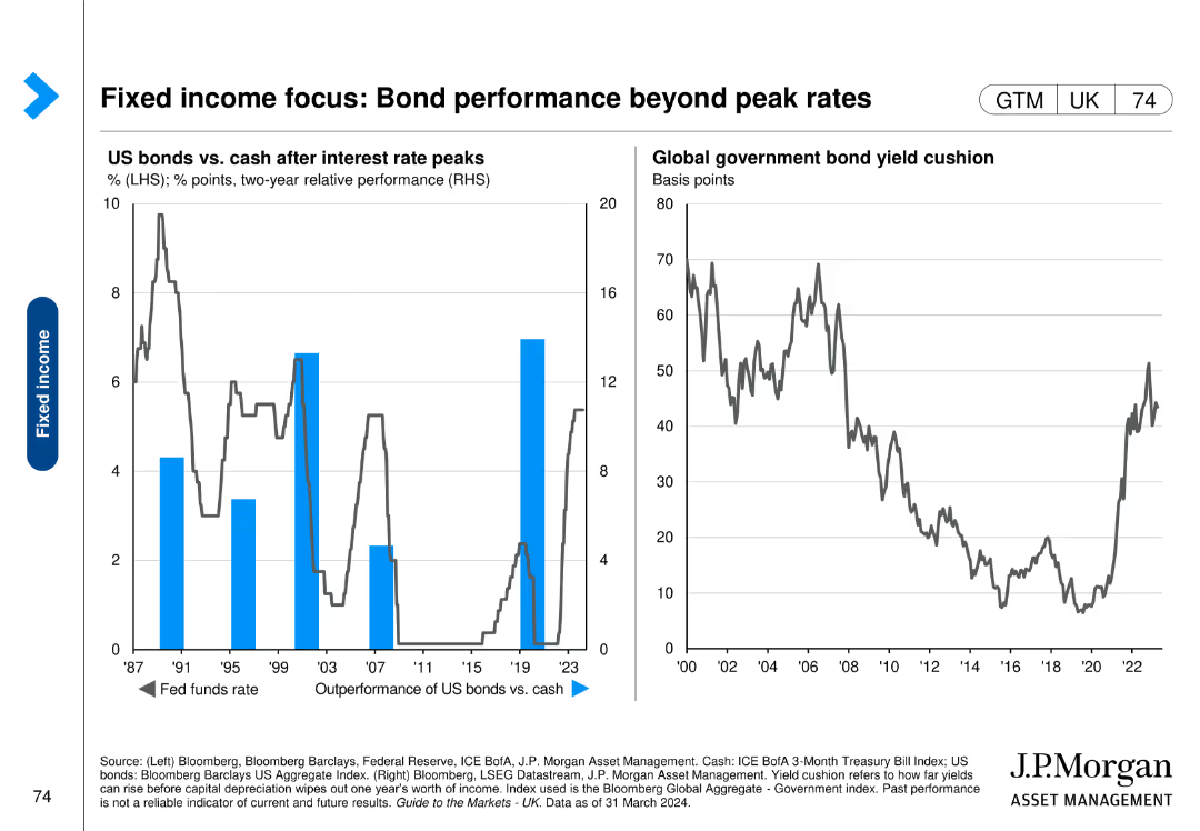
Includes a column chart on the left showing US bonds vs. cash after interest rate peaks and a line chart on the right displaying global government bond yield cushion over time.
Financial Performance
Financial Services
This slide evaluates the performance of US bonds relative to cash after interest rate peaks, and analyzes the yield cushion for global government bonds.
bond performance, interest rates, yield cushion, US bonds, global bonds
Multiple Chart
JP Morgan
Saved
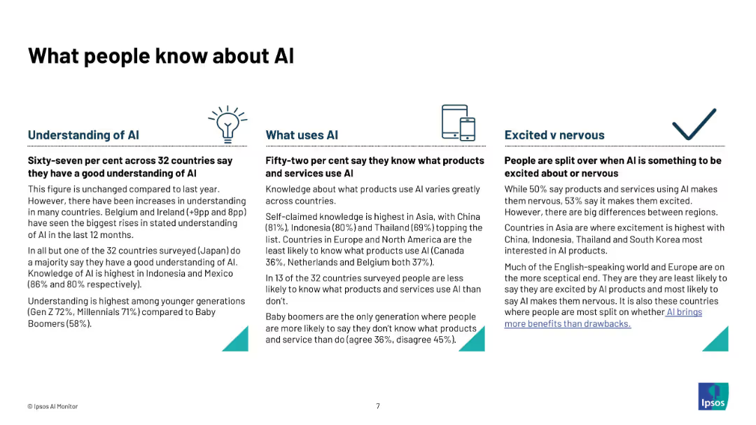
Three-column layout with icons and text under headings: "Understanding of AI", "What Uses AI", and "Excited vs Nervous".
Technology and Digital Transformation
Artificial Intelligence
Describes public knowledge about AI across 32 countries. Details include understanding levels, awareness of AI products, and emotional responses (excited vs nervous). Highlights generational and regional differences in knowledge and comfort levels.
AI awareness, public understanding, product knowledge, excitement, nervousness, generational gap, global survey, Ipsos, infographic
Pillar
IPSOS
Saved
Displays column charts showing changes in capital metrics like CET1 ratio and leverage ratio, alongside MREL/TLAC requirements with surplus figures.
Performance Metrics and KPIs
Financial Services
Provides an update on the bank's capital position, detailing changes in capital ratios and requirements, key for regulatory compliance and stability assessment.
Capital, CET1 ratio, leverage, compliance
Multiple Chart
Deutsche Bank
Saved
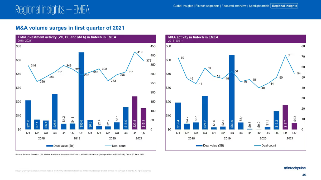
Two-panel bar and line chart layout; left chart covers total investment activity (VC, PE, M&A); right chart focuses on M&A activity; consistent blue and purple color scheme; simple data visuals.
Strategic Planning
Financial Services
The slide showcases the surge in fintech M&A activity in the EMEA region during Q1 2021, with strong increases in both deal value and count. It provides quarterly trend data from 2018–2021 for total investment and M&A-specific metrics, highlighting Q1 2021 as a peak period.
M&A, Fintech, EMEA, Investment, Deal Value, Deal Count, Q1 2021, Trends, PE, VC
Multiple Chart
KPMG
Saved
Contains two pie charts contrasting current and future revenue composition, with an arrow indicating the strategic direction. The charts are supported by a clean, minimalist design.
Financial Performance
Financial Services
Highlights strategies to improve revenue durability and return on equity, indicating a planned shift in segment revenue composition, and emphasizing the growth of management and incentive fees.
Revenue, Durability, Returns, Management Fees
Diagram
Goldman Sachs
Saved
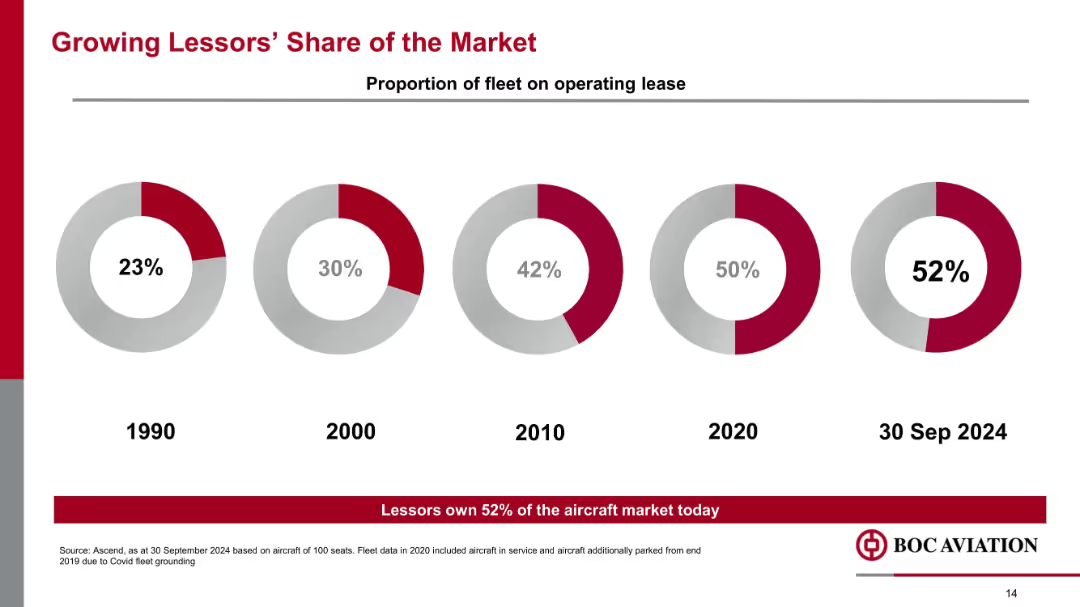
Donut chart progression showing operating lease share from 1990 to Sep 2024, with 52% share noted for 2024.
Market Analysis and Trends
Transportation & Logistics
The slide tracks the increasing dominance of aircraft lessors, whose market share of operating leases has risen from 23% in 1990 to 52% in 2024. It signals structural changes in how airlines manage fleet financing.
operating lease, lessors, fleet management, market share, leasing trend, aviation finance
Mixed Chart
Goldman Sachs
Saved
The slide includes three pie charts comparing operating profit distribution between investments, employees, shareholders, and taxes for 2017, 2021, and 2025.
Strategic Planning
Professional Services
It shows the distribution of value creation between stakeholders for the years 2017, 2021, and projected for 2025, highlighting changes over time.
value creation, stakeholders, profit, Ipsos, planning
Multiple Chart
IPSOS
Saved
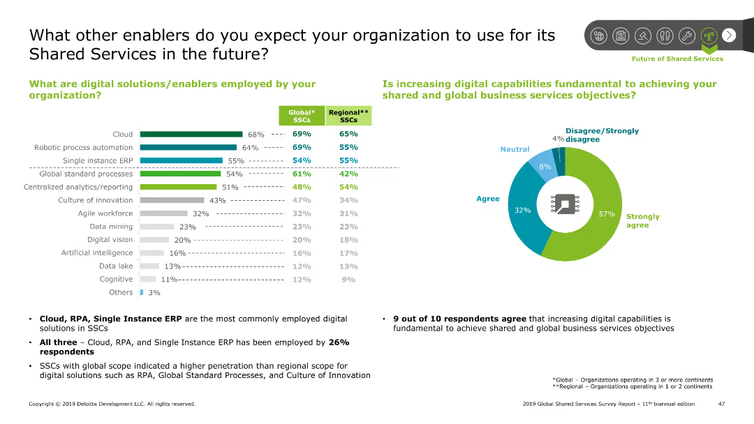
Features a bar chart on the left and a pie chart on the right, displaying digital solutions and their perceived importance.
Technology and Digital Transformation
Professional Services
Highlights the digital solutions used by organizations in Shared Services, like cloud and RPA, and the perceived importance of increasing digital capabilities.
enablers, digital, solutions, cloud, RPA, ERP, analytics, innovation, workforce
Multiple Chart
Deloitte
Saved
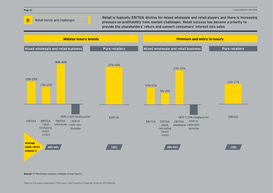
Displays various bar charts comparing EBITDA percentages for midsize luxury brands and premium/entry-to-luxury segments across different business models.
Market Analysis and Trends
Retail & E-commerce
Discusses the EBITDA impact on retail business models within midsize luxury brands and premium/entry-to-luxury segments, highlighting profitability.
EBITDA, retail business, luxury brands, premium, entry-to-luxury, profitability, business models, bar charts, market analysis
Multiple Chart
EY
Saved
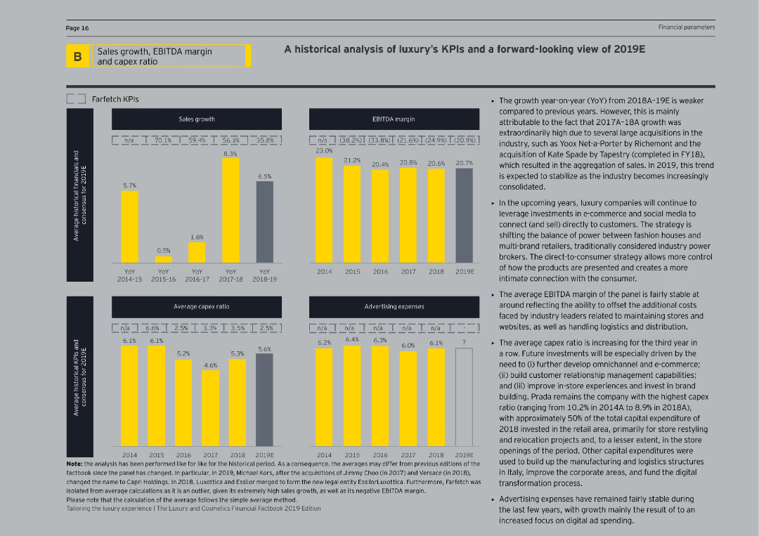
This slide features bar charts and line graphs analyzing historical and projected KPIs for luxury companies, including sales growth, EBITDA margins, and capex ratios.
Financial Performance
Consumer Goods
The slide provides a historical analysis and forward-looking view of key performance indicators for luxury companies, examining trends in sales, margins, and capital expenditures.
KPI analysis, luxury companies, financial performance, sales growth, EBITDA margin
Multiple Chart
EY
Saved
The slide includes a map of the United States with overlays indicating the company's footprint and prospective client density. It also has graphical elements such as circles of varying sizes representing data points, with a key to interpret these visual elements. The design is straightforward, focusing on market potential and presence.
Market Analysis and Trends
Financial Services
Aimed at demonstrating market strength and opportunities, the slide features a map visualizing the firm’s market presence and prospective client density in the middle market segment. It uses graphical representations to highlight the scale and scope of the company’s reach, underscoring the strategic positioning for growth within this segment.
middle market, market opportunity, banking, client prospects, presence, strategic positioning, footprint, growth potential
Diagram
JP Morgan
Saved
Highlights types of computing hardware optimized for different ML tasks, like GPUs and TPUs.
Technology and Digital Transformation
Technology & Software
Focuses on hardware solutions for software interconnection and workload optimization in the ML process.
Computing hardware, GPUs, TPUs, NPUs, ML optimization
Header Horizontal
McKinsey
Saved
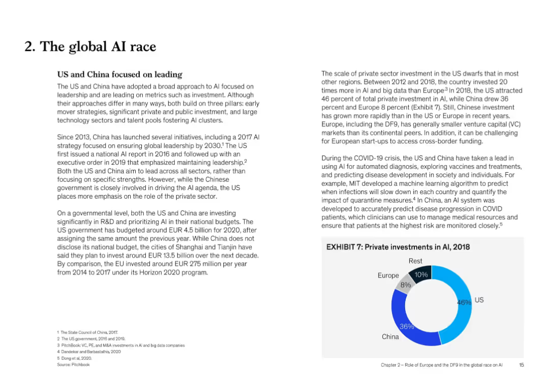
Two-column text with bullet points and chart inset (Exhibit 7) showing private AI investment shares by region (2018)
Strategic Planning
Artificial Intelligence
The US and China are leading in AI development through public and private investment. The slide outlines strategy, funding trends, and innovation leadership, with Europe lagging. COVID-19 applications and governmental strategies are discussed.
global AI race, US vs China, investment, policy, COVID-19, EU, private sector, leadership
Mixed Chart
McKinsey
Saved
Slide shows a bubble chart indicating the share of emissions per energy and land-use system. Text is complemented by bubbles of various sizes representing data points, set against a plain background for clarity.
Industry Overview
Environmental Services & Sustainability
Explains the universal nature of emission reductions required across all energy and land-use systems for a successful net-zero transition. Includes comparative data visualization for different emission types across various sectors.
Emissions, Net-Zero, Energy, Land-Use, Reduction, Carbon Dioxide, Methane, Nitrous Oxide
Single Chart
McKinsey
Saved
The slide contains a two-column layout listing the contents of the ESG report with sections on insights, clients, and the firm's operations.
Corporate Finance and Valuation
Government & Public Sector
It outlines the contents of McKinsey's ESG Report, detailing sections on company overview, strategy, governance, and key initiatives for sustainable growth.
ESG, Contents, McKinsey, Sustainable Growth, Corporate Strategy, Governance, Report Sections
Agenda
McKinsey
Saved
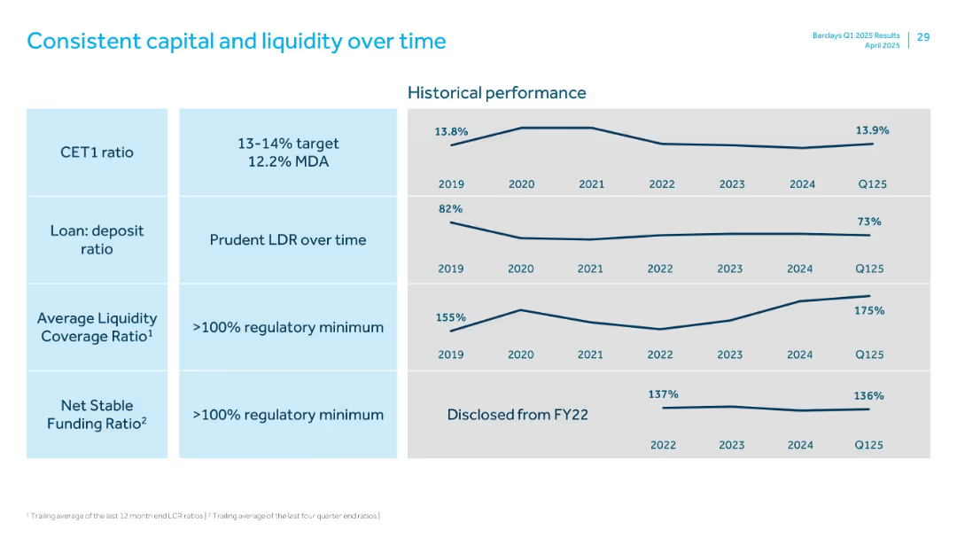
Matrix on the left and line graphs on the right showing historical trends of key financial ratios
Financial Performance
Financial Services
Presents historical trends (2019–Q125) for CET1 ratio, loan-to-deposit ratio, liquidity coverage ratio, and net stable funding ratio, emphasizing prudence and consistency across regulatory and capital metrics.
CET1, liquidity ratio, funding ratio, loan-deposit, trends
Single Chart
Barclays
Saved
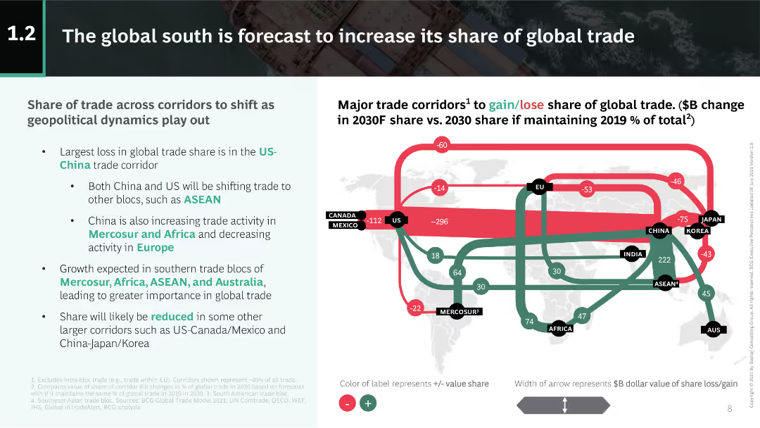
This slide features a colored flowchart illustrating trade share changes among regions. Text explanations are included on the left side of the slide, making it moderately complex.
Market Analysis and Trends
Transportation & Logistics
The slide explains shifts in global trade shares, particularly noting the losses in the US-China corridor and growth in other regions such as ASEAN and Mercosur.
global trade, share, US-China, ASEAN, Mercosur
Boxed
BCG
Saved
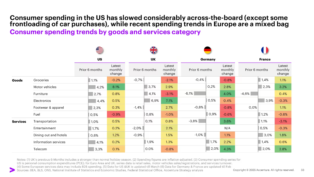
Comparative table with color-coded cells across 4 countries (US, UK, Germany, France), showing 6-month and latest monthly spending change by category.
Performance Metrics and KPIs
Consumer Goods
The slide offers a detailed breakdown of consumer spending shifts by category (goods vs. services) across the US and key European markets, highlighting mixed patterns and some volatility in recent monthly trends.
spending trends, goods vs services, US, UK, France, Germany, monthly change, consumption, inflation-adjusted
Single Chart
Accenture
Saved
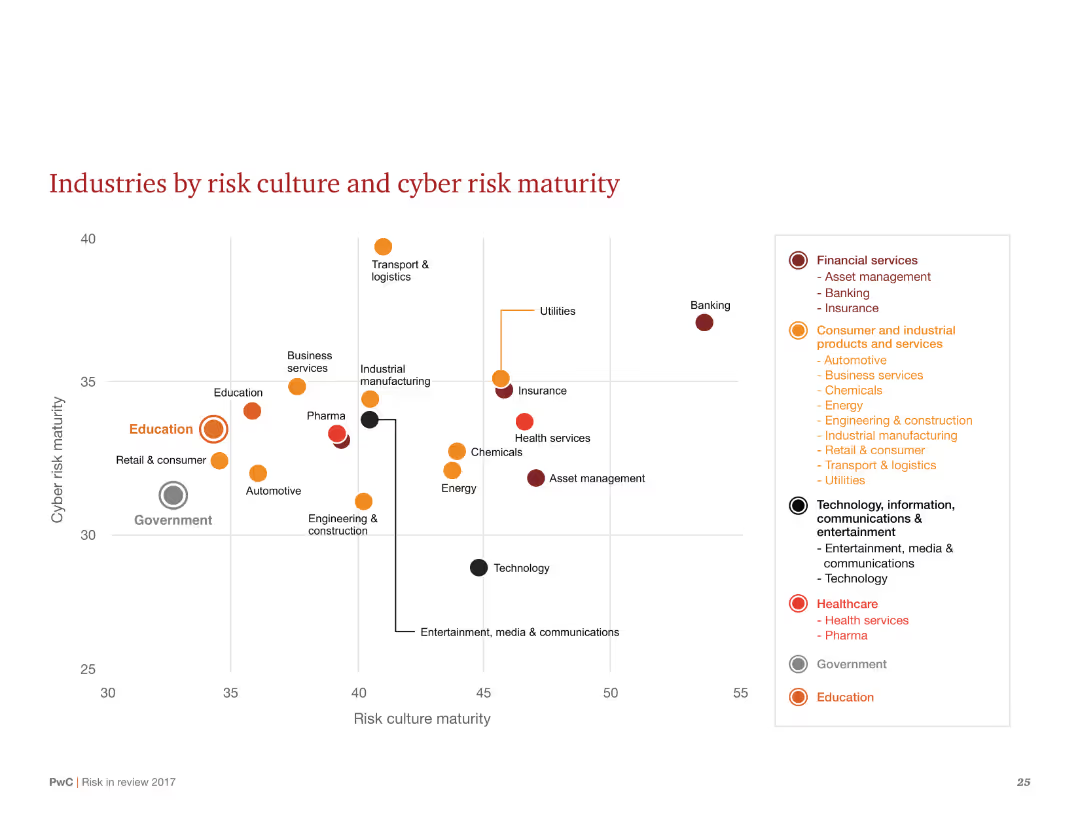
A scatter plot showing industries by their risk culture and cyber risk maturity, with different industry sectors marked on the chart.
Market Analysis and Trends
Financial Services
Visualizes the relationship between risk culture and cyber risk maturity across various industries. Highlights sectors like financial services and education in terms of their maturity levels.
Risk culture, cyber risk, maturity, scatter plot, industries, sectors, financial services, education, chart
Single Chart
PwC/Strategy&
Saved
The slide features a column chart on the left showing the percentage of Millennials shifting from luxury brands (54%) and those not shifting (46%). On the right, it shows a breakdown of the niches they are shifting to: Luxury sports niche (22%), Luxury niche (23%), Fast fashion (26%), and Premium (29%). Relevant categories are listed to the right.
Market Analysis and Trends
Consumer Goods
This slide analyzes the trend of Millennials shifting away from top luxury brands, highlighting the niches they are moving towards and listing relevant product categories.
Millennials, luxury, brands, niches, fashion
Multiple Chart
BCG
Saved
Previous
Next
If nothing, comes up, please save your slides first
Create a FREE account to continue browsing
Receive Instant Access to 1,000+ slides from companies like McKinsey, Google, and Goldman Sachs
First Name
Last Name
Email
Password
I agree to all
Terms & Privacy Policy
Thank you! Your submission has been received!
Oops! Something went wrong while submitting the form.
Have an account?
Sign in
Column Chart
Heatmap
Chevron
Org Chart
Infographic
Callouts
Timeline
List
Graphic
Picture
Process Flow
Diagram
Paragraph
Map
Table
Framework
Subtitle
Takeaway Box
Icon
Other Chart
Radar Chart
Waterfall Chart
Mekko Chart
Pie Chart
Scatter Plot
Line Chart
Bar chart
Bullet points