Create a FREE Account
Instant access to 1,000+ real slides from top companies like McKinsey, BCG, Goldman Sachs, Google and many more!
First Name
Last Name
Email
Password
I agree to all
Terms & Privacy Policy
Thank you! Your submission has been received!
Oops! Something went wrong while submitting the form.
Have an account?
Sign in
Library
Templates
Courses
Pricing
My Account
My Slides
My Templates
✦ AI
AI Prompt Library
AI Search
Sign in
Start Here
Logout
My Saved Slides
Multiple line charts showing sovereign EMD spreads, corporate EMD spreads, and local EMD yields over time.
Market Analysis and Trends
Financial Services
Updates on emerging market bonds with data on sovereign and corporate EMD spreads, and local EMD yields, providing a comprehensive view of the emerging markets bond environment.
Emerging markets, bond spreads, yields
Multiple Chart
Morgan Stanley
Saved
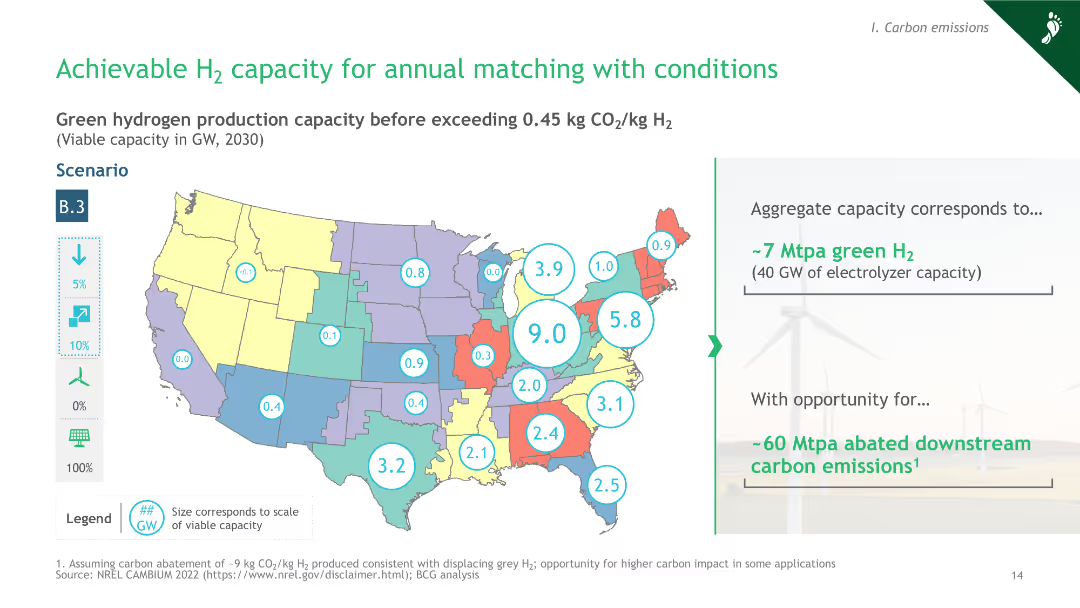
A map of the United States with color-coded states and numerical data points indicating green hydrogen production capacity, along with a column chart.
Market Analysis and Trends
Energy & Utilities
The slide presents a scenario analysis of green hydrogen production capacity across the U.S., projecting viable capacity before exceeding CO2 limits.
hydrogen, capacity, carbon emissions, scenario, 2030
Graphic
BCG
Saved
The slide includes a series of bullet points with accompanying icons, outlining the areas of investment such as 'Digital experience and innovation' and 'Branch expansion'.
Investment Analysis
Financial Services
Outlines JP Morgan's investment portfolio expected to yield long-term efficiency and innovation results, detailing various strategic areas from marketing to regulatory compliance. It serves to inform investors and stakeholders about the company’s future-focused financial decisions.
Long-Term Investments, Digital Innovation, Branch Expansion, Efficiency
Table
JP Morgan
Saved
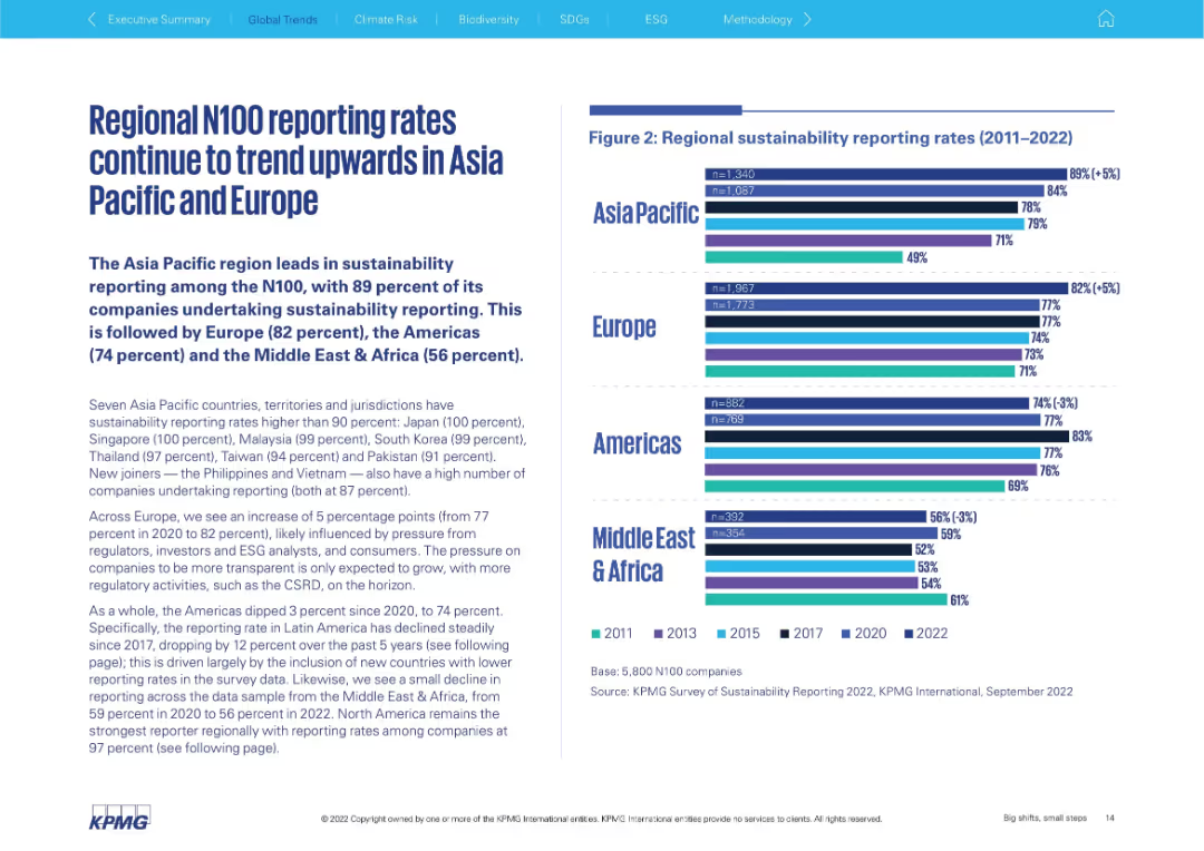
Two-panel layout; left side features bold headline and paragraph text, right side has horizontal bar chart (2011–2022) segmented by region
Performance Metrics and KPIs
Professional Services
This slide shows how sustainability reporting rates among N100 companies have increased across regions, with Asia Pacific and Europe leading. It presents specific country-level reporting stats and discusses the pressure to adopt transparency practices. A bar chart illustrates regional progress from 2011 to 2022.
sustainability, reporting rates, Asia Pacific, Europe, N100, ESG, transparency, benchmarking, regional trends
Mixed Chart
KPMG
Saved
The slide features a cloud-shaped information hub with people using computer terminals. The layout includes three key points presented in dialogue bubbles on a green background.
Industry Overview
Technology & Software
The slide discusses enabling technology to improve worker performance, using interventions for better human outcomes, and scaling insights for broader impacts.
technology, interventions, scaling, human impact, insights, performance improvement, technology enablement
Linear Flow
Deloitte
Saved
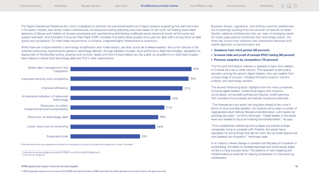
Left: horizontal bar graph listing tech benefits; right: text insights and key influencing factors.
Operational Efficiency
Financial Services
Discusses benefits from public cloud/XaaS like better data integration and security. Key transformation drivers include third-party guidance, in-house testing, and competitor adoption. Also addresses modernization of legacy tech stacks.
XaaS, cloud platforms, modernization, security, integration, third-party advice, financial sector
Mixed Chart
KPMG
Saved
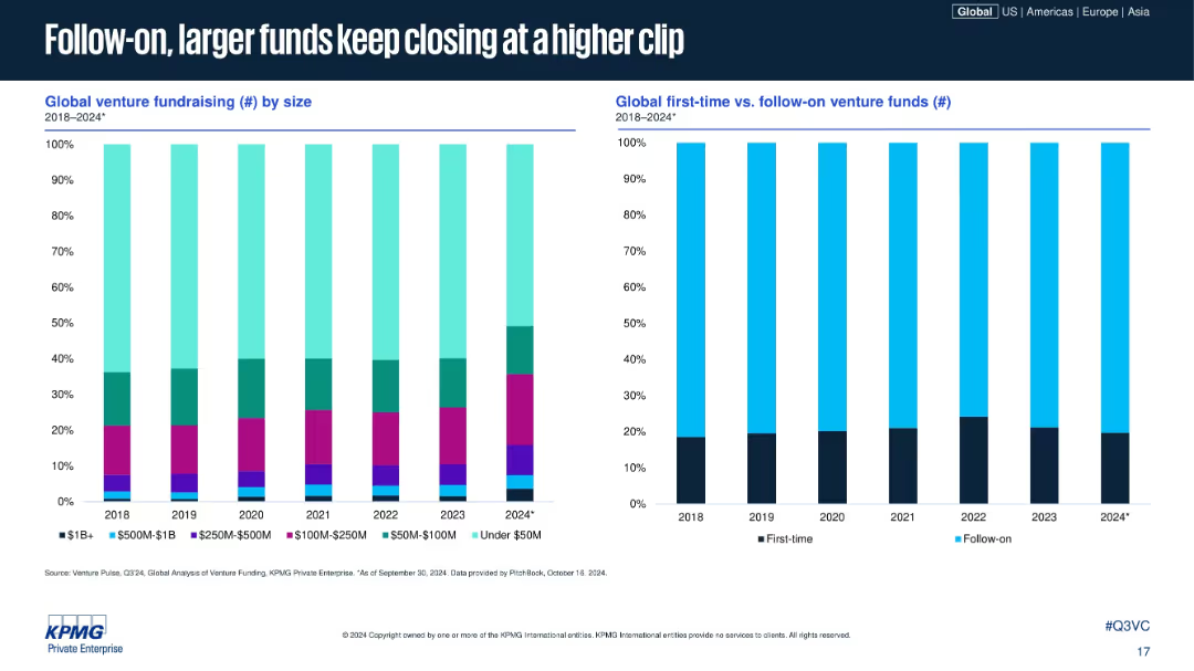
Two stacked bar charts: left by fund size, right by first-time vs. follow-on; consistent visuals and layout; timeline from 2018–2024.
Corporate Finance and Valuation
Financial Services
This slide analyzes venture fund closings by size and type. Larger and follow-on funds dominate recent years, with first-time funds making up a smaller proportion. It suggests investor preference for proven fund managers and larger, more stable vehicles.
fund size, follow-on funds, venture fundraising, first-time funds, VC trends, capital allocation, institutional preference, fund data
Multiple Chart
KPMG
Saved
This slide presents column chart and a table comparing current P/E ratios with historical highs, lows, and averages, using a clear color scheme to denote values.
Investment Analysis
Financial Services
Evaluates market valuation by comparing current price-to-earnings ratios with historical data, aiding investors in identifying potential overvalued or undervalued market segments.
valuation analysis, P/E ratio, bar graphs, heat map, historical comparison, market valuation
Single Chart
Morgan Stanley
Saved
This slide features bullet points summarizing recent sustainability achievements alongside a column chart of sustainable finance volumes. It is visually balanced between text and graphic elements.
Regulatory and Compliance
Environmental Services & Sustainability
Provides an overview of sustainability efforts and achievements, including financial volumes and strategic initiatives in sustainable practices.
sustainability, finance, corporate responsibility, environmental impact
Mixed Chart
Deutsche Bank
Saved
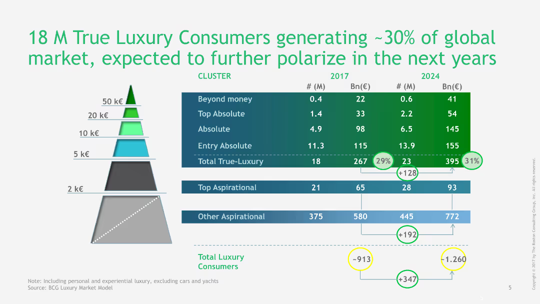
Pyramid chart showing the segmentation of true luxury consumers and their market contribution in 2017 and projected for 2024, with detailed figures.
Market Analysis and Trends
Consumer Goods
This slide provides a detailed segmentation of true luxury consumers, showing their contribution to the global market in 2017 and projections for 2024.
luxury, consumers, market segmentation, global market, projections, 2017, 2024, pyramid chart, detailed figures, market analysis
Table
BCG
Saved
The slide features three sets of bar charts comparing LCOH reductions under different power control scenarios (positive, negative, combined). Each set shows cost comparisons for grid-only and with power control.
Risk Assessment and Management
Energy & Utilities
This slide examines how grid servicing by electrolyzers can significantly reduce the Levelized Cost of Hydrogen (LCOH). It presents various scenarios and quantifies potential cost savings through effective power control management.
LCOH, grid servicing, electrolyzers, power control, cost reduction
Multiple Chart
Kearney
Saved
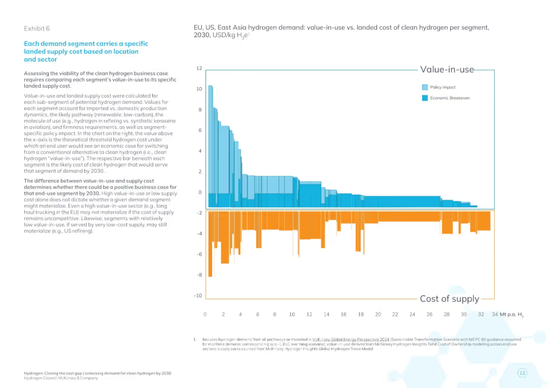
Bar chart with color-coded bars (light/dark blue above x-axis for value-in-use, orange below for cost of supply), descriptive text left, large title header
Investment Analysis
Energy & Utilities
The slide compares hydrogen's value-in-use against its cost of supply across different segments and geographies (EU, US, East Asia) projected to 2030. It visually assesses the economic viability of hydrogen adoption using breakeven and policy-adjusted thresholds, identifying segments where business cases exist or require support.
hydrogen cost, value-in-use, breakeven, policy impact, segment economics, 2030 projection, clean energy, EU US Asia, investment decision
Mixed Chart
McKinsey
Saved
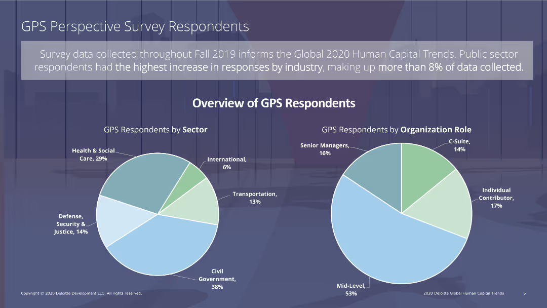
The slide has two pie charts: one showing GPS respondents by sector and the other by organizational role. Text sections provide additional explanations.
Market Analysis and Trends
Professional Services
The slide presents survey data on GPS respondents, showing distribution by sector (e.g., health, transportation) and organizational role (e.g., C-suite, senior managers), highlighting key demographics.
survey data, GPS respondents, professional services, demographics, sector distribution
Multiple Chart
Deloitte
Saved
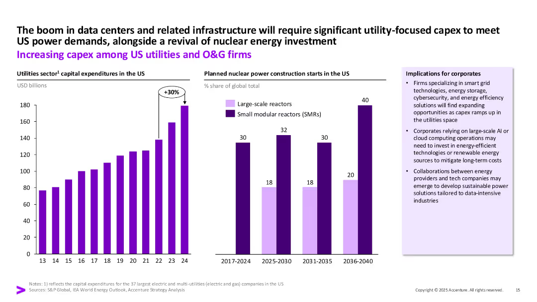
Bar chart on the left (utility capex growth) and bar chart on the right (nuclear reactor types), with implications box and upward arrow marking a 30% increase. Purple highlights.
Strategic Planning
Energy & Utilities
This slide presents the growth in capital expenditures among US utilities and oil & gas firms, especially due to the expansion of data centers and renewed interest in nuclear power. It emphasizes SMR growth and implications for energy and tech industry collaboration.
capex, utilities, SMR, nuclear energy, data centers, O&G, investment
Multiple Chart
Accenture
Saved
Detailed presentation with column charts showing Bitcoin metrics over years, including price projections and mining outputs.
Technology and Digital Transformation
Financial Services
Analyzes the future economic impact of Bitcoin mining, illustrating projected growth in value and reduction in new coins mined.
Bitcoin, Mining, Growth, Projection, Economy
Multiple Chart
McKinsey
Saved
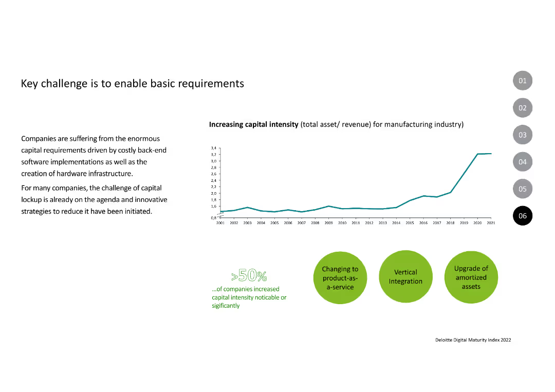
Features a line chart showing the increase in capital intensity for the manufacturing industry from 2001 to 2021. Below the chart, there are three key strategies illustrated with icons: changing to product-as-a-service, vertical integration, and upgrading amortized assets.
Operational Efficiency
Industrial & Manufacturing
Highlights the rising capital intensity in the manufacturing industry and the strategies being adopted to manage this challenge. It emphasizes the need for innovative approaches like product-as-a-service models and vertical integration to unlock capital and drive efficiency.
Capital, Intensity, Manufacturing, Strategy, Integration
Mixed Chart
Deloitte
Saved
The slide is data-heavy with multiple statistics and figures relating to Macquarie’s ESG efforts, presented in a mix of text, icons, and numerals. It has a structured design with a clear division of sections, each focusing on a specific ESG aspect. The color scheme and visual elements are consistent and clean.
Regulatory and Compliance
Financial Services
It showcases quantitative achievements in Macquarie’s ESG efforts, like carbon neutrality and investment in renewable energy. The slide could be used for detailed reporting to stakeholders on Macquarie’s ESG performance metrics, reflecting transparency and commitment to sustainable practices.
ESG metrics, Macquarie, carbon neutrality, renewable energy, sustainable operations, corporate reporting, ESG achievements, transparency
Pillar
Morgan Stanley
Saved
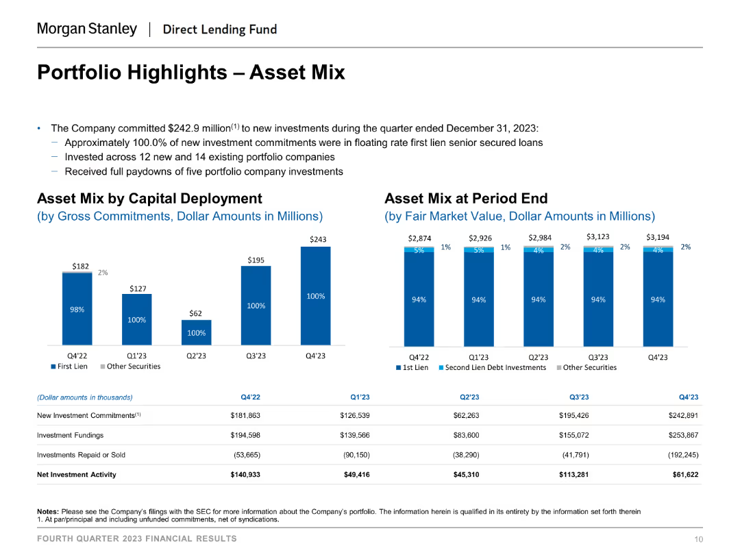
The slide includes column charts that depict the asset mix by capital deployment and at period end. Each chart uses distinct colors to differentiate between types of investments, such as first lien, second lien debt investments, and other securities.
Investment Analysis
Financial Services
The slide provides an overview of the portfolio's asset mix, showing how capital is deployed and the composition of assets at the end of different periods, aiding in investment analysis and portfolio management.
asset mix, capital deployment, investment analysis, financial services, portfolio management, period end asset composition
Multiple Chart
Morgan Stanley
Saved
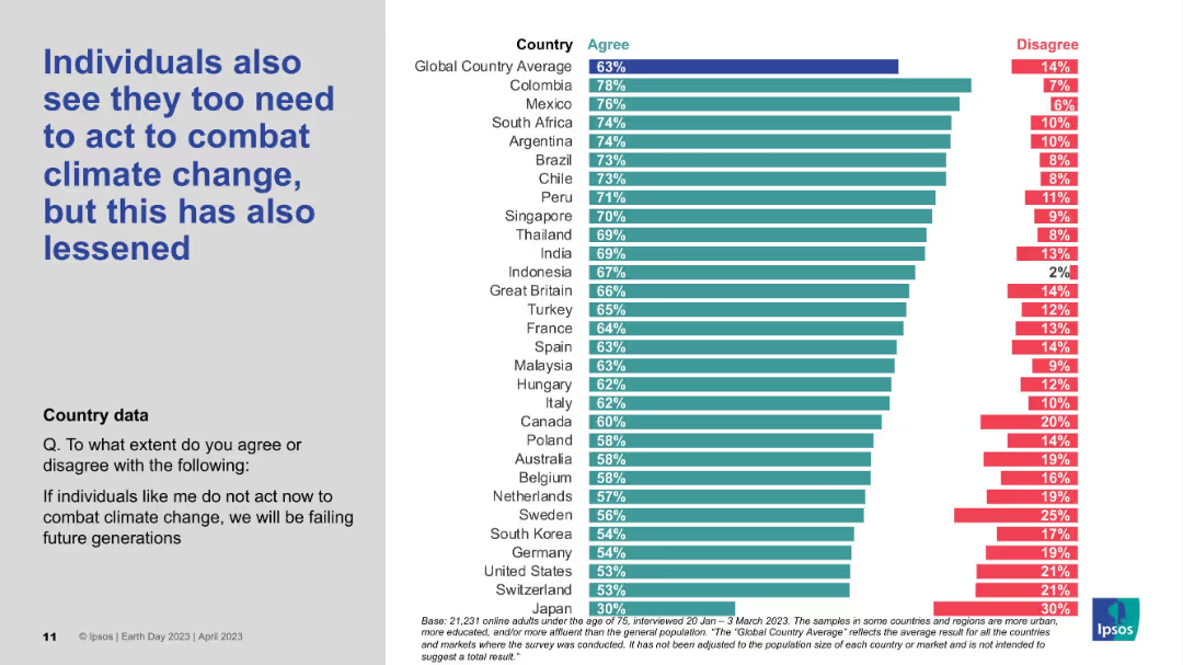
Vertical bar chart by country, measuring agreement/disagreement on individual responsibility; styled like previous slides.
Strategic Planning
Environmental Services & Sustainability
The data reflects decreasing belief that individuals must take personal action to address climate change. Despite the decline, countries like Colombia, Mexico, and South Africa still report strong agreement, while Japan shows the lowest individual sense of duty.
Personal responsibility, Climate perception, Ipsos survey, Individual action, Global data
Mixed Chart
IPSOS
Saved
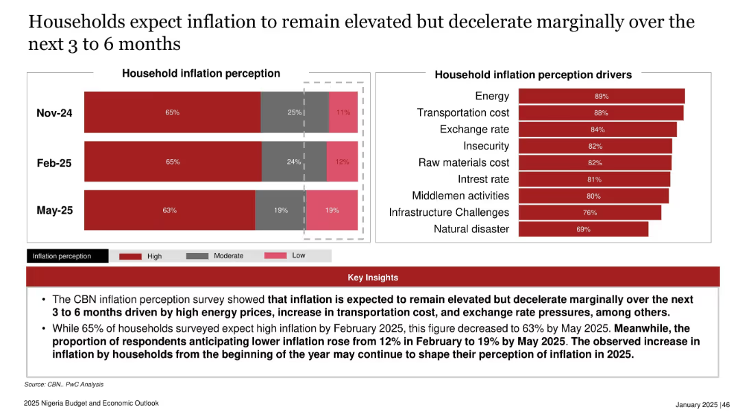
Split layout with a bar graph showing inflation perceptions by month on the left and a drivers bar chart on the right; red theme with bold key insights box at the bottom.
Market Analysis and Trends
Financial Services
This slide summarizes households' inflation expectations, showing a slight reduction in anticipated high inflation from Feb to May 2025. Key inflation drivers include energy, transportation, and exchange rates. The data reflects continued concerns despite marginal improvements.
inflation, household perception, Nigeria, energy costs, exchange rate, economic sentiment, 2025 trend, cost of living
Multiple Chart
PwC/Strategy&
Saved
The slide uses a horizontal bar chart to compare CO2 emissions for different hydrogen production methods from various primary sources, with color coding for clarity.
Regulatory and Compliance
Energy & Utilities
The slide examines CO2 emissions from hydrogen production using different primary energy sources, such as coal, natural gas, nuclear fuel, solar, and wind, emphasizing the environmental impact of each method.
CO2 emissions, hydrogen, production, pathways, environment
Mixed Chart
Kearney
Saved
Features a sequence of column chart illustrating changes in the leverage ratio over a period, complemented by a smaller bar chart depicting tier 1 capital data. Key highlights are noted on the right for quick reference.
Financial Performance
Financial Services
Focuses on the stability of the leverage ratio within a financial institution over time, emphasizing changes in regulatory treatment and capital adjustments. It provides insights into strategic financial planning and regulatory compliance.
leverage, capital, financial, compliance, stability
Mixed Chart
Deutsche Bank
Saved
Contains bullet points detailing the main challenges in achieving transformation and scale, focusing on people, culture, and collaborations.
Organizational Structure and Change
Environmental Services & Sustainability
Explores challenges such as knowledge gaps, collaboration difficulties, and transparency issues that companies face during transformation towards more sustainable practices. Suitable for discussions on change management and improving organizational culture and collaboration in corporate settings.
People and culture, Collaboration, Transparency, Transformation challenges, Sustainability, Governance, Corporate strategy, Organizational change, Knowledge management, Value proposition
Header Vertical
Accenture
Saved
Multiple column charts display financial performance over several years with projections up to 2026, accompanied by textual analysis.
Financial Performance
Financial Services
Reiterates Barclays' financial data focusing on RoTE, income, and other key financial indicators, setting performance targets for 2026 and illustrating past performance trends and future aspirations.
financials, RoTE, targets, 2026, performance
Multiple Chart
Barclays
Saved
Similar design to others; shows global average and detailed country-by-country percentage comparisons
Risk Assessment and Management
Government & Public Sector
Focusing on a single reason for inaction—feeling that no action would make a difference—this slide presents country-level data and gender-based breakdowns to highlight where this sentiment is most prevalent.
pessimism, gender equality, action barriers, Ipsos, survey data, global comparison
Mixed Chart
IPSOS
Saved
Previous
Next
If nothing, comes up, please save your slides first
Create a FREE account to continue browsing
Receive Instant Access to 1,000+ slides from companies like McKinsey, Google, and Goldman Sachs
First Name
Last Name
Email
Password
I agree to all
Terms & Privacy Policy
Thank you! Your submission has been received!
Oops! Something went wrong while submitting the form.
Have an account?
Sign in
Column Chart
Heatmap
Chevron
Org Chart
Infographic
Callouts
Timeline
List
Graphic
Picture
Process Flow
Diagram
Paragraph
Map
Table
Framework
Subtitle
Takeaway Box
Icon
Other Chart
Radar Chart
Waterfall Chart
Mekko Chart
Pie Chart
Scatter Plot
Line Chart
Bar chart
Bullet points