Create a FREE Account
Instant access to 1,000+ real slides from top companies like McKinsey, BCG, Goldman Sachs, Google and many more!
First Name
Last Name
Email
Password
I agree to all
Terms & Privacy Policy
Thank you! Your submission has been received!
Oops! Something went wrong while submitting the form.
Have an account?
Sign in
Library
Templates
Courses
Pricing
My Account
My Slides
My Templates
✦ AI
AI Prompt Library
AI Search
Sign in
Start Here
Logout
My Saved Slides
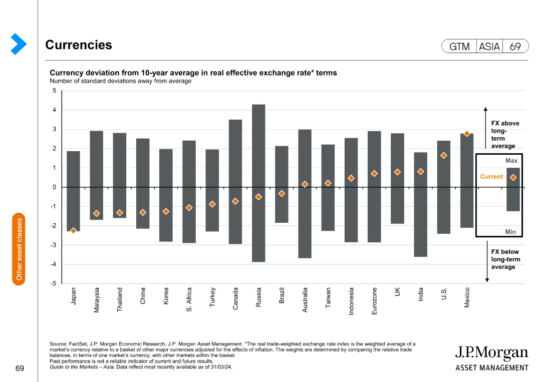
This slide features a column chart showing the currency deviation from the 10-year average in real effective exchange rate terms. The chart has columns representing standard deviations from the average for various countries.
Investment Analysis
Financial Services
This slide provides an analysis of currency deviations from the historical average, aiding in investment decisions by highlighting currency trends and potential risks.
currency deviation, investment, exchange rate, financial analysis, trends
Single Chart
JP Morgan
Saved
Contains a heat map to represent asset class performance from 2013 to the current year. It uses color coding to depict returns, with red indicating lower returns and green indicating higher returns. The layout is a complex grid with numerous data points for comparison.
Investment Analysis
Financial Services
Providing a yearly performance comparison of various asset classes, this slide serves as a tool for investors or financial advisors to assess historical returns. It visually distinguishes between high and low performers, facilitating strategic investment decisions based on past market behavior.
Asset Classes, Performance, Heat Map, Returns, Analysis
Table
Morgan Stanley
Saved
The slide includes pie charts, and a table, all showing assets under supervision (AUS). It has a title at the top and key highlights on the right, using a moderate design.
Investment Analysis
Financial Services
This slide focuses on the distribution and changes in assets under supervision for asset and wealth management. Ideal for financial reviews, investor updates, or internal strategic planning, providing insight into asset allocation and client channels.
Assets Under Supervision, AUS Mix, Net Inflows, Equity
Multiple Chart
Goldman Sachs
Saved
Stacked bar graphs displaying levels of employee commitment against how informed, connected, and heard they feel.
Strategic Planning
Professional Services
Analyzes the correlation between employee information, connection, and acknowledgment with their commitment to change initiatives.
commitment, employees, change, information
Multiple Chart
Bain
Saved
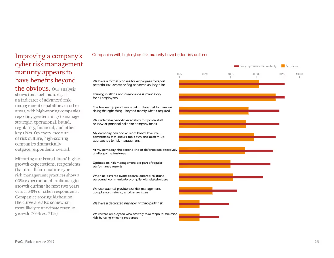
This slide has a white background with red and black text. It includes a column chart on the right side comparing different companies' risk cultures. The chart uses red and orange colors to represent very high and all other cyber risk maturity, respectively.
Risk Assessment and Management
Financial Services
The slide explains how improving cyber risk management maturity can benefit companies in various areas, including strategic, operational, and financial aspects. It compares companies with high cyber risk maturity to those with lower maturity.
cyber risk, maturity, benefits, comparison, companies, management, culture, improvement, strategic, operational
Mixed Chart
PwC/Strategy&
Saved
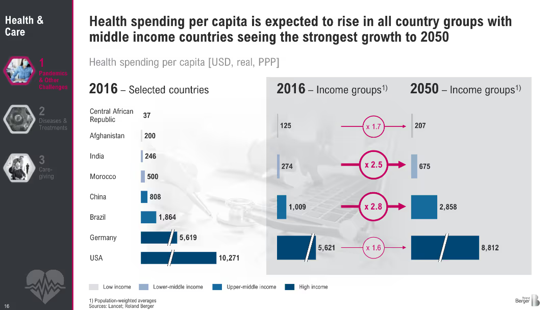
Comparative bar chart split by country and income groups (2016 vs. 2050 projections). Uses blue shades to represent income levels.
Financial Performance
Healthcare & Pharmaceuticals
This slide shows projected growth in per capita health spending across countries and income groups from 2016 to 2050. Low- and middle-income countries like India and China are projected to see the steepest increases, while high-income countries grow modestly. The visualization underlines disparities and expected convergence in global health investment.
Health expenditure, per capita, country comparison, income groups, projections, global health
Multiple Chart
Roland Berger
Saved
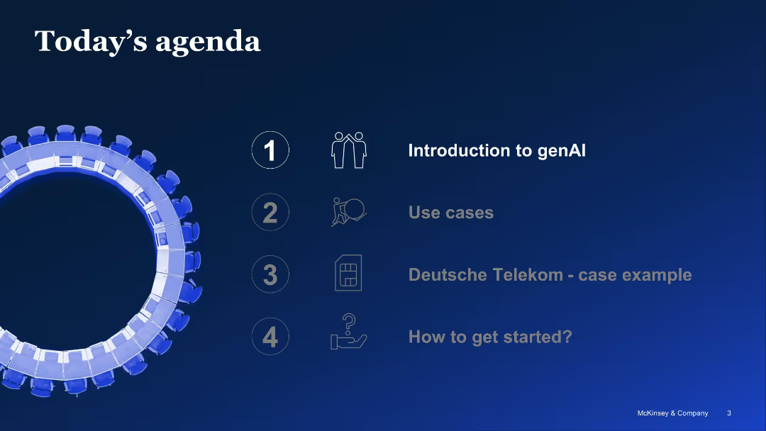
Simple visual agenda with circular motif on left and 4-step linear agenda list on right side
Strategic Planning
Artificial Intelligence
Overview of presentation topics related to generative AI: introduction, use cases, Deutsche Telekom case, and steps to get started. The slide uses minimalist icons and a blue gradient background for clarity.
agenda, generative AI, introduction, strategy, presentation topics
Agenda
McKinsey
Saved
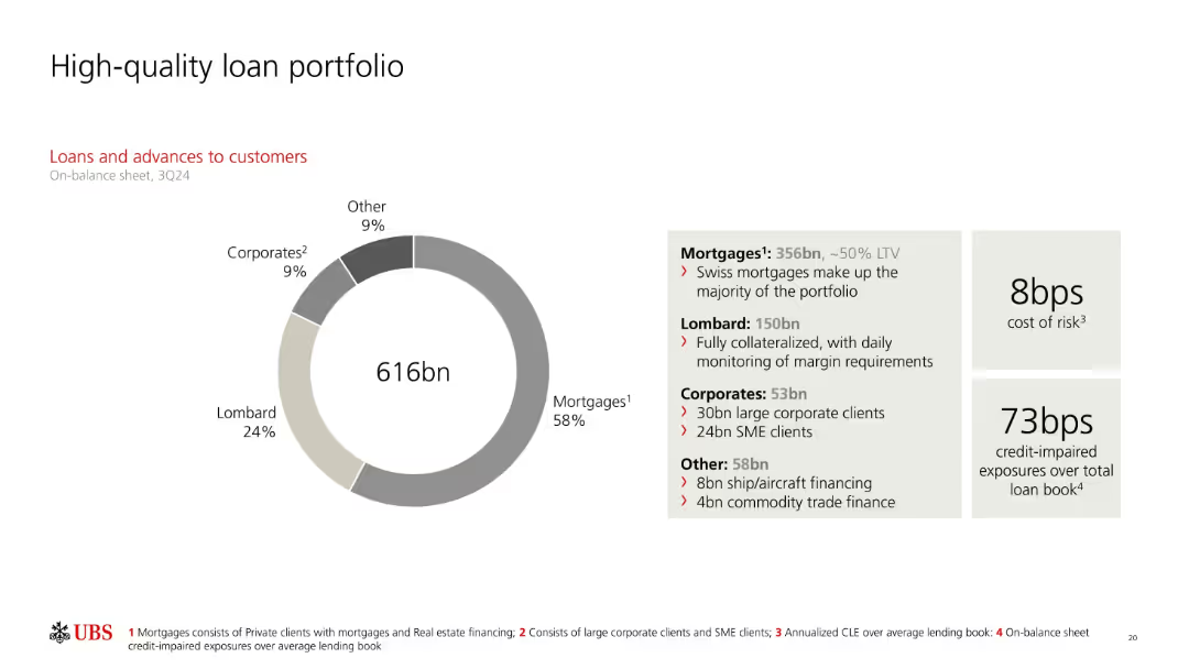
Donut chart visualizing loan breakdown; text box describes composition and values; metrics on cost of risk and impaired exposures on right.
Product and Service Analysis
Financial Services
UBS’s loan book totals 616bn, mostly consisting of mortgages (58%) and Lombard loans (24%). The slide includes loan distribution details and metrics like cost of risk (8bps) and credit-impaired exposures (73bps), highlighting portfolio quality and risk management.
mortgages, Lombard loans, loan portfolio, cost of risk, impaired exposures, SMEs, collateralized, UBS
Mixed Chart
UBS
Saved
Features an extensive flowchart diagram with different financial services offered by the firm, divided by client needs, and includes some numerical data points.
Organizational Structure and Change
Financial Services
Details the comprehensive offerings by the firm to support clients during IB transactions and the depth of relationships.
Collaboration, Franchise, Client Support, IB Transactions, Services Offering, Commercial Banking
Table
JP Morgan
Saved
A map highlighting Central American countries with icons indicating their roles in the semiconductor production value chain, such as assembly and test or manufacturing equipment.
Human Resources and Talent Management
Education & Training
The slide identifies Central American countries with skilled workforces capable of participating in the semiconductor production value chain, emphasizing roles in assembly, testing, and manufacturing.
Workforce, semiconductor, Central America, skills, map
Graphic
Deloitte
Saved
The slide includes text on pharma companies' performance and a scatter plot matrix showing financial performance by product segment.
Competitive Landscape
Healthcare & Pharmaceuticals
This slide analyzes the performance disparity among pharma companies, identifying characteristics of top-performing companies (winners).
pharma performance, winners, financial matrix, product segments, competitive analysis
Mixed Chart
Roland Berger
Saved
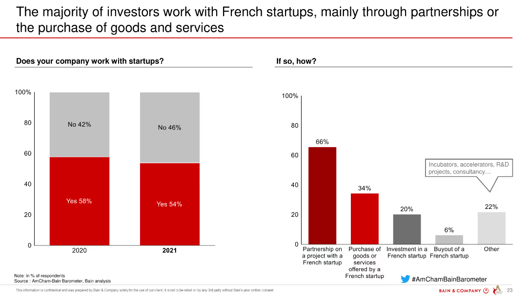
This slide features column charts showing the percentage of companies working with startups and the ways they engage with them, such as partnerships, purchases, and investments.
Market Analysis and Trends
Financial Services
The slide presents data on how investors work with French startups, including partnership projects, purchase of services, investments, and buyouts, highlighting the involvement level.
investors, French startups, partnerships, services, investments, buyouts, financial services
Multiple Chart
Bain
Saved
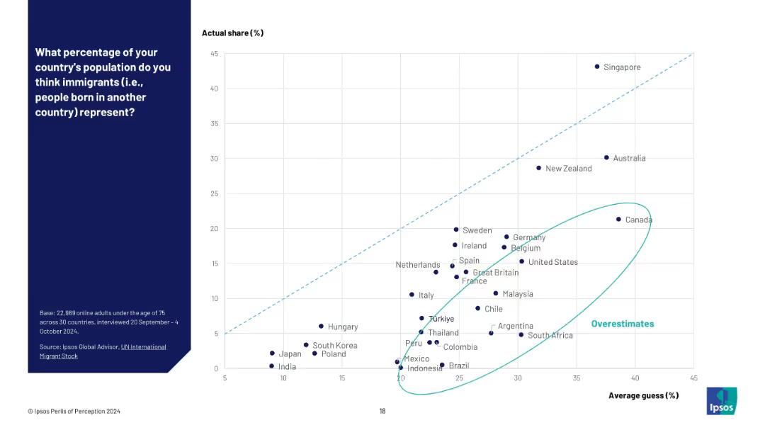
Scatter plot with average guess (%) on X-axis and actual share (%) on Y-axis; overestimators highlighted.
Market Analysis and Trends
Government & Public Sector
This slide shows a scatter plot comparing perceived versus actual immigrant population percentages. Countries are plotted to show which overestimated most, with a light blue ellipse marking the outliers.
immigration misperception, scatter chart, data gap, Ipsos perceptions, overestimate cluster, demographic misjudgment
Mixed Chart
IPSOS
Saved
Three sections, each with an image and a color-coded title. Images depict sunset, wind turbines, and water waves.
Industry Overview
Financial Services
Sections discuss retail investing, energy transition, and Web 3's impact on markets and efficiency in capital markets.
Retail, Energy, Web 3, Investing, Transition, Crypto, Efficiency, Capital Markets
Pillar
Bain
Saved
Features a flowchart and percentage breakdowns displaying the effects of broadband on social and community connections. The slide uses color coding to separate positive from negative impacts and includes a summary statistic block on the right.
Market Analysis and Trends
Telecommunications
Discusses the influence of broadband on enhancing social and community connections, including both positive and negative aspects.
Social, Community, Internet, Broadband, Connections, Positive, Negative, Impact, Telecommunications
Multiple Chart
Accenture
Saved
The slide features text and icons representing different client segments and services offered. Sections provide details on corporate and personal banking.
Strategic Planning
Financial Services
This slide describes UBS's balanced mix of personal and corporate banking, highlighting the client base and services offered.
UBS, Banking, Client Segments, Services, Strategic Planning
Multiple Chart
UBS
Saved
Features a column chart showing the quitting propensity of deskless workers based on their tenure at the job, using varying shades of green.
Risk Assessment and Management
Professional Services
Analyzes the likelihood of quitting among deskless workers based on job tenure, important for risk assessments in workforce management.
deskless workers, tenure, quitting likelihood, column chart
Single Chart
BCG
Saved
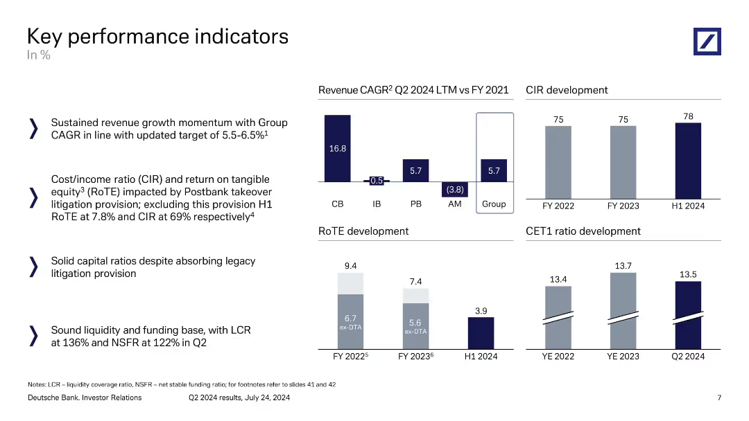
Four-panel layout: revenue CAGR, CIR, RoTE, and CET1 ratio development, alongside explanatory bullet points.
Performance Metrics and KPIs
Financial Services
A summary of Deutsche Bank’s key performance indicators including revenue growth (CAGR), cost-income ratio, return on tangible equity, and CET1 ratios. Commentary highlights sustained momentum, capital strength, and sound liquidity metrics, despite litigation provisions.
KPIs, revenue growth, CIR, RoTE, CET1 ratio, liquidity, Deutsche Bank
Multiple Chart
Deutsche Bank
Saved
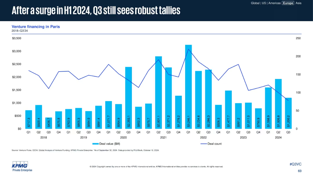
Venture data for Paris (2018–Q3 2024) shown in bar and line format. Commentary absent but trendline illustrates recent patterns.
Market Analysis and Trends
Financial Services
Paris continues to record strong VC activity into Q3 2024 after a notable increase in H1. While Q3 is slightly lower, deal value and count remain high compared to historical trends, indicating sustained investor interest in the region.
Paris, venture capital, 2024 H1 surge, robust Q3, deal volume, capital trends, funding activity, French ecosystem
Single Chart
KPMG
Saved
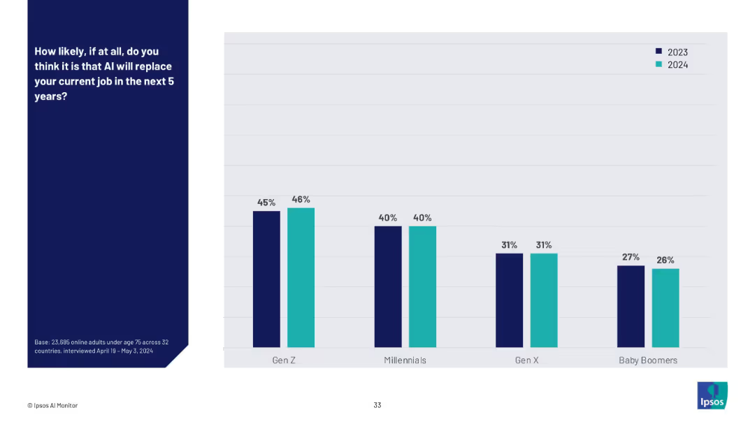
Vertical bar chart comparing 2023 vs. 2024 responses across generational groups (Gen Z to Baby Boomers).
Risk Assessment and Management
Artificial Intelligence
This slide tracks the year-over-year change in belief that AI will replace current jobs. Gen Z maintains the highest level of concern, while Baby Boomers show the least concern. Overall, responses have remained relatively stable between 2023 and 2024.
AI job risk, generational perception, technology anxiety, automation, workplace displacement, year-on-year trend, AI adoption
Mixed Chart
IPSOS
Saved
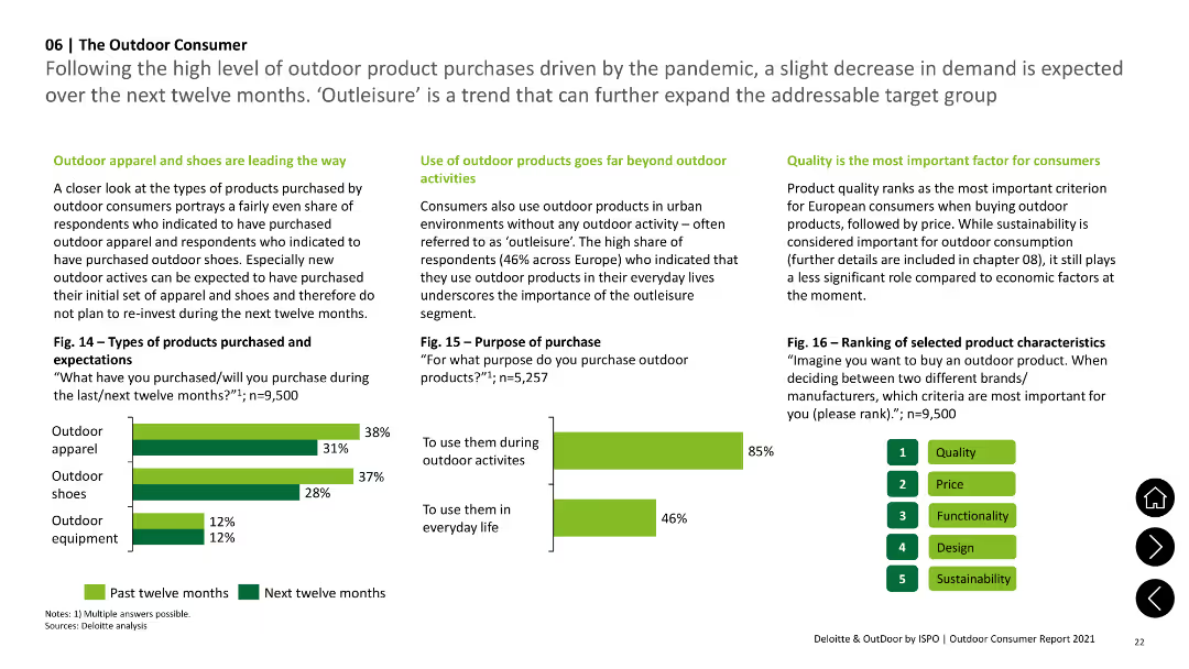
Column charts illustrating types of outdoor products purchased and purposes of purchase, highlighting 'outleisure' trend.
Market Analysis and Trends
Consumer Goods
Details types of outdoor products bought (apparel, shoes, equipment) and reasons for purchase, emphasizing urban use beyond outdoor activities.
Products, Purchase, Outdoor, Apparel, Shoes
Multiple Chart
Deloitte
Saved
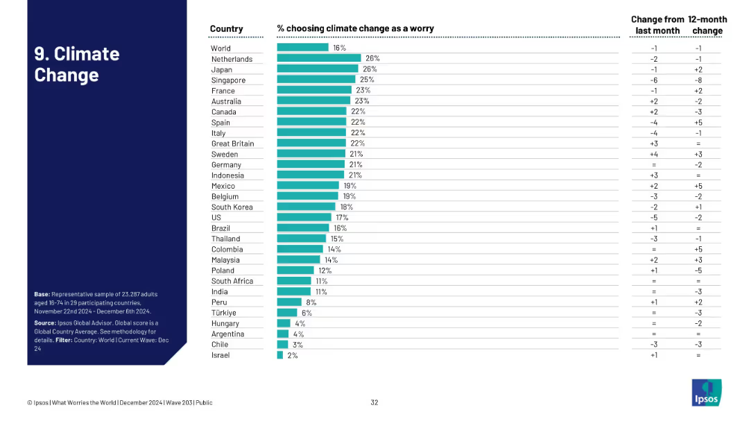
Vertical bar chart of country-level concern over climate change, with global average and monthly/yearly trends.
Market Analysis and Trends
Environmental Services & Sustainability
Climate change is a concern for 16% globally, with Netherlands and Japan showing highest concern. The chart reflects growing or declining worry levels by country.
climate change, environment, sustainability, Ipsos, global warming, perception shift
Single Chart
IPSOS
Saved
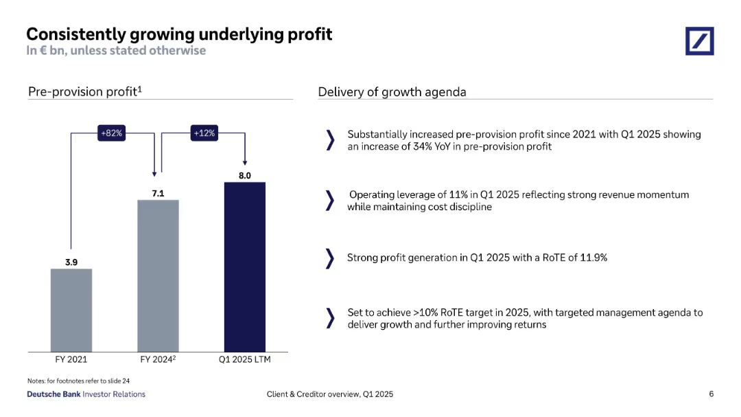
Bar chart showing pre-provision profit from FY2021 to Q1 2025; right side includes bullet-point analysis.
Financial Performance
Financial Services
Deutsche Bank demonstrates substantial pre-provision profit growth, from €3.9bn in FY2021 to €8bn in Q1 2025 LTM. Key contributors include operational leverage and a strong RoTE of 11.9%, with strategic intent to surpass the 10% RoTE target in FY2025.
profit growth, RoTE, operational leverage, pre-provision, revenue momentum, Q1 2025, cost control
Mixed Chart
Deutsche Bank
Saved
Bar chart showing the changes in the number of jobs due to one additional robot in the manufacturing sector, by income level of country.
Market Analysis and Trends
Technology & Software
The slide examines the impact of automation and robotics on employment, focusing on the manufacturing sector. It shows how each additional robot affects job numbers in high-income, average, and low-income countries, highlighting the greater substitutive effect in low-income countries.
Automation, Robotics, Manufacturing, Job Loss
Mixed Chart
Roland Berger
Saved
Contains a line chart depicting the declining trend of new banks chartered in the US from 1984 to 2022, with different time periods highlighted to show changes in average.
Regulatory and Compliance
Financial Services
Analyzes the decline in new banking licenses in the US, correlating it with increased regulatory pressures and the rise of non-traditional banking entities. Useful for discussions on market entry barriers.
banking regulations, market entry, US, new banks, licensing trends
Mixed Chart
Accenture
Saved
Previous
Next
If nothing, comes up, please save your slides first
Create a FREE account to continue browsing
Receive Instant Access to 1,000+ slides from companies like McKinsey, Google, and Goldman Sachs
First Name
Last Name
Email
Password
I agree to all
Terms & Privacy Policy
Thank you! Your submission has been received!
Oops! Something went wrong while submitting the form.
Have an account?
Sign in
Column Chart
Heatmap
Chevron
Org Chart
Infographic
Callouts
Timeline
List
Graphic
Picture
Process Flow
Diagram
Paragraph
Map
Table
Framework
Subtitle
Takeaway Box
Icon
Other Chart
Radar Chart
Waterfall Chart
Mekko Chart
Pie Chart
Scatter Plot
Line Chart
Bar chart
Bullet points