Create a FREE Account
Instant access to 1,000+ real slides from top companies like McKinsey, BCG, Goldman Sachs, Google and many more!
First Name
Last Name
Email
Password
I agree to all
Terms & Privacy Policy
Thank you! Your submission has been received!
Oops! Something went wrong while submitting the form.
Have an account?
Sign in
Library
Templates
Courses
Pricing
My Account
My Slides
My Templates
✦ AI
AI Prompt Library
AI Search
Sign in
Start Here
Logout
My Saved Slides
Stacked bar chart showing the self-assessed financial situations of respondents compared to pre-COVID-19. The chart divides responses into categories from 'Much worse off' to 'Much better off'.
Risk Assessment and Management
Financial Services
The slide analyzes the perceived financial impact of COVID-19 on Canadian investors, indicating that a significant portion felt worse off financially. It highlights variations across income groups, showing those with lower incomes were more adversely affected.
COVID-19, Financial Impact, Canadian, Income, Pandemic
Mixed Chart
IPSOS
Saved
Pie charts and a column chart illustrating the scope and reporting structure of shared services within organizations.
Operational Efficiency
Professional Services
Examines the maturity and scope of global business services, reporting structures, and the extent of service functions.
GBS, maturity, scope, pie chart, bar chart, reporting structure
Multiple Chart
Deloitte
Saved
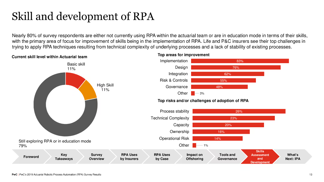
Pie chart showing skill levels within actuarial teams, and horizontal bar charts indicating top areas for improvement and challenges in RPA adoption (e.g., implementation, design, process stability).
Human Resources and Talent Management
Financial Services
The slide discusses the current skill levels in RPA among actuarial teams and identifies key areas for improvement, such as implementation and design, as well as challenges like process stability and technical complexity, aiming to enhance RPA adoption.
RPA, Skills Development, Insurance, Challenges
Multiple Chart
PwC/Strategy&
Saved
The slide contains a simple title section and a central list with circular icons connected by a vertical line, representing areas of improvement. There's a blue and teal color scheme with additional icons, and the design is clean with a balanced use of space.
Market Analysis and Trends
Retail & E-commerce
This slide reviews areas for enhancement within digital platforms, pinpointing the need for more promotions, lower fees, and better customer engagement. By identifying these top areas, the slide provides actionable insights for platform improvement and growth, catering to merchant feedback and emphasizing cost-effectiveness and user experience enhancements as pivotal.
digital platforms, improvement, promotions, transaction fees, user engagement, merchant feedback
Vertical Flow
Bain
Saved
The slide has column and line charts, and smaller column charts. The primary chart shows quarterly take-up and vacancy rates, with blue bars and a yellow line. On the right, two column charts display Grade A office vacancy in key markets and vacancy in weaker markets, distinguished by color gradations of blue and grey.
Operational Efficiency
Real Estate & Construction
This slide outlines improvements in office market occupancy, contrasting Grade A office vacancy against all office grades. It includes specific vacancy rates in weaker office markets. Real estate professionals can use this to assess market health or investment potentials in various office grades, especially when considering strategic property upgrades or marketing to reduce vacancy rates.
office market, occupancy, vacancy rates, Grade A, market comparison
Multiple Chart
Morgan Stanley
Saved
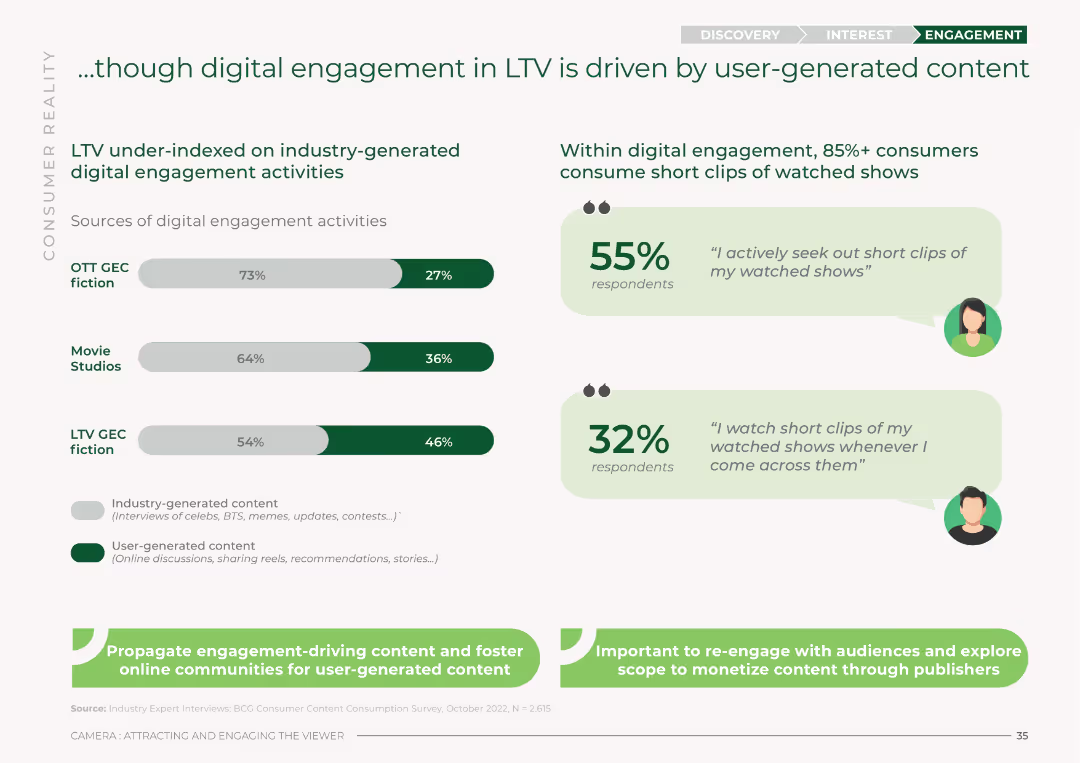
The slide features bar charts comparing industry-generated vs. user-generated digital engagement activities across OTT GEC fiction, Movie Studios, and LTV GEC fiction. It uses a green and white color scheme with percentages for each category.
Market Analysis and Trends
Media & Entertainment
This slide analyzes digital engagement in LTV, showing that user-generated content drives more engagement compared to industry-generated activities. It presents percentages for OTT GEC fiction, Movie Studios, and LTV GEC fiction.
digital engagement, LTV, user-generated content, industry-generated content, OTT, Movie Studios, engagement sources
Mixed Chart
BCG
Saved
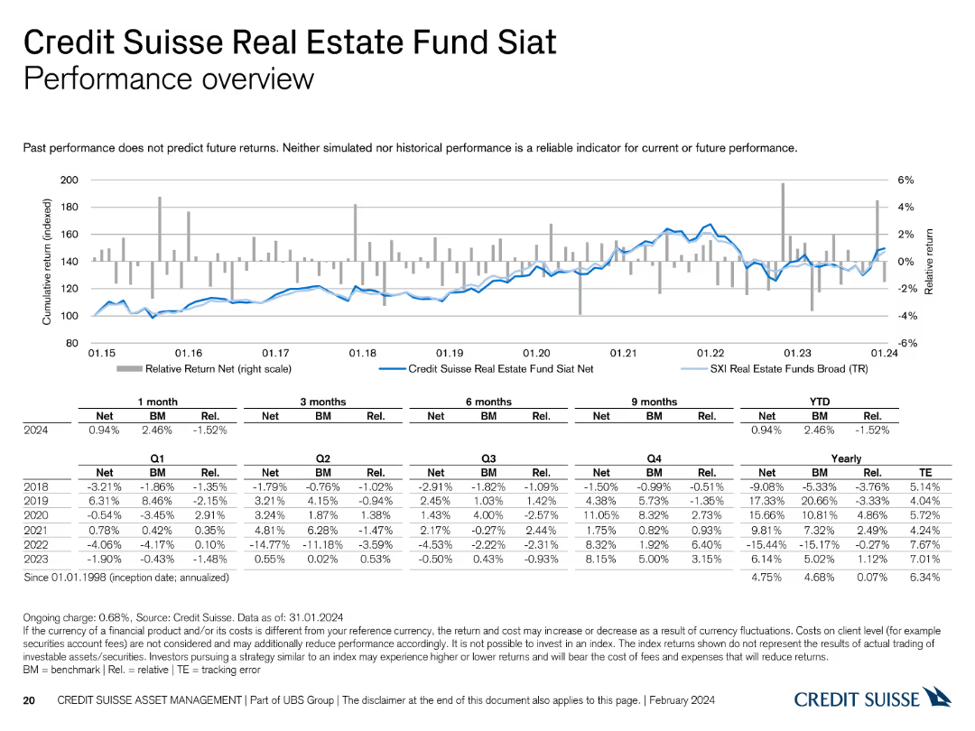
This slide presents a line chart and a table detailing the performance of the Credit Suisse Real Estate Fund Siat.
Financial Performance
Financial Services
It reviews the performance of the Siat fund, comparing it with benchmarks and historical data, offering insights into its financial health and trends.
performance, Credit Suisse, Real Estate Fund, benchmarks, historical data
Mixed Chart
Credit Suisse
Saved
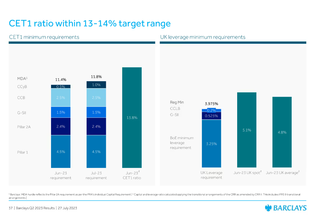
The slide displays two column charts: one for CET1 minimum requirements with different components and their percentages, and the other for UK leverage minimum requirements, highlighting the regulatory minimums and actual ratios.
Financial Performance
Financial Services
The slide shows CET1 and UK leverage ratios against regulatory minimum requirements, emphasizing the bank’s capital adequacy and compliance with financial regulations.
CET1 ratio, UK leverage, minimum requirements, capital adequacy, financial regulations
Multiple Chart
Barclays
Saved
The slide shows a comparison of subscriber growth between two consecutive years with a large blue circle indicating a substantial increase. Key points about market penetration, local content, and pricing innovations are provided to give insights into the strategy for SVOD services' expansion.
Market Analysis and Trends
Media & Entertainment
This slide argues that the online video sector is just beginning its growth phase, with significant potential for further expansion, particularly through deeper market penetration, a focus on local content, and innovative subscription models aimed at attracting a broader user base, including in non-metro areas.
online video, SVOD, market growth, local content, pricing innovation, subscription services, market penetration, digital strategy
Mixed Chart
Bain
Saved
The slide features a column chart detailing broadband satisfaction levels in the UK. It has simple, clean visual elements with colors like blue and green denoting different satisfaction levels.
Market Analysis and Trends
Telecommunications
The slide presents data on the high levels of satisfaction among UK broadband users, highlighting potential market inertia against switching providers or upgrading. Intended to analyze market trends and customer satisfaction in telecommunications.
broadband, satisfaction, market trends, UK, telecommunications
Mixed Chart
Deloitte
Saved
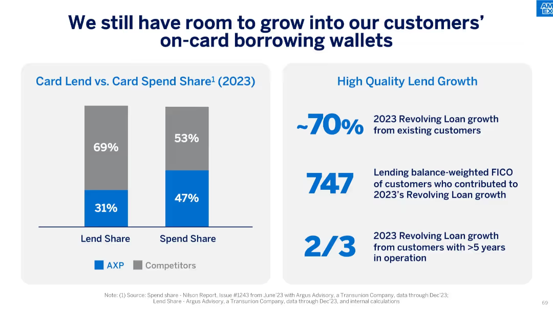
Split design with bar graphs on the left and text metrics on the right, clean and data-heavy layout.
Strategic Planning
Financial Services
This slide shows that while AXP has a high spend share (47%), its lend share (31%) is lower than competitors. It highlights the potential for growth in lending from existing customers and those with long-term accounts and strong FICO scores.
card lending, spend share, FICO, customer growth, revolving loans, strategic planning, credit, lending opportunity
Mixed Chart
McKinsey
Saved
This slide contains a large heading, three primary metric highlights, and three pie charts displaying product lines, geographies, and revenue models. The slide is visually balanced with significant use of purple.
Financial Performance
Healthcare & Pharmaceuticals
Highlights the financial performance and distribution of QuidelOrtho's Point of Care Business Unit for Q3 2023. It includes revenue figures, product line distribution, geographical reach, and revenue models.
Financial, Product, Geography, Revenue, Healthcare
Multiple Chart
JP Morgan
Saved
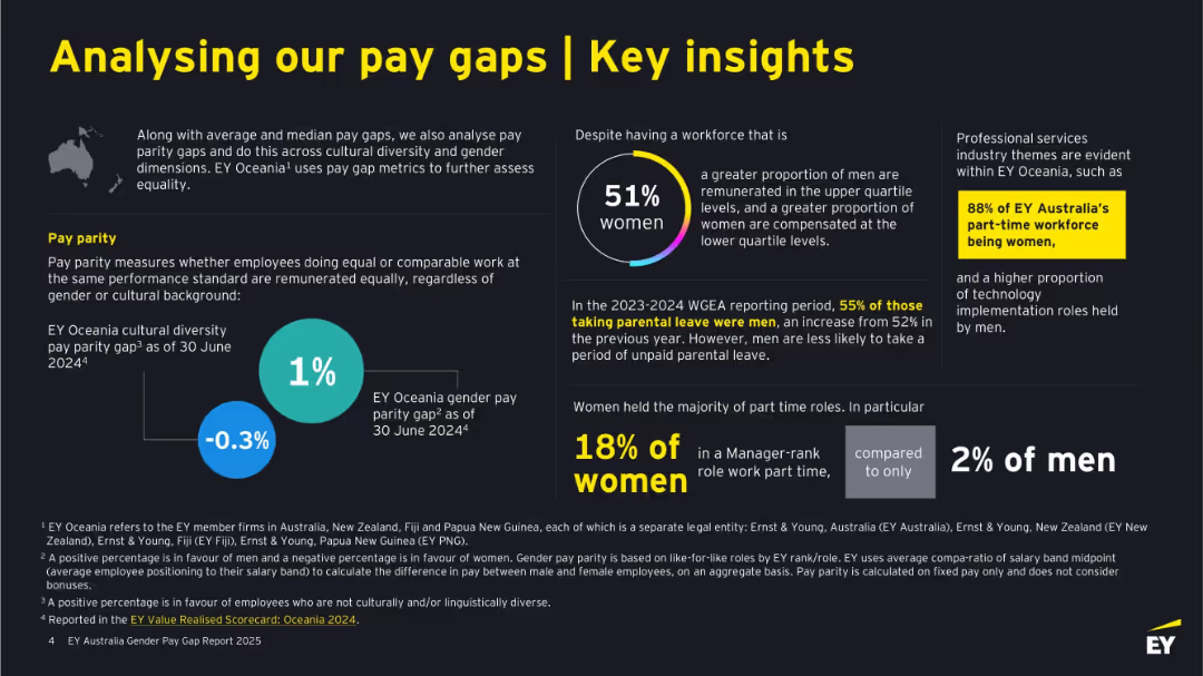
Multi-section layout on a dark background with white and yellow text. Includes infographic circles, text blocks, and callouts. Balanced left/right text and graphics.
Human Resources and Talent Management
Professional Services
This slide presents further analysis of pay gaps by highlighting gender and cultural diversity metrics, part-time work trends, and parental leave stats. It reveals workforce composition and roles by gender, emphasizing equity efforts and the professional services industry context. It also shows specific metrics like a 1% diversity gap and 88% women in part-time roles.
gender equality, diversity, pay parity, parental leave, part-time, workforce, EY Oceania, cultural inclusion
Mixed Chart
EY
Saved
Features multiple bar charts comparing costs in different countries with annotations for potential cost reductions.
Market Analysis and Trends
Energy & Utilities
Evaluates how Australia could become more competitive in the battery sector by refining costs and optimizing production efficiency.
cost competitiveness, refining, Australia, battery industry
Multiple Chart
Accenture
Saved
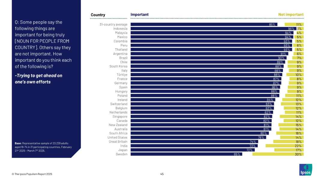
Horizontal bar chart with two categories: "Important" (dark blue) and "Not important" (yellow). Countries listed on the left; responses shown as % bars.
Market Analysis and Trends
Professional Services
This slide shows survey responses from 31 countries on the perceived importance of self-reliance for national identity. The majority in most countries consider "trying to get ahead on one’s own efforts" as important, with notable variation across countries.
self-reliance, identity, values, national perception, survey, Ipsos, global, bar chart, effort, attitudes
Mixed Chart
IPSOS
Saved
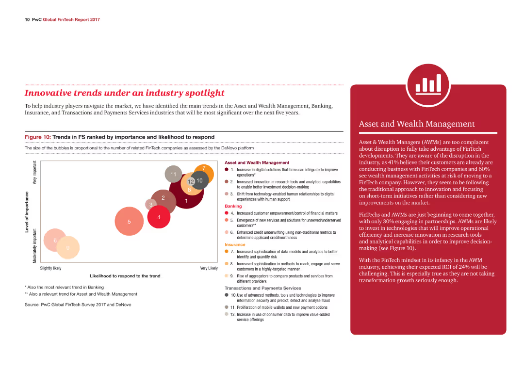
A bubble chart ranks trends in the financial services industry by importance and likelihood to respond, with different colored bubbles representing various industry trends.
Market Analysis and Trends
Financial Services
The slide outlines key trends in Asset and Wealth Management, Banking, Insurance, and Transactions and Payments Services, highlighting their importance and response likelihood.
Industry trends, Financial Services, Wealth Management, Banking, Insurance
Mixed Chart
PwC/Strategy&
Saved
The slide features three horizontal bar charts, each depicting user responses to potential changes in video subscription services if account sharing was banned. The bars are color-coded to show levels of agreement ranging from 'Definitely would' to 'Definitely would not'.
Market Analysis and Trends
Media & Entertainment
This slide explores consumer behavior if video account sharing is banned, analyzing willingness to accept ads, pay extra, or take new accounts.
video subscriptions, consumer behavior, account sharing, AVOD, survey results, market analysis, advertising acceptance
Mixed Chart
Deloitte
Saved
This slide features two column charts depicting "Public Debt", "Budget Deficit", and "Fiscal Weakness". Each chart is labeled with years and financial data in billions and percentage of GDP.
Regulatory and Compliance
Government & Public Sector
This slide compares public debt, budget deficits, and fiscal weaknesses over several fiscal years to illustrate government financial challenges.
Public debt, budget deficit, GDP, fiscal analysis, financial data
Multiple Chart
PwC/Strategy&
Saved
The slide is divided into two sections. On the left, bulleted text highlights automation benefits for IBKR. On the right, a column chart with overlaid percentage lines displays cost metrics over three years.
Operational Efficiency
Technology & Software
This slide illustrates how automation makes IBKR a cost-efficient processor in the industry, highlighting management software expertise and featuring a cost comparison chart to reflect financial growth.
Automation, IBKR, Software Engineering, Risk Management, Cost Efficiency, Financial Growth, Column Chart, Real-Time, Trades
Mixed Chart
Goldman Sachs
Saved
The slide contains a column chart showing BUK deposit balances and mix (£bn) from Dec 2019 to Sep 2023. It also features a net interest margin bridge for FY23 guidance.
Financial Performance
Financial Services
The slide presents Barclays UK's deposit mix and provides guidance for FY23 net interest margin, detailing deposit balances and mix changes over time and the factors affecting net interest margin.
deposits, mix, NIM, guidance, FY23
Multiple Chart
Barclays
Saved
This slide includes a horizontal bar chart showing preferred channels for purchasing new cars, alongside a column chart comparing preferences across different generations.
Market Analysis and Trends
Transportation & Logistics
It analyzes consumer preferences for purchasing new cars, emphasizing the importance of dealerships and showrooms, and compares generational differences in buying preferences.
purchasing channels, car buyers, generational differences, dealerships, showrooms
Multiple Chart
EY
Saved
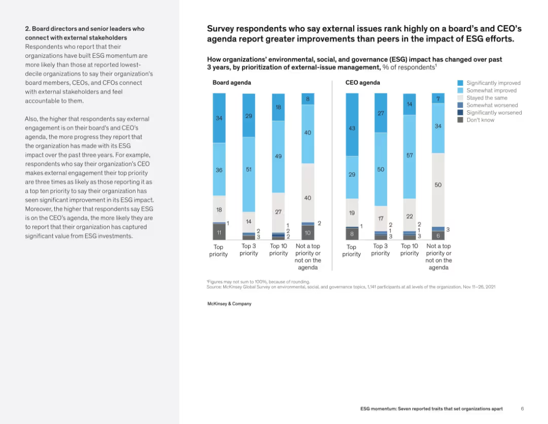
Left-aligned narrative with side-by-side vertical bar charts comparing ESG improvements based on board and CEO prioritization.
Human Resources and Talent Management
Professional Services
This slide links ESG success with the prioritization of external issues on leadership agendas. Organizations with high board and CEO ESG focus report significantly better ESG impact outcomes. Charts compare performance across four priority levels.
ESG impact, board leadership, CEO agenda, organizational outcomes, external engagement, ESG prioritization
Mixed Chart
McKinsey
Saved
Graph depicting reduction in operational backlogs, images of textual data concerning IT improvements and customer service.
Operational Efficiency
Financial Services
Describes the outcomes of IT migration and service improvements at Postbank, focusing on operational efficiency and customer service enhancements.
IT migration, operational efficiency, customer service, Q4
Multiple Chart
Deutsche Bank
Saved
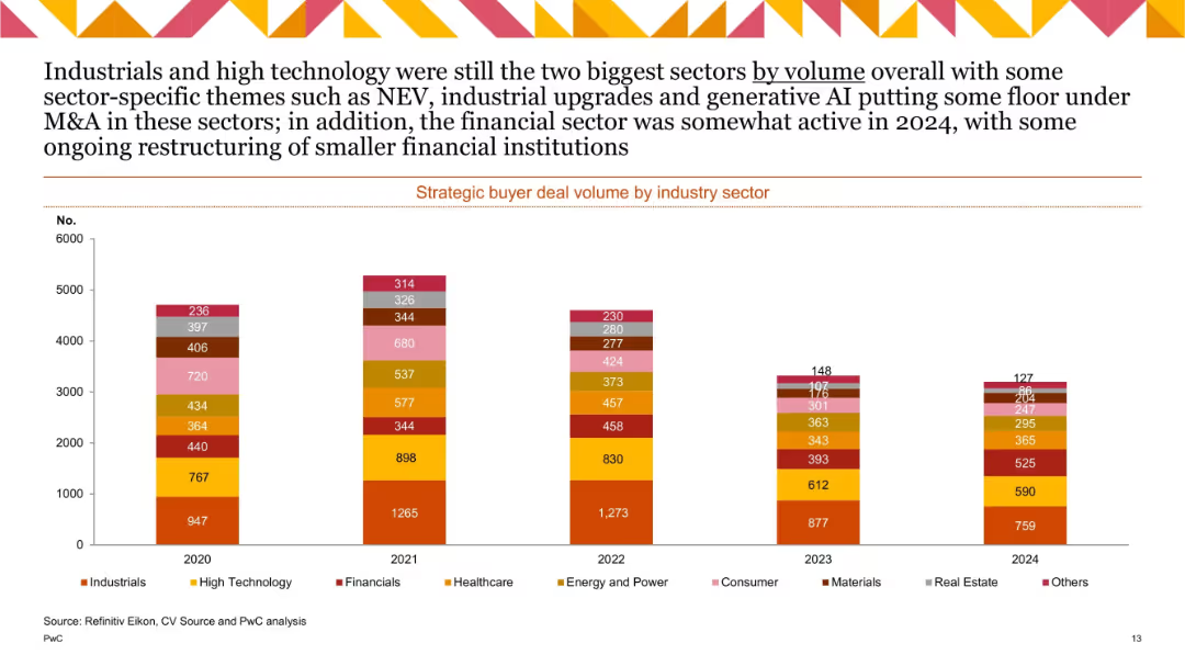
Vertical stacked bar chart with multiple colored segments representing industry sectors; years 2020–2024; moderate drop-off across all sectors.
Customer and Market Segmentation
Financial Services
Displays deal volume across sectors like industrials, tech, healthcare, and financials. Industrials and tech lead, with 2024 showing slight recovery in financials. Highlights themes like NEV, AI, and industrial upgrades.
sector analysis, M&A volume, strategic buyers, 2024, AI, NEV, industrial
Single Chart
PwC/Strategy&
Saved
The slide presents multiple stacked column charts in green shades showing the percentage of companies reporting different barriers to the development of personalized nutrition. Text boxes provide additional context and statistical data.
Market Analysis and Trends
Agriculture & Food Production
The slide provides insights into the main barriers faced by companies in developing personalized nutrition, such as R&D, consumer demand variations, and cost issues, alongside commentary on market trends and challenges.
personalized nutrition, R&D, consumer demand, cost barriers, market challenges
Mixed Chart
Deloitte
Saved
Previous
Next
If nothing, comes up, please save your slides first
Create a FREE account to continue browsing
Receive Instant Access to 1,000+ slides from companies like McKinsey, Google, and Goldman Sachs
First Name
Last Name
Email
Password
I agree to all
Terms & Privacy Policy
Thank you! Your submission has been received!
Oops! Something went wrong while submitting the form.
Have an account?
Sign in
Column Chart
Heatmap
Chevron
Org Chart
Infographic
Callouts
Timeline
List
Graphic
Picture
Process Flow
Diagram
Paragraph
Map
Table
Framework
Subtitle
Takeaway Box
Icon
Other Chart
Radar Chart
Waterfall Chart
Mekko Chart
Pie Chart
Scatter Plot
Line Chart
Bar chart
Bullet points