Create a FREE Account
Instant access to 1,000+ real slides from top companies like McKinsey, BCG, Goldman Sachs, Google and many more!
First Name
Last Name
Email
Password
I agree to all
Terms & Privacy Policy
Thank you! Your submission has been received!
Oops! Something went wrong while submitting the form.
Have an account?
Sign in
Library
Templates
Courses
Pricing
My Account
My Slides
My Templates
✦ AI
AI Prompt Library
AI Search
Sign in
Start Here
Logout
My Saved Slides
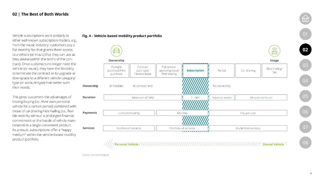
This slide features a comparative table showing the characteristics of vehicle-based mobility products, including ownership types, duration, payments, and services, comparing outright purchase, leasing, and subscription models.
Product and Service Analysis
Transportation & Logistics
Compares various vehicle-based mobility products, highlighting the flexibility and advantages of subscription models over traditional purchase and leasing options.
mobility products, vehicle ownership, leasing, subscription models, comparative analysis
Table
Deloitte
Saved
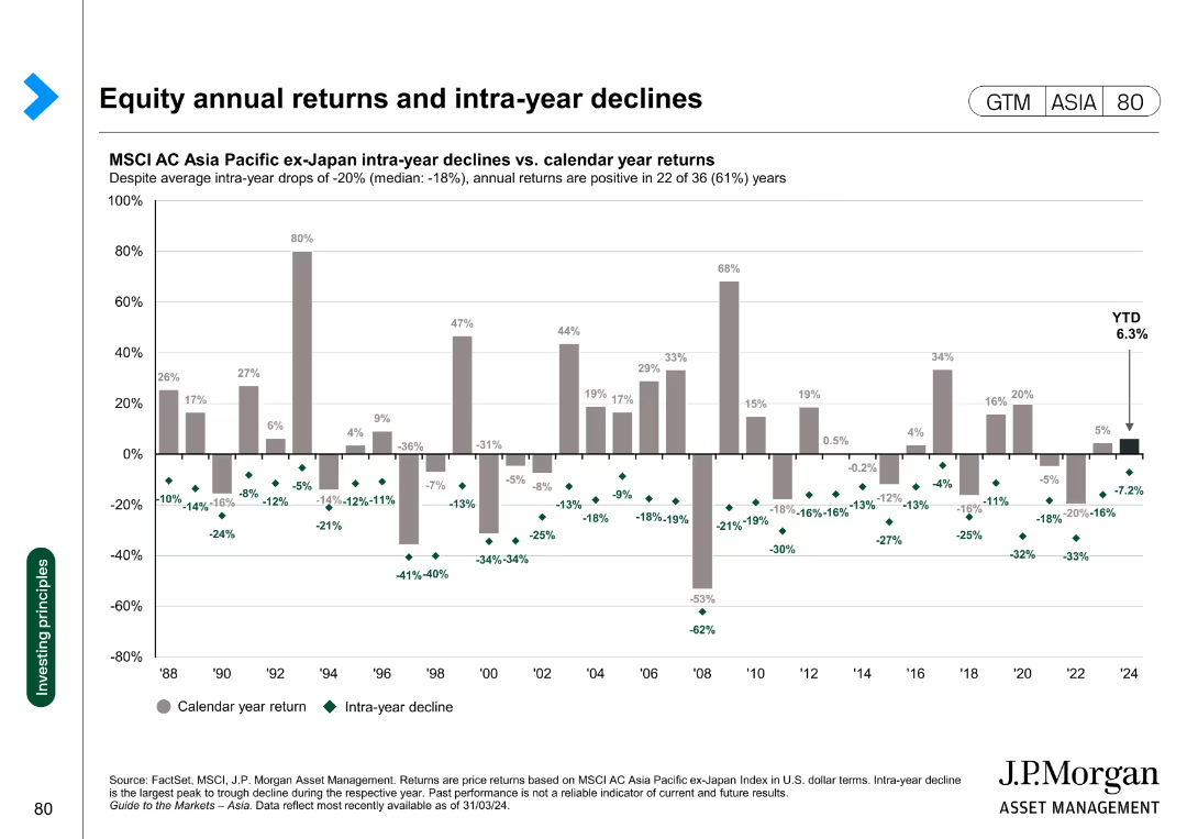
Column chart showing the intra-year declines versus calendar year returns for the MSCI AC Asia Pacific ex-Japan Index from 1988 to 2024.
Financial Performance
Financial Services
This slide analyzes the annual returns and intra-year declines of the MSCI AC Asia Pacific ex-Japan Index, highlighting the volatility and overall performance over the years.
equity, returns, declines, MSCI, volatility
Single Chart
JP Morgan
Saved
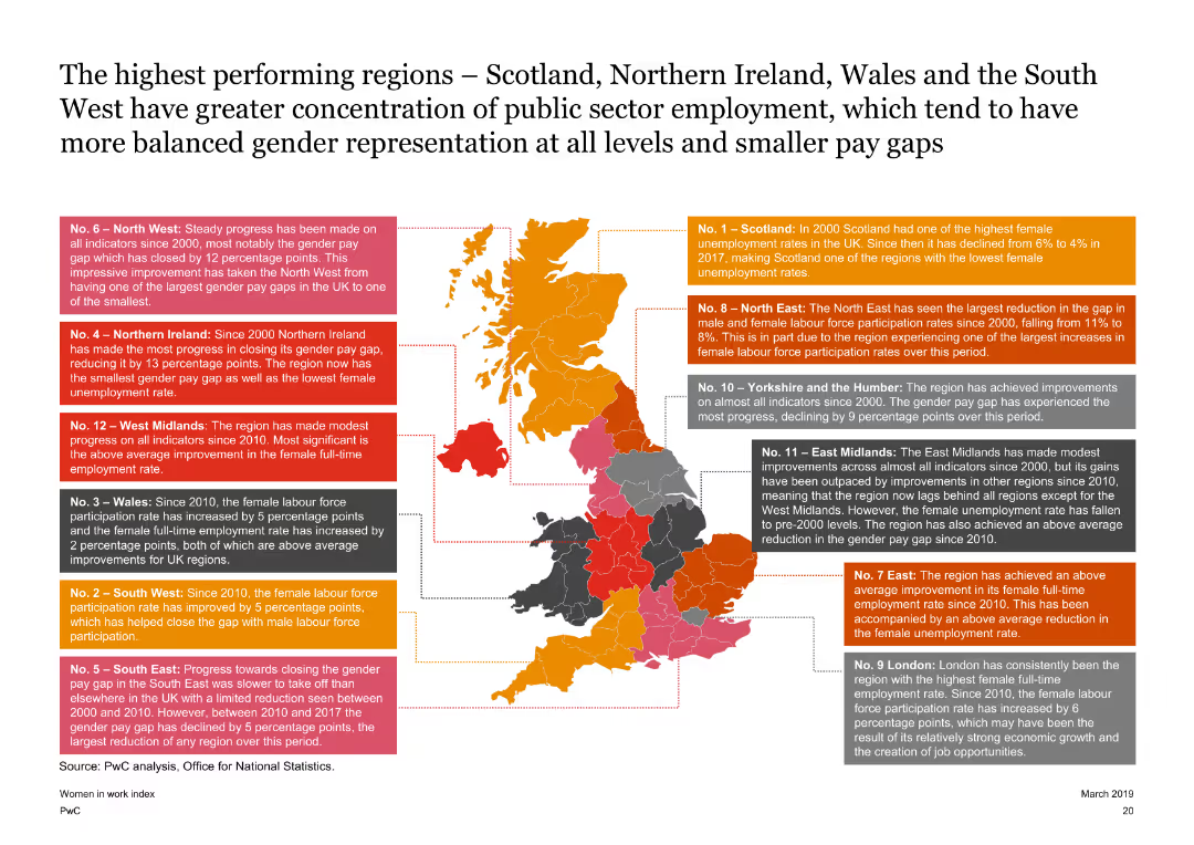
Features a map of the UK with highlighted regions and text boxes explaining the performance of each region on the Women in Work Index. The slide is detailed with a clear visual representation of regional data.
Market Analysis and Trends
Government & Public Sector
Highlights the top-performing regions in the UK on the Women in Work Index, such as Scotland and Northern Ireland, discussing their progress in female labor force participation and gender pay gap reduction since 2000.
UK map, regional performance, gender pay gap, female labor force participation
Graphic
PwC/Strategy&
Saved
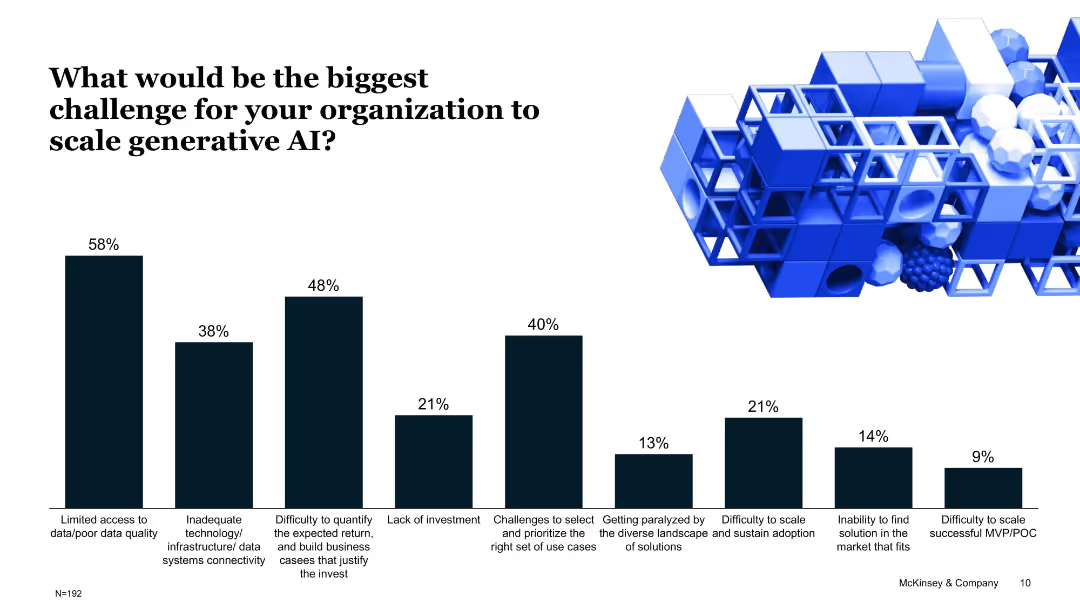
Bar chart with percentages showing top challenges to scaling Gen AI; structured list of barriers with iconography.
Risk Assessment and Management
Artificial Intelligence
This slide captures survey results from organizations identifying key challenges in Gen AI adoption, such as data quality, technology infrastructure, and difficulty quantifying ROI, which hinder successful scaling.
generative AI, challenges, data quality, infrastructure, ROI, investment, scaling
Single Chart
McKinsey
Saved
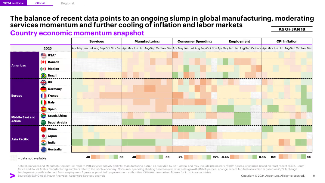
A heatmap displaying economic momentum across various metrics (services, manufacturing, consumer spending, employment, CPI inflation) for different countries, indicating an overall slump in global manufacturing.
Market Analysis and Trends
Professional Services
The slide highlights a continued downturn in global manufacturing, with varied momentum in services and consumer spending, and moderation in inflation and labor markets.
Manufacturing, Economic Momentum, Global, Services, Inflation
Table
Accenture
Saved
The slide contains column charts comparing school connectivity across various countries, and quotes about the challenges faced by Indonesian students in remote learning.
Strategic Planning
Education & Training
Discusses the disparity in internet access among students in Indonesia compared to other countries, emphasizing the difficulties in implementing online education.
online education, internet access, Indonesia, school connectivity, remote learning, students
Mixed Chart
BCG
Saved
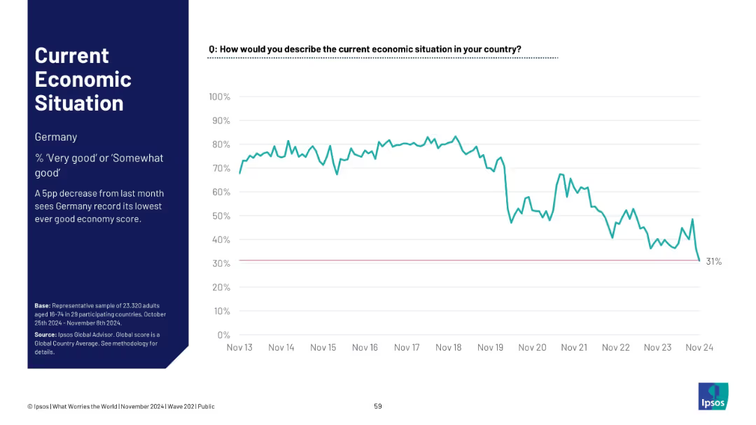
Similar layout as previous; focuses on Germany. Left panel has title and insights; right panel shows time-series graph
Market Analysis and Trends
Government & Public Sector
Germany records its lowest-ever good economy rating at 31%, with a sharp decline from stable historical highs. The graph shows public confidence waning dramatically over the decade.
Germany, economic outlook, sentiment trend, Ipsos, lowest score, public opinion, economy perception, Europe
Single Chart
IPSOS
Saved
Slide displays two sets of bar charts for a cross-geography view and France-specific data, comparing employee satisfaction with managers using shades of green and red.
Organizational Structure and Change
Professional Services
Analyzes employee satisfaction with their managers in a comparative perspective, highlighting managerial influence on workforce stability.
employee satisfaction, managers, comparison, France, bar chart
Multiple Chart
BCG
Saved
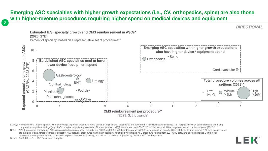
The slide features a scatter plot comparing CMS reimbursement per procedure with expected growth for different ASC specialties.
Market Analysis and Trends
Healthcare & Pharmaceuticals
It examines the relationship between CMS reimbursement and growth expectations for ASC specialties, noting higher spend for emerging specialties like orthopedics.
ASC, specialties, growth, reimbursement, CMS
Single Chart
LEK
Saved
Two comparative charts showing AI-enabled consumer intelligence platforms and marketing measurement and optimization solutions. One is in green shades, the other in blue.
Market Analysis and Trends
Technology & Software
This slide compares leading AI-enabled solutions in consumer intelligence and marketing measurement. It highlights strong performers and leaders in the market.
AI, Consumer Intelligence, Marketing, Optimization, Trends
Multiple Chart
IPSOS
Saved
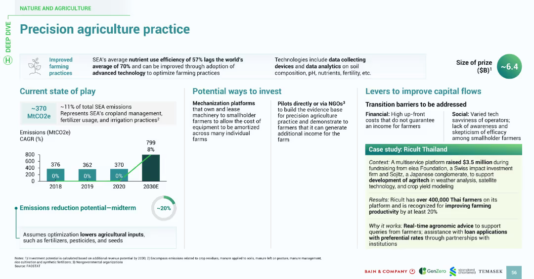
Features a similar design style: title banner, bullet-point sections, bar chart for emissions, and a boxed case study. Uses consistent fonts and icons with green highlights for visual continuity.
Technology and Digital Transformation
Agriculture & Food Production
Highlights the inefficiencies in SEA's current agricultural nutrient usage (57%) and promotes the use of data-driven precision farming to optimize practices. Investment avenues include tech-enabled mechanization platforms and NGO-led pilots. The slide identifies barriers like cost and tech savviness. Ricult Thailand is cited as a successful example leveraging tech to boost productivity by over 20%.
precision agriculture, nutrient use, farming, emissions, Ricult, SEA, agritech, data
Multiple Chart
Bain
Saved
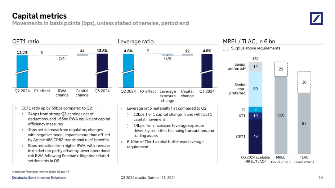
Three main charts: CET1 ratio, Leverage ratio, and MREL/TLAC stacked bars with basis points changes.
Regulatory and Compliance
Financial Services
Outlines changes in capital ratios (CET1, leverage) and capital buffer compliance (MREL/TLAC). Discusses effects from earnings, FX, regulation, and litigation settlements. Emphasizes strength in regulatory buffers and stable leverage.
CET1, leverage, MREL, TLAC, capital change, compliance
Multiple Chart
Deutsche Bank
Saved
Dominated by graphical data, this slide displays two main charts: the Eurozone real GDP forecast and the Eurocoin index, represented by bars and dots respectively. Text is limited, providing only sources and brief descriptions. The color palette includes shades of blue, black, and white. The slide design is clear, with each chart labeled and axis demarcated, promoting easy data interpretation.
Market Analysis and Trends
Financial Services
The slide illustrates IMF's economic forecasts and the Eurozone Eurocoin index, comparing them against other projections and historical data. It's typically used in economic or financial presentations to analyze trends, guide investment decisions, or provide economic forecasts.
IMF, GDP forecast, Eurozone, Eurocoin index, economic indicators
Multiple Chart
McKinsey
Saved
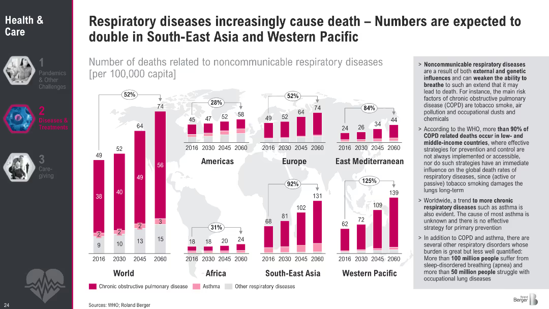
World map with bar charts per region showing death rates from respiratory diseases (2016–2060); sidebar with detailed insights; color-coded bars for disease types
Market Analysis and Trends
Healthcare & Pharmaceuticals
This slide presents global and regional projections of deaths from noncommunicable respiratory diseases, highlighting a sharp increase in South-East Asia and Western Pacific. It attributes the rise to environmental and behavioral risk factors and emphasizes disparities between high- and low-income countries.
COPD, respiratory diseases, regional projections, healthcare inequality, asthma, pollution, mortality, WHO, tobacco, healthcare trends
Multiple Chart
Roland Berger
Saved
Contains several small images of agricultural activities, solar panels, and wind turbines, accompanied by text blocks and bullet points summarizing the investment environment in Thailand.
Market Analysis and Trends
Energy & Utilities
Provides insights into Thailand's agricultural, solar, wind energy, and electric mobility sectors, emphasizing government and financial support.
Thailand, farming, solar, wind, electric mobility, government support
Header Horizontal
Bain
Saved
Features comparative column charts showing household income trends in developed and developing countries from 2000 to 2030.
Financial Performance
Professional Services
Analyzes trends in household income across developed and developing regions, discussing shifts in economic groups and income disparity.
income trends, developing countries, developed countries, economic disparity, globalization
Mixed Chart
Roland Berger
Saved
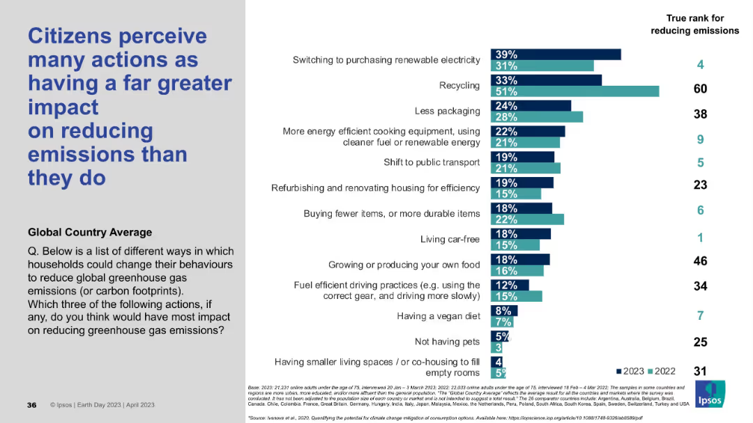
Title left-aligned; right side shows a bar chart comparing perceived vs actual impact ranks of various climate-related actions.
Market Analysis and Trends
Environmental Services & Sustainability
This slide reveals the mismatch between public perception and actual effectiveness of household actions on reducing emissions. Actions like recycling are overrated, while more impactful behaviors like living car-free are underrated. Data is shown across two years with actual ranks.
emissions, public perception, recycling, climate action, emission reduction, behavioral change, global survey, Ipsos, misperception
Mixed Chart
IPSOS
Saved
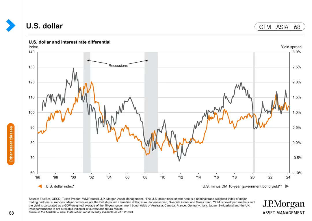
This slide includes a line chart depicting the U.S. dollar index and the interest rate differential over time.
Market Analysis and Trends
Financial Services
The slide analyzes the U.S. dollar index in relation to interest rate differentials, providing insights into currency trends and economic impacts.
U.S. dollar, interest rates, currency trends, economic analysis, financial insights
Single Chart
JP Morgan
Saved
Two column charts side-by-side: the left chart shows the share of minutes viewed by category (Cable, Broadcast, Streaming, Other), and the right chart shows the streaming share of minutes viewed by specific services (Netflix, YouTube, Hulu, etc.).
Market Analysis and Trends
Media & Entertainment
This slide provides a comparison of the share of minutes viewed by category and the streaming share of minutes viewed by specific services from May 2021 to January 2022, illustrating the dominance and trends of each service over time.
comparative analysis, viewership share, streaming services, cable, broadcast
Multiple Chart
Nielsen
Saved
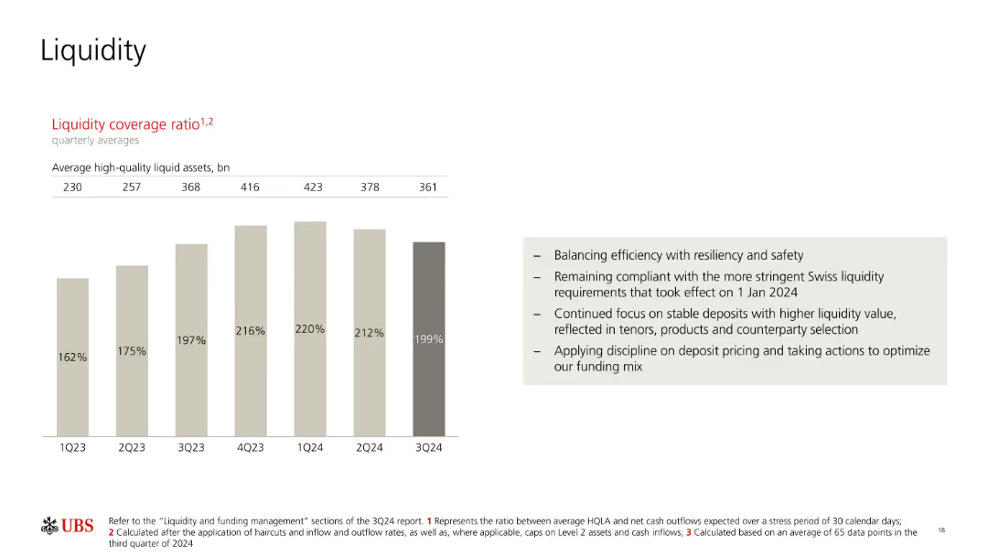
Bar chart with light beige and gray tones showing liquidity coverage ratio across quarters; bulleted text box on right with summary points.
Risk Assessment and Management
Financial Services
The slide presents UBS’s liquidity coverage ratio from 1Q23 to 3Q24, showing a steady rise and recent decline. Supporting notes highlight the bank’s focus on balancing safety and efficiency, regulatory compliance, and disciplined funding strategies to optimize deposits.
liquidity ratio, high-quality assets, funding mix, UBS, compliance, Swiss regulation, deposits, quarterly trends, liquidity management
Mixed Chart
UBS
Saved
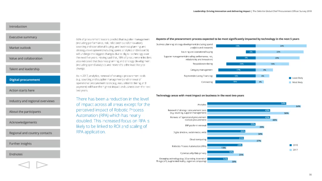
The slide presents multiple column charts detailing aspects of procurement processes and technology areas with the most business impact in the next two years.
Technology and Digital Transformation
Professional Services
Discusses the reduction in impact across areas except for the increased impact of Robotic Process Automation (RPA) on business processes.
Technology impact, business, RPA, analytics, future trends
Multiple Chart
Deloitte
Saved
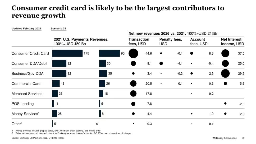
Horizontal bar chart and dot matrix showing revenue sources and growth breakdown
Financial Performance
Financial Services
Consumer credit cards are expected to be the main revenue growth driver from 2021–2026, contributing $90B in transaction fees and $37.5B in net interest income. The slide breaks down new revenue by fee type across major payment segments, highlighting consumer credit cards as the strongest contributor.
consumer credit card, transaction fees, net interest, McKinsey, revenue growth, penalty fees, account fees
Multiple Chart
McKinsey
Saved
World map with pie charts showing industry demand and Farfetch GMV percentages across different regions (Americas, EMEA, APAC) with office and localized site markers.
Strategic Planning
Retail & E-commerce
Maps out Farfetch's global platform, detailing the geographic distribution of industry demand, GMV, and presence of Farfetch offices and localized sites.
Farfetch, global platform, industry demand, GMV, regions
Multiple Chart
Deutsche Bank
Saved
Images of mobile devices and graphs represent new client solutions like TravelBank and RTP. Text explains the benefits of each service.
Product and Service Analysis
Financial Services
Discusses innovative solutions offered to commercial clients, focusing on tech-driven management and real-time payments, targeting underrepresented markets and large corporations.
Commercial Clients, TravelBank, RTP
Mixed Chart
Goldman Sachs
Saved
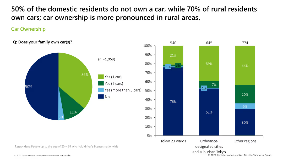
Features a pie chart on the left and three column charts on the right, displaying car ownership statistics across various regions.
Market Analysis and Trends
Consumer Goods
The slide details car ownership statistics, showing the percentage of domestic residents who own cars, with a focus on rural vs. urban areas.
car ownership, statistics, rural, urban, survey
Multiple Chart
Deloitte
Saved
Previous
Next
If nothing, comes up, please save your slides first
Create a FREE account to continue browsing
Receive Instant Access to 1,000+ slides from companies like McKinsey, Google, and Goldman Sachs
First Name
Last Name
Email
Password
I agree to all
Terms & Privacy Policy
Thank you! Your submission has been received!
Oops! Something went wrong while submitting the form.
Have an account?
Sign in
Column Chart
Heatmap
Chevron
Org Chart
Infographic
Callouts
Timeline
List
Graphic
Picture
Process Flow
Diagram
Paragraph
Map
Table
Framework
Subtitle
Takeaway Box
Icon
Other Chart
Radar Chart
Waterfall Chart
Mekko Chart
Pie Chart
Scatter Plot
Line Chart
Bar chart
Bullet points