Create a FREE Account
Instant access to 1,000+ real slides from top companies like McKinsey, BCG, Goldman Sachs, Google and many more!
First Name
Last Name
Email
Password
I agree to all
Terms & Privacy Policy
Thank you! Your submission has been received!
Oops! Something went wrong while submitting the form.
Have an account?
Sign in
Library
Templates
Courses
Pricing
My Account
My Slides
My Templates
✦ AI
AI Prompt Library
AI Search
Sign in
Start Here
Logout
My Saved Slides
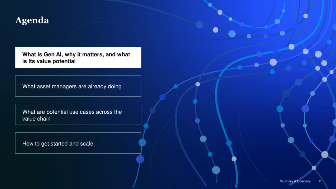
Dark blue slide with white and blue text boxes stacked vertically, highlighting key agenda items
Strategic Planning
Artificial Intelligence
The agenda outlines the structure of the presentation: understanding Gen AI, examining asset manager practices, exploring use cases across the value chain, and guidance on implementation and scaling.
Gen AI, agenda, value chain, asset managers, implementation, scaling
Agenda
McKinsey
Saved
This slide has multiple line graphs in different colors tracing the historical data of various tax revenues over the years, highlighting trends and changes.
Regulatory and Compliance
Government & Public Sector
Analyzes trends in tax revenue streams over time, aiding in forecasting and fiscal planning, with emphasis on customs, VAT, and corporate taxes.
tax, revenue, historical, forecasting, trends, customs, VAT, corporate, finance, government, analysis
Single Chart
PwC/Strategy&
Saved
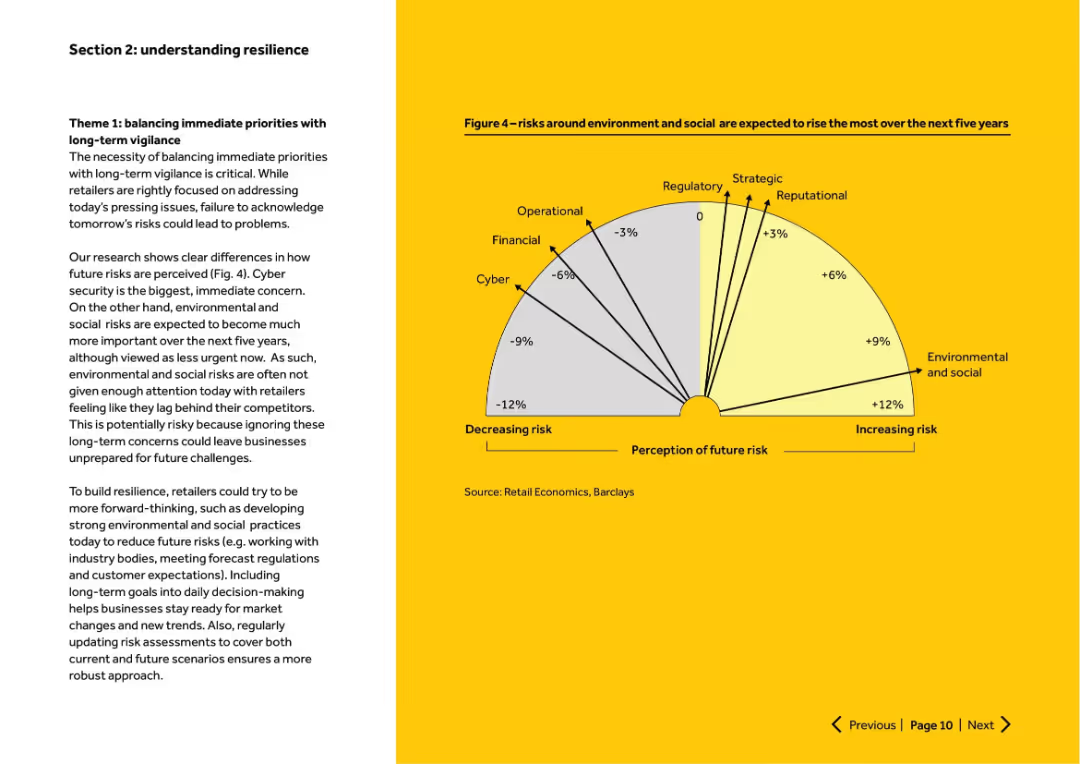
Left-aligned narrative text with right-side semicircle chart showing expected change in risk perception. Clean yellow and white layout.
Strategic Planning
Retail & E-commerce
Discusses the need to balance short-term and long-term risk priorities. Cyber risks are top short-term concern, while environmental and social risks are expected to increase significantly. Advises proactive risk management for future readiness.
future risk, environmental, cyber, resilience, long-term planning
Mixed Chart
Barclays
Saved
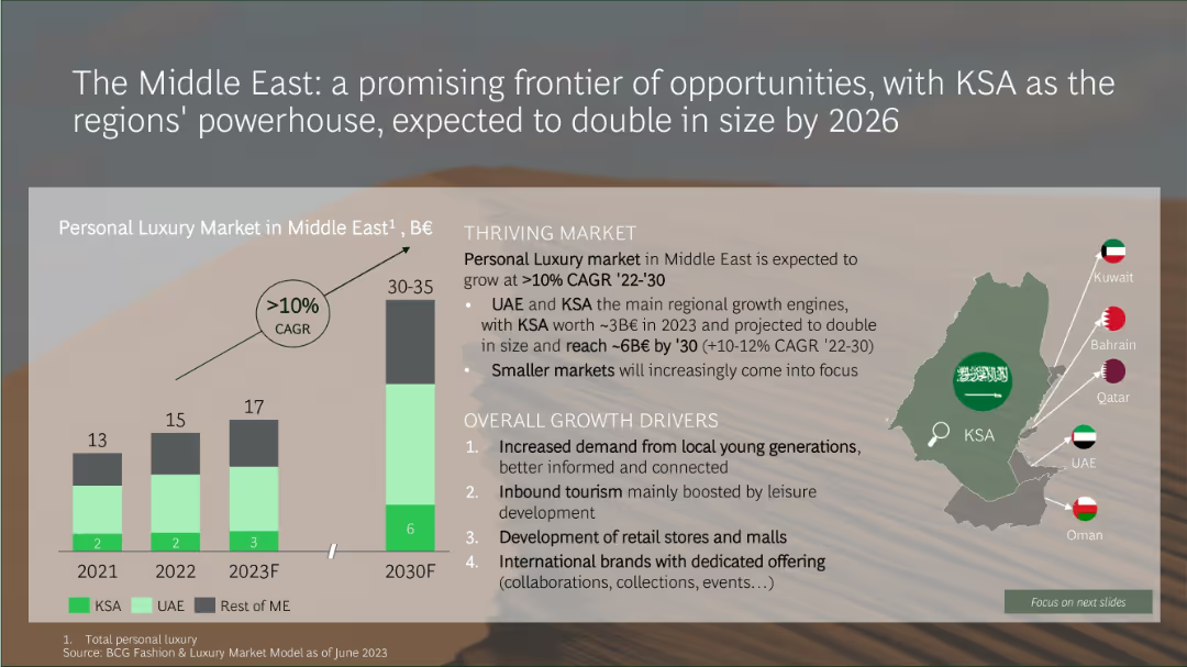
Infographic with a bar chart projecting Middle East luxury market growth and a map showing key Gulf countries
Market Analysis and Trends
Consumer Goods
The Middle Eastern luxury market is expected to double by 2030, growing at over 10% CAGR. KSA and UAE are the primary growth engines, driven by increased demand from younger consumers, tourism, retail development, and international brand expansion.
Middle East, KSA, luxury market, CAGR, retail growth, tourism, youth demand, market size
Mixed Chart
BCG
Saved
A combination of cycle diagrams and column charts, this slide showcases financial growth metrics, such as sales volume and net revenue. It's visually balanced with clear demarcations between different sections and graphical elements.
Financial Performance
Financial Services
The slide describes the growth strategy and financial performance of a card franchise, with a focus on scaling, engaging, and deepening customer relationships. It’s intended for illustrating successful financial strategies and growth patterns within the industry.
Card franchise, Industry position, Sales volume, Net revenue, Financial growth, Strategy implementation
Multiple Chart
JP Morgan
Saved
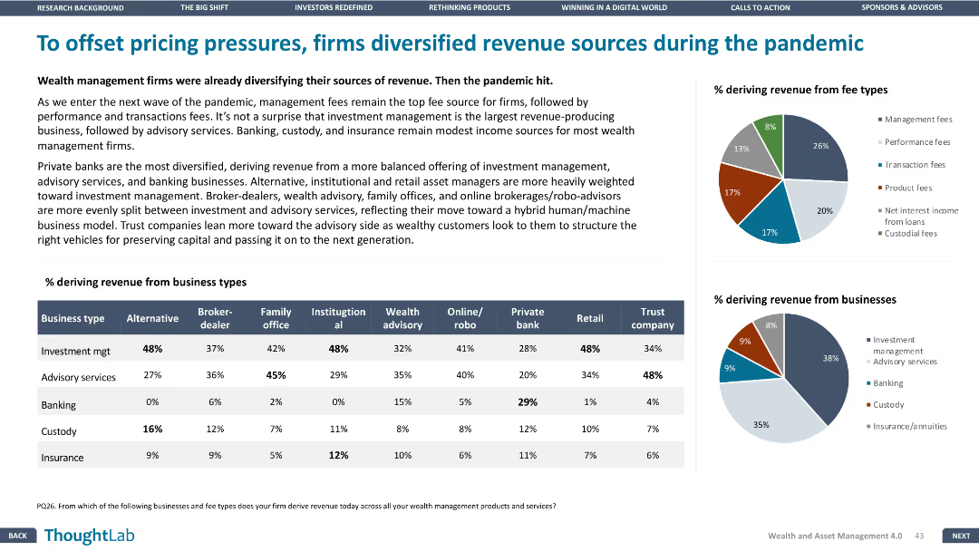
This slide has a column chart, pie charts, and a table. The layout is dense with multiple visual elements and minimal white space.
Strategic Planning
Financial Services
The slide discusses how wealth management firms diversified their revenue sources during the pandemic, with data showing the percentage of revenue from different business types and fee types.
Revenue, diversification, pandemic, wealth management, business types, fee types
Multiple Chart
Deloitte
Saved
The slide has a clear, structured format with two main sections, each containing checkmark lists. The design uses a simple blue and white color scheme.
Operational Efficiency
Financial Services
This slide details strategic measures for resource management across different risk areas, with a focus on people strategy and liquidity. It is typically used for corporate strategy presentations.
resource management, risk dimensions, strategy, liquidity, capital, people management, Goldman Sachs, COVID-19, private equity, investment
Table
Goldman Sachs
Saved
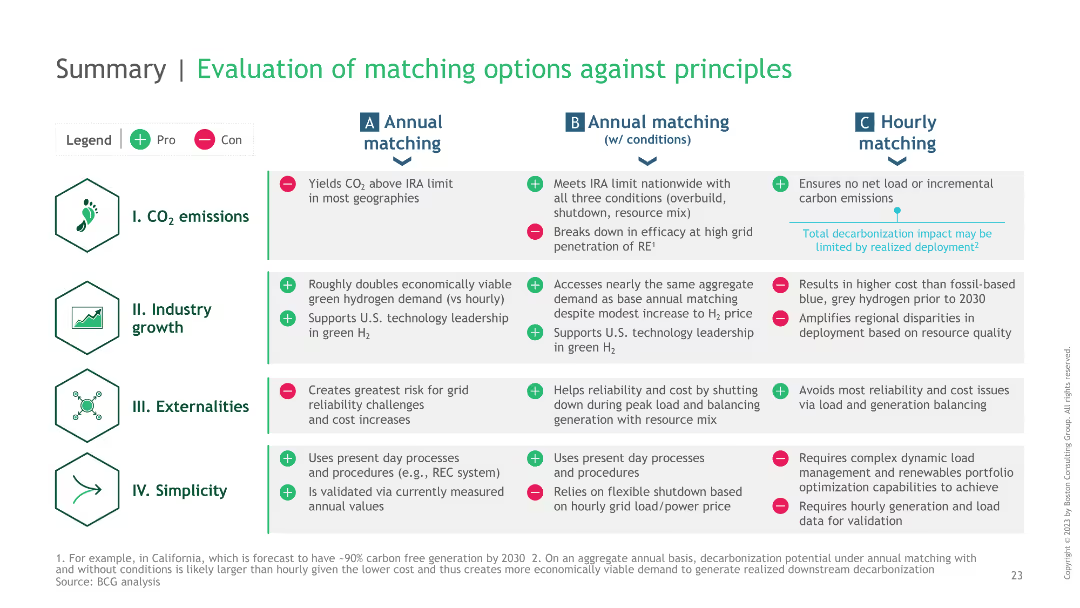
A summary table comparing different green hydrogen matching strategies against principles like CO2 emissions, industry growth, externalities, and simplicity.
Strategic Planning
Energy & Utilities
It summarizes the evaluation of different hydrogen matching strategies against key principles, providing a high-level overview of their benefits and drawbacks.
hydrogen, summary, strategies, principles, evaluation
Table
BCG
Saved
This slide is visually dense with column charts comparing different financial metrics from 2014 and 2019. It employs color coding to distinguish between the years.
Operational Efficiency
Financial Services
It analyzes the impact of secular trends on various financial services and how a company can navigate through them. It’s meant for discussing strategies in overcoming industry challenges.
AUM, commission rates, trading volume, net revenue
Multiple Chart
JP Morgan
Saved
This slide displays a column chart tracking expenses from 2018 to 2019 in billions of dollars, highlighting overhead, revenue-related, and investment areas. The chart has a balance of dark and light blue tones, with green bars for positive changes and red for negative ones.
Financial Performance
Financial Services
The slide analyzes the expense trends for JPMorgan, showing an increase in overall expenses from 2018 to 2019 due to higher revenues and investments in technology and non-tech areas. A bar and column chart illustrates the changes in financial figures, such as overhead ratio and revenue-related expenses, offering insights into the financial planning and budgeting of the firm.
Expenses, Revenue, Investments, JPMorgan, Financial Analysis, Overhead Ratio, Bar Chart, Column Chart, Financial Planning
Single Chart
JP Morgan
Saved
Column chart comparing conversion rates of online channels with and without genAI enabled contact centers. Shows significant improvement with genAI integration.
Sales and Business Development
Financial Services
Demonstrates how genAI enabled customer centers significantly increase sales performance by improving conversion rates for online loan applications.
genAI, customer center, sales, conversion rates, online channel
Multiple Chart
Kearney
Saved
This slide features two column layout with labels "Top 5" and "Top 3" and text blocks explaining targets for 2025 and 2030 in terms of GW. A map of Chile highlights northern and southern hydrogen valleys.
Industry Overview
Energy & Utilities
The slide outlines Chile's aspirations to be among the top global producers and exporters of green hydrogen by 2025 and 2030, with specific GW capacity targets. Also indicates geographic areas of development.
Chile, hydrogen, exporters, 2025, 2030
Graphic
McKinsey
Saved
The slide features bar charts showing operating expenses and total RWA from 2Q23 to 4Q23, with text detailing actions for cost reduction, capital release, and protecting customer franchise. Ambitions for PBT and RWA by 2026 are also listed.
Risk Assessment and Management
Financial Services
The slide outlines strategies for reducing costs and releasing capital in non-core and legacy sectors. It includes data on operating expenses, RWA, and strategic actions to achieve these goals. This slide can be used to communicate cost management and capital release strategies in non-core and legacy areas.
cost reduction, capital release, operating expenses, strategic actions, non-core
Multiple Chart
UBS
Saved
This slide has a blue and green color scheme with a pie chart showing outstanding debt and preferred shares. It contains bullet points with checkmarks and three text sections on the left side. The slide is marked as number 7.
Regulatory and Compliance
Financial Services
The slide presents actions taken for a seamless LIBOR transition, including leadership roles, meeting investor needs, and managing LIBOR exposure. It uses a pie chart to show the composition of outstanding debt and shares, and bullet points for structured information.
LIBOR, transition, debt, shares, derivatives, risk management
Mixed Chart
Goldman Sachs
Saved
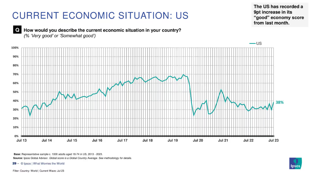
Line chart tracking sentiment from 2013–2023 with a recent increase to 38% highlighted as a 9-point monthly gain.
Market Analysis and Trends
Financial Services
Economic optimism in the US has risen by 9 percentage points to 38%, indicating a notable improvement in public sentiment. The chart shows historical trends and fluctuations in perception.
US economy, public sentiment, recent rise, Ipsos, economic perception, monthly change, economic trends, survey analysis
Single Chart
IPSOS
Saved
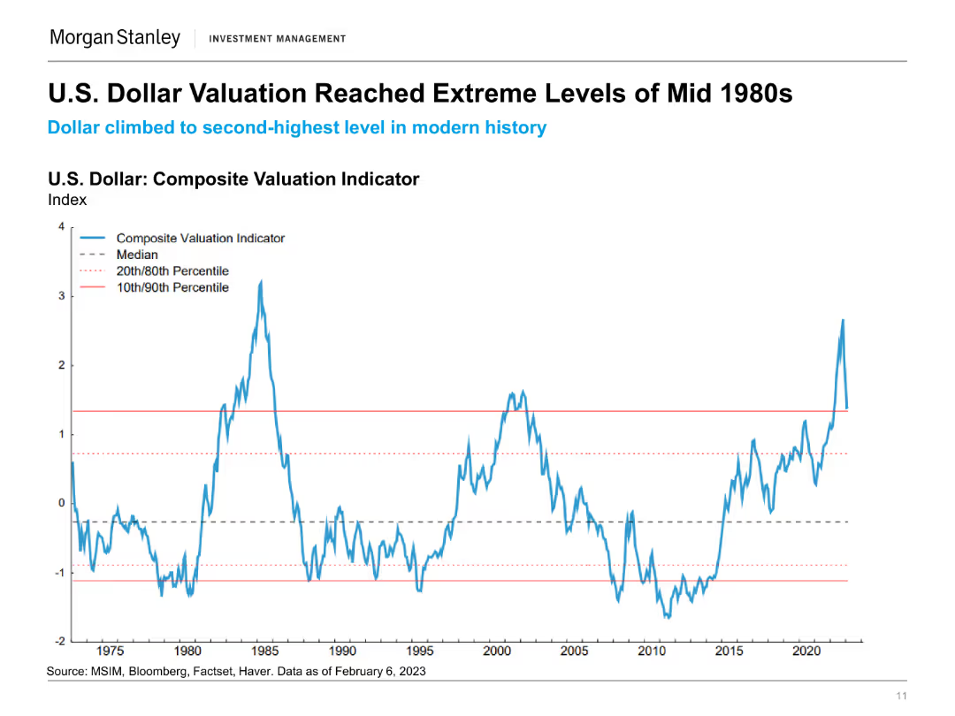
The slide includes a line chart showing the U.S. Dollar Composite Valuation Indicator from 1975 to 2023, with various percentiles marked. The chart highlights the extreme valuation levels.
Financial Performance
Financial Services
This slide illustrates the historical valuation levels of the U.S. dollar, comparing current valuations to historical extremes and noting significant changes.
U.S. Dollar, Valuation Indicator, Historical Analysis, Financial Performance, Currency Valuation, Economic History, Dollar Trends, Market Analysis
Single Chart
Morgan Stanley
Saved
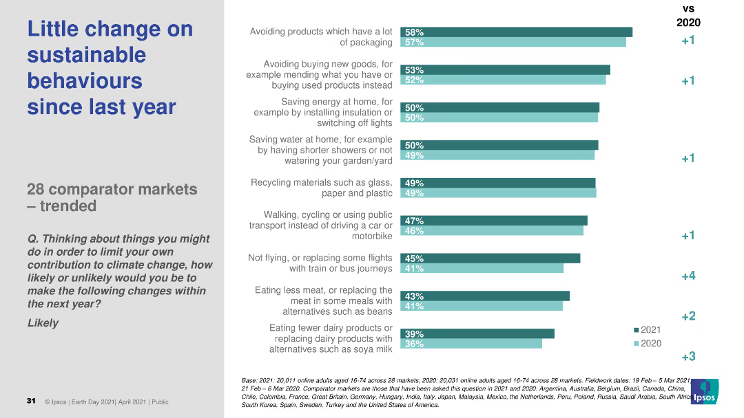
The slide features a column chart comparing sustainable behavior changes across 28 markets from 2020 to 2021. The chart displays percentages for different actions, with a comparison to the previous year.
Market Analysis and Trends
Environmental Services & Sustainability
The slide shows survey results on sustainable behaviors across 28 markets, indicating little change in engagement from 2020 to 2021.
sustainable behaviors, market trends, survey, year comparison, 2021
Single Chart
IPSOS
Saved
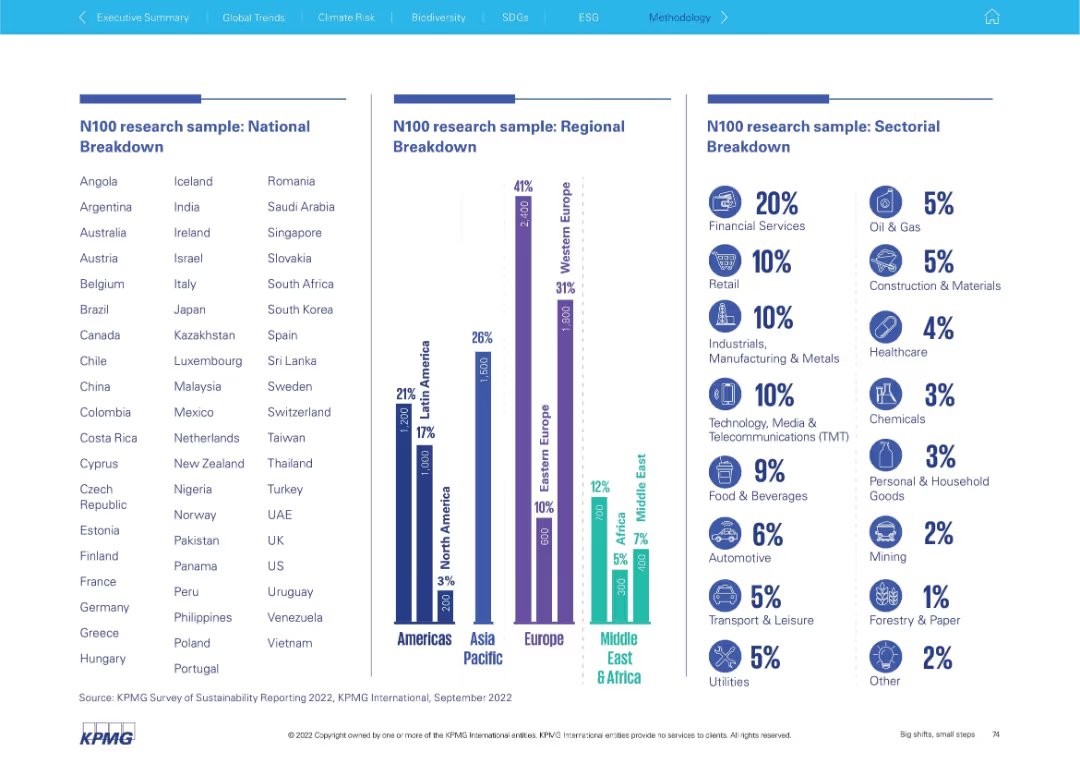
Triple-column layout with country list, regional chart, and industry breakdown using bars and icons.
Industry Overview
Professional Services
This slide shows the composition of the N100 research sample by country, region, and sector. It emphasizes where most data was collected and which industries were most represented (e.g., Financial Services 20%).
N100 sample, country list, regional breakdown, sector data, industry representation, financial services, research demographics
Mixed Chart
KPMG
Saved
This slide provides a line graph and two column charts, depicting unemployment rate forecasts and firmwide allowance for credit losses. The graphics are in shades of blue, and the line graph includes a forecast line with marked points. The column charts compare figures from different years with a pre-pandemic average, using clear color differentiation to enhance readability.
Risk Assessment and Management
Financial Services
Analyzing the unemployment rate forecast and allowance for credit losses, Slide 17 communicates JPMorgan's prudent financial reserves in anticipation of credit normalization and economic changes expected through the year.
Credit, Unemployment, Forecast, Allowance, Losses, Financial Reserves, Normalization, Pandemic Comparison
Multiple Chart
JP Morgan
Saved
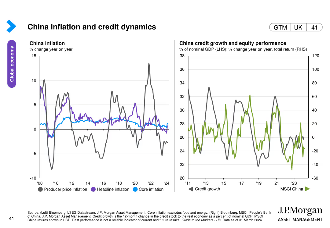
Two line charts: one displays China’s producer price, headline, and core inflation, and the other shows credit growth and equity performance with MSCI China index.
Market Analysis and Trends
Financial Services
This slide analyzes China's inflation rates across different measures and their credit growth dynamics, along with equity performance. Used for economic trend analysis and investment strategy.
China, inflation, credit, equity, MSCI
Multiple Chart
JP Morgan
Saved
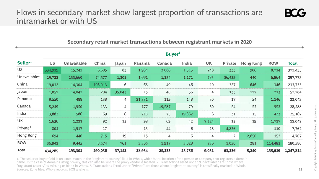
The slide features a table showing secondary retail market transactions between registrant markets in 2020. The table is color-coded with shades of green indicating transaction volumes.
Market Analysis and Trends
Financial Services
This slide presents data on secondary retail market transactions between various registrant markets in 2020, highlighting that the largest proportion of transactions are intramarket or with the US.
secondary market, transactions, registrant markets, US, 2020, intramarket, table, data visualization, BCG
Table
BCG
Saved
This slide presents a column chart with estimated completions of consumer apartment projects under construction, divided by quarters and marked with 'ACT' for actual and 'EST' for estimate. A sidebar contains additional notes on revenue from apartments under construction.
Market Analysis and Trends
Real Estate & Construction
The slide shows trends in housing completions, indicating declines and a forecasted peak, likely used for analyzing market dynamics or for investment planning.
Construction, Market Trends, Forecast, Housing, Revenue, Apartments, Peak, Decline, Q4, Estimations
Multiple Chart
Goldman Sachs
Saved
Descriptions of extended reality (XR), mixed reality (MR), augmented reality (AR), and virtual reality (VR), with a column chart showing the projected market size of XR technologies from 2018 to 2030.
Technology and Digital Transformation
Technology & Software
The slide discusses the different types of extended reality technologies, including XR, MR, AR, and VR. It emphasizes the potential impact of these technologies on various sectors and projects significant market growth for XR technologies by 2030.
Extended Reality, XR, AR, VR, Market Size
Mixed Chart
Roland Berger
Saved
It pairs a textual analysis of CEO confidence with a line chart. The chart tracks CEO confidence over the years, with a focus on the next 12 months and next three years. The design is clear and easy to follow.
Market Analysis and Trends
Professional Services
This slide analyzes the rebound in CEO confidence post-2020, showcasing a survey that indicates a shift towards more positive revenue growth expectations. It includes a historical comparison to pre-pandemic levels, providing insight into the evolving sentiment among business leaders regarding economic prospects.
CEO confidence, revenue growth, economic recovery, survey analysis
Mixed Chart
PwC/Strategy&
Saved
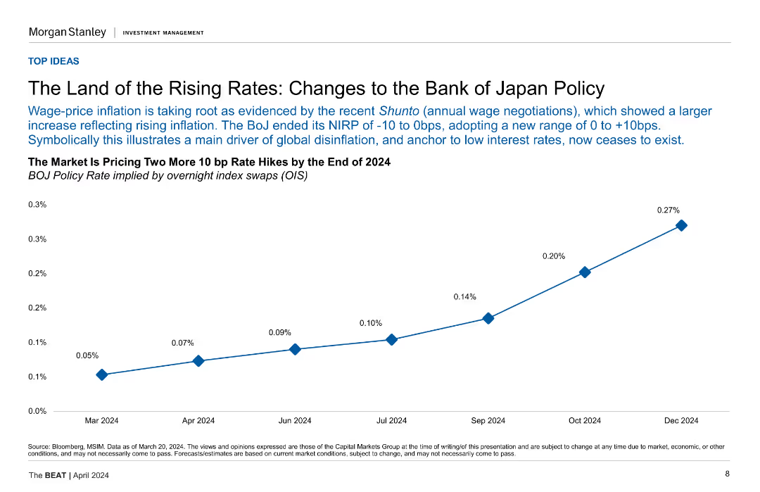
A line chart showing BOJ policy rate projections implied by overnight index swaps (OIS) from Mar-24 to Dec-24.
Market Analysis and Trends
Financial Services
This slide discusses changes to the Bank of Japan's policy and its impact on interest rates, showing the market's projections for future rate hikes.
BOJ Policy, Interest Rates, Japan, Projections, OIS, Rate Hikes
Mixed Chart
Morgan Stanley
Saved
Previous
Next
If nothing, comes up, please save your slides first
Create a FREE account to continue browsing
Receive Instant Access to 1,000+ slides from companies like McKinsey, Google, and Goldman Sachs
First Name
Last Name
Email
Password
I agree to all
Terms & Privacy Policy
Thank you! Your submission has been received!
Oops! Something went wrong while submitting the form.
Have an account?
Sign in
Column Chart
Heatmap
Chevron
Org Chart
Infographic
Callouts
Timeline
List
Graphic
Picture
Process Flow
Diagram
Paragraph
Map
Table
Framework
Subtitle
Takeaway Box
Icon
Other Chart
Radar Chart
Waterfall Chart
Mekko Chart
Pie Chart
Scatter Plot
Line Chart
Bar chart
Bullet points