Create a FREE Account
Instant access to 1,000+ real slides from top companies like McKinsey, BCG, Goldman Sachs, Google and many more!
First Name
Last Name
Email
Password
I agree to all
Terms & Privacy Policy
Thank you! Your submission has been received!
Oops! Something went wrong while submitting the form.
Have an account?
Sign in
Library
Templates
Courses
Pricing
My Account
My Slides
My Templates
✦ AI
AI Prompt Library
AI Search
Sign in
Start Here
Logout
My Saved Slides
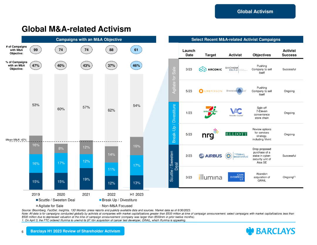
The slide consists of a column chart showing campaigns with M&A objectives and a table with recent M&A-related activist campaigns. It provides a clear visual representation of data related to M&A activism.
Mergers and Acquisitions
Financial Services
Examines the role of M&A-related activism, presenting recent campaigns and highlighting objectives such as company sales, spin-offs, and strategic reviews.
M&A activism, campaigns, objectives, strategic reviews, recent campaigns
Mixed Chart
Barclays
Saved
The slide includes a pie chart and column charts, with text describing the evolution of ESG awareness.
Regulatory and Compliance
Environmental Services & Sustainability
This slide discusses how organizations are evolving in their focus on ESG risks, with statistics and survey results.
ESG, risks, evolution, awareness, survey
Single Chart
Deloitte
Saved
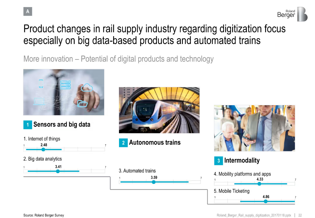
Three-column layout with images and blue icons; numeric sliders rate tech areas like IoT and ticketing
Technology and Digital Transformation
Transportation & Logistics
Highlights the shift in the rail supply industry toward digitization, focusing on IoT, big data, autonomous trains, and intermodal solutions such as mobility platforms and ticketing apps.
IoT, big data, autonomous trains, intermodality, mobility apps, analytics, ticketing
Single Chart
Roland Berger
Saved
This slide features a graph similar to slide 7, now populated with specific risk events categorized into "BAU," "Adverse," and "Severe." It includes examples like "Consumer Credit" and "Global Financial Crisis" to illustrate the spectrum of risk severity.
Risk Assessment and Management
Financial Services
Slide 8 delves into specific risk scenarios across the risk spectrum, including day-to-day operations and extreme financial crises. It's useful for financial analysts and managers to understand and prepare for different risk levels, discussing the impact of various market events and operational risks.
risk spectrum, financial crisis, BAU, adverse, Goldman Sachs
Table
Goldman Sachs
Saved
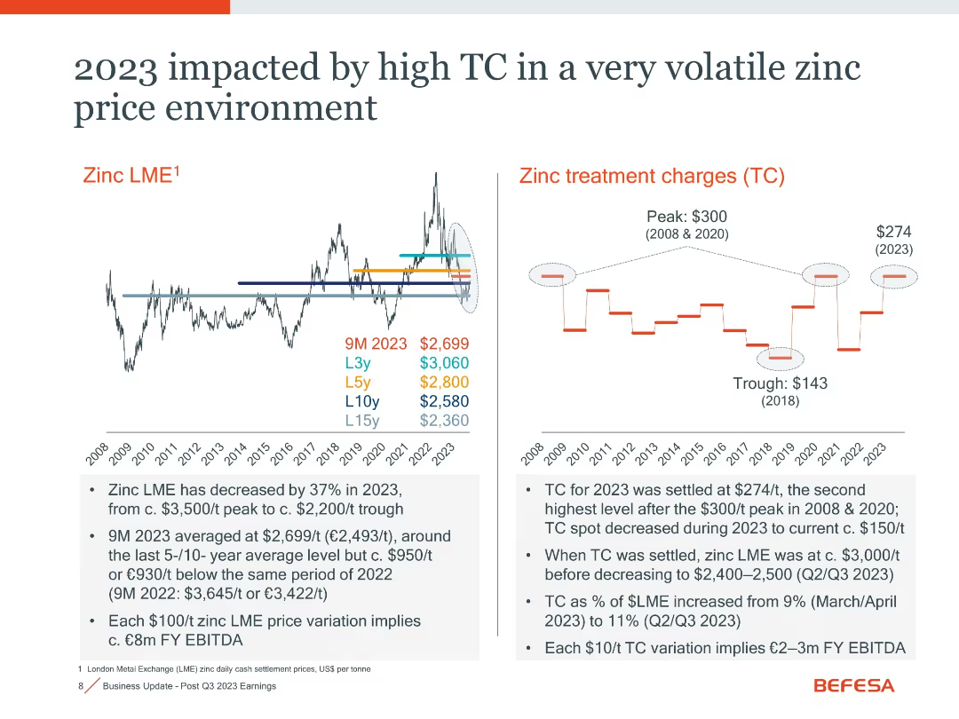
Dual-panel layout showing historical zinc LME trend and treatment charges (TC)
Risk Assessment and Management
Industrial & Manufacturing
Details the high treatment charges (TC) in 2023 alongside falling zinc prices. Notes that TC was settled at $274/t, second only to peak years. This combination negatively affects EBITDA.
zinc LME, treatment charge, volatility, risk, EBITDA impact
Multiple Chart
Goldman Sachs
Saved
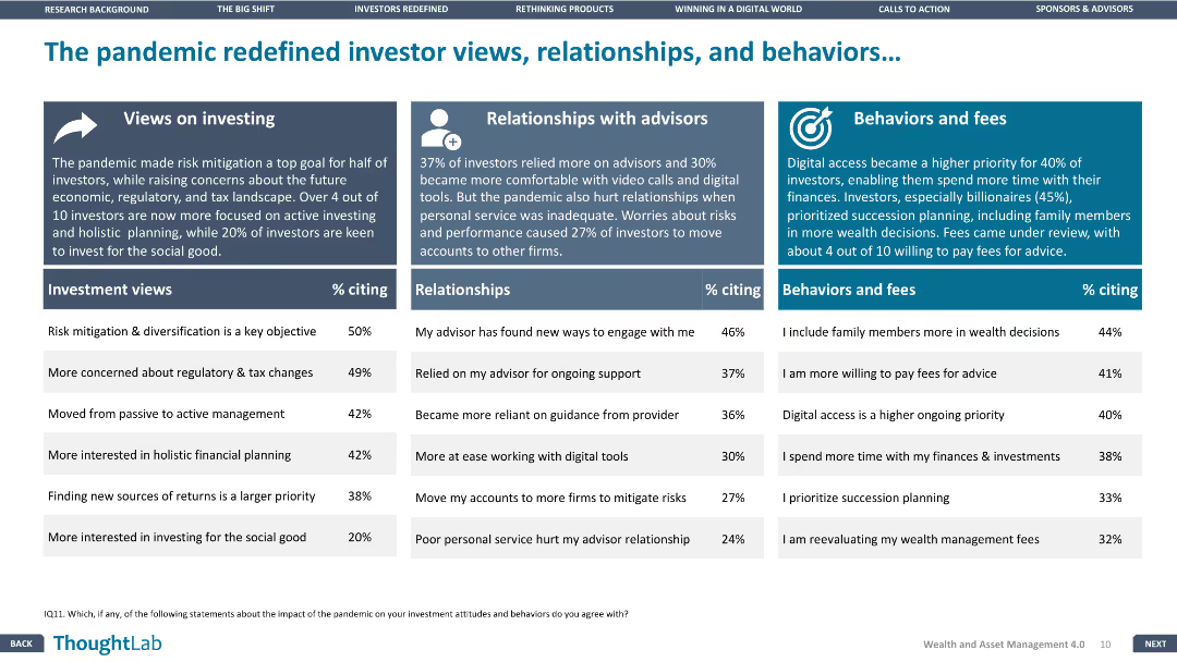
The slide has three sections: investment views, relationships with advisors, and behaviors and fees, each with a supporting column chart.
Market Analysis and Trends
Financial Services
The slide analyzes the changes in investor behavior and attitudes towards investment due to the pandemic, focusing on views, relationships, and behaviors.
Pandemic impact, Investor views, Relationships, Financial Services, Trends
Pillar
Deloitte
Saved
The slide presents comparative data between 2022 and 2023 about women's mental and physical health in a workplace setting, using bar graphs and a pie chart. The design is professional with a mix of text and data visualization elements.
Market Analysis and Trends
Professional Services
The slide highlights declines in women's mental well-being, with data on the ability to switch off from work and overall physical health, comparing trends over two years. It could be used to analyze wellness trends and inform workplace health initiatives.
mental health, physical health, women, workplace, well-being, decline, work-life balance, 2022, 2023, presenteeism
Multiple Chart
Deloitte
Saved
A donut chart dominates the slide, showcasing the distribution of a firm's investment platform across various asset classes, complemented by performance metrics on the right.
Investment Analysis
Financial Services
The slide indicates a financial firm’s asset and wealth management capabilities, detailing the distribution of firmwide investments and their performance over five years. Suitable for demonstrating the firm's diversified asset management and strong performance history.
asset management, investment, performance, diversification, growth
Mixed Chart
Goldman Sachs
Saved
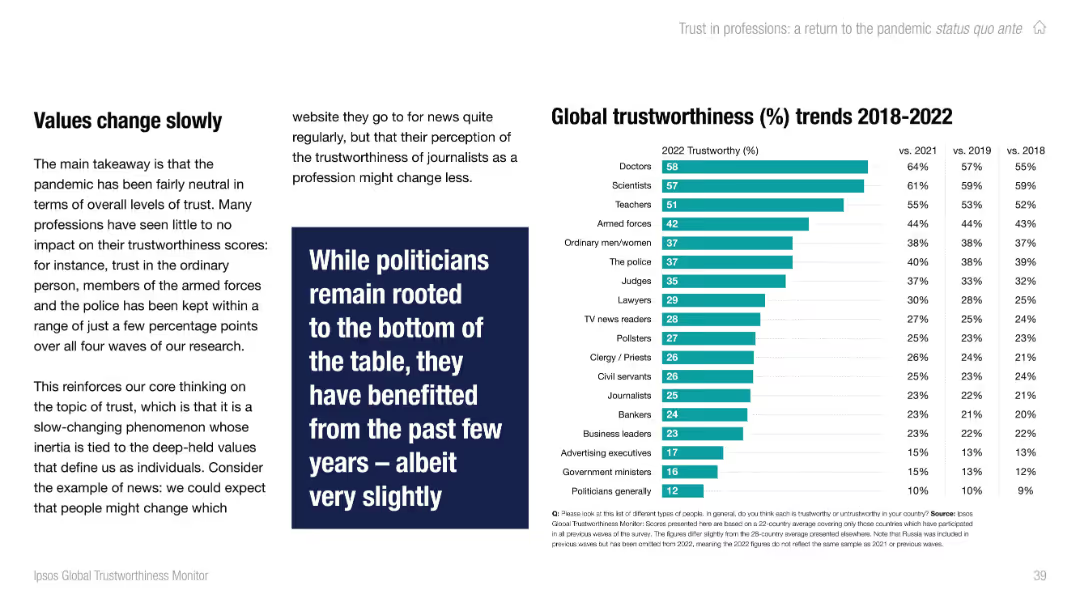
Left-aligned text with full-height vertical bar chart on the right showing trust ratings by profession. Teal color palette.
Performance Metrics and KPIs
Professional Services
This slide presents global trustworthiness scores for various professions from 2018–2022. Doctors and scientists rank highest in trust, while politicians and government ministers remain at the bottom. Changes since 2018 are relatively small, showing trust inertia.
trust, professions, global, Ipsos, doctors, scientists, politicians, stability, chart
Mixed Chart
IPSOS
Saved
The slide features bar charts showing the probability and profitability increase when applying four business levers. Color gradients indicate different stages of implementation.
Strategic Planning
Technology & Software
The slide discusses how applying four specific levers can significantly enhance profitability and the likelihood of moving up one maturity level in business, emphasizing strategic adjustments and timing for achieving such outcomes.
profitability, maturity, strategic planning, business levers, probability increase, Accenture Research, implementation, future-ready
Multiple Chart
Accenture
Saved
Features stacked column charts for pre-tax income, line graphs for the macroeconomic environment, and quantitative data points.
Financial Performance
Financial Services
Describes the growth of pre-tax income across various business units and macroeconomic conditions.
Pre-tax income, economic growth, GDP growth, federal funds rate, business units
Multiple Chart
JP Morgan
Saved
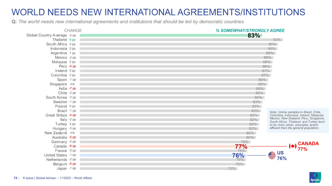
Detailed bar chart showing % agreement per country; red/blue highlights for Canada and US; consistent format with other slides.
Strategic Planning
Government & Public Sector
Focuses on support for new international agreements led by democracies. 83% globally agree; Canada and US slightly below average at 77% and 76% respectively. Chart reflects cross-country sentiment and how it has changed over time.
international cooperation, new institutions, democracy, global opinion
Single Chart
IPSOS
Saved
Slide features a clear diagram categorizing various EdTech solutions along the teaching and learning journey, with a side panel listing target audiences. It utilizes blue and grey for text and background contrast.
Industry Overview
Education & Training
This slide maps the ecosystem of EdTech startups in Southeast Asia, displaying a range of solutions and the respective educational segments they serve, from K-12 to corporate training.
EdTech, Ecosystem, Startups, SEA, Solutions, Education, Learning Journey, K-12, Corporate Training, Segmentation
Table
Bain
Saved
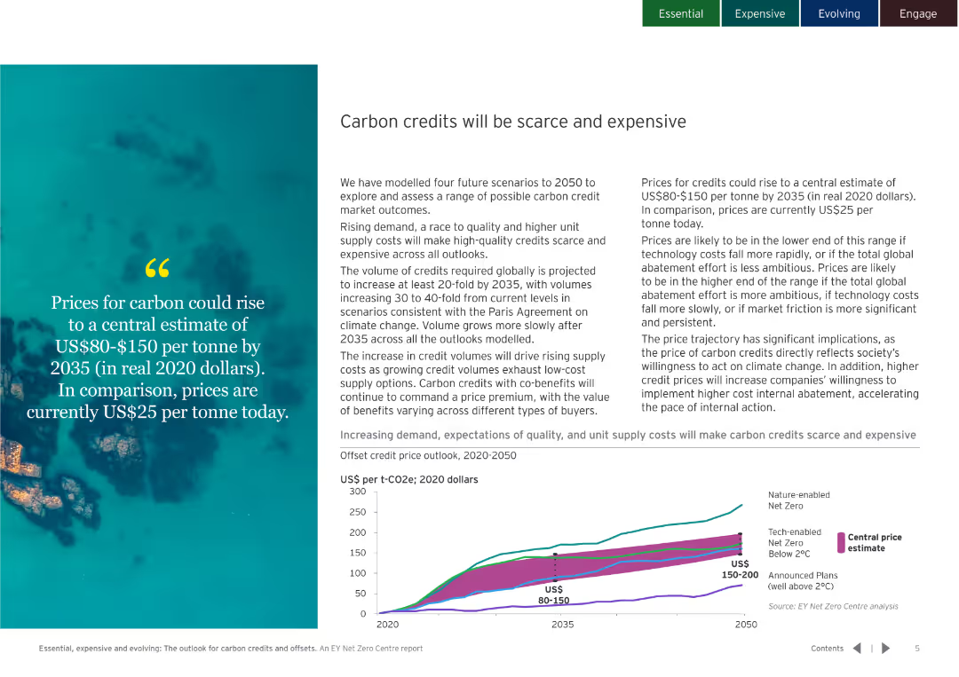
The slide combines text with an image and a line chart. The line chart shows projected carbon credit prices from 2020 to 2050 under different scenarios.
Strategic Planning
Environmental Services & Sustainability
It discusses the rising demand and costs for carbon credits by 2035, projecting prices to be between US$80-$150 per tonne. Emphasizes the importance of high-quality credits.
Carbon, credit, price, forecast, demand, 2035, scenario, cost, sustainability
Mixed Chart
EY
Saved
Line chart showing DM unemployment rate from 1971 to 2021 with a notable spike and grey shading indicating recent uncertainty. The design is clean with a single blue line and minimal text annotations.
Market Analysis and Trends
Financial Services
Analyzes unemployment trends over five decades, highlighting uncertainties due to recent global events. Useful for economic forecasting and labor market analysis.
Unemployment rate, DM, economic analysis, labor market trends, historical data, pandemic impact, line chart, J.P. Morgan.
Single Chart
JP Morgan
Saved
The slide uses bar charts to show the percentage of spend on various fitness products/services in 2020 versus 2022. It segments the data by at-home, outside of home, and digital categories, with additional focus on differences in spending habits between men and women.
Market Analysis and Trends
Healthcare & Pharmaceuticals
Analyzes shifts in consumer spending on fitness products/services, showing a trend towards at-home and digital solutions. Highlights gender differences and future spending intentions. Useful for understanding consumer allocation of budget in fitness and strategic planning for market positioning.
Consumer spending, fitness products, gender comparison, market analysis, digital solutions
Mixed Chart
McKinsey
Saved
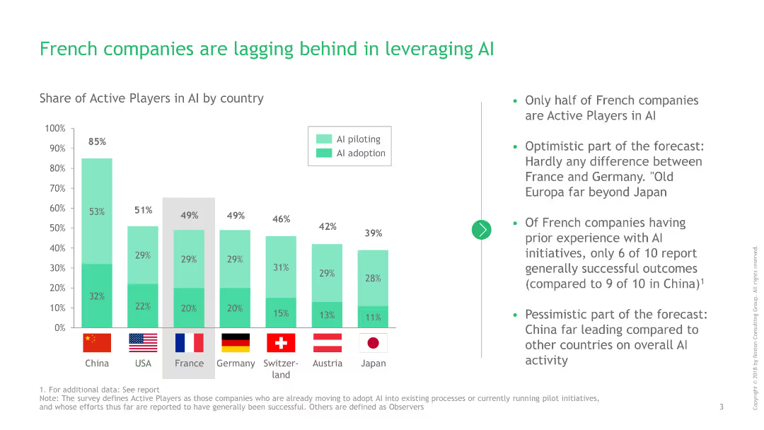
Contains a column chart showing the share of active AI players by country, with additional text highlighting France's position.
Technology and Digital Transformation
Technology & Software
Discusses the slower adoption and piloting rates of AI among French companies compared to other countries.
AI adoption, technology, France, global comparison, active players
Mixed Chart
BCG
Saved
This slide features a bar chart with horizontal bars showcasing various technologies and their impact on foodservice over the next five years, with percentages and changes.
Market Analysis and Trends
Hospitality & Tourism
The slide discusses key technologies influencing the foodservice industry, including online ordering, AI, and automation, highlighting their potential impact over the next five years.
Technology, Foodservice, Innovation, AI, Automation
Mixed Chart
Deloitte
Saved
The slide features four product images of Horlicks and Boost brands with circular charts above them depicting market share and profitability. There is also a large text box on the left displaying financial metrics.
Market Analysis and Trends
Consumer Goods
This slide highlights the acquisition of Horlicks and Boost, emphasizing their market positions and financial significance within the functional nutrition sector.
acquisition, nutrition, market share, profitability, functional nutrition
Multiple Chart
Deutsche Bank
Saved
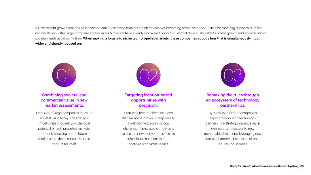
The slide is divided into three sections with circular icons, each section discussing a different strategic focus for new market assessments.
Market Analysis and Trends
Consumer Goods
The slide emphasizes the importance of combining societal and commercial value, targeting location-based opportunities, and leveraging technology partnerships for new market growth.
market assessment, societal value, commercial value, location-based, technology partnerships, consumer goods
Linear Flow
Accenture
Saved
Slide shows a detailed framework of banking segments like Deposits, Lending, and Investment Management, correlating with AI's estimated impact on these areas.
Financial Performance
Financial Services
Provides a comprehensive view of how generative AI is expected to influence various banking operations from front to back office, serving as a guide for strategic implementation in financial services.
banking, AI use cases, strategic implementation, front office, back office
Diagram
Accenture
Saved
The slide features two column charts comparing Booz Allen's total shareholder returns to core peers and broader indexes over one-, three-, and five-year periods. The bars are clearly labeled with percentages and time frames.
Investment Analysis
Financial Services
This slide highlights Booz Allen's market performance, illustrating total shareholder returns compared to core peers and broader indexes. It underscores the company's strong financial performance and effective capital management over different periods.
shareholder returns, market performance, investment, comparison
Multiple Chart
Booz Allen Hamilton
Saved
Slide uses column charts to analyze hypothetical shifts in yield curves affecting net interest income, broken down by year and currency, supplemented with textual explanations.
Risk Assessment and Management
Financial Services
Explores the impact of yield curve fluctuations on Deutsche Bank's net interest income from 2024 to 2026, providing insights into future financial risk management strategies.
Net interest income, yield curve, financial risk management, future forecasting, Deutsche Bank, sensitivity analysis
Multiple Chart
Deutsche Bank
Saved
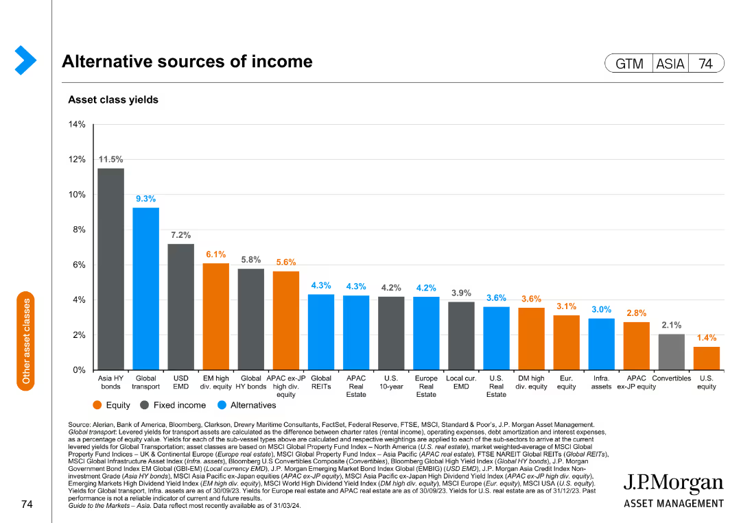
This slide includes a bar chart depicting asset class yields for equity, fixed income, and alternative investments, with yield percentages on the y-axis.
Investment Analysis
Financial Services
The slide compares different asset classes in terms of yield, providing insights into potential income sources for diversified investment portfolios.
asset class yields, income sources, investment, equity, fixed income
Single Chart
JP Morgan
Saved
Bar graphs with trend lines show the deal value and number of deals in the technology venture investing market by region from 2011 to 2017, with color differentiation for regions.
Market Analysis and Trends
Technology & Software
Analyzing global technology venture investing, this slide compares regional deal values and numbers, highlighting the continued growth against a backdrop of contracting deal numbers. It is useful for regional market analysis.
Venture, Technology, Global, Region, Market Analysis
Multiple Chart
Oliver Wyman
Saved
Previous
Next
If nothing, comes up, please save your slides first
Create a FREE account to continue browsing
Receive Instant Access to 1,000+ slides from companies like McKinsey, Google, and Goldman Sachs
First Name
Last Name
Email
Password
I agree to all
Terms & Privacy Policy
Thank you! Your submission has been received!
Oops! Something went wrong while submitting the form.
Have an account?
Sign in
Column Chart
Heatmap
Chevron
Org Chart
Infographic
Callouts
Timeline
List
Graphic
Picture
Process Flow
Diagram
Paragraph
Map
Table
Framework
Subtitle
Takeaway Box
Icon
Other Chart
Radar Chart
Waterfall Chart
Mekko Chart
Pie Chart
Scatter Plot
Line Chart
Bar chart
Bullet points