Create a FREE Account
Instant access to 1,000+ real slides from top companies like McKinsey, BCG, Goldman Sachs, Google and many more!
First Name
Last Name
Email
Password
I agree to all
Terms & Privacy Policy
Thank you! Your submission has been received!
Oops! Something went wrong while submitting the form.
Have an account?
Sign in
Library
Templates
Courses
Pricing
My Account
My Slides
My Templates
✦ AI
AI Prompt Library
AI Search
Sign in
Start Here
Logout
My Saved Slides
Contains multiple line charts, bar graphs, and informational text. The slide is dense with data showcasing demographic changes globally.
Market Analysis and Trends
Financial Services
This slide analyzes global demographic trends, showing aging populations and youth demographics to inform market strategies and policy development.
Demographics, Aging Population, Youth, Market Trends, Global Analysis
Multiple Chart
PwC/Strategy&
Saved
Column chart showing the adoption of digital health solutions in wellness and prevention, initial consultation/diagnosis, and patient info & personal data.
Technology and Digital Transformation
Healthcare & Pharmaceuticals
This slide compares the adoption of digital health solutions in SEA, China, and India, focusing on wellness programs, consultations, and patient data.
Wellness programs, digital health, SEA, China, India, patient data
Multiple Chart
LEK
Saved
Dual panel layout with circular charts comparing non-traditional vs traditional care usage on the left and an image on the right.
Market Analysis and Trends
Healthcare & Pharmaceuticals
Analyzes the preference for non-traditional healthcare services over traditional ones for specific needs like cold treatment and mental health.
non-traditional, healthcare, needs, comparison, preference
Mixed Chart
Accenture
Saved
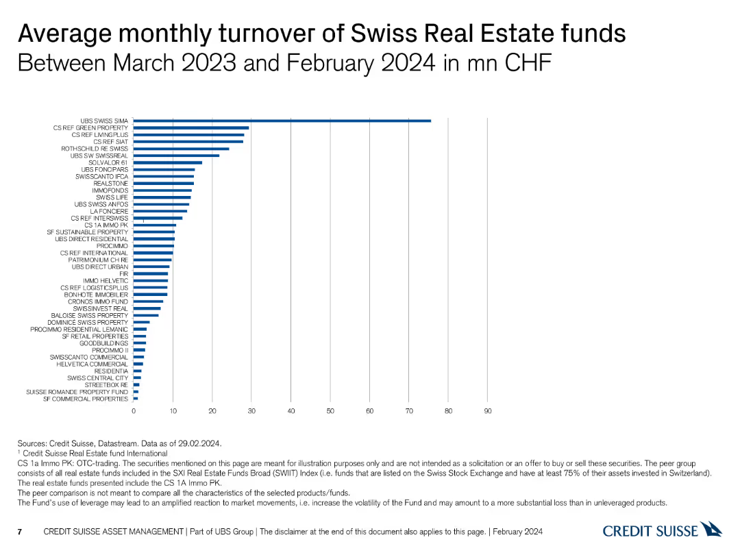
Column chart showing average monthly turnover of various Swiss real estate funds in CHF.
Market Analysis and Trends
Real Estate & Construction
Presents the average monthly turnover of different Swiss real estate funds, measured in CHF, for a one-year period.
real estate, turnover, monthly average, CHF, funds
Single Chart
Credit Suisse
Saved
Slide includes comparative column charts and percentage breakdowns of assets, liabilities, and loan quality.
Risk Assessment and Management
Financial Services
Demonstrates conservative financial management through asset distribution and liability management, highlighting stability and risk management.
balance sheet, assets, liabilities, management, finance, stability
Multiple Chart
Deutsche Bank
Saved
This slide features a dark background with a yellow highlight. It includes a header, body text, and a column chart displaying percentages. Four circular percentage indicators show key insights.
Market Analysis and Trends
Healthcare & Pharmaceuticals
The slide discusses the cautious optimism surrounding emerging technologies like AI and virtual presence in healthcare among German consumers. It highlights expected trends in digital technologies, precision medicine, and virtual hospitals.
healthcare, technology, AI, virtual presence, Germany
Mixed Chart
EY
Saved
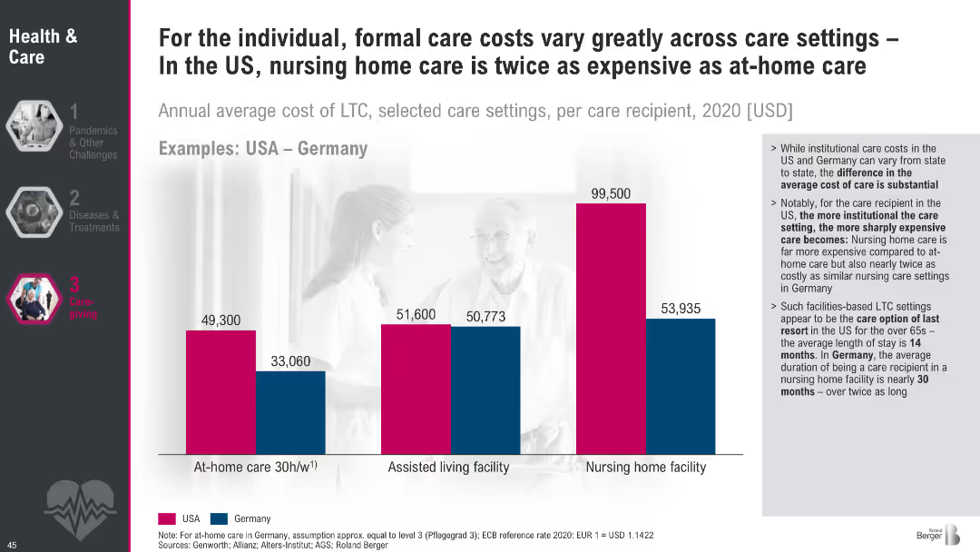
Bar chart comparing LTC costs for at-home, assisted living, and nursing homes between USA and Germany; text outlines implications of institutional vs. home care.
Pricing Strategies
Healthcare & Pharmaceuticals
The slide compares LTC costs in different settings and highlights stark cost differences between the US and Germany. It emphasizes that more institutionalized care leads to higher expenses, particularly in the US, with policy implications for affordability and planning.
LTC cost, nursing homes, assisted living, at-home care, USA vs. Germany, eldercare expenses, care settings
Mixed Chart
Roland Berger
Saved
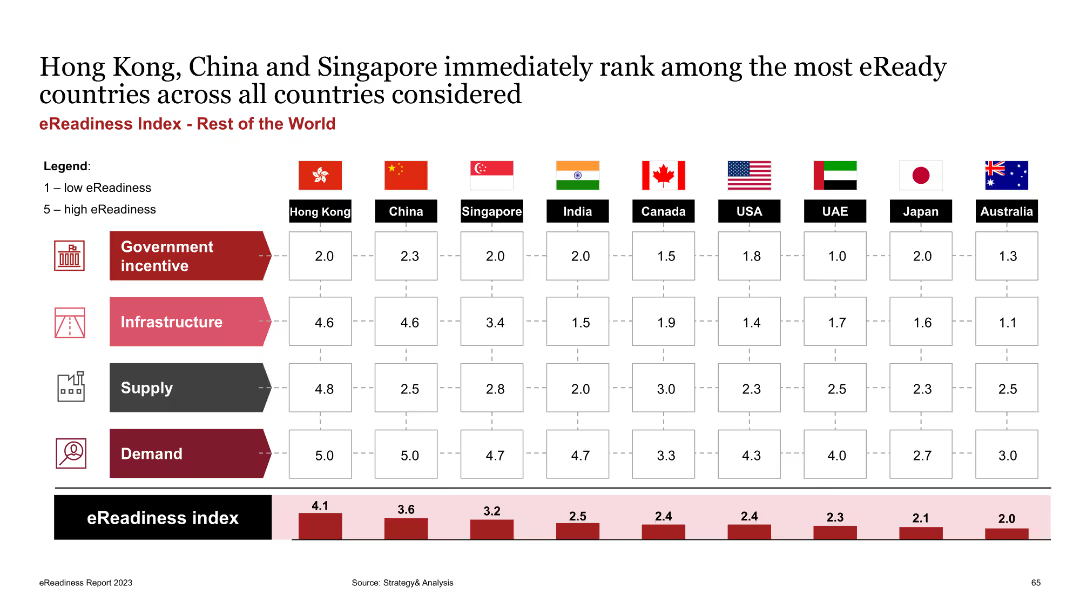
The slide features a table comparing eReadiness scores for countries outside Europe, across four dimensions: government incentives, infrastructure, supply, and demand. Each category is color-coded.
Market Analysis and Trends
Transportation & Logistics
The slide ranks eReadiness of countries globally, showing Hong Kong, China, and Singapore as leaders. It aims to provide a comprehensive view of EV market readiness beyond Europe.
eReadiness, global comparison, government incentives, infrastructure, supply, demand
Mixed Chart
PwC/Strategy&
Saved
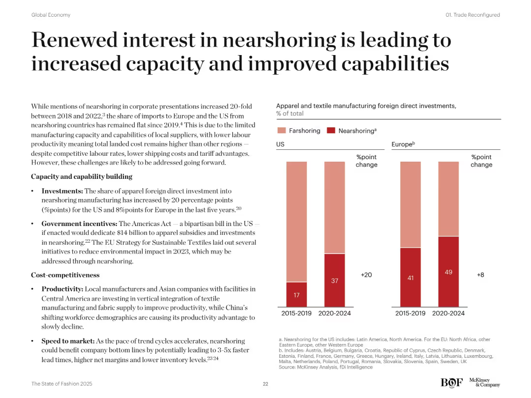
Bar charts on nearshoring vs farshoring FDI changes in the US and Europe. Bullet-point text explains investments, policies, and productivity. Modern clean layout.
Operational Efficiency
Consumer Goods
This slide highlights rising foreign direct investments in nearshoring for apparel manufacturing in the US and Europe. It attributes the growth to new policy incentives, improved productivity, and faster speed to market. The Americas Act and EU sustainability goals are noted as enablers.
nearshoring, farshoring, FDI, US, Europe, productivity, policy incentives, apparel, capacity building, local manufacturing
Mixed Chart
McKinsey
Saved
The slide has a bar chart of investment products held and a pie chart of the percentage invested in at least one financial product. Colors are used to distinguish categories.
Market Analysis and Trends
Financial Services
This slide presents data on the types of investment products held by respondents and the percentage of respondents with at least one financial product investment.
investment, products, financial, percentage, crypto
Multiple Chart
IPSOS
Saved
The slide displays pie charts illustrating the distribution of high and low-intensity shoppers and returners among different age groups (Generation Z, Millennials, Over 41s).
Market Analysis and Trends
Retail & E-commerce
Analyzes the shopping and return behavior of different age groups, highlighting the proportion of high and low-intensity shoppers and returners among them.
Shopping intensity, Returners, Age groups, Consumer analysis, Generation Z
Multiple Chart
Roland Berger
Saved
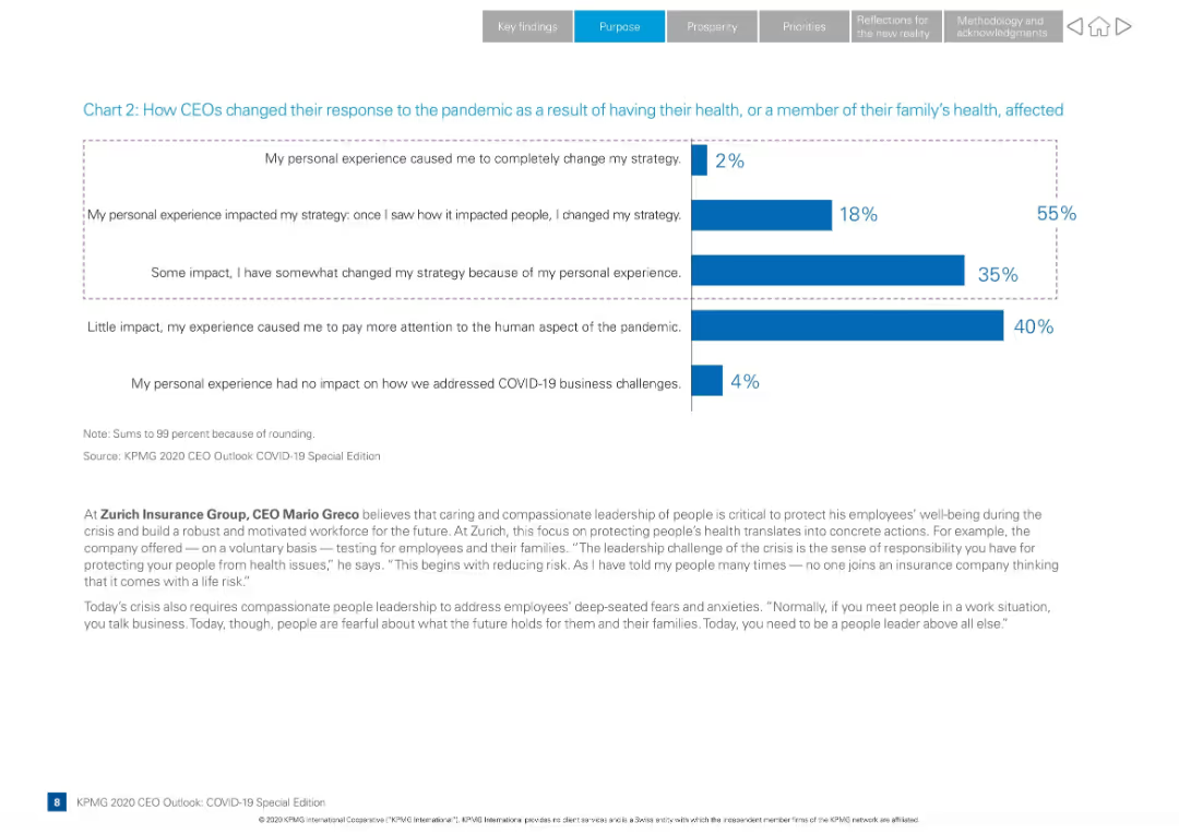
Full-width layout with bar chart showing CEO responses, supported by narrative and a quote from Zurich CEO
Strategic Planning
Professional Services
Shows how CEOs altered their strategies due to personal or family health impacts from COVID-19. Includes multiple response categories and a leadership quote from Zurich’s CEO Mario Greco on compassionate leadership.
pandemic response, CEO strategy, health impact, leadership, KPMG Outlook, bar chart, Mario Greco, employee well-being, emotional leadership
Mixed Chart
KPMG
Saved
The slide has two columns: the left side describes actions taken by CROs to enhance risk management, and the right side lists specific enhancements made.
Operational Efficiency
Financial Services
This slide details actions taken by companies to enhance risk management practices in response to market events in 2023, such as increased risk management involvement.
risk management, operational efficiency, enhancements, market events, actions
Multiple Chart
EY
Saved
Incorporates line charts comparing global SVOD revenue against traditional box office figures from 2015 to 2024, with a separate focus on India. The chart uses contrasting colors to highlight the overtaking of box office revenue by SVOD, underscoring a significant industry shift.
Competitive Landscape
Media & Entertainment
Discusses the impact of digital streaming services on traditional cinema, marking a pivotal shift as SVOD revenue surpasses box office collections globally and in India. This slide is vital for analyzing market dynamics, consumer behavior changes, and the strategic implications for content distributors and film producers.
SVOD, box office, digital transformation, cinema
Multiple Chart
PwC/Strategy&
Saved
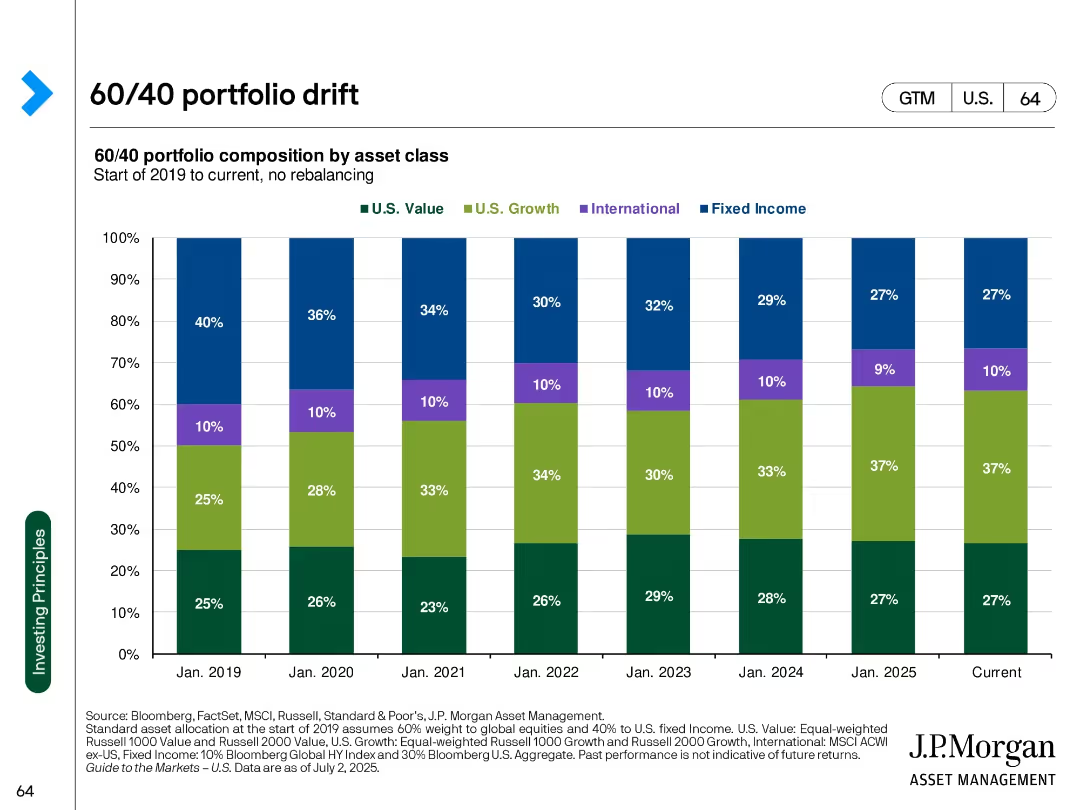
Stacked bar chart over time showing evolving composition of a 60/40 portfolio without rebalancing
Strategic Planning
Financial Services
Visualizes how a 60/40 portfolio's asset composition has shifted from 2019 to 2025 due to market movements without rebalancing. Highlights growth of U.S. Growth equity share.
asset drift, 60/40 portfolio, rebalancing, portfolio composition, U.S. growth, fixed income, equity allocation
Single Chart
JP Morgan
Saved
A line chart comparing 'Goods' (in blue) and 'Services' (in orange) spending by US consumers is presented on this slide. The chart tracks the spending index from December 2019, showing a sharp decline followed by a recovery with fluctuating levels for both categories.
Financial Performance
Technology & Software
This slide shows the impact of the pandemic on US consumer spending, demonstrating changes in the level and composition of expenditures on goods and services. It could be used to analyze consumer behavior during economic shocks and guide business strategy adjustments.
Pandemic, Consumer Spending, US, Goods, Services, Economic Impact, Spending Behavior
Single Chart
JP Morgan
Saved
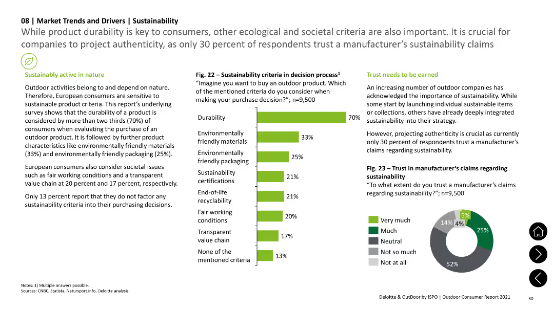
The slide has a column chart displaying sustainability criteria in decision-making, a pie chart showing trust in manufacturer's sustainability claims, and text sections summarizing survey findings on durability, eco-friendly materials, and societal issues.
Technology and Digital Transformation
Consumer Goods
The slide discusses European consumers' sensitivity to sustainable product criteria, highlighting the importance of durability, eco-friendly materials, and societal issues in purchasing decisions. Survey results are visualized in a column chart and a pie chart.
sustainability, consumer trends, durability, eco-friendly materials, survey results
Multiple Chart
Deloitte
Saved
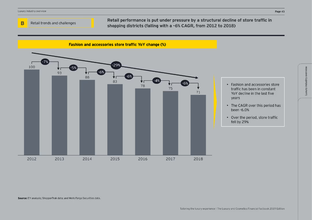
Features a column chart illustrating the year-over-year percentage change in store traffic for fashion and accessories from 2012 to 2018.
Market Analysis and Trends
Retail & E-commerce
Reviews the decline in store traffic for fashion and accessories, showing a -6% CAGR and discussing potential impacts on retail performance.
store traffic, fashion, accessories, YoY change, CAGR, decline, retail performance, column chart, market analysis
Mixed Chart
EY
Saved
Simple design focusing on a pie chart with a small legend describing regional differences in processes. The color green is used to denote different responses, facilitating an easy visual distinction between categories.
Regulatory and Compliance
Healthcare & Pharmaceuticals
Discusses the consistency of processes and technology for healthcare professional engagement across different regions. It highlights varying levels of adoption and challenges in standardizing practices globally, aiming to underline the importance of unified operational strategies.
healthcare processes, regional differences, operational consistency, survey analysis
Single Chart
Deloitte
Saved
This slide contains a scatter plot comparing S&P 500 valuations to interest rates and a column chart showing the market cap share of top S&P 500 firms.
Investment Analysis
Financial Services
The slide analyzes the high valuations of equity markets driven by a few ultra-mega-cap firms, represented as the "Magnificent 7." It discusses the impact of these firms on the S&P 500 and the overall market dynamics. This slide can be used for investment strategy discussions and market valuation analysis.
S&P 500, valuations, market cap, Magnificent 7, equities
Multiple Chart
JP Morgan
Saved
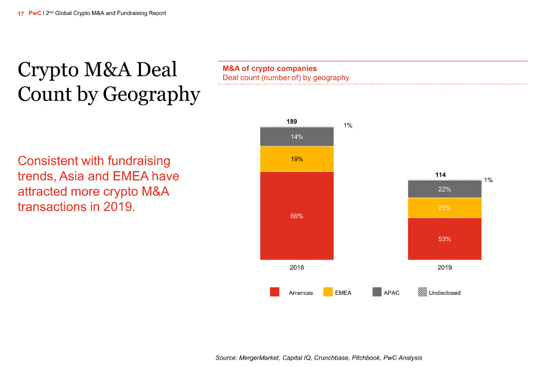
The slide features a column chart comparing the M&A deal count by geography for 2018 and 2019. The regions include the Americas, EMEA, APAC, and undisclosed.
Market Analysis and Trends
Financial Services
The slide shows the geographic distribution of M&A deals in the crypto sector, with an increase in deals in Asia and EMEA in 2019 compared to 2018, aligning with fundraising trends.
crypto, M&A, geography, column chart, comparison
Mixed Chart
PwC/Strategy&
Saved
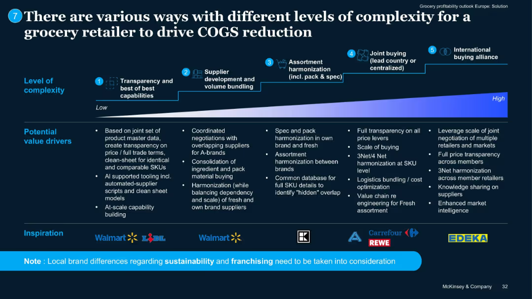
Horizontal flowchart from left to right illustrating 5 levels of complexity with icons/logos of retailers.
Operational Efficiency
Retail & E-commerce
Outlines a maturity curve for COGS reduction, from basic transparency to international alliances. Lists value drivers per stage. Shows examples from Walmart, Lidl, Carrefour, EDEKA, and others.
COGS strategy, sourcing, alliances, complexity, procurement
Pillar
McKinsey
Saved
Two column charts: one shows global equity sector weights across regions, and the other shows MSCI World Growth and Value sector weights by market cap.
Market Analysis and Trends
Financial Services
This slide details the distribution of equity sector weights globally and the breakdown of MSCI World Growth and Value sector weights.
Equity, sector weights, global, MSCI, market cap
Multiple Chart
JP Morgan
Saved
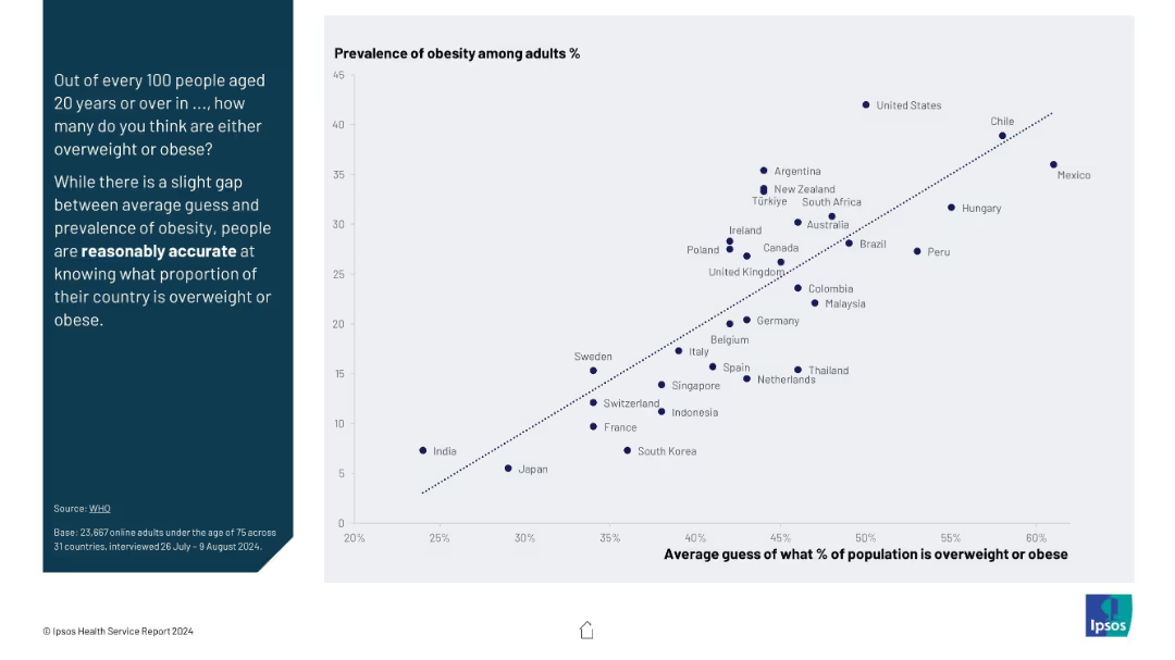
Scatter plot comparing average public guesses vs actual obesity prevalence; includes diagonal trend line for accuracy.
Market Analysis and Trends
Healthcare & Pharmaceuticals
The slide shows a correlation between the actual obesity rates and public estimates across countries. Despite minor gaps, it suggests people are reasonably accurate in estimating national obesity rates, indicating awareness of public health issues.
obesity, public perception, health awareness, statistical comparison, accuracy, health trend, overweight population
Mixed Chart
IPSOS
Saved
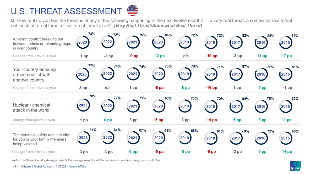
Continuation of U.S. threat data across four more categories; same visual style and layout as prior slides.
Risk Assessment and Management
Government & Public Sector
Explores U.S. threat perception regarding ethnic conflict, military conflict, nuclear/chemical attack, and personal safety. Shows general stability in concern, with slight increases in 2023. Presents longitudinal perspective on threat awareness in American society.
USA, terrorism, nuclear attack, personal security, public opinion, ethnic conflict, geopolitical tension
Single Chart
IPSOS
Saved
Previous
Next
If nothing, comes up, please save your slides first
Create a FREE account to continue browsing
Receive Instant Access to 1,000+ slides from companies like McKinsey, Google, and Goldman Sachs
First Name
Last Name
Email
Password
I agree to all
Terms & Privacy Policy
Thank you! Your submission has been received!
Oops! Something went wrong while submitting the form.
Have an account?
Sign in
Column Chart
Heatmap
Chevron
Org Chart
Infographic
Callouts
Timeline
List
Graphic
Picture
Process Flow
Diagram
Paragraph
Map
Table
Framework
Subtitle
Takeaway Box
Icon
Other Chart
Radar Chart
Waterfall Chart
Mekko Chart
Pie Chart
Scatter Plot
Line Chart
Bar chart
Bullet points