Create a FREE Account
Instant access to 1,000+ real slides from top companies like McKinsey, BCG, Goldman Sachs, Google and many more!
First Name
Last Name
Email
Password
I agree to all
Terms & Privacy Policy
Thank you! Your submission has been received!
Oops! Something went wrong while submitting the form.
Have an account?
Sign in
Library
Templates
Courses
Pricing
My Account
My Slides
My Templates
✦ AI
AI Prompt Library
AI Search
Sign in
Start Here
Logout
My Saved Slides
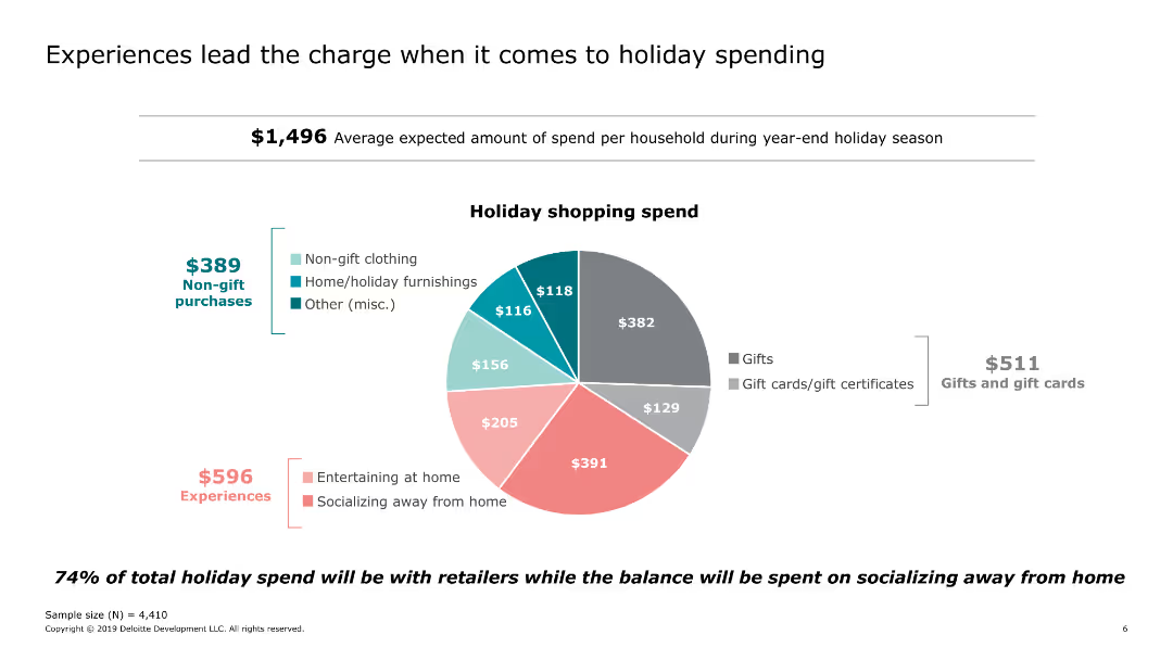
Includes a pie chart showing the distribution of holiday shopping spend across different categories.
Market Analysis and Trends
Retail & E-commerce
Examines the average holiday spending per household, highlighting the significant portion allocated to experiences such as socializing and entertaining at home.
holiday, spending, experiences, socializing, categories, gifts
Single Chart
Deloitte
Saved
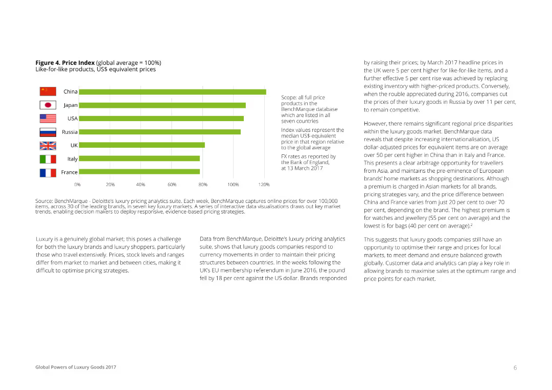
A horizontal bar chart comparing the price index of like-for-like luxury products in different countries. Bars represent the median US$ equivalent prices relative to the global average, with each country labeled and color-coded for clarity.
Pricing Strategies
Consumer Goods
This slide provides a comparative analysis of the price index for luxury goods across various countries, indicating regional price disparities and opportunities for strategic pricing adjustments based on currency movements and market conditions.
Price, Index, Global, Luxury, Goods
Mixed Chart
Deloitte
Saved
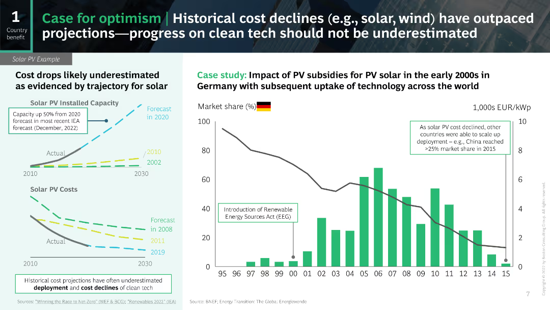
The slide includes line charts and a column chart to show historical and projected cost declines for solar PV technology.
Market Analysis and Trends
Energy & Utilities
The slide provides a case study on the cost declines in solar PV and the underestimated projections for clean tech progress.
cost declines, solar PV, projections, clean tech, case study
Multiple Chart
BCG
Saved
Features two line graphs and a bar chart illustrating the historical and predicted oil demand, key drivers for peak demand, and global EV sales share.
Risk Assessment and Management
Energy & Utilities
Details the potential peak in oil demand due to electric vehicle uptake, highlighting key factors like historical growth rates and changes in road transport, aiding in risk assessment for the oil industry.
Oil Demand Peak, EV Adoption, Historical Data, Transport Sector, Growth Rates, Risk Management
Multiple Chart
McKinsey
Saved
Includes column charts showing LGBT+ comfort levels in business environments across countries.
Human Resources and Talent Management
Professional Services
Discusses LGBT+ individuals' readiness to disclose their sexual orientation in professional settings.
LGBT+, business environment, disclosure, professional setting
Single Chart
BCG
Saved
Text, percentage circles, and a table showing employee and employer views on DEI actions and their most important actions to improve diversity, equity, and inclusion.
Human Resources and Talent Management
Professional Services
This slide addresses how hybrid work and addressing rewards can enhance diversity, equity, and inclusion (DEI) efforts, detailing survey results on actions to improve DEI from both employee and employer perspectives.
DEI, hybrid work, employee views, employer views, diversity, equity, inclusion
Multiple Chart
EY
Saved
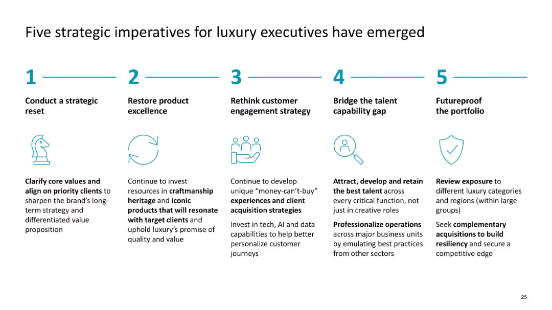
Horizontal list with icons and headers; structured in five equal columns
Strategic Planning
Consumer Goods
Recommends five strategic priorities for luxury execs, including strategic reset, product excellence, customer engagement, talent management, and portfolio resilience to drive growth and competitiveness.
luxury strategy, executives, imperatives, talent, portfolio, reset, customer engagement
Linear Flow
McKinsey
Saved
Column charts showing provisions for credit losses over several quarters with an additional line graph overlay for average loans. Includes key highlights.
Risk Assessment and Management
Financial Services
Discusses credit loss provisions, showcasing trends and risk management strategies in response to economic conditions.
Credit losses, risk management, trends
Mixed Chart
Deutsche Bank
Saved
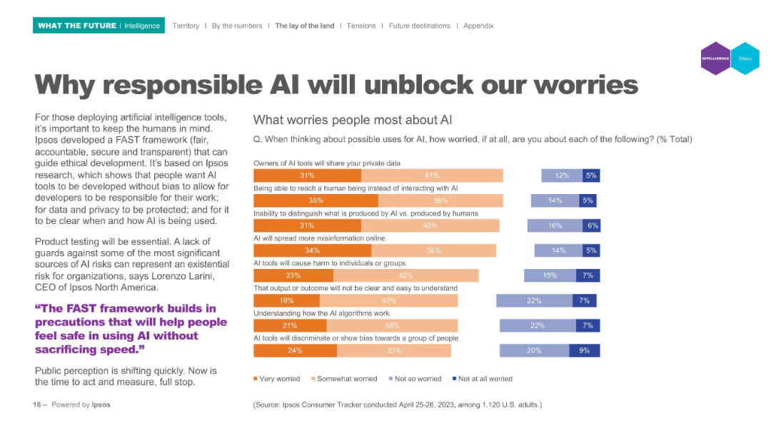
Left panel text; right panel horizontal bar chart indicating worry levels; categories use color-coded segments.
Risk Assessment and Management
Artificial Intelligence
Lists top public concerns regarding AI (e.g., privacy, bias, misinformation). Visual data shows levels of worry using segmented bar charts to represent varying degrees of concern from "Very worried" to "Not worried". Tied to Ipsos' FAST (fair, accountable, secure, transparent) framework.
AI ethics, public concerns, privacy, misinformation, bias, accountability, FAST framework
Mixed Chart
IPSOS
Saved
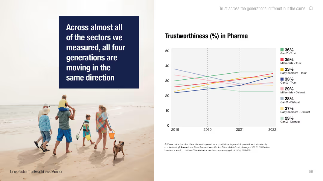
Split layout: photo of family walking on the beach with a bold quote on the left; line chart on the right.
Performance Metrics and KPIs
Healthcare & Pharmaceuticals
The slide highlights generational trends in trust toward the pharmaceutical sector, noting a general increase in trust across generations from 2019 to 2022.
pharma, trust, generational data, Ipsos, Millennials, Gen Z, Baby Boomers, Gen X, trend chart, trustworthiness
Mixed Chart
IPSOS
Saved
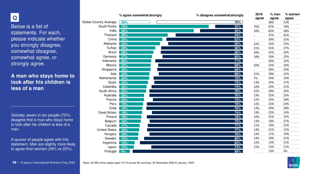
Horizontal bar chart with country-wise agreement/disagreement; includes 2019 data and gender breakdown; bold title on the left
Market Analysis and Trends
Professional Services
The slide assesses societal attitudes toward stay-at-home fathers. Most people globally disagree with the notion that caregiving reduces masculinity, though a significant minority agrees. The slide breaks down data by country and gender.
gender roles, masculinity, caregiving, parenting, perception, survey, cultural differences, Ipsos
Mixed Chart
IPSOS
Saved
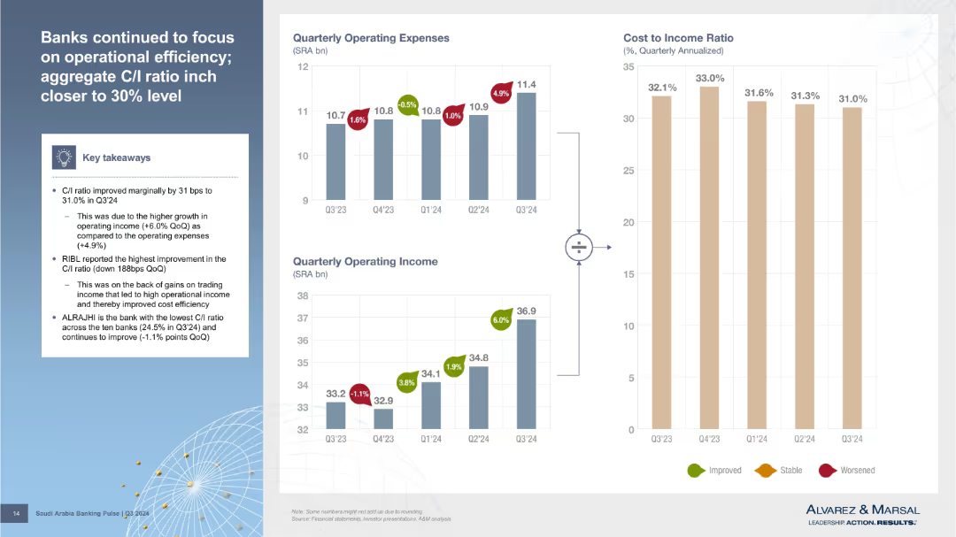
Three bar charts (Operating Expenses, Operating Income, Cost-to-Income Ratio) with callouts and a textbox of key takeaways on the left. Visual style is clean with color-coded indicators (green/red/yellow) for improvement, stability, or worsening metrics.
Performance Metrics and KPIs
Financial Services
The slide shows a marginal improvement in the cost-to-income (C/I) ratio driven by higher income growth over expenses. RIBL had the best improvement, while ALRAJHI maintained the lowest C/I ratio. The visual aids illustrate these financial efficiency trends across Q3’24.
cost-to-income ratio, operating income, operating expenses, bank efficiency, Q3 2024
Multiple Chart
Alvarez & Marsal
Saved
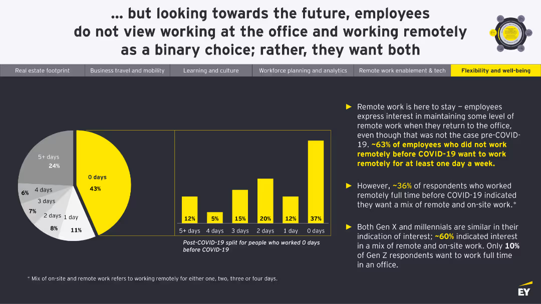
A pie chart showing desired remote work frequency post-COVID-19. A column chart compares pre and post-COVID remote work preferences for different days per week.
Human Resources and Talent Management
Real Estate & Construction
This slide illustrates employees' preferences for remote work post-COVID-19, indicating a desire for flexibility between remote and on-site work.
Remote Work, Flexibility, Preferences, Post-COVID, Strategy
Multiple Chart
EY
Saved
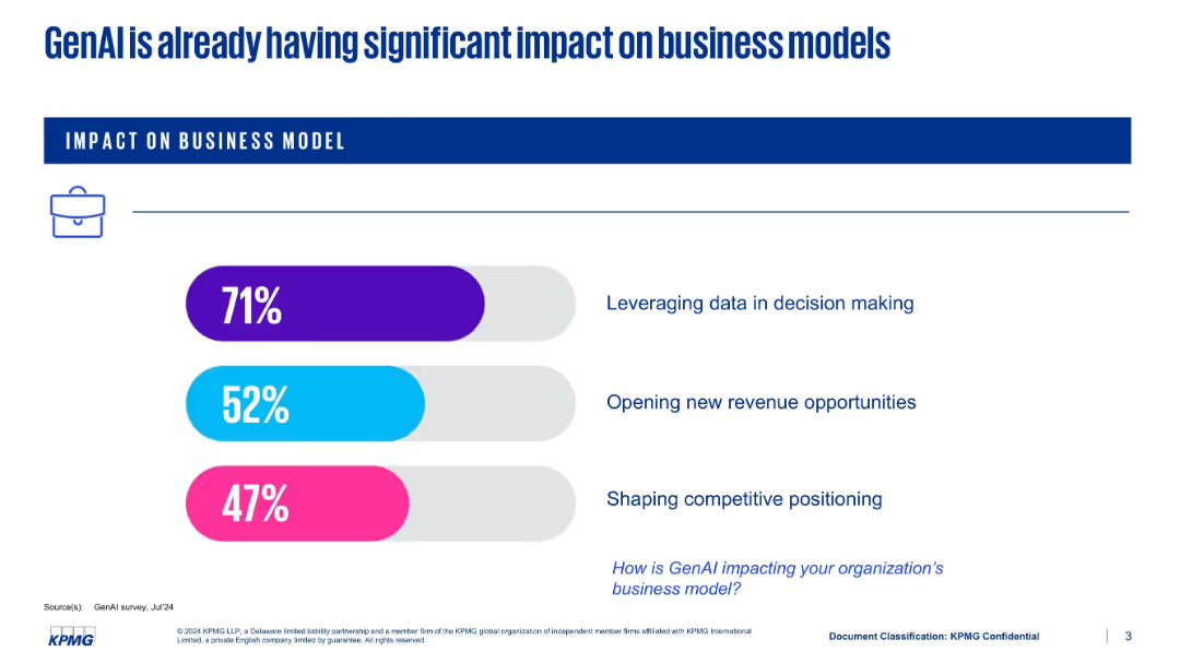
Minimalist slide with three horizontal bars in colored design elements showing percentage impacts; all content centers around business effects.
Product and Service Analysis
Artificial Intelligence
Communicates the transformational impact of GenAI on business models. Key areas include leveraging data in decision-making (71%), opening new revenue (52%), and competitive positioning (47%). It prompts the viewer to consider GenAI’s strategic implications.
GenAI, business models, data-driven decisions, new revenue, competitive positioning, transformation, AI impact
Single Chart
KPMG
Saved
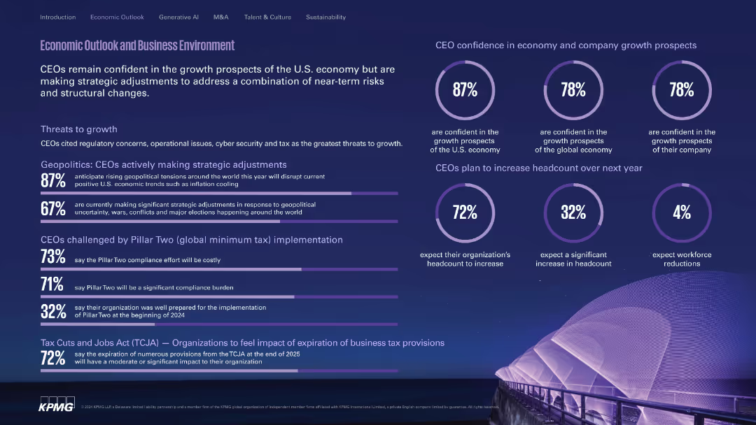
Deep purple theme with circular and horizontal stats, icons, and headlines. Modern, visually dense.
Market Analysis and Trends
Financial Services
Highlights CEO confidence levels in the U.S. and global economy, outlines key geopolitical and regulatory threats, and presents anticipated headcount changes. Includes views on tax impacts like Pillar Two and TCJA.
economy, growth, geopolitics, compliance, TCJA, headcount, Pillar Two
Multiple Chart
KPMG
Saved
This slide has a complex visual arrangement with a line chart showing data over a decade, emphasizing the gap between importance and data adequacy.
Organizational Structure and Change
Financial Services
It discusses CEOs' perspectives on data adequacy for decision-making over ten years, relevant to organizational change management and technology strategy sessions.
CEOs, Data Adequacy, Decision-Making, Organizational Change, Technology Strategy, Long-term
Mixed Chart
PwC/Strategy&
Saved
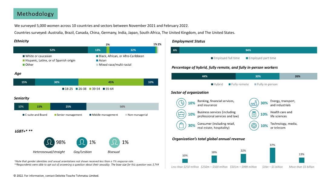
Various charts and text. Data on survey demographics, including ethnicity, age, seniority, employment status, and sector of organization.
Market Analysis and Trends
Professional Services
Provides detailed methodology of the survey, including participant demographics and organization details.
methodology, survey, demographics, ethnicity, age, seniority, employment status, sector, organization
Multiple Chart
Deloitte
Saved
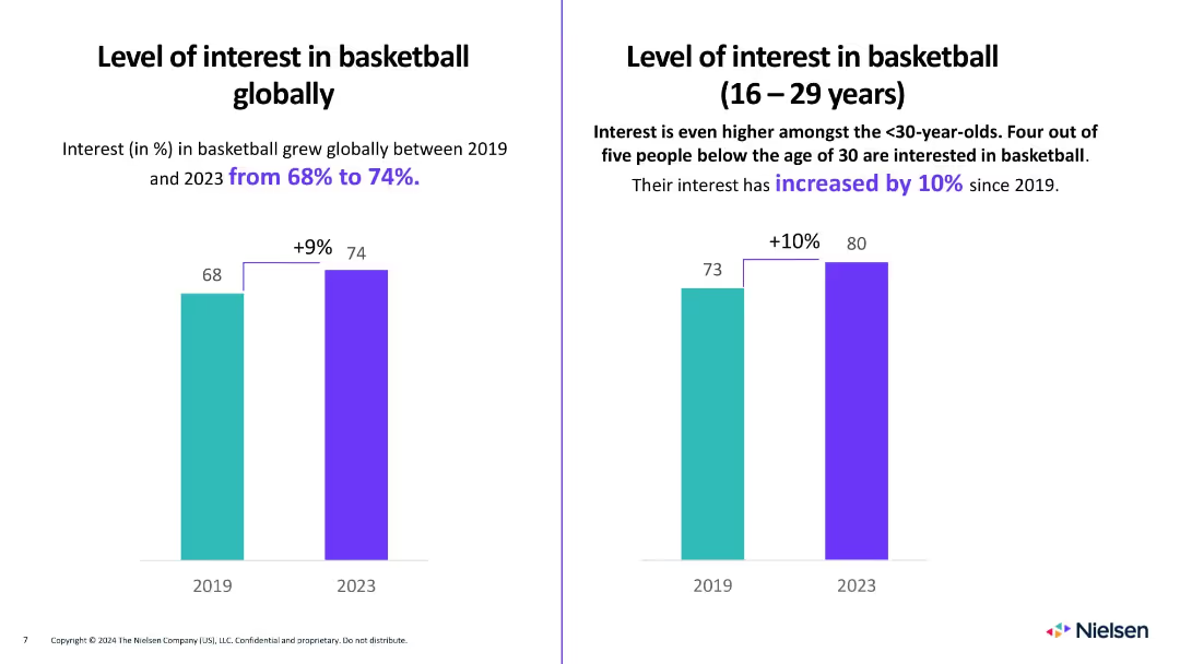
Two bar graphs comparing interest in basketball between 2019 and 2023 (overall and under 30).
Market Analysis and Trends
Media & Entertainment
Highlights an increase in global interest in basketball from 68% to 74% since 2019, with even greater growth (from 73% to 80%) among people aged 16–29. Underscores the sport’s growing global appeal, particularly among younger demographics.
basketball, global interest, youth, trends, sports engagement
Multiple Chart
Nielsen
Saved
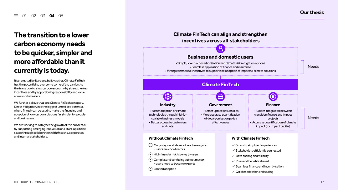
This slide features a balanced layout with text and a diagram. The text discusses the transition to a lower carbon economy and the barriers to achieving this. The diagram illustrates how Climate FinTech can align incentives across different stakeholders.
Strategic Planning
Financial Services
The slide discusses the challenges and necessity of transitioning to a lower carbon economy, emphasizing the role of Climate FinTech in simplifying and accelerating this process. It includes a diagram showing the alignment of incentives across various stakeholders to support this transition.
Lower carbon economy, Climate FinTech, transition, incentives, stakeholders
Boxed
Barclays
Saved
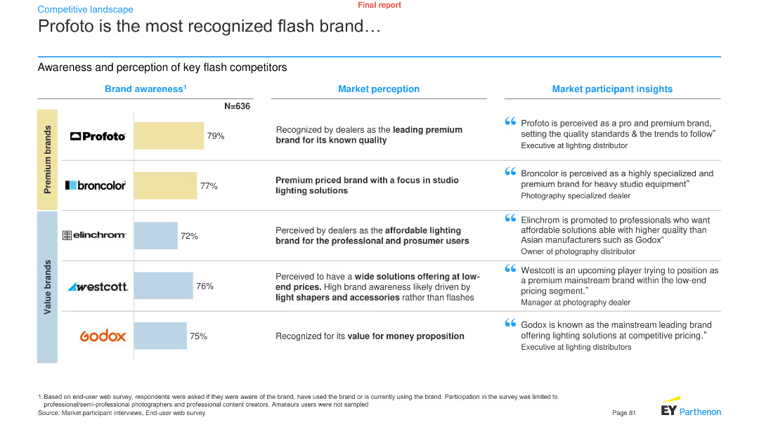
A combination of a bar chart and text boxes presents brand awareness data for key flash competitors, along with market perception and participant insights.
Pricing Strategies
Media & Entertainment
It showcases the brand awareness levels of key flash brands like Profoto, Broncolor, Elinchrom, Westcott, and Godox, with market perception and insights.
Brand awareness, flash brands, Profoto, market perception, participant insights, media, entertainment, analysis, trends
Mixed Chart
EY
Saved
The slide contains a V-shaped line chart illustrating EBITA over time, two text boxes for past results and forecasts, and a section for quarterly results. Red is used for emphasis.
Market Analysis and Trends
Industrial & Manufacturing
Offers insights into the Space sector's performance, showcasing EBITA trends, with a focus on the manufacturing recovery and satellite service performance.
space, EBITA, manufacturing recovery, satellite services, financial performance, telecommunication business
Single Chart
Goldman Sachs
Saved
Dual panel layout with a large image on the left and a series of bar charts on the right detailing dissatisfaction metrics by generation.
Market Analysis and Trends
Healthcare & Pharmaceuticals
Highlights younger consumers' dissatisfaction with traditional healthcare aspects, including treatment effectiveness and appointment convenience. Used for market analysis.
consumers, dissatisfaction, healthcare, trends, generations
Multiple Chart
Accenture
Saved
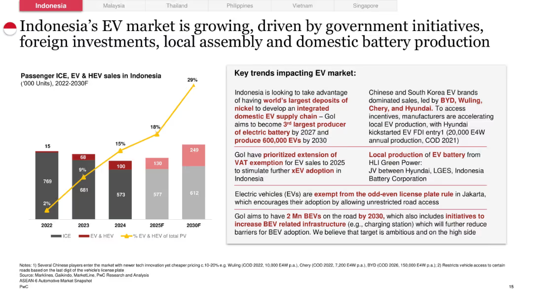
Left side has a stacked bar chart (ICE vs EV & HEV) and line chart (% EV of total PV); right side features detailed text on market drivers including incentives, infrastructure, and OEM strategies.
Technology and Digital Transformation
Industrial & Manufacturing
Explores Indonesia’s EV market growth through 2030. Highlights the rise in EV share of total passenger vehicles, supported by government incentives, battery production, VAT exemptions, and favorable road regulations. Forecasts 2 million BEVs by 2030 and positions Indonesia as a future battery and EV production hub.
Indonesia, EV market, BEVs, battery production, incentives, infrastructure, government policy
Mixed Chart
PwC/Strategy&
Saved
A set of bar charts representing the preferences for virtual socialization by age groups, using shades of purple.
Market Analysis and Trends
Retail & E-commerce
Highlights the trend of virtual socialization across various age groups, reflecting technology's role in maintaining social connections during periods of reduced physical interaction.
Virtual socializing, Age groups, Technology role, Social connections, Interaction trends, Bar charts, Media, Telecommunications
Multiple Chart
Accenture
Saved
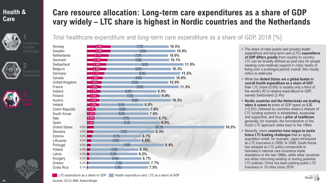
Horizontal bar chart comparing total healthcare and LTC spending (% of GDP) across countries; text highlights key takeaways on system structures and funding.
Financial Performance
Healthcare & Pharmaceuticals
This slide compares national LTC spending as a share of GDP, showing major differences in resource allocation. Nordic countries lead in LTC expenditure, reflecting strong public systems. Insights include challenges faced by countries like the US with lower LTC shares but higher total health costs.
LTC spending, GDP share, healthcare financing, eldercare, international comparison, Nordic model, public health funding
Mixed Chart
Roland Berger
Saved
Previous
Next
If nothing, comes up, please save your slides first
Create a FREE account to continue browsing
Receive Instant Access to 1,000+ slides from companies like McKinsey, Google, and Goldman Sachs
First Name
Last Name
Email
Password
I agree to all
Terms & Privacy Policy
Thank you! Your submission has been received!
Oops! Something went wrong while submitting the form.
Have an account?
Sign in
Column Chart
Heatmap
Chevron
Org Chart
Infographic
Callouts
Timeline
List
Graphic
Picture
Process Flow
Diagram
Paragraph
Map
Table
Framework
Subtitle
Takeaway Box
Icon
Other Chart
Radar Chart
Waterfall Chart
Mekko Chart
Pie Chart
Scatter Plot
Line Chart
Bar chart
Bullet points