Create a FREE Account
Instant access to 1,000+ real slides from top companies like McKinsey, BCG, Goldman Sachs, Google and many more!
First Name
Last Name
Email
Password
I agree to all
Terms & Privacy Policy
Thank you! Your submission has been received!
Oops! Something went wrong while submitting the form.
Have an account?
Sign in
Library
Templates
Courses
Pricing
My Account
My Slides
My Templates
✦ AI
AI Prompt Library
AI Search
Sign in
Start Here
Logout
My Saved Slides
A comprehensive chart illustrating online retail penetration in SEA with comparisons to India and China.
Market Analysis and Trends
Retail & E-commerce
Projects the growth of online retail penetration in SEA, analyzing the contribution of ecommerce to total retail and highlighting the expected rise in groceries.
online retail, growth, SEA, ecommerce contribution, retail penetration
Multiple Chart
Bain
Saved
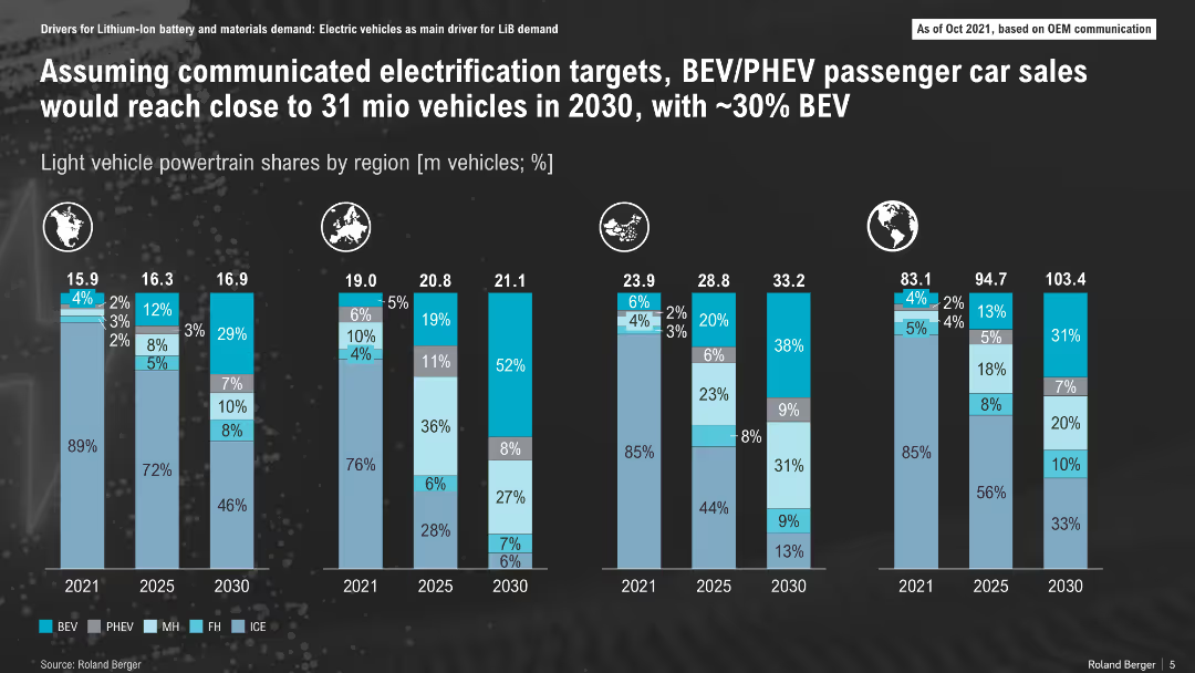
Multiple regional stacked bar charts showing EV powertrain mix forecast through 2030
Market Analysis and Trends
Transportation & Logistics
The slide forecasts EV adoption by region through 2030, indicating rising BEV and PHEV market shares, with BEV expected to hit ~30%. Europe leads in adoption while internal combustion engine (ICE) dominance continues in some regions through 2025.
BEV, PHEV, ICE, electrification, EV market, regional forecast, vehicle sales
Single Chart
Roland Berger
Saved
The slide presents a table chart detailing organizational responsibility in healthcare professional (HCP) engagement activities across various departments. Highlighted cells indicate the department with the majority of responses.
Market Analysis and Trends
Healthcare & Pharmaceuticals
This slide analyzes the distribution of responsibilities in HCP engagement activities across different departments within organizations, useful for assessing departmental workloads and process efficiency.
healthcare, professional engagement, organizational responsibility, survey, departmental distribution
Table
Deloitte
Saved
Bar charts showing revenue growth rates for luxury brands during various economic conditions from 1994 to 2017.
Financial Performance
Consumer Goods
Examines revenue growth polarization among luxury brands across different periods, highlighting how external economic conditions like crises impact financial performance.
Revenue, Luxury Brands, Economy
Multiple Chart
Bain
Saved
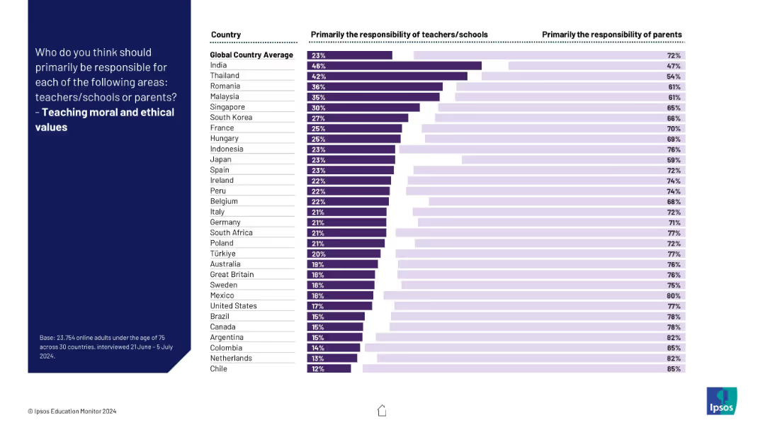
Visual ranking of countries on responsibility for instilling ethics; clear majority favor parents over schools.
Regulatory and Compliance
Education & Training
The slide illustrates global consensus that moral and ethical education should primarily fall to parents, though some variation exists.
ethics, values, morality, parenting, education, schools, culture, children, responsibility, global perspective
Mixed Chart
IPSOS
Saved
World map with red dots indicating company locations, larger red circles marking specific cities (Helsinki, Oslo, etc.) with numbers, large bold title text at the top.
Industry Overview
Professional Services
This slide highlights Bain & Company's position as a leading consulting firm in the Nordics, showcasing their staff and collaboration with QVARTZ. Ideal for corporate presentations and company overviews.
consulting, Nordics, Bain & Company, QVARTZ, global, local knowledge, powerhouse
Graphic
Bain
Saved
A bar chart listing various supply chain transformation measures, with highlighted percentages and an explanatory text box.
Strategic Planning
Financial Services
The slide explores how supply chain reconfiguration and friendshoring can drive investment in Europe, presenting survey data on companies' supply chain strategies.
supply chain, investment, Europe, friendshoring
Mixed Chart
EY
Saved
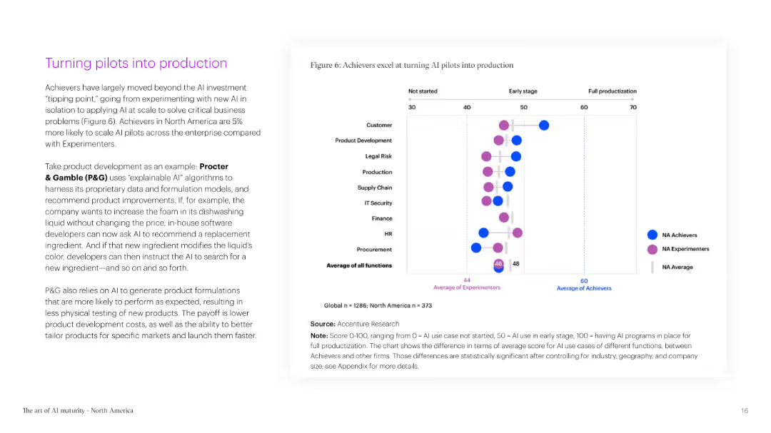
A two-column slide with text on the left and a bubble chart on the right. The bubble chart shows the stages of AI pilot programs and their production levels across different functions.
Technology and Digital Transformation
Technology & Software
This slide explains the transition of AI pilots into production, using Procter & Gamble as an example. It highlights the increased likelihood of AI Achievers to scale AI pilots compared to Experimenters.
AI, pilots, production, Procter & Gamble, scaling, functions, stages, transition, Achievers, Experimenters
Mixed Chart
Accenture
Saved
Shows line charts illustrating economic impact under low and high growth scenarios. Includes text bullet points explaining the benefits and investment impact on the economy.
Market Analysis and Trends
Energy & Utilities
Discusses how new oil and gas investments will stimulate economic activity, with detailed projections of the economic uplift and GDP impact under different growth scenarios.
Economic Uplift, GDP Impact, Oil and Gas Investment, Western Australia, Low Growth, High Growth, Economic Activity, Construction Phase
Mixed Chart
EY
Saved
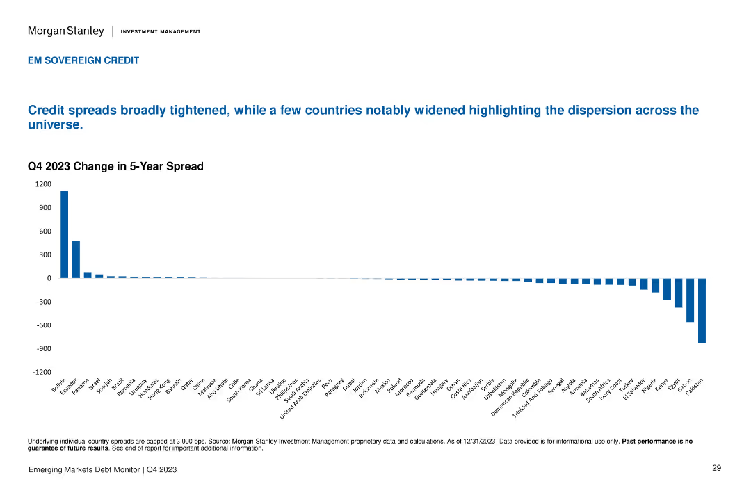
A column chart displays the Q4 2023 Change in 5-Year Spread for various countries, showing positive and negative changes across the board.
Market Analysis and Trends
Financial Services
The slide highlights the broad tightening of credit spreads, with notable widenings in a few countries. Useful for tracking credit spread changes across emerging markets.
credit spreads, change, Q4 2023, sovereign, EM
Single Chart
Morgan Stanley
Saved
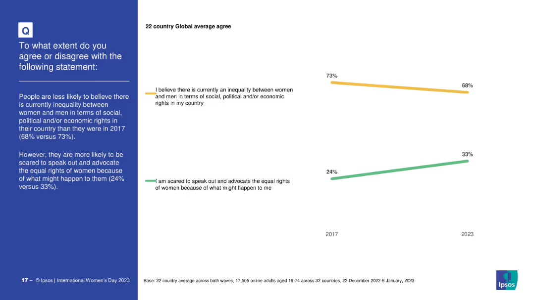
Minimalist design with two trend lines (2017 vs 2023); highlights changes over time for two statements; time comparison is the visual focus
Strategic Planning
Professional Services
This slide compares public opinion in 2017 and 2023 on gender inequality and fear of advocating for women’s rights. It shows that belief in inequality has declined slightly, while fear of advocacy has increased.
time trends, gender equality, opinion shift, advocacy, social change, Ipsos, 2017 vs 2023
Mixed Chart
IPSOS
Saved
A segmented bar chart showing expected changes in social media spending by market (APAC, LATAM, North America, EMEA). Each market is divided into segments indicating the percentage of expected increase or decrease in spending.
Market Analysis and Trends
Media & Entertainment
This slide analyzes the expected changes in social media budgets across different regions. It shows the percentage of marketers planning to increase, decrease, or maintain their social media spending over the next year.
Social Media, Spending, Market, Budget, Change
Mixed Chart
Nielsen
Saved
This slide features a complex line graph tracing global CO2 emissions against time, with annotations indicating various future scenario projections. It uses shades of blue and red to distinguish the trajectories, with additional text boxes for context.
Industry Overview
Environmental Services & Sustainability
The slide provides an outlook on global CO2 emissions, juxtaposing historical data with projections based on different scenarios. It discusses the implications of current commitments on global warming and the disparities in achieving a 1.5°C pathway.
CO2 Emissions, Global Trends, Net-Zero, Climate Change, Scenarios, Historical Data, 2050 Outlook, 1.5°C Pathway
Mixed Chart
McKinsey
Saved
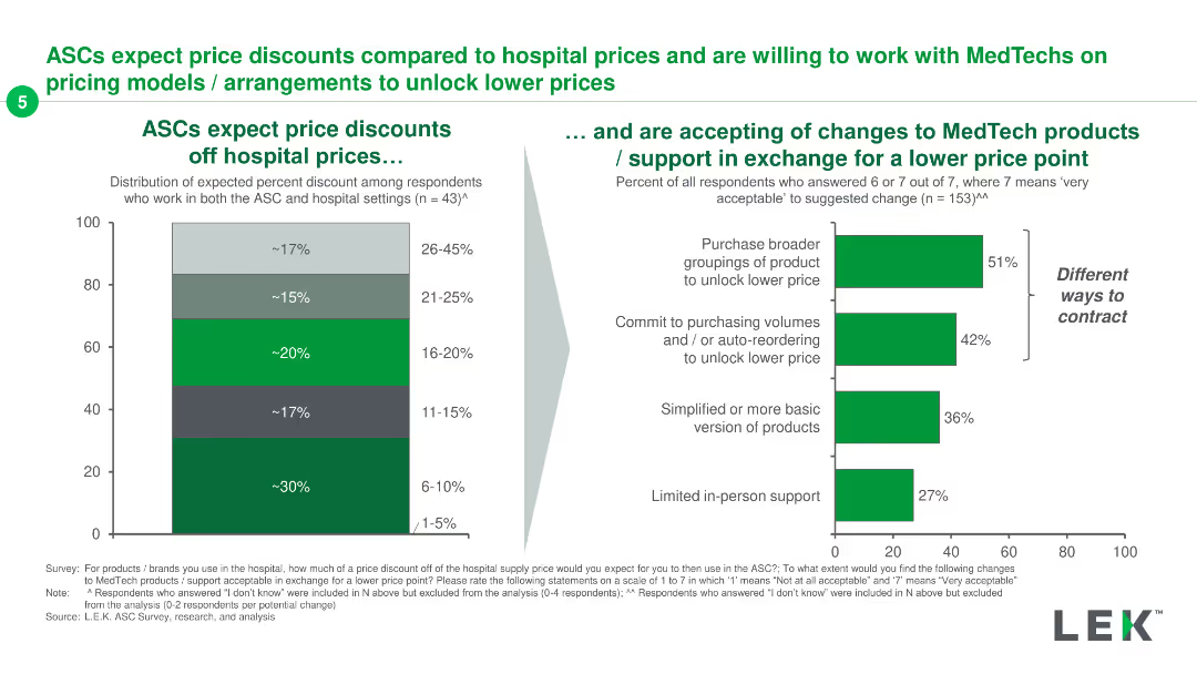
Two-part slide with a column chart showing expected price discounts off hospital prices and a horizontal bar chart detailing acceptability of changes for a lower price point.
Pricing Strategies
Healthcare & Pharmaceuticals
The slide shows expected price discounts ASCs want off hospital prices and the acceptance of changes in MedTech products/support for lower prices, emphasizing different contracting methods.
ASCs, MedTech, pricing models, discounts, price point
Multiple Chart
LEK
Saved
Timeline diagram projecting the evolution of space activities up to geostationary orbit by 2050, with different activities categorized by their orbital distances.
Technology and Digital Transformation
Technology & Software
The slide outlines the projected growth in human space activities, categorizing them by orbital distances from Earth. It highlights the various commercial and scientific endeavors in space, emphasizing the potential for continuous growth and innovation in space exploration and utilization.
Space Activities, Orbital Distances, Growth
Mixed Chart
Roland Berger
Saved
This slide uses a timeline layout with three phases represented as boxes progressing from left to right. The first phase, "Stabilizing, restructuring and planning (2023)," is in a light beige box. The second phase, "Restructuring, integrating and optimizing (2024 - 2026)," is in a medium beige box. The third phase, "Capturing sustainable growth and long-term value creation," is in a dark grey box. Below each box, there is a short description and a small arrow icon between the phases.
Strategic Planning
Financial Services
The slide outlines a phased plan to achieve long-term growth and value creation. Each phase has specific goals: achieving profitability in 2023, restructuring and optimizing from 2024 to 2026, and sustaining growth and delivering returns beyond 2026. The slide can be used to present a strategic plan to stakeholders.
growth, planning, restructuring, profitability, strategy
Linear Flow
UBS
Saved
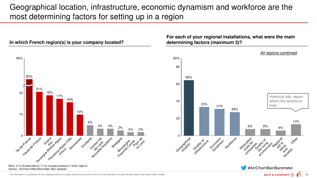
Two column charts showing factors for choosing a location in French regions, highlighting the importance of geographical location and infrastructure.
Strategic Planning
Industrial & Manufacturing
Highlights the key factors influencing company location decisions in French regions, emphasizing geographical and infrastructural considerations based on respondent data.
location, infrastructure, economic, workforce, factors
Multiple Chart
Bain
Saved
The slide features a column chart showing the number of countries supporting hydrogen initiatives in various sectors like transportation, refueling stations, buses, and trucks.
Regulatory and Compliance
Energy & Utilities
Highlights global initiatives supporting hydrogen deployment across different sectors, emphasizing the number of countries involved in each initiative.
Hydrogen, support initiatives, countries, deployment, transportation, refueling, buses, trucks
Single Chart
Kearney
Saved
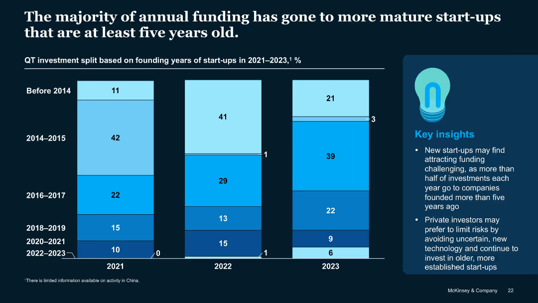
Stacked vertical bar chart showing funding split by start-up founding year across 2021–2023
Investment Analysis
Artificial Intelligence
Most QT investments go to start-ups older than five years, with declining shares for younger firms. The trend suggests investor caution toward early-stage or recently founded start-ups, particularly those formed post-2020.
Start-up Age, Founding Year, Funding Trends, QT Investment, Investor Bias
Mixed Chart
McKinsey
Saved
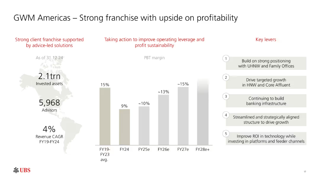
Three-column layout: infographic on left, PBT margin bar chart in center, and key levers on right. Red headings and grayscale bars.
Sales and Business Development
Financial Services
Focuses on UBS’s GWM Americas business, showing consistent PBT margin growth potential from FY24 to FY28e. Lists key strategic levers like HNW growth, infrastructure, and ROI-driven tech investments.
UBS, GWM Americas, profitability, PBT margin, high-net-worth, growth strategy, advisory, assets, FY28
Mixed Chart
UBS
Saved
This slide features multiple bar graphs comparing the Manufacturing PMI across several countries (US, Germany, Italy, Sweden, China, South Korea, Japan) before, during, and after the crisis. Each country's graph shows monthly PMI values from January to July, with bars color-coded to indicate different levels of manufacturing activity (negative growth, neutral, positive growth). The graphs are aligned horizontally for easy comparison, with annotations indicating significant events like lockdowns, providing a clear timeline of economic activity.
Operational Efficiency
Industrial & Manufacturing
The slide compares global manufacturing performance using PMI as an indicator, making it valuable for assessing the impact of COVID-19 on the manufacturing sector. It helps stakeholders understand which regions are experiencing recovery and which are still struggling, facilitating targeted strategic decisions in supply chain management and production planning. The visual representation of PMI trends provides a quick overview of economic resilience and recovery patterns, essential for operational planning and investment decisions in the manufacturing sector.
PMI, manufacturing, COVID-19, economic recovery, global comparison, operational planning, supply chain management
Multiple Chart
BCG
Saved
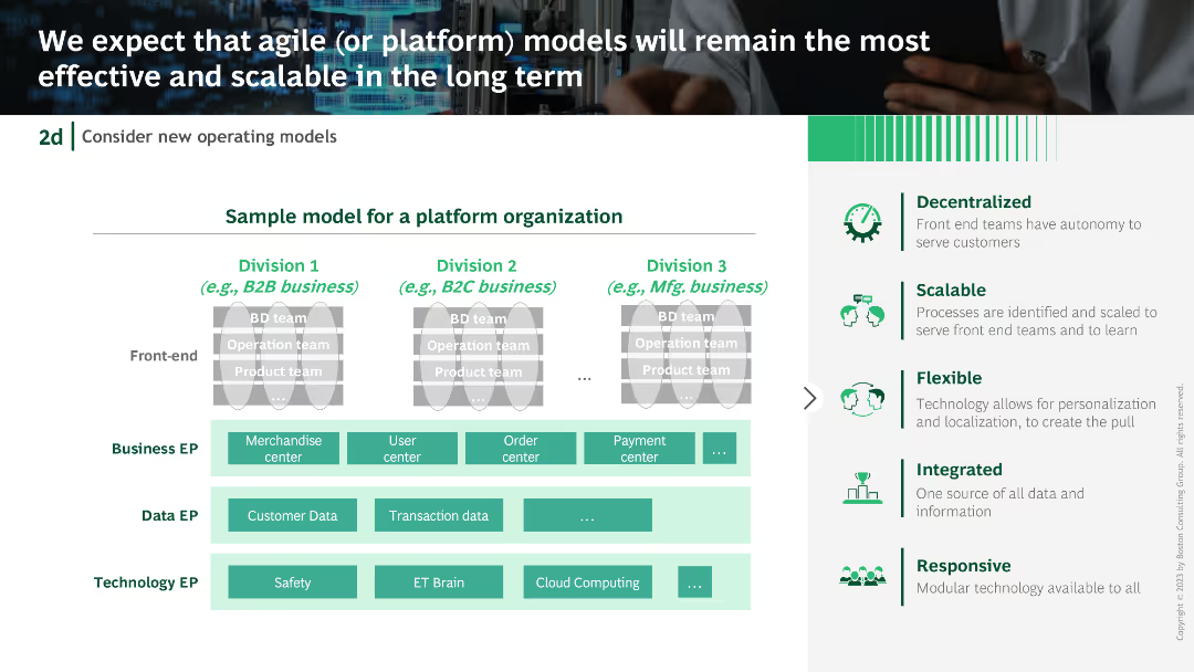
Platform organization model diagram with divisions and EP (Enterprise Processes) for business, data, and technology. Accompanied by descriptive text boxes and icons.
Operational Efficiency
Technology & Software
Advocates for agile or platform models for scalability and efficiency, presenting a sample model for a platform organization and its benefits.
agile models, platform organization, scalability, efficiency, enterprise processes
Table
BCG
Saved
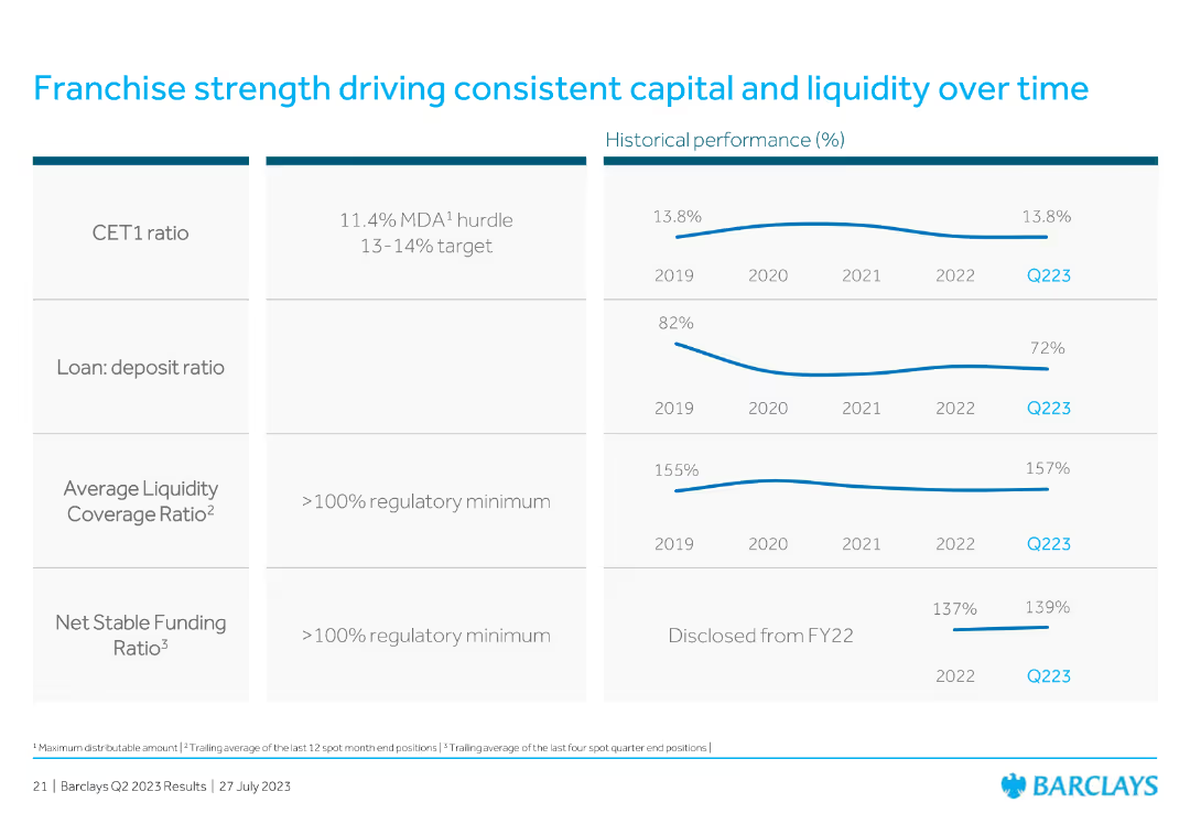
Features tables and line charts showing historical performance metrics such as CET1 ratio and liquidity coverage.
Financial Performance
Financial Services
Discusses the franchise strength in maintaining consistent capital and liquidity over time, with specific metrics.
capital, liquidity, performance, metrics, franchise
Multiple Chart
Barclays
Saved
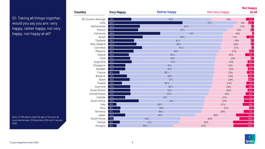
Bar chart with countries listed vertically and segmented horizontal bars for four happiness levels; left-aligned question text on dark blue background.
Market Analysis and Trends
Professional Services
This slide presents the percentage of people in 30 countries reporting different levels of happiness. It shows variation by country in responses to whether individuals feel "very happy," "rather happy," "not very happy," or "not happy at all." The chart reveals that India has the highest "very happy" rate, while Hungary ranks lowest.
happiness index, country comparison, survey, emotions, well-being, global trends, Ipsos, sentiment, 2025, ranking
Mixed Chart
IPSOS
Saved
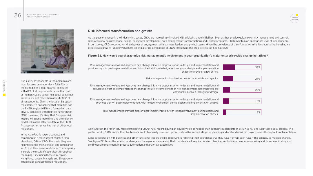
Image of two people working together. Column chart showing risk management involvement in major enterprise-wide change initiatives.
Strategic Planning
Financial Services
This slide examines the role of risk management in enterprise-wide change initiatives, detailing the different levels of involvement from advisory roles to active participation. It emphasizes the need for risk management to provide sign-off and oversight throughout the implementation phases of change initiatives.
risk management, transformation, change initiatives, enterprise-wide, oversight
Mixed Chart
EY
Saved
Previous
Next
If nothing, comes up, please save your slides first
Create a FREE account to continue browsing
Receive Instant Access to 1,000+ slides from companies like McKinsey, Google, and Goldman Sachs
First Name
Last Name
Email
Password
I agree to all
Terms & Privacy Policy
Thank you! Your submission has been received!
Oops! Something went wrong while submitting the form.
Have an account?
Sign in
Column Chart
Heatmap
Chevron
Org Chart
Infographic
Callouts
Timeline
List
Graphic
Picture
Process Flow
Diagram
Paragraph
Map
Table
Framework
Subtitle
Takeaway Box
Icon
Other Chart
Radar Chart
Waterfall Chart
Mekko Chart
Pie Chart
Scatter Plot
Line Chart
Bar chart
Bullet points