Create a FREE Account
Instant access to 1,000+ real slides from top companies like McKinsey, BCG, Goldman Sachs, Google and many more!
First Name
Last Name
Email
Password
I agree to all
Terms & Privacy Policy
Thank you! Your submission has been received!
Oops! Something went wrong while submitting the form.
Have an account?
Sign in
Library
Templates
Courses
Pricing
My Account
My Slides
My Templates
✦ AI
AI Prompt Library
AI Search
Sign in
Start Here
Logout
My Saved Slides
Includes a scatter plot chart correlating the number of high-growth companies with GVA by local authorities, supplemented with descriptive text and a key.
Regulatory and Compliance
Government & Public Sector
Explores the relationship between the density of high-growth companies and local economic performance measured by GVA, offering insights into regional economic policies.
local economies, high-growth companies, GVA, economic impact, local authorities, regional development, policy implications, economic analysis, public sector
Mixed Chart
Barclays
Saved
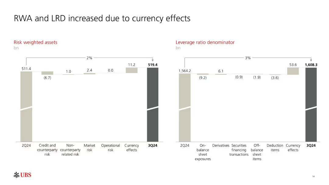
Two side-by-side waterfall charts illustrating changes in RWA and LRD from 2Q24 to 3Q24.
Risk Assessment and Management
Financial Services
Shows how UBS's Risk Weighted Assets (RWA) and Leverage Ratio Denominator (LRD) rose mainly due to currency effects. Breakdowns include operational and market risks, as well as changes in off-balance sheet and deduction items.
RWA, LRD, currency effects, risk metrics, UBS, leverage ratio
Multiple Chart
UBS
Saved
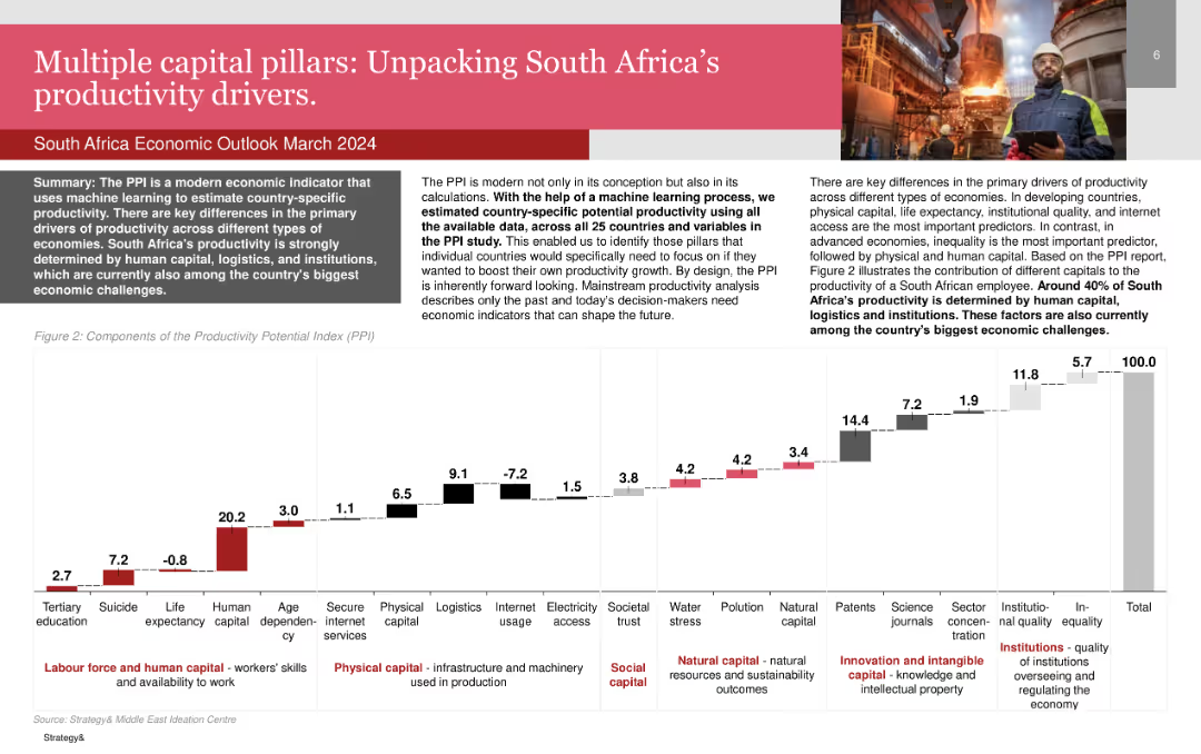
Bar chart showing the components of the Productivity Potential Index (PPI) for South Africa.
Market Analysis and Trends
Professional Services
Details the primary drivers of productivity in South Africa, emphasizing human capital, logistics, and institutions.
Productivity, South Africa, Human Capital, Logistics, Institutions
Mixed Chart
PwC/Strategy&
Saved
Features images of VR, cars, and lifestyle, representing different aspects of a luxury brand's in-store experience tailored to customer interests.
Customer and Market Segmentation
Retail & E-commerce
Describes how luxury retail stores are transforming into epicenters of brand story-living, enhancing customer experience through personalized brand interactions.
Branding, Retail, Customer Experience
Framework
Bain
Saved
The slide features an elegant design with a bar chart and professional imagery of a business setting. It compares satisfaction levels within an organization concerning various risk management activities, highlighting differences between more capable and less capable groups.
Strategic Planning
Professional Services
This slide explores the effectiveness of risk management practices across different organizational levels. It contrasts the satisfaction rates between groups with varying capabilities, underscoring the strategic benefits of comprehensive risk management training and integration within business processes. This comparison serves to motivate improvements in company-wide risk awareness and proactive management strategies.
risk management, empowerment, organizational levels, satisfaction rates, training, strategic benefits
Mixed Chart
Accenture
Saved
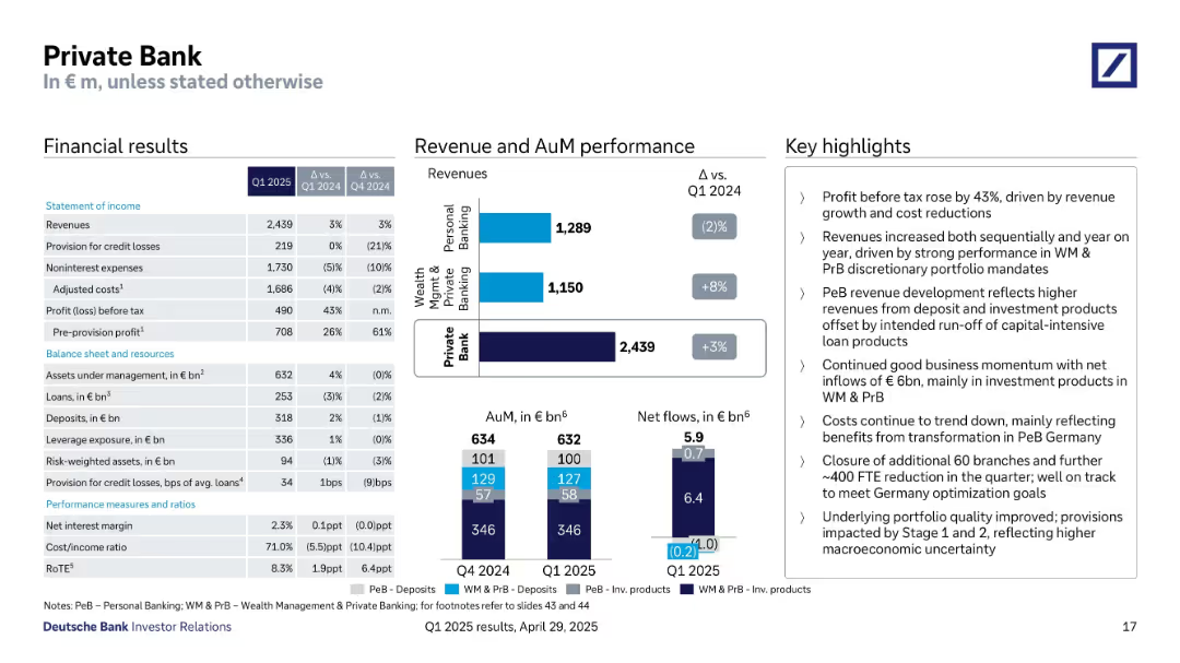
Three-column format: detailed financials, revenue & AuM breakdown with bar charts, and textual highlights.
Financial Performance
Financial Services
Q1 2025 Private Bank results include a 3% revenue increase, significant cost reductions, and a 43% rise in pre-tax profit. Revenue gains from Wealth Management offset Personal Banking declines. Net inflows of €6B indicate positive momentum.
private bank, wealth management, net inflows, revenue performance, loans, deposits, discretionary portfolio
Multiple Chart
Deutsche Bank
Saved
Features a flow diagram and text blocks assessing multiple scenarios based on vaccine characteristics and global response strategies.
Strategic Planning
Healthcare & Pharmaceuticals
Offers strategic insights into potential futures depending on vaccine and therapeutic developments, including impact on public health and policy decisions.
scenarios, vaccine, planning, COVID-19
Table
BCG
Saved
The slide combines a table and two line charts to show revenue and contribution margin trends over several quarters.
Market Analysis and Trends
Technology & Software
It details the performance of the research segment, including revenue, growth rates, contribution margins, and subscription revenue trends.
Research, Revenue, Contribution Margin, Subscription, Non-subscription, Growth
Multiple Chart
Gartner
Saved
Features a detailed circular diagram looking like a pie chart and text describing various trends within the FoodTech industry.
Investment Analysis
Agriculture & Food Production
Maps the FoodTech ecosystem according to key trends, showing how different players are aligned with these trends.
FoodTech, ecosystem, trends, mapping, alignment
Diagram
Accenture
Saved
A split slide with textual information on the left about job impact and an image of a worker on the right.
Human Resources and Talent Management
Transportation & Logistics
Analyzes the job creation impact of the F-Series across various sectors, with a focus on multiplier effects.
Ford, F-Series, job impact
Single Chart
BCG
Saved
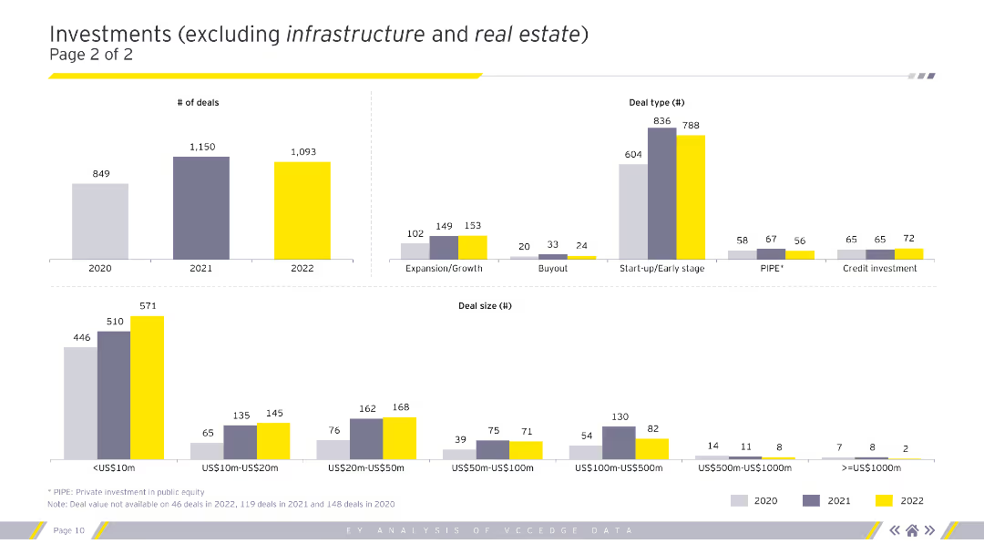
Column charts showing the number of deals, deal types, and deal sizes in various segments excluding infrastructure and real estate for 2020-2022.
Market Analysis and Trends
Financial Services
Continued analysis of investment types, sizes, and segments, excluding infrastructure and real estate.
deals, deal types, deal sizes, trends, analysis
Multiple Chart
EY
Saved
The slide features a world map highlighting the locations of CCUS facilities, using color-coded dots to indicate their status (operational, in development, etc.).
Industry Overview
Energy & Utilities
Describes the global distribution of CCUS projects, highlighting the USA as the leader. Details the operational status and geographic spread of these facilities.
CCUS, facilities, global distribution, USA, development, operational, North America, Middle East, Europe
Graphic
Kearney
Saved
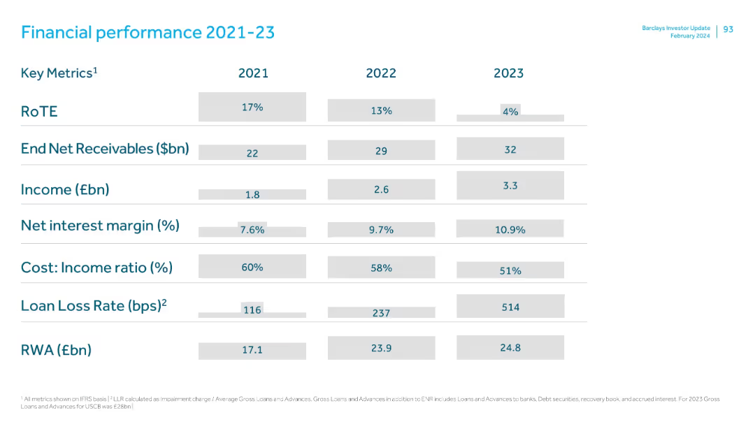
Tabular format showing annual metrics for three years, clearly segmented rows and columns, clean layout with shaded cells.
Financial Performance
Financial Services
Summarizes Barclays' key financial metrics from 2021 to 2023, showing trends in RoTE, receivables, income, net interest margin, cost-income ratio, loan loss rates, and risk-weighted assets. Notable decline in RoTE and rising loan loss rate in 2023.
financials, RoTE, income, net interest margin, receivables, cost-income ratio, RWA, loan loss
Single Chart
Barclays
Saved
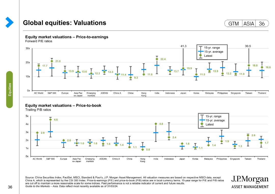
This slide contains two column charts. The first chart shows equity market valuations in terms of price-to-earnings ratios for various regions. The second chart shows price-to-book ratios. Color coding and markers represent different data points such as 15-year range, 15-year average, and the latest values.
Financial Performance
Financial Services
The slide analyzes global equity valuations through price-to-earnings and price-to-book ratios, comparing different regions to identify market trends and investment opportunities. It is used for financial performance evaluation and investment decision-making.
Global equities, valuations, price-to-earnings, price-to-book, financial markets, investment, Asia, Europe, AC World, S&P 500
Multiple Chart
JP Morgan
Saved
Features a table showing spot returns vs. USD and EUR for various currencies over multiple time frames (1 month, YTD, 1 year, 3 years, 5 years) and local interest rates. Also includes a line chart for the U.S. Dollar Index performance over time.
Financial Performance
Financial Services
Analyzes the performance and yields of developed market currencies compared to USD and EUR, highlighting changes in spot returns and interest rates. Useful for currency market analysis and investment strategies.
currency performance, yields, USD, EUR, spot returns, interest rates, U.S. Dollar Index
Mixed Chart
Morgan Stanley
Saved
This slide displays a world map with orange and gray circle graphs overlaid to represent regional fossil energy statistics like production and reserves, denoted in Gigatonnes of oil equivalent (Gtoe).
Market Analysis and Trends
Energy & Utilities
This slide provides a global overview of fossil energy distribution, highlighting regions like North America, the CIS, Australasia, and the Middle East with respect to their production, reserves, and resources. It identifies which regions have large reserves versus those with significant production capacities, crucial for strategic energy planning.
energy, reserves, production, global, distribution
Multiple Chart
Roland Berger
Saved
Slide includes a detailed table comparing hydrogen roadmaps by country, focusing on production goals and policy details.
Regulatory and Compliance
Energy & Utilities
Compares national hydrogen strategy details to assess regulatory environments and strategic directions in the energy sector.
hydrogen, strategic planning, regulatory framework, national policies, energy policies
Table
McKinsey
Saved
Featuring a central circular diagram labeled 'Connected Commerce,' this slide juxtaposes consumer benefits against brand partnerships. It utilizes icons and brand logos to visually support the textual data.
Market Analysis and Trends
Financial Services
This slide communicates the benefits of a financial platform for both consumers and partnering brands, indicating a market-leading position with key statistics and affiliations.
platform, consumers, brands, partnerships, commerce
Table
JP Morgan
Saved
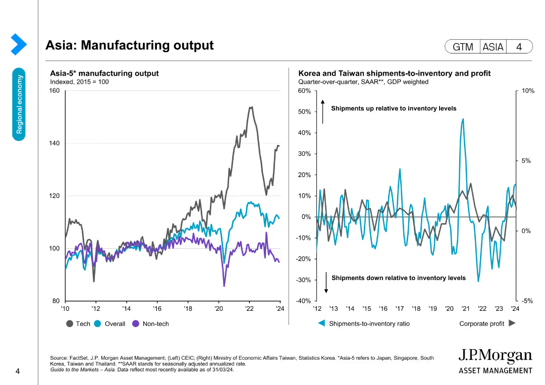
The slide has two line charts: one showing Asia-5 manufacturing output and another comparing shipments-to-inventory ratios and corporate profit for Korea and Taiwan.
Market Analysis and Trends
Industrial & Manufacturing
This slide assesses the manufacturing output in Asia and its correlation with shipments-to-inventory ratios and corporate profits in Korea and Taiwan.
Asia, manufacturing output, shipments, inventory, corporate profit
Multiple Chart
JP Morgan
Saved
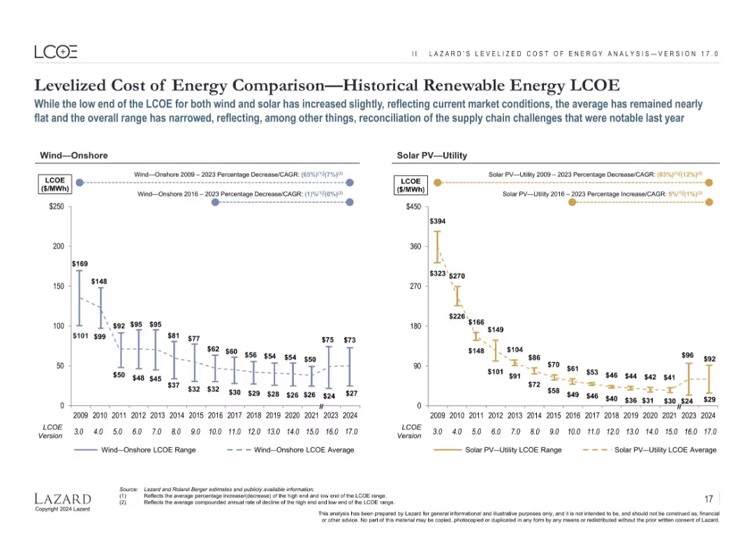
Two side-by-side line charts comparing LCOE ranges and averages for Wind—Onshore and Solar PV—Utility from 2009–2024.
Market Analysis and Trends
Energy & Utilities
The slide illustrates historical trends in the Levelized Cost of Energy (LCOE) for onshore wind and utility-scale solar PV. While prices dropped significantly from 2009 to 2020, recent years show slight increases and a narrowing range, reflecting market and supply chain dynamics.
LCOE, wind energy, solar PV, renewable energy, historical trends, pricing, market, CAGR
Multiple Chart
Roland Berger
Saved
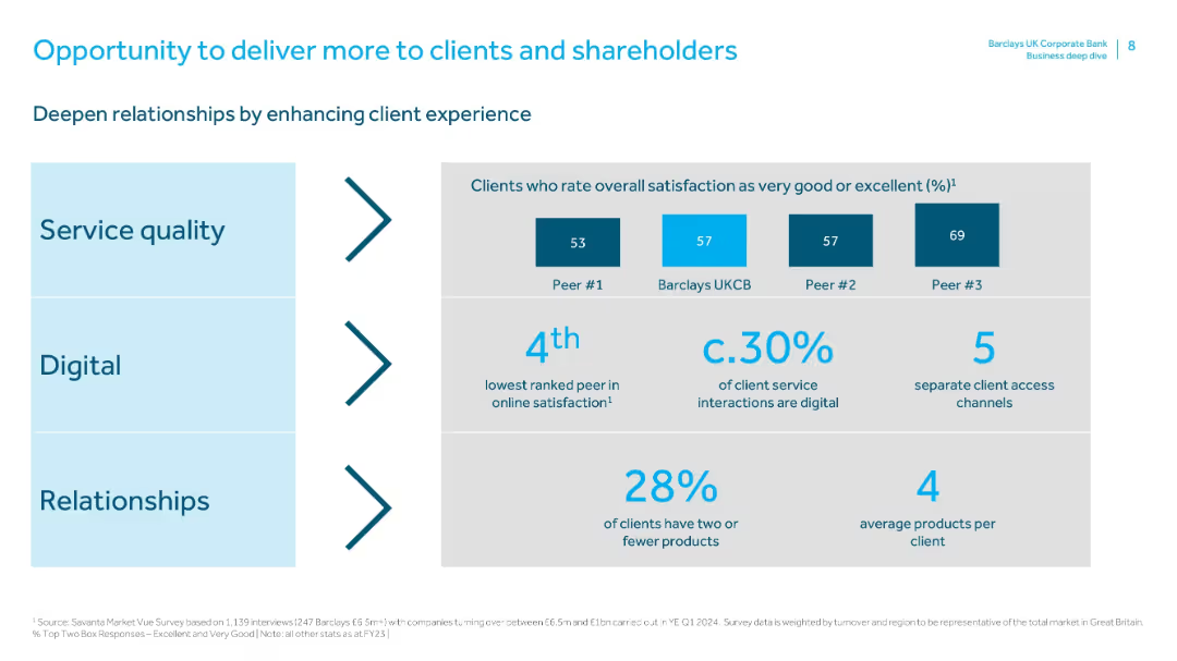
A three-row layout split into “Service quality,” “Digital,” and “Relationships,” each with related statistics. Includes peer comparisons and digital channel metrics.
Customer and Market Segmentation
Financial Services
This slide emphasizes enhancing client experience to strengthen relationships. It compares Barclays’ service quality with peers, highlights digital adoption (30%), and product engagement levels. Insights support upselling and loyalty efforts.
client experience, service quality, digital adoption, customer segmentation, product usage, peer comparison, satisfaction metrics
Mixed Chart
Barclays
Saved
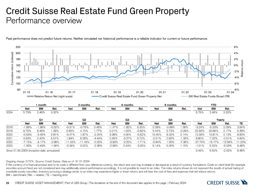
The slide displays a line chart illustrating the performance of the Credit Suisse Real Estate Fund Green Property from 2015 to 2024, with tables showing detailed return metrics.
Financial Performance
Real Estate & Construction
This slide analyzes the performance of the Credit Suisse Real Estate Fund Green Property, providing comprehensive return data over different timeframes.
real estate fund, Green Property, performance, returns, Credit Suisse
Mixed Chart
Credit Suisse
Saved
Contains a series of column charts indicating trends in total revenues, adjusted EBITDA, and net leverage over several years. Each graph uses blue bars of varying heights to represent values, with key figures highlighted for emphasis.
Financial Performance
Financial Services
The slide summarizes financial performance trends over time, displaying revenue, EBITDA, and leverage. It's designed for financial analysis and discussions around fiscal management and operational efficiency in a corporate setting.
financial performance, EBITDA, leverage, operational efficiency
Multiple Chart
Goldman Sachs
Saved
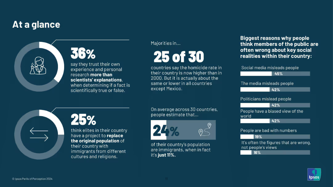
Infographic layout; icons, donut charts, large typography; dark background with white and blue text; no country-level breakdown.
Market Analysis and Trends
Education & Training
A summary slide offering highlights from the broader report. It shows 36% trust their own research over science, 25% believe in elite-driven population replacement, and 24% overestimate immigrant share. Misperceptions are tied to media, politicians, and biases.
misinformation, public opinion, perception gap, media influence, science trust, demographic myths, Ipsos, 2024, infographic, elite theories
Multiple Chart
IPSOS
Saved
Slide presents diagrams and statistics in a visually segregated format, enhancing readability and focus on specific data points. The layout is effectively utilized to present complex data.
Strategic Planning
Environmental Services & Sustainability
Explores the potential expansion of Copernicus user base beyond traditional commercial markets, specifically targeting public authorities and academics. Useful for strategic planning in expanding market reach and user engagement.
Copernicus, user base, market expansion, public authorities, academics
Multiple Chart
PwC/Strategy&
Saved
Previous
Next
If nothing, comes up, please save your slides first
Create a FREE account to continue browsing
Receive Instant Access to 1,000+ slides from companies like McKinsey, Google, and Goldman Sachs
First Name
Last Name
Email
Password
I agree to all
Terms & Privacy Policy
Thank you! Your submission has been received!
Oops! Something went wrong while submitting the form.
Have an account?
Sign in
Column Chart
Heatmap
Chevron
Org Chart
Infographic
Callouts
Timeline
List
Graphic
Picture
Process Flow
Diagram
Paragraph
Map
Table
Framework
Subtitle
Takeaway Box
Icon
Other Chart
Radar Chart
Waterfall Chart
Mekko Chart
Pie Chart
Scatter Plot
Line Chart
Bar chart
Bullet points