Create a FREE Account
Instant access to 1,000+ real slides from top companies like McKinsey, BCG, Goldman Sachs, Google and many more!
First Name
Last Name
Email
Password
I agree to all
Terms & Privacy Policy
Thank you! Your submission has been received!
Oops! Something went wrong while submitting the form.
Have an account?
Sign in
Library
Templates
Courses
Pricing
My Account
My Slides
My Templates
✦ AI
AI Prompt Library
AI Search
Sign in
Start Here
Logout
My Saved Slides
Includes a map displaying state-wise social return on investment and family impact numbers from the NCHP.
Strategic Planning
Government & Public Sector
Evaluates the regional impact of the National Community Hubs Program, showing differences in social returns and outreach by state.
NCHP, regional impact, social return, state comparison, family outreach
Graphic
Deloitte
Saved
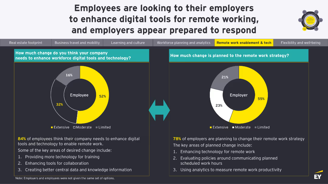
Two donut charts showing the extent of change needed in workforce digital tools and planned changes to remote work strategy.
Technology and Digital Transformation
Technology & Software
The slide compares the perceived need for digital tools among employees with the changes employers are planning for remote work strategies, highlighting key areas for enhancement.
Digital Tools, Remote Work, Change Management, Strategy, Technology
Multiple Chart
EY
Saved
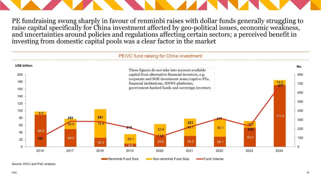
Dual-axis bar and line chart showing renminbi vs non-renminbi fund sizes and fund volume; notable spike in renminbi funding in 2024.
Investment Analysis
Financial Services
Depicts trends in PE/VC fundraising for China from 2016–2024. Highlights a shift toward domestic renminbi funding, peaking in 2024. Dollar funds struggled due to policy/regulation uncertainty, favoring domestic capital pools.
PE fundraising, VC, renminbi, capital sources, China investment, 2024
Single Chart
PwC/Strategy&
Saved
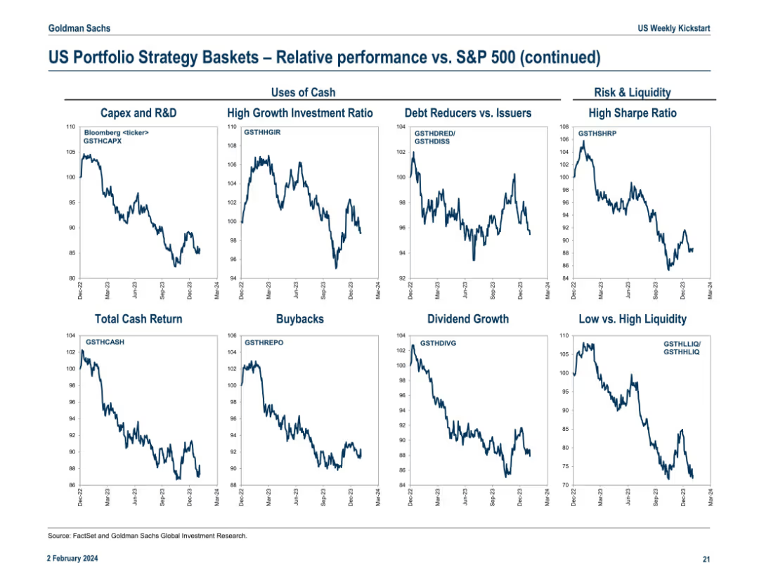
Final continuation slide featuring “Uses of Cash” and “Risk & Liquidity” strategy baskets. Includes 9 line charts with Bloomberg tickers. Each panel compares basket performance versus S&P 500 from Dec 2022 to Mar 2024.
Investment Analysis
Financial Services
The slide evaluates how different uses of cash (e.g., Capex, Buybacks, Dividends) and liquidity characteristics (e.g., High Sharpe Ratio, Low Liquidity) impact performance relative to the S&P 500. Trends indicate which corporate strategies align with investor preferences. For example, High Growth Investment Ratio and High Sharpe Ratio baskets underperformed recently.
capex, buybacks, dividend, liquidity, sharpe ratio, cash usage, S&P 500, investment themes, corporate strategy
Multiple Chart
Goldman Sachs
Saved
A diagrammatic slide with labeled tech clusters indicating their roles as Infrastructure, Enablers, and Applications. Uses a simple black and white scheme for a professional, analytical look.
Strategic Planning
Technology & Software
This slide demonstrates the exponential growth due to the combinatorial effects of technology across industries. It helps in understanding how the convergence of various tech advancements enables new business models and innovation, making it essential for strategic discussions about technological investments and industry evolution.
Combinatorial Effects, Technology, Growth, Innovation, Business Models, Investment, Industry Evolution
Framework
McKinsey
Saved
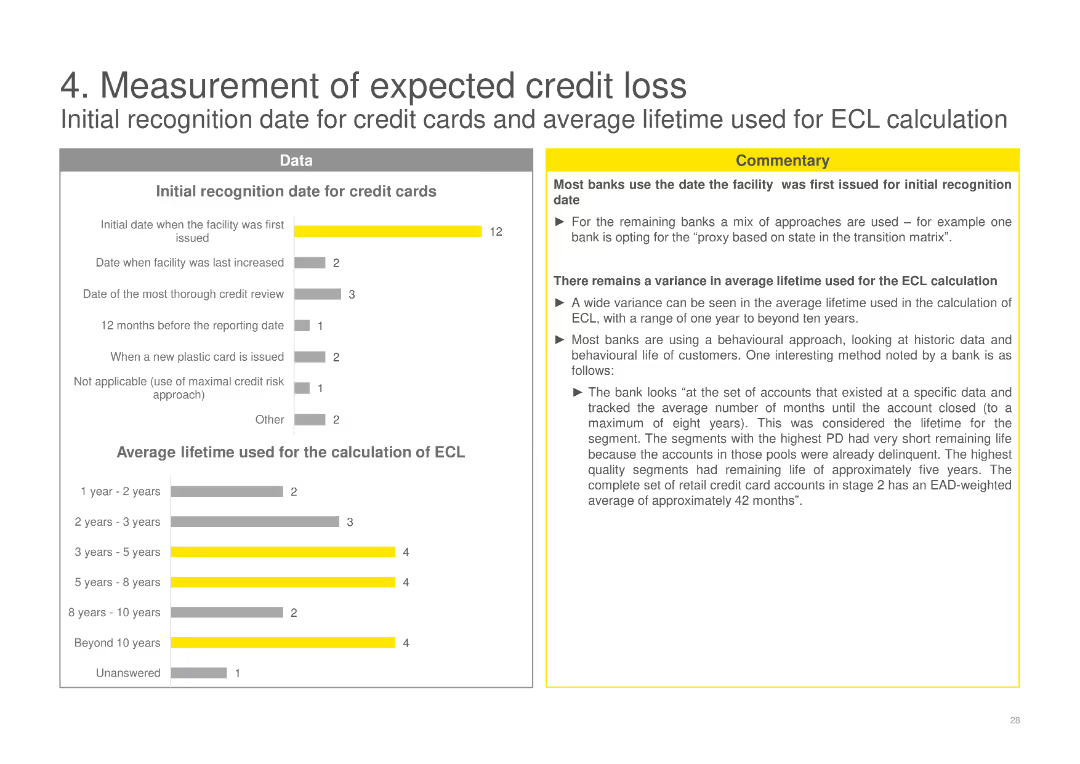
Column charts showing initial recognition dates for credit cards and average lifetime used for ECL calculation, with commentary explaining variance among banks.
Financial Performance
Financial Services
Analyzes the initial recognition dates for credit cards and the average lifetime used by banks for ECL calculation, showing variations in practice and methods used.
ECL, credit cards, measurement, banks, recognition, average lifetime, calculation, variance, methods
Multiple Chart
EY
Saved
Consists of a series of green bars assessing different solutions' abatement potential, technology readiness, and other factors across various sectors like transport and energy, all aligned in a clear, organized manner.
Market Analysis and Trends
Environmental Services & Sustainability
Highlights available, ready-to-deploy decarbonization solutions in different sectors, emphasizing their readiness and potential impact on reducing carbon emissions. Focuses on supply chain optimization in transport and cooling efficiency in the built environment as examples.
decarbonization, solutions, sector-specific, carbon emissions
Header Horizontal
Bain
Saved
Column charts comparing GDP growth and inflation rates.
Market Analysis and Trends
Technology & Software
Compares SEA's economic resilience to other regions, useful in evaluating regional economic stability and investment potential.
SEA, GDP growth, inflation rates, economic stability, comparative analysis
Multiple Chart
Bain
Saved
The slide features a red background with white text on the left, and two pie charts with accompanying text on the right. The layout includes a quote at the bottom right. The pie charts use red and gray colors to highlight key statistics.
Risk Assessment and Management
Financial Services
The slide discusses the low levels of cyber risk maturity among companies and highlights key statistics and quotes to emphasize the importance of improving cyber risk management.
cyber risk, maturity, companies, statistics, management, improvement, challenges, future, growth
Multiple Chart
PwC/Strategy&
Saved
Contains a set of column charts evaluating the impact of international conflicts, elections, and the 2024 Olympics on business investments in France, supplemented by executive insights.
Risk Assessment and Management
Government & Public Sector
Assesses how international conflicts, political events, and major sporting events like the 2024 Olympics influence corporate investments in France.
international conflicts, political events, investment impact, France, 2024 Olympics, business risk, geopolitical risk, economic outlook, corporate strategy
Multiple Chart
Bain
Saved
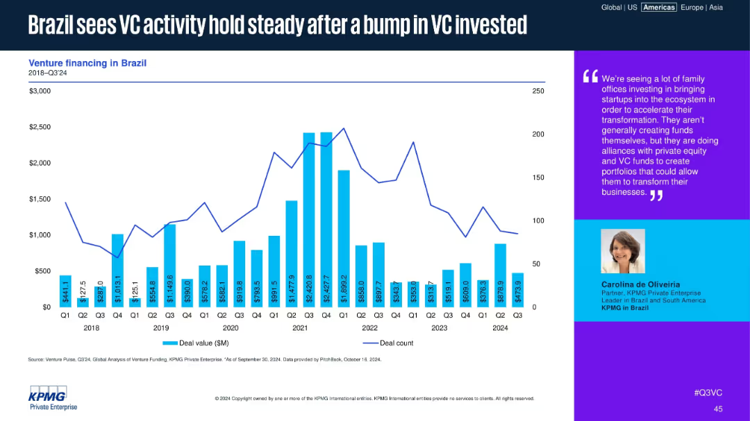
Bar and line chart for Brazil’s VC deal values and counts, with commentary from a regional KPMG partner.
Market Analysis and Trends
Financial Services
Brazil’s VC market has stabilized after a notable funding increase in 2021. While deal counts have dipped, moderate funding levels continue. Commentary highlights family office involvement and alliances with VC and PE funds to support digital transformation.
Brazil, VC activity, LATAM, family offices, KPMG, digital transformation, deal count, venture funding, steady
Mixed Chart
KPMG
Saved
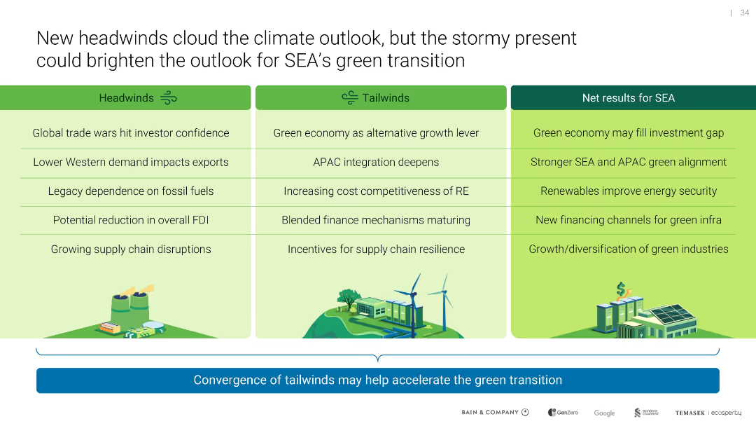
Three-column table labeled Headwinds, Tailwinds, and Net Results for SEA; icon illustrations reinforce thematic sections
Strategic Planning
Environmental Services & Sustainability
Contrasts risks and opportunities facing SEA’s green transition. Despite macroeconomic and political headwinds, tailwinds like maturing green finance and regional integration could accelerate sustainable outcomes.
headwinds, tailwinds, SEA, investment, renewables, supply chain
Table
Bain
Saved
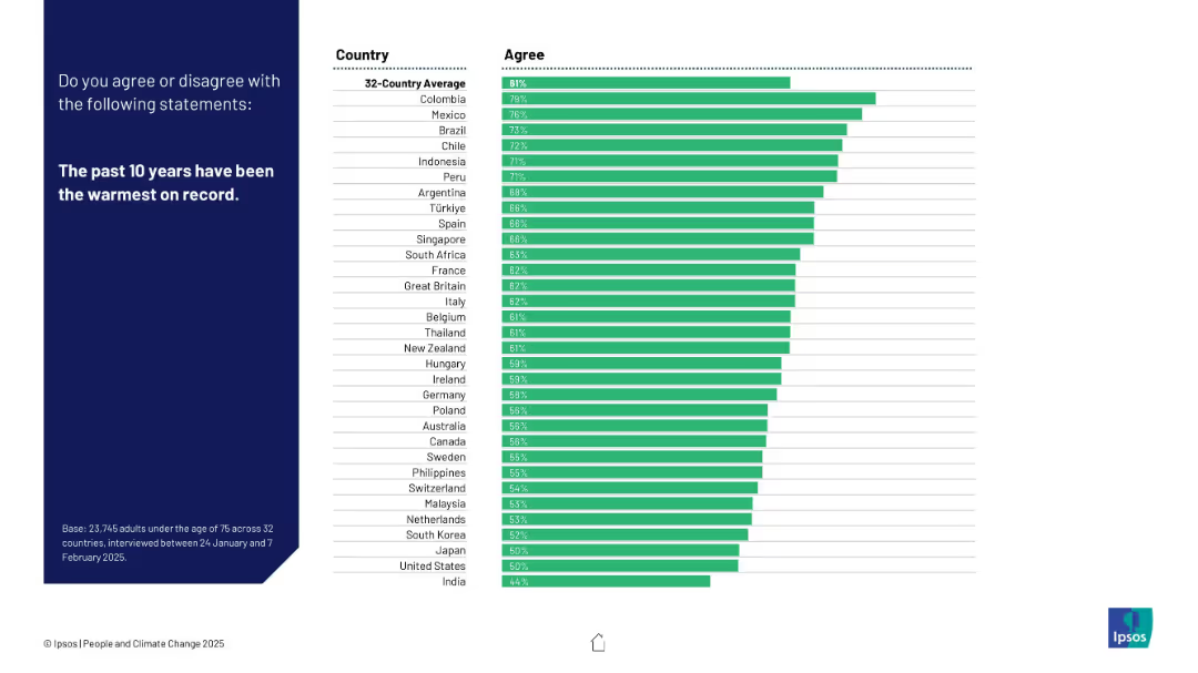
Green-colored bar chart ranked by agreement; includes 32 countries; consistent layout style; clean visual format.
Market Analysis and Trends
Environmental Services & Sustainability
Gauges public acknowledgment of recent climate warming. Colombia, Mexico, and Brazil lead in agreement. The slide supports awareness levels of global warming facts across different populations.
global warming, temperature trends, public awareness, Ipsos, climate evidence, warming recognition
Mixed Chart
IPSOS
Saved
Displays a composite of multiple line charts illustrating the revenue trajectories of different media segments from 2019 to 2024 in India. Each segment, such as internet, TV, and newspapers, is color-coded for clarity, highlighting the divergent paths of digital versus traditional media.
Market Analysis and Trends
Media & Entertainment
Provides an analysis of growth trends in various media segments, with a stark contrast between the robust growth of digital platforms and the decline of traditional media. This slide is used to facilitate strategic discussions on budget allocation, advertising strategies, and preparing for long-term shifts in media consumption patterns.
media trends, digital growth, traditional decline
Mixed Chart
PwC/Strategy&
Saved
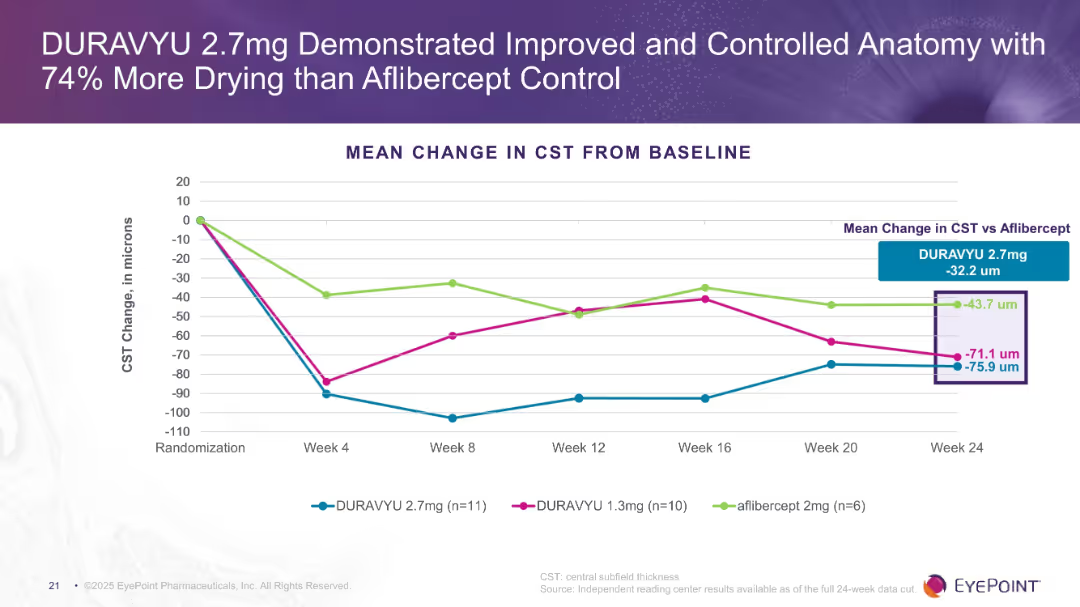
Line chart showing CST change in microns across treatment arms over 24 weeks. Clear visual comparison of drying effects. Purple theme consistent with previous slides.
Product and Service Analysis
Healthcare & Pharmaceuticals
The slide emphasizes anatomical control with DURAVYU 2.7mg, showing greater reduction in CST compared to aflibercept and DURAVYU 1.3mg. Indicates more efficient fluid reduction in the retina.
CST, drying, anatomical improvement, retina, DURAVYU, aflibercept
Single Chart
Goldman Sachs
Saved
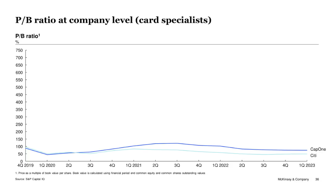
Line chart on white background comparing P/B ratios (%) over time (2019–2023) for CapOne and Citi, with a clean layout and minimal design.
Financial Performance
Financial Services
This slide compares the price-to-book (P/B) ratio trends for Capital One and Citibank over several years, showing fluctuations and relative valuations of these card-specialist companies. CapOne consistently shows a higher P/B ratio than Citi across the timeframe.
P/B ratio, CapOne, Citi, card specialists, valuation, financial trend, equity, bank performance, S&P Capital IQ
Single Chart
McKinsey
Saved
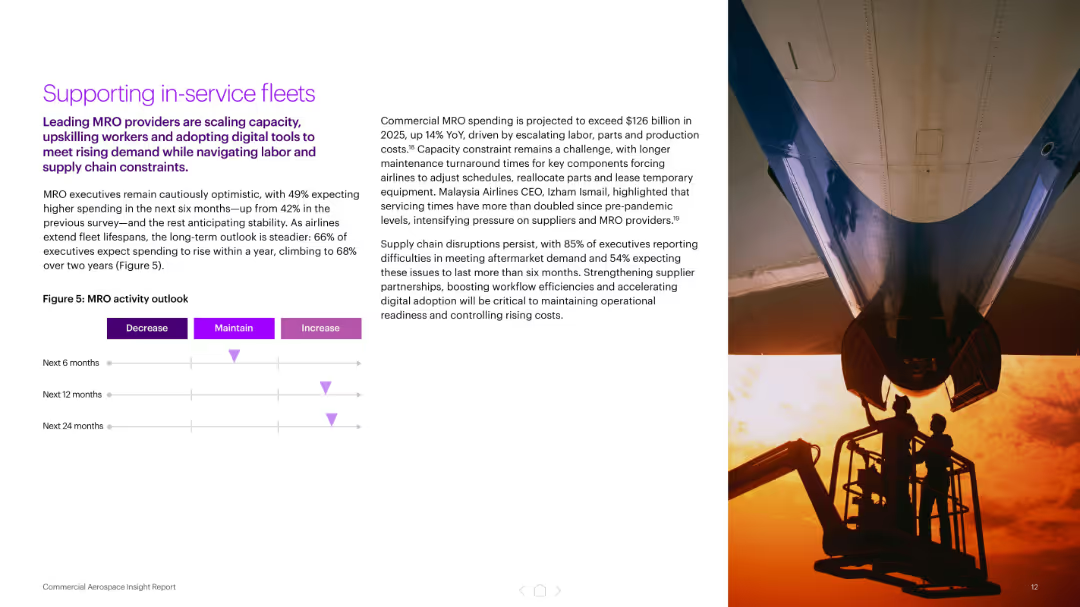
Split layout: left text with MRO forecast chart; right has photo of aircraft being serviced
Operational Efficiency
Industrial & Manufacturing
This slide outlines the challenges and expected increase in MRO (maintenance, repair, overhaul) spending, projecting a 14% YoY rise in 2025. It highlights executive expectations, supply chain constraints, and the need for digital tools and workforce expansion to maintain fleet readiness.
MRO, maintenance, spending, supply chain, capacity, aircraft, workforce, digital tools
Mixed Chart
Accenture
Saved
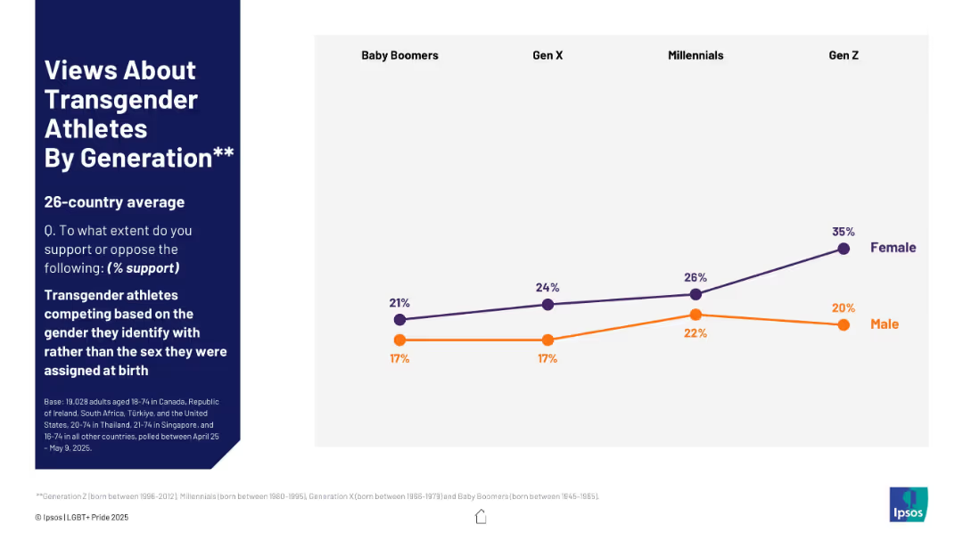
Line chart showing generational support trends, separated by gender, with a focus on Gen Z to Baby Boomers.
Regulatory and Compliance
Government & Public Sector
This slide shows generational differences in support for transgender athletes competing by gender identity. The data is segmented by gender and highlights increasing support among younger generations, especially among Gen Z females.
generational support, transgender athletes, Gen Z, gender identity, sports, gender split, LGBTQ+ survey, opinion by age
Mixed Chart
IPSOS
Saved
A clean layout with multiple text boxes summarizing key takeaways, including advertiser objectives, channel measurement, and data challenges. Each box contains a brief summary and a small icon representing the concept.
Strategic Planning
Media & Entertainment
This slide provides key takeaways on brand awareness, measurement, and data strategies. It emphasizes the importance of leveraging multiple channels and addressing data challenges to enhance marketing effectiveness.
Takeaways, Strategy, Brand, Measurement, Data
Multiple Chart
Nielsen
Saved
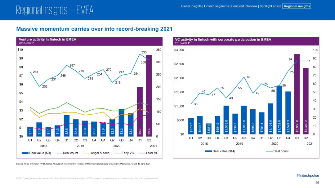
Dual-panel charts; left panel shows VC activity by deal stage (stacked bars) with lines for counts; right panel shows VC with corporate participation using bars and line graphs. Purple headers with blue and green tones.
Investment Analysis
Financial Services
The slide illustrates continued momentum in fintech venture activity across EMEA in 2021, highlighting record-high investments. It splits VC investments by stage and corporate participation, showing significant Q2 2021 growth, particularly in later-stage VC.
VC, Corporate Participation, Fintech, Angel Investment, EMEA, Deal Value, Early Stage, Later Stage
Multiple Chart
KPMG
Saved
Includes a dual-section infographic showing the size of the global private education market and the share of Asia, with color coding and annotations.
Market Analysis and Trends
Education & Training
This slide gives an overview of the global private education market size with a detailed breakdown of the Asian sector.
education market, global, Asia, private education, market size, regional breakdown, investment potential
Mixed Chart
EY
Saved
Line graph showing the yearly variance of NCDOT's cash balance from forecasts, marking a shift in FY19 with a detailed analysis of trends over time.
Regulatory and Compliance
Government & Public Sector
Analyzes the shift in cash balance variance for NCDOT in FY19, highlighting issues in fiscal management. Useful for government finance and policy analysis.
fiscal management, variance, government, NCDOT, trends
Single Chart
McKinsey
Saved
The left side features a text box setting a target for combined lost time injury frequency (LTIF), with a contrasting red backdrop. Adjacent to this is a grey-scale line graph with trends over the years and a target level indicated by a dashed line. On the right, a large image shows a smiling worker wearing a safety helmet. This personal touch adds a human element to the data-driven slide. The bottom contains a logo and footer text indicating the source and event.
Operational Efficiency
Government & Public Sector
Focuses on the importance of occupational safety, setting a specific LTIF target and using a graph to track performance, suitable for discussions on safety protocols and performance metrics.
occupational safety, supply chain, LTIF, performance tracking, industrial safety, worker well-being, safety protocols, safety metrics
Mixed Chart
Goldman Sachs
Saved
The slide features a header image of a person using a contactless payment system, with two columns of text and small images below the text.
Technology and Digital Transformation
Retail & E-commerce
Discusses the rise of digital payments, highlighting mobile payments, crypto, smartwatches, and the impact on retailers.
Digital Payments, Mobile, Crypto, Smartwatches, Retail, AmazonGo, Convenience, Online Stores, Payment Methods, Checkout
Multiple Chart
Deloitte
Saved
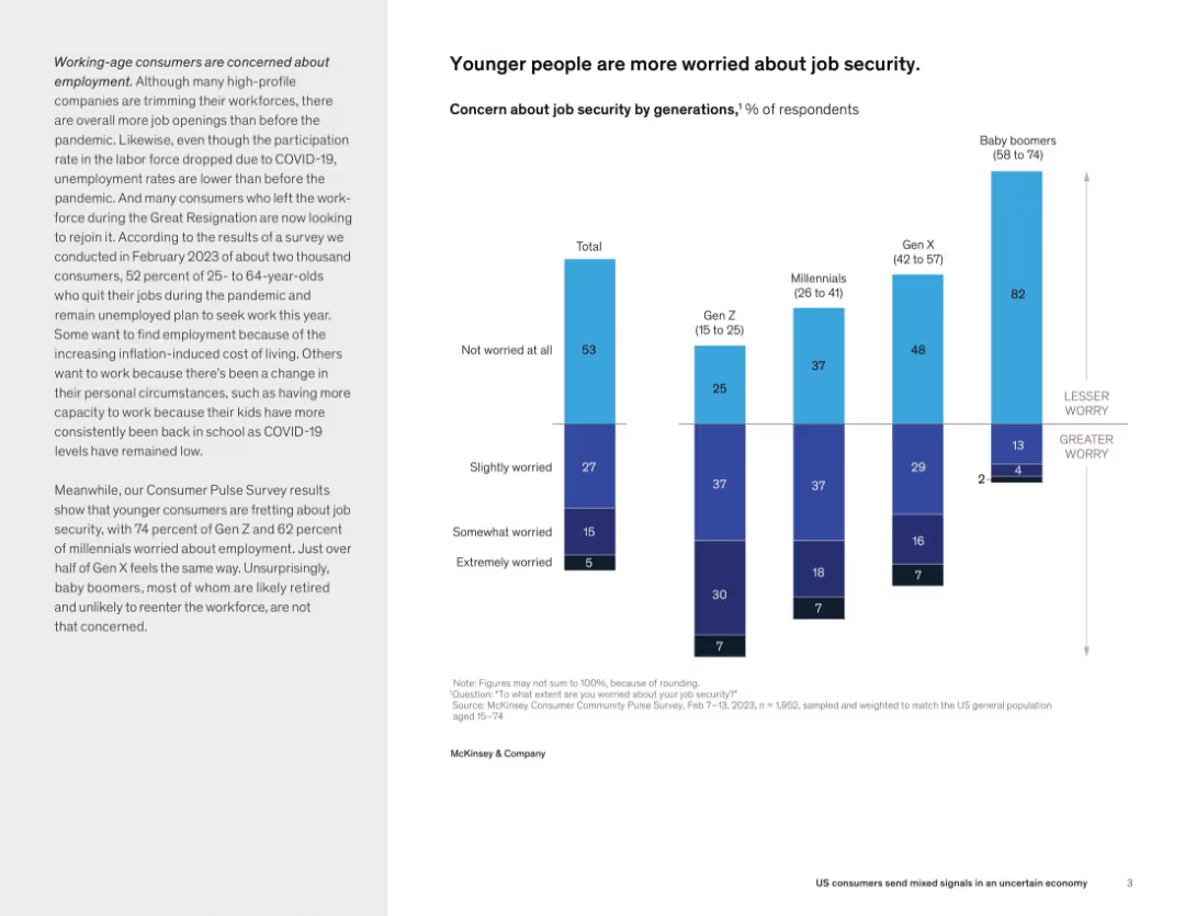
Split layout with descriptive text on left and vertical stacked bar chart on right showing job security concern by generation.
Human Resources and Talent Management
Professional Services
This slide conveys that younger generations, particularly Gen Z and millennials, are much more concerned about job security compared to Gen X and baby boomers. This reflects generational differences in employment sentiment post-pandemic.
job security, generational worry, Gen Z, millennials, employment concerns, workforce, consumer sentiment
Mixed Chart
McKinsey
Saved
Previous
Next
If nothing, comes up, please save your slides first
Create a FREE account to continue browsing
Receive Instant Access to 1,000+ slides from companies like McKinsey, Google, and Goldman Sachs
First Name
Last Name
Email
Password
I agree to all
Terms & Privacy Policy
Thank you! Your submission has been received!
Oops! Something went wrong while submitting the form.
Have an account?
Sign in
Column Chart
Heatmap
Chevron
Org Chart
Infographic
Callouts
Timeline
List
Graphic
Picture
Process Flow
Diagram
Paragraph
Map
Table
Framework
Subtitle
Takeaway Box
Icon
Other Chart
Radar Chart
Waterfall Chart
Mekko Chart
Pie Chart
Scatter Plot
Line Chart
Bar chart
Bullet points