Create a FREE Account
Instant access to 1,000+ real slides from top companies like McKinsey, BCG, Goldman Sachs, Google and many more!
First Name
Last Name
Email
Password
I agree to all
Terms & Privacy Policy
Thank you! Your submission has been received!
Oops! Something went wrong while submitting the form.
Have an account?
Sign in
Library
Templates
Courses
Pricing
My Account
My Slides
My Templates
✦ AI
AI Prompt Library
AI Search
Sign in
Start Here
Logout
My Saved Slides
The slide features two line charts with time-series data from 2007 to 2023. The charts depict the JPMorgan Global Purchasing Managers’ Index for Manufacturing and Services. The visual elements are placed on a white background with a top header in blue containing the slide title and source information.
Market Analysis and Trends
Industrial & Manufacturing
This slide presents the stability of the global manufacturing sector and the visible expansion in services as of July, with a detailed analysis of the JPMorgan Global PMI. It could be used to discuss market trends and economic outlooks.
PMI, Manufacturing, Services, Economic Outlook, Stability, Expansion, JPMorgan, Index, Global Sector, July
Mixed Chart
McKinsey
Saved
Features detailed column charts comparing global water demand projections for 2015 versus 2050 by sector, such as domestic, livestock, manufacturing, and electricity.
Market Analysis and Trends
Environmental Services & Sustainability
Offers a projection of water demand growth by 2050, emphasizing the increased need in sectors like manufacturing and electricity. This slide is critical for planning in environmental management and sustainability, showing where the greatest increases in water usage are expected.
water demand, projections, 2050, manufacturing, electricity
Multiple Chart
Roland Berger
Saved
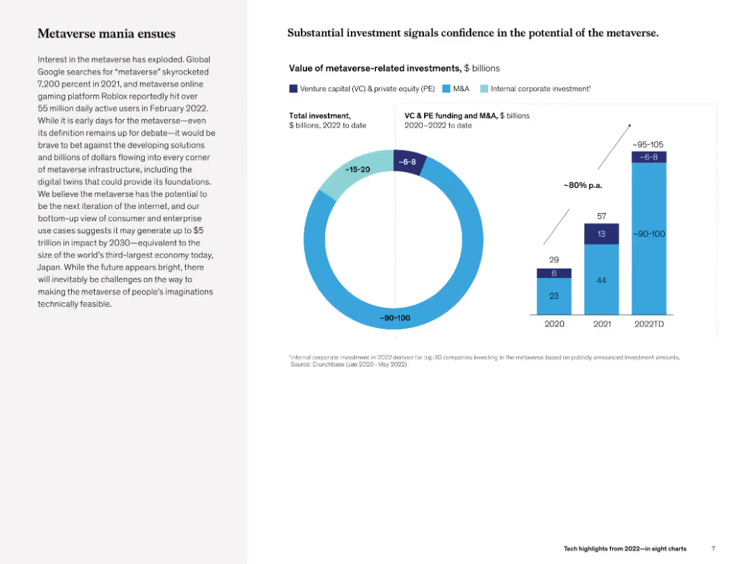
Left narrative on hype/investment trends and right combo chart (doughnut and bar) showing investment volumes and sources by year.
Investment Analysis
Media & Entertainment
The slide explores metaverse-related investments, noting rising confidence and projected impact of up to $5T by 2030. Charts illustrate growing VC and corporate spending in 2020–2022, showing increasing investor interest.
metaverse, investment, VC, M&A, infrastructure, McKinsey, growth, 2030 projections
Multiple Chart
McKinsey
Saved
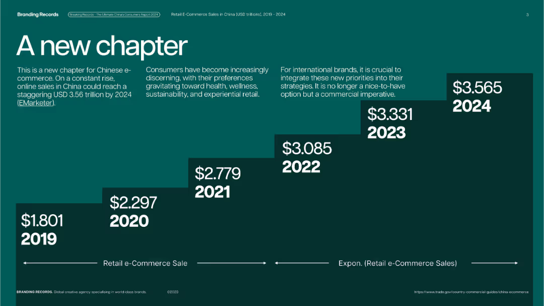
Dark green background with bold step chart design; each year shown on ascending blocks with white text.
Market Analysis and Trends
Retail & E-commerce
Highlights the continuous growth of retail e-commerce sales in China from 2019 to 2024, forecasting USD 3.565 trillion in 2024. It emphasizes evolving consumer preferences and urges brands to align with these shifts.
China, e-commerce, growth, retail, consumer trends, health, wellness, international
Single Chart
McKinsey
Saved
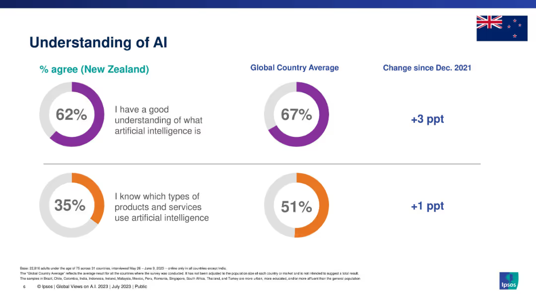
Split section layout with two circular graphs: one on AI understanding, the other on product awareness.
Industry Overview
Artificial Intelligence
This slide presents New Zealanders' understanding of AI in comparison with global averages. It measures agreement with two statements: understanding AI conceptually and knowing which products/services use AI. It also includes percentage changes since 2021.
AI, understanding, awareness, Ipsos, New Zealand, global comparison, knowledge levels
Single Chart
IPSOS
Saved
The slide features three separate columns titled "Revenue Growth," "Efficiency Measures," and "Capital Efficiency," each containing bullet points and percentage values. The design includes blue and white color themes with horizontal arrangement and clear section separators.
Financial Performance
Financial Services
This slide presents Deutsche Bank's Q3 2023 progress in revenue growth, efficiency measures, and capital efficiency targets, highlighting specific achievements and future goals.
revenue growth, efficiency, capital, target, banking
Table
Deutsche Bank
Saved
This slide includes a column chart showing assets under management (AUM) by strategy as of 1Q24, with different hedge fund strategies such as equity hedge, event-driven, macro, and relative value.
Investment Analysis
Financial Services
The slide presents the distribution of hedge fund assets under management across various strategies, offering insights into the allocation of capital within the hedge fund industry.
hedge funds, AUM, investment strategies, capital allocation, financial services
Multiple Chart
JP Morgan
Saved
Dominated by green hues, this slide details the concept of systemic resilience across a multi-point list.
Organizational Structure and Change
Professional Services
It provides a deep dive into building resilience, with six points explaining the approach, including seeking advantage in adversity and valuing diversity.
resilience, collaboration, performance, diversity, change, advantage
Boxed
BCG
Saved
A straightforward layout featuring three columns of bullet points accompanied by directional arrows. The color scheme is predominantly blue and white, maintaining a professional appearance.
Strategic Planning
Financial Services
The slide outlines the strategic directions of the company, focusing on business growth, product diversification, and operational efficiency. It presents a concise strategic plan with clear objectives for the future.
strategic direction, growth, diversification, efficiency, operational, business plan
Vertical Flow
Goldman Sachs
Saved
Timeline diagram comparing wireless communication networks (1G to 6G) across selected KPIs. List of use cases benefiting from 6G technology on the right.
Technology and Digital Transformation
Technology & Software
The slide explores the advancements in wireless communication technologies from 1G to 6G, highlighting the improvements in KPIs like peak data rate and latency. It lists potential use cases for 6G, emphasizing its role in supporting data-hungry applications and enabling fundamental innovations.
6G, Wireless Communication, Innovation, KPIs
Mixed Chart
Roland Berger
Saved
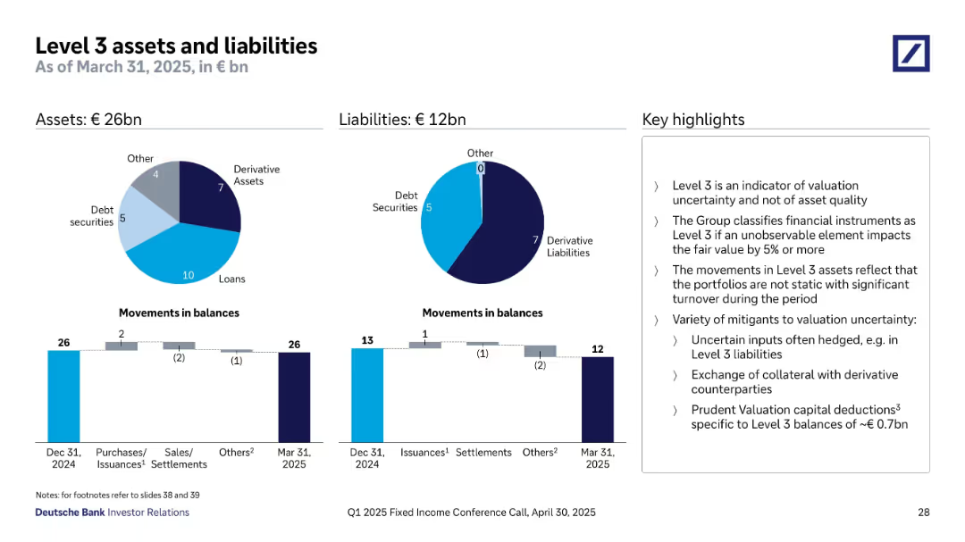
Two pie charts and bar charts tracking changes in Level 3 items; highlights on right.
Regulatory and Compliance
Financial Services
Presents Level 3 assets (€26bn) and liabilities (€12bn) as of March 31, 2025. Highlights valuation uncertainty and inputs subject to change >5%. Charts show breakdown by asset type (loans, derivatives, etc.) and movement across periods. Emphasizes that Level 3 is not a sign of asset quality deterioration, but reflects unobservable market factors and risk mitigants.
level 3 assets, liabilities, valuation uncertainty, derivatives, fair value, risk mitigation, IFRS, asset breakdown, financial instruments
Multiple Chart
Deutsche Bank
Saved
Comprises line charts, column chart, and an image of a city. Moderate visual complexity.
Market Analysis and Trends
Financial Services
Showcases Mexico's GDP growth, BBVA Bancomer's profit growth, and market trends.
Mexico, GDP, BBVA, profit
Multiple Chart
Morgan Stanley
Saved
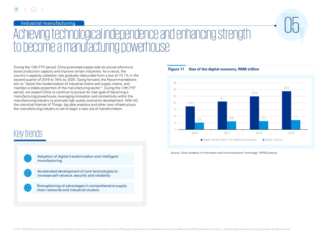
Split layout with text and “Key trends” on the left; right side includes a vertical bar chart showing growth of the digital economy by year.
Strategic Planning
Industrial & Manufacturing
This slide emphasizes China’s drive for technological self-reliance and manufacturing modernization. It outlines key policies and trends, including adoption of digital transformation, core tech development, and supply chain strengthening. Supporting chart illustrates digital economy expansion from 2016 to 2019.
industrial reform, manufacturing, supply chain, digital economy, innovation, 5G, IoT, AI, China strategy, economic development
Mixed Chart
KPMG
Saved
Utilizes a stacked bar chart to compare digital marketing maturity across multiple industries. The design is clear, using shades of green to differentiate maturity levels.
Market Analysis and Trends
Media & Entertainment
Evaluates digital marketing maturity across various industries in Asia Pacific, showcasing a significant range of maturity levels. This slide helps in identifying industry-specific trends and planning targeted marketing strategies.
digital marketing, Asia Pacific, industry comparison, maturity levels, marketing trends, targeted strategies, stacked bar chart, industry-specific analysis
Single Chart
BCG
Saved
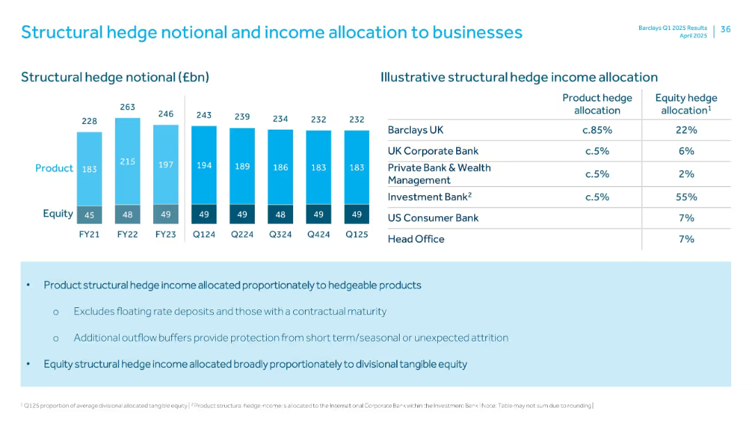
Bar chart (left) with hedge notional over time and a table (right) with income allocation across divisions
Risk Assessment and Management
Financial Services
Breaks down structural hedge notional into product and equity components and outlines income allocation to business units, emphasizing proportional distribution based on hedgeability and tangible equity.
structural hedge, income, allocation, equity, product
Mixed Chart
Barclays
Saved
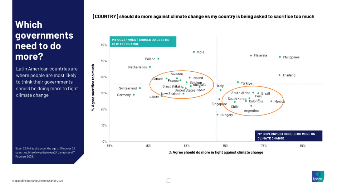
Scatterplot chart on right side shows correlation between views on government action and public sacrifice; annotated orange ellipses highlight country clusters
Regulatory and Compliance
Government & Public Sector
This slide examines the balance between public sentiment on whether their governments should do more on climate change vs. perceptions of national sacrifice. Latin American nations cluster around high dissatisfaction with government efforts.
government action, climate policy, perception, Latin America, scatterplot, Ipsos, responsibility, climate sacrifice, public opinion
Mixed Chart
IPSOS
Saved
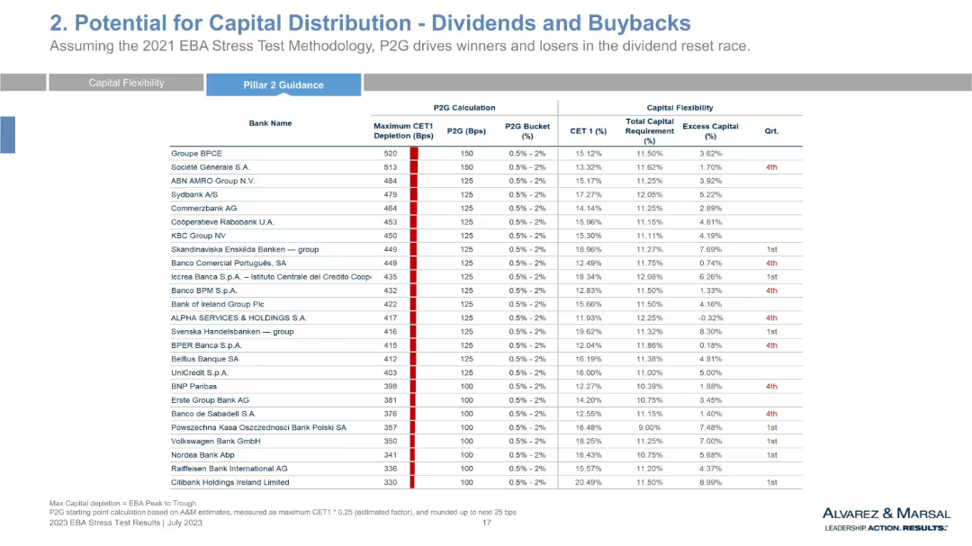
Continuation of previous table with more banks, keeping same structure—depletion, guidance, and capital ratios.
Regulatory and Compliance
Financial Services
This slide extends the bank-by-bank capital flexibility analysis, focusing on CET1 depletion and P2G designations. It continues the quartile categorization and highlights banks with high or low resilience in capital allocation. Key comparisons inform regulatory outcomes and dividend planning.
P2G analysis, CET1 depletion, stress testing, ECB regulation, capital excess, quartile, financial resilience
Single Chart
Alvarez & Marsal
Saved
Features a circular ecosystem diagram with different industry roles such as Upgrader and Recycler, connected by arrows to indicate workflow, accompanied by descriptive text.
Operational Efficiency
Transportation & Logistics
Highlights the necessity for collaboration in the maritime industry to optimize resource use and enhance sustainability through a circular economic model.
maritime, collaboration, circular economy, sustainability, optimization
Diagram
Accenture
Saved
This slide features multiple images, icons, and a pie chart. It visually represents different sectors like energy, technology, and real estate through icons. The design is clear and informative with a focus on significant achievements.
Investment Analysis
Financial Services
Highlights financial contributions and key achievements of Macquarie Capital. It serves as an investment summary and a strategic overview of the company’s performance across various sectors, emphasizing their leading position in global infrastructure and energy financing.
Infrastructure, Investments, Energy, Real Estate, Financial Advising
Mixed Chart
Goldman Sachs
Saved
A stacked column chart showing household wealth distribution by asset type and a column chart showing the average household savings rate by region.
Market Analysis and Trends
Financial Services
The slide provides a comparison of household wealth distribution by asset type across different countries and the average household savings rates in Asia versus other regions.
household wealth, savings rate, asset type, financial comparison, regions, economic trends, Asia, global, wealth distribution, financial insights
Multiple Chart
JP Morgan
Saved
Slide includes a column chart showing funding channels for ESG projects, like internal cash flow and green bonds. The chart is vertical and color-coded to differentiate between 2022 and 2023, indicating shifts in funding preferences over time.
Financial Performance
Environmental Services & Sustainability
Focuses on the financing strategies companies are adopting for ESG projects, particularly the increasing reliance on internal funding in response to higher interest rates and tighter credit markets. This shift underscores the practical aspects of funding sustainable initiatives amid broader economic pressures.
ESG, funding, finance, green bonds, 2023
Single Chart
PwC/Strategy&
Saved
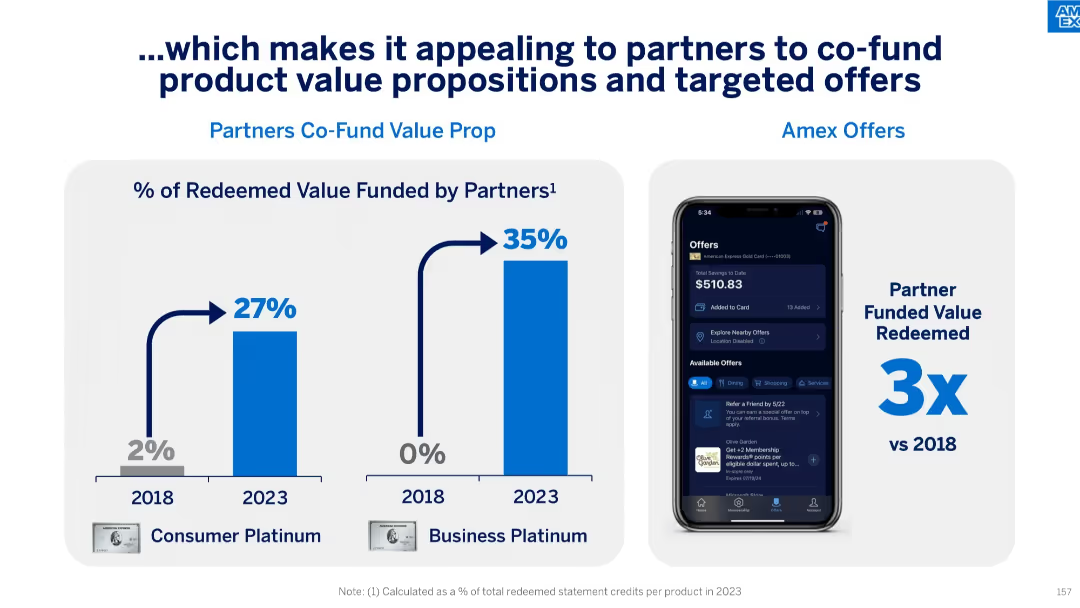
Split panel slide: bar charts on left showing rise in partner-funded redeemed value (2018–2023), right showing Amex Offers UI on phone and 3x increase in partner-funded value.
Product and Service Analysis
Financial Services
This slide illustrates how growing partner engagement has increased the share of redeemed value they fund—27% for Consumer Platinum and 35% for Business Platinum in 2023—up from 2% and 0% respectively in 2018. It supports the effectiveness of co-funded offers and digital engagement tools.
partner funding, value proposition, targeted offers, consumer engagement, co-funded redemption, Amex Offers, digital interface
Mixed Chart
McKinsey
Saved
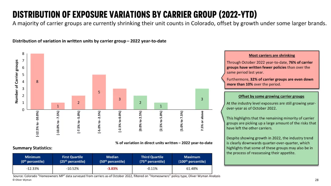
Bar chart grouped by unit variation ranges; supported by color-coded comments and summary stats at the bottom.
Risk Assessment and Management
Financial Services
Analyzes changes in written units by carrier groups in 2022. Most carriers are shrinking, with 76% reducing exposure, while a few are growing. A summary table shows statistics like median and quartile values for unit variation percentages.
insurance carriers, exposure variation, market trends, growth vs shrinkage
Mixed Chart
Oliver Wyman
Saved
The slide contains a central diagram labeled "Navigating a world of uncertainty," with five connected themes: Pricing strategy, Labor, Supply, Cost of capital, and ESG and sustainability. Each theme has additional relevant factors listed around the diagram.
Strategic Planning
Financial Services
The slide describes how to transform economic uncertainty into opportunities by focusing on five key themes: pricing strategy, labor, supply, cost of capital, and ESG and sustainability, with detailed sub-themes related to each main area.
uncertainty, opportunity, strategy, ESG, sustainability, pricing
Diagram
EY
Saved
A comparative column chart illustrating car commute statistics, combining car usage with other means, commute frequency, distance, and car tenure across regions.
Market Analysis and Trends
Transportation & Logistics
Provides insights into the commuting habits of EV owners in different regions, focusing on car usage, combination with other transport means, and typical commute.
commute, car usage, regional comparison, EV owners, survey
Multiple Chart
PwC/Strategy&
Saved
Previous
Next
If nothing, comes up, please save your slides first
Create a FREE account to continue browsing
Receive Instant Access to 1,000+ slides from companies like McKinsey, Google, and Goldman Sachs
First Name
Last Name
Email
Password
I agree to all
Terms & Privacy Policy
Thank you! Your submission has been received!
Oops! Something went wrong while submitting the form.
Have an account?
Sign in
Column Chart
Heatmap
Chevron
Org Chart
Infographic
Callouts
Timeline
List
Graphic
Picture
Process Flow
Diagram
Paragraph
Map
Table
Framework
Subtitle
Takeaway Box
Icon
Other Chart
Radar Chart
Waterfall Chart
Mekko Chart
Pie Chart
Scatter Plot
Line Chart
Bar chart
Bullet points