Create a FREE Account
Instant access to 1,000+ real slides from top companies like McKinsey, BCG, Goldman Sachs, Google and many more!
First Name
Last Name
Email
Password
I agree to all
Terms & Privacy Policy
Thank you! Your submission has been received!
Oops! Something went wrong while submitting the form.
Have an account?
Sign in
Library
Templates
Courses
Pricing
My Account
My Slides
My Templates
✦ AI
AI Prompt Library
AI Search
Sign in
Start Here
Logout
My Saved Slides
A pie chart on the left showing the proportion of passive and active investors, with another smaller pie chart on the right detailing net buyer, net zero, and net seller percentages.
Market Analysis and Trends
Financial Services
This slide compares passive and active investors during the pandemic, detailing the percentage of net buyers, net zero, and net sellers among active investors.
investors, passive, active, pandemic, comparison
Multiple Chart
IPSOS
Saved
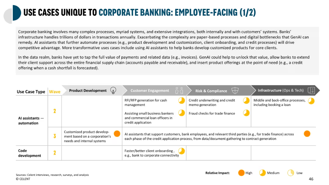
Large grid format categorizing corporate use cases by department, wave, and impact level.
Product and Service Analysis
Financial Services
Explores how GenAI can be used in corporate banking for product development, onboarding, and credit underwriting. Emphasizes the value in automating RFP responses and customizing offerings based on business needs.
corporate banking, GenAI, product development, onboarding, underwriting, credit processing
Mixed Chart
Oliver Wyman
Saved
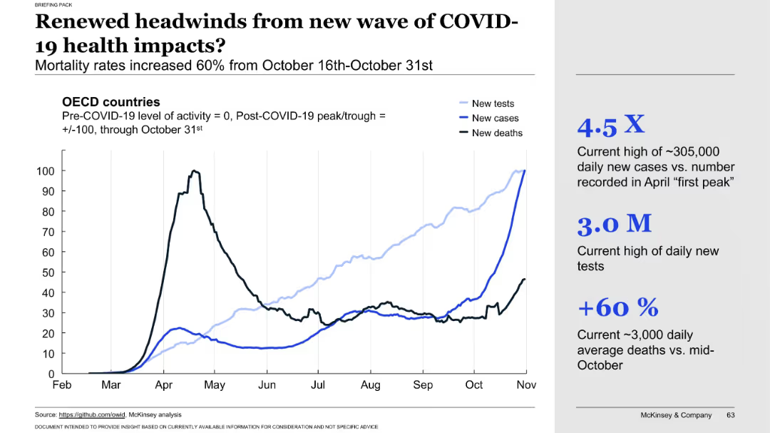
Line chart showing OECD country data (tests, cases, deaths) through October 31. Annotated metrics on the right highlight testing volume, case surge, and death rate increase.
Risk Assessment and Management
Healthcare & Pharmaceuticals
Warns of a resurgence in COVID-19 health impacts as data from late October shows significant increases in new cases, tests, and deaths. The chart visually confirms the renewed health risks and underscores the pandemic’s continued volatility.
second wave, health impact, mortality surge, new infections, testing volume, COVID-19 resurgence, OECD trends, death rate, late October data, public health threat
Mixed Chart
McKinsey
Saved
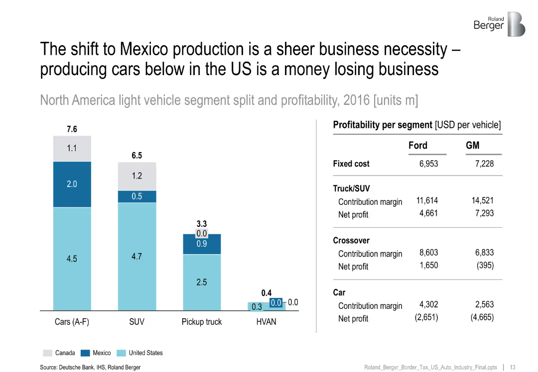
Bar chart of segment-wise production by country, with table comparing Ford vs GM profitability by segment.
Operational Efficiency
Industrial & Manufacturing
Emphasizes that car production in the US is unprofitable for major OEMs, especially for sedans, driving the shift to Mexico where margins are more sustainable.
production shift, Mexico, profitability, Ford, GM, vehicle segment
Mixed Chart
Roland Berger
Saved
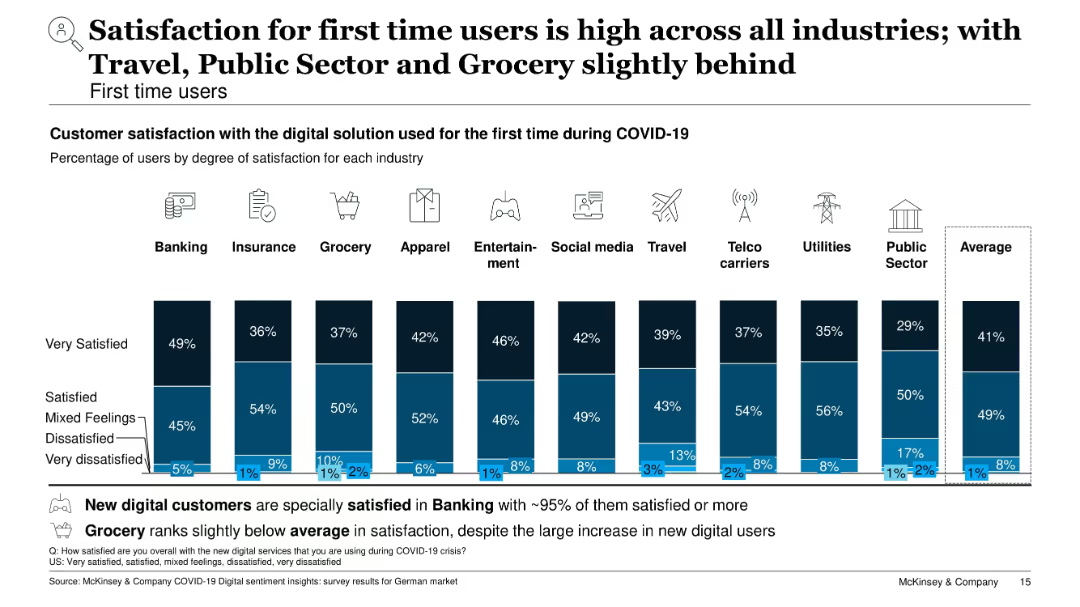
Vertical stacked bar chart showing degrees of satisfaction for first-time users by industry; blue color scheme
Customer and Market Segmentation
Technology & Software
This slide focuses on customer satisfaction among first-time digital users. Banking shows the highest satisfaction (~95%), while Travel, Grocery, and Public Sector lag slightly. Most users report being satisfied or very satisfied, with only a small percentage expressing dissatisfaction.
first-time users, satisfaction, customer experience, digital onboarding, banking, travel, public sector, survey
Single Chart
McKinsey
Saved
The slide shows a column chart with expected EPS growth for various regions/styles and another chart for S&P 500 sectors, highlighting differences in expected earnings growth.
Financial Performance
Financial Services
The slide provides an analysis of corporate earnings growth, comparing expected earnings across regions and sectors. Useful for investment strategies.
earnings growth, EPS, corporate earnings, regions, styles, S&P 500, sectors, financial performance
Multiple Chart
Morgan Stanley
Saved
This slide features two sets of column charts, one showing the dramatic decrease in the price of solar PV modules from 2010 to 2020, and another displaying the levelized cost of electricity (LCOE) for solar, diesel, and petrol in 2021. The layout is clean, with annotations providing clarity on the data trends.
Market Analysis and Trends
Energy & Utilities
The slide presents data on the declining cost of solar power compared to other energy sources, highlighting the increased affordability and cost-effectiveness of solar energy, which is significant for market competitiveness in the energy sector.
solar, LCOE, price reduction, cost effectiveness, energy comparison
Multiple Chart
BCG
Saved
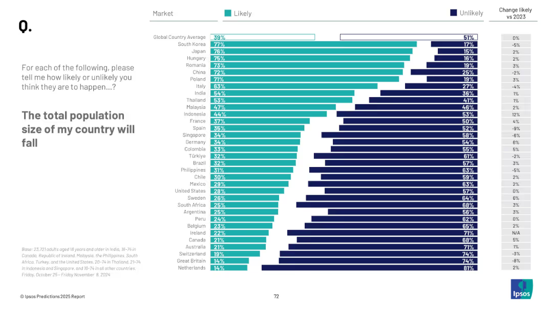
Horizontal bar chart by country showing % who think population will fall; Unlikely vs. Likely comparison; change vs. 2023 included.
Market Analysis and Trends
Government & Public Sector
The slide ranks countries by the perceived likelihood of population decline. East Asian countries like South Korea and Japan rank highest in concern. Global average is 39%, indicating moderate concern. Trend shifts from 2023 are also noted.
population decline, demographics, Ipsos, global sentiment, aging society, fertility, forecast, public perception, 2025 predictions
Mixed Chart
IPSOS
Saved
The slide contains a series of donut charts illustrating consumer uptake of technology, specifically EV adoption and heat pump adoption (% of sales) from 2025 to 2050 across different regions (Global, Europe, US, China). Each chart shows adoption rates at different time intervals.
Market Analysis and Trends
Energy & Utilities
This slide highlights the projected consumer adoption rates of electric vehicles (EVs) and heat pumps across different regions by 2050. It shows significant growth trends, driven by technological advancements and government mandates to reduce emissions and increase energy efficiency.
Consumers, Technology, Adoption, EV, Heat Pump, 2050, Growth
Multiple Chart
EY
Saved
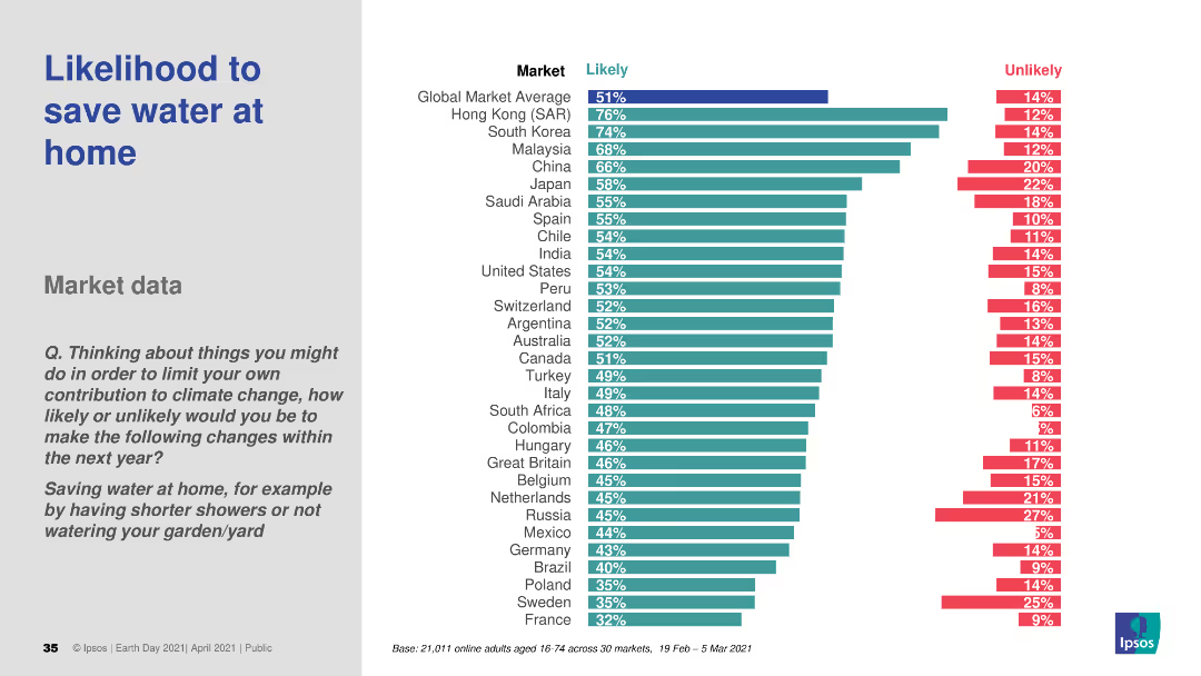
A bar chart (horizontal) comparing the likelihood to save water at home across various countries. The chart uses distinct colors to indicate likely and unlikely responses.
Market Analysis and Trends
Consumer Goods
The slide analyzes consumer responses on their likelihood to save water at home. It includes comparative data across multiple countries, providing insights into global attitudes towards water conservation.
water conservation, consumer behavior, sustainability, global attitudes, comparative data
Multiple Chart
IPSOS
Saved
Contains lists and categorizations of risks such as Product, Supply base, Manufacturing, etc., alongside icons illustrating different types of impact.
Risk Assessment and Management
Professional Services
Offers a detailed breakdown of various operations risks along with their potential impacts on revenue, cash, cost, and customer satisfaction.
Operations risk, Categories, Impact analysis, Revenue, Cash, Cost, Customer
Header Horizontal
Bain
Saved
This slide contains column charts showing preferred types of non-cash discounts, such as financing options and deferred payments, across different countries (US, UK, Germany, France, Italy, China, Japan).
Market Analysis and Trends
Transportation & Logistics
Explores consumer preferences for non-cash discount types in vehicle purchases, providing a comparative analysis across multiple countries.
financing options, deferred payments, column chart, automotive, international comparison
Multiple Chart
McKinsey
Saved
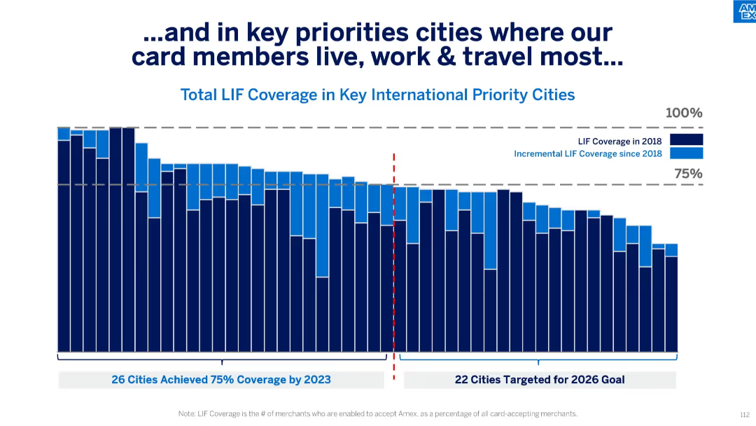
Vertical stacked bar chart split by year (2018 and incremental growth), segmented by 75% threshold and future target cities; uses bold blue tones and annotations.
Performance Metrics and KPIs
Financial Services
The slide illustrates LIF (Locations in Force) coverage across international cities where card members are most active. It differentiates between coverage levels as of 2018 and the progress made since then, showing how many cities have surpassed the 75% target and setting goals for 2026.
LIF coverage, cities, card members, merchant acceptance, 2023 goal, 2026 target, incremental growth, Amex, bar chart
Single Chart
McKinsey
Saved
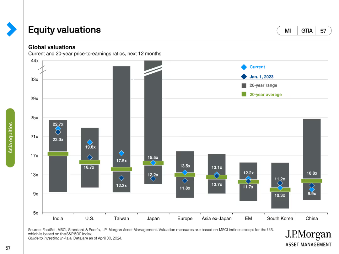
Bar chart comparing current and historical price-to-earnings (P/E) ratios across various regions, with additional markers for 20-year ranges and averages.
Investment Analysis
Financial Services
Evaluates equity valuations by comparing current P/E ratios with historical data, offering insights into regional market valuations and trends.
equity valuations, P/E ratio, bar chart, financial analysis, historical data, market trends, investment, regional analysis
Single Chart
JP Morgan
Saved
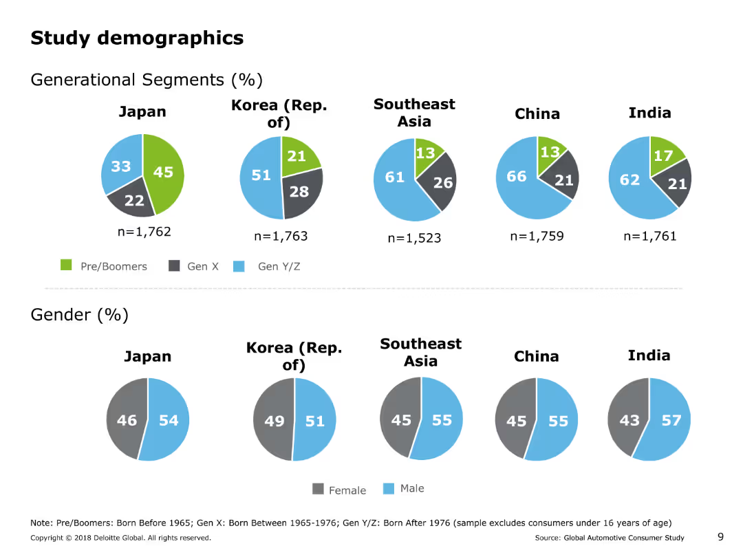
The slide contains several pie charts showing generational segments and gender distribution of the study's respondents across Japan, Korea, Southeast Asia, China, and India.
Market Analysis and Trends
Professional Services
This slide presents demographic information about the respondents in the study, including generational segments (Pre/Boomers, Gen X, Gen Y/Z) and gender distribution across various Asia Pacific countries.
demographics, generational segments, gender distribution, pie charts, market analysis, professional services, study demographics
Multiple Chart
Deloitte
Saved
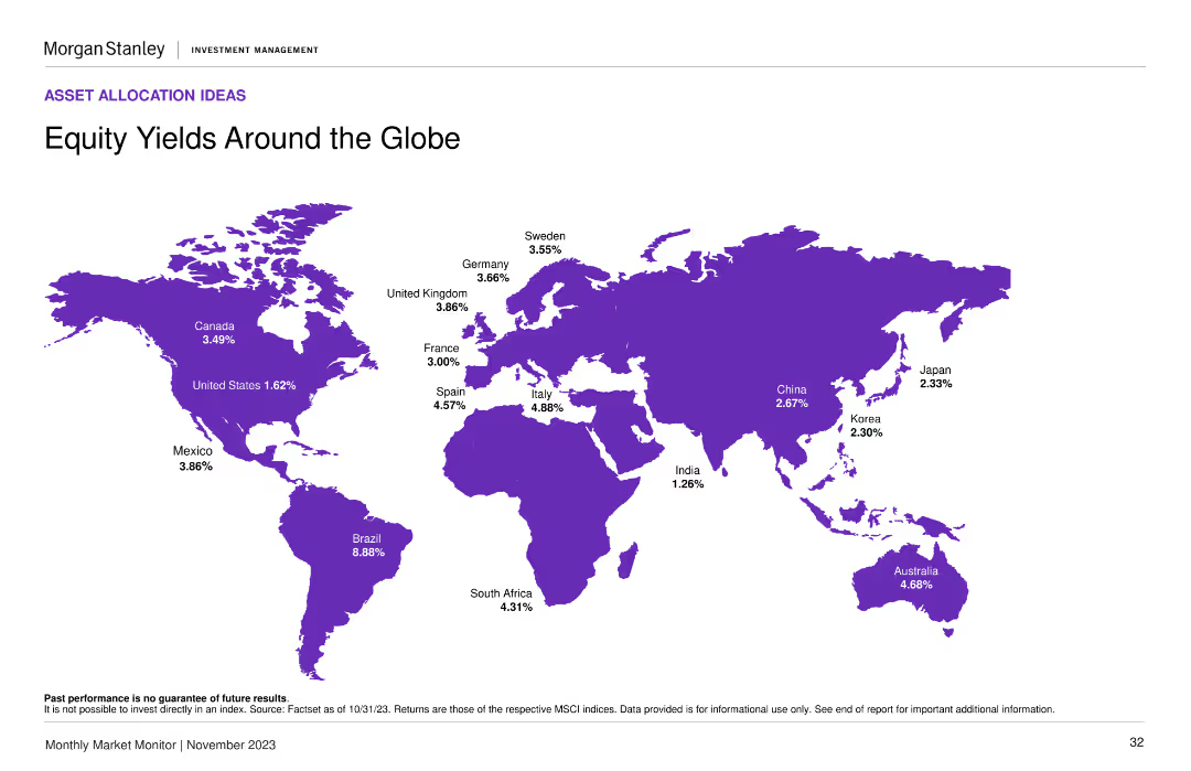
A world map displaying various countries highlighted in purple, with equity yield percentages annotated next to each country. The layout is clean with a central focus on the map.
Market Analysis and Trends
Financial Services
This slide provides a comparison of equity yields across different countries, showing investors where they might find the highest yields. Useful for global market analysis and investment decisions.
equity yields, global market, investment, countries, percentages
Graphic
Morgan Stanley
Saved
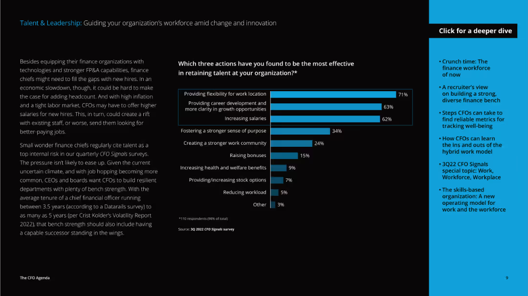
The slide features a detailed text on the left discussing talent retention strategies and a vertical column chart on the right showing effective actions taken by organizations.
Human Resources and Talent Management
Professional Services
The slide discusses strategies for retaining talent, including providing work flexibility, career development, and increasing salaries, highlighting the challenges and solutions CFOs face in talent management.
talent, leadership, workforce, retention, flexibility, career development, salaries, CFO, challenges, solutions
Mixed Chart
Deloitte
Saved
Contains bullet points detailing application modernization and infrastructure modernization with emphasis on cloud adoption and data center consolidation. It uses a purple color scheme and icons to denote different points, including the aim to decommission applications and adopt a multi-cloud strategy.
Operational Efficiency
Technology & Software
Focuses on the bank's initiative to modernize its software development and infrastructure to increase efficiency and cost-effectiveness.
Application Modernization, Infrastructure, Cloud Strategy, Efficiency, Optimization, Data Centers, Security, Financial Services
Table
JP Morgan
Saved
Includes multiple column charts depicting the distribution of the personal luxury goods market by geography and consumer nationality, highlighting growth trends.
Market Analysis and Trends
Consumer Goods
Analyzes geographical and demographic shifts in the personal luxury goods market, emphasizing the growing influence of Chinese consumers. Crucial for global market strategy development.
luxury market, geographical trends, Chinese consumers, market strategy, demographic shifts
Multiple Chart
Bain
Saved
The slide features a detailed process flow diagram illustrating the circular fashion ecosystem, with icons, text boxes, and arrows showing material flows and stages in the lifecycle of fashion products.
Strategic Planning
Retail & E-commerce
The slide provides an overview of the circular fashion ecosystem, detailing various stages from brands and designers to recycling, aiming to maximize utilization and reduce demand.
Circular fashion, Ecosystem, Recycling, Material flows, Fashion lifecycle
Diagram
Roland Berger
Saved
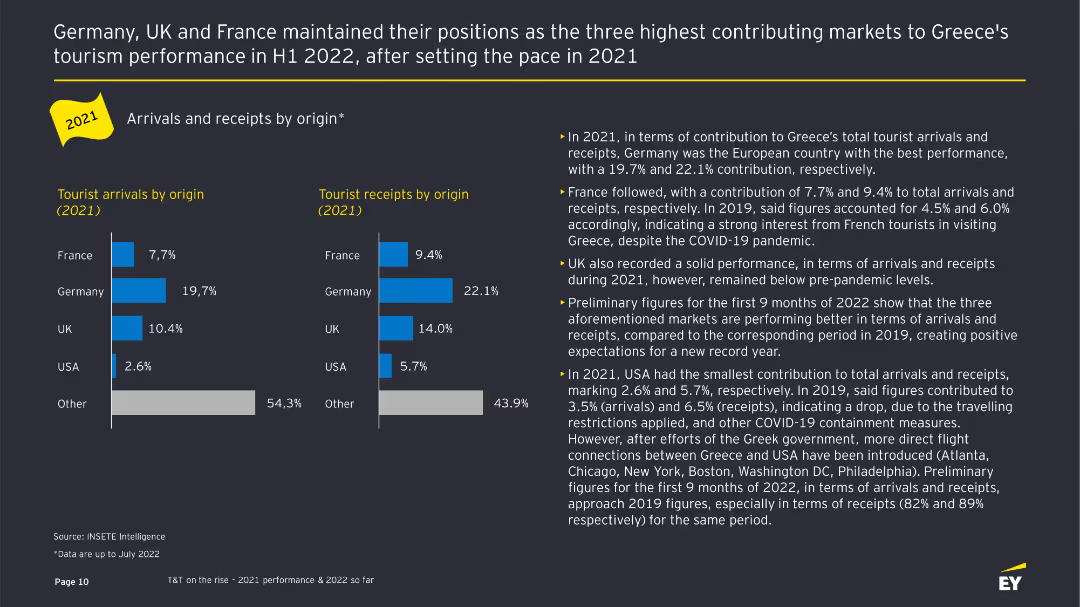
The slide displays bar charts comparing tourist arrivals and receipts by origin in 2021, with supporting text detailing performance by country.
Customer and Market Segmentation
Hospitality & Tourism
This slide analyzes the contributions of different countries to Greece's tourist arrivals and receipts in 2021, highlighting key markets like Germany, France, and the UK.
Tourist arrivals, receipts, market segmentation, country comparison, bar charts
Multiple Chart
EY
Saved
Market Analysis and Trends
Financial Performance
Technology & Software
Slide includes a variety of column charts showing the projected growth of Indonesia's digital economy by sector. The color blue is predominantly used to highlight the future forecast.
This slide projects the robust growth of Indonesia's digital economy by 2025, focusing on the e-commerce sector despite broader macroeconomic challenges.
Multiple Chart
Bain
Saved
The slide presents a side-by-side comparison of old vs. new product frameworks with emphasis on features like sustainability and nutrition.
Product and Service Analysis
Consumer Goods
Explains the new holistic product design framework adopted since 2019, highlighting improvements in sustainability and nutritional content.
product design, sustainability, nutrition, strategic planning, holistic approach
Framework
Deutsche Bank
Saved
The slide includes a column chart with data on natural gas imports from Russia from 2010 to 2022. It uses green shades to differentiate data points and includes a percentage change indicator. The chart is detailed, showing various entry points and their contributions over time. The layout is moderately complex, providing clear comparative data.
Market Analysis and Trends
Energy & Utilities
The slide details the reduction in natural gas imports from Russia and the plans to replace these imports in the second half of 2023. It presents data on various entry points for natural gas and their respective percentages, highlighting significant changes and trends in the import patterns over the years.
natural gas, import, Russia, entry points, trends
Multiple Chart
EY
Saved
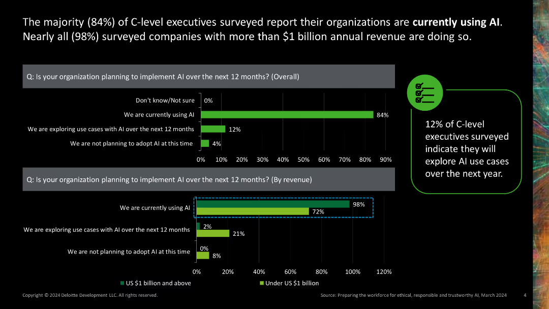
Two column charts showing AI adoption rates by overall and by revenue. Green bars with percentage values.
Market Analysis and Trends
Technology & Software
Presents data on the high rate of AI adoption among C-level executives and companies with significant annual revenue, indicating a trend towards widespread AI implementation.
AI adoption, C-level executives, revenue, market trends, technology
Multiple Chart
Deloitte
Saved
Previous
Next
If nothing, comes up, please save your slides first
Create a FREE account to continue browsing
Receive Instant Access to 1,000+ slides from companies like McKinsey, Google, and Goldman Sachs
First Name
Last Name
Email
Password
I agree to all
Terms & Privacy Policy
Thank you! Your submission has been received!
Oops! Something went wrong while submitting the form.
Have an account?
Sign in
Column Chart
Heatmap
Chevron
Org Chart
Infographic
Callouts
Timeline
List
Graphic
Picture
Process Flow
Diagram
Paragraph
Map
Table
Framework
Subtitle
Takeaway Box
Icon
Other Chart
Radar Chart
Waterfall Chart
Mekko Chart
Pie Chart
Scatter Plot
Line Chart
Bar chart
Bullet points