Create a FREE Account
Instant access to 1,000+ real slides from top companies like McKinsey, BCG, Goldman Sachs, Google and many more!
First Name
Last Name
Email
Password
I agree to all
Terms & Privacy Policy
Thank you! Your submission has been received!
Oops! Something went wrong while submitting the form.
Have an account?
Sign in
Library
Templates
Courses
Pricing
My Account
My Slides
My Templates
✦ AI
AI Prompt Library
AI Search
Sign in
Start Here
Logout
My Saved Slides
The slide features three column charts showing adjusted revenues, operating expenses, and pre-tax loss progression over several quarters. Text details the strategies and outcomes related to operating expense reductions and portfolio valuation risks.
Financial Performance
Financial Services
Explains the improvement in adjusted pre-tax loss through the reduction of operating expenses and portfolio valuation risks. The column charts show the financial progression across quarters, supported by text that details the specific strategies implemented and their impact on financial performance.
Operating Expenses, Portfolio, Risk, Financial Performance, Reduction
Multiple Chart
Credit Suisse
Saved
Left panel with title, global average, and methodology in blue; right side is a horizontal bar chart showing country-level agreement percentages (agree/neutral/don't know/disagree) with 5-year historical trend data on right.
Market Analysis and Trends
Government & Public Sector
This slide shows public sentiment across countries on the belief that their economies are structured to favor the rich and powerful. It includes current (2023) agreement levels along with historical data from 2016 to 2022, and a global average of 67% agreement. The data reflect a strong perception of economic inequality and favoritism globally.
economy, inequality, power, perception, public opinion, Ipsos, survey, global, fairness, trend
Mixed Chart
IPSOS
Saved
This slide features a column chart comparing rail freight costs in Australia, the US, and France, with data on CO2 emissions and typical freight distances. Bullet points highlight key issues.
Market Analysis and Trends
Transportation & Logistics
The slide compares rail freight costs across different countries and discusses factors affecting these costs, including infrastructure integration and geographical challenges.
rail freight, cost comparison, CO2 emissions, Australia, US, France
Mixed Chart
LEK
Saved
The slide includes an area chart showing the top 10 CCUS patents filed by OECD country producers from 1996-2018, with each country represented by a distinct color. Annotations provide context and highlight significant trends.
Financial Performance
Energy & Utilities
This slide details the number of patents filed for CCUS technologies by various OECD countries, showing the United States leading in patent filings. It highlights the competitive landscape in CCUS R&D and the leading contributors over time.
CCUS patents, United States, OECD, R&D, innovation
Single Chart
Kearney
Saved
The slide features a black background with a large orange header. It contains a text block and three bar charts displaying the percentage of employees discussing political and social issues at work, segmented by different groups.
Organizational Structure and Change
Government & Public Sector
Discusses the frequency and impact of political and social discussions at work. It examines the positive and negative outcomes of these discussions across various demographic groups, revealing that such interactions can have both beneficial and detrimental effects on workplace dynamics.
workplace discussions, political issues, social issues, demographics
Multiple Chart
PwC/Strategy&
Saved
Scatter plot correlating the S&P 500 share of oil and gas with Brent oil prices over time, differentiated between 2000-2015 and 2016-June 2019.
Market Analysis and Trends
Financial Services
This slide presents the declining trend of oil and gas industries' share in the S&P 500 index relative to oil prices, suggesting shifts in energy sector valuations influenced by market and price factors.
oil, gas, S&P 500, market trends, Brent oil
Single Chart
BCG
Saved
A mix of text, graphics, and data points addressing the need for digital trust technologies due to growing cybersecurity threats.
Technology and Digital Transformation
Technology & Software
Emphasizes the importance of cybersecurity in light of increasing threats, rising costs, and the need for regulatory compliance.
cybersecurity, digital trust, risk management, technology impact
Text Only
McKinsey
Saved
Column charts displaying changes in fleet size, age, and lease terms over seven years.
Investment Analysis
Transportation & Logistics
Evaluates growth and operational metrics of Aircastle’s fleet, including investments and age of aircraft.
fleet, growth, investment, aircraft, age, lease terms, operational metrics
Multiple Chart
Deutsche Bank
Saved
The slide features two column charts displaying oil & gas and leveraged finance exposure over different quarters.
Risk Assessment and Management
Financial Services
This slide provides an overview of Credit Suisse's exposure to oil & gas and leveraged finance, showing trends in non-investment and investment grade loans.
oil & gas exposure, leveraged finance, non-investment grade, investment grade, financial trends
Multiple Chart
Credit Suisse
Saved
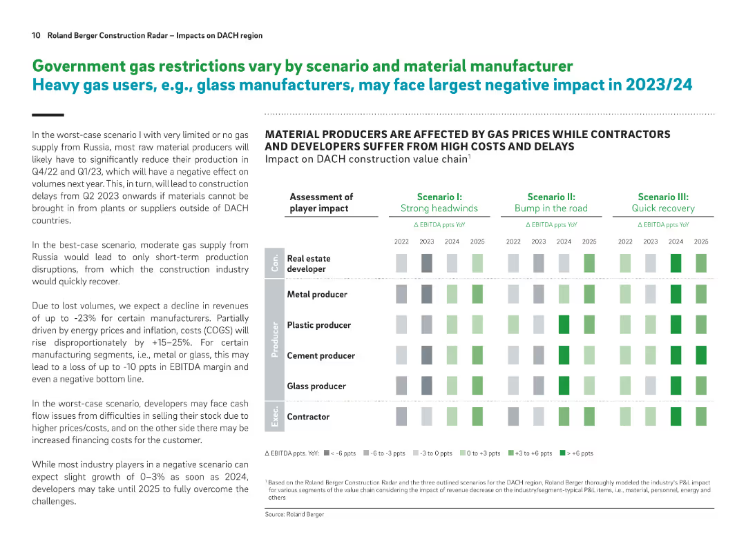
Split layout with text on the left and a heatmap-style matrix on the right. Uses bold headers, shaded boxes, and a structured grid to show impacts across scenarios.
Risk Assessment and Management
Industrial & Manufacturing
This slide assesses the impact of gas supply restrictions on various construction-related industries, focusing on how material manufacturers and developers will be affected under different scenarios. It presents EBITDA impacts across years and scenarios, indicating heavy losses for glass and metal producers in worst-case scenarios.
gas supply, EBITDA impact, construction, scenario planning, raw materials, manufacturing, cost pressures, DACH, delays, recovery
Table
Roland Berger
Saved
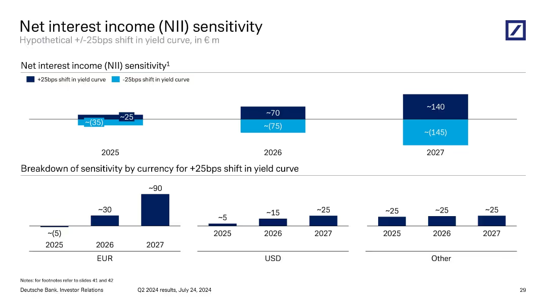
Two-part slide: bar charts showing NII sensitivity to ±25bps yield curve shifts across years, with currency breakdown for +25bps in lower section.
Risk Assessment and Management
Financial Services
Evaluates Deutsche Bank’s NII sensitivity to interest rate shifts from 2025–2027. Projects growing positive impact from a +25bps shift. EUR drives the largest exposure. Useful for forecasting interest rate risk and net income variability.
interest rate risk, NII, yield curve, sensitivity, EUR, forecast
Multiple Chart
Deutsche Bank
Saved
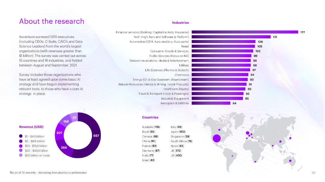
This slide contains a series of bar charts highlighting various capabilities and performance metrics of AI Achievers compared to other categories. The use of bold colors makes the data stand out.
Performance Metrics and KPIs
Technology & Software
It explains how AI Achievers outperform others in multiple areas such as strategy, data management, talent, and responsible AI practices. The slide focuses on the key differentiators of successful AI implementation.
AI performance, metrics, strategy, data management, talent
Multiple Chart
Accenture
Saved
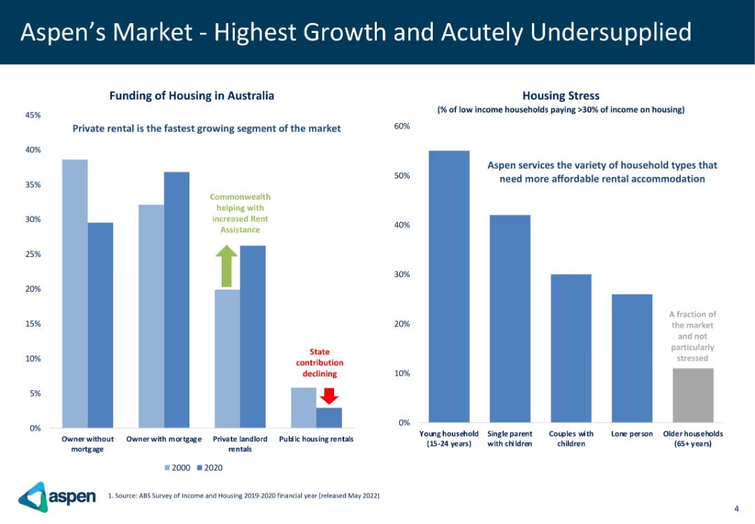
Two-bar chart panels: one showing funding sources for housing in Australia (2000 vs 2020), another showing housing stress by demographic. Simple style with labeled insights.
Market Analysis and Trends
Real Estate & Construction
This slide highlights trends in Australian housing market funding and housing stress levels. It shows a shift toward private rental markets, declining public housing support, and identifies demographics experiencing the most stress. Aspen targets underserved but high-demand housing segments.
housing stress, Australia, rental market, demographics, public housing
Multiple Chart
Goldman Sachs
Saved
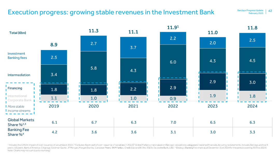
Stacked bar chart with segments labeled by revenue sources from 2019–2024. Color-coded by segment.
Financial Performance
Financial Services
Demonstrates stable investment bank revenue sources (fees, intermediation, financing) across 6 years. Shows relative share of Global Markets and Banking Fees across peer groups. Highlights consistent revenue contributions and peer comparisons.
investment bank, fees, financing, intermediation, peer comparison, revenue stability
Single Chart
Barclays
Saved
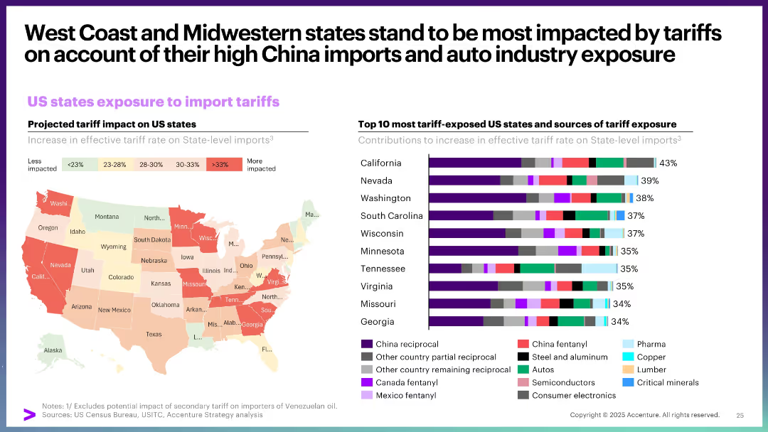
Choropleth map showing state-level tariff exposure, paired with a bar chart listing top 10 exposed states and their sources of exposure.
Strategic Planning
Government & Public Sector
This slide details how different US states are exposed to import tariffs, with West Coast and Midwestern states being the most vulnerable. It attributes this to high China import volumes and auto industry dependence, visualized through a heat map and stacked bar chart.
US states, import tariffs, exposure, auto industry, China trade, regional impact
Multiple Chart
Accenture
Saved
A table on the left shows M&A league table rankings by industry and region. The right side features a vertical breakdown of various sectors within the Tech, Media, and Telecom industry.
Competitive Landscape
Financial Services
The slide conveys the company's dominant position in M&A activities, with league table rankings reflecting its top-tier status across regions and industries. It also highlights the potential for growth in the tech, media, and telecom sectors, suggesting room for further market share expansion despite current leadership.
M&A, League Table, Ranking, Tech, Media, Telecom, Market Share, Growth
Single Chart
Goldman Sachs
Saved
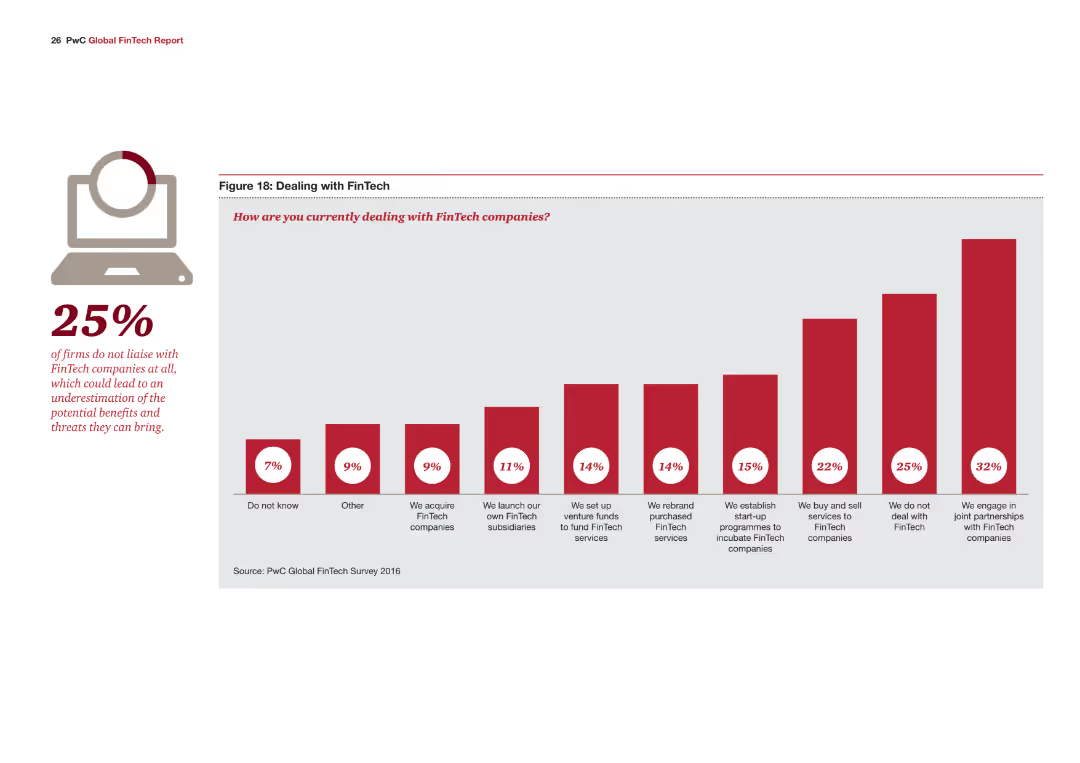
The slide features a single column chart detailing how companies are dealing with FinTech, with various strategies indicated by red bars. A large percentage (25%) is highlighted on the left side.
Risk Assessment and Management
Financial Services
The slide discusses different strategies companies are adopting to engage with FinTech, such as acquiring FinTech companies, setting up venture funds, or not dealing with FinTech at all.
FinTech, strategies, engagement, venture funds, risk management
Mixed Chart
PwC/Strategy&
Saved
Slide is a table layout detailing figures, with clear demarcation and legible text.
Risk Assessment and Management
Energy & Utilities
Analyzes BBVA's exposure to the Oil & Gas sector, with a breakdown by region and subsegment.
Oil, Gas, exposure, BBVA, risk
Table
Morgan Stanley
Saved
The slide uses a timeline chart to depict the expected commercial maturity of various hydrogen applications from 2020 to 2050.
Market Analysis and Trends
Energy & Utilities
The slide shows the expected timeline for the commercial maturity of various hydrogen applications, including industrial applications and mobility, from 2020 to 2050.
hydrogen, timeline, maturity, industrial, mobility, applications, 2050, commercial, chart
Table
Kearney
Saved
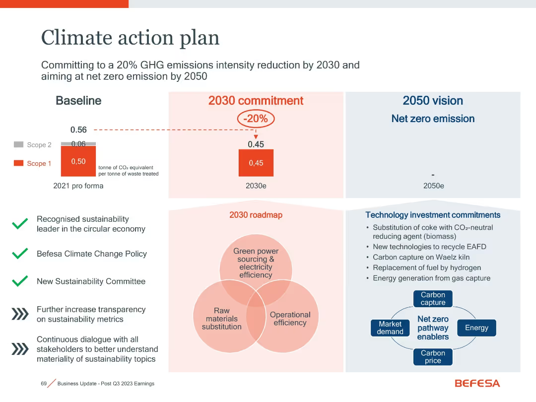
Split layout with charts, icons, and a central Venn diagram
Regulatory and Compliance
Environmental Services & Sustainability
This slide outlines Befesa’s targets for emissions reduction by 2030 and net zero by 2050, supported by policy commitments and technology investments.
Emissions, Climate Plan, Net Zero, Carbon Capture, Sustainability
Mixed Chart
Goldman Sachs
Saved
A series of stacked column charts and labeled circles denote data points, complemented by explanatory text on the side.
Financial Performance
Financial Services
This slide analyzes the composition of 2023 revenues, indicating a shift towards more durable revenue sources. Utilized for financial analysis or strategic planning discussions.
Revenue Breakdown, Financial Analysis, Growth
Mixed Chart
Goldman Sachs
Saved
The slide features comparative data from 2021 to 2022 showcasing the shift in online activities with an emphasis on video consumption. A bar graph and a circular graph highlight the increase in screen time dedicated to video. There's an image of an individual using a smartphone, symbolizing content engagement. The design is modern with a clear, legible font and contrasting colors.
Market Analysis and Trends
Media & Entertainment
This slide highlights the growing importance of video in digital consumer engagement, emphasizing the shift towards video consumption over other online activities in Southeast Asia. It's a valuable tool for discussions about media trends, consumer behavior, and strategic planning for content delivery in the evolving digital landscape.
Video Consumption, Southeast Asia, Media Trends, Consumer Behavior, Digital Engagement, Online Activities, Screen Time, Strategic Planning, Content Delivery, Market Research
Boxed
Bain
Saved
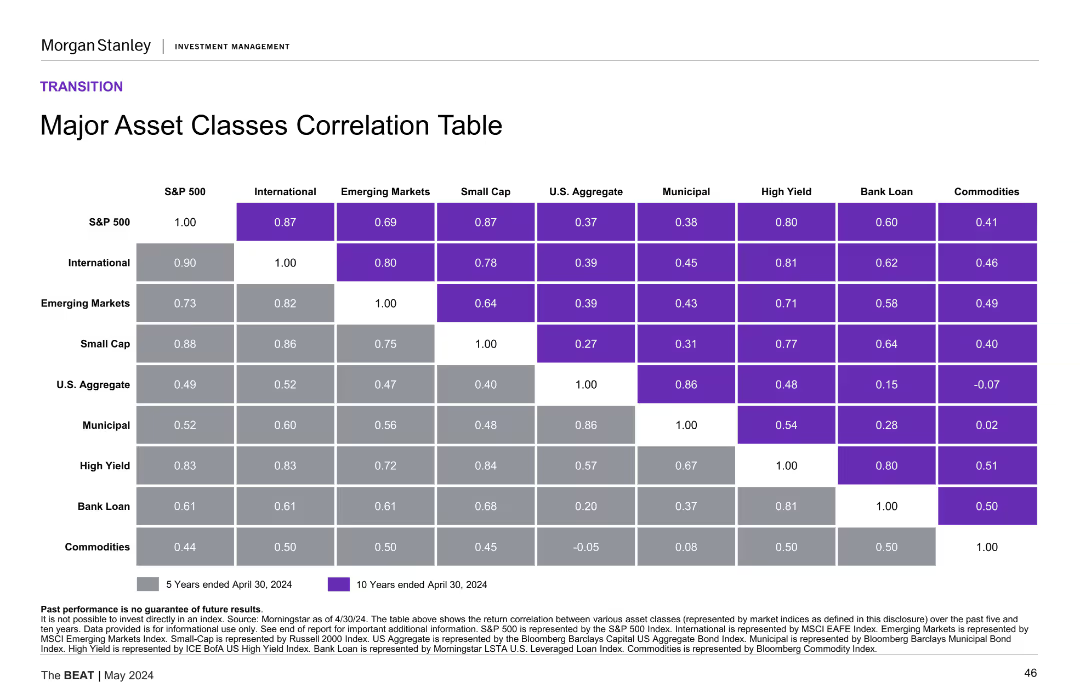
Table with correlation data between major asset classes (e.g., S&P 500, International, Emerging Markets) over 5 and 10 years. Each cell shows correlation coefficient with color coding.
Investment Analysis
Financial Services
Displays correlation coefficients between various asset classes over 5 and 10 years, helping in understanding asset diversification benefits.
Correlation, asset classes, investment
Table
Morgan Stanley
Saved
Text boxes and icons on a dark background describe potential disruptions in network services and the enablement of new services, painting a picture of the future landscape altered by edge computing.
Technology and Digital Transformation
Technology & Software
Discussing the transformative potential of edge computing, this slide explores how the trend could improve network services and unlock new services for both B2B and B2C segments. It delves into how this technological advancement can lead to improvements in content delivery, active-device location tracking, and more immersive end-user experiences.
Network Services, B2B, B2C, Technological Disruption
Header Horizontal
McKinsey
Saved
A bar chart (horizontal) showing the likelihood of consumers to save energy at home across various countries. The chart differentiates between likely and unlikely responses using different colors.
Market Analysis and Trends
Consumer Goods
This slide presents comparative data on the likelihood of saving energy at home. It includes insights into consumer attitudes and behaviors towards energy conservation across different regions.
energy conservation, consumer behavior, sustainability, global attitudes, comparative data
Multiple Chart
IPSOS
Saved
Previous
Next
If nothing, comes up, please save your slides first
Create a FREE account to continue browsing
Receive Instant Access to 1,000+ slides from companies like McKinsey, Google, and Goldman Sachs
First Name
Last Name
Email
Password
I agree to all
Terms & Privacy Policy
Thank you! Your submission has been received!
Oops! Something went wrong while submitting the form.
Have an account?
Sign in
Column Chart
Heatmap
Chevron
Org Chart
Infographic
Callouts
Timeline
List
Graphic
Picture
Process Flow
Diagram
Paragraph
Map
Table
Framework
Subtitle
Takeaway Box
Icon
Other Chart
Radar Chart
Waterfall Chart
Mekko Chart
Pie Chart
Scatter Plot
Line Chart
Bar chart
Bullet points