Create a FREE Account
Instant access to 1,000+ real slides from top companies like McKinsey, BCG, Goldman Sachs, Google and many more!
First Name
Last Name
Email
Password
I agree to all
Terms & Privacy Policy
Thank you! Your submission has been received!
Oops! Something went wrong while submitting the form.
Have an account?
Sign in
Library
Templates
Courses
Pricing
My Account
My Slides
My Templates
✦ AI
AI Prompt Library
AI Search
Sign in
Start Here
Logout
My Saved Slides
Text-focused slide with icons and percentages showing consumer use of digital banking channels and the emotional disconnect experienced.
Market Analysis and Trends
Financial Services
Highlights the functional yet emotionally lacking nature of digital banking channels, and the difficulty in maintaining personal customer relationships.
digital channels, impersonal, banking, consumer, emotional disconnect, customer relationship, insights, survey
Mixed Chart
Accenture
Saved
Text with images showing groups of employees in discussion and meeting environments, emphasizing trust and people experience in the workplace.
Human Resources and Talent Management
Professional Services
The slide emphasizes the importance of building trust and creating a sustainable people experience in the workplace, highlighting statistics on trust and employee support.
Trust, people experience, workplace, employee support, sustainability
Multiple Chart
EY
Saved
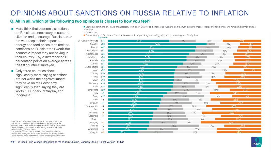
Horizontal stacked bar chart per country; green = pro-sanctions, orange = anti-sanctions, gray = neutral/don’t know.
Pricing Strategies
Government & Public Sector
This slide explores whether citizens think economic sanctions on Russia are justified despite inflation. It shows a 28-country net score comparison with only 3 countries (Hungary, Malaysia, Indonesia) predominantly opposing sanctions due to economic consequences.
sanctions, inflation, economic impact, Ukraine, public opinion, Ipsos, international response
Mixed Chart
IPSOS
Saved
This slide includes a bar graph displaying missed growth opportunities due to lack of resiliency across various industries like high-tech, utilities, and automotive. The graph uses shades of purple to distinguish between industries.
Risk Assessment and Management
Industrial & Manufacturing
Highlights the revenue loss across different industries due to insufficient resiliency and the importance of investing in capabilities that counteract disruptions in engineering, supply, and production.
resiliency, industry comparison, revenue loss, growth opportunities, engineering, supply chain, disruption management, Accenture Research
Mixed Chart
Accenture
Saved
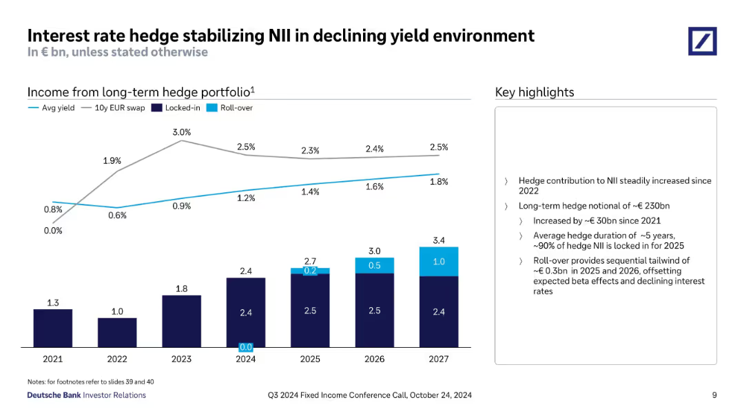
Line and stacked bar chart displaying yield trends and hedge portfolio income by year. Callouts describe hedge strategy components (locked-in vs. rollover). Sidebar includes key strategy metrics.
Risk Assessment and Management
Financial Services
Focuses on how Deutsche Bank's hedge strategy offsets yield declines and stabilizes NII. Displays projected hedge income through 2027 with increasing contributions from rollovers, and explains hedge portfolio size, duration, and income stability.
interest rate hedge, NII, yield environment, hedge duration, rollover, locked-in, hedge income, 2027 forecast
Mixed Chart
Deutsche Bank
Saved
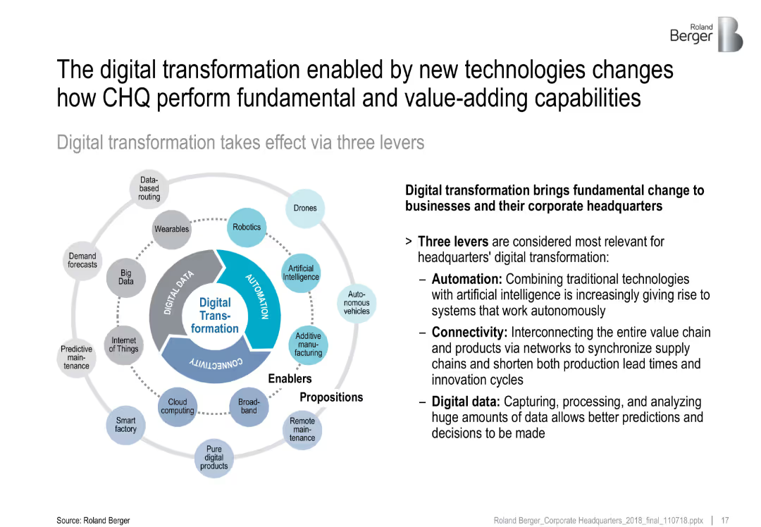
Circular infographic divided into three levers—Automation, Connectivity, Digital Data; surrounding icons represent technologies
Technology and Digital Transformation
Technology & Software
This slide explains the three levers of digital transformation—Automation, Connectivity, and Digital Data—that reshape CHQ functions. It highlights enabling technologies like AI, IoT, and cloud computing as drivers of efficiency, decision-making, and interconnectivity.
digital transformation, automation, connectivity, data, AI, IoT, CHQ
Diagram
Roland Berger
Saved
A structured layout featuring four main content blocks: about Palsgaard, challenge/opportunity, solution, and results and benefits, with accompanying icons and bullet points.
Client Case Studies
Environmental Services & Sustainability
This slide presents a case study on Palsgaard, illustrating how integrating SDG 12 (Responsible Consumption) and SDG 13 (Climate Action) into their core strategy has fueled business growth and decreased externalities, focusing on sustainable operations and CO2 reduction initiatives across global production sites.
Business Growth, Sustainability, SDG 12, SDG 13, Case Study
Table
McKinsey
Saved
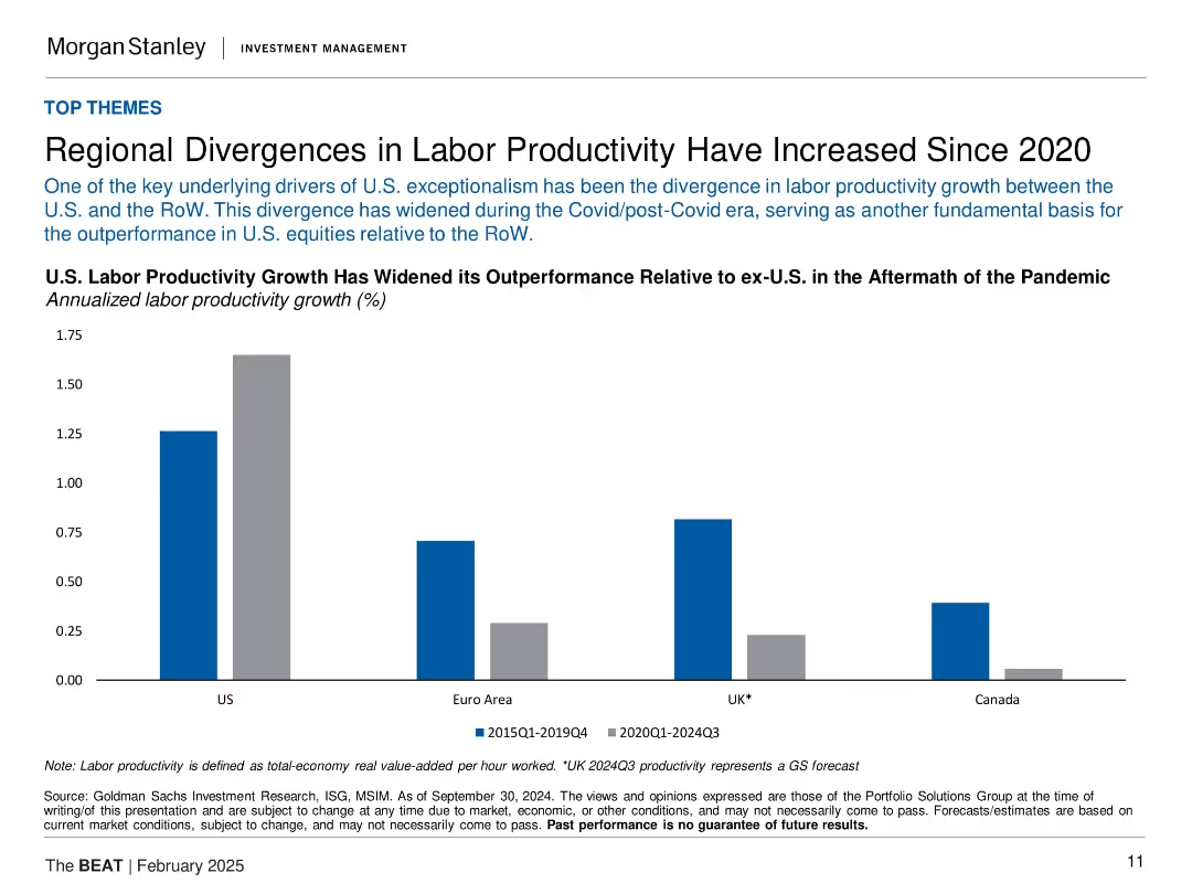
Bar chart comparing labor productivity growth in US, Euro Area, UK, and Canada for 2015–2019 vs. 2020–2024 periods.
Strategic Planning
Professional Services
This slide highlights the growing gap in labor productivity growth between the U.S. and other developed economies post-COVID. It attributes U.S. equity outperformance partly to this productivity divergence, especially in contrast with Canada and the Euro Area. The bars clearly contrast the two periods to emphasize acceleration in the U.S. and stagnation elsewhere.
labor productivity, COVID impact, U.S. outperformance, global comparison, economic efficiency, macro trend
Single Chart
Morgan Stanley
Saved
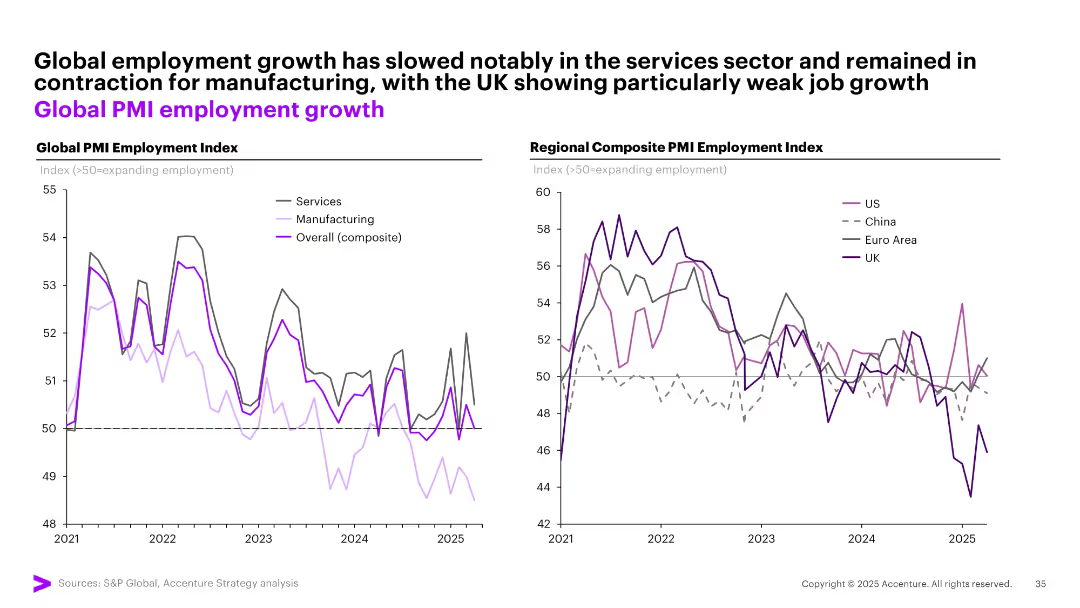
Two line graphs: one shows global employment index trends by sector (services, manufacturing), the other compares regional composite employment indexes.
Performance Metrics and KPIs
Professional Services
The slide illustrates declining employment growth globally, especially in manufacturing. The regional breakdown highlights differing trajectories for the US, UK, Euro area, and China using PMI-based employment indicators.
employment trends, PMI, manufacturing, services, regional comparison, slowdown, global workforce, hiring
Multiple Chart
Accenture
Saved
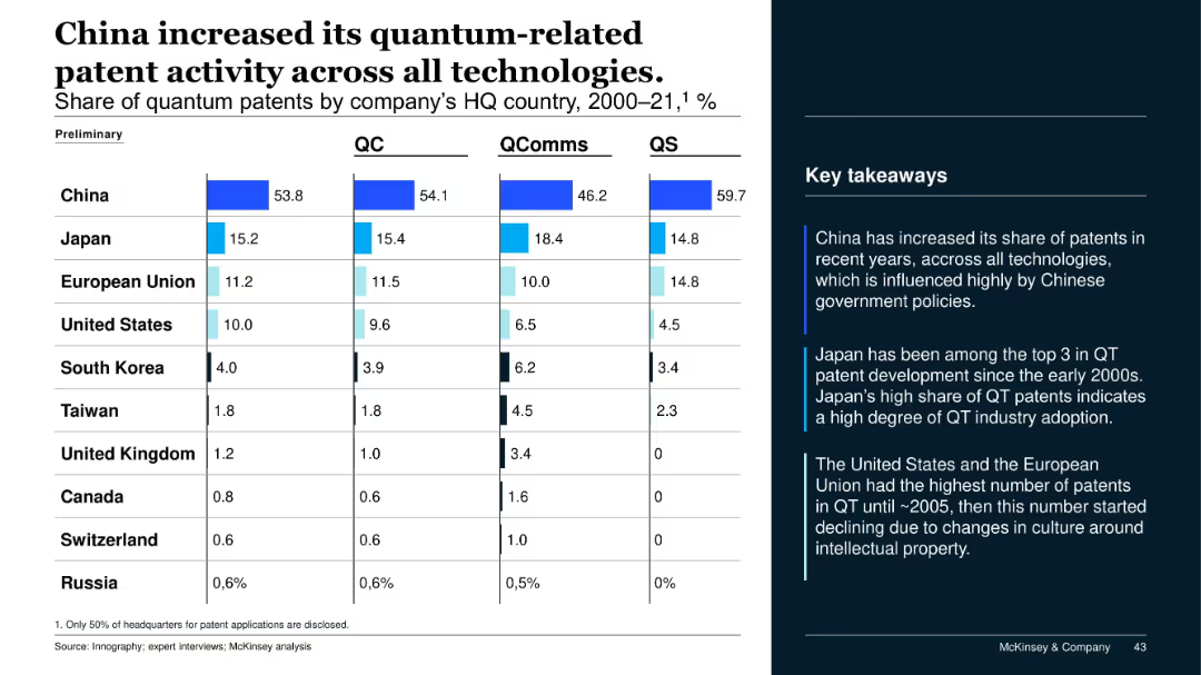
Table with stacked bar graphs and country-level shares of patent filings (QC, QComms, QS) from 2000–2021; summary points on the right.
Regulatory and Compliance
Government & Public Sector
This slide shows China’s leading position in quantum technology patents across all categories, followed by Japan and the EU. Insights note China's policy-driven growth, Japan's steady innovation, and the US/EU's early decline post-2005.
patents, quantum tech, China, Japan, US, EU, IP, innovation, regulatory
Mixed Chart
McKinsey
Saved
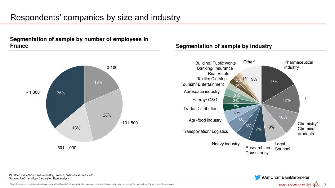
The slide has two pie charts. The left chart shows the segmentation of companies by number of employees, while the right chart depicts the segmentation by industry. Different colors are used for each segment.
Market Analysis and Trends
Professional Services
The slide provides a breakdown of respondents' companies by size and industry, highlighting the diversity of the sample and the representation across various sectors.
company size, industry, segmentation, pie charts, survey, sample diversity
Multiple Chart
Bain
Saved
Pie charts and statistic blocks highlighting customer data interaction and trust issues.
Strategic Planning
Professional Services
Discusses how strategic data use can improve customer relations and retention, focusing on trust and personalization in business approaches.
data use, customer trust, strategic plan
Multiple Chart
BCG
Saved
The slide features three comparison bar charts with accompanying annotations for sales data over two periods, 9M 23 and 9M 22. Design elements include shaded backgrounds for chart areas and color-coded bars for easy differentiation. There is a title at the top, and each bar chart has a label and a brief explanatory note on the right, which analyzes the change in sales and volume. The company logo is at the bottom.
Market Analysis and Trends
Industrial & Manufacturing
The content details the performance of different segments within the automotive and specialties sectors, including sales growth, volume changes, and market analysis. This slide is useful for discussing segment-specific strategies and performance in the automotive industry.
automotive, specialties, sales, performance, market analysis, growth, volume change, sector, strategy
Table
Morgan Stanley
Saved
The slide features a dark background, a quote in a yellow text box, and a question followed by a bar chart showing performance ratings of healthcare system aspects.
Customer and Market Segmentation
Healthcare & Pharmaceuticals
This slide presents Canadian consumers' ratings of the healthcare system's performance in optimizing experiences regardless of personal circumstances.
Healthcare experience, performance, consumer ratings, equitable treatment, Canada
Mixed Chart
EY
Saved
The slide shows column charts representing the adoption rates of physician support systems, such as medication management systems and clinical decision support tools, in hospitals across different APAC regions.
Technology and Digital Transformation
Healthcare & Pharmaceuticals
The slide focuses on the adoption of physician support systems like medication management systems, clinical workflow management systems, and clinical decision support tools across hospitals in APAC, noting lower adoption rates in Japan.
APAC, physician support, hospitals, adoption, digital tools
Multiple Chart
LEK
Saved
The slide divides into four key strategy areas, each with corresponding icons and bulleted lists. The color scheme is consistent with the firm's branding.
Technology and Digital Transformation
Technology & Software
Discussing how technology strategy supports business priorities, this slide could be used for internal alignment and strategic communication.
technology strategy, business priorities, alignment, icons, digital transformation, JPMorgan
Pillar
JP Morgan
Saved
This slide features a circular flowchart detailing portfolio management strategies and a list of key actions taken in various markets, emphasizing strategic decisions like business model evolution and market exit or entry.
Strategic Planning
Consumer Goods
Showcases Nestlé's strategic approach to optimizing its portfolio through selective market actions and business model adjustments. Useful for understanding strategic decision-making processes and their impact on business performance.
strategic planning, portfolio management, business model, market strategies, optimization
Linear Flow
Deutsche Bank
Saved
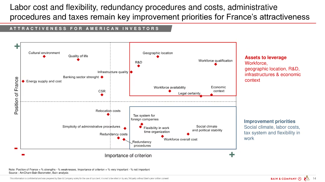
Scatter plot showing the position of France across various improvement priorities such as labor cost and flexibility, redundancy procedures, and taxes.
Strategic Planning
Professional Services
The slide highlights key improvement priorities for France to enhance its attractiveness for American investors, emphasizing labor costs, flexibility, and administrative procedures.
labor cost, flexibility, improvement priorities, France, attractiveness, American investors
Mixed Chart
Bain
Saved
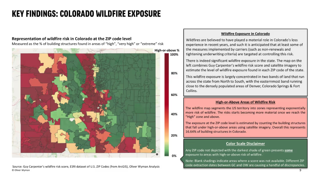
Left side features a color-coded ZIP code heat map of wildfire risk; right side contains descriptive text explaining the data and risk interpretation; uses red-green gradient with three text boxes for context and definitions.
Risk Assessment and Management
Environmental Services & Sustainability
This slide presents the wildfire exposure in Colorado at ZIP code level, identifying areas with high percentages of structures at significant wildfire risk. It highlights concentrated wildfire zones and their correlation with recent underwriting actions by insurers. About 16.6% of Colorado structures are in high-risk zones, influencing carrier decisions.
wildfire risk, ZIP code, building exposure, insurance, risk zones, high-risk areas, Colorado, wildfire impact, underwriting decisions
Mixed Chart
Oliver Wyman
Saved
Pie charts and text outlining asset class split, investment strategies, and medium-term priorities.
Strategic Planning
Financial Services
It discusses AM's strategic positioning and priorities, including asset class diversification and growth market strategies.
asset classes, investment strategies, AM, growth markets, diversification
Multiple Chart
UBS
Saved
This slide has a bar chart with horizontal bars, each representing a policy area with potential impact on green finance, colored in different shades of orange and gray.
Regulatory and Compliance
Government & Public Sector
Discusses several policy areas that could enhance Hong Kong's green finance competitiveness, like updating local tax policies, developing digital solutions for ESG reporting, and collaborating internationally on ESG data sharing. The importance of each area is measured by survey responses over two years.
Green finance, Policy, Subsidies, Tax, Hong Kong
Single Chart
PwC/Strategy&
Saved
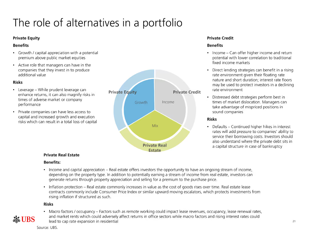
The slide is divided into three sections, each discussing the benefits and risks of Private Equity, Private Credit, and Private Real Estate. A pie chart in the center shows their roles.
Investment Analysis
Financial Services
Describes the roles, benefits, and risks associated with Private Equity, Private Credit, and Private Real Estate in a portfolio, highlighting their potential for growth and income.
Private Equity, Private Credit, Real Estate, Investment, Portfolio, Growth, Income, Risks, Benefits, Strategies
Diagram
UBS
Saved
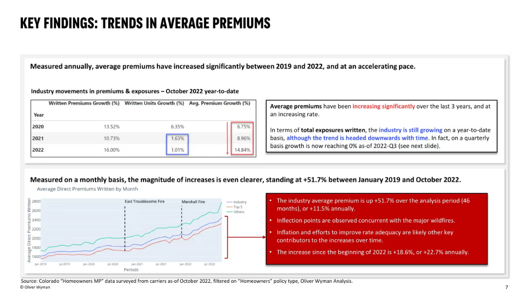
Upper section shows a yearly premium growth table; bottom section has a line chart showing monthly premium trends; highlights notable fire events and uses red callout boxes to emphasize observations.
Pricing Strategies
Financial Services
This slide analyzes significant increases in average premiums between 2019 and 2022, both annually and monthly. It links major premium spikes to wildfire events, inflation, and insurer efforts to restore rate adequacy. Premiums rose +51.7% overall in the period, with sharper increases in 2022 alone.
premium growth, rate adequacy, wildfires, inflation, pricing trends, homeowners, Colorado, insurance, premium trend analysis
Mixed Chart
Oliver Wyman
Saved
Column chart showing Ipsos US revenues vs. US research market with additional text highlighting key market metrics. Text boxes with various market statistics and competitive positions.
Market Analysis and Trends
Professional Services
Presents data on the market size, competitive landscape, and opportunities for growth in the US research market. Highlights Ipsos' position and potential for expansion.
Market Size, Growth, US Research Market, Ipsos, Revenues
Mixed Chart
IPSOS
Saved
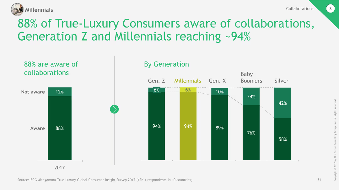
The slide contains column charts showing awareness of collaborations among different generations and overall awareness percentages.
Market Analysis and Trends
Retail & E-commerce
The slide highlights high awareness of brand collaborations among luxury consumers, particularly in Generation Z and Millennials.
Brand collaborations, Awareness, Luxury consumers, Generations, Market trends
Multiple Chart
BCG
Saved
Previous
Next
If nothing, comes up, please save your slides first
Create a FREE account to continue browsing
Receive Instant Access to 1,000+ slides from companies like McKinsey, Google, and Goldman Sachs
First Name
Last Name
Email
Password
I agree to all
Terms & Privacy Policy
Thank you! Your submission has been received!
Oops! Something went wrong while submitting the form.
Have an account?
Sign in
Column Chart
Heatmap
Chevron
Org Chart
Infographic
Callouts
Timeline
List
Graphic
Picture
Process Flow
Diagram
Paragraph
Map
Table
Framework
Subtitle
Takeaway Box
Icon
Other Chart
Radar Chart
Waterfall Chart
Mekko Chart
Pie Chart
Scatter Plot
Line Chart
Bar chart
Bullet points