Create a FREE Account
Instant access to 1,000+ real slides from top companies like McKinsey, BCG, Goldman Sachs, Google and many more!
First Name
Last Name
Email
Password
I agree to all
Terms & Privacy Policy
Thank you! Your submission has been received!
Oops! Something went wrong while submitting the form.
Have an account?
Sign in
Library
Templates
Courses
Pricing
My Account
My Slides
My Templates
✦ AI
AI Prompt Library
AI Search
Sign in
Start Here
Logout
My Saved Slides
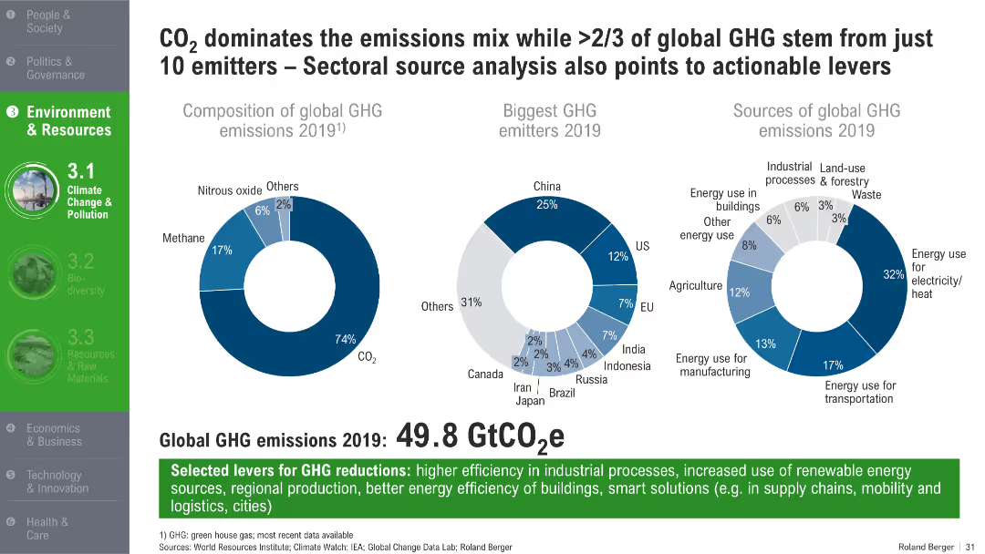
Three pie charts showing GHG composition, emitter countries, and sectoral sources; bold green headers and footnotes
Customer and Market Segmentation
Environmental Services & Sustainability
The slide identifies the dominance of CO₂ in global GHG emissions and highlights that a small group of countries and sectors contribute the most. It presents 2019 data on emission distribution by gas type, country, and economic sector, and suggests potential levers for emissions reduction.
GHG emissions, CO₂, top emitters, energy sectors, 2019 emissions, reduction strategies, industrial efficiency
Mixed Chart
Roland Berger
Saved
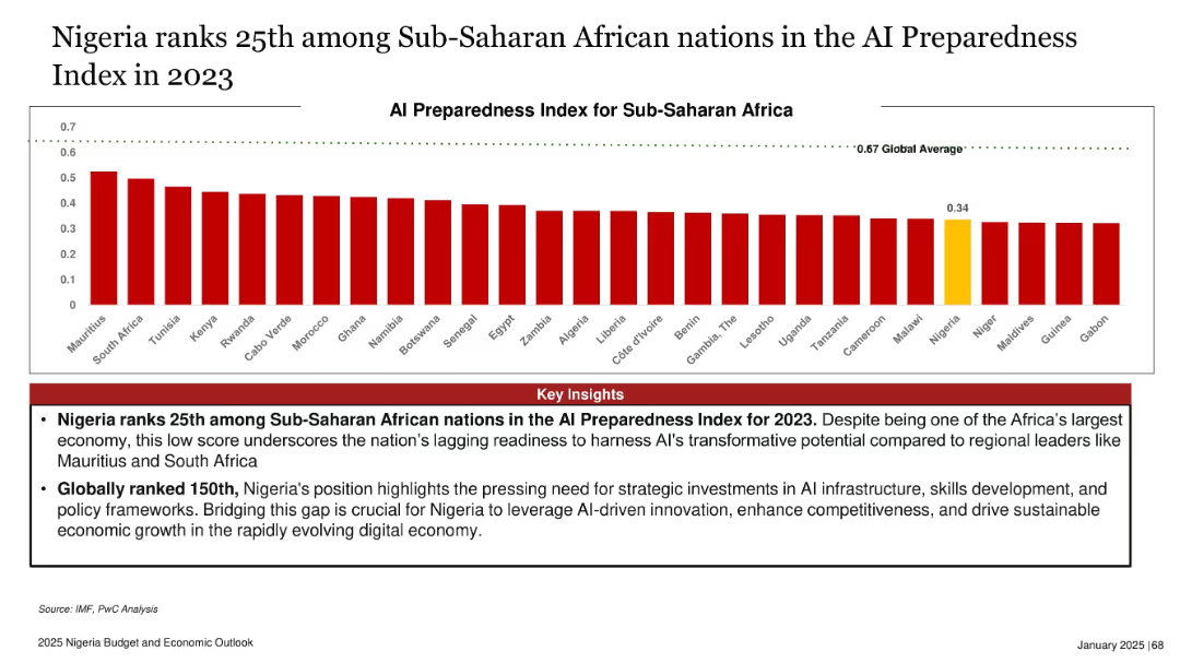
Horizontal bar chart comparing AI readiness index scores of SSA countries; Nigeria highlighted in yellow
Industry Overview
Artificial Intelligence
The slide ranks Nigeria low in AI preparedness among Sub-Saharan African nations, with a score of 0.34—below the global average of 0.67. Insights emphasize the urgent need for investments in infrastructure, policy, and skills to leverage AI’s economic potential and competitiveness in the digital age.
AI, Nigeria, digital economy, infrastructure, readiness, innovation, skills, policy
Mixed Chart
PwC/Strategy&
Saved
Features line graphs and column charts detailing economic indicators, interest rates, and credit cycle concerns.
Risk Assessment and Management
Financial Services
Examines the potential cyclical headwinds faced by the industry and the economic growth forecasts.
Economic indicators, interest rates, credit cycle, economic growth, cyclical headwinds
Multiple Chart
JP Morgan
Saved
The slide lists characteristics of an attractive business model, with each characteristic accompanied by an icon. The characteristics include real price growth, resilience, price insensitivity, long-term revenue visibility, barriers to entry, negative working capital, and high ROI.
Strategic Planning
Education & Training
This slide outlines key characteristics of an attractive business model in the education sector, highlighting factors such as resilience, long-term revenue visibility, high ROI, and barriers to entry, providing insights into the elements that make education a profitable market.
business model, education, profitability, revenue, resilience
Diagram
LEK
Saved
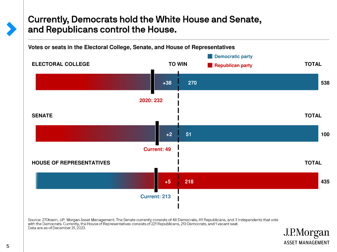
This slide includes bar charts showing the current composition of the Electoral College, Senate, and House of Representatives, with red and blue colors representing the respective parties.
Market Analysis and Trends
Government & Public Sector
Illustrates the current political landscape in the U.S., showing the distribution of power between Democrats and Republicans in the Electoral College, Senate, and House of Representatives.
Politics, Electoral College, Senate, House, Parties
Single Chart
JP Morgan
Saved
This slide contains multiple line graphs comparing incremental GDP changes with broadband speeds. Graphs are color-coded, representing different models from Briglauer et al. (2021) and Accenture (2023). Includes textual annotations on the right.
Market Analysis and Trends
Technology & Software
Analyzes the impact of broadband speed on GDP growth, contrasting different models and their implications for economic forecasting. Discusses methodological differences and data interpretations.
GDP, broadband, economic analysis, models, line graph
Mixed Chart
Accenture
Saved
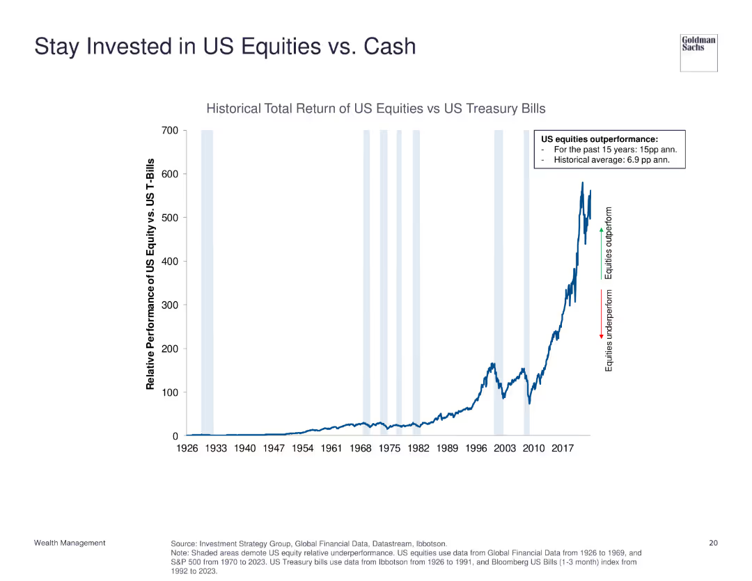
The slide contains a line chart illustrating the historical total return of US equities versus US treasury bills from 1926 to 2023. Key performance highlights are annotated.
Investment Analysis
Financial Services
This slide shows the performance comparison between US equities and US treasury bills, emphasizing the strong outperformance of equities.
US equities, treasury bills, historical return, investment, performance comparison
Single Chart
Goldman Sachs
Saved
Two-column format with financials on the left and profit breakdown via bar chart on the right. Uses segmented bars to explain losses and impacts by area.
Financial Performance
Financial Services
Reports a Q2 2024 loss of €1.49bn mainly due to Postbank litigation and centrally retained items. Segmented bar chart breaks down contributions by area. Highlights valuation reversals and operational risk RWA reduction.
corporate, loss, Postbank, litigation, noninterest expenses, Q2 2024
Mixed Chart
Deutsche Bank
Saved
Dark background with dual bar charts showing nickel production and export by country in 2020, focusing on class 1 and class 2 nickel.
Competitive Landscape
Industrial & Manufacturing
Provides an overview of the global nickel market, showcasing the leading exporting countries and their market shares, with a specific focus on Russian production and export trends.
nickel, export, market share, Russia, global
Multiple Chart
McKinsey
Saved
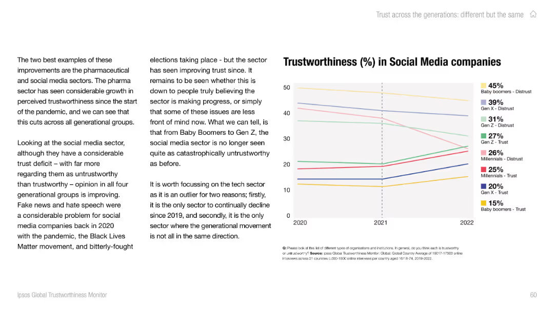
Text-heavy left side with analysis; right side contains a line chart showing trust/distrust by generation.
Market Analysis and Trends
Media & Entertainment
The slide outlines how public trust in social media companies has improved post-2020 across all generations, although overall levels of trust remain low, especially among older groups.
social media, trust trends, fake news, generational views, Ipsos, Baby Boomers, Gen Z, misinformation, public opinion, sector trends
Mixed Chart
IPSOS
Saved
Line chart showing the year-over-year growth of global personal luxury goods by channel from 2017 to 2023.
Strategic Planning
Consumer Goods
Examines the normalization of channel dynamics post-pandemic, focusing on retail, wholesale, and e-commerce.
Channel, Dynamics, Post-pandemic, Growth, Luxury
Mixed Chart
Kearney
Saved
The slide features a scatter plot with a diagonal trend, labeled "Exhibit 13". There's a legend at the top marking different regions with color-coded squares. The x-axis shows upskilling progress percentage and the y-axis shows CEO's belief in upskilling.
Market Analysis and Trends
Professional Services
The slide presents a correlation between the maturity of talent pools in various regions and the progress in establishing upskilling programs, suggesting regions with more mature talent are less likely to have made significant progress in this area.
upskilling, talent pools, regional comparison, CEO beliefs, progress
Mixed Chart
PwC/Strategy&
Saved
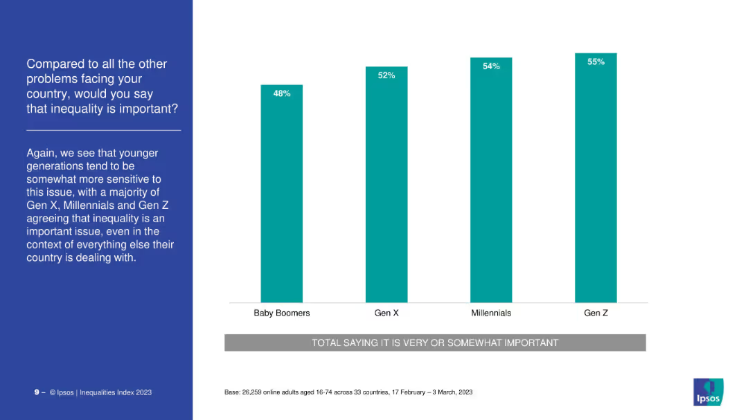
Vertical bar chart comparing importance of inequality by generation. Simple layout with teal bars and left-side title.
Market Analysis and Trends
Government & Public Sector
A generational comparison of perceived importance of inequality shows Gen Z rates it the highest (55%), followed by Millennials and Gen X, while Baby Boomers are least concerned at 48%.
inequality, generational attitudes, social concern, priorities, survey
Mixed Chart
IPSOS
Saved
Multiple bar and column graphs, with a clean layout displaying JPMorgan's asset management performance metrics.
Financial Performance
Financial Services
This slide aims to communicate JPMorgan's strategy and success in scaling asset management, using data visualizations to highlight growth in various investment types and to position themselves as industry leaders with effective ETFs and SMAs.
scaling, asset management, JPMorgan, ETFs, performance
Multiple Chart
JP Morgan
Saved
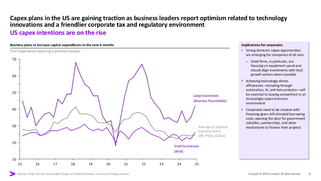
Line chart showing business capex intentions over time, segmented by company type. Right-hand sidebar contains corporate implications. Purple and grey lines track trends.
Market Analysis and Trends
Financial Services
Illustrates the increasing intention to raise capital expenditures among US businesses, especially large firms. Also outlines strategic implications for businesses, including the need for financing innovation amid a competitive environment.
capex, US business, investment intentions, technology, small business, regulation
Mixed Chart
Accenture
Saved
The slide features a line chart showing correlations between stocks and sovereign bonds, with the six-month correlation in gray and the one-year correlation in purple, covering the period from 1998 to 2023.
Market Analysis and Trends
Financial Services
This slide analyzes the correlations between stocks and sovereign bonds, providing insights into market trends and investment strategies.
Stock-bond correlation, market analysis, investment strategy, financial analysis, six-month correlation, one-year correlation
Multiple Chart
JP Morgan
Saved
Depicts future shareholder distributions through column charts for share buy-backs and dividends over upcoming years.
Financial Performance
Financial Services
Illustrates Deutsche Bank's strategy for increasing shareholder payouts, showing historical data and future projections.
shareholder, distributions, dividends, buy-backs, future, strategy, financial, bar graphs, payouts, projections
Multiple Chart
Deutsche Bank
Saved
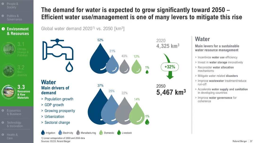
Illustrated water drops indicating demand by use sector, arrows showing growth; supporting sidebar text on levers and drivers
Market Analysis and Trends
Environmental Services & Sustainability
This slide forecasts a 32% increase in global water demand by 2050, with irrigation, manufacturing, and domestic use being key contributors. It identifies main demand drivers and outlines strategies for sustainable water resource management, including governance and efficiency.
water demand, 2050 forecast, irrigation, sustainable use, urbanization, water governance
Mixed Chart
Roland Berger
Saved
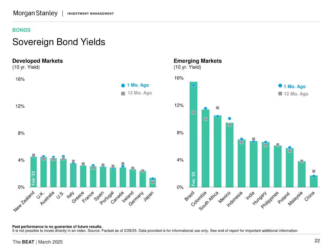
Dual-bar chart format comparing current vs. 12 months ago bond yields for developed and emerging markets. Uses consistent color scheme and gridlines for clarity.
Financial Performance
Financial Services
This slide compares 10-year sovereign bond yields from developed and emerging markets, highlighting significant yield differences and recent trends. It allows insight into relative monetary policy stances and investor return expectations across regions.
sovereign yields, emerging markets, developed markets, bond returns, interest rates, yield trends, 10-year, rate comparisons
Multiple Chart
Morgan Stanley
Saved
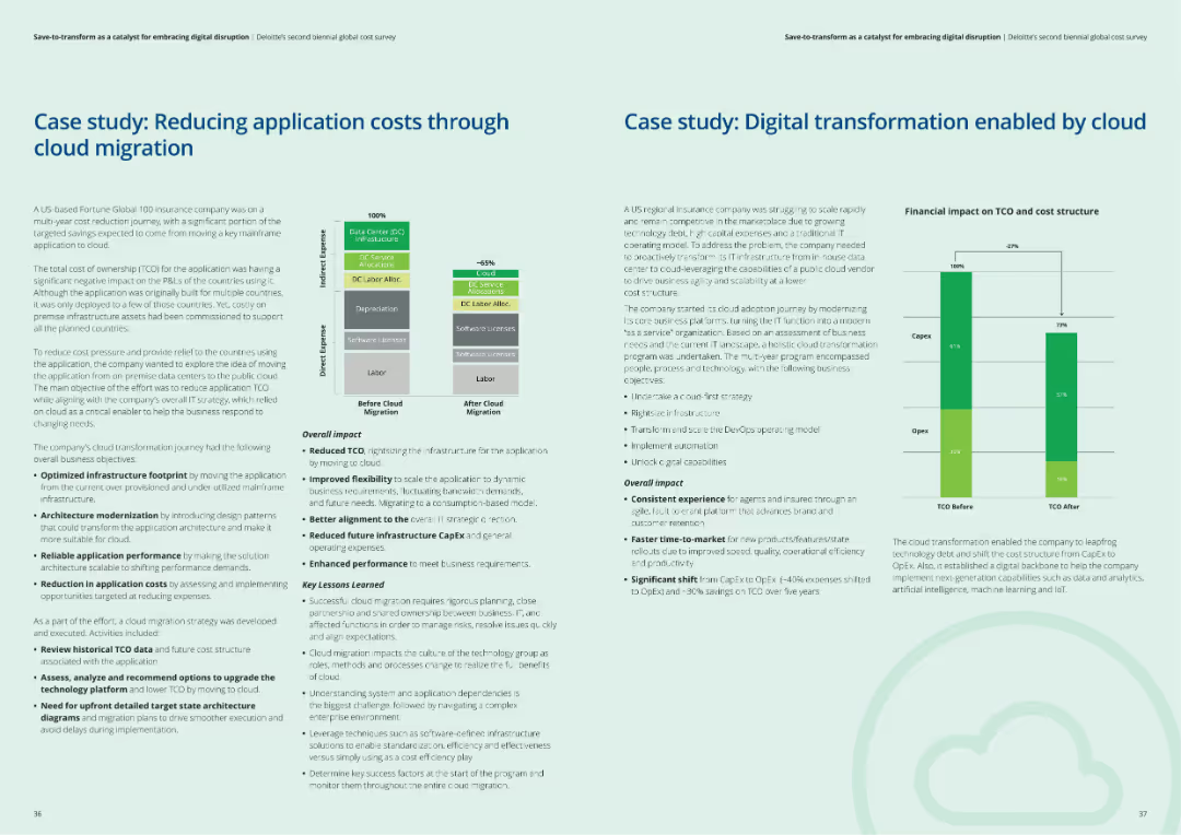
The slide includes two case studies, each with a structured layout showing context, challenges, actions taken, and results of cloud migration and digital transformation efforts.
Client Case Studies
Financial Services
The slide presents two case studies: one on reducing application costs through cloud migration and another on digital transformation enabled by cloud solutions, highlighting key lessons learned.
Cloud migration, digital transformation, case studies, client examples, financial services
Multiple Chart
Deloitte
Saved
The slide uses a combination column charts to illustrate the prevalence of burnout symptoms among different demographic groups. Includes textual analysis of the data.
Market Analysis and Trends
Healthcare & Pharmaceuticals
Focuses on the rise of burnout in professional settings, exploring demographic differences and providing insights into potential preventive measures and management strategies.
burnout, professional health, workplace wellness, demographic analysis, stress management, mental health strategies, burnout prevention, employee wellness, occupational health, survey data
Mixed Chart
Deloitte
Saved
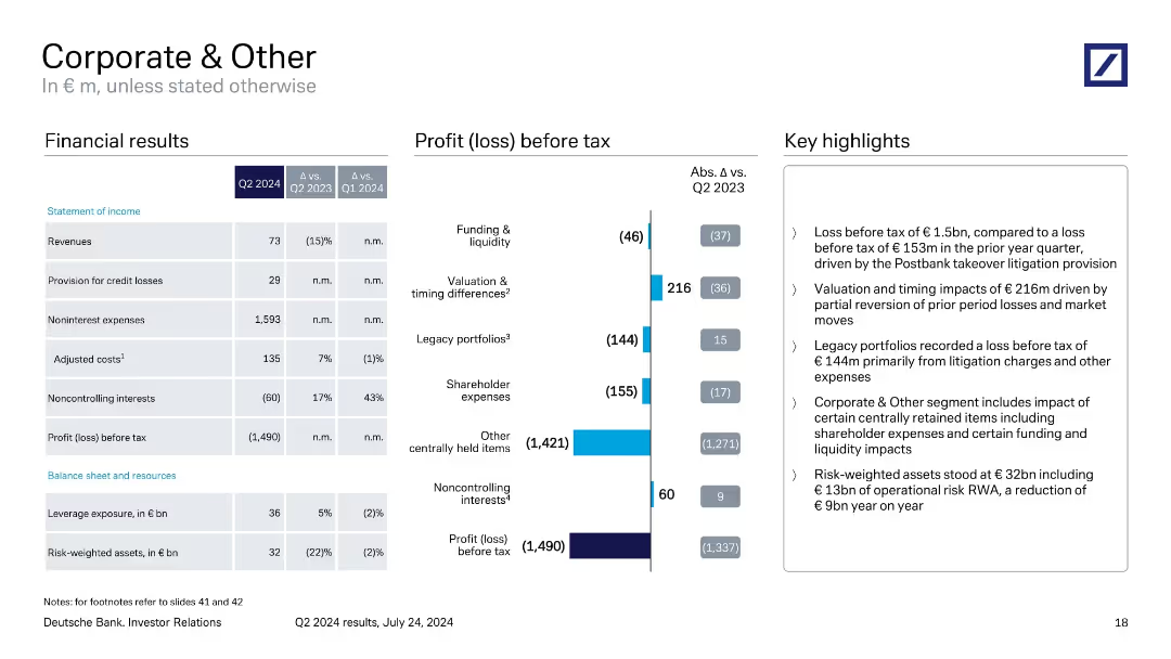
The slide uses bullet points and column charts to present financial results and losses. The layout is information-dense.
Financial Performance
Financial Services
Focused on the "Corporate & Other" segment of a financial institution, this slide shows detailed financial results including profits and losses, adjustments, and expenses. It is intended for financial analysts and management to evaluate the impact of non-core activities on the overall financial health of the institution, with specific attention to shareholder expenses, legacy portfolios, and valuation adjustments.
Corporate Finance, Losses, Profits, Financial Reporting, Analysis
Mixed Chart
Deutsche Bank
Saved
The slide features a large, bold title in blue at the top, with bar graphs comparing pre-pandemic consumers and new digital consumers across multiple Southeast Asian countries. There's a light blue overlay with text indicating three aspects: Continued adoption, Deepening usage, and New way of life.
Market Analysis and Trends
Technology & Software
This slide presents a comparative analysis of digital consumer growth in Southeast Asia, focusing on the increased proportion of online consumption due to the pandemic.
digital consumers, pandemic, SEA, growth, online consumption, Thailand, Philippines, charts
Single Chart
Bain
Saved
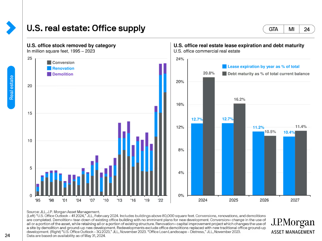
The slide features two charts. The left chart categorizes U.S. office stock removed by conversion, renovation, and demolition from 1995 to 2023. The right chart presents U.S. office real estate lease expiration and debt maturity as percentages of total current balance from 2024 to 2027.
Market Analysis and Trends
Real Estate & Construction
The slide provides an overview of the changes in U.S. office supply through different removal methods and outlines the lease expiration and debt maturity schedules for office real estate. It's useful for understanding supply dynamics and future lease/debt obligations.
office supply, lease expiration, debt maturity, conversion, renovation, demolition
Multiple Chart
JP Morgan
Saved
Slide features three overlapping circles in blue, green, and grey, labeled Work, People, and Technology. Within the intersection of all three is a central question about harnessing insights for performance.
Risk Assessment and Management
Technology & Software
Discusses the interplay between work, people, and technology, and how to harness insights to drive performance. Ideal for discussions on managing disruption and leveraging insights in business.
Disruption, Insights, Performance, Technology
Diagram
Deloitte
Saved
Previous
Next
If nothing, comes up, please save your slides first
Create a FREE account to continue browsing
Receive Instant Access to 1,000+ slides from companies like McKinsey, Google, and Goldman Sachs
First Name
Last Name
Email
Password
I agree to all
Terms & Privacy Policy
Thank you! Your submission has been received!
Oops! Something went wrong while submitting the form.
Have an account?
Sign in
Column Chart
Heatmap
Chevron
Org Chart
Infographic
Callouts
Timeline
List
Graphic
Picture
Process Flow
Diagram
Paragraph
Map
Table
Framework
Subtitle
Takeaway Box
Icon
Other Chart
Radar Chart
Waterfall Chart
Mekko Chart
Pie Chart
Scatter Plot
Line Chart
Bar chart
Bullet points