Create a FREE Account
Instant access to 1,000+ real slides from top companies like McKinsey, BCG, Goldman Sachs, Google and many more!
First Name
Last Name
Email
Password
I agree to all
Terms & Privacy Policy
Thank you! Your submission has been received!
Oops! Something went wrong while submitting the form.
Have an account?
Sign in
Library
Templates
Courses
Pricing
My Account
My Slides
My Templates
✦ AI
AI Prompt Library
AI Search
Sign in
Start Here
Logout
My Saved Slides
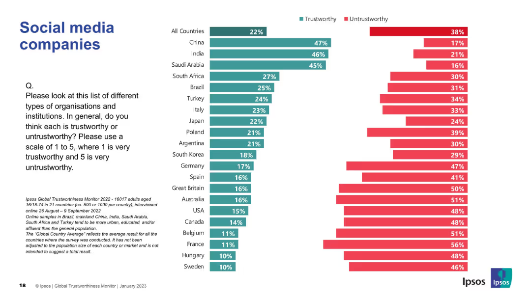
Country-wise trust ranking chart in social media; consistent visual theme with green/red bars.
Market Analysis and Trends
Media & Entertainment
The chart details the global public's low trust in social media firms, especially in Western countries. China and India lead in trust levels.
social media, trustworthiness, global survey, Ipsos, perception, internet platforms, countries, public trust, ranking
Mixed Chart
IPSOS
Saved
The slide is visually balanced, featuring a customer journey flowchart on the left and two sets of bulleted lists on the right describing commerce experiences and core capabilities.
Strategic Planning
Financial Services
Discusses strategies for engaging customers through commerce, with a focus on providing end-to-end customer experiences and driving merchant value.
customer journey, commerce, engagement, experiences, capabilities, value creation, financial strategy
Diagram
JP Morgan
Saved
Features a line graph showing the projected levelized cost of energy for green hydrogen across three macro-zones in Chile until 2025.
Market Analysis and Trends
Energy & Utilities
Projects the decreasing costs of green hydrogen production in Chile's northern and southern zones, highlighting the competitive and uncompetitive regions.
Chile, hydrogen, cost analysis, LCOE, competitive zones, 2020-2025
Mixed Chart
McKinsey
Saved
Slide with a bar chart showing industry participation in a survey, highlighted in various shades of green, alongside pie charts depicting regional and operational scopes.
Market Analysis and Trends
Professional Services
Summarizes industry, regional, and operational participation in a 2023 survey, focusing on the evolving landscape of contact centers.
Survey Participation, Industry Representation, Regional Analysis, Operational Scope, Contact Centers
Mixed Chart
Deloitte
Saved
The slide features a timeline chart showing the political attractiveness curve for CCUS policies from 1996 to 2020, including significant events and milestones.
Regulatory and Compliance
Government & Public Sector
The slide depicts the political support trajectory for CCUS policies from 1996 to 2020. It highlights key events, policy milestones, and shifts in support over time, showing how political attitudes towards CCUS have evolved and the impact of various external factors on this support.
CCUS, political support, timeline, policies
Single Chart
Kearney
Saved
A bar graph depicting the global top ten vehicles sold between 2010-2019 with a side image of the F-Series.
Client Case Studies
Transportation & Logistics
Asserts the F-Series as the top-selling pickup globally over the past ten years.
F-Series, best-selling, pickup truck, global market
Single Chart
BCG
Saved
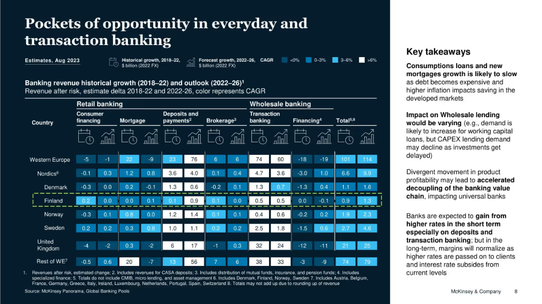
Grid matrix showing historical and forecasted banking revenue across multiple countries and sectors, with color-coded CAGR rates and key takeaways.
Market Analysis and Trends
Financial Services
This slide identifies growth trends in retail and wholesale banking sectors across Europe, especially in Finland. Key takeaways include the slowing of loan and mortgage growth, varying wholesale lending demand, and potential for margin gains through higher rates, especially in deposits and transaction banking.
revenue growth, banking sectors, transaction banking, Finland, CAGR, retail banking, wholesale banking, Europe, profitability
Boxed
McKinsey
Saved
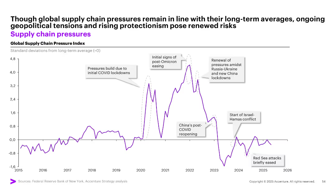
Line chart with annotations and key geopolitical events labeled, showing deviations in global supply chain pressures from the long-term average.
Market Analysis and Trends
Transportation & Logistics
Tracks global supply chain pressure index from 2015 to 2026, highlighting disruptions from events such as COVID-19 lockdowns, Russia-Ukraine conflict, and Red Sea attacks. Despite fluctuations, pressures are nearing long-term average, but risks from protectionism persist.
supply chain, COVID-19, geopolitical risk, logistics, index, pressure, trend, Russia, China, Omicron, Hamas
Single Chart
Accenture
Saved
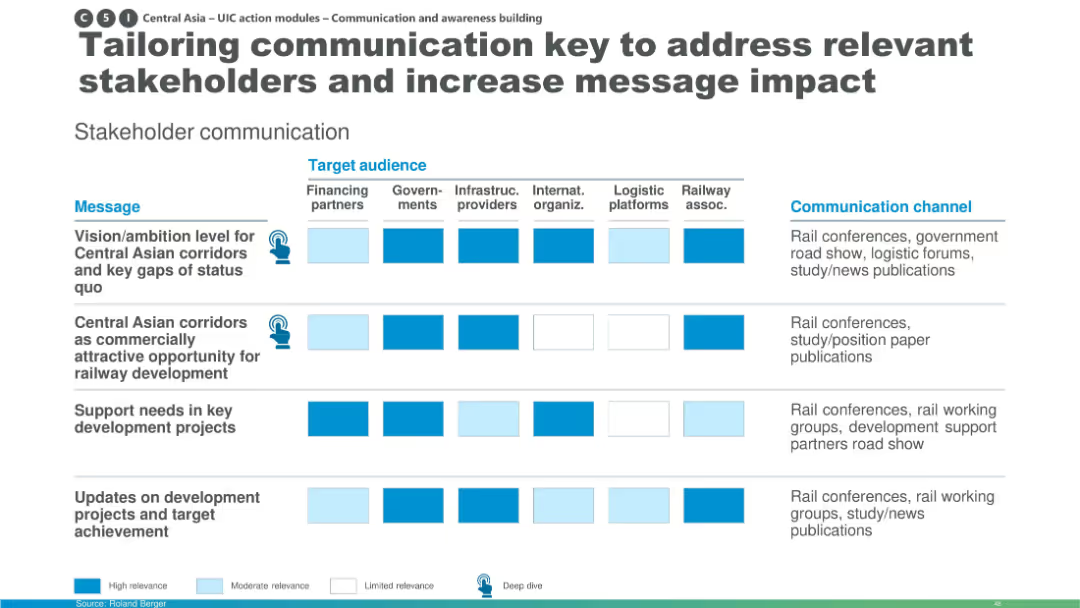
Matrix slide with rows of messages and columns of target audiences; uses color-coded relevance indicators (high, moderate, limited) and includes icons and communication channels.
Strategic Planning
Transportation & Logistics
This slide shows how communication strategies for Central Asian rail corridor development should be tailored to various stakeholders like financing partners, governments, infrastructure providers, and logistics platforms. It uses a matrix to visualize message relevance and preferred communication channels.
stakeholder communication, Central Asia, railway development, message relevance, logistics, infrastructure, communication strategy, rail corridors, target audience
Table
Roland Berger
Saved
The slide includes a column chart displaying market concentration levels across different access modes based on the Nielsen & Fletcher approach. Annotations provide detailed explanations of the concentration levels and their implications.
Market Analysis and Trends
Media & Entertainment
This slide explores market concentration levels (HHI) by access mode using the Nielsen & Fletcher approach, which considers only the last step before reaching news articles, excluding subsequent visits, offering insights into media concentration.
Nielsen & Fletcher, Market Concentration, HHI, Column Chart, Access Mode
Single Chart
IPSOS
Saved
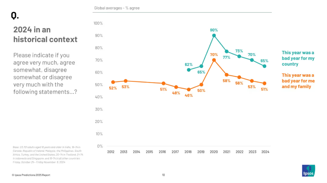
Line graph showing annual agreement trends from 2012 to 2024 for two statements, distinguished by color and labeled annotations.
Market Analysis and Trends
Professional Services
The slide shows longitudinal data on public agreement that 2024 was a bad year, both nationally and personally. Agreement levels have declined in recent years, peaking during 2020–2021, with 65% and 51% agreeing in 2024.
historical trends, public perception, 2024 reflection, sentiment analysis, Ipsos data, opinion tracking
Mixed Chart
IPSOS
Saved
Displays a multi-part column chart, detailing second-hand market behaviors between Chinese and US consumers in green and yellow tones.
Market Analysis and Trends
Retail & E-commerce
Compares second-hand luxury market behaviors between Chinese and US consumers, highlighting differences in selling and buying trends.
market behavior, Chinese consumers, US consumers, second-hand luxury, buying and selling trends
Single Chart
BCG
Saved
Features a structured checklist format outlining various governmental actions needed to meet COP26 ambitions, including strategies for decarbonization, energy transition costs, and green financing.
Regulatory and Compliance
Energy & Utilities
Details a comprehensive framework for government actions within SEA to build visibility and implement actionable plans that align with COP26 ambitions, focusing on regulatory, financial, and collaborative measures to facilitate the green transition.
COP26, Government Strategies, Decarbonization, SEA, Green Financing
Header Horizontal
Bain
Saved
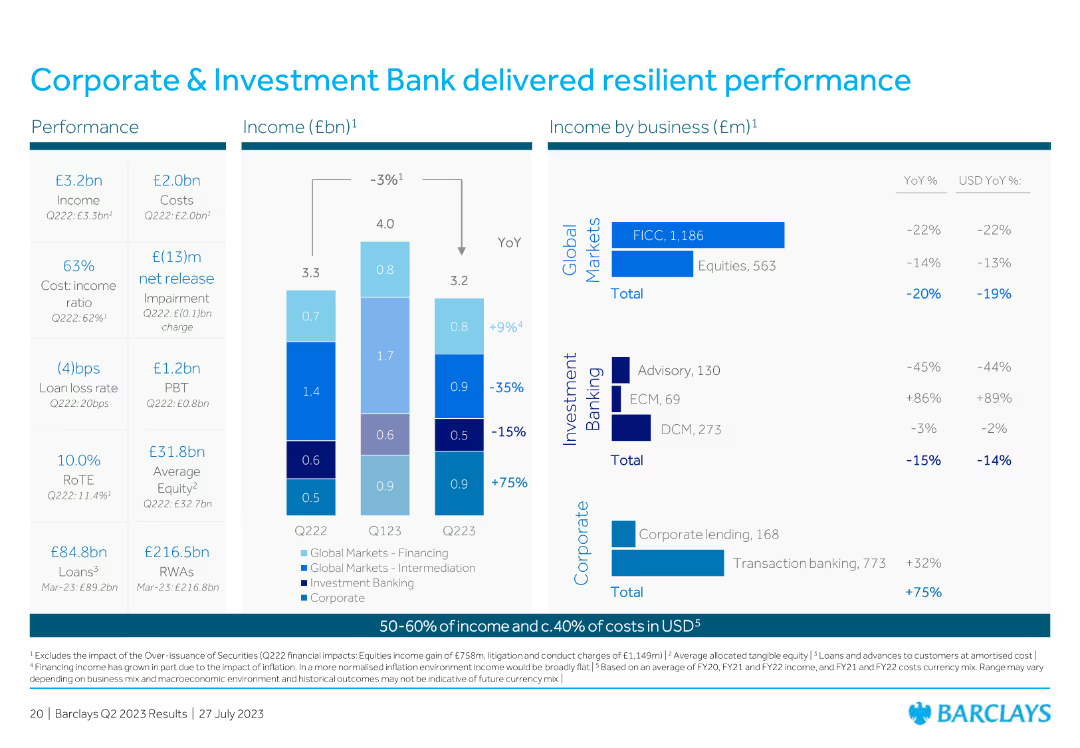
Contains column charts displaying income by business and YoY comparisons, highlighting performance metrics.
Financial Performance
Financial Services
Details the resilient performance of the Corporate & Investment Bank, including income and business segment breakdowns.
corporate, investment, performance, income, resilient
Multiple Chart
Barclays
Saved
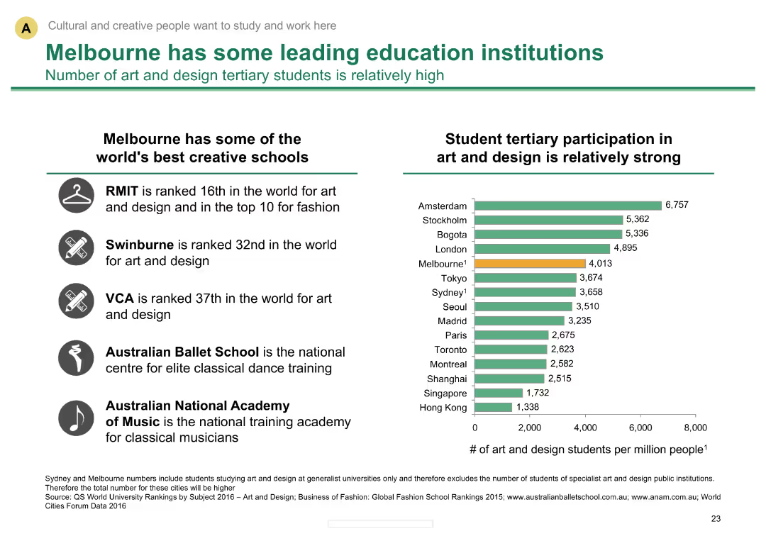
Column chart comparing art and design student participation across cities; text boxes with school rankings
Market Analysis and Trends
Education & Training
Highlights Melbourne's education strengths, comparing art and design student participation in global context
Education institutions, student participation, global ranking, Melbourne, art and design schools
Mixed Chart
BCG
Saved
The slide features a central diagram surrounded by text, breaking down the strategic priorities and core agendas of Barclays' DEI strategy.
Strategic Planning
Financial Services
Outlines the key components and strategic priorities of Barclays' DEI strategy, emphasizing inclusivity and accountability in the workplace.
DEI, strategy, inclusivity, accountability, workforce, leadership, data transparency, culture
Diagram
Barclays
Saved
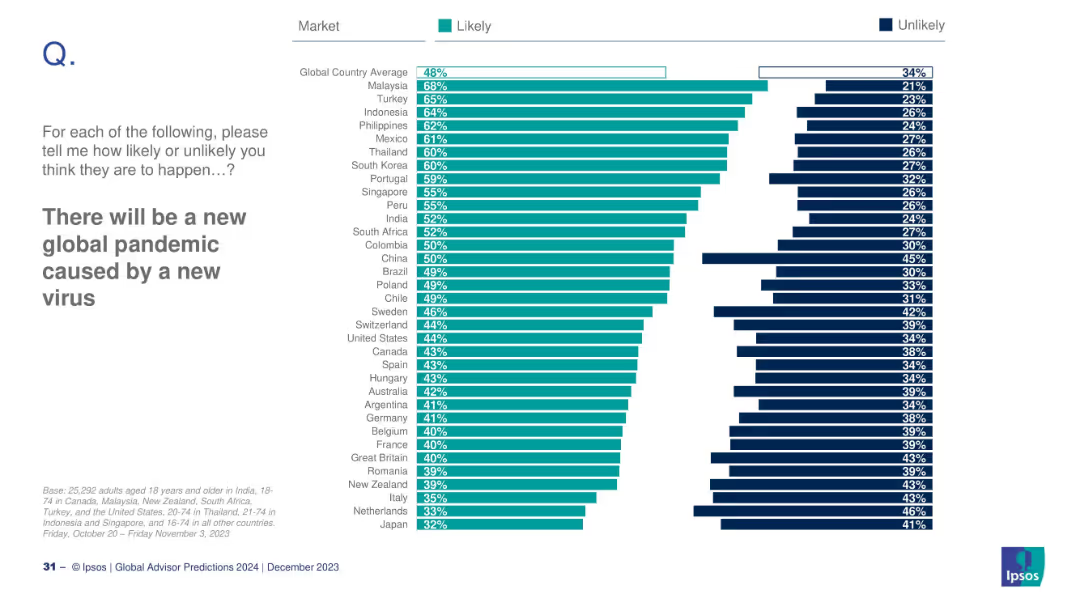
Horizontal bar chart comparing countries' likelihood responses; sorted by descending order.
Risk Assessment and Management
Healthcare & Pharmaceuticals
This slide ranks countries by how likely their citizens believe a new global pandemic will occur. Malaysia and Turkey top the list with high likelihood perceptions. The global average is 48%, and comparisons include "likely" vs. "unlikely" percentages by market.
pandemic, health crisis, virus, global risk, Ipsos, country comparison, 2024 outlook, survey
Mixed Chart
IPSOS
Saved
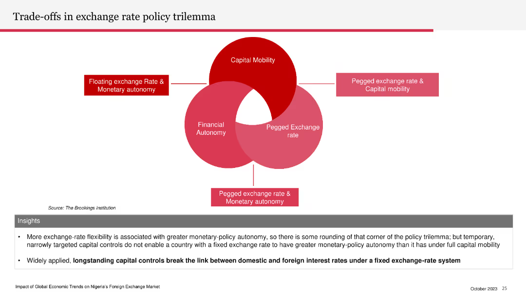
Venn diagram illustrating the exchange rate policy trilemma: capital mobility, financial autonomy, and pegged exchange rate. Insights section below.
Strategic Planning
Financial Services
The slide explains the trade-offs involved in exchange rate policy, emphasizing the limitations of having a fixed exchange rate, capital mobility, and monetary autonomy simultaneously. It highlights the impact of capital controls on interest rates.
exchange rate, policy trilemma, capital mobility, financial autonomy, pegged rate
Diagram
PwC/Strategy&
Saved
Contains a pie chart and a column chart, detailed textual information regarding staffing challenges in shared services, and clear graphical representation of turnover rates and retention strategies.
Human Resources and Talent Management
Professional Services
Offers insights into the staffing and turnover challenges within shared services centers, including statistics on turnover rates and strategies for talent retention. Useful for HR management discussions and planning.
Staffing, turnover, shared services, retention strategies, talent management
Multiple Chart
Deloitte
Saved
Slide contains multiple column charts showing financial metrics from 2021 to 2023 with projections for 2026.
Financial Performance
Financial Services
Highlights key financial targets and progress of a financial institution over several years.
financials, targets, projections, banking, metrics
Multiple Chart
Barclays
Saved
The slide combines text and a line chart. The text details the capital structure and free cash flow deployment, while the chart shows share repurchases over time.
Financial Performance
Financial Services
The slide discusses the capital structure, financial leverage, and free cash flow deployment strategies, including share repurchases and debt metrics.
Capital Structure, Leverage, Free Cash Flow, Share Repurchases, Debt Ratings, Investment Grade
Mixed Chart
Gartner
Saved
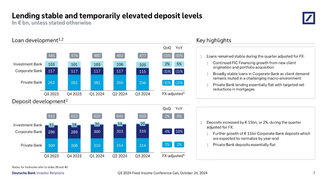
Two stacked bar charts show development in loans and deposits by segment and over time. Annotations provide QoQ and YoY growth rates. Key highlights summarized in text boxes.
Performance Metrics and KPIs
Financial Services
Tracks loan and deposit volumes across investment, corporate, and private banking. Loans remained flat, while deposits rose €15bn, driven by Corporate Bank. FX-adjusted insights and commentary on mortgage lending and deposit normalization are provided.
loan growth, deposit growth, FX-adjusted, stable lending, Corporate Bank, Private Bank, liquidity, Q3 2024
Multiple Chart
Deutsche Bank
Saved
A line chart showing historical CO2 concentrations, highlighting significant increases over millennia and recent years.
Regulatory and Compliance
Environmental Services & Sustainability
Offers historical context for current CO2 levels, underscoring the urgency in addressing climate change for policy makers and environmental planners.
CO2 levels, climate change, environmental policy, historical data, sustainability
Single Chart
BCG
Saved
Combination of bar charts and tables showing Tier 1 capital ratios and USD liquidity access arrangements
Risk Assessment and Management
Financial Services
This slide compares banking sector capitalization in APAC with the US, detailing central bank FX liquidity programs.
bank capitalization, APAC, liquidity, FX swap, US
Mixed Chart
Accenture
Saved
The slide features a vertical bar chart comparing levels of concern about the climate over several years across different countries.
Market Analysis and Trends
Environmental Services & Sustainability
Analysis of changing levels of public concern about the climate in various countries over time, showing trends and possible waning interest in some areas.
Climate, concern, trends, survey, countries
Mixed Chart
IPSOS
Saved
Previous
Next
If nothing, comes up, please save your slides first
Create a FREE account to continue browsing
Receive Instant Access to 1,000+ slides from companies like McKinsey, Google, and Goldman Sachs
First Name
Last Name
Email
Password
I agree to all
Terms & Privacy Policy
Thank you! Your submission has been received!
Oops! Something went wrong while submitting the form.
Have an account?
Sign in
Column Chart
Heatmap
Chevron
Org Chart
Infographic
Callouts
Timeline
List
Graphic
Picture
Process Flow
Diagram
Paragraph
Map
Table
Framework
Subtitle
Takeaway Box
Icon
Other Chart
Radar Chart
Waterfall Chart
Mekko Chart
Pie Chart
Scatter Plot
Line Chart
Bar chart
Bullet points