Create a FREE Account
Instant access to 1,000+ real slides from top companies like McKinsey, BCG, Goldman Sachs, Google and many more!
First Name
Last Name
Email
Password
I agree to all
Terms & Privacy Policy
Thank you! Your submission has been received!
Oops! Something went wrong while submitting the form.
Have an account?
Sign in
Library
Templates
Courses
Pricing
My Account
My Slides
My Templates
✦ AI
AI Prompt Library
AI Search
Sign in
Start Here
Logout
My Saved Slides
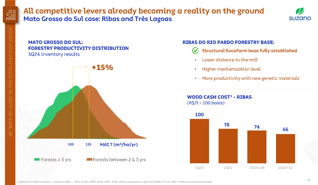
Histogram on forestry productivity, bullet points summarizing Ribas region benefits, and bar chart on wood cost.
Operational Efficiency
Agriculture & Food Production
Demonstrates forestry productivity improvements in Mato Grosso do Sul, highlighting the Ribas base’s structural advantages. Projects significant cost reduction in wood by 2029 through higher yields and mechanization.
forestry productivity, Ribas, genetic materials, cost reduction, MAI
Multiple Chart
Goldman Sachs
Saved
Column chart showing investment trends in Canadian climate tech from 2017 to 2022, with segments for emerging tech, early adoption, and maturing technologies.
Investment Analysis
Environmental Services & Sustainability
Tracks private investment in Canadian climate tech over several years, highlighting trends in funding and the growth of emerging technologies.
Investment, climate tech, Canada, trends, funding
Mixed Chart
BCG
Saved
This slide includes a column chart comparing the capital expenditure outlook on medical devices/equipment across different regions over three time periods.
Strategic Planning
Healthcare & Pharmaceuticals
This slide discusses the optimistic outlook on future capital expenditure by hospitals, highlighting expected increases in spending on medical devices and equipment.
capital expenditure, medical devices, equipment, hospital spending, regional comparison
Single Chart
LEK
Saved
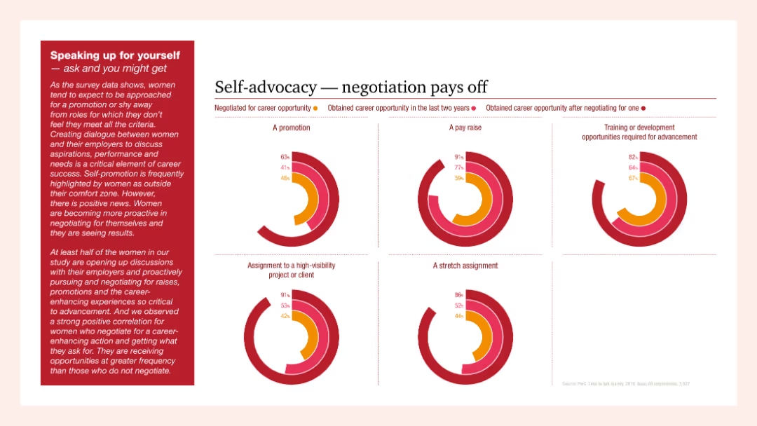
Multiple column charts showing the outcomes of self-advocacy in career advancement including promotions, pay raises, and high-visibility projects. Text emphasizes the importance of negotiation for career progression.
Human Resources and Talent Management
Professional Services
The slide illustrates the positive impacts of self-advocacy and negotiation on career opportunities for women, showing significant statistics on promotions, pay raises, and career advancement through self-advocacy.
self-advocacy, negotiation, career, women, advancement
Multiple Chart
PwC/Strategy&
Saved
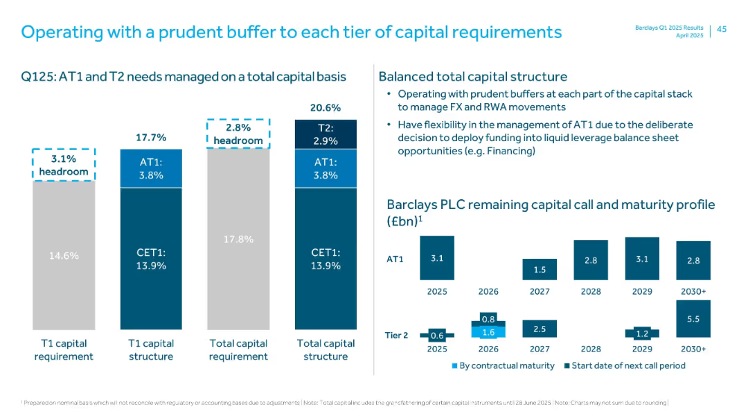
Three grouped bar charts for T1 requirement, capital structure, and total capital; supporting bullet points on the right; capital call chart at the bottom right.
Financial Performance
Financial Services
Describes Barclays’ capital structure in Q1 2025, showing CET1, AT1, and T2 buffers relative to requirements. Demonstrates prudent capital planning and provides a maturity timeline for capital instruments. Emphasizes flexibility in capital deployment.
CET1, AT1, T2, capital buffer, Barclays, capital maturity, capital call, Q1 2025
Multiple Chart
Barclays
Saved
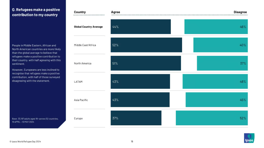
Split layout with a left-side text summary and a right-side horizontal bar chart comparing regions’ agree/disagree %
Market Analysis and Trends
Government & Public Sector
The slide explores regional attitudes toward the positive contribution of refugees. Middle East, Africa, and North America show more favorable views than the global average, while Europe shows more negative sentiment. The chart contrasts agreement levels across regions.
refugees, perception, contribution, global comparison, agreement, regional trends, Ipsos, 2024, World Refugee Day
Mixed Chart
IPSOS
Saved
The slide serves as a cover for a report, with a dual-tone image overlaying a forest and a clear title text. It's the introductory slide with additional details like the report's date and affiliating companies' logos.
Investment Analysis
Technology & Software
As a title slide, this introduces the theme of the presentation, which is an assessment of the influence of major technology firms on venture capital investment. It establishes the collaborative nature of the report between Oliver Wyman and Facebook.
venture investment, big tech, title slide, Oliver Wyman, Facebook, report cover
Title
Oliver Wyman
Saved
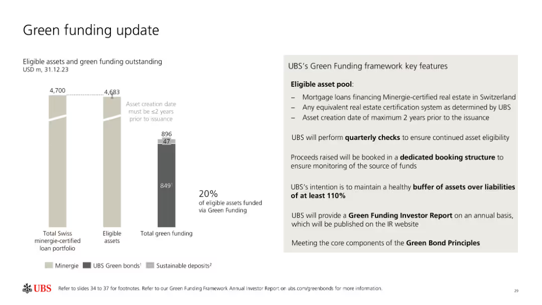
The slide includes bar charts and a list outlining UBS's green funding metrics, eligible asset pool, and key features of their green funding framework.
Investment Analysis
Financial Services
UBS provides an update on their green funding, detailing eligible assets, green bonds, sustainable deposits, and the framework for maintaining and monitoring green funding.
Green funding, UBS, sustainable assets, framework, bonds
Mixed Chart
UBS
Saved
A composite slide with a mix two column charts showing market share over time, one for individual products, and one by region.
Competitive Landscape
Financial Services
The slide compares investment banking fees, market share trends over a decade, and highlights continued leadership positions across various products, demonstrating sustained success in the industry.
Banking, Leadership, Fees, Trends
Multiple Chart
JP Morgan
Saved
This slide presents a dual bar chart comparing the daily costs of cold storage as a percentage of a farmer's income in Nigeria, India, and Rwanda, illustrating the significant financial strain on Nigerian farmers.
Strategic Planning
Agriculture & Food Production
This slide assesses the economic impact of cold storage costs on smallholder farmers in Nigeria, comparing it with other countries to highlight the disproportionate burden. It advocates for more affordable and accessible storage solutions to aid farmers and reduce food loss.
Cold Storage, Costs, Farmers, Nigeria, Comparative Analysis
Multiple Chart
BCG
Saved
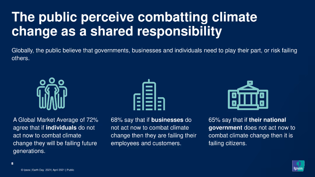
The slide includes a header, icons, and a text block summarizing survey data. The slide has a clean, simple design with three icons representing individuals, businesses, and governments, each accompanied by a key statistic from the survey about their perceived responsibility in combating climate change.
Market Analysis and Trends
Environmental Services & Sustainability
Highlights public opinion on shared responsibility for combating climate change among individuals, businesses, and governments. The slide uses icons and text to present survey data showing high agreement that all parties need to take action to address climate change.
Climate change, responsibility, public opinion, survey, environment
Pillar
IPSOS
Saved
This slide contains a series of column charts and a bar chart representing mobility pattern changes globally and for various countries (US, UK, Germany, France, Italy, China, Japan) during three survey waves. The column charts use shades of blue to indicate degrees of mobility increase, and grey for decrease. Each country's flag is shown for identification.
Market Analysis and Trends
Transportation & Logistics
The slide examines the changes in travel frequency and trip length among global respondents since COVID-19, highlighting recovery signs in specific markets.
mobility trends, COVID-19 impact, global survey, travel patterns, market analysis, data visualization, recovery tracking, comparative analysis
Multiple Chart
McKinsey
Saved
Bar graphs contrasting the gross margins of private label and branded products, accompanied by distributor case studies.
Financial Performance
Financial Services
This slide highlights how an emphasis on private label products can lead to significantly higher gross margins in distribution businesses.
gross margins, private label, branded products, distribution, profitability, case studies
Single Chart
EY
Saved
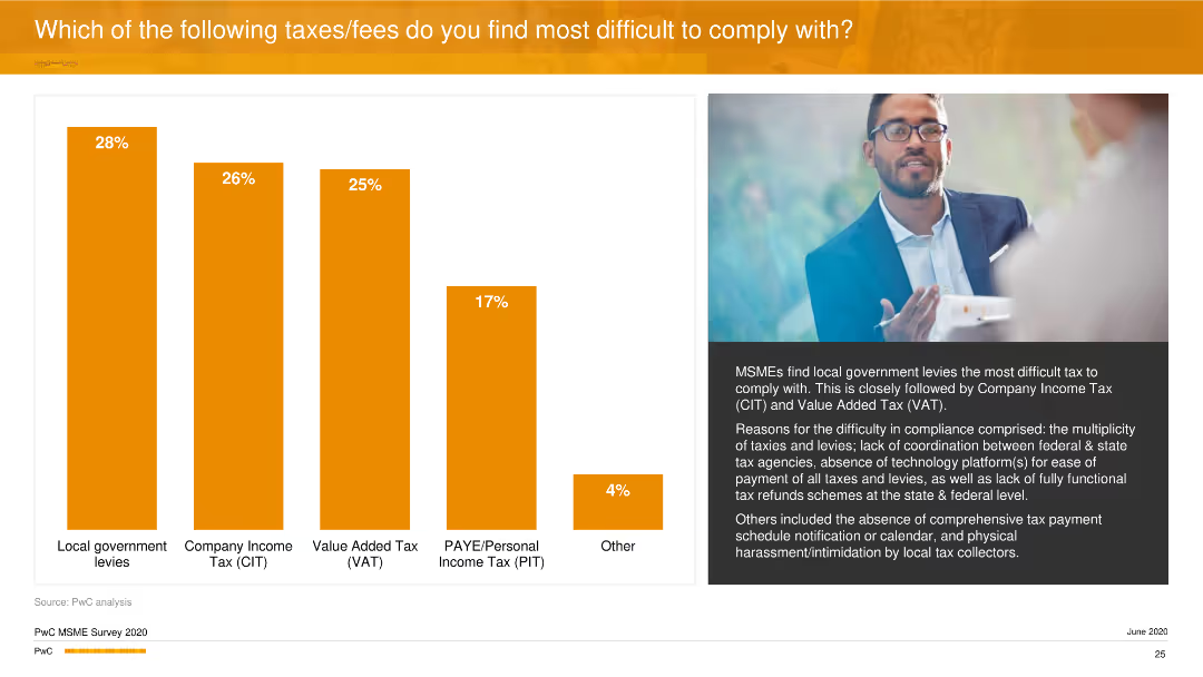
A vertical column chart ranks the difficulty of compliance with various taxes and fees. An image of a man with glasses is featured on the right side.
Regulatory and Compliance
Financial Services
The slide examines the challenges MSMEs face in complying with different taxes, highlighting local government levies and company income tax as the most problematic. It discusses the reasons behind these difficulties.
Taxes, Compliance, MSMEs, Business, PwC
Mixed Chart
PwC/Strategy&
Saved
The slide features a dark background with white and yellow text, highlighting survey results with column charts.
Market Analysis and Trends
Healthcare & Pharmaceuticals
It discusses the importance of healthcare experience for consumers, with survey results showing 44% above average, 26% average, and 30% below average rating.
healthcare, consumer, experience, survey, England
Mixed Chart
EY
Saved
Image of a man working on a laptop. Column chart illustrating additional operational resilience requirements expected from regulators in the next two years.
Regulatory and Compliance
Financial Services
This slide highlights additional operational resilience requirements expected from regulators, such as higher standards for monitoring critical third-party service providers and heightened oversight expectations. It underscores the growing trend towards stricter regulatory standards in risk management and compliance.
operational resilience, regulatory requirements, third-party, monitoring, compliance
Mixed Chart
EY
Saved
Circular charts showing percentages of tax concerns related to virtual work, with text discussing the impact.
Regulatory and Compliance
Financial Services
Discusses the increased tax concerns for family offices due to virtual work arrangements and the need for new strategies.
virtual work, tax concerns, family offices, APAC, connected businesses
Multiple Chart
EY
Saved
Includes multiple pie charts and column charts, showing revenue breakdown by segment, geography, and customer, and automotive production forecasts. The layout is dense with high detail, utilizing a mix of blue, gray, and green tones.
Market Analysis and Trends
Industrial & Manufacturing
Provides a comprehensive analysis of Stoneridge’s revenue sources and market forecasts. It’s used to discuss market strategies and the potential for growth in various geographic and market segments.
revenue, market forecast, automotive, segmentation
Multiple Chart
Deutsche Bank
Saved
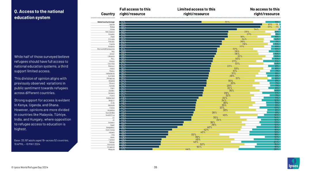
Ranked bar chart by country showing levels of support for refugee education access; detailed segmentation.
Regulatory and Compliance
Government & Public Sector
The slide shows that most countries support some level of refugee access to national education systems. Uganda and Kenya show the strongest support, while Türkiye, India, and Hungary show the most opposition.
refugees, education access, national systems, public opinion, support levels, global comparison, sentiment
Mixed Chart
IPSOS
Saved
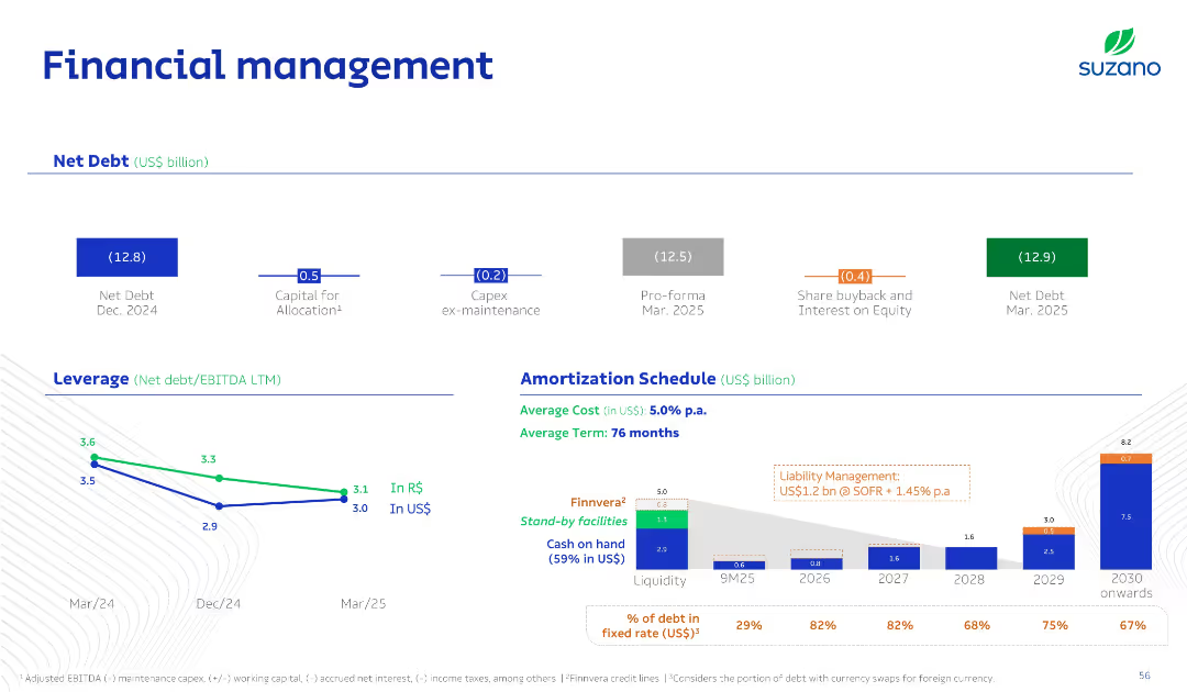
Clean multi-zone slide: top for net debt summary, bottom for leverage ratio trend and amortization bar chart; color-coded debt types and facilities.
Corporate Finance and Valuation
Consumer Goods
This slide presents Suzano's debt structure, including net debt positions, leverage ratios in R$/US$, and a debt amortization schedule through 2030. It details cost of debt, liquidity, and upcoming obligations.
Net Debt, Leverage, Amortization, Liquidity, Finance
Multiple Chart
Goldman Sachs
Saved
The slide has two graphs side by side. On the left, a line graph depicts the GDP with a time axis from 2012 to Q1 2023, with annotations for specific points. On the right, a dual line graph shows industrial production and retail trade indices from 2018 to June 2023.
Market Analysis and Trends
Financial Services
This slide presents economic data for Russia, showing GDP trends and industrial production over time, suggesting insights into economic recovery and market conditions.
Russia, GDP, Economic Recovery, Industrial Production, Retail Trade, Market Analysis, Q1 2023, Data Trends
Multiple Chart
McKinsey
Saved
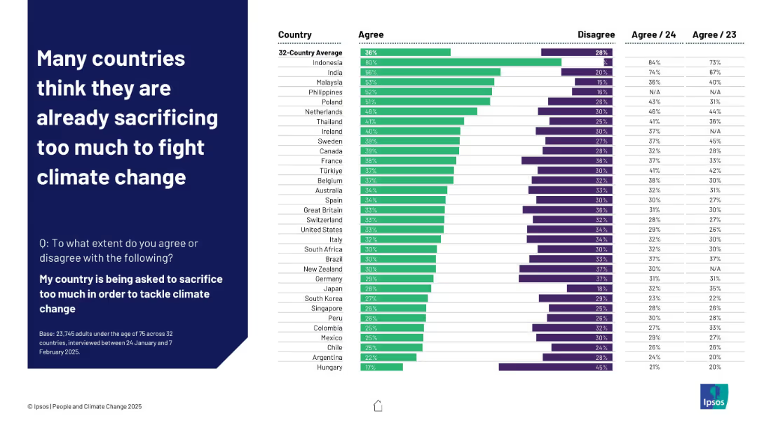
Left-aligned header on dark blue background; right side presents a horizontal bar chart ranking agreement by country with comparative historical data
Customer and Market Segmentation
Environmental Services & Sustainability
This slide shows that people in countries like Indonesia and India feel their nations are sacrificing too much to tackle climate change. The data is contextualized with agreement percentages from 2023 and 2024, indicating shifting attitudes over time.
sacrifice, climate change, public opinion, survey, Ipsos, 2025, international comparison, perception shift, sustainability
Mixed Chart
IPSOS
Saved
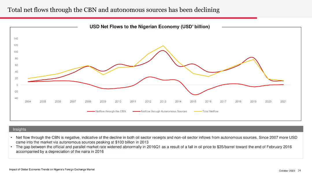
Line chart depicting USD net flows to the Nigerian economy from 2004 to 2021. Multiple lines show net flows through the CBN, autonomous sources, and total net flows.
Financial Performance
Financial Services
The slide details the declining net flows through the CBN and autonomous sources, indicating a negative trend in Nigeria's oil and non-oil sector receipts. It highlights the gap between official and parallel market rates, particularly in 2016.
CBN, net flows, Nigerian economy, oil sector, market rates
Mixed Chart
PwC/Strategy&
Saved
Two pie charts comparing the next vehicle type preferences among current new and used vehicle owners. Charts are in teal and gray with labeled percentages. Simple, clear layout.
Market Analysis and Trends
Transportation & Logistics
This slide illustrates consumer preferences for vehicle type in future purchases based on their current vehicle's status (new or used). It highlights a stronger preference for new vehicles among current new vehicle owners.
Consumer behavior, vehicle preferences, new vs used, market analysis, purchasing intentions
Multiple Chart
Deloitte
Saved
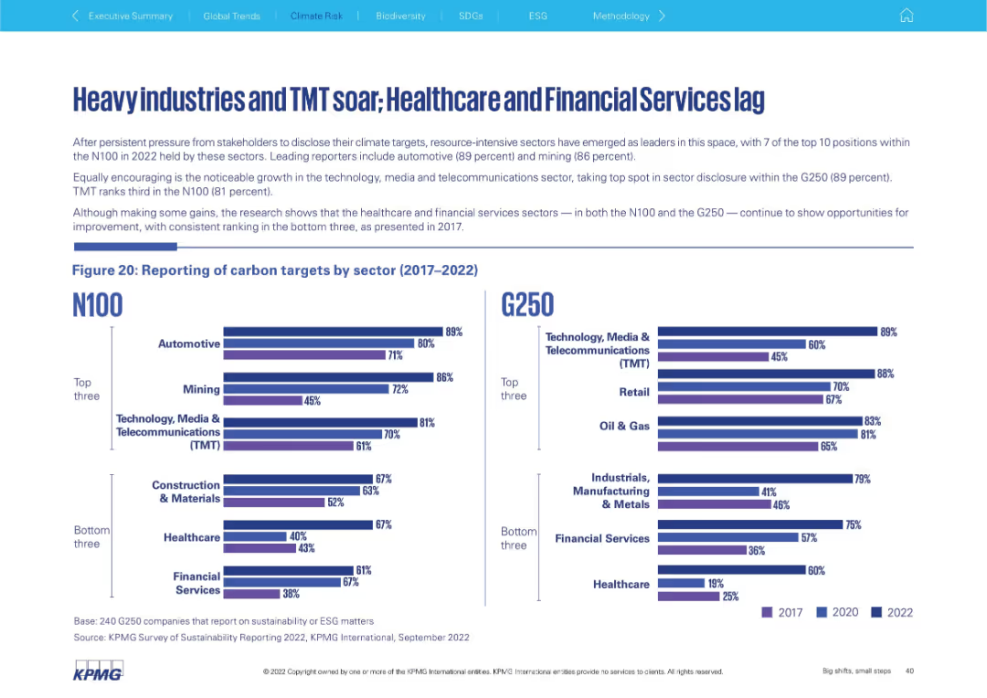
Left: text and bar chart for N100 sector reporting; Right: G250 sector reporting chart. Emphasis on top/bottom 3 sectors in both groups. Clear visual comparison.
Performance Metrics and KPIs
Environmental Services & Sustainability
The slide contrasts carbon target reporting by industry, showing strong adoption in sectors like Automotive, Mining, and TMT, while Healthcare and Financial Services continue to trail. Both N100 and G250 datasets show similar trends, emphasizing resource-intensive sectors' leadership.
carbon reporting, TMT, automotive, healthcare, mining, sectors, N100
Mixed Chart
KPMG
Saved
Previous
Next
If nothing, comes up, please save your slides first
Create a FREE account to continue browsing
Receive Instant Access to 1,000+ slides from companies like McKinsey, Google, and Goldman Sachs
First Name
Last Name
Email
Password
I agree to all
Terms & Privacy Policy
Thank you! Your submission has been received!
Oops! Something went wrong while submitting the form.
Have an account?
Sign in
Column Chart
Heatmap
Chevron
Org Chart
Infographic
Callouts
Timeline
List
Graphic
Picture
Process Flow
Diagram
Paragraph
Map
Table
Framework
Subtitle
Takeaway Box
Icon
Other Chart
Radar Chart
Waterfall Chart
Mekko Chart
Pie Chart
Scatter Plot
Line Chart
Bar chart
Bullet points