Create a FREE Account
Instant access to 1,000+ real slides from top companies like McKinsey, BCG, Goldman Sachs, Google and many more!
First Name
Last Name
Email
Password
I agree to all
Terms & Privacy Policy
Thank you! Your submission has been received!
Oops! Something went wrong while submitting the form.
Have an account?
Sign in
Library
Templates
Courses
Pricing
My Account
My Slides
My Templates
✦ AI
AI Prompt Library
AI Search
Sign in
Start Here
Logout
My Saved Slides
The slide features a bar chart showing the frequency of crypto asset trades over the past 12 months for 2023 and 2022, with categories ranging from 'Never' to 'Daily'.
Financial Performance
Financial Services
This slide illustrates how often crypto asset holders traded their assets in the past year, highlighting differences between 2023 and 2022. It can be used to assess trading activity trends.
Crypto, Trade Frequency, Activity, Comparison, Trends
Multiple Chart
IPSOS
Saved
The slide features multiple bar graphs and line charts showing percentage changes in IT costs over time. It uses a clean, professional layout with color differentiation for various data points.
Market Analysis and Trends
Technology & Software
The slide analyzes IT cost changes in the technology sector, showing trends in TCO, Opex, and Capex from 2021 to 2026. It indicates how costs are projected to change over time.
IT, TCO, Opex, Capex, technology costs, financial trends
Multiple Chart
Accenture
Saved
The slide presents two column charts, the first illustrating the growth in revenue and expenses for CIB Treasury Services, and the second showing operating and non-operating deposits growth across client segments and regions.
Financial Performance
Financial Services
Geared towards financial strategists and investors, it highlights the robust growth of CIB Treasury Services, with a focus on revenue increases, expense management, and deposit growth, essential for evaluating business health and operational strategy.
CIB, treasury services, revenue growth, expense management, deposits, operational strategy, financial health
Multiple Chart
JP Morgan
Saved
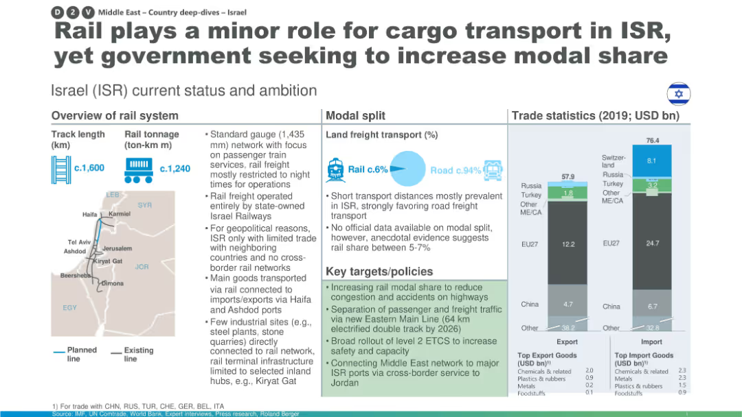
Map, modal split, rail system stats, and trade data with a focus on policy goals to enhance rail’s cargo role.
Strategic Planning
Transportation & Logistics
Israel’s rail system is underutilized for freight due to short distances and geopolitical constraints. The slide highlights modest rail modal share and lists initiatives to separate freight/passenger traffic and expand network connections, including a cross-border link with Jordan.
Israel rail, modal share, freight network, policy reform, passenger separation, infrastructure development, trade links
Multiple Chart
Roland Berger
Saved
Features column charts on attitudes towards working in countries hostile to LGBT+.
Risk Assessment and Management
Professional Services
Evaluates the willingness of LGBT+ talents to work in countries with unfavorable attitudes towards LGBT+.
LGBT+, international work, hostility, willingness
Single Chart
BCG
Saved
The layout includes a title and two columns of text, one for economic contribution details and the other for graphic representation of the same. The design is streamlined, with clear differentiation between sections.
Financial Performance
Government & Public Sector
Provides a comprehensive breakdown of the economic contributions of the Tempest partners’ activities, focusing on job creation and GVA contributions, making it apt for discussions on economic strategies in defense and related financial planning.
Combat Air, Tempest, GVA, Jobs, Economic Strategy, Defense
Text Only
PwC/Strategy&
Saved
Features a pie chart and two column charts with annotations, presenting data on new consumers to internet economy services and their predicted behaviors post-COVID-19 in Singapore.
Market Analysis and Trends
Technology & Software
The slide discusses the significant uptake in digital services and the potential permanence of these changes, valuable for understanding consumer behavior in the digital space.
Digital Consumers, Growth, Singapore, Internet Economy
Multiple Chart
Bain
Saved
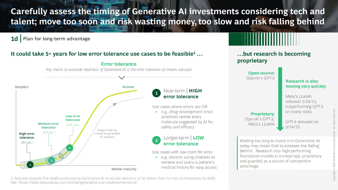
A column chart with error tolerance categories, a textual explanation on the right, and a descriptive flow chart at the bottom depicting AI adoption stages.
Strategic Planning
Technology & Software
The slide explains the error tolerance levels for generative AI use cases, emphasizing the timing for investments. It provides an analysis of short-term and long-term AI adoption strategies.
Generative AI, investment, error tolerance, AI adoption, strategic planning
Mixed Chart
BCG
Saved
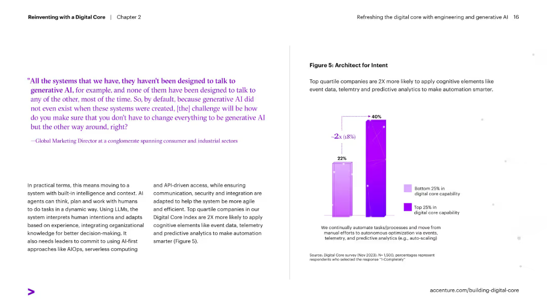
Left text-heavy with a quote and explanation; right contains a vertical bar chart comparing bottom and top quartile companies on use of telemetry and predictive analytics.
Performance Metrics and KPIs
Technology & Software
Describes how top-performing companies apply cognitive elements like telemetry and predictive analytics to automate processes. It shows these companies are twice as likely to use such technologies effectively.
automation, telemetry, predictive analytics, AI, architecture, digital core, performance
Mixed Chart
Accenture
Saved
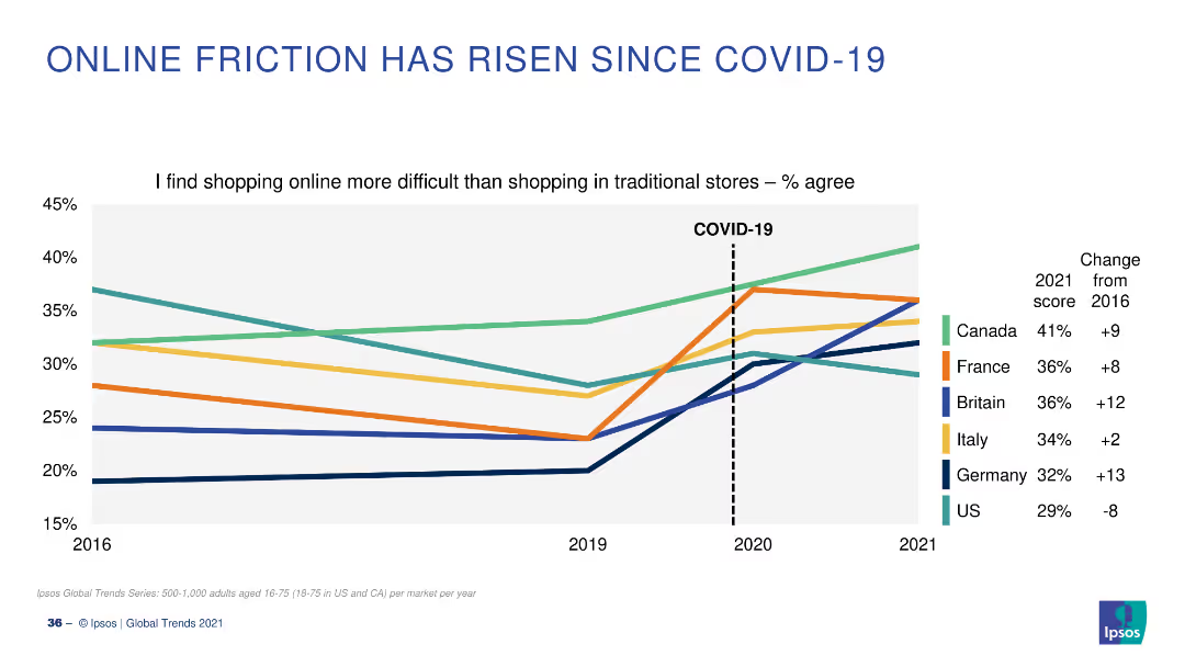
A line chart showing changes over time in the percentage of people who find online shopping more difficult than traditional shopping, with a significant rise post-COVID-19.
Market Analysis and Trends
Retail & E-commerce
The slide illustrates the increase in online shopping difficulties post-COVID-19, comparing 2016 to 2021 data for different countries, highlighting the impact of the pandemic.
online shopping, difficulties, COVID-19, trends, survey
Single Chart
IPSOS
Saved
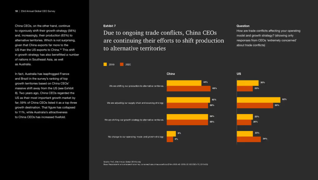
This slide includes a bar chart comparing responses from China and US CEOs in 2019 and 2020. The bar chart uses different colors to represent the years and is moderately complex.
Risk Assessment and Management
Industrial & Manufacturing
The slide discusses how trade conflicts are influencing China CEOs to shift production to alternative territories and adjust supply chain strategies.
Trade conflicts, production shift, China CEOs, US CEOs, supply chain
Multiple Chart
PwC/Strategy&
Saved
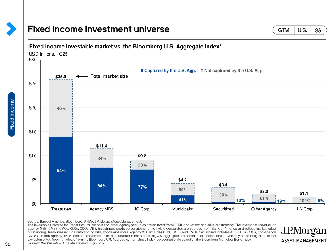
Bar chart showing total investable market size by fixed income asset class, split into portions captured by the Bloomberg U.S. Aggregate Index.
Product and Service Analysis
Financial Services
This slide breaks down the U.S. fixed income market into asset classes such as Treasuries, MBS, IG corporates, and others. It compares the total market to what’s captured by the Bloomberg Aggregate Index, highlighting investment gaps.
fixed income, market size, Bloomberg Agg, Treasuries, MBS, investment universe
Single Chart
JP Morgan
Saved
Contains a large column chart split between SMB and consumer lending, followed by in-depth textual analysis on the state of digital lending and associated risks.
Risk Assessment and Management
Financial Services
Explores the challenges faced by the digital lending sector, such as credit quality concerns and non-performing loans, while offering a glimpse into the government's mitigating actions and future growth.
Digital Lending, Credit Quality, NPLs, Future Growth
Mixed Chart
Bain
Saved
The slide presents a graph depicting the importance of various online activities categorized as Essentials, Social, and Entertainment based on user enjoyment and hours spent. It features a purple color scheme, with circles representing data points.
Market Analysis and Trends
Technology & Software
The slide illustrates how users on the nbn network prioritize essential tasks but spend more time on activities they enjoy, with large circles for music streaming and social media indicating significant user importance and time investment.
nbn, user behavior, online activities, streaming, social media, essentials, enjoyment, engagement
Single Chart
Accenture
Saved
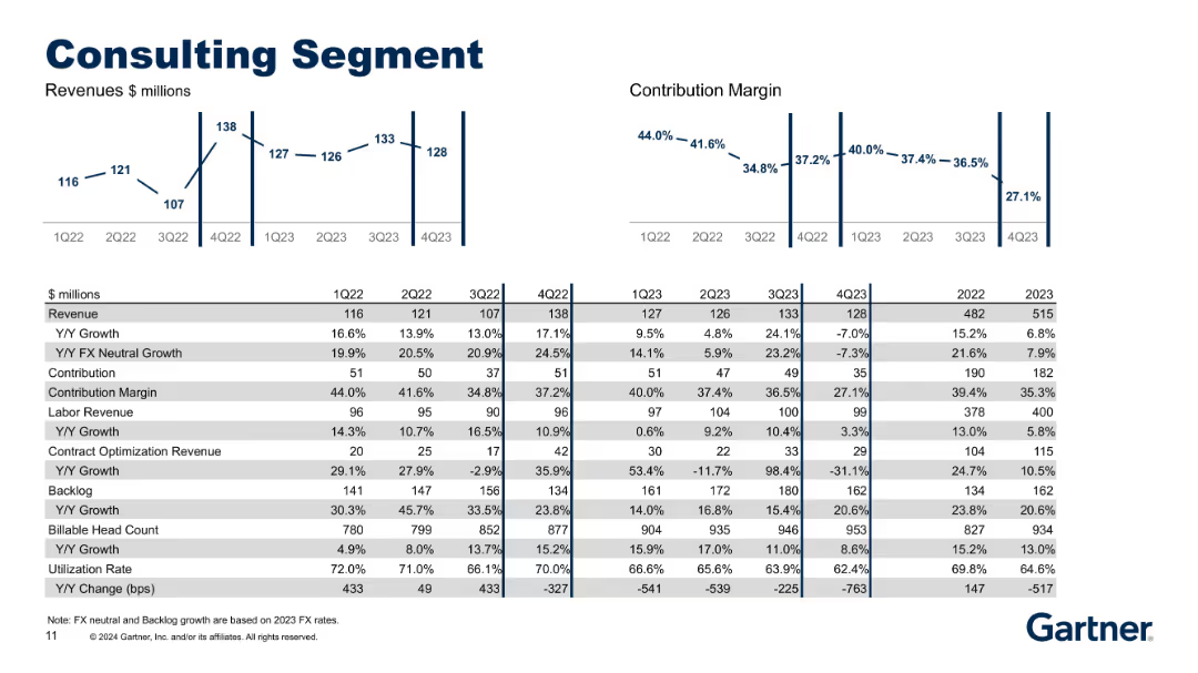
Symmetrical layout with bar/line visuals on top and detailed financial metrics in tabular format below.
Performance Metrics and KPIs
Professional Services
Focused on the Consulting segment, this slide tracks revenue, growth, and contribution margins alongside metrics like labor revenue, contract optimization revenue, backlog, and utilization rate. It reflects operational and staffing efficiency over time.
Consulting, Revenue, Backlog, Utilization, Labor, Growth
Multiple Chart
Gartner
Saved
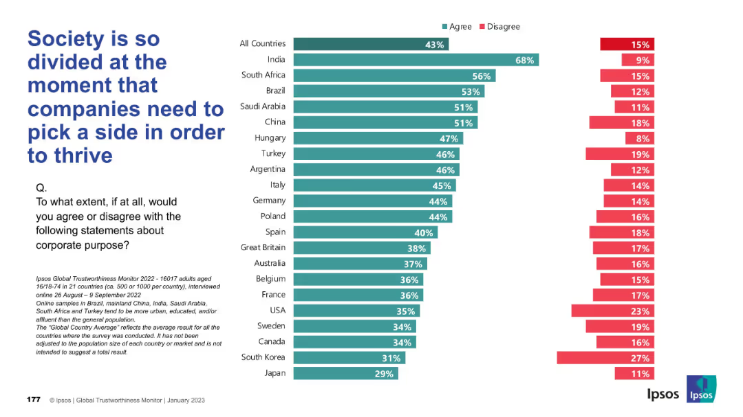
Similar format to previous slide with horizontal bars, percentage comparison by country, text left-aligned
Market Analysis and Trends
Professional Services
This slide measures agreement with the idea that companies must take sides in societal divisions to thrive. India leads in agreement at 68%, while Japan and South Korea show the least support. The global average agreement is 43%.
division, corporate purpose, public opinion, company positioning, Ipsos, social alignment, country comparison
Mixed Chart
IPSOS
Saved
World map showing COVID-19 case doubling times in various shades of green. Includes additional graphs with timelines of case numbers and recovery figures.
Regulatory and Compliance
Healthcare & Pharmaceuticals
Displays the global spread of COVID-19, the rate of case doubling, and recovery rates by country as of April 2020, useful for health analysts and policy makers.
pandemic, tracking, healthcare, global, recovery, COVID-19, data visualization, spread, rate
Multiple Chart
BCG
Saved
The slide showcases three column charts displaying net profit contribution, BFS deposits, and loan and lease portfolio amounts over time. The visual layout is well-structured with a timeline and financial metrics clearly labeled.
Financial Performance
Financial Services
Displaying the firm's financial performance metrics, this slide provides a historical trend analysis of net profit contributions, BFS deposits, and Australian loan and lease portfolios. The time-sequenced data enables a snapshot comparison of performance across key financial areas.
net profit, BFS deposits, loan, lease, portfolio, financial services, trend analysis
Multiple Chart
Morgan Stanley
Saved
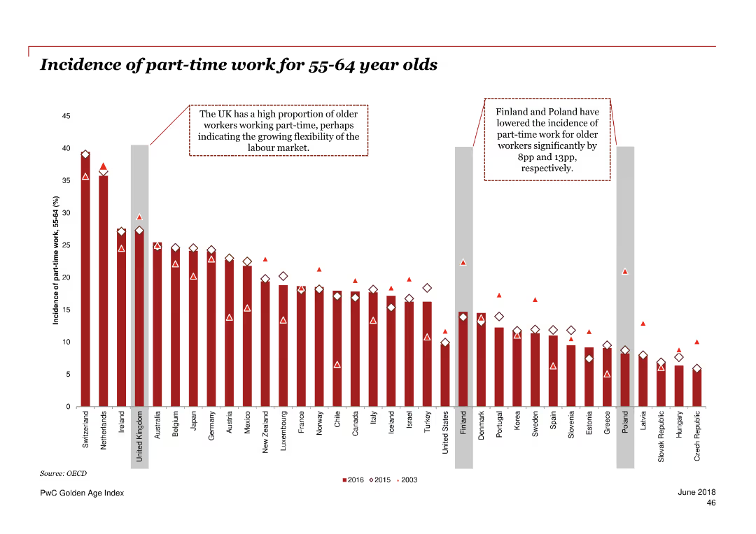
Column chart illustrating the incidence of part-time work for 55-64 year olds in various countries over three periods.
Market Analysis and Trends
Professional Services
The slide presents data on the proportion of older adults working part-time across multiple countries over 2003, 2015, and 2016.
part-time work, employment, older adults, OECD, trend
Single Chart
PwC/Strategy&
Saved
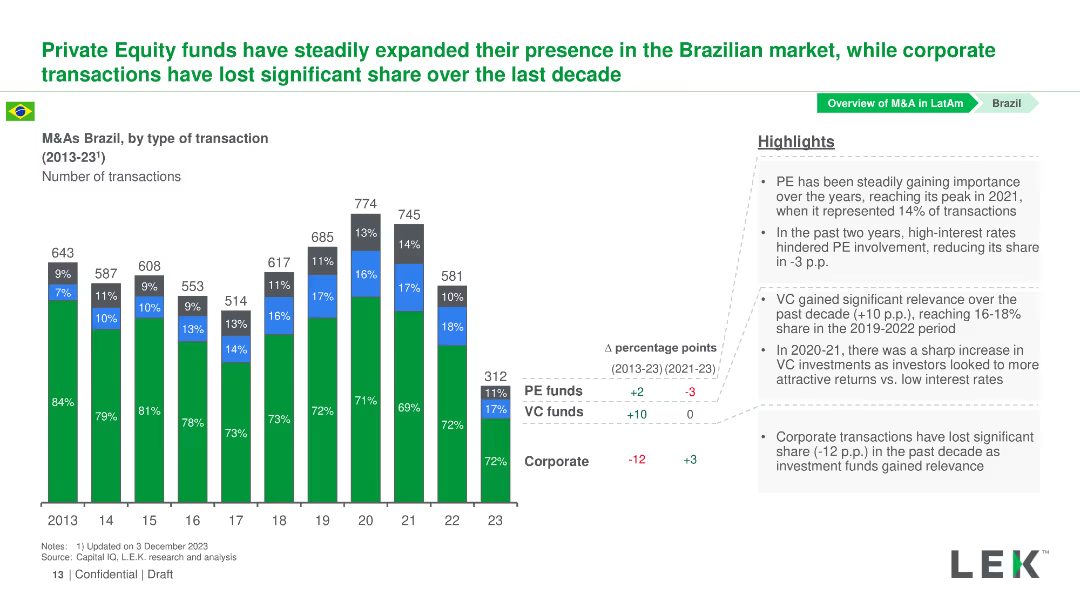
Column chart showing the number of transactions by type in Brazil from 2013-2023. The chart differentiates PE funds, VC funds, and Corporate transactions by color.
Market Analysis and Trends
Financial Services
This slide analyzes the trend of PE, VC, and Corporate transactions in Brazil from 2013-2023, highlighting the growth in PE and VC transactions over the years.
Brazil, M&A, Private Equity, Venture Capital, Corporate Transactions
Mixed Chart
LEK
Saved
A slide with a column chart illustrating the public funding value for 2020, 2021, and H1 2022, accompanied by a deal count. The chart shows a significant peak in 2021 compared to a steep decline in H1 2022. Annotations provide context about a bull run in 2021 and a cool-off period happening in 2022 due to various market conditions.
Investment Analysis
Financial Services
The slide shows a marked decline in public market funding, including IPOs and post-IPO financing, in H1 2022, contrasting with the previous year's bull run and outlining contributing economic factors like rising interest rates and stock valuation challenges.
public markets, funding, IPO, post-IPO, bull run, economic factors, decline
Single Chart
Bain
Saved
Column chart displaying survey results with percentages for Europe, United States, and APAC regions. Five main processes listed.
Technology and Digital Transformation
Technology & Software
The slide shows the top five processes companies use to ensure technology adoption, including organizational structure and innovation units.
technology, adoption, processes, survey, Europe, US, APAC, innovation, KPI, skills
Mixed Chart
Accenture
Saved
This slide presents a pie chart analysis comparing the distribution of digital transformation leaders within the automotive sector to other industries.
Competitive Landscape
Transportation & Logistics
Evaluates the success of automotive companies in scaling digital innovations, categorizing them into champions, contenders, and cadets, and comparing these categories to cross-industry averages.
automotive, digital transformation, industry comparison, scaling success, competitive analysis
Multiple Chart
Accenture
Saved
Slide features a large pie chart illustrating credit exposure, complemented by smaller column and pie charts detailing the breakdown by subsegment and rating, and exposure by business area.
Investment Analysis
Financial Services
Examines BBVA's credit exposure to the oil and gas sector, showcasing limited risk and investment grade focus. Suitable for evaluating sector-specific credit risk and investment strategies.
Credit Exposure, Oil and Gas, Investment Grade, Risk Assessment, Business Areas, Credit Risk
Multiple Chart
Morgan Stanley
Saved
Features comparative bar graphs with annotations, indicating growth over time, using contrasting colors for clarity.
Market Analysis and Trends
Retail & E-commerce
Highlights the rapid growth of internet and smartphone users in India, suggesting a digitally transforming market. Important for digital strategy discussions.
Digital Transformation, India, Internet Users, Smartphone Adoption, Growth Analysis, Market Development, Technology Trends
Multiple Chart
BCG
Saved
Previous
Next
If nothing, comes up, please save your slides first
Create a FREE account to continue browsing
Receive Instant Access to 1,000+ slides from companies like McKinsey, Google, and Goldman Sachs
First Name
Last Name
Email
Password
I agree to all
Terms & Privacy Policy
Thank you! Your submission has been received!
Oops! Something went wrong while submitting the form.
Have an account?
Sign in
Column Chart
Heatmap
Chevron
Org Chart
Infographic
Callouts
Timeline
List
Graphic
Picture
Process Flow
Diagram
Paragraph
Map
Table
Framework
Subtitle
Takeaway Box
Icon
Other Chart
Radar Chart
Waterfall Chart
Mekko Chart
Pie Chart
Scatter Plot
Line Chart
Bar chart
Bullet points