Create a FREE Account
Instant access to 1,000+ real slides from top companies like McKinsey, BCG, Goldman Sachs, Google and many more!
First Name
Last Name
Email
Password
I agree to all
Terms & Privacy Policy
Thank you! Your submission has been received!
Oops! Something went wrong while submitting the form.
Have an account?
Sign in
Library
Templates
Courses
Pricing
My Account
My Slides
My Templates
✦ AI
AI Prompt Library
AI Search
Sign in
Start Here
Logout
My Saved Slides
Contains column charts showing the role of Chinese OEMs in BEV production and their market share in the global top 100 suppliers. Includes text highlighting the professionalization and expansion of Chinese automotive suppliers.
Market Analysis and Trends
Transportation & Logistics
Discusses the growing influence of Chinese OEMs in the global automotive market, especially in BEV production. Analyzes the market share and strategic positioning of Chinese suppliers in the global top 100 suppliers.
Chinese OEMs, Market Dynamics, Automotive, BEV, Suppliers
Multiple Chart
Roland Berger
Saved
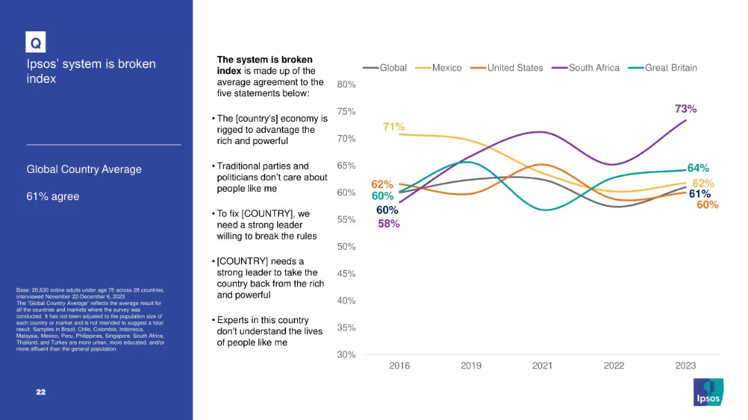
Line graph with average agreement to five statements comprising a “broken system” index; countries compared over time; text box lists index components.
Market Analysis and Trends
Government & Public Sector
Summarizes the Ipsos "broken system" index based on multiple political distrust indicators. South Africa shows highest agreement; trend data is shown for key countries from 2016–2023.
broken system, Ipsos index, trust, governance, political perception, dissatisfaction, public sentiment
Mixed Chart
IPSOS
Saved
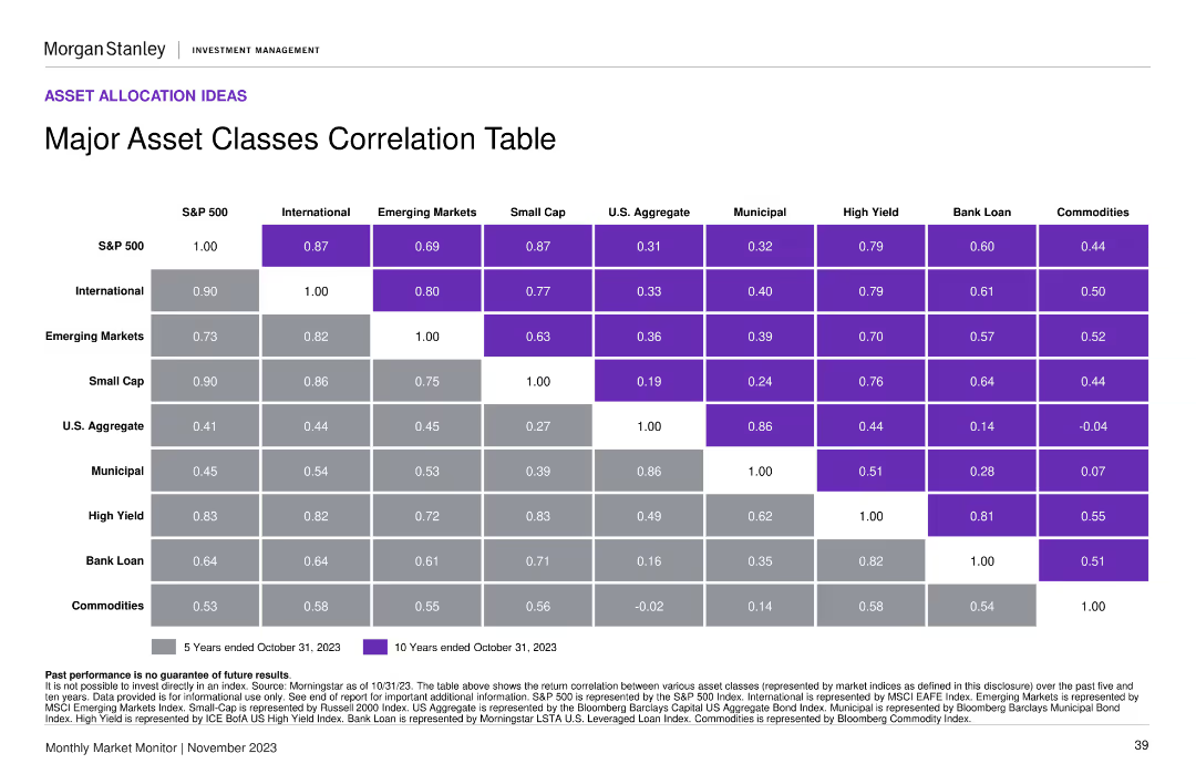
A correlation table showing the return correlation between various asset classes over 5 and 10 years. The design uses color-coding for clarity.
Financial Performance
Financial Services
This slide provides a correlation matrix for major asset classes, helping in understanding their performance relationships over time, useful for portfolio diversification strategies.
asset classes, correlation, return, performance, portfolio diversification
Table
Morgan Stanley
Saved
Tables depict asset distribution by class and region, accompanied by column chart showing asset and net flow changes over time.
Investment Analysis
Financial Services
The slide breaks down firmwide assets under supervision by segment, asset class, and region, with highlights on annual changes. It is useful for assessing investment distributions and monitoring long-term net asset flows.
Assets Under Supervision, Investment, Equity, Fixed Income, Regional Distribution, Net Flows, Asset Class, Financial Analysis, Firmwide Assets
Multiple Chart
Goldman Sachs
Saved
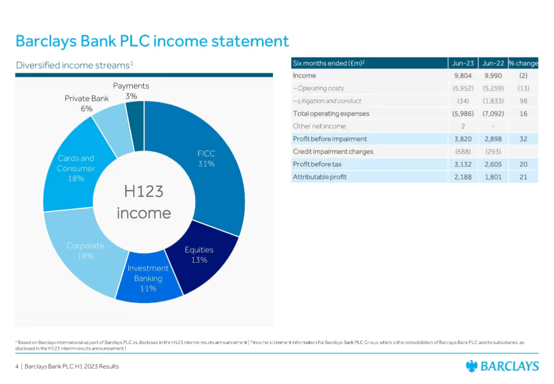
Doughnut chart (left) + financial table (right); simple, clean, corporate layout
Financial Performance
Financial Services
Displays diversified income streams for Barclays in H1 2023. The doughnut chart segments income sources like FICC, Equities, Investment Banking, etc., while the financial table details income, expenses, and profit data with YoY comparisons.
Income, Barclays, Profit, FICC, Equities, Banking, H1 2023, Revenue Streams, Financial Results
Mixed Chart
Barclays
Saved
This slide features bar charts comparing 2010 and 2019 market caps of top companies in Brazil, with tech vs. non-tech categorization.
Competitive Landscape
Technology & Software
Illustrates the dominance of traditional companies over tech companies in Brazil's top market cap rankings, and how this landscape has evolved over the decade.
market cap, Brazil, traditional sectors, tech companies, innovation
Multiple Chart
McKinsey
Saved
Slide includes multiple line graphs depicting real GDP growth for World, Eurozone, USA, and China from Q1 2019 to Q4 2021, with an adjacent table detailing GDP changes and expected recovery quarters.
Market Analysis and Trends
Financial Services
Exhibiting a muted recovery scenario, this slide illustrates the GDP growth trajectory under prolonged pandemic effects, useful for strategizing in uncertain economic climates.
GDP, muted recovery, economic trajectory, pandemic, uncertainty, Eurozone, USA, China, forecast
Mixed Chart
McKinsey
Saved
Column chart showing potential topline benefits from advancing maturity levels.
Technology and Digital Transformation
Financial Services
Discusses the potential incremental topline benefits for companies at different maturity levels in the SHoP framework.
topline, growth, customer conversion, NPS, engagement
Mixed Chart
BCG
Saved
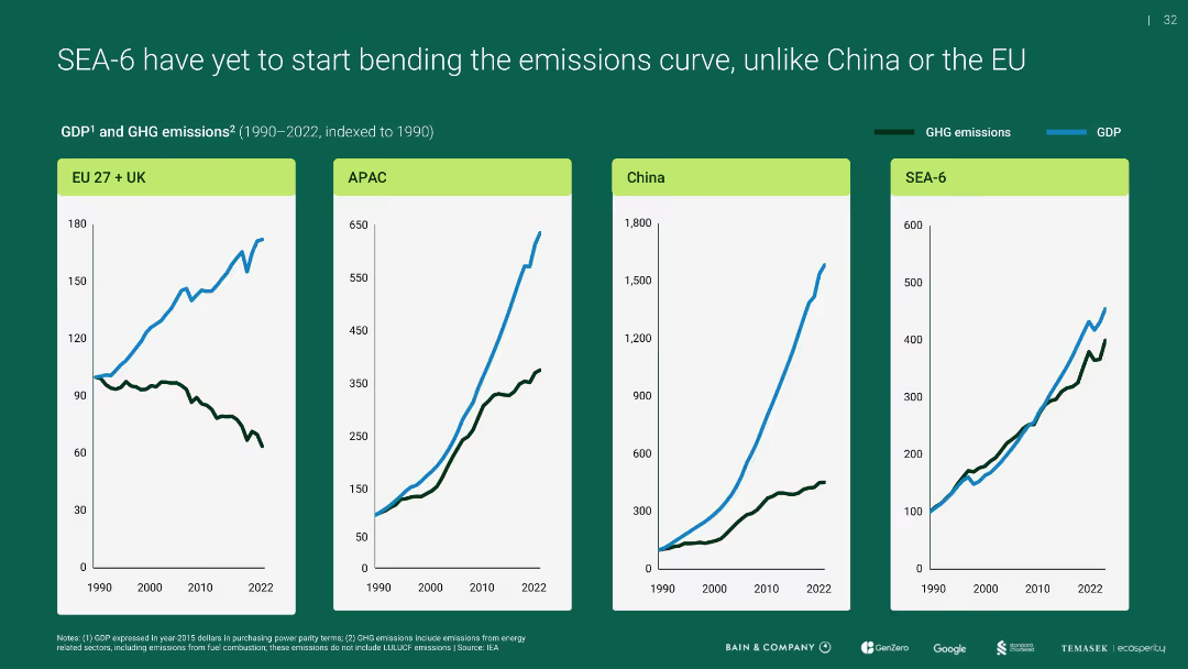
Four-panel line chart showing GDP vs. GHG emissions indexed to 1990 for EU+UK, APAC, China, and SEA-6
Performance Metrics and KPIs
Environmental Services & Sustainability
Compares emissions and economic growth over time, revealing that unlike the EU, SEA-6 and others (like APAC, China) have not decoupled emissions from GDP growth, highlighting a challenge for sustainable development.
emissions curve, GDP, SEA-6, APAC, EU, China
Multiple Chart
Bain
Saved
This slide includes line charts showing hourly radio reach percentages for weekdays and weekends. Images of people using audio devices are on the left side.
Market Analysis and Trends
Media & Entertainment
The slide illustrates the daily and weekend radio usage patterns, showing peak listening times and how radio reaches consumers throughout the day, especially during commutes.
radio use, daily patterns, line chart, weekday, weekend
Mixed Chart
Nielsen
Saved
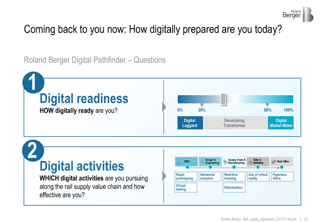
Split layout with readiness scale and digital activity icons across value chain
Technology and Digital Transformation
Transportation & Logistics
Introduces Roland Berger's Digital Pathfinder assessment with two key questions: evaluating current digital readiness and mapping digital activities across the supply chain.
digital readiness, digital activities, value chain, virtual testing, analytics, robotization
Mixed Chart
Roland Berger
Saved
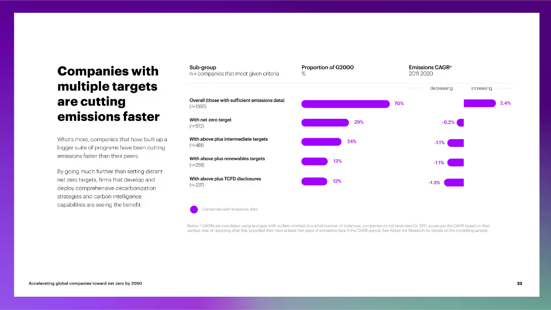
The slide includes a column chart depicting the proportion of G2000 companies with multiple emissions targets and their CAGR for emissions reduction.
Performance Metrics and KPIs
Environmental Services & Sustainability
The slide discusses the impact of multiple net zero targets on emissions reduction, showing that companies with comprehensive strategies perform better than their peers.
multiple targets, emissions reduction, G2000, net zero, intermediate targets, renewable targets, TCFD disclosures, CAGR
Multiple Chart
Accenture
Saved
This slide contains column charts and infographics depicting the operational efficiencies achieved by investing in digitization and automation. The design is clean, with icons that help explain the concepts discussed, such as AI digital assistants and modernized operations platforms.
Operational Efficiency
Financial Services
Illustrates Barclays' efforts to improve operational efficiency through digital transformation and automation, detailing the impact on cost reduction and enhanced customer service.
operational efficiency, digitization, automation, cost reduction
Multiple Chart
Barclays
Saved
The slide features a vertical column chart showing operating expenses for 3Q23, highlighting a reduction.
Operational Efficiency
Financial Services
This slide details the operating expenses for Q3 2023, emphasizing a decrease compared to previous quarters.
operating expenses, cost reduction, financial performance, Q3 2023, efficiency
Mixed Chart
UBS
Saved
The slide shows a world map and text describing a shift from globalized to localized and decarbonized value chains. It includes icons and lines connecting different regions, indicating shifts in operational strategies.
Operational Efficiency
Industrial & Manufacturing
Discusses the evolution from globalized to localized value chains, emphasizing the need for flexibility and decarbonization in operations to mitigate future disruptions and improve resiliency.
value chains, globalization, localization, decarbonization, operational flexibility, future disruptions, resiliency, Accenture Research
Graphic
Accenture
Saved
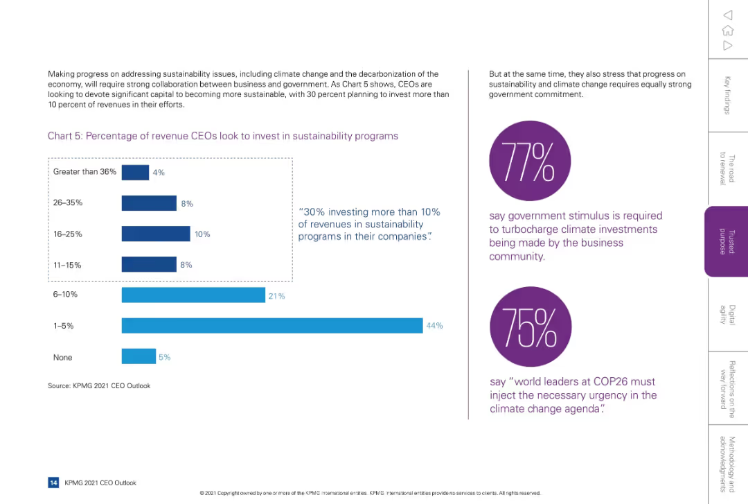
Split layout: left side with bar chart and supporting text, right side has two purple circular callouts with statistics and quotes.
Regulatory and Compliance
Environmental Services & Sustainability
Shows CEO intentions to invest revenue in sustainability programs, with 30% allocating more than 10%. Also emphasizes business-government collaboration on climate issues, highlighting expectations for government stimulus and leadership.
sustainability, revenue allocation, ESG, investment, climate, government
Mixed Chart
KPMG
Saved
Line chart with annotations for actual and projected expenditure rates from 2018/19 to 2023/24.
Financial Performance
Government & Public Sector
Shows the consistency and changes in government spending efficiency over six fiscal years.
Government, Public Sector, Expenditure, Efficiency, Spending, Financial, Rate, Actuals, Projections
Single Chart
PwC/Strategy&
Saved
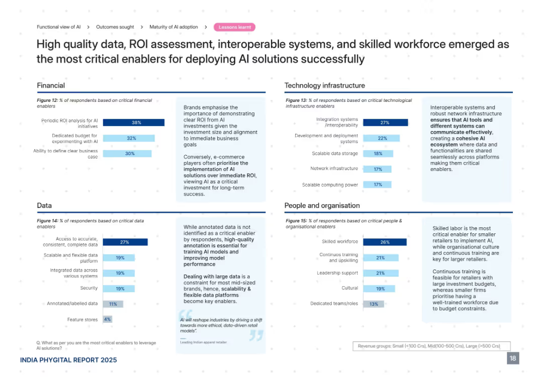
Four quadrant layout divided by themes: Financial, Data, Technology Infrastructure, and People. Each quadrant includes a bar chart with accompanying textual insights. Dark blue accent color.
Technology and Digital Transformation
Retail & E-commerce
The slide identifies key enablers for successful AI deployment, such as ROI evaluation, data accuracy, interoperable systems, and skilled workforce. It highlights that e-commerce players prioritize AI investment more than ROI and stresses the importance of annotated data and skilled teams for long-term AI integration success.
AI enablers, data quality, ROI, interoperability, workforce, budget, infrastructure
Mixed Chart
PwC/Strategy&
Saved
This slide features a scatter plot comparing the current and projected supply risks for various critical materials like barytes, borate, and molybdenum in 2030. Each material is plotted based on its current supply risk against the predicted future risk, emphasizing those with expected increases in risk. The design incorporates a linear trend line to visualize the expected change in risk level, and annotations provide context about the production-to-reserves ratio, which influences these projections.
Risk Assessment and Management
Industrial & Manufacturing
This slide provides a projection of future supply risks for selected critical materials based on their current production practices and reserves. It highlights materials like barytes, borate, and molybdenum, predicting increased risks due to continued heavy reliance on existing reserves without adjustments in production strategies.
critical materials, supply risk, future projections, resource management, mining, production practices, risk assessment, barytes, borate, molybdenum, sustainability
Mixed Chart
Roland Berger
Saved
A scatter plot showing the relationship between IT spending per employee and value-added per employee for different countries. The countries are grouped and color-coded into different regions.
Market Analysis and Trends
Technology & Software
The slide analyzes IT intensity across various countries by comparing IT spending per employee to the economic value added per employee, used for international market comparisons.
IT Intensity, Country Analysis, Economic Value, IT Spending, International Comparison
Single Chart
Gartner
Saved
Graph showing the cumulative number of tests per million population versus cases per million, along with a column chart comparing testing-to-case ratios by country.
Regulatory and Compliance
Healthcare & Pharmaceuticals
Discusses the scale of COVID-19 testing in various countries and contrasts it with the number of reported cases to evaluate testing adequacy as of April 2020.
COVID-19, testing, healthcare capacity, countries, testing ratios, cases, global overview, adequacy
Multiple Chart
BCG
Saved
This slide presents pie charts and a global map to illustrate the market capitalization and global presence of surveyed companies. The design is clean with color-coded pie charts for easy interpretation and a grey world map highlighting operational regions.
Regulatory and Compliance
Healthcare & Pharmaceuticals
Provides an overview of industry practices in healthcare professional engagement by showing the market size and global operation scale of responding companies. It discusses the sector's distribution and geographic reach, aiming to give insights into global healthcare market dynamics.
healthcare, global presence, market capitalization, industry practices, survey results
Multiple Chart
Deloitte
Saved
This slide shows a series of column charts displaying changes in the use of various intercity travel modes like airplanes, trains, and private vehicles across different countries.
Market Analysis and Trends
Transportation & Logistics
Examines how intercity travel preferences have shifted towards private vehicle use post-crisis.
intercity travel, mode shift, private vehicles, crisis
Multiple Chart
McKinsey
Saved
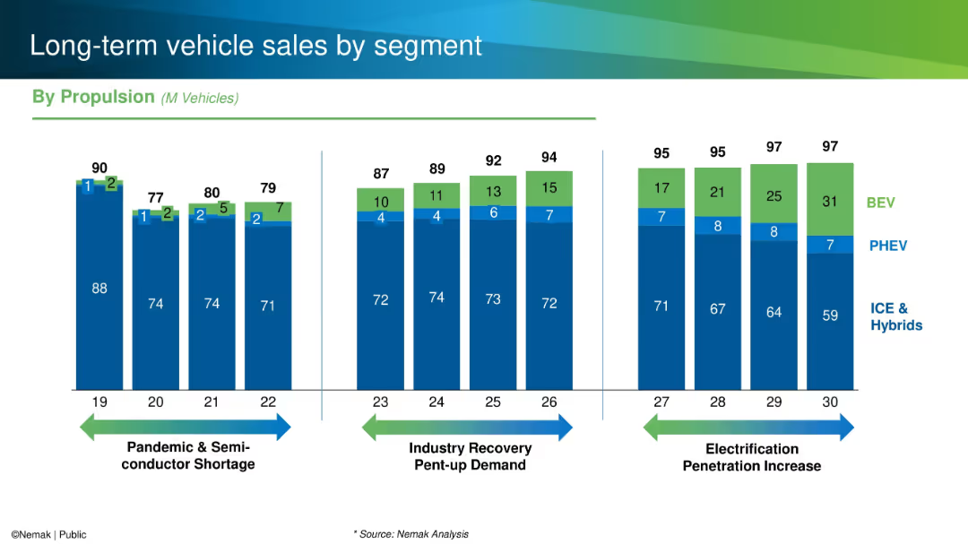
Stacked bar chart with propulsion type breakdown, grouped by period themes (e.g., pandemic, electrification).
Market Analysis and Trends
Industrial & Manufacturing
This slide shows vehicle sales trends segmented by propulsion type (ICE, PHEV, BEV) over time. It outlines three distinct periods: the semiconductor shortage, recovery, and increased EV penetration, illustrating how powertrain mixes are evolving through 2030.
vehicle segment, propulsion, ICE, BEV, PHEV, sales trends
Single Chart
Barclays
Saved
A slide with a clean design showing text boxes that summarize investors' preferences for financially healthy companies and the importance of delivering on EPS guidance. It employs a simple layout with a minimalistic color palette for clarity.
Financial Performance
Financial Services
Highlights investor priorities concerning the financial health of companies and the significance of EPS guidance, valuable for financial strategy discussions.
Financial Health, EPS, Guidance, Investor Expectations, Company Performance, Long-term Advantage, Strategic Priorities, Financial Planning, Corporate Investment, Shareholder Value
Text Only
BCG
Saved
Previous
Next
If nothing, comes up, please save your slides first
Create a FREE account to continue browsing
Receive Instant Access to 1,000+ slides from companies like McKinsey, Google, and Goldman Sachs
First Name
Last Name
Email
Password
I agree to all
Terms & Privacy Policy
Thank you! Your submission has been received!
Oops! Something went wrong while submitting the form.
Have an account?
Sign in
Column Chart
Heatmap
Chevron
Org Chart
Infographic
Callouts
Timeline
List
Graphic
Picture
Process Flow
Diagram
Paragraph
Map
Table
Framework
Subtitle
Takeaway Box
Icon
Other Chart
Radar Chart
Waterfall Chart
Mekko Chart
Pie Chart
Scatter Plot
Line Chart
Bar chart
Bullet points