Create a FREE Account
Instant access to 1,000+ real slides from top companies like McKinsey, BCG, Goldman Sachs, Google and many more!
First Name
Last Name
Email
Password
I agree to all
Terms & Privacy Policy
Thank you! Your submission has been received!
Oops! Something went wrong while submitting the form.
Have an account?
Sign in
Library
Templates
Courses
Pricing
My Account
My Slides
My Templates
✦ AI
AI Prompt Library
AI Search
Sign in
Start Here
Logout
My Saved Slides
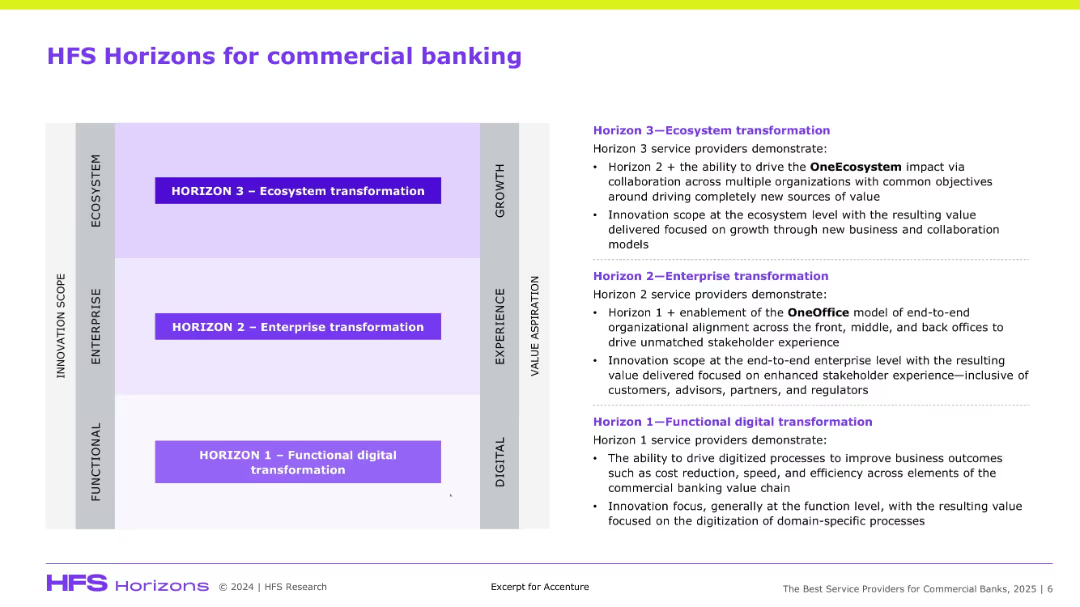
Matrix chart with three horizontal zones and detailed text explanation on the right side.
Technology and Digital Transformation
Financial Services
This slide presents a 3-tier model (Functional, Enterprise, Ecosystem transformation) explaining stages of digital maturity in commercial banking, with emphasis on value creation, innovation, and alignment.
HFS, commercial banking, digital transformation, ecosystem, innovation, OneOffice
Diagram
Accenture
Saved
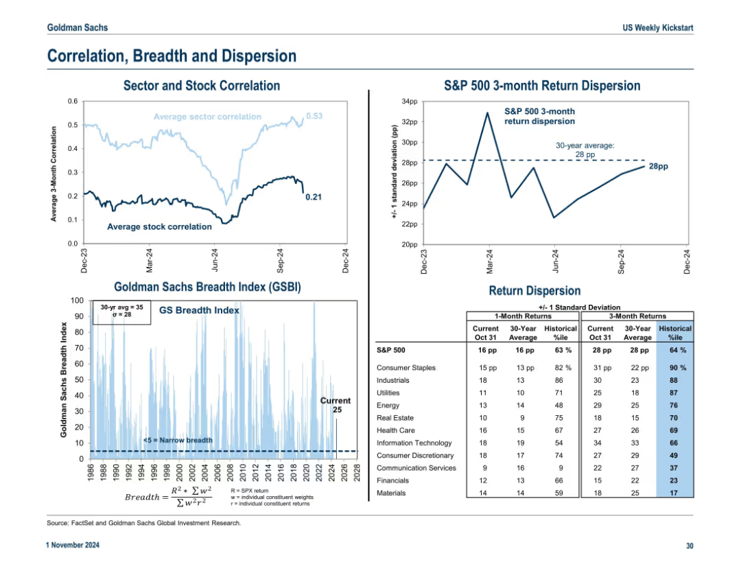
Three-section layout: average sector/stock correlation line chart, breadth index with historical context, and return dispersion stats. Blue gradient for breadth intensity.
Risk Assessment and Management
Financial Services
The slide presents market internals: sector and stock correlations, return dispersions, and the GS Breadth Index. It highlights market concentration and potential risks tied to narrow leadership or broad participation.
dispersion, correlation, breadth, return volatility, S&P 500, stock internals
Multiple Chart
Goldman Sachs
Saved
A column chart showing the share of total time viewed on Netflix for its top 10 shows over various weeks. The bars are segmented into categories like Movies, Acquired, and Originals, with a legend for reference.
Competitive Landscape
Media & Entertainment
This slide illustrates the weekly share of total viewing time on Netflix for its top 10 shows, categorized by type (Movies, Acquired, Originals), highlighting the platform's content performance from October to December.
Netflix, viewing time, top 10 shows, content performance, weekly data
Single Chart
Nielsen
Saved
Line charts display economic and trade growth from 1980 to projections in 2026, differentiated by global growth and ASEAN countries' growth. The color scheme includes red and white with dashed and solid lines, accompanied by a descriptive legend at the bottom.
Market Analysis and Trends
Financial Services
Discussing global economic trends with a focus on recovery phases and expectations for the ASEAN region. This analysis is vital for stakeholders in financial services to assess potential impacts on international trade and economic policies.
economic growth, ASEAN, trade growth, financial analysis, projections
Single Chart
Deloitte
Saved
Bar chart detailing adjusted costs by category such as compensation, IT, and professional services. Accompanied by bullet points of key highlights.
Operational Efficiency
Financial Services
Detailed analysis of quarterly changes in adjusted costs, focusing on the impacts of technology investments and operational efficiency.
Costs, adjustments, technology, efficiency
Mixed Chart
Deutsche Bank
Saved
Detailed text analysis with supporting statistics from a small bar and line chart showing predictions in graphic form.
Strategic Planning
Financial Services
Explores the shift towards hybrid and fully tech-driven advisory models in the financial industry.
hybrid model, tech-driven, advisory, financial industry, future, financial services
Multiple Chart
Deloitte
Saved
Circular diagram showing the product lifecycle stages (Pre-Launch, At Launch, In Market) and associated services Ipsos offers, with text descriptions of each stage.
Strategic Planning
Professional Services
Outlines the different stages of a product lifecycle and the various services Ipsos provides to support clients at each stage. Emphasizes strategic planning and service integration.
Product Lifecycle, Strategic Planning, Services, Ipsos
Diagram
IPSOS
Saved
This slide displays a gray map of Southeast Asia highlighting six countries with blue circles scaled to represent their population sizes. Each country is labeled with a flag icon and population figure.
Industry Overview
Technology & Software
The slide visually communicates the demographic reach of the e-Conomy SEA report, emphasizing the total population of 583 million across six countries in Southeast Asia.
Southeast Asia, e-Conomy SEA, demographics, population, internet economy, country coverage
Single Chart
Bain
Saved
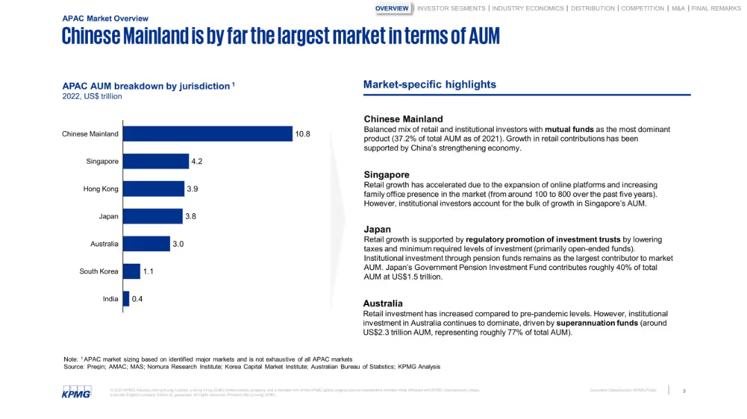
Bar chart with jurisdictional AUM and a column of highlights. Structured and minimalistic with strong blue tones.
Market Analysis and Trends
Financial Services
Breaks down APAC AUM by country, highlighting China’s dominance. The sidebar notes market-specific factors like regulatory frameworks, pension fund dominance, and online platform growth in Singapore and Japan.
AUM, China, Japan, Singapore, investment, retail growth, pensions
Mixed Chart
KPMG
Saved
Features a line chart tracking past and projected future spending on mobile activities, separated by B2B and B2C sectors.
Market Analysis and Trends
Professional Services
Analyzes trends and forecasts in mobile marketing expenditure, with a focus on sectoral differences and future predictions.
mobile marketing, spending trends, sector analysis, future forecast, line graph
Mixed Chart
Deloitte
Saved
The visual complexity is moderate with pie charts displaying survey data on the attractiveness of flexible international assignment packages. The slide uses a consistent color scheme to highlight percentages and maintains a clean and organized layout.
Human Resources and Talent Management
Professional Services
Addressing the appeal of flexible international assignments, the slide shows the importance of mobility package options in attracting female talent. It stresses that organizations must tailor these packages to various needs, emphasizing repatriation concerns and preferences for assignment duration and benefits.
Flexible assignments, Talent attraction, Repatriation, Mobility benefits
Multiple Chart
PwC/Strategy&
Saved
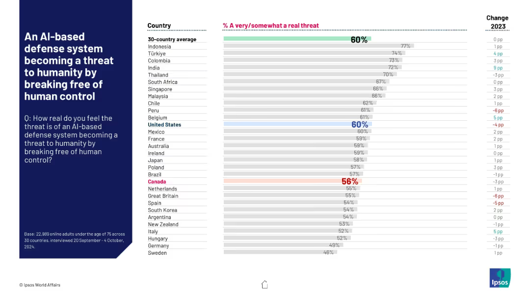
Horizontal bar graph ranking countries' fears of AI-based defense system threats; 30-country average shown.
Risk Assessment and Management
Artificial Intelligence
This slide captures international sentiment on the perceived risk of AI-driven defense systems losing human oversight. The global average concern is 60%, with the U.S. matching this rate and Canada slightly lower at 56%.
AI, defense, risk perception, public opinion, Ipsos, control, technology fears, threat, survey, 2024
Mixed Chart
IPSOS
Saved
The slide contains a table with percentages of investment product ownership across different age groups and a bar chart showing ownership by gender and social class.
Customer and Market Segmentation
Financial Services
The slide compares investment product ownership by age, gender, and social class, highlighting demographic differences in investment behaviors.
investment, age, gender, social class, comparison
Mixed Chart
IPSOS
Saved
The title slide for a presentation with a vivid background image of a wheat field, the logos of EY and Parthenon, and the names of two managing directors.
Industry Overview
Agriculture & Food Production
This introductory slide sets the theme for a presentation on investing in the agricultural crop industry, likely to be part of a broader discussion on investment opportunities and strategies within the agriculture sector. The visual backdrop of crops establishes the industry context.
Agriculture, Crop Industry, Investment, EY-Parthenon, Managing Directors, Overview
Title
EY
Saved
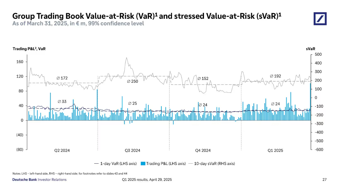
Line and bar chart show daily trading P&L, 1-day VaR, and 10-day sVaR trends over the past quarters.
Risk Assessment and Management
Financial Services
Visualizes Deutsche Bank’s trading risk metrics with 99% confidence level. Highlights stability in VaR and sVaR levels, with spikes in P&L volatility. Useful for understanding trading risk exposure and stress scenarios.
VaR, sVaR, trading risk, P&L, confidence interval, risk monitoring, financial risk
Single Chart
Deutsche Bank
Saved
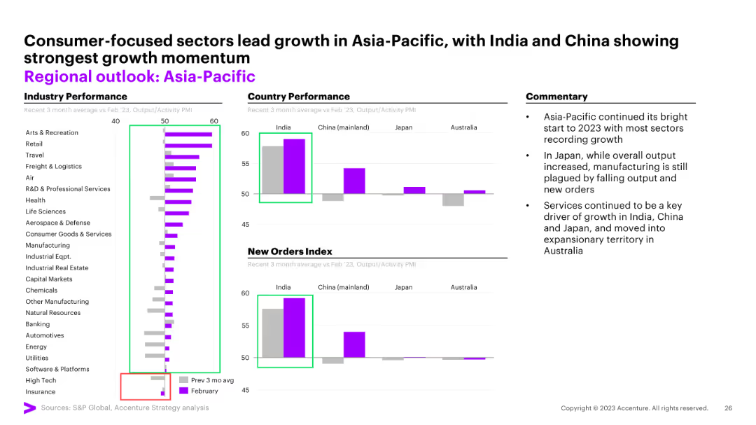
Column charts for industry performance, country performance, and new orders index
Market Analysis and Trends
Financial Services
The slide analyzes the performance of the Asia-Pacific region, highlighting consumer-focused sectors and growth momentum.
Asia-Pacific, regional outlook, industry performance, growth momentum, new orders
Multiple Chart
Accenture
Saved
Column chart indicating "Spread Percentile" for various asset classes across three different time points: December 2021, 2022, and 2023. Each asset class is represented by a column with three bars corresponding to the respective time points.
Investment Analysis
Financial Services
Slide provides an investment perspective by comparing the tightness of spreads for various asset classes over the last three years. Used to assess market changes and investment strategy formulation.
asset classes, spreads, investment, comparison
Single Chart
Morgan Stanley
Saved
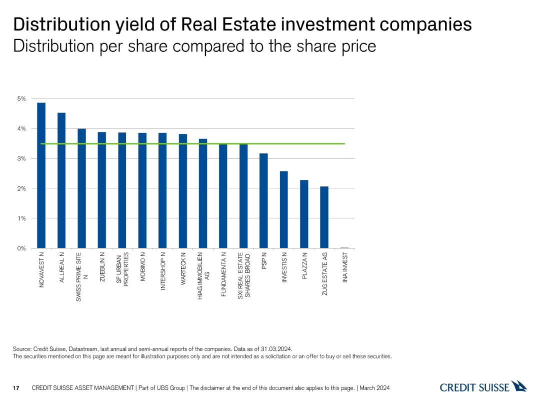
A column chart showing the distribution yield per share of various real estate investment companies. The X-axis lists companies, and the Y-axis represents distribution yield percentages up to 5%.
Financial Performance
Real Estate & Construction
This slide compares the distribution yield per share across different real estate investment companies, highlighting those with the highest and lowest yields.
distribution, yield, real estate, investment, companies, comparison, financial, performance, yield percentage, analysis
Single Chart
Credit Suisse
Saved
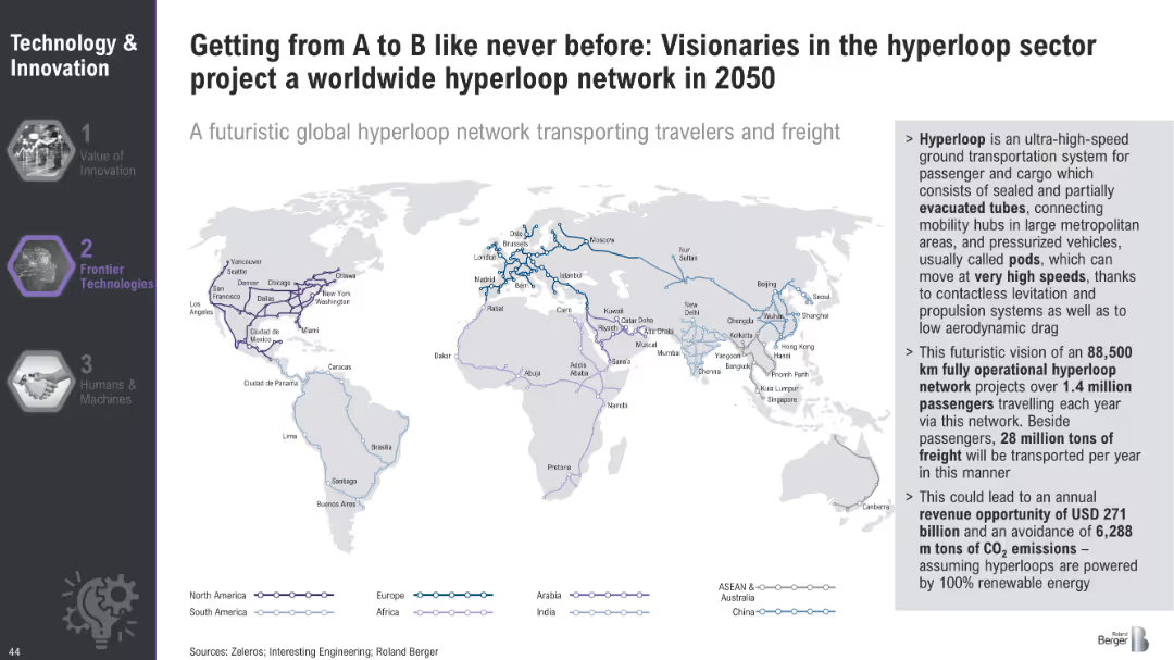
World map illustrating the projected global hyperloop network for 2050, highlighting major routes and connections across continents.
Technology and Digital Transformation
Transportation & Logistics
The slide envisions a global hyperloop network by 2050, outlining the potential routes and connections that could transport passengers and freight at high speeds. It emphasizes the economic and environmental benefits of this futuristic transportation system.
Hyperloop, Global Network, Transportation
Graphic
Roland Berger
Saved
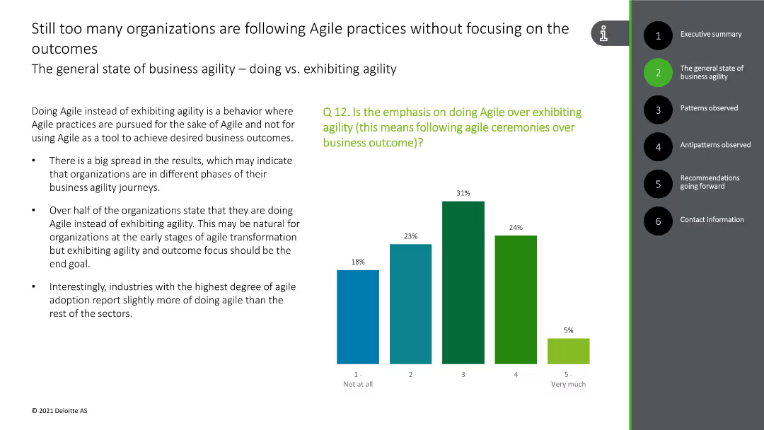
This slide contains a column chart showing the emphasis on following Agile ceremonies over outcomes, with green and blue bars.
Strategic Planning
Technology & Software
The slide discusses the focus on Agile practices rather than outcomes in many organizations, with survey data supporting this observation.
Agile practices, outcomes, focus, survey data, organizational behavior
Mixed Chart
Deloitte
Saved
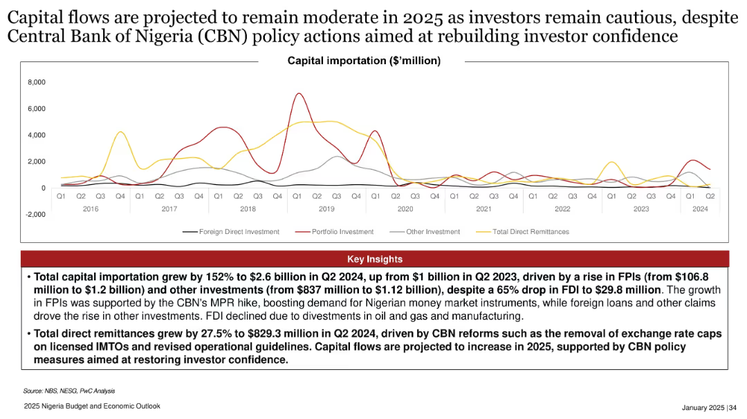
Multi-line chart tracking different types of capital importation; red insights box below; spans from 2016–2024.
Investment Analysis
Financial Services
Capital importation rose sharply in 2024 driven by FPIs and policy reforms, but FDI dropped significantly. The slide forecasts cautious capital flow in 2025, supported by CBN reforms and increased remittances amid efforts to rebuild investor confidence.
capital importation, FPI, FDI, CBN reforms, investor confidence, Nigeria, 2025, policy action, remittances, investment
Mixed Chart
PwC/Strategy&
Saved
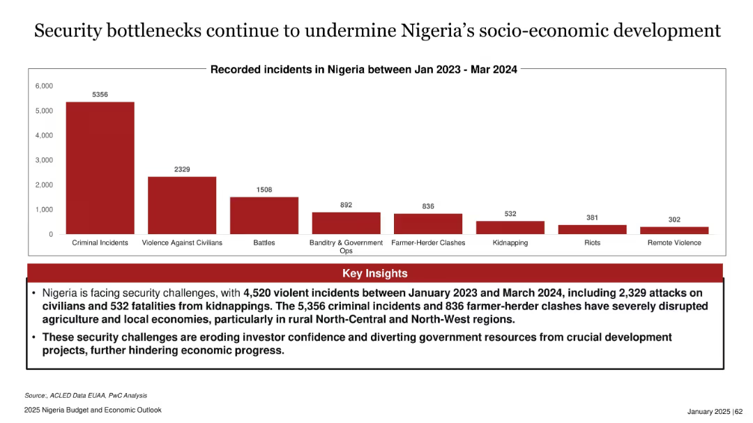
Bar chart with red bars representing different types of recorded incidents; header and insights in text box
Risk Assessment and Management
Government & Public Sector
The slide presents a bar chart showing the number of security incidents in Nigeria from Jan 2023 to Mar 2024. Criminal incidents dominate, followed by violence against civilians and battles. Key insights highlight the negative impacts on rural economies, agriculture, and investor confidence, urging attention to worsening insecurity trends.
Nigeria, security, incidents, criminal, rural, agriculture, investor confidence, development
Mixed Chart
PwC/Strategy&
Saved
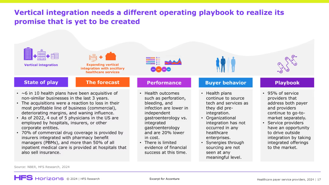
Horizontal layout with five color-coded columns (State of play, Forecast, Performance, Buyer behavior, Playbook), icons and infographics on top, light background, bold color headers.
Strategic Planning
Healthcare & Pharmaceuticals
The slide critiques the ineffectiveness of current vertical integration strategies in healthcare, stating that financial performance hasn't improved and buyer behavior hasn't changed. It highlights the need for a new operating model and playbook, as most service providers still market separately to payers and providers.
vertical integration, healthcare strategy, service providers, playbook, acquisitions
Pillar
Accenture
Saved
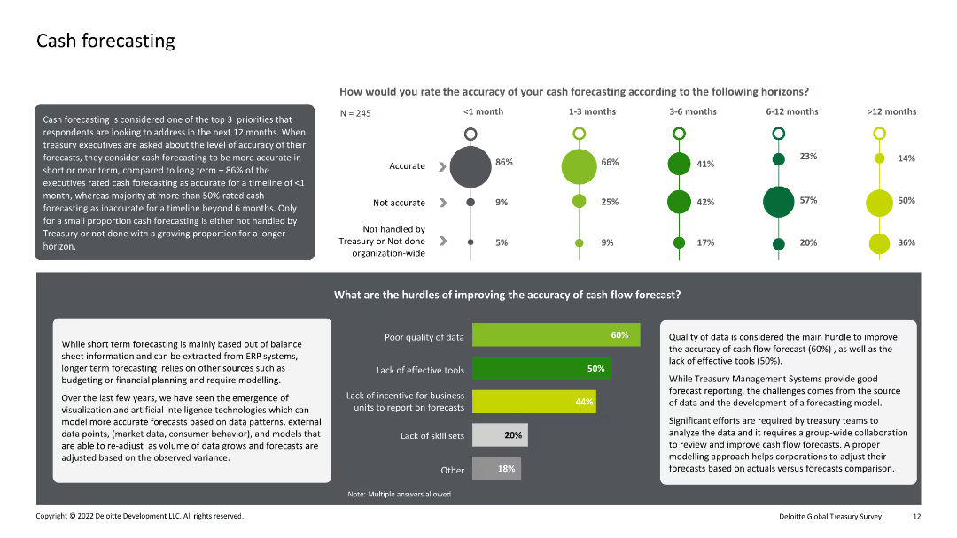
Combination of text, bar charts, and dot plots. The slide evaluates the accuracy of cash forecasting over different time horizons and identifies the main hurdles to improving forecasting accuracy.
Financial Performance
Financial Services
This slide analyzes the accuracy of cash forecasting within organizations over various time horizons and identifies key obstacles to improving this accuracy, such as poor data quality and lack of effective tools.
Cash, Forecasting, Accuracy, Hurdles, Improvement
Multiple Chart
Deloitte
Saved
The slide features a pie chart outlining leaders' expectations for a 2023 recession and colored blocks indicating strategies to mitigate economic downturns.
Risk Assessment and Management
Financial Services
Offers insights into the anticipated economic climate for 2023 with a focus on recession expectation and strategic responses, emphasizing risk management and financial planning.
Recession, Strategy, Risk Management, 2023
Mixed Chart
JP Morgan
Saved
Previous
Next
If nothing, comes up, please save your slides first
Create a FREE account to continue browsing
Receive Instant Access to 1,000+ slides from companies like McKinsey, Google, and Goldman Sachs
First Name
Last Name
Email
Password
I agree to all
Terms & Privacy Policy
Thank you! Your submission has been received!
Oops! Something went wrong while submitting the form.
Have an account?
Sign in
Column Chart
Heatmap
Chevron
Org Chart
Infographic
Callouts
Timeline
List
Graphic
Picture
Process Flow
Diagram
Paragraph
Map
Table
Framework
Subtitle
Takeaway Box
Icon
Other Chart
Radar Chart
Waterfall Chart
Mekko Chart
Pie Chart
Scatter Plot
Line Chart
Bar chart
Bullet points