Create a FREE Account
Instant access to 1,000+ real slides from top companies like McKinsey, BCG, Goldman Sachs, Google and many more!
First Name
Last Name
Email
Password
I agree to all
Terms & Privacy Policy
Thank you! Your submission has been received!
Oops! Something went wrong while submitting the form.
Have an account?
Sign in
Library
Templates
Courses
Pricing
My Account
My Slides
My Templates
✦ AI
AI Prompt Library
AI Search
Sign in
Start Here
Logout
My Saved Slides
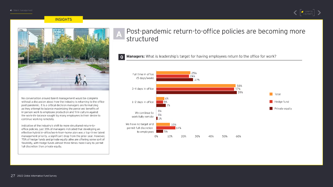
The slide features a column chart illustrating leadership's targets for employees returning to the office post-pandemic. An image on the left shows an outdoor urban setting with people walking. The chart uses shades of orange and red.
Human Resources and Talent Management
Financial Services
The slide outlines how leadership is targeting different levels of in-office presence post-pandemic, with a significant focus on structured return-to-office policies to balance remote work and office work.
Return-to-office, post-pandemic, remote work, office policies, leadership targets
Mixed Chart
EY
Saved
This slide presents a structured summary of health outcomes influenced by broadband, using flowcharts and bullet points. It details user percentages accessing telehealth and other medical resources, citing benefits and drawbacks. Color coding assists in distinguishing between positive and negative impacts.
Market Analysis and Trends
Telecommunications
The slide outlines how broadband access has influenced health services, detailing user engagement and satisfaction with telehealth and online health resources.
Health, Broadband, Telehealth, Medical, Resources, Impact, Positive, Negative, Internet, Access
Multiple Chart
Accenture
Saved
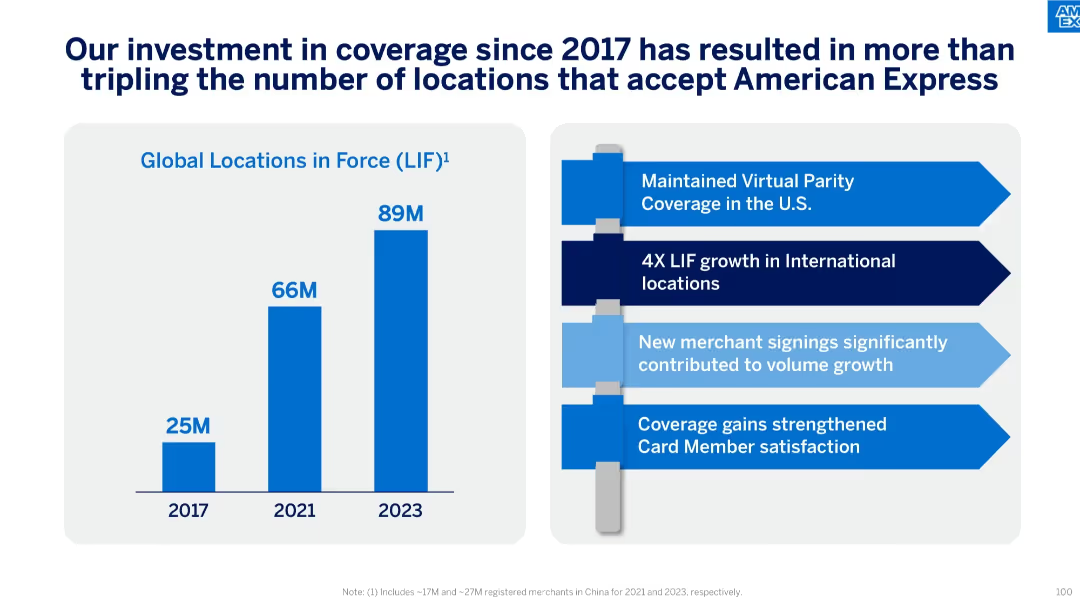
Bar chart (left) showing global LIF growth and a bullet list (right) with strategic initiatives and outcomes.
Operational Efficiency
Financial Services
This slide emphasizes the expansion in Global Locations in Force (LIF) from 25M in 2017 to 89M in 2023. It outlines strategic outcomes like virtual parity in the U.S., 4x growth internationally, and improved cardholder satisfaction.
LIF, Global Locations, Coverage, Strategy, Virtual Parity, International Growth, Merchant Signings
Mixed Chart
McKinsey
Saved
This slide includes stacked bar charts showing mining production by location and a bar chart displaying agricultural trade balances by region over time.
Market Analysis and Trends
Financial Services
The slide provides a global overview of key resource distribution, including mining production and agricultural trade balances, useful for understanding resource management and economic dependencies.
global resources, mining production, agricultural trade, resource management, economic dependencies, trade balances
Multiple Chart
JP Morgan
Saved
Features a detailed chart analyzing the correlation between various job satisfaction elements and employee retention in France.
Organizational Structure and Change
Professional Services
Detailed analysis of how different factors of job satisfaction impact employee retention among French deskless workers, critical for HR management and policy-making.
French workers, job satisfaction, emotional needs, chart
Multiple Chart
BCG
Saved
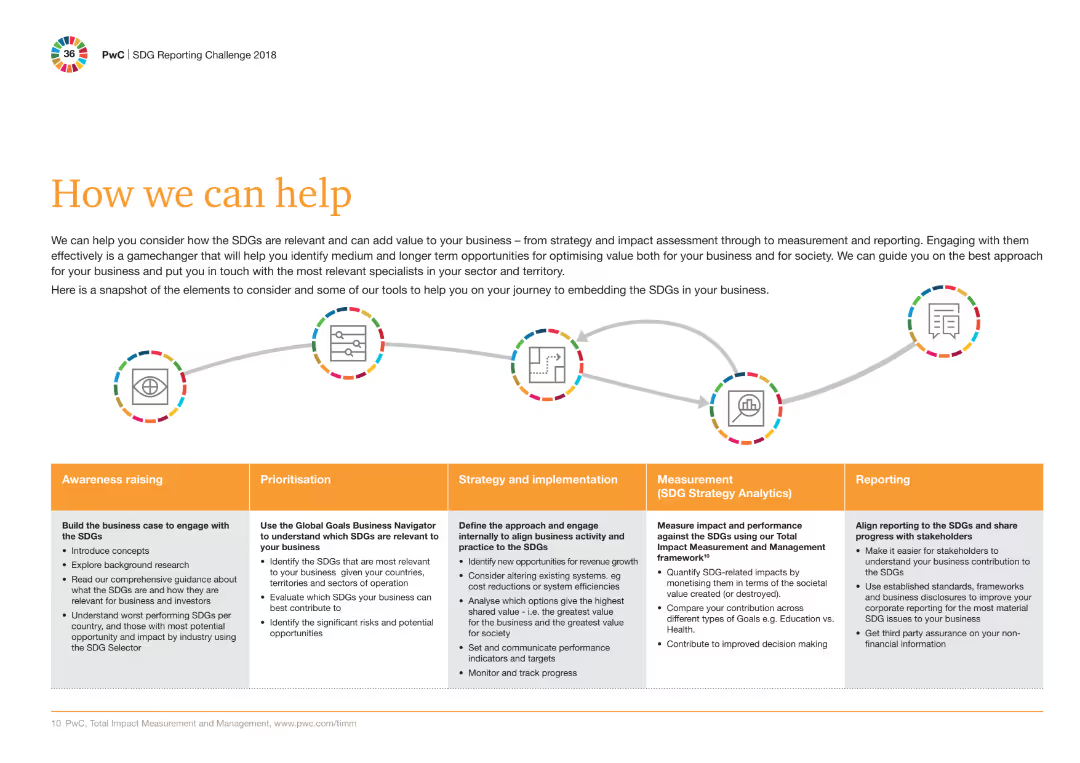
A sequence of five circular icons connected by arrows, each representing a different phase: Awareness raising, Prioritisation, Strategy and implementation, Measurement, Reporting.
Strategic Planning
Professional Services
The slide outlines the approach for embedding SDGs in businesses, highlighting steps from awareness raising to reporting with corresponding actions and tools.
SDGs, Strategy, Implementation, Reporting, Measurement, Tools, Awareness, Business, Value, Specialists
Mixed Chart
PwC/Strategy&
Saved
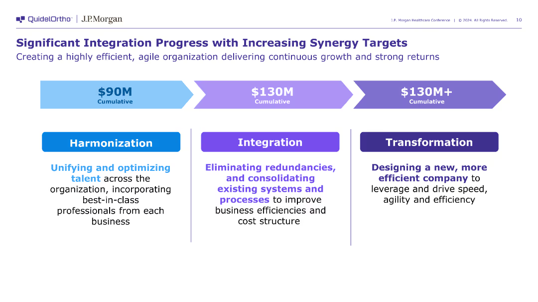
The slide includes three blocks detailing the stages of integration: Harmonization, Integration, and Transformation, each with specific actions and cumulative synergy targets. The design is clear and structured.
Operational Efficiency
Healthcare & Pharmaceuticals
The slide outlines the progress and targets of QuidelOrtho's integration efforts, focusing on harmonizing talent, eliminating redundancies, and transforming the company for better efficiency.
integration, synergy, transformation
Linear Flow
JP Morgan
Saved
This slide presents a forward-looking column chart forecasting the growth of the personal luxury goods market from 2018 to 2025, highlighting potential market drivers.
Market Analysis and Trends
Consumer Goods
Forecasts the growth of the personal luxury goods market, discussing underlying economic fundamentals and potential challenges. Useful for long-term strategic planning.
market forecast, luxury goods, economic fundamentals, growth potential, strategic planning
Mixed Chart
Bain
Saved
This slide features two vertical column charts comparing the transfer intentions of first-gen versus continuing-gen students at community colleges, in shades of green.
Human Resources and Talent Management
Education & Training
The slide analyzes the transfer intentions of community college students, emphasizing the confidence levels between different student demographics.
community college, students, transfer, first-gen, intentions
Multiple Chart
BCG
Saved
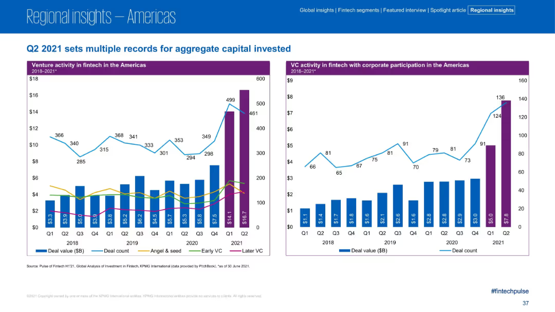
Two bar charts with overlay lines show VC activity and corporate participation over time; color-coded segments for Angel & Seed, Early VC, and Later VC
Strategic Planning
Financial Services
Venture activity in Q2 2021 reached new highs, driven largely by Later VC rounds. Charts show a significant jump in deal value and counts compared to previous quarters, reflecting growing investor confidence and maturing startups. Corporate participation in VC deals also increased sharply.
VC funding, Later VC, corporate VC, fintech investment, Q2 records, angel investors, seed stage
Multiple Chart
KPMG
Saved
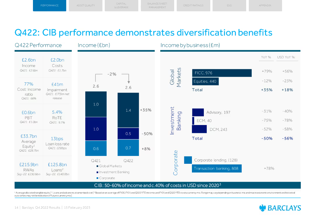
Column charts showing Q422 performance and income by business. Key metrics like income, costs, and RoTE.
Financial Performance
Financial Services
Barclays' CIB performance with detailed metrics, highlighting diversification benefits across various segments.
CIB, performance, diversification, income, business
Multiple Chart
Barclays
Saved
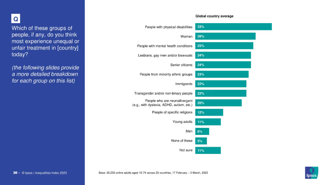
Bar chart showing public opinion on which groups face the most unequal treatment.
Customer and Market Segmentation
Government & Public Sector
This slide reveals which social groups are perceived to face the most unequal treatment, based on global averages. Top groups include people with physical disabilities, women, mental health sufferers, and LGBTQ+ individuals.
inequality, social groups, discrimination, public perception, unfair treatment, diversity
Mixed Chart
IPSOS
Saved
A line chart comparing Netflix's penetration rates in MVPD (Multichannel Video Programming Distributor) and Non-MVPD U.S. TV households over several quarters. The chart uses two lines to represent each category's penetration trend.
Market Analysis and Trends
Media & Entertainment
This slide compares the penetration of Netflix in MVPD versus Non-MVPD U.S. TV households, showing trends and growth patterns over multiple quarters from Q1 2018 to Q4 2021.
Netflix penetration, MVPD, Non-MVPD, U.S. households, quarterly trends
Single Chart
Nielsen
Saved
This slide is visually complex, containing a mixture of column charts along with text explanations, depicting mental health statistics and trends among Gen Z and Millennials.
Market Analysis and Trends
Healthcare & Pharmaceuticals
Provides a comprehensive overview of mental health trends among younger demographics, offering insights into stress levels, contributing factors, and potential interventions.
mental health, Gen Z, millennials, survey data, health trends, stress levels, demographic analysis, health interventions, psychological statistics, mental wellness
Mixed Chart
Deloitte
Saved
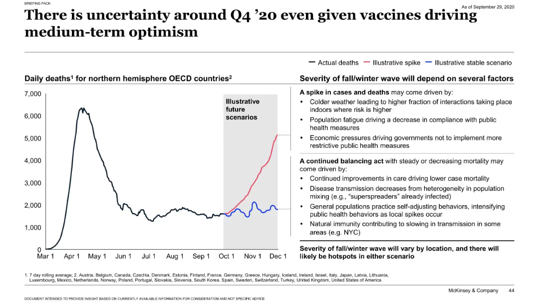
Line chart showing daily deaths and future scenario projections; side panel lists factors driving potential outcomes.
Risk Assessment and Management
Healthcare & Pharmaceuticals
This slide presents possible COVID-19 mortality trends in Q4 2020. It compares actual death rates with projected spikes or stable scenarios. Key factors influencing outcomes include seasonality, public fatigue, compliance with measures, and emerging immunity. It emphasizes regional variability and uncertainty in projections.
COVID-19, mortality, forecast, uncertainty, public health, seasonal trend
Mixed Chart
McKinsey
Saved
The slide displays pie charts and tables alongside textual information, breaking down assets under supervision by asset class and region. It uses contrasting colors to delineate various sections and facilitate comprehension of data distribution.
Investment Analysis
Financial Services
It discusses the distribution and changes in assets under supervision, targeting financial analysts and investors analyzing portfolio diversification and regional asset allocation to guide investment decisions.
assets, supervision, investment, portfolio diversification, asset allocation
Multiple Chart
Goldman Sachs
Saved
A bar graph highlights the F-Series' revenue in comparison to other notable companies.
Financial Performance
Transportation & Logistics
Shows the F-Series' revenue outperforming that of many major companies in 2019.
F-Series, revenue, companies, financial performance
Single Chart
BCG
Saved
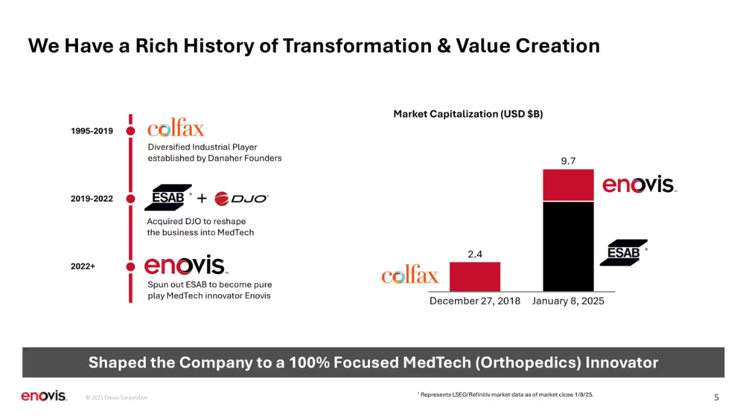
Timeline on left, bar chart on right; clean and minimalistic layout with red and black bars.
Strategic Planning
Healthcare & Pharmaceuticals
Chronicles Enovis's transformation from Colfax to a focused MedTech company through acquisitions and restructuring. Illustrates significant increase in market capitalization from 2018 to 2025 and outlines historical evolution stages.
transformation, MedTech, history, timeline, value creation, Colfax, DJO, ESAB, Enovis
Mixed Chart
JP Morgan
Saved
This slide displays a line chart of CPI inflation in developed markets over a period spanning from the 1970s to the 2020s. The x-axis marks the years while the y-axis shows the percentage change. The chart shows significant fluctuations, with notable peaks and troughs.
Market Analysis and Trends
Financial Services
The slide presents historical data of CPI inflation in developed markets, with an emphasis on the trends over the past five decades. This could be used to analyze economic patterns, predict future inflation trends, and inform investment strategies.
Inflation, CPI, Developed Markets, Economic History, Trends, Data Analysis, Fluctuations
Single Chart
JP Morgan
Saved
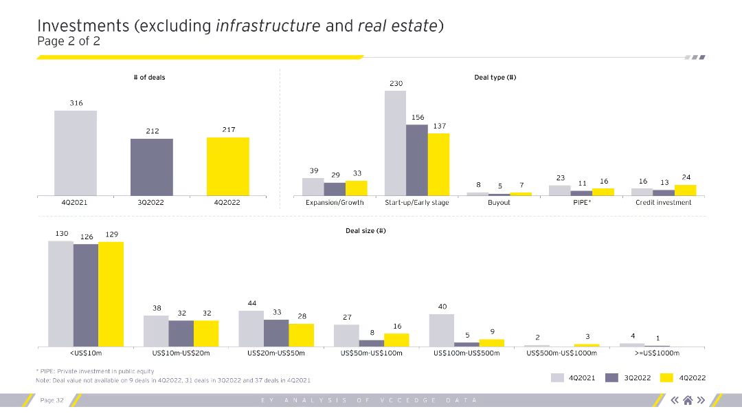
The slide includes column charts depicting the number of deals, deal types, and deal sizes for different quarters. Different colors represent distinct quarters, enhancing comparative analysis.
Market Analysis and Trends
Financial Services
This slide continues the analysis of investments excluding infrastructure and real estate, emphasizing the number of deals and their distribution across deal types and sizes.
Deal types, number of deals, deal sizes, investments
Multiple Chart
EY
Saved
The slide shows a table listing various sectors (e.g., agriculture, industry) and their respective gross estimates of greenhouse gas emissions with potential CCUS applications. Different stages of technology maturity are also indicated.
Technology and Digital Transformation
Energy & Utilities
This slide outlines how CCUS technology can significantly reduce CO2 emissions in key sectors responsible for large amounts of greenhouse gases, highlighting its critical role in achieving emission targets.
CCUS, decarbonization, sectors, CO2 emissions, technology maturity
Single Chart
Kearney
Saved
The slide contains a line chart displaying the progress on Scope 2 goals from 2014 to 2023. The left side includes text with detailed emissions data and trends. The layout is dense with detailed graphs and comprehensive text.
Risk Assessment and Management
Environmental Services & Sustainability
The slide provides an overview of Booz Allen's progress on reducing Scope 2 emissions. It includes year-over-year GHG emissions data, detailed percentage reductions, and verification methods for emissions inventory.
emissions, GHG, Scope 2, reduction, environmental performance
Mixed Chart
Booz Allen Hamilton
Saved
Includes title, bar charts representing different digital initiatives like "Smart Sensors" and "Remote Operations Centre", and their potential impacts.
Operational Efficiency
Industrial & Manufacturing
Outlines the transformative impact of digital technologies in mining and metals, focusing on operational efficiencies, safety improvements, and environmental benefits.
mining, metals, digital transformation, operational efficiency, environmental benefits
Mixed Chart
Accenture
Saved
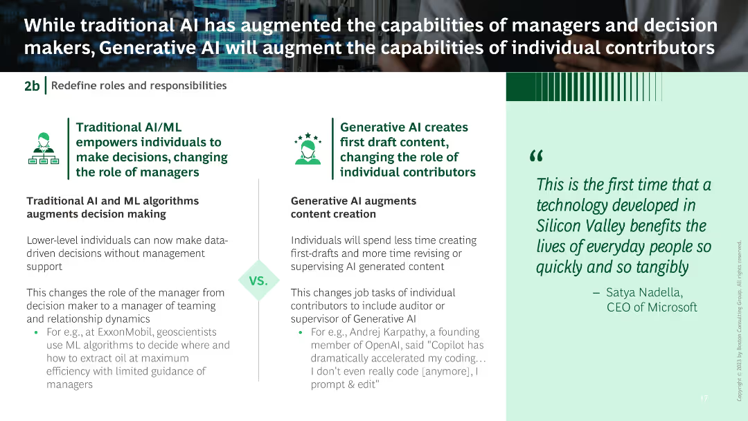
Split into two sections: Traditional AI/ML on the left with text and an icon, Generative AI on the right with text and an icon.
Operational Efficiency
Technology & Software
The slide contrasts traditional AI/ML roles with generative AI, highlighting changes in roles from decision-making to content creation.
traditional AI, generative AI, decision making, content creation, role changes
Boxed
BCG
Saved
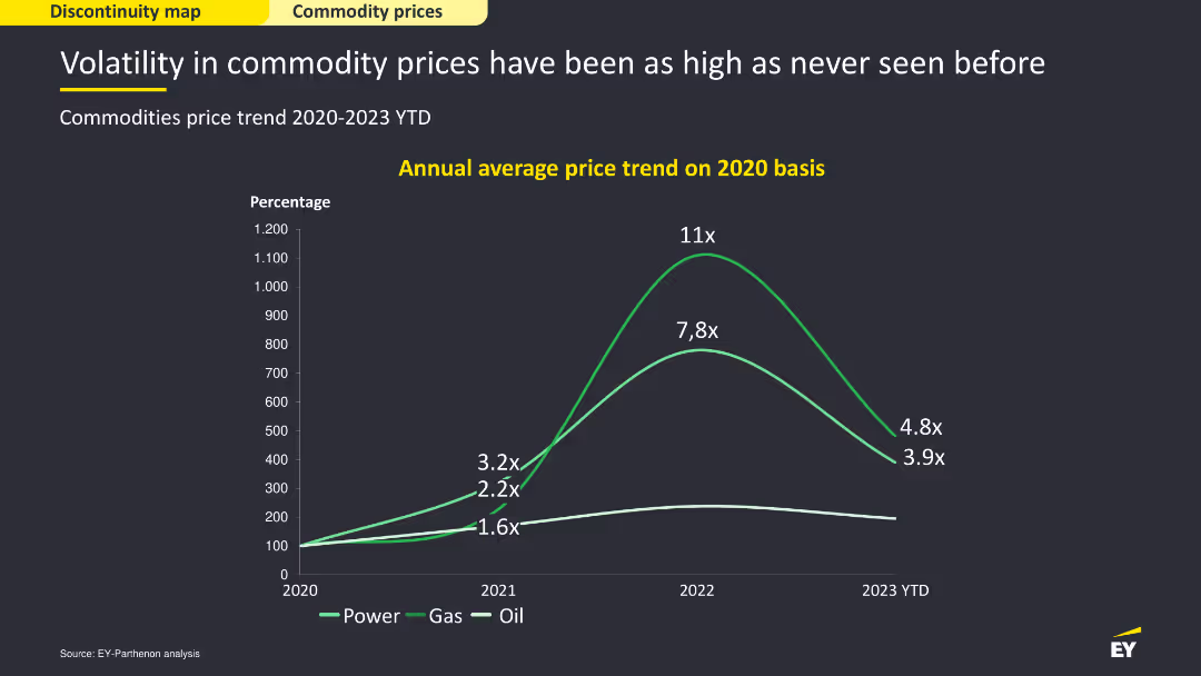
Line chart showing annual average price trends for power, gas, and oil on a 2020 basis from 2020-2023 YTD. Moderate complexity, effectively visualizing commodity price volatility over the years.
Market Analysis and Trends
Financial Services
This slide analyzes the volatility in commodity prices, particularly in power, gas, and oil. It discusses the trends in average prices from 2020 to 2023 YTD, highlighting the significant fluctuations in commodity markets.
Commodity prices, power, gas, oil, volatility
Single Chart
EY
Saved
Previous
Next
If nothing, comes up, please save your slides first
Create a FREE account to continue browsing
Receive Instant Access to 1,000+ slides from companies like McKinsey, Google, and Goldman Sachs
First Name
Last Name
Email
Password
I agree to all
Terms & Privacy Policy
Thank you! Your submission has been received!
Oops! Something went wrong while submitting the form.
Have an account?
Sign in
Column Chart
Heatmap
Chevron
Org Chart
Infographic
Callouts
Timeline
List
Graphic
Picture
Process Flow
Diagram
Paragraph
Map
Table
Framework
Subtitle
Takeaway Box
Icon
Other Chart
Radar Chart
Waterfall Chart
Mekko Chart
Pie Chart
Scatter Plot
Line Chart
Bar chart
Bullet points