Create a FREE Account
Instant access to 1,000+ real slides from top companies like McKinsey, BCG, Goldman Sachs, Google and many more!
First Name
Last Name
Email
Password
I agree to all
Terms & Privacy Policy
Thank you! Your submission has been received!
Oops! Something went wrong while submitting the form.
Have an account?
Sign in
Library
Templates
Courses
Pricing
My Account
My Slides
My Templates
✦ AI
AI Prompt Library
AI Search
Sign in
Start Here
Logout
My Saved Slides
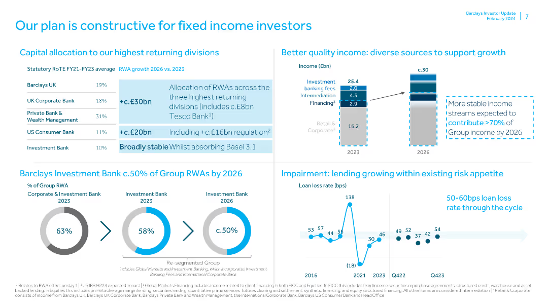
The slide includes a table of capital allocation by divisions, a bar chart of income sources, pie charts of group RWAs, and a line chart of loan loss rates, with text highlights.
Investment Analysis
Financial Services
The slide presents a plan for fixed income investors, focusing on capital allocation, quality income sources, and lending within risk appetite, supported by detailed data and projections.
Fixed Income, Investors, Capital, Allocation, Income, Risk
Multiple Chart
Barclays
Saved
This slide mirrors the layout of slide 1852 with the same title, list, and background design. However, no particular point is highlighted on this slide.
Strategic Planning
Professional Services
This slide serves a similar purpose as slide 1852, possibly used earlier in a presentation to introduce the upcoming discussion points on digitization without emphasizing a particular focus area.
digitization, opportunities, challenges, introduction, strategic planning, presentation
Agenda
McKinsey
Saved
Slide displays a line chart comparing the nominal GDP growth of BRICS, MINT, Next 11, and MIST countries up to 2030. Uses a simple color scheme and clear labels for easy understanding.
Market Analysis and Trends
Financial Services
This slide analyzes the GDP growth trajectories of various country groups, illustrating which might lead in economic growth. Used to highlight investment or development opportunities in these regions.
GDP, economic growth, BRICS, MINT, investment, development
Mixed Chart
Roland Berger
Saved
The slide includes a purple and white theme with two bar charts and text blocks. The charts display probabilities of low-risk exposure across different categories with comparisons between average and optimized companies.
Risk Assessment and Management
Technology & Software
Analyzes the risk mitigation potential of adopting best network practices, showing increased low-risk probabilities when such practices are integrated, aimed at business leaders and strategists for risk management and decision making.
risk management, network practices, business strategy, data analysis, probabilities
Multiple Chart
Accenture
Saved
A slide with a dark background displaying a column chart of the trailing twelve months' efficiency ratio and a box detailing efficiency drivers.
Operational Efficiency
Financial Services
The slide focuses on operational efficiency, showing the efficiency ratio trend over time and identifying key drivers of efficiency improvement.
efficiency ratio, operational efficiency, cost efficiencies, revenue growth, deal-related expenses, KPIs, scaling
Mixed Chart
Goldman Sachs
Saved
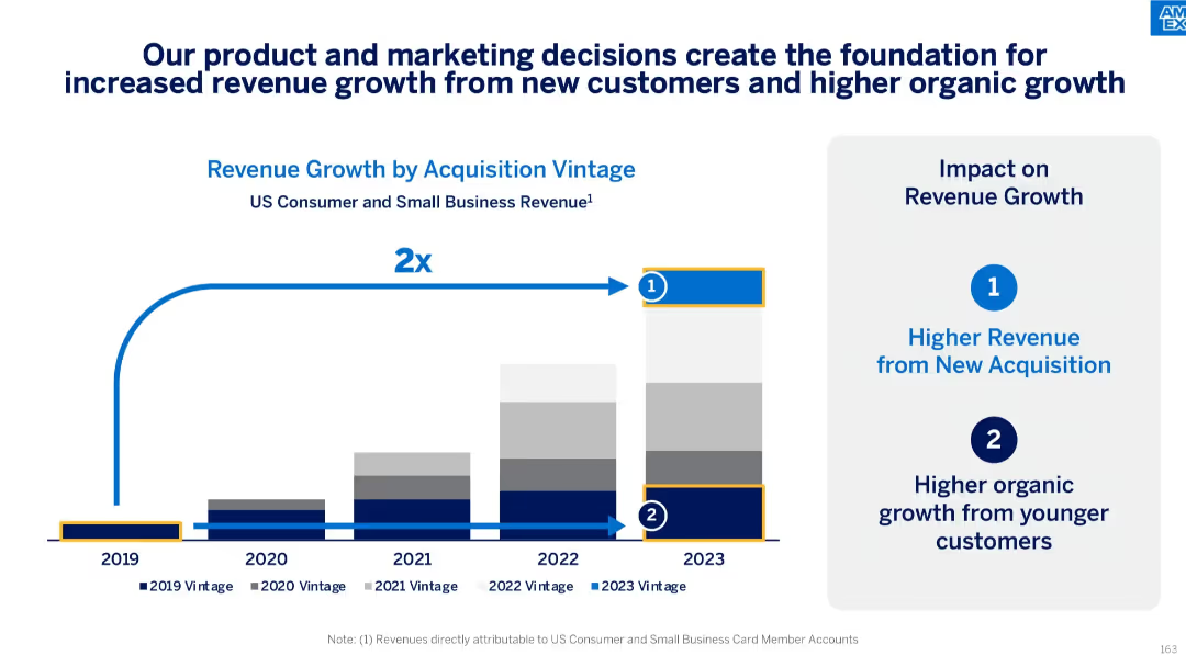
Stacked bar chart (2019–2023) with callouts for vintage revenue growth; two blue callout icons summarizing revenue sources
Strategic Planning
Financial Services
This slide outlines the doubling of revenue from 2019 to 2023, driven by strategic product and marketing efforts. It attributes growth to both new customer acquisitions and increased spending from younger customer cohorts, emphasizing sustainable organic growth.
revenue growth, customer acquisition, marketing impact, organic growth, vintage analysis, small business, consumer revenue
Mixed Chart
McKinsey
Saved
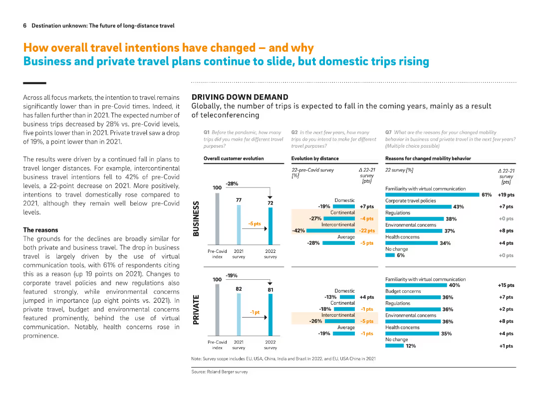
Split between text explanation and bar graphs; visualizes pre- and post-Covid travel trends for business and private sectors, showing drivers like virtual communication and policy changes.
Market Analysis and Trends
Transportation & Logistics
This slide shows that business travel is expected to fall significantly due to virtual communication, regulations, and environmental concerns. Private travel also declines but less sharply. Domestic travel shows some resilience. Key reasons are clearly visualized.
Travel intentions, business travel decline, private travel, virtual tools, environmental concerns, domestic travel, teleconferencing
Multiple Chart
Roland Berger
Saved
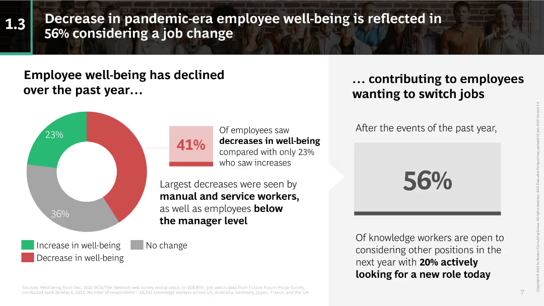
Pie chart showing the decline in employee well-being; text discussing how it has led to job change considerations.
Human Resources and Talent Management
Professional Services
Highlights the decline in employee well-being during the pandemic and its impact on job change considerations, especially among manual and service workers.
employee well-being, pandemic impact, job change, manual workers, service workers, employee health, workforce trends
Mixed Chart
BCG
Saved
Displays a central circular graphic, a dotted outline around certain segments, and a textbox with highlighted key figures. The slide's design is simple with a clear focus on the synergistic elements.
Strategic Planning
Financial Services
This slide outlines how the integration of investment banking and global markets contributes to Goldman Sachs’ ROE improvement. It is tailored for discussions on strategy and synergy in business services.
investment banking, global markets, ROE, synergy, Goldman Sachs
Diagram
Goldman Sachs
Saved
This slide includes a table displaying compliance review results over several years. It includes percentages for compliant, non-compliant, and those requiring improvement, accompanied by a brief description of the audit process and results.
Client Case Studies
Professional Services
The slide reviews the compliance status of audit engagements, showing improvement trends and emphasizing PwC's commitment to audit quality and adherence to regulatory standards.
Compliance, audit, regulatory standards, engagement reviews, audit quality
Mixed Chart
PwC/Strategy&
Saved
Heatmap and bar chart showing correlations between Asian and global equities, and beta values of different equity markets to the MSCI AC World Index.
Risk Assessment and Management
Financial Services
Investigates correlations and volatility among Asian and global equities, providing insights into risk and market behavior through correlation and beta analysis.
correlation, volatility, equities, heatmap, beta values, risk assessment, MSCI, financial analysis, market behavior
Mixed Chart
JP Morgan
Saved
The slide presents a column chart showing Europe HICP y/y inflation (2023-24F) for various countries. The data is displayed clearly, highlighting differences in inflation rates across EU Member States with supporting textual explanations.
Market Analysis and Trends
Financial Services
This slide forecasts diminishing cross-country inflation differentials in the EU for 2024, with most member states seeing inflation in the 1%-3% range. It provides a detailed comparison of inflation rates, discussing the factors contributing to these trends.
inflation, EU, HICP, cross-country, forecast
Mixed Chart
EY
Saved
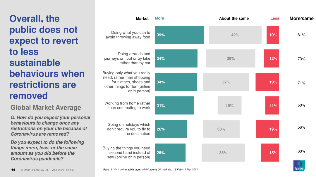
Horizontal bar chart comparing expected changes in personal sustainable behaviors post-COVID-19 restrictions across different markets.
Market Analysis and Trends
Government & Public Sector
Shows survey results on public expectations for maintaining or changing sustainable behaviors once COVID-19 restrictions are lifted.
sustainability, behavior change, post-COVID-19, public opinion, survey
Multiple Chart
IPSOS
Saved
A quadrant scatter plot categorizes technologies and services based on their market positioning before and after signing contracts. Dots represent companies; color indicates service or goods focus.
Risk Assessment and Management
Technology & Software
Evaluates the challenges in purchasing services versus goods, illustrating the technology landscape's division into pre and post-contract signing phases, focusing on areas like risk and contract management.
Buying, Services, Challenges, Technology, Market
Single Chart
Kearney
Saved
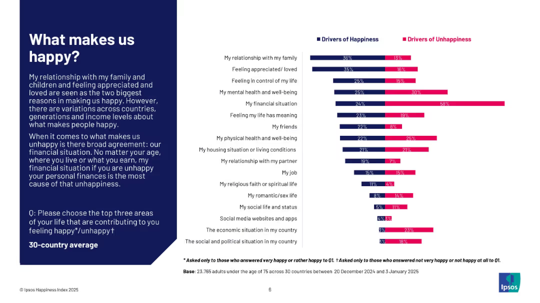
Dual bar chart comparing happiness and unhappiness drivers; left-aligned explanatory text in dark blue box; white background chart area.
Customer and Market Segmentation
Professional Services
The slide identifies key personal factors that contribute to happiness and unhappiness across 30 countries. Relationships and feeling loved are top drivers of happiness, while financial situation is the dominant cause of unhappiness. The layout compares these drivers side-by-side for clear contrast.
happiness, unhappiness, drivers, financial, relationships, mental health, global study, Ipsos, well-being, satisfaction
Mixed Chart
IPSOS
Saved
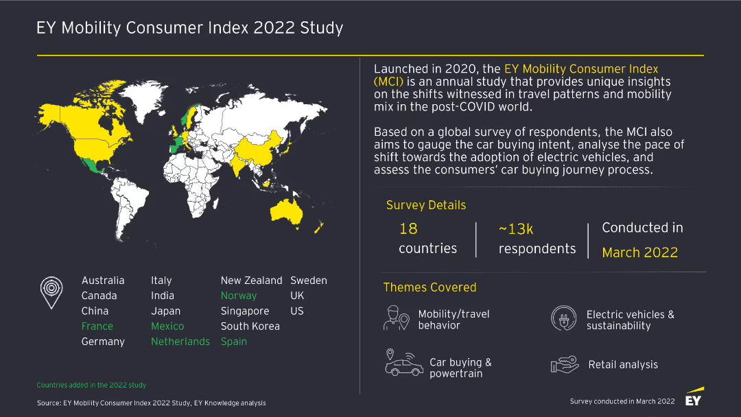
This slide features a world map highlighting countries included in the study, with accompanying text detailing survey details, themes, and respondent demographics.
Market Analysis and Trends
Transportation & Logistics
The slide introduces the EY Mobility Consumer Index 2022 Study, outlining the survey details, themes covered, and the global reach of the study across 18 countries and 13k respondents.
Mobility, Survey, 2022, Consumer Index, Transportation, Trends, Global, Study, Market Analysis
Graphic
EY
Saved
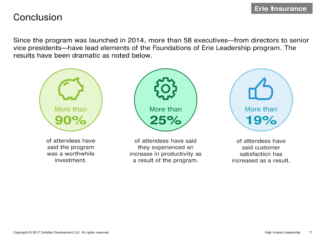
Three infographic elements highlighting key statistics: More than 90% found the program worthwhile, More than 25% saw productivity increase, More than 19% saw customer satisfaction improvement.
Client Case Studies
Financial Services
Summarizes the impact of the Erie Leadership program with key statistics showing high satisfaction rates, increased productivity, and improved customer satisfaction among participants.
Conclusion, statistics, leadership program, satisfaction, productivity
Pillar
Deloitte
Saved
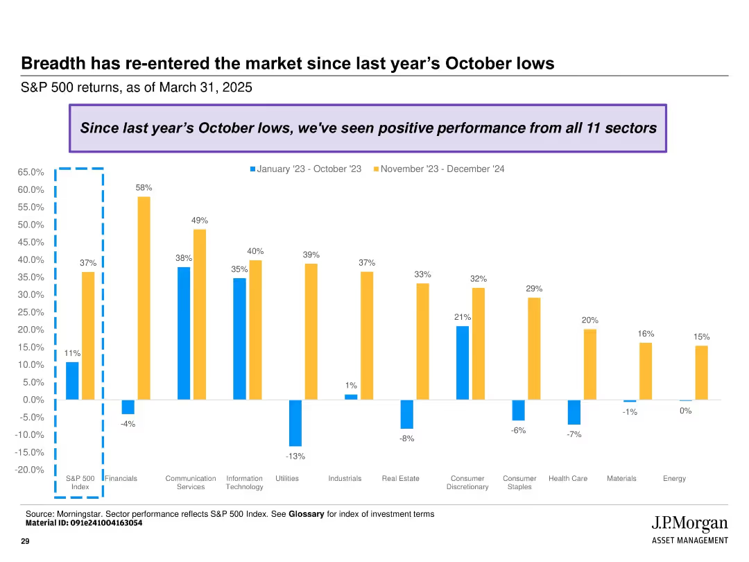
Clustered bar chart showing sectoral returns across two periods (Jan-Oct 2023 and Nov 2023-Dec 2024); color-coded with annotation box at top.
Market Analysis and Trends
Financial Services
Highlights the broad-based recovery of the S&P 500 with all 11 sectors showing positive performance since October 2023. Contrasts performance between early and late periods across various industries.
market breadth, S&P 500, sector performance, recovery, returns, 2023, 2024, equity sectors, rebound, financial analysis
Single Chart
JP Morgan
Saved
This slide features multiple column charts comparing the impact of generative AI on different countries and industries. It uses shades of purple to differentiate between augmentation and automation potential, with detailed percentage labels for clarity.
Technology and Digital Transformation
Technology & Software
Analyzes the projected impact of generative AI on working hours across various industries and countries.
AI, Work, Automation, Augmentation, Industries, Countries, Impact, Technology, Labor
Multiple Chart
Accenture
Saved
The slide features a circular diagram representing global forces with different areas like 'business fragmentation' and 'individualism'. Each segment has brief descriptors and the design is color-coded for clarity.
Strategic Planning
Professional Services
This appendix slide offers a conceptual framework for understanding the forces influencing global business and people management. It associates various global trends with potential impacts on business structures and decision-making, providing a reference point for considering future scenarios in a corporate context.
Global forces, business trends, people management, conceptual framework
Framework
PwC/Strategy&
Saved
This slide features a title, a column chart about average attendances in FCoA and FCC from 2012-2017. A side note emphasizes a 45% higher attendance in FCoA. Icons representing legal elements are present. Red and black colors dominate, with annotations for clarity.
Regulatory and Compliance
Government & Public Sector
The slide compares court attendances between FCoA and FCC over five years, highlighting the significantly higher attendance required by litigants in the FCoA, with cost implications and details on case management practices.
FCoA, FCC, court attendances, final order finalisation, litigation costs, pre-trial management
Mixed Chart
PwC/Strategy&
Saved
Column chart showing the increasing percentage of brands willing to engage with politically charged issues from February 2020 to September 2022. Insights discuss sector-specific willingness.
Customer and Market Segmentation
Professional Services
Highlights the growing trend of brands taking public stances on political issues, with data spanning over two years. It discusses sector-specific differences in brand engagement with political matters.
Branding, Politics, Engagement, Bar Chart, Trend Analysis, 2020-2022, Public Stance
Mixed Chart
Deloitte
Saved
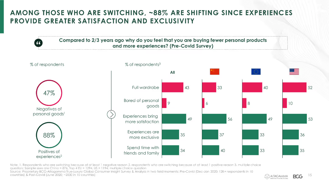
The slide contains a combination of column charts showing reasons why consumers are shifting from personal goods to experiences, segmented by country.
Market Analysis and Trends
Consumer Goods
It discusses the reasons behind consumers' shift from buying personal goods to investing in experiences, emphasizing satisfaction and exclusivity.
consumer behavior, experiential luxury, satisfaction, exclusivity, country comparison, COVID-19
Multiple Chart
BCG
Saved
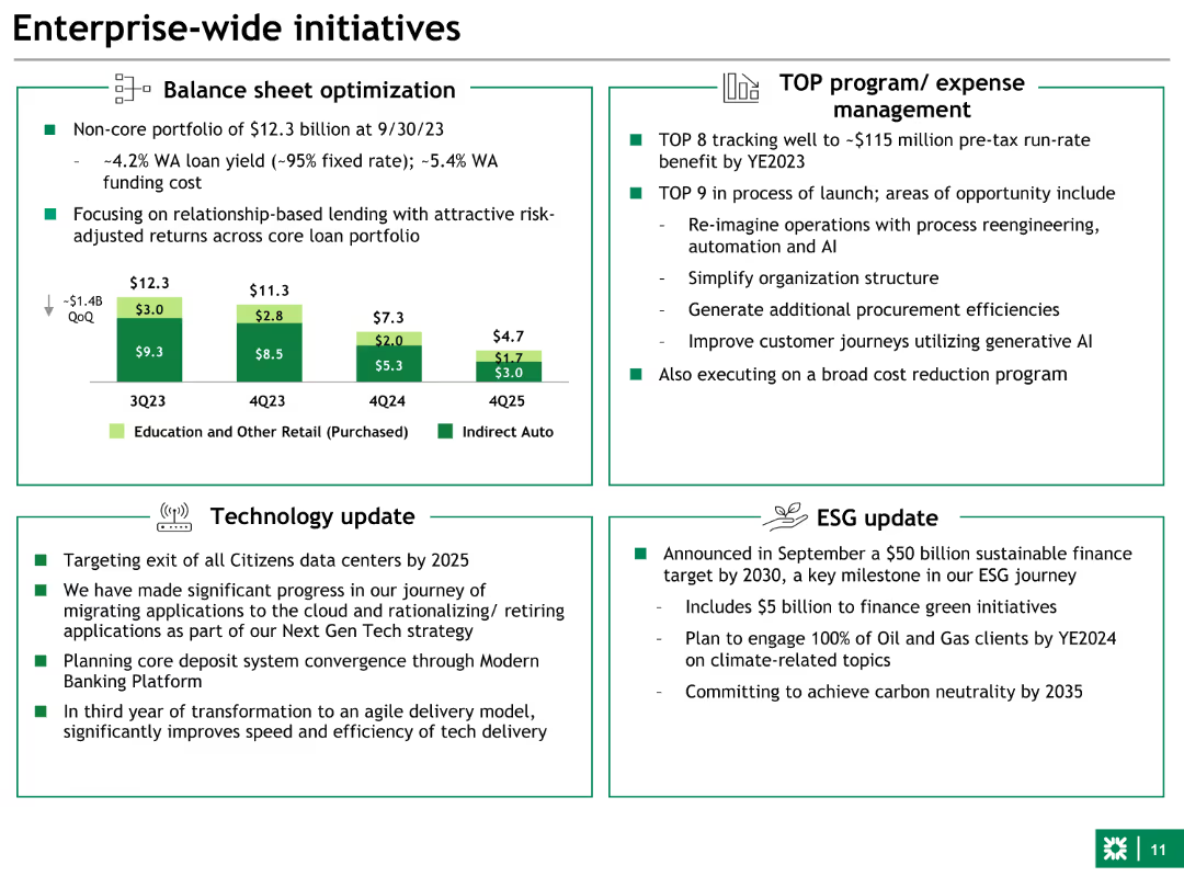
The slide contains a combination of text and a column chart. The layout is divided into four sections: Balance sheet optimization, TOP program/expense management, Technology update, and ESG update.
Strategic Planning
Financial Services
Provides an overview of key initiatives such as balance sheet optimization, expense management programs, technology updates, and ESG targets for the financial year.
Initiatives, balance sheet, ESG, technology, expense management
Mixed Chart
Goldman Sachs
Saved
Moderate visual complexity with icons and text that streamline the presentation of key data points and statistics relevant to clean energy investment considerations for leadership.
Investment Analysis
Financial Services
Details why leaders should pay attention to clean energy trends, citing significant capital investment and regulatory changes.
clean energy, leadership, investment, regulation, power demand, corporate commitment, environmental, market cap, energy storage
Header Horizontal
McKinsey
Saved
Previous
Next
If nothing, comes up, please save your slides first
Create a FREE account to continue browsing
Receive Instant Access to 1,000+ slides from companies like McKinsey, Google, and Goldman Sachs
First Name
Last Name
Email
Password
I agree to all
Terms & Privacy Policy
Thank you! Your submission has been received!
Oops! Something went wrong while submitting the form.
Have an account?
Sign in
Column Chart
Heatmap
Chevron
Org Chart
Infographic
Callouts
Timeline
List
Graphic
Picture
Process Flow
Diagram
Paragraph
Map
Table
Framework
Subtitle
Takeaway Box
Icon
Other Chart
Radar Chart
Waterfall Chart
Mekko Chart
Pie Chart
Scatter Plot
Line Chart
Bar chart
Bullet points