Create a FREE Account
Instant access to 1,000+ real slides from top companies like McKinsey, BCG, Goldman Sachs, Google and many more!
First Name
Last Name
Email
Password
I agree to all
Terms & Privacy Policy
Thank you! Your submission has been received!
Oops! Something went wrong while submitting the form.
Have an account?
Sign in
Library
Templates
Courses
Pricing
My Account
My Slides
My Templates
✦ AI
AI Prompt Library
AI Search
Sign in
Start Here
Logout
My Saved Slides
The slide includes bar graphs and bullet points, contrasting SEA average with Vietnam in media usage and intent to use services like e-commerce and transport. The color scheme is blue and grey, with clear demarcation between different categories. Each bar graph is accompanied by percentage values and annotations for clarity.
Market Analysis and Trends
Technology & Software
This slide provides an in-depth look at digital consumer behavior in Vietnam, including media usage frequency and service adoption rates. It’s valuable for understanding consumer trends in the digital space, and could be used to inform strategic decisions for businesses targeting Vietnamese digital users.
Vietnam, digital consumers, media usage, e-commerce, transport, service adoption, SEA, consumer trends
Multiple Chart
Bain
Saved
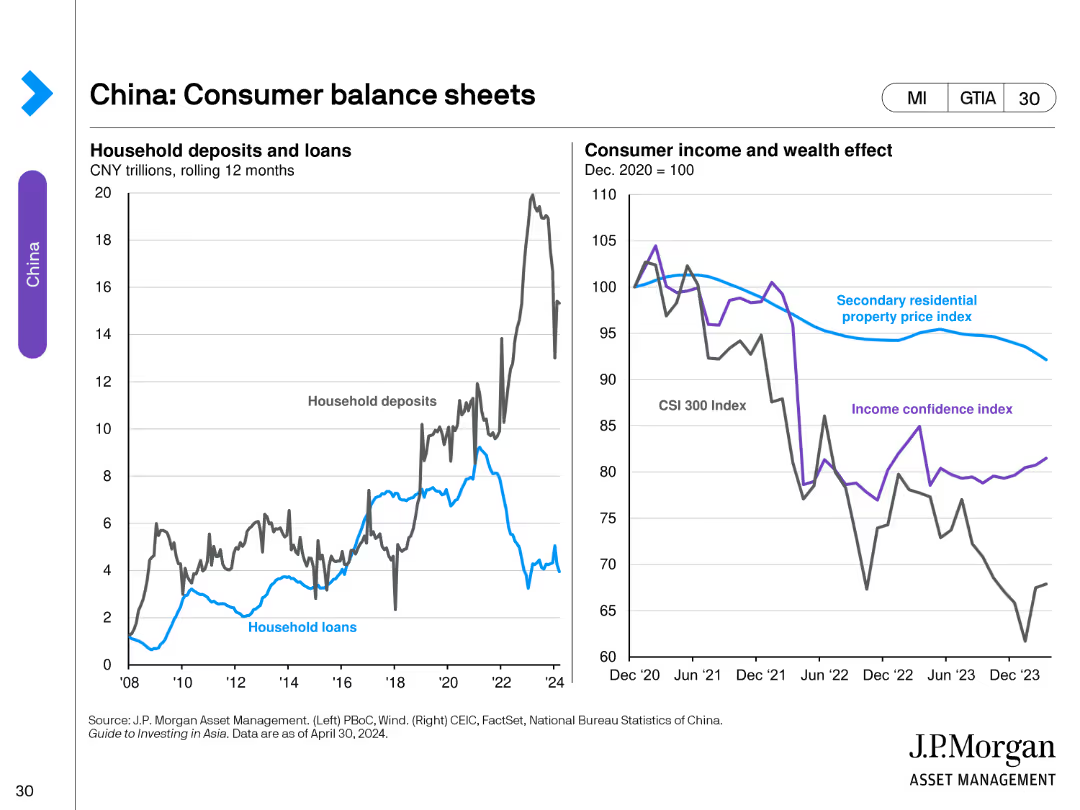
The slide features two line charts. The left chart depicts household deposits and loans in trillions of CNY. The right chart shows consumer income and wealth effect, including indexes like secondary property price and income confidence.
Financial Performance
Financial Services
This slide reviews the financial status of Chinese consumers, showing trends in household deposits and loans and examining the effect on consumer income and wealth.
Financial, Deposits, Loans, Wealth, Income
Multiple Chart
JP Morgan
Saved
Two-column layout with text on the left and a table on the right. The text discusses the rebalance of marketing efforts, while the table shows the expected budget change over the next 12 months among global marketers with various channels.
Market Analysis and Trends
Media & Entertainment
This slide introduces the challenges faced by brands in the past years and their marketing strategy adjustments. It also provides expected changes in budget allocations for various marketing channels over the next year.
Marketing, Budget, Global, Channels, Strategy
Mixed Chart
Nielsen
Saved
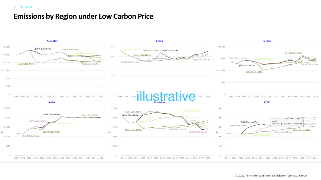
This slide features line charts comparing emissions by region under low carbon price scenarios. It highlights differences in emissions trends across regions and how low carbon pricing affects these trends over time.
Risk Assessment and Management
Environmental Services & Sustainability
The slide examines the effects of low carbon pricing on regional emissions, providing insights into how minimal carbon costs influence environmental outcomes and policy effectiveness in various regions.
Low carbon price, emissions, regions, policy impact, carbon pricing
Multiple Chart
Deloitte
Saved
Slide includes multiple line graphs depicting real GDP growth for World, Eurozone, USA, and China from Q1 2019 to Q4 2021, with an adjacent table detailing GDP changes and expected recovery quarters.
Market Analysis and Trends
Financial Services
Exhibiting a muted recovery scenario, this slide illustrates the GDP growth trajectory under prolonged pandemic effects, useful for strategizing in uncertain economic climates.
GDP, muted recovery, economic trajectory, pandemic, uncertainty, Eurozone, USA, China, forecast
Mixed Chart
McKinsey
Saved
The slide includes two charts: one showing the change in IMF growth forecasts and another depicting current account changes as a percentage of GDP. The layout is clear and comparative.
Market Analysis and Trends
Financial Services
The slide discusses the positive correlation between emerging market FX performance and good growth/strong external balances, supported by IMF growth forecasts and current account data.
growth forecasts, current account, GDP, emerging markets, FX performance
Multiple Chart
Morgan Stanley
Saved
The slide includes a column chart illustrating concentration levels across different access modes, similar to slide 8201 but under a different approach. Bars are vertically oriented and labeled accordingly.
Market Analysis and Trends
Media & Entertainment
This slide presents an alternative analysis of concentration levels across various access modes, treating all subsequent visits as direct.
concentration, direct visits, column chart, media, alternative analysis
Single Chart
IPSOS
Saved
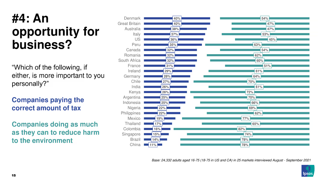
Comparative column chart highlighting the importance of tax payment vs environmental harm reduction.
Strategic Planning
Environmental Services & Sustainability
The slide compares the importance of companies paying taxes vs reducing environmental harm.
business, opportunity, taxes, environment, global
Multiple Chart
IPSOS
Saved
The slide features a line chart showing the Composite Indicator of Systemic Stress Index from 2019 to 2023 for the UK, Euro area, and US.
Risk Assessment and Management
Financial Services
The slide assesses the levels of systemic financial stress in major economies post recent bank failures, noting stress trends and future expectations.
financial stress, systemic indicators, UK, Euro area, US, risk management
Mixed Chart
Accenture
Saved
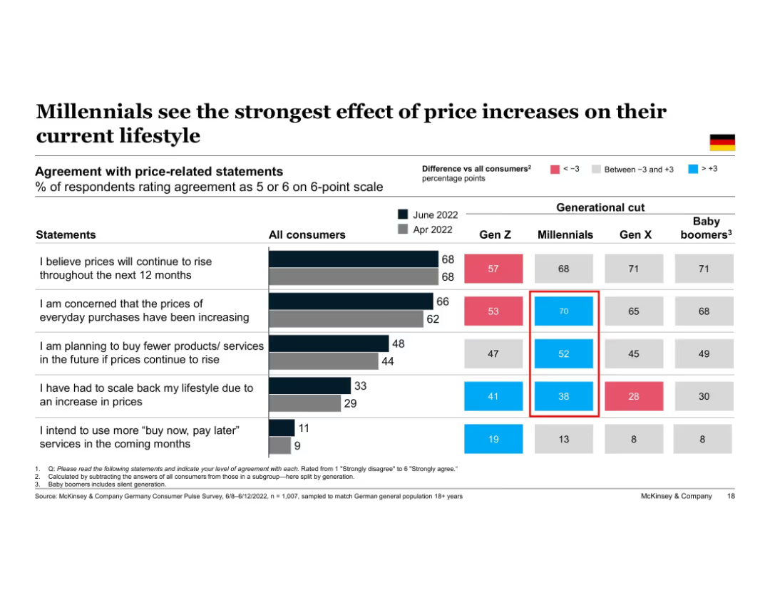
Table chart comparing consumer agreement with price-related statements across generations. Highlights % differences vs. average, using color coding. Five behavioral statements evaluated.
Customer and Market Segmentation
Financial Services
This slide reveals how different generations perceive the impact of rising prices. Millennials stand out as the most concerned and responsive, particularly in lifestyle changes and future consumption plans. The data is based on agreement with five specific inflation-related statements.
Millennials, inflation impact, generational comparison, price concern, consumption behavior, Germany, Gen Z, lifestyle changes
Multiple Chart
McKinsey
Saved
A structured layout with categorized initiatives for various industries, highlighting specific digital trends and strategies.
Industry Overview
Technology & Software
Summarizes key digital initiatives across industries like healthcare, logistics, and telecommunications, aiming to guide strategic planning and innovation efforts.
Strategic Initiatives, Digital Transformation, Industry Overview, Future Trends, Multi-Industry
Table
Accenture
Saved
This slide presents a data table split into two parts, displaying sales by currency, year-to-date currency changes against the euro, and the impact on segment operating income. The background is a light gradient, and the Michelin logo is placed at the bottom left.
Financial Performance
Financial Services
The slide provides a financial analysis of sales by currency and the subsequent impact on segment operating income, which is critical for financial risk assessment and management in multinational corporations, potentially as part of a quarterly or annual financial report.
sales, currency impact, operating income, financial analysis
Table
Morgan Stanley
Saved
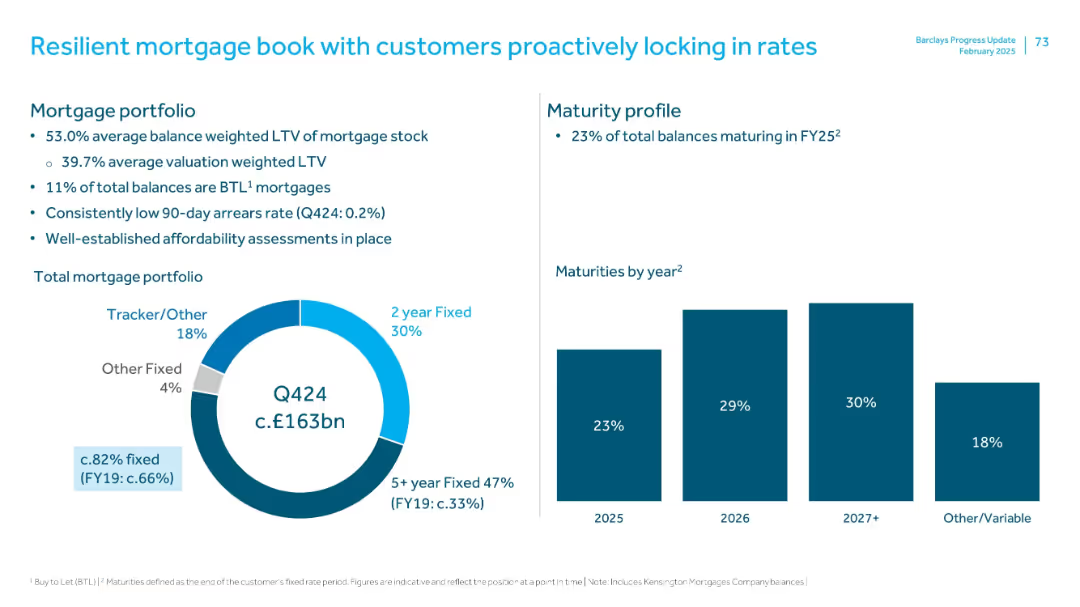
Left: donut chart of mortgage types; Right: bar chart of maturity profile; bulleted insights above; blue/white palette
Risk Assessment and Management
Financial Services
Highlights characteristics of Barclays’ mortgage portfolio, such as LTV, arrears rates, and type distribution. Shows that 82% of balances are fixed-rate, with a strong maturity profile and low default risk. Emphasis is on resilience and proactive customer behavior in securing fixed rates.
mortgages, LTV, arrears, fixed rate, portfolio maturity, residential lending
Multiple Chart
Barclays
Saved
This slide includes a map and bar graphs illustrating school connectivity rates across different regions, highlighting areas with significant connectivity issues.
Strategic Planning
Education & Training
Focuses on the challenges of improving internet connectivity in schools across Indonesia's less populated islands, underlining the geographical disparities.
school connectivity, internet access, sparsely populated, Indonesia, structural challenges
Graphic
BCG
Saved
Slide shows a dark background with five sets of dual vertical column charts comparing "Leading innovator" vs "Lagging innovator" percentages for five fundamental adoption metrics, labeled from 1 to 5.
Strategic Planning
Professional Services
This slide visually compares the adoption of five fundamental principles between leading and lagging innovators, providing a clear measure of innovation culture within organizations.
innovation, adoption, comparison, culture, principles
Multiple Chart
McKinsey
Saved
Timeline showing different countries' responses to COVID-19 with a focus on lockdown measures and case doubling times.
Regulatory and Compliance
Government & Public Sector
Examines the timing and types of responses implemented by various countries to the COVID-19 pandemic, useful for comparative policy analysis and planning.
COVID-19, global response, lockdown, policy, timeline
Mixed Chart
BCG
Saved
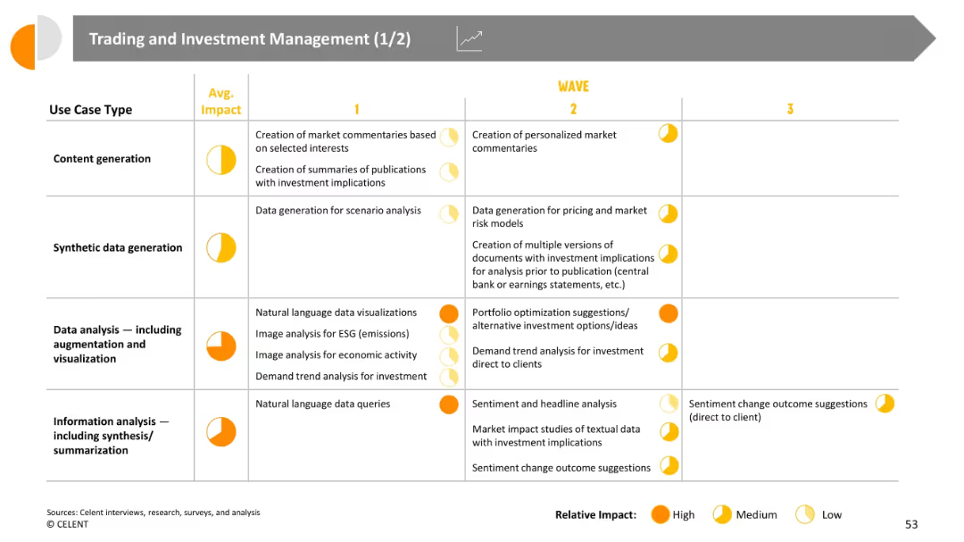
Tabular structure with use case types as rows and wave phases as columns; includes average impact icons
Technology and Digital Transformation
Financial Services
Lists use cases for GenAI in trading and investment across three waves. Covers data visualization, synthetic data, investment analysis, and summarization techniques with a focus on trend analysis and personalized content.
investment analysis, market trends, data generation, AI content, GenAI wave analysis
Single Chart
Oliver Wyman
Saved
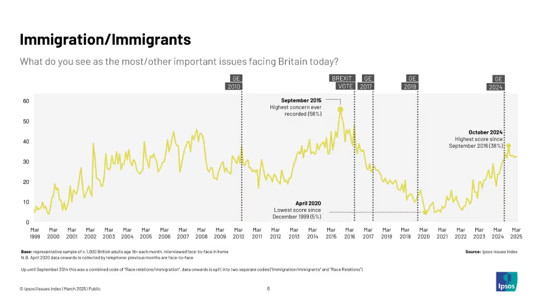
Yellow line chart (1999–2025) showing concern about immigration over time; highlights key dates like Brexit vote and 2015 peak.
Market Analysis and Trends
Government & Public Sector
Displays long-term trends in public concern around immigration in the UK, with major spikes during political debates and crises, notably Brexit and the 2015 refugee crisis.
immigration, Ipsos, Brexit, refugees, public concern, UK, politics, timeline
Single Chart
IPSOS
Saved
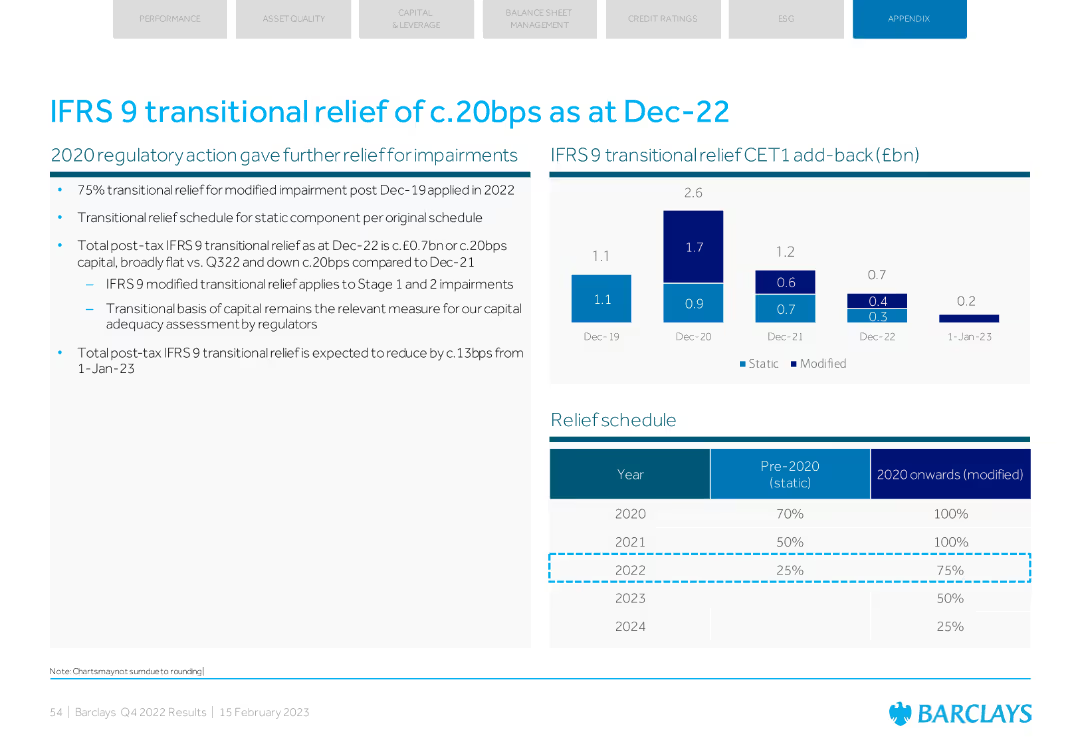
Column charts showing transitional relief impact and a table with the relief schedule.
Regulatory and Compliance
Financial Services
Details the impact of IFRS 9 transitional relief on Barclays' CET1 capital and outlines the expected schedule for reducing this relief in future years.
IFRS 9, transitional relief, CET1, schedule, capital
Mixed Chart
Barclays
Saved
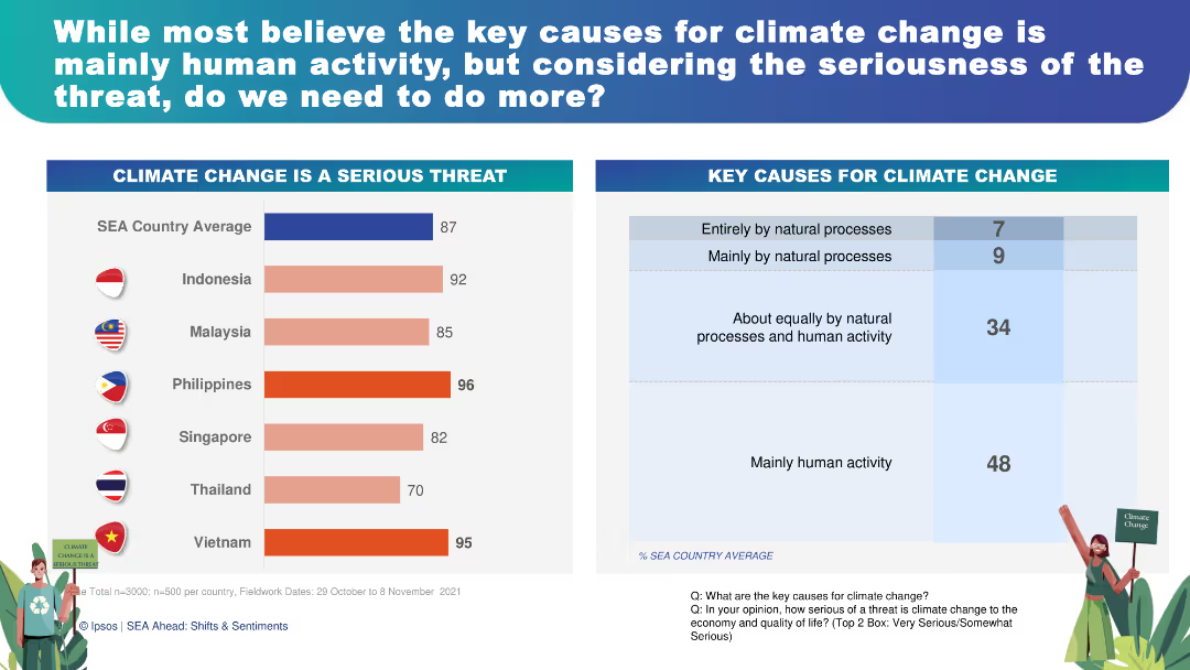
This slide features a combination of horizontal and vertical bar charts showing perceptions of climate change as a serious threat and its key causes. The charts are color-coded for easy interpretation, with accompanying text for clarity.
Risk Assessment and Management
Environmental Services & Sustainability
The slide presents survey results showing 87% of respondents consider climate change a serious threat, with 48% attributing it mainly to human activity. This can be used to discuss the urgency of climate action, public opinion on environmental issues, and strategies for risk management and mitigation.
climate change, public opinion, environmental risk, human activity, sustainability
Multiple Chart
IPSOS
Saved
This slide features a series of bar charts evaluating energy and power portfolios based on CTF scores, alongside a comprehensive text breakdown of Barclays' client engagement strategies in transitioning to lower-emission operations.
Client Case Studies
Financial Services
Describes how Barclays assesses and engages with clients on their ESG performance using the Client Transition Framework, offering insights into sector-specific transition plans and executive engagement.
client engagement, ESG performance, transition planning, sector analysis, sustainability, client assessment
Multiple Chart
Barclays
Saved
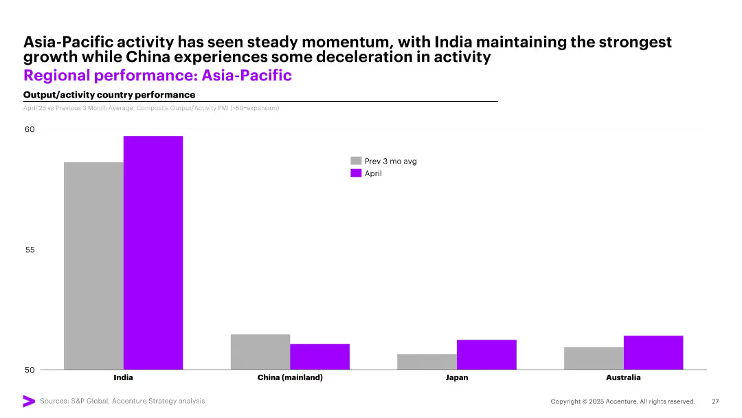
Bar chart showing April activity vs 3-month average PMI for India, China, Japan, and Australia; consistent color scheme; clean layout.
Performance Metrics and KPIs
Industrial & Manufacturing
This slide reviews recent business activity in the Asia-Pacific region. India leads with strong performance, while China shows signs of deceleration. It provides insight into which regional markets are showing momentum and which are softening.
Asia-Pacific, PMI, India growth, China slowdown, regional comparison, business activity
Single Chart
Accenture
Saved
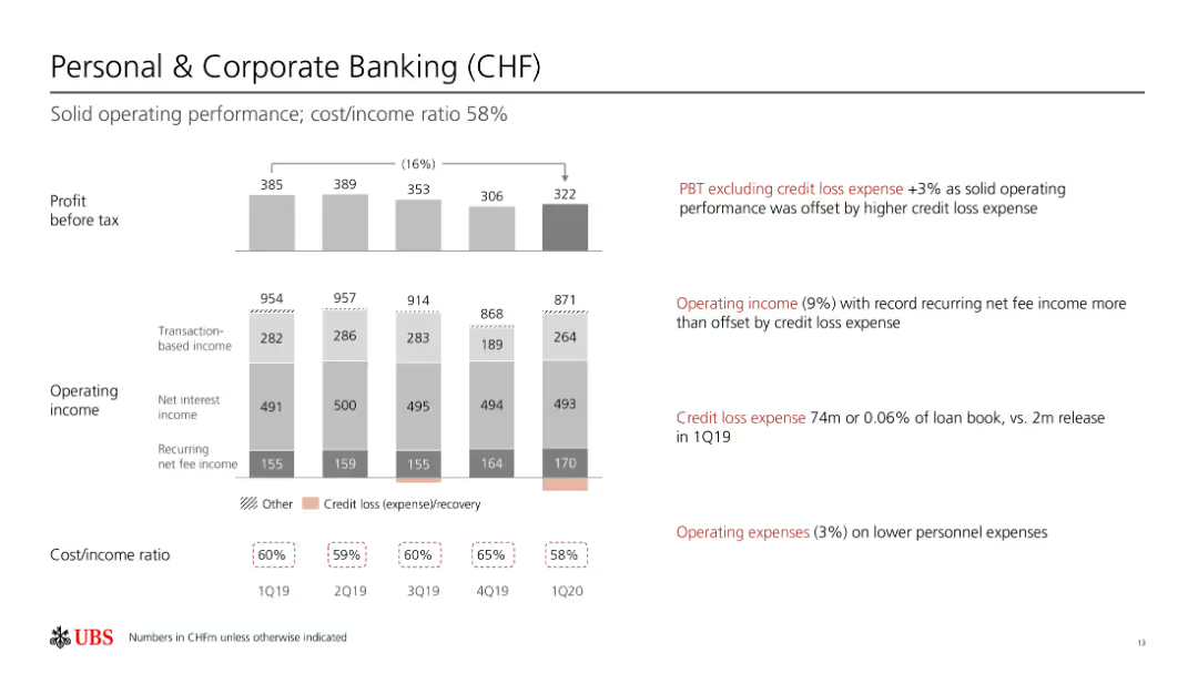
Column chart shows profit before tax, operating income, and cost/income ratios over several quarters.
Financial Performance
Financial Services
Reviews solid operating performance in personal and corporate banking, with a focus on credit loss expenses.
personal banking, corporate banking, financial performance, operating income, credit loss
Multiple Chart
UBS
Saved
The slide features a large column chart on the left, a central section with color-coded contributing factors, and a final column chart on the right, providing a clear comparison of overhead ratios over time.
Operational Efficiency
Financial Services
Demonstrates the improvement in the overhead ratio at JPMorgan Chase & Co., driven by various factors, meant for showcasing efficiency gains to investors.
overhead ratio, efficiency, revenue growth, JPMorgan, investment, expense
Single Chart
JP Morgan
Saved
Features a graph titled "Figure 7", a sidebar with additional text and headers, and a purple footer. The graph shows changes in skill importance over time.
Technology and Digital Transformation
Technology & Software
Highlights the evolving importance of various skills for science and engineering roles, implying a trend towards increasing value in creativity and social skills.
Skills Evolution, Science and Engineering, Data Analysis, Creativity, Social Skills
Single Chart
Accenture
Saved
Previous
Next
If nothing, comes up, please save your slides first
Create a FREE account to continue browsing
Receive Instant Access to 1,000+ slides from companies like McKinsey, Google, and Goldman Sachs
First Name
Last Name
Email
Password
I agree to all
Terms & Privacy Policy
Thank you! Your submission has been received!
Oops! Something went wrong while submitting the form.
Have an account?
Sign in
Column Chart
Heatmap
Chevron
Org Chart
Infographic
Callouts
Timeline
List
Graphic
Picture
Process Flow
Diagram
Paragraph
Map
Table
Framework
Subtitle
Takeaway Box
Icon
Other Chart
Radar Chart
Waterfall Chart
Mekko Chart
Pie Chart
Scatter Plot
Line Chart
Bar chart
Bullet points