Create a FREE Account
Instant access to 1,000+ real slides from top companies like McKinsey, BCG, Goldman Sachs, Google and many more!
First Name
Last Name
Email
Password
I agree to all
Terms & Privacy Policy
Thank you! Your submission has been received!
Oops! Something went wrong while submitting the form.
Have an account?
Sign in
Library
Templates
Courses
Pricing
My Account
My Slides
My Templates
✦ AI
AI Prompt Library
AI Search
Sign in
Start Here
Logout
My Saved Slides
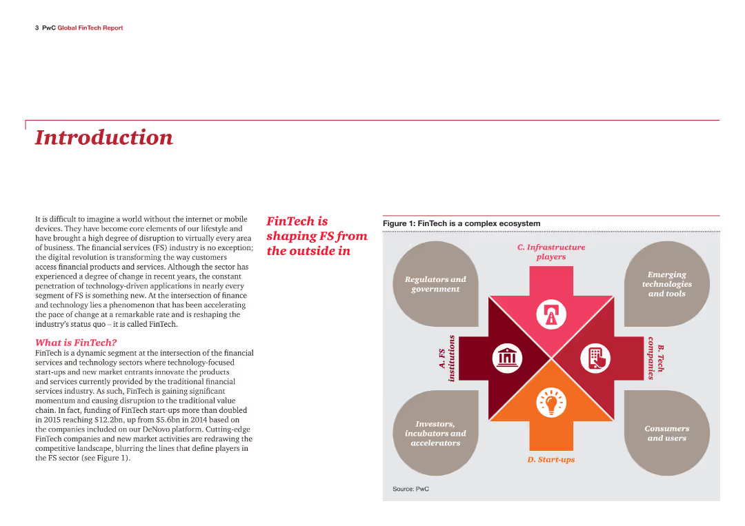
Introduction slide with text explaining the FinTech industry's impact on financial services. Includes an infographic showing the FinTech ecosystem, consisting of FS institutions, tech companies, start-ups, regulators, and government.
Industry Overview
Financial Services
This slide introduces the report on the FinTech industry's influence on financial services. It defines FinTech and highlights its role in transforming the industry through digital applications and technology-driven innovations, setting the stage for detailed analysis in the report.
FinTech, financial services, introduction, industry impact, digital transformation, ecosystem
Diagram
PwC/Strategy&
Saved
Includes a column chart with blue and yellow columns, labeled with percentages and SEA country flags at the bottom.
Market Analysis and Trends
Technology & Software
Shows the proportion of new digital service consumers in SEA countries, highlighting how COVID-19 has affected digital adoption.
digital service, consumers, SEA, COVID-19, adoption
Single Chart
Bain
Saved
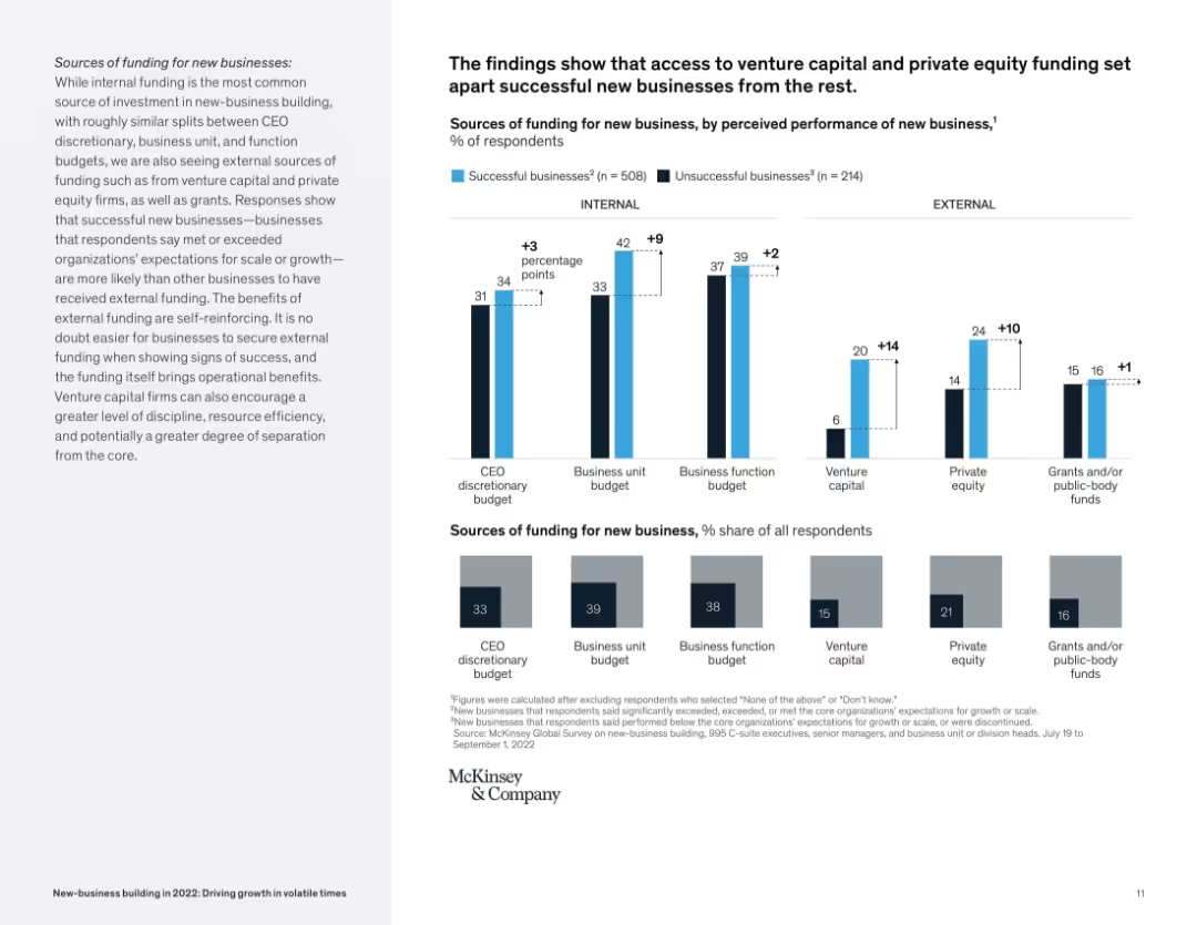
Bar graph layout comparing successful vs. unsuccessful businesses on internal/external funding sources.
Corporate Finance and Valuation
Financial Services
The slide compares sources of funding (CEO, business unit, venture capital, etc.) for successful vs. unsuccessful new businesses. It reveals external sources like VC and private equity correlate with higher business success rates.
funding, venture capital, private equity, startup success, internal vs external, McKinsey, new business
Mixed Chart
McKinsey
Saved
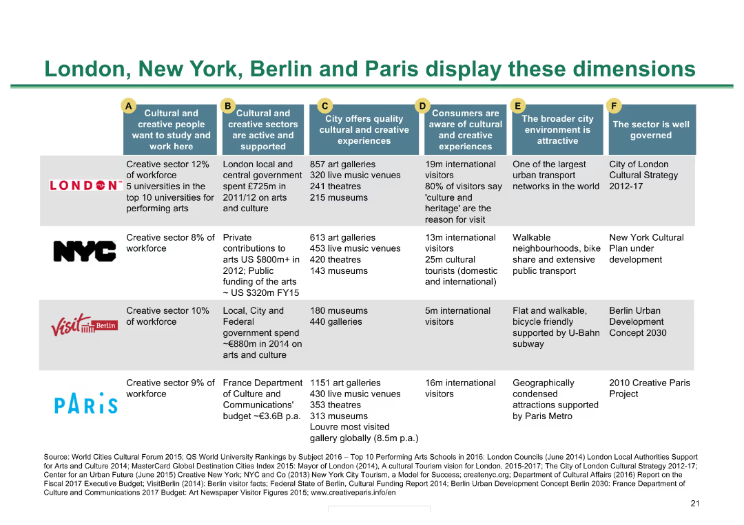
Table comparing cultural metrics across four major cities; color-coded for clarity
Market Analysis and Trends
Hospitality & Tourism
Compares cultural and creative metrics of London, New York, Berlin, and Paris, showing strengths and metrics
City comparison, cultural metrics, global cities, creative sectors, cultural experiences
Diagram
BCG
Saved
Column chart with shades of gray showing the percentage of occupations that could be fully automated or partially automated, listing specific job roles as examples at various automation levels.
Operational Efficiency
Industrial & Manufacturing
Shows the automation potential across different occupations, illustrating how many roles could see a significant portion of their tasks automated and identifying specific occupations like travel agents and web developers.
Occupations, Automation, Job Roles, Potential, Tasks
Single Chart
McKinsey
Saved
Slide presents multiple bar graphs. Color-coded elements distinguish different data sets and regions. Clear, structured layout with annotations.
Market Analysis and Trends
Environmental Services & Sustainability
This slide analyzes South East Asia's climate commitments compared to global benchmarks using graphs showing emissions changes, carbon pricing, and corporate climate ambitions. Aimed at environmental policy analysts.
SEA, climate, emissions, carbon pricing, NDC, corporate ambitions, global comparison, bar graphs, column charts, map
Multiple Chart
Bain
Saved
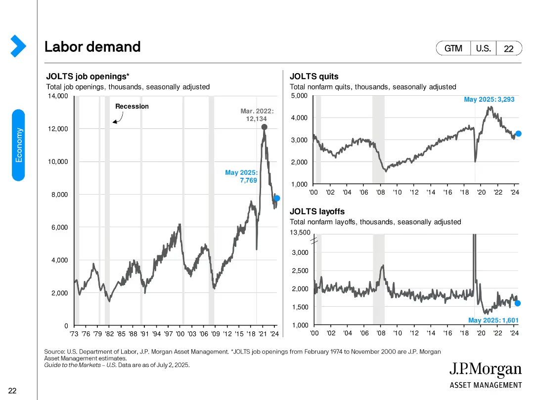
Three-panel layout showing JOLTS job openings, quits, and layoffs with long-term historical data. All charts are line graphs with recession periods shaded. Current values as of May 2025 are labeled.
Performance Metrics and KPIs
Financial Services
Examines labor market tightness through job openings, quits, and layoffs. Openings are down from 2022 peaks but still above pre-pandemic norms. Quits have stabilized, while layoffs remain low, indicating resilient labor demand.
labor market, JOLTS, job openings, quits, layoffs, workforce, recession, May 2025, employment trends
Multiple Chart
JP Morgan
Saved
Two pie charts showing the percentage of people using VPNs to access crypto trading platforms, divided into 'Outside of Canada' and 'Inside of Canada' for 2023 and 2022.
Regulatory and Compliance
Financial Services
This slide analyzes the use of VPNs by individuals accessing crypto trading platforms inside and outside Canada, comparing 2023 data to 2022.
VPN, crypto, trading, Canada, 2023, 2022, comparison
Multiple Chart
IPSOS
Saved
The slide provides information on "Leonardo Labs" and "DAVINCI-1 HPC" with two separate sections, each with bullet points and a map highlighting locations.
Technology and Digital Transformation
Industrial & Manufacturing
Showcases the company's R&D capabilities and strategic positioning in technology and aerospace. It details the structure and accomplishments of Leonardo Labs and the DAVINCI-1 HPC system, potentially for investor presentations or to showcase technological advancements.
R&D, Technology, Aerospace, Leonardo Labs, DAVINCI-1 HPC
Graphic
Goldman Sachs
Saved
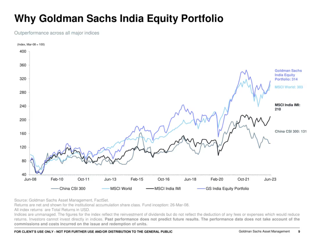
Full-slide line chart comparing multiple indices over time from 2008 to 2023; dark background lines over a white grid; minimal text, with index labels annotated directly on lines.
Financial Performance
Financial Services
Depicts the outperformance of the Goldman Sachs India Equity Portfolio versus major global indices (MSCI World, India IMI, China CSI 300) since 2008. The portfolio line leads above the others, reinforcing consistent superior returns over 15+ years.
portfolio returns, index comparison, GS India, MSCI, CSI 300, equity performance, long-term growth
Single Chart
Goldman Sachs
Saved
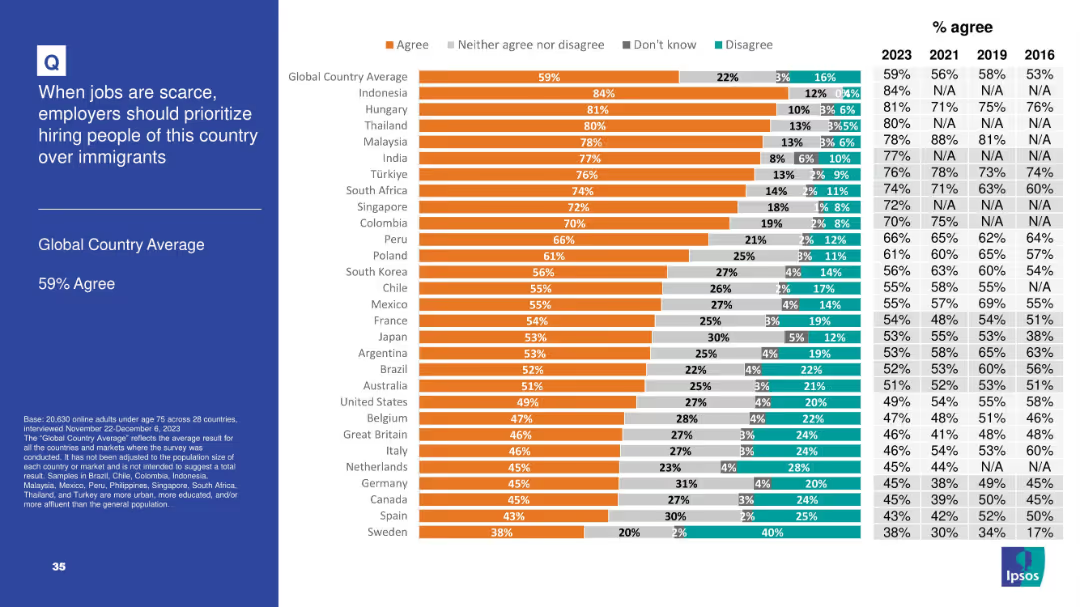
Horizontal bar chart with segmented agreement levels by country; includes historical comparison table (2016–2023) on the right and a bolded left-side title panel
Market Analysis and Trends
Government & Public Sector
The slide shows the level of agreement in 28 countries with the idea that employers should prioritize hiring nationals over immigrants when jobs are scarce. 59% globally agree, with particularly high support in Indonesia, Hungary, and Thailand.
immigration, employment, public opinion, nationalism, workforce, Ipsos, survey, global comparison, job scarcity, hiring priorities
Mixed Chart
IPSOS
Saved
Contains multiple bar charts aligned horizontally displaying the percentages of consumers delaying, maintaining, or increasing vehicle maintenance and repairs post-COVID-19. Colors differentiate actions across several countries.
Market Analysis and Trends
Transportation & Logistics
Discusses the impact of COVID-19 on consumer behaviors related to vehicle maintenance and repair, showing trends of postponement and additional work done across different nations.
COVID-19 impact, vehicle maintenance, consumer behavior, repair trends, international comparison
Single Chart
McKinsey
Saved
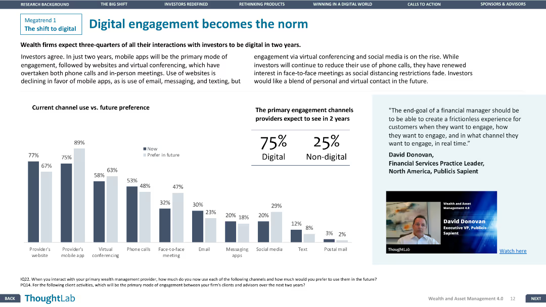
The slide features a column chart comparing current and future engagement channels and a quote on the right.
Technology and Digital Transformation
Financial Services
The slide discusses the shift towards digital engagement in wealth management, with a focus on future preferences for digital channels.
Digital engagement, Financial Services, Technology, Future trends, Channels
Mixed Chart
Deloitte
Saved
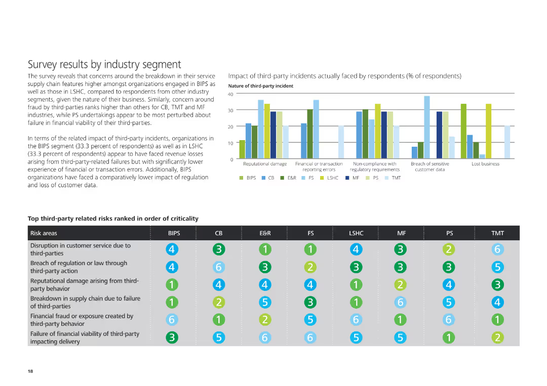
The slide features a column chart on the left showing the impact of third-party incidents, and a table below ranking top third-party risks by industry segment.
Risk Assessment and Management
Professional Services
The slide reveals survey results about the impact of third-party incidents and lists top third-party related risks ranked by criticality across different industry segments.
Third-party incidents, impact, risks, industry segment, survey results
Mixed Chart
Deloitte
Saved
The slide includes two line charts. The left chart shows global supply chain pressure and freight costs over time. The right chart compares freight costs by route for Shanghai-Los Angeles and Shanghai-Rotterdam.
Operational Efficiency
Transportation & Logistics
The slide analyzes global supply chain pressures and freight costs, comparing different trade routes. It is used for understanding logistics challenges and optimizing supply chain management.
supply chains, freight costs, global logistics, trade routes, Shanghai-Los Angeles, Shanghai-Rotterdam, operational efficiency, logistics analysis
Multiple Chart
JP Morgan
Saved
An image with network visualizations complements the textual information which includes key metrics regarding the firm's global technological reach.
Technology and Digital Transformation
Technology & Software
This slide aims to illustrate the firm's expansive technological capabilities and global customer reach through significant figures.
global scale, technology, digital customers, data storage, network visualization, JPMorgan
Text Only
JP Morgan
Saved
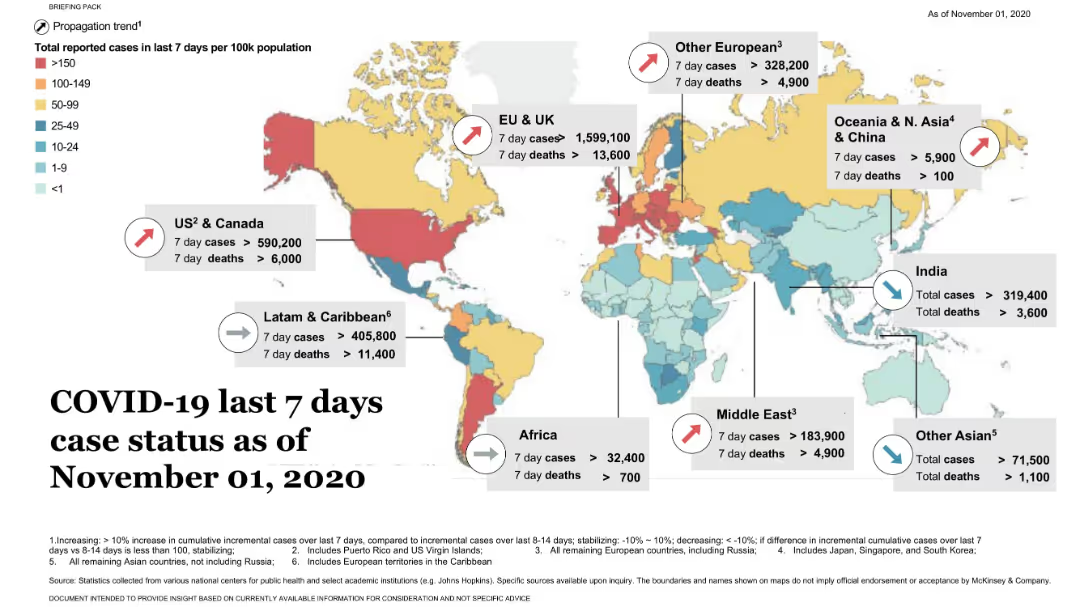
World map with heatmap coloring and arrows for trend direction; regional stats in callouts; legend and notes at bottom.
Risk Assessment and Management
Healthcare & Pharmaceuticals
This slide presents a global heatmap of COVID-19 case rates by region for a 7-day period. Regional callouts show case and death figures, with trend indicators (rising/stabilizing/decreasing).
COVID-19, heatmap, global health, cases, deaths, McKinsey, pandemic, trend
Uncategorized
McKinsey
Saved
Pie charts and text outlining asset class split, investment strategies, and medium-term priorities.
Strategic Planning
Financial Services
It discusses AM's strategic positioning and priorities, including asset class diversification and growth market strategies.
asset classes, investment strategies, AM, growth markets, diversification
Multiple Chart
UBS
Saved
Features a column chart displaying changes in planned premiums and exposure for 2019 versus 2018 across multiple insurance lines, highlighted with color differentiation.
Risk Assessment and Management
Financial Services
Outlines expected changes in insurance market exposures and premiums, especially highlighting significant reductions in Aviation. Gives insights into strategic adjustments for the year ahead.
market changes, insurance premiums, 2019 forecasts, aviation, exposure
Single Chart
PwC/Strategy&
Saved
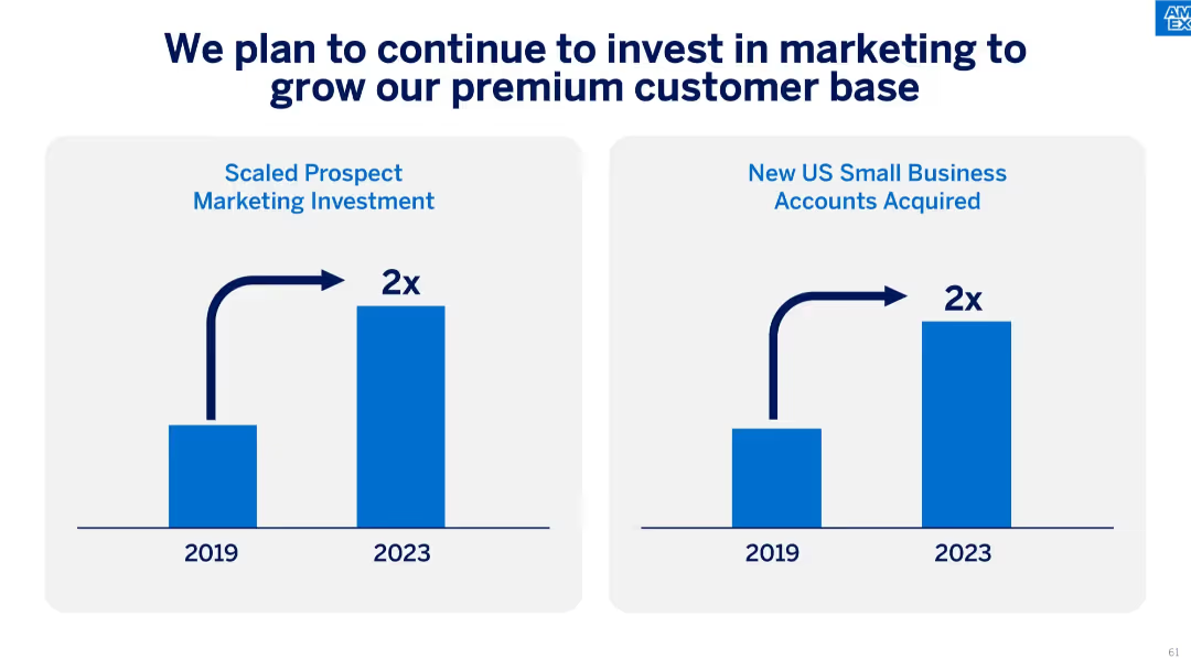
Side-by-side bar charts comparing 2019 vs. 2023 values for marketing investment and small business accounts acquired.
Strategic Planning
Financial Services
The slide presents a strategy to grow premium customer acquisition through doubling marketing investments, which has resulted in a twofold increase in small business accounts acquired.
premium customer, marketing investment, account growth, strategic plan, small business, ROI, acquisition
Single Chart
McKinsey
Saved
Features column charts for portfolio loans, with clear visual indicators for changes over time. Bar chart for FICO score distribution included.
Risk Assessment and Management
Financial Services
Focuses on indirectly secured consumer loans, highlighting key performance metrics and FICO score distribution. This slide is used to assess credit risk and loan performance, mainly in auto and specialty lending, such as RV and marine finance.
Secured Loans, Consumer, Auto, Finance, FICO
Multiple Chart
Morgan Stanley
Saved
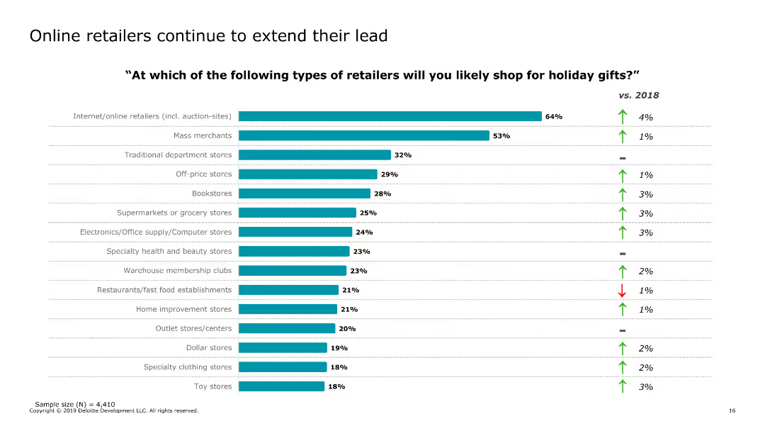
The slide features a bar chart listing the types of retailers where consumers are likely to shop for holiday gifts, with a comparison to the previous year.
Market Analysis and Trends
Retail & E-commerce
The slide identifies the preferred retail formats for holiday shopping, showing the popularity of online and mass merchant retailers.
retail types, holiday shopping, consumer preferences, e-commerce, retail trends, 2019, shopping habits, comparison, online retailers
Single Chart
Deloitte
Saved
Features a map and a detailed flowchart illustrating the hierarchical structure of Indonesia's central, provincial, and local governments including budget allocations.
Strategic Planning
Government & Public Sector
Explains the decentralized administrative system in Indonesia, emphasizing the challenges this poses to coordinated efforts and project funding, especially in education and technology.
administrative structure, decentralization, Indonesia, government, project management, funding
Diagram
BCG
Saved
The slide is divided into three sections: a left section with general statistics, a middle section with role distributions, and a right section with jurisdiction data, represented by bar charts.
Market Analysis and Trends
Financial Services
This slide summarizes the demographics of the survey respondents, including the size of family offices, their roles, and the jurisdictions they operate in within the APAC region.
demographics, APAC, survey, roles, jurisdictions
Multiple Chart
EY
Saved
Features two column charts showing the distribution of liabilities and capital before and after restructuring, using different colors for each category and labeled axes.
Financial Performance
Financial Services
This slide shows financial restructuring impacts, displaying reduced liabilities and new capital distribution, essential for understanding the company's financial health and stability post-restructuring.
financial restructuring, liabilities, capital, stability
Mixed Chart
Barclays
Saved
Previous
Next
If nothing, comes up, please save your slides first
Create a FREE account to continue browsing
Receive Instant Access to 1,000+ slides from companies like McKinsey, Google, and Goldman Sachs
First Name
Last Name
Email
Password
I agree to all
Terms & Privacy Policy
Thank you! Your submission has been received!
Oops! Something went wrong while submitting the form.
Have an account?
Sign in
Column Chart
Heatmap
Chevron
Org Chart
Infographic
Callouts
Timeline
List
Graphic
Picture
Process Flow
Diagram
Paragraph
Map
Table
Framework
Subtitle
Takeaway Box
Icon
Other Chart
Radar Chart
Waterfall Chart
Mekko Chart
Pie Chart
Scatter Plot
Line Chart
Bar chart
Bullet points