Create a FREE Account
Instant access to 1,000+ real slides from top companies like McKinsey, BCG, Goldman Sachs, Google and many more!
First Name
Last Name
Email
Password
I agree to all
Terms & Privacy Policy
Thank you! Your submission has been received!
Oops! Something went wrong while submitting the form.
Have an account?
Sign in
Library
Templates
Courses
Pricing
My Account
My Slides
My Templates
✦ AI
AI Prompt Library
AI Search
Sign in
Start Here
Logout
My Saved Slides
Slide includes multiple line graphs depicting real GDP growth for World, Eurozone, USA, and China from Q1 2019 to Q4 2021, with an adjacent table detailing GDP changes and expected recovery quarters.
Market Analysis and Trends
Financial Services
Exhibiting a muted recovery scenario, this slide illustrates the GDP growth trajectory under prolonged pandemic effects, useful for strategizing in uncertain economic climates.
GDP, muted recovery, economic trajectory, pandemic, uncertainty, Eurozone, USA, China, forecast
Mixed Chart
McKinsey
Saved
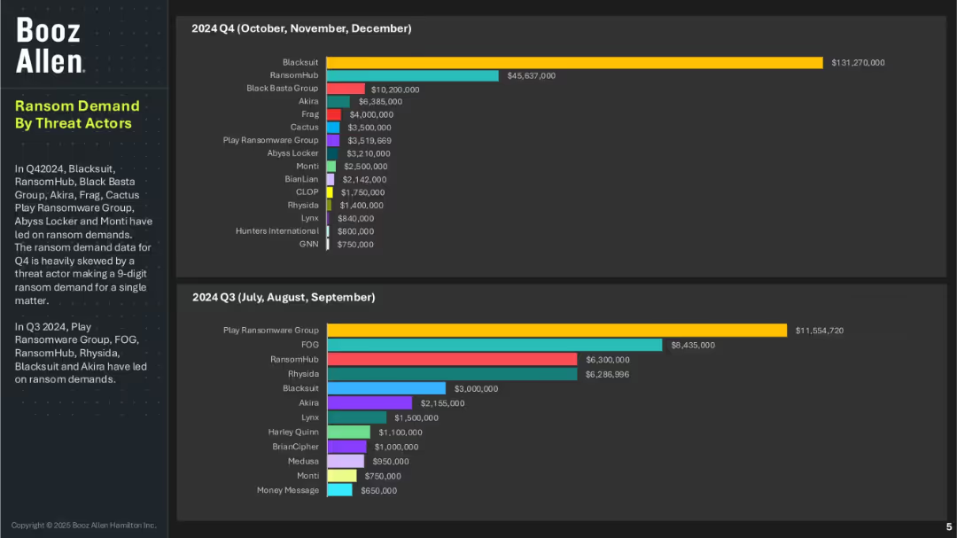
Two bar charts comparing ransom demand values by threat actors in Q4 and Q3 of 2024; left column includes summary text; dark background design.
Risk Assessment and Management
Technology & Software
This slide highlights the top ransomware actors based on ransom demand amounts for Q3 and Q4 2024. BlackSuit and RansomHub top the Q4 list, with one case skewing the data due to a nine-digit demand. In Q3, Play Ransomware Group led in demand. It reflects the shifting threat landscape and varying financial impacts of different ransomware actors.
ransomware demand, threat actors, Q3 Q4 2024, cybercrime economics, Booz Allen, Play Ransomware Group, BlackSuit, RansomHub, extortion trends
Multiple Chart
Booz Allen Hamilton
Saved
Displays a table comparing sin tax rates for various products over two years, alongside an illustrative crowd of diverse people.
Regulatory and Compliance
Government & Public Sector
Provides details on the adjustments in sin tax rates for alcoholic beverages and cigarettes in Namibia, reflecting policy changes in consumer taxation.
sin taxes, tax rates, Namibia, alcoholic beverages, cigarettes, consumer taxation
Table
PwC/Strategy&
Saved
Basic visual complexity, contrasting textual information with a relatable image.
Strategic Planning
Professional Services
Discusses the need for businesses to adapt to changes and disruptions, hinting at strategies for maintaining competitiveness and relevance.
business strategy, adaptability, global trends, disruptions
Mixed Chart
Bain
Saved
Displays a scatter plot graph analyzing digital maturity against age demographics, highlighting countries with strong digital performance.
Market Analysis and Trends
Technology & Software
Examines the digital maturity levels of various countries and discusses the potential influence of digitally adept consumers in global markets.
digital maturity, consumer influence, demographics, market trends, technology adoption, global markets, segmentation, strategic analysis
Single Chart
Accenture
Saved
This slide displays a line chart of CPI inflation in developed markets over a period spanning from the 1970s to the 2020s. The x-axis marks the years while the y-axis shows the percentage change. The chart shows significant fluctuations, with notable peaks and troughs.
Market Analysis and Trends
Financial Services
The slide presents historical data of CPI inflation in developed markets, with an emphasis on the trends over the past five decades. This could be used to analyze economic patterns, predict future inflation trends, and inform investment strategies.
Inflation, CPI, Developed Markets, Economic History, Trends, Data Analysis, Fluctuations
Single Chart
JP Morgan
Saved
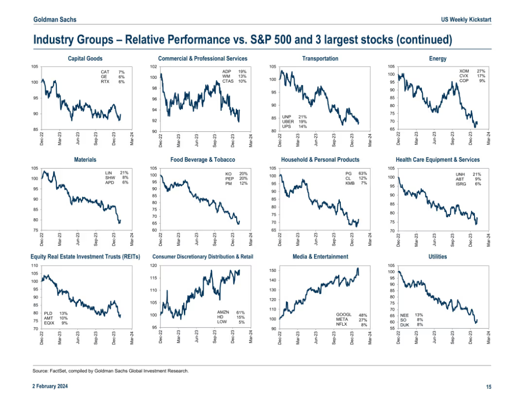
Continuation of the previous slide with another 16-panel grid layout of line charts. Includes industry groups like Transportation, Materials, Media, and Utilities. Each chart notes top 3 stocks in the group with YTD return.
Competitive Landscape
Financial Services
This continuation slide presents relative industry group performance vs. the S&P 500, focusing on sectors such as Transportation, Food & Tobacco, and REITs. Highlighted performers include UNP, KO, and META. The charts emphasize structural performance differences across industries and help detect winners and laggards among large-cap stocks.
REITs, META, UNP, KO, industry trends, relative performance, S&P 500, materials, transportation, utilities
Multiple Chart
Goldman Sachs
Saved
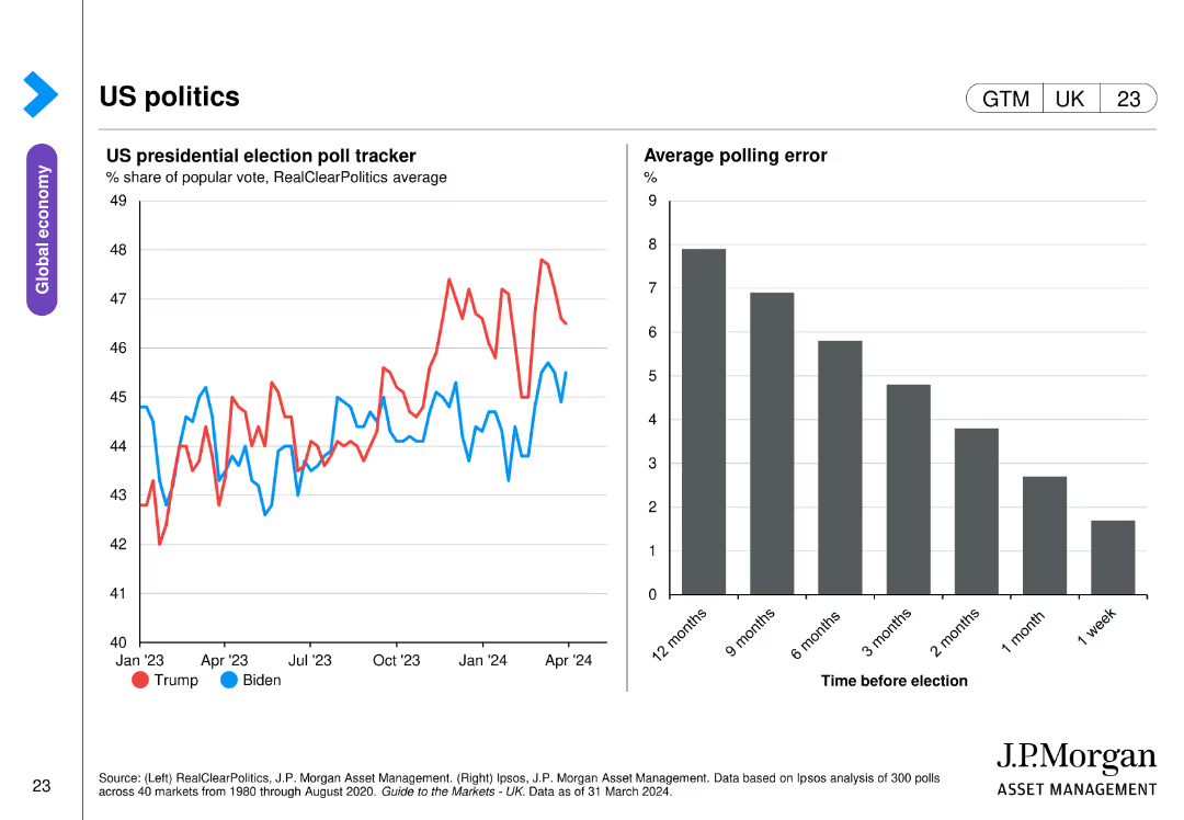
The slide includes two charts: one line chart tracking the US presidential election poll tracker from January 2023 to April 2024, and a bar chart showing the average polling error over different timeframes before the election.
Market Analysis and Trends
Government & Public Sector
This slide analyzes US presidential election polling data, showing trends in voter support for Trump and Biden from January 2023 to April 2024, along with a bar chart illustrating the average polling error at various points before the election.
US politics, presidential election, polling, trends, errors
Multiple Chart
JP Morgan
Saved
The slide presents three line charts comparing sovereign EMD spreads, corporate EMD spreads, and local EMD yields over time, along with a table summarizing key metrics.
Market Analysis and Trends
Financial Services
The slide provides an update on emerging markets bonds, highlighting spread and yield trends. Useful for analyzing emerging markets investment.
emerging markets, bond market, spreads, yields, sovereign EMD, corporate EMD, financial analysis
Multiple Chart
Morgan Stanley
Saved
This slide features a bar chart comparing the cumulative solar PV capacity per capita across several countries, annotated with percentages of off-grid population. The visual is organized and comparative, aiding in quick cross-country comparisons.
Competitive Landscape
Energy & Utilities
Compares the solar market penetration in Nigeria to other countries, highlighting underpenetration and potential growth areas within the global energy sector.
solar capacity, market comparison, Nigeria, PV penetration, global stats
Single Chart
BCG
Saved
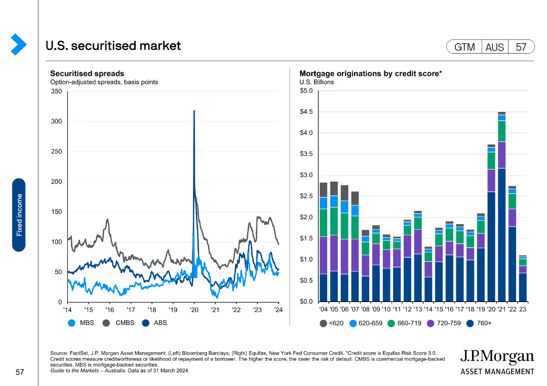
This slide includes a line chart on the left showing securitised spreads (MBS, CMBS, ABS) and a column chart on the right showing mortgage originations by credit score.
Market Analysis and Trends
Financial Services
It analyzes the U.S. securitised market by presenting spreads and mortgage originations data, useful for understanding the securitised product market.
securitised, market, spreads, mortgage, credit
Multiple Chart
JP Morgan
Saved
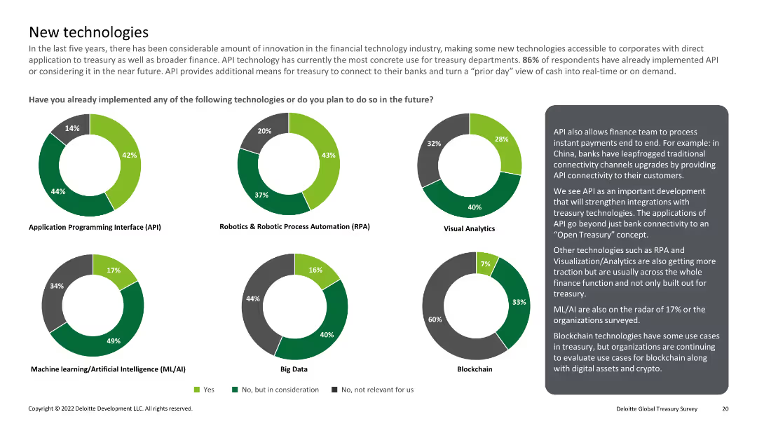
Multiple pie charts showing implementation of technologies like API, RPA, visual analytics, ML/AI, big data, and blockchain
Technology and Digital Transformation
Financial Services
Reviews the implementation of emerging technologies in treasury departments, including APIs, RPA, and blockchain.
New technology, API, RPA, ML/AI, blockchain
Multiple Chart
Deloitte
Saved
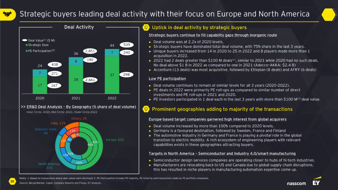
Vertical bar chart on deal activity with strategic vs PE split, pie chart by geography, and supporting text explanations.
Mergers and Acquisitions
Professional Services
This slide shows strategic buyers dominating deal activity over PE firms, particularly in Europe and North America. It discusses deal value growth, unique buyer activity, and key regions. Europe-based targets are increasingly attractive due to capability gaps, while PE participation remains low and focused.
M&A, strategic buyers, deal activity, Europe, North America, PE participation, ER&D
Multiple Chart
EY
Saved
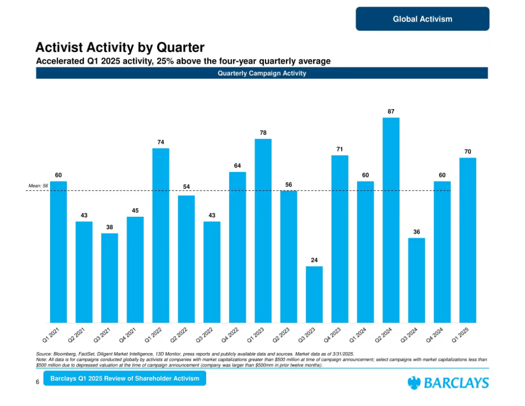
Bar chart of quarterly campaign activity from Q1 2021 to Q1 2025; average line marked; title and subtitle emphasize 25% above average activity.
Market Analysis and Trends
Financial Services
Depicts a quarter-by-quarter view of activist campaigns. Q1 2025 shows strong performance at 70 campaigns, surpassing the 4-year average. Highlights variability across quarters with visible spikes and lulls, indicating cyclic activism patterns.
quarterly campaigns, shareholder activism, 2025 Q1, Barclays, market patterns, campaign volume
Single Chart
Barclays
Saved
Two column charts comparing U.S. real business investment, future capex intentions, personal interest payments, and credit card delinquencies.
Market Analysis and Trends
Financial Services
The slide presents trends in U.S. business investment and consumer finances, focusing on capex intentions and personal interest payments over time.
business investment, capex, consumer finance, credit card delinquencies, U.S. economy
Multiple Chart
JP Morgan
Saved
Features a combination of column and line charts for GIB, M&A, DCM, and ECM. The slide includes a legend, market share trend lines, and key takeaways at the bottom.
Financial Performance
Financial Services
Displays market share growth in global investment banking sectors, emphasizing leadership and deal participation over five years.
Investment Banking, Market Share, M&A, DCM, ECM
Multiple Chart
JP Morgan
Saved
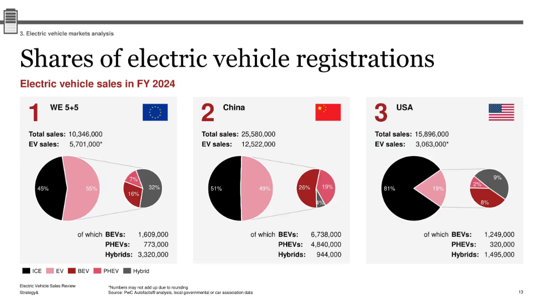
Three-part layout with pie charts for WE 5+5, China, and USA; flags and national data; red-pink-black hybrid color scheme with category breakout
Market Analysis and Trends
Industrial & Manufacturing
This slide compares electric vehicle registrations in FY2024 across Western Europe, China, and the USA. Each region’s total and EV sales are provided, with breakdowns into BEVs, PHEVs, and Hybrids. China leads in absolute numbers, while Western Europe shows the highest EV share percentage. The visualization highlights regional market penetration and composition.
EV registrations, BEV, PHEV, hybrid market, regional comparison, 2024 sales, WE5+5, China, USA
Single Chart
PwC/Strategy&
Saved
The slide presents a bubble chart indicating the value from digital health solution adoption across different countries, focusing on metrics like staff efficiency, patient satisfaction, and medical error reduction.
Technology and Digital Transformation
Healthcare & Pharmaceuticals
The slide emphasizes the expected benefits of digital health solutions in hospitals worldwide, highlighting increases in staff efficiency, patient satisfaction, and the shift away from focusing solely on reducing medical errors.
Digital health, benefits, hospitals, efficiency, satisfaction
Single Chart
LEK
Saved
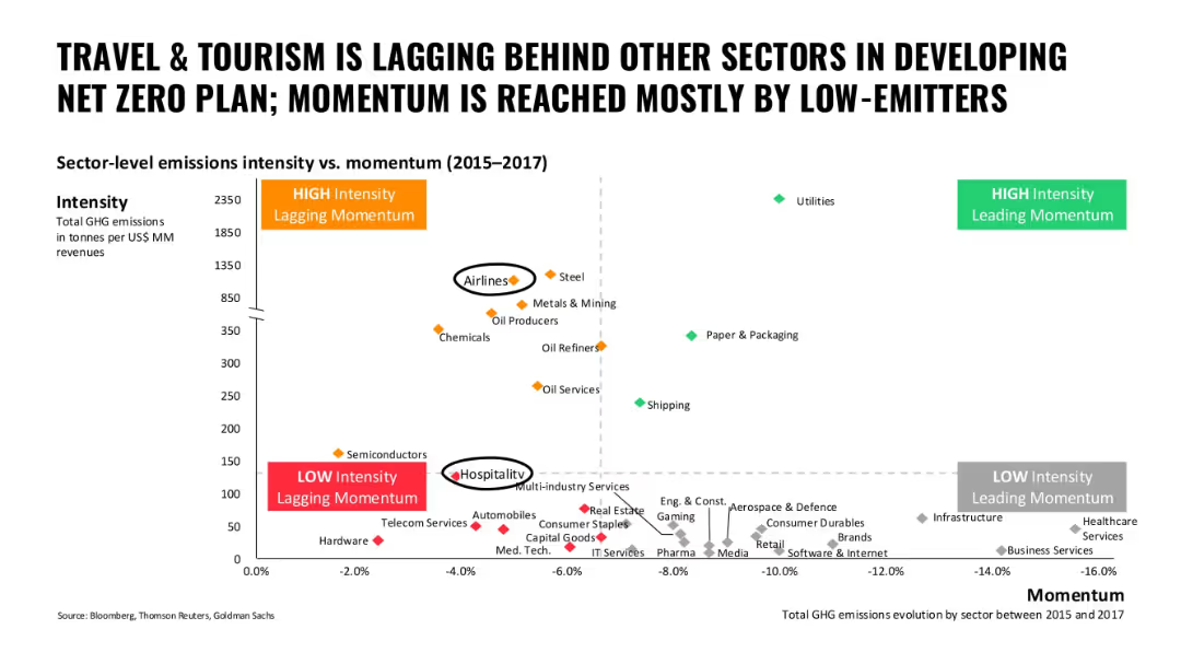
Scatter plot of sectors comparing GHG emissions intensity to momentum; color-coded sectors; high and low quadrants marked
Performance Metrics and KPIs
Hospitality & Tourism
This slide compares travel and tourism sectors to others in terms of carbon intensity and decarbonization momentum, showing airlines and hospitality as lagging in progress.
travel, tourism, emissions, momentum, lagging sectors, airlines, hospitality
Single Chart
Oliver Wyman
Saved
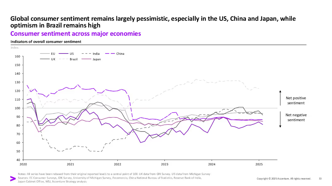
Line chart showing sentiment index trends from 2020 to 2025 across regions (EU, US, India, China, UK, Brazil, Japan).
Strategic Planning
Financial Services
The chart reflects long-term consumer sentiment trends. While Brazil remains optimistic, most other economies like the US, China, and Japan are entrenched in negative sentiment zones, showing low consumer confidence.
Consumer Sentiment, Brazil, Pessimism, Global Outlook, Index, Confidence, 2025
Single Chart
Accenture
Saved
This slide features two sets of column charts, one showing the dramatic decrease in the price of solar PV modules from 2010 to 2020, and another displaying the levelized cost of electricity (LCOE) for solar, diesel, and petrol in 2021. The layout is clean, with annotations providing clarity on the data trends.
Market Analysis and Trends
Energy & Utilities
The slide presents data on the declining cost of solar power compared to other energy sources, highlighting the increased affordability and cost-effectiveness of solar energy, which is significant for market competitiveness in the energy sector.
solar, LCOE, price reduction, cost effectiveness, energy comparison
Multiple Chart
BCG
Saved
The slide includes bar charts and column charts showing revenue and asset under management performance, with distinct colors for different categories and detailed annotations.
Financial Performance
Financial Services
This slide discusses the Q4 2023 performance of the asset management division, focusing on revenue changes and asset inflows.
asset management, financial performance, revenue analysis, Q4 2023, asset inflows
Multiple Chart
Deutsche Bank
Saved
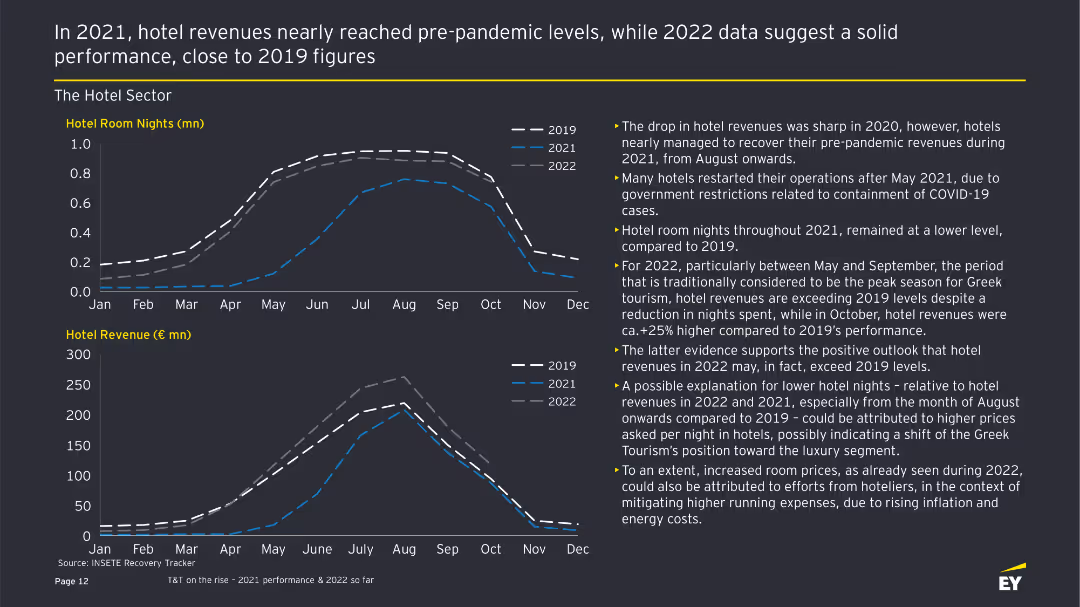
The slide features two line charts showing hotel room nights and revenue from 2019 to 2022, with accompanying text highlighting trends and performance.
Financial Performance
Hospitality & Tourism
This slide provides an analysis of the Greek hotel sector's performance, comparing room nights and revenue across different years, emphasizing recovery and growth trends.
Hotel performance, room nights, revenue analysis, financial performance, tourism trends
Multiple Chart
EY
Saved
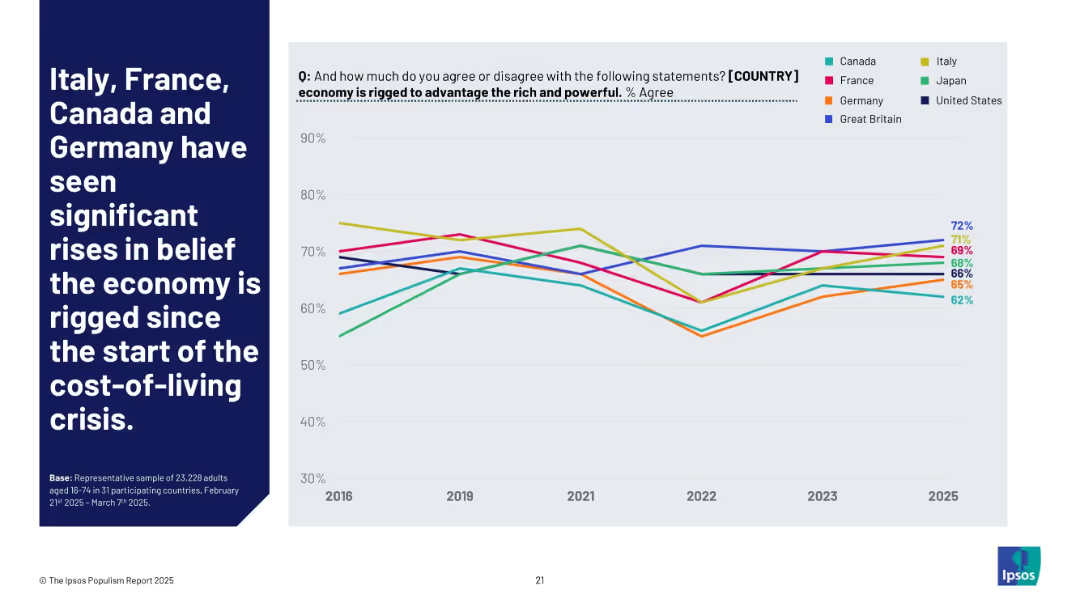
Line graph (2016–2025) showing how belief in economic rigging has trended across selected countries. Each country is shown with a distinct color-coded line.
Market Analysis and Trends
Government & Public Sector
This chart illustrates rising belief that national economies are biased in favor of elites. Italy, France, Canada, and Germany show sharp upward trends—especially since 2021—suggesting an impact from inflation and affordability concerns.
inflation, economy rigged, cost-of-living, public sentiment, trend data, Ipsos, inequality
Mixed Chart
IPSOS
Saved
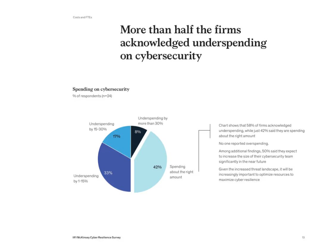
Donut-style pie chart showing distribution of cybersecurity spending levels. Supporting text on the right details implications of underinvestment.
Risk Assessment and Management
Financial Services
58% of firms admit they’re underspending on cybersecurity, with no firm reporting overspending. Many plan to grow their cybersecurity teams. The slide underscores the need to optimize security investments to align with growing threats and reduce risk exposure.
cybersecurity, budget, spending, underinvestment, risk, survey, financial firms
Mixed Chart
McKinsey
Saved
Previous
Next
If nothing, comes up, please save your slides first
Create a FREE account to continue browsing
Receive Instant Access to 1,000+ slides from companies like McKinsey, Google, and Goldman Sachs
First Name
Last Name
Email
Password
I agree to all
Terms & Privacy Policy
Thank you! Your submission has been received!
Oops! Something went wrong while submitting the form.
Have an account?
Sign in
Column Chart
Heatmap
Chevron
Org Chart
Infographic
Callouts
Timeline
List
Graphic
Picture
Process Flow
Diagram
Paragraph
Map
Table
Framework
Subtitle
Takeaway Box
Icon
Other Chart
Radar Chart
Waterfall Chart
Mekko Chart
Pie Chart
Scatter Plot
Line Chart
Bar chart
Bullet points