Create a FREE Account
Instant access to 1,000+ real slides from top companies like McKinsey, BCG, Goldman Sachs, Google and many more!
First Name
Last Name
Email
Password
I agree to all
Terms & Privacy Policy
Thank you! Your submission has been received!
Oops! Something went wrong while submitting the form.
Have an account?
Sign in
Library
Templates
Courses
Pricing
My Account
My Slides
My Templates
✦ AI
AI Prompt Library
AI Search
Sign in
Start Here
Logout
My Saved Slides
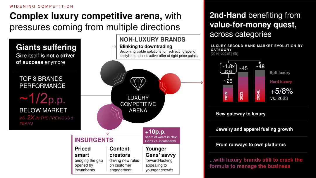
Central diagram of competitive forces; sidebar showing second-hand market growth; bar chart of resale growth from 2019–2024E.
Competitive Landscape
Consumer Goods
Luxury brands are facing intensified competition from both insurgents and non-luxury brands, alongside rapid second-hand market growth. Younger, price-savvy consumers and content creators are reshaping competition and share of wallet dynamics.
competitive dynamics, second-hand, luxury market, insurgents, content creators, value-for-money
Mixed Chart
Bain
Saved
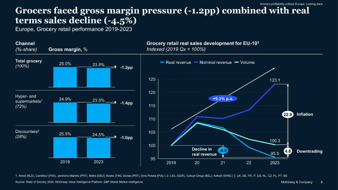
Combination chart with left-side bar graphs showing margin declines by segment and right-side line chart showing sales development indexed to 2019. Dual-axis highlighting inflation and volume trends.
Performance Metrics and KPIs
Retail & E-commerce
Analyzes grocery sector performance from 2019–2023, showing declining real sales (-4.5%) and margin pressure due to inflation. Differentiates performance between hypermarkets and discounters, and outlines the impacts of cost pass-through and consumer behavior shifts.
inflation, margin pressure, sales trends, COVID, grocery sector
Multiple Chart
McKinsey
Saved
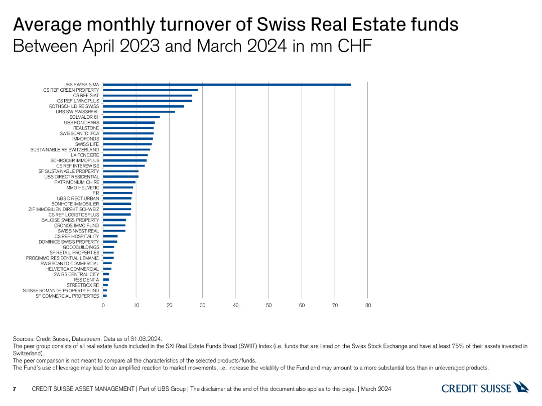
The slide displays a column chart illustrating the average monthly turnover in CHF for various Swiss Real Estate funds between April 2023 and March 2024, with bars in blue.
Financial Performance
Real Estate & Construction
This slide shows the average monthly turnover of different Swiss Real Estate funds, helping to analyze liquidity and fund performance over the specified period.
turnover, real estate, average, monthly, funds
Single Chart
Credit Suisse
Saved
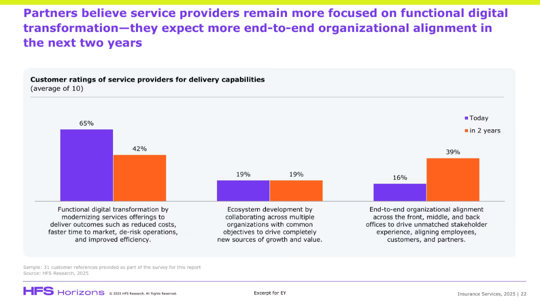
Similar bar chart format to previous slide but focused on partner perceptions; compares current and future priorities in service delivery.
Customer and Market Segmentation
Financial Services
Partners echo a sentiment similar to clients, indicating a strong current focus on cost-efficient transformation but predicting growth in end-to-end organizational alignment and ecosystem-based collaboration. The shift highlights strategic evolution in partner expectations of service delivery, aiming for deeper stakeholder integration.
Partner ratings, transformation, ecosystem, alignment, efficiency, service expectations
Single Chart
EY
Saved
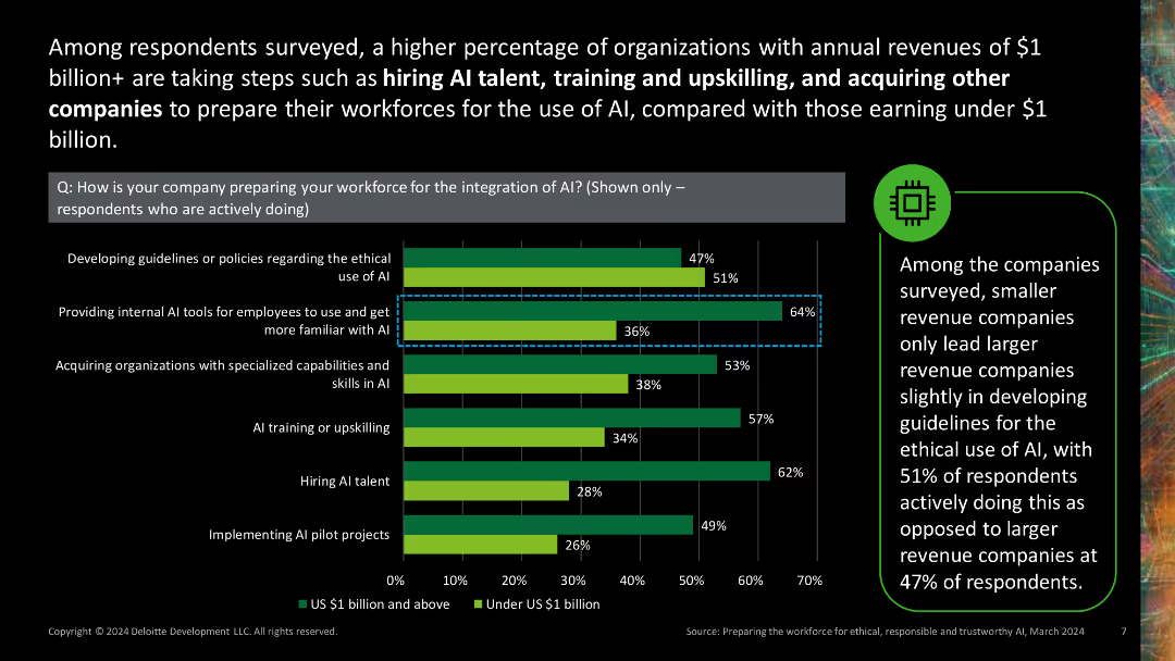
Column chart comparing AI preparation strategies by company size.
Human Resources and Talent Management
Technology & Software
Compares the approaches of large and small companies in integrating AI into their workforce, highlighting differences in hiring and training strategies.
company size, AI integration, workforce strategies, hiring, training
Mixed Chart
Deloitte
Saved
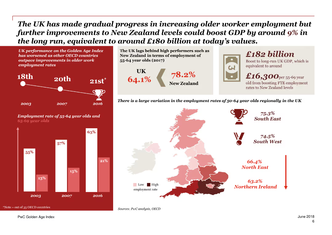
The slide contains a mix of column charts, maps, and text blocks. Predominantly red and white color scheme.
Market Analysis and Trends
Government & Public Sector
This slide compares the employment rates of older workers in the UK with other countries, and discusses potential GDP boosts if employment rates matched those of New Zealand.
employment, GDP, older workers, UK, New Zealand, boost, comparison, trends, OECD, potential
Mixed Chart
PwC/Strategy&
Saved
The slide presents column charts and donut charts breaking down sales and EBITDA pre percentages. Red and grey colors are used to show contrasts.
Financial Performance
Industrial & Manufacturing
Analyzing Q1 results, the slide breaks down sales and EBITDA pre percentages by sector, supported by LANXESS’s Consumer Protection and Engineering Materials divisions.
Q1 results, sales breakdown, EBITDA, Consumer Protection, Engineering Materials, LANXESS, financial data, sector analysis
Multiple Chart
Morgan Stanley
Saved
A bar chart shows the percentage of urban consumers intending to travel internationally, compared over two years. There is a clear visual distinction between the years.
Market Analysis and Trends
Hospitality & Tourism
Investigates the intent of consumers from various SEA countries to travel internationally, showing a significant rise and projecting future trends.
international travel, SEA, Singapore, Malaysia, consumer intent, urban consumers, travel trends
Mixed Chart
Bain
Saved
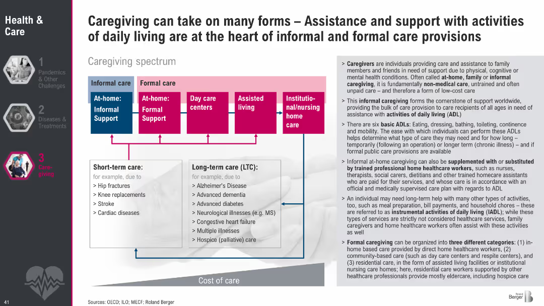
Diagram of caregiving spectrum from informal to formal care with color-coded boxes; side text explains caregiving types, ADLs, and care roles.
Human Resources and Talent Management
Healthcare & Pharmaceuticals
This slide outlines the caregiving spectrum, showing informal vs. formal care types and short-term vs. long-term needs. It also defines the roles of caregivers and the activities they support, emphasizing the importance of both unpaid and professional care structures in supporting daily living.
caregiving, informal care, formal care, ADLs, long-term care, support systems, care spectrum, eldercare
Diagram
Roland Berger
Saved
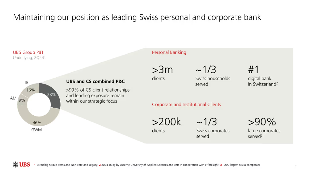
Donut chart and infographics on left and right; red-highlighted headers for key stats.
Strategic Planning
Financial Services
UBS emphasizes its dominant role in Swiss banking, serving over 3 million personal clients and 200k corporates. It shows client distribution and a donut chart of UBS Group PBT by division, highlighting its continued strategic alignment post-Credit Suisse acquisition.
Swiss banking, market share, PBT, UBS, personal banking, corporate banking, digital bank, CS integration
Mixed Chart
UBS
Saved
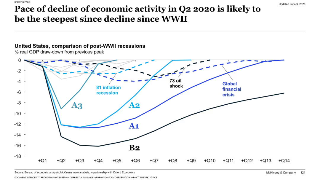
Line chart comparing post-WWII US recessions by GDP draw-down. COVID-19 scenarios (A1–B2) are overlaid on historical downturns.
Risk Assessment and Management
Financial Services
Shows the severity and steepness of US GDP decline in Q2 2020 across multiple scenarios compared to historical recessions (e.g., 1981, 1973 oil shock, global financial crisis). Scenario B2 shows the deepest and most prolonged downturn.
recession comparison, economic shock, COVID-19, historical data, GDP trend
Single Chart
McKinsey
Saved
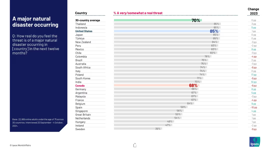
Horizontal bar chart showing likelihood of major disaster by country; global average at top, Canada highlighted.
Risk Assessment and Management
Environmental Services & Sustainability
This slide reflects how real people think the threat of a major natural disaster is in their country. The global average is 70%, with high concern in the U.S., Thailand, and Indonesia (85%). Canada, at 68%, shows a 10-point rise over last year.
natural disaster, climate risk, environmental concern, public safety, Ipsos, disaster prediction, regional threat, global average, year-over-year
Mixed Chart
IPSOS
Saved
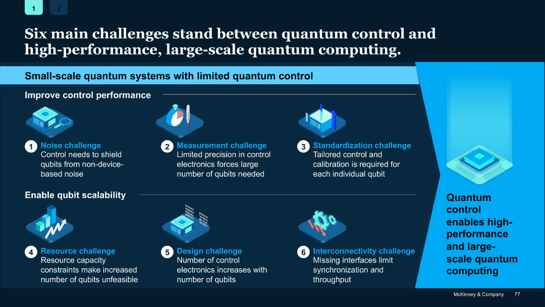
Grid layout with icons and blue highlight sections; challenges numbered 1–6 and grouped under two main themes: control performance and scalability.
Risk Assessment and Management
Artificial Intelligence
Identifies six key technical challenges limiting high-performance quantum computing—ranging from noise control to scalability. Focuses on both improving control and expanding qubit capabilities.
Quantum control, challenges, scalability, qubit, noise, electronics
Linear Flow
McKinsey
Saved
The slide features a column chart with vertical columns, two text blocks, and a diagram with a dotted line indicating the efficiency ratio. The layout is well-organized, and the color scheme is muted with blue highlights.
Financial Performance
Financial Services
The slide provides a detailed comparison of expenses and financial results, highlighting key areas such as compensation, transaction-based expenses, and efficiency ratio. It’s designed for financial analysis and might be used to illustrate fiscal responsibility or areas for cost reduction in a corporate finance context.
financial, expenses, efficiency, compensation, technology, professional fees, tax rate, Goldman Sachs
Mixed Chart
Goldman Sachs
Saved
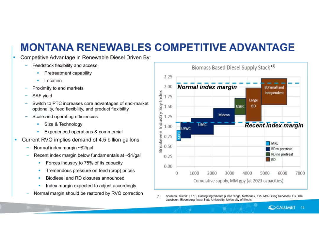
Left-aligned text and bullet points with a central stacked bar chart showing breakeven margin vs. industry benchmarks.
Strategic Planning
Energy & Utilities
Emphasizes Montana Renewables’ feedstock and operational advantages. Compares index margins and industry supply stack, and outlines challenges under current RVO demand, emphasizing future normalization of margins through corrections.
renewable diesel, feedstock, RVO, margin pressure, index margin, capacity, operational efficiency, diesel supply, Montana Renewables
Mixed Chart
Goldman Sachs
Saved
This slide features two stacked column charts: one showing PE/VC investments by deal segments in terms of value, and another showing the number of deals. The charts use different colors to differentiate between segments like Growth, Buyout, Start-up, PIPE, and Credit Investment, with detailed numerical data.
Market Analysis and Trends
Financial Services
This slide breaks down the PE/VC investments across various deal segments by both value and number of deals, providing a comprehensive view of how different segments are performing over time. This information is essential for strategic planning and investment analysis.
PE/VC, deal segments, investment value, number of deals, growth, buyout
Multiple Chart
EY
Saved
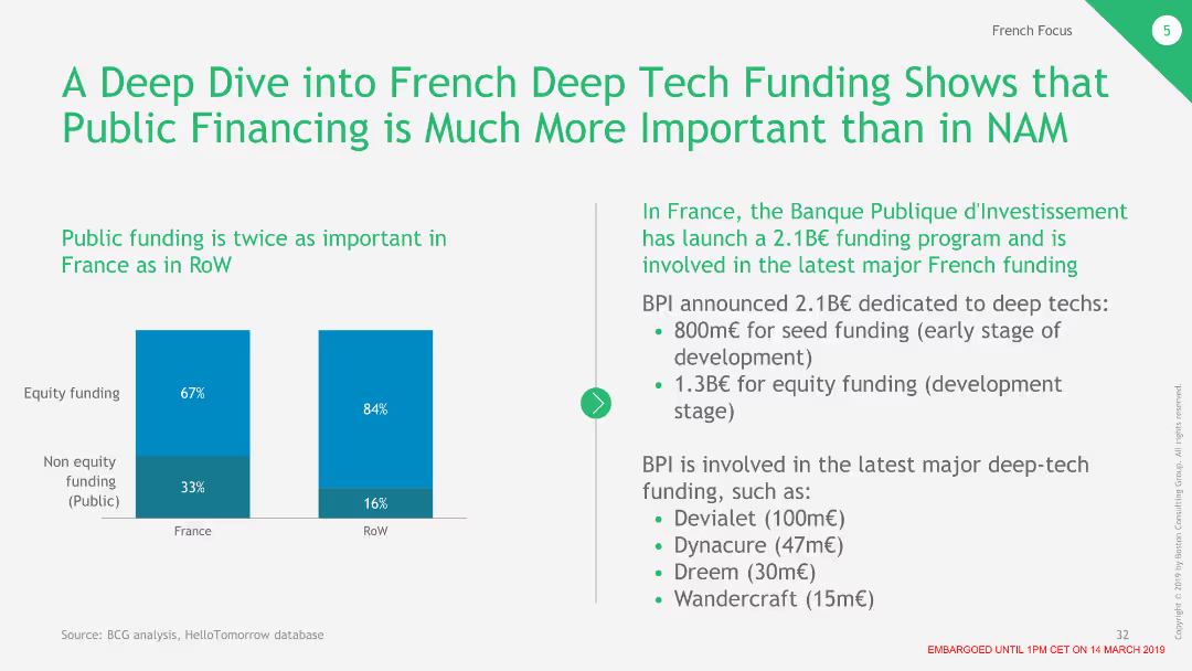
This slide includes two column charts comparing public funding importance between France and the RoW, with text detailing BPI's actions.
Financial Performance
Financial Services
Illustrates the significant role of public funding in France's deep tech sector and details major investments and funding programs.
public funding, BPI, equity funding, deep tech, France
Mixed Chart
BCG
Saved
The slide features a dark background with six column charts in contrasting colors comparing Q1 2020 and Q1 2021 figures. A cyan highlight indicates improvements or targets met.
Financial Performance
Financial Services
This slide presents financial data comparisons year-on-year to assess company performance. It's designed to inform stakeholders about fiscal health and forecast alignment with annual financial guidance.
Revenue, NPAT, Earnings, Profit, ROIC
Multiple Chart
Goldman Sachs
Saved
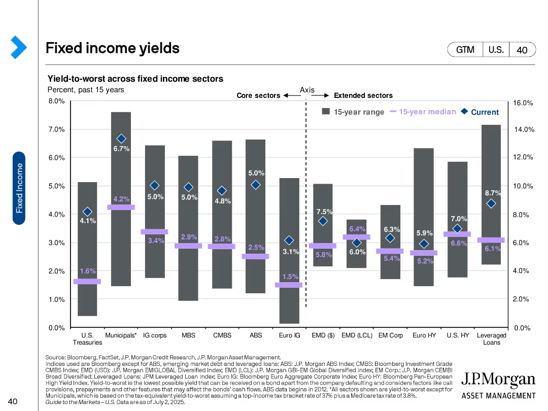
Bar chart with diamond markers comparing current, 15-year median, and range of yields across fixed income sectors.
Investment Analysis
Financial Services
This slide presents yield-to-worst data across core and extended fixed income sectors, showing how current yields compare to historical norms. It highlights opportunities in areas like leveraged loans and high-yield bonds.
Fixed income, yields, investment returns, sector analysis, bonds, interest rates, historical comparison, risk-return, income strategy
Single Chart
JP Morgan
Saved
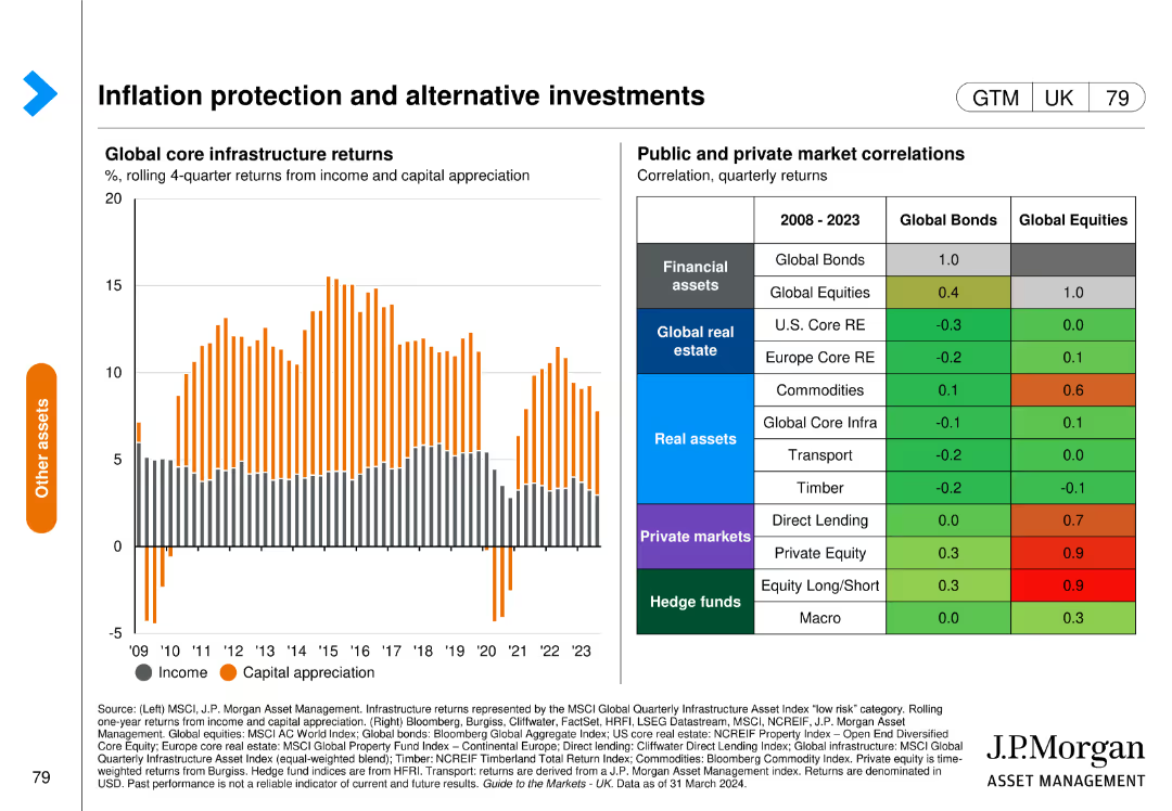
Features a column chart on the left showing global core infrastructure returns from income and capital appreciation, and a table on the right detailing public and private market correlations.
Investment Analysis
Financial Services
This slide highlights the role of alternative investments in inflation protection, analyzing returns from global core infrastructure and examining correlations with public and private markets.
inflation protection, alternative investments, infrastructure returns, market correlations, global
Mixed Chart
JP Morgan
Saved
Slide contains multiple pie charts and column charts showing the composition of deposits and liquidity metrics. Layout is straightforward with distinct color coding.
Financial Performance
Financial Services
Analysis of funding sources and liquidity ratios, important for assessing the financial health and operational capabilities.
funding, liquidity, deposits, financial health, ratios
Multiple Chart
Deutsche Bank
Saved
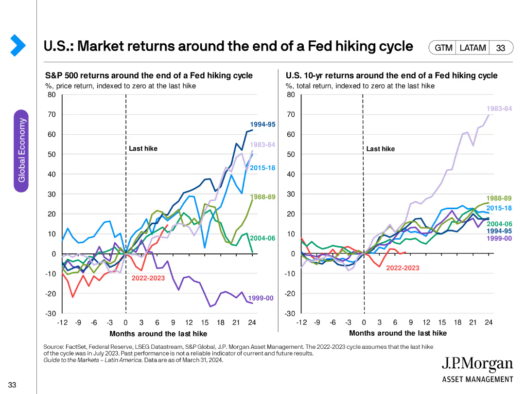
The slide features two line charts comparing S&P 500 and U.S. 10-year returns around the end of various Fed hiking cycles, indexed to zero at the last hike.
Investment Analysis
Financial Services
This slide analyzes market returns around the end of Fed hiking cycles, comparing historical S&P 500 and 10-year treasury returns to provide investment insights.
Fed hiking cycle, market returns, S&P 500, 10-year returns, investment analysis, historical trends
Multiple Chart
JP Morgan
Saved
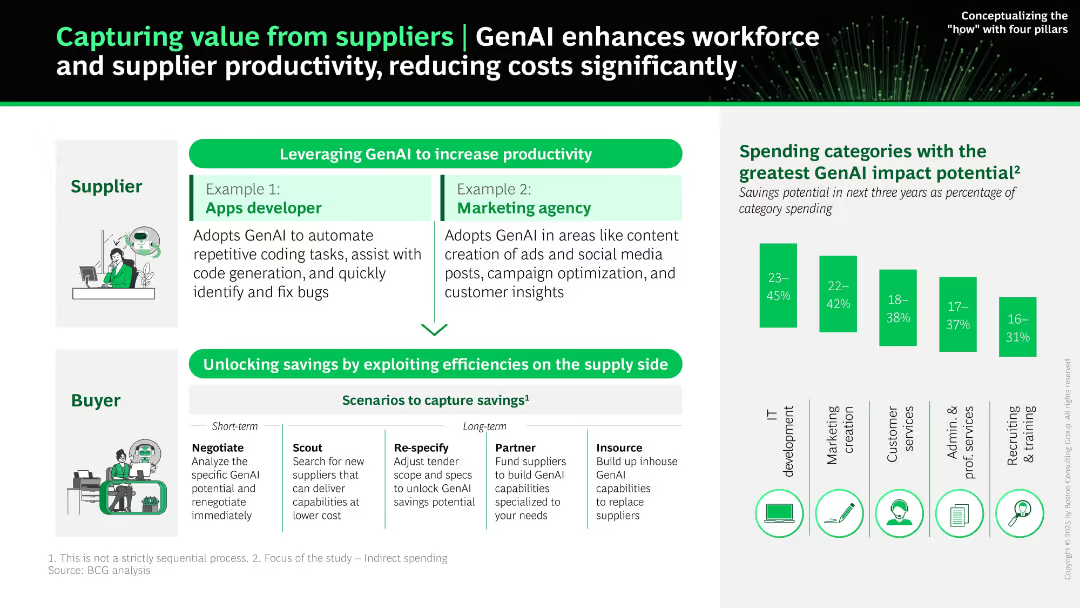
Top-down layout showing supplier and buyer roles; includes example boxes, bar graph on GenAI impact by category, and icons for each procurement category.
Operational Efficiency
Professional Services
The slide shows how GenAI boosts supplier and buyer productivity. It illustrates two supplier examples and outlines buyer-side strategies like scouting, negotiating, and insourcing. A bar graph reveals which spending categories have the highest GenAI savings potential.
supplier value, GenAI, cost savings, automation, procurement, category impact, negotiation, AI adoption
Mixed Chart
BCG
Saved
Four column charts compare investment-grade and high-yield ratings, with up/down ratios across U.S., European, and EM corporates.
Investment Analysis
Financial Services
Slide showcases rating trends and the predominance of upgrades over downgrades in high-yield ratings, essential for investment decision-making.
ratings, high-yield, investment, US, Europe, EM, trends, corporates, analysis, Q4
Multiple Chart
Morgan Stanley
Saved
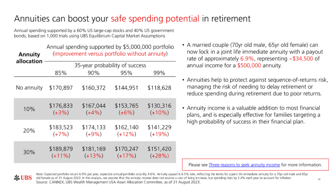
A slide with a table and text explaining how annuities can boost safe spending potential in retirement. The table compares income with and without annuities across different probabilities.
Financial Performance
Financial Services
The slide illustrates the benefits of annuities for enhancing retirement spending potential, using a table to compare income outcomes with and without annuities under various scenarios.
annuities, retirement income, safe spending, financial planning, income stability
Table
UBS
Saved
Previous
Next
If nothing, comes up, please save your slides first
Create a FREE account to continue browsing
Receive Instant Access to 1,000+ slides from companies like McKinsey, Google, and Goldman Sachs
First Name
Last Name
Email
Password
I agree to all
Terms & Privacy Policy
Thank you! Your submission has been received!
Oops! Something went wrong while submitting the form.
Have an account?
Sign in
Column Chart
Heatmap
Chevron
Org Chart
Infographic
Callouts
Timeline
List
Graphic
Picture
Process Flow
Diagram
Paragraph
Map
Table
Framework
Subtitle
Takeaway Box
Icon
Other Chart
Radar Chart
Waterfall Chart
Mekko Chart
Pie Chart
Scatter Plot
Line Chart
Bar chart
Bullet points