Create a FREE Account
Instant access to 1,000+ real slides from top companies like McKinsey, BCG, Goldman Sachs, Google and many more!
First Name
Last Name
Email
Password
I agree to all
Terms & Privacy Policy
Thank you! Your submission has been received!
Oops! Something went wrong while submitting the form.
Have an account?
Sign in
Library
Templates
Courses
Pricing
My Account
My Slides
✦ AI
AI Prompt Library
AI Search
Sign in
Start Here
Logout
My Saved Slides
A slide with blue column chart bars showing Chase Travel sales volume over time, with additional details on marketplace strategies and acquisitions.
Financial Performance
Technology & Software
Projects growth in consumer travel, discussing marketplace strategies and highlighting the value of recent acquisitions.
travel sales, growth projection, marketplace strategy, acquisitions, premium customers, Chase
Mixed Chart
JP Morgan
Saved
This slide presents a series of line charts depicting household savings dynamics in the US, EU, and UK, along with commentary. Each chart shows the actual savings rate, model-predicted trend savings rate, and cumulative excess savings.
Risk Assessment and Management
Financial Services
The slide discusses household savings dynamics, indicating that US consumers are depleting excess savings accrued during the pandemic. It forecasts savings trends and highlights differences between US and European savings behaviors, suggesting cautious consumer spending in the future.
household savings, US, EU, UK, dynamics, forecast
Multiple Chart
Accenture
Saved
Timeline-based design with key milestones from 1985 to 2022 and a vertical bar chart comparing robotic surgeries in 2008 vs. 2020. Bottom section uses bullet points for explanations.
Technology and Digital Transformation
Healthcare & Pharmaceuticals
The slide details the evolution and impact of robotic surgery, particularly via the da Vinci system, and highlights how AI is transforming medtech. It emphasizes benefits such as precision, reduced recovery time, and ongoing innovation. Key milestones and usage stats underline the fast-growing adoption of surgical robotics.
robotic surgery, AI, medtech, da Vinci, medical devices, surgical robotics, healthcare technology, innovation timeline
Mixed Chart
Roland Berger
Saved
The slide contains a stacked bar chart showing the contribution to potential GDP growth in China from TFP, labor, and capital, alongside actual GDP growth from 1990 to 2030. The chart includes a table summarizing growth rates in various periods.
Market Analysis and Trends
Financial Services
This slide assesses China's long-term economic growth potential, breaking down contributions from total factor productivity (TFP), labor, and capital. It contrasts these with actual GDP growth over time, providing forecasts for future growth rates.
China, GDP, growth, potential, TFP, labor, capital, economic forecast, stacked bar chart, financial services
Single Chart
JP Morgan
Saved
Contains a central diagram with five strategic actions around it, each action is represented with an icon and a brief description.
Operational Efficiency
Technology & Software
Details the five fundamental actions high-tech companies should take to effectively adopt as-a-service models, from ecosystem expansion to redesigning the operating model.
high-tech, as-a-service, strategy, ecosystem, operating model, business
Diagram
Accenture
Saved
Features a variety of data visualization formats including bar charts and line graphs, alongside textual explanations and column chart.
Market Analysis and Trends
Technology & Software
Examines the acceleration of technological innovation and its widespread impacts across various sectors, highlighting both the benefits and potential risks associated with rapid technological adoption.
technology, innovation, transformation, sectors, bar charts, line graphs
Multiple Chart
PwC/Strategy&
Saved
Map of Europe with market analysis coverage in blue; side panel with text insights
Market Analysis and Trends
Transportation & Logistics
Describes the geographic scope of rail project analysis in Europe, highlighting a market volume of EUR 12.12 bn and top countries by number of analyzed projects.
European rail market, project analysis, market volume, coverage map, public financing
Multiple Chart
Roland Berger
Saved
The slide presents a bar chart depicting the average number of touch points during different stages of the consumer journey, with a breakdown of digital touchpoints.
Customer and Market Segmentation
Consumer Goods
This slide shows the average touch points consumers are exposed to during various stages of the buying process, emphasizing the significant role of digital touchpoints.
consumer journey, touch points, digital touchpoints, buying process, average touch points
Single Chart
BCG
Saved
Bar chart showing the percentages of late initiatives and value leakage during deployment for different transformation scenarios.
Risk Assessment and Management
Professional Services
Assesses risk management in transformations by analyzing initiative timeliness and value leakage.
risk, management, transformation, initiatives, analysis
Single Chart
McKinsey
Saved
Features two large column charts comparing tangible equity and parent level debt over three years. Includes textual content outlining capital priorities.
Financial Performance
Financial Services
Details the capital buildup and debt reduction over three years, emphasizing on profitability and capital return. Intended for financial review meetings or investment analysis focusing on company’s financial health over recent years.
capital growth, debt reduction, tangible equity, financial strategy, investment
Multiple Chart
Barclays
Saved
The slide contains a column chart showing spread analysis for different financial securities, along with a corresponding table detailing max and min spread dates.
Risk Assessment and Management
Financial Services
Analyzes the spread of various financial instruments over time, highlighting market volatility and investment risk.
spread analysis, financial securities, volatility, risk, bar graph
Single Chart
Morgan Stanley
Saved
Circular pie chart showing value distribution by truck tractor component (EUR%), with callouts for powertrain, cabin, chassis, systems/connectivity
Product and Service Analysis
Industrial & Manufacturing
The slide illustrates how value in a truck tractor is distributed across components. Powertrain holds the largest share (40–45%), followed by the cabin and chassis. Connectivity systems hold minimal value currently but are expected to grow. Value-add is analyzed by OEM vs. supplier, with trend indicators until 2030.
truck tractor, component value, powertrain, cabin, chassis, connectivity, OEM, supplier
Single Chart
Roland Berger
Saved
A column chart comparing investment returns of CDs, bonds, and portfolios during past rate hiking cycles.
Investment Analysis
Financial Services
Analyzes investment opportunities beyond cash, focusing on CDs, bonds, and portfolio performance during rate hikes.
Investment, CDs, bonds, portfolios, rate hikes, performance, analysis, opportunities, returns
Single Chart
JP Morgan
Saved
Green-colored bar chart ranked by agreement; includes 32 countries; consistent layout style; clean visual format.
Market Analysis and Trends
Environmental Services & Sustainability
Gauges public acknowledgment of recent climate warming. Colombia, Mexico, and Brazil lead in agreement. The slide supports awareness levels of global warming facts across different populations.
global warming, temperature trends, public awareness, Ipsos, climate evidence, warming recognition
Mixed Chart
IPSOS
Saved
Bar chart comparing national QC funding; pie chart showing US funding split by technology type (QC, QComms, QS).
Regulatory and Compliance
Government & Public Sector
The slide outlines the US government’s $1.9B funding plan for QC, with most of the allocation (57.6%) going to quantum computing, followed by quantum sensing and communications. It contrasts this with other nations' investments for contextual benchmarking.
US government, quantum computing, QComms, funding, public investment
Multiple Chart
McKinsey
Saved
The slide includes two pie charts showing common decarbonization themes and the geographical distribution of investment needs. It uses distinct color segments and a side panel with key takeaways to enhance understanding.
Investment Analysis
Financial Services
The slide advises aligning investment agendas with climate-conscious investors, showing that a significant portion of investment needs is in Asia. It highlights common decarbonization themes and emphasizes the growth in venture capital for climate tech.
investment agendas, climate-conscious, decarbonization, venture capital, Asia
Multiple Chart
BCG
Saved
Horizontal bar chart comparing total healthcare and LTC spending (% of GDP) across countries; text highlights key takeaways on system structures and funding.
Financial Performance
Healthcare & Pharmaceuticals
This slide compares national LTC spending as a share of GDP, showing major differences in resource allocation. Nordic countries lead in LTC expenditure, reflecting strong public systems. Insights include challenges faced by countries like the US with lower LTC shares but higher total health costs.
LTC spending, GDP share, healthcare financing, eldercare, international comparison, Nordic model, public health funding
Mixed Chart
Roland Berger
Saved
Three-column layout with left chart (emissions), center (investment avenues), and right (barriers and case study); green-themed design with icons.
Technology and Digital Transformation
Agriculture & Food Production
This slide offers a deep dive into regenerative agriculture, identifying its impact on emissions, soil health, and investment potential. Key investment methods include financing platforms and NGO support. Challenges such as financial viability and skepticism are noted, with a case study on sustainable Vietnamese coffee production.
regenerative agriculture, soil health, emissions reduction, Vietnam, sustainable farming, smallholders, investment barriers, crop management
Multiple Chart
Bain
Saved
The slide features a column chart comparing the importance and readiness of various human capital trends, such as worker well-being, belonging, and reskilling. Text sections provide context and analysis.
Human Resources and Talent Management
Professional Services
The slide addresses the gap between the importance and readiness of human capital trends in GPS organizations, with a column chart illustrating disparities in areas like worker well-being, belonging, and reskilling.
human capital, readiness, importance, GPS organizations, trends
Single Chart
Deloitte
Saved
Diagram showing hierarchical structure with CTO, CEO, COO, and CFO.
Organizational Structure and Change
Professional Services
Defines the role and responsibilities of a Chief Transformation Officer within a corporate hierarchy.
CTO, roles, corporate, hierarchy, leadership
Diagram
McKinsey
Saved
The slide contains three column charts comparing the preferences and prevalence of virtual vs. in-person meetings before, during, and after the COVID-19 pandemic.
Strategic Planning
Healthcare & Pharmaceuticals
The slide indicates that despite lifting travel restrictions, HCPs prefer virtual meetings, with significant percentages indicating a preference for continued virtual engagement.
virtual meetings, COVID-19, HCPs, preferences, engagement
Multiple Chart
Accenture
Saved
Text and bar chart comparing belief in a society divided between elites and ordinary citizens by political ideology and country.
Customer and Market Segmentation
Government & Public Sector
The slide compares agreement levels with the belief that society is divided between elites and citizens across France, Germany, Spain, and Sweden, broken down by political orientation. Both radical right and left show high agreement.
populism, elites, democracy, left-wing, right-wing, public sentiment
Mixed Chart
IPSOS
Saved
The slide includes a column chart displaying participants' views on the importance of crypto assets in the financial ecosystem, rated from 1 to 7.
Market Analysis and Trends
Financial Services
This slide assesses participants' opinions on the current significance of crypto assets within the financial ecosystem.
Financial ecosystem, crypto assets, significance, survey, participants
Mixed Chart
IPSOS
Saved
Similar bar chart to previous slide, but focused on personal/family-level sentiment across countries, with % change vs 2022.
Market Analysis and Trends
Professional Services
This slide details the global personal/family perception of 2023, with Turkey topping the chart at 73% agreement and Japan at the bottom with 38%. Global average agreement is 53%.
personal sentiment, bad year, family impact, country comparison, Ipsos, survey, 2023, bar chart
Mixed Chart
IPSOS
Saved
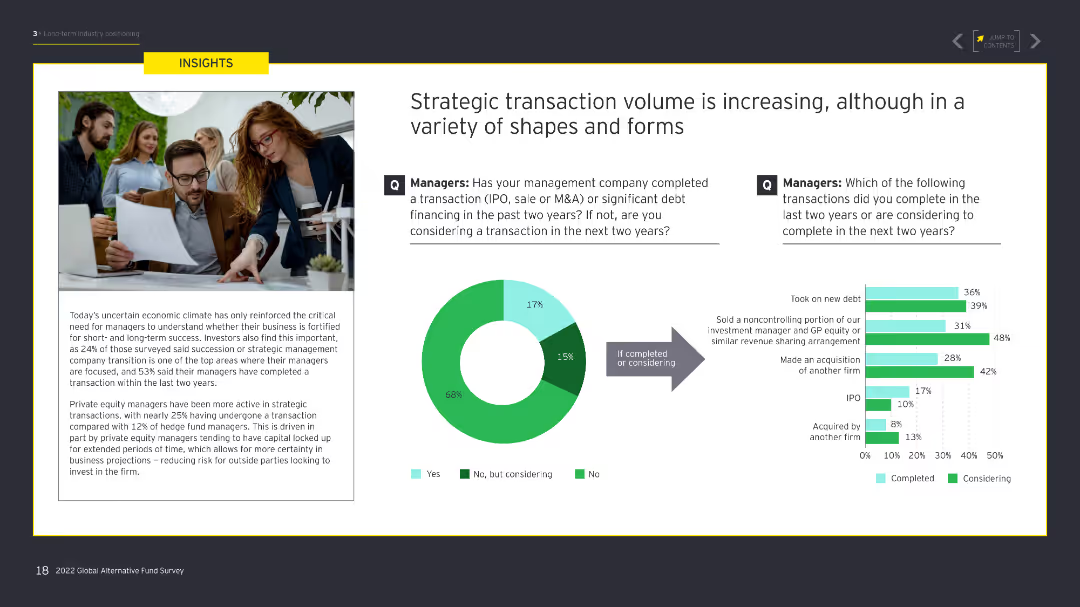
The slide features a column chart comparing the number and proceeds of IPOs in the London Main Market and AIM from 2016 to 2020. Text sections provide highlights of the UK IPO market in Q4 2020.
Market Analysis and Trends
Financial Services
Summarizes the UK IPO market's performance in Q4 2020, noting significant deals, sector activity, and market trends. Discusses outlook and expected competition for capital in 2021.
IPO, UK, market highlights, Q4 2020, financial services, London Main Market, AIM
Mixed Chart
EY
Saved
Previous
Next
If nothing, comes up, please save your slides first
Create a FREE account to continue browsing
Receive Instant Access to 1,000+ slides from companies like McKinsey, Google, and Goldman Sachs
First Name
Last Name
Email
Password
I agree to all
Terms & Privacy Policy
Thank you! Your submission has been received!
Oops! Something went wrong while submitting the form.
Have an account?
Sign in
Column Chart
Heatmap
Chevron
Org Chart
Infographic
Callouts
Timeline
List
Graphic
Picture
Process Flow
Diagram
Paragraph
Map
Table
Framework
Subtitle
Takeaway Box
Icon
Other Chart
Radar Chart
Waterfall Chart
Mekko Chart
Pie Chart
Scatter Plot
Line Chart
Bar chart
Bullet points