Create a FREE Account
Instant access to 1,000+ real slides from top companies like McKinsey, BCG, Goldman Sachs, Google and many more!
First Name
Last Name
Email
Password
I agree to all
Terms & Privacy Policy
Thank you! Your submission has been received!
Oops! Something went wrong while submitting the form.
Have an account?
Sign in
Library
Templates
Courses
Pricing
My Account
My Slides
My Templates
✦ AI
AI Prompt Library
AI Search
Sign in
Start Here
Logout
My Saved Slides
Contains multiple charts: a bar chart for federal budget composition, line charts for deficit and net interest outlays, and a line chart for federal net debt. Colorful and data-dense.
Market Analysis and Trends
Government & Public Sector
Examines the U.S. federal budget, deficit, and debt projections, suggesting that fiscal policy will be a significant issue in the upcoming election campaign.
Budget, Deficit, Debt, Fiscal Policy, Campaign
Multiple Chart
JP Morgan
Saved
This slide includes three distinct line charts, plotted over time to illustrate the trend in headline inflation numbers across China, the United States, and the Euro Area. The layout is simple and focused.
Regulatory and Compliance
Financial Services
The slide compares inflation trends, essential for financial and economic analysts assessing monetary policy implications and market strategies. It visualizes inflation data in a way that is likely to impact investment and regulatory decisions within the financial services industry.
Inflation, CPI, Trends, Economic
Single Chart
Morgan Stanley
Saved
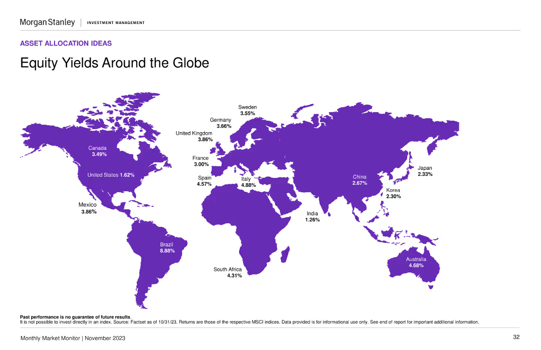
A world map displaying various countries highlighted in purple, with equity yield percentages annotated next to each country. The layout is clean with a central focus on the map.
Market Analysis and Trends
Financial Services
This slide provides a comparison of equity yields across different countries, showing investors where they might find the highest yields. Useful for global market analysis and investment decisions.
equity yields, global market, investment, countries, percentages
Graphic
Morgan Stanley
Saved
The slide features a timeline chart showing the political attractiveness curve for CCUS policies from 1996 to 2020, including significant events and milestones.
Regulatory and Compliance
Government & Public Sector
The slide depicts the political support trajectory for CCUS policies from 1996 to 2020. It highlights key events, policy milestones, and shifts in support over time, showing how political attitudes towards CCUS have evolved and the impact of various external factors on this support.
CCUS, political support, timeline, policies
Single Chart
Kearney
Saved
An agenda slide with bullet points detailing the main topics: Distribution industry dynamics, Drivers of profitability, and an overview of EY-Parthenon.
Strategic Planning
Financial Services
This agenda slide outlines the key presentation topics, providing a structured overview for the audience.
agenda, distribution industry, profitability drivers, EY-Parthenon, presentation overview
Agenda
EY
Saved
A collection of blue column charts comparing digital economy growth to GDP growth for various SEA countries.
Financial Performance
Technology & Software
The slide demonstrates the digital economy's growth, anticipated to be twice as fast as GDP growth through 2030 in SEA countries.
digital economy, GDP growth, SEA, CAGR, forecast
Multiple Chart
Bain
Saved
A slide comparing key financial metrics over three years, with blue column charts and tabular data representation.
Financial Performance
Financial Services
Analyzes JPMorgan Chase & Co.'s financial performance in 2019, emphasizing growth and client relationships.
Financial results, JPMorgan Chase, client focus, revenue growth, banking performance, comparative analysis, yearly metrics, business development
Multiple Chart
JP Morgan
Saved
Features a variety of data visualizations including tables to discuss the drivers of economic growth in the Philippines.
Market Analysis and Trends
Government & Public Sector
Reviews factors driving the Philippine economy, such as consumption, government spending, and the impact of COVID-19 on various sectors.
economic growth, Philippines, COVID-19, government spending, pie charts, column charts, consumption, sectors
Table
Deloitte
Saved
Displays bar charts showing how managers allocate their work time across various tasks.
Operational Efficiency
Professional Services
Analyzes time management among managers, highlighting inefficiencies and potential areas for improvement.
time management, task allocation, efficiency, work priorities, managerial duties
Multiple Chart
BCG
Saved
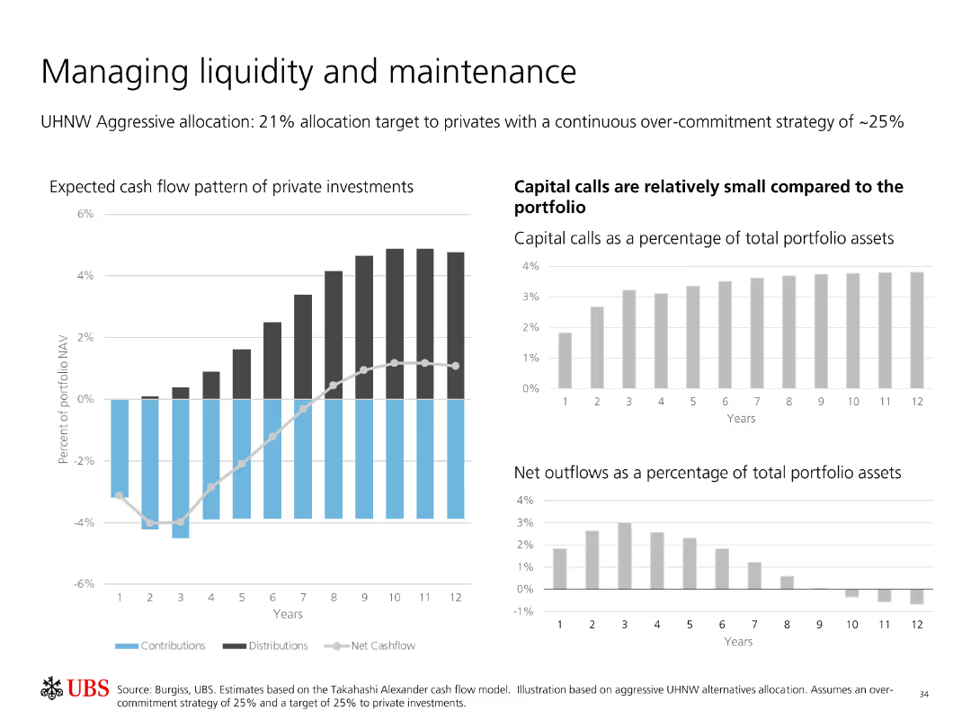
Contains multiple bar charts showing expected cash flow patterns of private investments, capital calls, and net outflows as a percentage of total portfolio assets.
Financial Performance
Financial Services
Analyzes liquidity management and maintenance in private investments, highlighting expected cash flows, capital calls, and net outflows relative to portfolio assets.
Liquidity Management, Private Investments, Cash Flow, Capital Calls, Net Outflows, Portfolio, Strategy, Analysis, Maintenance
Multiple Chart
UBS
Saved
Slide features image-focused layout discussing the importance of personalization in consumer interactions, with a timeline of increasing trend relevance.
Product and Service Analysis
Retail & E-commerce
Analyzes how personalization in digital spaces is shaping consumer experiences, appealing strongly to Gen X and Millennials.
personalization, consumer experiences, Gen X, Millennials, digital
Multiple Chart
Bain
Saved
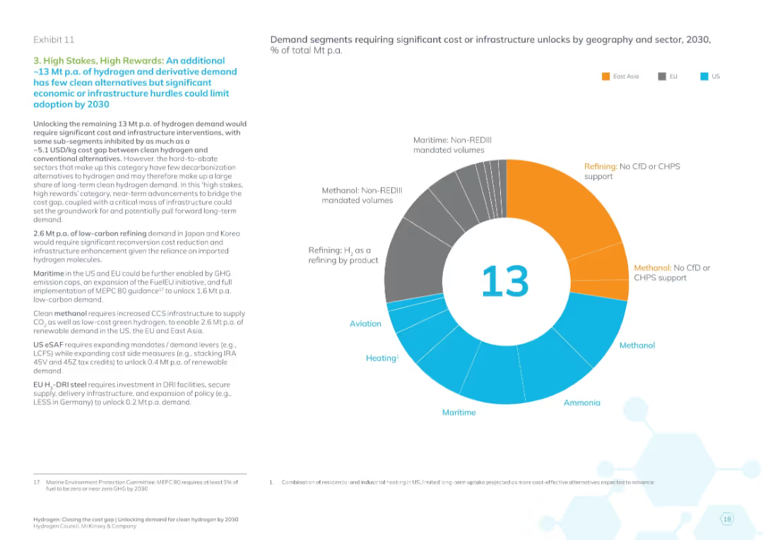
Donut chart of 13 Mt demand showing high unlock effort segments; explanatory text left with sector detail
Risk Assessment and Management
Energy & Utilities
This slide highlights the most difficult segments to unlock for clean hydrogen, requiring high cost reductions or infrastructure buildout. It includes aviation, maritime, heating, and methanol sectors. Despite high potential, economic and logistical barriers may limit 2030 adoption.
hydrogen hurdles, high cost gap, aviation, maritime, methanol, infrastructure challenge, hard-to-abate
Mixed Chart
McKinsey
Saved
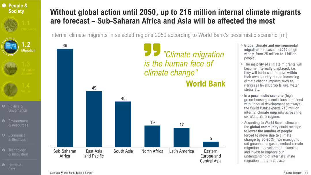
Bar chart with blue bars showing climate migrant projections by region, supported by a large quote and summary bullets on the right.
Risk Assessment and Management
Environmental Services & Sustainability
This slide highlights the World Bank’s worst-case projection of 216 million internal climate migrants by 2050, with Sub-Saharan Africa and Asia being most affected. It explains contributing factors and mitigation potential through development and emissions policies.
climate migration, internal displacement, Sub-Saharan Africa, World Bank, environmental risks, emissions, population shift
Mixed Chart
Roland Berger
Saved
This slide has a large, bold title on the left, and two main content areas with bullet points and icons on the right, colored in blue and green. The layout is balanced and clear.
Human Resources and Talent Management
Technology & Software
It discusses identifying unique strengths and conveying an attractive employee value proposition (EVP) to new hires, pivotal for startups and HR branding efforts.
EVP, talent acquisition, startup, branding, culture, benefits, development opportunities
Header Horizontal
Kearney
Saved
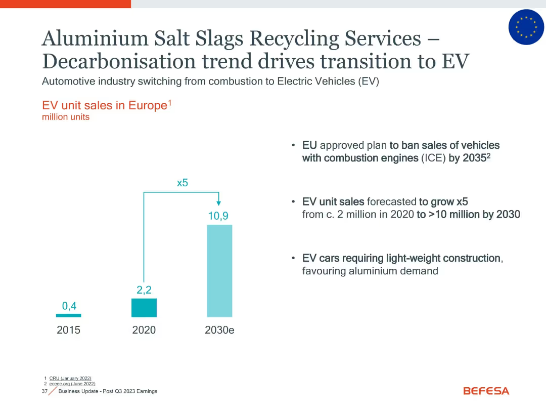
Clean, minimal layout with vertical EV unit sales bar chart; includes text highlights and EU policy info
Market Analysis and Trends
Government & Public Sector
Illustrates Europe’s rapid EV growth and policy bans on ICEs by 2035. Emphasizes increased demand for aluminium recycling driven by lightweight EV construction, positioning Befesa within this market transition.
EV, aluminium, recycling, EU, combustion ban, electrification, lightweight, vehicle sales
Mixed Chart
Goldman Sachs
Saved
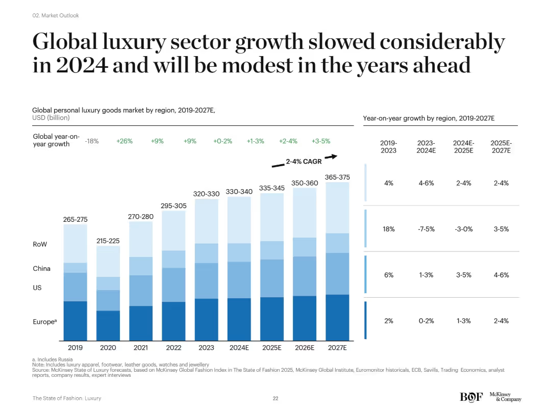
Bar graph showing personal luxury market size by region from 2019 to 2027E. Also includes YoY growth percentages and CAGR.
Market Analysis and Trends
Consumer Goods
This slide depicts a sharp slowdown in luxury market growth starting in 2024, after strong gains in previous years. It shows projected modest growth (2–4% CAGR) with regional breakdowns indicating especially weak recovery in China and stable growth in the US and Europe.
luxury slowdown, growth forecast, 2024 dip, CAGR, regional analysis, China, US, McKinsey
Mixed Chart
McKinsey
Saved
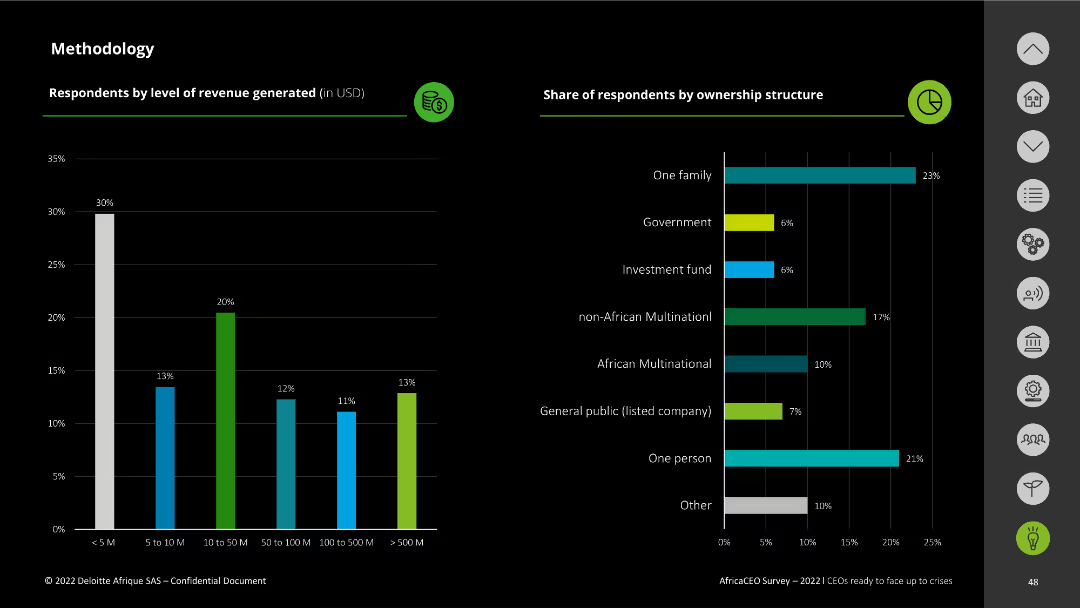
This slide includes bar charts showing respondents by revenue generated and ownership structure.
Strategic Planning
Professional Services
It categorizes survey respondents based on their revenue levels and ownership structures, providing insight into the diversity of the survey sample.
revenue, ownership structure, survey respondents, Africa CEO Survey, demographics
Multiple Chart
Deloitte
Saved
The slide contains a line chart comparing delinquency rates and two column charts showing industry versus Chase stats on card outstandings and auto originations. It also has bullet points with insights.
Risk Assessment and Management
Financial Services
This slide presents risk management data comparing Chase's credit profile and decision making with industry averages. It could be used to demonstrate financial stability and prudent risk management strategies.
Credit risk, Balance sheet, Capital, Liquidity, Portfolio
Multiple Chart
JP Morgan
Saved
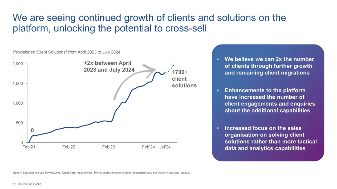
Line chart showing 2x growth in client solutions from Apr 2023 to Jul 2024 with bulleted insights.
Performance Metrics and KPIs
Financial Services
Depicts a sharp increase in provisioned client solutions to over 1700, doubling since April 2023. Accompanying text explains platform enhancements, client engagement growth, and cross-sell opportunities.
client growth, platform, Experian, KPIs, cross-sell, analytics, solutions, engagement
Mixed Chart
Barclays
Saved
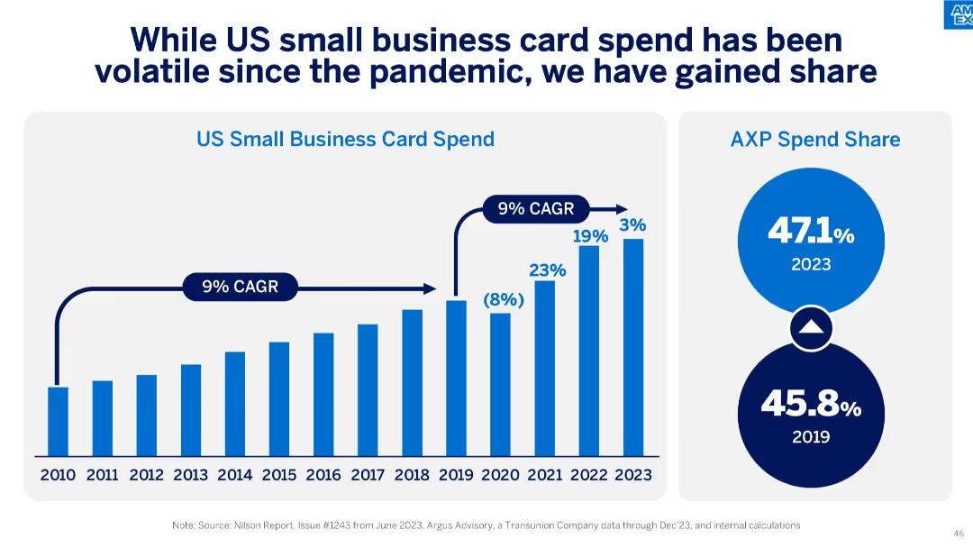
Left side features a vertical bar chart showing US small business card spend (2010–2023), while the right side includes two circular infographics showing AXP spend share for 2019 and 2023.
Financial Performance
Financial Services
The slide outlines the US small business card spending trend and highlights American Express’ increasing share, rising from 45.8% in 2019 to 47.1% in 2023, despite pandemic-related volatility.
CAGR, small business, card spend, AXP, market share, volatility, growth, pandemic impact, Nilson Report
Single Chart
McKinsey
Saved
A data-rich slide with multiple bar graphs representing regional economic impacts. The slide is text-heavy with key statistics highlighted.
Technology and Digital Transformation
Government & Public Sector
Focuses on the economic contribution of the Tempest programme to various UK regions, presenting data and graphs on regional impact and productivity.
Tempest, economic contribution, UK, regions, impact, productivity, data
Multiple Chart
PwC/Strategy&
Saved
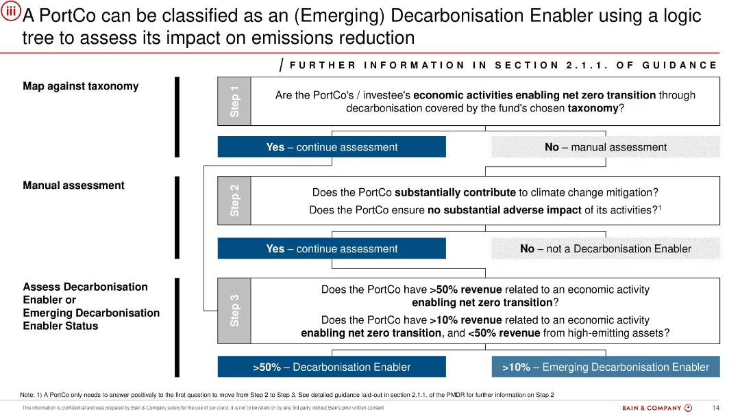
Vertical logic tree layout in grayscale and blue, progressing through 3 assessment steps. Boxes contain decision questions and flow to "Yes"/"No" outcomes. Blue highlights indicate enabling status.
Customer and Market Segmentation
Financial Services
Provides a decision framework to classify PortCos as Decarbonisation Enablers based on taxonomy alignment, climate contribution, and revenue thresholds. This structured logic is used to guide investment decisions or categorize assets according to their role in supporting the net-zero transition.
decarbonisation enabler, emissions, climate, taxonomy, classification, PortCo, investment criteria
Uncategorized
Bain
Saved
This slide has a central Goldman Sachs logo with surrounding text describing different roles such as "Investor," "Business," "Operator," "Issuer," and "Employer." The layout is organized with clear, readable segments.
Strategic Planning
Government & Public Sector
It explains the role of Goldman Sachs' Sustainable Finance Group in mobilizing expertise to address clients' ESG needs. The slide is pertinent for discussing strategic planning and commercial opportunities within sustainable finance, detailing how the firm engages with various stakeholders.
ESG, sustainable finance, Goldman Sachs, strategic planning, expertise
Framework
Goldman Sachs
Saved
Slide with a list layout, including bullet points and headers, detailing strategy points in a clear, readable format without additional visual elements.
Strategic Planning
Financial Services
JP Morgan's strategic focus areas such as customer engagement, digital tool scaling, expense management, and risk control are outlined on this slide. Intended for communicating to stakeholders how the company intends to grow and strengthen its market position.
Strategy, Customer Engagement, Digital Tools, Expense Management, Risk Control
Table
JP Morgan
Saved
The slide features two sections: "Automated Buying" on the left with an icon of a smart fridge and text, and "Interactive Shelves" on the right with a photo of a woman interacting with a screen. Both sections have trend assessment bars indicating "Prepare" and "Watch" with impact on industry and time of mainstream adoption.
Technology and Digital Transformation
Technology & Software
Describes the concepts of automated buying and interactive shelves in the context of AI and data era, highlighting how these technologies can improve shopping experiences and customer retention. The slide also includes trend assessments and industry impact projections.
AI, Data, Retail, Technology, Innovation
Multiple Chart
Deloitte
Saved
Previous
Next
If nothing, comes up, please save your slides first
Create a FREE account to continue browsing
Receive Instant Access to 1,000+ slides from companies like McKinsey, Google, and Goldman Sachs
First Name
Last Name
Email
Password
I agree to all
Terms & Privacy Policy
Thank you! Your submission has been received!
Oops! Something went wrong while submitting the form.
Have an account?
Sign in
Column Chart
Heatmap
Chevron
Org Chart
Infographic
Callouts
Timeline
List
Graphic
Picture
Process Flow
Diagram
Paragraph
Map
Table
Framework
Subtitle
Takeaway Box
Icon
Other Chart
Radar Chart
Waterfall Chart
Mekko Chart
Pie Chart
Scatter Plot
Line Chart
Bar chart
Bullet points