Create a FREE Account
Instant access to 1,000+ real slides from top companies like McKinsey, BCG, Goldman Sachs, Google and many more!
First Name
Last Name
Email
Password
I agree to all
Terms & Privacy Policy
Thank you! Your submission has been received!
Oops! Something went wrong while submitting the form.
Have an account?
Sign in
Library
Templates
Courses
Pricing
My Account
My Slides
My Templates
✦ AI
AI Prompt Library
AI Search
Sign in
Start Here
Logout
My Saved Slides
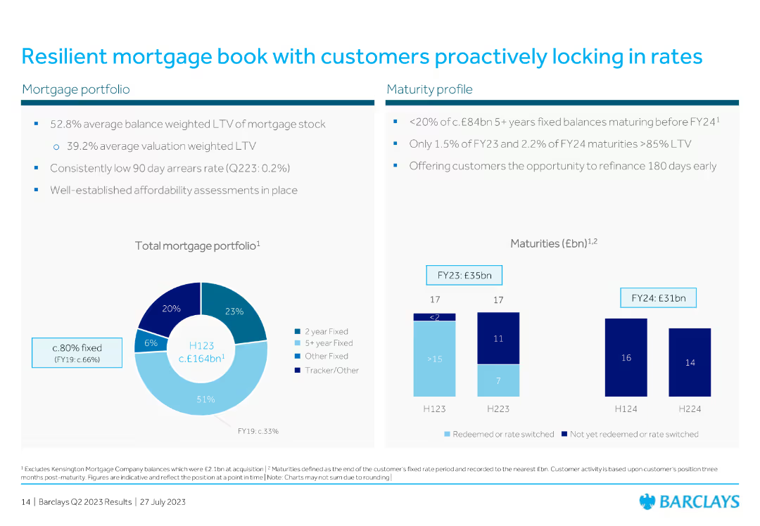
The slide includes a pie chart for mortgage portfolio composition and a column chart for maturity profiles over different periods.
Risk Assessment and Management
Financial Services
The slide discusses the resilience of the mortgage book, with data on average loan-to-value ratios and maturity profiles, emphasizing customer behavior in locking rates.
mortgage, portfolio, resilience, customer, rates, LTV, maturity, financial, pie chart, column chart
Multiple Chart
Barclays
Saved
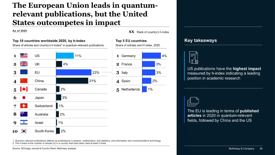
Dual-bar chart layout; left shows top 10 countries by h-index and share of articles, right shows top 5 EU countries; sidebar with icons and takeaways.
Industry Overview
Artificial Intelligence
The slide compares the global output of quantum-relevant academic publications. While the EU leads in publication volume, the US leads in impact, as measured by h-index. Key takeaways highlight regional strengths in both volume and quality.
quantum, h-index, publications, EU, US, research, impact, China, McKinsey, ranking
Mixed Chart
McKinsey
Saved
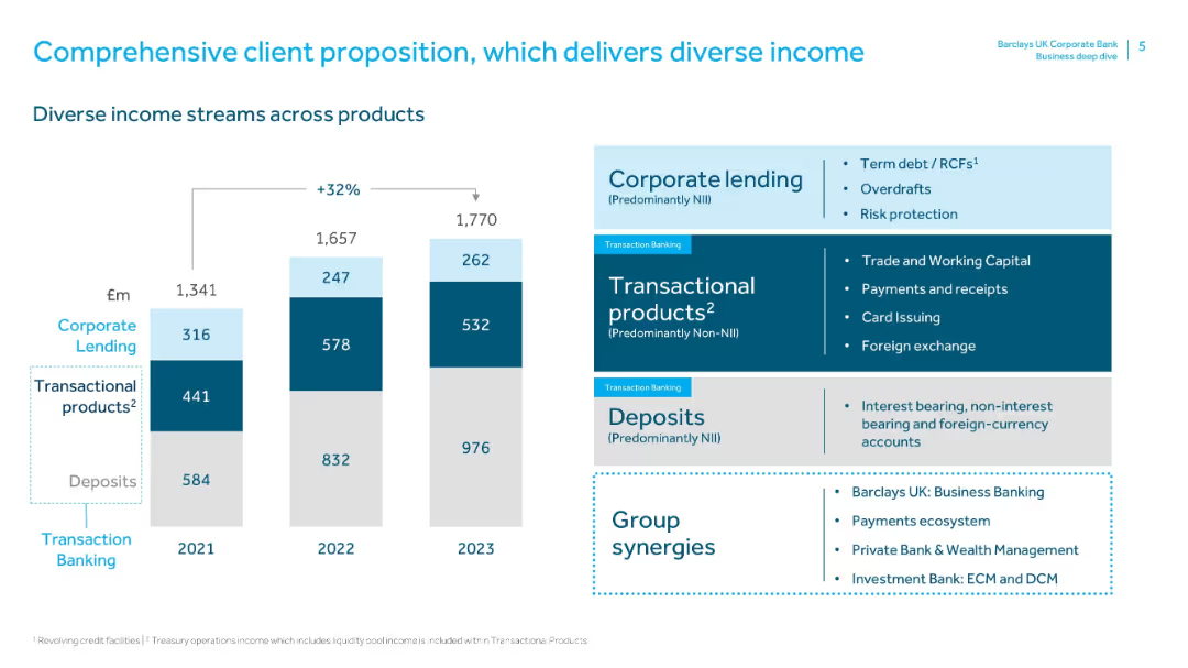
Left side features a vertical stacked bar chart (2021–2023) with segments for Deposits, Transactional Products, and Corporate Lending. Right side includes color-coded text boxes with descriptions of each segment. Clean, corporate layout with blue color palette.
Product and Service Analysis
Financial Services
This slide shows how Barclays UK Corporate Bank generates income from diverse products—Deposits, Transactional Products, and Corporate Lending—with a 32% growth in total income from 2021 to 2023. It outlines product characteristics and synergies from other Barclays divisions.
deposits, transactional products, corporate lending, income growth, group synergies, NII, non-NII, diversification, product analysis, revenue streams
Mixed Chart
Barclays
Saved
The slide contains two column charts illustrating the increase in levelized cost of energy production for coal and natural gas power plants with various CO2 capture rates.
Market Analysis and Trends
Energy & Utilities
The slide details how applying CCUS to power plants increases the levelized cost of production, with moderate impacts from higher capture rates. The left chart shows cost increases for coal, and the right for natural gas, highlighting the additional cost burden at different capture rates.
CCUS, power plants, production cost, CO2
Multiple Chart
Kearney
Saved
The slide features a line graph plotting the fleet-wide time charter rate against the breakeven rate prior to debt service over the last two decades, marked by quarters.
Financial Performance
Transportation & Logistics
It shows the historical financial performance of fleet-wide charter rates versus breakeven costs, highlighting financial sustainability over time.
charter rates, breakeven, financial performance, transportation, sustainability
Single Chart
Deutsche Bank
Saved
Provides detailed statistics and icons for specific luxury market trends, highlighting the impact of collaborations and environmental considerations among consumers.
Market Analysis and Trends
Retail & E-commerce
Delivers an in-depth analysis of prevailing trends in the luxury market, with a focus on the growing importance of sustainability and collaborative business models.
luxury market, detailed trends, collaborations, sustainability, consumer behavior, statistical analysis
Table
BCG
Saved
Shows a column chart for online media GMV with a detailed breakdown of sub-sectors like video, gaming, and music.
Market Analysis and Trends
Media & Entertainment
The slide presents a comprehensive look at the online media industry, indicating strong growth amidst changing consumption patterns due to the pandemic. It can inform media companies' strategic planning, especially in areas like video streaming and gaming.
Online Media, GMV, Growth, Trends
Mixed Chart
Bain
Saved
Three-column layout with text describing capabilities and services, ecosystem partnerships, and value to stakeholders, accompanied by relevant icons and minimal visual elements.
Technology and Digital Transformation
Technology & Software
The slide explains how cloud and ecosystem partnerships accelerate time-to-market and deliver transformation, highlighting capabilities, partnerships, and value to stakeholders.
cloud, partnerships, transformation, capabilities, services
Pillar
Credit Suisse
Saved
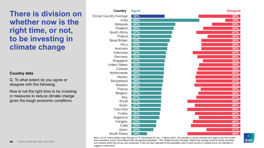
Layout includes left-aligned text and a country-based agreement/disagreement bar chart. Shows mixed levels of agreement across regions.
Investment Analysis
Environmental Services & Sustainability
This slide addresses timing concerns over investing in climate action during economic uncertainty. Opinions are divided, indicating that while some countries like India support immediate investment, others remain hesitant, revealing a tension between urgency and economic pressure.
climate investment, economic conditions, timing debate, public opinion, Ipsos, climate strategy
Mixed Chart
IPSOS
Saved
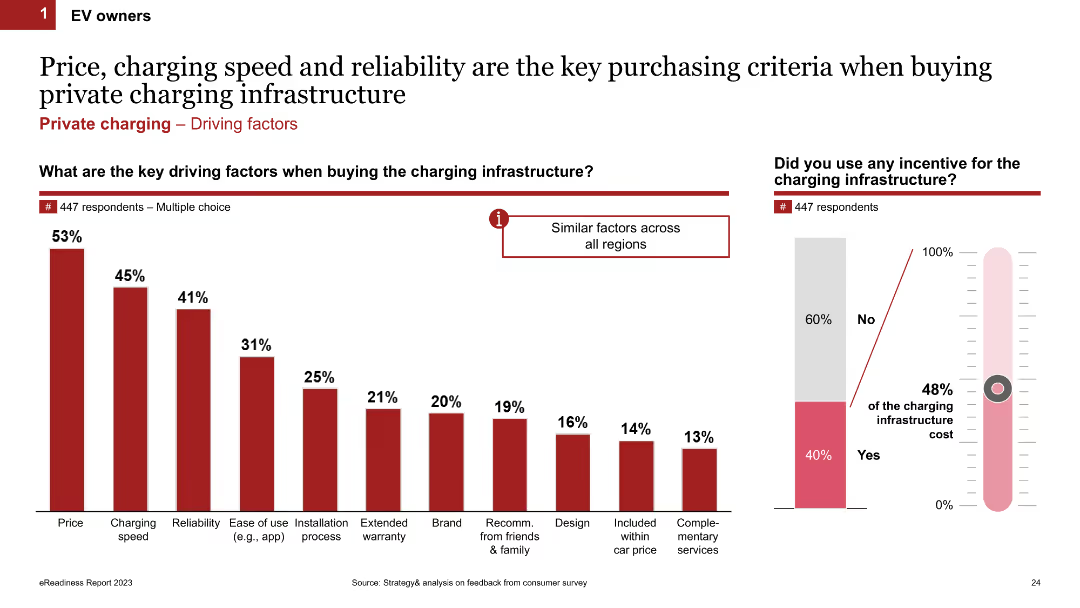
Column chart showing the key driving factors when buying charging infrastructure. It lists factors like price, charging speed, reliability, and ease of use. The slide includes multiple charts, such as a thermometer chart showing incentives used.
Market Analysis and Trends
Transportation & Logistics
This slide outlines the main factors influencing the purchase of charging infrastructure for EV owners. It highlights price, charging speed, reliability, and other factors like ease of use and installation process.
charging infrastructure, purchase criteria, key factors, incentives, EV owners
Multiple Chart
PwC/Strategy&
Saved
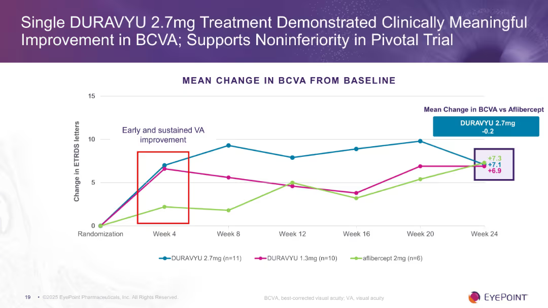
Line chart showing mean change in BCVA over 24 weeks for 3 treatment groups. Purple-themed background with EyePoint branding and annotated data points.
Product and Service Analysis
Healthcare & Pharmaceuticals
Demonstrates visual acuity improvements in patients treated with DURAVYU 2.7mg compared to lower dosage and aflibercept. Results show early and sustained benefits with similar performance to aflibercept.
DURAVYU, BCVA, visual acuity, clinical trial, ophthalmology, EyePoint
Single Chart
Goldman Sachs
Saved
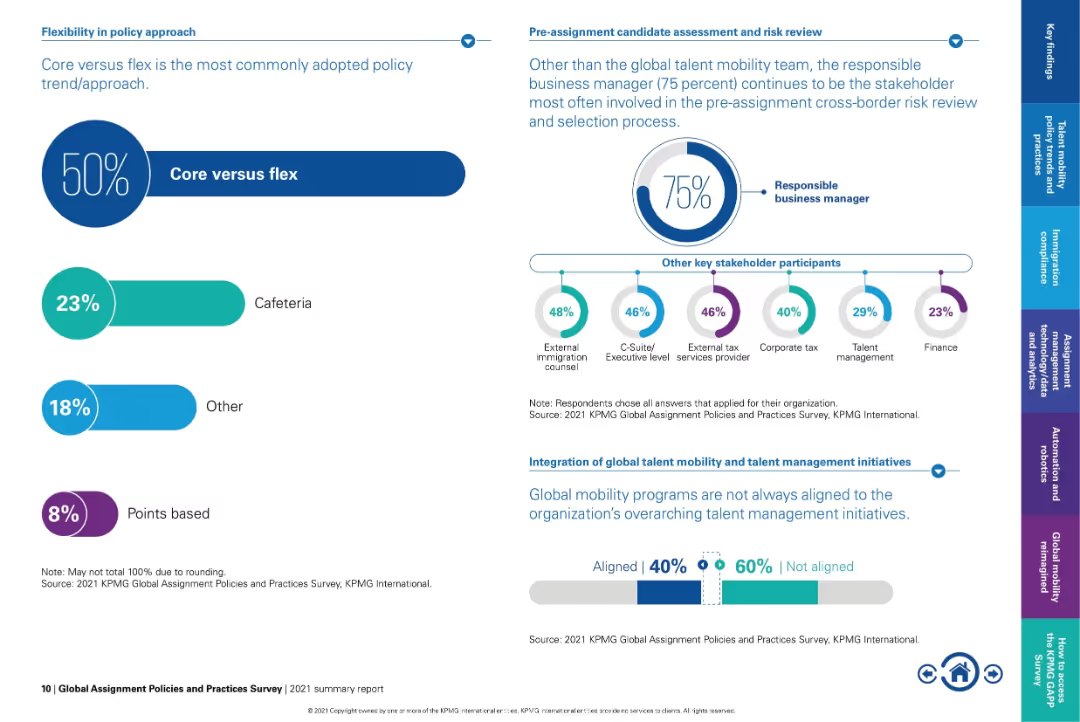
Dual-panel layout: left side uses percentage bars, right side uses circular infographic and icon chart.
Organizational Structure and Change
Professional Services
Highlights the growing preference for the "core versus flex" approach in mobility policy, with 50% of organizations adopting it. Also shows stakeholder involvement in risk review and notes the lack of integration between mobility and talent management initiatives.
core vs flex, stakeholder roles, mobility policy, risk review, talent alignment, global mobility strategy, executive involvement
Multiple Chart
KPMG
Saved
The slide has a blue and white color scheme with three comparative shift pattern diagrams for a manufacturing setting. It utilizes arrow graphics to indicate shift durations across different days of the week, with corresponding textual explanations in separate columns for description, pros, and cons.
Operational Efficiency
Industrial & Manufacturing
This slide compares current shift patterns in manufacturing with three proposed options to enhance on-site employee safety by reducing exposure. Each option is accompanied by a brief description, pros, and cons, outlining the implications of implementation. It is used for decision-making in operational management.
manufacturing, safety, shift patterns, exposure reduction, operational management, employee well-being
Header Horizontal
McKinsey
Saved
A bar chart comparing the absolute weightings of different sectors for the Sustainable Emerging Markets Equity Representative Account against the MSCI EM Index.
Strategic Planning
Financial Services
This slide shows the sector allocation for the Sustainable Emerging Markets Equity Representative Account, comparing it with the MSCI EM Index.
Sector Allocation, Sustainable, Emerging Markets, Equity, Financial, Planning, Investment, Weightings, Comparison, MSCI
Mixed Chart
Morgan Stanley
Saved
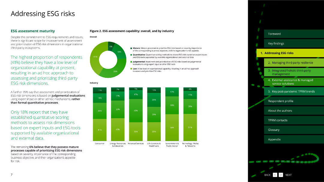
The slide includes column charts displaying ESG dimensions managed by respondents.
Risk Assessment and Management
Environmental Services & Sustainability
This slide highlights the quality of data used for managing and reporting ESG risks across various industries.
ESG, data quality, reporting, dimensions, industries
Multiple Chart
Deloitte
Saved
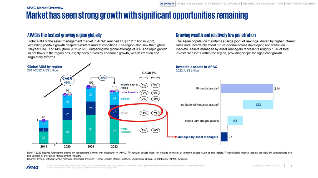
Dual-section layout with bar charts and data callouts. Emphasis on APAC growth and low penetration.
Market Analysis and Trends
Financial Services
Emphasizes the rapid growth of asset management in APAC, noting a high CAGR and wealth accumulation. Includes AUM data by region and shows untapped opportunities due to low penetration by asset managers.
APAC, AUM, market growth, asset managers, penetration, CAGR
Multiple Chart
KPMG
Saved
This slide shows a line chart depicting the maturity curve of CO₂ utilization technologies. It includes various stages and labeled points for different utilization methods.
Technology and Digital Transformation
Energy & Utilities
It details the maturity stages of CO₂ utilization technologies, from lab work to mature technology, highlighting methods like synthetic methane, methanol, saline formation, and enhanced coal bed methane.
CO₂ utilization, maturity curve, synthetic methane, methanol, saline formation, coal bed methane, energy, utilities
Single Chart
Kearney
Saved
This slide is divided into two halves with large icons—a human figure and a monitor. There are percentages next to each visual, with a clear title above and a background that provides contrast for readability.
Market Analysis and Trends
Financial Services
This slide reflects the consensus between employees and HR leaders on the negative impact of financial stress on workplace performance, suggesting a focus on well-being in HR policies. It's likely to be used for presentations discussing the intersection of personal finance and workplace efficiency.
financial stress, productivity, HR leaders, employees, workplace
Boxed
Goldman Sachs
Saved
Text and stacked column charts detailing fee preferences among different age groups of investors
Technology and Digital Transformation
Financial Services
Discusses fee preferences among young and older investors, focusing on performance-based fees and the shift in pricing structures.
investor fees, performance-based, age differences, financial services
Mixed Chart
Deloitte
Saved
A bar chart comparing the relative streaming minutes versus Netflix for various platforms in Q4 2021. Platforms are listed on the x-axis with percentages representing their relative minutes viewed compared to Netflix, which is set at 100%.
Market Analysis and Trends
Media & Entertainment
This slide compares the relative streaming minutes of different platforms to Netflix in Q4 2021, indicating Netflix's dominance and the performance of other services like YouTube, Hulu, Amazon, Disney Plus, and others.
streaming minutes, platform comparison, Netflix, Q4 2021, Nielsen gauge
Single Chart
Nielsen
Saved
Introductory slide detailing the purpose and methodology of the compendium.
Industry Overview
Professional Services
Explains the scope and intent of the Roland Berger Trend Compendium 2030.
trend analysis, methodology, strategic planning, global trends, 2030
Table
Roland Berger
Saved
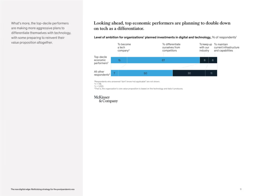
Clean layout with bar chart on the right and narrative paragraph on the left. Categories show ambition levels for tech investment.
Strategic Planning
Technology & Software
This slide reveals that top-performing companies are more likely to pursue aggressive technology strategies. The majority aim to differentiate themselves with tech or even become tech companies, unlike others who prioritize infrastructure maintenance.
digital strategy, tech differentiation, future investment, ambition, business transformation, technology leaders, innovation, McKinsey
Mixed Chart
McKinsey
Saved
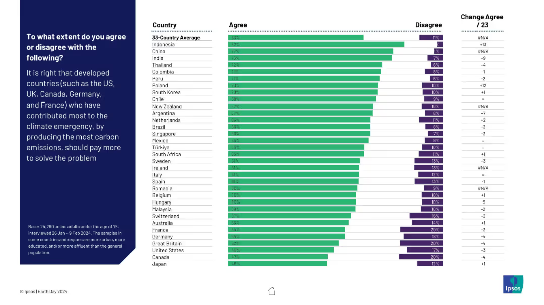
Horizontal bar chart showing agreement/disagreement by country on whether developed countries should pay more due to higher carbon contributions. Change from 2023 is noted.
Regulatory and Compliance
Environmental Services & Sustainability
This slide reflects opinions on climate justice—whether developed nations should pay more for their historic carbon emissions. Strong support is evident in Indonesia, China, and India. The data shows a global push for equitable climate responsibility distribution.
climate justice, carbon emissions, responsibility, financial contribution, global fairness, sustainability, Ipsos, Earth Day
Mixed Chart
IPSOS
Saved
Slide contains multiple data visualizations: a line chart comparing GDP growth of Iceland with EU, UK, and US from 2009-2021; a column chart showing tourist arrivals in millions from 2009-2021; a stacked area chart illustrating the share in total exports of goods; and a line chart depicting population growth. Colors and labels are clearly used to denote different data sets.
Market Analysis and Trends
Financial Services
This slide presents a comprehensive overview of Iceland's economic recovery post-financial crisis, highlighting major growth sectors like tourism and new industries such as IP sector, pharma, and fish farming. It visually compares Iceland's GDP growth with major economies and details the changes in tourism, population, and export composition.
Iceland, economy, GDP, tourism, exports, population growth, recovery
Multiple Chart
Deutsche Bank
Saved
The slide features a column chart displaying satisfaction levels (percentage very/somewhat satisfied) with various technologies like identity solutions, DCRs, CMPs, etc.
Technology and Digital Transformation
Technology & Software
The slide compares user satisfaction across different privacy-preserving technologies, indicating that satisfaction with DCRs is comparable to more established solutions.
satisfaction, DCRs, privacy technologies, comparison
Mixed Chart
IPSOS
Saved
Previous
Next
If nothing, comes up, please save your slides first
Create a FREE account to continue browsing
Receive Instant Access to 1,000+ slides from companies like McKinsey, Google, and Goldman Sachs
First Name
Last Name
Email
Password
I agree to all
Terms & Privacy Policy
Thank you! Your submission has been received!
Oops! Something went wrong while submitting the form.
Have an account?
Sign in
Column Chart
Heatmap
Chevron
Org Chart
Infographic
Callouts
Timeline
List
Graphic
Picture
Process Flow
Diagram
Paragraph
Map
Table
Framework
Subtitle
Takeaway Box
Icon
Other Chart
Radar Chart
Waterfall Chart
Mekko Chart
Pie Chart
Scatter Plot
Line Chart
Bar chart
Bullet points