Create a FREE Account
Instant access to 1,000+ real slides from top companies like McKinsey, BCG, Goldman Sachs, Google and many more!
First Name
Last Name
Email
Password
I agree to all
Terms & Privacy Policy
Thank you! Your submission has been received!
Oops! Something went wrong while submitting the form.
Have an account?
Sign in
Library
Templates
Courses
Pricing
My Account
My Slides
My Templates
✦ AI
AI Prompt Library
AI Search
Sign in
Start Here
Logout
My Saved Slides
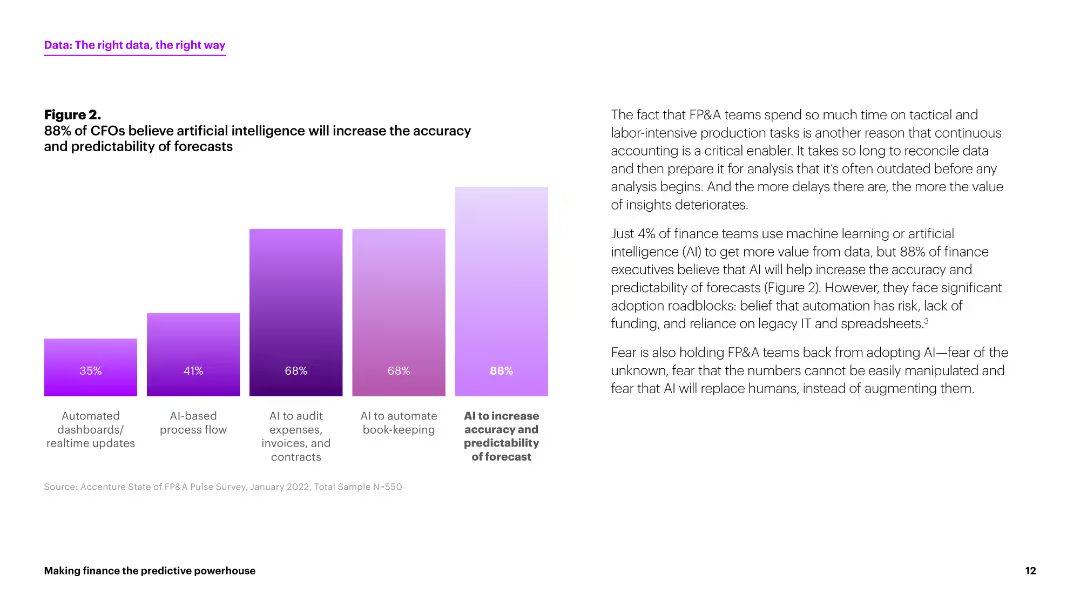
This slide features a column chart displaying the percentages of CFOs who believe AI will increase the accuracy and predictability of forecasts. The chart is presented in various shades of purple. The layout includes a paragraph of text explaining the implications of the chart.
Strategic Planning
Financial Services
The slide indicates that 88% of CFOs believe AI will improve forecast accuracy and predictability. It highlights the adoption roadblocks for AI in finance, such as risk and reliance on legacy systems.
AI, forecasts, CFOs, predictability, accuracy
Mixed Chart
Accenture
Saved
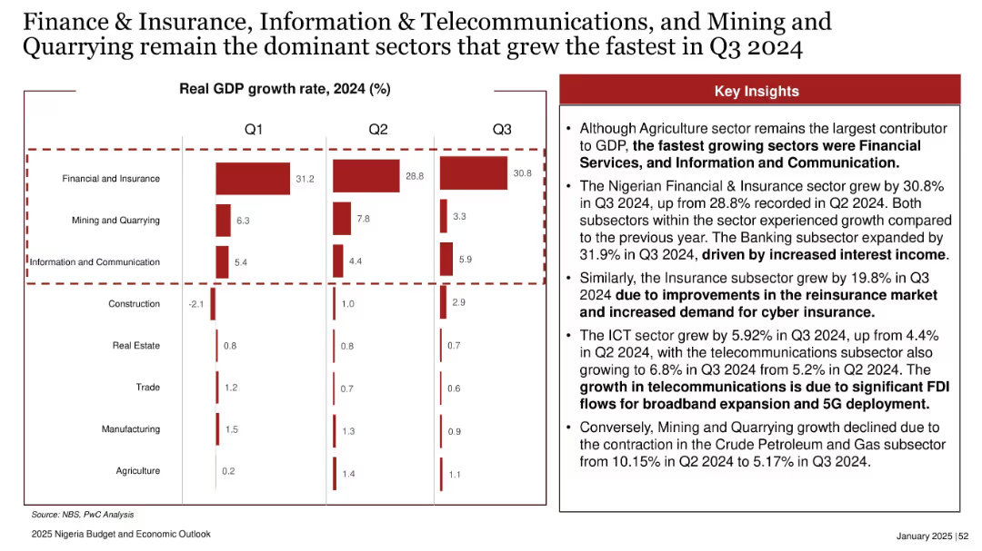
Bar charts per sector for Q1–Q3 2024 with detailed key insights at right. Dotted border highlights focus sectors.
Industry Overview
Financial Services
This slide analyzes quarterly GDP growth rates in 2024, highlighting the top-performing sectors: Finance & Insurance, ICT, and Mining. Key growth drivers include higher interest income and foreign investment in telecoms.
GDP growth, Q3 2024, finance, insurance, ICT, mining, sectoral analysis, Nigeria economy
Mixed Chart
PwC/Strategy&
Saved
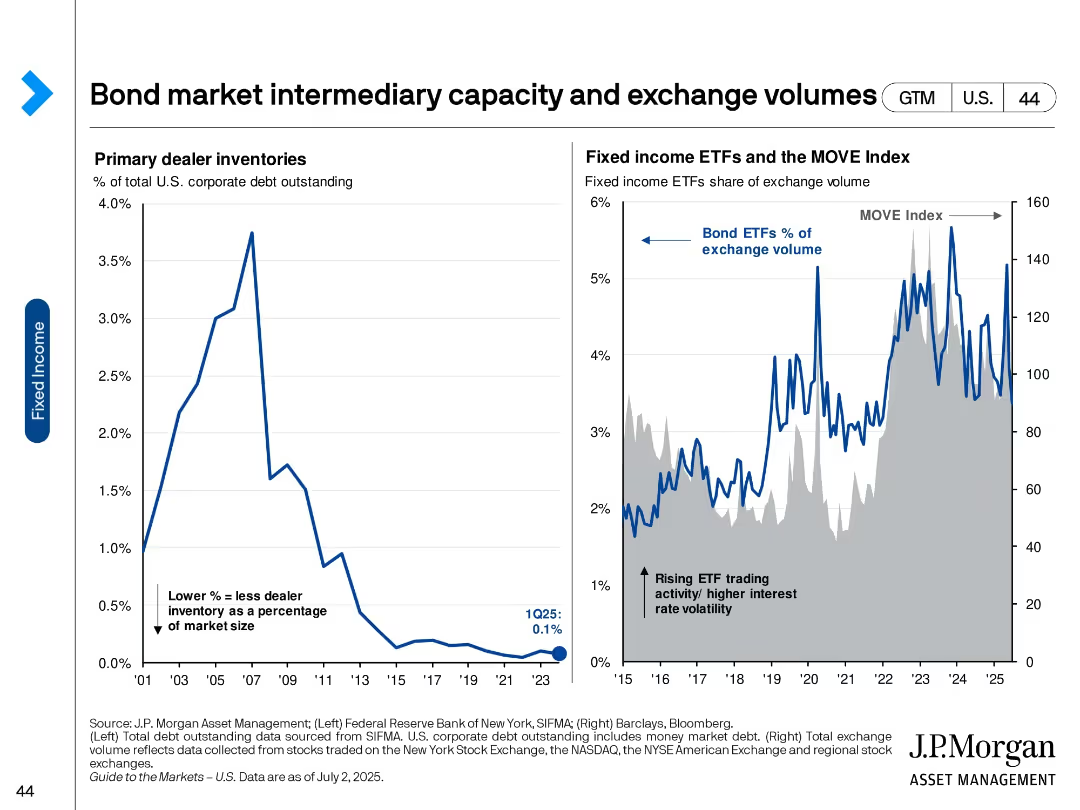
Two-panel slide with line charts on dealer inventories and bond ETF trading volume.
Market Analysis and Trends
Financial Services
Examines the decline in primary dealer bond inventories and the rise of ETF trading in fixed income markets. Suggests a shift in market structure and increased volatility as ETFs become more prominent trading vehicles.
Bond ETFs, market liquidity, dealer inventory, trading volume, volatility, MOVE index, fixed income, market structure
Multiple Chart
JP Morgan
Saved
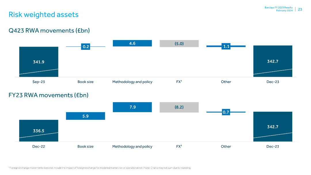
Includes column charts showing Q423 and FY23 RWA movements with detailed breakdowns for book size, methodology, policy, FX, and other factors.
Risk Assessment and Management
Financial Services
Analyzes risk-weighted asset movements for Q423 and FY23, detailing changes due to book size, policy, and other financial elements.
RWA, Q423, FY23, risk assessment, book size, methodology, policy changes, FX impact, financial movements, data presentation
Multiple Chart
Barclays
Saved
The slide features a circular diagram labeled "Goldman Sachs FINANCIAL CLOUD" with circular arrows linking concepts like "Drive scale advantages" and "Internal developers access the same APIs as clients", along with explanatory text.
Operational Efficiency
Financial Services
This slide illustrates the strategy of Goldman Sachs to create value by leveraging technology platforms and APIs to drive scale advantages and provide uniform services to both internal developers and clients, thereby optimizing operations and revenue.
value, technology, platform, APIs, efficiency
Linear Flow
Goldman Sachs
Saved
Features a bar graph showing the confidence levels of businesses in managing major risks identified since 2012, across categories like financial, operational, and disruptive technology risks.
Risk Assessment and Management
Financial Services
Evaluates businesses' confidence in their risk management capabilities, highlighting areas where confidence is low and the need for improved risk strategies is high. Useful for risk management training and development.
risk management confidence, business strategies, operational risks, technology risks
Mixed Chart
Accenture
Saved
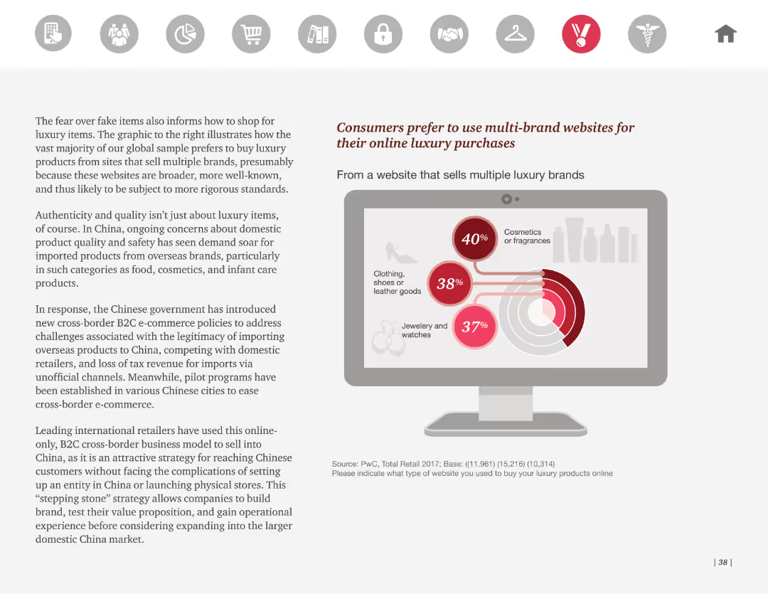
This slide includes a pie chart illustrating consumer preferences for buying luxury items from multi-brand websites. It features a prominent graphic of a laptop screen showing the product categories.
Market Analysis and Trends
Retail & E-commerce
The slide reveals that consumers prefer multi-brand websites for luxury purchases due to broader product ranges and perceived reliability. It discusses the Chinese market's growing demand for imported luxury goods and related B2C e-commerce policies.
Luxury goods, multi-brand websites, online shopping, consumer preferences, e-commerce
Mixed Chart
PwC/Strategy&
Saved
The slide has two line charts. The first chart shows Tier 1 risk-based capital ratios by bank asset size from 1996 to 2023. The second chart depicts primary market sources of financing for broadly syndicated loans from 1999 to 2022.
Market Analysis and Trends
Financial Services
This slide provides an analysis of U.S. bank capital ratios and the sources of financing for syndicated loans, giving insights into the stability and funding sources in the credit market.
banks, credit market, capital ratios, syndicated loans, U.S. market
Multiple Chart
JP Morgan
Saved
This slide presents a simple, three-part horizontal comparison layout, using arrows to indicate reductions and green bars to visualize savings for clients in different financial areas.
Financial Performance
Financial Services
The slide demonstrates JPMorgan’s efforts in reducing various fees and commissions, quantifying the annual savings for clients, intended to showcase cost efficiency.
cost reduction, client savings, JPMorgan, fees, commissions, percentage decrease, financial services
Multiple Chart
JP Morgan
Saved
Presents detailed radial diagrams mapping the usage of communication channels across different industries and regions. Utilizes a clear, structured layout with varied icons and color coding to represent each channel and industry distinctly.
Technology and Digital Transformation
Telecommunications
Provides a comprehensive overview of how various communication channels are utilized across industries and regions, highlighting trends in customer interaction preferences. Essential for businesses in technology and professional services aiming to optimize their communication strategies.
communication channels, industry analysis, regional trends, technology, customer interaction
Multiple Chart
Deloitte
Saved
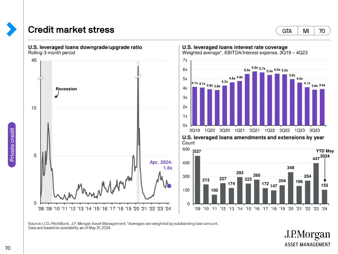
This slide features a line chart, a column chart, and a bar chart. The line chart shows the U.S. leveraged loans downgrade/upgrade ratio, the column chart displays U.S. leveraged loans interest rate coverage, and the bar chart indicates U.S. leveraged loans amendments and extensions by year.
Risk Assessment and Management
Financial Services
The slide discusses the stress in the credit market, focusing on U.S. leveraged loans. It provides insights into the downgrade/upgrade ratio, interest rate coverage, and amendment trends.
credit market, leveraged loans, downgrade, interest rate, amendments
Multiple Chart
JP Morgan
Saved
Features a bar chart and explanatory text sections divided by headers. The chart and text provide analysis on key performance indicators for tax functions.
Performance Metrics and KPIs
Financial Services
Examines key performance indicators crucial for tax functions in the financial services industry, discussing misalignments in priorities and the need for strategic alignment of tax KPIs with overall business objectives.
tax, KPIs, performance, financial services, bar chart, alignment
Mixed Chart
PwC/Strategy&
Saved
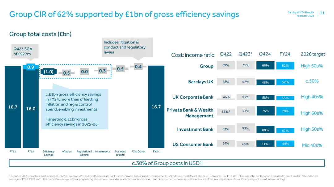
Bar charts and ratio tables; cost-income ratios shown per division; stacked bars and step-down cost waterfall with annotation overlays
Operational Efficiency
Financial Services
Provides an overview of Barclays Group’s cost-income ratio improvements due to efficiency savings. Breaks down total costs and efficiency drivers while detailing CIR targets for FY26 across divisions.
cost-income ratio, CIR, efficiency savings, Barclays, FY24, cost breakdown, targets, divisional performance
Multiple Chart
Barclays
Saved
This slide features a bar chart with factors such as political, technology, and financing influencing the criticality of raw materials.
Regulatory and Compliance
Industrial & Manufacturing
The slide visually breaks down various factors that determine the criticality of raw materials in industries, focusing on political, technological, and financial aspects.
raw materials, criticality, factors, diagram, political, technology, financing
Multiple Chart
McKinsey
Saved
Column chart comparing GDP growth vs. Net Income growth across different regions (Developed Economies, United States, etc.), bars in red and grey, descriptive annotations.
Financial Performance
Financial Services
This slide compares GDP growth with net income growth across various regions, illustrating a golden age of corporate profitability. Useful for economic insights and financial trend analysis.
GDP growth, net income, corporate profitability, economic analysis, financial trends, regions, comparison
Single Chart
Bain
Saved
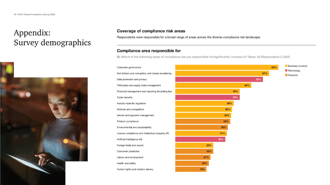
Clean design with a demographic chart showing responsibility across compliance areas.
Industry Overview
Professional Services
Final appendix slide showing the range of compliance areas respondents are responsible for. Corporate governance, anti-bribery, and data privacy top the list. Categorized into business conduct, tech, and product areas. Demonstrates the breadth of responsibilities handled by compliance professionals today.
survey demographics, compliance areas, governance, data privacy, AI
Mixed Chart
PwC/Strategy&
Saved
A line graph and a stacked column chart dominate the slide. It also features numerical annotations and a color-coded key for clarity.
Financial Performance
Financial Services
The slide demonstrates year-over-year loan and deposit growth, and the quarterly average of interest-earning assets, essential for financial growth discussions.
deposit growth, loan growth, assets, optimization
Multiple Chart
JP Morgan
Saved
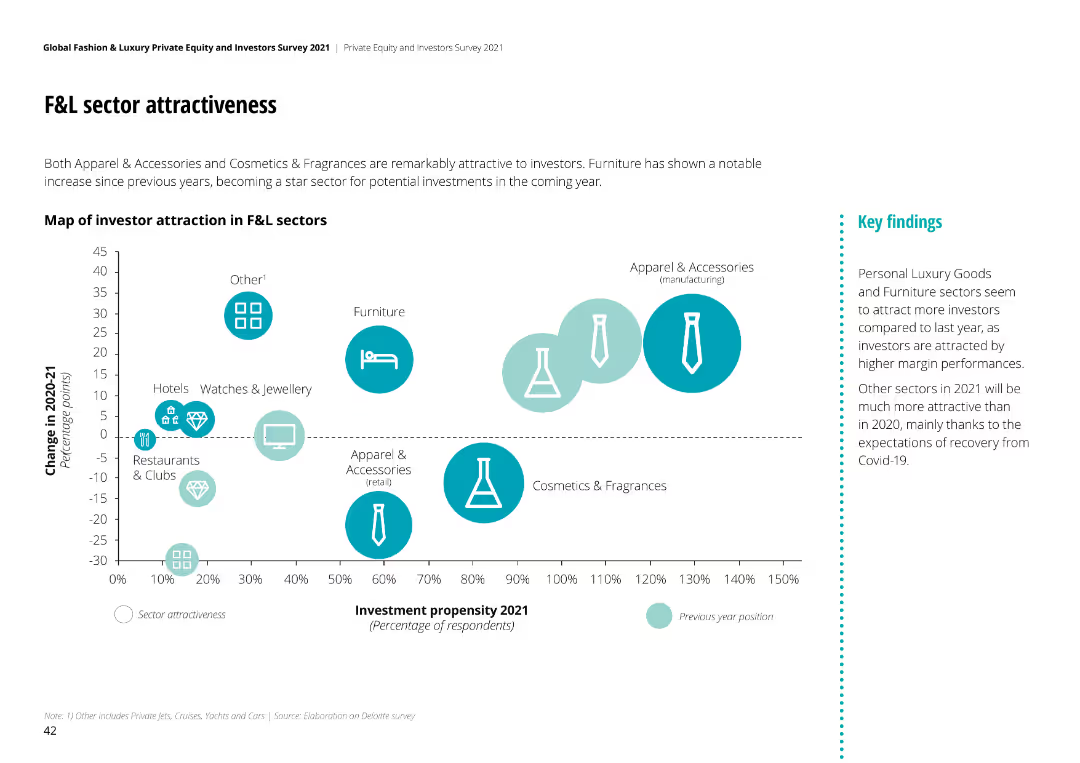
Bubble chart mapping investor attraction in F&L sectors, showing change in attractiveness from 2020-21. Sectors like Apparel & Accessories and Furniture highlighted.
Competitive Landscape
Financial Services
Apparel & Accessories and Cosmetics & Fragrances are highly attractive to investors. Furniture has shown notable increase in investment propensity for 2021.
sector attractiveness, F&L sectors, investor perspective, investment propensity, market trends
Mixed Chart
Deloitte
Saved
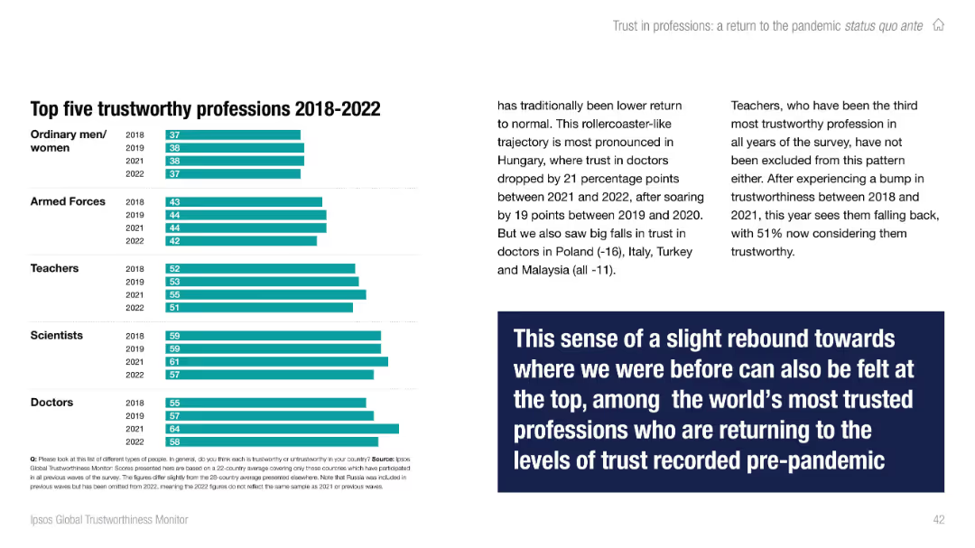
Right side contains multi-year bar chart; left has contextual text with a bold quote box. Color-coded by year.
Performance Metrics and KPIs
Professional Services
Highlights the top five most trusted professions from 2018 to 2022: doctors, scientists, teachers, armed forces, and ordinary people. Notes recent dips in trust for teachers and doctors in specific countries but overall consistency near the top of the trust scale.
professions, trust, Ipsos, top trusted, trends, teachers, doctors, global
Mixed Chart
IPSOS
Saved
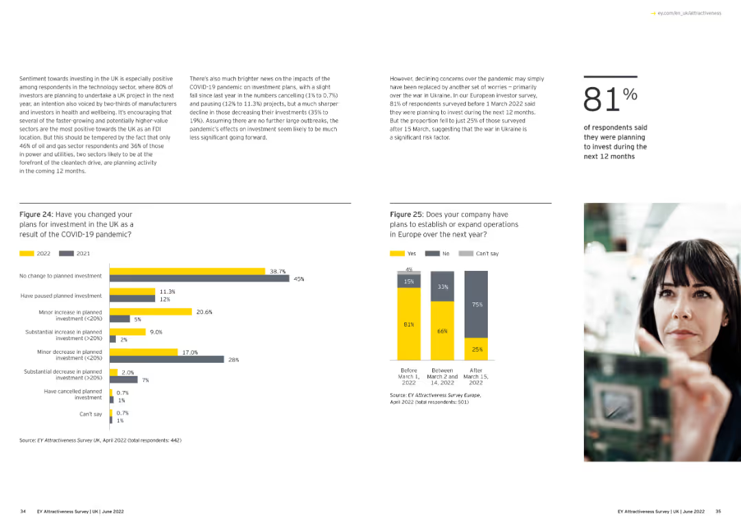
Features a bar chart comparing the regional and devolved administration destinations of UK projects in 2020 and 2021.
Market Analysis and Trends
Financial Services
This slide presents data on the distribution of UK investment projects across various regions and devolved administrations, showing year-on-year changes.
UK projects, regions, devolved administration, 2020-21
Multiple Chart
EY
Saved
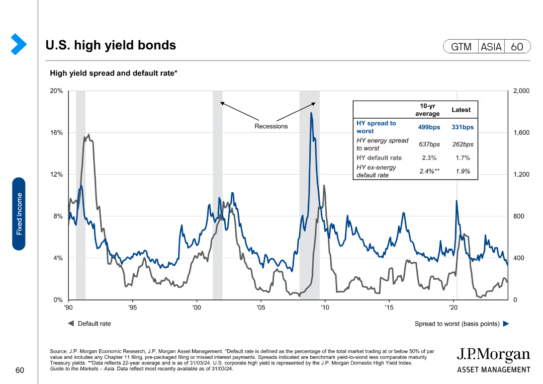
This slide shows a line chart with multiple series representing high yield bond spreads, default rates, and energy sector spreads.
Financial Performance
Financial Services
The slide discusses high yield bond spreads and default rates, comparing energy and non-energy sectors and historical performance during recessions.
high yield bonds, default rates, energy sector, financial trends, bond spreads
Single Chart
JP Morgan
Saved
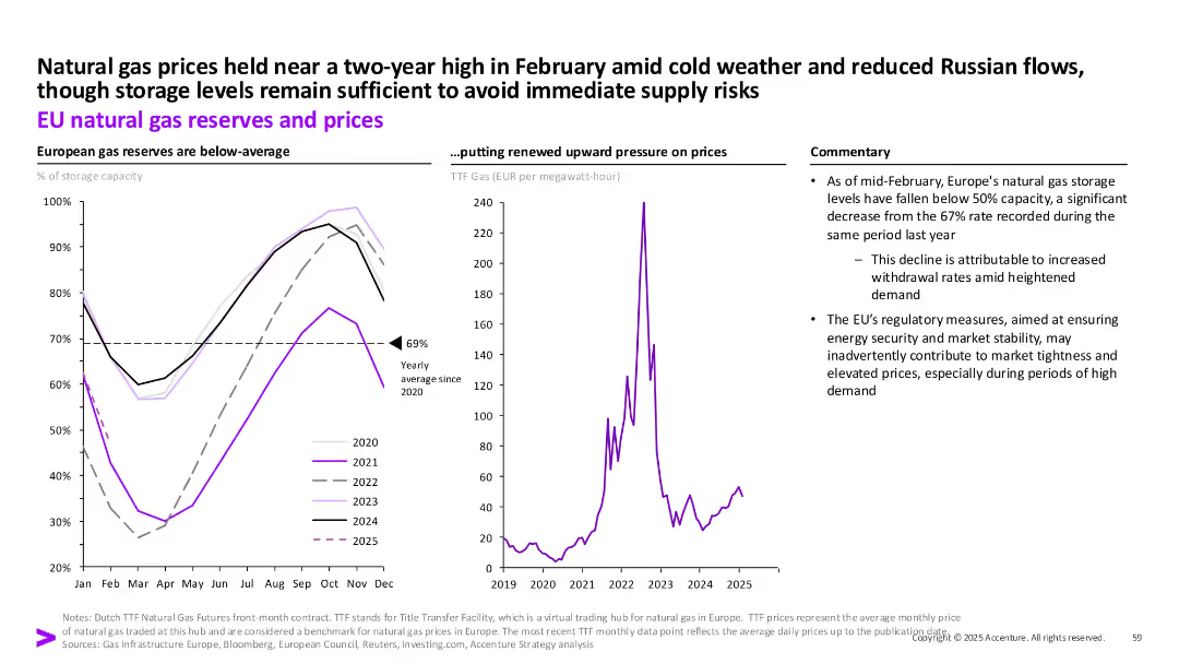
Dual chart layout: reserves by year (left), gas prices (right), plus commentary box on the side.
Risk Assessment and Management
Energy & Utilities
The slide provides an overview of declining EU gas reserves as of early 2025 and how this correlates with higher prices, especially amid colder weather and reduced Russian flows. Regulatory impact is also addressed.
Natural gas, EU, storage, TTF prices, energy security, regulation, Russia, demand
Multiple Chart
Accenture
Saved
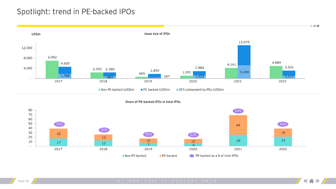
The slide features two charts. The top chart is a column chart showing the issue size of IPOs over several years. The bottom chart shows the share of PE-backed IPOs in total IPOs.
Market Analysis and Trends
Financial Services
This slide highlights trends in PE-backed IPOs, showing issue sizes and shares of total IPOs over multiple years.
PE, IPO, trends, issue size, share, financial services
Multiple Chart
EY
Saved
Features column charts, with icons and data points detailing job creation and income boost figures. Emphasizes savings through color contrasts and visual hierarchy in design.
Market Analysis and Trends
Telecommunications
Details how the nbn network has facilitated job creation, increased incomes through remote work, and provided cost savings by enabling cheaper online alternatives to traditional services.
nbn, Jobs, Savings, Remote Work, Business Creation
Multiple Chart
Accenture
Saved
Two horizontal bar charts comparing parents with/without school-age children; clean two-column layout with side panel explanation.
Performance Metrics and KPIs
Education & Training
This slide compares perceptions of school safety and inclusiveness between parents of school children and others. Parents with children in school report more favorable views on both measures.
school safety, diversity, parent opinions, comparison, education metrics, Ipsos, survey insights
Mixed Chart
IPSOS
Saved
Previous
Next
If nothing, comes up, please save your slides first
Create a FREE account to continue browsing
Receive Instant Access to 1,000+ slides from companies like McKinsey, Google, and Goldman Sachs
First Name
Last Name
Email
Password
I agree to all
Terms & Privacy Policy
Thank you! Your submission has been received!
Oops! Something went wrong while submitting the form.
Have an account?
Sign in
Column Chart
Heatmap
Chevron
Org Chart
Infographic
Callouts
Timeline
List
Graphic
Picture
Process Flow
Diagram
Paragraph
Map
Table
Framework
Subtitle
Takeaway Box
Icon
Other Chart
Radar Chart
Waterfall Chart
Mekko Chart
Pie Chart
Scatter Plot
Line Chart
Bar chart
Bullet points