Create a FREE Account
Instant access to 1,000+ real slides from top companies like McKinsey, BCG, Goldman Sachs, Google and many more!
First Name
Last Name
Email
Password
I agree to all
Terms & Privacy Policy
Thank you! Your submission has been received!
Oops! Something went wrong while submitting the form.
Have an account?
Sign in
Library
Templates
Courses
Pricing
My Account
My Slides
My Templates
✦ AI
AI Prompt Library
AI Search
Sign in
Start Here
Logout
My Saved Slides
Contains a line chart showing the change in consumer sentiment about COVID-19 over time in the US and emerging markets. The layout is simple with clear labels and a contrasting color scheme for clarity.
Market Analysis and Trends
Healthcare & Pharmaceuticals
Discusses changes in consumer confidence in the US and emerging markets due to the COVID-19 Delta variant, using survey data to illustrate perceptions over time and expectations for economic recovery.
COVID-19, Delta Variant, Consumer Sentiment, Markets
Mixed Chart
BCG
Saved
Features a detailed chart analyzing the correlation between various job satisfaction elements and employee retention in France.
Organizational Structure and Change
Professional Services
Detailed analysis of how different factors of job satisfaction impact employee retention among French deskless workers, critical for HR management and policy-making.
French workers, job satisfaction, emotional needs, chart
Multiple Chart
BCG
Saved
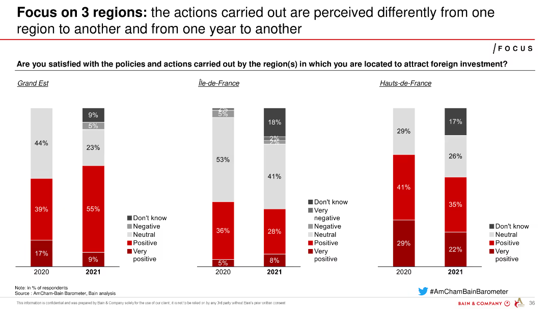
Column charts showing satisfaction with policies and actions in different French regions over two years, highlighting variances in perceptions.
Regulatory and Compliance
Government & Public Sector
Examines regional differences in satisfaction with policies and actions aimed at attracting foreign investment, showing changing perceptions over two years.
policies, actions, satisfaction, regions, perceptions
Multiple Chart
Bain
Saved
Includes text descriptions with accompanying icons related to survey insights on hospital priorities in SEA.
Market Analysis and Trends
Healthcare & Pharmaceuticals
Provides an overview of an annual survey conducted by L.E.K. to understand hospital priorities in the SEA region, highlighting key decision areas.
SEA region, hospital priorities, survey, healthcare, MedTech
Diagram
LEK
Saved
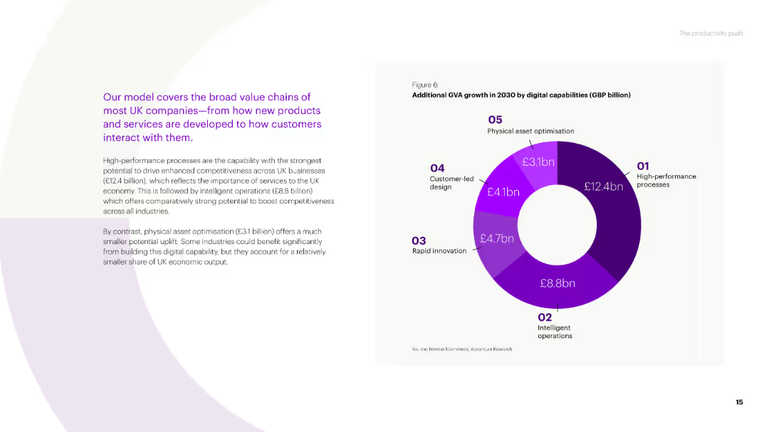
A donut chart showing additional GVA growth in 2030 by digital capabilities (high-performance processes, intelligent operations, rapid innovation, customer-led design, physical asset optimisation) for UK companies.
Market Analysis and Trends
Technology & Software
This slide details the potential GVA growth from digital capabilities in the UK, highlighting which processes and innovations will drive the most value across various industries.
value chains, GVA growth, digital capabilities, UK companies, high-performance processes
Mixed Chart
Accenture
Saved
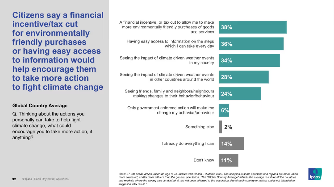
Left-aligned blue headline with supporting vertical bar chart on the right showing response percentages by category.
Strategic Planning
Environmental Services & Sustainability
The slide outlines motivating factors that could encourage individuals to take more action against climate change. A financial incentive or tax cut and easier access to information top the list of responses, reflecting what support mechanisms people believe would be most effective.
behavior change, motivation, incentives, environment, climate action, survey, Ipsos, awareness, global average, support strategies
Mixed Chart
IPSOS
Saved
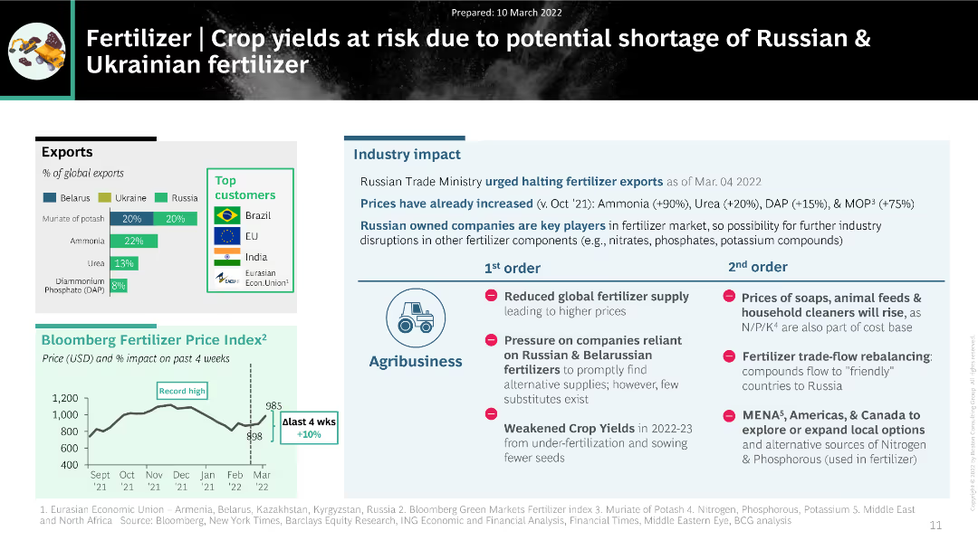
The slide features a mix of charts and text, including a column chart of fertilizer exports from Belarus, Ukraine, and Russia, a price index trend, and a detailed table of industry impacts.
Market Analysis and Trends
Agriculture & Food Production
The slide analyzes the impact of potential fertilizer shortages from Russia and Ukraine on global crop yields. It includes data on export percentages, pricing trends, and the cascading effects on agribusiness, highlighting significant challenges in the fertilizer supply chain.
fertilizer, supply disruption, crop yields, agribusiness, pricing trends
Multiple Chart
BCG
Saved
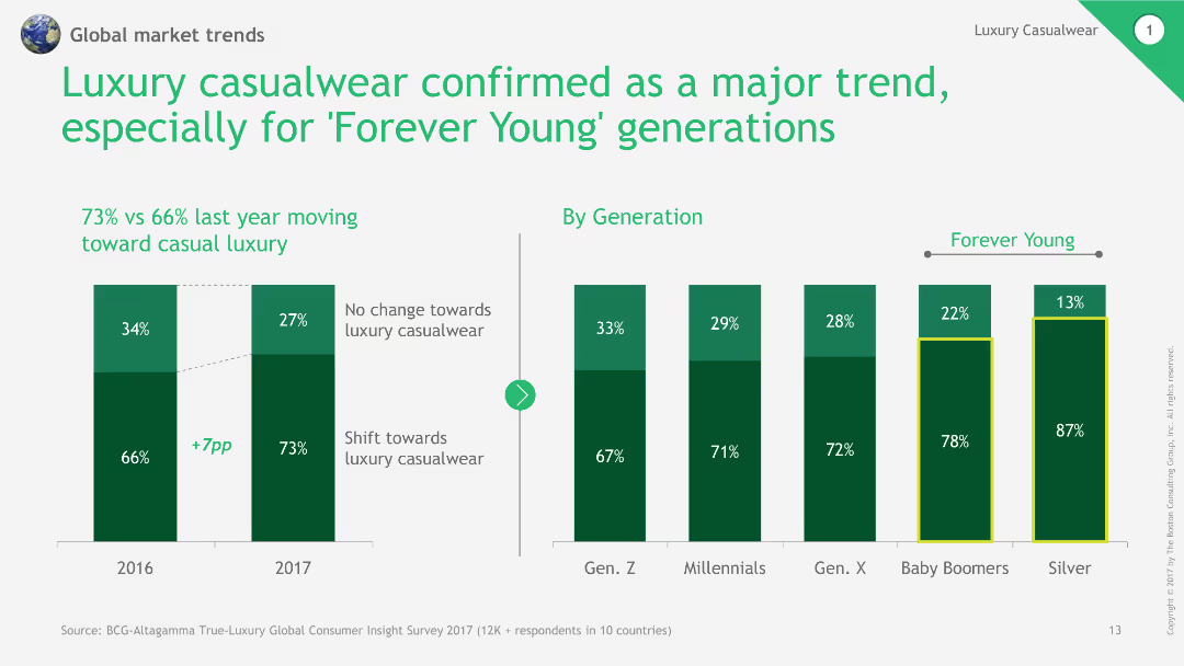
This slide includes a column chart comparing the shift towards luxury casualwear over two years and by different generations. It uses green and dark green bars for visual clarity.
Market Analysis and Trends
Consumer Goods
The slide discusses the growing trend of luxury casualwear, especially among the 'Forever Young' generations, supported by comparative data from 2016 and 2017.
luxury casualwear, trend analysis, generational comparison, column chart, market shift
Multiple Chart
BCG
Saved
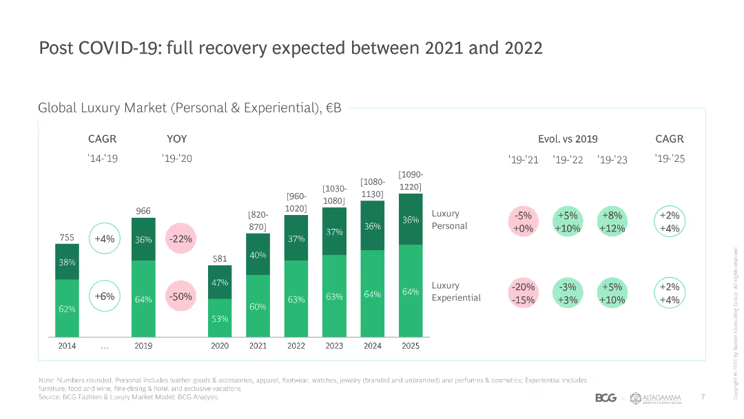
This slide features a column chart comparing global luxury market size and growth rates from 2014 to 2025, with color-coded segments for personal and experiential luxury.
Market Analysis and Trends
Retail & E-commerce
The slide projects the recovery of the global luxury market post-COVID-19, highlighting growth rates and market size for personal and experiential luxury segments.
COVID-19 recovery, luxury market, growth rates, market size, experiential luxury, personal luxury, global trends, projections, CAGR
Single Chart
BCG
Saved
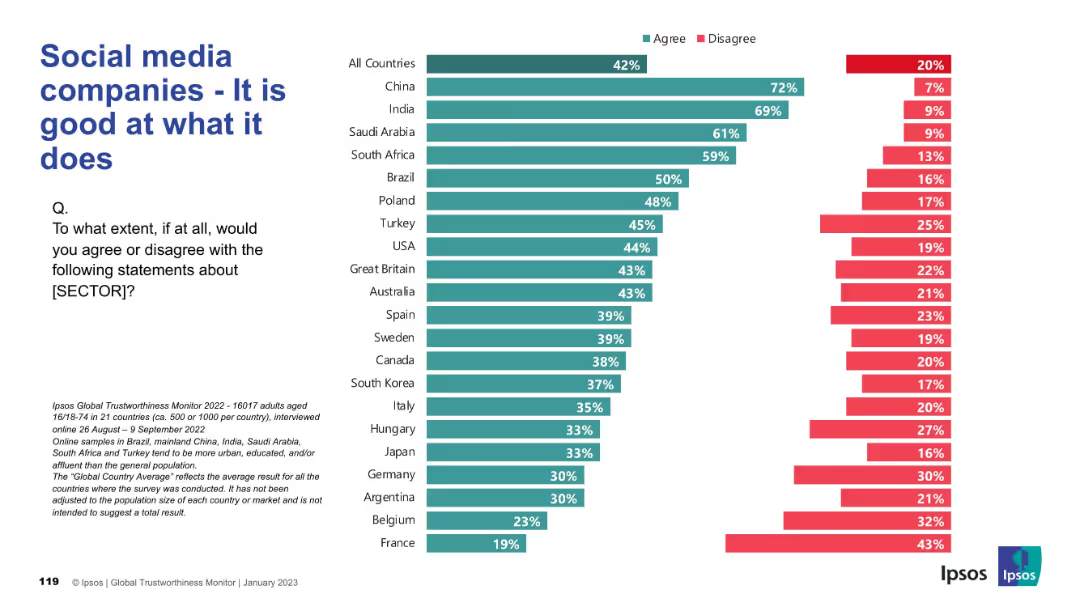
Similar chart format showing agreement/disagreement on performance of social media companies globally.
Product and Service Analysis
Technology & Software
This slide shows public agreement with the competence of social media companies. While emerging markets show strong belief in performance, Western nations like France and Belgium express more skepticism.
social media, performance, public perception, global opinion, Ipsos survey, competence, tech industry, country comparison
Mixed Chart
IPSOS
Saved
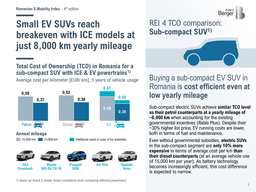
Bar chart comparing the total cost of ownership (TCO) for sub-compact SUVs with ICE and EV powertrains in Romania, showing cost efficiency at low yearly mileage.
Market Analysis and Trends
Transportation & Logistics
Highlights the cost efficiency of sub-compact EV SUVs in Romania, achieving breakeven with internal combustion engine (ICE) models at lower annual mileage due to incentives.
EV SUVs, ICE models, cost efficiency, TCO, Romania
Mixed Chart
Roland Berger
Saved
Features column charts and a text box. Charts show U.S. market podcast ad revenues from 2015 to 2022, highlighting a significant growth in revenue. Text box details the growth rates of podcasting compared to other digital channels. Red and black bars indicate different years.
Financial Performance
Media & Entertainment
Discusses the rapid growth of podcast advertising revenues in the U.S., significantly outpacing overall internet ad revenue growth. Provides a detailed comparison to other digital advertising channels.
Podcasting, Ad Revenues, Digital Channels, Growth Rates, Market Trends
Single Chart
PwC/Strategy&
Saved
Features a column chart comparing gender distribution across different ranking scales for applications.
Strategic Planning
Professional Services
Analyzes gender distribution by application rank, showing differences in the proportion of female to male applicants across ranking categories.
gender, distribution, ranking, applications, analysis
Single Chart
Accenture
Saved
A column chart showing global agreement on purchasing products from responsible brands, with countries listed on the x-axis and agreement percentages on the y-axis.
Market Analysis and Trends
Consumer Goods
This slide discusses consumer preferences for responsible brands, highlighting global willingness to pay more for such products, with varying agreement across countries.
responsible brands, consumer preferences, global agreement, purchasing, column chart, countries
Multiple Chart
IPSOS
Saved
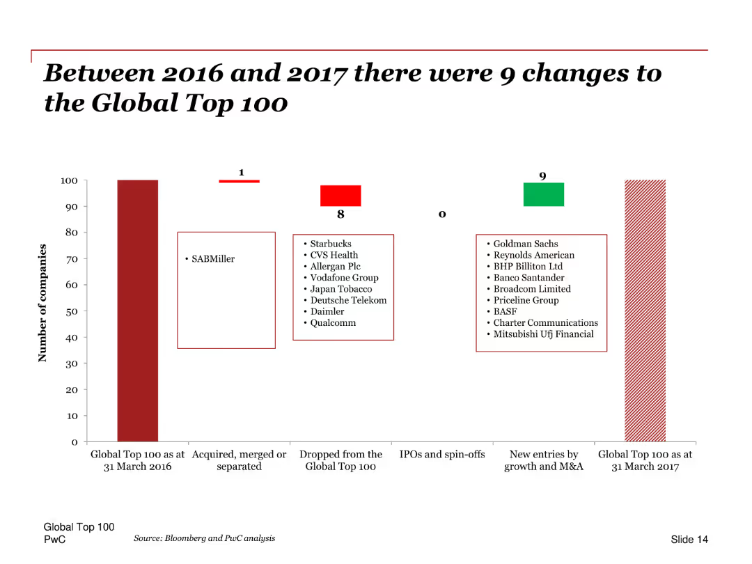
A column chart showing changes in the Global Top 100 companies between 2016 and 2017. Includes a list of companies that entered and exited the list, and those that were acquired or merged.
Competitive Landscape
Financial Services
This slide illustrates the changes in the Global Top 100 companies from 2016 to 2017, including companies that were acquired, merged, or separated, as well as new entries and exits. It provides a comprehensive overview of the dynamic shifts in the top companies.
Global Top 100, changes, 2016, 2017, acquisitions, mergers, exits, entries, column chart
Single Chart
PwC/Strategy&
Saved
The slide has two line charts plotted on the same axes, showing the price trend of natural rubber (TSR20 and RSS3) over several years. Below the chart, a legend differentiates the two types of rubber with color coding.
Market Analysis and Trends
Industrial & Manufacturing
The slide compares historical price data of TSR20 and RSS3 natural rubber from 2016 to 2023, represented by two fluctuating line charts. This could serve as a market analysis tool to forecast pricing trends or to evaluate material costs in production planning for industries reliant on rubber, such as automotive manufacturing.
natural rubber, price trend, line chart, market analysis
Single Chart
Morgan Stanley
Saved
The slide presents a series of column charts showing different hypothetical scenarios for assessing risk tolerance among Canadians. The layout is moderately complex.
Risk Assessment and Management
Financial Services
This slide assesses the risk tolerance of Canadians by presenting various scenarios with different potential gains and losses. It aims to measure how willing people are to take risks for higher returns.
risk tolerance, scenarios, investment, assessment, Canadians
Single Chart
IPSOS
Saved
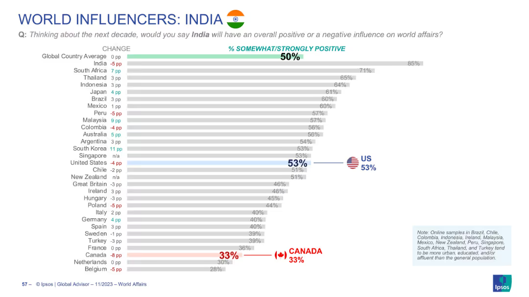
Horizontal bar chart ranking countries by % of positive influence attributed to India; includes flags and % changes.
Market Analysis and Trends
Government & Public Sector
The slide evaluates how global respondents view India's influence in the coming decade. While globally India holds a 50% positivity rating, the highest positivity comes from South Africa, and the lowest from Canada.
India, global image, public opinion, influence, Ipsos, rankings, decade outlook, soft power
Single Chart
IPSOS
Saved
This slide illustrates year-over-year quarterly changes in volumes, price-mix, and currency with a trio of column charts. It features colored bars to represent growth or decline over quarters for 2022 and 2023, against a simple blue and white background. The Michelin logo is present at the bottom, and the overall design is clean, utilizing the brand's color palette.
Operational Efficiency
Financial Services
The slide analyzes quarterly performance in terms of volumes, price-mix, and currency impacts. It likely serves as an operational review tool to steer company strategies during periods of weak market demand. It may be used in management meetings or financial briefings to guide decision-making.
steering, volumes, price-mix, currency, performance, Michelin, operational, market, analysis, efficiency
Multiple Chart
Morgan Stanley
Saved
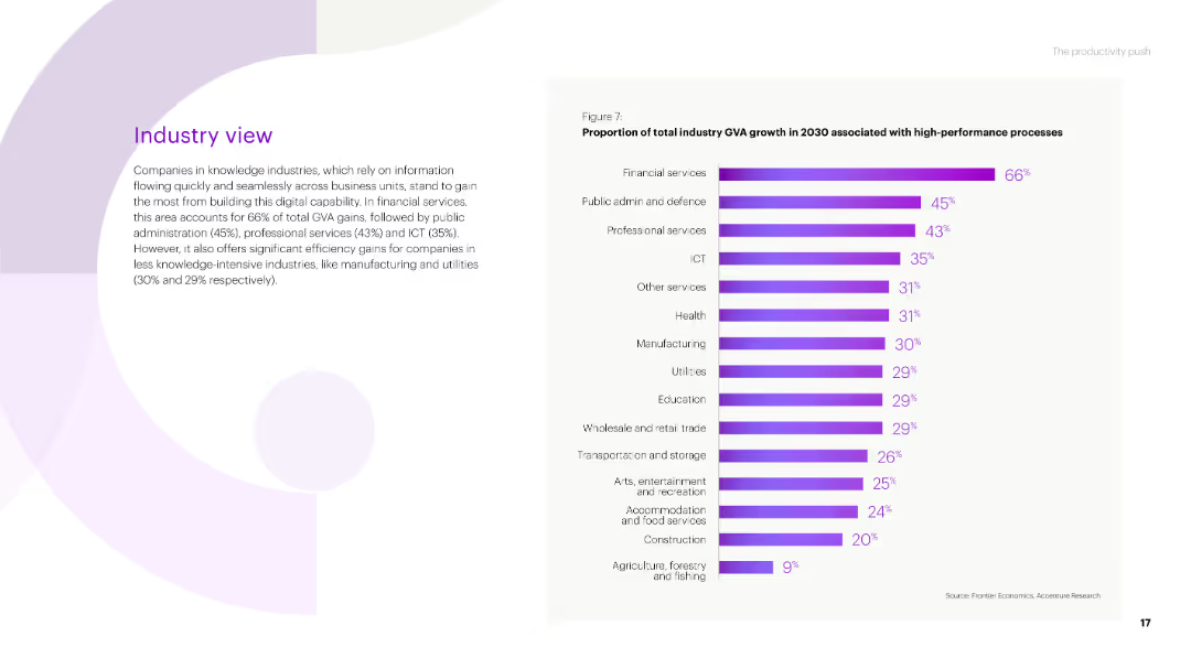
A bar chart showing the proportion of total industry GVA growth in 2030 associated with high-performance processes across various industries, with percentages indicated for each industry.
Market Analysis and Trends
Technology & Software
The slide presents data on the contribution of high-performance processes to GVA growth by industry, highlighting sectors like financial services, public administration, and ICT.
industry GVA, high-performance processes, growth, financial services, public administration
Mixed Chart
Accenture
Saved
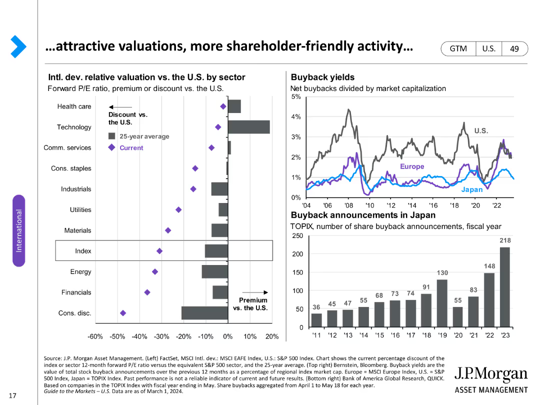
Two charts: a column chart showing relative valuation by sector and a line chart of buyback yields and announcements.
Investment Analysis
Financial Services
Analyzes relative valuations and buyback activity across different sectors, emphasizing shareholder value.
Valuations, buybacks, sectors, shareholder value, analysis, yields, announcements, activity, relative
Multiple Chart
JP Morgan
Saved
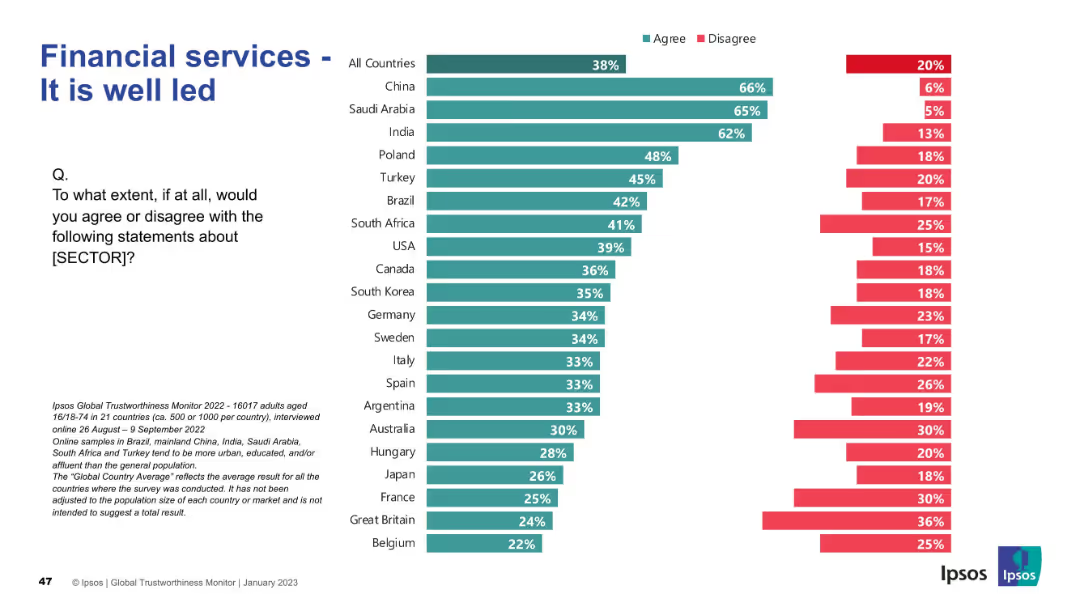
Country-level bar chart split between agreement and disagreement; visual structure mirrors previous slides
Human Resources and Talent Management
Financial Services
The slide assesses leadership perceptions in financial services. China, Saudi Arabia, and India again lead in agreement. Western Europe and Latin America score lower, showing regional skepticism about leadership quality.
leadership, perception, trust, financial, Ipsos, countries, agreement, talent, management, governance
Mixed Chart
IPSOS
Saved
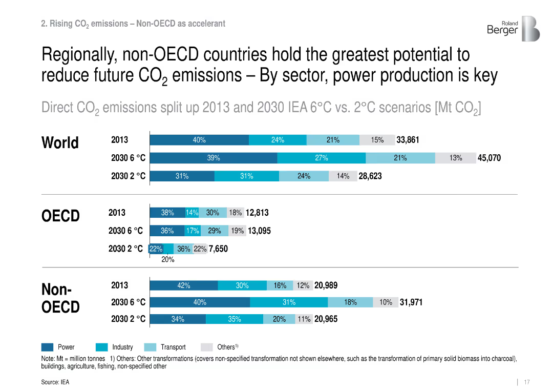
Stacked horizontal bars show CO₂ emissions by sector for World, OECD, and Non-OECD.
Market Analysis and Trends
Environmental Services & Sustainability
Breaks down current and projected CO₂ emissions by sector and region, emphasizing power sector transformation in non-OECD countries as essential for mitigation.
sectoral emissions, OECD, non-OECD, power, climate targets
Single Chart
Roland Berger
Saved
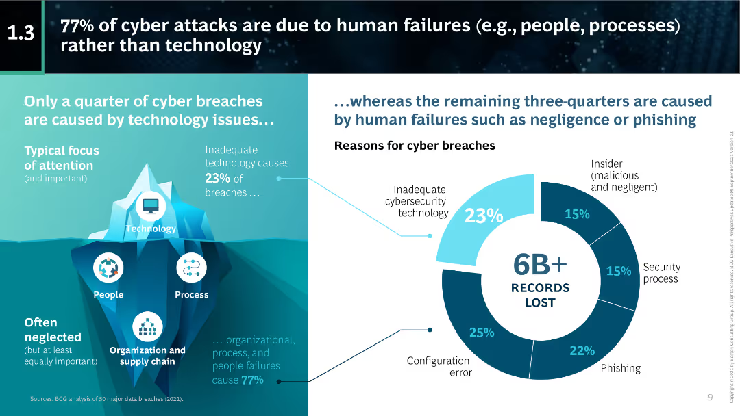
The slide features a pie chart illustrating that 77% of cyber attacks are due to human failures. Accompanying text details the reasons for cyber breaches, including inadequate technology and insider threats.
Risk Assessment and Management
Technology & Software
This slide highlights that the majority of cyber attacks are caused by human failures rather than technological issues. It provides a breakdown of the causes of cyber breaches and emphasizes the importance of addressing human factors in cybersecurity.
human failures, cyber attacks, technology issues, insider threats, cybersecurity, pie chart, BCG
Mixed Chart
BCG
Saved
This slide has a white and blue color theme with a bubble chart categorizing various cash-related initiatives by their typical EBIT impact and time to cash release. The chart uses different shades to distinguish between receivables, inventory, payables, and cross-cutting measures, with annotations for certain initiatives.
Financial Performance
Financial Services
The slide prioritizes cash-related initiatives based on their EBIT impact and time to cash release. It visually categorizes these initiatives into groups like "immediate cash opportunities" or "structural changes," providing a strategic overview for financial planning and cash flow management.
cash management, EBIT impact, financial planning, cash flow, strategic prioritization
Single Chart
McKinsey
Saved
Previous
Next
If nothing, comes up, please save your slides first
Create a FREE account to continue browsing
Receive Instant Access to 1,000+ slides from companies like McKinsey, Google, and Goldman Sachs
First Name
Last Name
Email
Password
I agree to all
Terms & Privacy Policy
Thank you! Your submission has been received!
Oops! Something went wrong while submitting the form.
Have an account?
Sign in
Column Chart
Heatmap
Chevron
Org Chart
Infographic
Callouts
Timeline
List
Graphic
Picture
Process Flow
Diagram
Paragraph
Map
Table
Framework
Subtitle
Takeaway Box
Icon
Other Chart
Radar Chart
Waterfall Chart
Mekko Chart
Pie Chart
Scatter Plot
Line Chart
Bar chart
Bullet points