Create a FREE Account
Instant access to 1,000+ real slides from top companies like McKinsey, BCG, Goldman Sachs, Google and many more!
First Name
Last Name
Email
Password
I agree to all
Terms & Privacy Policy
Thank you! Your submission has been received!
Oops! Something went wrong while submitting the form.
Have an account?
Sign in
Library
Templates
Courses
Pricing
My Account
My Slides
My Templates
✦ AI
AI Prompt Library
AI Search
Sign in
Start Here
Logout
My Saved Slides
Bar graphs with comparative analysis of RoTE and RoRWA
Financial Performance
Financial Services
Santander's profitability and capital management from 2015-2019
Profitability, Capital, Acquisitions, Banking, RoTE
Mixed Chart
Morgan Stanley
Saved
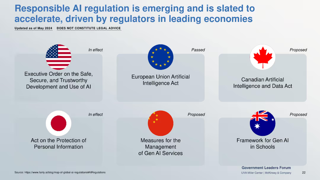
Flags and legal act titles from multiple countries categorized by legal status (in effect, passed, proposed).
Regulatory and Compliance
Government & Public Sector
Overview of emerging and existing AI regulations across the US, EU, China, Canada, Japan, and Australia. Covers data protection, GenAI use in schools, and ethical governance frameworks.
AI regulation, global laws, compliance, policy, governance, GenAI law
Table
McKinsey
Saved
The slide features a column chart showing the number of countries supporting hydrogen initiatives in various sectors like transportation, refueling stations, buses, and trucks.
Regulatory and Compliance
Energy & Utilities
Highlights global initiatives supporting hydrogen deployment across different sectors, emphasizing the number of countries involved in each initiative.
Hydrogen, support initiatives, countries, deployment, transportation, refueling, buses, trucks
Single Chart
Kearney
Saved
The slide has a green background with white text and includes icons representing different recyclable materials like paper, glass, plastic, and clothes. Below, it shows icons for e-waste items like washing machines, large kitchen appliances, etc., each with a percentage indicating knowledge on recycling.
Market Analysis and Trends
Environmental Services & Sustainability
This slide highlights that respondents know more about recycling common materials than e-waste, with percentages for various materials and e-waste items. It emphasizes the need for better e-waste recycling knowledge.
recycling, e-waste, knowledge, survey, materials
Multiple Chart
Oliver Wyman
Saved
Features column charts for population growth and market share, along with a map indicating market presence. The color scheme is blue, grey, and white, with a clear data representation.
Market Analysis and Trends
Financial Services
Analyzes market dominance and growth prospects, likely used for market positioning, investment discussions, or strategic planning sessions to highlight competitive advantages in high-growth areas.
market share, population growth, competitive advantage, strategic planning
Multiple Chart
Goldman Sachs
Saved
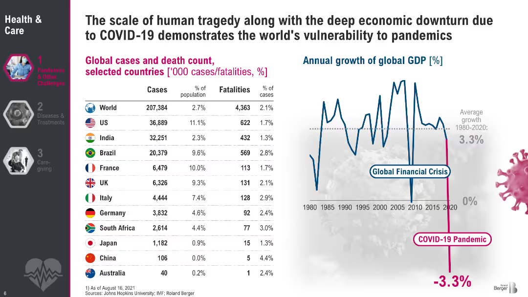
Split layout: left side features a table of COVID-19 cases and fatalities by country; right side shows a line graph of global GDP growth from 1980 to 2020 with a sharp drop in 2020; white background with pink and blue accents; sidebar navigation on the left.
Performance Metrics and KPIs
Healthcare & Pharmaceuticals
Demonstrates the global scale and impact of COVID-19, with detailed statistics on cases and fatalities across selected countries. It highlights how pandemics influence human health and global economic performance, with GDP data showing a sharp contraction in 2020. The slide contextualizes pandemic vulnerability using both health and economic indicators.
COVID-19, GDP impact, global health, fatalities, economic downturn, pandemic, WHO data, IMF, vulnerability
Mixed Chart
Roland Berger
Saved
The slide has a column chart displaying US client satisfaction scores from 2019 to 2021, with a testimonial quote from a top US tech player.
Client Case Studies
Professional Services
It highlights client satisfaction scores over three years, emphasizing the positive impact of Ipsos's work on client relationships and growth.
client satisfaction, growth, Ipsos, impact, scores
Mixed Chart
IPSOS
Saved
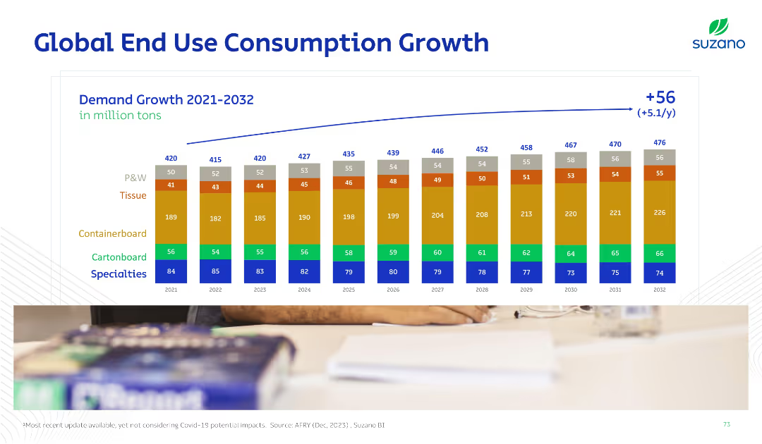
Horizontal bar chart over years with stacked categories (e.g., tissue, specialties). Blue arrow shows net increase. Color-coded for product types.
Strategic Planning
Industrial & Manufacturing
Forecasts global consumption growth across end-use pulp categories from 2021 to 2032. Categories like tissue and containerboard are emphasized, showing a +56 million ton increase with breakdowns by type.
consumption, end-use, tissue, containerboard, demand, forecast, growth, P&W, specialties
Single Chart
Goldman Sachs
Saved
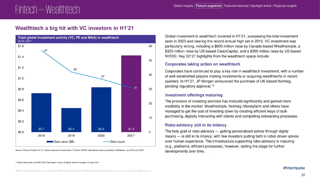
Left-aligned bar and line combo chart with deal value bars and deal count line; right section includes text blocks with bolded headings
Investment Analysis
Financial Services
The slide illustrates a sharp increase in wealthtech investments in H1 2021, reaching $1.4B, outpacing previous years. It highlights key VC deals and trends, including corporate acquisitions and the evolution of investment offerings. The narrative emphasizes the growth and maturing of wealthtech, while pointing out that robo-advisory is still developing.
wealthtech, VC investment, robo-advisory, JP Morgan, CleanCapital, investment trends, Nutmeg, digital onboarding, corporate acquisition
Mixed Chart
KPMG
Saved
This slide presents a column chart contrasting employer and employee views on the attention paid to financial benefits over three years, with a significant increase in employee attention highlighted for the recent year.
Human Resources and Talent Management
Financial Services
Focuses on HR leaders' perspectives on employee attentiveness to benefits, indicating a growing awareness and importance of financial benefits in the workplace.
HR Perspectives, Financial Benefits, Employee Attentiveness, Bar Graph, Trends
Single Chart
Goldman Sachs
Saved
The slide features a screenshot of a transaction banking software interface, displaying an account snapshot, notifications, and a cash flow forecast graph.
Technology and Digital Transformation
Financial Services
Providing a glimpse into the user interface of a transaction banking platform, this slide depicts the dashboard with a balance snapshot, notifications, and analytics. It serves to illustrate the ease of digital banking, showcasing how the platform offers insights and facilitates financial management for users, thus highlighting the company's technological innovation in client solutions.
Transaction Banking, User Interface, Digital, Analytics, Cash Flow, Technological Innovation
Mixed Chart
Goldman Sachs
Saved
A bar chart showing potential reach of the TV screen by source for different age groups, with a focus on AVOD reach and its incremental gain.
Market Analysis and Trends
Media & Entertainment
The slide highlights that AVOD content has the greatest reach potential among younger viewers, showing significant incremental gains in audience reach.
AVOD, reach, potential, younger viewers, incremental gain
Multiple Chart
Nielsen
Saved
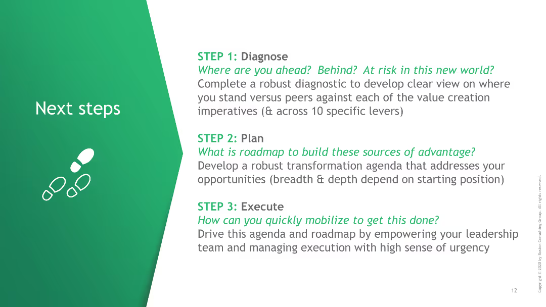
The slide uses a simple text-based format with green highlights, outlining three steps for strategic planning.
Strategic Planning
Professional Services
It provides a step-by-step guide for diagnosing, planning, and executing a transformation agenda in response to current challenges.
Steps, Strategy, Planning, Execution, Transformation
Vertical Flow
BCG
Saved
Slide with multiple pie charts and bullet points. Clean layout with distinct sections for commercial, consumer loans, investment portfolio, and long-term debt.
Financial Performance
Financial Services
This slide is structured to provide an overview of a company's loan distribution and investment portfolio details as of a specific date. It's used for financial analysis and to communicate financial health and strategy to stakeholders or investors.
Financials, Analysis, Loans, Portfolio, Debt
Multiple Chart
Morgan Stanley
Saved
Slide presents a series of blue column charts tracking EBIT Margin Benefit from Cost Savings over several years.
Financial Performance
Consumer Goods
This slide demonstrates the company’s financial efficiency over time, highlighting consistent cost savings as reflected in EBIT margin improvements.
cost savings, EBIT margin, financial, yearly, analysis
Single Chart
Barclays
Saved
This slide utilizes a balanced layout with grouped content boxes that feature numerical highlights, percentages, and short descriptive texts, maintaining a clear visual hierarchy in a blue and white theme.
Operational Efficiency
Financial Services
It emphasizes strategic imperatives and priorities in payments, detailing the growth, customer experiences, and infrastructure modernization. It's intended to communicate specific goals in payment processing, customer experience improvements, and technology upgrades to maintain market position.
Payments, Customer experience, Infrastructure, Strategic priorities
Table
JP Morgan
Saved
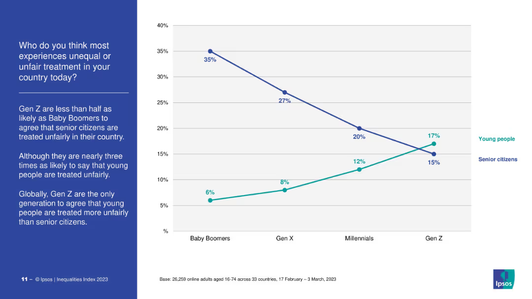
Dual-line chart contrasting perceptions of unfair treatment for young vs. senior citizens by generation.
Market Analysis and Trends
Government & Public Sector
The slide reveals a generational divide: Gen Z believes young people are more unfairly treated than seniors, the opposite of older generations. It highlights Gen Z’s unique perspective on age-based discrimination.
age discrimination, Gen Z, fairness, youth vs seniors, public perception
Mixed Chart
IPSOS
Saved
This slide uses a bar graph and segmented bars in a purple and grey color scheme to compare essential tasks and enriching activities' relative importance and projected annual growth.
Market Analysis and Trends
Technology & Software
It displays the perceived importance of various online activities over the nbn network, highlighting a trend towards more time spent on enriching activities like gaming and virtual reality.
online activities, nbn network, importance, growth trends, enriching activities, essentials, gaming, virtual reality
Multiple Chart
Accenture
Saved
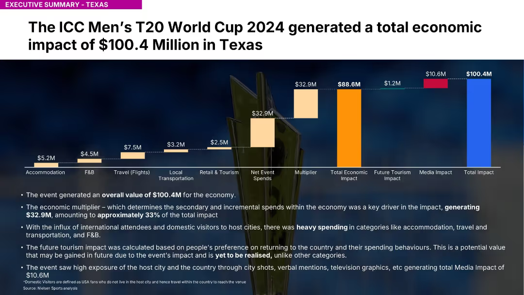
Bar chart with stacked economic impact contributions and bullet-point summary below
Investment Analysis
Media & Entertainment
Shows Texas generated $100.4M economic impact from the ICC T20 event. Key spend categories include accommodation, F&B, travel. Future tourism impact noted.
ICC, T20, Texas, economic impact, tourism, accommodation, F&B, Nielsen, sports economy, event analysis
Mixed Chart
Nielsen
Saved
Map with highlighted regions and percentages indicating the likelihood to purchase a home in various areas such as York, Peel, Halton, Durham, and Toronto.
Market Analysis and Trends
Real Estate & Construction
The slide shows regional data on the likelihood of purchasing a home, with percentages and changes from previous data points, highlighting the most and least likely areas.
purchase likelihood, regional data, home buying, York, Peel, Halton, Durham, Toronto
Graphic
IPSOS
Saved
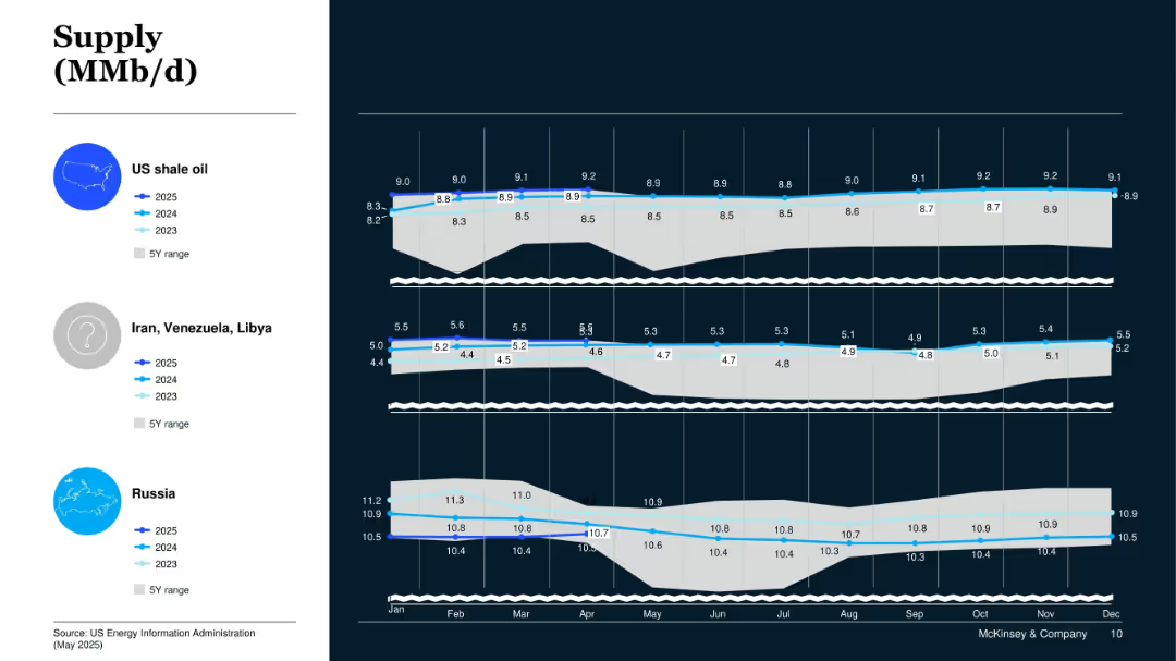
Panel chart for US shale, Iran/Venezuela/Libya, and Russia; shows 2023–2025 data with 5Y range overlay.
Operational Efficiency
Energy & Utilities
This slide presents oil production trends from specific geopolitical regions. US shale shows steady growth, while Iran/Venezuela/Libya and Russia remain relatively stable.
Shale Oil, Geopolitical Supply, Russia, Iran, Venezuela, Libya, Crude Oil
Mixed Chart
McKinsey
Saved
Contains several bar charts and a remarks section. Charts display respondents' age, years worked in the industry by line of business, and detailed remarks about workforce age and tenure.
Market Analysis and Trends
Financial Services
Detailed demographic analysis of insurance industry respondents segmented by line of business, offering insights into the age and tenure of workers in personal, commercial, and specialty lines.
insurance, demographics, business lines, age distribution, tenure, personal lines, commercial lines, specialty lines
Multiple Chart
Accenture
Saved
Two-column layout with textual content on the left and a table comparing FY20 and FY21 guidance on the right. Shades of gray and blue are used for text and table elements respectively.
Financial Performance
Financial Services
Details fiscal updates, affirms segment profit guidance, and indicates an increase in NPAT guidance. It's a deep dive into financial adjustments, explaining changes in projections with a focus on integration and transition costs.
NPAT, Segment Profit, Guidance, ETR, ROIC
Mixed Chart
Goldman Sachs
Saved
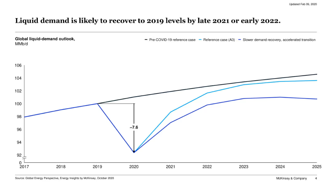
Line chart showing three global liquid-demand outlook scenarios from 2017 to 2025: pre-COVID, reference case, and accelerated transition.
Market Analysis and Trends
Energy & Utilities
This slide models the impact of COVID-19 on global liquid fuel demand, showing a sharp dip in 2020 followed by a recovery trajectory. It compares multiple scenarios including slower and faster transitions.
oil demand, COVID-19 impact, recovery, energy demand, liquid fuels, 2020, forecast
Single Chart
McKinsey
Saved
The slide features two column charts. The first chart shows the number of companies yielding greater than 4% by yield level, and the second chart shows the number of companies yielding greater than 4% by region.
Financial Performance
Financial Services
The slide details dividend sources for APAC ex-Japan equities, highlighting the number of companies with high dividend yields by yield level and region. It is used for financial performance evaluation and dividend strategy planning.
APAC, dividend sources, yield level, region, financial performance, dividend strategy
Multiple Chart
JP Morgan
Saved
Previous
Next
If nothing, comes up, please save your slides first
Create a FREE account to continue browsing
Receive Instant Access to 1,000+ slides from companies like McKinsey, Google, and Goldman Sachs
First Name
Last Name
Email
Password
I agree to all
Terms & Privacy Policy
Thank you! Your submission has been received!
Oops! Something went wrong while submitting the form.
Have an account?
Sign in
Column Chart
Heatmap
Chevron
Org Chart
Infographic
Callouts
Timeline
List
Graphic
Picture
Process Flow
Diagram
Paragraph
Map
Table
Framework
Subtitle
Takeaway Box
Icon
Other Chart
Radar Chart
Waterfall Chart
Mekko Chart
Pie Chart
Scatter Plot
Line Chart
Bar chart
Bullet points