Create a FREE Account
Instant access to 1,000+ real slides from top companies like McKinsey, BCG, Goldman Sachs, Google and many more!
First Name
Last Name
Email
Password
I agree to all
Terms & Privacy Policy
Thank you! Your submission has been received!
Oops! Something went wrong while submitting the form.
Have an account?
Sign in
Library
Templates
Courses
Pricing
My Account
My Slides
My Templates
✦ AI
AI Prompt Library
AI Search
Sign in
Start Here
Logout
My Saved Slides
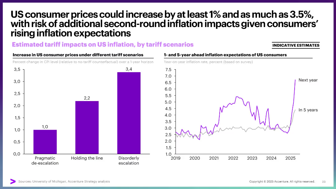
Left: bar graph comparing CPI change under three scenarios. Right: line graph showing inflation expectations over time. Simple and color-coded.
Market Analysis and Trends
Financial Services
This slide illustrates the inflationary effects of US tariffs, showing that even mild tariffs could raise consumer prices by at least 1%. It also highlights the trend in rising inflation expectations, suggesting a risk of second-round inflation due to consumer perception.
inflation, CPI, consumer prices, expectations, tariffs, economic policy, stagflation
Multiple Chart
Accenture
Saved
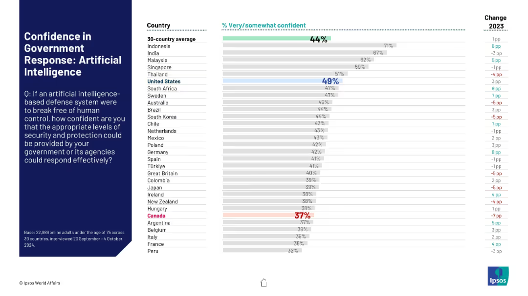
Structured identically to previous slides. Focuses on AI systems becoming threats. Bars highlight levels of trust in national response systems, Canada among the lowest.
Risk Assessment and Management
Artificial Intelligence
Public confidence in the ability of governments to contain AI-based defense systems that malfunction or rebel is depicted. Most countries score below 50%, reflecting global uncertainty on AI risk management.
AI safety, government trust, artificial intelligence, rogue systems, public concern, risk management
Mixed Chart
IPSOS
Saved
A comparative layout with two side-by-side sections detailing time saved in remote work and telehealth appointments, using purple and violet hues.
Operational Efficiency
Technology & Software
Compares the biggest time savers for nbn users, specifically remote work and telehealth, detailing time and cost savings for each.
time savings, nbn users, remote work, telehealth, cost savings, efficiency, work from home, health consultations
Table
Accenture
Saved
Timeline showing traditional versus accelerated paths for COVID-19 vaccine development, highlighting key phases from discovery to commercial launch.
Strategic Planning
Healthcare & Pharmaceuticals
Provides a timeline for potential COVID-19 vaccine development, comparing traditional and accelerated pathways, important for healthcare planning.
COVID-19, vaccine development, timeline, healthcare, accelerated pathway, traditional, discovery, commercial launch
Linear Flow
BCG
Saved
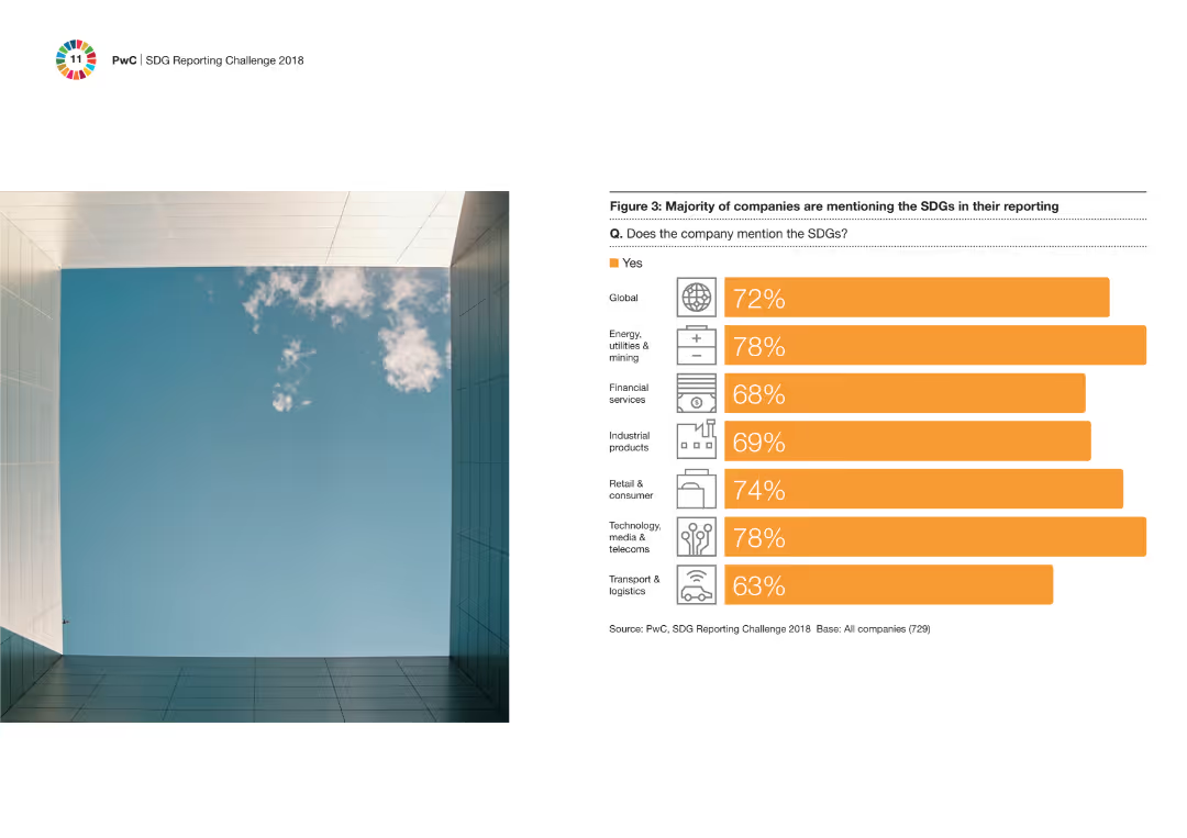
Column chart illustrating the percentage of companies across various industries that mention the SDGs in their reports. Visual includes icons representing different industries on the right side of the chart.
Regulatory and Compliance
Financial Services
The slide details the percentage of companies in various industries that mention the SDGs in their reporting, highlighting that most sectors are engaging with these sustainability goals.
SDGs, industries, reporting, sustainability, companies
Mixed Chart
PwC/Strategy&
Saved
The slide contains a column chart displaying monthly PE/VC fundraising totals in US$m and the number of funds raised from Jan-22 to Jan-23. The chart uses green for fund values and orange for the number of funds raised.
Market Analysis and Trends
Financial Services
The slide presents data on monthly PE/VC fundraising activities from January 2022 to January 2023. It highlights the total amount of funds raised and the number of fundraising events, showing trends in the fundraising landscape over the specified period.
PE/VC, fundraising, monthly trends, financial data, value, number, market analysis, fundraise trends, financial services, investment
Single Chart
EY
Saved
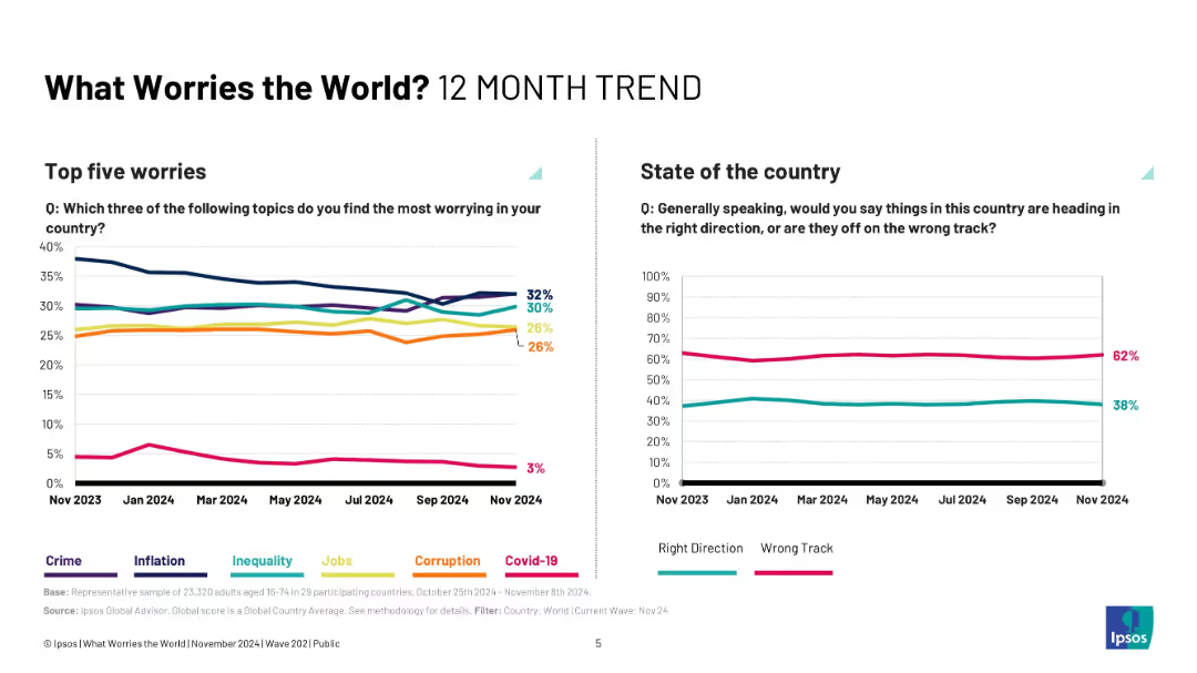
Two-panel chart layout; left side line graph on worries, right side line graph on country direction.
Market Analysis and Trends
Professional Services
This slide shows 12-month trends in global concerns, revealing shifts in the prominence of crime, inequality, inflation, and corruption as key worries. Parallel tracking of public perception of national direction illustrates consistent dissatisfaction over the past year.
trend analysis, public opinion, inflation, crime, inequality, corruption, Ipsos, monthly change
Multiple Chart
IPSOS
Saved
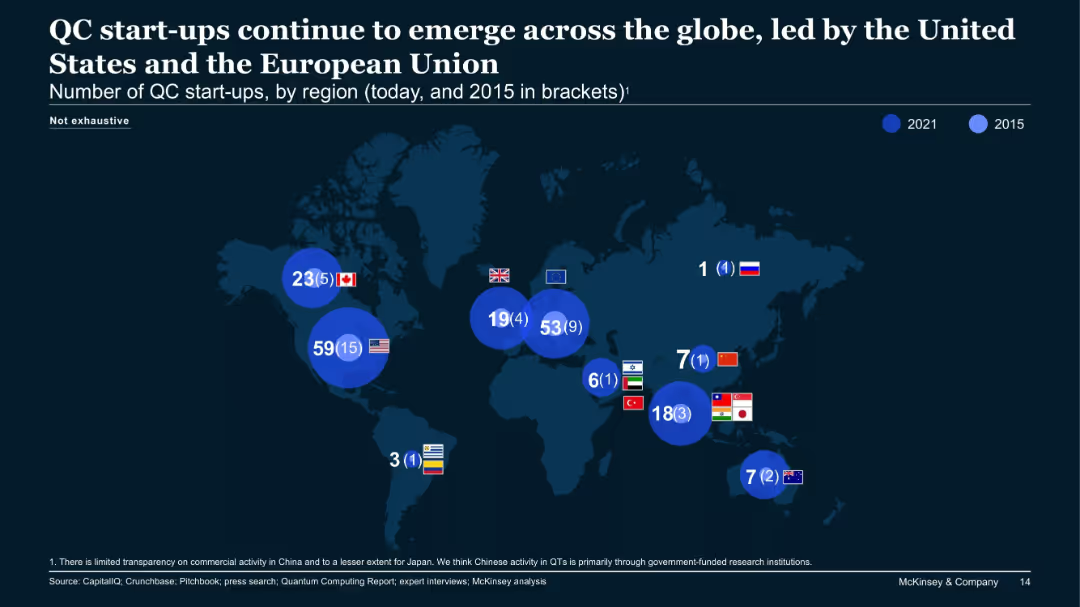
World map with blue circles showing number of QC start-ups by region in 2021 vs. 2015, labeled per country.
Market Analysis and Trends
Technology & Software
The map displays the rise of quantum computing (QC) start-ups globally, with major growth in the US (59 from 15), EU (53 from 9), and Canada. It underscores increased activity and geographic spread, especially in Western countries.
quantum computing, start-ups, global, USA, EU, growth, map, regional distribution
Single Chart
McKinsey
Saved
Features a column chart showing the growth of the online luxury goods market from 2015 to 2025F.
Market Analysis and Trends
Retail & E-commerce
Highlights the explosive growth of the online luxury goods market, predicting continued expansion and digital influence through 2025.
online, luxury, market, growth, 2025
Multiple Chart
Bain
Saved
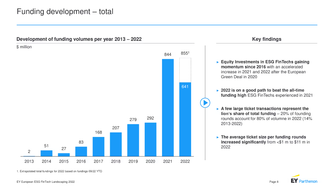
The slide contains a column chart showing the development of funding volumes per year from 2013 to 2022.
Market Analysis and Trends
Financial Services
The slide depicts the growth of funding volumes for ESG FinTech from 2013 to 2022, highlighting key findings such as the rise of equity investments, the potential for 2022 to surpass 2021's funding high, the concentration of large ticket transactions, and the increase in average ticket size per funding round.
Funding, ESG FinTech, Investment, Growth, Trends
Mixed Chart
EY
Saved
Diagram of SP platform showing different functions like product development, trading, and risk management, with related text boxes.
Product and Service Analysis
Financial Services
Overview of the Securitized Products platform, highlighting its integrated approach to product development, trading, and risk management.
SP platform, product development, trading, risk management, integrated approach
Mixed Chart
Credit Suisse
Saved
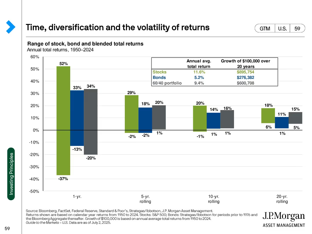
Clustered bar chart by rolling periods (1-yr to 20-yr); color-coded by asset mix; table inset for growth
Strategic Planning
Financial Services
Demonstrates how time horizon and diversification impact return volatility for stocks, bonds, and blended portfolios from 1950 to 2024. Shows that longer horizons reduce volatility.
volatility, diversification, time horizon, portfolio return, stocks, bonds, 60/40 portfolio, investment growth, risk, long-term strategy
Single Chart
JP Morgan
Saved
Contains a stacked column chart displaying the average loans by client segment over five years, with text annotations on 2020 growth factors and 1Q22 loan performance.
Financial Performance
Financial Services
Reviews JPMC's loan portfolio diversification, noting a balanced growth in commercial and real estate lending, alongside competitive market challenges and strong performance indicators.
loan portfolio, diversification, JPMC, commercial lending, real estate, market competition, performance indicators
Mixed Chart
JP Morgan
Saved
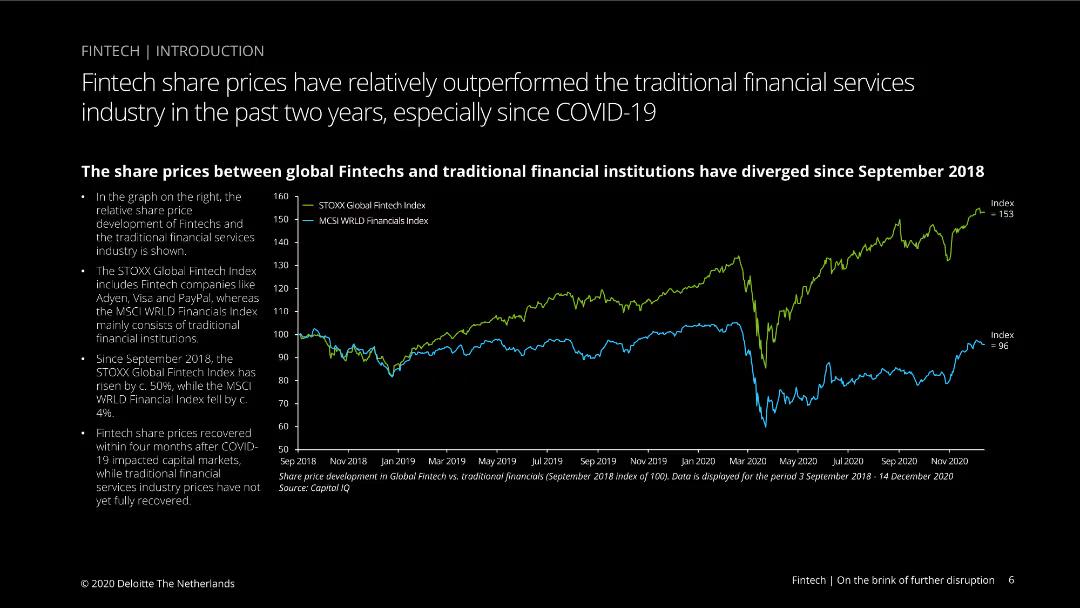
Line chart comparing share price development of global fintechs and traditional financial institutions from September 2018 to December 2020, with blue and green lines.
Financial Performance
Financial Services
Compares share price performance between fintech companies and traditional financial institutions, noting fintech outperformance and recovery after COVID-19 market impacts.
fintech, share prices, traditional finance, COVID-19, performance, STOXX Global, MSCI World, stock market, comparison, recovery
Mixed Chart
Deloitte
Saved
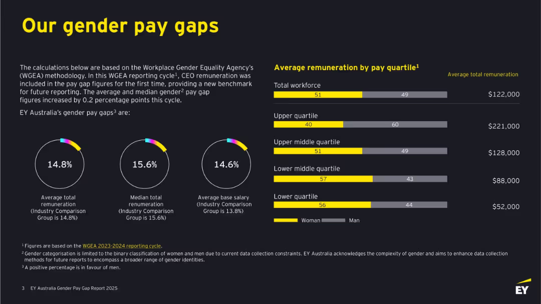
Dark background with bold yellow and white text. Features circular graphs, bar charts, and figures. Clearly divided into left-side text explanations and right-side remuneration bars by quartile.
Human Resources and Talent Management
Professional Services
This slide outlines EY Australia's gender pay gaps based on WGEA methodology, including total and median remuneration and base salary differences. It shows visual comparisons by gender across pay quartiles, revealing gaps in compensation and detailing where discrepancies occur. It emphasizes benchmarking against industry standards.
gender pay gap, remuneration, WGEA, EY Australia, salary, pay quartiles, workforce, diversity, women, equality
Multiple Chart
EY
Saved
Circle diagram and lists detailing a cost-saving program, showing major areas of expense reduction planned for the next year.
Operational Efficiency
Financial Services
Discusses strategies for significant cost reduction and operational simplification expected to save around $750 million.
cost reduction, operational efficiency, savings, strategy, diagram
Mixed Chart
Barclays
Saved
Features a marginal abatement cost curve graph with various transportation methods, and a detailed description of how digital platforms can optimize supply chain efficiency.
Market Analysis and Trends
Transportation & Logistics
Focuses on how supply chain optimization can significantly reduce emissions in the transportation sector, specifically through digital freight platforms that enhance efficiency and reduce empty backhauls, thus lowering both costs and emissions.
supply chain, emissions reduction, transportation, digital platforms
Mixed Chart
Bain
Saved
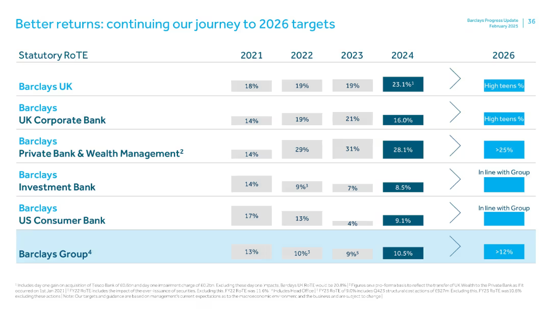
Table comparing RoTE by Barclays divisions from 2021–2024 with 2026 targets. Uses horizontal alignment with industry-specific goals and strategy callouts.
Strategic Planning
Financial Services
Lays out RoTE performance and 2026 targets across Barclays’ divisions. Barclays UK shows strong 2024 gains (23.1%), while Investment Bank and US Consumer Bank show modest improvements. Group target RoTE is >12% by 2026.
RoTE, targets, strategy, Barclays UK, investment bank, 2026 outlook
Single Chart
Barclays
Saved
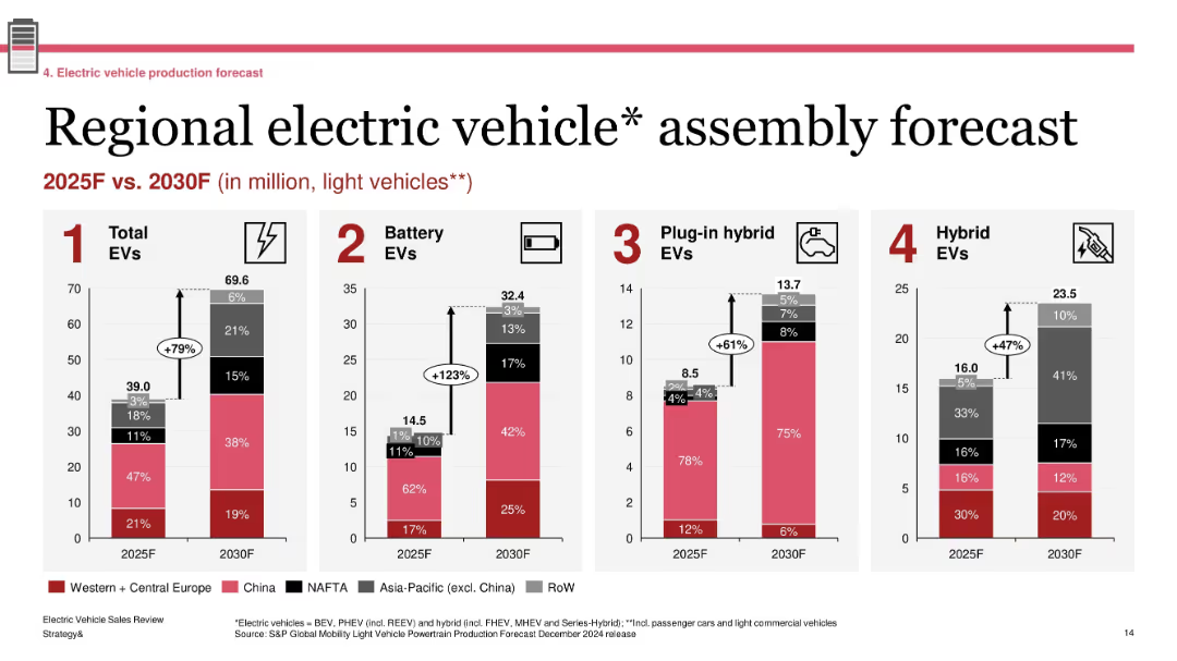
Four grouped bar charts showing production forecasts by region; labeled segments with growth percentages; standard red-gray-black color palette
Technology and Digital Transformation
Industrial & Manufacturing
The slide forecasts EV assembly volumes across major global regions between 2025 and 2030. It projects a 79% increase in total EVs, with battery EVs seeing the most significant growth (+123%). Regional shares are shown for each EV type (BEV, PHEV, Hybrid), emphasizing China and Western Europe as leading contributors.
EV forecast, regional production, BEV growth, 2030 outlook, light vehicles, automotive transformation
Single Chart
PwC/Strategy&
Saved
The slide features a column chart illustrating Asset Management pre-tax income growth from 2015 to 3Q18. The layout is clear with blue and white tones and a comparison table on the right highlighting key financial metrics.
Financial Performance
Financial Services
This slide showcases the financial success of the asset management strategy, highlighting pre-tax income growth, adjusted PTI, RoE, AuM, and NNA. It underscores the strategic execution with impressive financial metrics.
Financial Results, Strategy, Asset Management, Pre-tax Income, Metrics
Mixed Chart
Credit Suisse
Saved
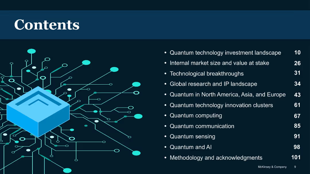
Dark background with blue circuit illustration and list-style table of contents
Industry Overview
Artificial Intelligence
Provides a structured overview of the report’s sections, including topics like investment landscape, technological breakthroughs, global perspectives, and specific quantum technologies like computing, sensing, and communication.
Table of contents, report structure, quantum sections, chapter list
Agenda
McKinsey
Saved
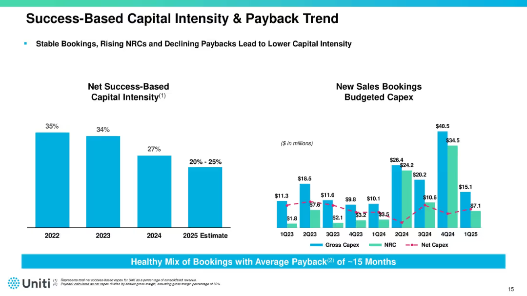
Dual chart layout with capital intensity bar chart (left) and capex trend line/bar chart (right). Accompanied by notes and metrics. Uses blue bars and magenta lines.
Corporate Finance and Valuation
Telecommunications
Tracks declining capital intensity and improving payback period (~15 months) across 2023–2025. Provides insight into Uniti’s booking strategy, NRC growth, and efficient capital deployment for infrastructure expansion.
capex, bookings, ROI, capital intensity, Uniti, fiber infrastructure
Multiple Chart
Goldman Sachs
Saved
The slide features multiple bar graphs and line charts showing percentage changes in IT costs over time. It uses a clean, professional layout with color differentiation for various data points.
Market Analysis and Trends
Technology & Software
The slide analyzes IT cost changes in the technology sector, showing trends in TCO, Opex, and Capex from 2021 to 2026. It indicates how costs are projected to change over time.
IT, TCO, Opex, Capex, technology costs, financial trends
Multiple Chart
Accenture
Saved
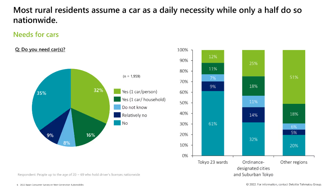
Includes a pie chart and three column charts to illustrate the need for cars across different regions and demographics.
Market Analysis and Trends
Consumer Goods
The slide discusses the necessity of cars among rural and urban residents, with data on how many cars they need and why.
car necessity, rural, urban, survey, demographics
Multiple Chart
Deloitte
Saved
Incorporating charts and graphs, this slide provides a visual representation of population growth, arable land per person, and meat consumption trends.
Investment Analysis
Agriculture & Food Production
An analysis of agricultural market drivers globally, emphasizing the influence of population growth and dietary changes on the industry.
Multiple Chart
EY
Saved
Previous
Next
If nothing, comes up, please save your slides first
Create a FREE account to continue browsing
Receive Instant Access to 1,000+ slides from companies like McKinsey, Google, and Goldman Sachs
First Name
Last Name
Email
Password
I agree to all
Terms & Privacy Policy
Thank you! Your submission has been received!
Oops! Something went wrong while submitting the form.
Have an account?
Sign in
Column Chart
Heatmap
Chevron
Org Chart
Infographic
Callouts
Timeline
List
Graphic
Picture
Process Flow
Diagram
Paragraph
Map
Table
Framework
Subtitle
Takeaway Box
Icon
Other Chart
Radar Chart
Waterfall Chart
Mekko Chart
Pie Chart
Scatter Plot
Line Chart
Bar chart
Bullet points