Create a FREE Account
Instant access to 1,000+ real slides from top companies like McKinsey, BCG, Goldman Sachs, Google and many more!
First Name
Last Name
Email
Password
I agree to all
Terms & Privacy Policy
Thank you! Your submission has been received!
Oops! Something went wrong while submitting the form.
Have an account?
Sign in
Library
Templates
Courses
Pricing
My Account
My Slides
✦ AI
AI Prompt Library
AI Search
Sign in
Start Here
Logout
My Saved Slides
Clustered bar chart comparing productivity impact (CAGR) for early vs. late GenAI adoption across countries (USA, Germany, India, etc.).
Strategic Planning
Artificial Intelligence
This slide shows that early GenAI adoption can significantly boost productivity and GDP in both developed and emerging economies, especially Germany. Germany could gain €2.6 trillion by 2040 with early adoption.
GenAI, GDP growth, automation impact, early vs. late adoption, Germany, productivity, international comparison
Mixed Chart
McKinsey
Saved
Circular diagram representing the innovation cycle, with segments for inception, value creation, adoption & diffusion, and impacts. Text explains the dynamic process of innovation in economic and social contexts.
Technology and Digital Transformation
Technology & Software
The slide presents the innovation cycle, illustrating the stages from inception to wider impacts. It discusses the dynamic nature of innovation, emphasizing the importance of R&D, adoption, and diffusion for achieving significant economic and social benefits.
Innovation Cycle, R&D, Economic Impact
Linear Flow
Roland Berger
Saved
The slide is moderately complex, featuring two main sections with distinct headers. On the left, a column chart details family law final order types with a key explaining colors for settled, transferred, and other outcomes. A bar graph on the right shows the age of finalizations in months.
Market Analysis and Trends
Government & Public Sector
The slide compares family law case outcomes between the Federal Circuit Court (FCC) and Family Court of Australia (FCoA), focusing on settlement rates and the duration before finalization. It's designed to present an analysis of the efficiency and process variation between the two courts.
Family law, finalization, FCC, FCoA, settlement, transfer, duration, analysis, court process, efficiency
Multiple Chart
PwC/Strategy&
Saved
Layout features paragraph text on the left and two data visualizations on the right: a stacked bar chart showing insurer category participation from 2014 to 2023 and a line graph of consumer access by plan type. Clean, analytical design.
Industry Overview
Healthcare & Pharmaceuticals
The slide explores how exchange participation by insurer category has broadened from 2022 to 2023, with Insurtechs as the exception. It also shows the growth in consumer access to various plan types, particularly national, Medicaid, and Blue insurers. Consumer access has notably expanded across nearly all categories.
exchange, insurers, access, national plans, Medicaid, Insurtech
Multiple Chart
McKinsey
Saved
Curved timeline chart with logos and milestones showing GenAI evolution and corporate interest
Market Analysis and Trends
Artificial Intelligence
A visual timeline of key GenAI advancements and corporate initiatives, emphasizing rapid development and increased CEO attention toward AI-driven strategies.
GenAI evolution, timeline, CEOs, corporate focus, tech companies
Uncategorized
McKinsey
Saved
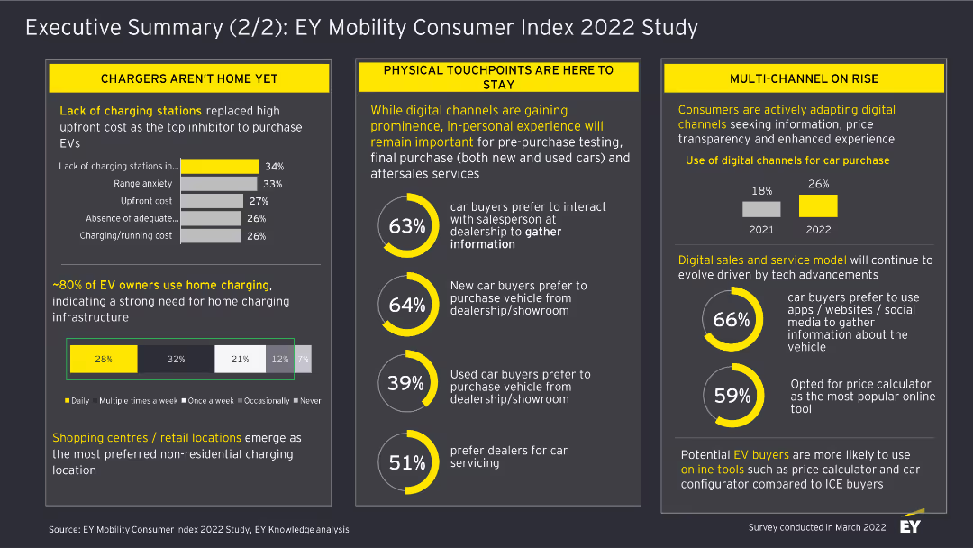
This slide features a column chart displaying the percentage of car buyers intending to buy a fully electric car across different countries. Each country is represented by a vertical bar with percentages labeled on top. The slide has a dark background with yellow highlights.
Market Analysis and Trends
Transportation & Logistics
The slide analyzes the intent to purchase fully electric cars in various countries, highlighting China as the highest and Japan as the lowest. It provides a comparison of consumer interest across 18 countries, showing the global average.
Electric cars, purchase intent, market analysis, consumer trends, automotive industry
Single Chart
EY
Saved
Central Venn diagram showing integration of JPMorgan Chase's services, surrounded by key strategic points with icons.
Competitive Landscape
Financial Services
The slide presents JPMorgan Chase's integrated platform, highlighting relationships, liquidity solutions, digital solutions, and data analytics. Ideal for discussing competitive advantages and corporate synergy.
JPMorgan Chase, competitive advantage, integrated platform, relationships, liquidity, digital solutions, data analytics, branches
Framework
JP Morgan
Saved
This slide features comparative column charts that contrast the growth in real GDP per capita against the expenditures on food and beverages from 2015 to 2030 in various regions, including OECD, Western Europe, Developing countries, BRIC, and China. The charts are color-coded to distinguish between the years compared, and each region's data points are clearly labeled to facilitate easy interpretation.
Market Analysis and Trends
Financial Services
The slide examines economic growth versus expenditure trends on food and beverages in various global regions. It highlights a general trend where increased prosperity leads to a relative decrease in the proportion of spending on food, indicating a shift in consumer behavior and economic priorities.
GDP growth, consumer spending, economic analysis, developed countries, developing countries, expenditure trends, food and beverages, prosperity effects, market trends, fiscal policies
Single Chart
Roland Berger
Saved
Line chart tracking four major oil supply sources over time on dark background, including Non-OPEC, OPEC, US shale, and others.
Operational Efficiency
Energy & Utilities
This slide visualizes global oil supply dynamics from major sources over time. It highlights steady increases in non-OPEC and US shale outputs, with some fluctuation in OPEC nations.
Oil Supply, Non-OPEC, OPEC, Shale Oil, Energy Production, Crude Oil
Mixed Chart
McKinsey
Saved
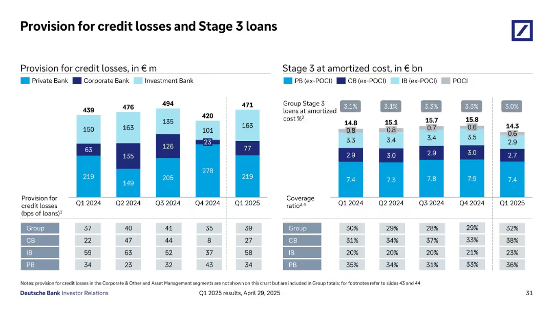
Bar chart displaying balance sheet provisions for ECL, with commentary on the right explaining impairment provision and economic uncertainty adjustments.
Risk Assessment and Management
Financial Services
The slide discusses Barclays' well-provisioned balance sheet, detailing expected credit losses (ECL) and economic adjustments, ensuring financial stability and risk management.
balance sheet, ECL, impairment provision, economic adjustments, risk management
Mixed Chart
Barclays
Saved
Heatmap and value impact table by sector and use case, covering economic value (2025/2035) and value share in four key quantum computing applications
Investment Analysis
Artificial Intelligence
The slide analyzes where quantum computing will create the most economic value across industries, highlighting AI/ML, optimization, and simulation. Finance, global energy, and technology sectors show significant near- and mid-term potential.
quantum impact, economic value, AI/ML, optimization, finance, mid-term outlook, industry impact
Table
McKinsey
Saved
Includes bar charts showing commute times and primary work locations. Key findings are provided in bullet points.
Market Analysis and Trends
Professional Services
Analyzes how office attributes like commute time and primary work location influence employee preferences, including tenure at the current company.
Commute time, Work location, Employee preferences, Tenure, Office attributes
Multiple Chart
EY
Saved
The slide features a column chart with main reasons for investing in cyber security.
Market Analysis and Trends
Technology & Software
The slide details various reasons companies invest in cyber security, with a focus on business continuity and compliance.
cyber security, investment, business continuity, compliance, regulation, reputation, data protection
Single Chart
IPSOS
Saved
Bar chart by demographics (gender, generation, income, education) on white background
Market Analysis and Trends
Government & Public Sector
This slide shows that perceptions of discrimination against seniors vary by generation. Baby Boomers perceive the most inequality toward their age group, while Gen Z and Millennials see it less. Patterns are relatively consistent across income groups.
ageism, senior citizens, generational views, demographics, Ipsos, inequality, Baby Boomers, Gen Z
Mixed Chart
IPSOS
Saved
Step-by-step infographic with three sequential steps illustrated using icons. Each step has a title, brief description, and examples. Red icons and arrows highlight progression.
Risk Assessment and Management
Financial Services
Details a framework for determining when a PortCo has no viable path to align with decarbonisation goals. Criteria include revenue from high-emitting sectors, nature of economic activities, and feasibility of asset transition. Intended to classify assets realistically based on emissions challenges.
high-emitting sectors, alignment, risk, emissions, PortCo, feasibility, transition plan
Linear Flow
Bain
Saved
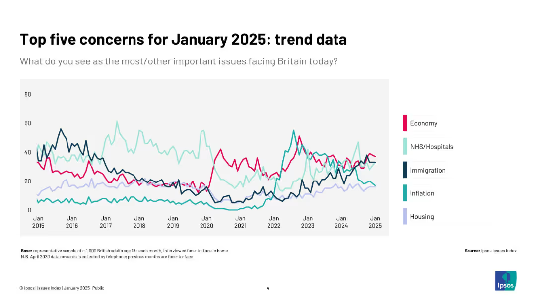
Line chart showing trends from 2016 to 2025 in agreement with the “strong leader willing to break rules” statement across selected countries. Each country is represented by a distinct colored line.
Strategic Planning
Government & Public Sector
This chart visually represents how support for strong leadership has evolved in several countries. Notably, France and Italy have seen major drops in support over the past decade, reflecting shifts in political tolerance or trust in rule-bending solutions.
populism, authoritarianism, leadership, Ipsos trend, France, Italy, political change, international opinion
Mixed Chart
IPSOS
Saved
This slide features multiple bar graphs comparing the Manufacturing PMI across several countries (US, Germany, Italy, Sweden, China, South Korea, Japan) before, during, and after the crisis. Each country's graph shows monthly PMI values from January to July, with bars color-coded to indicate different levels of manufacturing activity (negative growth, neutral, positive growth). The graphs are aligned horizontally for easy comparison, with annotations indicating significant events like lockdowns, providing a clear timeline of economic activity.
Operational Efficiency
Industrial & Manufacturing
The slide compares global manufacturing performance using PMI as an indicator, making it valuable for assessing the impact of COVID-19 on the manufacturing sector. It helps stakeholders understand which regions are experiencing recovery and which are still struggling, facilitating targeted strategic decisions in supply chain management and production planning. The visual representation of PMI trends provides a quick overview of economic resilience and recovery patterns, essential for operational planning and investment decisions in the manufacturing sector.
PMI, manufacturing, COVID-19, economic recovery, global comparison, operational planning, supply chain management
Multiple Chart
BCG
Saved
Two charts: one column chart showing IRR during the financial crisis, and another column chart comparing historical risk with unsmoothed risk.
Risk Assessment and Management
Financial Services
The slide discusses how illiquidity in private markets can mask true volatility. It shows the difference in performance when using smoothed vs. unsmoothed valuation models.
Appraisal, Risk, Volatility, Private Equity, Financial Crisis
Multiple Chart
UBS
Saved
The slide includes a column chart showing the progression of invested assets from 2.8 trillion in 2022 to over 5 trillion in 2028. Text on the right specifies ambitions for NNA per annum and cost/income ratio targets. The timeline highlights key phases from 2023 to 2028 for achieving growth.
Strategic Planning
Financial Services
The slide presents an ambitious goal to surpass 5 trillion in invested assets by 2028. It outlines key phases and targets for net new assets (NNA) and cost/income ratio improvements. This slide can be used to communicate long-term growth ambitions and strategic milestones to investors and stakeholders.
invested assets, growth, ambition, long-term, strategic planning
Mixed Chart
UBS
Saved
Contains a line chart with investors' priorities for actions by financially healthy companies, like 'Invest to grow and protect revenue'. The chart uses teal and dark green bars to denote importance.
Strategic Planning
Financial Services
Discusses strategic actions that investors expect from financially healthy companies to navigate the macroeconomic environment, such as investing for growth and managing cash flow effectively.
financial health, investment strategies, growth, cash flow
Mixed Chart
BCG
Saved
The slide displays two column charts with lighter labels, adhering to Tufte's principle to lighten labels for better data clarity.
Technology and Digital Transformation
Professional Services
This slide illustrates the principle of lightening labels to improve the clarity and focus of data presentations according to Tufte's guidelines.
Tufte, data-to-ink, ratio, survey, responses, visualization, light labels, chart, clarity, design
Multiple Chart
EY
Saved
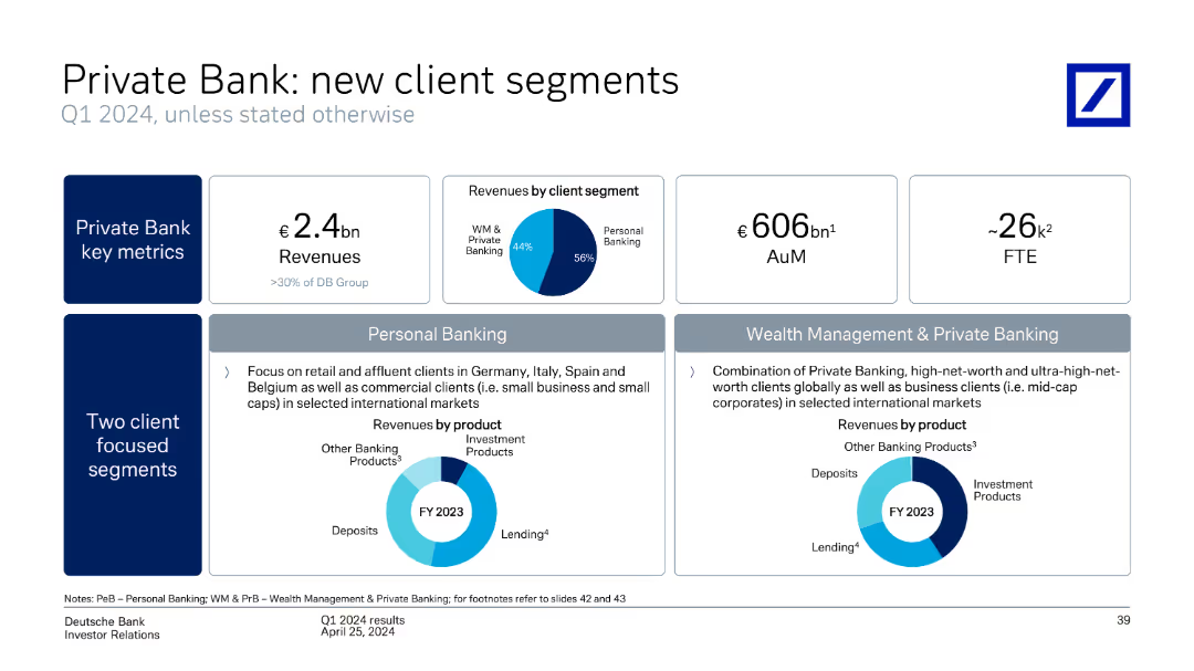
This slide contains pie charts, a leverage ratio comparison, and bullet points emphasizing the bank's strong capital position and strategies.
Financial Performance
Financial Services
The slide provides an overview of BBVA's capital ratios and risk-weighted assets, evidencing a robust capital position. Useful for discussions on financial solidity and regulatory compliance.
Capital Ratios, Financial Strength, Risk Management, Leverage Ratio, Regulatory Compliance, Capital Generation
Multiple Chart
Morgan Stanley
Saved
Column chart and pie chart, clean design with green and blue accents.
Customer and Market Segmentation
Retail & E-commerce
Discusses the optimism among retail executives for revenue growth and challenges in 2022.
retail, market trends, revenue growth, executive outlook
Multiple Chart
Deloitte
Saved
The slide presents a horizontal bar chart listing various investment products owned by respondents.
Market Analysis and Trends
Financial Services
The slide details the ownership distribution of various investment products such as mutual funds, stocks, and bonds.
Investment, Products, Ownership, Mutual Funds, Stocks
Single Chart
IPSOS
Saved
Bar chart with descending agreement levels per country; agreement/disagreement shown visually.
Market Analysis and Trends
Retail & E-commerce
Reflects whether consumers feel retail companies align with their personal values. Agreement is low globally, with only a few countries exceeding 40%.
values, alignment, trust, opinion, retail sector, Ipsos, global
Mixed Chart
IPSOS
Saved
Previous
Next
If nothing, comes up, please save your slides first
Create a FREE account to continue browsing
Receive Instant Access to 1,000+ slides from companies like McKinsey, Google, and Goldman Sachs
First Name
Last Name
Email
Password
I agree to all
Terms & Privacy Policy
Thank you! Your submission has been received!
Oops! Something went wrong while submitting the form.
Have an account?
Sign in
Column Chart
Heatmap
Chevron
Org Chart
Infographic
Callouts
Timeline
List
Graphic
Picture
Process Flow
Diagram
Paragraph
Map
Table
Framework
Subtitle
Takeaway Box
Icon
Other Chart
Radar Chart
Waterfall Chart
Mekko Chart
Pie Chart
Scatter Plot
Line Chart
Bar chart
Bullet points