Create a FREE Account
Instant access to 1,000+ real slides from top companies like McKinsey, BCG, Goldman Sachs, Google and many more!
First Name
Last Name
Email
Password
I agree to all
Terms & Privacy Policy
Thank you! Your submission has been received!
Oops! Something went wrong while submitting the form.
Have an account?
Sign in
Library
Templates
Courses
Pricing
My Account
My Slides
My Templates
✦ AI
AI Prompt Library
AI Search
Sign in
Start Here
Logout
My Saved Slides
Pie chart and data points, featuring a concise and clean layout.
Investment Analysis
Energy & Utilities
Provides an overview of Compass's Oil & Gas portfolio, key figures, and risk assessments for BBVA USA.
Compass, portfolio, BBVA, risk
Mixed Chart
Morgan Stanley
Saved
The slide has a circular, flow-like diagram in the center with a professional blue and white color scheme. The diagram surrounds the company logo, and to the right, there are bullet points outlining types of risks.
Risk Assessment and Management
Financial Services
Focuses on the company’s approach to risk management, outlining key components like culture, process, and oversight, and enumerates evolving risk profiles such as reputational and cybersecurity risks.
risk management, process, culture, oversight, reputational, cybersecurity, geopolitical
Framework
Goldman Sachs
Saved
This slide is rich with column charts, dotted lines, and textual annotations, displaying financial growth trends in navy blue and light blue.
Financial Performance
Financial Services
Demonstrates a decade of financial performance, emphasizing consistent growth and strong returns, relevant for investors and analysts.
net income, ROTCE, TBVPS growth, financial growth, performance, decade, trends, investment
Multiple Chart
JP Morgan
Saved
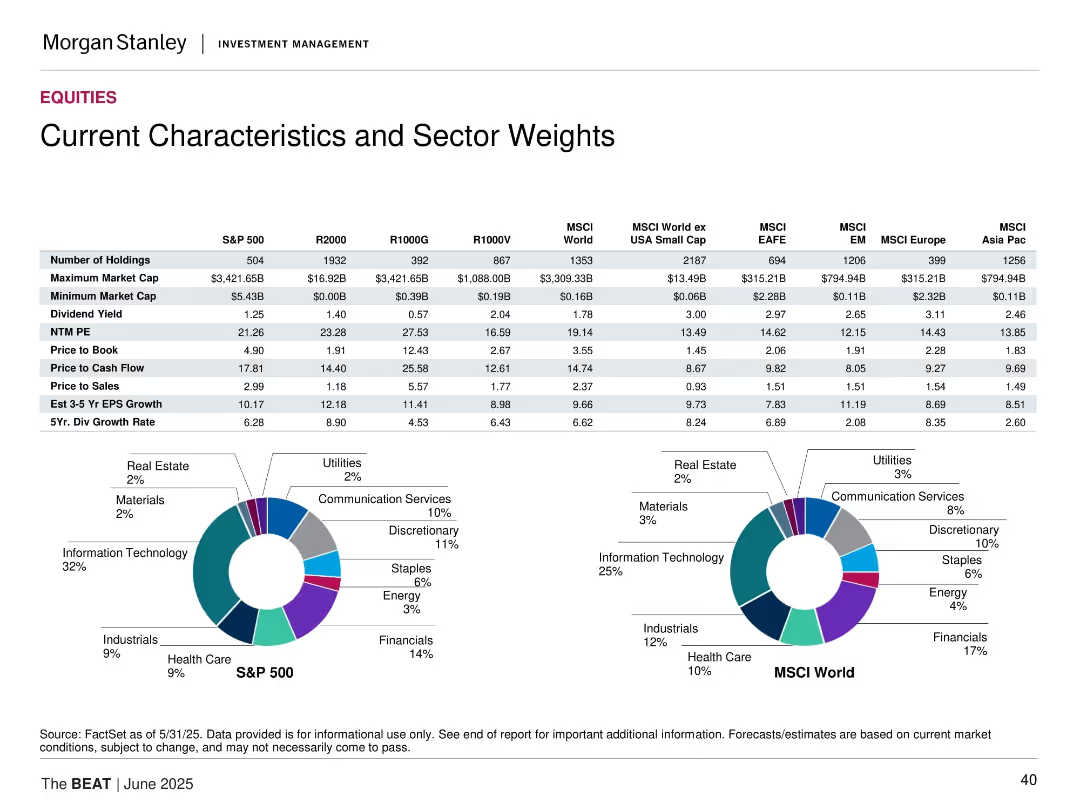
Tabular comparison of key metrics across indices plus pie charts for S&P 500 and MSCI World sector weights.
Market Analysis and Trends
Financial Services
The slide compares valuation and performance metrics like P/E, dividend yield, and EPS growth across major indices. It also visualizes sector weights for S&P 500 and MSCI World using pie charts, highlighting the concentration in Technology and Financials.
sector weights, index comparison, valuation metrics, S&P 500, MSCI World, dividend yield, earnings growth
Multiple Chart
Morgan Stanley
Saved
The slide presents a timeline-style layout with icons and percentages. The visual elements are straightforward and focus on the impact of digital platforms in job creation and business opportunities. The blue and teal color scheme is consistent and professional.
Market Analysis and Trends
Retail & E-commerce
The slide argues for the positive impacts of digital platforms, such as job creation and improved livelihood, as perceived by digital merchants. Statistical data is used to emphasize the significant role of digital platforms in sustaining revenue and creating opportunities during the pandemic, suggesting a reliance on these platforms for economic stability.
online platforms, impact, job creation, revenue, business opportunities, pandemic, digital merchants
Pillar
Bain
Saved
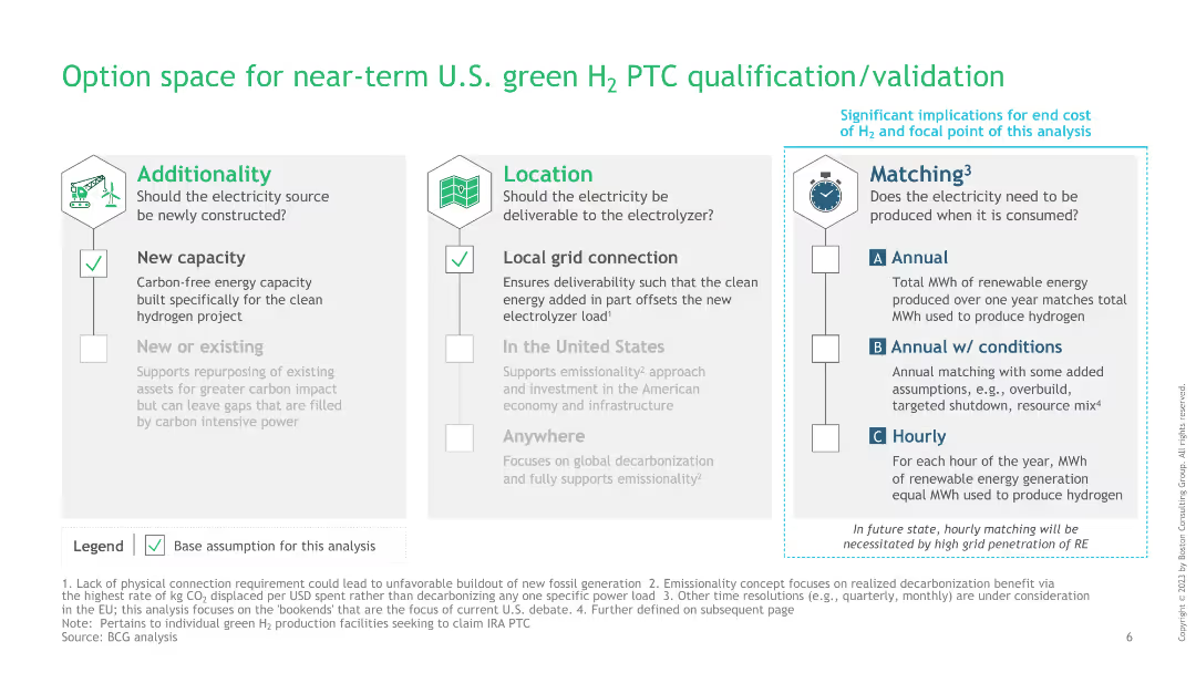
The slide is divided into three sections: Additionality, Location, and Matching, each with checkboxes and detailed points explaining each category’s criteria.
Regulatory and Compliance
Energy & Utilities
This slide outlines the criteria for near-term qualification and validation of U.S. green hydrogen production tax credit (PTC), focusing on additionality, location, and matching aspects necessary for compliance and efficiency.
green hydrogen, PTC qualification, additionality, location, matching
Pillar
BCG
Saved
This slide contains a line chart comparing perceptions of inclusive culture maturity between different respondent groups with color-coded lines and percentage annotations.
Strategic Planning
Professional Services
Examines how U.S. respondents view the maturity of inclusive culture compared to a global sample, particularly among non-minority women.
inclusive culture, U.S., global comparison, line chart, maturity assessment, gender perspective, diversity
Mixed Chart
Accenture
Saved
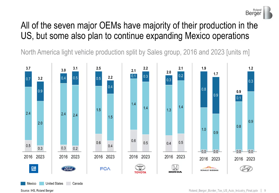
Multiple stacked bar charts per OEM (GM, Ford, etc.) showing vehicle production split (2016 vs 2023).
Strategic Planning
Industrial & Manufacturing
Compares North American production plans of major OEMs, showing most intend to keep majority production in the US, though Mexico's share is projected to grow for some brands.
OEMs, Mexico production, 2023 forecast, US dominance, vehicle production
Single Chart
Roland Berger
Saved
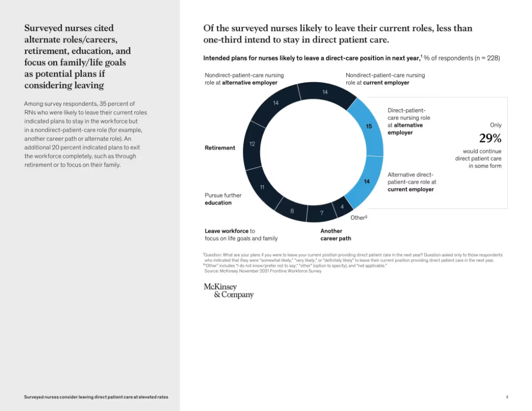
Split layout: left side contains text summary, right side features a donut chart with percentages and categories of career transitions; light background with blue accent
Human Resources and Talent Management
Healthcare & Pharmaceuticals
This slide explores nurses’ potential career moves if they leave direct patient care. It shows that only 29% intend to remain in direct patient care roles, with others planning retirement, education, alternate roles, or leaving the workforce. The visual emphasizes a workforce shift and highlights the need for retention strategies.
nurse retention, career transitions, patient care, workforce trends, survey data, McKinsey, alternate roles, retirement, education, family goals
Mixed Chart
McKinsey
Saved
The slide has a dark background, a yellow text box for the quote, and a question followed by four circular charts with percentages showing consumer preparedness for tech care.
Technology and Digital Transformation
Healthcare & Pharmaceuticals
This slide discusses Canadian consumers' openness to personalized medicine, genetic testing, and non-urgent care in retail locations, using wearables, and sensors.
Technology-enhanced care, personalized medicine, genetic testing, wearables, Canada
Mixed Chart
EY
Saved
The slide contains a line chart comparing delinquency rates and two column charts showing industry versus Chase stats on card outstandings and auto originations. It also has bullet points with insights.
Risk Assessment and Management
Financial Services
This slide presents risk management data comparing Chase's credit profile and decision making with industry averages. It could be used to demonstrate financial stability and prudent risk management strategies.
Credit risk, Balance sheet, Capital, Liquidity, Portfolio
Multiple Chart
JP Morgan
Saved
Features a process diagram of photolytic conversion technologies, supported by text descriptions of the reactions and processes involved, along with pros, cons, and key features.
Technology and Digital Transformation
Energy & Utilities
Explains photolytic technologies for hydrogen production, focusing on converting sunlight into hydrogen, with details on the processes, pros, cons, and key features.
Hydrogen, photolytic conversion, sunlight, production technologies, renewable energy
Graphic
Kearney
Saved
Two primary visual elements are present. The left section shows a blue column chart detailing 'NET INTEREST-BEARING DEBT' in euros over five quarters, with a noticeable downward trend. The right section shows a grey-scale column chart of the 'MATURITY STRUCTURE OF INTEREST-BEARING DEBT' for the upcoming years, demonstrating an extended maturity profile. The upper right corner provides a real-life connection with an image of two people in a hallway, symbolizing the corporate world.
Financial Performance
Financial Services
Outlines the significant year-over-year reduction in net interest-bearing debt and the extension of its maturity profile, critical for financial planning and investment discussions.
debt reduction, financial planning, interest-bearing debt, maturity structure, y-o-y comparison, financial management, investment strategy
Multiple Chart
Goldman Sachs
Saved
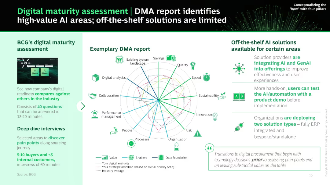
Left panel gives overview of BCG's DMA tool; right panel shows a radar chart with multiple KPIs. Icons and brief explanations summarize off-the-shelf AI solutions and their limitations.
Industry Overview
Technology & Software
This slide promotes BCG’s digital maturity assessment (DMA) to identify strategic AI implementation areas. It highlights the value of evaluating current readiness and pain points via surveys and interviews before choosing AI tools. Charts illustrate current gaps vs. strategic ambitions.
DMA, maturity assessment, radar chart, AI readiness, off-the-shelf, BCG, pain points, procurement tools
Mixed Chart
BCG
Saved
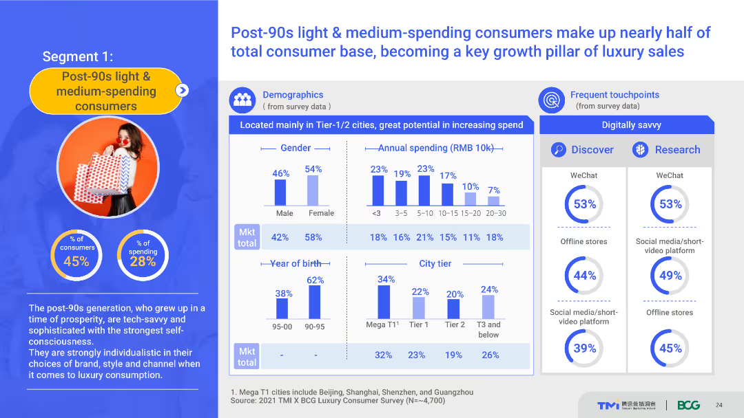
The slide uses a content layout with demographic charts, spending data, and touchpoint information. It details the demographics and spending behavior of post-90s light & medium-spending consumers, highlighting their role in luxury sales growth. The visual complexity is moderate, with well-organized sections.
Customer and Market Segmentation
Consumer Goods
This slide provides a detailed profile of post-90s light and medium-spending consumers, including demographics, spending habits, and preferred touchpoints. It emphasizes their importance in driving luxury sales growth.
post-90s consumers, demographics, spending behavior, luxury market, touchpoints
Multiple Chart
BCG
Saved
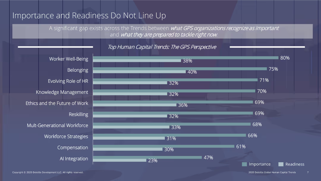
The slide features a column chart comparing the importance and readiness of various human capital trends, such as worker well-being, belonging, and reskilling. Text sections provide context and analysis.
Human Resources and Talent Management
Professional Services
The slide addresses the gap between the importance and readiness of human capital trends in GPS organizations, with a column chart illustrating disparities in areas like worker well-being, belonging, and reskilling.
human capital, readiness, importance, GPS organizations, trends
Single Chart
Deloitte
Saved
Slide includes two pie charts and a column chart, contrasting the perceptions of value creation with actual outcomes in M&A transactions. It also details factors contributing to the failure of achieving the expected synergies, like integration and due diligence issues.
Mergers and Acquisitions
Financial Services
Explores the common pitfalls in M&A transactions that lead to failure in achieving expected outcomes, focusing on integration challenges and discrepancies in perceived versus actual value.
M&A, Failures, Value, Integration, Due Diligence, Transactions, Challenges
Multiple Chart
Deloitte
Saved
The slide displays a pyramid diagram representing the tiered service approach, and bar charts that quantify the firm's market opportunity. The layout is straightforward with a mix of graphics and bullet points.
Corporate Finance and Valuation
Financial Services
Illustrating Ayco's role in providing integrated corporate client services, the slide highlights the scope of Ayco's reach in the market and outlines its full-service offerings across corporate hierarchies.
Ayco, corporate clients, financial planning, market reach
Framework
Goldman Sachs
Saved
Column chart comparing the top ten countries where physical health is prioritized over mental health, along with text comparing mental and physical health priorities in selected countries.
Customer and Market Segmentation
Healthcare & Pharmaceuticals
This slide compares the emphasis on physical versus mental health across various countries, identifying those where physical health is given more priority, with specific data from Kenya, Panama, etc.
physical health, mental health, priority, comparison, survey
Mixed Chart
IPSOS
Saved
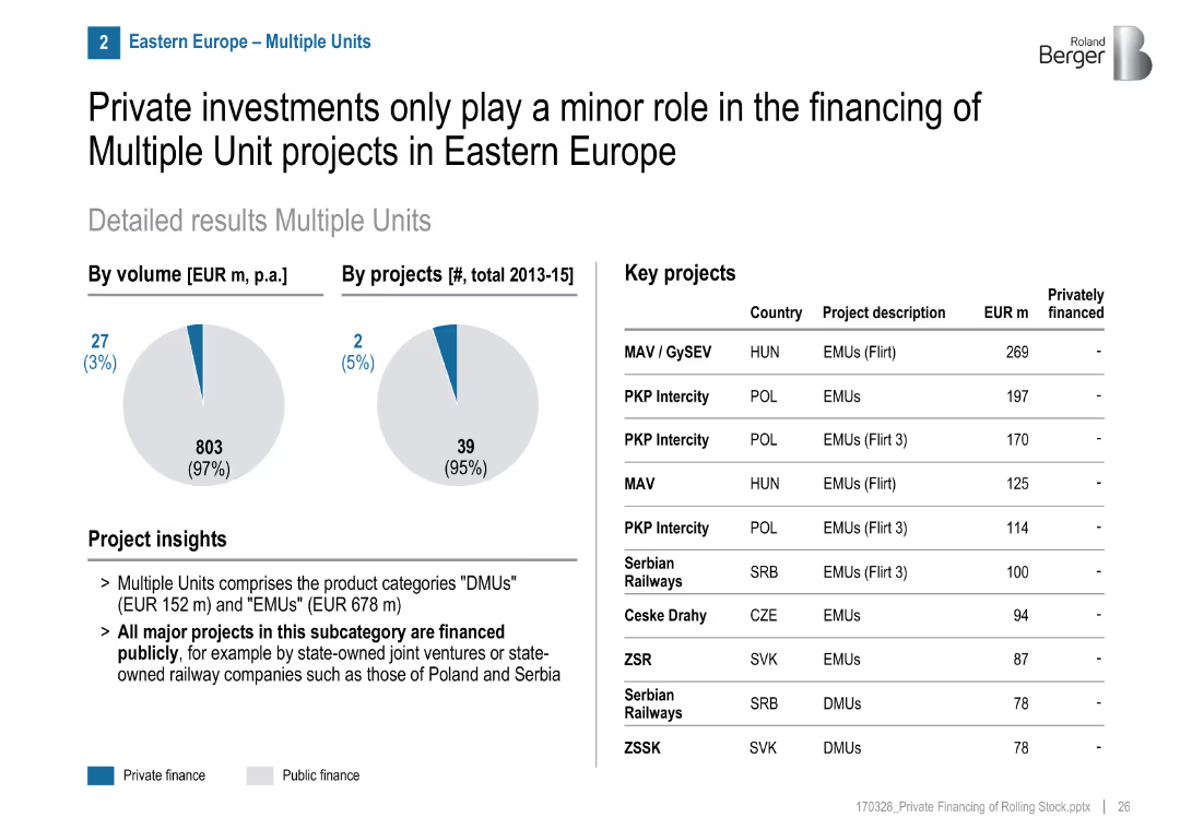
Similar visual format to others, project list shows no private projects
Market Analysis and Trends
Transportation & Logistics
Almost all multiple unit projects (EMU/DMU) in Eastern Europe are publicly financed. Projects are managed by state-owned or joint ventures in Poland, Hungary, Serbia, etc.
multiple units, public funding, Eastern Europe, EMU, DMU, rail projects, state-owned
Mixed Chart
Roland Berger
Saved
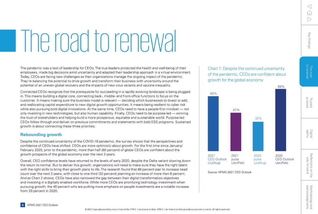
Two-column layout with large title on left, supporting text below, and a vertical bar chart on the right. Navigation tabs on the far right margin.
Strategic Planning
Professional Services
This slide discusses how CEOs have adapted to the pandemic by balancing growth opportunities with human and digital transformation. It emphasizes connected leadership, digital innovation, human capability, and ESG-driven purpose. A chart highlights rising CEO confidence in economic growth from 2020 to 2021.
CEOs, leadership, transformation, pandemic recovery, ESG, digital growth
Mixed Chart
KPMG
Saved
Pie charts, text description, icons.
Market Analysis and Trends
Retail & E-commerce
Discusses significant growth in indie beauty market.
indie, beauty, skincare, growth, CAGR
Mixed Chart
Bain
Saved
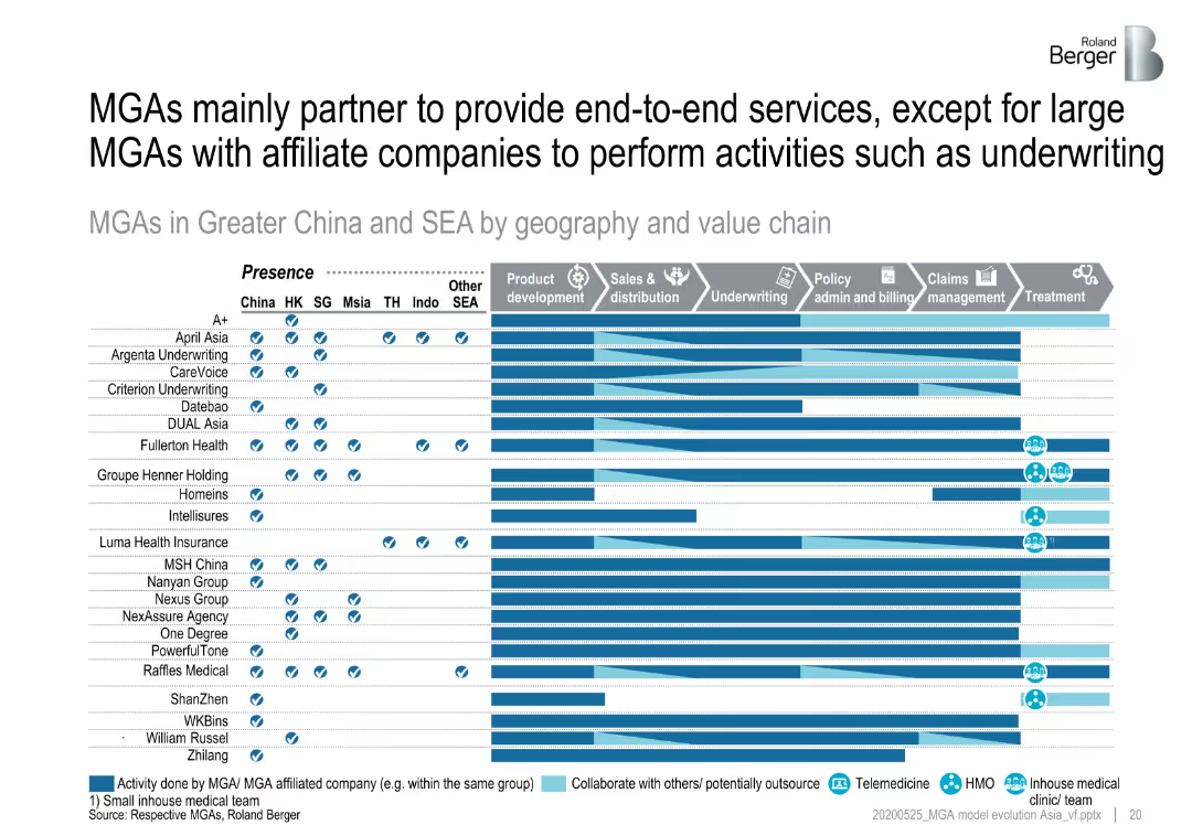
Matrix showing MGAs in Greater China and SEA by geography and value chain activities, emphasizing their partnerships to provide end-to-end services.
Strategic Planning
Financial Services
Analyzes how MGAs in Greater China and Southeast Asia partner with other companies to offer comprehensive services across the value chain, focusing on end-to-end service provision.
MGA partnerships, end-to-end services, Greater China, SEA
Table
Roland Berger
Saved
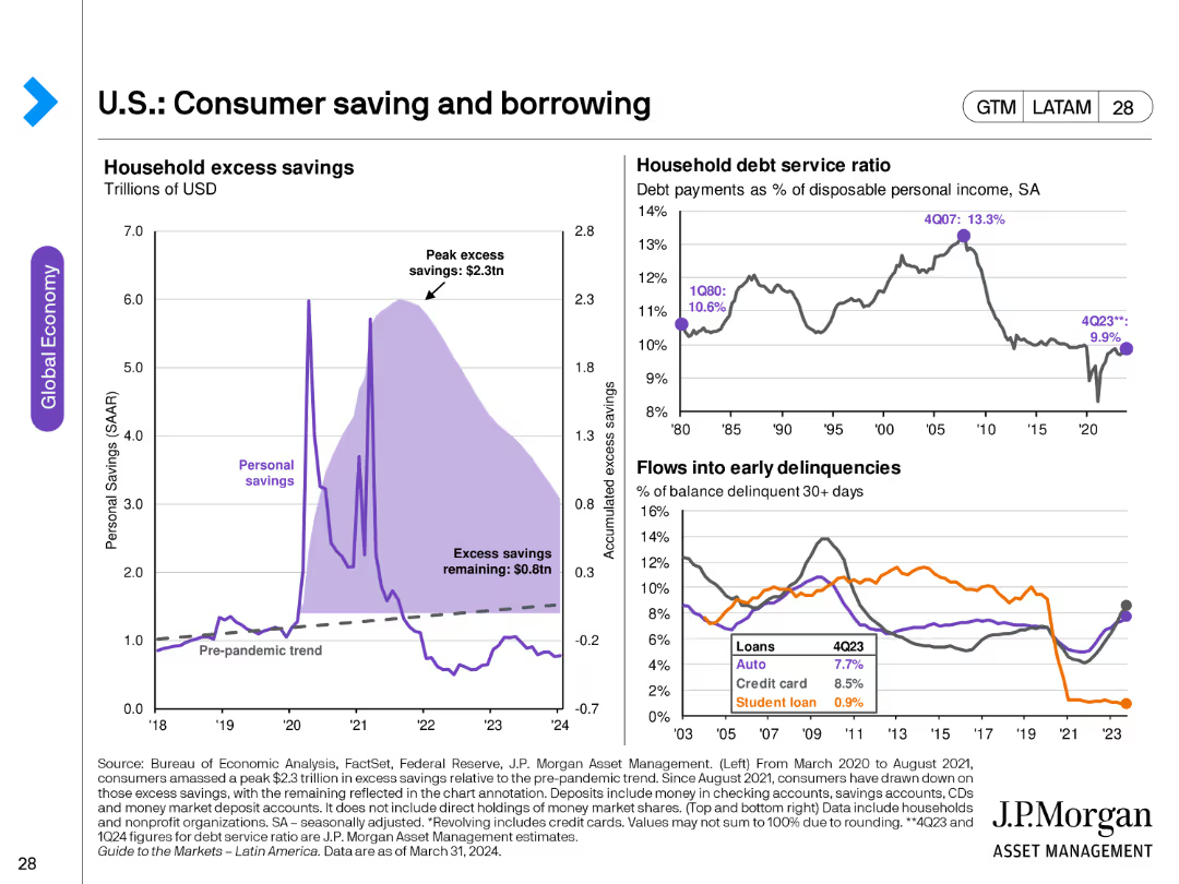
The slide contains three charts: a line chart showing household excess savings, another line chart depicting household debt service ratio, and a line chart for flows into early delinquencies for different loan types.
Market Analysis and Trends
Financial Services
This slide analyzes consumer savings and borrowing trends, highlighting excess savings, debt service ratios, and delinquency rates. Useful for understanding consumer financial health.
consumer savings, borrowing, debt service, delinquencies, financial health, household savings
Multiple Chart
JP Morgan
Saved
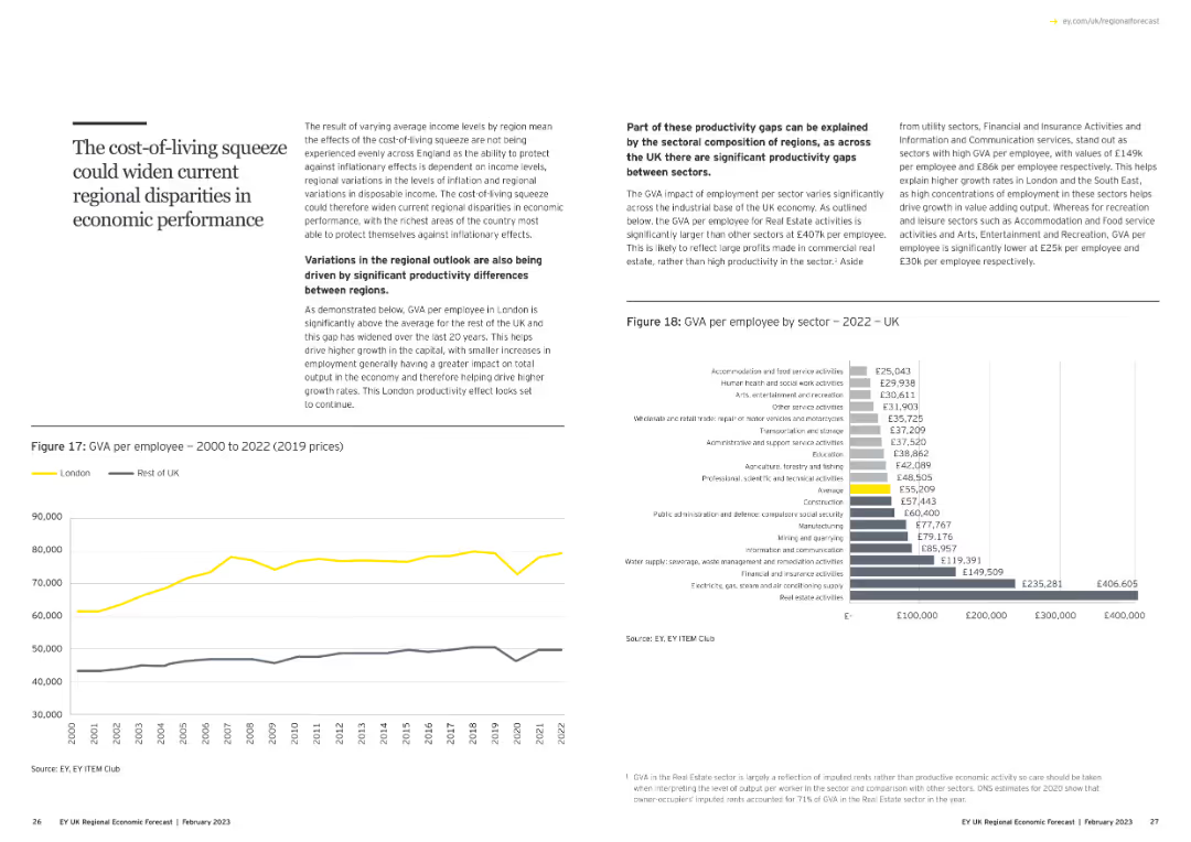
This slide features a title on the left with a block of text explaining the concept. On the bottom left, there is a column chart comparing GVA per employee in London vs. rest of UK. The right side contains a text box and a bar chart detailing GVA per employee by sector for 2022.
Market Analysis and Trends
Financial Services
The slide discusses how varying average income levels and productivity differences across regions could widen regional disparities in economic performance, with specific data on GVA per employee.
regional disparities, GVA, productivity, income levels, economic performance
Multiple Chart
EY
Saved
Previous
Next
If nothing, comes up, please save your slides first
Create a FREE account to continue browsing
Receive Instant Access to 1,000+ slides from companies like McKinsey, Google, and Goldman Sachs
First Name
Last Name
Email
Password
I agree to all
Terms & Privacy Policy
Thank you! Your submission has been received!
Oops! Something went wrong while submitting the form.
Have an account?
Sign in
Column Chart
Heatmap
Chevron
Org Chart
Infographic
Callouts
Timeline
List
Graphic
Picture
Process Flow
Diagram
Paragraph
Map
Table
Framework
Subtitle
Takeaway Box
Icon
Other Chart
Radar Chart
Waterfall Chart
Mekko Chart
Pie Chart
Scatter Plot
Line Chart
Bar chart
Bullet points